Wolverine #6 is out this week from Marvel Comics. Writer Benjamin Percy, artist Viktor Bogdanovic, colorist Matthew Wilson, and letterer VC’s Cory Petit present part three of 22 “X of Swords,” Logan seeks out the Muramasa blade, the weapon he will wield in Otherworld’s contest of champions. However, he is not the only one who pursues the blade.
Percy comes strong out of the gate, giving readers what may be the strongest written issue in this series to date. Past arcs have taken a while to pick up steam, but this is a tightly written issue. Add to that the fact that he has to pivot away from the story he’s been setting up in order to participate in this X-Men mega-crossover, but Percy steers into the skid, telling one of Logan’s most personal stories yet.
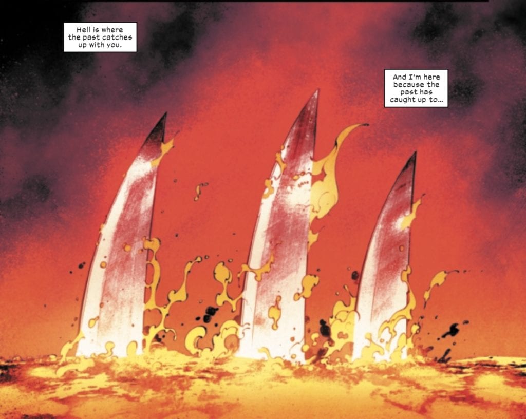
This issue starts bold from the very first page. Percy’s prose about hell hits hard. It is succinct and visceral, capturing Wolverine’s durability, as he does whatever it takes and endures any trial to succeed in his mission. Petit does an excellent job of wrapping the lettering around a beautifully drawn and colored scene by Bogdanovic and Wilson that contains one of the most compelling images in the book — Wolverine’s claws slowly emerging from a fiery pit of lava…literally in hell!
Bogdanovic’s work here is subtle with just the tip of Logan’s claws emerging, but they are accentuated by Wilson’s colors, whose slight tint of red on the claws make them appear to be glowing from the heat. The way this image takes up half of the first page really draws readers in right from the beginning with its evocative imagery.
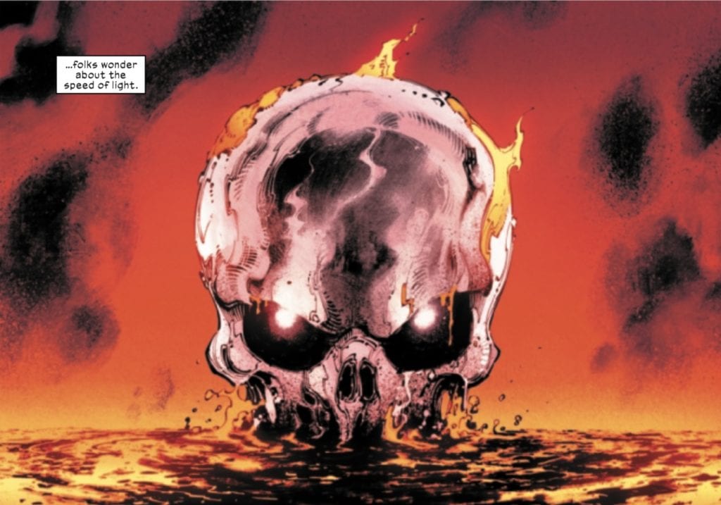
The entire story is framed around Logan’s emerging from the lava. This serves to capture Logan’s unkillability and determination as he walks through the fires of hell itself! As we arrive at the second to last page, we are again treated to another powerful but haunting Wolverine image.
The skull Bogdanovic draws provokes feelings of horror as Wilson’s colors in Logan’s eyes show that, despite having all of his flesh and most of his vital organs burned away, there is a soul alive inside of him.
This issue was very much a trial by fire (literally!) for Wolverine. Percy’s writing has never been stronger, while Bogdanovic and Wilson draw and color some gorgeous if at times, horrific imagery that fits both the moodiness and low-grade horror of the title. Petit’s letters provide the reader with compelling dialogue and exposition without crowding or weighing down the story.
Wolverine #6 is another solid chapter in the “X of Swords” mega-event, with Logan’s journey continuing in X-Force #13.
What did you think of Wolverine #6? Are you enjoying “X of Swords?” Tell us in the comments below!
Even for the denizens of Asgard, it seems everything old can be made new again. Marvel Comics has released a preview of the upcoming THOR #9, available on November 4th, featuring the return of Thor’s old human ward, Don Blake.
Says Marvel about Blake’s return: “So where has the good doctor been all this time? The answer will shock Thor and fans alike as Donald Blake is no longer the man he once was.”
You can watch a motion-comic trailer, check out the cover art, and read the full Marvel press release below.
Do you have fond memories of the Don Blake years with Thor? Let us know what you think in the Comments section, and please share this post on social media using the links below.
DONALD BLAKE RETURNS WITH A VENGEANCE IN THE THOR #9 TRAILER
“Prey” by Donny Cates and Nic Klein kicks off on November 4th!
New York, NY— October 8, 2020 — Donny Cates and Nic Klein’s critically acclaimed run on THOR continues next month with the start of a brand-new arc! “Prey” will feature the startling return of Thor’s classic alter ego, Donald Blake, in what promises to be Donny Cates’ darkest story yet.
It’s been years since the God of Thunder required his human ward. So where has the good doctor been all this time? The answer will shock Thor and fans alike as Donald Blake is no longer the man he once was. Enter the twisted prison of Donald Blake in this chilling trailer, featuring never-before-seen artwork from THOR #9!
“‘Prey’ is maybe the most fun I’ve ever had writing at Marvel. Thor fans are going to lose their minds over this one and I can’t wait to unleash this terrifying beast on them!” Cates said. “Nic Klein is back and at the top of his game on this one. I promise you this, True Believers, just like the mighty thunder king himself…..you won’t see this one coming. Behold…the return of Donald Blake!”
Journey into a dark mystery left unsolved since 1962 when THOR #9 arrives on November 4th!
Flip This Bitch is a full-service production design firm that creates fictional fantasy worlds come alive on hit web series like Critical Role and makes reality shows like Jersey Shore look slick and sexy.
Flip This Bitch is a small group of dedicated artists. Depending on the project, the company typically organizes film-set duties for 30 or more people. However, the group’s core includes President and Production Designer Jeffrey Toraichi Eyser, VP and Set Decorator Sue Oneto, and Executive VP and Art Director Joe Myers.
PopAxiom wrangled Jeff, Sue, and Joe for a chat about what they do, how they do it, and the origin of the company’s name.
How did the members of Flip This Bitch get their start in the film and television industry?
Jeff: “I moved to Los Angeles back in 2006 and landed my first job in television with Bad Girls season one. From there, I fell in love with the art department and design. It was something I had a focus on growing up, and so it was a natural shift.”
Jeffrey Toraichi Eyser, Production Designer & President – Flip This Bitch
Joe: “I went to film school in Florida and drove across the country three days later. I started an internship, and within a year or two, I was working with Jeff on Bad Girls Club. He said, ‘Hey do you want to do this job with fewer people, but more respect?'”
Joe Myers, Art Director & VP – Flip This Bitch
Sue: “My education is actually in social work. I got my Masters in social work but quickly realized there’s no money in that and I wasn’t married to the idea that I loved doing it. I always had a dream to be living in California. I drove across the country to California six years ago. I had a friend who worked in the art department as a decorator and asked her if she could get me a quick gig for some cash while I figure out what I want to do. She hired me for two weeks on the Tyra Banks pilot for her talk show. I fell in love with the art department. It was a very fast switch in my head. I was passionate about it, and it was a career I could build on. Then I met these freaks who got my name from a mutual contact and asked me if I’d come to a job for a couple of days. Here we are five years later.”
Sue Oneto, Set Decorator & VP of Projects – Flip This Bitch
Where did Flip This Bitch get its start?
Jeff: “Flip This Bitch has been around for almost 12 years, but we’ve been a real company for the last five. It started as a funny idea with my friend Alexis and I as a title for our team. We thought it would be funny to have a crew wearing t-shirts with our faces on it saying ‘Flip This Bitch,’ so we did. We became known as Flip This Bitch, and as we progressed and became bigger in the industry, we became a real company. We have a team of carpenters; a team of draftsmen; people who get us lunch.”
Sue: “The first project that I was on with Flip This Bitch was a reality show called Fix My Mom, where they just pitted mothers and daughters sort of against each other, but trying to make them come together. I started working on the Bad Girls Club.”
Joe: “Our first big show as Flip This Bitch, as recognized by the government, was Fix My Mom.”
Jeff: “Fix My Mom was our very first show as a team, I did 15 seasons of Bad Girls Club. Collectively we did about seven or so seasons. We did a season of The Real World and MTV’s The Challenge in Spain.”
Sue: “We’ve done the reincarnated Jersey Shore, which bled into Floribama Shore, which bled into many other MTV reality shows that we tend to always do.”
Jeff: “We do kind of everything. We do reality TV, TV, and film, but we also do residential projects for people, restaurants, stage productions, and gameshow-type shows. It’s an interesting niche we’ve carved out for ourselves.”
Flip This Bitch works on a lot of reality television, which is a lot more work than most viewers recognize.
Jeff: “Ultimately, it’s funny; people tend to look down on the reality TV world. But I feel like the mindset is the same. You’re developing a world for the characters. Our characters happen to live in the world we create. We have to make sure there’s a bar near-by and a pool table to keep people busy. It’s about creating a flow through the set and how people will interact with it.”
Joe: “I think one of the primary things that we’ve talked about before, so many times a scripted show is trying to dull-down the fantastical, whereas we take reality and lift it and heighten the experience.”
Jeff: “A lot of times, we’re building these sets. Even when you see a show that takes place in a house, we’re building sets within the house. A lot of the walls you see are built in front of existing walls to hide the cabling, lighting, and camera gear. You generally see about half of an actual house. We’ve gone in and built rooms inside of rooms to create our looks. I don’t think people realize how much work goes into a lot of these set constructions.”
Reality TV of the likes worked on by Flip This Bitch film all over the world.
Sue: “There was one year where we clocked like thirty-something flights.
Joe: For three months, we traveled between Spain, Georgia, and Florida.”
How many projects does Flip This Bitch handle at any given time? The answer is a bit hazy when things are continuously busy.
Jeff: “Currently, we have six?”
Sue: “Seven?”
Joe: “I was thinking five.”
Where does each member draw inspiration?
Sue: “The first name that comes to my head and I’m stealing it from Jeff because I know he’s going to say it is Kelly Wearstler. She’s a genius with putting crazy combinations of patterns, furniture, and lighting together, and it all looks brilliant. She’s probably my number one.”
Joe: “My aesthetic is probably less from interior design and more from print and graphic design, like screen printing and minimalist design; 2D art is where my heart is.”
Jeff: “There are so many things to pull from. I’m really into chaos right now. It’s all about trying to meld things into our work.”
Flip This Bitch services a wide range of clients.
Jeff: “We work with MTV, Discovery, SyFy channel, NETFLIX, and Critical Role. The residential project that we’re doing now, which I can’t reveal, is big in that world.”
Role-playing games (RPGs) like Dungeons and Dragons are popular because of Critical Role and Flip This Bitch’s work. It helps that Jeff and Joe are fans of RPGs.
Joe: “We have a Flip This Bitch Pathfinder Game.”
Role-playing games aren’t part of Sue’s wheelhouse.
Sue: “I do enjoy the Critical Role jobs. I don’t understand it. But I love to learn, and I get to learn about all these characters and the world. It’s a fun challenge for me because it’s totally different from anything I’ve been into.”
Jeff: “When you love working with people, it makes it all fun.”
What’s a dream project for each member of the team?
Sue: “I want to do horror. If they were to remake A Nightmare On Elm Street, that would be so amazing to me!”
Joe: “I would love to do something like future LA. Something like Westworld or Blade Runner. I think that future-mid-century aesthetic works well with our skillset. We’d knock it out of the park.”
Jeff: “Anything Evil Dead. I would lose my mind.”
Flip This Bitch handles films, television, reality television, game shows, and homes. So, what’s a tip from the team for designing at home?
Sue: “I love nature and the outdoors, so I take every opportunity to bring that inside. So, plants or using a lot of wood or stone. I advocate for plants everywhere.”
Jeff: “I have a stock answer for this one. My biggest tip is that there are no rules. You shouldn’t be afraid to do whatever makes you happy.”
What’s coming next from Flip This Bitch?
Joe: “We’re working on Top Elf season two for Nickelodeon. It’ll be out for Christmas. Children get to compete to be Santa’s next helper.”
Jeff: “We’re doing a secret dating show that we can’t talk about and another in Georgia we can’t talk about.”
Are reality shows in your queue?
Thanks to Flip This Bitch for making this interview possible.
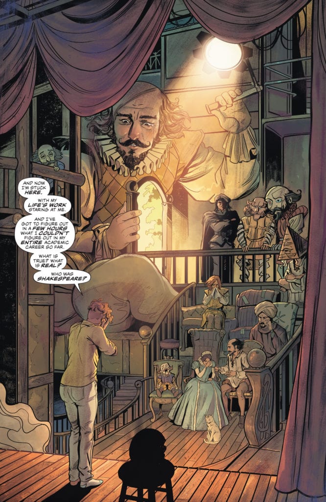
Writer G. Willow Wilson and artist Nick Robles continue to craft an immensely pleasing tale in “The Dreaming: The Waking Hours” #3. This issue offers emotional weight, whimsy, and classic callbacks aplenty to create what may be the most entertaining issue of this series thus far. With outstanding visual direction from Robles and colorist Mat Lopes, and tonally superb lettering from Simon Bowland, this new chapter of The Dreaming is a surefire crowdpleaser for new readers and classic Sandman fans alike.
“In the waking world, Ruin and the fallen cherub Jophiel have teamed up with the sorceress Heather After to try to pull Lindy out of the Dreaming, and home to her newborn daughter…but they’d better work fast. Lindy’s mind is rapidly disintegrating as she reckons with thousands of possibilities for who Shakespeare really was, each one alive and walking around in front of her—and if she can’t keep it together, then she’ll be lost forever!”
Writing & Plot
G. Willow Wilson‘s approach to writing the inhabitants and guests of the Dream Realm in “Waking Hours” #3 makes for some of the most pleasant and comparatively light-hearted storytelling seen in this universe. Don’t get me wrong, there’s still plenty of emotional weight to be felt in these pages, (Lindy’s life story is no pleasant affair) but the air of good intentions and pleasant mischief makes this a hard comic to not have fun with. Lindy being stuck in a realm full of potential Shakespeares from all manner of literary theory is quietly hilarious. The journey of a hopelessly incompetent nightmare, a smartassed angel, and their dangerous with counterpart all trying to reunite an infant with its mother feels vaguely Pratchett-esque in the best possible ways. The fact that the whole comic feels so damn smart, while also paying superb homage to the creation of Neil Gaiman before her is the icing on the cake. Each new character is a great addition to the Sandman mythos, and the old characters feel exactly like they always have. Some special appearances by classic characters aren’t just for fan service (although they are great for that), but they genuinely serve the plot. The dialogue and narration are uniquely delivered based on the character speaking/thinking the lines, and they all also feel naturalistic and easy for readers to get in tune with. The poetic and literary prose style of prior Sandman tales has been eschewed in favor of something more new-reader friendly, but this doesn’t diminish the experience and makes for a stellar read.
Art Direction
The visual symphony that is created by Nick Robles’s pencils and Mat Lopes’s colors in “The Waking Hours” #3 gets continually more impressive as it continues. The changes in method from scene to scene are seamless yet breathtaking, as Robles casually changes from conventional pencils to what seem like watercolor paints and back again. It’s akin to J.H. William III’s work in Overture, but not quite as radical. The penciller makes his mark on The Dreaming by still offering a similar style to Bilquis Evely’s run on the prior series, but still also making these huge departures that add not just variety, but the tonal context within a scene. The images of Dream wandering around his prison for nightmares does deserve a different aesthetic than the rest of the book. Mat Lopes’s colors serve as the unifying thread of creative cohesion between the prior Dreaming run and this one, and it’s difficult to imagine anyone but him coloring this universe at this point. Each and every page on this comic is filled with vibrance. Even the rainy and fog-covered London streets appear luminescent. Each character has their own color scheme that seems to follow them wherever they go; Lindy is surrounded by yellow light from candles or the sun, Ruin brings cool blues and violets with him wherever he wanders, and Dream brings his usual ever-changing array of starlit skies and the morphing color waves of dreamy realities. There’s one particular scene where a summoning (no spoilers!) occurs where Robles’s talents quite literally explode onto the page in fiery blues and ethereal tones. The letters from Simon Bowland, another carry-over from Spurrier and Evely’s run, are just as varied and tonally mixed as all great Sandman stories should be. Every character would seem to have their own font, and the wavering or stilted delivery of some dialogue wraps the reader in the experience of being a part of this comic. Much like its predecessor, this is easily one of the best looking comics hitting shelves right today.
“The Dreaming: The Waking Hours” #3 is a whimsical and emotional chapter full of more brilliant characterization and fantastic character appearances than could be dreamed of in a good night’s sleep. G. Willow Wilson’s script dances across the lines of relatable human drama, horror, and literary whimsy while also giving us a compelling character-focused narrative. The visual marvel that is the combined work of Nick Robles and Mat Lopes shifts and changes among all manner of beautiful sights while keeping a consistent visual core. This is yet another brilliant chapter for this Sandman Universe tale, and a great read whether you’re a long time fan or not. Be sure to grab this newest release from your local comic shop when it hits shelves on 10/8!
Longtime production designer Randy Ser unleashes a torrent of terror in Cruiser, his second film as a director after working on films and shows like The Middle, The Mighty Ducks, and My Name Is Earl.
Ser’s new film, Cruiser, follows the unnamed titular character played by Tony Award-winning Shuler Hensley. Cruiser, the character, murders a cop then assumes his identity. It’s not too long before Cruiser’s kidnapped Tara Kirkland (Lori Beth Sikes) and holds her captive so that she can be witness to his martyrdom.
PopAxiom spoke with Randy about going from sunny South Florida to sunny Los Angeles, making his horror film Cruiser, and working with Sam Raimi on Darkman.
Childhood Dream
Randy Sur grew up in South Florida, where he recalls, “I always wanted to be a filmmaker. Since I was a kid, I was completely enamored by Universal horror films of the 30s; Wolf Man; Frankenstein; The Mummy; all those characters.”
In the fifth grade, Randy “got into a play in fifth grade, and it hooked me.” Hooked is probably too light a word. “I got an AA with an emphasis in design. I got a BA in theatre from Florida State. Then I followed that up with an MFA in directing from the Florida State School of Theatre.”
“It was a childhood dream,” Randy says, and he’s spent a lifetime living it.
For Randy, he “just wanted to be involved in the business. I knew it was not going to be easy to make a career at it, so I studied as much as I could to see what I could get going.”
After graduating, Randy “came out to LA,” he says, “I got a job with another Florida State alum teaching pre-school four hours a day. A lot of the parents there were involved in the entertainment industry. One of them got me a job in an industrial film.”
“A few months down the road,” Randy continues, “I got a job on a film called Exterminator 2.”
One of Randy’s early connections included designer Julie Fanton. “We ended up working together for 40 years until she retired recently. We worked on things like Darkman, The Mighty Ducks, and The Middle.”
All You Need
Randy’s directed two films. Is it a new goal to go from production design to directing? “I was trying to make the change for a long time. I was the second unit director on Burning Zone, also on a pilot for another series. So, I started branching towards what I wanted to do.”
Randy says he puts a lot of story into his design work. “In my heart, I’ve always considered myself a storyteller, so I wanted a chance to tell a story.”
During this period, Randy met Sam Hensley Jr. “We’ve been producing partners for over 25 years,” Randy says. “He showed me a novel that he thought would make a good movie.”
Sam turned the novel into a script and got it to Randy. “We all met up in Tallahassee and started to move forward with the script. That movie got a way down the road, we raised some money, we started to shoot the movie, and then the money fell out.”
Discouraged, but not defeated, Randy and Sam pressed on, “We wrote All You Need. We went out and raised the money independently and got to make our movie. It starred Kellie Martin, and because of her, we ended up selling the film, and it got a Thanksgiving premiere on Lifetime.”
After that, Randy “got involved in second unit directing on action films. I did all the car racing scenes for a film called Dirt and other films.”
About Cruiser
“During all those times,” Randy recalls, “Sam and I kept writing things and trying to get other movies going. We decided at one point that horror was the way to go. Sam had an idea for a look for a found-footage movie, and that’s what we ended up going with.”
Randy and Sam planted the idea of Cruiser, and it began to grow. “It’s proven to be rather timely. It’s a found-footage horror film, but also one that makes people think. A lot of the terror in Cruiser comes from the questions the movie brings up.”
“One question is,” Randy explains, “‘Does God let bad things happen to good people?’ In my estimation, there’s a lot to think about with that.”
In the film, “Cruiser [the character] has a message and has a way he wants that message to be seen. He does that by taking a woman captive who will bring his message to light. The message involves going out and dismembering people.”
“Cruiser’s not looking to become a celebrity,” Randy details, “but to bring his beliefs to the attention of the world.”
The message of Cruiser is what Randy thinks “the audience will be pondering a lot after going on a wild, blood and guts ride.”
Cruiser is a “found footage” film, but don’t let that label leave a lasting impression. It’s more than that. “I think what we’ve done with the film is; it’s not a single-camera found footage story. Part of what drew me to it is that we could tell the story in a cinematic way. Sam wrote it; then, we took it further by having the ability to use all kinds of different cameras; body cams; car cameras; cellphones; fixed cameras in parking lots and stores.”
At the heart of Cruiser is Tara, the woman forced to watch a living nightmare. “The performance by Lori Beth Sikes is going to pull the audience into the backseat with her.”
“I think the terror,” Randy says, “is not only being in the backseat while watching this man murder people but when Cruiser talks to Tara — to us — and we have to stare into his soul through the eyes in the rearview mirror.”
Filmmaking is a process that evolves over time. Randy and company added a new layer to the character based on Shuler Hensley’s skillset, which includes an incredible singing voice. “Cruiser sings in many languages while summarily executing his victims. The music he sings takes him to a timeless place, and he uses it to soothe his victims. These angelic sounds coming out during these demonic acts are also meant to confound the audience and their senses. We do that a lot in the film.”
Making Darkman
Darkman is a 1990 action-horror film from director Sam Raimi. It’s a cult gem, and Randy was there every day with the legendary director as a production designer. “Working with Sam was an amazing, creative adventure. He is a man that has a vision, and he will challenge you to interpret and bring that vision to the screen. We’d have so much fun together, acting out scenes, getting so intense we’d knock lamps off of tables.”
“Sam wanted to create a dark, comic book world,” Randy says, “What I brought to him was a love for Universal horror and the looks of those films.”
Randy explains, “I felt that Darkman’s world was between darkness and light, teetering on the brink of life and death, and that played into my favorite film, Frankenstein.”
For Randy, Frankenstein’s influence “showed up a lot in different areas of the movie. Darkman’s loft/lab, to me, was an homage to Frankenstein’s lab and playing with light and dark.”
“We had a two-story fire furnace,” Randy says, “which gave off the light to flicker on Darkman’s face. To me, that was a direct homage to the Tesla Coils in Frankenstein.”
Darkman starred Liam Neeson long before he had that particular set of skills. Neeson’s fame only fueled re-watches of Darkman. “That film still has a huge audience and resonates with today’s younger viewers as well. It just celebrated it’s 30th anniversary the day before Cruiser released.”
Wrapping Up
“Several films like Being There, Brazil, and Awakenings,” sent Randy’s creativity on fire. Directors like “Sidney Lumet and Stanley Kubrick” also left a long-lasting impression.
“My parents took me to the movies when I was a young kid in the 60s,” Randy shares, “and I watched a lot of films I probably shouldn’t have. There’s a number of voices and films that inspire me to want to tell stories.”
“Two of my all-time favorite horror movies,” Randy says, “are Rosemary’s Baby and The Exorcist. Those horror movies put things into the mind’s eye and then terrify you with your thought process.”
That seed of terror in the mind is alive in Randy’s film Cruiser. “We have plenty of blood and gore, but I think there’s that other side of Cruiser that’s going to go into the viewer. You’ll relive the visual terror, but more so the thought-provoking terror.”
Randy’s not a fan of remakes. However, he does say, “I would love to make my interpretation of Frankenstein. But I’d like to get away from that. Once a story’s told, let it be. I don’t know that as a storyteller that I’d want to remake something.”
Cruiser is out and about on a streaming service or VOD near you. So, what’s next for Randy? “Sam and I are developing some other horror and drama ideas. We’re waiting to see what happens with Cruiser before we commit to what we pull out of the sleeve and put in front of an audience.”
Is Cruiser on your watch list?
Thanks to Randy Ser and Projection PR for making this interview possible.
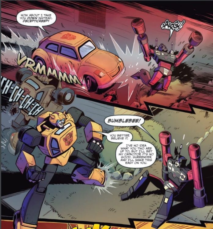
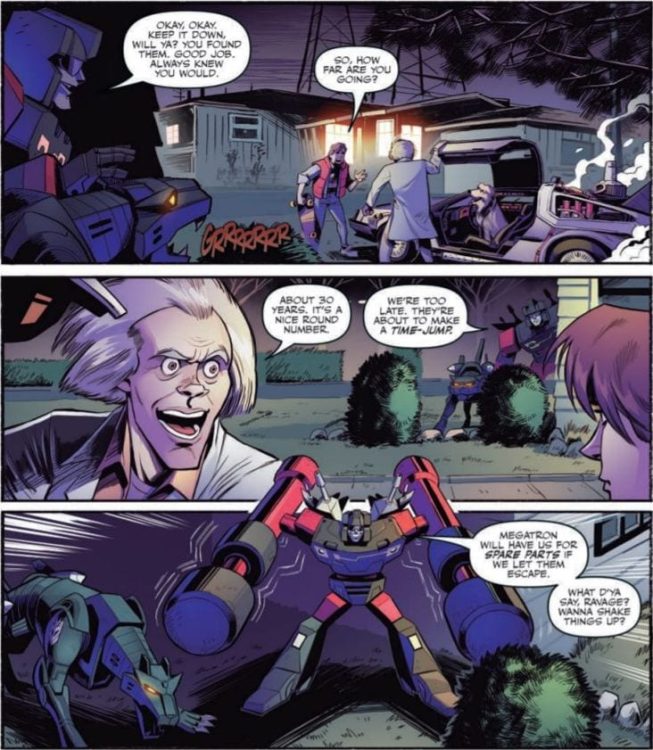
TRANSFORMERS/BACK TO THE FUTURE #1, available from IDW Publishing on October 7th, follows the Decepticons as they steal Doc Brown’s time machine to remake history for their own ends. Cavan Scott’s script is snappy and full of fun with plenty of easter eggs to delight the fans of either franchise.
Cover Art
This entire issue leans heavily on nostalgia, and Juan Samu’s cover is no exception. Marty and Doc Brown are giving their best “That’s heavy!” face when faced with their time-hopping DeLorean converted into an Autobot. The human costumes are movie accurate, the lightning rod from the first film is immediately identifiable, and the flux capacitor makes a pleasing guest appearance. Everything about this cover screams “fun.”
Writing
Great Scott, Cavan Scott! What a fun mashup!
To set the stage, this story picks up almost immediately after the events of the first Back To The Future (BTTF) film but with a twist. Transformers have secretly been observing the time-traveling duo, and the Decepticons decide to win the war against the Autobots with some timeline-altering shenanigans by stealing Doc Brown’s invention.
Nearly everything about this story works. The presence of the Transformers in this world is explained well. The plot makes total sense. And the callbacks/references to the characters from both properties are profuse and enjoyable. Scott also does a great job keeping the tone right in that sweet spot between “just silly enough for kids to enjoy” and “action-oriented enough for adults to have fun.” The only minor critique I have is around the occasional, jarring British slip in some of the dialog and narration (e.g. calling a “speeding car” a “flash motor”) that interrupts the flow of the story. If Editorial can catch those breaks in subsequent issues, this will be a near perfect script.
Pencils/Inks
Samu’s art perfectly matches the high energy and silly fun of Scott’s script. Rather than going for a unique design take or drawing inspiration from the modern films, Samu goes straight to the original cartoons for the Transformers designs. That was the wisest choice to further play on the nostalgia hooks of this issue.
The character designs are just cartoonish enough to not deviate too far from the source material but detailed enough to appeal to a slightly older audience. When translating recognizable actors to comics, it can be jarring when the rendering is so far off that the character looks like a random paper doll. Samu took the time to create a version of Doc Brown and Marty McFly that feels authentic and true to the actors without being a slave to realism. Samu figured out a great compromise between live-action and cartoon that pays respect to both without slighting either.
Coloring
David Garcia Cruz’s colors are generally quite good but with a few rough spots. The highlight of Cruz’s work is the electric blue lightning strikes when the DeLorean time jumps. They’re bright and powerful. Where Cruz’s coloring doesn’t quite work is in the overuse of purple in nearly every panel. You get the impression most of the scenes, night and day, are highlighted with black light bulbs.
Lettering
Neil Uyetake’s lettering is solid, clean and wholly organic for the subject matter. The Transformers emanate a whole gallery of sound effect from changing shape to shooting missiles to starting mini earthquakes, and Uyetake letters the sounds in such a way as to make them seem natural for the panel. Uyetake also made a wise choice by coloring the sound effects to match the object receiving the impact (e.g BONK! is colored the same blue as Starcream’s head when he takes the hit). It’s a small choice that strongly contributes to the integration of sound with the visuals.
Conclusion
TRANSFORMERS/BACK TO THE FUTURE #1, available from IDW Publishing on October 7th, is one of those rare mashups that lives up to expectations. The nostalgia and eater eggs in the story are amped up to 11, and the art will be satisfying for longtime fans and new readers. This is a fun little book that’s worth your time and money.
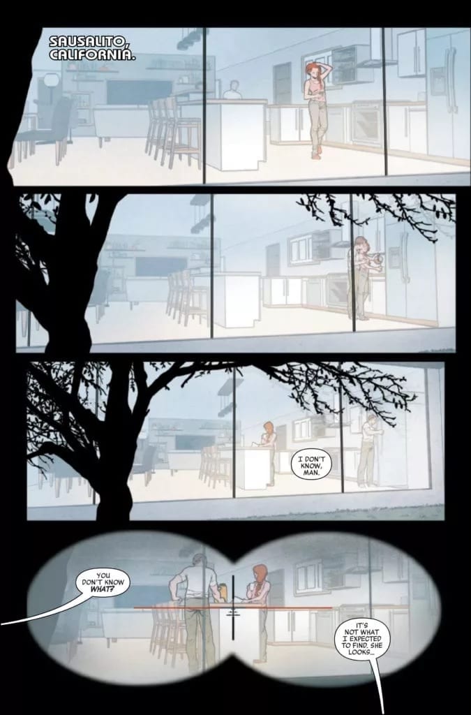
BLACK WIDOW #2, available from Marvel comics this Wednesday, continues the latest adventure for the one and only Black Widow. Only, that’s not quite the most accurate statement at the moment, as Natasha seems to be anybody but the Black Widow.
***SPOILER WARNING***
Natasha Romanoff has been many things over the years. An Avenger, a spy, a friend, an ally. Now she appears to be something new altogether, thanks to the latest plot arc. Her story is once again changing, and it’s difficult to guess how it will all turn out.
A glance from the outside makes Natasha’s new life look perfect. Like the sort of life one should leave her to – the sort of life she deserves. But the closer one looks, the more cracks appear. It’s clear that there is something nefarious happening behind the scenes. Then again, isn’t that commonly the case for heroes?
Black Widow’s latest series is already setting up to be bigger and bolder than ever. Taking on new perspectives, throwing new challenges into the mix, and overall just being unafraid to take risks in her story.
And so the story continues in Black Widow #2.
The Writing
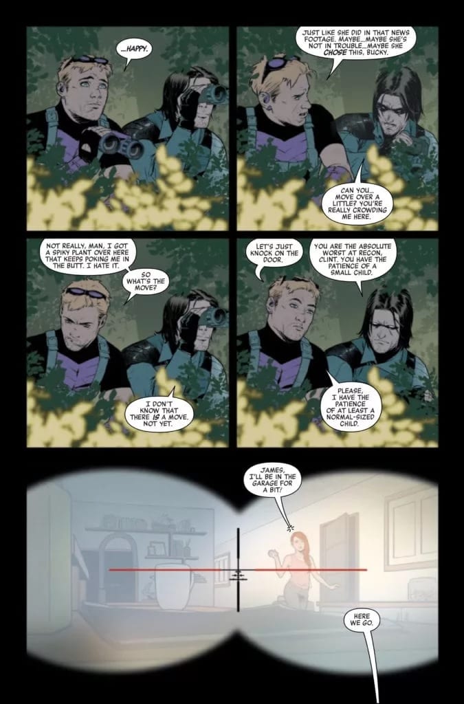
Picture a perfect life for Natasha. Now, picture that perfect life, but with a mild Stepford Wive’s twist. Now, you have an idea of what Kelly Thompson has written in Black Widow #2. It’s a plot that is slowly unfolding with time, and the gradual progression is enough to send chills down shines. Which in itself almost feels odd, since everything does appear, at a glance, to be perfect.
What makes this issue unique isn’t the story itself (though there is that), but the way the story itself is told. Two famous heroes walk into the scene, and it’s their assessment that provides a glimpse into Natasha’s new life.
It’s a stark comparison to the other perspective, which allows for a subtle creep of what is wrong with this life. It’s so carefully crafted, both inside and out of the story. Here’s Thompson’s finesse shining through.
Every element and revelation in this issue felt like it was setting up for something more to come. Especially that final page, which in itself leaves a pretty strong impression on what is going to happen within the next issue. The scene has been set – now to see it all play out.
Natasha Romanoff’s new life – at a glance.
The Art
The artwork found inside Black Widow #2 is every bit as bold, driven, and dynamic as the leading lady herself. The colors pop off the page, as do small details that simply demand attention, even when logic dictates that it shouldn’t be so.
Elena Casagrande was the lead artist, and is responsible for all of the stunning poses and designs on the pages. Natasha is really rocking her new look, all while seeming quite at home with her new life. Meanwhile, the confusion and exasperation are palpable on those checking up on her.
Those bright colors were provided by Jordie Bellaire, and they are the perfect fit for Natasha’s story. The color palettes of each and every panel seem dominated by the characters stealing the scene – and their current state of mind. That means, at times, a certain shade of red feels almost inescapable.
VC’s Cory Petit’s lettering is the final touch that this issue needed. It handled everything from the perfectly ordinary scenes, to providing the necessary impact during more action-filled scenes.
At least a normal-sized child, right?
Conclusion
Black Widow #2 is an intriguing issue, through and through. A fact that is surely only going to get stronger in time, as the rest of Natasha’s story unfolds. While her comrades may be confused about the situation, one thing is certain – it’s good to have a Black Widow series again.
It’s easy to see someone as a monster and not a person. In fact, life is often simpler when we see those who disagree with us as being totally inhuman. Of course, there’s a price for seeing others as monsters, and it’s this price that writer Joe Hill, artist Gabriel Rodriguez, colorist Jay Fotos and letterer Shawn Lee are interested in. In IDW’s Locke and Key… In Pale Battalions Go… #2, this creative team revisits World War I and asks us to see something new.
Writing
Hill drops us in the middle of World War I in the first page of this issue, but we land in unfamiliar territory. We’re not following American or British soldiers, but German soldiers. The enemy. But what kind of enemy does Hill make us face? The most frightening of all. One with a human heart beating in their chest. These German soldiers don’t sneer at dead bodies, or get giddy at the idea of killing their opponents, they stand up to their leaders over the use of chemical weaponry. So when John Locke comes swooping in and German soldiers crumble in his wake, there isn’t a sense of victory. There’s a feeling of loss over human life, no matter the side they stood on. Hill humanizes the enemy to lead us into a final issue where we may not fully know who we’re rooting for.
Art
Rodriguez brilliantly shows in this issue how the brutality of war feels both personal and impersonal at the same time. Focusing in, at the opening of the issue, on discolored corpses choking on their own vomit, the brutality feels close and real. But when German soldiers are being brought down in large numbers, Rodriguez pulls us back. The scene no longer feels close or personal, but like it affects everyone. War doesn’t discriminate, it’ll take whoever it can get. Yet, in the final moments of the battle, we see an up close attack and the panicked look on a dying man’s face. This tension Rodriguez creates is both terrifying and depressing, just as war should be.
Coloring
Much of this issue seems monochromatic, even dull. Fotos uses many of the same colors, creating a kind of bland look on the battlefield. But the moments that stick out, stick out for a reason. The green canisters, and later green clouds, of chlorine gas stick with the reader, as do the bright red spurts of blood. It’s all the most difficult moments to swallow. The moments Fotos knows we want to ignore. But Fotos makes them impossible to ignore. Lastly, as soldiers enter a house, Fotos shows the juxtaposition of the earthy tones of the battlefield and the brighter tones of a welcoming home.
Lettering
One of the most noticeable things about IDW’s Locke and Key… In Pale Battalions Go… #2 is its lettering. Lee shows the confidence of these characters with the large balloons, full to the brim with dialogue. Their words aren’t parsed out or broken up, they’re like speeches with brief intervals. At one point, as two German brothers talk, Lee does with the balloons what the younger brother does with his dialogue. He’s saying his older brother isn’t like everyone else, says he’s still back in the classroom talking about ethics while the rest of them are all here fighting in the mud. But when he describes his brother, it’s in one balloon, and when he describes everyone else, it’s in another word balloon attached to its side. Through this, Lee creates a sense of alienation for the brother. He isn’t just divided from everyone else in how he acts, but even in how he is spoken about.
IDW’s Locke and Key… In Pale Battalions Go… #2 makes war feel universal. It focuses in on “the enemy,” and makes us like them. In so doing, it complicates the simple “right” and “wrong” of the battle and of this series’ plot. We’re left wondering who we’re rooting for. An American who revels in taking the lives of Germans, or Germans who are agonizing over the indecencies of war? IDW’s Locke and Key… In Pale Battalions Go… #2 is a brilliant new issue in a strong series, and it’s out October 7th at a comic shop near you!
LEGEND OF THE SWAMP THING HALLOWEEN SPECTACULAR #1, available from DC Comics on October 6th, follows Big Green’s anthology of life, loss, and revenge over the ages. Created by an assortment of artists and writers, this anthology is more tragedy than horror, and it reminds you that the green, crawling things of nature are as much a part of this world as we are.
[Author’s Note: For an atypical comic, this will be an atypical review. Each section will cover each short story’s art and writing in a quick-hit style so you can get a sense of the overall work. There will be some mild spoiler throughout]
At The Heart Of Trees
(Writer: Ram V, Artist: Mike Perkins, Colorist: Andy Troy, Letterer: Aditya Bidikar)
This is the wrap-around story of the anthology. Swamp Thing saves a boy lost in the swamp while the boy is cared for by one of the swamp’s tree spirits. The ancient tree spirit has taken on so much pain and grief from other lost souls over the years that the thought of this boy’s death drives it to unnatural means of protection. Swamp Thing frees the boy and offers comfort to the tree in exchange by sharing how Swamp Things of the past have given aid or wrought justice when needed.
This is one of the best stories in this anthology. Ram V does an excellent job establishing the players and their motivations, especially the Sheriff leading the search party. Every character has a past that’s scarred by the pain of loss, and it sets the tone for the rest of the book nicely.
Likewise, the art suits the subject matter perfectly with deep heavy lines and long dramatic shadows. It’s a mix that pays homage to Bernie Wrightson’s grotesque body-horror style and Gene Colan’s dramatic shadow work by nailing the deep sadness of the Halloween season… and the grave.
Set in Druidic times when Roman forces occupied Britain, this short tells of a Roman commander who forfeits his allegiance to Rome and sacrifices everything in service to the Green and Britain’s native people.
Johnson’s story is the stuff of ancient legends where monsters rise to protect their people in mercilessly violent ways. It’s a stiff reminder that old rituals from even older cultures have a dark power that shouldn’t be taken lightly. More warning fable than revenge tale, this story portrays the most symbiotic take between Swamp Thing and the land people he protects.
The highlight of this entry is its utterly monstrous version of the Swamp Thing character as a patchwork beast formed from Earth’s elements. Hulk-like and raging, this version of the creature is an organic weapon of mass destruction. You could easily picture how such a beast effectively puts Britain’s country off-limits to the entire Roman Empire.
Sleeping Giant
(Writer: Vita Ayala, Artist: Emma Rios, Colorist: Jordie Bellaire, Letterer: Ariana Maher)
A girl seeks revenge for her sister’s death at the hands of a local sugar mill owner. Revenge, in this case comes, by way of a petition to waken the Green that rests at the base of the mountain at the heart of the island. The Green then raises a Swamp Thing to set things right.
Ayala’s story is the weakest in the anthology, not for its premise but its clunky execution. Several times I caught myself going back a few pages or panels to understand what was going on. This could be chalked up by a gap in a synergy between writer and artist, but the result is a lopsided story with a bait and switch for an ending that fell flat.
Mostly, the art in this story works to match the story’s jungle island flavor, but the big creature reveal near the end was odd. This version of Swamp Thing looked closer to a bizarre jungle flower plant with a wrinkled face. As far as a fresh take on Swamp Thing, this version is unrecognizable and misses the mark.
No Sign Of The Enemy
(Writer: Julian Lytle, Artist: John Timms, Colorist: Gabe Eltaeb, Letterer: Clayton Cowles)
This short would fall into the “alternate history” category. A Japanese soldier, abandoned on a remote island during World War II, continues his mission for decades with only the Green to keep him company before he meets a tragic end.
Emulating the real-world circumstances of Hiroo Onada, Lytle’s story leans heavily on the bitter pill of carrying out your duty against all reason. The main character chooses to endure any hardship from living alone on the Pacific island over the shame of returning home defeated while the war rages on. In the form of a small plant, the Green encourages him to give up his mission repeatedly over the years. Lytle crafts an interesting character piece about how easily honor and responsibility can devolve into obsession when left unchecked, with the spirit of Swamp Thing acting as a spiritual force instead of a physical one.
Despite the lack of physical representation from Swamp Thing, the art is loaded with intense and personal moments for the soldier. Even while carrying out such mundane tasks as digging a ditch, the offset camera angles imply a manic and desperate tone that escalates with each passing year in the soldier’s life. You can feel the soldier degenerating into madness with each panel until the bitter, final scenes where Swamp Thing appears for a saddened goodbye. This is the most emotional story of the bunch.
Age Of Discovery
(Writer: James Tynion IV, Artist: Christian Ward, Letterer: Travis Lanham)
The honor of most fantastical short goes to this story by Tynion IV. Spanish sailors motivated to plunder by greed, encounter an uncharted island that will take from the men much more than it gives. This is an interesting facet to the Swamp Thing’s history that shows the Green can be the very land itself.
Tynion IV has a knack for whimsy with a dark edge, and this story is no exception. Told through a young sailor’s eyes aboard the doomed ship, the narration starts on a note of excitement for the undiscovered future. Once the island’s nature is revealed, Tynion IV layers on creeping dread as the young sailor realizes how foolish and naïve he truly was. What makes the story more fantasy-like is the almost poetic narration style that gives the short a dreamy quality.
What sells the dreaminess of the story is Ward’s gorgeous art. The story becomes more horrific because the setting is bright, colorful, and beautiful. The art makes the island seem peaceful and the stuff of dreams the young sailor longs for, but once the island’s voracious actions take its toll on the crew, the dream shifts to a nightmare. And bonus points to Ward for the most esoteric, yet recognizable, interpretation of Swamp Thing revealed as a gut punch in the very last panel.
At The Heart Of Man
(Writer: Ram V, Artist: Mike Perkins, Colorist: Andy Troy, Letterer: Aditya Bidikar)
This story book-ends the anthology by revisiting the rescued boy from the first story many years later. The boy, now an old grandfather, encounters Swamp Thing and the Green during a camping trip and tells his own tale about his search for personal meaning after he was rescued all those years ago.
Ram V expertly captures a sense of tragic irony with this final short. A boy is so shaken by an experience that he spends his life searching for a way to justify his worth in being saved. At the very end, he fails to realize that the search itself was all the justification he ever needed and more. Here, like with No Sign Of The Enemy, it’s the desire to be more than we choose to believe we already are, which leads to obsession and a tragic end. And as with any good Halloween story, the hero who thinks he escaped his fate winds up right back where he started.
Conclusion
LEGEND OF THE SWAMP THING HALLOWEEN SPECTACULAR #1, available from DC Comics on October 6th, is a satisfying collection of tragic tales with an alternate version of Swamp Thing throughout history. There are more hits than misses, and it’s a melancholy collection that will put you in just the right mood for the holiday. Happy Halloween!
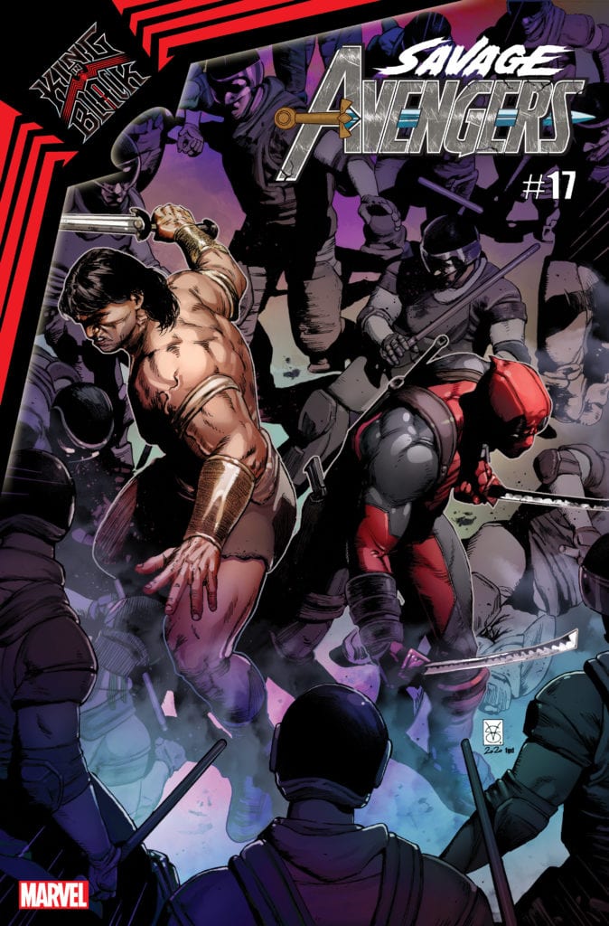
SAVAGE AVENGERS #17 hits your local comic book store in January, but thanks to Marvel Comics, Monkeys Fighting Robots has the privilege of revealing the cover and solicit text for you.
The comic is by writer Gerry Duggan and artist Kev Walker, with the cover by Valerio Giangiordano.
About the issue: “BLACK SKIES” PART 1!
CONAN rings in the New Year on Ryker’s Island — which he promptly breaks out of with the help of…DEADPOOL. The two warriors fight together against the symbiotes of KNULL, and Conan makes a surprising discovery that may help him overcome KULAN GATH.
As the solicit text suggests, SAVAGE AVENGERS #17 will serve as a tie-in to KING IN BLACK, Marvel’s big winter event for 2020, and will pit Conan the Barbarian and Deadpool against the army of the Symbiote King, Knull.
Check out the SAVAGE AVENGERS #17 cover below:
Are you reading SAVAGE AVENGERS? Sound off in the comments!