

TRANSFORMERS/BACK TO THE FUTURE #1, available from IDW Publishing on October 7th, follows the Decepticons as they steal Doc Brown’s time machine to remake history for their own ends. Cavan Scott’s script is snappy and full of fun with plenty of easter eggs to delight the fans of either franchise.
Cover Art
This entire issue leans heavily on nostalgia, and Juan Samu’s cover is no exception. Marty and Doc Brown are giving their best “That’s heavy!” face when faced with their time-hopping DeLorean converted into an Autobot. The human costumes are movie accurate, the lightning rod from the first film is immediately identifiable, and the flux capacitor makes a pleasing guest appearance. Everything about this cover screams “fun.”
Writing
Great Scott, Cavan Scott! What a fun mashup!
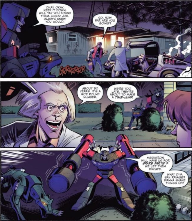
To set the stage, this story picks up almost immediately after the events of the first Back To The Future (BTTF) film but with a twist. Transformers have secretly been observing the time-traveling duo, and the Decepticons decide to win the war against the Autobots with some timeline-altering shenanigans by stealing Doc Brown’s invention.
Nearly everything about this story works. The presence of the Transformers in this world is explained well. The plot makes total sense. And the callbacks/references to the characters from both properties are profuse and enjoyable. Scott also does a great job keeping the tone right in that sweet spot between “just silly enough for kids to enjoy” and “action-oriented enough for adults to have fun.” The only minor critique I have is around the occasional, jarring British slip in some of the dialog and narration (e.g. calling a “speeding car” a “flash motor”) that interrupts the flow of the story. If Editorial can catch those breaks in subsequent issues, this will be a near perfect script.
Pencils/Inks
Samu’s art perfectly matches the high energy and silly fun of Scott’s script. Rather than going for a unique design take or drawing inspiration from the modern films, Samu goes straight to the original cartoons for the Transformers designs. That was the wisest choice to further play on the nostalgia hooks of this issue.
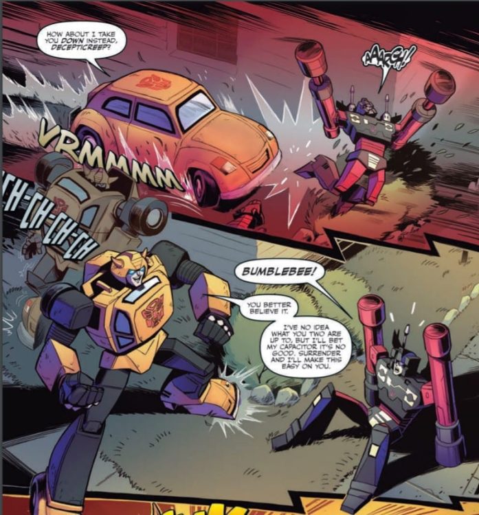
The character designs are just cartoonish enough to not deviate too far from the source material but detailed enough to appeal to a slightly older audience. When translating recognizable actors to comics, it can be jarring when the rendering is so far off that the character looks like a random paper doll. Samu took the time to create a version of Doc Brown and Marty McFly that feels authentic and true to the actors without being a slave to realism. Samu figured out a great compromise between live-action and cartoon that pays respect to both without slighting either.
Coloring
David Garcia Cruz’s colors are generally quite good but with a few rough spots. The highlight of Cruz’s work is the electric blue lightning strikes when the DeLorean time jumps. They’re bright and powerful. Where Cruz’s coloring doesn’t quite work is in the overuse of purple in nearly every panel. You get the impression most of the scenes, night and day, are highlighted with black light bulbs.
Lettering
Neil Uyetake’s lettering is solid, clean and wholly organic for the subject matter. The Transformers emanate a whole gallery of sound effect from changing shape to shooting missiles to starting mini earthquakes, and Uyetake letters the sounds in such a way as to make them seem natural for the panel. Uyetake also made a wise choice by coloring the sound effects to match the object receiving the impact (e.g BONK! is colored the same blue as Starcream’s head when he takes the hit). It’s a small choice that strongly contributes to the integration of sound with the visuals.
Conclusion
TRANSFORMERS/BACK TO THE FUTURE #1, available from IDW Publishing on October 7th, is one of those rare mashups that lives up to expectations. The nostalgia and eater eggs in the story are amped up to 11, and the art will be satisfying for longtime fans and new readers. This is a fun little book that’s worth your time and money.