Home Blog Page 230

Preview: GHOSTS ARE PEOPLE TOO Is “Charmingly Spooky”

ghosts are people too preview

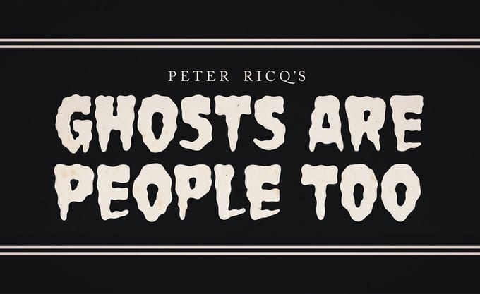
Peter Ricq’s book GHOSTS ARE PEOPLE TOO is currently on Kickstarter, and it’s perfect for fans of Jill Thompson’s SCARY GODMOTHER or Neil Gaiman’s THE GRAVEYARD BOOK.

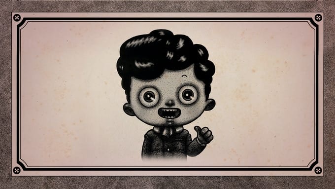
The 42-page, all-ages illustrated book is the first prose work from Ricq. It’s the story of a simple ordinary ghost named Ethan Alby.

About GHOSTS ARE PEOPLE TOO:
Ethan has a family—just like you. He likes playing with toys and his dog, Mini Ricky. Sometimes, though, Ethan gets scared. In GHOSTS ARE PEOPLE TOO, Ethan shares what scares him, how difficult it is to share a home with a living girl he’s fallen for (when she doesn’t even know he exists), and why we shouldn’t be afraid of one another.

“Halloween season has been my favorite season since I was a child,” said Ricq. “It had a sense of danger and adventure and that feeling has never dissipated since. I remember watching Fright Night and The Thing from Outer Space coming home from Trick or Treating when I was around 7 years old and those moments of counting your treats along with the excitement of monsters on the TV was so magical, more so than any other holiday. I’ve since always had a touch of horror, danger, and adventure in my work since.”

You can check out GHOSTS ARE PEOPLE TOO on Kickstarter right here.

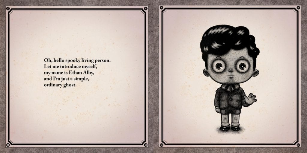
And read on for a preview of the book:

ghosts are people too preview

ghosts are people too preview

ghosts are people too preview

ghosts are people too preview

ghosts are people too preview

ghosts are people too preview

ghosts are people too preview
A “doodle book” is one of the rewards offered by the campaign.

What people are saying about GHOSTS ARE PEOPLE TOO:

“Charmingly strange, scary and sweet, GHOSTS ARE PEOPLE TOO gives you an Edward Gorey style tale with nods to classic and contemporary creepy crawlies. A lot of fun if you have anyone in your life who likes their spookiness with a little heart (not a literal one!) and great for kids who like theirs stories on the darker side.”
—Mariah McCourt (Ash & Thorn)

“GHOSTS ARE PEOPLE TOO is beautifully drawn, well designed and very fun! Just the book to “liven up” your spooky Halloween season.”
—Johnnie Christmas (Tartarus)

“Ricq’s vision of compromise between the human and spectral realms is both disturbing and endearing!”
—Simon Royal (Habitat)

“Like perusing an album of haunted photographs, GHOSTS ARE PEOPLE TOO is a fitting book for the samhain season. Reading it will send you strolling through your local cemetery, or make you brave enough to purchase that cursed talisman you’ve been eyeing since your last blood ritual.”
—Samuel Sattin (Bezkamp)

“Sweet, unsettlingly adorable.”
—Christopher Golden (Baltimore)

“Peter Ricq’s GHOSTS ARE PEOPLE TOO is a gorgeous book that brings to mind the best of Edward Gorey. Filled with stunning artwork and a charming story, it is a sincere, beautiful and imaginative love letter to the gothic and bizarre.”
—David Gallaher (High Moon)

“Just in time for me to get into the Halloween spirit, a being from the great beyond brought this delicious creepfest into my seance room! No, seriously, it is awesome! Help it manifest into our astral plane.”
— Stephan Franck (Silver)

Monkeys Fighting Robots Youtube

Marvel Exclusive Preview: WEB OF VENOM: EMPYRE’S END #1

Marvel Exclusive Preview: WEB OF VENOM: EMPYRE'S END #1

Web of Venom: Empyre’s End #1 hits your local comic book shop on November 04, but thanks to Marvel Comics, Monkeys Fighting Robots has an exclusive four-page preview for our readers.

About the book:
SPINNING OUT OF EMPYRE, KNULL’S DOMAIN BEGINS! FOR WEEKS, chaos engulfed Earth and space alike. First, the corpse of serial killer Cletus Kasady was bonded to a remnant of a mysteriously powerful alien symbiote, resurrecting his psychotic alter ego, Carnage. THEN, the generations-long Kree/Skrull conflict reached a brutal head-on Earth, with shocking and unforeseen consequences. MEANWHILE, one ancient entity at the edge of the universe has awoken. Born of hate and darkness, it’s the entity that feeds on chaos and brutality—and one group of unlucky fighters is about to face it head-on…

Web of Venom: Empyre’s End #1 is written by Clay McLeod Chapman, with pencil work Guiu Vilanova, Philip Tan worked on the cover.

Enjoy the preview below. FYI – KNULL IS COMING…

Monkeys Fighting Robots Youtube

Review: THE AMAZING SPIDER-MAN #51 – Magical Assistance From Doctor Strange

The Amazing Spider-Man #51 Cover

The Amazing Spider-Man #51, out now from Marvel Comics, is the gripping continuation of the “Last Remains” arc that will not disappoint you.

About the Book:
After Kindred has possessed Spider-Man’s friends, Peter flees to the Sanctum Sanctorum to get assistance from his friend, Doctor Strange. As Silk attacks the Sanctorum, the following conflict results in emotional dialogue that reexamines Peter’s guilt related to Kindred.

The Amazing Spider-Man #51 Dialogue example

The Amazing Spider-Man #51 Story

The Amazing Spider-Man #51 does a phenomenal job of bringing in outside elements of the Marvel Universe. Nick Spencer understands how to do this well, as is evident from previous issues in the series, such as The Amazing Spider-Man #34. It isn’t groundbreaking when this is done, but by bringing in elements that don’t often appear in the series, problems the characters have can be solved in ways that readers might have difficulty foreseeing. Spencer does this in this issue through Spider-Man’s partnership with Doctor Strange. It is an unusual way for Spider-Man to handle a problem, so it is interesting to see.

Spencer also does an amazing job of setting up tense scenes in The Amazing Spider-Man #51. He does this by having the villain communicate with Spider-Man through the possession of one of his friends. The dialogue that results from this scene is captivating, as a dreaded villain can get under our hero’s skin while talking through someone he strongly cares about. This tactic is so effective that the dialogue of the issue has you drawn in from just the first few pages.

The Amazing Spider-Man #51 Color example

Art

Patrick Gleason lets his stunning talent shine in The Amazing Spider-Man #51 and brings the issue to a whole new level it could have never achieved without him. The paneling in the issue is unbelievable. Gleason does not care about breaking the rules, and it pays off tremendously. Through characters extending past panel borders or oddly shaped borders, Gleason helps the reader feel as if they are experiencing the comic book rather than just reading it. This rule-breaking is really allowed to shine when Gleason draws visions due to magic or dreams, and this issue features a stunning case of that.

The Amazing Spider-Man #51 features some beautiful coloring from Edgar Delgado. The entire issue has a vast color palette, with there being never being a bland, single tone for any scene. Magical lights and dream sequences in the issue allow for incredibly fascinating coloring, and Delgado definitely delivers. Delgado also does a brilliant job of setting up contrasts between lights and darks that provides for some captivating art.

The Amazing Spider-Man #51 Art Example

VC’s Joe Caramagna once again provides solid lettering in The Amazing Spider-Man #51. The Bold fonts used for sound effects and captions pairs wonderfully with Gleason’s art and adds depth to the story that would not have been there otherwise.

Conclusion

The Amazing Spider-Man #51 is another gripping issue in the “Last Remains” arc. It features wonderful dialogue, exciting action, and rising tensions as Spider-Man creeps nearer and nearer to his final encounter with Kindred. The story is backed up wonderfully by the art, colors, and lettering, and every page is truly a pleasure to read.

Monkeys Fighting Robots Youtube

Advance Review: BURN RESIDUE #1 Ignites One Sizzling Crime Story

Burn Residue

Burn Residue by Jonathan Thompson and Rossano Piccioni delivers the heat with both it’s intense, propulsive narrative and moody, noirish art. A definite must-have for any crime comics fan.

Burn Residue

Burn Residue #1
Written by: Jonathan Thompson
Art by: Rossano Picciono

This is the story of Willy Boyd, a one time high stakes gambler who now lives life as a mild-mannered gas station attendant. One night while going back and forth to the pump to serve customers a car pulls into his station driven by one of the men who lit Willy’s body on fire years before.n the back seat of the car is a woman, gagged and bound. As the car rides off into the night, Willy must decide if he’s ready to be some sort of hero…or at least get his revenge. 

Crime fiction has been back on the rise in the comics medium, and Burn Residue #1 is a fantastic addition to the genre. Jonathan Thompson has a hell of a hook in the character of Willy Boyd. The image of Boyd, skin burned from head to toe, clad in a dirty gas station jumpsuit, is an image that is instantly burned (pun intended) on your retina. But a good character doesn’t mean a good story and thankfully Thomspon kills when it comes to the narrative as well. The first person voice-over, a classic of the crime/noir genre, is perfectly executed. Boyd’s narration drips with cynicism, and it’s easy to hear a gravely, cooked voice in your head. Boyd is also not a hero, not really, but he IS sympathetic despite what we learn of his past and what we see him do in this issue.Burn Residue

The storytelling strength does not stop there, as the narrative itself is filled with twists, turns, and reveals of the past that firmly place Willy and all the people we meet toward a collision course of revenge and violence. This first issue creates a believable underworld for these characters to exist. And by the end of the issue, you really want to see what the fuck Boyd is going to do now that he’s lit the spark of his revenge.

The art by Rossano Picciono is beautiful. The linework is angular, with sharp edges and straight lines everywhere. And it’s all colored in a dark palate, creating a crime comic that visually almost has a horror comic feel. Thompson is telling a very dark story and Picciono is nailing it with the visuals. Picciono also changes up the palate a bit in the flashbacks images, a technique that really tells the reader how different Boyd’s life and perspective were before someone poured gas on him and lit him on fire. And Picciono has designed such a great character in Boyd. This guy just looks cool and is almost an instant iconic and classic image. Burn Residue

So DO NOT sit on this book. Burn Residue has the makings of a new crime comics classic. It’s one hell of a read and one fucking fantastic book to look at. You want in on this. Trust me. The Kickstarted just launched and you can support it here. Let’s make sure this book gets the support it needs so we can all watch Willy Boyd gets his revenge. Burn Residue

Monkeys Fighting Robots Youtube

Review: MEGA MAN: FULLY CHARGED #3 – Inner Conflicts and a Shocking Ending

Mega Man: Fully Charged #3 Cover

Mega Man: Fully Charged #3, out now from BOOM! Studios is an engaging, action-packed, and beautifully drawn issue that ends, leaving you deeply wanting to read the next issue.

A.J. Marchisello’s writing in Mega Man: Fully Charged hooks in a reader like few others’ writing. Much of the focus in the past few issues has been on the internal conflict of Mega Man. There seems to be a new human and robot war near approaching, and Mega Man must choose a side to be on. He is a robot but has sworn to protect the residents of Silicon City. Both his father and sister, Thomas and Suna Light, are also human. Problems arise as more and more information is revealed that may imply people Mega Man thought were trustworthy might not be. Marchisello’s writing is so captivating that a scene of Mega Man talking with Nemagem will have you convinced there is a clear answer to Mega Man’s dilemma, and the following scene of him talking with his sister will have you believing otherwise.

Mega Man: Fully Charged #3 Variant Cover

Another part of what makes Mega Man: Fully Charged #3 such an entertaining issue is its ending. Going into nearly any detail would give it away, but the conclusion to this issue is certain to have any Mega Man fan dying to read the following issue.

Stefano Simeone has provided excellent work in every issue of Mega Man: Fully Charged so far. This issue features some stunning cityscapes with interesting and complex architecture and surprising amounts of detail. Mega Man: Fully Charged #3 also contains tons of action, which Simeone brings to life through his art. His forms are always dynamic, and every character’s pose is filled with energy. The pages of combat — and really every page — is a pleasure to look at thanks to Simeone’s work.

Mega Man: Fully Charged #3 Coloring Example

Igor Monti brings his all in each issue that he works on, and Mega Man: Fully Charged is a clear example of this. Filling the issue with such beautiful palettes for areas such as the city, Monti makes all of Simeone’s art into even more of a spectacle through his coloring. The issue has a nice variety of tones, and each area and scene has its own palette that reflects the emotion of the scene. Monti’s work in this issue is truly marvelous, and I hope it continues for many issues to come.

Mega Man: Fully Charged features the talents of Ed Dukeshire for its lettering. Speech bubbles in the issue are never placed in ways that make the order confusing, and the fonts used never hinder the story. However, the work of Dukeshire doesn’t improve the issue much at all. The styles used for captions and sound effects don’t stand out as unique or intriguing, and there is little variety in the fonts used throughout the issue. Dukeshire’s work allows for the story to progress seamlessly and does what is necessary for good lettering, but the lettering doesn’t improve the story in many ways.

Mega Man: Fully Charged #3 is a riveting issue filled with gorgeous art and a captivating story. The ending is sure to shock readers and leave them impatient for the next issue to hit shelves. This issue is a wonderful read and is sure to leave fans of the games and the cartoon happy.

Monkeys Fighting Robots Youtube

DRY FOOT #1 – Great Introduction To A Fun Crime Comic

Dry Foot #1

With its second printing coming out on October 28th, Dry Foot #1 is the first issue of a crime/action miniseries from Mad Cave Studios. Set in Miami during the 1980s, we follow four teens who decide to steal money from the infamous serial killer, El Viejo, and his cruel gang in order to escape the drugs and violence of the city.

Writing

One thing writer Jarred Luján does well in this first issue is not wasting his readers’ time. By page 5, Luján introduces us to this miniseries’ main characters, the main villain, and the heroes’ motivation. Using caption boxes and giving each character a distinct feature, we get familiar with the characters quickly and sympathize with them. The issue also gives us important glimpses into the personal lives of each of the main characters, Diego, Marianna, Fabian, and Angel, and their relationships with each other and their relationship with their families, so by the end of the issue, you can’t help but get a sense you’re reading about real human beings with real feelings and real relationships. You can’t help but feel like you’re now a part of the gang.

The dialogue flows nicely. The interactions between the main characters are enjoyable, but what I’m most excited about is the use of Hispanic culture in the story Luján is trying to tell. An element not seen often enough in comics, especially mainstream comics.

The only downside to this issue was the rather anticlimactic ending. We get no real sense of danger or threat by the end; No huge reveal. But, the issue is enjoyable enough to look past this small flaw.

Dry Foot #1 page 2

Pencils & Inks

The pencils and inks by artist Orlando Caicedo are mesmerizing. True, the way he draws faces is unique, and it might take the occasional reader some time to get used to, but the vibrant, fun art style complements the YA-ish vibe of the story beautifully. The layouts are simple in the best way possible, and the faces are consistent throughout the entire comic. The acting in this comic does the heavy lifting, making us laugh a few times just by seeing how the main characters interact with one another, and especially, the fight sequence in the middle looks great because it looks like a real fight.

Coloring

Colorist Warnia K. Sahadewa did a fantastic job with the warm tone colors that complement the story almost perfectly. It gives us an idea of where the story’s taking place; you can actually feel the warmth of Miami. It gives the comic life. Additionally, the choice of using unsaturated colors tells us that the story doesn’t happen in the present. It feels like you’re looking at an old photo from the ’80s.

When the comic reaches its darker parts, Sahadewa pulls back on the brightness and lightness from the rest of the story and sets the grim mood well. Also, Sahadewa uses a gradient effect in his backgrounds, giving them more dimension instead of doing a basic flat coloring.

Dry Foot #1 page 3

Lettering

Letterer Justin Birch definitely knows what he’s doing. The sound effects are efficient, not calling too much attention to themselves. Birch gave the balloons of each character a different color, which is a smart choice. The decisions taken by Birch definitely make the reading experience a lot less confusing. Professional lettering all around.

Conclusion

Dry Foot #1 serves as an effective and engaging introduction to the main characters of this miniseries. Highly recommended for fans of comedic crime stories like the Bad Boys films, the Ocean’s franchise, and Martin McDonagh’s earlier films.

Monkeys Fighting Robots Youtube

Check Out Phillip Tan’s Variant Cover For IRON FIST: HEART OF THE DRAGON #1

Check Out Phillip Tan's Variant Cover For IRON FIST: HEART OF THE DRAGON #1

Marvel Comics announced Iron Fist: Heart of the Dragon #1 (of 6) written by Larry Hama with art by David Wachter yesterday. TODAY, Monkeys Fighting Robots has the exclusive reveal of Phillip Tan’s variant cover (below).

Iron Fist: Heart of the Dragon #1 by Phillip Tan

Tan does an excellent job of capturing all the energy and power of the Iron Fist. This is a top-notch cover. When done well, the sword reflection is so intoxicating at setting up a dramatic conflict for our hero.

About the series:
Someone is killing the ancient dragons that power the Heavenly Cities, and only Iron Fist and the Deadly Weapons can stop them… if they can discover who they are in time! Zombie armies, mystical portals, dragon hearts, some of the Marvel Universe’s deadliest fighters all converge in one action-packed extravaganza, and the fate of all worlds hangs in the balance! Larry Hama and David Wachter are building a story that hits as hard as the Iron Fist itself!

Iron Fist: Heart of the Dragon #1 hits your local comic book store in January 2021.


Are you excited for a Larry Hama Iron Fist series? Comment below with your thoughts.

Monkeys Fighting Robots Youtube

Review: Giant Mechs And Techno-Theocracy In GIGA #1

Giga #1, Lê cover

GIGA #1, available from Vault Comics on October 28th, begins a new tale of a war-ravaged world where dormant mechs have become the new cities and technology-based religion rules with an iron fist. Written by Alex Paknadel and drawn by John Lê, this new series combines Robotech’s large-scale future tech with the desperate-hope-under-claustrophobic-oppression of Brazil (1985).

Cover Art

Lê’s cover hits all the right notes to be successful. There’s a strong contrast between the dormant Giga’s hand and the peaceful blue sky. Your eye is immediately drawn to the figure seated casually in the Giga’s palm. Despite the scene’s serenity, you get a small hint of anxiety as the growing tree tilts precariously over the edge. Lê cleverly hints with symbolism, the tenuous nature of life, and its dependence on the Gigas in this world.

Writing

Paknadel’s story gives you the impression that something is about to happen to this future dystopia, breaking everything loose. Evan, a talented engineer, left the Order years ago after a tragic incident. In the years since, Evan’s life has been very hard as he struggles with robbers, finding scrap to trade for food, and surviving just above the bare minimum. Where Paknadel’s story works are in the thorough development of the world and its characters. You get history, government, people, and the predicament without getting lost in any of the jargon.

Where Paknadel’s story doesn’t quite land is the lack of a hook. In screenwriting terms, there needs to be an inciting incident that grabs the reader to invest them in whatever adventure lies ahead. The inciting incident is possibly Evan’s search for a robot part, but the action is so mundane for Evan’s daily routine that it hardly feels like anything is happening at all. I’m mildly curious to see what happens in issue #2.

Pencils/Inks

Lê’s artwork echoes a strong Moebius influence, particularly in the architecture and the backgrounds. The Gigas and the cities their “corpses” have created appear ancient – almost Aztec – but infused with futuristic technology details. When Lê combines the aging technology with the surrounding jungle’s overgrowth, the scenes become huge and feel much bigger than the panels they fill. Excellent design work be Lê.

Giga #1, art sample 1

If there’s one area from the art that needs some work, it’s in the details of the faces. Frequently, the eyes are misaligned, or hairlines are off-center, or the angles of a chin or jaw don’t match the angle of the character’s head. It’s not noticeable in any of the wide panels, but it’s hard to miss on the closeups. It doesn’t detract from the issue overall, but it was distracting on scenes that were close-up where character emotion needed to come through.

Coloring

ROSH’s coloring work on this issue is excellent. Every scene is cast in varying lighting gradations, giving you the impression that you’re watching the scenes unfold during sunset or dusk. It adds a mood of transition, as day fades to night, which adds to the sense that change is about to happen.

Lettering

Aditya Bidikar made some unique lettering choices that add some uniqueness to the look of this issue. Word balloon tails are pairs of black and white lines, which gives each speaker their own unique style depending on how the lines are shaped. It’s a nice touch to add a little distinctiveness.

Conclusion

GIGA #1, available from Vault Comics on October 28th, does an excellent job setting up a unique world to explore. Despite the lack of a strong hook, the story fleshes out the main character very well, and the art team accomplishes the daunting task of creating a future world that looks wholly lived in.

Monkeys Fighting Robots Youtube

Review: WYND #5 Takes Flight

Wynd #5, Dialynas cover

WYND #5, available from BOOM! Studios on October 28th wraps up the current storyline with a fatal confrontation between Wynd and the Bandaged Man. Written by James Tynion IV and drawn by Michael Dialynas, this final issue in the current volume punctuates the general theme of self-acceptance with an act of sacrifice.

Cover Art

Dialynas’ cover, consistent with the entire series, ticks all the boxes for a solid cover. The Bandaged Man’s one visible eye stands out in stark contrast to the soft swirl of bandages and feathers. Those same falling bandages subtly hint that the Bandaged Man’s identity will be revealed, and falling feathers imply that somebody is headed for a fall.

Writing

Tynion IV wraps up the current arc neatly and with a fairly predictable outcome. The final confrontation builds tension through the Bandaged Man’s threats because it shows you he’s not above maiming and killing to prove a point, making you feel nobody is safe. Up to now, the Bandaged Man has always been in the background, but here he’s brought forward as a truly ominous and cruel villain to keep you on the edge of your seat.

There’s a rescue scene toward the very end, and it has a “wow” factor. Tynion IV provides a nice change of pace when the series has largely been overwrought with a frightened, desperate chase. The end of the story works as it gives the reader a deserving emotional payoff, all while Tynion IV sets up the next volume.

Pencils/Inks

Dialynas’ art has been consistently solid throughout the series, and this issue is no exception. The Bandaged Man’s true form design is monstrous enough to be intimidating, and Wynd’s appearance in the final battle is whimsical and epic. Dialynas’ style was a perfect match for this material, and I’m looking forward to more from him in the future.

Wynd #5, art sample 1

Coloring

Combined with the artwork, Dialynas did an excellent job of coloring in the uniquely magical creatures that are so prevalent in this issue. The woodland spyrtles practically glow and bubble with a rainbow of magical energy. For this reviewer, the highlight was the collage of dreamy hues in the epilogue’s dream sequence. This was a strong, standout coloring job by Dialynas.

Lettering

Aditya Bidikar’s lettering work is top-notch in this final issue. This is a conversation-heavy issue, aside from the final battle, and the Bidikar bolded the right words to give the conversation’s more energy. The word balloon place was excellent to guide the reader’s eye and keep a brisk pace.

Wynd #5, lettering sample 1

Conclusion

WYND #5, available from BOOM! Studios on October 28th, is a sound and satisfying conclusion to this original series from Tynion IV. The story hits all the right “feel good” notes in conclusion, and the art is a perfect marriage with the subject matter. I strongly recommend this series for fans of YA fantasy.

Monkeys Fighting Robots Youtube

Review: SPAWN #311 – Hunters Or The Hunted?

SPAWN #311, available in comic book stores on Wednesday, October 28th, takes readers on a thrilling hunt for Hellspawn. After breaking the timeline in a previous issue, a number of Hellspawn from the past found their way into the present. What’s more, undead warriors are running amuck. Can Al Simmons find a way to round up these beings? The issue answers this question in a way that leaves readers hungry for more.

Story

This issue follows three distinct storylines while telling one main story throughout each. The focus? An unaccounted batch of Hellspawn and undead warriors who have gone missing. There are a number of potential players who might be at the root of it all, and Al is on the case. But could he be one of the targets?

From a journalist’s mysterious death after interviewing a mayor to a vampire’s party, readers will find plenty of potential leads to the true culprit. But the most peculiar suspect is Jim Downing, a fellow Hellspawn Simmons thought he could finally trust. The resulting clash could either leave the two at odds, or create a team to take one whoever is behind the disappearances.

Todd McFarlane’s writing combines mystery, horror, and action in ways few creators can. In moments that make you hold your breath, the writer masterfully portrays protagonists who aren’t sure if they’re the hunters, or the hunted.

Artwork

Carlo Barberi’s penciling and ink work, Peter Steigerwald’s coloring, and Tom Orzechowski’s lettering pulled us into the narrative in spectacular fashion. The transformation sequences of hero and foe alike are drawn with an otherworldly fluidity. They’re then fleshed out with dark shades that occasionally transition into lighter colors, luring readers into the panel to find out more. We also found the word balloon placements effective in the ways they framed each scene’s action.

Conclusion

SPAWN #311 is an engaging read that will keep readers on the edge of their seats. We are excited to see where the events of this issue take our heroes next.

Who do you think is behind all of the disappearances? Let us know in the comments below!

Monkeys Fighting Robots Youtube