LONELY RECEIVER #4 hits your local comic book store December 9th, but thanks to AfterShock Comics, Monkeys Fighting Robots has an exclusive four-page preview for you.
About the issue: A horrific breakup story in five parts.
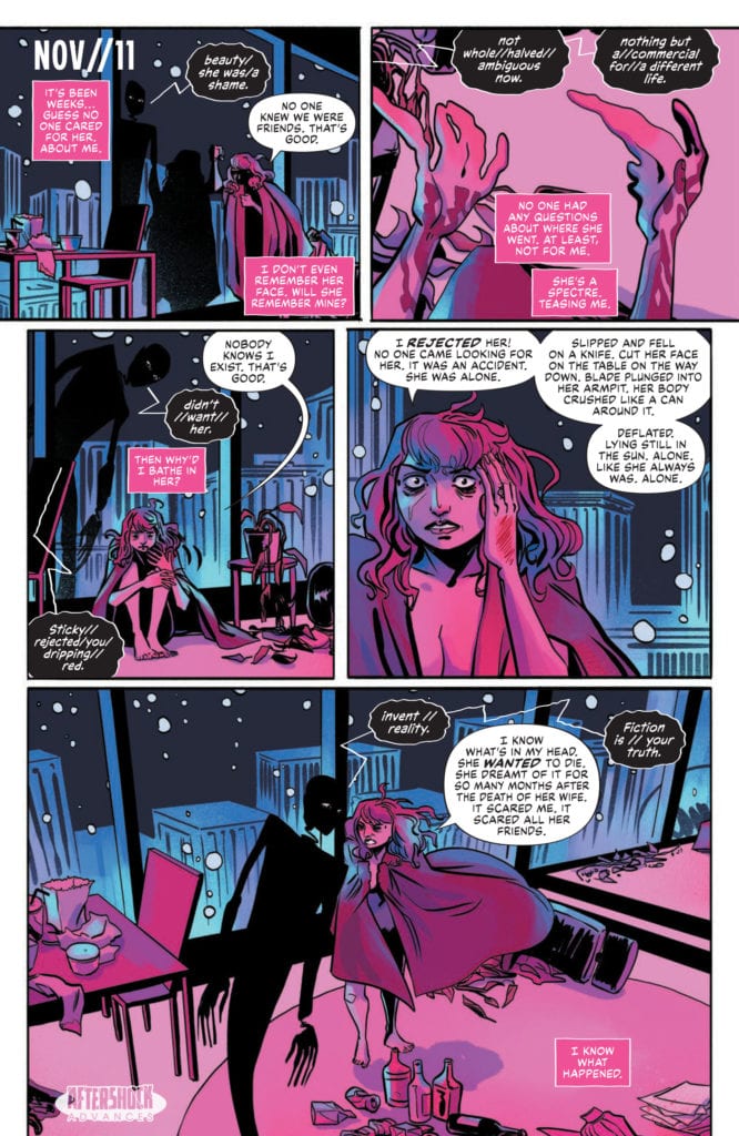
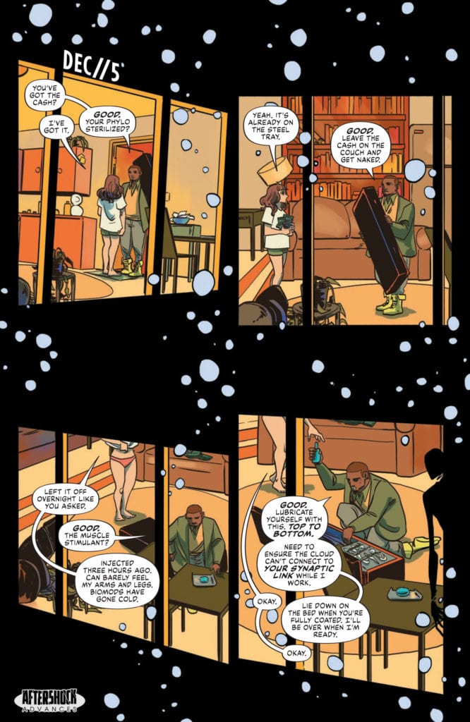
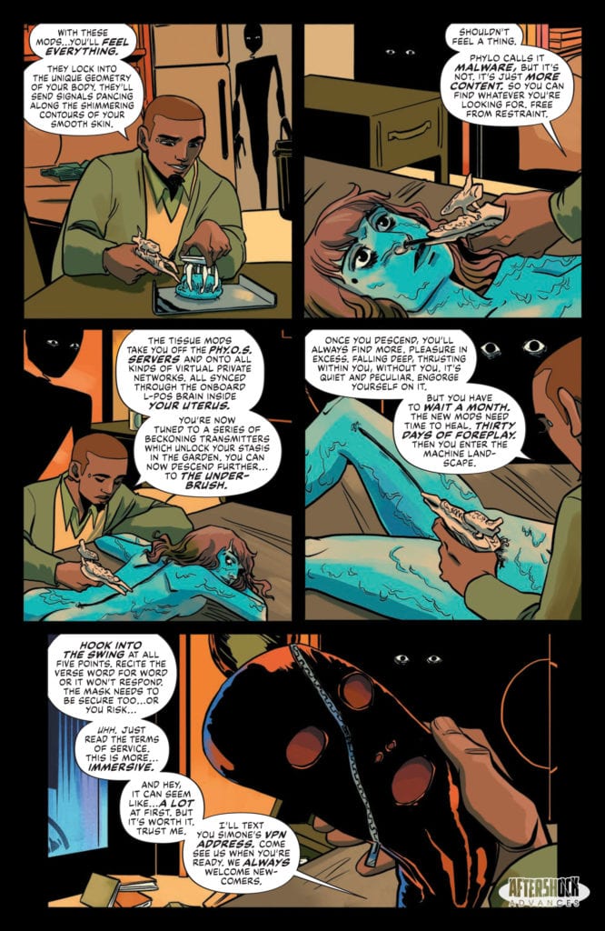
Catrin is truly alone and descending into madness. Lost with her thoughts, she finds herself reeling, falling deeper in love with her phone. But it refuses to love her back. So, she gives herself to it and becomes one with the machine landscape.
Reeling backward / and I’m changing // // Not myself / I evolve / spinning into the green above / Descending deep / I’m alone / spiraling into others / / Until I meet // the one I love.
LONELY RECEIVER #4 is by writer Zac Thompson and artist Jen Hickman, with letters by Simon Bowland. The cover is by Hickman.
Check out the LONELY RECEIVER #4 preview below:
Are you reading LONELY RECEIVER? Sound off in the comments!
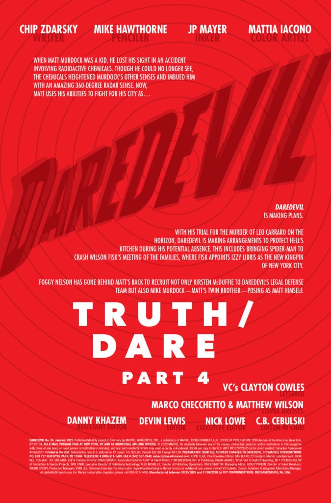
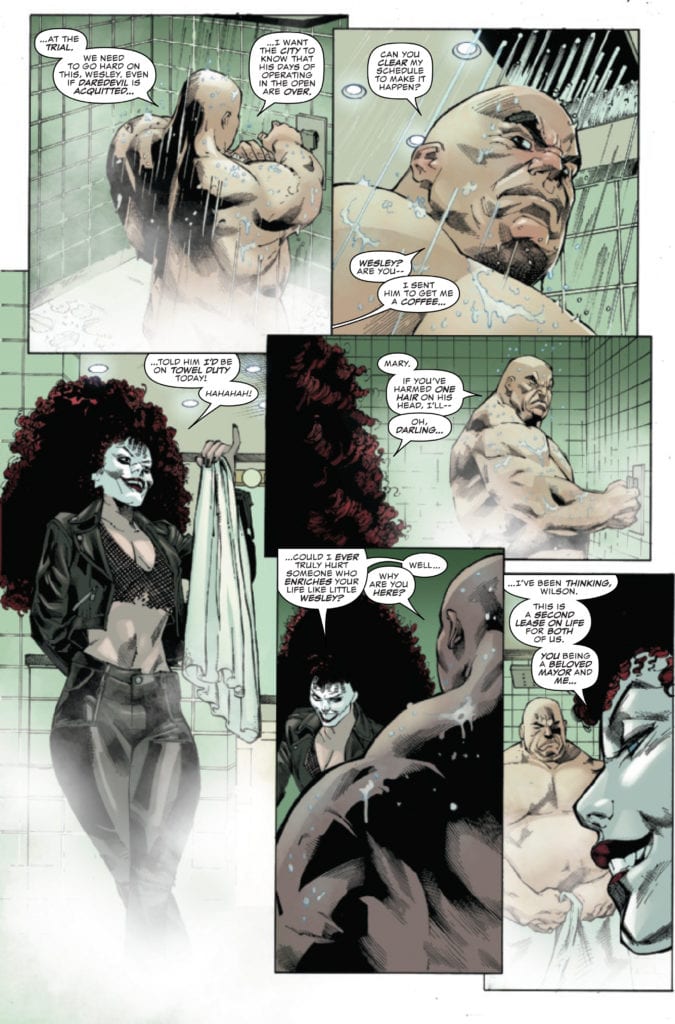
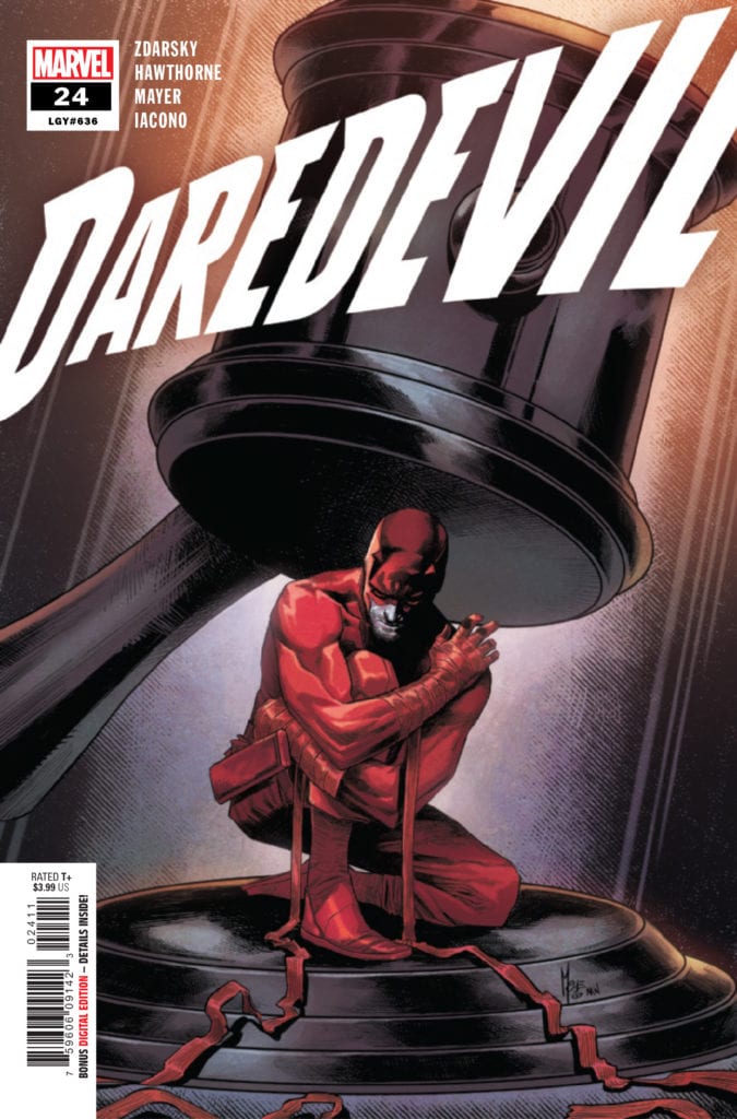
DAREDEVIL #24 hits your local comic book store November 25th, but thanks to Marvel Comics, Monkeys Fighting Robots has an exclusive four-page preview for you.
About the issue: THE VERDICT ON DAREDEVIL!
BACK IN RED, but for how long? As Hell’s Kitchen still reels from the chaos unleashed upon its streets by the Stromwyns, its citizens are looking for someone to hold accountable.
MEANWHILE, hizzoner Mayor Wilson Fisk, now a hero in the eyes of his citizens, sets his sights on a new venture – with a dangerous ally at his side.
DAREDEVIL #24 is by writer Chip Zdarsky and penciller Mike Hawthorne, with inks by JP Mayer, colors by Mattia Iacono, and letters by Clayton Cowles. The cover is by series regular artist Marco Checchetto and colorist Matthew Wilson.
Check out the DAREDEVIL #24 preview below:
Are you reading DAREDEVIL? Sound off in the comments!
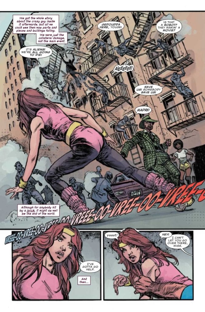
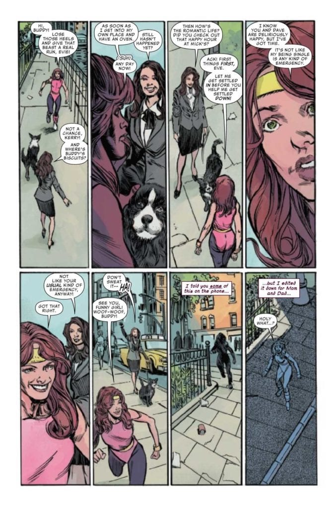
MARVELS SNAPSHOTS AVENGERS #1, available from Marvel Comics on November 18th, tells a slice of life story between two first responders against the backdrop of Avengers battles in the Big Apple. Written by Barbara Randall Kessel, this story looks at how the Avengers’ escapades affect the citizens around them.
Cover Art
Alex Ross produces another winner with his hyper-realistic depiction of Iron Man in flight. Although this is an Avengers title, a majority of appearances are with Iron Man/Tony Stark, so the cover subject is fitting for the content. Iron Man is a bold, singular figure against the plain white background, and you can almost imagine his trajectory pulling the reader along at hypersonic speeds. It’s a beautiful Ross painting.
Writing
Kessel’s story, true to the intent of the Snapshots series, successfully looks at superheroes through a radically different lens. The main characters, Kerry and Jay, partner up to help wounded civilians in a bunker while an Avengers battle rages on the city streets above them.
This is a light-hearted romance story with a decidedly New York flavor to it. New Yorkers (speaking as a former Brooklynite) have an uncanny ability to roll with the punches, even in the most extreme or bizarre situation, and this issue reflects that quirk perfectly. I enjoyed the hometown (for me) sensibility, and the snappy banter between the lead characters felt as good as any comedic romance film, ala When Harry Met Sally.
Pencils/Inks
Staz Johnson’s pencil work hits the right tone by giving the main characters some action proportional to their role as first responders without going over the top. The visuals were good enough to hold my attention, but I didn’t feel like the movements were so exaggerated as to not make sense for who the characters were or what they were doing.
Tom Palmer’s inking work is mostly good with a few rough sports. Palmer uses a lot of thick lines to provide depth and contour to the surroundings well enough, but sometimes the line thickness looked sloppy on the page, especially when you have multiple pages with six grid layouts and higher. Also, the inking tended to distort faces, making them look droopy. Overall, the art’s good, but it needed some refinement.
Coloring
Jim Charalampidis’ colorwork is exceptional in this issue, specifically because this is a grid-heavy issue. Working within small, tight panels, Charalampidis’ added tons of clean, multi-layered shading to make each character distinctive without looking smudged or blotchy.
Lettering
VC’s Ariana Maher does a great job working within such a confined space to mix in copious amounts of narration captions and dialog. The art was never crowded out, and the words flowed smoothly.
Conclusion
MARVELS SNAPSHOTS AVENGERS #1, available from Marvel Comics on November 18th, works as a light-hearted romantic comedy in the unlikeliest of settings. The story is chock full of witty banter, and the art is fairly solid. This is a recommended buy.
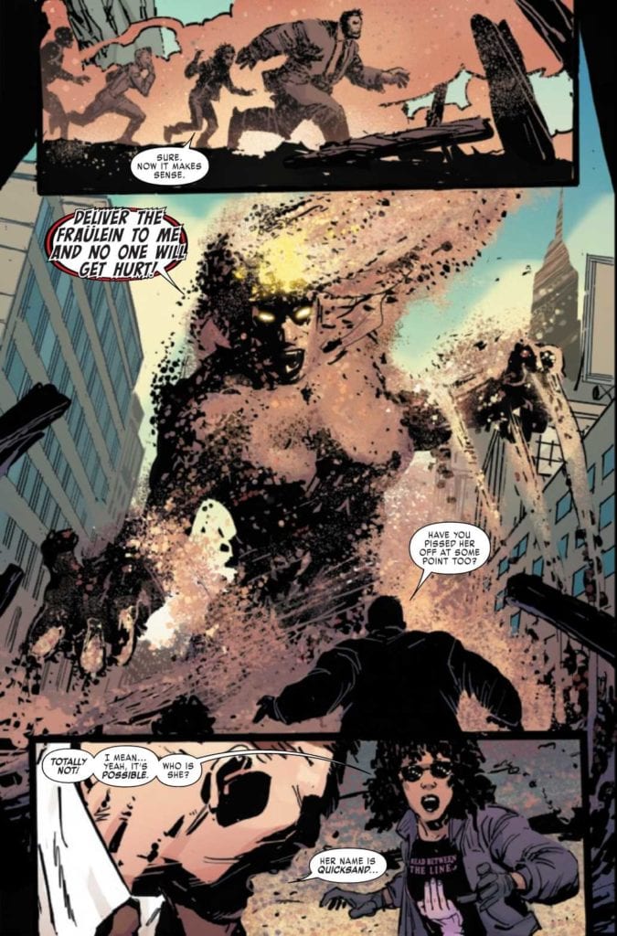
JUGGERNAUT #3, available from Marvel Comics on November 18th, puts Cain Marko in the middle of a lawsuit for past damages while an old enemy comes calling for D-Cel. Fabian Nicieza’s writing establishes a solid redemption story for Juggernaut and teases a deeper mystery in store for the giant and his “agent.”
Cover Art
Geoff Shaw’s cover is as menacing as it is prescient. Juggernaut holds the scales of justice amidst the rubble, and his cold, glowing stare suggests an enemy underneath is pulling the strings. Shaw paints a powerful pose that brings your eye right to Juggernaut’s eyes in a magnetic way.
Writing
Nicieza picks up a short period after the events of issue #2 (read our review of Juggernaut #2 here) with the lawsuit well underway when a powerful villain interrupts the proceedings. During the ensuing chaos, we’re treated to some flashback scenes reminiscent of Batman Begins’ training scenes that explain how Marko got his new armor.
The mystical, magical, hard-earned explanation for the new armor works. It defines Marko as somebody who’s as tough on the inside as he is when wearing the Juggernaut armor on the outside. That toughness, and his increasing willingness to help people, turns Juggernaut into a former-villain that’s easy to root for.
Nicieza’s allusion to a big bad behind the scenes increases my anticipation and excitement for the next issue.
Pencils/Inks
Ron Garney’s rough style continues to match Juggernaut’s rough, blue-collar nature in a very organic way. He’s a character that’s not afraid to get his hands dirty, and Garney’s art is perfectly in line with that rough-and-tumble sensibility.
The rough style works even better in this issue because the guest villain, Quicksand, takes on a grainy, flowing anatomy that suits Garney’s work well.
Coloring
Matt Milla adds authenticity to this issue with great use of filters, specifically on the flashback scenes. It helps to delineate between panels in the present day and actions set in the past, and the coloring makes the flow of multiple timelines clear and easy to follow.
Lettering
VC’s Joe sabino executes a credible job with clean, clear, and concise lettering. The lettering is a little too clean as it doesn’t quite integrate with the art style naturally, but it carries the story through at a good pace.
Conclusion
JUGGERNAUT #3, available from Marvel Comics on November 18th, is an entertaining entry in a, so far, surprisingly good series. The art matches the characters and situations perfectly, and the story is far from predictable in the best possible way. I highly recommend this book.
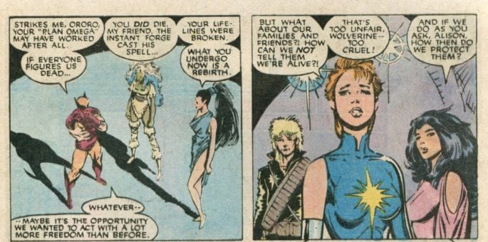
Per this issue’s gorgeous cover by Russell Dauterman and Matthew Wilson, Storm and Death take center stage in this issue.
The conversation between the two is one of mutual respect and almost flirtation (although Storm makes it clear she does not desire Death). At one point, Death tells her, “The other sword bearers of your host have tasted death many times…in many ways…but not you.”
This is an interesting comment for him to make, and looking at Storm’s publication history, it is true that it is hard to find instances of her dying like many of her cohorts have. Wolverine famously died back in 2014 in The Death of Wolverine storyline. Magik died in Uncanny X-Men #303 from the Legacy Virus (she got better). Even Douglas Ramsey (Cypher) died all the way back in New Mutants #60 in 1988. The others, likewise, have similar death stories.
But not Storm, so Duggan, Percy, and Hickman are doing some serious foreshadowing here, especially given that Storm drew the Death tarot card in Stasis, which claimed not to be a reason for fear and promised a metamorphosis.
This is a deep continuity cut from the X-titles team to highlight Storm’s uniqueness of never having experienced “comic book death.”
However, there is one problem here.
Storm actually died in the Fall of the Mutants storyline back in 1988 (weirdly even, the same story in which Cypher dies). While the details of the story aren’t terribly important here, what matters is that all of the X-Men give their life-force to stop an enemy only to be immediately resurrected. But it is made clear in the text of Uncanny X-Men #227 that the X-Men DID die.
As Roma clarifies, the X-Men really did die (interesting side note: this scene also takes place on the Starlight Citadel).
Given that the X-Men are resurrected in the same issue and don’t disappear from publishing history for a few years, I suppose we can let this one slide.
Mirka Andolfo Partners with Executive Producer Erik Barmack and Wild Sheep Content for Sweet Paprika Animated Series; First Images Revealed
The former Netflix VP joins the comic creator alongside Director Gabriele Pennacchioli and production companies Grey Ladder Productions & Arancia Studio.
Internationally renowned comic creator Mirka Andolfo (Mercy, Unnatural) has partnered with executive producer Erik Barmack and his production firm, Wild Sheep Content, for Sweet Paprika, Andolfo’s debut animated series. Barmack joins Sweet Paprika following an eight-year run at Netflix where, among other positions, he served as the Vice President, Head of International Originals, where he spearheaded the development of series including The Witcher from Poland and the United States, La Casa de Papel from Spain, The Rain from Denmark, Dark from Germany, and Sacred Games from India, among others. Barmack has continued his mission of developing esteemed international programming through his own firm, Wild Sheep Content, which he founded in May 2019. The company has secured a number of high-profile projects since its inception, including the animated collaboration with French African artist Nicholle Kobi, Queens, as well as the live-action adaptation of the bestselling Yakuza video game series with Sega and 1212 Entertainment. To date, Wild Sheep Content has secured 12 projects into development with platforms, studios, and third party financiers.
“Mirka has the rare ability to enchant readers across the globe, and I couldn’t be more excited to help adapt her vision from page to screen with Sweet Paprika,” Barmack said. “It’s a charming, relevant, and hilarious foray into romantic comedy, and a project I couldn’t resist.”
Announced last July, Sweet Paprika is an original idea from Andolfo that revolves around the erotic misadventures of a career-driven woman—Paprika—who reluctantly engages a charming, if immature, delivery boy named Dill. Consumed by her job at a major New York City publisher, Paprika learns to balance her own needs as she embarks on a frustrating, passionate romance with Dill. In October, Andolfo announced that she will also write and draw a Sweet Paprika comic book series, published by Image Comics beginning in July 2021, with Edizioni Star Comics releasing in Italy and Éditions Glénat in France. Arancia Studio is producing both the book and the animated project, with Grey Ladder Productions aiding the latter.
“Erik has been a pioneer in global storytelling, introducing the most vital international voices to the biggest audiences,” Andolfo said. “It’s an honor to have him collaborate on Sweet Paprika.”
Gabriele Pennacchioli, who received a 2019 Primetime Emmy Award for his role as Supervising Director on Netflix’s Love Death + Robots, will serve as Director. Pennacchioli has 25 years of experience in animated features, working on such films as Shark Tale, Shrek the Third, Kung Fu Panda, and How To Train Your Dragon, among others.
For more news and coverage of Sweet Paprika and more of Mirka Andolfo’s work, stay glued to Monkeys Fighting Robots!
FRANK AT HOME ON THE FARM #1, out today from Scout Comics, is the first issue of a 4-issue psychological horror miniseries. If you’re looking for a few good scares, and a mysterious, well-crafted plot, this is the perfect book for you.
About the issue:
Frank returns from the trenches of World War I expecting to be greeted by his loving family on their farm. What he finds instead is a dark mystery, his family missing, and only the animals there waiting for him.
Writing
As a psychological horror writer, there’s a thin line you walk between confusing and intriguing your reader. Fortunately enough, writer Jordan Thomas only manages to do the latter. Throughout the entire issue, there is so much mystery — so many unanswered questions, like “Where is Frank’s family?” or “What’s up with the weird animals in this town?” The reader can’t even get themselves to start questioning what the heck is going on. In this comic, all they can do is sit back and let the puzzling story creep up on them with the promise that it’ll eventually sweep them off their feet and answer every question they have.
One of the big answers in this series brilliantly arrives only at the issue’s last few pages. But when it arrives, the reader’s left so astonished and curious, their thirst to know more grows with each time they contemplate what they had just read. I’m personally really looking forward to learning more about this story’s weird world and characters. Exquisite work here from Thomas.
Art
Bint’s artwork pairs perfectly with Thomas’ creepy tale. His layouts tell a clear story, manipulating the reader’s feelings as Bint sees fit. The terrifying panels look well-detailed and convey real horror. The characters’ facial expressions look incredibly distressing and ugly to great effect. The grim, cold color palettes elevate the story’s uncomfortable vibes, and his use of natural light to add to the mystery and intensity works beautifully. But Bint’s most important feat comes with the paranoia he manages to convey in the pages’ panel gutters.
More specifically, there’s a scene where Frank, the main character, enters an old lady’s store and inquires about his family’s whereabouts. Upon realizing he’s just walked into a taxidermy store, Frank freaks out. The reader keeps getting the paralyzing notion that Frank’s being watched. If the reader doesn’t look close enough, they might miss it. But on a second look, the reader discovers that between the panels, the cold, prying eyes of all the dead animals at the taxidermy store were staring at them this entire time. These simple but clever choices Bint makes along the way never ceases to amaze the reader. After reading this issue, anyone will leave it wanting to see what Bint has in store for them next.
Lettering
There’s simply not a single flaw in LetterSquids’ wonderful, stylish lettering. The bolded words pop out, making the reader think they can almost hear the characters talking. The choice to not use any sound effects brings a new layer of gravitas. When the characters scream, LetterSquids masterfully makes it look realistic and dramatic. Each choice LetterSquids makes elevates the art to a whole new level of creepiness and suspense. It’ll be interesting to see how LetterSquids is going to handle the lettering once the story inevitably reaches its darker moments.
Conclusion
Frank at Home on the Farm #1 gives the readers everything they could’ve hope for, and then some. The story is a psychologically terrifying tale with many unanswered questions, and the art’s unique style further engages the reader in the story’s world and grabs them by the throat, refusing to let go. Strongly recommended for fans of The Shining and Animal Farm.
STRANGER THINGS AND DUNGEONS & DRAGONS #2, available December 2nd from Dark Horse Comics, continues the adventures of four boys and the Tabletop RPG they fell in love with. It’s so easy to forget just how much this game had a positive impact on their lives.
Heroes unite once again in Stranger Things and Dungeons & Dragons #2.
Easy to forget, that is, until a series like this forces us to see how it all connects. The last issue explained how the four friends came to be, and how they made one discovery that would forever change their lives. Now, it’s time to see more of those long-lasting changes and impacts, in Stranger Things and Dungeons & Dragons #2.
Honestly, there’s something so empowering in seeing how many positive changes were wrought by this discovery. There’s no doubting that D&D changed the lives of these characters for the better. Just look at how well they were able to cope during the Netflix series. They used terminology, confidence, and knowledge gained from that very game.
The Writing
The adventure of four kids in Hawkins continues in Stranger Things and Dungeons & Dragons #2. Written by Jody Houser and Jim Zub, this issue takes place after the events of the first season. Meaning that it happens after Will went missing — and was eventually saved. Not to mention everything else that happened in between.
While there are also two more seasons (at the moment) that take place after that point as well, the focus felt significantly different. This issue, the whole series, was intentionally written to showcase the changes made by D&D.
So naturally, one can guess the focus here: How four kids, damaged and hurting, once again learned coping mechanisms from something they have come to treasure so much. It was heartbreaking yet beautiful to see and read. One of those moments that many a reader can connect with. Even if they themselves are lucky enough to never have faced a Demogorgon in real life.
In many ways, this issue focused on the smaller moments that make up the series. In that way, what was written here felt very…human. Other than their past experiences (and their awaiting future), there was nothing larger than life or supernatural about it. Or how they were coping.
The Art
Stranger Things and Dungeons & Dragons #2 is a vibrant issue. One that struck a balance between comic art and the styles portrayed within the show. It’s an issue steeped in details of the time period — with D&D imagery to help flesh it all out.
Diego Galindo was the lead artist, portraying all of these little details, and then some. Galindo did an especially wonderful job showing the lingering trauma of events, making solid use of the imagery available to do so.
Msassyk’s colors really brought it all to life, while also sticking the issue firmly in the 80s. There’s no avoiding those specific hues, not without diving back into the Upside Down, that is. On that note, The Upside Down and its creatures felt even brighter than ever in this issue, thanks to the contrast.
Nate Piekos’s lettering is another detail worth mentioning. Much of the issue was an internal monologue, yet Piekos arranged it in such a way as to carry the imagery, rather than interfere. The two worked hand and hand, and created something new.
Conclusion
Stranger Things and Dungeons & Dragons #2 is a bittersweet issue, one that follows the events of the first season. Its success is in making the characters feel so very human, as they learn to cope with everything they have seen and survived.
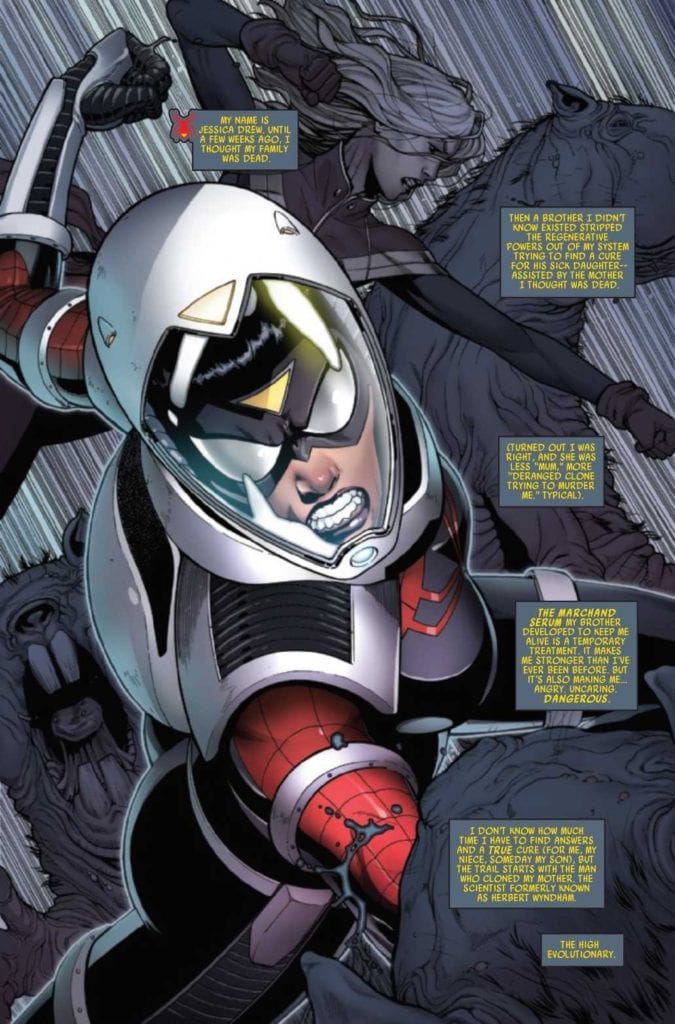
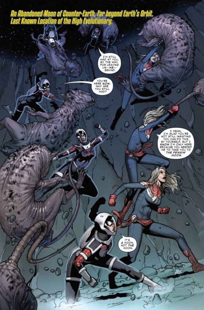
SPIDER-WOMAN #6, available today from Marvel Comics, dives straight back into the latest adventure for Jessica Drew. Only this time, she’s gone to her best friend for a bit of help — and space transport.
Jumping right into a fight in Spider-Woman #6.
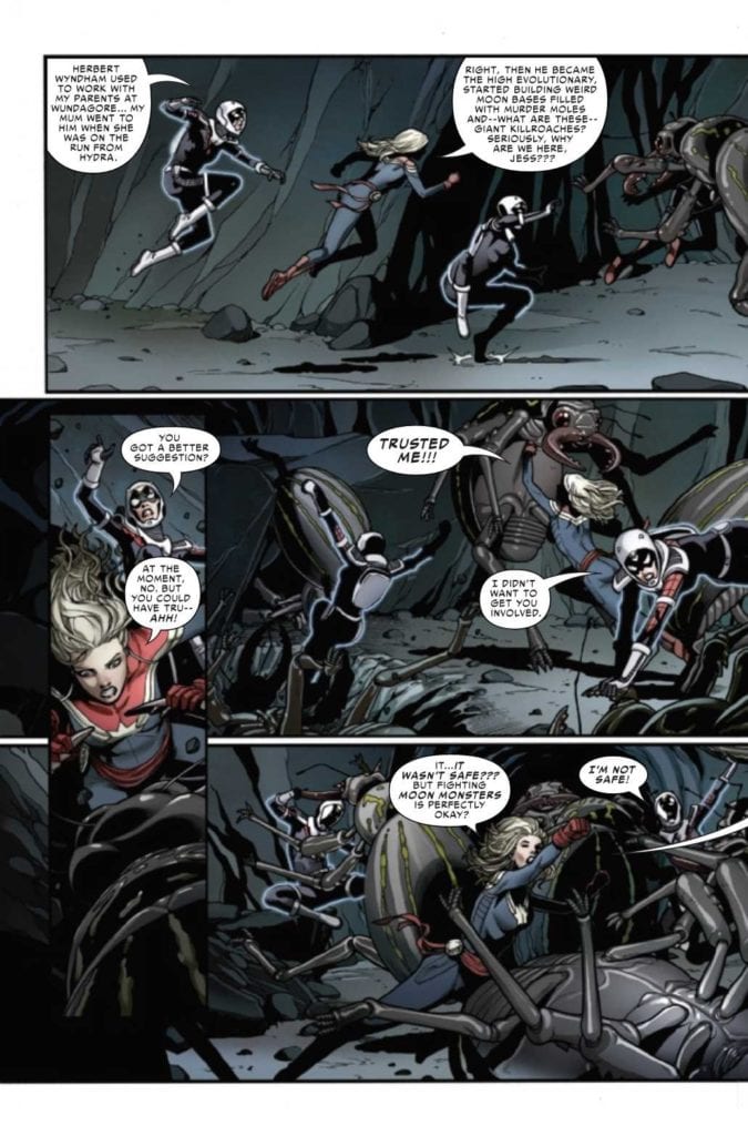
Jessica Drew may have her own series again, but it has been far from smooth sailing. Her entire life has been shaken up, from being forced to step away from Gary and Greg, to finding some dark truths about her family.
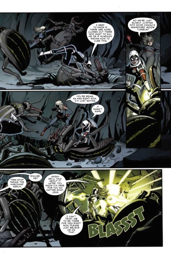
In truth, her story has only just begun. Every revelation seems to send her down a new spiral. Whatever is causing all of this obfuscation is not making it easy for Spider-Woman, though admittedly the mitigating circumstances aren’t helping either.
At least in Spider-Woman #6, she has an ally on her side. Only, it isn’t quite the team-up that fans have eagerly been hoping for. After all, there’s something wrong with Jessica, and that couldn’t be more apparent than when she’s standing side by side with her bestie.
Two dynamic heroes and besties just taking care of business.
The Writing
In many ways, it feels like Spider-Woman #6 is a deviation from the rest of the series — even though in truth, it isn’t. It may have taken Jessica Drew away from earth, but not away from her problems. That much writer Karla Pacheco made painfully clear.
This issue is a very fine balance of humor, drama, and suspense. There’s plenty of action to be found, thanks at least in part to the mental state of Spider-Woman (if you’ve been following the series up to this point, then you know exactly what is going on).
A lot of the humor comes at the expense of another Avenger, but honestly, that just makes it all the more entertaining. An easy mark, sure, but one that is still appreciated. It very much fits with the dynamics of the characters involved. Namely, the two best friends.
It’s intriguing seeing where this story is unfolding, though it is raising more questions (and concerns) along the way. One thing is certain, fans are once again finding themselves fully invested in what is about to happen to Jessica Drew.
She does have a point…
The Art
The artwork inside Spider-Woman #6 is a treasure, simply put. It also deviates from the norm, but in a way that really showcases the action in particular. Our heroines bounce all over the panels, as they battle and sass their way through multiple situations.
Pere Perez (art), Frank D’Armata (colors), and VC’s Travis Lanham (letters) really did create something memorable here. Not just because of the fighting (though there is certainly that), but the way our heroines react to everything, as well as dozens of other little details.
The colors are so perfect for this issue, transitioning alongside the plot. One moment it’s vibrant and alive, the next muted, as if it too exists in the void of space, and then the next we’re seeing a sun-dried palette perfect for an abandoned world.
Finally, there’s the lettering, which is top-notch. Everything from Jessica’s mental state to the impact she had on her surroundings (and the people in it) was made clear as day. Thanks largely to the careful placement of those letters.
One major blast to deal with the last of the enemies?
Conclusion
Spider-Woman #6 is one of those issues that is perfect for fans of both Spider-Woman and Captain Marvel. It goes without saying that it is also perfect for those that adore their friendship, and their combined sass.
Alongside all of that sass is a solid plot, one that is dark and compelling. As it raises concerns about our heroine and her fate.
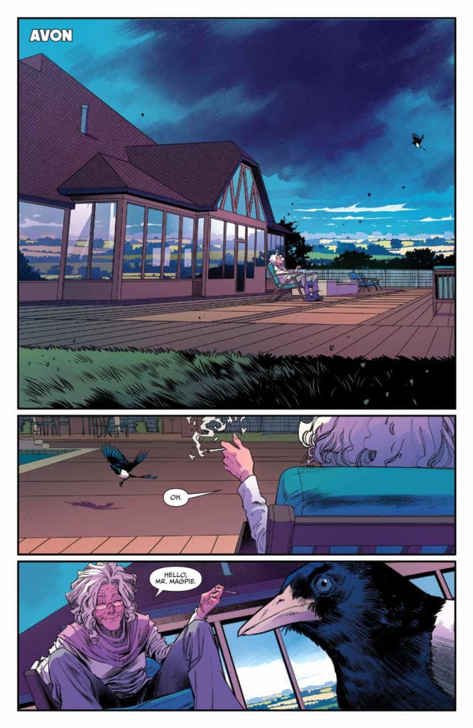
ONCE & FUTURE #13, available today from BOOM! Studios, continues a tale full of legends of old — and the havoc they can wreak when summoned into today’s day and age.
A disturbing variant cover for Once & Future #13.
Once & Future is a series that has been steadily increasing in drama — and danger. It started with a classic Arthurian tale, but with a darker twist. Now it has become a creature of its own making, as the stories come to life.
Before the series started, Duncan was no hero. Now, he’s been transformed, taking on the role of multiple heroes. But even that has a limit, as we’re soon to learn. That is where Once & Future #13 picks up, as he picks up the family career of monster (and legend) hunting.
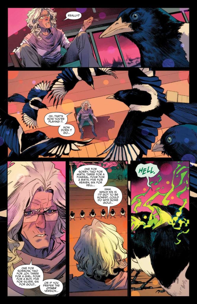
One magpie for sorrow,
The Writing
Once & Future #13 is not quite as full of action as the previous few issues, but it does bring something new to the table: suspense. A creeping feeling, like something is watching from the darkness.
That is Kieron Gillen’s writing style shining through, weaving in different elements into this already horrifying tale. The introduction alone is an intriguing one, though as with the rest of this series, it isn’t exactly for the faint of heart.
From there, the issue takes a few different twists and turns, reminding readers that it isn’t all about the fighting (don’t worry, there’s still that). There are human beings interacting with legends and lore. It’s an important detail that one must never forget.
Oddly enough, there’s even a little bit of humor found within the writing this time around. It’s almost like a breath of fresh air. Almost. It feels more like the calm before a storm, where readers simply know that things are likely going to get even worse than ever. Especially now that we’ve been reminded of all the reasons to root for these characters.
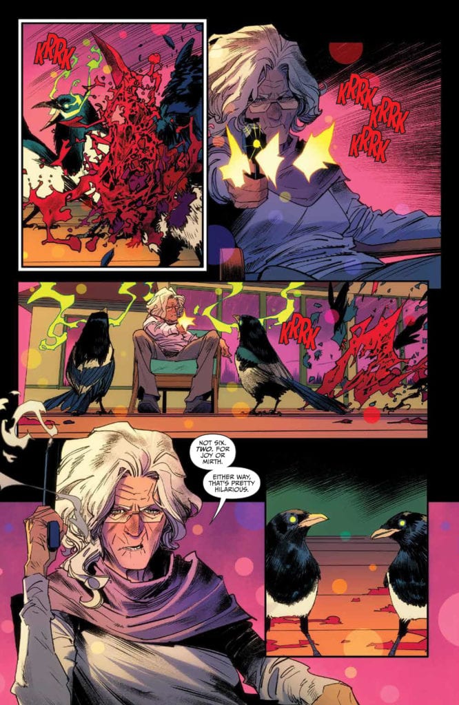
Six magpies for…hell…that can’t be a good sign.
The Art
Once & Future #13 is a bright issue, almost literally, as the case may be. The colors are bold and bright, with backdrops that pop, even in what should be nothing more than a dreary rain scene. It makes for a memorable setting, even without the supernatural interfering.
Naturally, that is not something that will last. Something, some creature, from legend will pop out, and Tamra Bonvillain’s colors will make them absolutely striking. It’s the ideal complement to Dan Mora’s lines.
His characters, be they human or something more, are fascinating. They dominate the pages, requiring only simple backdrops to complement their designs. Admittedly, the creatures tend to be even more captivating, but that makes sense, doesn’t it?
Ed Dukeshire’s lettering is the final touch in this issue, bringing with it an epic scale that is exactly what the story needed. As with the character designs, it’s the creatures and their words that the lettering is the most intriguing.
Does that still count as two?
Conclusion
Once & Future #13 is a unique issue, even among an already unique series. It makes a few deviations, while ultimately getting back to the main focus before the end. Yet that variance allowed for a spark of humor and humanity to shine right through. A poignant reminder of what these characters are battling for.