Home Blog Page 184

GENERATIONS FORGED: Celebrating The Forgotten

Generations Forged Cover

Generations Forged is a special one-shot by DC Comics out on February 23, celebrating different parts of DC’s history. With a massive creative team backing it up and DC’s more obscure elements like Dr. Light and Steel, there’s something for everyone.

Generations Forged: Carving The Niche

Generations Forged features three writers in collaboration for an epic about celebrating the past vs. living in it. The central villain Dominus is practically a stand-in for publishers and editors who are also DC fanatics. By removing nonessential elements of the current DC Universe like Ultra-Humanite and the Golden Age Batman, he lives a perfect life. One that he can change on a whim to avoid the ugliness. But doesn’t this take away the efforts and sacrifices that build character?Generations unmade

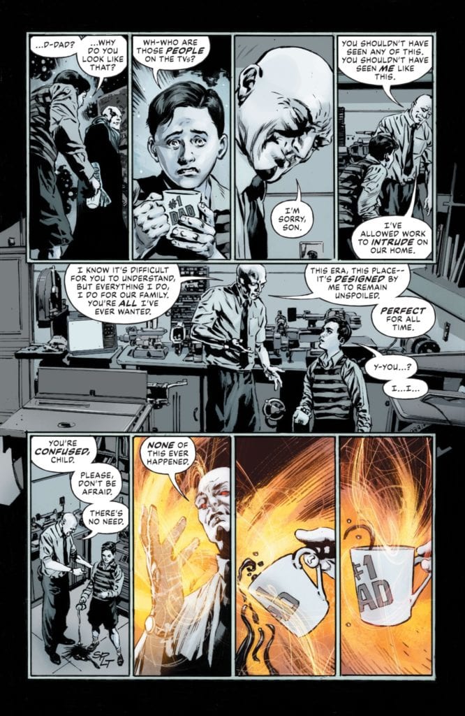
Dan Jurgens, one of the main writers and artists, is a DC history aficionado. The inclusion of his creation, Booster Gold, and his time travel equipment allow Jurgens to show off elements that people tend to forget. Characters like Dr. Light might have peaked in notoriety in events like Crisis On Infinite Earths, but that doesn’t mean people won’t use them again.

Robert Venditti, another writer of Generations Forged, made his career around exploring the DC Universe, hence the inclusion of Green Lantern Sinestro. Characters like him are complex enough for many depictions. Shouldn’t that mean giving creators and characters the chance to develop?

Andy Schmidt is continuing this story by building it off of Generations Shattered. After some developments in his career at DC, like Generation One coming up short for “reasons,” he and the other creatives take time to make their efforts memorable. After seeing Kamandi, OMAC, and Steel in action, I felt compelled to learn more about them.

Art In Sequence

In terms of artwork, Generations Forged features a revolving door of artists who show off their capabilities. Mike Perkins shows off Dominus’ home life in simple black and whites, a style that is easily malleable to suit the villain’s wants. Thanks in no small part to colorist Hi-Fi using sparse red and orange to demonstrate Dominus’ control of his domain.

Generations Forged Santucci
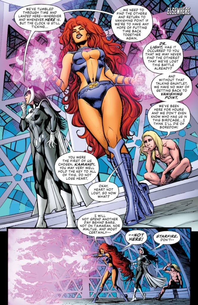
Marco Santucci gives his pages a style evoking DC’s 70s and early 80s comics, which is larger than life and full of energy. Starfire alone steals the show with how much space her hair takes up. It’s to the point where it’s played for laughs when she uses it to leave a trail.

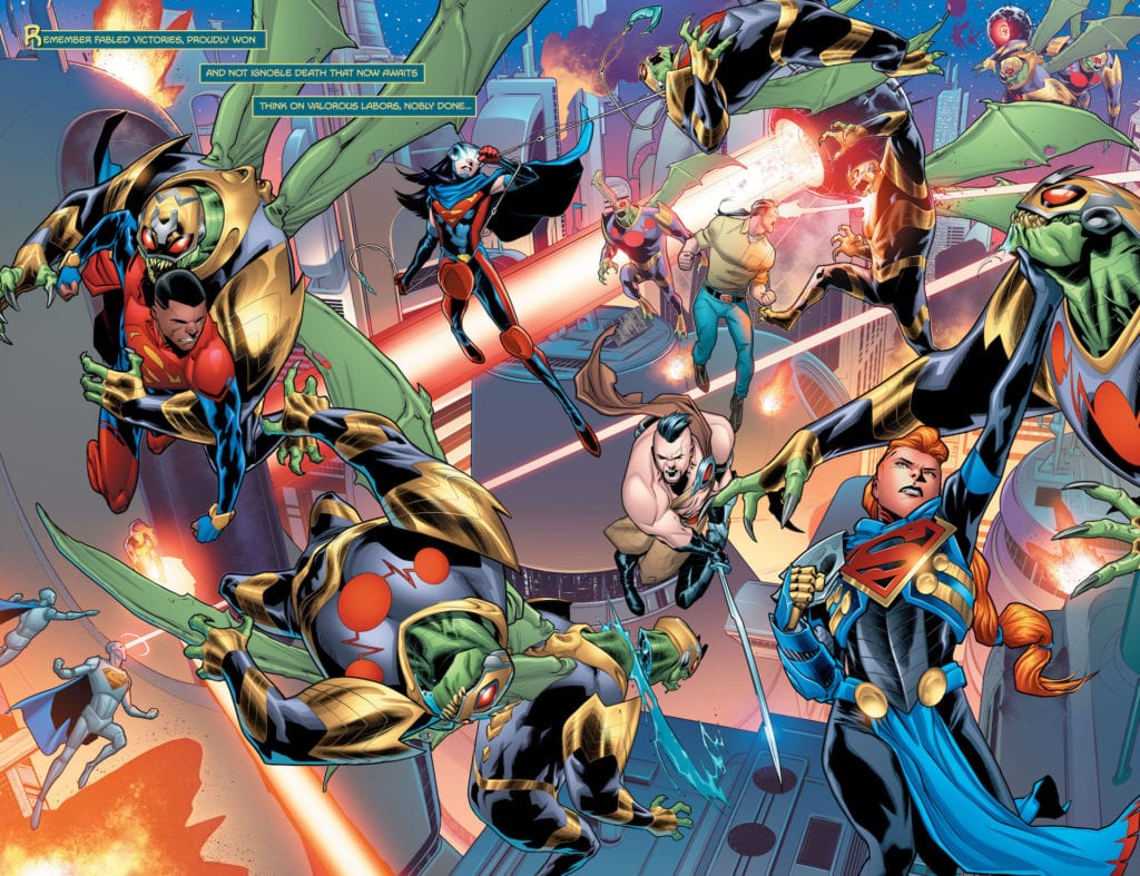
Paul Pelletier and Norm give an epic art style that full of thrills. Steel and Superboy face unimaginable threats on an alien world they stick out in. No amount of power will help them, with their movements signifying resourcefulness over might.

Bernard Chang gives his sections a sense of evocative emotions. One moment, the reader sees a world so flashy it’s easy to get distracted until a character’s actions pull them into one moment where the world blanks out.

Joe Prado shows off Dr. Light’s uniqueness in a gritty art style that tells a serious situation. So when Dr. Light harnesses crackling energy glowing red, she saves the moment by becoming one with the threat. This gives her more power over a situation than before.

Colleen Doran makes a double-page spread where all of the art coalesces into a style that allows all the characters to exist in the same plane.

But it’s when Bryan Hitch and Andrew Currie present these characters in action, do these eras of art become something new. The bright colors of the pre-20th century begin to show signs of layered art.

So when Jurgens and Kevin Nowlan take the pen, it completes the transition into the modern era. The art becomes more layered, more diverse in coloring, and in focus, has fine details in wrinkles and light shading.

All of Generations Forged comes wrapped together with lettering by Tom Napolitano. The word balloons practically reflect the eras each character comes from. The amount of words Booster speaks about times and Humanite quieting him practically reflect a need for less expositional storytelling. Then there are the SFX which look tailor-made for actions like roars and hits from a hammer.

Generations Forged: Eternal Fandoms

Generations Forged calls back to some of DC’s efforts for collaborative passion projects like 52. With so much of the DC Universe ready to explore, when creatives get the freedom to collaborate, they can create great things. Being able to communicate and share what you love is something that any DC fan shares.

Monkeys Fighting Robots Youtube

FUTURE STATE: HOUSE OF EL #1 – The Legacy Of The Man And Super

House of El #1 Cover

Future State: House of El #1 out on February 23 from DC Comics. Serves as a sort of finale to the Superman section of Future State, writer Phillip Kennedy Johnson depicts Superman’s legacy at its peak. Bringing forth the epic/mythic scale of the Man of Steel comes artist Scott Godlewski. All while colorist Gabe Eltaeb and letterer Troy Peteri provide further decorations.

House of El #1: Man vs. Super

At the heart of House of El #1 is what makes Superman an iconic piece of the DC universe. Superman, in his best depictions like American Alien, emphasizes his humanity. Within the pages of the issue, Johnson makes this humanity so notable, the alien identity of Kal-El is treated as a myth. What makes so Johnson so memorable is how he gets all of the cast to question what makes them worthy of the emblem. Especially since a family feud practically erupts over how the titular family sees Superman. Because what better way to affirm your faith in both the man and the super than questioning it all? It allows people to explore the nuances of it all.

Epically Larger Than Life

House of El #1 castThroughout House of El #1 are several double-page spreads to show off the scale of the characters. With every El family member in action, their very presence can hold the weight of their world. When they separate, each member focuses on a single moment in all of the chaos, practically warping the page with their actions.

The costume designs certainly add to this effect. Each emblem-bearing costume is practically an extension of the original Man of Steel in some way. Brandon Kent, for example, wears regular street clothes as a tribute to Clark Kent, unlike most of his relatives.

No reference is too small, especially when Eltaeb can make the ultimate reference to Superman Red/Blue. Blue Lantern Rowan Kent and the Red King’s color-coded costumes are equal parts tribute as well as points of conflict in House of El #1. No specifics as those would be spoilers.

Finally, Peteri makes all of the lettering hold narrative weight as extensions to every action. The scenes featuring Brainiac 4 with word balloons taking up space in a panel tell a dire situation without actually seeing it. The SFX, in the meantime, are as big and loud as the actions in battle. The humming sound of the Black Racer speeding by might sound quieter in juxtaposition, but that just means she’s all the more dangerous. In all the excitement, it’s easy to lose track of danger in House of El #1.

House of El #1: The Family Who Has Everything

In this last piece of Future State for Superman, House of El #1 gives a grand finale in tribute to the Man of Steel. The best parts of Superman might be his humanity, but it’s always good to show his sensational aspects in juxtaposition. With so many characters following in his lead, you need to ask the right questions to see why. Superman’s very spirit can hold the weight of the entire universe because the emblem and costumes are points of inspiration.

Monkeys Fighting Robots Youtube

WANDAVISION – Breaking the Fourth Wall | TV Review

The seventh episode of Wandavision was the most psychological entry in the series so far as Wanda has to deal with the consequences of her actions.

Wanda has expanded the boundaries of the hex to save Vision’s life (again). However, she has fallen into a deep depression that has resulted in her fantasy world glitching and Agnes offering to care for the twins. Vision finds himself at the S.W.O.R.D. camp that has now turned into a circus and resolves to get back to Westview. Monica and Woo discovered that Hayward wanted to turn Vision into a weapon and try to find a way to warn Wanda.

Throughout the series Wanda has been refusing to face Vision’s death. Westview was meant to be the ideal suburb, the American dream that TV often projects. If anyone challenges Wanda she would exile them or reverses time so she can preserve her illusion. But as time progressed the illusion became harder to maintain with Vision asking questions.

“Breaking the Fourth Wall” opened with Wanda lying in her bed like she was both hungover and depressed and the twins being concerned for her. The commercial for an anti-depressant spelled out the theme of the episode and the voiceover saying that one of the side effects was ‘facing your problems.’ The setting has moved to a late Noughties/early 2010s look – Wanda and Agnes spoke to the camera like the characters in Modern Family and they spoke about their feelings. Westview looked more grounded than in the previous episodes and there was less attempt at humor involving Wanda’s story.

Most of the humor in the episode came from Vision and Darcy. Darcy has always been a comedic character and she got to shine as both an escape artist in the S.W.O.R.D. circus and as herself when traveling with Vision. Even though their interactions were comedic, there was still a dark undertone because Darcy tells Vision about what happened to him before Wandavision and they find out Wanda was trying to keep Vision from returning to Westview.

The big character developments involved Monica and Agnes. In the previous episode Monica found out her DNA has changed after going through the static twice. She goes through the static a third time and it finally gives her superpowers, something that will be important for Captain Marvel 2.

Agnes was always the wildcard in the series. In previous episodes she appeared whenever Wanda and Vision needed help and S.W.O.R.D. didn’t find out her real identity. This episode finally revealed who Agnes really was and it confirmed most fan speculation. It led to a catchy song and finding out Agnes did the evillest action in the MCU. The big questions now are what’s her game plan and what does she want with Wanda?

“Breaking the Fourth Wall” worked as the metaphorical/psychological episode that explored Wanda’s mental states and sets up a big conclusion for the series.


Monkeys Fighting Robots Youtube

Review: BUFFY THE VAMPIRE SLAYER #22 — A Fourth Slayer

Main Cover

Available now from Boom! Studios, Buffy the Vampire Slayer #22 is written by Jordie Bellaire and Jeremy Lambert. Ramon Bachs illustrated and Raul Angulo colored the issue. Last but not least, Ed Dukeshire contributed lettering.

Sunnydale is the Hellmouth that keeps on giving. Whenever Buffy seems to have won a boss fight with some great evil, another appears just around the corner. But sometimes, enemies are closer than anyone thinks, and friends have the potential to turn.

spoilers ahead

So it was with Xander and now Anya, although she hasn’t revealed herself to the Scooby Gang. However, Morgan Palmer, the clandestine fourth slayer, stands somewhere in the middle. Yes, she’s been secretly plotting with Anya to kill all the Watchers, but is she really a foe? Issue #22 poses that question.

Morgan Palmer

Bellaire and Lambert begin by juxtaposing inner monologue with Willow wandering alone. The monologue is existential, expressing the character’s doubts about their life choices. Because the monologue is captioned alongside Willow, we assume they are the young witch’s thoughts. It’s understandable, given that she only just returned from her time abroad and has felt uncertain of her role in the Scooby Gang before. Then the scene shifts to Morgan with Anya at the magic shop, and it’s revealed these have been her thoughts all along.

Through this narration and subtle artistic choices, the issue focuses on the characters’ emotional inner lives and relationships. Each member of Buffy’s circle is privately dealing with new stresses, and this issue attends to their feelings. Willow feels out of touch with the group, drawing closer to Xander despite his evil ways; Buffy questions her role in the group with the addition of Faith; Giles also questions his role while keeping a secret from everyone else; and Morgan questions whether she truly believes in taking revenge on the Watchers.

Artistically, Bach’s simplistic backgrounds, Angulo’s soft coloring, and few close-ups allow equal attention to each character and delineate between the supernatural and the mundane. Further, letterer Dukeshire is unafraid of large blocks of monologue text and pragmatically minimizes SFX. Given that the majority of the story is framed through Morgan’s astral point of view, these artistic choices guide the reader to both empathize with Morgan and see the group differently.

Giles

Due to the emotional nature of the issue, not much happens in the way of plot, and the pacing is on the slower side. But important developments are made without much fanfare. For one, Xander’s demon slave is caught spying by Faith. She takes the demon to Wesley while Buffy updates Giles. Giles, meanwhile, has been drinking and ignoring phone calls from his mother, yet the reader isn’t told why.

Then Buffy and Giles have a heart-to-heart witnessed by Morgan, which seems to endear her to him. She’s already been questioning her commitment to carrying out Anya’s plot, so seeing Giles’ compassion might have just decided both of their futures. Yet a cliffhanger ending keeps the reader guessing whether or not Morgan will kill Giles.

Fortunately, the creative team have sympathetically and in a balanced manner carried Buffy fans through the “Ring of Fire” arc. The cliffhanger allows us some hope for a bloodless way out.

Monkeys Fighting Robots Youtube

Review: POWER RANGERS #4 — Do I Feel Bad For Lord Drakkon?

Power Rangers #4 was released February 17, 2021 by BOOM! Studios. The issue is written by Mighty Morphin Power Rangers head writer Ryan Parrot. Francesco Mortarino is the illustrator, Raũl Angulo provides the colors, and Ed Dukeshire letters the comic.

Story

Power Rangers affords Parrot a luxury its sister series, Mighty Morphin, does not. Since the work is less rooted in the original show and has a substantially smaller cast, the writer gets a chance to flesh out these characters. In this comic, we see Parrot shine as he gets to humanize Lord Drakkon. This is executed quite well and brings the reader on a journey similar to the other members of the cast. Should we trust Lord Drakkon? Do we feel empathy for what he has endured? Is there more to him than just an evil being hell-bent on reaching the ultimate power?

These are all questions Zach, Jason, and Trini ask in this issue, and due to Parrot’s superior writing, we the readers are drawn into the same mindset. This issue does feel a little light on action, however, but since we have some really great character-building, it does not feel like a let down.

Art

The way Mortarino captures faces on the Rangers is amazing. Their movements are fluid and the models convey a real sense of emotion and heart. The scenery leaves a little bit to be desired, though. The issue is set on a desolate prison world, but it feels a little generic. There is nothing in the background that jumps out and grabs you. Since this is a space opera, the reader should have a little more desire to look around and explore the panels, but the world feels flat and boring. Even when there are giant monsters roaming around, the setting may leave you wanting more.

rangers

Coloring

Raũl Angulo’s coloring has the same problems that Mortarino’s art does. While the Rangers, Lord Drakkon, and the celestial beings are brilliantly colored, the world just isn’t satisfying to look at. These characters jump off the page and draw you into their setting. Once you get there, though, it is a bit boring and flat to look at. The world we are in in this issue is in ruins, but it just feels like flat concrete on a gray background. The colors thrive when they are illuminating living things, but they make the setting feel bland.

rangers

Lettering

Ed Dukeshire pulls double duty on the MMPR line and letters both books. Power Rangers #4 is an issue where he gets to truly shine. The letters do not enhance the main cast, but they help set a mood of foreboding and doom that the setting fails to establish. When we see how Dukeshire voices some of Drakkon’s creations, they are able to show us how bleak and lonely Drakkon actually has been. The lettering he provides for the onomatopoeia really grabs you and fills you with a sense of excitement in the little bit of action the book provides. Ed Dukeshire has been a good and consistent letterer on Power Rangers, and this is an issue where he really shines.

Conclusion

Power Rangers #4 is a good and solid comic. I continue to be impressed with the quality of storytelling BOOM! lends to this family of titles. While this issue is light on action, it never feels like a let down. Lord Drakkon shines and feels like a deeper character. I was disappointed when the issue ended, and that’s not a bad thing. I want more, and I am impatient to have to wait a whole month for the next installment.

Monkeys Fighting Robots Youtube

Review: KILL LOCK: The Tragedy Of The Prisoners’ Dilemma

Kill Lock Cover

Kill Lock is one of the most eye-catching and well written stories to have come out of IDW. It was released on September 9th, 2020. Creator Livio Ramondelli works as both writer and artist to a beautiful universe with a robot society. Joining him is letterer Tom B. Long to display the unique voices of each character.

Kill Lock: Robot Faction Building

The World of Kill Lock
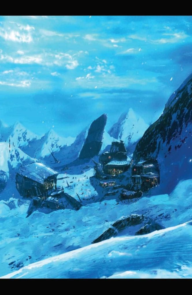
Ramondelli writes Kill Lock with multiple layers of both world and character. In a space age where robots practically run the universe, the reader views the world through four distinct personalities.

Our hero everybody
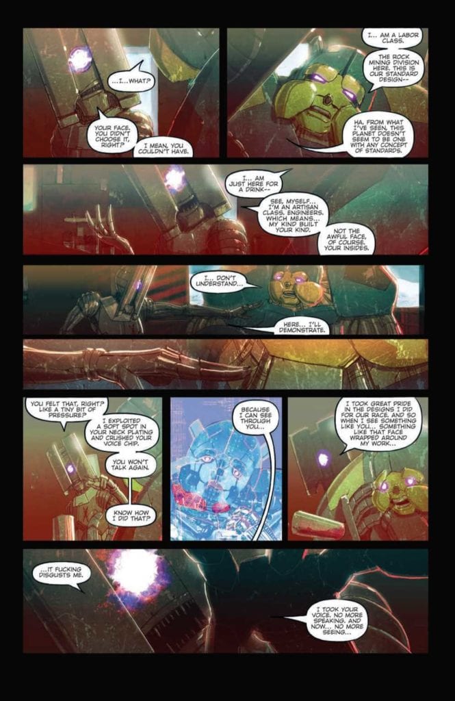
The protagonist, Artisan, reflects the greater society’s status quo to purge weakness. Any flaw is something to eliminate, even if it’s not that robot’s fault. Imagine this being like the concept of needing to replace a still working computer with the latest model and now apply that to a disabled person. Real dictatorships come from this kind of thinking, one in particular that still echoes throughout
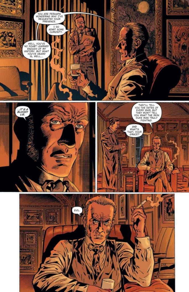
 history.

But what makes Kill Lock unique is the titular jail sentence. It’s a form of exile where four undesirables are forced to work together. Because, if one of them dies, they all die. The Artisan is by no means sympathetic, he’s as much an antagonist as he is a protagonist. The other characters meanwhile deserve a little love and empathy.

The Labor Class’s attitude is like any blue-collar worker who got into a bad situation. He’s the kind of character people would relate and give sympathy to the most because of how close to life he feels. The Wraith Legionnaire is a heroic figure who, through subtle visual storytelling, goes through the most development. These two are the muscle to protect the heart of their group, the Unfinished. He looks and acts like an innocent child, the kind that changes the sympathetic connection the Laborer and Legionnaire to empathy. Because wanting to protect someone from a cold cruel world when they don’t have the power was something the artisan was counting on for his master plan. No spoilers, but with how empathetic these three become, the audience have become unwilling accomplices of the Artisan.

Robots In Distress

Ramondelli’s artwork has plenty of similarities with his time on Transformers. The hyper detailed orientation and coloring give a photorealistic design to everything. Each robot body’s appearance gives the reader an idea on how they look and function. The bulky bodies of the Laborer and Wraith look tough enough to survive what can be thrown at them while the Artisan and Unfinished look frail.

The facial features also help in displaying the emotions of the relatable characters. Surprisingly, even the Wraith’s glowing symbol face gets expressive, to show he isn’t as stoic as he might suggest. All of these things make the reader want to connect to these characters, except for the foreboding Artisan.

Long, as letterer, brings arguably the most subtle details to Kill Lock. Robots who live in general society all have a mechanical font, unlike the more natural font of outcasts. This gives the reader a sense of awe at how the robot society treats its citizens with complete indifference. With the Kill Lock cast’s natural speech, readers get the impression that they are more “human”. They recognize their flaws but are okay with it, unlike the rest of society that only see them as mistakes.

Kill Lock Commence!

This short but sweet series collects a story that looks into a society of robots. One where the concept of a humanistic outlook by both characters and readers leads to tragedy. The reader finds themselves attaching to certain characters they genuinely come to love, only for everyone to realize that they were led astray. It’s these feelings, feelings of love and disillusionment, that allow for a great story to come out in Kill Lock.

Monkeys Fighting Robots Youtube

BOOM! Studios Exclusive First Look: ABBOTT: 1973 #3

boom! studios exclusive preview ABBOTT 1973

ABBOTT: 1973 #3 hits your local comic book store March 17th, but thanks to BOOM! Studios, Monkeys Fighting Robots has an exclusive five-page preview for you.

About the issue:
The dark forces terrorizing Detroit have struck Elena Abbott where it hurts most…and
she’s going to strike back. But even after pulling together an uneasy alliance with the
last people she expected, Abbott is about to learn her enemies are one step ahead of
her… and it might cost her the person she loves most.

ABBOTT: 1973 #3 is by writer Saladin Ahmed and artist Sami Kivelä, with colors by Mattia Iacono, and letters by Jim Campbell.

The five-issue series is a follow-up to 2018’s ABBOTT, which took place in 1972.

Check out the ABBOTT: 1973 #3 preview below:

boom! studios exclusive preview ABBOTT 1973

boom! studios exclusive preview ABBOTT 1973

boom! studios exclusive preview ABBOTT 1973

boom! studios exclusive preview ABBOTT 1973

boom! studios exclusive preview ABBOTT 1973

boom! studios exclusive preview ABBOTT 1973

boom! studios exclusive preview ABBOTT 1973

boom! studios exclusive preview ABBOTT 1973


Are you reading ABBOTT? Sound off in the comments!

“Readers can find ABBOTT VOL 1 available everywhere books are sold. In the uncertain social and political climate of 1972 Detroit, hard-nosed, chain-smoking tabloid reporter Elena Abbott investigates a series of grisly crimes that the police have ignored. Crimes she knows to be the work of dark occult forces. Forces that took her husband from her. Forces she has sworn to destroy.”

Monkeys Fighting Robots Youtube

Review: HOLLOW HEART #1 – Sci-Fi & Romance Like No Other

From writer Paul Allor and artist Paul Tucker comes a deeply personal and focused start to a romantic science fiction comic in the form of “Hollow Heart” #1, published by Vault Comics. This oddly sweet and fascinating comic is a completely new experience even for diehard fans of the genre, wrapping personal philosophy, human relationships, and good ol’ sci-fi up in a brilliant comic book package. With beautiful narrative work and stellar visuals, this is going to be a must read first issue, I can feel it.

“EL used to be human. Now he’s a jumble of organs in a bio-suit. EL is also in tremendous pain and has been for a very long time. Hope arrives in the form of Mateo, a mechanic brought in to work on EL’s suit. Mateo sees LK in a way no one ever has. And what’s more: Mateo offers EL an escape.”

Writing & Plot

The most striking element in Paul Allor’s script for “Hollow Heart” #1 is how he pulls off a bit of a no-no in the comics medium, and nails the hell out of it. Allor utilizes a narrative voice outside of the dialogue for nearly every page of the comic – something generally considered a faux pas in a visual medium. However, instead of using that voice to describe images that can be seen on the panel (which is why this practice is widely discouraged), he uses this technique to weave a narrative inside the heads of his characters that adds a whole new dimension of complexity to the cast and story. What’s more is that we need this kind of perspective to be able to understand who El really is and how he feels. He is, after all, basically just a pink skull in a glass helmet, Being able to understand El’s pain and conflicted emotions in a manner that gives us just enough to understand him, but never overtakes the page, is a huge win on part of this comic. The prose work here is full of insight, while also on a stylistic level is enrapturing. There is some beautiful, near Gaiman-level narrative work going on here, and it makes this comic unique and poetic. The story itself is delivered with a purposeful sense of mystery. We don’t really get much of introduction to El or Mateo and the universe they live in. Instead, this comic focuses on their actions here and now to tell this story. This distills the often highly-conceptual nature of sci-f- stories into a purely character-centric chapter, getting us to intimately knw these two people. This is a comic written with a passion that rarely comes out in any medium, and I’m beyond engaged with this story and whatever Allor plans to write in its future.

Art Direction

This comic’s striking visual style is brought to life by artist Paul Tucker, who builds this world – much like the writing – off of its characters. First and foremost we have to talk about El’s design and how he’s presented here. There’s something instantly engaging about this sorrowful pick skull floating in liquid whilst running around in a giant bio-mechanical suit reminiscent of something from Forbidden Planet. Tucker’s frequent close ups on El’s visage allow us to gauge how this character is feeling even when the narration has stopped. This is a huge credit to Tucker, since he’s able to accomplish this with a character that can’t really emote because of his physical situation. I mean, the guy is a skull in a bowl of liquid. Tucker manages to make him emote with how his eyes move, and also with how he is angles in-panel. Certain perspectives make us able to see what’s on El’s face better than other, so Tucker’s astute visual direction works wonder for getting the reader into the head of this character. The environmental artwork is brilliant as well, offering a variety of sets that range from a dingy bar akin to something in Blade Runner to a sterile laboratory. Every panel, even the lab, feels lived in and realistic, making this sci-fi story feel more feasible than fantastic. Tucker’s colors are a stellar visual feast as well, setting the perfect tone for every scene. The most striking use of this color is, obviously, El’s pink glowing skull in the backdrop of black liquid; an image that is indelible in my mind now that I’m writing this. The character animations and designs for the regular human cast is, admittedly, a tad rough at points, but the direction and detail in other spots more than makes up for this. The sense of visual storytelling that weaves along with the narrative is one that could be used as a textbook example of how comics work as a written and visual medium, and it’s one of the most excellently directed books I’ve read recently.

Another little note I have to make about something I really like about this comic is the breakdown of the lettering for the narrative bits. Allor, the writer, is also the letterer for this issue, and in being so I imagine that gave him license to play with his sentence structure in the text boxes. The sentences in his detached narration are broken up from box to box; so he’ll start a sentence in one textbox only to have it end suddenly and pick it right back up in the following box. It’s a neat trick that actually works really well and I’ve never seen it done in a comic before. He also uses a font for El’s artificial cyborg-ian voice I don’t think I’ve ever seen in a comic, but it illustrates how the character sounds perfectly.

“Hollow Heart” #1 is a beautiful and deeply personal start to this romantic sci-fi comic starring a depressed monster in a space suit. The scripting and lettering from Paul Allor make for one of the most insightful and engrossing reads I’ve taken in thus far in 2021. The visual work of Paul Tucker is well-detailed (if sometimes a bit sloppy) and brilliantly directed. Please check this issue out when it hits shelves on 2-17!

Monkeys Fighting Robots Youtube

AfterShock Comics Exclusive Preview: KAIJU SCORE #4

aftershock exclusive preview kaiju score

KAIJU SCORE #4 hits your local comic book store February 24th, but thanks to AfterShock Comics, Monkeys Fighting Robots has an exclusive four-page preview for you.

About the issue:
MORE STORY! MORE ART! MORE KAIJU!

The good news is that the crew for the Kaiju Score is very close to pulling off a heist that will set them up for the rest of their lives. The bad news is that two kaiju are tearing the city apart as they try to finish the job. It’s all on the line now: tens of millions in art, their very lives, and even their souls. It’s going to end one way or another, and not everyone is going to make it out alive.

The final chapter in the first story arc of this exciting franchise being developed as a film by Sony Pictures!

KAIJU SCORE #4 is by writer James Patrick and artist Rem Broo, with letters by Dave Sharpe.

Check out the KAIJU SCORE #4 preview below:

aftershock exclusive preview kaiju score

aftershock exclusive preview kaiju score

aftershock exclusive preview kaiju score

aftershock exclusive preview kaiju score

aftershock exclusive preview kaiju score

aftershock exclusive preview kaiju score


Are you reading KAIJU SCORE? Sound off in the comments!

Monkeys Fighting Robots Youtube

Review: WELLINGTON: A Humorously Unpredictable Series

Wellington Cover

Wellington is an entertaining series from IDW. It came out on December 9th of 2020. Podcaster Aaron Mahnke writes this series, alongside Delilah S. Thompson, for a different take on Britain’s supernatural side. Artist Piotr Kowalski provides some eerie artwork for atmospheric effects which Brad Simpson makes more suspenseful. The lettering duties between Christa Miesner and Valeria Lopez add a level of unpredictability to the story.

Wellington: Anything But Ordinary

Meet our heroMahnke, of the Lore podcast, gives Wellington a familiar monster hunter premise that turns on its head. With the Barghest monster serving as the antagonist, there are many elements displaying how such a life affects those around them. The titular character is certainly a man of duty, willing to share his experiences for the greater good. It’s the ones closest to him that get the brunt of his negative traits, like his right-hand man.

Let it be said that this is not a traditional monster story that’s governed by logic. Monsters, like the Barghest, don’t really seem to follow any rules of that sort. Some of its abilities can even look quite humorous, like when it turns into a white rabbit.

Monsters like the Barghest easily throw off the Wellington, who pursues the monster out of duty. Given how Wellington likes to be in control of things, how he interacts with unusual things like a German speaking crow can be rather amusing. The only issue comes from how such comedic undertones clash with the supernatural horror.

Timely Illustrations

Wellington First Impression
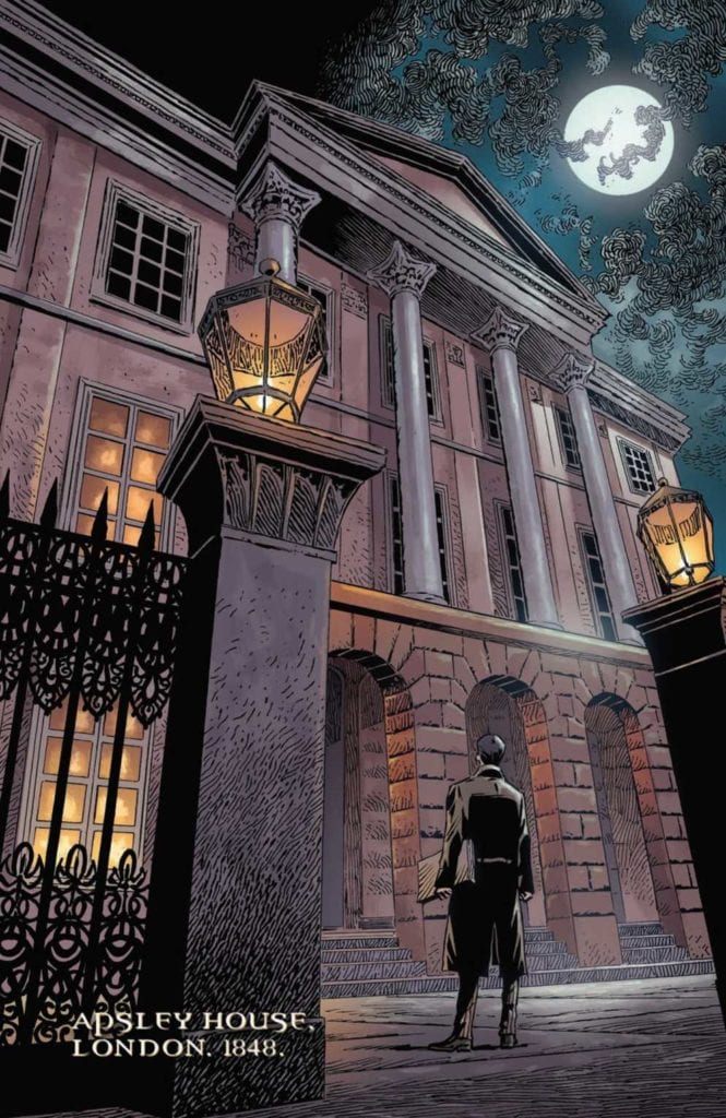
Kowalski illustrates Wellington with a style reminiscent of 19th century drawings. This makes the series feel timely. The scale of some of the architecture can be overwhelming. Right from the opening pages, we see huge pictures of Wellington’s home.

With how the Duke shows his utter shock at the events as they play out from his narrations, it’s as if he shows everyone what he’s been through. The scenes in the cave, which are an extension of the Barghest, by contrast are ever changing and impossible to make sense of.

Simpson enhances the above feelings through his coloring. Most scenes featuring the Duke often accompany some light orange colors, as if to show a passionate man. The antagonistic side of Wellington meanwhile often accompanies ghoulish greens.

To further illustrate this connection, some of the captions and word balloons from Miesner and Lopez match with the characters. Alongside these, are sound effects that ,depending on the intensity, get bigger or smaller to reflect the mood.

Give Wellington A Try

Wellington is an enjoyable romp with a plot that will keep readers on board. The juxtaposition from the illustrations and aesthetics can certainly drive the plot forward. When viewing all of this through a plot that keeps people guessing on what will happen next, it’s definitely worth reading.

Monkeys Fighting Robots Youtube