Home Blog Page 141

Review: Visually Stunning Neo-Noir In SECOND CHANCES #1

Writer Ricky Mammone and artist Max Bertolini team up for a heavy dose of neo-noir action in Second Chances #1. With DC Hopkins on letters, this first issue debuts a generic but entertaining plot and bolsters it through sheer stylistic drive. With solid narration and outstanding visuals, Second Chances is off to a damn good start.

“Second Chances Hotline—call now and get a new identity! All you need is some cash, a proper referral, and a very good reason to start over. When Leblanc, the man behind the hotline, is approached by a shady figure from his past, he’s forced to accept a new client who doesn’t meet any of the requirements—a client with chemically induced amnesia in desperate need of protection.”
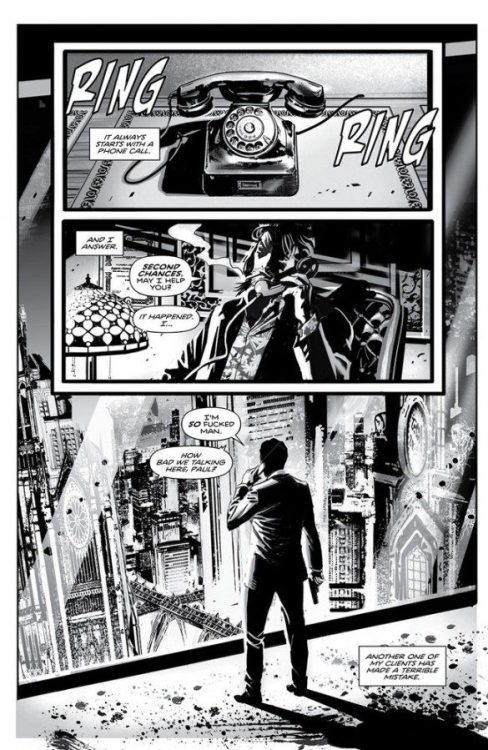
Writing & Plot

The script for Second Chances #1 is a good example of taking a well-worn concept and dusting it off well enough to keep it engaging. Ricky Mammone’s script isn’t going to surprise any neo-noir fans. The entire “second chance at life” fixer angle in a crime story isn’t new. However, there are some refreshing elements that keep this story exciting. Mammone glosses over Leblanc’s life and past, making for true noir goodness. His story interweaves with the b-plot following our main secondary character (no spoilers). The overall plot development is well-conducted and makes the audience do a bit of headwork to make sense of events.

Mammone manages to take predictable plot beats and make them engaging enough to stay intrigued. Stylistically, he knows how to let the art speak. There are numerous moments where the script just lets the visuals do the storytelling via good direction. Mammone’s external and internal dialogue uses just the right amount of genre-influenced and stylized cheese to really sell the noir experience. This script won’t be breaking any boundaries in the genre but it’s a fun enough ride to keep things interesting.
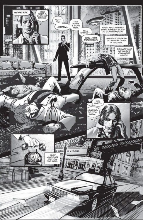
Art Direction

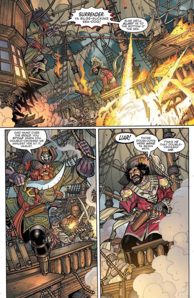
The real selling point for Second Chances #1 is the astounding visual work from Max Bertolini. The artist’s heavily inked black and white panels are stunning and atmospheric, making for the perfect setting to place this noir tale in. Bertolini immaculately crafts details with almost labyrinthine precision. You can get lost in the penciling and inking done on every page. Character designs and animations are all unique and instantly recognizable. Each person is designed with striking features, such as Leblanc’s hair or some mysterious hitwoman’s tattoos.

The city environments look incredible and threatening. Bertolini takes a classic noir design mechanic by making the urban environment look actively menacing. The action sequences are phenomenal as well, with character movement and gunfire exploding through the panels with kinetic force. The lettering from DC Hopkins fit the noir atmosphere perfectly as well. His italicized, rough font reads like you would imagine noir dialogue to sound, like it’s coming from a 1940 microphone. The entire visual experience of this comic is outstanding.
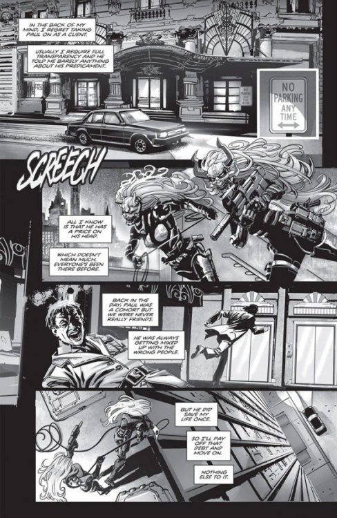
Verdict

Second Chances #1 is written well and beautifully drawn. Ricky Mammone’s script is entertaining and well paced, doing just enough to keep itself separated from the neo-noir genre. Max Bertolini’s visuals are gorgeous, with some of the most striking art seen in any comic this year. Be sure to pick up this comic when it hits shelves on 8/18!

Monkeys Fighting Robots Youtube

Review: BLACK HAMMER: VISIONS #7 Struggles to Make Sense

Black Hammer Castellucci Dark Horse

Dark Horse’s Black Hammer: Visions #7 has a brilliant message at its core. Unfortunately, the whole issue gets muddied by a lot of confusing meta devices, and ends up not making a ton of sense. That said, it’s hard to fault writer Cecil Castellucci, artist Melissa Duffy, colorist Bill Crabtree, and letterer Nate Piekos for this issue falling flat. That’s because this issue revisits one of the very few moments from Black Hammer that just didn’t work. So, to really talk about why this issue struggles to deliver, we need to take a little detour and talk about why it didn’t work the first time, in Black Hammer: Age of Doom #6 & 7, a two-parter I’ve come to refer to as Black Hammer‘s “Limbo arc.”

All the Way Back in Black Hammer: Age of Doom #6 & 7…

There was a lot to love about the “Limbo arc” in Black Hammer: Age of Doom. Not only did writer Jeff Lemire, and guest artist Rich Tommaso, create a brilliant cast of “forgotten characters,” but they got to joyfully employ old, cheesy narrative devices. It was a taste of retro comics with a twist. A huge influence on the arc, it seems, was Grant Morrison’s Animal Man. But unlike the jaw-dropping finale to Animal Man, the “Limbo arc” ended on a note that was just… silly.

Black Hammer Castellucci Dark Horse
From BLACK HAMMER: AGE OF DOOM #7. A meta device ought to add to the story being told in one of two ways: it should bring real life into the comic book world in a literal or figurative way.

Escaping Limbo finally, Colonel Weird, Inspector Insector, and Golden Goose climb out of Jeff Lemire’s ear. Lemire, as a character in the issue, stands on a barren landscape. Pink clouds cover his face and he’s standing shoulder to shoulder with a whole slew of other writers/artists. It seems that Lemire wanted the meta twist that happened in Animal Man for Black Hammer. But unlike Animal Man, the seeds had not been sown. This twist came out of left field. And even worse, it wasn’t actually very meta. Lemire didn’t write himself into the comic as he actually is. He was a statue, there as some confusing plot device but nothing more. The meta commentary was lost in the details. Lemire appeared as the silent “Creator” and had nothing else to offer the story.

The very purpose of a meta device is to say something about reality. That’s what makes something meta in the first place. But this issue had nothing to say in a literal sense — the appearance of the creators wasn’t realistic enough to — and it has nothing metaphorical to say beyond “creators create.”

Black Hammer Castellucci Dark Horse
From BLACK HAMMER: AGE OF DOOM #7. Not only is this scene too strange to take literally — clearly creators don’t stand around in clouds like this — but it has nothing figurative to offer the story beyond “creators create art.” Seems like an obvious point.

Writing

Black Hammer: Visions #7 inherits all the weaknesses of its predecessor. The meta commentary is garbled and confusing. Not only does Castellucci employ far too many “meta” devices — characters refer to “call sheets” and “communicators” through which they’ll be “called up to the main story,” characters rip through pages and dodge pens, writers and artists show up among the characters with inkblots for faces, the giant eyes of creators look through windows — but the devices used often don’t feel like they have a literal or figurative meaning. It also complicates some of the existing stories we already know. Golden Gail is seen pulling back a page and addressing a writer, yet nothing about her character in any other appearance suggests she knows she’s a comic book character.

That said, Castellucci still manages to make a point with this issue. Black Hammer: Visions #7 is about being underestimated. It’s about what someone is capable of when no one else believes in them. It even seems to be about glass ceilings and misogyny. Though the vast majority of the characters in this issue are women, it’s hard not to notice that our main character, Ms. Moonbeam, is a woman who is punished for her ambition. She’s created to be a refrigerator woman. It’s a brilliant commentary that’s hidden in what is unfortunately an overstuffed and confusing script. But much of that was simply inherited.

Black Hammer Castellucci Dark Horse

Art

Duffy’s art style often feels messy and scribbled onto the page. Sometimes, this effect works perfectly. When a giant being comes out of a portal to Hell, Duffy’s design is exactly what is called for. But in characters like Grizzly and Golden Gail, their style sometimes feels like a couple drafts from being complete. It’s entirely possible, though, that that is part of the point. For one thing, this is an issue about early drafts of comics. And Duffy’s art evolves in this issue. They begin by showing Ms. Moonbeam in panel that looks a little rushed. But by the end of the issue, she looks fully formed. Moonbeam’s outlines are neat, her proportions are right. She becomes a real comic book character.

Coloring

It’s not surprising that a comic with a character like Ms. Moonbeam would be so colorful. But Crabtree really plays with that concept. For one thing, when we first see Moonbeam, she’s experiencing the most relevant moment of her life. Colors swirl around her and she looks alive. Then, as she and the other inhabitants of limbo discuss it for years and years, trying to hold onto the relevance they felt, the table and walls around them fade more and more. Moonbeam’s life becomes rather monochromatic, until her explosive return to reality.

Lettering

Piekos’ letters are brilliantly done. As Inspector Insector and Ms. Moonbeam discuss their time with Colonel Weird, something occurs to Moonbeam. Insector describes what a big part he played and how he’ll surely be part of the main story soon. But, in small lettering, Moonbeam simply says “It was a cameo.” The font size tells us she says it more to herself than anything else, telling us so much about her self-worth in that moment. And later, when she auditions for a group of creators, Piekos lays out the steps across the page. The little labels for each of them look like they’re written on a typewriter, reminding us again that Moonbeam is a comic book character and nothing more.

Black Hammer Castellucci Dark Horse


Dark Horse’s Black Hammer: Visions #7 is a difficult read. It retreads the rockiest part of Black Hammer‘s history, and has no more luck making any sense of it. Despite all of this, this creative team does manage to say something worthwhile with this issue. Their meditation on glass ceilings and refrigerator women hits its mark. Unfortunately, it has to dodge a lot of clunky “meta” devices in order to get there. Pick up Black Hammer: Visions #7, out from Dark Horse August 18th, at a comic shop near you!

Monkeys Fighting Robots Youtube

Review: X-O MANOWAR #5 – The Quiet Start of Something New

X-O Manowar #5 Cover

X-O Manowar #5, from Valiant Entertainment, comes to comic stores on August 18th. Writer Dennis Hopeless begins a new story arc after lots of build up in previous issues. Penciler Emilio Laiso continues to provide out of this world imagery. Most of which would go unnoticed if not for inker Raffaele Forte. Colorist Ruth Redmond, meanwhile, provides the atmospheric mood. Finally, letterer Hassan Otsmane-Elhaou showcases sound effects in dedication to every action.

Background

X-O Manowar #5 recap page
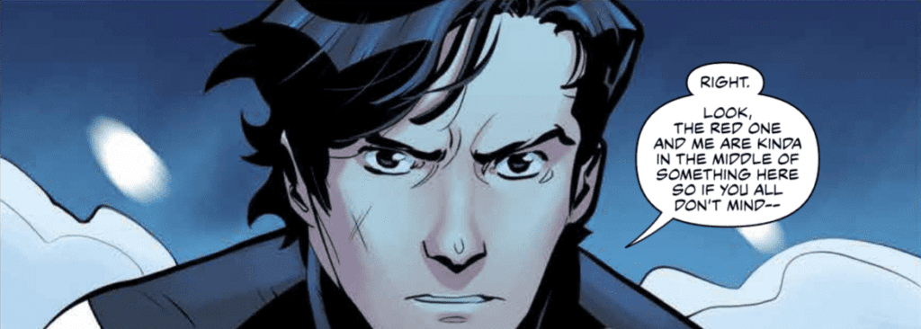
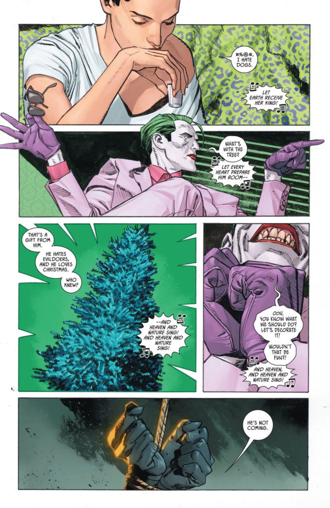
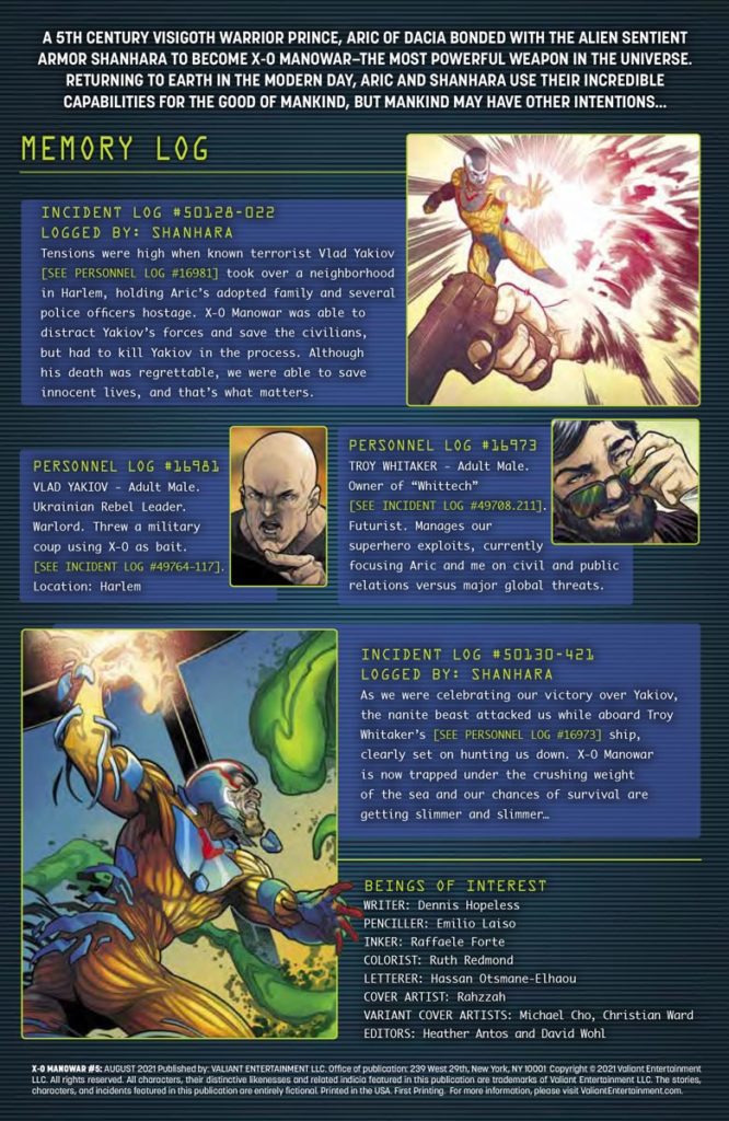
Aric of Dacia (a.k.a. X-O Manowar) works alongside tech billionaire Troy Whitaker to keep his image positive. While Aric can handle warlords, he struggles against the press and hyper intelligent nanites.

X-O Manowar #5: Keeping The Suspense Constant

After such a long hiatus, Hopeless opens X-O Manowar #5 with all the suspense from the last issue. Aric is vulnerable with his armor, Shanhara, stuck in hibernation. So, Troy has to fill in the role of Aric’s guide. Thankfully, Troy opens up a little more as a character. He becomes more than just the eccentric billionaire archetype. Troy believes in Aric and Shanhara’s potential as heroes to overcome the nanite goop that’s been attacking them all. Because, apparently, Shanhara is the only threat to this technological singularity.Aric getting close to Hopeless

Sliding Scales Of Anticipation

Every artist in X-O Manowar #5 adds a significant layer of scale to the plot. The pencils by Laiso create scenarios where characters like Aric look so small, the weight of the situation could crush him. If not for the inking by Forte outlining Aric’s hand, readers might not even notice his vulnerable position under the nanite swarm. That includes the coloring by Redmond where the blue elements of Aric’s costume blend together with the background, except for the yellow pieces that help highlight his outline.

X-O Manowar #5 best lettering
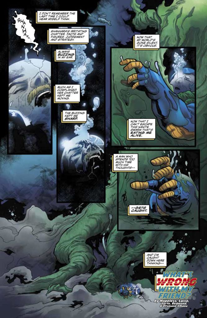
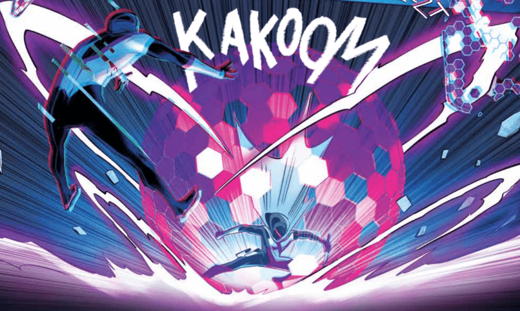
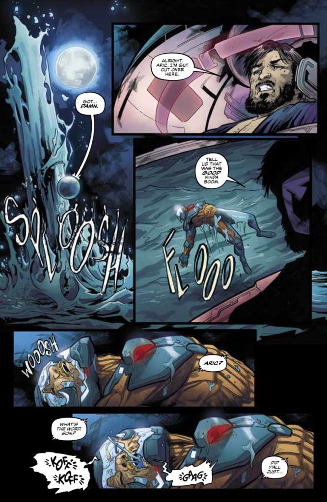
As for Otsmane-Elhaou’s lettering in X-O Manowar #5 gives every action twice as much life. Otsmane-Elhaou designs the word balloons with effects where regular talk features the standard round shapes, with occasional decorations like electric ripples. Other times, more chaotic sounds like coughing are shown in distorted word balloons with fonts and words out of place. But even these pale in comparison to the tailored illustrations of sound effects with exaggerated lengths and size. All of which emphasize the actions taking place to an absurd degree.

Check Back In For X-O Manowar #5

X-O Manowar #5 sets the stage for a science-fiction epic with artistic suspense. Each bit of art adds levels of excitement ready to engage readers for issues to come. In all consideration, it was well worth the wait for this new chapter.

Monkeys Fighting Robots Youtube

Review: BERMUDA #2 – The Colorfully Detailed World Of Pirates

Bermuda #2 Cover

Bermuda #2, from IDW Publishing, comes to comic stores on August 18th. Writer and letterer John Layman slows the pace of the plot to allow the reader to experience Bermuda’s setting. With artist Nick Bradshaw, every page is filled with lively images that tell their own stories. All while colorist Len O’Grady makes a few plot-related elements stand out.

Background

Bermuda tells the story of the titular adventurer, named after the very region she lives in. Exotic things like giant ridable lizards are normal for her; but an actual adventure to rescue a castaway’s sister is something she wants no part of.

Bermuda #2 Swashbucklers Galore

Bermuda #2 puts a little more focus on Layman’s world. The opening gives readers an idea of the setting. The island in the Bermuda Triangle holds the potential for adventure all around. There’s even an ensemble of pirates in a very long rivalry with another crew, a rivalry about who can make better alcohol. But with not enough time to enjoy this part of the triangle, the issue takes the time to capture imaginations with the next issue’s antagonists. Because not even the cutthroats want to mess with some magic fish people who possess a language Layman decorates with special symbols and black word balloons.

Bermuda IDW

Mapping The Triangle

Bermuda #2 has Bradshaw showcase some campy characteristics for memorable moments. All of the elements of a pirate fantasy are on display: peg legs, a town made of recycled pirate ships, and even some trained monkeys. For such a short appearance, everything in this issue will not be so easily forgotten.

With all of the activity going on in Bermuda #2, both Bradshaw and O’Grady take measures to keep the reader’s attention. Bradshaw employs bolder outlines around characters who move the plot forward. But perhaps it is O’Grady’s use of the color red that makes the most progress. Most of the pirates who wear a darker red push the plot around, with the brighter red colors making the most significant contributions. That’s why the brightly red-haired Bermuda is able to overcome them in plot relevance.


Have A Taste of Bermuda #2

Bermuda #2 gives readers a glimpse into a larger world, enough for readers to become more curious. No space is wasted in getting the reader’s attention with a sense of culture and adventure. With more to come, readers are sure to want the next issue even more.

Monkeys Fighting Robots Youtube

Review: RADIANT BLACK #7 – Everything is Coming Together

Radiant Black #7 Cover

Radiant Black #7, out today from Image Comics, marks the beginning of the series’ second arc and begins to show us what this series is all about.

Radiant Black #7 Art Example
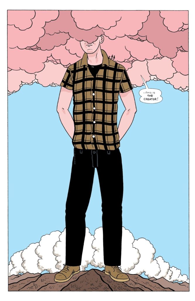
Kyle Higgins made the first arc of the series’ an unforgettable beginning, and he’s on track to make this second arc just as high-quality. Radiant Black #7 shares many aspects that made the previous issues so great, such as light-hearted dialogue and glimpses of the larger world we have yet to explore. The dialogue becomes especially important as we meet new characters, and the jokes and quirky things they say both humanize and endear them to the reader. This issue introduces us to new elements of the world but brushes them aside as they are not vital to the immediate story. This keeps readers engaged as they wonder when all these questions that are arising will be resolved.

Radiant Black #7 Story Example

Radiant Black #7 is full of fast-paced action, which allows Marcelo Costa to show off. The issue is full of breathtaking spreads that highlight Costa’s incredible abilities. He utilizes techniques such as action lines and blurring a figure to show the intense speed and energy of the fights in the issue. This is all without talking about the incredible designs of the newly introduced characters, which are all as iconic as superheroes that have stuck around since the Silver Age.

Natália Marques does a fantastic job of making the fights stand out in Radiant Black #7. The issue’s color palette is also extremely broad and bright, making the reading experience seem more fun than dramatic, which is a nice change of pace since this is the first issue that isn’t addressing intense emotional conflicts. Marques also does a phenomenal job of coloring space when it’s a backdrop. Space in the issue is much more than a black void, and is full of the greens and blues that you would see if you were looking at images from a satellite.

Radiant Black #7 Color and Lettering Example

Radiant Black #7 features some fantastic lettering that provides in-depth detail into how the characters speak. Becca Carey will make a word bold or give a red outline on a speech bubble to add emphasis to specific phrases, but she will also use less common techniques such as changing the shape of part of a speech bubble to show a change in the line delivery. The font choices for the sound effects do a splendid job of capturing the intensity of the battle, and Carey provides excellent lettering all around for the issue.

Radiant Black #7 is a start to the new arc that will not disappoint and retains the fun and engaging feel that has made the series so enjoyable to read in the first place. If you enjoyed the first arc, you will not want to miss this issue, where the series begins to come together into the Power-Rangers-like experience we were promised. Pick up Radiant Black #7, out from Image Comics August 18th, at a comic shop near you!

Monkeys Fighting Robots Youtube

BOOM! Studios Exclusive First Look: SEVEN SECRETS #12

boom! studios exclusive preview comics seven secrets

SEVEN SECRETS #12 hits your local comic book store September 15th, but thanks to BOOM! Studios, Monkeys Fighting Robots has an exclusive five-page preview for you.

About the issue:
A dangerously close encounter with Amon leaves Caspar shaken to the core. With the
Order divided and at a disadvantage, will the traitor finally accomplish their mission from
within? One thing is for certain, it will bring them one step closer to exposing the
remaining Secrets and nothing will ever be the same…

SEVEN SECRETS #12 is by writer Tom Taylor and artist Daniele di
Nicuolo, with colors by Walter Baiamonte (with assistance by Katia Ranalli), and letters by Ed Dukeshire. The main cover is by di Nicuolo, with variant covers by Toni Infante and Miguel Mercado.

Check out the SEVEN SECRETS #12 preview below:

boom! studios exclusive preview comics seven secrets

boom! studios exclusive preview comics seven secrets

boom! studios exclusive preview comics seven secrets

boom! studios exclusive preview comics seven secrets

boom! studios exclusive preview comics seven secrets

boom! studios exclusive preview comics seven secrets

boom! studios exclusive preview comics seven secrets

boom! studios exclusive preview comics seven secrets


Are you reading SEVEN SECRETS? Sound off in the comments!

Monkeys Fighting Robots Youtube

Review: THE NIGHT HOUSE Brings Atmospheric Ghost Story

The Night House is a psychological horror film on the surface, but underneath lies a chilling love story. Its examination of the grief process, which is heightened by a tremendous lead performance, is done to near perfection. Ghost stories still have a place in the horror genre, and The Night House is a great example of that. As it plays out, audiences will be expected to piece together the puzzle behind this mystery.

Becoming immersed in this narrative is unavoidable. The Night House isn’t a complete original tale, but constantly subverts expectations. The film was a hit at the Sundance Film Festival last year. After being delayed, it will arrive in theaters this Friday. Directed by David Bruckner and written by Ben Collins and Luke Piotrowski. The Night House stars Sarah Godlberg, Stacy Martin, Vondie Curtis-Hall, Evan Jonigkeit, and Rebecca Hall. The film follows Beth (Hall), newly widowed after her husband Owen (Jonigkeit) shot himself. Determined to understand why he did this, Beth unravels a darker explanation.

Meticulously told through dialogue riddled with clues and foreshadowing, The Night House is an impressive screenplay. Beginning after an apparent funeral for Owen, we are introduced to Beth, his highly depressed and heartbroken wife. School teacher by day, grief stricken mess by night, it becomes clear her depression has been a problem for a while. The Night House relies heavily on attentiveness from its audience. Its ambiguous ending is supported throughout the screenplay, but it still feels like it’s lacking. Up until its end, audiences are taken on an exhilarating ride while Beth unravels Owen’s secrets. Beth died for a few minutes as a teen, so her outlook on life hasn’t been the same since. The knowledge of this event rationalizes her jokes about death when she’s with her friends. She’s spiraling, and it’s only exacerbated by random sleep walking experiences involving an unseen force.

The Night House portrays Beth as a sympathetic widow who anyone can relate to. Her descent into madness over Owen is unnerving to watch. Her sanity is slowly declining, until this concerning behavior becomes justified. Owen did have many secrets, but they were kept hidden for a reason Beth thought she had put behind her. Luke and Piotrowski have put together a hauntingly beautiful story rooted in paranoia, love and heartbreak. The blend between horror and drama is at its best during Beth’s sleep walking. A lengthy jump scare sequence keeps the anxiety high during her ominous late night adventures. A rare instance where the jump scares are not ill-timed, or without reason.

Hall is breathtaking as Beth, she skillfully portrays a woman trying to navigate life after losing her husband. With each new piece of information related to Owen’s life, Hall channels the emotions with ease. Heartbreak grows to confusion, confusion leads to anger, and Hall’s gripping performance makes you feel just like Beth as these mood changes occur. Bruckner uses the environment to create this lingering feeling of dread that grows with each new revelation. The use of lighting and shadows to keep audiences engaged is handled masterfully.

Paced very methodically, this choice never becomes a problem for The Night House. The score rings throughout the house, as if it were part of the structure. Keeping the suspense high and becoming one with certain creaks in the house itself. Elisha Christian’s cinematography provides beautifully haunting visuals drenched in a remarkable color pallette. Specifically towards the end, the use of red lighting gives great aesthetic pleasure as the mystery comes full circle.

The Night House contradicts itself on purpose and while the ending may not live up to what came before, it’s still executed so well. Hall’s performance carries the narrative and audiences will get lost in her downward spiral. Ghost stories done in this manner, deserve every bit of praise. The Night House is a spectacular film that will make you reevaluate your life.

Monkeys Fighting Robots Youtube

Review: EAT THE RICH #1 Devours Its Subject Matter

From writer Sarah Gailey and artist Pius Bak comes a brilliant and incisive comic book that mixes ominous horror with sharp commentary. Colored by Roman Titov with letters from Cardinal Rae, Eat The Rich #1 is a phenomenal book that excels at every objective a comic can try to accomplish. With a wickedly smart script and outstanding visual work, this could very well be the best comic of its kind.

“Welcome to Crestfall Bluffs! With law school and her whole life ahead of her, Joey plans to spend the summer with her boyfriend Astor in his seemingly perfect hometown. It’s a chance to finally meet his family and childhood friends, all while enjoying a vacation where every need is attended to. But beneath the affluent perfection lies a dark, deadly rot… will Joey discover the truth before it’s too late, and even if she does, can she survive to tell the tale?”

Writing & Plot

Sarah Gailey‘s script for Eat The Rich #1 is a multi-layered work of comics magic. Gailey makes compelling terror through the eyes of a brilliantly characterized protagonist. Joey’s nervousness as the outsider to the wealthy society she is trying to blend in with is written perfectly. Her nervous tics in her speech and constant mental self-assurances all feel real. The way she deals with her boyfriend Astor and his personal issues makes her endearing and personable. Her status as an outsider to this alien social circle she’s stepping into is something the majority of us can surely relate to. Gailey’s dialogue is snappy and naturalistic, and their internal narration is just as great. From a stylistic and character standpoint, this script is an absolute gem.

The real genius and substance in this first issue is how Gailey actually approaches this strange, secretive society of one-percenters. The impenetrable societal norms of people with so much wealth and power they are almost inhuman is both a great plot device for the horror, but also an incredibly timely allegory. Gailey makes it clear that Joey’s quest is going to be harder than she could ever imagine it. This isn’t just because of what the wealthy do behind closed doors, but because they simply don’t partake in reality the way normal people do. Saying anything more would be spoiling the experience, but Gailey takes a very real concern and addresses it in a sharp and entertaining manner.

Art Direction

The visual end of Eat The Rich #1 is absolutely stunning, thanks to artists Pius Bak and Roman Titov. Bak’s pencils and inks are expressive and detailed with the intent of crafting atmosphere. His characters are all unique and he creates expressions with a natural ease. From Joey’s flabbergasted face to the facades of wealthy family members, everyone looks unique and easy to read. Bak’s heavy inks create much of the ominous atmosphere throughout the panels. Character’s faces are often obscured in shadow at prescient moments. Set pieces, like the house or certain rooms, are shrouded in black and cast deep shadows. Bak sells the fact that there is something wrong with how unsettling and dark his pencils and inks are here.

Roman Titov’s colors highlight the uneasy atmosphere with an eye-popping contrast-filled palette. Much of the Crestfall Bluffs scenery is bathed in peach and pink hues. Titov crafts a distinct sort of pop-art vapor wave aesthetic in many of the panels. However, there’s an almost Lynchian uneasiness to the whole experience. Much like with Bak’s pencils, Titov creates contrast within the details. He colors specific little details within the panel to sort of throw off the false-prettiness of Joey’s view of Crestfall. They serve to throw the reader off as well, making you wonder what the hell is happening here before the carnage is revealed.

Cardinal Rae’s lettering switches font styles between dialogue and narration, and it works spectacularly well. Her style all-around is very modern, with thin, almost handwriting-esque letters contrasted with a similar italicized font for internal narrating. Her tonal shifts are seamless, and I can hear the characters voices perfectly through how she presents her boxes and bubbles. This first issue is front-to-back perfection in terms of visual direction and stylistic achievement.

Verdict

Eat The Rich #1 is a perfect mixture of insight, entertainment, and artistry. Sarah Gailey’s script is almost too smart for its own good. They mix brilliant character writing, intelligent commentary, and take an almost cliched premise and make it genuinely frightening. Pius Bak and Roman Titov’s visuals are both gorgeous and eerie, creating a perfectly contrasting atmosphere for this comic book. Be sure to pick up this incredible first issue when it hits shelves on 8/18!


Monkeys Fighting Robots Youtube

Review: NIGHTWING #83 is a Heartwarming Tribute to Alfred Pennyworth

Fans of Dick Grayson are going to love this issue. DC Comics’ Nightwing #83 is all about the good Dick has done over the years. And it’s about the good he plans to do in the future. But all of it is spurred on, and ultimately for, Alfred Pennyworth. Writer Tom Taylor, artist Bruno Redondo, colorist Adriano Lucas, and letterer Wes Abbott are creating a tribute to the man behind the Bat family with this series.

Nightwing DC Comics Taylor

Writing

Taylor gives us a tour of Dick Grayson’s life in this issue. We see him interacting with the Teen Titans, the Bat family, and even a Justice Leaguer or two. In many ways, Taylor makes this feel like the breath before diving in. He teases dark new chapters. He even points out how difficult Nightwing’s projects for Blüdhaven are going to be. But Taylor still takes the time to let Nightwing take stock. We not only see the ways that Dick Grayson has touched the lives of so many, but we so did Alfred. Alfred was a man who meant so much to the DCU at large, not just the Bat family. With some jokes and some danger thrown into the mix, this issue is fun and moving.

Art

There are a lot of bright moments to Redondo’s art in this issue. His action scenes are dynamic and brilliantly done. As Nightwing runs towards a helicopter that’s shooting at him, Redondo makes it so that the shots are coming at the reader. We feel like we’re right there with Dick, being shot at. And when Nightwing swings from the helicopter, we see multiple instances of him in one panel, marking his trajectory through the air. But it’s when he gets home that we see the beauty of Redondo’s art really shine. Dick lies down in bed, after a long couple days. His brow is knitted together and he seems troubled, but his eyes are closed. Then his face relaxes and he’s asleep. It’s a small moment in a rather action-packed issue, but it’s beautifully done.

Coloring

There’s an overall arc for the color palettes in this issue. When we begin the issue, Nightwing is in danger. The colors are dark blues and reds. But as Nightwing starts making plans for Blüdhaven, the colors brighten. Lucas shows that Dick is doing what he’s supposed to be doing. He’s laying claim to his destiny. Then, as the villains of the story react to the news, the colors return to the danger filled pages of red and blue. Nightwing might be making bright plans, but there’s going to be some resistance.

Lettering

Abbott continues to use spacing to show levels of intimacy between characters. When Nightwing’s word balloons are overlapping or being overlapped by someone else’s lines, it’s a sign that he feels a closeness to them. We can hear the warmth in their voices. But sometimes, the same effect is used to show a familiarity of circumstances. When Nightwing has to cut off one of Blockbuster’s rants, their lines collide in the air. Dick has done this 100 times before, so he knows when it’s his cue. But in each of these moments, Abbott creates a visual rhythm. We can hear the pauses and the banter.


DC Comics’ Nightwing #83 is a really wonderful issue. It takes a tour through the life of Dick Grayson, pointing to all of the things that have made him great. Pick up Nightwing #83, out from DC Comics August 17th, at a comic shop near you!

Monkeys Fighting Robots Youtube

Review: BATMAN/CATWOMAN #6 and the Complicated Ms. Selina Kyle

Batman Catwoman King DC Comics

DC Comic’s Batman/Catwoman is a quieter look at the superhero genre. It doesn’t concern itself with moral blacks and whites. This is a series that is written entirely in greys. But it also wants to look at the “blacks and whites” of this genre and see how they hold up in a messy world that colors outside the lines. Writer Tom King, artist Clay Mann, colorist Tomeu Morey, and letterer Clayton Cowles use Batman/Catwoman #6 to discuss Selina Kyle’s complicated journey through life.

Batman Catwoman King DC Comics

Writing

When we first see Selina, she’s hanging out with Joker like he’s an old friend. King always brings us back to this relationship. At first, it seemed like Selina and Joker got each other. They were on each other’s level and they didn’t have to pretend around one another. But King juxtaposes this Selina with the older Selina from the future. Old Selina is impulsive, proud, and incredibly sure of herself. Some wrinkles and a little bit of grey hair won’t stop her from jumping right back into her old Catwoman outfit, jumping around on rooftops like she’s not a day over 25.

But when we really focus in on the younger Selina, she’s not this bold. Her lines may read as a casual exchange with her friend, or they’re part of a nervous dance. She doesn’t know what the Joker will find funny or infuriating. And how is he planning on getting under her skin this time? At one point, when they decide to decorate a Christmas tree together, she gets out her box of ornaments. Before Joker can say anything, Selina takes the lead: “Jesus &#$%@. These are all cats. I’m a cliché of myself.” It feels like she’s beating Joker to the punchline. She isn’t confident in front of him. In fact, she’s a ball of insecurities. But if she can criticize herself before he has the chance, this cool, calm, and collected charade can go on.

Art

More than ever, in this series, the past and the future are interacting. Mann, on several occasions, will show a page set in the past, with one panel at the beginning that is set in the future, or vice versa. These timelines are inextricably related, and Mann wants to remind us of that. They exist because of each other.

But there’s an even more subtle moment of Mann’s art that really shines in this issue. When Helena is questioning Selina at the dinner table about the murder of the Joker, a mouse appears in the page gutters. It sticks its head into the first panel, hovering over Selina. As readers, we subconsciously make the connection that Selina must be the mouse. But then it scurries over to Helena’s side of the page, just as the dynamic of the scene is being flipped on Helena. And then we see the paws of a cat, running from Selina’s half of the page over to the mouse. Mann is telling us that this mother and daughter are playing a game of cat and mouse. But while Helena may think she holds all the cards, her mother can turn things on her in mere seconds.

Coloring

There is a ton of color in this issue. Morey emphasizes the sheer joy of certain scenes, and the foreboding danger of others. In a brilliant splash page of Helena and Selina fighting crime — with great new characters like Dragoon, Four-Face, and Polymath — Morey gives us brilliant purples, yellows and greens. Not only does it look like something out of an old pulpy comic and make the scene fun, it covers the page in the colors of Catwoman. She’s literally wearing her old purple and green costume as she kicks butt, blending in to the lightning bolts of green and purple all over the page. The colors make it clear that this is Selina in her element.

Lettering

Cowles does a great job of creating dynamics in a room. When Commissioner Dick Grayson speaks to the older Selina, the tail for his word balloon is long. When she responds, it’s with a word balloon that’s right next to her face, so the tail is short. These small visual elements make it feel like Dick chooses his words with Selina. He respects her, he pauses and thinks before speaking. But Selina is the queen of this crimefighting world and she always knows what to say before anyone else is even done talking. She’s quick, confident, and to the point.


DC Comics’ Batman/Catwoman series is showing us the complicated nature of Selina Kyle. She’s a hero, she’s a villain, she’s lonely, she’s surrounded by those who love her. But above all, she’s an interesting, three dimensional, human character. This creative team is masterfully turning this woman of many contradictions into the star of the show. Pick up Batman/Catwoman #6, out from DC Comics August 17th, at a comic shop near you!

Monkeys Fighting Robots Youtube