Home Blog Page 133

Review: ARMY OF THE DEAD Turned A Fun Premise Boring

Zack Snyder is a filmmaker who started his career with a remake of Dawn of the Dead and has been known for making comic book movies. He combines the zombie genre with his comic book style with Army of the Dead.

Las Vegas has suffered from a zombie breakout and the American government has blockaded the city. The American President plans to launch a tactical at Las Vegas to rid the world of zombies, and it would be really cool. Scott Ward (Dave Bautista) gets an offer from Bly Tanaka (Hiroyuki Sanada), a casino owner who has $200 million in his Las Vegas vault. Bly promise Scott and his team they can keep $50 million if they can retrieve the money before the nuke is launch.

Army of the Dead is a film that Netflix has pinned a lot on. It has a large budget for a Netflix film, and it is set to start a multimedia franchise. A prequel film, anime series, and TV series are set to be released and a sequel has been proposed. It was a film Snyder had a big hand in because as well as directing, he produced it, co-wrote the screenplay, and was even the cinematographer. However, Army of the Dead was a lesser effort from the divisive filmmaker.

Snyder wanted to make the ultimate genre mash-up. It was a zombie horror, an action flick, and a heist film all in one. It had the potential to be a film that gorehounds could lap up, but it failed to live up to the hype.

The big problem with Army of the Dead was one that affects a lot of current zombie media: oversaturation. Since The Walking Dead started airing there have been a lot of zombie films, shows, and video games. It’s hard for anything to stand out. Army of the Dead tries to stand out by being a heist film but still felt derivative. The setting and tone of Army of the Dead seemed like the Dead Rising games. It was even structured like a video game.

Even when Snyder and his team did try to do something different it still felt like it was lifted from other properties. The zombies in Las Vegas were split into two types. There were traditional zombies and Alphas, more intelligent zombies that had formed a primitive society. This was similar to the White Walkers in Game of Thrones who had the intelligent leaders and the living dead who were the grunts. Army of the Dead even shared a plot point from the third season of Game of Thrones where it was revealed people made sacrifices to the zombies.

Army of the Dead also had cliches from the heist and action genres. When Scott was assembling his crew, it felt like the Rick and Morty episode “One Crew over the Crewoo’s Morty” because it was so easy. I’m surprised the crew members didn’t say ‘you son of a bitch, I’m in.’ Like many action and heist films, Army of the Dead had characters who had their own agendas and were willing to betray their colleagues.

Being unoriginal can be forgiven if a film it’s fun. Army of the Dead had the potential, but Snyder can be an indulgent filmmaker. He released a four-hour cut of Justice League and with Army of the Dead he delivered a two-and-half long film. Army of the Dead didn’t need to be that long. There was a scene that the film was trying to establish the world and rules for the potential sequels, but the story was thin. It could have come in at a lean 105 minutes.

Snyder’s greatest attribute is his visuals. Even his more criticized films like Sucker Punch and Batman vs. Superman had a distinctive style and he’s usually able to craft some excellent action sequences. Army of the Dead lacked the panache that Snyder’s known for. The action was lacking because there was no sense of style or invention. One of the oddest decisions Snyder made was having loads of out-of-focus shots. It got so annoying that I wanted to shout ‘hire a focus puller!’

Snyder has been seen as a director who takes an overly dark and serious approach. His DC films suffered from this. With Army of the Dead, he made a conscious effect to lighten things up. There were a lot more jokes that were usually expected from a Snyder film. Matthias Schweighöfer’s Dieter was the comic relief character. He was a safe cracker who was excited to work in the abandoned casino, but not so keen on facing the living dead. Stand-up comedian Tig Notaro had a prominent supporting role, and her character had a causal approach to the mission.

Army of the Dead did have some fun moments. When the team go into the casino filled with dormant zombies it had a chilling atmosphere. The characters had to move past them slowly and quietly because they were surrounded. It was an effective horror moment. When the team reached the vault they had to use a zombie to set off all the traps. It allowed for some gory fun.

Army of the Dead should have been a fun gory romp because of its simple premise. What Snyder delivered was an overly long and dull film that stretched a thin premise. It lacked the sense of flash and style that Snyder’s known for.
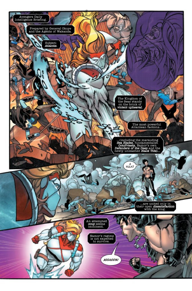
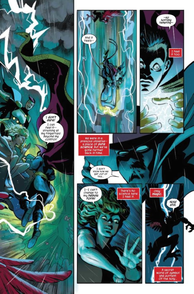
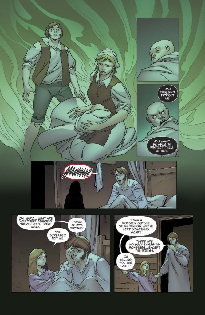
 

Monkeys Fighting Robots Youtube

Marvel Comics Exclusive Preview: AVENGERS #49

marvel comics exclusive preview avengers #49

AVENGERS #49 hits your local comic book store October 13th, but thanks to Marvel Comics, Monkeys Fighting Robots has an exclusive four-page preview for you.

About the issue:
“WORLD WAR SHE-HULK” Goes Nuclear!

War beneath the waves. The Winter Hulk has been sent to Atlantis with a dark mission. And things will get even darker and bloodier if the Russian super-assassin Red Widow has her way. But no matter who wins, She-Hulk and the Avengers will be changed forever! And next month, it all explodes in AVENGERS #750!

The issue is by writer Jason Aaron and artists Javier Garrón & Flaviano, with colors by David Curiel, and letters by Cory Petit. The cover is by Garrón and Curiel.

Check out the AVENGERS #49 preview below:

marvel comics exclusive preview avengers #49

marvel comics exclusive preview avengers #49

marvel comics exclusive preview avengers #49

marvel comics exclusive preview avengers #49

marvel comics exclusive preview avengers #49


Are you reading AVENGERS? Sound off in the comments!

Monkeys Fighting Robots Youtube

Review: DEFENDERS #3: Comic Books Are Magic Spells

Defenders #3 Cover

Defenders #3 continues this epic of Marvel’s non-team by diving straight into comics magical connections. As the characters and art demonstrate, a comic book’s structure and narrative are like spells.

Background

Just a bit of recapThe Defenders magically summoned by Dr. Strange and their journey takes them to unusual places. In the chase for a rogue scientist who goes through past versions of the Marvel Universe’s reality, they recruit Taaia, the mother of Marvel’s Great Devourer Galactus.

Defenders #3: A Spell’s Outline

Defenders #3 spread part 1
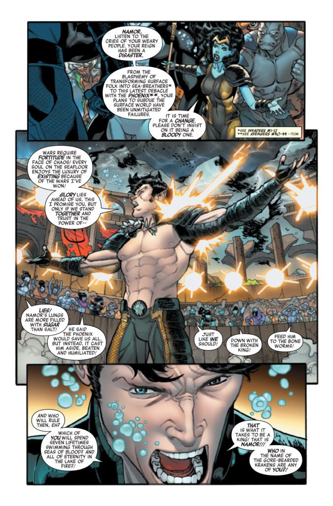
Al Ewing continues the adventure of a lifetime, this time by making clever use of foreshadowing. Harpy serves as the point-of-view character of Defenders #3 and explains her role in the bigger narrative. She’s the one who has to save everyone’s skins the most, as the intro demonstrates. But it’s not just because Harpy’s the only one to retain her full power, unlike the others. It’s because Ewing makes use of Harpy’s childhood as a military brat. spread part 2

The CMYK Model Is Magic

Javier Rodriguez highlights the design of Moridun, the creature who becomes the Devourer from last issue, Omnimax. His cephalopod-like appearance, tall stature, and the way Moridun moves his limbs to cast magic looks just as terrifying as his future form.

Rodriguez also decorates parts of Defenders #3 with symbols that serve as creative exposition for an ancient magic system. Initially, Moridun uses these symbols to demonstrate his power over the fish-out-water Defenders. That is, until the Defenders are shown in panels that are shaped like these same symbols. Which means, even with their pants down, the Defenders have a chance against Moridun.

But it’s the fact that those panels are filled with CMYK colors that stand out. These colors tell the reader that comic books are magic in and of themselves.

The Magic Lettering

Joe Caramagna letters the words of the characters in patterns that befit them. Almost every humanoid speaks with the standard word balloon. But in the Sixth Cosmos’ reality, the more monstrous characters like Moridun and Harpy, with warped word balloons, are normal.

Defenders #3 is Spellbinding

Defenders #3 features an immersing look at how comic books function like magic. Through clever foreshadowing and artistic stylizations of comic book elements, the reader becomes spellbound. The reader is left waiting in anticipation for the next issue.

Monkeys Fighting Robots Youtube

Review: SOUL PLUMBER #1 – Back-Alley Exorcism

From writers Marcus Parks and Henry Zebrowski and artist John McCrea, along with colors from Mike Spicer and letters by Becca Carey, comes a gross and goofy slice of religious parody in Soul Plumber #1. Equal Parts Beavis & Butthead  and Preacher, this grimy opening chapter is both outrageously dumb and far wittier than it has any right to be.

“After attending a seminar hosted in a hotel conference room by a mysterious group called the Soul Plumbers, Edgar Wiggins, disgraced former seminary school student, discovers what he thinks is the secret to delivering souls from the thrall of Satan. But after stealing the blueprints and building the machine himself, out of whatever he can afford from his salary as a gas station attendant, Edgar misses the demon and instead pulls out an inter-dimensional alien with dire consequences for all of mankind.”

Writing & Plot

Marcus Parks and Henry Zebrowski bring the feeling of a Garth Ennis and Mike Judge collaboration in Soul Plumber #1. The irreverent humor of a wannabe priest, an insane combat vet, and a spazzy druggie on a quest to fight demons is already akin to something from an early Vertigo or underground comic. Plumber manages to be equally dumb and deceptively intelligent. Some of the trappings of its religious critique are old hat, but they’re hidden under how insane its characters are.

Despite how witless Edgar may be, his genuine desire to help and not judge his profane friends is genuinely endearing. He’s the kind of protagonist you want to root for, despite how dumb he actually is. Think Arseface from Preacher but as a seminary dropout and you’ve got a good picture. The dialogue is snappy, random, and laced with profanity. In other words, it’s perfect for this story. Each character has a different manner of speaking that makes it instantly easy to pin their personalities. Edgar’s naïve scripture quoting clashes with Elk’s friendly barrage of swearing, and even more with Scuzz’s nonsensical drug-fueled ramblings. Will this be a reading experience for everyone? Absolutely the hell not. For the right twisted readers though, this will be a blast.

Art Direction

I honestly couldn’t think of a better artist than John McCrea of Hitman fame to draw the grimy world of Soul Plumber #1. McCrea’s unique brand of messy yet expressive visuals bring these characters to life in spot-on sleazy glory. Each person is designed with their own instantly recognizable design that works perfectly under McCrea’s guiding hand. The scuzzy outer appearances of the cast blend them into this gross world yet become offset by their distinctive expressions. This mainly goes for Edgar, whose sympathetic looks manage to elevate him above his desolate surroundings – but just barely.

Mike Spicer comes through with the colors and therefore much of Plumber’s atmosphere and personality. There’s a distinct grungy indie comic feeling that Spicer’s work brings to the panels that is perfect for this issue. Everything is covered in a greasy green and brown-tinged palette. This kind of soupy look, the kind where it looks like everyone should be covered in cystic acne, is disgustingly perfect. Becca Carey’s letters manage to match the gnarly look of the art. Her rough-edged and sketchy fonts fit the art direction of the comic perfectly, while also ranging in size and focus to match the tone of the dialogue. Every nasty visual aspect of this opening issue offers the perfect amount of scuzzy detail.

Verdict

Soul Plumber #1 is a grimy, hilarious, and deceptively smart opening to this blasphemous mini-series. The script from Marcus Parks and Henry Zebrowski is complete with a colorful cast and irreverent humor that is sure to land with the right crowd. John McCrea and Mike Spicer’s art is detailed and perfectly scummy, crafting exactly the right atmosphere. Be sure to grab this new #1 when it hits shelves on 10/5!


Monkeys Fighting Robots Youtube

Interview: Scott Snyder Talks About The Future Of comiXology

Interview: Scott Snyder Talks About The Future Of comiXology

We Have Demons #1 written by Scott Snyder with art by Greg Capullo dropped on Comixology today. Yesterday morning we talked with Synder about the future of ComiXology and his three new titles coming to the platform.

LISTEN TO THE INTERVIEW BELOW:

We Have Demons written by Scott Snyder with art by Greg Capullo

Issue #1 Available October 5th

Interview: Scott Snyder Talks About The Future Of comiXology

In practically every folklore throughout history, there’s a struggle between angels and demons–beings of goodness and light and monstrous beings of darkness. But what if this struggle, this war for the soul of humanity, wasn’t rooted in the mystical or supernatural, but in science?

Lam was named after the first female angel, “Lamassu.” Lam never really understood her father’s devotion to their small-town Unitarian church. And when he dies under mysterious circumstances, she starts to question everything she thought she knew.

We Have Demons is full throttle entertainment by two comic book megastars, featuring action, conspiracies, secret organizations, monsters, mayhem, and a climactic war of good and evil with no less than the fate of the world hanging in the balance.

Clear written by Scott Snyder with art by Francis Manapul

Issue #1 Available October 12th

Interview: Scott Snyder Talks About The Future Of comiXology

Welcome to the future, a world where people can connect to the internet neurologically and mediate the real world through the lenses of their eyes, transforming reality. Everything can be skinned to fit a preference from steampunk to old-fashioned Hollywood glamour. If you can name it, you can live it. You choose how you see the world and no one else knows what you’re seeing.

San Francisco, private detective Sam Dunes is working a case when he’s approached by his former police partner, who informs him of his ex-wife’s alleged suicide. But nothing about this adds up. And when he receives a gift in the mail, Dunes finds himself pulled into a wild and twisting mystery that stretches from the city’s deadly underworld to the even deadlier heights of the city’s wealthy and powerful elite.

Night of the Ghoul written by Scott Snyder with art by Francesco Francavilla

Issue #1 Available October 19th

Interview: Scott Snyder Talks About The Future Of comiXology

It was said to be the greatest horror movie in cinematic history. Shot in 1936, “Night of the Ghoul” by writer/director T.F. Merritt was meant to sit beside “Frankenstein” and “Dracula” as an instant classic… But the legendary film never made it to the silver screen. Just before editing was finished, a mysterious studio fire destroyed the footage and killed the cast and crew during their celebratory wrap-party. Rumors of the doomed film’s greatness persist to this day, but no footage from it was ever recovered…until now.

Forest Inman is a horror film obsessive who digitizes old films for the famed Aurora movie studio. When he stumbles across a seemingly forgotten canister of footage, his discovery sends him on a dark odyssey to the California desert, where he’s warned by a mysterious old man that the film’s ghoul is far more than a work of fiction.

Night of The Ghoul is a dazzling work of contemporary horror, intercutting between the present-day narrative and the story of the lost film (drawn by Francavilla in stunning black and white).

Monkeys Fighting Robots Youtube

Review: THE SWAMP THING #8 – What is a Monster?

SWAMP THING RAM V DC COMICS

DC Comics’ The Swamp Thing has always been something of a horror series. Mike Perkins’ art almost seems to seize on the page at times, twisting and contorting into terrifying images. And writer Ram V’s scripts are often full of a quiet dread. But this series is as much a work of lyrical poetry as it is horror. With The Swamp Thing #8, writer Ram V, artist Mike Perkins, colorist Mike Spicer, and letterer Aditya Bidikar explore, through lyrical dialogue and breathtaking action, what it means to be a monster.

SWAMP THING RAM V DC COMICS

Writing

The rhythmic feeling to V’s writing in this chapter is impossible to miss. V is verbose and complex in his language. “The forest lies littered… with the effluent… of war,” he writes. At times it reads almost more like a hymn than a comic book. But that’s the point. V is writing about things that are larger than these comic pages can express. Swamp Thing is a walking force of nature. He cannot be captured on the page. Yet V’s commitment to this style of writing doesn’t stop him from also allowing the story to joyfully take part in comic book tropes. It’s enemy after enemy that Swamp Thing faces in this issue. He stops one foe only to have another bigger, more dangerous rival revealed. V sees the best of both worlds, his artistic writing style and the pulpy excitement of comic book fights, and says “Yes, please,” to all of it.

Art

Perkins art similarly bounces back and forth between these two styles. We get the truly emotional moments of Swamp Thing questioning his purpose. His face is so expressive, you can see Levi’s humanity beneath the leafy exterior. But then Perkins shows he’s just as brilliant at big monster fights. One scene shows Swamp Thing and Parasite, duking it out. Behind them, there are a bunch of panels of smaller moments going on in the fight. In this background we see Swamp Thing’s eyes widen in fear, before they narrow again with resolve. Not only does Perkins manage to have his art be both intimate and full of flashy action, but he manages to do both things in a single image. It’s a fantastic balance of styles that at times feels like it ought to be impossible to achieve. But sure enough, Perkins does it!

SWAMP THING RAM V DC COMICS

Coloring

As is true of many of the other chapters of this series, this issue has a beautiful interplay of green, orange and purple. These seem to be representative of the major themes of this comic. Swamp Thing, of course, is green. But so is the toxin that is killing the forest. Spicer shows us Swamp Thing’s feeling of responsibility. Not only does he feel like he should be protecting the trees, but he feels implicated in their deaths. And when we see Levi’s past, it is shown in orange hues. As a new character is introduced, they are surrounded by orange. Spicer gives us this visual cue that this character has been influencing Levi for longer than we could know. Spicer creates a gorgeous tapestry of colors, all ripe with a deeper meaning.

Lettering

This issue feels like a license for Bidikar to go wild. Nearly every page is filled with really expressive lettering. Even when they’re simply writing caption boxes, Bidikar shows the fade from Swamp Thing’s narration to Levi’s. But it’s in the last few pages that Bidikar pulls out all the stops. The sound effects of a character contorting in pain, Swamp Thing’s cries of grief as he realizes a horrible truth, and Peacemaker’s grunts as he fights are all wildly expressive. We see a big “OOF!” of Peacemaker being thrown against a tree and a smaller “nngh!” as the pain of the moment sinks in. Bidikar shows us every beat of every fight by constantly switching up how things are lettered.


The Swamp Thing is an incredible series. It’s as much a meditation on life and humanity as it is an action comic full of thrilling fight sequences. This creative team has mastered small, intimate moments and big, bombastic ones. Pick up The Swamp Thing #8, out from DC Comics October 5th, at a comic shop near you!

Monkeys Fighting Robots Youtube

Heavy Metal Exclusive Preview: INTRUSION

intrusion heavy metal magma comix comics exclusive preview

INTRUSION is out October 6th at your local comic shop, but thanks to Heavy Metal, Monkeys Fighting Robots has an exclusive six-page preview for you!

About the issue:
Set deep in the Louisiana bayou in the late 1760s, INTRUSION tells the story of the Broussard family, Acadians seeking a new life after being cast out of Canada by the British and having lived the last several years in indentured servitude. They arrive in Louisiana desperate for a second chance. Settling on a patch of remote land bordered by a “cursed” swamp, Jacques will do anything to defend his family’s homestead…even if that puts them on a collision course with a creature that dwells in the bayou. At its terrifying heart, INTRUSION is a parable about the consequences of misguided prejudice and hate. The patriarch of the Broussard family will stop at nothing to defend his family from the horrors that lurk in the swamp—and neither will the Grunch!
 
Conceived as a one-shot horror comic from creators Ethan Sacks (Star Wars: Bounty Hunters, Old Man Hawkeye) and Marco Lorenzana (Heavy Metal Magazine, Hulk), the story makes use of the flip book format in an innovative way to tell the story from two very different perspectives—the human and the monster. The story from the human perspective starts at the front of the comic and the story from the monster perspective starts from the back, merging in the center of the comic on a double-paged spread.

INTRUSION is by writer Ethan Sacks and artist Marco Lorenzana, with colors by Erick Arciniega, and letters by Jaime Martinez. The cover is by Daniel Govar, with variants by Lorenzana. Denton J. Tipton serves as editor, and publisher of Heavy Metal’s Magma Comix imprint.

Check out the INTRUSION preview below:

intrusion heavy metal magma comix comics exclusive preview

intrusion heavy metal magma comix comics exclusive preview

intrusion heavy metal magma comix comics exclusive preview

intrusion heavy metal magma comix comics exclusive preview

intrusion heavy metal magma comix comics exclusive preview

intrusion heavy metal magma comix comics exclusive preview

intrusion heavy metal magma comix comics exclusive preview

intrusion heavy metal magma comix comics exclusive preview

intrusion heavy metal magma comix comics exclusive preview

intrusion heavy metal magma comix comics exclusive preview


Are you looking forward to INTRUSION? Sound off in the comments!

Monkeys Fighting Robots Youtube

INTERVIEW: Content Creator The Closer Look Dives Into Movie Analysis On YouTube

Closer Look-YouTube-film

The Closer Look is a YouTube channel written, produced, and hosted by London-er Henry that’s dedicated to examining pop culture in ways beyond your typical praise, hate, or egg hunting.

The Closer Look features topics such as ‘How to Make a Great Villain’ or ‘How to Harm an Audience.’ The latter delves into Wonder Woman 1984 and picks apart the blockbuster film in ways you won’t find on many other channels. Henry wasn’t a fan of the film, but his videos don’t devolve into hate but instead a deeply curious analysis of the movie, its themes, merits, and narrative construction.

PopAxiom spoke with Henry about the film that blew his mind, his early days as a content creator, and how passion led to the success of The Closer Look.

Blew My Mind

“I’ve always loved cinema,” Henry begins, “but I guess the moment where I realized that I love film to bits is when I saw Interstellar in the theater. It’s a weird film. It’s either the best movie ever or terrible. I’ve never met someone who doesn’t hold one of those two opinions.”

Henry was around 15 when he first watched Interstellar. “The way it would work is that I’d go to the cinema with my dad. On the drive home, we’d rant about how terrible or good a film was. But with Interstellar, I was not in the mood to talk about it at all right after. I was blown away. For an hour or two after, I was spaced out; I was lost in the movie. That very rarely ever happens to me. I’d say it’s my favorite film of all time.”

Henry’s no doubt a Christopher Nolan fan, so what does he think about Nolan’s last film, the polarizing Tenet? “I think it was Nolan experimenting. Or maybe it’s some sort of mid-life crisis.”

closer look-youtube-content

About The Closer Look

Henry’s close to a quarter-century into his life. His journey into content creation started nearly a decade ago. “I started trying to be a YouTuber when I was around 14 years old. For anyone who didn’t watch any of my old videos, you are not missing out. I did a very, very, VERY, let me stress that, very bad gaming channel.”

“For four and a half years,” he continues, “I knew that I wanted to make YouTube into a job. So I was grinding my ass off trying to grow the channel. But, in the end, it only got to around 8,000 subs after all that time. The reason why is because I was incredibly incompetent and didn’t know what I was doing.”

Henry’s aspirations to be a professional content creator diminished slightly. “After all that time, I said, ‘I’m done trying to grow a YouTube channel.’ So, I just kept doing it as a hobby. Then, I started making videos about films, something I’ve been deeply passionate about.

That first essay about movies was “How to Make a Great Villain. Bear in mind, on my old videos, I’d be lucky to get 300 views per. But right now, that video is sitting at two million views.”

“After I did about ten videos,” he says, “it hit me that the channel was growing. As cliche as it sounds, me following my heart, my passion, literally was the best call I could’ve made.”

Henry’s Philosophy

The brilliance of YouTube is the insane variety of content. There’s a home for every kind of channel. So, it’s important for content creators to follow their philosophy. “The thing that defines a good video essay is if it’s insightful. Sure, it should be entertaining; that matters. But the substance of the essay should be genuinely insightful and provide fresh points.”

“The best possible response to get for a video essay,” he determines, “is ‘thank you for putting into words what I knew but couldn’t express.’ That’s your goal as a YouTuber.”

Henry’s well aware of feeding the YouTube algorithm, but he also follows his sense direction regarding what topic to focus on next. “I only ever make a video if I think ‘Ooh, that’s a good angle to discuss.’ But if I see that’s already being discussed, I won’t continue.”

However, he also adds that the process for making videos “… varies. Usually, I work on one project at a time. Firstly, I’ll think of an angle for it. I’ll brainstorm points. Then I’ll write the script and record the video.”

“About eight months ago, I made a Knives Out video,” he continues, “and I realized it’s gotten easy for me. I feel like I’ve got the format down to a degree. So, that’s why I added the green screen. It was different.”

Managing personal challenges and successfully navigating the algorithm is tricky. “As a YouTuber, you have to be aware of what’s best for the algorithm. But at the same time, if you keep doing the same thing again and again, it’ll get repetitive for you. So I like looking for ways to challenge myself.”

The new challenge for Henry is making more and more use of the green screen. “I’ve been working on a Cyberpunk 2077 video and using the green screen for that. It’s going to be absolutely mental. But it’s such a big project that I’ve been working on it since Cyberpunk 2077 came out.”

Wrapping Up

“Christopher Nolan is a big one,” Henry says about filmmakers he admires. “Before him, I sort of felt movies either had to be smart but boring or fun but shallow. He showed me you could do both.”

Henry mentions a storyteller from another medium. “Brandon Sanderson is one of my favorite novelists. I’m working on a novel. I hear other writers say that something like Lord of the Rings or Dune, some classic changed their lives. For me, it’s the game Mass Effect. It left a permanent imprint on me as a human.”

With that said, it’s no surprise that Henry’s novel is “a standalone sci-fi story with a unique, crazy concept. I’m trying to write something that has something to say, but it’s also a fun story.”

Until the book is complete, Henry will continue to create content for The Closer Look. “I know for a fact that I have one of the best jobs in the world. I’m lucky to be able to do what I do.”

Are you subscribed to The Closer Look?

Thanks to Henry for making this interview possible.

Find more interviews from Ruben R. Diaz right here!

Monkeys Fighting Robots Youtube

BOOM! Studios Exclusive First Look: POWER RANGERS #12

power rangers boom! studios comics exclusive preview

POWER RANGERS #12 hits your local comic book store October 13th, but thanks to BOOM! Studios, Monkeys Fighting Robots has an exclusive five-page preview for you.

About the issue:
As the Empyreals carry out their final task before the war is fully underway, the Rangers fight to survive the aftermath of their destruction on an alien planet. But will they be able to save both the universe and themselves from their devastating might? Or will they find themselves stranded without hope of survival?

The series is by writer Ryan Parrott and artist Francesco Mortarino, with colors by Raúl Angulo and Jose Enrique Fernández, and letters by Ed Dukeshire. The main cover is by Gerald Parel, with variant covers by Daniele Di Nicuolo with Walter Baiamonte, Goñi Montes, and Yejin Park.

Both POWER RANGERS and its sister series, MIGHTY MORPHIN, are currently setting the stage for the upcoming ELTARIAN WAR event.

Check out the POWER RANGERS #12 preview below:

power rangers boom! studios comics exclusive preview

power rangers boom! studios comics exclusive preview

power rangers boom! studios comics exclusive preview

power rangers boom! studios comics exclusive preview

power rangers boom! studios comics exclusive preview

power rangers boom! studios comics exclusive preview

power rangers boom! studios comics exclusive preview

power rangers boom! studios comics exclusive preview

power rangers boom! studios comics exclusive preview


Are you reading POWER RANGERS and its counterpart MIGHTY MORPHIN series? Sound off in the comments!

Monkeys Fighting Robots Youtube

Review: MARIE CURIE: A QUEST FOR LIGHT and a Journey of Excitement

Marie Curie: A Quest for Light Credit: IDW Publishing

Most people will have heard of Marie Curie, winner of two Nobel Prizes and the only person to have won it for different disciplines. But not may will be aware of the extraordinary life that she led. Marie Curie: A Quest for Light, published by IDW, is an accessible, biographical examination of an extraordinary woman’s life and it charts numerous scientific discoveries of the late 19th and early 20th century. It is a collaboration between the author Frances Andreasen Østerfelt, the acclaimed Danish astrophysicist Anja Cetti Andersen, and the magnificent artist Anna Blasczcwyk. Aimed as an educational book to teach young readers about the famous scientist, A Quest for Light is also a captivating, moving, and all round engrossing book for readers of any age.

A Quest For Light
Marie Curie: A Quest for Light Credit: IDW Publishing

From the Beginning

A Quest for Light reads like a well constructed lecture on the life of Marie Curie, interspersed with excerpts from her diaries and letters that give the book an intimate feel. The captions are clearly written for an ease of understanding, signifying the educational aspects of the book; however, there is still a lyricism to the words. On occasion, the simplicity of the text creates a deeper emotional connection. For example, when the writers say that ‘Mother is now too weak to leave the house’, it conjures up images of sickness within the family but it is also a very personal comment. The way that the distant narrator uses familiarity, such as the word “mother” when speaking about someone else’s family, produces an emotional attachment not often associated with educational texts. The familiar turn of phrase alters the narration from textbook to life story. It isn’t a monologue about a figure from history but the story of someone’s life, up close and personal.

From the very beginning, Østerfelt and Anderson make the reader welcome and comfortable in the life of Marie Curie which in turn makes it easier to relay the scientific information. The educational element feels secondary to the story of the characters and this allows for the information to seep into the reader’s mind, almost unnoticed. The scientific discoveries and pivotal moments in Marie Curie’s life become explicitly linked to emotional moments and turning points in her life, acting like exclamation marks for the educational aspect of the book.

Each chapter of the book touches several aspects of Marie Curie’s life but also highlights wider sociological concerns. The sexism inherent in the science world and the political turmoil within Europe are two of the more obvious themes that the writers bring out, but there is a wealth of knowledge embedded in the text and the corresponding illustrations. A Quest for Light is optimistic in tone, even through some of the more heartbreaking times of the scientist’s life. Any reader will be uplifted by the determination of Marie Curie but also the admiration on display by the creators of the book.

A Quest for Life
Marie Curie: A Quest for Light Credit: IDW Publishing

Collage and Representation

You could sum up the narrative in A Quest for Light as compelling and to do the same for the artwork you’d need to use the word outstanding. Anna Blasczcwyk’s work is an absolute pleasure to read and is visually all-consuming. From the moment you open this book you are pulled into the cut-out style and mix of abstraction and photographic representation. This merging of styles leads to the creation of something greater than the sum of its parts. The layered printed style reflects the complexities within the narrative, reminding the reader that there is always something else going on. This accentuates the emotional punches of the story in the same way that the familiarity of the narrator changes the way that readers interact with the text. Moments of despair and mourning engulf full pages while emerging loves and close families busy themselves on the page with panels running up against and even over each other.

The page design throughout A Quest for Light is provocative while still being simple to follow for the intended audience. A scene with a disturbing hanging has panels that tick tock across the page like the chiming of a doomsday clock, represented visually by bold red text, which culminates in a shockingly bright panel at the bottom of the page. The contrast between the panels and the coloring behind the panels marks the final image out from the page, emphasizing it and its importance. This technique of using the design to emphasize elements of the story is at the heart of Blasczcwyk’s work. Each page is a work of art to be discovered, admired and dissected.

The lettering and coloring is an integral part of the book’s design. The constant narration sits in unusual shaped caption boxes that have broken edges as if they have been torn from a book or are emerging directly from the artwork. This emphasizes the connection between dispossessed narrator and emotional story and bridges the gap between the reader and the characters. The more standard speech balloons still lack thick borders making them less intrusive, and the diary/letter excerpts blend beautifully with the artwork. There is a cohesion between each aspect of the comic artwork that makes it easy and pleasurable to read.

Marie Curie: A Quest for Life Credit: IDW Publishing

Conclusion

It has to be said that this book is not for everyone and some older readers may struggle with some of the chapters that feel more educational than others. But for the most part, if the subject matter is appealing, I would recommend this to anyone of any age. It magnificently tells the story of one of the most important scientists who ever lived and whose life influenced women for generations. Marie Curie led a fascinating and important life and the detail that is represented in this book is a fitting memorial. There is a growing movement in education to include more graphic narratives and biographies like this are definitely great additions to the educational system. There should be more books like A Quest for Light in the world. It is exciting, moving, educational, and visually magnificent.

Marie Curie: A Quest for Light is published by IDW Publishing and available at your local comic and book shops now.

Monkeys Fighting Robots Youtube