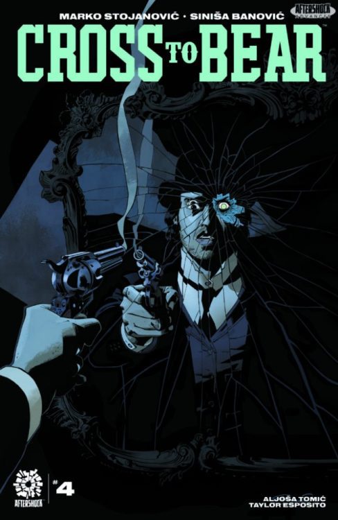
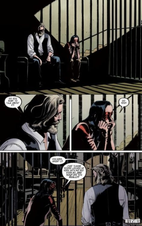
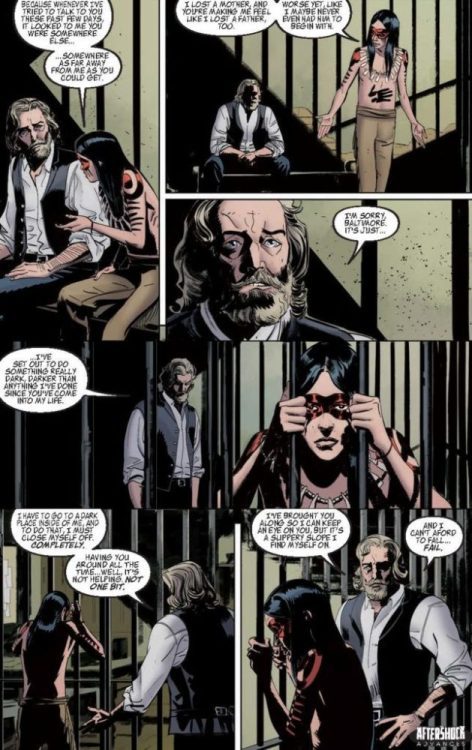
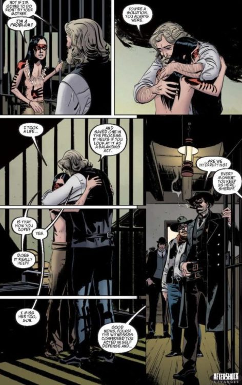
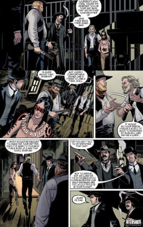
CROSS TO BEAR #4 hits your local comic book shop on February 16, but thanks to AfterShock, Monkeys Fighting Robots has an exclusive four-page preview for our readers. Enjoy the preview below.
CROSS TO BEAR #4
Writer: Marko Stojanović
Artist: Siniša Banović
Colorist: Aljoša Tomić
Letterer: Taylor Esposito
Cover: Sinisa Banović
Colts bark and scalpels bite! Chaos ensues when the Order finally catches up with the Ripper at the Mexican border. All bets are off, and only one thing is for sure as things finally come to a head: You did not see this one coming!
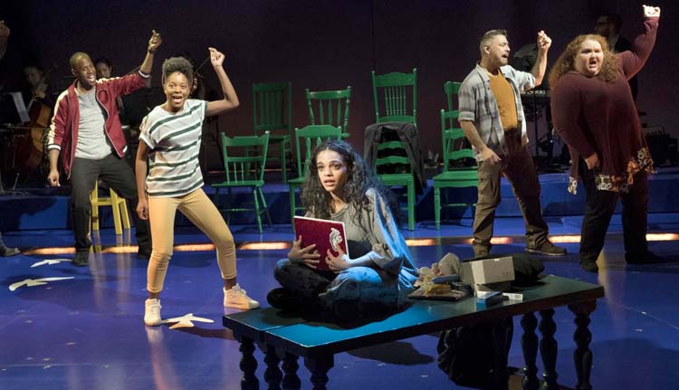
Dexter: New Blood is the recent Showtime revival of the beloved serial killer Dexter Morgan, played by Michael C. Hall, and Gizel Jimenez is along for the wicked ride.
The former forensics expert who spent his nights as a vigilante, finds himself retired 10 years later in a small town called Iron Lake in upstate New York. Dexter now goes by the name of Jim Lindsay living peacefully among the small town people of Iron Lake.
In this new limited series, Gizel plays the role of Tess; a High School science teacher by day and a part-time bartender by night who’s completely unaware of the “dark passenger” Jim carries with him.
PopAxiom spoke with Gizel Jimenez about her actor’s journey from training, to stage performance, to the screen and how it all lead her to Dexter: New Blood.
Safe
Born in Miami, raised in New York, Gizel is the daughter of Cuban immigrants. Her mother Nancy is from the Capital of Cuba, Havana, and her father Pedro is from the city of Santa Clara. She grew up in an “old school” household where rules and discipline kept her in her shell. “I was extremely shy as a kid. Any attention from people gave me crippling anxiety. I loved school” she continues, “Learning came easy to me. I felt safe in this world of books, pencils and paper.” Safe, that is, until the day her elementary school teacher had all of the students audition for the school play.
“There was no way I was auditioning,” Gizel remembers thinking. “What if I ask to be the assistant to the teacher instead?” she thought. To her relief, the teacher said yes. “It felt like my first job,” she says, “being the teacher’s right hand. It continued my sense of purpose while I remained behind the scenes and out of the spotlight. I went above and beyond learning the entire show on my own just in case someone needed help with a line, a lyric, or where to stand on stage. Little did I know that extra work would end up changing my life for good.”
Didn’t Even Know
“Days before our opening night, our soloist who plays Belle in the opening number of Beauty and the Beast called out sick. We were scheduled to run through the opening number that day and our director insisted on running it without her. She asked me to stand in for her. No pressure.”
Gizel went on stage, closed her eyes and began to sing. “I heard my voice out loud for the first time that day. The melody vibrated through my body and calmed my anxiety and turned it into a healing blanket of comfort.” It was during that moment that Gizel discovered the freedom that came with being someone else. Following that performance, everyone around her looked shocked and confused. “Our director came up to me and asked: “Why didn’t you tell us you could sing?”; “My response was simple. I didn’t even know I could.”
Natural
At the age of thirteen, tragedy struck when Gizel’s mother passed away. She then moved to Florida to live with her dad. “My father enrolled me in a Magnet Middle school where I joined the chorus program. I loved it! Choral music was the first genre I studied. It has nothing to do with your individual sound and all to do with blending. As a result, the journey to discovering my voice as a soloist was put on pause.”
Fast forward to Gizel’s sophomore year at Coral Reef High School. “I continued my interest in Chorus and began to compete in classical vocal competitions. Sadly enough, I would get terrible scores. When I asked my Choral director why, he explained that I fail to give proper posture in the room. “The judges aren’t interested in the performance of the song. All they care about is vocal technique and posture.” My response came in the form of a simple question: How do they expect me to stand still with excellent posture while I’m singing about my dead baby?
Gizel’s “common sense,” as she calls it was just her instinct to express the story further. Her teacher suggested, musical theatre. “You’re very expressive Gizel. I think you should try auditioning for Miami Children’s Theater at the Jewish Community Center.”
Southeast Side Story
“At the time, the JCC was holding auditions for West Side Story. I figured I’d give it a shot and as a result, I was cast as Anita. I hadn’t even learned acting yet,” she laughs. “But subconsciously I was just a kid pretending. It made sense in my head.”
Gizel fell in love with acting from that production forward. “Senior year I joined our Thespians club. The drama teacher then set me up with an audition for a private College at New World School of the Arts. I got in, and freshman year was the first time I learned the fundamentals of acting.”
100 Tapes
“I come from a Broadway background. My first professional job was a Broadway tour. I was the cast as Rosalia in the first National Tour of West Side Story after receiving my BFA in Music Theater. Since then, I’ve performed regionally, Off Off Broadway, Off Broadway, and Broadway for close to ten years now.” So, how did the first-generation Cuban actress go from stage to screen as a Puerto Rican bartender? “I did do some Guest/Co-Star roles on TV. But because my theater career was non-stop, I never had the time to really focus on TV acting.”
But Gizel doesn’t like to rest on her laurels by simply continuing to act within her comfort zone. She believes doing so stems from fear. “That’s the mindset I give myself. I set goals. I accomplish them. Then I set new goals. I’m always challenging myself.”
The theatre industry shut down during the pandemic, so Gizel got to work on a new goal. “Why don’t I perfect my TV craft?”, she thought. “I did a self-tape every day and said yes to every audition my agents and manager sent via email. I must have sent in to at least 100 self-tapes during that time.”
About Dexter: New Blood
One of those self-tapes led to Dexter: New Blood, the Showtime revival of the long-dormant show. “The process starts with an emailed attachment of the script and/or audition scene, information on the creative’s involved and a character description. It’s our job as actors to interpret that character. Once you’re on set, you’re expected to lift the words off the page and bring them to life.”
As Tess formed, the process continued. “Marcos Siega, who directed mostly all of the episodes that I’m in, was great to work with. I absolutely adore him. And I love his most recent work on the Netflix series You and HBO’s Flight Attendant. He’s the kind of director who trusts his actors. So I got on set and he really just let me go for it.”
“After he allows the actor to play,” she adds, “he decides how he wants to sculpt us; to maybe take some air out of a line or adjust blocking. He was time efficient, direct, down to earth, with a great sense of humor. I soaked up everything from him. His level of trust brought out my confidence and allowed me to trust him right back.”
Wrapping Up
Many creative souls inspire Gizel. “Rita Moreno is one of the OG people who inspired me. When I learned that for many productions her skin had been darkened because she wasn’t ‘dark enough’ to be Hispanic,” I thought to myself, “She is a warrior and a survivor.”
“Meryl Streep is another one,” she continues, “I study her. She’s an actress that pays attention to every detail. She’s so specific. Which I find key in creating a character.”
The third of many inspirations is “Anya Taylor-Joy” of Queen’s Gambit and, more recently, Last Night In Soho. “She is another one who is so subtle, with so much depth in her eyes. It’s the kind of depth I seek as an actress and hope to carry in my work.”
Gizel took a shot at one of her dream jobs when she tried out for the role of Maria in Steven Spielberg’s remake of West Side Story. “I didn’t get it but I got so many other opportunities during the time. Everything happens for a reason, and I really believe that.”
Acting on camera brings me such joy.” She says, and her new goal is clear: “I want to continue my journey with television and film.”
Gizel became “obsessed with the subtlety of acting for the camera.”
“I’m a fan of horror, so I’d love to be a vampire,” she muses, “or one day have superpowers, maybe do a badass gun scene or fight scene with a few tricks. I guess I’m a kid at heart. I also grew up reading comics and watching lots of action and superhero shows.”
Is Dexter: New Blood on your watch list?
Thanks to Gizel Jimenez and Rhapsody PR
for making this interview possible.
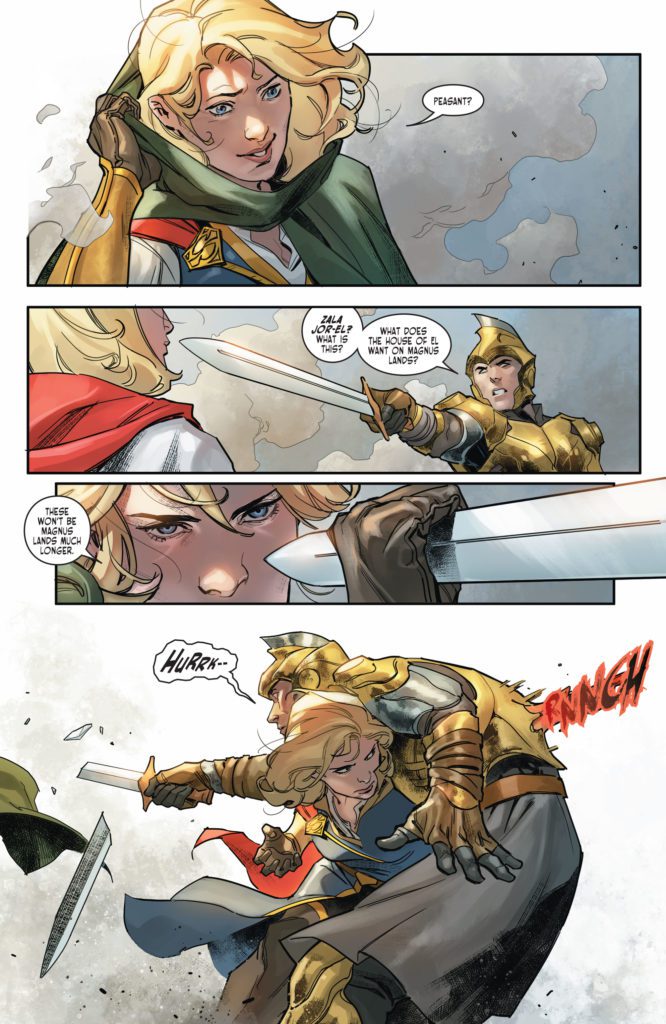
God laughs at the plans of men. Writers laugh at their own plans. There’s an incredibly organic feel to the script of DC Comics’ Dark Knights of Steel. It sets itself up, ripe with foreshadowing and characters full of potential. But it feels like this script got away from the creative team, in the best way. Writer Tom Taylor, artist Yasmine Putri, colorist Arif Prianto, and letterer Wes Abbott don’t give us a tale that feels planned and safe. No, DC Comics’ Dark Knights of Steel #3 is full of the chaos and destruction of war.
Writing
In the first issue of Dark Knights of Steel, Taylor made it clear that this is not your mom and pop’s version of Superman or Batman. He made a point of showing that anything can happen. And that’s true within the parameters of his own story too. Just because a character seems like they’ll be a big influence on the story, doesn’t guarantee their safety. Just because a plotline feels like it’s going somewhere, doesn’t mean it won’t be killed in its tracks. It’s a fantastic way of communicating how chaotic war is. Taylor shows that this won’t follow the typical beats of a story, because war is unpredictable. And still, within the chaos, Taylor gives us just enough time to connect to each character. It’s cruel and beautiful all at once.
Art
Putri continues to give us a strong sense of each individual character. We see the handful of characters that have yet to be hardened by war and grief. Zala Jor-El wears her heart on her sleeve. You can see her fury and happiness as clear as day. But King Jefferson, who has just experienced a terrible loss, is indecipherable. Where Zala is an open book, Jefferson is a brick wall. With swords at his throat, he looks on in concentrated stoicism. Nothing fazes him now.
But Putri does more than just show how war discourages feeling anything. She shows how it also takes individuality out of life. When one character happens upon a group of knights, we see each knight shown quite descriptively. Their faces and their body language immediately tell us something about them. But then, the knights are slaughtered. Putri covers the knights’ faces in shadow. They become non-descript pawns of a larger power. Putri makes their deaths impersonal, even pointless. It compounds the feeling that things are beginning to go very, very wrong.
Coloring
So much of the brightness and color that Prianto brings into Dark Knights of Steel relates to violence. It’s the scenes of people being dismembered in battle that are rendered in dazzling red. It’s King Jefferson’s use of his lightning powers against an enemy that are shown in startling blue. And it’s the ominous green rock from the skies that Prianto colors in a stunning green. Much of the rest of this issue feels very normal, even bleak, by comparison. Occasionally, though, we see the vivid colors characters wear to express their fealty. King Jefferson’s ship is adorned in the gold and blue of the King of Storms. Zala wears an outfit, colored in the red, blue and gold of the House of El. All color in this world, Prianto shows us, leads back to the war and destruction that’s looming.
Lettering
Abbott continues to bring the excitement in Dark Knights of Steel #3. And he’s starting to create a pattern with his sound effects in this series. The lettering for the lightning powers of the Jefferson family are all shown in the same scratchy blue font. The sound of someone’s fist going through someone’s chest looks the same as the noise of a piece of wood stabbing through another character’s back. Taylor and Putri keep giving Abbott new scenarios for him to dream up new fonts for. But he’s creating a visual language for Dark Knights of Steel. Abbott’s reusing of fonts, and the little variations he has for each instance, makes each moment blend into the narrative and become a part of the story that’s being told.
DC Comics’ Dark Knights of Steel #3 is chaotic and unpredictable. This creative team shows that war destroys everything – even the comfortable predictability of a story. Dark Knights of Steel isn’t a comfortable series. It’s heartbreaking, disturbing, and a brilliant discussion of the horrors of war. Pick up Dark Knights of Steel #3, out from DC Comics January 4th, at a comic shop near you!
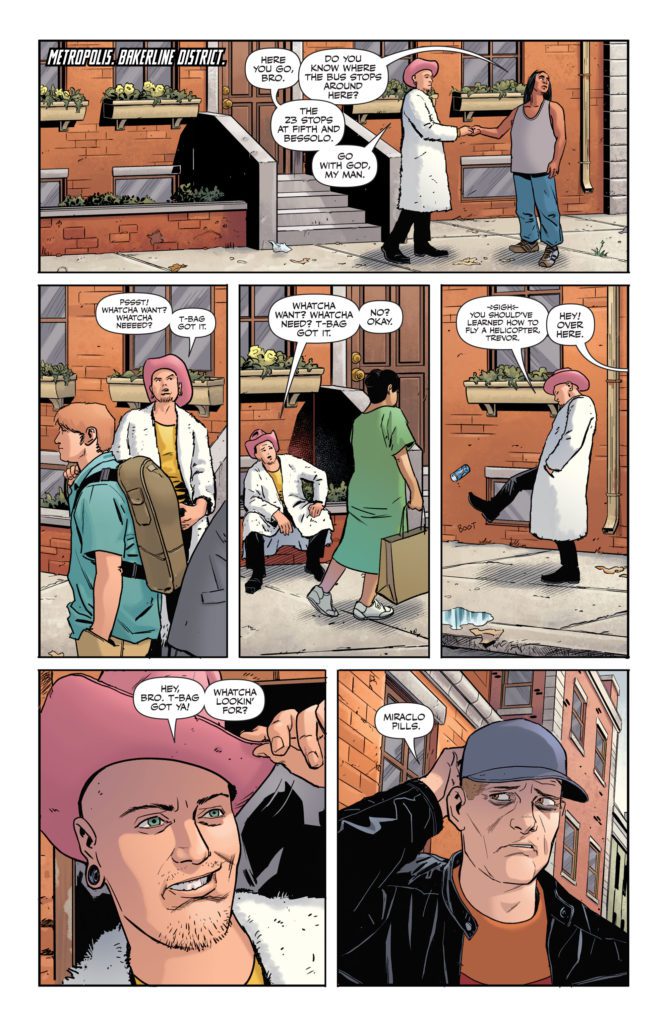
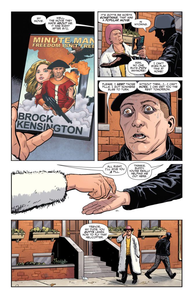
DC Comics’ One-Star Squadron continues to be a dose of equal parts hilarity and misery. One-Star Squadron #2 focuses on Z-List superhero, Minute Man. Thanks to his Miraclo pills, Minute Man has the power of flight, super strength, and invulnerability. The only catch is, his powers just last for a minute. Writer Mark Russell, artist Steve Lieber, colorist Dave Stewart, and letterer Dave Sharpe show us that Minute Man’s fame and glory lasted for about as long as his powers do.
Writing
The script for One-Star Squadron #2 is hilarious. Minute Man was once so popular, they even made a movie about him. But now, he’s relegated to showing up to kids’ birthday parties and swapping DVDs for bootleg Miraclo pills. And he can’t even get those things right. He’s insufferable. But at a certain point, he becomes so pathetic that it’s hard not to feel bad for him. In the midst of this pathetic display, Russell sneaks in all kinds of brilliant jokes that work to lighten the mood. Yet even those jokes have a sad undertone to them. At one point, a junky gives Minute Man an in-depth explanation of why street deals are governed by the concept of “caveat emptor,” an idea he learned about in law school. At face value, the joke gets a great laugh. It’s absurd and funny. Then the realization that this man had plans for his life, including becoming a lawyer, settles in. Russell’s biting commentary about the results of capitalism gives each joke a bitter aftertaste.
Art
Lieber works perfectly alongside Russell, matching his tone beat for beat. Every scene is just chock full of melodramatic emotion. Minute Man has all the subtlety of a sledgehammer to the broad side of your head. He grimaces, smiles, and cries with an undiluted intensity. Lieber uses this to distract us from the depressing undertones of each scene, so that those undertones can quietly settle in later. When Minute Man has to call someone for help, he’s at a loss for who to talk to. In the space of three panels he goes from fierce concentration to tears streaming down his face. It’s a sad moment, for sure, but the over-the-top nature of the art keeps the comedic tone of One-Star Squadron intact.
Coloring
One-Star Squadron #2 is an incredibly brightly colored comic. Stewart fills these pages with the vibrant costumes of Red Tornado, Plastic Man, and more. It’s actually the dull-colored scenes and characters that stand out. Minute Man, in his earthy outfit of dark red and brown, is a lackluster island in a sea of gaudiness. With this, Stewart achieves two things. First, he makes the superhero game feel fake. Their coloring is unnatural and even silly. Second, he makes Minute Man seem even more pathetic. It’s not that Minute Man is above these superheroes. He’s not more real than the rest of the superheroes, he just can’t even get his costume right. He’s a pale imitation of the people he’s trying to emulate.
Lettering
Sharpe’s lettering in One-Star Squadron #2 is full of dramatic flare. It can be as simple as the words that are bolded in a word balloon. “Please, Red. I need this.” When Sharpe bolds those words, you can hear the desperation. And when Minute Man shows up at a kid’s birthday party, he puts his all into the showmanship of it. His lettering is colorful and it bursts past the borders of his word balloons. “Who wants to see some SUPERPOWERS?” he asks the kids. The kids’ exclamations and excited laughter are just as colorful and big. Sharpe shows us how much effort Minute Man puts into his work. He might fail at just about everything, but that isn’t because he doesn’t try.
You might not know whether to laugh or cry but, either way, you’re destined to love One-Star Squadron. This series is funny and sad. Russell and Lieber make their criticism of capitalism a joy to read by filling it with laughs. Pick up One-Star Squadron #2, out from DC Comics January 4th, at a comic shop near you!
Aaron Dalla Villa (Immortal) plays Nolan Parthmore, your average nerd in director Dan Lantz’s Alpha Rift, an action-adventure film that’s a loving mix of Dungeons and Dragons and Star Wars that sets up a whole world of stories for a new generation.
Nolan runs a gaming store with friends Gabby (Rachel Nielsen) and Lewis (Christopher Ulrich). The trio forms an entertaining dynamic with Nolan joyful caught somewhere between Lewis’ need to nit-pick and Gabby’s whip-smart sense of humor. Nolan’s nerd expertise is the mythology about an ancient order of knights that protected the world against demons known as the Nobleman. Myth becomes a reality when Nolan puts on a magical helm that reveals his true destiny as a knight. But will he become the hero the world needs before it’s too late?
PopAxiom spoke with Aaron about becoming Nolan in the independent action-adventure film Alpha Rift.
New Reality
The last time we spoke, Aaron had just finished Immortal. Since then, he’s been part of 14 other projects from television and back again with Alpha Rift. “Dan Lantz and I, this is our fourth project together.”
“I got the audition through my agent,” Aaron says unsurprisingly. “Honestly, it wasn’t one of my best auditions. But I got the callback thanks to the callback Gods and ended up booking the role.”
Is that feeling of a bad or good audition ever accurate? “You never know. I’ve had auditions that I thought I was terrible, but I booked the job, then I’ve had auditions I thought I was the best I’ve ever been and never heard back.”
“Sometimes they don’t give you anything,” he continues about the audition process. “Sometimes, it’s a brief character description and maybe a few pages of dialogue.”
But things were different for Alpha Rift. “I had the initial script. If you can get a script, you’re lucky.”
About Alpha Rift
Aaron describes in a name who is at the heart of Nolan’s character. “Marty McFly.”
Intending to channel the charming energy of a beloved 80s character in mind, Aaron adds, “We talked a lot about the wardrobe. He’s wearing a D&D shirt. I think Nolan’s outfit is iconic because it hearkens back to those 80s movies.”
Alpha Rift features swords, shields, action, and legendary actor Lance Henriksen (Aliens, Pumpkinead). “What else could you want?”
“It’s got a reluctant hero, a pretty heroine, Lance Henriksen, and a great villain,” he continues, “It’s a good time. It’s an original IP superhero film franchise.”
Aaron reveals, “Dan wrote this script 20 years ago. I got to read that original version. He had the idea 20 years ago, and it came to fruition. It’s his baby, and I will support it to the end.”
Alpha Rift is an action film that requires the dancer-turned actor to sharpen his sword-fighting skills both on-screen and off. “A lot of green screen,” Aaron adds. “People are going to be surprised with what we did. Dan is a wizard when it comes to special FX. COVID pushed the release of the movie back. So Dan got more time to work on the FX.”
Aaron ends the Alpha Rift talk with a word about working with Lance Henriksen “learning from his expertise was amazing. He’s a national treasure.”
Wrapping Up
Alpha Rift made its debut at the 2021 Dances With Films. It’s made a theatrical run and is available on Apple, Amazon, or YouTube. Aaron keeps moving, “I’ve got several films coming that are in post-production. Another project called All Those Small Things starring James Faulkner (Downtown Abby, Game of Thrones). Another Dan Lantz film, Hayride to Hell, where I play Kane Hodder’s son. I’ll also be in an episode of Gossip Girl.”
“I’m focused on doing the next thing and keep doing the work.”
Is Alpha Rift on your watch list?
Thanks to Aaron Dalla Villa and Studio Matrix PR
for making this interview possible.
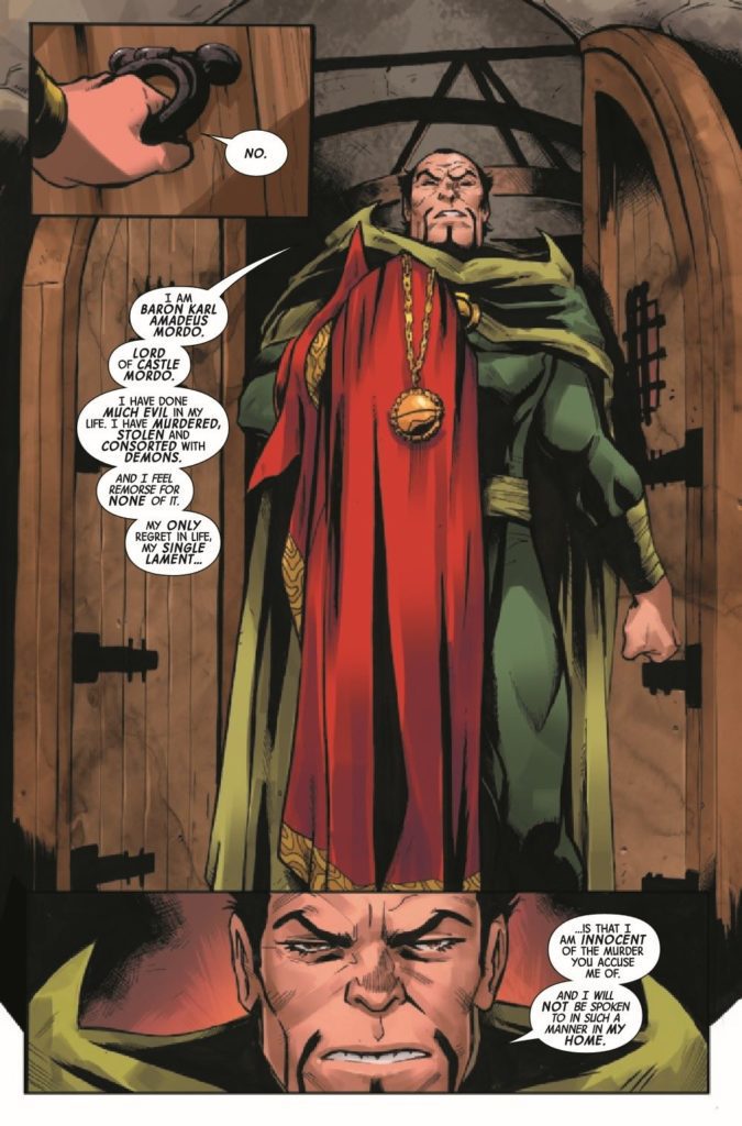
Writer Jed Mackay continues to weave his mystery with the Death of Doctor Strange #4. Joined on pencils by Lee Garbett, featuring colors by Antonio Fabela and letters by Cory Petit, this issue answers some questions but leaves readers with a couple of new ones before we get to the finale.
Whenever a major character dies, there is usually an event to signify its importance to the greater Marvel universe. This five-part mini-series captures a lot of what makes these books work. We have some underused characters, like Clea and Baron Mordo, and they are able to take center stage and show off how great they can be when written well. These characters need to come together to solve the mystery or figure out how someone died. It’s a bit formulaic, but it usually ends with a new status quo for a while and some much-needed spotlight on other characters.
WRITING
Mackay has been on a hot streak at Marvel, making a book like Black Cat a must-read. As we saw in the last issue, there was a confrontation with Baron Mordo. The conflict is resolved intelligently. However, Mackay doesn’t make things so obvious that the usual suspect is the killer; we have to work to find answers. The supporting cast is also written superbly. From Wong to Clea, even to Bats, every character serves a purpose and plays a part in this story.
ART
The pencils by Garbett work well with this issue. Garbett’s work is detailed but not overly so. As you can see in the image above, everything looks outstanding, and our eyes are drawn to what Garbett wants us to see. Garbett uses close-up panels that focus on character faces to effectively show readers the facial expressions of the major players in the issue. As Strange reveals how he was killed, Garbett has a tremendous and trippy panel layout that takes us through all the characters and why they are not suspects. These two pages allow Garbett to cover multiple threads in a short period while also making this a joy to view visually.
Just as crucial as the pencils laid down by Garbett are the colors by Fabela. For such a dark book, Fabela doesn’t use that dark of a color palette. Much of the book takes place in the Sanctum Santorum, and Fabela uses lighter gold colors that illuminate the page. As the story moves to Antarctica, colder blues signify the change in tone of the story. Fabela also does a fantastic job with the pages that focus on Strange revealing the killer. Vibrant pinks and greens draw your eye as you read the dialogue on the page.
The lettering by Petit is standard for the most part, but his best work is done on the pages that signify a chapter change. The lettering is stylized and reads like an old book from the library. These chapter changes are crucial to the story, and Petit does a phenomenal job on them.
CONCLUSION
The Death of Dr. Strange #4 is a fun read that builds on previous issues. As we inch closer to the conclusion, questions remain about how the perpetrator will be dealt with, but never doubt Dr. Strange. Death of Dr. Strange #4 is out now at a comic shop near you!
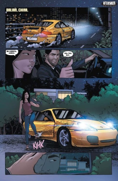
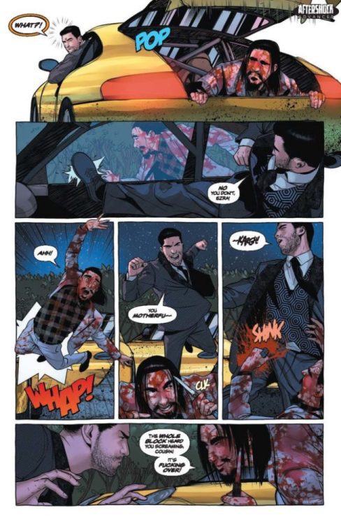
SEARCH FOR HU #5 hits your local comic book shop on January 19, 2022, but thanks to AfterShock Comics, Monkeys Fighting Robots has an exclusive four-page preview for our readers.
The book is written by Steve Orlando & Jon Tsuei, with art by Rubine, DC Alonso drops the color, and you will read Carlos M. Mangual’s letter work. Rubine and DC Alonso created the cover. About the issue:
Aaron Tse came to China to avenge family against family, diving into a generations-long feud that caught him and his parents in the crossfire. Now, on the other side of a blockbuster heist, Aaron’s dodged a bullet from an unexpected gun. And with a blood relative in his trunk, and the endgame on his mind, he races towards the true source of the hit on his mother and father. Fists up – it’s the final round!
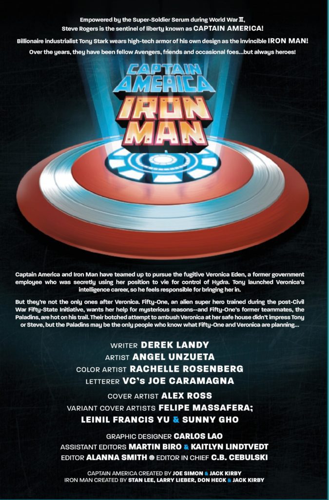
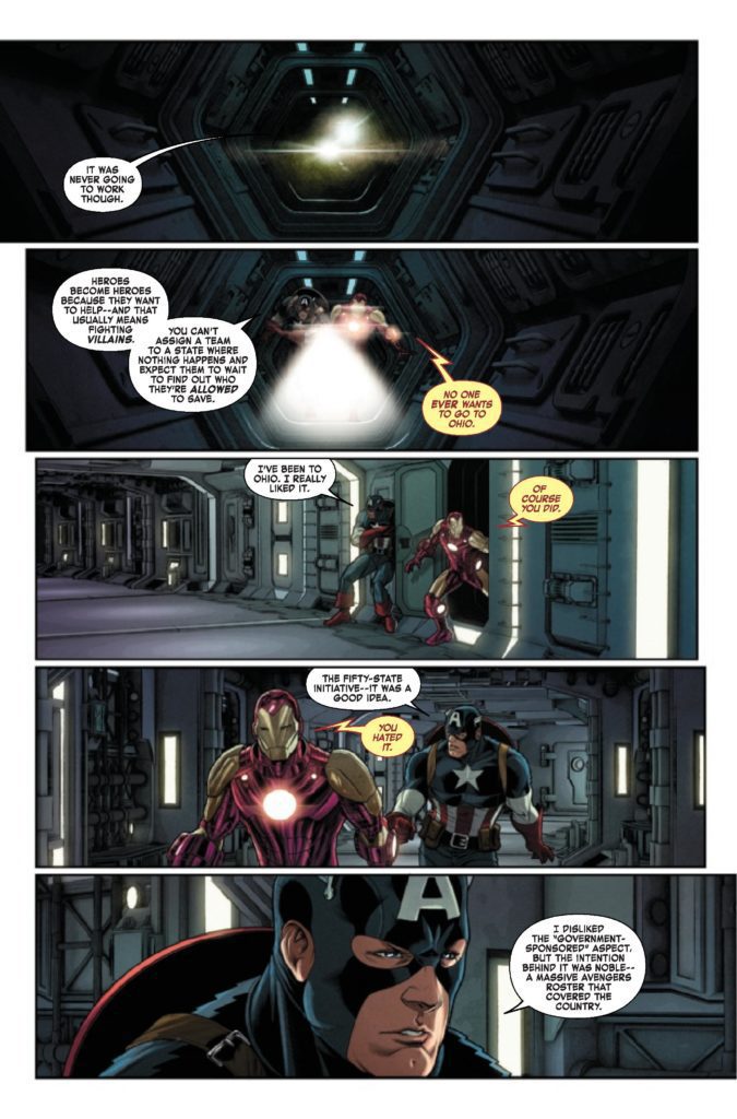
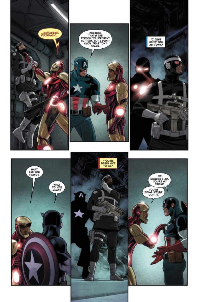
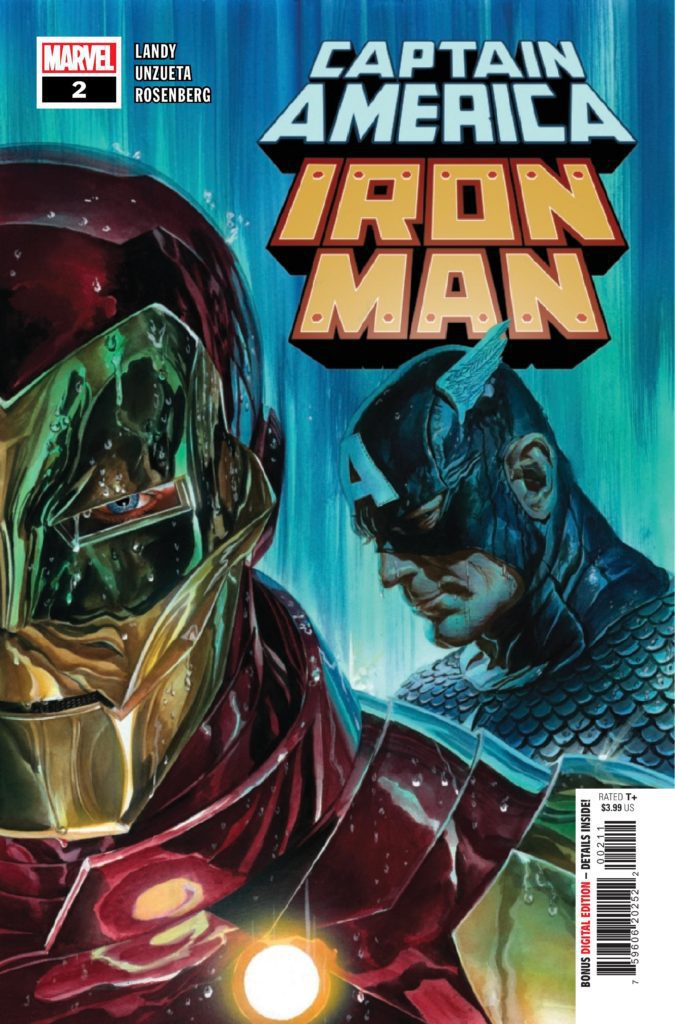
CAPTAIN AMERICA/IRON MAN #2 hits your local comic book store January 5th, but thanks to Marvel Comics, Monkeys Fighting Robots has an exclusive three-page preview for you.
About the issue: Meet the PALADINS! When a group of eager new super heroes interrupts Cap and Iron Man’s hunt for escaped Hydra commander Veronica Eden, Steve and Tony struggle to determine whether the team is an asset or a liability. But they’ll need all the help they can get when Veronica makes a powerful new friend…
The issue is by writer Derek Landy and artist Angel Unzueta, with colors by Rachelle Rosenberg, and letters by Joe Caramagna. The main cover is by Alex Ross.
Check out the CAPTAIN AMERICA/IRON MAN #2 preview below:
What Marvel characters do you want to see in a team-up series? Sound off in the comments!
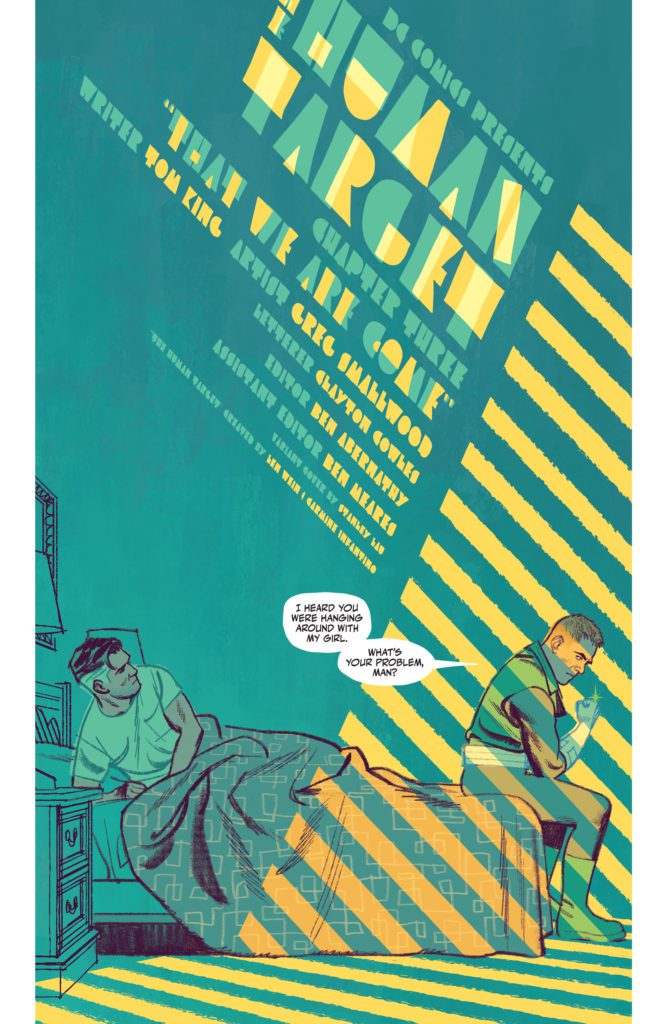
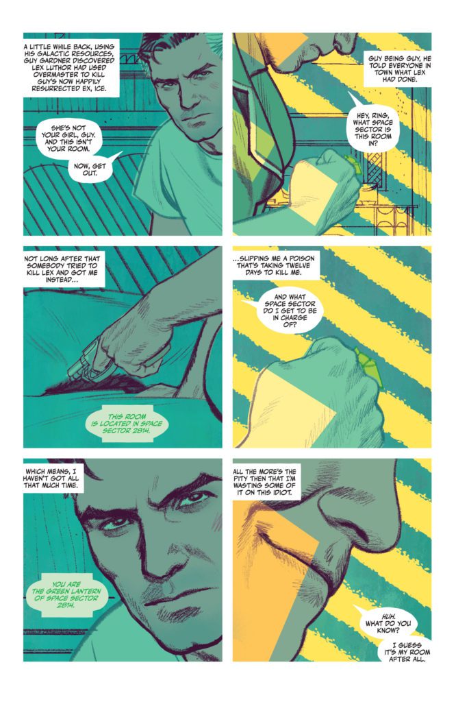
There’s something so enticing about The Human Target. This series, from DC Comics, plunges you into the dark world of Christopher Chance. Chance, who works as “The Human Target,” is investigating the Justice League International. These characters, who all starred in 1987’s treasured run, seem bright, fun, and occasionally a little simple. But Chance isn’t fooled by any of it. He’s ahead of the curve, a force to be reckoned with. Yet still, beneath Chance’s own cool-headed façade, he can still be a self-destructive fool. Writer Tom King, artist Greg Smallwood, and letterer Clayton Cowles will play with your mind and heart in The Human Target #3. Because, after all, can’t we all be a little self-destructive?
About The Human Target #3 (from DC Comics)
Christopher Chance is a man on a deadline and working to solve a crime that might be unsolvable. Despite his better judgment, he’s falling for his lead suspect, and her violent ex-boyfriend isn’t happy about it. Oh, and that ex? He’s a Green Lantern.
Writing
Christopher Chance, the Human Target, is a professional. You can see it in the way he carries himself. You can hear it in the coolness with which King writes Chance’s thoughts. But Ice is cool too. And King shows us in this issue just how much she’s getting under Chance’s skin. In the opening to this issue, Chance gets visited by Ice’s “violent ex-boyfriend,” Guy Gardner. Gardner is everything that Chance isn’t. He’s a hot-headed, quick to judgment, “shoot first, ask questions later” kind of guy. He’s the kind of man who can make a mess of things when he puts his mind to it. So it’s funny that the next time we see Chance, he’s still got Ice tagging along with him. King clearly sets it up for us: Ice is trouble, whether that’s her fault or not. If Chance wants to solve this case before his impending demise, it’s best to shake her. But that’s exactly what King is saying. Chance can’t shake her. And the self-destructive voice in the back of his head – the auto-pilot voice that his conscious mind is railing against – is telling him that maybe he shouldn’t even try.
Art & Coloring
When we first see Guy Gardner, he’s a huge presence. Smallwood shows Gardner from the chin down, as he grins a little. With this, Smallwood does two things. He makes Gardner feel very big on the page. And he creates a power dynamic between them. Gardner is above Chance. He’s looking down on him. Then, as the issue progresses, Smallwood puts Chance and Gardner on the same level. Sometimes, Smallwood even makes Gardner look small and weak on the page. He shows panels of Gardner standing far away, so that all his threats feel just a little less menacing. But that’s just one of the many ways Smallwood tells such a smooth story in the visuals of The Human Target. In fact, these pages feel like they’d be more at home in a pop-art gallery of a museum, than in a comic book.
Smallwood’s colors have a stunning depth to them. When Chance parks his car out in the street, on a late night, his headlights create a beautiful pattern across the panel. Smallwood’s incredible impressionist-style use of light is jaw-dropping. But he’s also playful with his coloring. When he creates a gag of Booster Gold running across the page, each panel a flashback to a recent time travel escapade, the colors are flat but bright. Smallwood drops all sense of realism in these panels to help this moment pop. It’s whimsical and funny. Even the return back to reality, in the bottom two panels of the page, feels like cause for a chuckle. Smallwood’s art and coloring, together, make for some of the most breathtaking work in comics. He’s on an entirely different playing field. His peers aren’t even legends like Kirby, Lee, or Ditko – they’re Warhol, Cezanne, and Turner.
Lettering
The sound effects of this issue seamlessly blend with the art on each page. When Chance throws a punch at Gardner, and it’s blocked by a brick wall, the “THUD” noise almost seems to smash up against the wall too. The U and D get much thinner than the TH, brought to a stop by Chance’s fist making contact. But there’s so much more to Cowles’ lettering than the brilliant sound effects. For one thing, the placement of Chance’s captions tells us a lot about him as a character. On one page, he’s fighting with Gardner. His captions are all in the top left corner of every panel. But when the fight is over and Ice enters the scene, his captions sink to the bottom of the page. Cowles shows us how Chance seems to relax around Ice. He lets his guard down and settles. Cowles shows us that Chance isn’t the bitter bastard he wishes he was. He’s got a beating heart behind that rough exterior, and his thoughts are proof of that.
DC Comics’ The Human Targetis delightful. You’d be hard-pressed to find a team that works together as brilliantly as Tom King, Greg Smallwood, and Clayton Cowles. With a smooth script, gorgeous pop-art style visuals, and a subtle rhythm to the lettering, what’s not to like? The Human Target #3 is just another example of this creative team’s unmatched brilliance. Pick it up, out from DC Comics December 28th, at a comic shop near you.
DC Comics’ Swamp Thing: Green Hell feels like it’s coming out at just the right time. It’s the story of the leftovers of humanity. A battle-worn group of people, on the brink of extinction. With Swamp Thing: Green Hell #1, writer Jeff Lemire, artist Doug Mahnke, colorist David Baron, and letterer Steve Wands, ask the question: “Is humanity – in all its destructive glory – really worth fighting for?”
The Premise of Swamp Thing: Green Hell #1 (from DC Comics):
The Earth is all but done. The last remnants of humanity cling to a mountaintop island lost in endless floodwater. The Parliaments of the Green, the Red, and the Rot all agree: it’s time to wipe the slate clean and start the cycle of life over again. And to do so, they’ve united their powers to summon an avatar—one of the most horrific monsters to ever stalk the surface of this forsaken planet. Against a creature like that, there can be no fighting back…unless you have a soldier who understands the enemy. Someone who has used its tactics before. Someone like Alec Holland.
Of course, it would help if Alec Holland hadn’t been dead for decades…
Writing
Lemire retreads some familiar territory with this series. We come back to a world of warring Parliaments, much like we saw in Lemire’s 2011 run on Animal Man. The Parliaments of Red, Rot, and Green, watch the slow extinction of mankind in impatient anticipation. And, honestly, it’s tempting at first to side with the Parliaments in this. The world Lemire puts forward is bleak and uncaring. But Lemire then sprinkles in characters with big hearts and sturdy senses of integrity. Characters that, Lemire shows us, have weathered all kinds of hardship and heartbreak. Yet they’re still here, fighting for what’s right. With this, Lemire connects to an audience that feels exhausted by our years in the pandemic. He places us in the story: an optimistic few who have managed to survive some of the worst the world could muster. And so, Lemire has created what seems like insurmountable odds in this story, but odds we’re truly invested in seeing the characters overcome.
Art
Mahnke’s art is terrifying. He gives the entire issue a feeling of foreboding. While there are small moments of brightness, of characters smiling and swapping jokes, it’s the evil things in this story that take up the most space on the page. When a group of armed bandits show up to the town, it’s there image at the bottom of the page that makes up the background of every panel. And when they beat a man in the center of town, the same thing is true. By placing these images in the backdrop and eliminating page gutters, Mahnke makes these violent moments feel inescapable and all-encompassing. It’s only at the end of the issue, after we’ve seen plenty of gore and carnage, that we see the good guy equivalent. Characters ask someone for help to fight off the evil that’s quickly spreading. When the character arrives, his moment of arrival acts as the backdrop of the page. He’s just as powerful, just as inescapable, as the threats they’re facing.
Coloring
Baron actually keeps to a relatively bright color palette throughout this issue. At times, it feels a little strange. Some moments are quite dark thematically, yet the characters are shown in vibrant flesh tones, wearing colorful clothing. But there’s something really interesting to this choice. For one thing, it’s quite disturbing. We see people ripped apart on a page that feels unsympathetic to their struggle. It’s the same coloring treatment you’d get for a big superhero battle. But it also means that the darker moments, the ones where Baron pulls back on in his coloring, really do stand out. When one character ominously sinks into the sea, or when our main character has a tough conversation with his daughter, these scenes mean something. It’s an unorthodox choice on Baron’s part, but it brilliantly highlights the emotional moments of this issue.
Lettering
Wands’ sound effects similarly almost seem to ignore the gravity of each moment. It has a disturbing and sadistic feel to it. When people are slaughtered, Wands shows the “SPLORT” noise of branches puncturing flesh in neon yellow. In fact, it’s actually once the carnage begins that Wands’ sound effects really come to life. Up until that point, his sound effects are quite subtle. We see the small “KRK” of someone’s nose breaking shown in red. We see the noise of a bell ringing in orange purple hues that blend in with the rest of the page. It’s when heads roll that Wands’ sound effects splatter across the page in sadistic joy. It works really well to make these scenes feel even more disturbing than they already are.
DC Comics’ Swamp Thing: Green Hell starts off with a no-holds-barred first issue. This creative team presents a bleak future and insurmountable odds, begging the question “Is humanity really worth all the trouble?” But somehow, in the midst of the blood, guts, and horror, they also manage to tease out a subtle optimism. In the end, we want these characters to beat this. Because if they can, maybe we can too. Pick up Swamp Thing: Green Hell #1, out from DC Comics December 28th, at a comic shop near you!