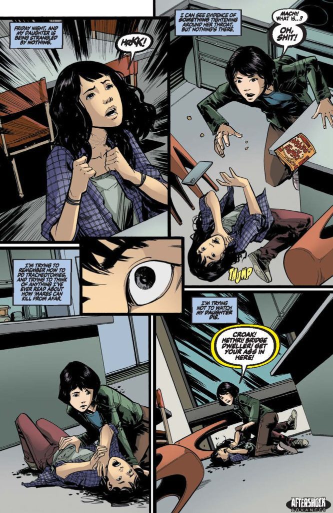
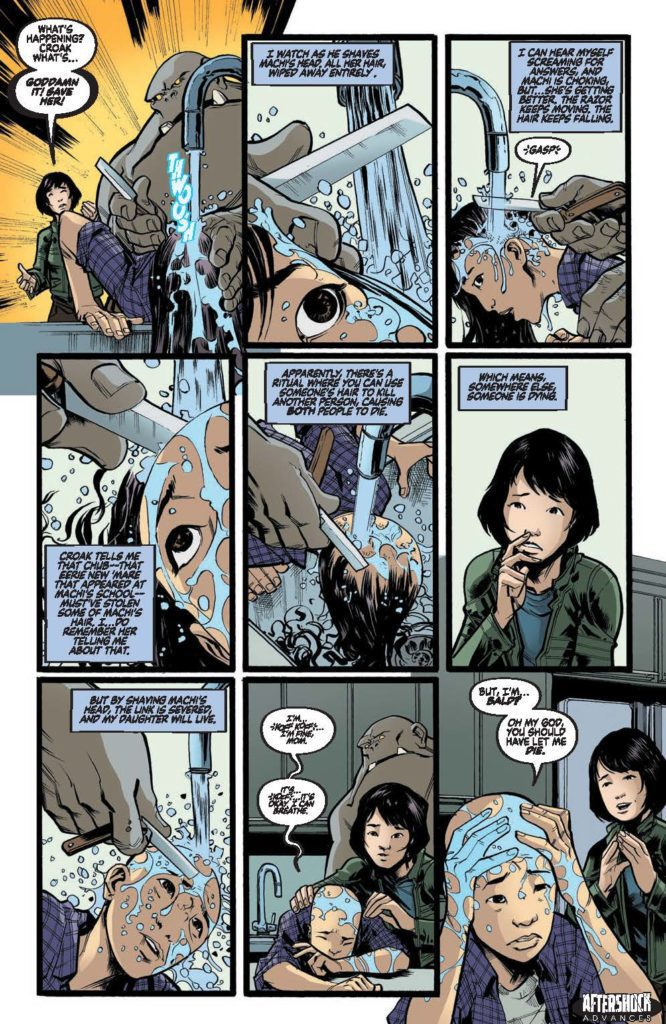
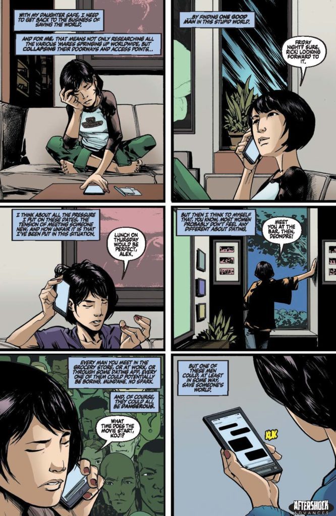
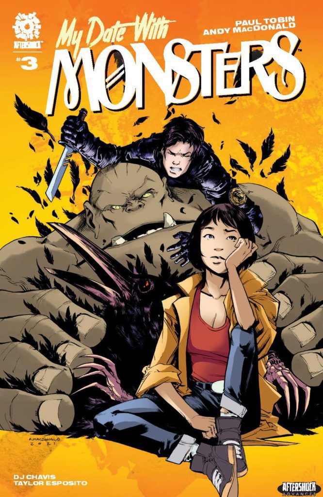
MY DATE WITH MONSTERS #3 hits your local comic book store January 19th, but thanks to AfterShock Comics, Monkeys Fighting Robots has an exclusive four-page preview for you.
About the issue: Machi is being strangled. Croak meets a fox woman. Risa goes on a string of terrible dates, and Genka finally manages to have a good idea. Meanwhile, all the horrors of the world of nightmares are creeping closer, more than a few people are going to die and someone’s going to end up bald, but, hey: at least there’s a dog.
The series is by writer Paul Tobin and artist Andy MacDonald, with colors by DJ Chavis, and letters by Taylor Esposito. The main cover is by MacDonald and Chavis.
Check out the MY DATE WITH MONSTERS #3 preview below:
Are you reading MY DATE WITH MONSTERS? Sound off in the comments!
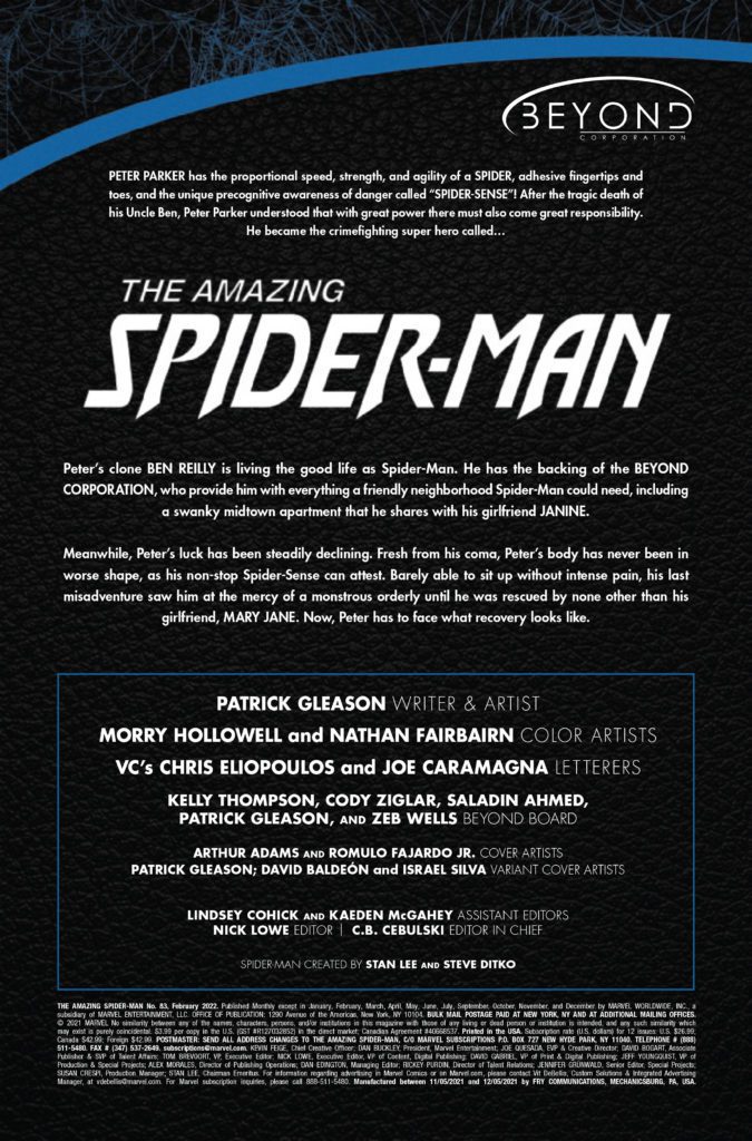
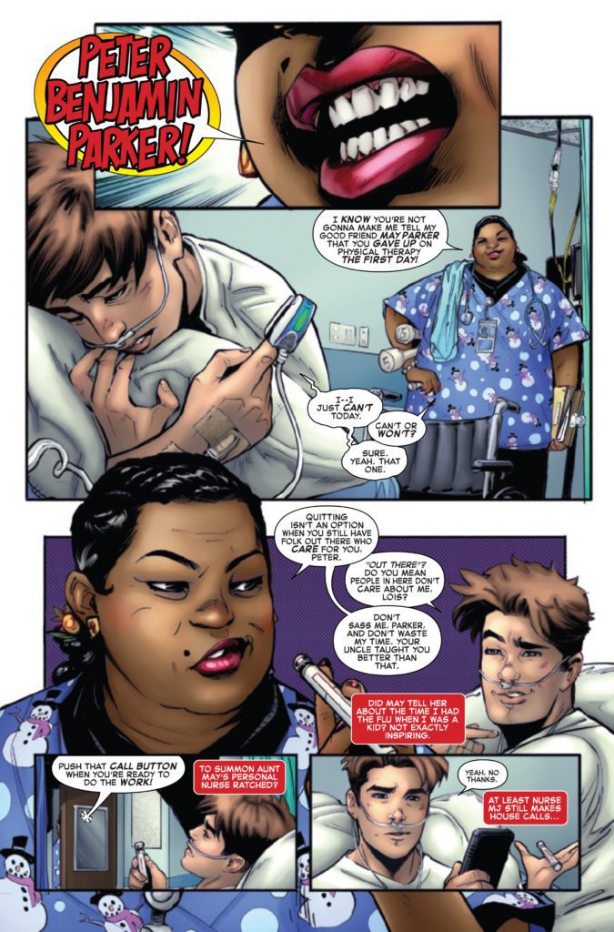
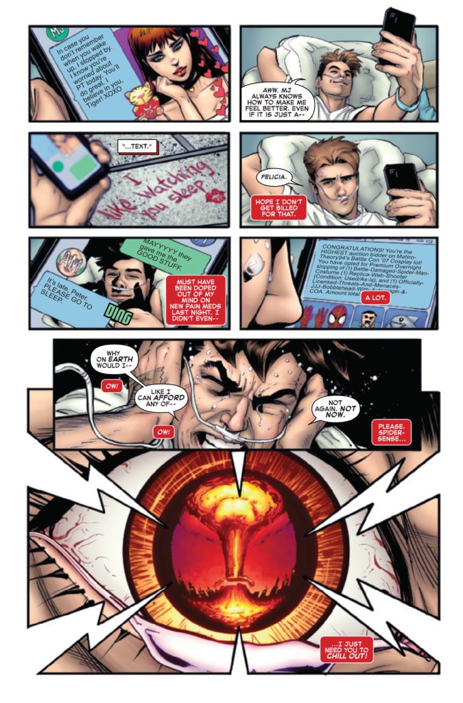
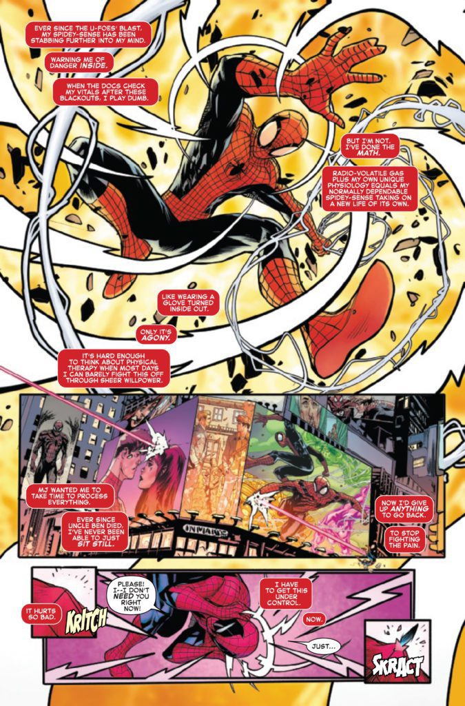
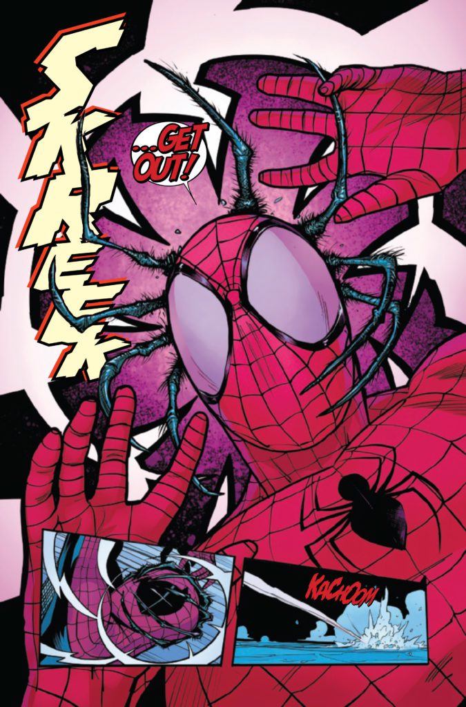
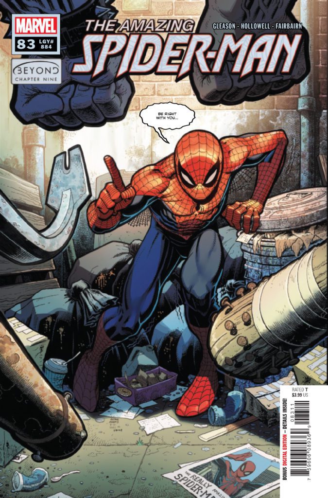
AMAZING SPIDER-MAN #83 hits your local comic book store December 29th, but thanks to Marvel Comics, Monkeys Fighting Robots has an exclusive four-page preview for you.
About the issue: The creator behind the biggest cover in the last decade is going to show you what he can do with one of the biggest Spider-Moments in decades, as Patrick Gleason writes and draws this issue. The Web-Head is facing unbeatable odds again. Can he rise to the occasion and save the day?
The issue is by writer/artist Patrick Gleason, with colors by Morry Hollowell & Nathan Fairbairn, and letters by Chris Eliopoulos & Joe Caramagna. The main cover is by Arthur Adams and Romulo Fajardo Jr.
Check out the AMAZING SPIDER-MAN #83 preview below:
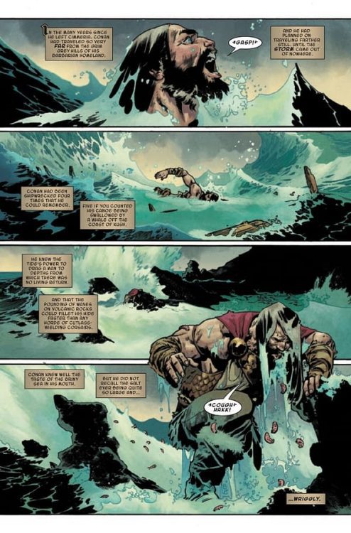
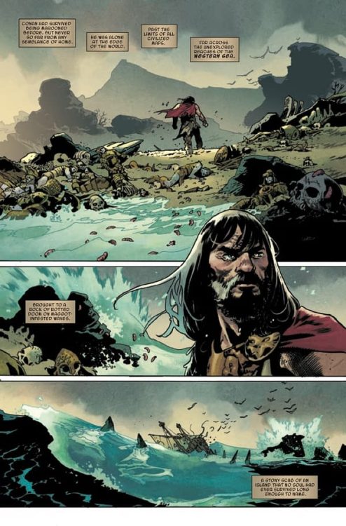
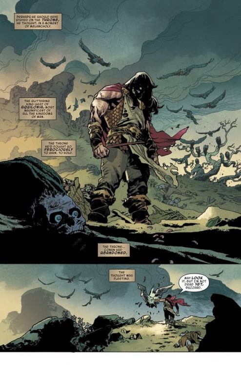
Writer Jason Aaron (Conan The Barbarian, Scalped) and artist Mahmud Asrar (X-Men) return to the Hyborian Age to tell tales of a Cimmerian with a crown in King Conan #1. With Matt Wilson on colors and Travis Lanham on letters, this opening chapter is full of the exact kind of thundering action and blood sport one would expect from a Conan story. With a fun, fitting script and stellar visuals, this is a great start to this follow-up series and a solid addition to the legacy of Conan tales as a whole.
“CONAN’S LAST STAND AT THE EDGE OF THE WORLD! Jason Aaron and Mahmud Asrar return to the saga of CONAN in an all-new adventure that takes the story of the Cimmerian further than has ever been revealed in ANY media to date! As Robert E. Howard posited, when King Conan grows restless on the throne, he sails west, toward land and adventure unknown. Now see the first step of King Conan’s fateful journey from Aquilonia, as an old and terrible danger threatens to end the saga of the Cimmerian once and for all!”
Writing & Plot
As with his prior 2019 series, Jason Aaron pens a fitting script for this well-trodden world in King Conan #1. His scripting is full of the grandiose narration and dialogue used in all the tales of the Hyborian Age. Aaron’s first chapter here is a simple retread of what many Conan tales are like. This time there is the wrinkle of his now being the King of Aquilonia, and the responsibilities he is escaping. Much like in Howard’s original writings, Conan’s hardened exterior hides the complexities of his character. For a long time Conan reader, watching the legendary Cimmerian develop into a man who struggles with the weight of massive responsibility is cathartic. Don’t let this fool you though, this is a sword-swinging barbarian tale through and through.
Aaron’s careful pacing makes the most of this comic’s 22-page length with some solid action, revealing flashbacks, and a great cliffhanger. Even with the reintroduction of a classic Conan foe, this comic isn’t going to blow your mind if you’re a long-time Conan fan. However it’s still a a great start to this mini-series.
Art Direction
There is a strong argument to be made for Mahmud Asrar being the premier contemporary Conan artist, and King Conan #1 builds more of that case. The X-Men artist’s truly epic framing and visual style makes every panel look like a piece of mythic tapestry. His heavy inks and thick pencils capture detail and atmosphere in this comic’s desolate environment. Asrar’s take on this older, graying Conan posits him as every bit the cunning and eager warrior he always has been, albeit a bit wiser. The aging Cimmerian is captured here at his most regretful and contemplative. He reflects on the choices he’s made that have led him to the throne – and this cursed island. Asrar draws Conan with the needed complexity across multiple flashbacks and in the quiet moments in the current plot.
Unsurprisingly, he also still draws some kickass fight scenes. Conan has scarcely looked more fearsome than when drawn by Asrar. The kinetic power that the Cimmerian is drawn with matches some of the best Conan artists in the character’s history.
Matt Wilson’s colors in this book perfectly fit the vision crafted by Asrar. The rich, dark tones used on characters and the foreboding island lend a sense of timeless myth to the story. Natural tones clash with the dark-magic and supernatural purples and misty greens that arrive with Conan’s nemesis. Conan’s chiseled, scarred appearance is on par with that the best of the color interpretations done by colorists past. Travis Lanham’s lettering is sharp and easy to follow, with a classical font on the narration for that “scroll” effect. This is a stellar looking comic that’s visually on par with many other great Conan books.
Verdict
King Conan #1 is a wholly entertaining opening chapter to this addition to the Conan mythos. Jason Aaron’s script keeps Robert E. Howard’s vision intact while still crafting a story in his own style. The visuals from Mahmud Asrar and Matt Wilson are deep and full of energy, bringing more complexity to the story. Be sure to pick up this #1 when it hits shelves on 12-22!
X-O Manowar #9, which came out on December 15th, concludes an enjoyable Valiant Entertainment run by celebrating the connections these characters have made.
Background
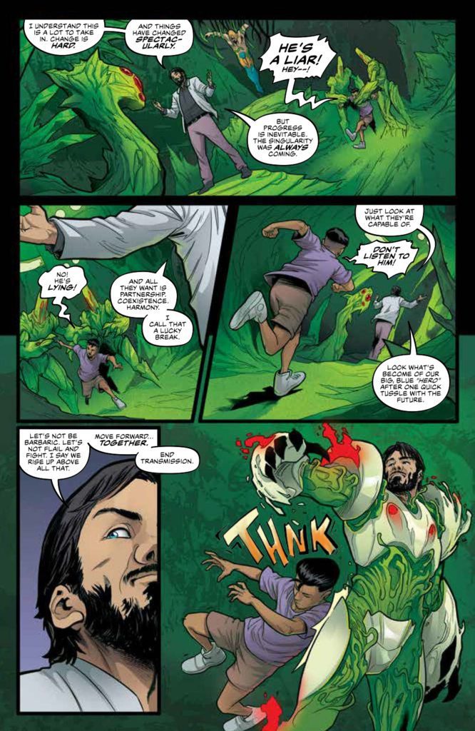
After X-O Manowar finally manages to settle in as a superhero, his advisor Troy Whitaker takes it all away. How? By using his battle suit’s AI to help take over New York.
X-O Manowar #9: Communicate Don’t Dominate
Dennis Hopeless writes an entertaining story built on the shoulders of every issue before it. It’s always enjoyable for characters like X-O Manowar to look heroic, as a source of inspiration. Everyone Aric has helped comes to his and Shanhara’s aid against Troy, a character who readers love to hate for deceiving their hero. It’s a classic clash of ideologies wrapping up in a manner that makes readers feel good.
Standing Out Amongst Progress
The art of X-O Manowar #9 continues to be a visual delight for readers. Ruth Redmond makes the dominating green hues of Troy’s technological singularity very eye-catching. Just about every character looks helpless before it. Thankfully, the body language from Emilio Laiso’s pencils and Raffaele Forte’s outlines make major characters stand out for a fighting chance. That’s not even including how Hassan Otsmane-Elhaou’s word balloons match the emotional state of every word spoken. Plus it is interesting to see the way the singularity speaks through echoing captions.
X-O Manowar #9: A Good Ending
This run concludes with a pretty good ending. It really shows off X-O Manowar as a superhero who can inspire people. Enough to make the characters from prior issues stand out among an otherworldly presence. X-O Manowar #9is out now, from Valiant Entertainment, at a comic shop near you!
Defenders #4 is out December 15th, and serves as the most attention-gripping issue of this remarkable Marvel mini-series. Why? Because it delves into the very essence of comic books in terms of ideas and art. Mainstream superhero comics have a reputation of resisting change; but maybe looking at how this issue deconstructs the central elements of the Marvel Universe can inspire new ideas.
Background
The ragtag group of Defenders are chasing rogue scientist Cario Zota through previous Marvel multiverses. After a close encounter with primordial magic, they come upon a bizarre world.
Defenders #4 On Comic Patterns
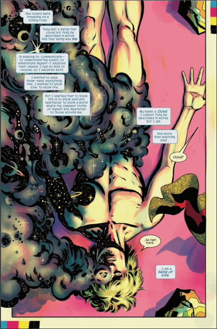
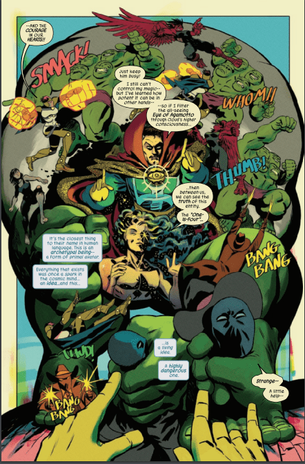
Writer Al Ewing has a lot to say about comic books in this issue. Through the POV character, Cloud, readers witness comics’ foundations in the Fourth Cosmos. There’s something so appealing about experiencing the abstract caricatures that represent modern Marvels. These archetypes comment on the central ideas surrounding Marvel’s most popular characters and how they interact in the main Marvel universe. Co-plotter Javier Rodriguez makes this extremely relevant with a spread that evokes similarities to Marvel’s Civil War promotional material. For all of the eye-catching character designs, they feel secondary to the nostalgic tone that Rodriguez is creating. Which goes into a Defenders #4 theme about patterns and how they can limit expression.
Cloud of the Defenders
Cloud’s character development via pattern recognition serves as a highlight. After many issues of just being a background element, this underutilized character finds a way to express themselves. Cloud shifting their appearance into a new form feels hopeful; the way they interact with the Fourth Cosmos feels like inspiration, enlightenment, and a coming out moment all at once.
Art’s Not Just Patterns
Rodriguez’s larger-than-life art is so complex it’s mesmerizing. The way most of Defenders #4 has a pale yellow background evokes the nostalgia of aged comic books. There are also instances where panel layouts get so abstract, it feels like perspectives are warping. Take for example the Defenders fight against the Hulk Archetype “One-Is-Four.” The reader gets a genuine feeling of how much of an immovable wall he is with how characters transition across the page. Readers could be so used to reading comics a certain way that instances like this inspire the idea of The Fine Art of Comics.
Joe Caramagna’s lettering also assists in this surreal setting. The way “Four-As-One” speaks in colors adds a sense of minimalism. Even as the archetypes start speaking in full words, the multiple colored words showcase the archetypes’ inability to speak in full sentences. The simpler fragments they utter make them feel primitively alien.
Defenders #4 Goes Beyond Perspective
Defenders #4 is so far the best issue of this entire mini-series. After so many developments, this issue’s absurd art doesn’t just keep attention, it gives new perspectives. Readers are guaranteed to walk away with more of an appreciation for the craft of comic books. This awe-inspiring story is perfect for readers who feel like they’re experiencing superhero burnout.
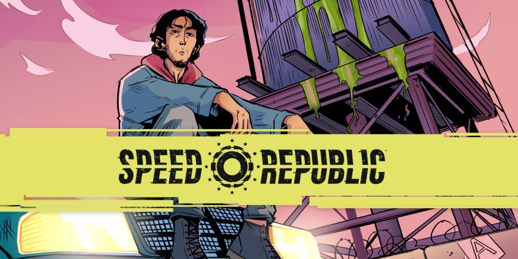
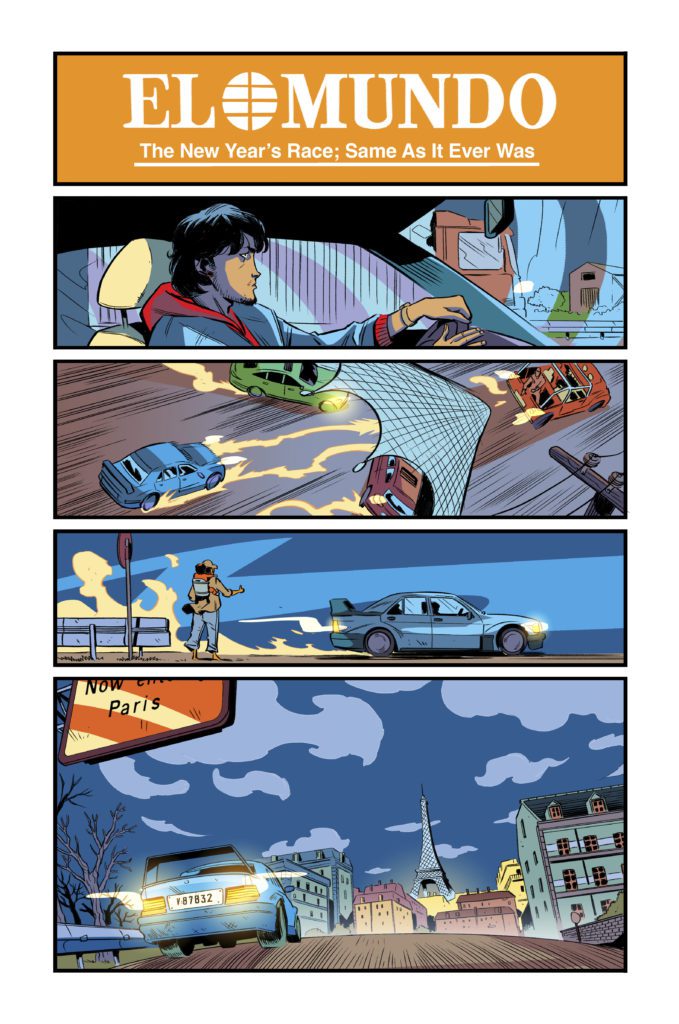
Speed Republic #1 from Mad Cave Studios presents readers with an all-too-relatable world about feeling helpless amid excitement. This issue releases February 2, 2022 and is available for pre-order now.
Series Synopsis
From the official press release: In the future, Europe has united under one man, The Autocrat. He rules the apocalyptic landscape from corporate monopolies with a vision of unity that is gospel to some, but hollow to others. To distract the 99% from their poor and empty lives, they are given the opportunity to compete in the Grand Race. A marathon street race through Europe where only one driver can make it to the end and win a life of luxury. Our hero, Sebastian Valencia enters with the hope that winning this race can make up for his wasted past, but along the way he starts to question what kind of future he is actually buying into.
You Can’t Outrun Your Feelings
Speed Republic #1 introduces writer Ryan K Lindsay’s Europe in a dystopia that can feel close to home. This series looks at the entrepreneurial escapism that pervades our modern world. So it makes sense that our protagonist Sebastian Valencia is a burnout like some readers. Sebastian’s situation presents a most compelling look at hustle culture; imagine if you had the chance to get a dream job but had to cut yourself off from your old life. Sebastian’s father is sick and wants Sebastian around, but Sebastian wants to find a stable way to provide for him. But this has also caused Sebastian to lose out on relationships with his ex-girlfriend and older sister.
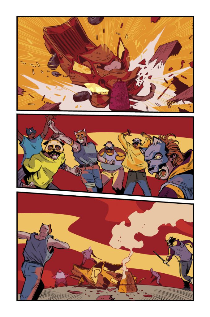
Then there’s the bigger conflict in Speed Republic #1, on whether it’s even worth winning the central race at all. Sebastian knows that his situation won’t get better by winning the race. There are too many larger systemic issues to fix, all because of an unnamed Autocrat whose policies strangle the life out of the citizens of Europe. This all means some people aren’t too fond of the racers because they’re part of the problem. A significant few people are even ready to tear drivers to pieces. Tensions are high all around as readers wonder what will happen with Vincent going forward.
Eye-Catching Traps
The art by Emanuele Parascandolo presents simple yet highly expressible designs in Speed Republic #1. In addition to the facial language of every character that helps set the mood, the cars show off plenty of personality. The way some vehicles are driven and the equipment they come with says a lot about their drivers. A pickup truck driver moving fast and recklessly works just as much as seeing the driver’s face high on adrenaline. Readers can find just about any character to latch onto depending on their personalities.
Most of the coloring of Speed Republic #1 by Michele Monte is in an enticingly colorful if muted display. Despite the amount of costumes, cars, and settings, they feel devoid of life which evokes the series’ actual tone. It gives readers a strong sense of empathy for almost every character on display; especially after they look at one page that has brighter colors along with a news banner. That page serves as an enticing ad for readers to get excited over the race in the preview catalogues, obviously belying the depressing content. Readers connect to people struggling with all of their might in this neo-noir atmosphere.
Finally, the lettering by Joamette Gil provides the appropriately designed SFX for some intense moments. Each one allows the reader to feel the event as it happened. Some feel like extensions of actions like a gunshot to signal the start of the race. A truck crashing into a piano meanwhile has a very attention grabbing SFX in bright white colors. This makes the event stand out to the reader with how surprising it is.
Subscribe With Speed Republic #1
Speed Republic #1 has just about everything to entice readers amid workplace burnouts. Something as out-of-this-world as a race to survive just can’t cover up the depressing situations every character has to face. And yet this is something readers refuse to look away from because of how it tugs at their heartstrings.
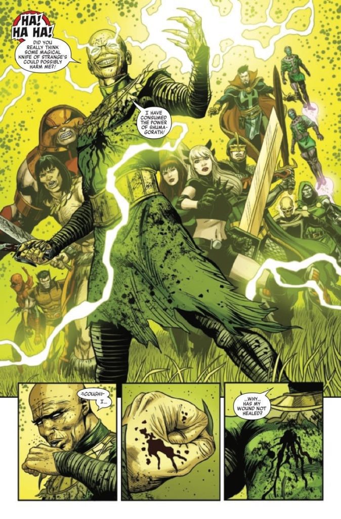
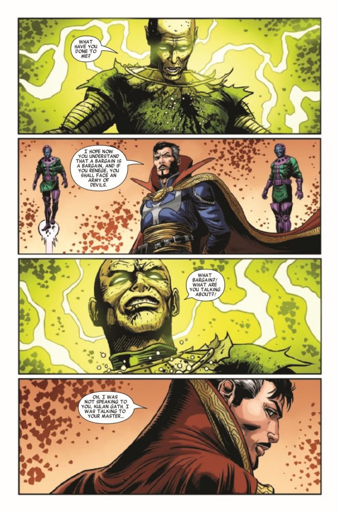
Writer Gerry Duggan brings his Kulan Gath story kine to an end in Savage Avengers #27. Teaming up with Patch Zircher on pencils, Java Tartaglia on colors and Travis Lanham on letters, we are treated to a well thought out climax to the years-long story.
In the two years since this story has been going on, Savage Avengers has brought in various cast members to appear on the team. From Venom to Magik, many of Marvel’s most brutal characters all took a turn. Despite the rotating cast, Conan and Doctor Strange have been at the forefront for most of this run. This was essentially Gerry Duggan welcoming Conan in and having him interact with as many Marvel characters as he can.
Writing
Savage Avengers #27 gives fans who have stuck with the book for two years an ending they will be satisfied with. Duggan has built up Conan wonderfully throughout this series. This issue we see him finally accept what it means to be a teammate. He works with Magik and the Black Knight to defeat Kulan Gath. Duggan doesn’t falter with such a large cast either. If you’re a fan of any of the characters in this book, they’re all treated with respect from Duggan. The way Duggan deals with Kulan Gath is both creative and disgusting. Our heroes have to take a chance on working with characters like Dr. Doom and Kang to make sure they can come away with a victory.
Art
The pencils by Zircher are amazing. Zircher has smooth lines that make each panel a joy to look at. The graphic panels, like someone getting a hand cut off, are drawn with great precision. The most amazing stretch artistically in the book comes with how Kulan Gath is handled. Without going into spoilers, Zircher draws his fate in a grotesque way that would make even a veteran horror fan squirm.
Tartaglia’s colors shine in this issue with his vibrant backgrounds and dark tones. As Kulan Gath attempts to ascend, Tartaglia gives us a gorgeous yellow background. In the battle panels Tartaglia gives us dark colored blood that is a mix of black and red. Tartaglia’s colors are effective in this issue because he doesn’t overdo it with wild colors. Everything he does has a natural feel to it. While his backgrounds are crazy colors, and we occasionally get a purple sky, in a mystical book, that seems legitimate. The colors on characters fit with the shading and changing backgrounds as well.
Lanham handles the lettering for this issue. As Kulan Gath laughs, believing that he has assured a victory, Lanham emphasizes his laugh with a nice red word balloon. Lanham also makes great use of the effects from weapons this issue. Whether it’s Black Widow blasting or Conan slicing, the sound effects play in your head as you read the issue.
Conclusion
Savage Avengers #27 is a fitting end to a long story arc. We get to see a ragtag group of heroes who hardly interact come together for the greater good of the Marvel Universe. This well written ending that really shines with great pencils and colors should please any reader. This isn’t the end of Savage Avengers, but merely the beginning. Marvel’s Savage Avengers #27 is out now at a comic shop near you!
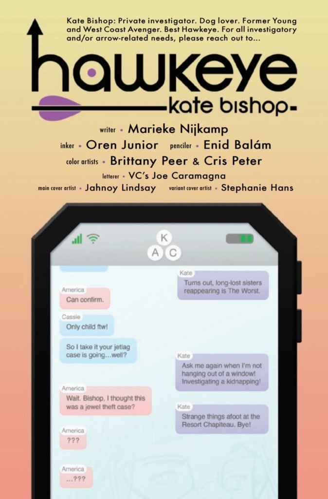
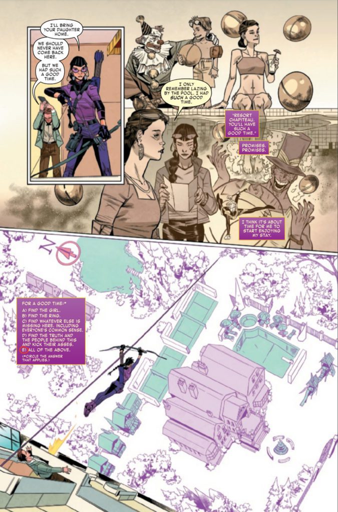
One of the sassiest heroes in Marvel Comics is back in action in Hawkeye: Kate Bishop #2. First, it was a missing sister, then a missing ring, and now a missing child? What next? Kate’s endless ability to find trouble continues thanks to writer Marieke Nijkamp, penciller Enid Balam, inker Oren Junior, colorists Brittany Peer & Chris Peter, and letterer VC’s Joe Caramagna.
Jumping right into another quippy conversation, huh?
The timing of Hawkeye: Kate Bishop could not be better. Fans are actively seeking out new material thanks to the most recent Disney+ series (which fans of either Hawkeye will surely adore). In both instances, we’re getting a heavy dose of Kate Bishop charm…or sass, depending on how you feel like labeling it.
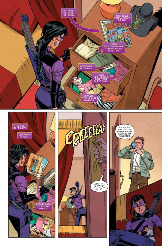
Last we saw, Kate had been lured to a suspiciously lovely hotel under the guise of helping her estranged sister. Given her family, she naturally knew that it was a trap. Yet if there’s one thing Kate can’t resist, it’s checking a situation out.
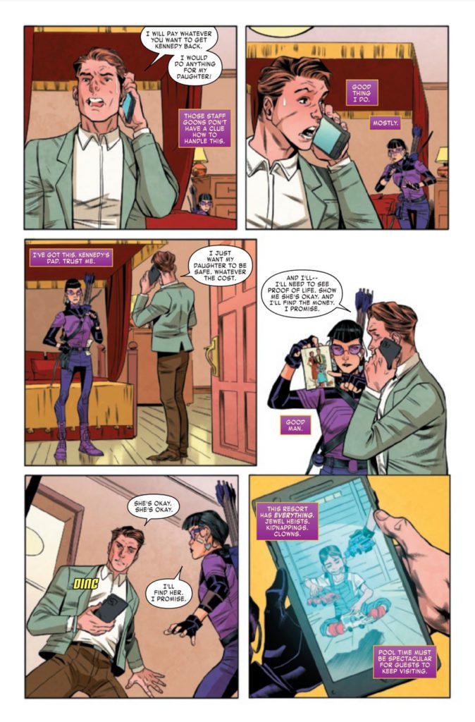
Hawkeye: Kate Bishop #2 picks up right where the last issue left us, which means we’re knee-deep in Bishop family drama, two separate investigations, and a Kate very intent on finding excuses to avoid heading home.
Kate’s keen eyes are spotting lots of important details here.
Writing
Kate Bishop’s series are always the perfect find for those looking for a light read that is guaranteed to bring laughter. Hawkeye: Kate Bishop #2 is no exception to that rule, as Marieke Nijkamp lets Kate’s bright personality fly free. In this instance, flying free means throwing herself headfirst into a strange situation — with no backup. Well, that’s not entirely true. She has Lucky, after all.
For those that need a refresher: Kate Bishop is currently working as a private eye. This fact is made evident as Kate notices dozens of little details of the scene. Details like this are very helpfully pointed out to us readers (with a heavy dash of commentary, of course).
That’s the refreshing thing about Kate: you never have to wonder for long about what is in her head. She’ll quickly make a point of telling you even if you don’t want to hear it. Admittedly, this makes the whole situation with her sister all the more entertaining and awkward.
Despite the lighter tones that come with a series such as this, there is no denying that the stakes have been steadily rising throughout Kate’s investigation. It’s difficult to predict how severe it’ll get before the end, but we just know that Kate will somehow find herself in the center regardless.
She knows how to handle this situation, thankfully.
Artwork
Hawkeye: Kate Bishop #2 is so very nostalgic for Hawkeye fans. Every spec of detail emanates with the humor and style that fans know her for. It’s an impressive feat, come to think of it. Enid Balam (pencils) and Oren Junior (inks) clearly understand her character.
They also know the fans well, as evidenced by a sneaky little Jeff the Land Shark cameo (did you spot it?). Little moments like this give so much personality to a series, so it is a delight to see them embracing it.
The colors are another element of this series that set the tone. Brittany Peer and Chris Peter portray a vibrant palette, yet there’s no missing that iconic purple suit, even with those bold colors pulling our attention elsewhere. Out of all the highlights worth mentioning here (and there are a lot), what is possibly most impressive is their mastery of subtle blending for backgrounds. It makes what would otherwise be a dull scene at night turn into something striking.
You can tell that VC’s Joe Caramagna had a bit of fun with the lettering here. It helps that there is so much to work with! First, we’ve got Kate’s ever-present banter, plus her commentary on investigations. Then we’ve got dozens of other details, from sound effects to blurred out conversations — the works. Oh! And don’t forget the frequent text chats with the exceptional America. Yet Caramagna perfectly fits everything on the page without it ever feeling crowded.
All of the above sounds good right about now!
Conclusion
Hawkeye: Kate Bishop #2 is a whirlwind of a read, throwing Kate from one investigation to the next. It’s almost like they’re trying to distract her (or like she’s trying to stay distracted). Yet the character and charm shine through all that chaos, leaving fans with a captivating read.
Acclaimed comics creator Cliff Chiang returns to a new era of Gotham with Catwoman: Lonely City #2. From training montages to exciting heists, and from political debates to nostalgic reunions, this comic nails every plot point it aims for. With outstanding writing and predictably phenomenal artwork, this could shape up to be the defining Catwoman story of the modern era.
“If Selina Kyle is going to break into the Batcave at her advanced age, she’s going to need a crew to help…and luckily for her, some of Gotham’s craftiest former villains have time on their hands and bills to pay. But who is the mysterious OGBeast? And with political pressure mounting, how long will Mayor Harvey Dent let this cat stay out of the big house?”
Writing & Plot
Cliff Chiang constructs an insanely fun and carefully plotted story chapter with Catwoman: Lonely City #2. Each of this comic’s plot points, setting changes, and character (re)introductions are handled with deliberate pacing that makes the absolute most out of the page count. What’s so striking is how each sequence is massively entertaining and revealing about these characters new and old. From the humorous yet inspiring training montages, to the tense heist sequences, and even to the political debates, every part of this book is pure comics magic.
Chiang has the tonal consistency of a practiced screenwriter. The entire comic manages to maintain a sense of levity while know when it needs to get serious. Even then, while the more serious sequences are rightfully poignant and emotionally heavy, they don’t overstay their welcome. Chiang’s characters, from his takes on our old favorites to the new faces, is uniquely written and brilliantly portrayed. With this chapter, Chiang proves that he is every ounce as great a writer as he is an artist.
Art Direction
If you’ve seen his work on Paper Girls or New 52 Wonder Woman, then you know the visual caliber you’re getting in Catwoman: Lonely City #2. Chiang’s thick pencils and inks carve personality into his characters and life into Gotham City. There is a massive amount of work and attention to detail going on in this comic. Post-Batman Gotham is already a fascinating and unique signature made by Chiang on this legendary city. What’s even more astonishing is the work he puts into his characters with his art. Chiang’s designs for the returned Selina Kyle, Barbara Gordon, Killer Croc, and others are a perfect combination of familiarity and unique flair. The real winner here (and hear me out) is the outfit design.
Everyone’s sense of fashion is picked out is perfectly picked out in terms of character personality and practicality. Gone are Selina’s alluring catsuits, replaced with loose-fitting sweats and custom-made sneakers. Croc’s large jersey’s and newsboy cap give him more characterization than he’s ever received. This same pattern applies to every person, including those I can’t share because of spoilers. What’s doubly impressive about this feature? Their clothing is constantly changing. Everyone’s wardrobe alters what feels like every 3 pages. This may seem like an odd detail to focus on, but think about it. When was the last time you noticed significant clothing changes on a character in a mainstream comic? More than just going from a signature costume to *one* standard plainclothes outfit? It doesn’t happen much. The effort and eye Chiang puts into the detail is insanely impressive to think about.
Colors
Chiang’s color choices create a sense of tonal mastery for every page and specific scene. His neon, almost pastel choices at points juxtapose with the tone we typically get from a comic set in Gotham. The twilight skies dotted with searching lights during a heist lend a sense of kinetic energy to the scene. More conversational moments are typically dominated by a single shade over the whole sequence, cast by an internal light source. Chiang’s colors mesh perfectly with his pencils and storytelling structure in a way seldom seen. His lettering is on point as well, with a sharp font that reflexively matches the character’s voices and focus words in the word bubbles. This whole experience is a carefully crafted piece of a smooth running, gorgeously put-together machine.
Verdict
Catwoman: Lonely City #2 is a perfect comic book, and a brilliant continuation of this Black Label comic series. Cliff Chiang crafts a comic with the energy of an action/heist film and rounds it off with relevant political discussion and deep character moments that all nail their landings. His visual work is as stellar as one might have guessed – and then some. Please make sure you’re reading this comic and pick up this issue when it hits shelves on 12-21!
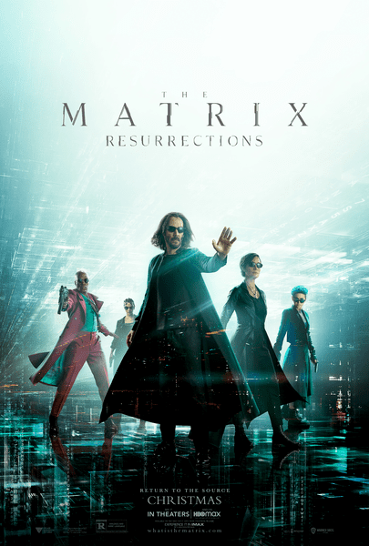
The Matrix: Resurrections decides to bring a meta aspect to this innovative universe. This is a solid return to a franchise credited for redefining Sci-fi and action films. Some plot threads might be easier for fans of the trilogy to appreciate, but the breathtaking action sequences might be enough to draw in a new generation of fans. The meta approach is handled very well overall, Keanu Reeves impresses as a matured Neo, and his chemistry with Carrie-Anne Moss remains strong.
Jumping back into this world after so many years felt surreal at times. The original trilogy is heralded for its groundbreaking action and complex narrative. While this fourth entry could be overlooked as just another sequel, Neo and Trinity’s relationship makes The Matrix: Resurrections worth enduring. The film follows Neo (Keanu Reeves) living as Thomas Anderson once again, he has now made a name for himself by turning The Matrix into a game.
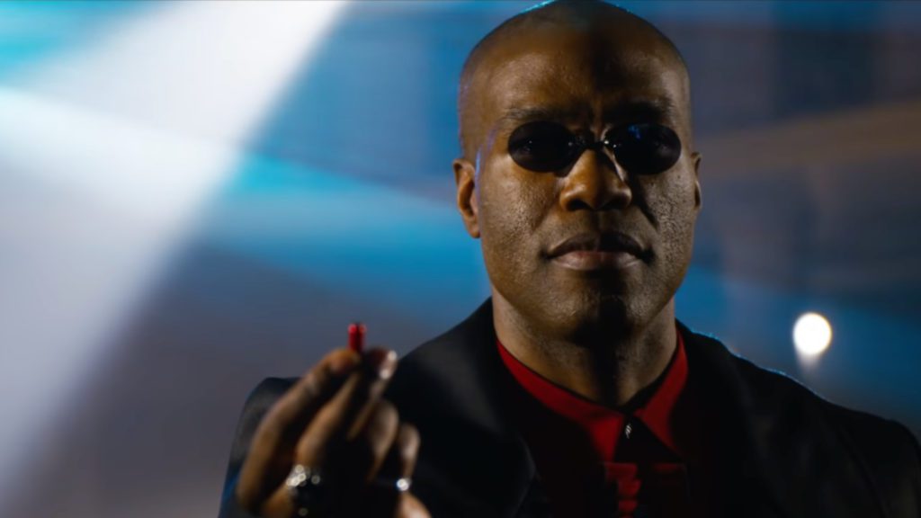
When a woman who appears to be Trinity (Carrie-Anne Moss) enters his life, an alternate version of Morpheus (Yahya Abdul Mateen) arrives to get his help against a new threat. The progression of Neo’s character is fitting when considering his computer programming background. This meta approach does grow tired once it’s put through the wringer. Luckily, it’s forgotten for a more familiar narrative. The Matrix: Resurrections does try to coast on nostalgia too much, but glimpses of the previous entries do help the romance being rekindled between Neo and Trinity.
The film’s events can be difficult to follow, especially when considering how Neo and Trinity are alive again. It’s necessary to have watched the previous installments because The Matrix: Resurrections caters to the established fan base in more than one way. Exposition dumping isn’t mandatory, nor is it always used in the best way. However, with the fourth Matrix film, there’s an argument to be made that not enough exposition dumping took place.
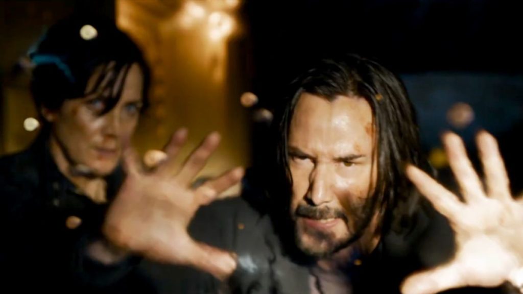
The Matrix: Resurrections script may have needed some revisions, but the performances are remarkable. Mateen joins the legacy cast as if he’s been present from the start. There’s familial chemistry that everyone shares. Jada Pinkett’s return was underwhelming, and this is due to Niobe (Pinkett) not having much to do. Reeves’ return as Neo doesn’t disappoint, but he does feel more at home when sharing the screen with Moss. The new additions to the Matrix family seemed more committed than some of the returning talent.
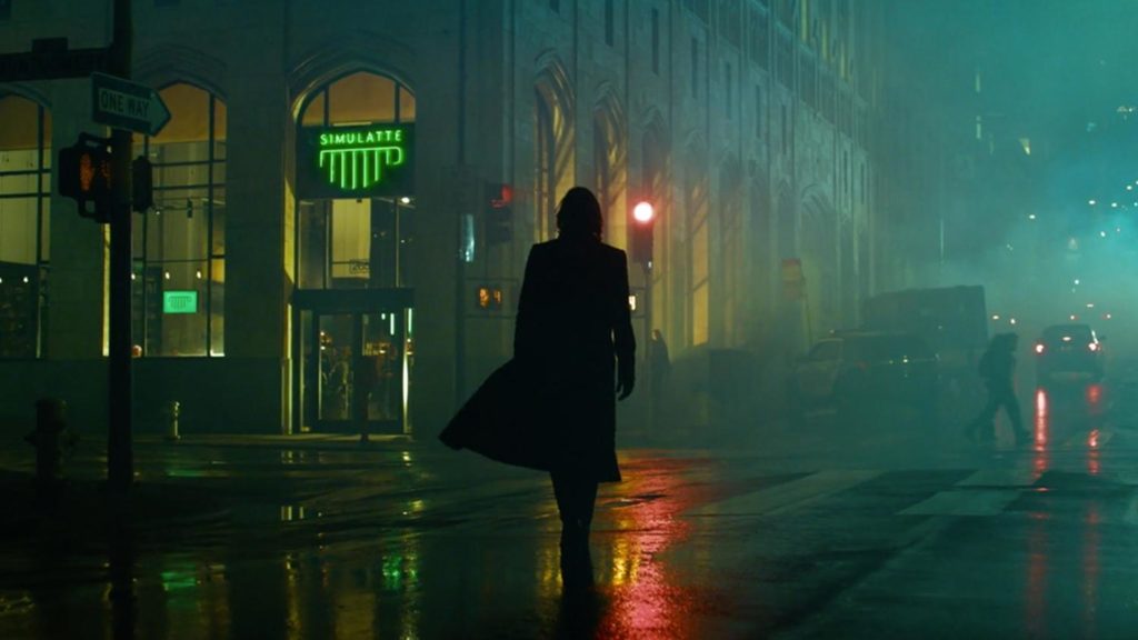
While the action sequences are thrilling to watch, none of it was memorable compared to the original. Neo and Trinity share some intimate moments complimented by excellent lighting choices. Sadly, a lot of the cinematography can be dull and lifeless. Lana Wachowski captures some brilliant shots and this franchise is still one of the best for slow-motion sequences. Neo and Trinity share a breathtaking moment during the film’s final act and Wachowski’s style heightens the emotions, as you anxiously wait to see if one of them will perish. This action-packed adventure is paced very well and the complexity of its narrative keeps you engaged just like its predecessors.
The Matrix: Resurrections arrives in theaters this week and audiences should have fun with it for the most part. The nostalgia baiting does get played out, and its meta aspect does get worn out rather quickly. Neo and Trinity’s revived relationship, the film’s complexity, and its gripping action sequences are its primary strengths. A second viewing will be needed to fully appreciate this long-overdue return to The Matrix. Staying true to its roots and only suffering from its narrative getting messy at times, The Matrix: Resurrections is a blast from start to finish.


 The art of X-O Manowar #9 continues to be a visual delight for readers. Ruth Redmond makes the dominating green hues of Troy’s technological singularity very eye-catching. Just about every character looks helpless before it. Thankfully, the body language from Emilio Laiso’s pencils and Raffaele Forte’s outlines make major characters stand out for a fighting chance. That’s not even including how Hassan Otsmane-Elhaou’s word balloons match the emotional state of every word spoken. Plus it is interesting to see the way the singularity speaks through echoing captions.
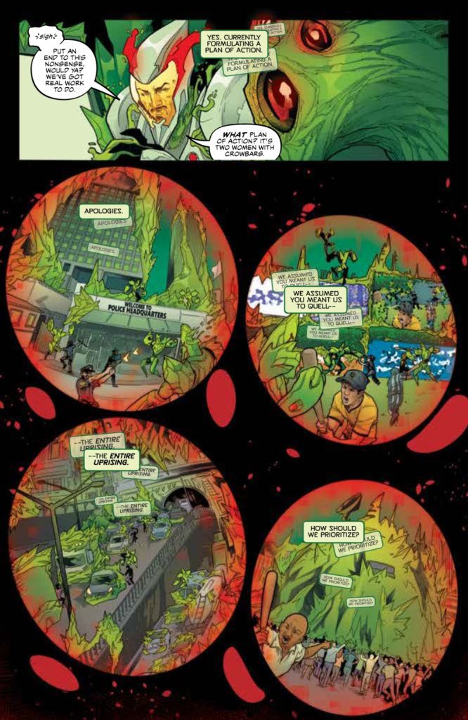

 Rodriguez’s larger-than-life art is so complex it’s mesmerizing. The way most of Defenders #4 has a pale yellow background evokes the nostalgia of aged comic books. There are also instances where panel layouts get so abstract, it feels like perspectives are warping. Take for example the Defenders fight against the Hulk Archetype “One-Is-Four.” The reader gets a genuine feeling of how much of an immovable wall he is with how characters transition across the page. Readers could be so used to reading comics a certain way that instances like this inspire the idea of