God laughs at the plans of men. Writers laugh at their own plans. There’s an incredibly organic feel to the script of DC Comics’ Dark Knights of Steel. It sets itself up, ripe with foreshadowing and characters full of potential. But it feels like this script got away from the creative team, in the best way. Writer Tom Taylor, artist Yasmine Putri, colorist Arif Prianto, and letterer Wes Abbott don’t give us a tale that feels planned and safe. No, DC Comics’ Dark Knights of Steel #3 is full of the chaos and destruction of war.
Writing
In the first issue of Dark Knights of Steel, Taylor made it clear that this is not your mom and pop’s version of Superman or Batman. He made a point of showing that anything can happen. And that’s true within the parameters of his own story too. Just because a character seems like they’ll be a big influence on the story, doesn’t guarantee their safety. Just because a plotline feels like it’s going somewhere, doesn’t mean it won’t be killed in its tracks. It’s a fantastic way of communicating how chaotic war is. Taylor shows that this won’t follow the typical beats of a story, because war is unpredictable. And still, within the chaos, Taylor gives us just enough time to connect to each character. It’s cruel and beautiful all at once.
Art
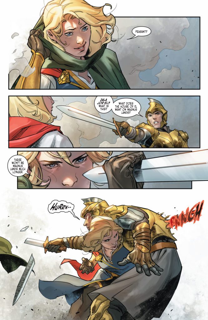
Putri continues to give us a strong sense of each individual character. We see the handful of characters that have yet to be hardened by war and grief. Zala Jor-El wears her heart on her sleeve. You can see her fury and happiness as clear as day. But King Jefferson, who has just experienced a terrible loss, is indecipherable. Where Zala is an open book, Jefferson is a brick wall. With swords at his throat, he looks on in concentrated stoicism. Nothing fazes him now.
But Putri does more than just show how war discourages feeling anything. She shows how it also takes individuality out of life. When one character happens upon a group of knights, we see each knight shown quite descriptively. Their faces and their body language immediately tell us something about them. But then, the knights are slaughtered. Putri covers the knights’ faces in shadow. They become non-descript pawns of a larger power. Putri makes their deaths impersonal, even pointless. It compounds the feeling that things are beginning to go very, very wrong.
Coloring
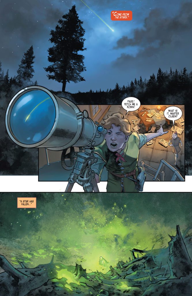
So much of the brightness and color that Prianto brings into Dark Knights of Steel relates to violence. It’s the scenes of people being dismembered in battle that are rendered in dazzling red. It’s King Jefferson’s use of his lightning powers against an enemy that are shown in startling blue. And it’s the ominous green rock from the skies that Prianto colors in a stunning green. Much of the rest of this issue feels very normal, even bleak, by comparison. Occasionally, though, we see the vivid colors characters wear to express their fealty. King Jefferson’s ship is adorned in the gold and blue of the King of Storms. Zala wears an outfit, colored in the red, blue and gold of the House of El. All color in this world, Prianto shows us, leads back to the war and destruction that’s looming.
Lettering
Abbott continues to bring the excitement in Dark Knights of Steel #3. And he’s starting to create a pattern with his sound effects in this series. The lettering for the lightning powers of the Jefferson family are all shown in the same scratchy blue font. The sound of someone’s fist going through someone’s chest looks the same as the noise of a piece of wood stabbing through another character’s back. Taylor and Putri keep giving Abbott new scenarios for him to dream up new fonts for. But he’s creating a visual language for Dark Knights of Steel. Abbott’s reusing of fonts, and the little variations he has for each instance, makes each moment blend into the narrative and become a part of the story that’s being told.
DC Comics’ Dark Knights of Steel #3 is chaotic and unpredictable. This creative team shows that war destroys everything – even the comfortable predictability of a story. Dark Knights of Steel isn’t a comfortable series. It’s heartbreaking, disturbing, and a brilliant discussion of the horrors of war. Pick up Dark Knights of Steel #3, out from DC Comics January 4th, at a comic shop near you!