Home Blog Page 114

INTERVIEW: Editor Gabriel Fleming Finds Tension In NATIONAL CHAMPIONS

national champions-film-interview-editor-gabriel fleming

National Champions is a new film from Ric Roman Waugh (Greenland) about the complex relationship between top-tier colleges and the student-athletes who put their health on the line to generate billions of dollars.

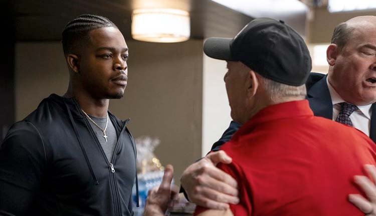
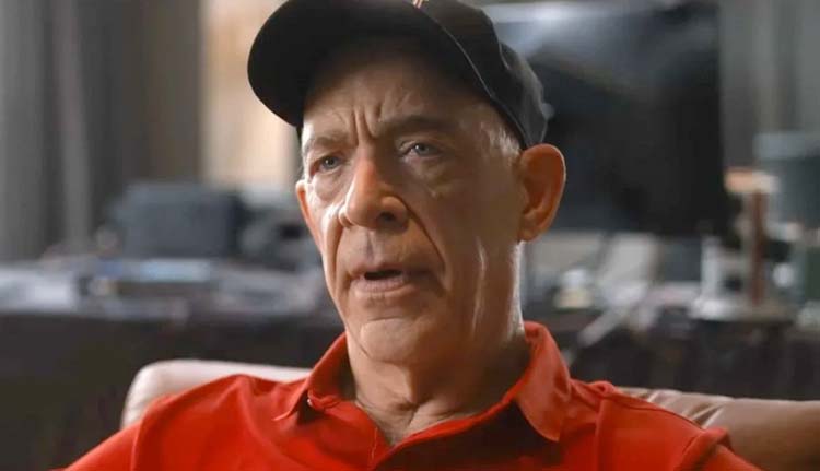
Coach James Lazor, played by JK Simmons (Whiplash, Spider-Man: No Way Home), has come close to a national championship several times but never held the trophy. However, things are looking bright this season with his superstar, Heisman-winning QB LeMarcus James (Stephan James). The team prepares to play for the national championship. However, LeMarcus makes a bold decision to strike against the NCAA and not play in the championship game. Now seventy hours before the game, many players on both teams have joined James’ protest.

PopAxiom spoke with Gabriel Fleming about becoming a filmmaker and editing National Champions, a “hotel drama” as a “thriller.”

That’s The Job

Gabriel’s connection to making visual art “… started with a video camera when I was 12 years old. I worked as a busboy at a local restaurant so that I could save up to buy a VHS camera; this was 1985.”

“One of the new features on the camera,” he continues, “was a flying erase head so you could do clean edits. It was very new; the first consumer-friendly form of editing. I was messing around with that as a kid.”

Gabriel attended film school, where he initially focused on “writing and directing,” he says. Then, “I got into the French New Wave and documentary-style art films. Finally, I made a couple of micro-budget feature films.”

“I do remember that when I thought about feature films, I saw cuts in it.” Gabriel’s editor brain was in full effect. “As a director, I didn’t think about just the story or lines or performance, I was more interested in visualizing how one shot connects to the next and how that would combine with the music and sound to build emotion.”

Gabriel kept creating and realized that the visual way he put together movies was “just the way my brain worked.”

“It is all about the montages and how one element juxtaposes the next to create a feeling or an idea,” he adds. “ Editing is the unique art of cinema. All the other elements are borrowed from theatre and photography, and fashion. Editing you can do only in a film. That’s always appealed to me.”

Of course, understanding editing and committing to the act of editing are two different things. “I was an editor on America’s Top Model for a couple of seasons. I had an assistant who got his first chance to edit. He was editing a couple of scenes, and he came out and said to me one day, ‘How do you watch it over and over again?’ I said, ‘That’s the job.’” Your brain has to be wired that way.”

editor-national champions-interview-gabriel fleming

About National Champions

National Champions director Ric Roman Waugh and Gabriel worked together on two previous films, “Angel Has Fallen and Greenland, which were action films.”

COVID happened, and the film industry had to shift gears in the way things were produced. “This film came up for Rick. It’s something that can be shot during COVID because it takes place almost entirely in hotel rooms. So, the cast and crew could be easily quarantined.”

Having actors safe in hotel rooms is great, but how do you make an exciting film in these locations? “One of the things Rick said early on was, ’this isn’t just a drama in hotel rooms, this is a thriller.’ So we want to treat it with that in mind.”

“Also, treat it as a football game, yet there’s no football in the film,” Gabe shares. “We want to think of it as ‘this side has scored a point and they’re up, then this side scored and is in the lead.’ We want to keep the thriller tension in that back and forth in what could’ve been a plain, beige wall hotel room movie. We wanted to keep the audience on the edge of their seats.”

Gabriel compares National Champions to a previous project with Rick. “You can feel a little bit of a similarity between National Champions and Greenland, which is a movie about the end of the world,” Gabriel laughs. “There are some stylistic similarities with pacing and music approach.”

national champions-editor-interview-JK Simmons

Pacing & Process

Every film has a pace, a rhythm or a tempo that reveals the plot. “Pacing is so subjective. In my process, I start with the first pass of a scene. I try to pace it as reasonably fast as I think I can. Then come back to it later and discover, ‘Oh, this is way too slow’ then pace it up.”

“Eventually, I like to go through the whole movie and pace it as fast as it allows,” he continues. Finding the “right” place for a film is part of the puzzle for editors and filmmakers. “Then I go back, and sort of loosen a bunch of pockets. So you get an ebb and flow instead of this monotonous type of pacing.”

National Champions has long scenes of drama and tension. “The second to last scene, which is a 12-minute long scene, was one that we tried pacing it up, and it was just breaking it. It was ruining the scene.”

“In the end,” he explains, “we ended up pacing it down from my original editor’s cut. Slowing it down in certain pockets was surprising to me. This movie was a discovery in pacing for me because of the mix of thriller and drama.”

The mix of a thriller’s fast pace and a drama’s slow one was a balance that Gabe sought to find. “That’s the art of editing, that personal taste of how something flows and moves and guiding the emotions of the audience.”

Working with JK

JK Simmons is one of the principal characters in this riveting, poignant story. “JK is such a pro,” he says about editing scenes of the legendary actor. “He delivers an amazing performance in every single take. But, of course, that can present its own challenges. You’re always trying to find not the best take, but what is the most appropriate performance for this moment.”

Gabe recalls the first day of shooting. “There’s a scene where JK gives a speech to a whole team, and we see what he can do. It’s the very first day of shooting, and he’s got this 5-page monologue essentially. He did probably about 15 takes. He’d do something a little different in each one. One might be stern, then threatening; the next, he’s more vulnerable. Finally, there’s one take where he’s crying through most of it.”

“That was about finding each mode of his performance and intermixing the different emotional places that he was in in a way that created a shape to the scene,” he explains. “I could dip in and out of the vulnerability for a few lines, and the threatening lines intercut with the faces of these players who are real college players.”

As an editor, “It’s just a pleasure to work with someone like JK and get these subtle variations.”

Wrapping Up

What filmmakers does Gabe love to watch? “These days, any Denis Villeneuve film I’m excited to see. Watching Dune was mind-blowing. I’m a huge David Lynch fan. I listen to his weather report every morning in LA. But, I do like some obscure international filmmakers like Apichatpong Weerasethakul (Memoria).”

“I always say to my agent ‘Star Wars,’” he shares. “If there’s a Star Wars project available, I’ll do it. Star Wars and Star Trek were really important in my childhood. I’d love to be involved with that.”

Is National Champions on your watch list?

Thanks to Gabriel Fleming and Backlight PR
for making this interview possible.

Discover more interviews from Ruben R. Diaz right here!

Monkeys Fighting Robots Youtube

Marvel Comics Exclusive Preview: DAREDEVIL: WOMAN WITHOUT FEAR #2

marvel comics exclusive preview daredevil woman without fear

DAREDEVIL: WOMAN WITHOUT FEAR #2 hits your local comic book store February 2nd, but thanks to Marvel Comics, Monkeys Fighting Robots has an exclusive four-page preview for you.

About the issue:
Elektra Natchios is the greatest assassin in the Marvel Universe – but having recently taken up the mantle of DAREDEVIL, she’s taken a vow to never take a life again. But that vow is about to be put to the ultimate test, as KRAVEN THE HUNTER has her dead in his sights…and, unlike Elektra, he has no reservations about killing. If anything, he likes it when his prey struggles. At least, he thinks he does.

The issue is by writer Chip Zdarsky and artist Rafael de Latorre, with colors by Federico Blee, and letters by Clayton Cowles. The main cover is by Chris Bachalo.

WOMAN WITHOUT FEAR is a tie-in to DEVIL’S REIGN, also written by Zdarsky.

Check out the DAREDEVIL: WOMAN WITHOUT FEAR #2 preview below:

marvel comics exclusive preview daredevil woman without fear

marvel comics exclusive preview daredevil woman without fear

marvel comics exclusive preview daredevil woman without fear

marvel comics exclusive preview daredevil woman without fear

marvel comics exclusive preview daredevil woman without fear

marvel comics exclusive preview daredevil woman without fear


Stay tuned to Monkeys Fighting Robots for Marvel Comics Exclusive Previews every week!

Monkeys Fighting Robots Youtube

AfterShock Comics Exclusive Preview: DARK RED: WHERE ROADS LEAD

aftershock comics exclusive preview dark red where roads lead

DARK RED: WHERE ROADS LEAD hits your local comic book store February 9th, but thanks to AfterShock Comics, Monkeys Fighting Robots has an exclusive five-page preview for you.

About the issue:
The hit vampires-in-the-heartland series returns! 

Following the events surrounding the defeat of the Order of the Eventide, blue-collar vampire Chip tries to return to his life of quiet, rural isolation. But soon he has to ditch his late-night convenience store shift to travel across the country to New Orleans to visit a dying veteran. What starts as a trip of noble intent becomes a quest through a hell of wars to retrieve a stolen soul and escape an old enemy.

The 48-page one-shot is by writer Tim Seely and artist Corin M. Howell, with letters by Carlos M. Mangual. The main cover is by Howell, and the incentive variant is by Andy Clarke and Jose Villarrubia.

Seeley and Howell return to bring us the next chapter in the epic tale of horror and adventure that is DARK RED – and this one has twice the bite!

Check out the DARK RED: WHERE ROADS LEAD preview below:

aftershock comics exclusive preview dark red where roads lead

aftershock comics exclusive preview dark red where roads lead

aftershock comics exclusive preview dark red where roads lead

aftershock comics exclusive preview dark red where roads lead

aftershock comics exclusive preview dark red where roads lead

aftershock comics exclusive preview dark red where roads lead

aftershock comics exclusive preview dark red where roads lead


Are you a fan of DARK RED? Are you excited for WHERE ROADS LEAD? Sound off in the comments!

Monkeys Fighting Robots Youtube

Spoiler-Free Review: SAGA #55 — The Return

saga 55 image comics review

SAGA makes its triumphant return to comic book stores this week, and if you were concerned that the series lost a step during its hiatus, we’re here to put your mind at ease.

Disclaimer: This is a spoiler-free review. Due to the nature of the series and its long break, we will be discussing this issue in as little detail as possible, trying to focus instead on its tone and characters in a more abstract sense.

The last issue of SAGA came out on July 25, 2018, roughly three and a half years ago. That’s an insanely long break for one of the best-selling and most critically-acclaimed comics on the stands, and in that time, fans began to wonder if the series was actually ever going to return. Well return it has, and with the same, original creative team: artist Fiona Staples, writer Brian K. Vaughan, and letterer Fonografiks.

This is a difficult issue to review, because, well…it’s SAGA. As mentioned, it’s one of the best-selling series out there. If you’re a fan, chances are you were at your local comic shop this morning to pick up the new issue. But a lot can change in three years; as Vaughan mentions in his letter at the end of this new chapter, there are probably readers out there who have moved on from SAGA, or from comics entirely. So this review is for those people, the ones who are unsure whether or not they want to return to this world.

In short: you do.

saga 55 image comics review

Staples and Vaughan throw readers right back into this worn-torn galaxy, and it’s like we never left. We’re reunited with the characters we know and introduced to new ones who feel like they’ve always been there. Even though things have changed since we last saw Hazel and her family, this world still feels familiar, even with the introduction of new conflicts.

One of SAGA‘s greatest strengths has always been its ability to grab hold of you at the get-go and not let go until you run out of pages, and that still holds true. Staples’ art is full of emotion and kinetic energy — she’s the star of the show, with all due respect to BKV and Fonografiks. She fills this world with life and excitement, to the point where you’ll finish this double-sized issue in no time and start your re-read immediately.

Cast your reservations aside: SAGA is just as good as it’s ever been. It’s as funny, crass, and horny as you remember (damn, is this issue horny). Staples’ work has only gotten better since we last saw it. But crass humor and horniness aside, SAGA is still, at its core, a story about families and the flawed individuals that make them up.

That last sentence almost dovetailed into a soliloquy on all the things SAGA is about, but the fact of the matter is that SAGA is about a lot of things, good and bad, and that’s what makes it a relatable, beloved series that has (and will continue to) stand the test of time.

Read SAGA. That’s all.

Monkeys Fighting Robots Youtube

Review: A Multifaceted Battle in the Works in ONCE & FUTURE #24

BOOM! Studios’ Once & Future #24, available now, brings the arcs of many stories to battle — both literally and figuratively. Be sure to check out this latest issue, brought to us by Kieron Gillen, Dan Mora, Tamra Bonvillain, and Ed Dukeshire.

Once & Future #24
More legends coming to life on this variant cover of Once & Future #24.

Remember twenty-plus issues ago, when Duncan had no idea what was up with his family’s history? More than that, remember when Britain wasn’t overrun by monsters and beings of legend and lore? Yeah, things have changed.

Once & Future #24 brings readers to a war-torn Britain, though arguably not in any way that we could have ever anticipated. In this war, multiple Arthurs battle for supremacy, with dozens of other legendary beings (literally) running around and making messes of their own. All while the surviving humans continue to try and do just that – survive.

To say that this is a complicated world at the moment would be an understatement. And yet that is where this series shines – in its complexity. These are not the stories people dream of finding themselves stranded in, nor are they clear-cut. This warped version of classical tales has found a way to add new life to the lot.

Once & Future #24
Gran’s sass is coming out strong right out the bat in Once & Future #24.

Writing

Once & Future #24 continues its complex dance, with Kieron Gillen at the helm. There are many players on the field, and if we’re being honest, any one of these characters would have been enough to hold our attention — not to mention enough to create a severe threat for all the humans involved (Duncan, Gran, and Rose included).

Throwing so many to the world simultaneously makes it all so delightfully unpredictable. Just when the motivations become clear, something happens to change it all up. Usually, that something comes in the form of violence.

As such, Once & Future #24 keeps up the dramatic trend – full of action and storytelling elements. One of the highlights of this issue (of which there are many) would have to be the battle of two Arthurs.

There’s something oddly poetic about the concept and about the way it is portrayed. Perhaps this is because we’ve had quite some time to get to know them. More likely, this is another instance of Gillen carefully leading the readers through a curated journey.

Once & Future #24
While the humans are busy on one adventure, another threat continues to rise in Once & Future #24.

Artwork

One of the reasons Once & Future has become so popular is the blindingly brilliant artwork. It almost feels like each panel or page of this series would make for an outstanding print, especially with a fantasy bend. Once & Future #24 is no exception, providing fantastic artwork for readers to relish once again.

Dan Mora’s art style has proven perfect for this world, bouncing back and forth between the human realm, the gore of battle, and the fantastic elements of stories. It makes for a visually compelling masterpiece.

Once & Future #24 has a lot going on within these pages, both in the storytelling and visually. It’s easy to understand how rapidly the battles are changing, thanks to how the panels are laid out. This design increases the drama and anxiety of it all, though in somewhat unexpected ways at times.

Unsurprisingly, the colors remain one of the best parts of this series. Tamra Bonvillain’s colors are out of this world – and that makes them ideal for this entire series. But that fact has never been more accurate, as legends and worlds forcefully collide here.

Ed Dukeshire’s lettering plays a critical role in this issue, grounding the series and the tale as a whole. It does all this while casually reminding readers of each legend’s role, all through font and color choices.

Once & Future #24
A blast to the past in Once & Future #24 – one that should feel quite familiar.

Conclusion

Once & Future #24 is yet another incredible addition to this series. Truth be told, it is hard to believe how consistently the ante has been upped. Every issue (this one included) adds new complications and reasons to eagerly countdown the next installment. Until then!

Monkeys Fighting Robots Youtube

Review: Goodbyes Are Never Easy in STRAY DOGS: DOG DAYS #2

Image Comics’ Stray Dogs brings us another wave of goodbyes in Stray Dogs: Dog Days #2. So if you’re in the mood to visit some of the best canines around — and have your heartbroken at the same time — make a point of reading this latest issue by Tony Fleecs and Trish Forstner, available now.

Our canine cast looks like they’re about to find themselves in a fair amount of horror, given this variant cover of Stray Dogs: Dog Days #2.

Stray Dogs: Dog Days #2 continues a series of one-shot stories focused on the individual dogs that made this story come to life. Most of the stories in this collection occur before Stray Dogs‘ events, which adds a strong bittersweet note to it all.

There’s something very melancholy about seeing the life of a happy pet before their life (and the life of their owner) gets turned upside down. However, it is a gentle comfort to know that they had love in their life.

One of the best parts of Stray Dogs: Dog Days is that readers finally get a chance to know a bit more about each dog – not just the canines who stole the show. Yes, it comes at a price, but it’s a price I’m willing to pay, and I’m sure I’m not the only one.

*Spoiler/content warning: Stray Dogs and Stray Dogs: Dog Days are essentially Silence of the Lambs merged with All Dogs Go to Heaven. It gets pretty heavy at times, especially for animal lovers out there. Please keep this in mind.

Stray Dogs: Dog Days #2
Balto? Is that you? Nope, just another variant cover for Stray Dogs: Dog Days #2.

Writing

It sincerely feels like every panel in Stray Dogs: Dog Days #2 (and the series as a whole) was designed to tug at our heartstrings. It certainly succeeds in making us feel a plethora of emotions, thanks largely to Tony Fleecs’ writing.

There’s no point in pretending that this is a light-hearted series — it isn’t. Yet even with that fact in mind, it does feel like Stray Dogs: Dog Days #2 is darker than its predecessor. Before, it was easier to pretend that these happy moments were almost outside of the larger story. That is more difficult to do in this issue.

That is likely due to the dramatic (and twisted) beginning of the issue. Readers are thrown right into the thick of things, with a quick reminder of what Master was really up to this whole time.

Despite that heavy introduction, it is impressive how many surprises and little details are woven into these short stories. Some provide insight that maybe we were better off without, while others offer a much-needed sense of closure.

All things said and done, Stray Dogs: Dog Days #2 tells us stories about Henry, Sophie, Earl, and Victor. However, other hounds appear here and there, only when it makes sense for their appearance. Victor’s story is by far the most satisfying of the set, as it gives readers a sense of closure, alongside a good place to say goodbye (again).

Stray Dogs: Dog Days #2
Stranger Things meets Stray Dogs on this cover of Stray Dogs: Dog Days #2.

Artwork

Before talking about the artwork inside Stray Dogs: Dog Days #2, we must take a moment to talk about the variant covers available. Not only are there a ton of them (the ones included in this review are only a small sampling), but the sheer breadth of them is impressive. The references are all over the place, showing a sense of humor that is sometimes morbid (but still very much appropriate).

As for the artwork inside Stray Dogs: Dog Days #2, it is perfection, as always. Trish Forstner makes this series what it is. In addition, there’s Brad Simpson, who provided the colors for this issue.

Several of the stories in this issue rely heavily on nonverbal elements to build the narrative. As such, Forstner and Simpson do a lot of heavy lifting here. The end result makes it worthwhile, as there’s a lingering feeling that comes with finishing this issue, one that takes some time to fade.

For me, it was page thirty-three that cut to the quick. Four seemingly simple panels, and yet it feels like they carry the weight of the world. For lack of a better description, they almost feel hauntingly real.

As for the colors, they are vibrant and alive. This makes for a stark contrast to the story’s tone. But it is also where much of the charm for this series comes from. Here it is easy to see where All Dogs Go to Heaven created inspiration within the creative team.

The wanted posters at the beginning of each chapter hit home as well. I don’t think they would have carried the same level of import if not for a certain dedication to detail through lettering and colors. The lettering helps to further enhance each and every scene, especially as the calm of the before merges into the here and now.

Stray Dogs: Dog Days #2
Adding an extra sense for this variant cover of Stray Dogs: Dog Days #2.

Conclusion

Stray Dogs: Dog Days #2 may not give readers all of the closure they’ve probably been craving, but it comes close. It is yet another goodbye to the series that feels exceedingly final.

Monkeys Fighting Robots Youtube

Marvel Comics Exclusive: X DEATHS OF WOLVERINE #4 Variant Covers

Marvel Comics Exclusive

X DEATHS OF WOLVERINE #4 hits your local comic book store March 9th, but thanks to Marvel Comics, Monkeys Fighting Robots has an exclusive first-look at Ema Lupacchino and Chris Bachalo’s variant covers for the book!

About the issue:
KRAKOA IN THE CROSSHAIRS!

WEEK 8 – The chase leads to the mutant nation of Krakoa, as the force of mutantkind’s ultimate destruction breaches its borders. Is this the last stand of Xavier’s dream? Readers and collectors take note: This will be a major turning point for the X-books!

The issue is by writer Ben Percy and artist Federico Vicentini. You can see both electric variant covers below.

Ema Lupacchino:


Chris Bachalo:

marvel comics exclusive preview reveal Chris Bachalo cover


Did you pick up X DEATHS OF WOLVERINE #1 today? Sound off in the comments!

Monkeys Fighting Robots Youtube

Review: COWBOY BEBOP #1 – A Silver Lining

LET’S JAM!

From writer Dan Watters (Lucifer, Home Sick Pilots) and artist Lamar Mathurin (Gumbo) comes a slick and stellar opening to this tie-in to a horrible adaptation of a masterpiece of animated storytelling with Cowboy Bebop #1. With colors from Roman Titov and letters by Richard Starkings and Jimmy Betancourt, this tie-in comic pulls off the charm, style, and thematic weight of the original series far better than the ill-fated Netflix adaptation it is directly linked to. With a faithful and wildly fun script and incredible visual work, this comic is far better than it has any right to be.

“An original story set in the year 2171. The bounty hunter crew of the spaceship Bebop chase an ex-gang member who holds a vest which gives the wearer unlimited luck.”

Writing & Plot

Dan Watters demonstrates a love and fundamental understanding of the source material with his script for Cowboy Bebop #1. The Coffin Bound writer uses only what bits of changed lore he was required to use for this tie-in, but kept everything else faithful to Watanabe’s original anime. The crew of the Bebop are once again broke with an empty fridge, and are desperately after a high-value bounty. Only trouble is that this mark is wearing a “luck vest,” that grants him with improbable…well, luck. With this vest he’s able to effortlessly dodge the authorities, as well as Jet, Spike, and Faye. Each character is faithfully portrayed; Spike with his existential indifference, Jet with his gruff seriousness and ISSP contacts, and Faye’s angry, financially driven determination. Ein makes an appearance too, and is just as full of personality as his original version. There’s no Edward here, but if the Netflix series is any indicator, that may be for the best.

What really makes this comic such a treat, and one that stands on its own, is how much it feels like a lost episode of the original Bebop. Not only does the plot sound just like something out of a series arc, but the tone and dialogue all just feel right. Each character’s interactions have the swagger and personality of the original series. There’s a rhythm to the dialogue and plot itself that directly reflects that of the anime, and it’s all a testament to how much attention Watters paid to that source material. There’s a scene that sticks out to me, where Jet has a conversation with a local about the man they are hunting down. It’s a melancholic, somber exchange that just screams Bebop, and it solidified how impressed I am with this issue. This is Cowboy Bebop from a writer who knows why the original series worked; a knowledge the live-action series creators sorely lacked.

Art Direction

I’m ashamed to say I was unfamiliar with Lamar Mathurin’s work before Cowboy Bebop #1. Now I’m desperately hoping for more of his work, because this comic has my favorite art of 2022 thus far. Mathurin’s ultra-stylized, heavily inked pencils bring a reading experience that mimics the flavor of the anime while being very much its own beast. Characters are highly expressive and detailed, and remind me of Sean Gordon-Murphy but much sharper. His panel direction shares the rhythmic flow that the plot itself does, making the two storytelling elements work hand-in-hand beautifully. Diehard fans may be disappointed by the character models being based on the actors and designs from the Netflix shows. Much like the lore pieces though, this is just fulfilling this comic’s technical duty as a tie-in. Visually, this comic, is Shinichiro Watanabe’s Cowboy Bebop all the way.

Roman Titov’s colors are arguably the most critical and awesome component of this comic’s visual approach. Every panel is slammed with the rich, deep, jazzy tones found in the original animation, but applied in a manner that works perfectly for the comics medium. The dark jazz clubs, slums, and starship interiors cast their shadow onto every surface, making the comic feel like the anime, but then also something else entirely. The lettering from Richard Starkings and Jimmy Betancourt carries the smooth and rhythmic feeling this comic has over the finish line. The dynamic, off-kilter word bubble fonts and percussion-like SFX lettering splash across every page and tie this phenomenal reading experience together. This is a brilliant comic from the visual end, and the most impressive I’ve experienced this year so far.

Verdict

Cowboy Bebop #1 succeeds in spades where the (cancelled) television adaptation it ties into failed. Dan Watters pens a script that has all the makings of a lost episode of Watanabe’s original anime, with the thematic heart and flavor of that work flowing throughout. The visual work from Lamar Mathurin and Roman Titov is an absolute delight, as it carries the unique visual swagger of Bebop while adapting it in its own way to a completely different medium. This is the adaptation treatment that Cowboy Bebop truly deserves. So see you, Space Cowboy… at your local comic shop when this issue hits shelves on 1-26!


Monkeys Fighting Robots Youtube

Review: PEACEMAKER: DISTURBING THE PEACE #1 – Peace Through Childhood Trauma

Comics legend Garth Ennis (Preacher, The Punisher) and artist Garry Brown (The Massive) team up for a brutal, smart, and darkly hilarious opening issue with Peacemaker: Disturbing The Peace #1. Featuring colors by Lee Loughridge and letters from Rob Steen,  this DC Black Label comic fuses Ennis’s twisted humor and sharp military & political writing with a top-notch visual aesthetic to create the perfect start to a story reintroducing America’s favorite peace-loving professional killer.

“Long before joining the Suicide Squad, Christopher Smith, code name Peacemaker, meets with a psychiatrist—a woman dangerously obsessed with his bizarre and violent past. From his tragic childhood to his military service overseas to his multiple missions with Special Forces, Smith has more than his share of skeletons in the closet. But who’s actually analyzing whom? And will this trip down memory lane result in yet more fatalities?”

Writing & Plot

I imagine Garth Ennis was grinning like a madman as he was penning the script for Peacemaker: Disturbing The Peace #1. The fact that he hadn’t written a Peacemaker comic until now seems strange, as I could scarcely imagine a better melding of writer and character. The narrative here takes place in the form of Christopher Smith – a.k.a. Peacemaker – meeting a psychiatrist as she evaluates him before he is permitted to join a U.S. Special Forces team. The rest of the story works as a semi-frame narrative consisting of flashbacks to Smith’s traumatizing early life and prior military engagements.

Ennis is able to perfectly navigate both the twisted humor and surprisingly cool intellect of our deadly protagonist. The humor doesn’t come as much of a surprise, between Ennis’s own history and the applauded live action interpretation of the character via James Gunn. However, it’s the shocking and smart delivery of the Preacher writer’s brand of gallows humor that really sets this comic apart. The psychiatrist who comes to see Christopher serves as the audience character. Her morality would tend to mirror ours. But because we are seeing these insane acts of over-the-top brutality from our readers’ perspective, they come off as humor juxtaposing the psychiatrist’s horror.

Ennis, in his signature style, also offers incisive bits of brutal commentary on our government’s military. I’m not going to get into spoilers, but makes some pointed remarks through his plot about recruiting and ignoring/hiding the ugliest sides of international military operations. Ennis has always excelled at criticizing world governments for how they conduct their armed forces. I’m pleased to report that he is still at the top of his game in this regard – if not better than he’s ever been.

Art Direction

Artist Garry Brown brings a gritty, almost 90’s Vertigo aesthetic to the grim and darkly humorous events of Peacemaker: Disturbing The Peace #1. Brown’s heavily crosshatched pencils bring a sense of menace and foreboding to every scene. Whether this was the intended effect or not, Brown’s style is a clever touch for keeping this comic mired in unpredictability. He utilizes a great amount of detail in his character animations and designs, especially for a bunch of figures who are dead/dying/going to die. His visual direction is busy yet easy to follow, with panels being laid over each other as he bounces from present day to flashback. Brown fits in well among other artists who have worked with Ennis, with a definitive style that serves the story well.

Lee Loughridge’s colors finish off the visual style with a smoky, semi-watercolor look. He complements Brown’s work by using the darker end of every color he chooses. This is stellar for setting the tone for every page. One that really sticks out is near the beginning when Christopher arrives home from school on a um…fateful day. The room he walks into is colored with a hazy, almost sick-looking shade of light green. Another is a gorgeous shot of a purple early morning sky when Peacemaker is on an op as he looks over a beach he just swam to. His work here is some truly fantastic stuff. The letters from Rob Steen have a classic design to them, with some great and well placed SFX letters as well. Visually, this team puts together a fantastically designed comic that serves the story immensely well.

Verdict

Peacemaker: Disturbing The Peace #1 is a deviously funny and immensely entertaining start to this new mini-series starring DC’s funniest sociopath. Garth Ennis’s script shows the Irish legend is still in top form, with his signature blend of gallows humor, naturalistic dialogue, and ever-incisive political commentary. The visuals from Garry Brown and Lee Loughridge are detailed, gritty, and well directed and give this opening a great artistic aesthetic. Be sure to grab this new #1 when it hits shelves on 1-25!


Monkeys Fighting Robots Youtube

Review: BATMAN/CATWOMAN SPECIAL #1 — A Meditation on Grief

Batman/Catwoman Leon DC Comics

DC Comics’ Batman/Catwoman Special #1 is a tough read. Don’t get me wrong, it’s beautifully written and masterfully rendered by all the creators involved. But, as many know, this particular issue saw a big change in its creative team during production.

Originally, Batman/Catwoman Special #1 was to be drawn by a giant in the comic book industry: John Paul Leon. But 13 pages into this issue, along with breakdowns and covers completed, John Paul Leon died of cancer. Writer Tom King brought artists Bernard Chang, Shawn Crystal, and Mitch Gerads, along with colorist Dave Stewart, and letterer Clayton Cowles, on board to finish the issue. Instead of a simple history of the Bat and the Cat, Batman/Catwoman Special #1 became a meditation on grief and loss, dedicated to John Paul Leon. Some spoilers ahead for this issue.

Writing

King takes us through a history of Selina Kyle’s life. We see her as a young orphan, growing into the role of Catwoman. King’s tone is empathetic and warm. We don’t judge Selina for her choices. Instead, we understand why she chose a life of crime. In fact, it’s hard not to respect her for it. But King, in the latter half of his script, makes a change. He begins to focus on the trials of old age and the heartbreak of loss. Selina carries Bruce through his last days as his health deteriorates. Eventually, she stands by his grave. There, Selina tells Bruce that he’s wrong. There’s nothing noble or beautiful about grief. Grief sucks. Perhaps King is expressing some of his own frustrations in this moment. His script, following Bruce’s decline, seethes with emotion and rails against the idea of accepting that these things just happen. King beautifully and devastatingly communicates his sadness and fury at losing a friend and collaborator.

The beauty of this script, beyond its connection to John Paul Leon, is in how King writes Selina Kyle. We see her grow from a curious little girl into a tired old woman. But when she’s young, there’s a wisdom that’s beyond her age. When she’s old, she has the mischievousness of a toddler bent on wrecking havoc. King’s Catwoman is a wonderful paradox. Only a character like this, so rounded and human, could feel the weight of the grief King is portraying in this issue. But “feel” might be the wrong word. King doesn’t show Selina in tears or screaming in anger. She stuffs the many, complicated emotions down. She’s too strong — or maybe, more accurately, too cowardly — to truly feel them. It’s grief in a nutshell: realistic and upsetting in its depiction.

Batman/Catwoman Leon DC Comics

Art

John Paul Leon’s finished pages are mesmerizing. He pulls you into the world he’s creating and you become completely immersed. Leon had the ability to include all the right details, and let everything else fade away. In some of the most emotional sequences, Leon’s backgrounds disappear altogether. Yet, in other scenes, we see Selina balancing over a detailed cityscape. He also makes subtle choices in drawing Selina, which speak volumes about her. In Leon’s pages, Selina rarely looks at the “camera.” She looks down and away, often with her eyes closed. She’s a girl who is full of shame and fury. When she does look at us, her eyes are brimming with tears. But she looks concentrated, even mad. Honestly, it’s hard not to cry reading these pages. Not only because it’s proof of the beauty John Paul Leon brought into the world, not only because these pages show what a giant we’ve lost, but because Leon was such a powerful storyteller and he gets you to feel as the characters do.

Chang and Crystal’s pages have an unmistakable Leon flavor to them. Leon completed the breakdowns for the pages that Chang and Crystal finished. You can see Leon’s visual language at work. Some panels have no background, while others focus on nothing but details in the background. Yet, there’s an immediate change in the art too. Not only do the faces of each character look quite different, (Chang and Crystal show us characters that have more prominent features than in Leon’s work). But we also see a release of emotion. Where Leon pulled back and away from the reader, Chang and Crystal push forward. We see Selina looking right towards us, with a sorrowful expression on her face. In the middle of this rather muted issue, we get an emotional storm. Coming on the heels of Leon’s pages, it feels like Chang and Crystal are allowing the characters to mourn the loss of the pen that depicted them only pages before.

While Gerads does work with his own breakdowns in the final half of this issue, he also employs the visual language of Leon’s works. Remove some of the creases on the characters faces, some of the patterns on their clothes, and you could almost be made to believe these were Leon’s pages too. Yet there’s also Gerads’ own ingredients that are added into the mix. We see a touch of levity sneak in. There’s a celebration of the characters’ highs before the onset of grief. We see interlocked panels: panels that show characters looking at something, what they’re looking at, and then back to see their reaction. It has an almost comedic affect at times. And Gerads actually feels like the perfect choice to be doing these final scenes. There’s a stark reality to them that Gerads’ style works brilliantly for. Every wrinkle, every wart, every grimace, every smile is shown in an unadorned realistic art style.

Batman/Catwoman Leon DC Comics

Coloring

I can’t speak to the timeline of when decisions were made by this creative team, but I have a hunch about the coloring. John Paul Leon’s cover to this issue has a very different color palette to the interior pages. The cover is warm and nostalgic. The inside pages, perhaps colored by Stewart after Leon’s death, feel muted and sad. Regardless, there’s an intimate, candlelit feeling to this issue. Stewart turns the lights down, making every scene feel like a quiet chat between friends. Gerads adopts this same palette for his pages too. The few exceptions are the bright orange jumpsuits of Selina’s stay in prison, the vibrant red of wrapping paper, the shocking red of Selina scratching someone in a fight, and the neon yellow on the front of Helena’s batsuit. But these aren’t the halcyon days of dazzling costumes and glittering action sequences. Stewart and Gerads make it clear, this is the twilight of these characters’ lives.

Batman/Catwoman Leon DC Comics

Lettering

One of the most stunning things about Cowles’ lettering is how he changes his sound effects to match the style of each artist. Often, the sound effects in John Paul Leon’s pages are shown in big, hollow block letters. Cowles manages to achieve the feeling of a big noise, while avoiding covering much of Leon’s artwork. In one case, Cowles uses thin black letters that actually mimic Leon’s lines. Later, in Gerads’ more lifelike, wrinkle-filled pages, Cowles uses a messy font for one of his sound effects. The sound of a scratch almost looks like it has been scratched into the page. And when Selina speaks to Bruce’s tombstone, her word balloons come down in columns on each side of the page. Visually, it almost looks like the words are hugging his grave.


DC Comics’ Batman/Catwoman Special #1 is truly something special. For fans of John Paul Leon, this is a celebration of the artist’s life and a furious mourning of his death. Complete with essays by folks who knew Leon, and variant covers that many artists used as a way to pay tribute, this issue is heartbreaking and beautiful. It’s out from DC Comics on January 25th, at a comic shop near you.

R.I.P. John Paul Leon: April, 1972 – May, 2021

Thank you for inviting us into countless worlds and making us feel at home there.

Monkeys Fighting Robots Youtube