There are lots of comics out there that don’t have much of a point. They deliver gasps, laughs, and gut punches, and then they just end. No big takeaway. No moral. Just a story for the sake of story. I love comics like that. They’re fun and entertaining. But every once in a while, you need a comic that isn’t about the fistfights or the villainous monologues. You need a comic that has a point – that makes you think. DC Comics’ One-Star Squadron #4has made its home in the tension between these two kinds of comics. Writer Mark Russell, artist Steve Lieber, colorist Dave Stewart, and letterer Dave Sharpe have created a world that has plenty to say, populated with characters that wish they were just there to tell a flashy story.
Writing
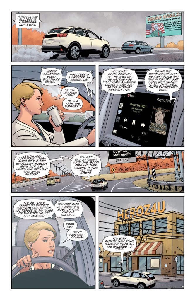
Russell isn’t trying to be subtle with the points he’s making. He’s making it all too clear: success is a castle with a moat. Once you’re in, you pull up the drawbridge and keep the whole damn thing to yourself. As Powergirl cruises through town, listening to Max Lord’s book on tape, we hear plenty of similar ideas. But One-Star Squadron is also a superhero comic. You get characters like Red Tornado, who used to be on the Justice League, fighting against capitalism with all the drama of a battle to save the world. Red Tornado’s inner monologue is full of melodramatic soul-searching, that’s often comedically oblivious to its own intensity.
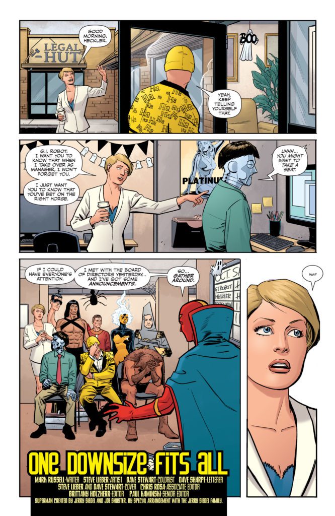
At one point, through an anguished admission of feeling spared from a round of downsizing, Red Tornado says he feels “Like a kid who just survived another round of musical chairs.” These are superheroes that Russell is writing, but they’re facing the monotony of office jobs instead of the schemes of Darkseid. You can practically see them looking at the other books on the shelf, wishing they were fighting for their lives and not their careers.
Art
Lieber’s art is similarly pulled in two directions. It’s hard not to laugh a little when you see Flying Fox walk into Red Tornado’s office. He’s wearing his superhero costume – what amounts to a loin cloth and a cape – while sitting on a desk. The image is ridiculous. But Lieber doesn’t overdo it. He leans into the emotion of the scene too. Flying Fox is there to beg for his job. He might stand out like a sore thumb, but the quietly resigned look on his face will break your heart. One-Star Squadron #4 also takes place during Halloween. So every scene of this rather heavy plot is peppered with smiling ghosts and grinning pumpkins. Lieber simultaneously cuts through the tension and piles on the misery. It’s funny that such depressing scenes are happening around such goofy decorations, but it also has a sad irony to it.
Coloring
Speaking of sad irony, Stewart’s coloring is full of it. I’ve mentioned before that Stewart’s coloring is rarely very bright. The brightest colors are always shown in the superhero costumes of our characters. Everything else has a natural look to it, with plenty of browns, greys, and blues. As always, we get plenty of Red Tornado’s crimson skin. As a robot, he doesn’t have the luxury of hanging up the ol’ superhero duds when he gets home. His insignia is painted right on his chest. His cape follows him everywhere. Often, Stewart uses the vibrant colors of Red Tornado as a juxtaposition to the bleak events that are going on. He exists as a harsh reminder that these characters once lived a full, rich life before they left it all behind. But in One-Star Squadron #4, we see a brief moment where Red Tornado feels like his old self. Instead of being the striking patch of color in the corner, his blues, reds and yellows take up the majority of the page. For one glorious moment, Stewart shows us an island of brilliance in a faded sea.
Lettering
There isn’t a ton of action in One-Star Squadron. So when we get fight scenes and battles, Sharpe makes sure that they pop. At one point of One-Star Squadron #4, a character begins fighting a group of people. Every sound effect is shown in neon lettering. Phrases pop out of word balloons in red, orange, or yellow letters. The scene looks like something out of your typical superhero comic. Except that this isn’t a typical superhero comic. So when a page like this comes up, it’s very noticeable. And in making it look like other superhero comics, Sharpe also shows how fighting might be what this character feels most comfortable with. He’s used to throwing punches. He’s not used to sitting at home and trying to be peaceful.
DC Comics’ One-Star Squadron #4 is depressingly aware of the facts. Success is a commodity that’s hoarded by a few, and shared with no one. In One-Star Squadron, even legendary Justice Leaguers have to figure out where next month’s rent is coming from. This would be a hard pill to swallow if it weren’t also delivered with a ton of laughs. Pick up One-Star Squadron #4, out from DC Comics March 1st, at a comic shop near you!
TORI AMOS AND Z2 COMICS PARTNER FOR LITTLE EARTHQUAKES 30TH ANNIVERSARY GRAPHIC NOVEL AND VINYL RELEASE
This unique graphic novel creation celebrating Tori Amos’s landmark album features the massive talents of writers such as Neil Gaiman (Sandman, American Gods) and Margaret Atwood (The Handmaid’s Tale), as well as artists like David Mack, Colleen Doran, and Bilquis Evely.
I got to sit down and chat with Z2 editor and the man overseeing this project Rantz Hoseley. Here we discussed the process for getting this team of creators together, the links between comics and music as storytelling mediums, and more.
MFR: Tori Amos has almost always been inextricably tied to the comics medium in some way or another. That in mind, was the idea for Little Earthquakes: The Graphic Album something that had been brewing for years, or something that suddenly struck as the 30th anniversary approached?
RH: Well, this can be traced back to me staying at Tori’s place in Hollywood while she was writing and recording Little Earthquakes. I was interviewing for a position on The Simpsons, and there was a lot of waiting to hear back from the studio, so I would go to Hi De Ho and Golden Apple and buy a lot of comics, and that resulted in stacks of comics lying all around her place, so one day she was asking ‘which of these should I read?’ and I gave her the ‘Calliope’ issue of The Sandman, and that was that. She was hooked.
I don’t think at the time I thought, ‘oh, this music should have a comic book component,’ but certainly after Comic Book Tattoo the two of us have kept an eye out for an opportunity to do a graphic novel project again. With the 30th anniversary of Little Earthquakes, plus me being at Z2, it made sense to ‘put the band back together,’ so to speak.
MFR: You have assembled a group of some of the most monstrously talented storytellers on the planet contributing to this book; from writers Neil Gaiman to Margaret Awood, to artists such as David Mack, Colleen Doran, and a personal favorite of mine in Bilquis Evely. How did you manage to get this sort of talent to fill this book with their interpretations of Amos’s work?
RH: I think it’s a combo of the success of Comic Book Tattoo. Creators very clearly know what level of quality we’re aiming for in putting this together… and a love and appreciation for the poetry and depth in Tori’s music. I’ve tried to include some folks who are icons when it comes to storytelling, and some folks who I think are some of the most promising newer creators in comics and prose. It was the approach that I took with CBT, and it ended up being very successful, so if anything it’s just refining the formula and approach. That’s the nature of creative work at its best, really—keep moving it forward, and learn from experience in the past to do work to push the boundaries in the storytelling form.
MFR: Other than Amos’s obvious love for the comics medium, how did you figure that the lyrical storytelling of Little Earthquakes could be reinterpreted into a collection of comic stories?
RH: A big part of why Tori’s music and lyrics work so well in comics is because there’s a lot of secondary and tertiary meaning in how she structures a line. She plays with theme and allegory and narrative tangents in a way that echoes the liminal process of how thought works. Since it isn’t declarative and literal, there’s a lot of room for personal attachment and interpretation. It’s the same reason her music resonates with so many people.
MFR: Related to that last question, you and the folks at Z2 have been pumping out graphic novels by musicians about their music left and right – several of which I’ve covered myself. What is it about the comics medium that you think makes it uniquely suited for these adaptations and/or reimaginings of musicians’ work?
RH: Structurally, they are very similar. They both rely on elements of timing and ‘beats’ to convey emotional impact. A full page spread echoes a long held note. A series of small identical panels echo the effect of a staccato rhythm pattern. I spend a lot of time examining the formalist aspects of storytelling, and I think that they work together because of a combination of that echo in structure, and the fact that the surge you get from a dramatic moment in comics is very similar to the surge you get from a powerful moment in music. They are both an internal, personal, interpretive experience, where the audience’s individual background and perception of it plays a critical role in the experience of consuming it. Much moreso than most films or TV shows.
MFR: Do you think any of this awesome work – from Amos’s incredible discography to this graphic album – would have turned out the way it did if you hadn’t slipped Neil Gaiman that demo tape?
RH: I’m a huge fan of Kieślowski’s films, and a recurring theme in his work—Blind Chance, The Double Life Of Veronique, etc—is the idea of possible vectors that a life can take. What the outcome could be. In the exchange of one possibility, what do you gain? What do you lose? TL;DR – “What Ifs.”
On a personal level, I think ‘what ifs’ are great for storytelling, but from a real-life point of view, I don’t really consider them. I’m much more practical and pragmatic about it. I gave Neil the tape… and I can’t honestly even say how much impact it had on Tori’s career, or on mine, or on Neil’s. Tori and Neil and I are all friends, and that is certainly the one measurable impact of me giving Neil the cassette, but past that? There are too many variables to even consider vectors and outcomes, honestly.
Released in 1992, Amos’ debut album Little Earthquakesestablished her iconic thematic voice, as well as her live intensity behind the keys with unflinching lyrics and songs that would inspire generations of artists and musicians. Thirty years later, Z2 will publish a graphic novel that demonstrates the lasting influence of this defining work with 24 stories inspired by the 12 songs on the album, as well as the 12 ‘B-sides’ that accompanied the album and its associated singles. The book will be assembled by Z2 editor Rantz Hoseley, who previously edited the multi-award-winning Comic Book Tattoo, and who painted the cover for her recent Christmastide EP.
Tori Amos says “To have some of the most creative graphic artists interpret the songs from Little Earthquakes, is a true honor. I enjoyed working with Rantz on Comic Book Tattoo so much that when he contacted me about putting something together for the 30th Anniversary, I had no hesitation. Artwork is such an important part of my musical world and to see these songs come to life in graphic form is such a joy.”
Editor Rantz Hoseley states “Having been present during the writing of many of these songs, I can tell you they are inextricably bound to comics. They were on the early demo cassette that I snuck to Neil Gaiman at the San Diego Comic-Con in 1991, telling him ‘this is my friend, she sings about you, please don’t sue her.’ It’s been too long since Comic Book Tattoo, and it’s truly a pleasure to get to make comics with Tori again.”
Tori Amos is a classically trained pianist and singer-songwriter, who came to prominence in 1992 with Little Earthquakes, an album spun out of her religious upbringing and struggle to establish her individual identity. The album served as her commercial and artistic breakthrough, entering the British charts in January 1992 at #15. Little Earthquakes was released in the United States 30 years ago in February and slowly, but steadily, began to attract listeners, gaining attention with the video for the first single, “Silent All These Years.” Since that time, Amos has sold over 12 million albums across 16 releases, with her most recent effort, Ocean to Ocean,released in October 2021.
This graphic novel release demonstrates the breadth of impact of Amos’ work through the 24 stories inspired by the album and its accompanying B-sides. The contributors to the book are an all-star cast of literary and artistic talent, including Tori’s longtime friend Neil Gaiman (The Sandman, American Gods) telling a tale inspired by “Tear In Your Hand” with artist Bilquis Evely (The Dreaming), and legendary author Margaret Atwood (The Handmaid’s Tale) who will bring to life the iconic song “Silent All These Years” with acclaimed artist David Mack (Kabuki), who has also painted the stunning cover. Other contributors include Leah Moore, Colleen Doran, Derek McCulloch, Lar deSouza, Annie Zaleski, Marc Andreyko, Cat Mihos, Neil Kleid, and Alison Sampson. A full list of participating creators and the stories they are creating will be released on March 11th, coinciding with the first part of Tori’s Ocean to Ocean tour.
Little Earthquakes: The Graphic Album will be available in three editions. The 8”x8” standard hardcover edition will be released in finer bookstores, comic shops, and record stores everywhere in September 2022, and will be available for pre-order through Z2 and ToriAmos.com. The limited Deluxe and Platinum Artists Editions will be available exclusively through Z2’s website in limited quantities.
The oversized 12”x12” Deluxe Edition will belimited to 1,450 units, which will come packaged in a collectors slipcase, with vinyl releases of Little Earthquakes and the previously unavailable vinyl picture disc of Little Earthquakes: The B Sides, as well as 12”x12” art prints by Comic Book Tattoo contributors Jason Levesque, KAKO, and David Mack.
The Platinum Artists Edition islimited 500 copies, and includes the signed and numbered oversized 12”x12” graphic novel with a foil embossed hardcover, the vinyl album of Little Earthquakes and the exclusive B-Sides picture disc vinyl, prints by Jason Levesque and KAKO, and a print of the cover signed by David Mack and Tori Amos, and a sketchbook/diary, contained in a die-cut clamshell collectors box that echoes the wooden crate that is synonymous with the cover of this album. There will not be a second pressing of the limited picture disc vinyl of Little Earthquakes: The B-Sides that is available with the Deluxe and Platinum editions.
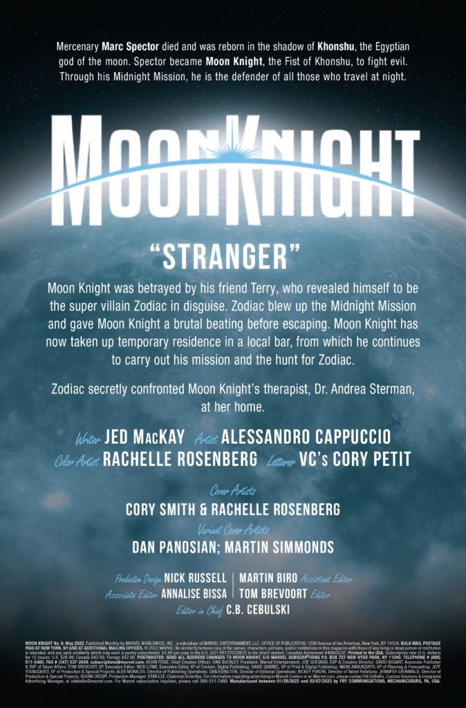
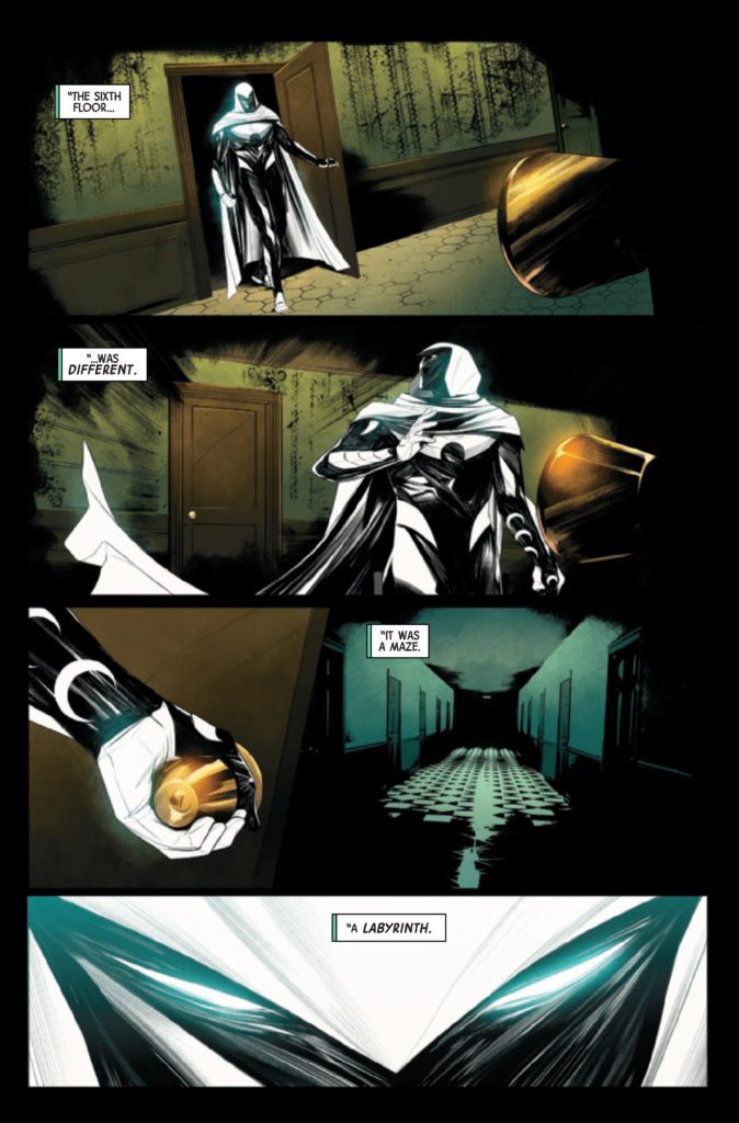
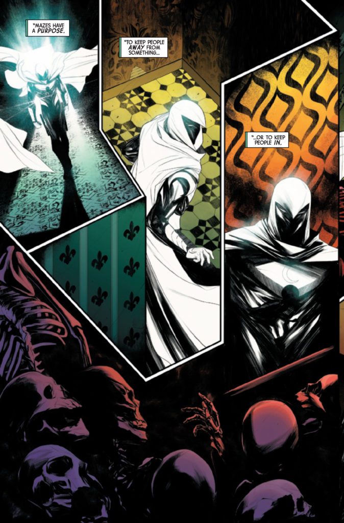
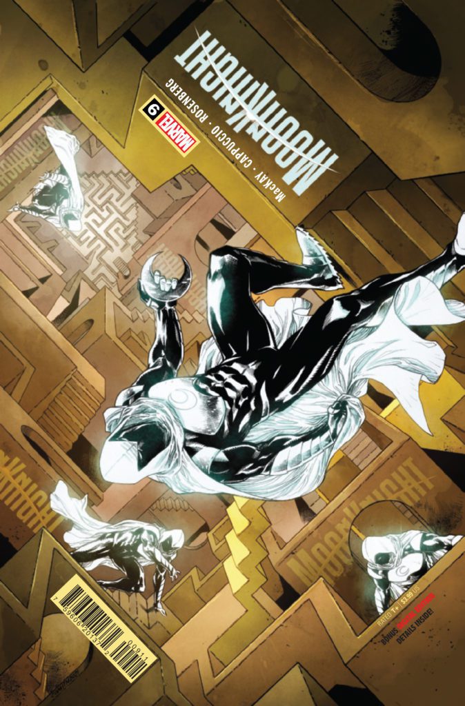
MOON KNIGHT #9 hits your local comic book store March 2nd, but thanks to Marvel Comics, Monkeys Fighting Robots has an exclusive four-page preview for you.
About the issue: Mazes have one of two purposes: to keep people out or to keep people in. An unnatural labyrinth has swallowed up people under Moon Knight’s protection — but how do you fight a maze? How do you kill a labyrinth? And will Moon Knight emerge victorious, or will his body and mind be broken by the Fifth Floor?
The issue is by writer Jed MacKay and artist Alessandro Cappuccio, with colors by Rachelle Rosenberg, and letters by Cory Petit. The main cover seen below is by Cory Smith and Rachelle Rosenberg.
Check out the MOON KNIGHT #9 preview below:
Are you reading the current MOON KNIGHT run? Sound off in the comments!
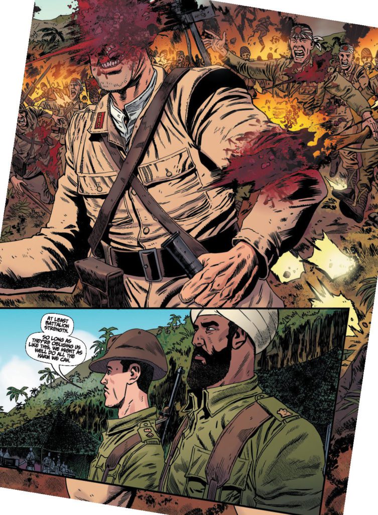
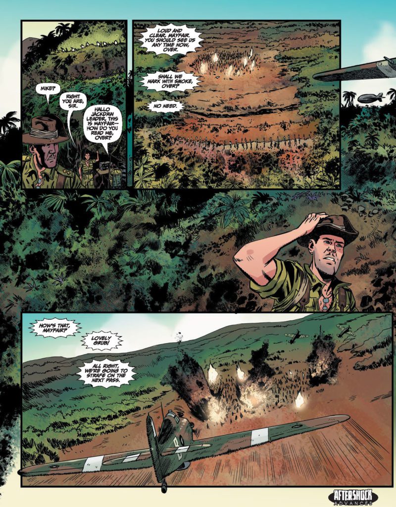
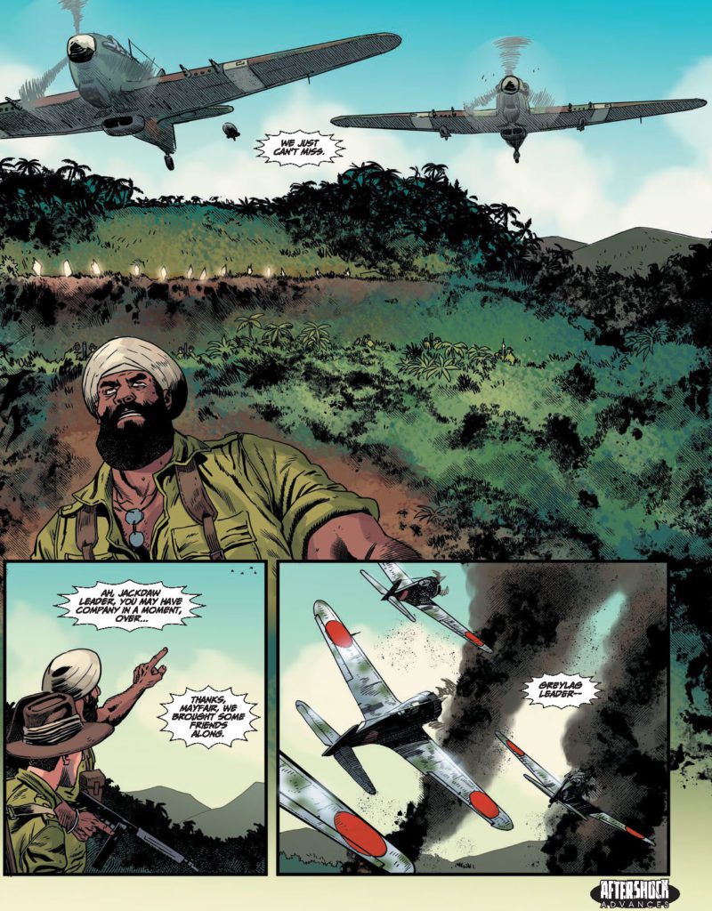
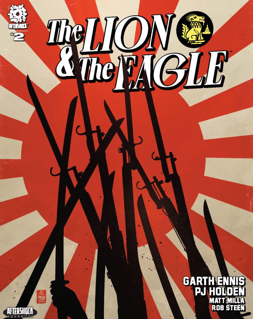
THE LION AND THE EAGLE #2 hits your local comic book store March 23rd, but thanks to AfterShock Comics, Monkeys Fighting Robots has an exclusive four-page preview for you.
About the issue: The battle begins in earnest as the British unleash a holocaust of high explosive on their enemy, and fanatical Japanese courage comes face to face with the fury of the Gurkhas. But a change in command sees the Chindits’ mission change from offense to defense, and soon the British unit is surrounded — and fighting for survival against increasingly heavy odds.
The “oversized prestige format miniseries” is by writer Garth Ennis and artist PJ Holden, with colors by Matt Milla, and letters by Rob Steen. The main cover is by Tim Bradstreet, and the incentive variant is by Keith Burns.
Check out the THE LION AND THE EAGLE #2 preview below:
Did you pick up the first issue of THE LION AND THE EAGLE? Sound off in the comments!
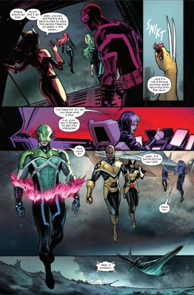
With each passing issue of Gerry Duggan’s X-Men, it becomes more clear that he has a plan for these characters. He’s been showcasing each team member in standalone stories that highlight what each player brings to the X-Men. This issue, we get some focus on Synch. Duggan is joined by Javier Pina on pencils, Marte Gracia on colors, and Clayton Cowles on letters for this week’s book.
WRITING
Let’s be realistic here, MODOK is a silly villain. Having said that, Gerry Duggan does give him a sinister plan and shows us how ruthless he can be as an antagonist. MODOK taints the water supply on a cruise ship. This in turn makes the passengers become maniacal killers who attack anyone they see. Duggan does a terrific job of giving us both the diabolical side of MODOK and the silly side. As MODOK’S plan is playing out, Duggan has him eating from the ship’s buffet while people get killed. Duggan also has him yell “For Science” as he kicks a helpless woman.
Team building is something that Duggan has been doing since his first issue. Synch has been attempting to reconnect with Wolverine since their time in the Vault together. Duggan pairs them both up as they search the cruise ship for MODOK. The pair talk about their experiences from a life that Wolverine doesn’t remember. This conversation affects Synch in a way that he simply can’t describe to her. Duggan uses this chat to build a bond on another blossoming relationship. The pairing of Synch and Cyclops is becoming a great bromance in this title. Duggan has had Synch confide in the X-Men’s leader for certain things, and the trend continues this issue.
ART
Javier Pina is filling in for regular artist Pepe Larraz, and he does an amazing job. Pina starts off the issue with a giant page of MODOK. This is a perfectly shaded image that has closeups of microscopic organisms. Pina had the tough task of making ordinary cruise ship goers look dangerous and crazy. Pina does this by giving them longer faces and beady eyes, and it works well. The mind controlled patrons are fierce as they wield weapons with their distorted faces. I can’t honestly say if you’ll see a funnier panel in a comic this year than MODOK eating from the buffet on a cruise ship. Pina draws this panel perfectly. MODOK is hovering over the mashed potatoes as he adds them to his plate with hot dogs. The absurdity of the panel, while MODOK is mid-evil-plan mind you, has to crack a smile as you read the issue.
Marte Gracia’s colors are as great as usual. The dark backgrounds and skies at the beginning of the issue set the tone for the chaos the X-Men are about to walk into. The pink light emitting from MODOK’S head is a constant attention draw on each page. One of the best colored sequences in the book comes when Cyclops enters MODOK’S mind. Gracia uses a lighter color palette for these panels to differentiate from reality. The softer colors work as a good change of pace from Gracia’s normal vibrant style.
The letters by Clayton Cowles are very important for this issue. Since we have a lot of action, like Captain Krakoa punching MODOK, we need a large “SKRABOOM.” When mind controlled guests attack Wolverine and Synch, one yells “DIE DIE DIE.” The letters are large and red to emphasize the tone. These are the little touches that Cowles puts into his work that separate him from others.
CONCLUSION
X-Men #8 is a great addition to Gerry Duggan’s story for the mutants. This team continues to grow and gel with each passing issue. The writing is strong and gives readers a little bit of everything in regards to character moments. X-Men #8 is an issue that delivers the goods on all fronts.
Carnage turns 30 this year. There’s even a little logo to remind you on the cover, the killer proudly jumping in front of the number 30. Back in 1992, when Carnage debuted, the Green Goblin had been around for only 28 years. Weird to think about. For a villain many fans associate with trying to usurp classic villains using a more in-your-face attitude, the character’s lasted for a solid half of Spider-Man’s existence. But then you open Carnage Forever and by the second paragraph, the intro’s already dropping terms like “extrembiote.” Maybe that’s why it doesn’t feel like it’s been thirty years. Carnage is forever, and the 90’s never truly left.
WRITING
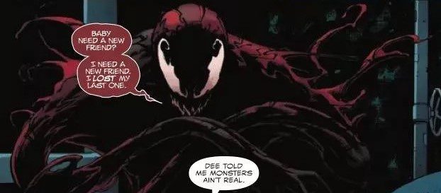
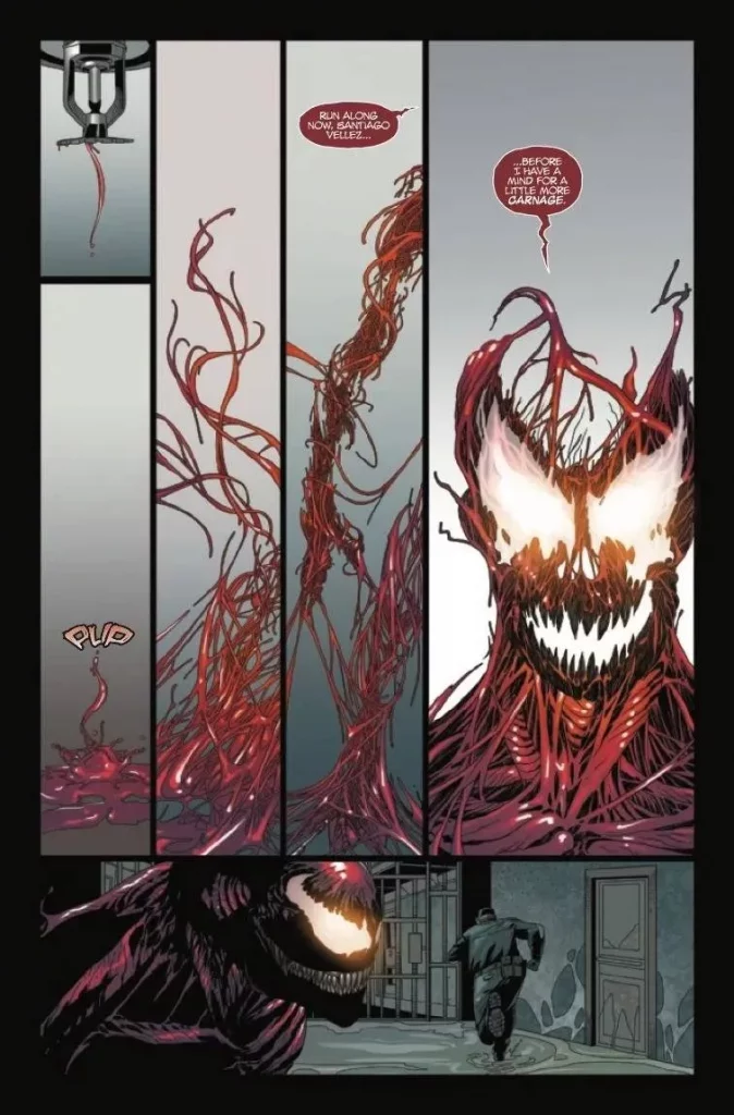
Formatted as an anthology, Carnage Forever #1 features one main story, an eight-page teaser for his upcoming solo series, and a fun one-page newspaper strip gag. The lengthiest story, written by Phillip Kennedy Johnson, positions Carnage as a malicious influence on a creepy little girl named Elsie. Her habit of hanging around the burned remains of Cletus Kasady’s old orphanage brings her into contact with the monster, while a local vagrant named Jerry starts to notice her odd behavior.
And yes, monster is the best word for Carnage at the moment, since the symbiote is currently wandering around without a human host. So this isn’t Carnage (the combination of Cletus Kasady and the Carnage symbiote), nor is it Carnage (Cletus Kasady acting through the Grendel Symbiote), this is an issue about Carnage (the Carnage Symbiote acting independent of Cletus Kasady). Got it? Okay.
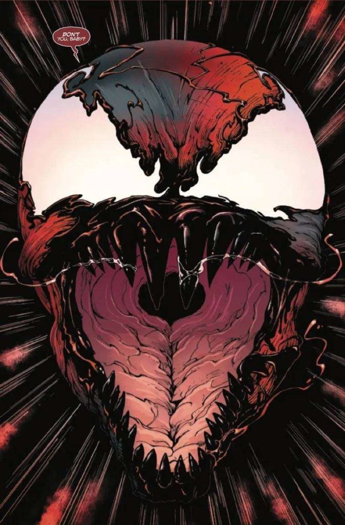
Though honestly, committing fully to being a goopy blood monster isn’t a bad development for the character. The niche that Carnage has found over the years revolves around riffing on a number of different horror movies and tropes. He was introduced during the post-Silence of the Lambs serial killer fiction boom, after all. Since then, he’s taken over a small rural town, called upon a Lovecraftian god, orchestrated a body-snatching political conspiracy, and in this story, played the role of an Exorcist style dark influence. He’s not a character you come to expecting a complex inner life. And making him a full shapeshifting monster adds to his flexibility. He’s a character whose raison d’��tre is chaos, so it pays to play him a bit fast and loose.
Which is a long way of saying that the main story is a simple, fun horror story, but one that sticks to what the character’s good at. Meanwhile, Ram V’s writing on the teaser offers a short look at where the character’s headed. Not to give too much away, but the symbiote’s on a journey to find out the limits of its own power. Which may involve other people’s powers. Guess the Venom symbiote somehow copying Spider-Man’s powers all those years ago might be getting a payoff.
ART
Edgar Salazar’s work on the Elsie story stands out for all its filthy concrete, peeling wallpaper, and puddles of rainwater. The streets are empty, the sun is harsh, and the centerpiece of the story is a burned orphanage. Which Elsie only hangs around because it smells better than her normal house. Rachelle Rosenberg’s colors add to the washed-out, bleak feeling, turning vibrant during the attack of the titular blood monster near the end.
As for Salvador Larroca’s work on the teaser story, the biggest strengths lie in how he draws Carnage and the guest-starring Hydro-man. He draws Carnage as a creature made entirely of veins and muscle-fiber, who can form himself whole after dropping from a sprinkler. So when he fights a man made of water, it turns into two human-shaped piles smashing against each other. Rain Beredo’s colors start with blues and greys, but the story becomes more and more soaked in moody red over 8 short pages. VC’s Joe Sabino keeps his lettering clear and precise in contrast to the characters whose mouths they come from, unstable inside and out.
Ty Templeton’s one-pager has a fun riff on Family Circus, Dennis the Menace, and the daily Jumble puzzle. His art is bouncy and fun, and closes the issue on a pleasant note. No one said killer aliens had to be all doom-and-gloom.
VERDICT
Carnage Forever is a fairly fun time, though a bit slight. It acts more as an appetizer, a way to show fans both old and new where the character’s headed. Though it’s certainly a promising direction. Fingers crossed that Ram V and Francesco Manna can keep up the momentum, come March.
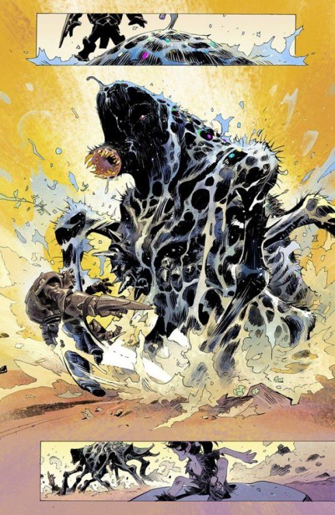
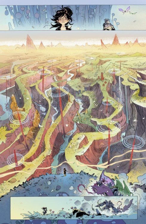
Image Comics’ Step By Bloody Step #1 isn’t your typical comic. That becomes pretty clear the moment you realize that this script has no dialogue or captions. But, Step By Bloody Step also kind of is your typical comic. It doesn’t treat storytelling differently just because it has no words. It takes on the same objectives as any story, it just does so with images. Writer Si Spurrier, artist Matias Bergara, and colorist Matheus Lopes do as much world building and character development in Step By Bloody Step #1 as in any other comic on the shelves. How do they do it without the help of words? Now, that’s the real question.
About Step By Bloody Step #1 (from Image Comics):
An armored giant and a helpless child. Together they cross an astonishing world brimming with beasts, bandits, and—deadliest by far—civilizations… If they stop walking, the earth itself forces them onwards. WHY? The child can’t ask. She and her guardian have no language, no memory, nothing—except each other.
Story
Spurrier’s scripting for this issue is fantastically paced. It’s no coincidence that the title of this story has the words “step by step” in it. That’s exactly how Spurrier approaches his script. We see every little, relevant moment, from picking flowers to dismembering monsters, laid out in a shot-by-shot progression. When Spurrier transitions into a montage, or makes any big leaps in the passing of time, he does so on an entirely new page. That way, we’re never confused as to what is happening or what led us to each new image. At times, the story feels quite mysterious. We see the fantastical landscape these two characters are traversing actually respond to them in magical ways. And the interactions between characters feel meaningful, though we don’t know what it is they’re communicating to each other. Spurrier makes everything so physical in this script that despite the mystery – which Spurrier excitedly dishes out in heavy doses – we have a general sense of what’s going on, and a specific sense of what we want to know more about.
Art
There’s a stunning versatility to Bergara’s page layouts. No one page looks anything like the others. Bergara tailor makes every image to match each story beat in the script. We get big panels that seem to stretch on forever that get interrupted by smaller panels of a character squinting their eyes or looking on in shock. Often, panels overlap one another in a chaotic jumble. The violence Bergara depicts feels disruptive to the tranquility he’s brought out on each page. You can feel the panic the characters are experiencing. And so much of this script works because of the style of Bergara’s art. His characters are so expressive and full of life. You barely notice that we don’t have the words to know what they’re thinking or saying, because you can read it on their faces so clearly. Even in the context of Bergara’s beautifully detailed scenes, his characters stand out dramatically. You’ll feel all the fear, happiness, sadness, and anger that’s painted across every face.
Coloring
Thanks to Lopes, you will find yourself completely lost in every scene. The way Lopes colors each landscape makes every panel an immersive experience. In the first few pages, the stunning dark blues mix together with light grays to make you feel the intensity of the cold winter night. You can feel the difference in the red heat of someone’s anger and the terrifying yellow brilliance of a raging fire. Some settings are painted almost entirely in brown, letting the poverty of the civilization sink in as you see that nothing grows there, while others are covered in a playful pink. But every scene’s coloring fades away when Lopes has an emotion to show. The lush green of a scene disappears when a character feels fear, resulting in a mustard colored background. The same scene warms to a light red as his fear turns to fury. Lopes makes every landscape beautiful, but – more importantly – he makes sure that every emotional beat stands out distinctly.
Step By Bloody Step from Image Comics is gorgeous and moving. This creative team has done mountains of worldbuilding without uttering a single word. Frankly, it’s the kind of storytelling you have to see to believe. Pick up Step By Bloody Step #1, out from Image Comics now, at a comic shop near you!
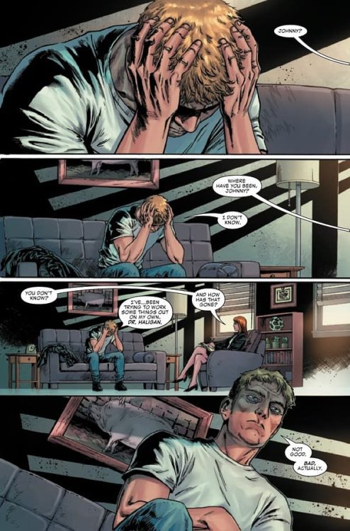
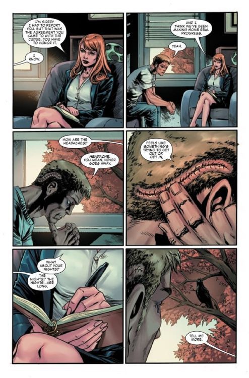
From writer Benjamin Percy (Wolverine, X-Force) and artist Cory Smith (Conan The Barbarian) comes the hellfire-scorched return of the classic Spirit of Vengeance in Ghost Rider #1. With colors by Bryan Valenza and letters from Travis Lanham, this opening chapter sees the return of Johnny Blaze as he sorts out what has happened to his life – and tries to ward of demons new and old. With a tense, wild script and absolutely kick-ass artwork, this return to a the classic Rider is off to an outstanding start.
“Johnny Blaze has the perfect life: a wife and two kids, a job at an auto repair shop and a small-town community that supports him… But Johnny isn’t doing well. He has nightmares of monsters when he sleeps. And he sees bloody visions when he’s awake. This life is beginning to feel like a prison. And there’s a spirit in him that’s begging to break out!”
Writing & Plot
Benjamin Percy sets the Spirit of Vengeance back to square one in Ghost Rider #1. We return back to the perspective of Marvel’s original Ghost Rider with Johnny Blaze. We find our old hot-headed friend living in a quiet, peaceful All-American town. However, there’s something clearly wrong. He’s suffering from hallucinations and grotesque visions, as well as gaps in his memory. Clearly our old rider has been out of the game for awhile, and Percy takes his time to show us why.
This opening chapter is admittedly a bit of a slow burn (no pun intended). This works really well, though. This being a 40-page issue, Percy get more room to re-introduce Blaze and dig into his current predicament. There’s a constant uneasiness throughout the issue, making this feel much more like a horror comic than we usually ever get out of a Marvel book. In fact, it’s a bit hard to believe this is a Marvel comic at all. This issue really reminded me of the old 90’s Hellstrom comic written by Warren Ellis. As cool as the Robbie Reyes and Cosmic Ghost Rider material is, it’s been a long time since we’ve gotten a properly hellfire and blood-singed Ghost Rider comic. Percy gives this comic the tense pacing of a horror/thriller with its extra page length, while still keeping it a tongue-in-cheek enough to feel like an over-the-top Ghost Rider joint. This is a stellarly written opening issue, and I’m psyched for the rest of this series.
Art Direction
Of course, a Ghost Rider comic won’t be worth a damn if it has good writing but shoddy art. Fortunately Cory Smith is on hand to deliver a fantastic looking experience for Ghost Rider #1. His distinct linework, insane monster designs, and sharp horror directing make this a superbly fun comic to read. Smith’s animations and details are top notch, very much up there with many of the other moderns greats currently working in the ‘big 2.’ The real treat of this comic though are his fleshy demonic drawings. The monsters that Blaze hallucinates are writing, sticky masses of flesh that pule and bleed over every panel they appear in. They’re like witnessing a Cronenberg film, if the film was on fire the whole time. Smith’s panel direction is relatively subtle and plain-looking in terms of his blocking. However, it’s how he frames the horror moments that make his work stick out here. We constantly follow Blaze’s eyes as he witnesses horrors only he can see, and they appear on the page as bleeding, disgusting panels contrasted with everything else. It’s simple yet effective placement that, along with how great his work here is in general, solidifies this comic’s reading experience.
Bryan Valenza’s colors bring the perfect vibrancy and fire to Smith’s pencils. The hunky-dory colors of the small town Blaze now lives in is sharply juxtaposed against the flesh, blood, and brimstone that flashes into the comic. It’s stunning, high-fidelity work that fits into Marvel’s overall visual style. Finally, Travis Lanham provides great, classically legible lettering that blends into the reading experience. This is a visually excellent comic worthy of the return of the classic Spirit of Vengeance.
Verdict
Ghost Rider #1 is a tense, heavy metal return to Marvel’s original Rider. Benjamin Percy’s script is carefully paced, coming across like a sequence of nightmares before exploding into the story we may expect – but will still be totally hooked into. The visuals from Cory Smith and Bryan Valenza are sharp, well-directed, and sometimes bats#!t insane. This will be a must-read for Ghost Rider fans both new and old, so be sure to grab a copy when it hits shelves on February 23rd!
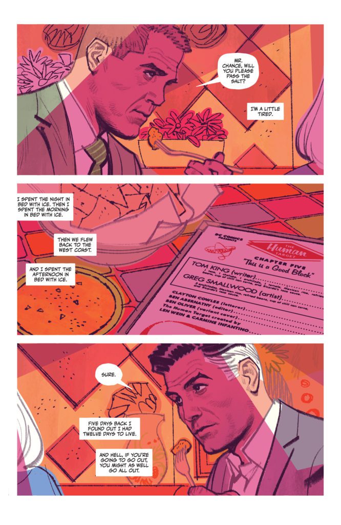
I’m a bit of a stickler for subtext. If you’ve read any of my articles before – on the off chance that you’ve noticed my name in the byline – then you’ll know it’s my own personal soapbox. If you can’t fit the information naturally into the story, well, chances are the reader doesn’t need to know it. I’ve seen fantastic ideas lost in a sea of overexplaining. And I’ve seen mediocre premises turn into compelling narratives because the writer played it close to the vest. But, on very rare occasion, I’ve come across a script with mountains of exposition that just works. DC Comics’ The Human Target #5is one such script. Writer Tom King, artist Greg Smallwood, and letterer Clayton Cowles give us a tour of Christopher Chance’s life. And somehow, they trick us into learning a metric ton about the character, while enjoying every second of it.
Writing
Maybe part of what makes King’s script work so well is that it’s a little scattered. We bounce between the thought lives of different characters, often confusing one person’s memories for someone else’s. He wants us to feel a little lost. The characters certainly do. Yet, on a second read, the intertwining threads are clear, even when they seamlessly transition back and forth. But King also sets up a frame story for this issue. He gives us a reason for Chance to be telling us so much about how he came to be the Human Target. We’re not learning what drives Chance simply because the script dictates that we do. We’re told about Chance’s history in a story where he’s learning how to keep his past hidden. This issue doesn’t feel like it’s full of flashbacks. Every line, every memory, is fully relevant to what Chance is going through right now.
That, of course, is talking about King’s work on this issue in rather broad strokes. He didn’t force feed us information, he found brilliant and creative ways to subtly get his ideas across. But the specificities of each scene are also brilliant. In some of Chance’s memories, the captions feel rehearsed. He’s waxing poetic about the moments that defined him. These are the thoughts he returns to, the ones he refines on each revisit. But in Chance’s childhood memories, the captions are run-on sentences that feel like they’re all coming out in one breath. It reads just like a six-year-old who’s so thrilled to tell you about his day. King can write in the voice of a haunted hitman, a desperate father, a gentle goddess, a misunderstood alien, or an excited child. Reading it all and getting swept away with the story, it’s hard not to write with the tone of an excited child, myself.
Art
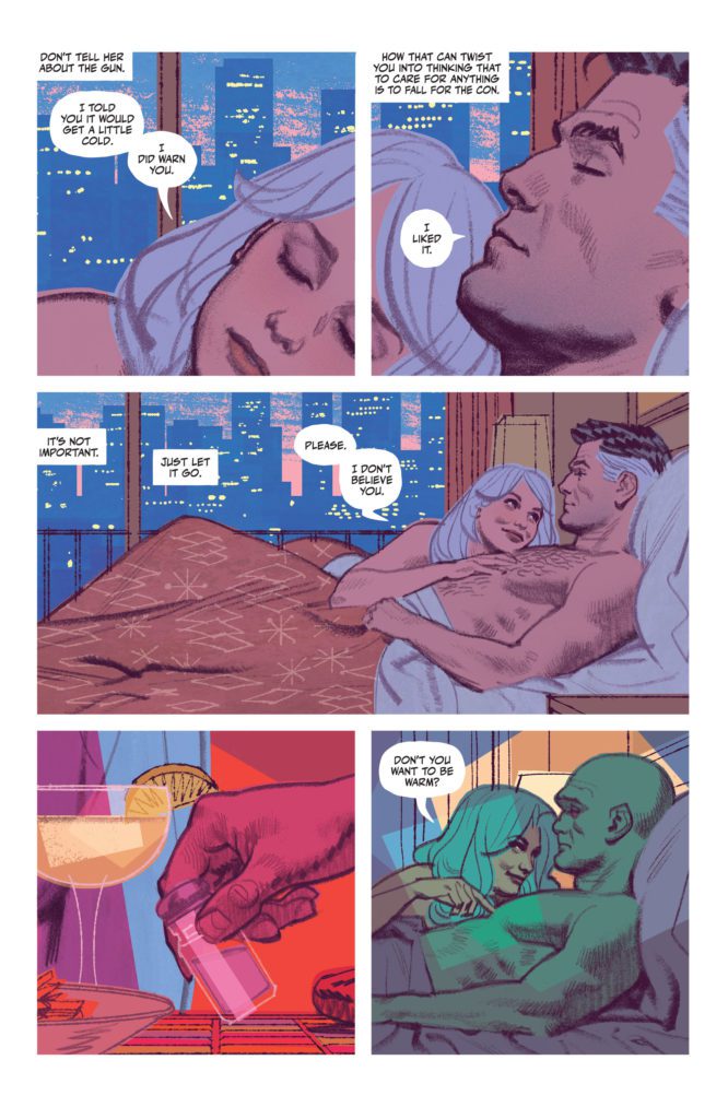
Smallwood’s art is somehow crisp, clean, and smooth, while maintaining a joyful messiness around the edges. While the forms he creates are proportionate and neat, the details of the work have little squiggled quirks to them. You can see each individual pencil line. Some look hurriedly scribbled along the side of someone’s face, others jut out slightly past the outlines that are supposed to contain them. Even Smallwood’s colors don’t fit inside the lines. The measured linework of a gun is colored in by a grey shape with moderately wobbly edges, which create a simpler outline than Smallwood’s pencils. All these “mistakes,” however, are undoubtedly deliberate. Smallwood achieves two things with this: First, he makes the art feel relaxed. You can picture Smallwood doodling all of it, only half paying attention while he downs a glass of bourbon in true Human Target style, instead of slaving over the page with a ruler and compass. (With the quality of his work, I’m pretty sure he does plenty of slaving, with a flourish here and there to make it all look effortless.) Secondly, he makes you intently aware of the form of his work. You find yourself noticing every line made by his pencil and marveling at the intricacies of his brushstrokes.
And of course, the coloring isn’t just there to make this issue look relaxed and effortless. Smallwood uses the colors to show us how Chance feels about the many memories rattling around inside his head. We start in the present day in a Mexican restaurant. The mingled pink and red of the scene is more than just mood lighting. It soon becomes a color coding for danger. As alarm bells go off in Chance’s head, we return to this scene again and again. And later, we see Chance reliving a trauma. The colors are nearly identical to his memory of lying next to someone in bed. Perhaps Smallwood is telling us that Chance’s haunted past is never far away. Even in his moments of bliss, he remembers the horrors that have defined him.
Lettering
Cowles’ edgeless word balloons add to the easygoing tone of this whole series. They’re blobs of white, mixing into the rest of the scene like they’re part of the furniture. There’s rarely much reason to notice them. They tell the story in smooth lines that trace your eye across every page. Again, it’s all effortless. But the times you do notice the lettering, it’s magic. We see a character react to someone hurting him. His reaction is “GNNNNN.” The letters are italicized and they jostle together in an uneven line. It’s his pain, even his arousal, at being touched. The next page, we see Chance make a similar noise: “NNNNN.” The “G” is missing, but everything else remains the same. He’s in pain, but it’s the kind of thing he can handle. It’s even the kind of thing that gets him going. Three panels later and Chance is screaming in full force.
The letters strain against the bonds of their word balloon, only keeping a thin layer of white intact around them. We’ve never seen anything remotely like this from Chance. We may move back to the usual cadence of the story – smooth lines and the occasional dirty secret whispered in small font – but we don’t forget that we just saw Chance reach his limit. In restraining himself for four issues, Cowles has made a moment stick out spectacularly. Normally, a lettering quirk like that would be par for the course in comics. It would happen a half a dozen times in an issue and the effect would be lost. But this is the first time we’re seeing an affect like this, and it feels huge. We feel like we’re seeing behind the many masks of Christopher Chance, all because he let out a little scream.
I’ve called The Human Target comic book magic before. Every issue makes me want to say it again. The Human Target #5 is also a rare breed in storytelling. This creative team has stuffed this issue to the brim with exposition and information about our main character. In the hands of plenty of other creators, this issue could feel heavy-handed and overdone. But The Human Target #5 teases out every new revelation with subtlety and finesse. Yes, this is a fantastic comic book issue. But it’s also a textbook example of how to communicate exposition in all the right ways. Don’t miss this stunning new issue, out from DC Comics February 22nd at a comic shop near you!
Every so often, Marvel likes to play around with the Spider-Man format. This usually involves altering Peter Parker in some way so that they can portray a ‘new’ Spider-man with a different personality. In the past poor Parker has been mutated so that he grew additional arms to more closely resemble a spider; infected with a parasitic alien goo that brought out his darker side; had cosmic powers bestowed upon him; and been possessed (for want of a better word) by the spirit of one of his arch enemies, Doc Ock.
In the most recent comics, a man named Wulf has injected Parker with a drug called A-Plus. Under normal circumstances this would temporarily improve the victims performance before ultimately sapping their intelligence but with Parker it reacts differently due to his radioactive blood. The outcome is Savage Spider-Man, a new primal beast of a character who has just been given his own monthly comic of the same name. Issue 1 is out now and it is a difficult comic for new readers to engage with.
Savage Spider-Man #1 Credit: Marvel Comics
There is a problem with ‘mainstream’ comics. And by mainstream, we are of course talking about the two big publishers, Marvel and DC, and their superhero output. The fact that these two publishers are accepted as the face of mainstream comics is a far greater issue with the branding of Comics in general terms because the superhero genre has held sway for so long that it is still seen as being the primary driving force behind the comic industry. This allows people to attack the industry as a whole if the superhero titles aren’t successful. However, just because no-body cares about the most recent Superman comic (although sales for the recent Tom Taylor and John Timm’s Superman: Son of Kal-El appear to be just fine) that does not mean that the Industry is failing. The Comic Industry is a massive beast that covers a range of genres and diverse audiences, and the estimated global worth in 2020 was $3.87 billion.
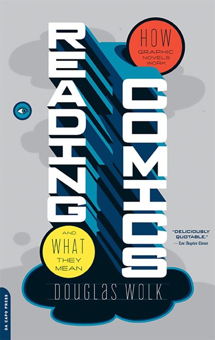
However, back to the misadventures of Peter Parker. There is a belief in mainstream comics that all readers are the same and that they indulge themselves in the vast universes that Marvel and DC put out. You may be a Marvelite or the DC equivalent but whichever publisher you follow, you will read a number of different titles and know what’s happening with the majority of the characters within that universe. In fact, judging from recent releases, it’s almost imperative that this is the case because the comics are so wrapped up in each other’s stories that even issue 1s of a series rely heavily on background knowledge. The superhero genre has become a collection of metacomics that are, as described by Douglas Wolk in his book Reading Comics, ‘mostly about where their plots and characters are positioned in the matrices of the big superhero narratives.’ This approach makes it very difficult to attract new readers because the publishers have erected a barricade built from decades of stories and comics. The unfortunate side effect is that, no matter how good the scripting and art is, the comic can only be measured against other titles and judged primarily on this shared narrative.
Reading Comics by Douglas Wolk,
One of my favorite runs from recent years was the epic opus by Jonathan Hickman on Avengers (starting in 2012). His story was meticulously planned from start to finish with a superb collection of artists visualizing his vision. There were, however, moments where I became partially distanced from the story and these usually occurred when characters that I have previously followed in comics, but not for a number of years, would act against my understanding of their personality. Spider-Man is the most obvious because at that point in time he was the arrogant and blunt Doc Ock version of the character. Imagine picking up an Avengers comic today, for the first time, and being faced with the Savage Spider-Man with no explanation or elaboration? Comics used to use Editors Notes on a page to help out new readers with quick, often witty, explanations and references to relevant comics that would fill in the gaps. This worked two-fold as it not only provided an element of explanation but also advertised comics that readers might want to pick up. Helpful and commercial but for the most part absent from modern comics.
While discussing the 1980s comic industry, this statement from Benjamin Woo sums up the current superhero comics beautifully: ‘ comics were not only sequestered from the media choices readily available to most people but also increasingly incomprehensible to anyone uninitiated into the culture of fandom.’* Basically, you have to read all of the superhero comics to understand the superhero comics you are reading. Instead the publishers could, fairly easily, tell readers about other titles that compliment the comics they are reading, whether this is other comics in the series, a different comic series, or any number of media spin offs. This, in turn can work the other way, with adverts for a range of comics before a movie, or in game adverts on X-Box or PlayStation tie-ins.
It used to be the case that comics readers got into the hobby through other people. Either parents handing down their old floppies or last month’s issues were shared around the schoolyard between friends. But this segue into Comics has changed over recent years. As comics, especially the superhero genre, have become more of a multimedia product, people are discovering comics through other formats and this makes it harder and harder to cater to all levels of fans. Those who have engrossed themselves in the MCU and related television series and then come to a comic shop may find it difficult to find anything new that they can engage with because none of it ties in with the characterizations they will be familiar with. I came into superhero comics cold and at a time when it was still considered best practice to treat each issue as if it was somebody’s first.
That idiom is no longer the case for most Marvel and DC comics. Instead the publishers have embraced Wolk’s metacomic as standard, further creating a ‘them and us’ situation which is damaging to superhero comics as a whole. As a form of entertainment it has become extremely elitist at the very time it should be opening up to embrace the wider popularity of the form. A cross media strategy could fix the problem. There are adverts for the movies and games in the comics so why not the other way around? We know when the new Spider-Man film is due to be released, even if we don’t even see any trailers because it’s there in the comics we love. How many people who see the film knows when (or even where) to get the comics from? This approach is more important for non-superhero comics because, quite often, people aren’t aware that the movie is based on a comic. A pre-movie advert with a hint as to where to shop could make a massive difference to the sales of the comic, which is beneficial to everyone involved.
Spider-Man in Avengers (2012) #6 Credit: Marvel Comics
There is a difference between commitment to character and self imposed barricading of narrative, making it impossible for those on the outside to get in. Superhero comics need to make themselves more accessible. Whether that involves simply adding a ‘previously in’ page or integrating the current status into the story itself from issue to issue, or even Editor’s Notes, as previously mentioned. And we need to rethink our discussions on what Comics are so that the obsession with superheroes does not automatically become the default setting when talking about the state of the industry. If superhero comics wish to remain on the fringes of the medium, despite the massive popularity of the genre elsewhere, then the discussion about Comics needs to be refocused on the rest of the industry so that the medium can reach as many people as possible. You just need to take this article as an example of the problem. I was considering Comics Culture and the majority of this is about superheroes and the Big Two publishers, which itself is a loaded term. It’s such a difficult cliché to break away from but one that is necessary in order to successfully discuss Comics Culture and not just superhero stories. The industry survived because of the growth of superhero comics and now it is growing even further, beyond this single genre. By celebrating all comics and the media off-shoots, everybody wins, even Marvel and DC.
Notes
*Taken from Comics Studies: A Guidebook Edited by Charles Hatfield and Burt Barty