Nottingham #7 of Mad Cave Studios comes to comic stores on May 11th with the Final Order Cutoff on April 18th. In this issue, loyalties and ethics are tested as an inevitable betrayal builds to a boiling point.
Background
Sheriff Blackthorne and Robin Hood make an uneasy alliance to rescue King Richard from France. Meanwhile, Lady Marian is making advances to take control of the Merry Men.
Nottingham #7: Backstabbing Paramount
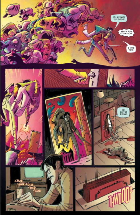
David Hazan writes Nottingham #7 with a strong sense of uneasy tension throughout the issue. Just about every interaction between characters feels like a subtle attempt at domination. With a murder aboard Blackthorne and Hood’s ship, there’s a suspenseful debate of ethics on how to deal with the assassin. Which gets worse as it feels like it’s going to lead to even more problems.
Then there’s how Marian uses the Merry Men in a very gruesome fashion. Marian is very much preparing for a war, but what really arrests readers’ attention is where her loyalties lie. If anything, Marian is out for herself and how she proceeds keeps readers in suspense. It’s this kind of writing that pulls you in and has you waiting for the next issue.
Art Directing Focus
Shane Connery Volk’s artwork puts a tremendous focus on important situations. The most important plot points of Nottingham #7 manifest in panels devoid of background. It gives the feeling that everything else disappears, at least in juxtaposition with letterer Justin Birch’s placement of dialogue. Seeing only Lady Marian’s green eyes, red mouth, and the blood on her face in colorist Luca Romano’s black background makes her words twice as impactful.
Catch up to Nottingham #7 Immediately!
Nottingham #7 arrests the readers attention with well-presented suspense. Every major character has a powerful narrative stake that clashes with another’s. As an inevitable betrayal inches closer, readers are sure to commit to seeing the entire plot through.
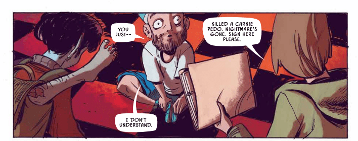
Storytellers think a lot about dreams. It’s a natural obsession, since they often consist of snippets of information from our everyday lives, swirled about into something that almost-but-not-quite resembles a narrative. Connect a few dots and you can spin stories out of them. Maybe learn something about yourself. But then again, dreams can also be about falling off a building or getting an “F” on a test, so sometimes they can just be a plain nuisance. Image Comics’ Slumber #1, which is available now, stars Dream Detective Stetson. The character is best described as a kind of punch-clock nightmare exterminator. She’s not here to tell you why you dream the things you dream. She’ll just crawl inside your head and shoot the stuff that stresses you out. Sure, maybe it’s not the most romantic take on dreamscapes, but it gets the job done, doesn’t it?
WRITING
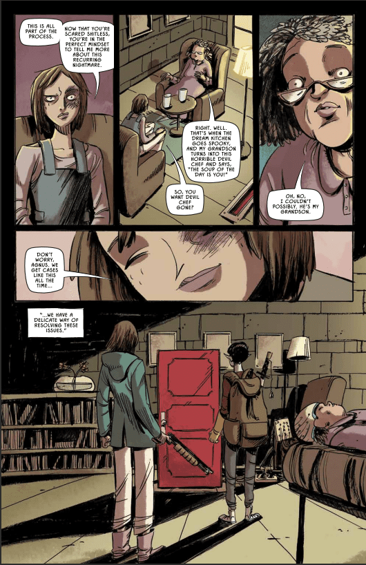
An everyday police detective named Finch has been investigating the “Sleepwalker Killings,” a string of murders carried out by seven different killers in their sleep. Finch has a hunch that the killings might be connected to a different kind of detective: the aforementioned dream-diving Stetson. Meanwhile, Stetson is keeping busy at her dream-healing agency. But it quickly becomes clear that wading through the dreamscapes of strangers is more than just a job for her. She’s looking for someone. And that someone might just have their eyes on Detective Finch.
Tyler Burton Smith approaches Slumber #1 with a mix of weary sarcasm and growing dread. When the issue works best is when it draws out the main character’s sleep-deprived recklessness. Though some of the turns into wackier hijinks don’t land quite as well. The sudden swerves from serial-killer noir material to a buddy-cop comedy in a dream carnival are ambitious, at least. But it feels odd spending 2 pages on a joke about the main character explaining a poor lemons-into-lemonade analogy given all the threads this issue has to set up.
I’d be lying, though, if I said those threads didn’t pique my interest. There’s a lot being hinted at here, including a more supernatural twist on the classic “got into the detective business to hunt one man down” trope. Other aspects of the world are simply presented as-is in a way that could or could not be expanded upon later. I’m fairly certain we’ll learn why Stetson’s partner is a blue, supernatural creature eventually. But all the whys and hows behind her dream-traveling technology are ignored in a way I admire. Jump right into the story, and all the details will maybe get sorted out later. They’re not really the focus anyway.
ART
Vanessa Cardinali starts the issue with establishing shots of suburbs and cityscapes – all harsh, inorganic grids contrasting her cartoony character work. So when it comes time for the characters to enter dreams, the world itself comes alive with the same sense of loose caricature. She’s clearly having fun drawing the strange creatures that populate dreams, having them clamber over one another until they move as a single mass of eyes and teeth.
Simon Robins provides colors that add to the sickly unease of the world the comic presents. The real world tends to use a lot of dark browns and greens, while the colors of dreams are rendered in nauseating yellows and pinks. It keeps the whimsy often associated with dreams in an off-kilter register. These are, after all, the kinds of dreams that keep the characters from the sleep they desperately desire.
Steve Wands’ lettering work is also given a chance to show off in the unreality of dream logic. A Nightmare creature has the letters giving life to his screams practically fall out of his speech bubble. Another dream creature has their speech rendered in a thin, stark font, with a white font on a pink word balloon.
VERDICT
Slumber #1’s tone can stumble in the moment-to-moment, but still manages to paint a clear overall picture. It’s one of the most fundamental sources of childhood whimsy reduced to a gory, grueling day job. One where the main source of excitement is hoping you can find a runaway killer inside someone else’s head. Just make sure to follow all the 30+ rules, and file all the paperwork in the right places. Sign here, please.
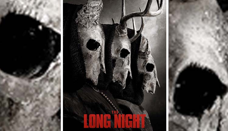
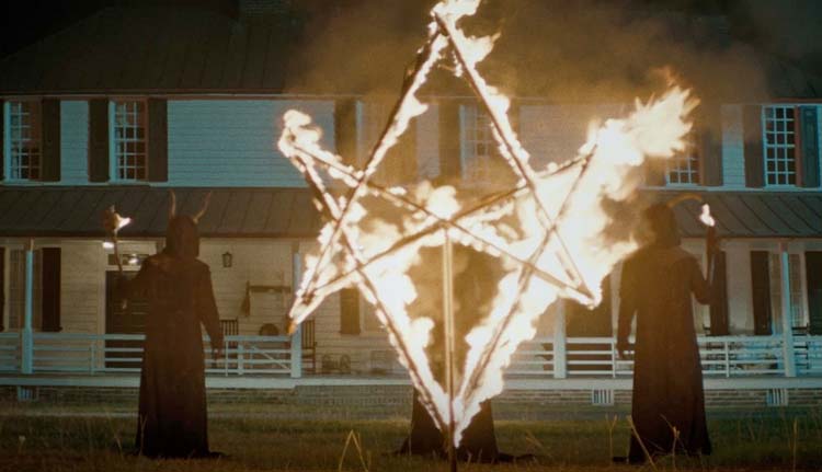
The Long Night is a horror film by director Rich Ragsdale (Chevelle: Door to Door Cannibals) that brings a demonic cult to rural America where they torment a couple on a farmhouse in service to a greater evil.
Scout Taylor-Compton (Triple Threat) plays Grace, a young woman with no understanding of her family history. She’s spent years trying to track them down when a call from an investigator presents a new lead. Grace and her boyfriend Jack (Nolan Gerard Funk) leave New York City for a trip deep into southern, rural America. Things start weird and get progressively stranger and more terrifying. Snakes keep showing up in the large farmhouse. Phone reception’s gone haywire, and there’s an altar in the nearby woods. To make matters all the more frightening, a cult wearing goat-head masks surrounds the property.
PopAxiom and producer Daemon Hillin discussed becoming part of the film business and making The Long Night.
Get Up
Daemon’s been producing for 14 years with more than two dozen projects now in his filmography, including Death of Me and Final Kill. How did he become a producer? “I fell into it. I had a background in fashion. I was in front of the camera for years. From about 17 years old to 23, I did shows in Italy, Germany, Greece, and Japan.”
“I wanted to stay in entertainment and blend business,” he shares as he lost interest in the fashion work he was doing, “but I didn’t have a background.”
What did Daemon do? “I went into real estate and finance.” The move proved to be the right step. “That is what bridged me to production and production finance. I used many tools for mortgages and the [real estate] industry to finance films and package projects. That was the stepping stone for me.” But it was a big struggle. “I was working in a bar and working for a film company for free.”
It can be argued that no one is more important to a film than its producer. “It’s the Rolodex. Who can you call to put this together? It’s turning all that creativity into numbers. How do I explain why I need thousands of dollars of goat-head masks.”
“You have to get back up,” Daemon says about producing, though it’s advice with broad application. “It’s a constant getting dropped on your butt. People are putting you down, especially in LA, where you’ll hear a lot ‘oh, sure, everyone’s a producer.’ So get back up and fight if you love it.”
About The Long Night
Daemon undeniably loves it and finds projects that motivate him to put productions together. “The Long Night came to me through my mentor. He brought me this script and asked if I could help him make it. I read the script and loved it.”
“It had this supernatural feel,” Daemon says and adds, “My mom loves covens and witches, so I was gravitating towards it because my mom would like it.”
What’s the first step for him as a producer? “… getting numbers and understanding what the value of the movie is. From there, what actor will generate the kind of revenue we need to make this movie.”
“Our movie was green-lit, and we all went to Charleston, North Carolina,” he shares as the process seemed to be going as planned. “However, in the time to get the movie greenlit, schedules changed, and we lost the director and a lot of the cast.”
Primal
Daemon and his team “were devastated. We thought we were going to lose it all. But we took it on the chin and kept going forward.” They got back up. “We had our crew and our trailers. So, we had to figure out how to fix this situation quickly. I called Rich Ragsdale, who I previously worked with on Ghost House. We had Scout Taylor-Compton in that too.”
“Working on Ghost House in graveyards in the middle of Thailand was grueling.” From that experience, he understood, “I needed to bring in people that worked together before and could work under pressure.”
As the process continued, “we brought in another writer to make it more about folklore than a coven.”
The new writer resulted from Rich Ragsdale, who Deamon explains was the “new captain of the ship, and he’s the visionary. He wanted to put his mark on the film. So, to make it to his liking and what he’s visualizing, he needed to bring in a writer he trusted to do a rewrite. We said ‘no problem.’”
“The foundation was always there,” he explains about script changes. “The characters were similar. But it turned more into folklore; the snake aspect came in, and it became more primal.”
Being a Producer
It’s a miracle that movies are ever made, “There are so many moving pieces, and then you have the human factor. Different creative choices, different amounts of time, moods, attitudes, and changes in the financing.”
“You know, you might have an investor who makes a bad investment elsewhere and suddenly doesn’t have the money for this movie,” he explains. “You have three days to find $750,000. Go!” No pressure.
The Long Night came to Daemon through a mentor. Otherwise, he doesn’t “go look for stuff” and instead uses a different method to find stories to tell. “I’ll talk to my distributor and see what the market needs. Then, I’ll go to my writer friends and say, ‘give me three loglines and synopsis for this kind of movie.’ Then, I’ll take that to the distributor who will say, ‘I like idea number three’ then I hire the writer to write a script for me.”
“I stopped the days of going and looking for scripts,” he continues. “It’s too much. So this way to me is ideal because it gives you a sense of the pulse of what people are looking for.”
Wrapping Up
Each movie is part of a larger goal to grow as a producer. Daemon has big dreams. “One day, I would love to have the kind of budget to make things like Lord of the Rings or Star Wars. I love fantasy; I love heroes and sacrifice. For those things, you need huge FX.”
The Long Night is available on VOD platforms such as iTunes and Prime Video. Daemon recommends VOD “because it helps independent filmmakers.”
Is The Long Night on your watch list?
Thanks to Daemon Hillin and Impact24 PR
for making this interview possible.
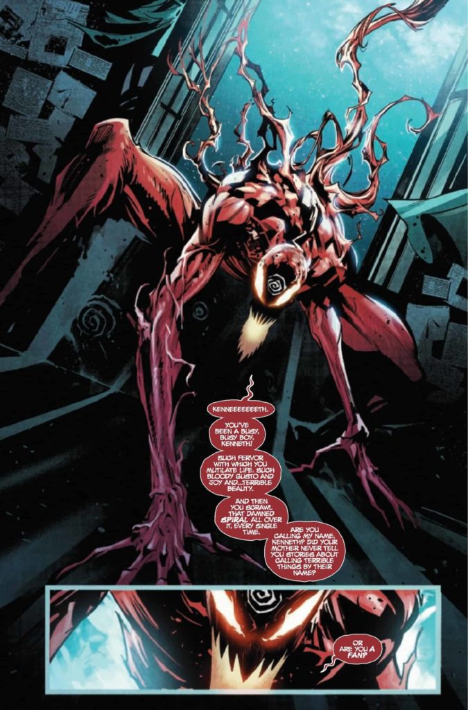
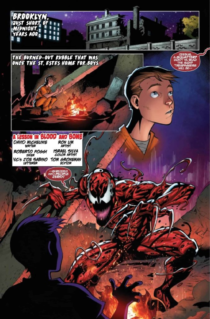
Back in 1995, Carnage met the Joker during a crossover. While they initially hit it off, what caused them to turn on one another was Joker’s insistence that murder was an art. When he killed, it was out of a sense of theatricality, an attempt to make a point about the cosmic joke. Carnage… didn’t. He just kind of wanted to do it. 27 years later, Carnage’s symbiote has found itself without its trigger-happy host, courted by a serial killer with artistic ambitions. So the question, then, is whether the alien will want a partner with the soul of a killer poet. But for those who wanted Cletus, don’t worry – a backup story has him doing what he’s always done best.
WRITING
As with, Carnage Forever, Carnage #1 (no subtitle) features three stories. A twenty page main story, a ten page backup story, and one page of newspaper-style gag strips. The main story is written by Ram V, following detective Jonathan Shayde as he pursues a serial killer who goes by the moniker “The Artist.” What quickly becomes clear is that the killer’s spree is all an attempt to court the Carnage symbiote, recently left without a human host. But the symbiote quickly reveals itself to have… different ambitions.
The original Carnage stories were written in a time where serial-killer investigation dramas were exploding in popularity, and the character always carried some of that with him. The many stories that try to go into Cletus’ mind have all opted for different serial killer clichés. Sometimes he’s begging for death, sometimes he’s a helpless child trying to exert control, and sometimes he’s simply a moral black hole, devoid of emotion. This first issue leans heavy on those influences by opening with a very classic Silence of the Lambs type set-up, a harried detective chasing an eccentric killer with a flashy theme, only for the symbiote to show up and admit it has little interest in what the killer has been doing. When the symbiote says it wants to find its own meaning rather than just doing what Cletus did, it’s rejecting the influences that have defined Carnage up to this point (give or take a few excursions into dark god worship). What does it want, then? The issue doesn’t answer that yet. It’s more a table-setting exercise for a new direction, starting by setting itself against what’s come before.
As a balance against Carnage’s new direction, we also have a backup story starring Cletus and written by Carnage co-creator David Michelinie, set during the character’s 90’s heyday. The story has a young child in Juvie try to recruit Cletus to murder some bullies that have been giving him trouble. Cletus agrees, but his spree rattles the child, who ultimately decides to stand up to the killer and decry his brand of bloody vengeance. While Ram V’s take on Carnage is influenced by Donny Cates’, who writes the character as a supernatural agent of chaos, Michelinie’s version is someone who really wants to be an agent of chaos. Michelinie has always written Cletus as a bit pathetic, which makes sense for a character who uses his power to hurt people weaker than him and literally nothing else. His Cletus is a blowhard big-talker who shouts his flimsy motivations to anyone who will listen. He even falls for the same trick he fell for many times in the 90’s – someone telling him “Since you’re an agent of chaos, then the most chaotic and unexpected thing for you do would be doing exactly what I want.” So naturally, he’s ultimately defeated in this story by being stood up to like a schoolyard bully. Carnage rules, up until he picks on someone with a backbone.
Finally, Ty Templeton gives two more newspaper-style cartoons on the final page to act as a bit of a palate-cleanser. After two stories of filth and murder, it’s nice to end on two cuter, bouncier strips about murder. His cartoons were a highlight of Carnage Forever, so I’m glad to see the tradition continuing strong.
ART
Francesco Manna starts the issue by cutting lose – reality tears apart and detective Shayde is stretched like taffy as a dimensional portal sucks him in amidst imagery of floating shapes and eyeballs. After that, he’s free to scale things back for a creepier, more grounded aesthetic. Caution tape, grimy warehouses, and rooms lit by a single open window. It’s a detective thriller. But as soon as Carnage shows up, expect more close-ups on molecules and magic portals- something colorist Dijo Lima gives an unearthly glow to. The second half of the issue involves Carnage using Hydro-Man as a conduit for the aforementioned magic portal, and Lima depicts it by showing Hydro-Man’s cool blues becoming overtaken by Carnage’s piercing reds. When they struggle against one another, the red and blue overlap to create a neat, 3d-glasses effect. It’s a moody, blue comic that sells its descent into chaos.
As for the backup, Rom Lim is someone who’s been drawing symbiotes since the 90’s, and his work with Roberto Poggi harkens to classic Carnage. Carnage is a writhing mass of red and black spaghetti strands wrapped around a muscular man like a suit. Colorist Roberto Poggi even gives him his pink void of a mouth. As opposed to Manna’s more moody and mysterious tone, Lim goes for a cartoonier aesthetic, complete with plenty of off-screen PG-13 kills. Poggi renders it all in bright reds and oranges – this is much more the Carnage you can imagine leaping from the pages of Spider-Man.
VC’s Joe Sabino letters both stories, and you can tell he’s having fun indulging in the occasional 90’s horror-style font for credit-boxes and captions. The bolding of some words helps establish the flow of the dialogue, which helps for a motor-mouth like Carnage.
Ty Templeton’s cartooning is effortless and bouncy. He effectively simplifies the writhing, slimy designs of the symbiotes into Peanuts-esque characters.
VERDICT
Carnage #1 is more than anything a statement of intent. The new series is moving past serial killers into more grandiose, cosmic horrors. How that will look is still unclear, but the previews given by the comic’s brief interludes into portal-induced madness definitely keep me curious.
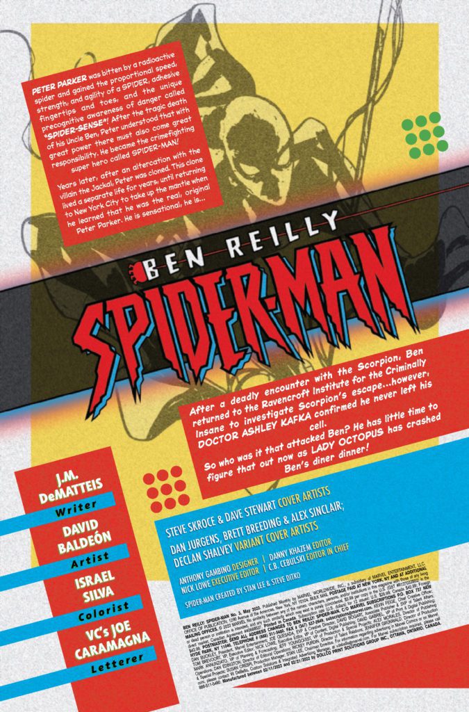
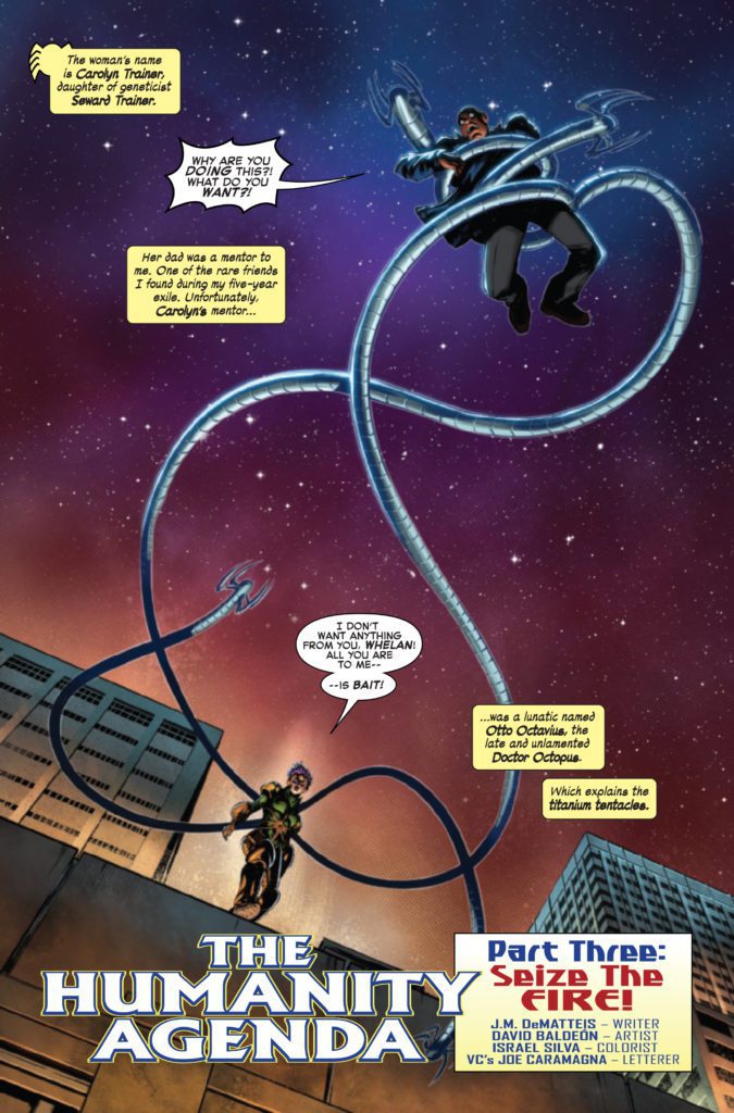
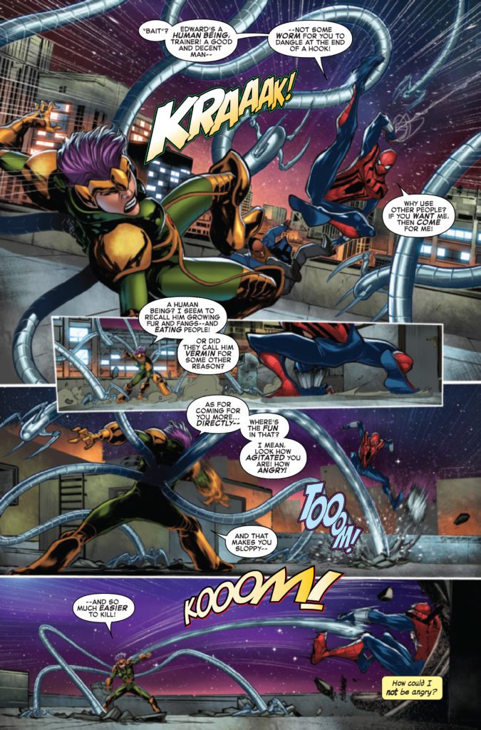
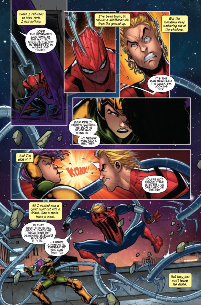
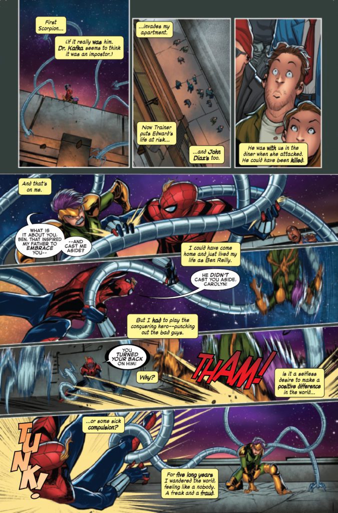
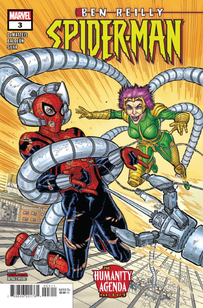
BEN REILLY: SPIDER-MAN #3 hits your local comic book store on March 23rd, but thanks to Marvel Comics, Monkeys Fighting Robots has an exclusive four-page preview for you.
About the issue: ENSNARED BY DOCTOR OCTOPUS! Jealousy strikes as Carolyn Trainer takes her anger out on Spider-Man! But who’s REALLY behind this cavalcade of villains? And is Ben ready to face that truth? Find out as J.M. DEMATTEIS and DAVID BALDEÓN bring the action – and heart! – you know and love in a Spidey story!
The issue is by writer J.M. DeMatteis and artist David Baldeón, with colors by Israel Silva, and letters by Joe Caramagna. The main cover is by Steve Skroce and Dave Stewart.
This series is an “untold story” from Ben Reilly’s past, taking place during his time as Spider-Man following the 90’s “Clone Saga.”
Check out the BEN REILLY: SPIDER-MAN #3 preview below:
Have you been reading BEN REILLY: SPIDER-MAN? Who is your favorite spider-person? Sound off in the comments!
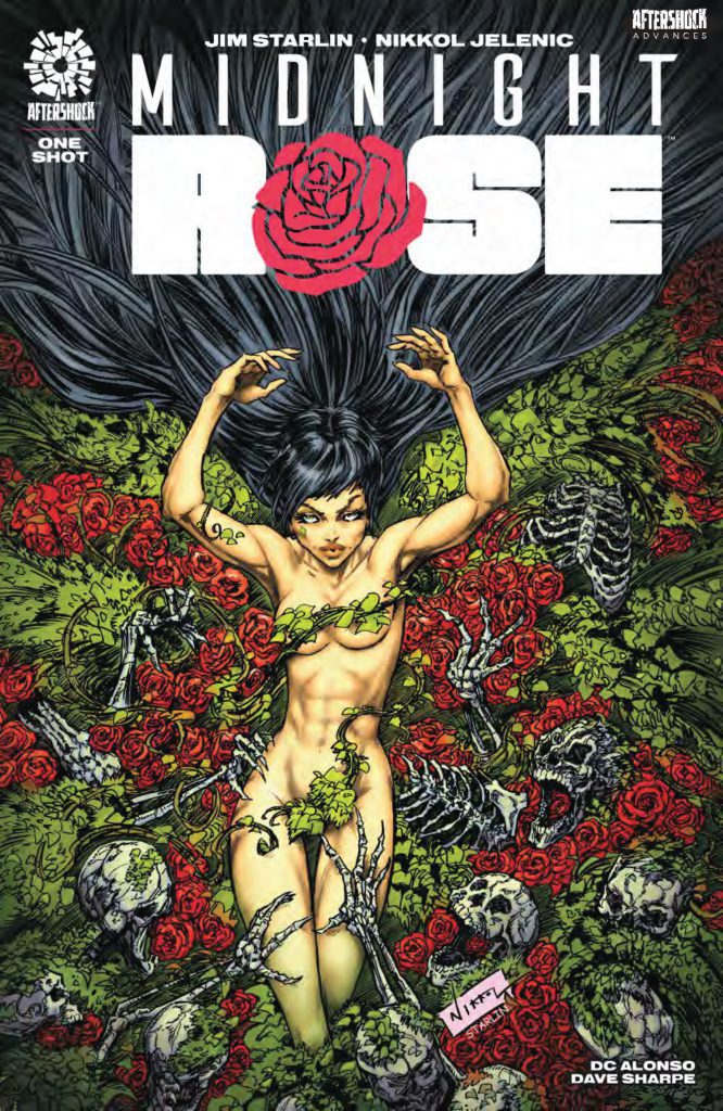
MIDNIGHT ROSE hits your local comic book store April 13th, but thanks to AfterShock Comics, Monkeys Fighting Robots has an exclusive five-page preview for you.
About the issue: Join the legendary Jim Starlin (Creator of Thanos, Gamora, Dreadstar) and Nikkol Jelenic (AFTERDARK, A Taste for Killing, The Fall, Red Crow) on a journey through the life of a singular, frightening and very human creature: MIDNIGHT ROSE. A particularly bizarre tale of loneliness, love and what happens when you can’t help but give in to the vengeance growing deep within yourself.
The 64-page one-shot is by writer Jim Starlin and artist Nikkol Jelenic, with colors by DC Alonso, and letters by Dave Sharpe. The main cover is by Jelenic, with an incentive variant by Starlin.
Check out the MIDNIGHT ROSE preview below:
What’s your favorite Jim Starlin comic? Sound off in the comments!
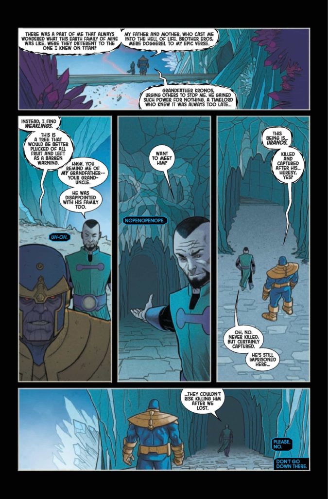
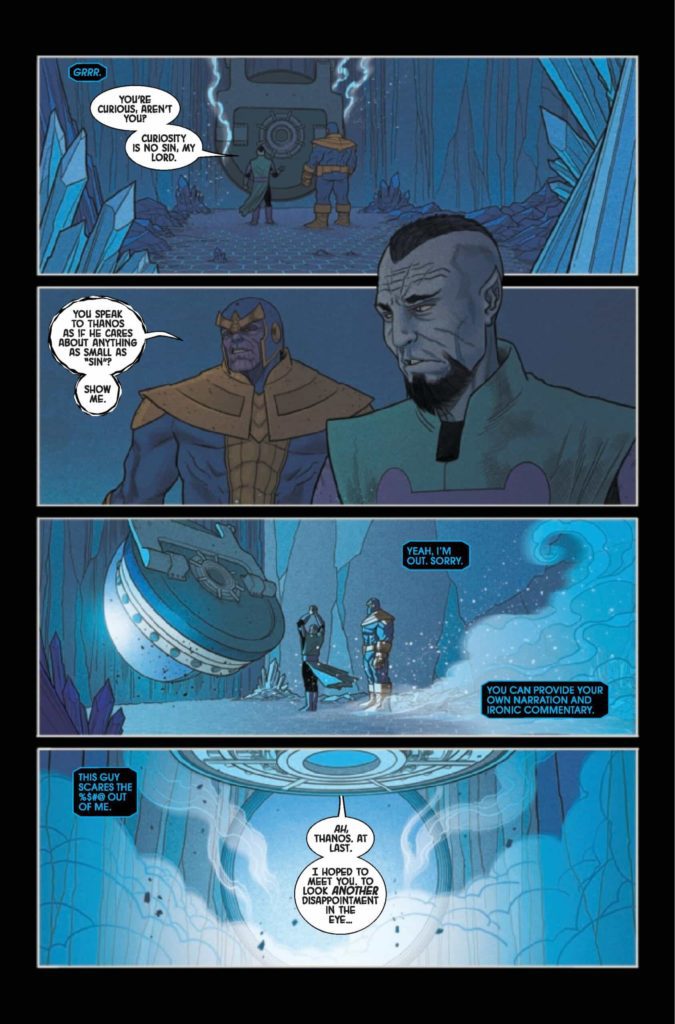
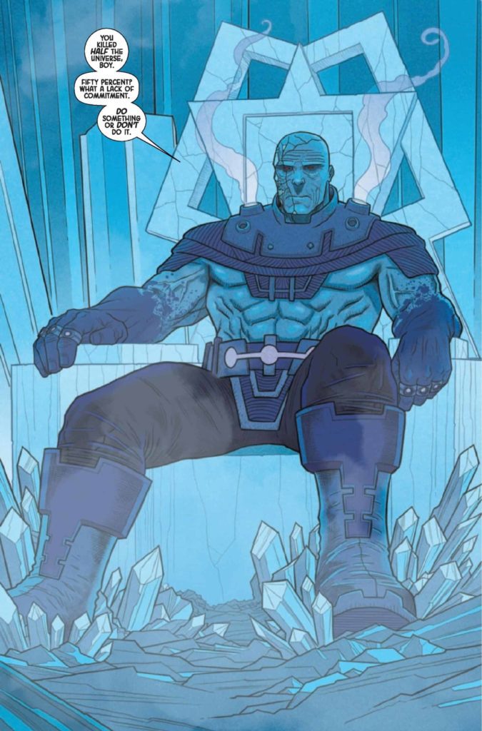
From Eternals writer Kieron Gillen and artists Edgar Salazar and the late-great Ryan Bodenheim comes a fascinating trek through cosmic family history in Eternals: The Heretic #1. Featuring colors by Chris O’Halloran and letters from Clayton Cowles, this one-shot sees grand philosophizing and flashback storytelling between the new Prime Eternal, Thanos and his long-lost relative, Uranos. With a fascinating script and great visuals, this is a one-shot absolutely worth picking up for cosmic-Marvel fans.
“Thanos is now ruler of the Eternals! But believe it or not…he’s actually not the worst leader that the Eternals’ society has ever seen. No, that honor belongs to someone even more horrific. Thanos is evil, yes, but who was the original evil from whom all Eternal evils descend? Meet Uranos, the Undying. And may the Celestials have mercy on your souls.”
Writing & Plot
What works so well about Kieron Gillen’s script for Eternals: The Heretic is how grandiose he makes this relatively simple premise feel. Thanos seeks a conversation and possibly some wisdom from the original Eternal gone bad, Uranos. The ancient Titan then regales Thanos (and us readers) with the story of how he split off with the other original Eternals – as well as his philosophy regarding obeying the Celestials. I can’t get into specifics without dipping into spoilers, but trust me when I say that it’s genuinely fascinating and entertaining.
Gillen’s dialogue approach for these characters takes Kirby’s “cosmic Shakespeare” style and modernizes it. Every line carries immense weight thanks to how Gillen writes their conversation. We are watching gods philosophize and debate and it’s so damn entertaining. It may come off as slow to some, but it’s well-paced and interesting enough that I doubt it will come up often. The flashbacks to Uranos’ time as an Eternal and his discussion of how he came to his rather…dark conclusions about life are almost as compelling as the conversation with his young relative. There are also some Hickman-esque text-only pages that inform us about Celestial and Eternal life structure and philosophy. Much like a Hickman book, I find them completely satisfying. This is an era of Marvel’s cosmic history we don’t get to see in modern comics too often, and it’s a compelling treat in this book.
Art Direction
Our journey into the cosmic storytelling withinin Eternals: The Heretic #1 is visually put together by the late Ryan Bodenheim and Edgar Salazar. Their thin lines and deliberate direction create the thoughtful, conversational yet epic tone of this comic. Believe it or not, cosmically powerful beings in the Marvel universe, especially Titans and Eternals, aren’t much for emotional displays. As such, illustrating the faint smirks and frowns we do get from Thanos and Uranos is a hugely important task to get us into their headspace. Bodenheim and Salazar accomplish just that, with effective subtleties drawn into every close-up panel. Body language is important here as well, and is equally difficult to capture since these two characters mainly focus on being imposing. So much of what makes this comic’s fascinating back-and-forth work is watching them communicate. This is thanks to how Bodenheim and Salazar carefully handle this task. The moments we get massive displays of power are handled with intensity, with an obviously Kirby-inspired method of drawing this specific brand of cosmic power.
Chris O’Halloran provides the colors for Bodenheim and Salazar’s art, and here he does a solid job of bringing that art to life. For much of the book we’re in the crystalline cavern prison where Uranos is being kept. As suc, most of the coloring shows up in soft violets and blues that bleed together in a pretty and atmospheric manner. The flashback sequences end up being a suitably jarring change, but O’Halloran crafts these scenes with a tonal consistency. They’re intentionally a tonal shift, but they still look like a proper part of the story. Finally, Clayton Cowles had his work cut out for him with the lettering. Every page is littered with narration boxes and speech bubbles full of conversational dialogue. Cowles uses a simple, modern font that is easy to read and does its job well, carrying the reading experience forward in a clean manner. Visually this is a great looking comic, and an outstanding endnote for the phenomenal talent that was Ryan Bodenheim.
Verdict
Eternals: The Heretic #1 is a fascinating and immensely compelling one-shot of cosmic Marvel storytelling. Kieron Gillen’s script is loaded with eloquent, grandiose dialogue that carries the weight of the two powerhouse main characters brilliantly well. The visuals from the late great Ryan Bodenheim, Edgar Salazar, and Chris O’Halloran are well-detailed and fantastically directed, crafting a nuanced reading experience that is perfect for the sort of comic we get here. Please be sure to grab this book when it hits shelves on March 16th!
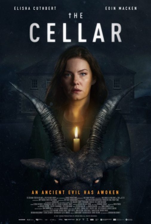
The Cellar is an atmospheric film that provides a narrative for you to invest in, but the payoff isn’t satisfying. The film had its debut at the South by Southwest 2022 film festival event. It does a great job at building tension, suspense, and the performances help save its weaker moments. Sadly, The Cellar starts to lose its footing in the second act before it builds to a thrilling finale.
Supernatural horror delivered two notable franchises in the last decade, Insidious and The Conjuring. The Cellar takes elements from both and it comes out to a mixed result. A family moves in, a child goes missing, and a presence is felt. The film isn’t bad, but the explanation of the activity takes away from its terror. I’ll just say that a certain school subject made the film slightly comical.
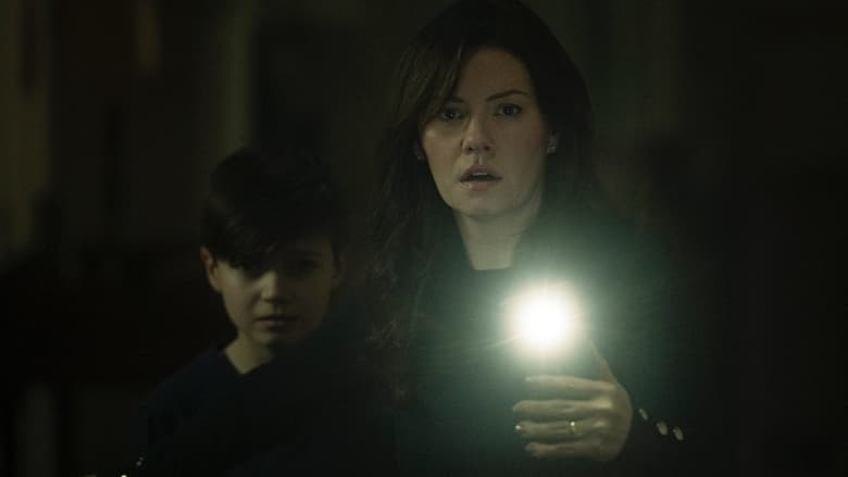
Directed and written by Brendan Muldowney, The Cellar follows Keira Woods, a mother who searches for her daughter after she disappears in the cellar of their new home. Elisha Cuthbert stars as Keira Woods and is joined by Eion Macken, Abby Fritz, and Dylan Fitzmaurice. House of Wax fans will enjoy Cuthbert in this role, as she does a tremendous job at portraying a concerned mother who wants to keep her family safe. It was great to see her return to the horror genre, even if the results aren’t that memorable.
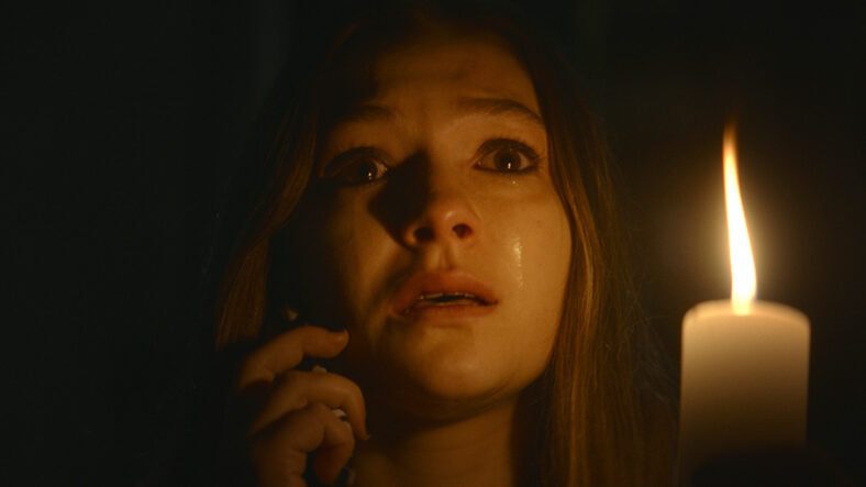
An eerie atmosphere is established early on and grows more unsettling as the narrative progresses. The unease is felt by the viewer and Keira as she researches the house’s history. If not for its atmosphere and competent performances, The Cellar may have been a misfire. Its narrative is gripping, but the characters involved feel like an afterthought. Brian (Macken), Keira’s husband, is the standard in denial father. There’s tension between Keira and her daughter so that development allows you to root for while she researches.
The Cellar becomes less compelling as the mystery unravels, but it’s kept alive by a horrific final act. Exposition dumping takes over, which brings the mystery to a displeasing halt. Cuthbert shines as a mother who must remain strong for her younger son, yet is visibly broken by her daughter’s disappearance. As mentioned above, performances are strong for everyone, but their characters feel unimportant. Outside of Keira, the narrative doesn’t allow this family to be fleshed out before the terror tears them apart.
I wish the film kept playing with your mind because it opts to reveal its monster, which does allow some stellar VFX from that department. Muldowney effectively builds tension through the exterior shots of the house, its spooky cellar, and Keira navigating its dark halls. While its monster is revealed, The Cellar doesn’t overexpose the entity, it’s a quick glimpse at best. What’s effective about this is it still raises intrigue but doesn’t squander it through overexposure of the creature.
The creature design isn’t that unique, and posters for the film will showcase this as well. Shudder acquired The Cellar and will be releasing it soon on its platform. Horror fans will find something to enjoy from this new film. It’s not that good, but it isn’t the worst thing either. Its atmosphere is inviting, which makes up for the weak characters, and lackluster exposition dumping.
The Cellar is an enjoyable haunted house film that manages to retain your interest, despite coming to mixed results. Cuthbert’s performance was the strongest aspect that kept me invested, but the first act does a great job at reeling you in as well. Solid performances, a haunted house, every horror cliche, and a competent story that doesn’t go completely bonkers. The Cellar will satisfy some horror fans, and I’d say this one will be worth revisiting one day.
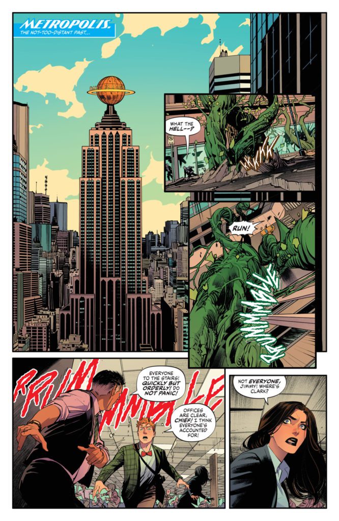
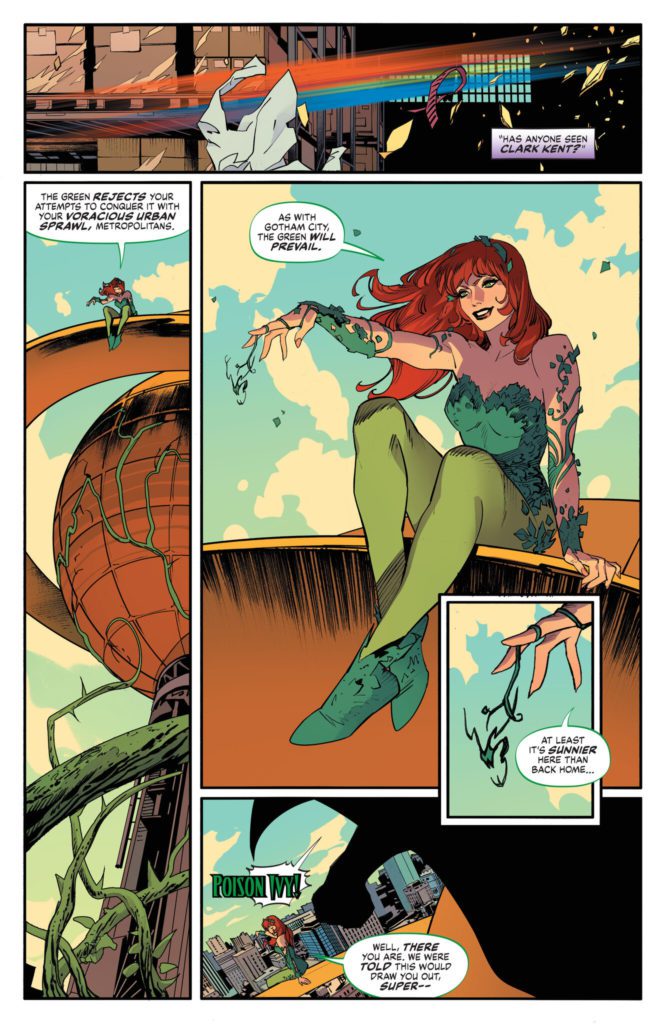
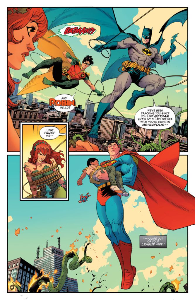
Possibly the most hyped creative team of 2022 so far, writer Mark Waid (JLA: Tower Of Babel, Kingdom Come) and artist Dan Mora (Klaus, Power Rangers) come together to create possibly the best Cape comic of the year with Batman/Superman: World’s Finest #1. Featuring the impeccable coloring talents of Tamra Bonvillain and letters from Aditya Bidikar, this comic brings DC’s two flagship characters back together for a tense and wildly fun ride – featuring the Doom Patrol!
“In the not-too-distant past, Superman’s powers are super-charged from a devastating chemical attack by the villain Metallo…and the only ally that the ultra-powerful Man of Tomorrow can turn to in this turbulent hour is Gotham’s own dark vengeance: the Batman. A nearly fatal burst of power drives Bruce Wayne to his own extreme measures to help his friend…enlisting none other than the Doom Patrol for aid. It’s the world’s greatest superheroes from the world’s greatest comic book talent in an epic comic book experience that kicks off the next big events in the DCU. Get ready, it’s time to soar.”
Writing & Plot
You know, I could scarcely think of a better writer in 2022 for Batman/Superman: World’s Finest #1 than Mark Waid. His bibliography includes some of the best stories the ‘Big 2’ have to offer and demonstrates that few writers understand the superhero genre as he does. Waid brings his Silver Age influenced style to the pages of this iconic team-up and makes it a complete joy. World’s Finest #1 feels like a 60’s DC book but with modern structure and sensibilities. I’ll never get tired of reading a good ol’ Bats and Supes team-up comic, and this first issue sets up what could go on to be one of the most memorable yet. Waid takes some familiar ingredients – a Batman villain causing trouble in Metropolis followed by Superman getting poisoned as part of a secret plot – and throws in splashes of modern creativity to make them feel fresh.
The real treat that drew me to this comic was without a doubt the inclusion of the “World’s Strangest Superheroes – The Doom Patrol!” Waid effortlessly blends this cult classic team into this book. His modernized version of the original Arnold Drake and Bruno Premiani team is a wonderful treat, and he writes them exceptionally well (especially Robot Man). If you were expecting a Morrison/HBO series take on them, prepare to be disappointed. This is a Silver Age-style pastiche in every way, and a wonderfully entertaining comic through and through.
Art Direction
Dan. Freaking. Mora. The modern comics phenom blesses the pages of Batman/Superman: World’s Finest #1 with his signature brand of clean and hyper-kinetic penciling. His designs for our favorite classic DC characters here match what Waid does in the script. He takes the older designs and modernizes them through his own art style. Poison Ivy and other villains have scarcely looked better, and the Doom Patrol come across has highly refined versions of their classic selves – red and white uniforms and all. Mora injects life and personality into his characters through his highly detailed animations. His action sequences feel both immense and lightning-fast. If you’ve seen Mora’s work before, you know how hard his scenes hit when fists and superpowers are unleashed. Every page is busy but still focused. Mora is a master of using blocking to direct a comic’s pacing and the reader’s eyes.
The only thing that could improve the artwork of Dan-Freaking-Mora is the color-work of one Tamra Bonvillain. The former Doom Patrol colorist (Way & Derington run) brings her bright and vivid palette to this heavy-hitting superhero book with incredible results. She’s the perfect complement to Mora’s energetic pencils, offering colors that are reminiscent of the bright optimism of the Silver Age, but with modern fidelity. Lastly, Aditya Bidikar’s lettering is in absolutely perfect form for this comic. Their contemporary style constantly shifts like a liquid reacting to rocks being thrown in it, then crescendos into perfectly placed and effective SFX letters. This is a phenomenal work of visual storytelling, with an absolute S-tier art team making possibly the best-looking Superhero comic of the year so far.
Verdict
Batman/Superman: World’s Finest #1 is an absolute treat of a superhero comic, and a reminder of what DC comics are like at their very best. Mark Waid leverages his years of expertise in the genre to pen a script that is equally fun and intense, with plenty of suspense to carry it into the next chapter. The visuals from Dan Mora and Tamra Bonvillain are nothing short of jaw-dropping, as they have crafted possibly the best-looking ‘Big 2’ comic of 2022. Be sure to grab this incredible #1 when it hits shelves on March 15th!
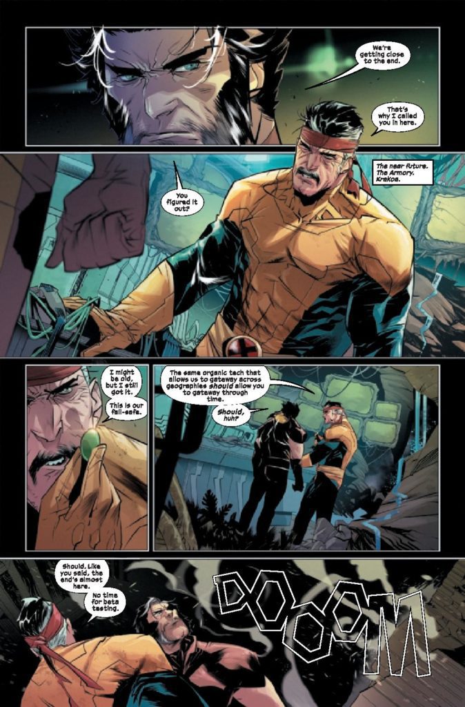
To take on two big stories at one time is a hard task. Jonathan Hickman pulled it off flawlessly when he did House of X and Powers of X. Now, Benjamin Percy is trying his hand at doing this with X Deaths of Wolverine and X Lives of Wolverine. As we enter the fourth issue of X Deaths of Wolverine, things start to take shape and boundaries are being crossed. Percy is joined on X Deaths of Wolverine #4 by Federico Vicentini on pencils, Dijjo Lima on colors and Cory Petit on letters.
WRITING
The fun thing about this series is that it takes place immediately after Inferno. Benjamin Percy has been writing Wolverine since X-Force #1, so he has a good grasp on who the character is. This book is a little different though since it uses alternate versions of Wolverine. This future version of Wolverine is different, but still has a lot of the same priorities. Wolverine still values his family and kids. We see this as Logan confronts Arnab. One of the reasons Wolverine has come back is to stop his family from dying horribly. He discusses this with Arnab and uses it as motivation to complete his mission. Percy has done a great job of villainizing Moira throughout this series. This issue she does something so despicable that she can never go back to being a decent person. This behavior feels like a natural progression for a character that feels betrayed and abandoned by everyone she loved.
ART
The pencils by Federico Vicentini offer a good art style to go along with Percy’s script. Vicentini doesn’t overcomplicate the backgrounds on many panels. Sometimes things can get too messy and too detailed, but Vicentini allows the panels room to breathe by not bogging everything down. There is a panel that will most likely stick with you after reading this issue. As Moira does an unspeakable act, she disregards any care she had for mutant kind. Vicentini draws this panel very creepily. The look on Moira’s face afterward shows us that she’s dead inside.
Dijjo Lima steps up and takes on the coloring duties for this book. The color palette is lighter for this issue with lots of pastel like blues and reds. The gold on the future Wolverine really sticks out. The Phalanx gold is a good contrast to the dark colors on the rest of Wolverine’s costume. As Moira faces off against an astral Professor X, Lima uses a texture on Xavier to blur his form. This blurred and faded image breaks up the colors used in the rest of the issue. It makes thing visually more interesting for a couple of pages.
The letters by Cory Petit work well with this style of art. In the beginning of the issue, as sentinels come for Logan and Forge, Petit uses a transparent “DOOOM.” No Wolverine book would be complete without the infamous “SNIKT” as Logan unleashes his claws. The sound effects for this issue really enhance the reading experience and that is, by and large, thanks to Petit.
CONCLUSION
X Deaths of Wolverine #4 is one of the better entries of the series so far. Benjamin Percy keeps giving us little glimpses of the unsettling future for our favorite mutants. The future may be grim for mutants in this book, but Percy’s star keeps shining brighter. X Deaths ofWolverine #4 is out at a comic store near you.


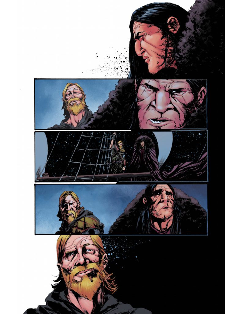
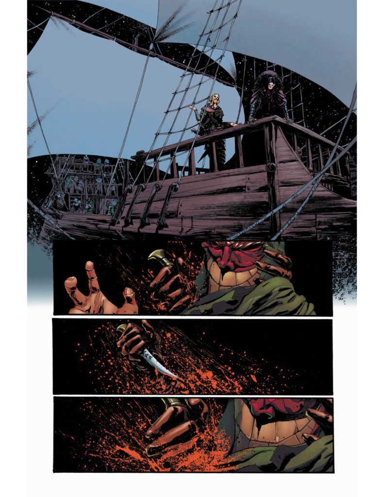 Shane Connery Volk’s artwork puts a tremendous focus on important situations. The most important plot points of Nottingham #7 manifest in panels devoid of background. It gives the feeling that everything else disappears, at least in juxtaposition with letterer Justin Birch’s placement of dialogue. Seeing only Lady Marian’s green eyes, red mouth, and the blood on her face in colorist Luca Romano’s black background makes her words twice as impactful.


")