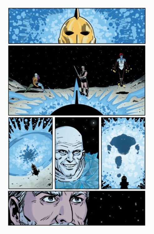
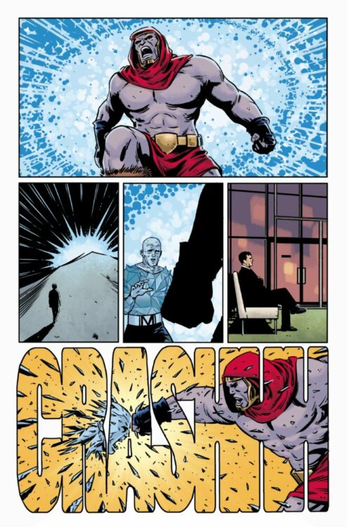
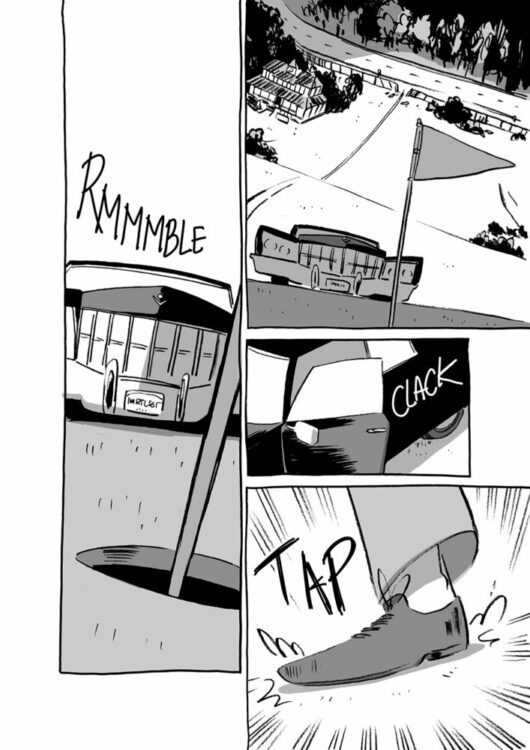
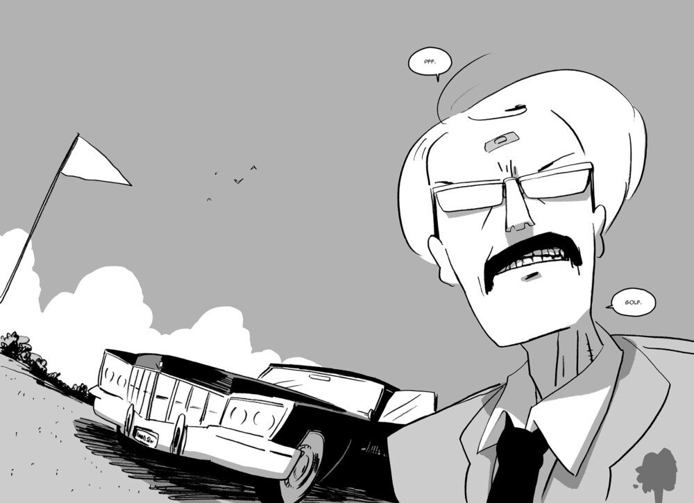
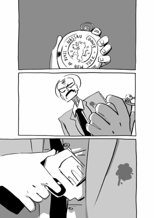
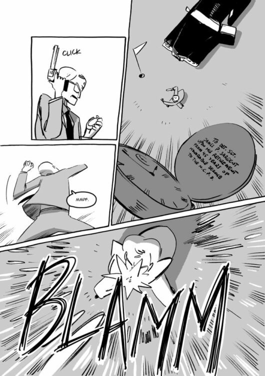
Monkeys Fighting Robots got to sit down and chat with the incredible Tom King about his upcoming series, Danger Street and the series it was birthed from, 1976’s DC’s 1st Issue Special. We also talk about FX’s Fargo, the movies of the Coen Brothers, and existential malaise!
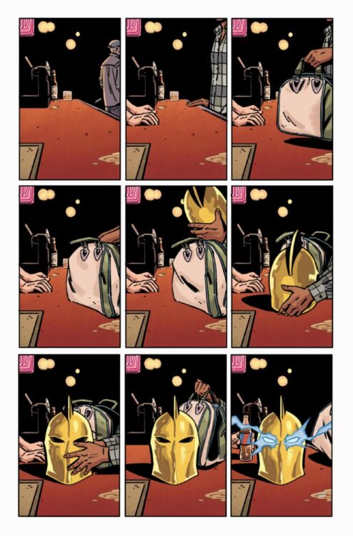
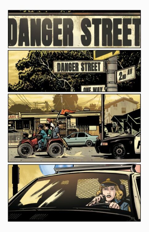
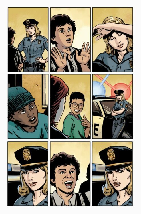
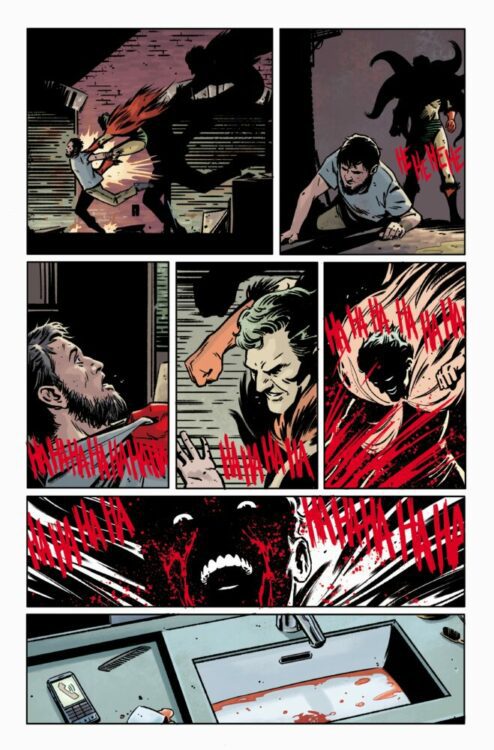
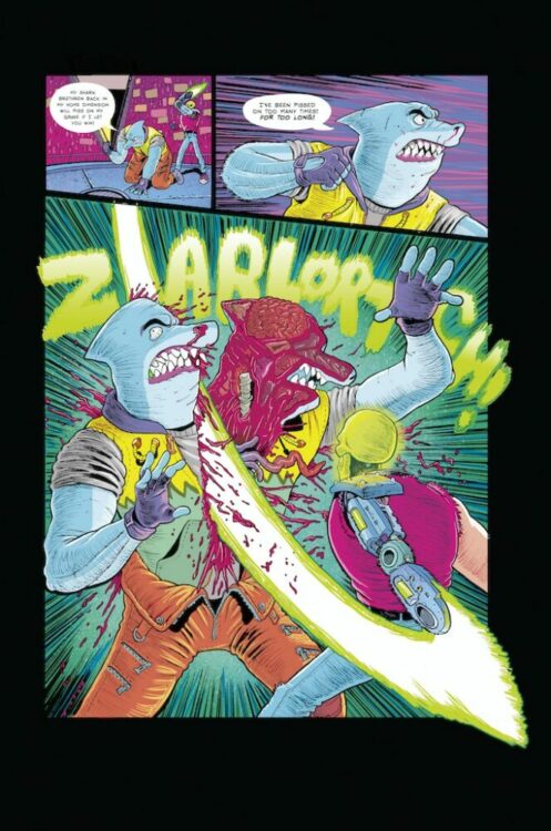
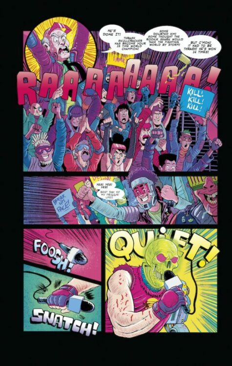
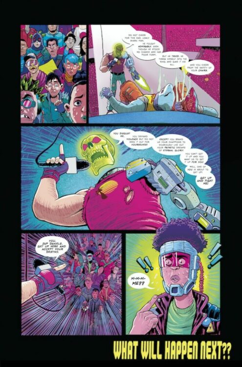
Danger Street #1 is out from DC Comics on the 13th of December, and along with writer Tom King it has artist Jorge Fornes, colorist Dave Stewart, and letterer Clayton Cowles. It’s fantastic, you don’t want to miss it! If that recommendation isn’t enough for you, here’s a peek at what’s inside:
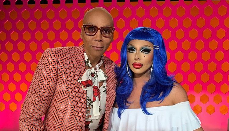
Painted with Raven is a competition series on Wow Presents Plus in its second season. Hosted by Ru Paul’s Emmy-winning makeup artist and right-hand wo[man] Raven, the series is all about creating beautiful work with up-and-coming makeup artists.
Drag queens are like superheroes with secret identities behind their fabulous costumes. In Raven’s case, her not-so-secret identity is David Petruschin, born in Southern California. Today, Raven’s flown far from her desert home and traveled worldwide, creating fabulous looks along the way. She’s become friends with the queen of all drag queens, Ru Paul, and now has her own series, Painted with Raven, that opens the door for other makeup artists to show their skills.
PopAxiom spoke with Raven about becoming a makeup artist and going from David to Raven.
Inspired
“I know how to click the link. I forget that the camera is on. I don’t have my microphone ready. I’m still learning.” We had technical difficulties starting, all on my end.
Raven’s story begins in Victorville, California. “When I Was a kid, I loved playing with makeup. I loved doing my sister’s makeup. I was a boy in the 80s and was not supposed to wear that. Everything was very — blue is for boys, pink is for girls. You only saw a guy wearing makeup because he was in a rock band.”
“I knew I wanted to do it,” she says. “I’d watch my mom putting on makeup. Anytime anything came up like Dynasty, the beauty and makeup, it was so enthralling.”
In secret, young Raven “started playing with it myself. In high school, I would do my friend’s makeup. So I knew I would love to be a makeup artist.”
“It wasn’t until I started dabbling in glamour boy makeup, just before I got into drag, I thought, I want to do my makeup,” she explains. “I like doing my own. So it went from drag to getting on Drag Race to painting the Queen of Drag Ru Paul really fast.”
Raven doesn’t take for granted the wild change in her life. “I went from wanting to do makeup to painting the person who inspired me to start doing drag and doing my makeup.”
Journey Into Drag
What was the learning process like for becoming a drag queen? “I feel like I’m still learning. I feel like people should always be learning. You should always download new software or upgrade to a new version of yourself.”
“I remember going out to clubs before I started doing drag, and I loved watching drag shows; the audience responded and how beautiful and glamorous it all looked.” But back in time, things were different. For example, “… the resources there are now did not exist. You couldn’t find tights in a bunch of different colors, cosmetics, wigs, costumes, or jewelry. You had to be very self-sufficient and be able to utilize what was within your radius.”
Raven’s early shows as a backup dancer were part of the learning process. “I would watch what everyone was doing and wanted to do it. But it wasn’t until I saw Chad Michaels, who won All-Stars 1 … I knew that’s what I wanted to do. In the show, I watched him go from Celine Deion, then about 20 minutes later, he came out as Cher, which is his thing. Twenty minutes later, he came out as Marilyn Manson.”
“So, on my journey, it’s been different versions of myself,” Raven explains all those versions of herself. “There was the gothic dark princess version, the glamazon, the club kitty version. I feel like I have all that stuff, and I can pull that out once in a while. I feel like I’m not just one type of queen but a little bit of everything.”
Raven’s philosophy for versatility is simple. “Why not? We’re playing dress up. So why not be anything you want to be? You’re given this body, and on official papers, you have a certain name, but if you can spend a couple of hours dressed up decorated as something else, it’s fun, it’s freeing.”
Becoming Raven
“There’s not much of a difference,” Raven says about herself and the man behind the mask. “It’s a little bit of a character. There are different ways I carry my hands and act and walk. It’s an extension of who I am. Ru always says, ‘drag reveals who you are.’ There’s that little bit of a diva or a bitch or old lady inside of you that when you get in it, it comes out, and you exude that. I feel that Raven is not one thing; she’s everything.”
But there is a ritual to bringing Raven to life. “The process is the invoking of the spirit. I like to give myself four hours to get ready. I don’t necessarily need it, but I just like that. I take my time. I do a little this and sit back a minute instead of feeling rushed. I can think about things. I have a formula for the way I do my makeup. I love the process of getting into it.”
“It’s always laying right under the surface,” she says about all of us and that liberated alter ego. “Once you put on those lashes and high heels,” she snaps, “it comes right out. I’ve seen even the straightest of men put on the costume and makeup, and there’s a little ‘swish’ in the step. Drag gives you a sense of empowerment.”
Wrapping Up
Raven’s got a long list of [super]heroes. “There are so many greats. Madonna has always been. Cher, Diana Ross, Tina Turner, Liza Minnelli, Judy Garland, all of the greats.”
“The reason that these people are the gay icons a lot of people say they are,” she says about the super-list, “is because they are drag. They were putting up all of this gaudy stuff, lashes, heels, makeup to go out and do these shows that made a lot of drag queens say, ‘I want to do that.’ So to be someone that others want to impersonate, I say, makes you iconic.”
Raven’s inspiration draws “… from the 20s, 50s, 60s, eras from long ago. You look at them and know what era it is because it’s so distinct. Everything was so polished, and it’s come around again. The influx of the beauty industry where now everyone is doing a little bit of contour, highlight, lashes, and lipstick.”
“Because we went through a spell where it was just sweatpants, sweatshirts, and trucker caps for everyone,” she reminds us, though not disparagingly. “Not that it was lazy, it wasn’t that little extra where you see every woman wearing lashes, even men. People are going out into the world and have bought themselves a couple of little trinkets they put on.”
It’s been one dynamic journey from mere mortal to drag queen. “I went from being a stifled kid growing up in the desert thinking this is what the rest of my life would be like to my early twenties realizing there’s a whole world out there. I’ve become the makeup artist for the number one drag queen in the world and compete on her show. I’ve been given my own show now too!”
“I wanted to travel the world and show the world what I do,” she adds with a big smile, “I’ve been able to see the way different cultures do drag. All these things we do here but in their way.”
More is to come from Raven as she considers the future. “I think the next step would be collaborating with someone on a makeup line.”
“Painted with Raven season 2 on Wow Presents Plus” is where you can find Raven for now. “It’s an amazing ride. Eight fabulous artists from all over the country. Each brings their expertise and learning from the other along the way. It’s an amazing thing to watch.”
Is Painted with Raven on your watch list?
Thanks to David Petruschin and Metro Public Relations
for making this interview possible.
Welcome to Self-Published Spotlight, a regular interview column where I will be highlighting self-published comics and the creators and small print publishers who make them.
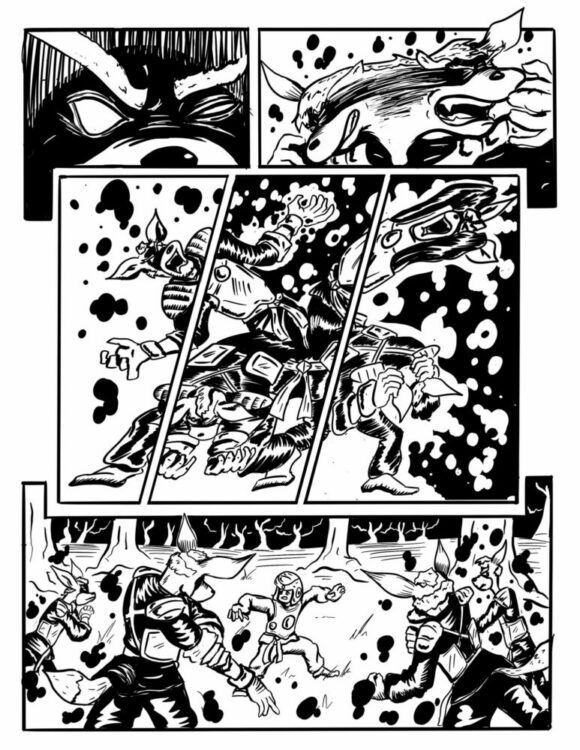
Jerome Cabanatan came onto my radar, like so many other amazing creators, through the Cartoonist Kayfabe Ringside Seats group. Jerome, both an accomplished martial artist AND cartoonist, has been self-publishing work for years. However, TREE VS FOX, his latest project, is his first shot at a Kickstarter campaign. Like a lot of his work, TREE VS FOX bridges his passion for martial arts and comics to create an action-packed narrative with just about the best choreography you are going to find in any comic. I hit up Jerome for a chat and he graciously agreed. Check it out below and make sure to go support and get yourself a copy of TREE VS FOX!
MONKEYS FIGHTING ROBOTS: Jerome, what’s your comic book origin? How did you get into comics? Jerome Cabanatan: I’ve always been into comics and cartoons… Space Ghost was the first superhero I remember but when it comes to comics I’ll always remember the time my Lolo (grandfather) visited from the Philippines dragging a suitcase full of my brother’s old comics, which happened to be bootlegs of a bunch of different Marvel Comics. Byrne or Cockrum X-Men, Shang Chi, Daredevil and for some reason Man from Atlantis still sticks out in my head.
MFR: Oh wow. That bootleg experience must have been quite different. Not the typical way to discover comics. JC:I didn’t know the difference between a real comic and a bootleg until later, so it made no difference to me. Both had words, pictures and panels!
Art by Jerome Cabanatan
MFR: So at what point did you realize you wanted to MAKE comics? What sparked that? JC:I don’t think you can read a comic without wanting to make one, so I think the first time I looked at one I was doomed (laughs). But as far as ACTUALLY making one, it was back in 2011 when I retired from fighting competitively and started an after-school Taekwondo program. I needed to create a poster to advertise it and google just gave me the same pictures every other martial art school used. So I drew it myself on a computer that was gifted to me by a family that I taught. And when the kids started asking questions about the characters… I inadvertently started to world-build. And it rolled from there.
MFR: So for you, martial arts and sequential art are really connected? Two lifelong passions. JC: Yes, seeing life through the lens of both is something I really can’t help anymore.
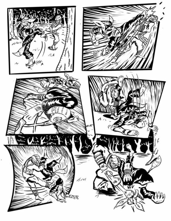
MFR: So tell us about Tree vs Fox. What’s the pitch? JC: It’s an all-action, magazine-size, black and white, fight comic follow-up to my Amazon best-selling Tree Kids of Troop 44. It’s a love letter to martial arts and comics. As Troop 44 was more of a pseudo instructional manual, TVF hits harder in the action and I express more of my thoughts and opinions on how the martial arts lifestyle relates to everything rather than explaining a kick or a punch. Those that want just a fight comic will get a really good one but I’m hoping that the theme of finding strength through challenges resonates with anyone with ambitions. It’s about being more than what people think you are. It’s about trying, failing, and trying again. I think those are important themes in life and art. But as far as the plot… Years after their controversial match at the “All City Troop Fight Championships” went viral, Vaughan, the Tree Kid, and Burad, the young fox, are drawn together by their fighting spirits and face off to prove their supporters right and their haters wrong.
MFR: That sounds amazing! And how come you went with Kickstarter for the first time? JC:Tree vs Fox is something that’s been brewing in me for quite some time since the end of Troop 44. It’s been the constant project I’ve been chipping away at for the past year, and the one I’m most precious about because of how close the subject matter is to me. There are quite a few crowdfunding platforms, Kickstarter has the brand recognition for comics that I am hoping to leverage
MFR: And when does the campaign end? JC: December 20 at 11:44 EST!
Cover artwork for Road To Perdition published originally by Paradox Press
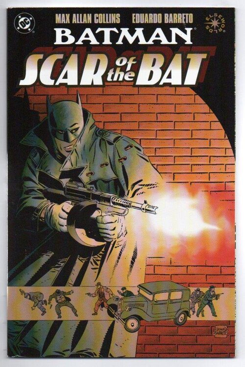
I recently picked up a copy of Scar of the Bat by Max Allan Collins and Eduardo Barreto. It’s like a What if..? take on Batman, fixated on prohibition-era America with a historically real world application of the vigilante character. The book is relatively short but a fascinating insight into the writer, more than an expansion of the character. Collins takes the mythology surrounding the real people of 1930s Chicago and blends it with the mythology of the Batman franchise. He portrays the excesses of violence, the nature of greed, and the need for vengeance, and he does so while keeping within the confines of a Batman-style template.
But Max Allan Collins isn’t known for writing Scar of the Bat or any superhero story. Instead, Max Allan Collins is famous for a much riskier comic book project that combined all of his strengths and knowledge to produce one of the greatest graphic novels of the late twentieth century.
Cover Art to Scar of the Bat published by DC Comics
Recognizable Work
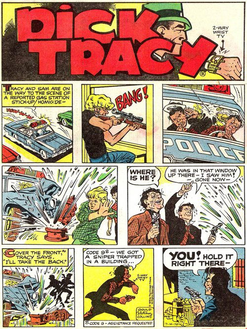
Max Allan Collins is probably most famous for writing the graphic novel on which the movie Road to Perdition is based. As a writer, he is proud of this as, nearly twenty-five years later, he still uses the ‘from the author of..’ on the covers of his other work. In an interview, Collins has stated ‘[F], or years my big credit had been Dick Tracy, but it wasn’t mine – I hadn’t created it. Road to Perdition was something famous that could be put on book covers with “author of,” This quote demonstrates his affection for the work but also introduces us to another example of his work, one that is much more famous than the writer, Dick Tracy. Collins took over the newspaper strip when the original creator, Chester Gould, retired, but despite working on the strip for fifteen years, the character would always be more famous than the writer. With Road to Perdition, the writer was able to receive direct recognition for his work.
The comic, with art provided by Richard Piers Rayner, is a historical gangster story and family drama focused on the relationship between father and son. Collins has stated that he had examined maternal relationships in previous work and, after being influenced by the manga hit Lone Wolf and Cub, he wanted to explore a father/son relationship.
Road to Perdition contains several themes particular to Collins’ work which makes it particularly interesting to examine. The following are the three central themes of the book, all of which run through Collin’s body of work in one form or another.
The Parent/child relationship.
After the death of Michael O’Sullivan’s wife and youngest son, the hired killer takes his remaining son on a road trip across America to protect the young boy from his previous, violent life. This theme is central to Road to Perdition. It is a combination of the extended relationship between Dick Tracy and Junior created by Chester Gould in 1937 and inspiration from the seminal manga Lone Wolf and Cub, which was first published in 1970. It is also the central theme of the movie adaptation of the comic, although there is a shift in the dynamic between father and son in that version. In Collins’ original, the narrative is about the bonding of the characters, the father and son coming to understand each other. In contrast, the movie uses the relationship to play out a redemption arc for Michael. Nevertheless, his son retains the innocence that he has lost and will never regain.
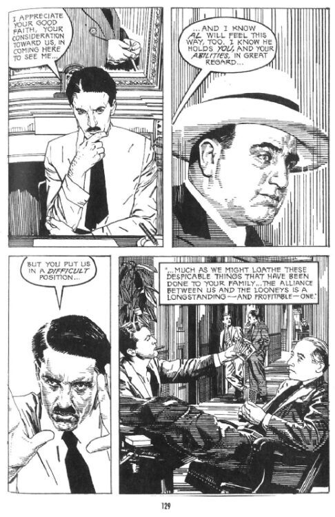
Al Capone features in Road To Perdition
Cosa Nostra.
This mafia-related term means loyalty to ‘the family. Without this concept, the events in Road to Perdition would be over very quickly, as O’Sullivan would be allowed to exact his revenge at the start of the story. Unfortunately, the sense of family instilled in the prohibition of mobsters means that the top Mafia bosses in America protect Conner Looney. The hierarchy of crime often features in Collins’ novels, especially those co-written with Mickey Spillane and his first hit series Quarry. The Mob also features in his novelizations of feature films, including American Gangster, and his comic strip work for Ms. Tree.
A mix of Fact and Fiction.
Most of the antagonists in Road to Perdition are based on real-life figures from American history. Al Capone, Frank Nitti, Eliot Ness, and even the Looney who start O’Sullivan on the path of destruction. Collins extensively researches his work, and there is cross pollination of ideas and characters from series to series. He has written a trilogy of novels based on Eliot Ness, and the Nathan Heller series has the protagonist interacting with a host of celebrities including Orson Welles and Amelia Earhart. Collins uses real-life incidents and people to populate his stories giving them a level of authenticity. This is also true of his work on famous comic books such as the Batman title mentioned above. By using recognizable figures from history, Collins can evolve the fictional characters in relatable ways while commenting on historical events. The merging allows the overlaying of ideas and concepts and the ability to draw parallels between the real and fictitious.
Time and again, Collins returns to the same themes for his work and his extensive research has provided him with an uncanny insight into the history of the American underworld. This has allowed him to write some of the most in-depth, believable crime fiction of the last 40 years.
Dick Tracy comic strip was written by Max Allan Collins for the 1970s
Publishing Perdition
Dealing with subjects of violence, honor, love, and relationships, Road To Perdition was released during a difficult time for the publisher Paradox Press, an adult-orientated imprint of DC Comics. The editor, Andrew Helfer, wanted to publish a number of crime comics produced by different creative teams. He reached out to Collins because of his previous work and good relationship with DC Comics. Unfortunately for all concerned, the comic industry was still reeling from the Boom and Bust era of the 1990s, and DC Comics was making cut backs on their publications. This resulted in Road to Perdition being canceled as a three-part, prestige format release.
Helfer convinced DC Comics to release Collins and Rayner’s work as a graphic novel, along with another title, The History of Violence which had a similar journey as Road to Perdition from the page to the screen. The graphic novel was a critical success and was reprinted several times. The New York Times and Publishers Weekly gave the book, and specifically the author, glowing reviews. The writer of The Witchfinder, Loren D Estleman, claimed the graphic novel was ‘the final evolution of the form once known as the ‘comic book.’
Although the graphic novel did not make waves in the mainstream comic industry, the final publishing strategy helped it to reach an audience within the book market that monthly comics usually could not reach. This was a boost not only for the book but also for Collins as an author. It also helped to bring the work to the attention of Hollywood and allowed for the famous movie adaptation.
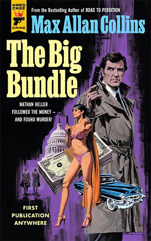
Cover for The Big Bundle, Max Allan Collins’ latest book
Conclusion
Road to Perdition was not an easy comic to produce. Richard Piers Rayner created stunning work that bordered on hyperrealism, popular within auteur graphic novels. However, it was a slow process. This process was another blessing in disguise for Collins because the ‘somber tone of the drawings’ kept Collins ‘on the right track, serving the narrative beautifully’ (Collins’ own words). Everything that appeared to work against the project, such as the state of the industry, ultimately led to greater success for the finished product. This battle to exist is reflected in the finished work, with the bitter struggle for survival featuring prominently on the pages. A strong desire to publish the book and the creators’ determination led to a comic that was revered outside of the industry, as seen by the various literary reviews.
By having the time to work on the narrative and draw on all of his usual themes, Collins was able to focus on the greater thematic core of the narrative and produce a startling piece of work that stands as a highlight of his career; one that he is still proud of as demonstrated on the cover of his latest publication (See image above).
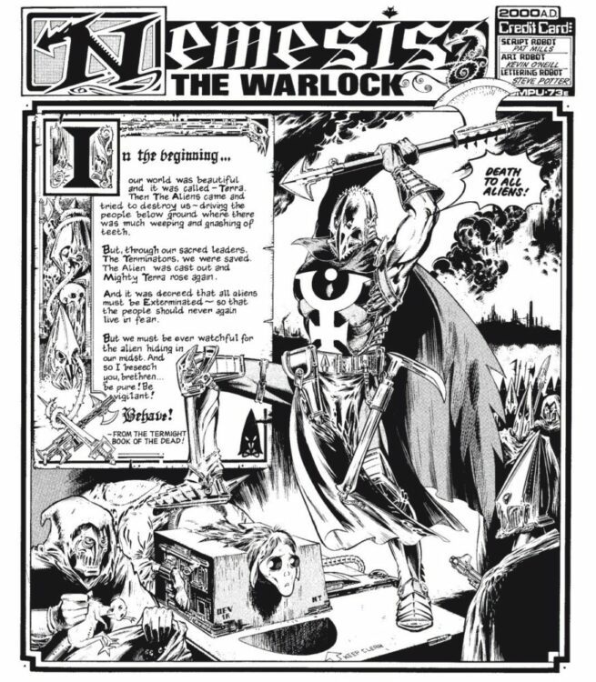
Pat Mills has admitted he had to hold off on introducing new concepts to Nemesis the Warlock early on. In the preface to the first volume of The Complete Nemesis the Warlock, he recalls fearing that “Nemesis would implode under the weight of trying to combine crazy inventions with the conventional hero approach the readers were demanding.” So he and artist Kevin O’Neill decided to revisit and flesh out some of the strip’s earlier ideas instead. In other words, Nemesis, as we know it, was a product of restraint. But in the same way you might try to restrain an angry bull, as Nemesis is a creation of dark joy, the kind of comic where it’s easy to imagine the authors cackling over each page. Of course the hero is an alien who wants to kill humanity. Just look at one of O’Neill’s hellish renderings of the petty world of man. Who else could it be?
Though Nemesis himself was less of a presence in the early strips, the series started more as a showcase for bizarre forms of transport. Mills and O’Neill’s editor had called their proposal for a tube transport in Ro-Busters “too complicated,” so the first few Nemesis strips went under the name Comic Rock, giving the two a place to develop outlandish throwaway worlds for their weirdest concepts. Except, the world of the first strip returned in the second. It may have been so a strange system of tube-shaped roadways could be one-upped by people traveling along electrical wires. But then the second strip ended on a cliffhanger. By the fourth, they had a full-blown series on their hands.
The bedrock the new series built itself on wasn’t Nemesis, but Torquemada. The villain had been introduced in the first strip as captain of the Tube Police, a religious blowhard who protected his “sacred traffic laws.” It wasn’t long until he was established as humanity’s supreme ruler. And as Torquemada took power, the strip reshaped itself to fit him. Where the first few strips had been pure sci-fi, the first under the new title “Nemesis the Warlock” opens on a medieval-style illuminated manuscript. Torquemada had not-so-subtly been named after a key figure of the Spanish inquisition Tomás de Torquemada, after all.
So along with medieval stylings, the strip gave Torquemada an inquisition of his own. The extermination of all alien life. Nemesis had never been shown before this point, only heard as a mysterious voice emanating from a stylish spaceship. Then why not make him an alien? And so the engine that would sustain the strip for its entire run was set in motion.
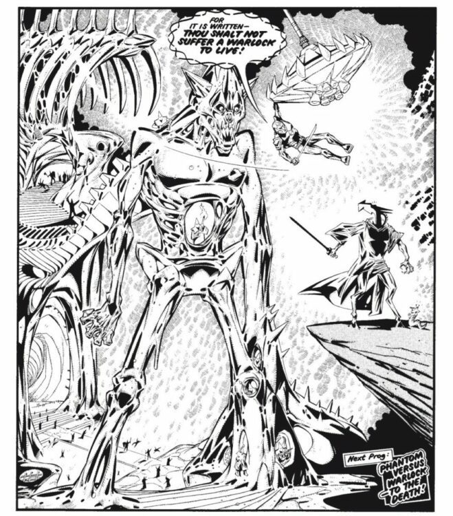
But Nemesis is not just any alien. He has the head of a cubist horse, long horns, and cloven feet, marking him as demonic. It’s an incredibly striking design in a series of almost nothing but striking designs. O’Neill keeps up a mad pace in introducing strange aliens and terminators in increasingly baroque armor. But for all its harsh edges and steel, there’s something organic about O’Neill’s art. Though organic often calls to mind soft tissue and vegetation. This is a world of insects and fungi. It’s no coincidence Earth goes under the name “Termite.” Humans scurry about immense, towering structures, armor resembling chitinous exoskeletons, eyes bulging from behind every visor. Even the walls of the grand Temple of Terminus look more chewed than sculpted. Again, Torquemada is the touchstone for how the style of the strip develops. He’s introduced as a figure wearing a futuristic helmet shaped like a caproate. But the helmet becomes increasingly elaborate after his death and transformation into a ghost. Eventually, he stops wearing clothes, resembling a withered corpse with a gothic cathedral for a head. Then the helmet loses its sheen, and it becomes unclear where the helmet ends, and he begins. By the time two giant robots fight across a battlefield, even steel has gained a sick, fleshy texture.
And yet Nemesis is funny. Very funny. Nemesis may be a world of rot, but it’s one that sprouted from the corpse of MAD magazine. Mills has openly talked about Torquemada being inspired by the teachers he had to deal with in his Catholic upbringing. That sense of wry spite comes through in Torquemada’s pettiness and hypocrisy. Because Torquemada is both a specter of ultimate bigotry and of paltry classroom authoritarians. Nemesis’ answer to Torquemada, then, is gleeful misbehavior. He may not laugh or smile, but his blows against Torquemada often take the form of impish tricks. He’ll dance along the tops of spears, fool a commander into taking a grotesque alien form or put the ashes of Torquemada’s mother in his nosebag. He exists to make fools of the blustering, self-serious terminators and monks. Because while the strip may draw from real pain and anger, it also knows that sometimes it’s best to just laugh at it.
Pat Mills referred to the early Nemesis strips as “comic jamming.” An improvisational style where he and O’Neill would try to come up with the wildest ideas they could think of. Other people might refer to this style of creation as spitballing. But Nemesis never stopped being a comics spitball, even when some of the improvisations were dropped. Because the strip at its purist is a wad of pulp and froth, sailing towards the head of the class.
IMMORTAL SERGEANT #1 doesn’t hit your local comic book shop until January 18, 2023, but thanks to Image Comics, Monkeys Fighting Robots has an advance review for our readers.
About IMMORTAL SERGEANT #1 by Joe Kelly & Ken Niimura (I KILL GIANTS): On the eve of his unwelcome retirement, Jim Sargent (aka “Sarge”) a grizzled, old-school detective, catches a break on a murder case that’s haunted him for decades. Unfortunately, Sarge must drag his anxiety-riddled adult son, Michael, along for the ride or risk losing the lead forever. Can this dysfunctional duo overcome their own hang-ups, blindspots, and secrets to catch a killer?
Do you plan to add IMMORTAL SERGEANT #1 to your pull list? Check out the preview below.
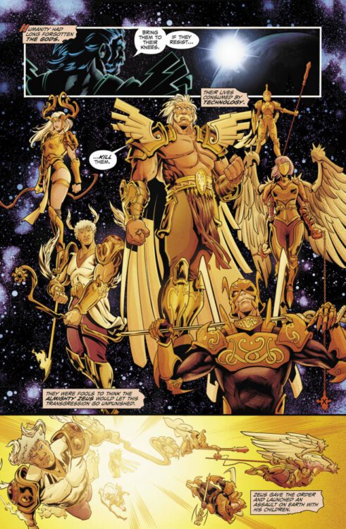
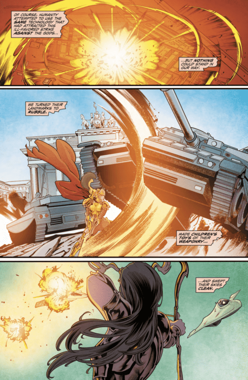
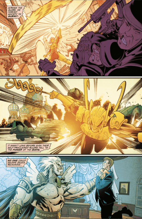
HUNT. KILL. REPEAT. #1 hits your local comic book store on March 23, 2023, but thanks to Mad Cave Studios, Monkeys Fighting Robots has an advance review for our readers.
The book is written by Mark London, with pencils by Francesco Archidiacono, Marc Deering is the ink master, Lee Loughridge drops the colors, and you will read Rus Wooton’s letter work. Ryan Kincaid created the cover.
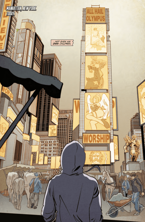
About HUNT. KILL. REPEAT. #1: It’s Kill Bill meets Clash of the Titans in Hunt. Kill. Repeat. The all-new, action packed series by Mark London (Battlecats, Knights of the Golden Sun). When the Greek gods invade Earth, society is quickly forced to comply with their new rulers. However, one god, Artemis, rejects her brethren’s ideology and has found solace in the love of a mortal. When she is called to Olympus to answer for her betrayal, the gods strip away her godly powers and leave her for dead. Now, ten years later, Artemis is on a quest for revenge to confront her father, Zeus, for taking away everything she ever loved.
Do you plan to add HUNT. KILL. REPEAT. #1 to your pull list?
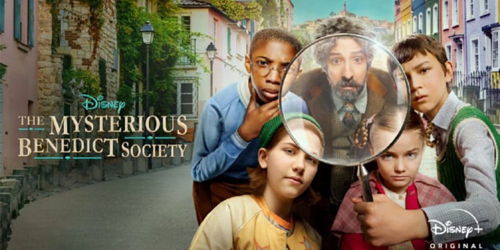
The Mysterious Benedict Society is a Disney+ series based on Trenton Lee Stewart’s children’s books, where four tweens unite to thwart the bad guy. The second season ends this week, and costume designer Chrisi Karvonides discusses the collaboration involved in making the unique look of the show work.
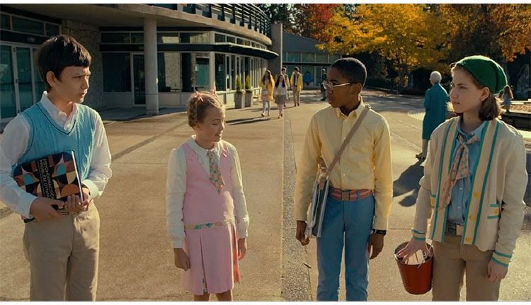
“Reynie” (Mystic Inscho), Kate (Emmy DeOliveira), “Sticky” (Seth Carr), and Constance (Marta Kessler) are either orphans or outcasts recruited by a mysterious and narcoleptic man known as Nicholas Benedict (Tony Hale). Mr. Benedict chose the children because they possess innovative, intelligent minds and unique, complementary skills. Reynie is super-smart; Sticky remembers everything he reads; Kate has a bucket of tricks, and Constance, the youngest member, is surprisingly brilliant. Through season one, the kids learn to become a team. Then, in season two, they take things across the Atlantic.
PopAxiom spoke with Chrisi Karvonides about her career and living on set to get The Mysterious Benedict Society done right.
Fashion to Film
“I started in fashion for a hot minute,” costume designer Chrisi Karvonides begins her story. “I worked in New York. I got in very young, at 17; I worked in the sweatshops,” she laughs. “I realized I did not like it.”
Chrisi loves storytelling, and “fashion was more about telling the trends. So, I got out.” But undeniably thinks of it as an essential part of her learning process. “I learned my skillset in New York at FIT and the shops.”
“I went to Emerson for costume design, then NYU. A huge scholarship took me to Yale. I had a broadway show, Two Trains Running with August Wilson,” she continues, then turns into a consequence of all that outstanding higher education. “I had big student loans to pay back, so I moved to the west coast to work on films; as an assistant designer, lots of sci-fi, big sci-fi films. I became a costume designer for things like From the Earth to the Moon, Big Love, and Carnivale with HBO. After that, I moved to Fox to work on the first season of American Horror Story.”
Theatre and a film set are similar, but “the pace is different. Every ten days, you have a new story, a new ‘play’ to design.”
“I love designing for episodic TV,” she gleefully asserts. “I love the pace. I love making it become a reality.”
Theatre is never too far behind, and neither is another passion. “I still design for theatre three decades later. But, in the last decade, I’ve been able to pursue my first and foremost love — opera. I design for opera in both Europe and the States.”
About The Mysterious Benedict Society
How did Chrisi become part of The Mysterious Benedict Society team? “It’s a lovely story. Big shoutout to Care Adair, who was the season one costume designer. She went on to the HBO Perry Mason, so she pulled out of season two. But she set the tone, and it’s quite magical. She called and asked if I’d consider interviewing.”
“At first, I didn’t know anything about it,” she says, “But once I saw that nod to the Wes Anderson aesthetic and filmmaking, I was so excited. I want to be in television storytelling that allows for costume creativity, and this doesn’t get any better.”
Watching even a frame of The Mysterious Benedict Society tells you all you need to know about how cohesive a show it is, and that’s because of incredible collaboration. “What’s incredible is you have these four writers that are so engaged and involved; they want to convey this magical realism, a non-specific period. Almost an artificial reality with a nod to the 60s and 70s.”
“To achieve that, you need an incredible amount of collaboration, so we’re not going down some rabbit hole where the show ends up being orange or grey. It was a daily communication with [production designer] Cynthia, constantly working with each other.”
Chrisi shares an example. “Originally, Mr. Cutain’s space was supposed to be a coral or ochre color. But the guys wanted it to be calming and gravitate towards blue. But they also really wanted his costumes to be in the blue world. So Cynthia and I figured out how to separate. She’d go darker in the background if I were lighter, and vice versa. It was a weird tinge to the blue, like a blue-green we both embraced.”
Making the Show
“We call it cross-boarding,” she says about how they shoot the show. “We do two episodes at the same time. But working with young actors, we found it difficult to do that, so we tried to keep things more in sequence. It helped the young actors with plowing through their scenes.”
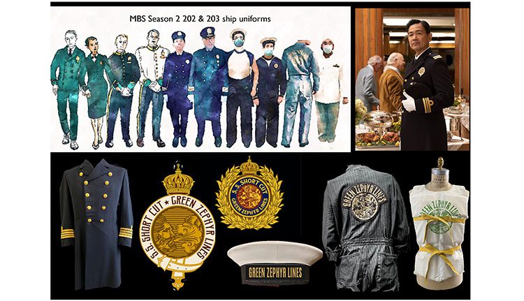
Season two of the series takes the Benedict gang aboard the Queen Mary to England. “We filmed on the Queen Mary in Long Beach. It’s a huge setup to be there. The elevator wasn’t working, so they had to move all this film equipment up six flights of these narrow, iron staircases from the 1930s.”
“It was quite a feat,” she declares and shares more about life on set. “We camped out there for ten days. Two costume trailers, my whole crew including stitchers and seamstresses.”
Costume renderings from Chrisi Karvonides
Ideally, costume designers like to pre-fit background performers ahead of time, “but that wasn’t working out. COVID was ripping through, so we had a lot of restrictions. Not as bad as 2020, but it was complicated.”
“About a third of the people we dressed head-to-toe on site,” she says, and there’s no way to emphasize the number of costumes and detail involved in season two. “My favorite part of season two is that so much takes place on the ship. We created, you don’t see it that much on screen, but we created the entire ship’s crew, from Captain Nolan to the sailors, patches, and signage. The guys working down in the engine room with the boiler suits. We made all the life jackets. So it was about 100 costumes just for the ship’s crew.”
How much time and people-power was available for all that work? “Two weeks. We had about sixteen people on my crew. The whole crew was talented and creative and had something great to contribute.”
Puzzles
“In Benedict, the way it’s shot and how they line things up it’s beautiful. It’s so inspired by the way Wes Anderson does his movies,” she gushes about the show, and that energy is alive in every episode.
One thing Chrisi loves about the show is what she calls puzzles. “There are verbal puzzles, and her team loves working on visual puzzles. Take Kristin Schaal’s character, her name is Number 2 because of her birth order, but she also felt that the name correlated to a number two pencil. So it’s given that it’ll be a saturated, warm yellow color. When we shift from there, it might be a bit of a burnt orange like the top of an eraser.”
“My other was Constance,” she adds “we wanted to keep the pink coat. We had a backstory that you’ll never hear where she got a new coat from Number 2, and it has scraps from the old coat as part of it. So we go into a new coat, embracing her character’s age which was now like 12. From there, we stayed in that color, then went around the color wheel to figure out everyone else’s colors.”
Wrapping Up
Who inspires Chrisi, past or present? “Oh my goodness, that’s a very long list. I would feel terrible missing out on someone,” she laughs, then thinks a moment. “I can give the nod to when I was a kid, the big costume designer I admired was Milena Canonero. Then, of course, Colleen Atwood.”
“Some I admire because they get to do a lot of magical realism,” she says. “Maya Rubeo, who was nominated for JoJo Rabbit. That’s that same thing where it’s a whimsical or nostalgic nod to a time in history, but her sense of color and composition is incredible. She also designed for Avatar and all the jewelry the Navi wear.”
Chrisi’s a fan of creators like Taika Waititi, who she says is doing a lot to elevate heightened reality, which I love. I’ve done a lot of realism, so it’s fun to explore those possibilities. Guillermo Del Toro’s work as well. His journals are fantastic. It’s a combination of his beautiful handwriting with all these drawings. I want to work in that kind of milieu. I love opera; it allows for more artistic freedom.”
Season two completes its run and is available on Disney+. So what’s next for Chrisi? “I’m hoping for a season three. I’m in the middle of designing an opera for the Royal Swedish Opera that’s based on Lars Von Trier’s film Melancholia. It’s part of that heightened reality, non-period defined. The music is quite incredible.”
Is The Mysterious Benedict Society on your watch list?
Thanks to Chrisi Karvonides and Metro PR
for making this interview possible.
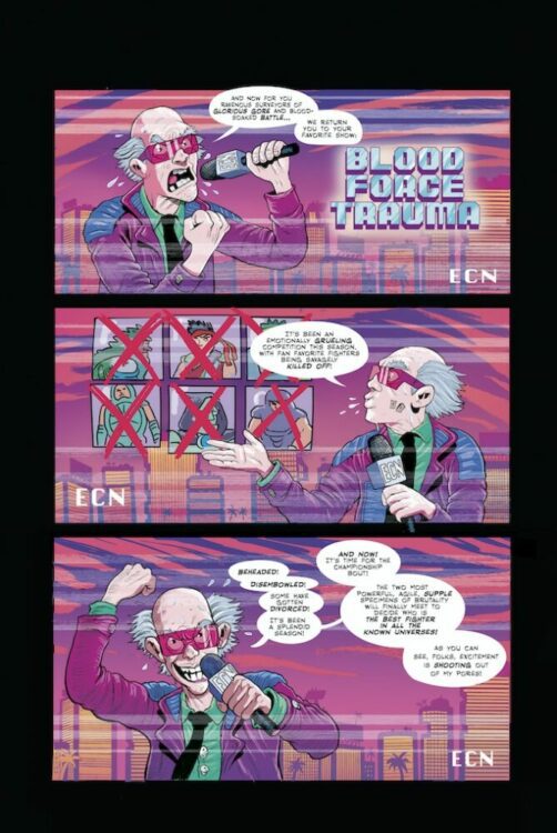
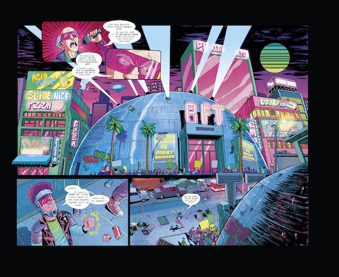
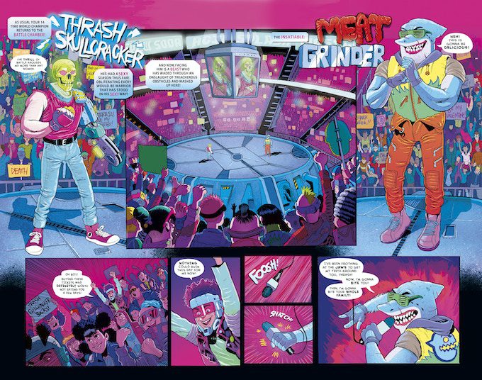
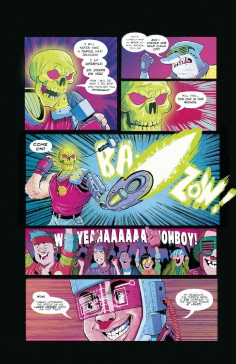
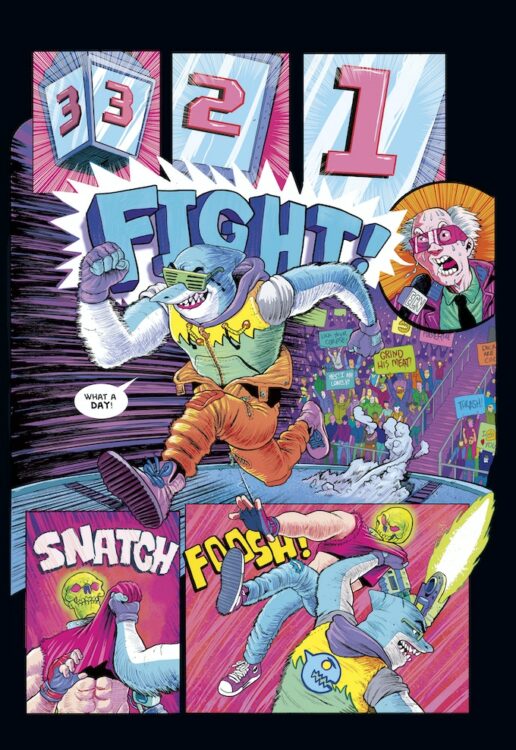
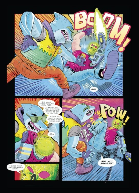
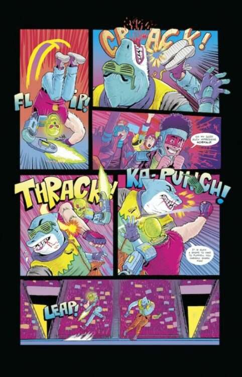
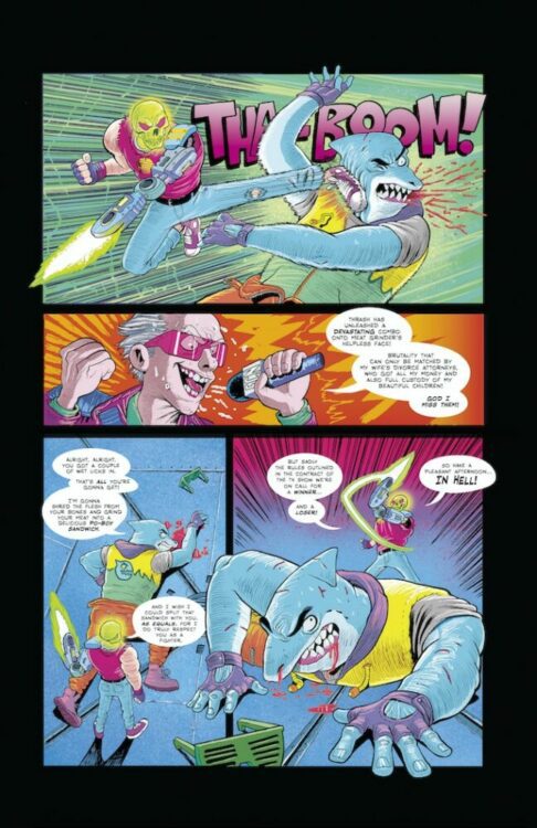
BLOOD FORCE TRAUMA is a comic book series created by Jake Smith and Hiram Corbett. Smith has successfully run six Kickstarter campaigns to get the series out to the public, and today, Dark Horse Books announced they will collect the series and publish the trade paperback.
About BLOOD FORCE TRAUMA: It’s America’s pastime of the future! Brutal hand-to-hand combat. Two fighters enter, one walks out. The other? Gets scraped off the arena floor! Full of laser skull guys, kung fu masters, and mutant shark dudes from another dimension! It’s somewhere a normal kid like Zap Daniels just doesn’t belong. Too bad he’s the new world champ!
The BLOOD FORCE TRAUMA trade paperback hits your local comic shop on August 16, 2023, and bookstores on August 29, 2023.
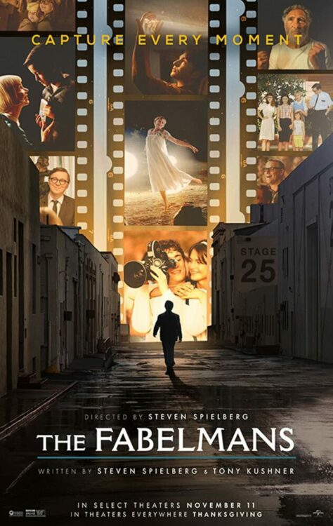
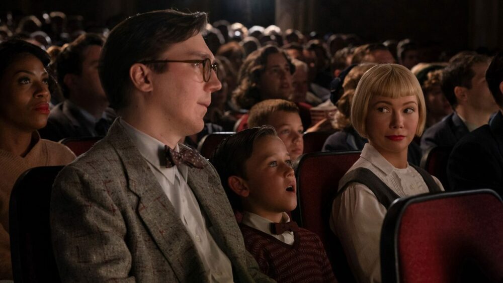
Steven Spielberg has returned with a phenomenal family drama in The Fabelmans. A coming of age epic that loosely chronicles the director’s youth. Spielberg is known for his blockbuster spectacles, so this was a surprisingly significant departure from Spielberg’s definitive work. The Fablemans is a crowd-pleasing family drama that will touch your heart, and showcase a side of Spielberg you’ve never seen before.
If Spielberg intends to pour his heart out like this in the future then I’m open to seeing similar projects like The Fabelmans. The film is riddled with award-winning performances, meta aspects, and features the most realistic depiction of a family slowly crumbling from within. Michelle Williams, who is known from Dawson’s Creek, delivers some of her best work in recent memory. Directed and co-written by Spielberg, The Fabelmans stars Williams, Paul Dano, Seth Rogan, Judd Hirsch, and Gabriel LaBelle.
Set in the 1950s, The Fabelmans follows Sammy Fabelman (LeBelle), a young boy with a passion for filmmaking who discovers the power of movies. Sammy’s world is turned upside down after discovering a family secret, but his passion for filmmaking allows him to overcome this unfortunate reality. This might be the best love letter to cinema this year, and Spielberg being the brain behind it makes it more rewarding. On one hand, you have a compelling family drama, but then Sammy’s journey offers a salute to film and those that are passionate about it.
Admittedly, there are some moments where the pacing isn’t great. Still, even the dull moments are kept afloat by the stellar performances. Spielberg and Tony Kushner delivered a satisfying script for The Fabelmans. This family is easy to relate to and their struggles are heartbreaking as a result of the talent bringing it to life. Sammy was the character I found myself wanting to see more of. I’m sure this will apply to several viewers because he’s someone that uses film to escape the difficulties of life. For many of us, movies are a form of relief, a way to put our hardships on pause.
What I love about The Fabelmans script is that it spends a while to let viewers grow attached to this family before it puts them in difficult positions. For instance, the attacks on Sammy at school strike a core due to how the character has been built up as a sympathetic protagonist. Sammy and his family are constantly moving due to parental adjustments, but their Jewish background creates a problem for Sammy. Their interactions with one another are very believable as well, especially the dinner table sequences.
Everyone is tremendous in their roles, which only makes the more depressing moment that much more richer and heartbreaking. LaBelle is great as Sammy, but Williams is the standout as Mitzi Fabelman, Sammy’s mother. Her facial expressions combined with her delivery make it challenging to not get lost in the performance. Mitzi’s journey is a challenging one, and Williams demonstrates that with ease. As mentioned, perhaps the only negative is the pacing because the film might have overstayed its welcome toward the end.
The Fabelmans cinematography gives it a dream-like feel that only enhances the experience. Also, Spielberg doesn’t rely on exposition dumping but opts to let the viewer piece together the obvious. Once the family secret is revealed, a sequence unfolds that plays with your imagination versus explaining everything. For anyone concerned with “wokeness”, The Fablemans is more interested in a subtle approach, which keeps the narrative engaging. I’m not sure where this will end up on my list for the year, but The Fabelmans is another example of Spielberg’s brilliance.


")