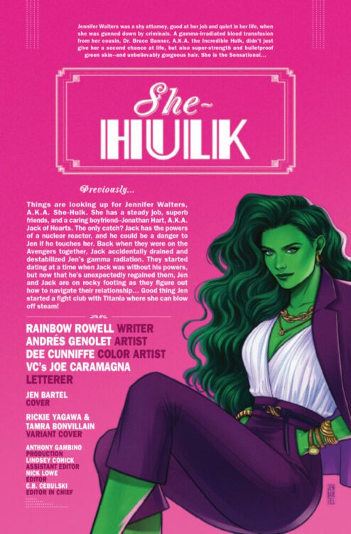
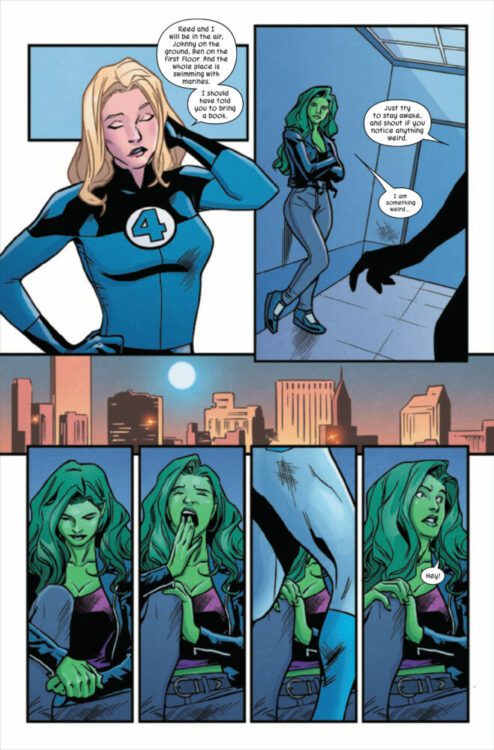
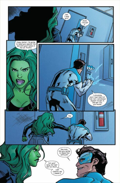
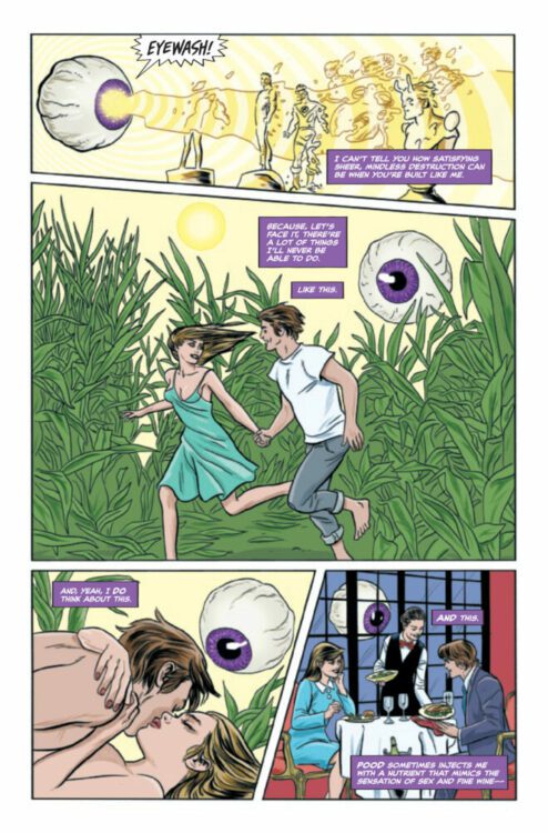
SHE-HULK #11 hits your local comic book store on March 22nd, but thanks to Marvel Comics, Monkeys Fighting Robots has an exclusive three-page preview for you!
About the issue: New arc! Great jumping on point! A new villain starts a thieving spree through New York City and ends up face-to-green-face with Jennifer Walters, the Sensational She-Hulk! Also, have you noticed that this is LGY #174? You’d almost think something very special is coming!
The issue is by writer Rainbow Rowell and artist Andrés Genolet, with colors by Dee Cunniffe, and letters by Joe Caramagna. The main cover is by Jen Bartel.
Check out the SHE-HULK #11 preview below:
Are you reading SHE-HULK? Sound off in the comments!
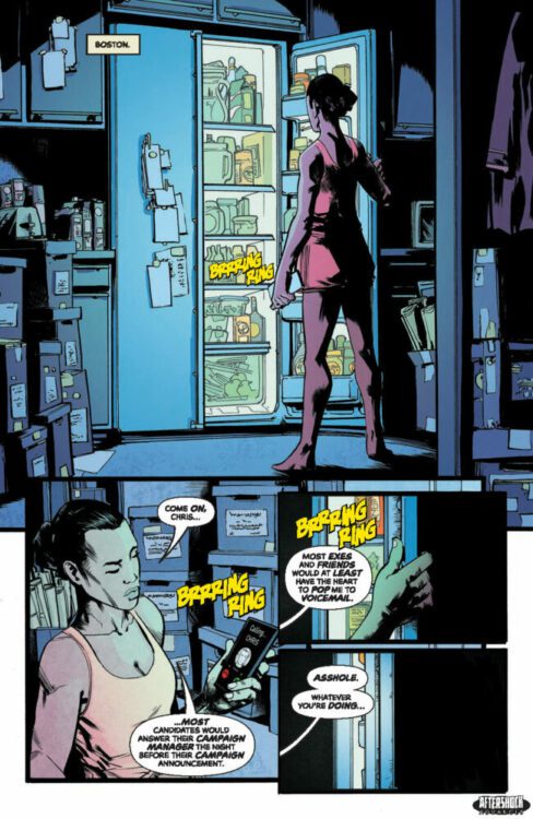
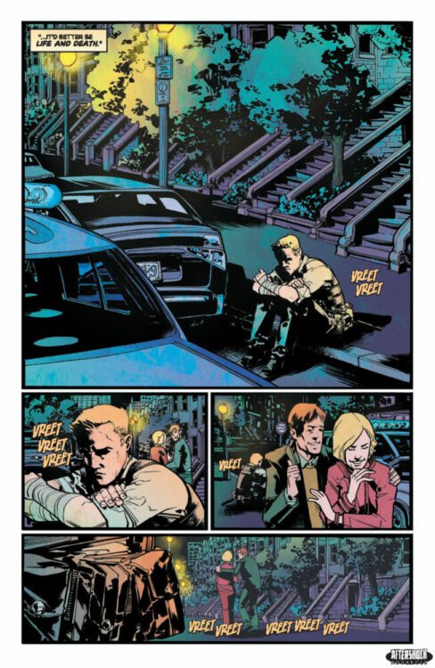
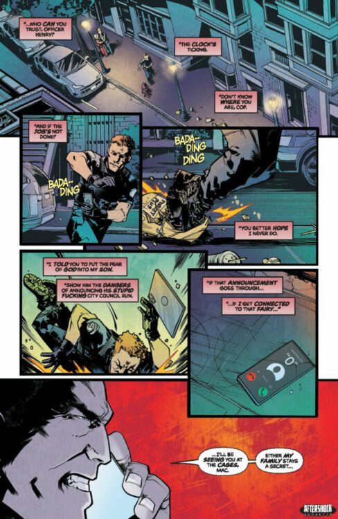
BULLS OF BEACON HILL #3 hits your local comic book store March 29th, but thanks to AfterShock Comics, Monkeys Fighting Robots has an exclusive five-page preview for you.
About the issue: Boston Surgeon Christopher Boldt has spent his whole life ashamed of his father’s gangster background – so, when Chris decides to run forpublic office, it’s in the name of building his own legacy. Unfortunately, his father can’t tolerate that, and puts a hit out on his own son. But no matter how far it tried to fall, the apple landed close to the tree. Chris’s family tradition of violence explodes, he survives the hit, and now he’s out for revenge on his own father, someone his mother hates as well, but never divorced…so just where do her loyalties stand?
The series is by writer Steve Orlando and artist Andy MacDonald, with colors by Lorenzo Scaramella, and letters by Carlos M. Mangual. The main cover is by MacDonald.
Check out our BULLS OF BEACON HILL #3 preview below:
Are you reading BULLS OF BEACON HILL? Sound off in the comments!
From acclaimed veteran writer Christopher Priest (Black Panther, Deathstroke) and artist Carlo Pagulayan (Planet Hulk, Wonder Woman) comes a story of the Man of Steel adrift in space and time in Superman: Lost #1. Featuring inks from Jason Paz, colors by Jeremy Cox, and lettering by Willie Schubert, this opening issue features Priest’s signature intelligent scripting and some incredible visual work to create a comic that is wholly engrossing – and sets up potentially one of the most personally challenging Superman stories in recent memory.
“SUPERMAN’S ODYSSEY OF SOLITUDE! After Superman is called away on a routine Justice League mission, Lois Lane awakens to find a complete stranger standing in her living room. The Man of Steel, home much sooner than expected, reveals he has, in fact, been lost in space for 20 years. Nothing and no one seem familiar to him anymore, and the timeless bond between them has been severed…or has it? Can love conquer all?”
Writing & Plot
Christopher Priest brings a softer yet still wholly compelling version of his brand of intelligent writing with his script for Superman: Lost #1. The Black Panther writer is famously known for his sardonic sense of humor, biting satire, and tendency to make many of his arcs centered around some sort of geo-political conflict. Those first two habits are entirely missing from this first issue – but this isn’t a bad thing. Priest does hit readers with some political drama early on, but it’s used as fodder for a playful conversation between Lois and Clark. Priest flexes his character writing abilities in this comic in a way that often gets overlooked in his other books. He’s always been a solid character writer – his Deathstroke run and his handling of that series’ cast is ample proof of this. However, even for a veteran mainstream comics writer, writing an entertaining and emotionally fulfilling Superman comic can be a serious challenge. Just from this first issue though, Priest seems to already have it nailed. While much of the script is broiled in action and political jargon, there’s a sense of personal weight and character understanding on every page. Priest’s script may be wordy, but the dialogue flows remarkably well and is constantly fascinating. This book serves as a reminder that superheroes are typically supposed to be super-smart, and watching the Justice League rattle off info about an otherworldly mystery they uncover is truly awesome. Every character’s voice sounds distinct and true to themselves, all while still making the book feel like a Priest comic. Lost itself is home to a familiar premise, but it’s written so well that the wait for the next issue is going to be a difficult one.
Art Direction
The whole Deathstoke team made their way over for this series, with Carlo Pagulayan and Jason Paz providing an incredible visual experience for Superman: Lost #1. Pagulayan’s pencils are full of detail for both characters and setting, making for a high-fidelity mainstream comic experience that holds a distinct artistic feel. His defined linework is unique among other “Big 2” comic artists, with a slightly edgier aesthetic that still feels perfectly suited for action scenes and quieter moments. His facial expressions bring an intensity and intimacy to both the big JL action sequence, and the conversations in Lois and Clark’s apartment. Lost is given a lot of dimension and atmosphere by Paz’s inks. The dynamic between his work and Pagulayan’s pencils makes for a stunning visual experience that pulls the reader into the room with Supes, Lois, and any other guests they may have. There’s a sullen sadness at a certain point in the book that I could scarcely imagine being better crafted by another creative team. The color art from Jeremy Cox finishes the visual experience with vivid yet subtle tones. Every part of his work here is impressive, but an absolute highlight has to be the cityscape shots from Lois and Clark’s apartment in Metropolis. The way the distant city lights mimic stars – and how that parallels with this story’s subject – is truly stunning. Finally, Willie Schubert’s lettering makes for a stellar reading experience with reflexive fonts that reflect character tone in each exchange. Overall, this opening chapter is a phenomenal visual read, fitting this sci-fi driven and emotionally tense Superman story.
Verdict
Superman: Lost #1 is a fantastic opening chapter to this new limited series from the acclaimed former Deathstroke creative team. Christopher Priest takes a familiar science fiction premise and wonderfully applies it to a Superman story, all while offering emotional intensity and his signature brand of geo-political bantering. The visuals from Carlo Pagulayan, Jason Paz, and Jeremy Cox are absolutely stunning and expertly sequenced, making for one of the best-looking DC comics to come out this year so far. Be sure to grab this debut chapter today!
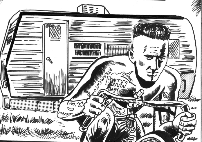
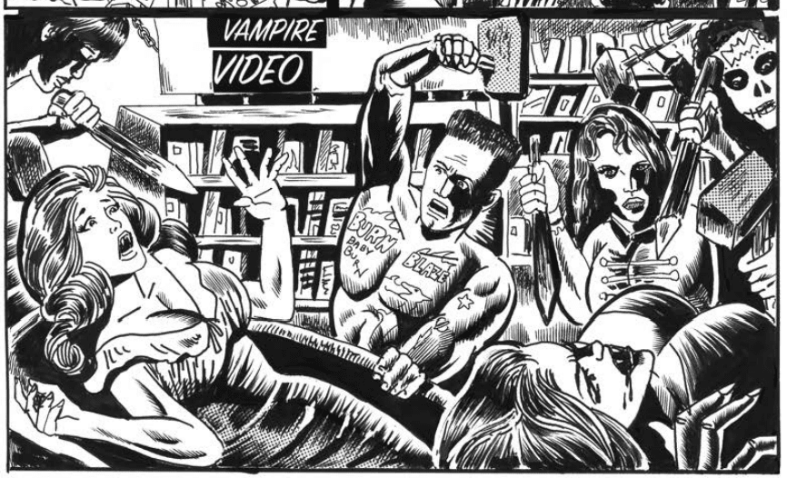
Ken Landgraf is a true cult icon in the world of comics. He studied with legends like Will Eisner and Harvey Kurtzman and worked as an assistant to Gil Kane and Rick Buckler. In the ’70s and ’80s, he went on to work on some of DC Comics, from titles like Weird War Tales to Superman Family and World’s Finest. His most infamous work might just be New York City Outlaws with Bob Huszar, perhaps the first true ‘outlaw’ comic. Huzar and Lamdgraf most recently collaborated on Apocalypse 5000, from Floating World Comics. Currently, Landgraf is at the tail end of an already fundedKickstarter campaign for a new project, Ink Zeitgeist, described as “a black and white outlaw genre pastiche comic (bikers, horror, cult cinema, superhero, punk, sci-fi, rockabilly, etc.) that takes place in Ink Town, a low-class but captivating destination of flea markets, arcades, trailer camps, diners and sideshow carnivals.” Mr. Landgraf took some time to rattle out his top five writers and inkers in the world of comics, along with some cool details. Check it out below, in his own words, along with some preview images from Ink Zeitgeist. Then make sure you head over to theKickstarter page and push Ink Zeitgeist to the extreme!
Special thanks to Kirk Oldford (author and campaign manager for Ink Zeitgeist) for making this article happen. Could not have been possible without him!
Art for Ink Zeitgeist by Ken Landgraf.
Ken Landgraf’s Top Comic Book Writers
Stan Lee: The ultimate creator of major Marvel superheroes. His word balloons were funny and unique to read. A major influence on future Marvel and DC writers.
Roy Thomas: A master writer trained by Stan lee, he was the best Conan writer. Even worked on the screenplay for the first Conan movie!
Doug Moench: A great prolific writer of Batman and Master of Kung Fu.
Gardner Fox: An important early DC writer, worked on The Atom and many of the DC classic comic book stories. He also wrote for the paperback books.
Paul S Newman: The writer of Turok Son of Stone and a major writer for Dell Comics. I even got to draw a sci-fi story that he wrote at DC comics
Ken Landgraf’s Top Comic Book Inkers
Wally wood – A master of light and shadow, face lighting effects, master of the female figure; master of the brush I never became a Wood assistant. When I did get the chance I was already starting to get work at DC Comics. I met Wood 3 times as I would hang out with Jack Able watching him ink Iron Man. Wally who was friends with Jack would sit on the floor and talk. He told me to never ink a figure more than 50 percent black. He would ask me to go down to the Deli and get him a sandwich and said “get a soda for yourself. Mostly I got him a plain ham sandwich.
Dick Giordano: A pen master of dynamic ink line. Whoever he inked, he improved. Giordano was responsible along with Joe Orlando, on letting me draw Hawkman.
Russ Heath: He had a perfectly controlled ink line. Another master of light and shadow. I would often watch Heath ink up at Continuity Studios. I gave him blotting paper and purchased original art from him.
Dan Adkins: trained by Wally Wood, he kept the pencil style of each artist he inked. He would put his ink into a heated pot on the stove to take out water so the ink would be super dense. Dan invited me to dinner a few times and I got to watch him ink a John Byrne Iron Fist story.
Dublin-based comic collective Limit Break Comics recently launched a Kickstarter campaign for its new Norse horror anthology FRACTURED REALMS.
About the book: The darkest nights of Fimbulwinter are upon us, Ragnarök isn’t far behind, and the Nine Realms are falling… welcome to FracturedRealms, the new anthology from Limit Break Comics. Norse mythology meets contemporary horror in this 24-story collection from Irish and international creators, totalling 96 pages.
Limit Break has previously successfully crowdfunded two other myth-inspired anthology books: TURNING ROADS in 2021, and DOWN BELOW in 2022. FRACTURED REALMS will feature stories by over 50 comic creators and is due for publication in the winter of 2023. The book is edited by Limit Break’s own Paul Carroll and Gary Moloney, and is supported by the Arts Council of Ireland.
The cover to FRACTURED REALMS, by Nick Roche (inks) and JP Jordan (colors).
FRACTURED REALMS will put a unique horror spin on stories from Norse mythology and folklore, including the Mead of Poetry, Thor’s Fishing Trip, the talking head of Mimir, and — of course — Ragnarök.
Creators involved: Brendan Albetski, Sarah Amundson, Kaydee Artistry, Daniel Beals, Nick Bryan, Patrick Buermeyer, Nick Caponi, Paul Carroll, Colin Craker, Aaron Cruz, Robert Cullen, Ryan Estrada, Anna Everts, Tríona Farrell, Aaron Fever, Ben Filby, Alex Garrick-Wright, Kyle Gaynier, Oliver Gerlach, Adam Gilbert, Travis B. Hill, Seán Hogan, DC Hopkins, Ben Humeniuk, Liam Johnson, JP Jordan, Seamus Kavanagh, James Killian, Rapha Lobosco, J.J. Lopez, Andriy Lukin, Marin, Aline Martins, Adlai McCook, John McGuinness, Alyssa Meier, Mariana Meira, Michiums , Chris Mole, Gary Moloney, Alex Moore, Oscar Osorio, Chris Panda, Benjamin Paulus, Christian Abel Peña, Lan Pitts, Nikki Powers, Toben Racicot, Jack Reickel, Rae RS, Andrea Schiavone, Gustaffo Vargas
In addition to the new book itself, Limit Break is offering up all kinds of rewards for backers, including titles from their back catalogue, stickers, pins, zines, and more. Aspiring creators even have the chance to have their own script reviewed by Paul and Gary.
Limit Break Comics is a Dublin-based comic collective, founded in 2018 on the back of a shared desire to see small press comics grow in Ireland. It is made up of Paul Carroll, Gareth Luby, Gary Moloney and Seamus Kavanagh.
The premise is simple: read one comic every day for the entire year. It seems like a simple task but there is no way that I read 365 comics last year, even if you count the individual issues in collections. So, this year, I am committing myself to this reading challenge, in the hope that I can broaden my reading habits and fully engage with my favorite hobby again.
When someone mentions comic book adaptations to you, what do you think of first? Is it one of the movies from the MCU? Or possibly Christopher Nolan’s Batman trilogy? Maybe it’s a television series such as CW’s Arrow or Supergirl. For me, it’s the magnificent world of Classics Illustrated, or the various comic versions of Frankenstein based on the original novel and the numerous film adaptations. You see, I find adaptation infinitely fascinating, and the different translations from one medium to another has so much to say about the process of creating comics, film, and novels. Adaptation is an art form unto itself.
This week I’m going to be working through (or at least start on) a collection of comics based on novels.
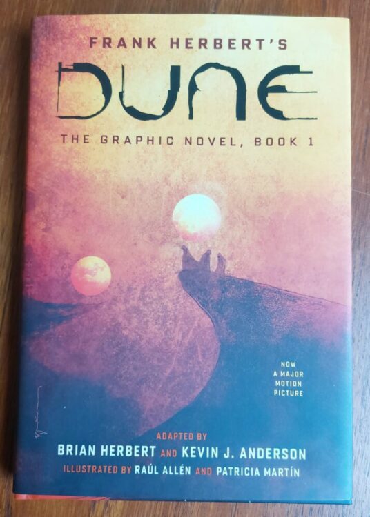
One of several Dune comic books
Comic Number 64: Dune (2021)
Frank Herbert’s Dune has a long history with adaptation. First there was the David Lynch movie, which was adapted into a three-part limited series by Marvel Comics and later collected in Marvel Super Special #36. The novel was then given the TV treatment, an ambitious project, but surprisingly bland. More recently, the novel hit the big screen again, and this time BOOM! Studios began releasing prequel comics based on the expanded universe novels — those not directly linked to the movie. Also, Abrams ComicArts started a three book adaptation of the novel, again not directly linked to the 2021 movie.
It is the first of these books that I am currently reading. The cover is by Bill Sienkiewicz, and he perfectly captures the raw power of the atmospheric novel, just as he did with the Marvel version in the 1980’s. It’s a shame, then, that the artwork by Raul Allen and Patricia Martin does not have the same effect. The work is good and has some dramatic flair but it does not own the narrative in the same way Sienkiewicz did. This book is an interesting study for adaptation purposes because it is a very faithful re-imaging of the original text, with much of the script lifted directly from Herbert’s novel. The question remains, how much is added to the graphic novel to distinguish itself from the original book? Is it merely a recreation with illustrations replacing descriptive text?
I am enjoying the book, but I am reading it much more like a novel than I am a comic. The script — the actual text on the pages — is more important than the images. There is very little added by the artwork, with only the occasional elaborate panel or two bringing a visual dynamism. The book highlights one aspect of literary adaptation: that of constant space. In a novel the characters are well defined but their locations are fixed at specific points and then barely mentioned. As a reader, you place the character in the location outside of the actual written word. In a comic, the location is constantly visible. In this version of Dune, the artists choose to fill each panel and page with scenery and location, almost to the point of over saturation. And only rarely does it add anything to the narrative. In the 2021 movie, it could be argued that the focus is primarily on the locations, with the scenery and props telling the story, which works very well. Filmmaker Denis Villeneuve is telling his version of the Dune legacy through a visual spectacle because that is cinema’s strength. Allen and Martin occasionally accentuate an element of the novel in a visual, comics specific way, often through their use of color saturation, but this does not happen enough.
Maybe, when the story gets going, this will change.
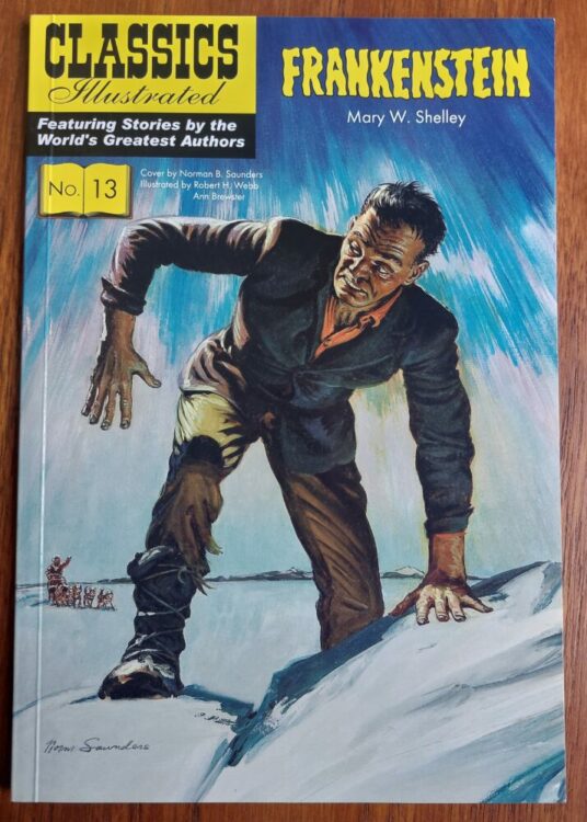
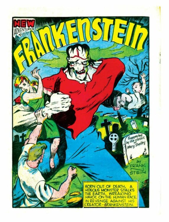
Frankenstein in Classics Illustrated #13
Comic Number 65: Frankenstein (Classics Illustrated)
The Classics Illustrated range of comics was devised to introduce literary texts to children and reluctant readers. The series has been described as “uneventful, one-dimensional, often blatantly silly literary adaptation” (from Literary Adaptations in Comics and Graphic Novels by Jan Baetens, 2020). However, that standpoint is counterproductive to the purpose of the comic. The Classics Illustrated range was specifically aimed at younger readers, therefore potentially falling into the realms of children’s books, and almost by default they do one thing that is uniquely comics: they embrace reduction.
Comics are all about reduction — about taking an idea or an image and reducing it to its minimal form while still being recognizable. Cartoons and comic strips use the least amount of lines to depict characters and places. This reduction, however, does not make the comics infantile or unworthy.
In Frankenstein (numbered 13 in the series I have), Ruth A. Roche cherry picks the elements of the novel that are important for representing the key themes. These are then illustrated by Robert Hayward Webb and Ann Brewster to a strict page count. It is true that some sequences of the novel have been massively condensed or removed altogether, however it is the way in which they handle what is left that is truly impressive. Webb and Brewster pack so much tension, horror, and raw emotion into each page that the essence of the novel shines through. One panel can contain enough information to warrant jettisoning whole sections of the book. And the use of the space on the page is brilliant. The sequence where the creature first awakens is composed upon the page in such a way as to visually demonstrate the hold the creature already has over Victor. The scientist is trapped within the panels and overshadowed on the page.
It is this visual image play that makes comic adaptations of novels so interesting. Seeing the way that people interpret a text and the ingenious ways in which they represent emotional and psychological themes in a purely visual way.
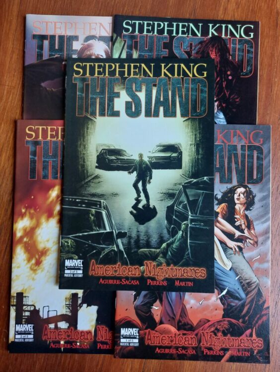
The Stand published by Marvel Comics
Comic Number 66: The Stand (Marvel Comics)
Stephen King’s The Stand is arguably one of his best novels. Yes, it has some moments that flounder, and the “kill them all” shock two thirds of the way in clearly exists only to move the plot on (King has admitted as much, himself), but that doesn’t detract from the score of horrific scenes, intense characters, and compelling End of Days story that is a precursor to the modern obsession with apocalypse narratives.
And for today’s reading, I picked up issue 3 of The Stand: American Nightmares. This comic is a perfect example of how to adapt the written word. This issue is centered on Larry Underwood and his journey out of the disease ridden New York. In the grand scheme of things (by which I mean the 1002 pages of tightly printed text in my Complete and Uncut edition of the novel), this sequence is a fleeting moment. A few pages of unnerving exodus used to bring two characters closer together and highlight to the reader the move from the closed, isolated plot threads to the wider world beyond. And yet, it is possibly one of the most memorable parts of the story. It contains everything required to scare the reader and get inside their heads. In an interview with Marvel.com, series artist Mike Perkins shared his excitement for this particular part of the book, stating “This scene with Larry just oozes tension,” and was one of the reasons that, unlike most book to comic adaptations, the scene was extended to include elements that weren’t in the original. Perkins and writer Roberto Aguirre-Sacasa stretched Larry’s journey through the Lincoln Tunnel so that they could get inside the characters head and add new levels of horror that were not in King’s novel.
The way that Perkins depicts the intense claustrophobia in this comic is almost perfect. The gruesome images of murdered pedestrians and imagined zombies creates a visual horror akin to cinema’s body horror genre. However, it is the all encompassing darkness that really gives this comic its menace. On pages 13 and 14, Perkins switches the darkness from a vast space for Larry to be lost in to a closed, claustrophobic space. On page 13, the images of the stabbed man are surrounded by light and appear in the boxed panels, while the text, the third person narrative of Larry’s journey, is across the entire page. This reminds the reader that Larry is ever present, even in the black, borderless sections of the page. Then, moving across to page 14, this pattern is reversed so the actual images (thoughts inside Larry’s head) exist in the border-less part of the page while Larry becomes trapped in the panels. The darkness shuts him into a confined space.
In King’s novel, the darkness is alluded to by Larry’s obsession with his lighter and most of the journey is about the things that he imagines to be there. But in the comic, Perkins is able to create the same sense of nervous horror through the depiction of the darkness, coating the pages in pitch blackness. The result is unnerving and creepy. Exactly the right level of tension that Perkins spoke about in the interview.
It’s also worth mentioning Rus Wooton’s lettering in this comic because they do some heavy lifting. The characters’ emotions are brought out in the tone depicted by the changes in text size and emphasis. Larry’s anger, Rita’s pleading and stubbornness, and then the fear in the characters’ voices as they make the most horrific journey of their lives — Wooton’s work perfectly captures the nuances from the novel, proving that you can recreate written emotion using visual techniques.
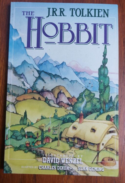
The Hobbit Graphic Novel
Comic Number 67: The Hobbit published by Grafton Books
I could not get on with the Lord of the Rings books and (confession time) never got more than 150 pages into the first book. I do remember reading The Hobbit. And, probably more so, I remember reading the comic book adaptation of The Hobbit illustrated by David Wenzel.
Wenzel’s work is whimsical and majestic. At times the artwork feels more like the illustrations in a children’s book and less like the dynamic characters in an exciting comic. However, that is how this book is meant to be read. It is a dense children’s book, though. If you pick this up thinking that it’ll be a quick way to read The Hobbit, you’ll be disappointed because “text heavy” is a fitting phrase. There are pages where the beautiful watercolor images almost disappear under crammed caption boxes and weighted down word bubbles.
Having said that, Wenzel extracts the atmosphere of the novel and splashes it across the pages. The humor of the hobbits, the stupidity of the trolls, and the creepiness of Gollum are all present in this book. It is also stylistically consistent, something which Peter Jackson’s movie version cannot be accused of.
If the purpose of literary adaptations is to introduce new readers to the originals, then I’m not sure that Charles Dixon, Sean Deming, and David Wenzel’s version of The Hobbit is a good example. Mainly because, after reading this version, I can’t think of any reason why you would be compelled to read the novel, because this book already feels like reading a novel.
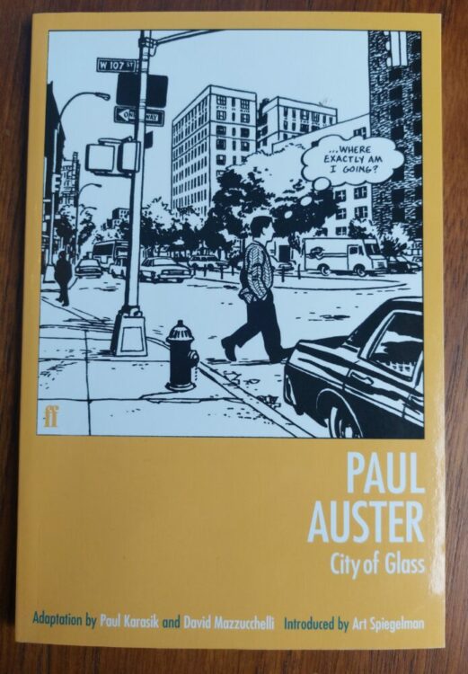
City of Glass
Comic Number 68: City of Glass
There are novels that are dubbed “unfilmable” — books that for one reason or another are too immense to be given the cinema treatment. Obviously, this doesn’t stop people from trying, and the same is true for comic book adaptations. However, comics have an advantage over film in that they have less restrictions. A graphic novel project, for example, is not limited to space, allowing the creators to include more from the source material. Movies are often limited to 2 hours (up to 3, possibly, but this is still rare even in today’s movie industry) whereas a graphic novel can have as many pages as are needed to tell the story the creators want to tell.
City of Glass fits both of the points that I have made above, first being a difficult novel to adapt and secondly a fine example of what creators can do when given the freedom that graphic novels allow.
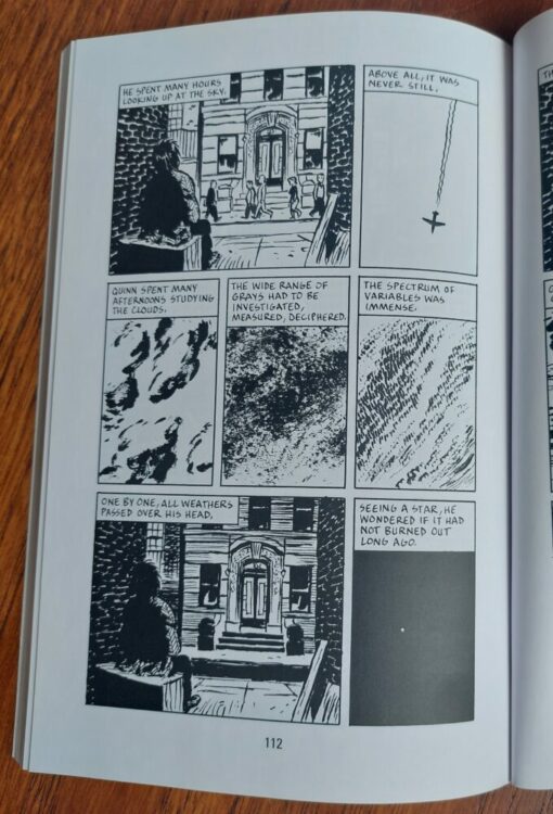
David Mazzucchelli and Paul Karasik’s adaptation of Paul Auster’s novel is an exciting and fascinating read. Auster’s novel is a complex narrative that relies on wordplay and deals with subjects of time and the nature of fiction, all of which are difficult to represent in the visual forum. However, Mazzucchelli translates the word play into image play. He takes the essence of the novel, and how it relates to that particular medium, and injects that into the comic, making it comic specific. The general narrative runs through both versions but their emphasis relates to their own media. This means that a level of abstraction is evident in the graphic novel version, with a high number of non-sequitur panel transitions. It is a visual feast and challenges the reader in the same way that Auster’s novel required the reader to engage with the fiction and solve the literary puzzles.
Example of page layout from City of Glass
Comic Number 69: Academic Papers
Replacing today’s comic is an article written about the application of literary adaptation to comics and graphic novels. (That’s not because I haven’t read a comic, though. I’m working through Hickman’s Fantastic Four run and today read issue number 583. It just didn’t fit this week’s topic.) Entitled Literary Adaptations in Comics and Graphic Novels by Jan Baetens, published in The Oxford Handbook of Comic Book Studies in 2020, the article investigates why literary adaptations are under-represented within the comics world. Movies and television embrace novels and there are hundreds of adaptations, which are often praised and studied. Baetens points out that in cinema it is “assumed that the best adaptations are based on the worst novels, the good ones being resistant to any kind of faithful reworking,” whereas in comics only a few classics are constantly adapted and re-adapted. I have also found this to be the case, especially this week as I have looked for adaptations to read. There are a few modern writers whose work has been faithfully re-imagined as comics — Stephen King and Anne Rice for example — but these appear to be few and far between.
The article also discusses the types of adaptation, drawing on the pros and cons, and constantly comes around to the concept of fidelity. Fidelity rules the roost on the internet with the release of every superhero movie but the actual relationship between fidelity and adaptation is complex. Baeten’s starts the discussion here but it is too large a subject for this one article.
Finally, Baetens asks the question, are literary adaptations in comics second-rate or do they offer something new from the process of translation? The answer, as you can imagine, is not straight forward. I personally believe that any form of adaptation can be worthwhile but we have to stop being fixated on the concept of fidelity. Spiritual adaptations, by that I mean adaptations that take the essence of the original text, can produce the most interesting work. You only need to look at the history of Shakespearean adaptations to see this in practice.
Title page for Frankenstein from Prize Comics #7
Comic Number 70: Prize Comics #7
The idea of multiple versions of the same story is a fundamental part of Frankenstein’s history. Even before the array of adaptations appeared, the original novel was revised and re-released several times in Shelley’s lifetime, and nearly 300 editions have been released since.
In 1940, Dick Briefer brought the Frankenstein narrative to life in a successful comic strip. Briefer’s Frankenstein starts life as a horror comic strip in Prize Comics #7 where it retells a large portion of Mary Shelley’s novel before introducing a twist ending. The ending was to serve a purpose: it allowed Briefer to continue the story beyond the original narrative. It also allowed him to re-introduce a theme from the novel that was lacking for much of his interpretation. You see, in this initial version, the creature does not speak for the majority of the story. He is a “grunter,” which is a term given to a particular interpretation of the creature and made popular by the 1931 film.
Although Briefer’s monster is influenced by the look and vocabulary of the earlier adaptations, much of Shelley’s story is condensed into the few wonderful and energetic scenes. One aspect that Briefer draws on is the use of setting to reflect mood. This is an important part of the original and Briefer is able to make great use of it in this visual adaptation. The contrast between consuming darkness and oppressive light features in several juxtaposed panels, capturing the struggle within the creature as it tries to understand the life and the world it has been born into.
Despite the low page count, Briefer proves that it is possible to successfully capture the essence of a novel, re-imagine it in visual terms, and even add something to the source text to, on this occasion, give it longevity.
The Further Adventures of Frankenstein can be read in the pages of Prize Comics, available for free on the archive website Comic Book Plus. They are worth looking at, and get quite gruesome in places.
So, what is the point of comic adaptations of novels? I would argue that if your comic doesn’t add anything to the original then it has failed as an adaptation. If all your comic has done is retell the book but with pictures, the final product serves no purpose.
Adaptations have the ability to help education (Classics Illustrated), enhance magical worlds (The Hobbit), enrich or even alter the perspective of the original (The Stand), or re-imagine a concept so that it fits modern, alternative societies, using the familiarity of the source material as a grounding or point of contrast. They can even create something new and exciting while still remaining true to the original (City of Glass). Comics, as a medium, have the ability to do things that other media are not able to do, in the same way that film or photography can. So, what is wrong with allowing comics to embrace works of literature and interpret them in new and imaginative ways?
Since Zeb Wells took over writing duties on Amazing Spider-Man, there has been some tension between Peter and Mary Jane. As a reader, we had no idea what happened. Picking up the first issue felt like you missed out on a key story element. Here we are, 21 issues later, and Wells is finally giving us the story arc of what Peter did. Joining Wells on this issue are John Romita Jr. on pencils, Scott Hanna on inks, Marcio Menyz on colors, and Joe Caramagna on letters.
WRITING
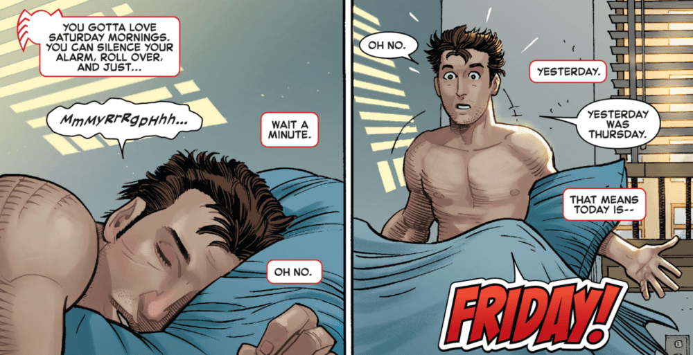
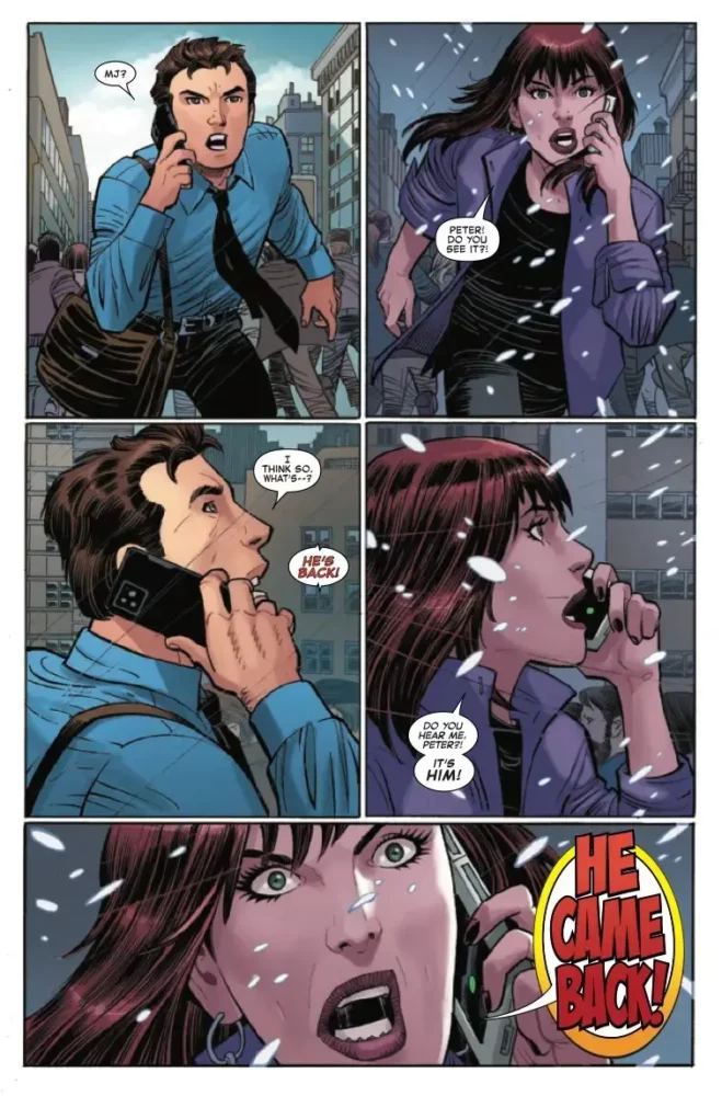
This is an important story arc for Wells’ run, because a lot of what he’s doing hinges on whether or not this is a believable plot. Readers have been wondering how Peter ruined everything and screwed up all his relationships; this is Wells chance to show what he can do. This is an issue that jumps between the present and the past, one year ago specifically. Wells uses his time in the present to show us how the lives of Peter and Mary Jane are going. Peter is running late as usual and has to multitask to attempt to get to work on time. Mary Jane is moving on and living her new life with her husband Paul and their kids (part of the mystery that Wells has set up). All of this stops for Peter and Mary Jane when the Tattered Man reappears. Wells uses that moment to take us back in time one year. The last half of the issue is devoted to showing the reader how the Tattered Man escaped from Ryker’s Island and what his connection is to Peter and Mary Jane. Wells will definitely pique your interest with this issue. As it ended, I wanted to read more and see what would happen next. The use of the Tattered Man is an interesting choice too. We don’t know much about him or what his powers can do, but he is definitely a powerful threat. As the first issue wraps, Spider fans should be pleased with where this story is going. Wells is successful in getting fans excited and invested in this book — he gives just enough answers but raises more questions to keep you reading. I can’t wait to see what the next issue brings.
ART
John Romita Jr. does the pencils for this issue under Hanna’s inks, and it’s some of his best modern work. Romita Jr. can sometimes be a bit boxy with his art, especially with heads, but this issue doesn’t look like that at all. As Mary Jane talks to her and Paul’s children, their heads and body are shaped well and don’t have that boxiness that we sometimes see with his art. In a panel where Mary Jane is disappointed that it’s taking the kids too long to get dressed, Romita Jr. draws her wonderfully, and the look on her face is picture perfect. There is also something eerie to how he draws this rendition of the Tattered Man. Romita Jr. gives him a look and design that allows the reader to see that this is a character that is not playing games. The deadness of his eyes and unkempt hair lets us know this is a man with nothing to lose.
Menyz’s colors in this issue generate a lot of warmth. The reds as the Tattered Man slices a fellow inmate speak volumes, as does the vibrant yellow glow as the villain floats through the street. These can both signify danger for our hero, as warm colors can often be equated with trouble. There is a great page where Spider-Man is fighting the Tattered Man outside. The contrast in colors Menyz uses between the power coming off of the Tattered Man and the gorgeous blue sky is truly eye catching.
The letters by Joe Caramagna are excellent here. This is an issue that uses a lot of sound effects and yelling, so Caramagna had a lot of work to do. We get started right on the first page as Peter forgets what day of the week it is. Caramagna uses a large “FRIDAY” to emphasis Peter yelling. Later, as the battle between Spider-Man and the Tattered Man ensues, Peter hits him with a chunk of drywall and Caramagna lays down a nice “THUNK” right next to the Tattered Man’s head. This is an emotional issue, so the yells and loud voices are littered throughout the issue. When the Tattered Man reappears, Mary Jane yells “HE CAME BACK” — Caramagna uses a quarter of the panel for his letters to emphasize the fear in her voice.
CONCLUSION
Amazing Spider-Man #21 is a very good start for this story arc. Zeb Wells writes an interesting introductory issue that finally gives us the back story we’ve been waiting for. John Romita Jr. turns in some of his best pencils in recent memory and reminds everyone he is an A-list talent. Amazing Spider-Man #21 is available at a comic shop near you!
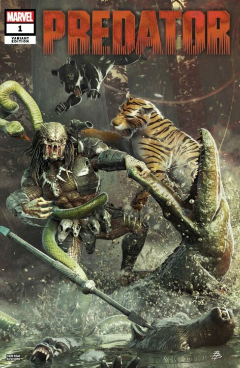
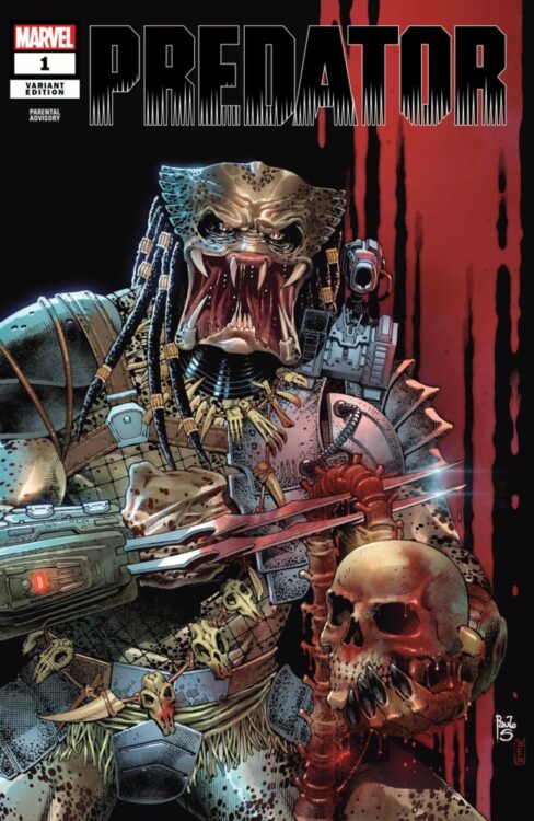
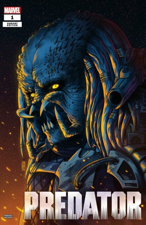
From writer Ed Brisson (Ghost Rider, Batman Inc.) and artist Netho Diaz comes Marvel Comics’ send series following the galaxy’s most terrifying hunters in Predator #1. Featuring inks by Belardino Brabo and Victor Nava, colors from Erick Arcinega, and lettering by Clayton Cowles, this new series is propped up by some solid art but brought down by an all-too familiar premise.
“FEAR IS REBORN! On a planet far from Earth, eight strangers find themselves in a deadly game. But this time, the Predators aren’t the only ones on the hunt. Someone has the Yautja in their sites – and they’ve been searching for this game preserve for a long time. Ed Brisson and Netho Diaz kicks off an explosive new series that will turn everything you thought you knew about Predators on its head!”
Writing & Plot
Accomplished comics writer Ed Brisson makes a couple of unusual choices with his script for Predator #1. In his defense, he makes this new series an actual direct follow-up to last year’s Predator mini-series, much like how in the Dark Horse era most of the separate comics were actually linked into one large story. Also, from page one this certainly feels like a Predator story. We quite literally hit the ground running with some good old-fashioned bullet-flinging and spine-tearing. However, while it’s impossible to escape the tropes and habits of prior Predator stories from every medium, this one sticks a little too close to one of the franchise’s prior films. A group of killers the world over are suddenly dropped onto a jungle planet with no memory of how they got there, and are immediately hunted down by the masked aliens. While every Predator comic has had its obvious references to the films, just blatantly re-using the plot of one – in this case 2010’s Predators – feels cheap. Granted, Brisson throws some interesting wrinkles in the story, it still stays too close to that film for too long. The other strange choice here is using the 2018 film The Predator – the one film we’re all trying to forget – as essential backstory. Yes, the prior series does the same thing which also becomes a key element in this new chapter, but using such a hilariously flawed film as plot fodder is an odd idea. Fortunately, the issue does pick up in the last couple pages with the potential for some genuinely interesting developments. Hopefully, Brisson is able to make some magic out of a pile of oddities – this is comics, after all.
Art Direction
Predator #1’s strongest feature is its visual storytelling, thanks to the efforts of Netho Diaz’s pencils and Belardino Brabo & Victor Nava’s inks. The art team here throws the reader into this alien jungle with excellent environmental detail, great character animation, and strong sequential pacing. While the cast aren’t really memorable as characters (not a huge deal, they’re mostly trophy fodder), they are each drawn with a distinct look that matches their varied backgrounds as different kinds of soldiers. Without spoiling one of the major plot points, several of the fighters here have a distinct descriptor that adds even more of a sci-fi twist to this alien-filled comic. Diaz’s designs look the part without ever feeling completely out of place. His take on the Predators themselves is familiar in all the right ways, with a touch of his own to make at least one of the hunters memorable. One of them has a missing eyepiece in his mask with the scar to match, making for some pretty badass closeup shots. Brabo and Nava’s inks make the jungle dark and oppressive, and perfect the detail in every panel. They work in tandem with Eric Arcinega’s dense color art to make a stellar visual experience that stands tall with other great looking Predator comics. The deep jungle greens and flashes of thickly-toned blood spatter make for a proper Predator reading experience right out of the original 1987 film. Finally, Clayton Cowles’ letters make for great punctuation in every sequence. His dialogue balloons are easy to read and capture character tone well, but his SFX work is what really shines. Every action sequence is peppered with cleverly placed FX lettering that never overtakes the panels, but still make an impact on the page. Overall, this new entry in the Predator universe has some solid visual work that brings readers right back into the hunt.
Verdict
Predator #1 is a puzzling first issue that has some definite potential. Ed Brisson’s script relies too heavily on prior films for too long before dipping into the most interesting new plot elements. The visuals from Netho Diaz, Belardino Brabo, Victor Nava, and Erick Arcinega are very solid and sit high among modern Predator comics. While there are some problems with this first chapter, it’s got enough intrigue and momentum in its story to warrant reading what’s coming next. If you’re a Predator fan, be sure to grab this issue from your local comic shop today!
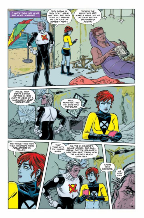
THE X-CELLENT #1 hits your local comic book store on March 15th, but thanks to Marvel Comics, Monkeys Fighting Robots has an exclusive four-page preview for you!
About the issue: Your favorite celebrity super villains are back! Zeitgeist is still on a mission to achieve social media godhood, no matter who he has to kill! But the spotlight won’t be big enough when the next generation of the X-Statix drop in! Join Peter Milligan and Michael Allred for the final half of their mutant celebrity saga!
The issue is by writer Peter Milligan and artist Michael “Doc” Allred, with colors by Laura Allred, and letters by Nate Piekos. The main cover is by Michael and Laura Allred.
Check out the THE X-CELLENT #1 preview below:
Are you excited for THE X-CELLENT? Sound off in the comments!
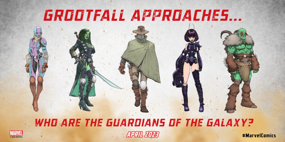
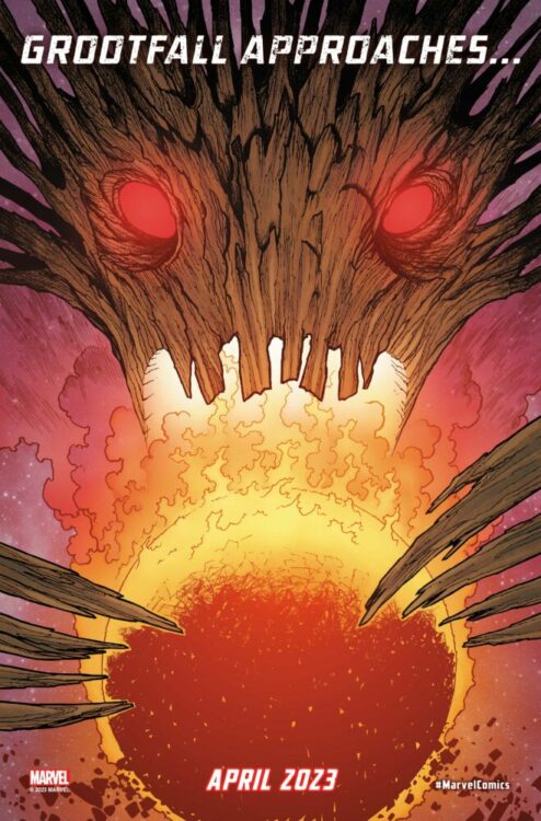
GUARDIANS OF THE GALAXY #1 hits your local comic book shop on April 12, but thanks to Marvel Comics, Monkeys Fighting Robots has an early review for our readers. The book is written by Collin Kelly & Jackson Lanzing; Kev Walker is the artist, Matt Hollingsworth is the colorist, and you will read the letter work by Cory Petit.
About the new series:
One year ago, the Guardians of the Galaxy were destroyed. Their optimistic future is shattered by the betrayal of one of their own. Now they ride the space lanes of a lawless corner of the galaxy, trying to outrun their tragedy. Can they rediscover their heroism and humanity on the bleakest frontier? Can they forgive the failures of their past? Or will they fade into the dark, eternally unforgiven?
My first impression of the issue; I have no clue what is going on, the jokes are clunky, but the artwork is amazing. With Guardians of the Galaxy Vol. 3 coming out in May, it’s hard not to read the dialogue and add the voices and delivery of Chris Pratt, Zoe Saldaña, Dave Bautista, Karen Gillan, Pom Klementieff to the comic. With that said, I can’t wait to read the second issue.
The setup by Kelly and Lanzing is enough to hook me for the first story arc. GROOTFALL is an intriguing concept, and Walker makes it look impressive. The western setting works for the comic, and jumping right into the action gives the book a sense of urgency. It isn’t until you put the book down that you start to ask a million questions. This is good because you are engaging with the story.
Walker’s art and Hollingsworth’s colors are the stars of the show. There are major Mike Mignola and Walt Simonson vibes going on in this book. With his horned jacket, Drax is definitely the “Hellboy” of the Guardians. Hollingsworth’s colors are rich and bold yet maintain the western feel.
Walker’s use of panel structure adds to the chaos of the story and the dysfunction of the Guardians. Angling action panels give the reader the feeling the story will jump into your lap. Also, the chaotic panels almost seem to rattle as the impending doom gets closer.
Cory Petit has to deal with a lot of yelling and action, but the story remains easy to follow and read. In one great example, a word balloon is outlined in red as Star Lord said, “LET’S RIDE!” followed by a “FWOOOSH” and a “THOOM.” The action jumps off the page, and you feel solid movement as the action unfolds.
Overall, GUARDIANS OF THE GALAXY #1 is a must-buy in my book. I need to know what happened to Groot and Rocket Racoon!