En Sabah Nur leads a psychedelic underground resistance against X-Man in APOCALYPSE AND THE X-TRACTS #1.
***SPOILERS LIE AHEAD***
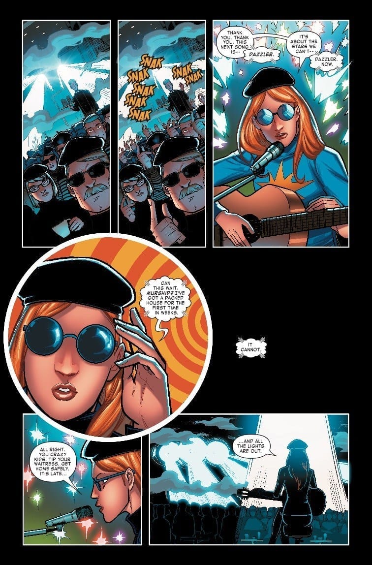
In the underground art scene of X-Man’s mutant utopia, Apocalypse fights for free love and other groovy ideals. His son Evan, Genesis, is desperate to join in on the front lines and prove himself a mighty Rider (not Horseman). Dazzler, Eye-Boy, Kitty Pryde, and Unveil are the underlings of En Sabah Nur spreading the good word of their definitely-not-evil leader.
Writer Tim Seeley joins in on the Age Of X-Man fun and finally takes us inside the opposition to Nate Grey’s passive tyranny. We don’t dive too much into the characters or Apocalypse’s message much outside of Genesis.
The tone established in this issue is much lighter than the others in the AOX line. Jazzy hipster Dazzler (or Jazzler) warrants further exploration. A lot of the underground art scenery reminds me of Hey Arnold! with it’s cartoon style and soft edge.
The X-Tracts ritual scene, with Unveil showing her ability, is a beautiful looking scene but it’s not clear exactly what’s going on–other than the fact that it’s really groovy! It’s odd seeing Apocalypse in a fatherly role with Evan, how that relationship develops could make or break this story.
After years of the character having nothing to do, Tim Seeley may have found a way to make Genesis interesting for the first time since Rick Remender’s Uncanny X-Force.
On the side of antagonists, we’ve been getting a lot of Omega Red recently. He’s been featured multiple times since the beginning of Marvel’s X-Men ResurreXion. He looks to be a promising wild card thrown into whatever Seeley has planned for us.
Artist Salva Espin and colorist Israel Silva do the heavy lifting in establishing the book’s tone and groovy atmosphere. The edges of Apocalypse And The X-Tracts are much softer than the rest of the Age Of X-Man line, it provides a comforting contrast.
The more psychedelic moments of this issue are colorful and mesmerizing. The cartooning on display here is similar to that of Humberto Ramos’ work on Amazing Spider-Man. It’s just the right amount of bubbly.
Apocalypse And The X-Tracts #1 may not have the clearest mission statement but it sets up an interesting underground corner of the Age Of X-Man world. Tim Seeley likes to get weird, let’s hope the next issue is less tame and leans more into psychedelia.
“HUNTED” begins with AMAZING SPIDER-MAN #17. Nick Spencer pits Spidey against the mighty Kraven for his first big villain arc.
***SPOILERS LIE AHEAD***
The hunt is on! Kraven has rounded up all the costumed villains based on members of the animal kingdom and thrown Spider-Man into the mix. This collection of characters is trapped in a cage created by Arcade for the purpose of being hunted by a bunch of rich people in Kraven gear.
When Spidey awakens in the trap, he finds himself in his black suit. Kraven is calling back to the famous standoff between himself and web-head from “Kraven’s Last Hunt.” Seeing Peter surrounded by all of his animal-inspired enemies before the Kraven murder squad bursts onto the scene, guns blazing, is a hell of a way to conclude our first issue of this arc.
This new chapter in Kraven’s continuity is an exciting one. With his age forcing him to rebrand himself, no longer the Hunter, he’s developing and dealing with vulnerability for the first time. His clone-son is the most intriguing and worthy member of the Kravinoff family we’ve seen yet.
Nick Spencer chose wisely, making Kraven his first big villain to focus a story around. We’ve been getting teases and snippets throughout this entire run of what eventually led us to “Hunted” and it’s paying off. We haven’t gotten a majorly significant Kraven story in a long time, Spencer is poised to correct that.
Amazing Spider-Man #17 is the second consecutive issue that has featured very little actual Spidey action. Kraven and Spidey’s supporting cast have been carrying the torch and it’s been wonderful. The strength of this fantastic run so far can be measured by how much enjoyment is found away from Peter Parker and his alter ego.
Spencer has a knack and role for all of the supporting characters and makes them all feel as crucial to the narrative as our beloved wall-crawler. We may only be seventeen issues into this run but it’s been so strong that it’s safe to say this is one that we’ll be collecting and celebrating for a long time.
While we obviously want the artist we signed up for in Ryan Ottley, Humberto Ramos has done a great job adding to his already stellar Amazing Spider-Man track record. Switching between artists on a book this important and frequent can be quite irritating, but the swapping between Ottley and Ramos hasn’t taken away from the book one bit.
Ramos brings Kraven and his clone-son to life, illustrating their intensity and animalistic nature; even in stilted scenes heavy with dialogue. Colorist Edgar Delgado has his hands full making this comic explode off the page. The landscape and players involved provides an opportunity for plenty of color and Delgado doesn’t let a single panel go to waste.
Amazing Spider-Man #17 carries the weight it needs, provides an old school comic book development payoff, and takes us somewhere new with a character we’ve loved for a long time. Nick Spencer’s first big villain story is shaping up to be unmissable comic book drama.
Mark Russell and Richard Pace’s controversial Jesus-centric series Second Coming has found a new home at AHOY Comics. After being cancelled by DC/Vertigo last month following a negative FOX News story and online petition, Russell and Pace requested the book’s rights back in order to shop it elsewhere; DC agreed, and the relationship ended amicably.
Second Coming #1 (of six) will arrive in July in a slightly different form that it would have originally. The first issue will be six pages longer than first laid out, while some alterations requested by Vertigo — a reduced amount of coarse language, fig leaves added on Adam and Eve — will be scrapped.
Russell spoke to the New York Times about the news, and the Second Coming series itself:
“It’s not as respectful as to what they actually do. It’s not a satire of Christ so much as it is a satire on how his followers of the last 2,000 years have turned his message of forgiveness and empathy into one of power and domination, which is as un-Christlike as one can possibly imagine.”
This isn’t Russell’s first foray into divine-themed stories; he previously wrote both God Is Disappointed In You and Apocrypha Now for Top Shelf.
The Times story adds that while Pace will do layouts for each issue, he’ll only be drawing the events that take place in heaven and in biblical times, while a second artist (still to be named) will draw the scenes on Earth. Pace commented that this system “gives us a chance to have a really visual indication of where the reader is in a story.”
AHOY Editor in Chief Tom Peyer told the Times about Second Coming:
“I don’t think a comic book is anything to get that upset about. I just think it’s a really good story that people have a right to read.”
Will you be picking up Second Coming #1 this summer? Has all the controversy made you more interested in the series? Let us know in the comments!
In 1984 Marvel Comics published the first issue of a four part limited-series entitled The Transformers. Last year IDW Publishing brought their ongoing series to an end with the destruction of Cybertron, the Transformers homeworld, a mere 34 years later. Although the continuity has changed from that initial story, several times in fact, many of the concepts and characters have stayed the same. It’s a story of good against evil and the consequences rippling out from that ongoing fight.
But what happened before the war on Cybertron began? What led up to the fateful day when the Decepticon’s were born out of conflict? These, amongst others, are the questions that IDW Publishing are asking in their brand new ongoing series.
The Transformers are back for a ‘Bold New Era’.
Transformers #1 Credit: IDW Publishing
Story/Writing
The Scottish born fantasy author Brian Ruckley has bravely taken the reigns for this new Transformers series. Acting as a prequel to all other transformer stories, it isn’t made especially clear if this is a new universe or set in an old one. However, as the giant robots have changed and passed through a number of re-boots, the actual setting is irrelevant to the story. All the reader needs to know is that this is set back before the civil war began, something that Ruckley does from the outset.
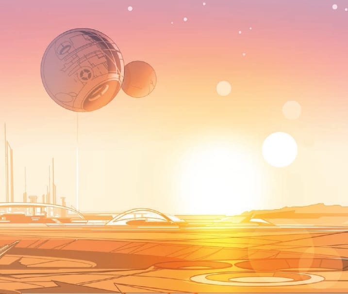
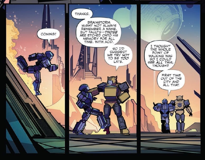
The opening sequence introduces Rubble and Bumblebee as they travel through the beautiful world of Cybertron. Instantly the setting shows a world at peace; in a state of tranquillity. Ruckley uses the conversation between the two Transformers to reinforce the visual setting but also explain the basic premise of Transformers to any brand new readers picking this up.
The story becomes conversation heavy at several points in this opening issue but it all feels natural. The flow of speech is normal for these characters and each of the robots have a distinctive voice. The discussion between Windblade and Bumblebee may be mostly exposition but it is also a conversation that these two characters would have. Ruckley uses the newly created Rubble as a way of drawing out much needed exposition from the other characters. This has a rolling effect as it lets the reader get to know the other characters as well.
But not all is peaceful on Cybertron and the onset of conflict is depicted by angry demonstrators marching through the streets. A short meeting is held between Orion Pax and Megatron to assess the situation. Here Ruckley uses the reader’s knowledge of future events to make a seemingly unimportant meeting appear world changing. The weight of history hangs heavy over the two characters and this isn’t lost in the script. The reader is left in no doubt that a monumental moment has just passed.
By focusing on only a few characters in this first issue, Ruckley is able to focus the narrative on character first and setting as a by-product. This demonstrates the kind of story that is going to be told. This version of Transformers is going to be intimate and character driven to start with. A slow build into the waring giant robots that readers have come to know over the years. This first issue has more in common with the recent Bumblebee movie than it does the earlier franchise movies under the helm of Michael Bay. And that can only be seen as a good thing.
Transformers #1 Credit: IDW Publishing
Art
Whereas the conversation brings character, it has to be said that the art work brings the setting. Angel Hernandez, who produces the art for the opening and ending of the comic, renders magnificent vistas. Large scale landscapes of the Transformers home world, untouched by war, greet the read as they follow Rubble and Bumblebee across the terrain. A sneaky little plot element sees the two robots walking slowly across their world, allowing Hernandez to draw the scenery as the newly created Rubble might experience it; with wonder and awe.
Cachet Whitman takes over art duties for the urban setting of the narrative. With a heavier design, the Transformers have a machine like quality that Hernandez’ characters lack. Everything is sharp angles and straight lines. This harsher style suits this element of the narrative more because there is a tension between the characters and conflict is that much closer. Harsher art for the harsher story-line.
There is an alien-ness to Joana LaFuente’s colors. The landscapes are awash with shades of orange and pink shifting to machine blues as the night falls. A strange atmosphere is created by these choices of color; it’s almost like she is depicting the moment before a storm. This imposing fate of the Transformers is ever present throughout this issue but not more so than in the coloring.
Tom B. Long uses the, often large amount, of speech to lead the reader through the pages. Broken speech balloons give each page a different pace and the emphasis on certain words and speech balloons to change the beat of the narrative. On occasions this forces the reader to pause and focus their attention on a particular panel. At other times the reader follows the back and forth between characters, building momentum.
Transformers #1 Credit: IDW Publishing
Conclusion
It may seem an odd choice to restart a story so soon after the previous years’ long narrative has only just come to an end, however, IDW Publishing appear to have been planning this for a while. The new take on the Transformers universe actually covers new ground that hasn’t been covered before. Flashback sequences aside, the pre War Cybertron is a landscape ripe for new tales and legends to be created.
This opening issue is a great beginning to that journey. It has plenty for long-time fans to get their teeth into but is very much a jumping on point for new readers. It’s very nature is new reader friendly.
And the tone of the comic is spot on. There is the sense of adventure brewing but also of looming catastrophe. It is strong enough to pull the reader in and get them hooked on the mystery and the intrigue. Despite many, many years of Transformer’s comics, there is still an infinite number of stories left to tell. Transformers issue 1 is a great starting point for a new continuity; different yet familiar.
Ever felt like you need a fresh start in life? Maybe a new career or a change of scenery? The titular character in Calamity Kate #1, the new limited series from Dark Horse, finds herself experiencing that very feeling. So, like any rational person, she grabs a katana and hits the road to hunt monsters across the country.
Kate ditches her old life and heads for the West Coast, aiming to become the world’s best monster hunter in this new title from creators Magdalene Visaggio and Corin Howell.
The Writing
Of course, there’s some suspension of disbelief behind the worldbuilding here. The creators envision an alternate version of our world, one that developed in the exact same way…save for the giant monsters that attack civilization more or less constantly. You can easily look beyond that, though, as we find a lot to enjoy in this new book.
The storytelling in Calamity Kate #1 is tight and engaging, with a fun tone throughout. Visaggio keeps the storytelling focused on the action. However, she plants the seeds of conflicts to develop further in the series. There’s the fraught relationship between Kate and her friend, Vera, whose house serves as Kate’s home base and butcher shop. And then, of course, there’s the past life and relationship that Kate is trying to escape.
Kate is an enjoyable lead character, despite her destructive tendencies. It’s common in a lot of fiction to take a character and try to rationalize or write-off that person’s flaws as fun quirks; idiosyncrasies that make a person interesting, rather than inconsiderate or toxic. Fortunately, Visaggio mostly avoids that in Calamity Kate #1. Instead, you look forward to seeing the character grow and develop over the next few issues.
The Artwork
Corin Howell’s artwork is fun and full of energy. The artist fills each panel with a vibrant, kinetic sense. However, she employs visual motifs in numerous places, using panels that mirror or echo one another to make everything feel very cohesive.
It’s in the slower moments of Calamity Kate #1, though, where Howell’s talent for conveying emotion through expression really shines. A slight shift in a character’s eyes or their brow accentuates emotional pitch.
Colorist Valentina Pinto employs a wide palette that compliments the artwork well. Colors are bright and vibrant, but can shift quickly to match the tone of each panel.
Final Thoughts
Calamity Kate #1 is a monster hunter’s delight. Definitely worth checking out.
Over worldly horrors and the weakness of Human kind forge the backbone of BOOM! Studios’ The Empty Man series. Part all-consuming virus and part supernatural invasion, The Empty Man twists and turns each issue but at its beating heart is the story of human suffering and a fight to survive.
Fear and pain are the biggest enemies that Cullen Bunn’s protagonists have to face. In this issue technology also poses a problem, but how will the world react to visual proof of the Empty Man virus made flesh?
The Empty Man #5 Credit: BOOM! Studios
Writing/Story
The Empty Man has manifested into the Human world and is smarter than it’s been given credit for. A deliberate sacrifice leads to worldwide attention giving the virus the exposure it so desperately wants.
The next stage of contamination has begun and only a small handful have a chance of fighting back.
Bunn starts this issue off with a man in the wilderness, affected by the Empty Man virus. This opening is like a twisted version of the 2001: A Space Odyssey opening sequence and it portrays the effects of the virus on a small society. It also leads to the image of a strange figure, religious in nature.
This opening acts as groundwork for this issue of The Empty Man. It expands on the history and mystery of the virus while at the same time preparing the reader for the explosive outbreak that is about to happen. It also has greater significance to a scene later in the comic which is worth waiting for.
The construct of this issue is expertly managed with a definitive beginning, middle and end. It stands on its own two feet and is surprisingly easy for new readers to engage. Quick, throw away lines from various cast member’s give insight into already established character traits without having to elaborately go over the same ground. There is even a flashback sequence that fits perfectly into the story, giving important narrative information without stopping the natural flow of the story.
Bunn builds tension between the ‘heroes’ of the story by highlighting the differences between them and their priorities. There is a conflict bubbling just under the surface that is reaching breaking point. This situation is made more prominent because everything in this issue is surging ahead at great speed. The sense of urgency can be felt in each sequence and conversation. The Empty Man has stepped up the game and Bunn makes sure that the reader knows it.
The Empty Man #5 Credit: BOOM! Studios
Art
The layouts for each page set the pace of the story. It starts with a slow walk and unevenly placed panels on the page. The grid pattern changes from page to page in the introduction, slowing the reader down while this set piece unfolds. After this the layouts begin to reflect the increasing pace of the narrative with more panels to a page; high, thin panels to fit more onto a row; and even single images broken up by gutters indicating several things happening at the same time.
Jesus Hervas picks his composition to match the narrative, constantly moving the reader forward and not allowing them to take a breath. The main characters are on the run, for their lives, and Hervas lays out the pages to illustrate this.
The best example of his layouts comes with Agent Jensen’s flashback sequence. He breaks all of the rules and makes the sequence appear like a collage with images torn from a previous comic and stuck into this one. The effect is mesmerising and disturbing. It reminds the reader of the horror that lays at the heart of this comic.
The color work for this sequence also stands out against the rest of the issue. Niko Guardia gives everything a crimson wash as if it is all soaked in blood. The horror of the Agent’s memory is reflected in the palette Guardia uses.
This crimson color is only used sparingly throughout the rest of the comic and on most occasions it’s when there are images of the mutant creatures, often only seen by Agent Jensen. This makes the appearance of the Empty Man virus stand out whenever it is featured on a page. Instantly your eye is drawn to it amidst the sedated colors of the rest of the world.
The speech balloons bleed into the page layout to help the pacing of the narrative. The most successful part of Ed Dukeshire’s work in this issue of The Empty Man is making the large amount of Radio and T.V. broadcasts stand out from the regular speech. The different types of caption box make it clear exactly where the speech is coming from. In the opening, the on site reporter’s speech flows onto another page even though she does not and Dukeshire gives the caption boxes their own appearance, different from the T.V. reports later in the comic.
Dukeshire also uses the speech balloons to indicate the physical state of the characters, most notably Agent Owen. He is in a serious condition and when he is rushed to the hospital his speech balloons are uneven with long, zigzagged tails. His speech within the balloons is smaller than everybody else’s and the combination of all of these things remind the reader of Owen’s current state. If you took the images away and left the speech balloons, you would still know that the character speaking was physically injured in some way.
The Empty Man #5 Credit: BOOM! Studios
Conclusion
The creators working on The Empty Man #5 are coming together to build a narrative that is picking up speed and heading towards a confrontation. Bunn’s script is all inclusive, welcoming new readers and expediting the plot at the same time. The art work has the same effect as the script, starting slowly then building throughout the issue, picking up the pace to keep the reader engaged.
This issue of this modern horror comic deals with the dangers of media manipulation and misunderstanding. It also deals with the fear of what is inside, that element of ourselves that we bury at all costs. At some point we can no longer keep it buried and then, what do we do?
The Empty Man is an astutely entertaining comic. Like Stephen King’s best horror stories, this twisted tale is about people and how they react to situations beyond their control. And it has just reached the point in the narrative where everyone is about to break.
Fighting demons and saving Sunnydale was the essence of the weekly episodes of Buffy The Vampire Slayer when Joss Whedon created it back in 1996. But even then, the writers of the show were embracing the series arc and building up a world full of characters that could return at any point.
In BOOM! Studios new Buffy series, Jordie Bellaire understands this all important aspect of the shows history and issue three is still part of the introduction to this Buffy-verse. There is a monster of the week and the laying of groundwork for future stories. Characters are dropped unceremoniously into the mix as if they are simply residents of Sunnydale and not major players in the story; exactly as Joss Whedon did back in the day.
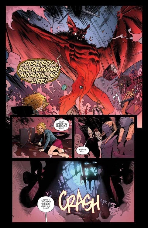
Buffy The Vampire Slayer #3 Credit: BOOM! Studios
Writing/Story
In the Magic Shop, Spike and Dru are making their plans but unwittingly unleash a giant vampire hunting demon upon Sunnydale. Anyanka explains that the oversized red bat creature, known as Camazotz, is as much a danger to Spike and Dru as he is a danger to the residents of Sunnydale so armed with protective amulets, the two vampire’s go bat hunting.
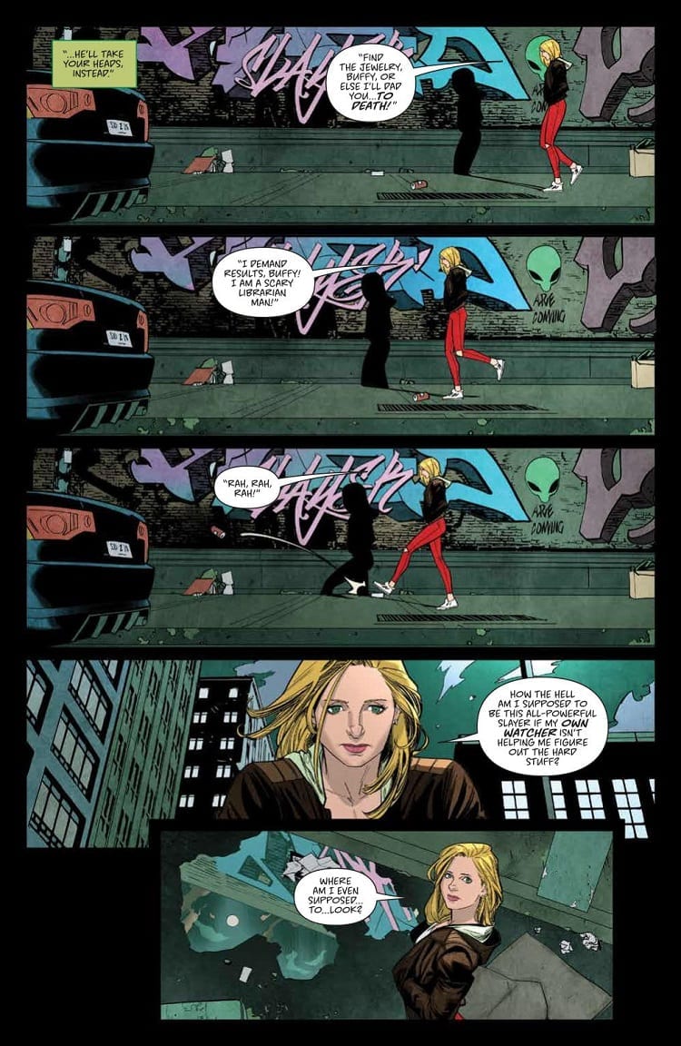
Meanwhile Buffy is still searching for the information regarding the previous piece of jewellery she liberated from a vampire. It isn’t long before these two plot lines converge in spectacular fashion.
Bellaire uses the creature of the week feature to expand the characters of the central cast that she has already introduced. A number of character traits regarding the regulars are dropped in through conversation or from the setting itself. When Buffy’s favourite coffee shop is attacked, for example, an element of Giles’ character is revealed in a way that will be familiar to fans of the T.V. series. The relationships forging between Buffy and her Scooby Gang are also the focus of this issue.
One of Bellaire’s strengths as a writer is her ability to juggle so many complex characters at the same time, even during action sequences. The development of her cast is a constant, ongoing concern. She also leaves enough ambiguity in certain scenes and speeches to make you question where a particular plot thread is going. She did it with Xander beautifully in the last issue and again with Cordelia in this issue.
Plus, the cliff-hanger to this issue has ominous signs scrawled all over it. I suspect that Jordie Bellaire is going to break some hearts with this series.
Buffy The Vampire Slayer #3 Credit: BOOM! Studios
Art
Dan Mora’s art is as exceptional as in previous issues. He brings energy and dynamism to the script. The pages have a cinematic flair to them giving the narrative a large stage on which to play out. The reader is led from panel to panel, often by Ed Dukeshire’s lettering placement, in an easy flow allowing time to take in the beautiful art work.
Mora sets each scene with the required amount of background details; sometimes there is a fully realised set, other times just the impression of a place. The atmosphere is provided by the coloring especially as this entire issue is set during a single night. Raul Angulo changes the tones from the Magic Shop to Buffy’s lonely walk to the well-lit coffee shop, giving each place their own atmosphere. This also helps to break the narrative into different beats, allowing the reader to shift gear from one scene to the next.
Without a doubt the highlight of the art if Mora’s character work. He produces wonderfully accurate representations of the characters when he needs to however, he also manages to make them recognisable with the simplest of lines and shapes. There is never any question of who you are following at any given moment. Add to this Mora’s amazing talent for expressive faces and you get the most emotionally identifiable characters currently in print. Even the vampire hunting beast Camazotz exudes a wide range of emotions producing a full rounded character.
Buffy The Vampire Slayer #3 Credit: BOOM! Studios
Conclusion
Buffy The Vampire Slayer continues to grow as an exciting and all-consuming narrative under the guidance of Jordie Bellaire and Dan Mora. It has been said before and will continue to be said that this comic from BOOM! Studios feels like a part of the original series but also is new and different in many ways. The characters are so familiar but not the same, it creates a feeling of déjà vu that you just can’t shake.
Everything about this comic is exciting and fresh. BOOM! Studios picked the perfect creators to work on this and we should thank them for it. Buffy The Vampire Slayer is going to be the next big thing. Again.
Rumors were flying when the SXSW [South By Southwest Conference] Marvel panel was first announced. Would this be the end of Marvel Comics as we know it? Would Disney be pulling the plug on the publishing side of the company?
Would you believe internet clickbait headlines were 100% wrong?
Instead of some dramatic bombshell, the capacity crowd that gathered Friday to hear Marvel Editor-In-Chief C.B. Cebulski and Chief Creative Office Joe Quesada got to hear a casual, wide-ranging discussion about the company and its characters. Unsurprisingly, given the SXSW venue, the conversation leaned more toward Marvel’s films rather than comics, though the two men did spend time on the company’s origins.
Cebulski recounted then-publisher Martin Goodman’s reaction to Stan Lee’s original Spider-Man pitch:
“Goodman said, ‘you’re crazy. No one’s going to want to read a story about a bug. You’re supposed to squash bugs. And who wants to read about a story about a kid in high school?’”
Quesada added:
“Peter Parker is the real person. When he puts on the mask, he becomes somebody else… I think that’s what makes these characters so relatable. We can understand the core person who is Peter Parker, or Tony Stark.”
When discussing Lee’s continuing influence, Cebulski said:
“I think not a day goes by when we’re there in meetings or in editorial when Stan’s name is not invoked in some shape or form.”
In fact, “What would Stan Lee do?” is still a question asked around the halls of Marvel, according to Cebulski.
Some other highlights from the SXSW conversation:
The best selling single issue of all time is still 1991’s X-Men #1, at more than 8 million copies.
Cebulski cited the 1990s X-Men animated series for its strong female characters, and said he’s heard female creators mention that show as a formative part of their fandom.
Quesada mentioned Blade as a character better suited for movies than comics, pointing out that he was never a top seller on paper, but helped Hollywood realize “there’s gold in them hills.”
The Infinity Gems (as they were known in comics) being renamed Infinity Stones (as they’re now known everywhere) can be credited to the animated Super Hero Squad show.
Runaways, both a successful comic and TV series, came from a forgotten old pitch Quesada found when he started as EiC.
Quesada shared an amusing anecdote about a pitch for a Daredevil TV show from years ago, which would have featured Daredevil and a canine sidekick. He jokingly called it “Daredevil and Daredog.”
An image of Wave, Marvel’s first Filipina superhero, was revealed prior to her first comic appearance in one of the War of the Realms books: New Agents of Atlas. Writer Greg Pak also posted the image on Twitter.
You can read more about the panel over at Comics Beat.
Even though there was no big “news” broken, did you see anything that surprised you? Leave us a comment!
Red Sonja #2 continues the new adventures of everyone’s favorite redhead barbarian warrior with great action, quality artwork, and even some understated comedy.
Now the queen of Hyrkania, Sonja finds herself staring down the barrel of an imminent invasion. The powerful Zamoran Empire is at her shores; however, Sonja unveils some creative ways to derail their campaign.
The Writing
Red Sonja #2 delivers on the classic sword and sorcery goodness. All of the essential elements are in place as writer Mark Russell lays out his vision for the series. However, he also does a great job of hitting different dynamics with his storytelling, too.
We see Sonja as stoic, collected, and always in control as ruler. At the same time, her relationship her long-lost cousin, Kryon, forms the emotional basis of the story. She could have declined to take the throne, but chose to stay in order to protect him, adding additional layers to the narrative.
Despite the serious tone, there is plenty of sharp humor throughout. From the Hyrkanians’ cynical reactions to the impending invasion, to Emperor Dragan’s awkward family dynamics, there is plenty of great dark humor in Red Sonja #2. Without giving away spoilers, one of the book’s best moments comes when Sonja insists on repeatedly burning bridges with her enemy (literally).
The Artwork
Artist Mirko Kolak relies on a lot of closely-cropped panels, so character designs take center stage. The figures benefit from a realistic style, giving the book a feel of genuine historical drama. However, when the visuals pull-out to an establishing shot, you get a sense of the dedication to craft on display here.
Kolak’s illustrations are done with a fine attention to detail. The excellent artwork helps bring the world to life and makes everything feel much more real and grounded.
Given it’s a desert climate, the book is dominated by a palette of yellows and browns. As a result, colors pop nicely when they break the scheme. It’s a nice effect at key points, though it sometimes leads the eye to focus on unimportant details.
Final Thoughts
Red Sonja #2 offers great storytelling and humor, with very impressive artwork. It looks like the character is in good hands for this run.
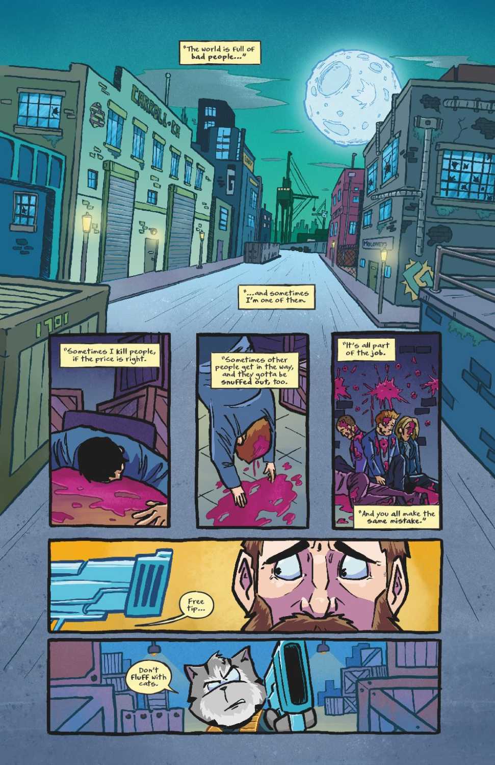
Take the cartoony style and unapologetic violence of I Hate Fairyland, add a main character that’s one part Garfield the Cat and two parts Rocket Raccoon, throw in some satirical references to The Punisher and Daredevil, and you’ve got the dark, brutal world of Meouch.
**Some Spoilers Below**
Story:
Drawing inspiration from Deadpool, Rocket Raccoon, and the work of Skottie Young, Meouch is an action-comedy comic featuring a gun-toting, pun-cracking assassin cat named Frankie. In the series’ first issue, Frankie is up against a deadly litter of killer cats known as the Nine Lives, whose handy work is getting in the way of his business.
Writing
Written by Paul Carroll, Meouch is a well-structured foray into this world. Readers are quickly given a sense of the gritty, neo-noir tone with introductory captions and enough blood, decapitations, and brain matter splattered throughout the book. Frankie is immediately established as a vulgar (those “fluffling” puns aren’t fooling anyone) and no-holds-barred feline with a enough of an interesting motivation to want to follow him into the underbelly of his world.
Meouch is fairly light on word count, leaving more room for the bloody action sequences in the panels. Overall, Carroll delivers a fun read that doesn’t take itself seriously whatsoever, except with its silly puns and spoof-y references.
Art:
Gareth Luby’s illustrations bring the words and action of Meouch to life with a curvy, cartoony style akin to Garfield and Tom and Jerry. The blood splatter and brain matter is not off-putting. It also doesn’t leave much to the imagination.
The colors of Joe Griffin only enhance the R-rated Saturday morning cartoon style presented in Meouch. Most notable is his use of dark pink coloring of blood. It looks more like a can of jelly that exploded instead of someone getting a bullet to the head.
Hassan Otsmane-Elhaou’s letters are a nice contrast to the big and animated illustrations. They are jagged, looking as if they have been etched into the pages with a small knife.
Conclusion:
Meouch #1 is a fun read. It packs the high-brow humor from the cartoons of yesteryear and adds a heaping scoop of blood and guns. If you enjoy Rocket Raccoon, Deadpool, The Punisher, or Teenage Mutant Ninja Turtles, do yourself a favor and pick up a copy.
Check out the first few pages of Meouch #1 which is is set to launch at Dublin Comic Con this weekend: