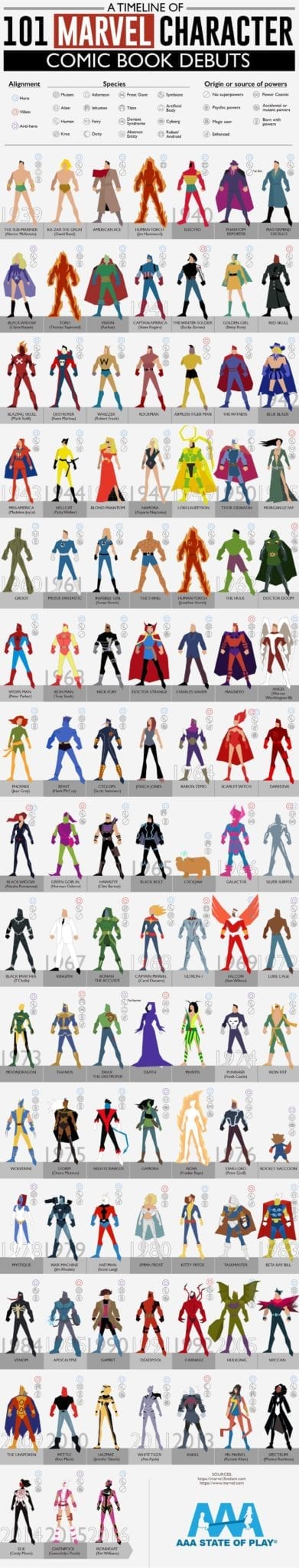
Who was the first-ever Marvel character? Do you think you know?
It was a superhero you may have never even heard of: Namor the Sub-Mariner, a mutant son of a sea captain and the princess of Atlantis not too dis-similar from Aquaman. Namor, the star of Marvel Comics #1, is lesser-known. That’s probably because he’s never had a film, partially due to an embroiled copyright war between Disney, Marvel, and Universal.
Since Namor in 1939, the company has introduced hundreds of characters we love, but this short guide points out some comic classics. Did you know, for instance, that Thor, Captain America, and the Fantastic Four all pre-date Spider Man? Did you know that the crowd-favorite Deadpool is 28 years old? And Deadpool is far younger than Carol Danvers, who dates back to 1968 or Black Panther, who dates back to 1966.
In this celebration and retrospective of Marvel, we can see some of the hit comic-book characters who’ve made the big screen as well as who haven’t. Fans of Miss America or Rockman, for instance, have had to wait quite a while for a film. On the other hand, X-Men like Gambit were introduced on TV not long after their comic-book debut. Newer characters, like Spectrum, Ms. Marvel, and Ironheart are already smash hits and hopefully will get their own screen appearance soon.
Whether you love popular film darlings or the obscure superheros only found on the page, it can be fun to look back and see when your favorites made their debuts compared others on this list of Marvel characters.
It’s amazing to see what the company has done over the past eight decades. Who knows what kind of stories they’ll be telling after 100 years?
About our team: This chart was created by the AAAStateofPlay content development team, led by Kim Hart. Those who worked on it include Kim, Mitch, Joy, and Nic.
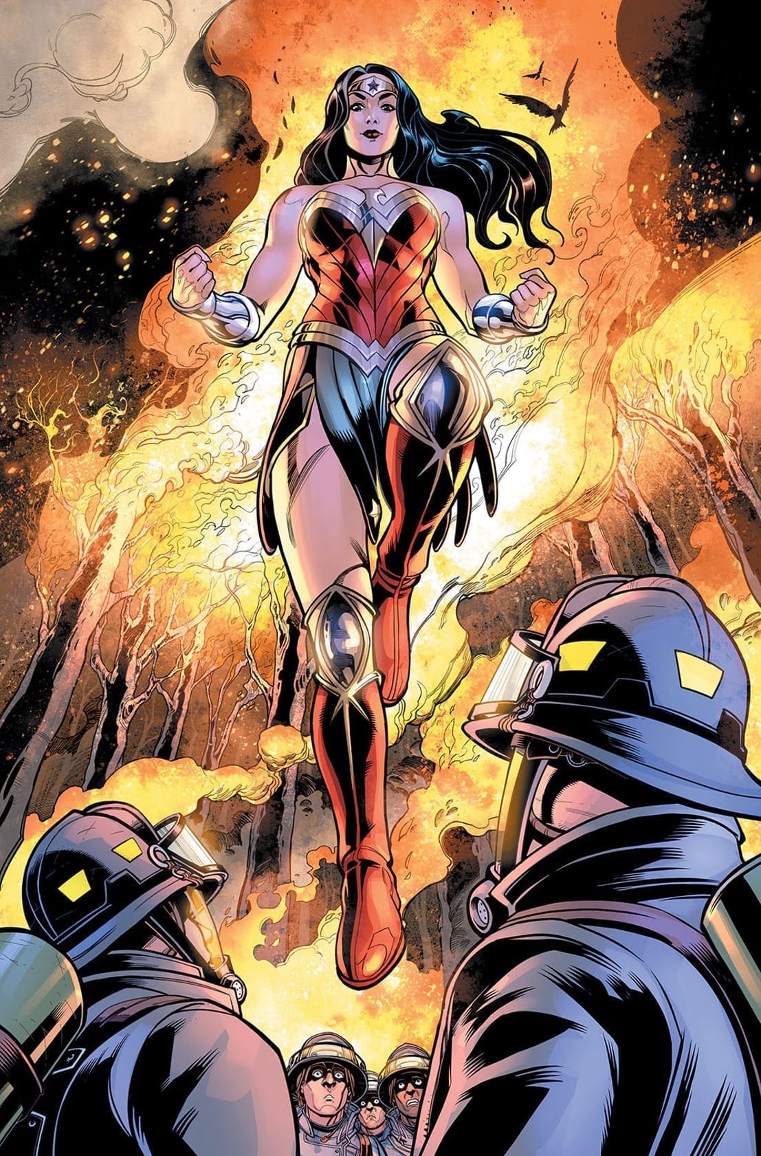
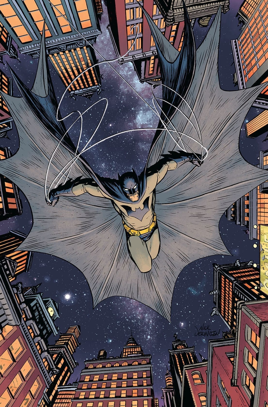
The DC Comics-Walmart partnership saga has certainly had its share of plot developments already, and here’s some further information: starting in July, the new story material — until now available exclusively in Walmart’s 100-Page Giant comics — will be arriving in comic stores. Superman by Tom King and Andy Kubert; Batman by Brian Michael Bendis and Nick Derington; and Wonder Woman by Amanda Conner, Jimmy Palmiotti, and Chad Hardin lead the charge, with each character’s storyline collected as a six-issue miniseries.
Retailers had a mixed reaction to this plan — not surprisingly, since they were completely cut out of the mix. Then came the rumors that DC was ending the line… or not ending it… or expanding it further. Dan DiDio addressed all of this back in February, where he clearly stated that their plans included “distribution to the direct market.” Now he’s following up on that promise.
DC’s official descriptions are below:
The fireworks start early on July 3, with SUPERMAN: UP IN THE SKY #1, written by Tom King (BATMAN) with art by Andy Kubert and Sandra Hope. Following a home invasion that ends in murder, Superman is put on the trail of a Metropolis mystery by Batman—but can even the Man of Steel discover the truth behind these tragic deaths, or their ties to the far-off world of Rann?
The action continues July 10 with Brian Michael Bendis and Nick Derington teaming up for BATMAN UNIVERSE #1. Following the theft of a priceless Fabergé egg, the Riddler leads The Dark Knight on a wild hunt after its true owner: Jinny Hex, a descendant of the haunted Western hero Jonah Hex. Deathstroke, Green Arrow and some of the brightest stars in the DC Universe will join The Dark Knight on the chase to find this treasure!
Amanda Conner, Jimmy Palmiotti and Chad Hardin combine their powerhouse talents on a new adventure featuring the Amazon Princess Diana in WONDER WOMAN: COME BACK TO ME #1, on sale July 17. When Steve Trevor is called in for a test flight of an experimental new aircraft, he winds up lost in the Bermuda Triangle—and it’s up to Wonder Woman and Etta Candy to follow his trail to a mysterious and savage island.
Each miniseries will also feature brand-new cover art from Andy Kubert (SUPERMAN: UP IN THE SKY), Amanda Conner (WONDER WOMAN: COME BACK TO ME) and Nick Derington (BATMAN UNIVERSE).
Are you excited for the chance to read these stories by top creative teams? If you already managed to track down any of the Walmart copies, will you still buy the miniseries? Let us know in the comments!
The Dirt is a new film on Netflix based on the autobiography of 80s hairband Motley Crue that tells the tale of their rise to fame, adventures in debauchery, and the hardships of humanity and Melanie Jones helped bring the neon and spandex world to life as production designer.
If you haven’t watched The Dirt, it’s a rockin’ ride through the lives of four guys who came together to become global rockstars. In the 80s, rock was alive and well and existed in many forms. But perhaps the most memorable iteration was known as the “hairband” which typically consisted of four white guys, a lot of hairspray spread across a lot of hair, and some hard-hitting rock tunes that have aged better than the look. Behind the scenes, many of these bands lived the cliche rock life that was fueled by ego, sex, and drugs. Like many stories, the volatile combination worked for a while but then it didn’t. The Dirt, like many rock biopics, is a story that’s insanely fun to watch and also has a profoundly human core.
PopAxiom got a chance to talk with Melanie before she heads off to work on a long-awaited sequel that we’ll get to at the end of the article. So, read on as the production designer tells us about her work on The Purge, the Oscar-winning Whiplash, and The Dirt.
Dancing to the Movies
Melanie’s connection to movies started early on “My parents took me to the movies a lot.”
Growing up a small town “We have a few smalls theaters. This one would play, like, all the Planet of the Apes movies.”
At a young age, Melanie’s artistic soul was driving her decisions “I started dancing when I was 11 and got into theater. I could draw. And I ended up making props and then designing sets.”
Making The Purge
The first Purge film pretty much takes place all in one house, and so choosing the right place was a priority “We found a house out in Chatsworth out in the valley in Los Angeles and left a note on the door. The owner got back to us. They’d just had this house built, and there was no furniture.”
The narrative of The Purge wasn’t the only thing that relied on the location “That house became our everything. The garage was my office. We had two trailers outside.”
The film takes place in a not-so-distant future. So to get that point across in the production, Melanie turned to a tried-and-true style “Deco comes back and comes back and comes back and it’s often a fundamental component of future-fantasy design. Repeating patterns, layers. The furniture we picked is very influenced [by that style]. I had a scenic artist paint deco-influenced murals.”
Melanie adds “And then we trashed it.” Of course, for the record, everything was fixed while the owners stayed a hotel paid for by the production.
Six months after shooting The Purge, Melanie got a call about additional shooting required “The production wanted to create a game room, and shoot in the dining room. But we didn’t want to go back to the house, and the owner had fully moved in by this point. So we rebuilt those rooms. I also built a hallway that didn’t really exist at the location.”
Work On Whiplash
Melanie brought her production design skills to the Oscar-winning Whiplash and unabashedly says about the film’s writer/director “Damien Chazelle is incredible.”
About Whiplash, Melanie adds “We shot that film, the L.A. portion of it, in 17 days. The schedule was really, really tight.”
To make sure the short time frame was used wisely, Melanie suggested finding a versatile place to shoot “We landed on the Palace Theater. We did multiple locations there. We used every inch of that place that we could. Then we moved down the street and shot the rest.”
The overall vibe of Whiplash feels very gritty 70s film, and there’s a reason for that “I treated that film like it was a 70s period piece with the colors and the sets that we built to create a look and a mood.”
About The Dirt
What was the first thing you thought of when you read the script for The Dirt? “Oh, well, a production designers wet dream.”
Melanie dishes some more on The Dirt “We shot in New Orleans, but we had to make it look like 80s Los Angeles. Building their apartment with the terrible carpet, the linoleum, burn spots from where they kill roaches. It was so much fun.”
The fun came in the time period and the evolution of the film over the course of about twenty years “As it starts it’s the late 70s and the movie moves into the 80s, so I got to reflect that in the design, the use of colors, starting with more muted colors then moving into the neon of the 80s.”
What did the band think of it all? “They were really excited about it. We submitted questions to them to get insight so that we could honor things as true to life as we could.”
Making the movie meant there would be a bit of a back and forth between creative license and sticking to reality “There were places where we pushed it. But I got to ask Nikki Sixx, ‘When you died …’ which is a weird way to start a question ‘when you died at the Franklin Plaza Hotel what did the hotel look like?’”
There were no reference photos of the hotel “What I saw in my mind was the Chateau Marmont which is infamous for celebrities and the wealthy to go when they don’t want anyone to know what they’re doing.
However, Sixx revealed to Melanie that “‘… the Franklin Plaza Hotel was a shithole.’” The reality was tweaked, and the scene in the film takes place in a fancier location than reality.
Wrapping Up
Melanie is a big fan of the movies and gives us the two extremes of her taste and influences “… I love Spike Lee. The red walls in Do The Right Thing rocked my world. It’s super-simple. But I love the look of that film, it’s one of my favorite movies. But I also love Young Frankenstein.”
Outside a film there’s a related force that drives Melanie’s creative eye “I worked with Annie Leibovitz for a while, so I’m really into photography.”
We finish off with a question worthy of arena rock legend status. If they were remaking any classic movie, and Melanie was going to be the production designer, what movie would she want it to be? “Let’s hope they don’t remake this, but that would be Gone with the Wind.”
So, that sequel I talked about earlier? That’s Melanie’s next project “I’m going … to work on Bill and Ted Face the Music.” It will be quite bodacious.
Thanks to Melanie Jones and Impact24 PR for making this interview possible.
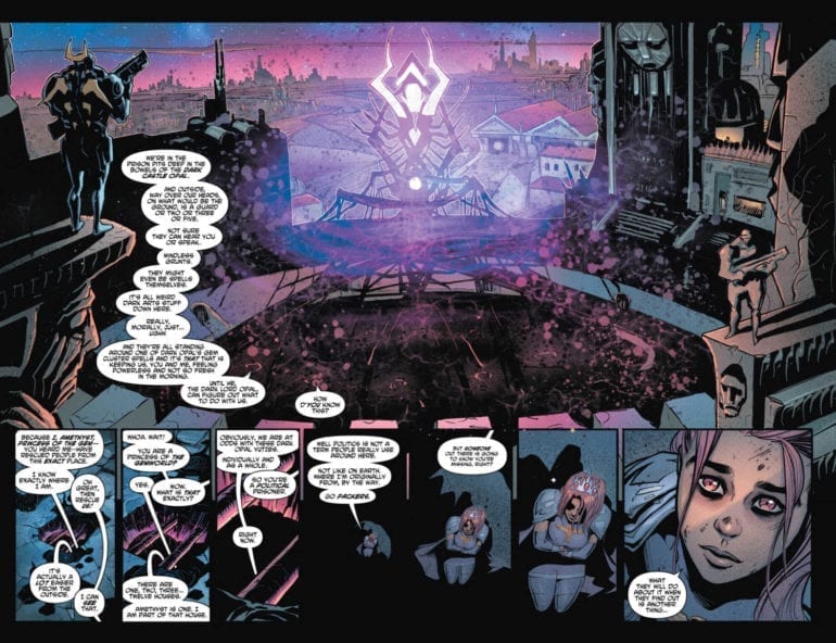
Amidst the boring politics, the light of the Young Justice family shines.
Young Justice is back! That’s what I would say if they weren’t scattered throughout Gemworld. Instead, we have been treated to flashbacks that explain what the heroes have been up to up to that point. While it’s great to get a picture of what character like Conner Kent has been up to, we practically learn nothing about the new characters in the bunch. Currently, most of the team has been captured by Dark Opal’s Forces. Bart, on the other hand, is with a new pacifist Conner, cornered by one of Opal’s commanders. Has Young Justice already fallen before it began its rebirth?
**Some Spoilers Below**
Story:
We get two stories in this issue; however, unlike the last two, we get to focus on the present nearly as much as the past. In flashbacks, we see Amethyst trying to convince the other leaders of Gemworld to take on Dark Opal. When they ask what they should do, she responds by doing whatever it takes. She is sent from the room, being labeled as too young and bold to make such decisions. Meanwhile, in the present, Conner is revealed to have not lost his fighting spirit and takes on Opal’s Forces. With the gem people defeated, he and Bart go off to find the others from Earth.
While the stuff in the present is short, I much prefer it over the flashbacks. The teens of Young Justice talk to each other as if they’re old friends trying to catch up. It makes the group feel more realistic, and their humor makes each part enjoyable.
However, that’s where the problem of the story is as well. There’s not enough of it to keep the overall issue interesting. The politics of Gemworld are rather dull and goes to show how the adults don’t trust the young princess. The last part of the flashbacks includes Amethyst finding Robin, meaning this might be the last issue of them. I genuinely hope that because, just like every other issue, they’ve grown dull.
Art:
While the politics of Gemworld bore me, I can’t say the world doesn’t look cool. The world of Amethyst is imaginative, blending sci-fi and fantasy beautifully. The young heroes continue to look fantastic thanks to the art team’s attention to detail as well. If the comic continues to look as good as it does here, it might be enough to overlook the hiccups in the story.
Conclusion:
While the road is still rocky, Young Justice is beginning to find its way. I like the team’s interactions with each other. I wish this series has had more of it, but with the team finally finding each other, it’s apparent that it will fix itself soon. The art is pretty good as well; both colorful and imaginative which is perfect for the team. Unfortunately, the issue still has the problem of having a large chunk of it being boring flashbacks. I see the potential for this book; it just has to shake off its big problems in storytelling.
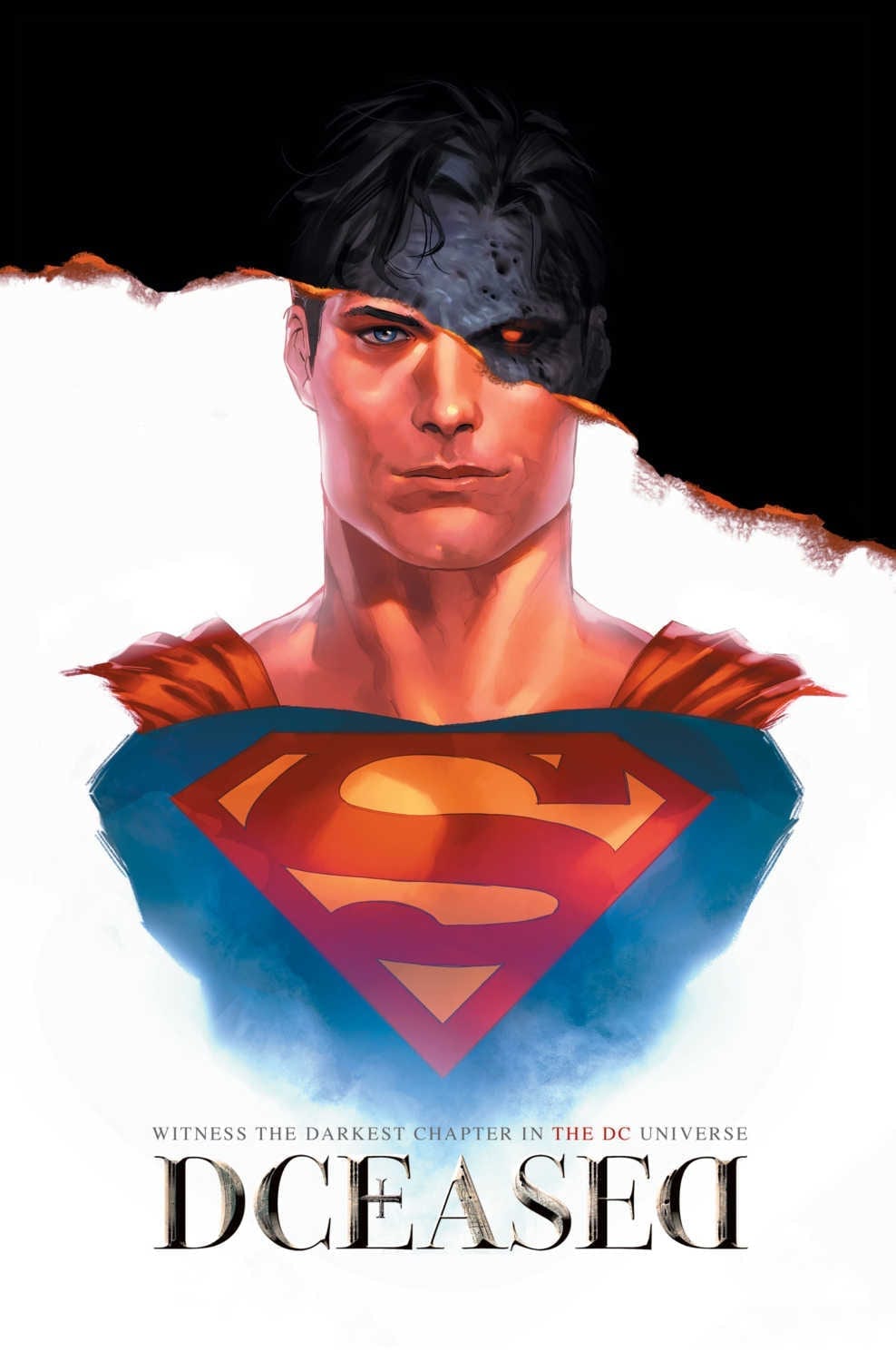
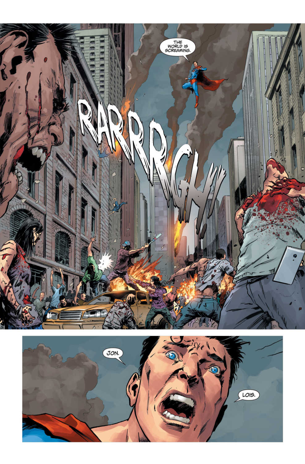
DC Comics’ new horror series DCeased kicks off on May 1, but you can take a look at every single terrifying cover from the first three issues right now!
DCeased is written by Tom Taylor with art by Trevor Hairsine and Stefano Gaudiano. A mysterious techno-virus hits the DC Universe, and no character is safe.
About the comic: “I looked, and there before me was a pale horse! Its rider was Death, and Hades was following close behind him.”-Revelation 6:8
A mysterious techno-virus has been released on Earth, infecting 600 million people and turning them instantly into violent, monstrous engines of destruction. The heroes of the DCU are caught completely unprepared for a pandemic of this magnitude and struggle to save their loved ones first…but what happens to the World’s Greatest Heroes if the world ends?
The series will have covers by a myriad of artists, each more morbid than the last, including horror movie-inspired variants and retailer exclusives. Check out all the covers that have been revealed to date below!
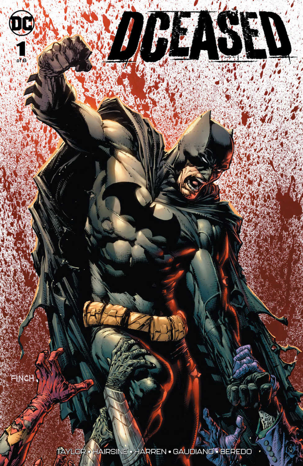
DCeased #1 Covers
DCeased #1 Cover by Greg Capullo and FCO PlascenciaDCeased #1 Cover by Francesco MattinaDCeased #1 Horror Movie Cover by Yasmine Putri
DCeased #2 Covers
DCeased #2 Cover by Leinil YuDCeased #2 Cover by Francesco MattinaDCeased #2 Horror Movie Cover by Yasmine Putri
DCeased #3 Covers
DCeased #3 Cover by Trevor HairsineDCeased #3 Horror Movie Cover by Yasmine PutriDCeased #3 Cover by Francesco Mattina
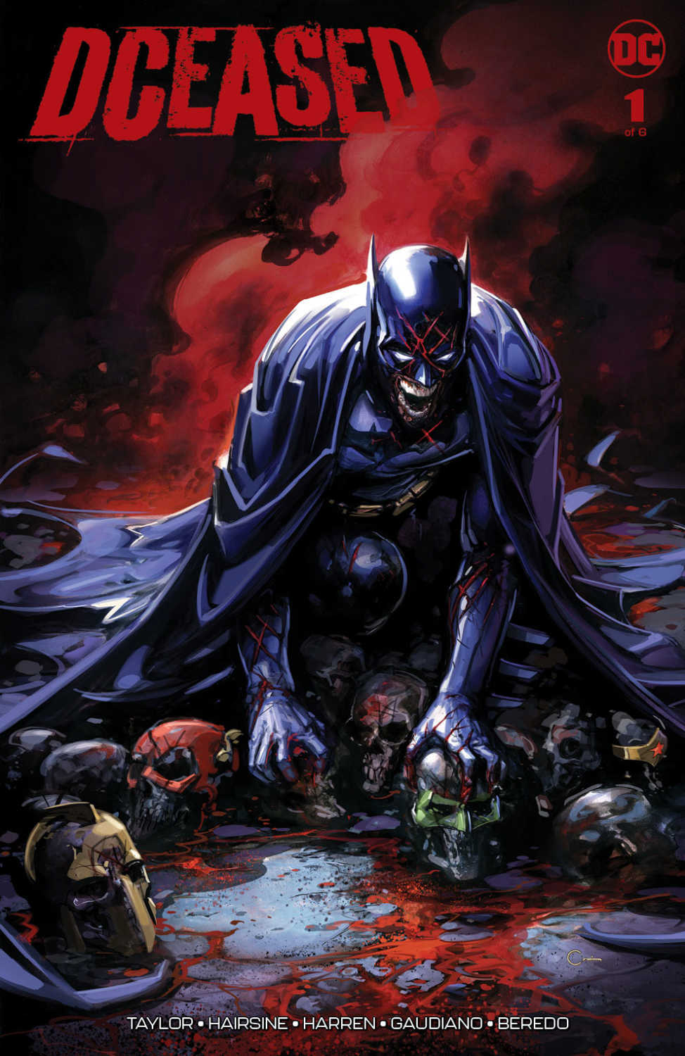
DCeased #1 Retailer Exclusive Covers
DCeased #1 Retailer Exclusive by Arthur SuydamDCeased #1 Retailer Exclusive by Shannon MaerDCeased #1 Retailer Exclusive by Lucio ParrilloDCeased #1 Retailer Exclusive by JeeHyung LeeDCeased #1 Retailer Exclusive by InHyuk LeeDCeased #1 Retailer Exclusive by David Finch and Tomeu MoreyDCeased #1 Retailer Exclusive by Clayton CrainDCeased #1 Retailer Exclusive by Ben Oliver
Are you excited for DCeased? Let us know in the comments!
DCeased #1 is out May 1st, but you can get your first-look at DC Comics’ upcoming zombie horror right now!
About the comic: “I looked, and there before me was a pale horse! Its rider was Death, and Hades was following close behind him.”-Revelation 6:8
A mysterious techno-virus has been released on Earth, infecting 600 million people and turning them instantly into violent, monstrous engines of destruction. The heroes of the DCU are caught completely unprepared for a pandemic of this magnitude and struggle to save their loved ones first…but what happens to the World’s Greatest Heroes if the world ends?
New York Times best-selling writer Tom Taylor (INJUSTICE) returns with a terrifying new tale and is joined by artists Trevor Hairsine (LEGENDS OF THE DARK KNIGHT) and Stefano Gaudiano (The Walking Dead).
Tom Taylor is no stranger to writing alternate DC Universes; his Injustice series has been a fan-favorite over the last few years. The writer has been teasing DCeased on social media for months, promising that no character is safe from his wrath.
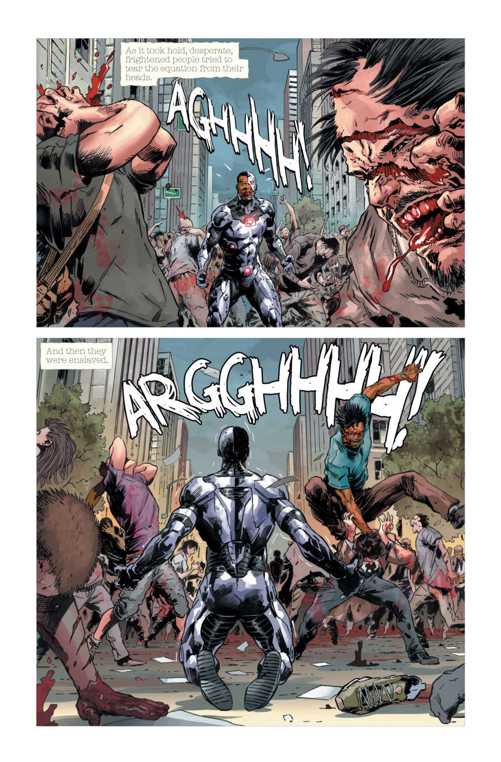
Check out the first five pages of DCEASED #1:
How excited are you for DCeased? Let us know in the comments!
Friendly Neighborhood Spider-Man (2019) #5 hits your local comic book store on April 10, but thanks to Marvel Comics, Monkeys Fighting Robots has an exclusive five-page preview to share with you.
The 24-page book is written by Tom Taylor, with art by Yildiray Cinar, Nolan Woodard worked on colors, letters are by Travis Lanham, and the cover is by Andrew C. Robinson.
Taylor is taking Peter Parker and his family in a new direction; it will be interesting to see how the Aunt May storyline plays out. Since Aunt May was the catalyst for One More Day, what will Peter do now that his comic world is more grounded then back then?
About the issue: A bomb drops on Peter’s world when Aunt May finally fesses up to Peter about what’s happening. Don’t miss this special issue!
Check out the full preview below:
Do you have the Friendly Neighborhood Spider-Man on your pull list? Comment below with your thoughts.
About the series: Spider-Man is the worst neighbor EVER! There are always crazy villains and property damage and drama and…and he CATCHES the villains. And he tries to fix the damage and he helps carry your groceries and actually that property damage keeps the rents down. You know what? Spider-Man is the best neighbor ever and this book will give you a closer look at Spider-Man’s (and Peter Parker’s) neighborhood than any book ever. Also, it wouldn’t be a Spider-Man adventure without a threat that could destroy not only Spider-Man, but all his neighbors. Superstar writer TOM TAYLOR (X-MEN RED, ALL-NEW WOLVERINE, Injustice) and rising art star JUANN CABAL (ALL-NEW WOLVERINE, X-23) give you the most local Spider-Man ever!
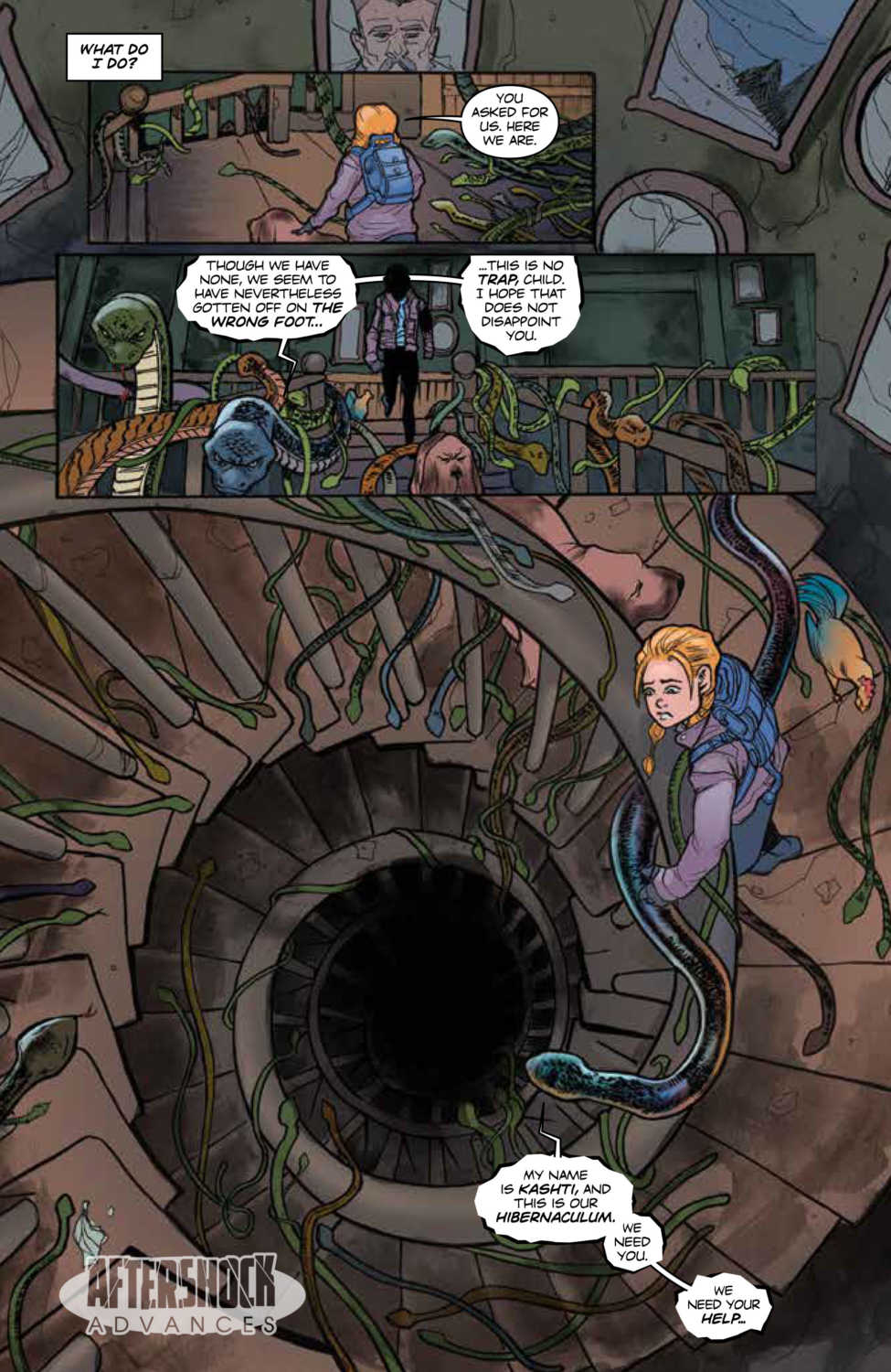
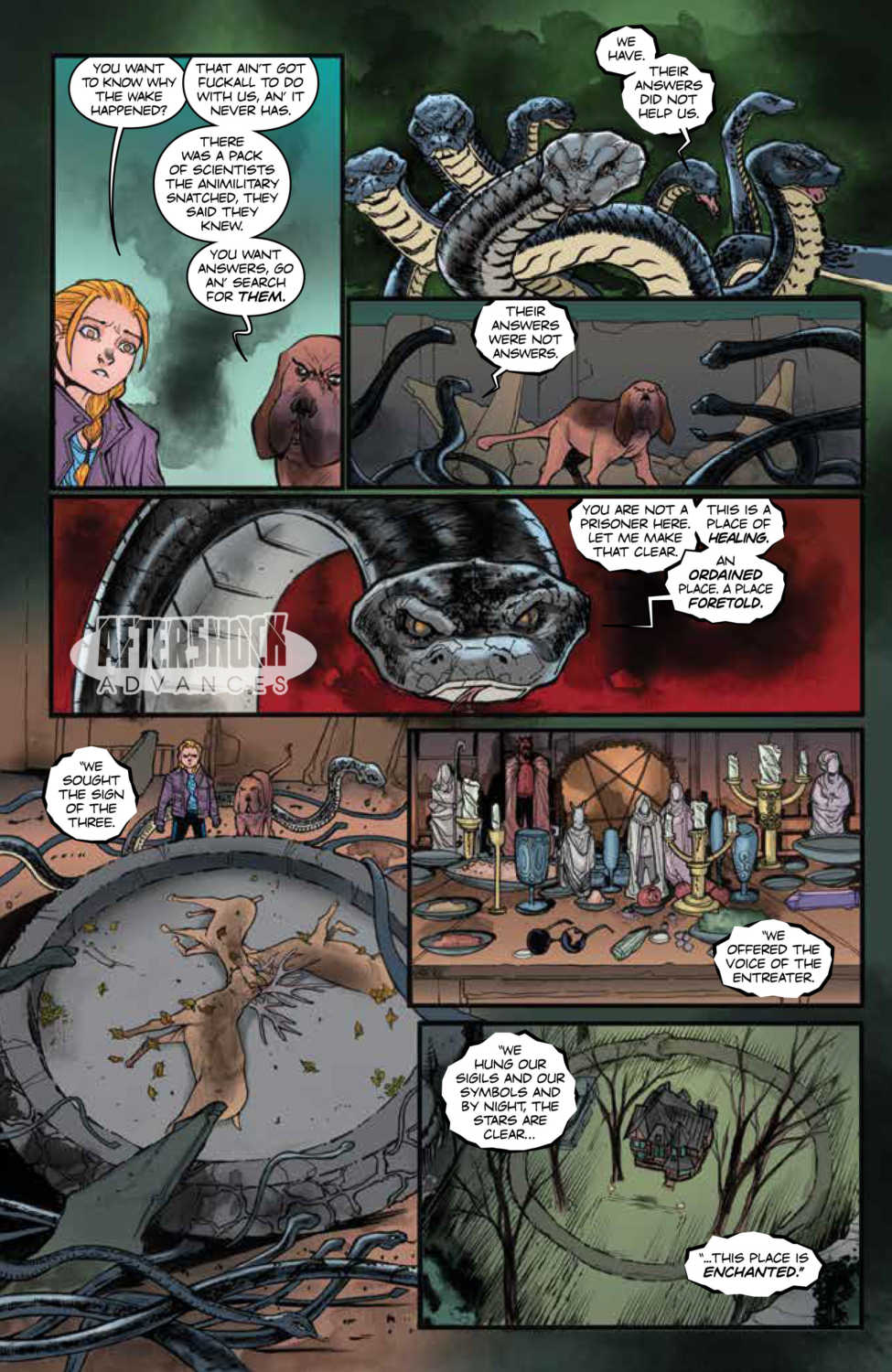
Animosity #20 hits your local comic shop on April 17, but thanks to AfterShock Comics, Monkeys Fighting Robots has an exclusive four-page preview to share with you.
Animosity is AfterShock Comics longest running series.
The 32-page book is written by Marguerite Bennett, with art and cover by Rafael De Latorre with Ornella Savarese, colors by Rob Schwager, and letters by Marshall Dillon.
About the series: One day, the Animals woke up. They started thinking. They started talking. They started taking revenge. Now, a dog and his girl are trying to get away–out of New York City, and all the way to San Francisco, to the only person who might be able to protect and save her.
Check out the full preview for Animosity #20 below:
Do you have Animosity on your pull list? Comment below with your thoughts on the series.
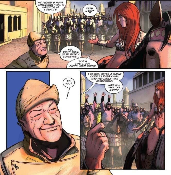
After making-off with Emperor Dragan’s treasure and supplies, Sonja plans her next move in Red Sonja #3.
This chapter sees the titular barbarian plotting how to defend her people and the treasure captured in issue two. At the same time, she must weigh how to handle a band of mercenaries interested in the same score.
The Writing
Mark Russell continues to excel as the writer behind Red Sonja #3. The book is well-paced and thoroughly engaging, with very little narrative flab.
Issue three offers less humor than the previous chapter. However, there is more emphasis on character development, specifically with Sonja herself. She displays immense competence as a leader, but her skills don’t come from nowhere. We see flashbacks to a younger Sonja under the tutelage of her master, Domo of Khitai. This provides insight on how Sonja developed from a hot-headed raider into a wise warrior.
Loyalty is a dominant theme in Red Sonja #3; specifically, how loyalty stands up against the prospects of wealth. We see the lessons learned in flashbacks play out in the present-day narrative, and how they relate to broader themes within the book. As Domo explains, “Nothing is more dangerous than a man with no loyalty.” Sometimes, you can do much better with a small band dedicated cadre than with an undisciplined army.
The Artwork
While not as action-packed as the last issue, the artwork in Red Sonja #3 is still stunning. Characters possess a kinetic sense of energy, with bold and expressive designs. Readers get a true sense of emotional tone through characters’ gestures and faces.
Mirko Colak pays meticulous attention to detail; his eye for backgrounds and architectural designs helps bring the world of the book to life. Of course, the bold colors, especially as the action heats up in the book’s second half, make the visuals pop off the page.
Final Thoughts
Red Sonja #3 continues this latest, excellent run with the character. Skilled storytelling and excellent artwork elevate this run above the standard for the sword-and-sorcery genre, making it a must-read series.
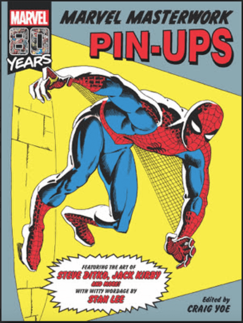
Classic Marvel Comics fans, IDW Publishing has some good news for you: they’re teaming with Yoe Books for a new hardcover reprint series of Marvel material from the Golden Age onward.
Publishers digging into their archives is nothing new, from Masterworks to Complete Collections to Epic Collections and more. What sets this new venture apart, at least from the outset, is that their first release is a dedicated book of comic art rather than a story reprint collection. Marvel Masterwork Pin-Upswill collect exactly what the title promises: pin-up pages from a variety of issues and artists. This is a rare treat, as pin-ups — which used to appear inside Annuals or “Giant-Sized” issues — have often only been reprinted in the Omnibus books (unless you’re lucky enough to own the original comics, that is).
So far, the company has revealed art by Steve Ditko (Spider-Man, Doctor Strange) and Jack Kirby (The Thing), though the press release offers many more names, including Jim Steranko, Wally Wood, Barry Windsor-Smith, and John Byrne. Curiously, they also refer to this being a lineup of “legendary Silver Age creators”; while Windsor-Smith debuted at Marvel in the late 1960s, Byrne’s work didn’t appear until well into the Bronze Age.
IDW has yet to announce any future books in the series, but based on the first offering alone this is off to a promising start. The official press release is below:
SAN DIEGO, CA (April 2, 2019) – IDW Publishing and Yoe Books are proud to announce a new line of Marvel Comics collections, a sensational series of large-format hardcovers curating the finest artwork from the Golden Age’s four-color foundations all the way up to the Marvel Age’s dizzying heights!
Coinciding with the year-long celebration of Marvel’s 80 years of publishing, Yoe Books will debut their retrospective look at the House of Ideas with Marvel Masterwork Pin-Ups, which will be followed by additional entries in 2019.
In Marvel Masterwork Pin-Ups, the pulsating pin-up artwork of legendary Silver Age creators – including Jack Kirby, Steve Ditko, Jim Steranko, Don Heck, John Byrne, Barry Windsor-Smith, John Severin, Wally Wood, Dan Decarlo, John Romita, and many more – is collected for the first time ever into a single volume, accompanied throughout with witty wordage, pulse-pounding patter, and zany zingers by Stan “The Man” Lee!
Fans will treasure large, deftly drawn pin-ups by these marvelous artists of Spider-Man, Thor, Doctor Strange, Captain Marvel, The Hulk, The X-Men, the Fantastic Four, and many more, plus nefarious villains led by Doctor Doom – and even Millie the Model by Dan DeCarlo!
“I’m the person that I am (such as that is) because of Stan, Jack, Steve, and the other early Marvel creators inspiring me in my Peter Parker teenage-years,” says multiple Eisner Award-winning editor Craig Yoe. “To take this ‘journey into history’ with this – the first in a line of Marvel books – is an amazing, fantastic, incredible thrill for this proud charter member of the Merry Marvel Marching Society!”
Marvel Masterwork Pin-Ups is now available for pre-order via online booksellers and comic book specialty retailers. Visit www.comicshoplocator.com to find a store near you.
Marvel Masterwork Pin-Ups
by Jack Kirby, Steve Ditko, Jim Steranko, Don Heck, John Byrne, et al.
ISBN 978-1-68405-520-3
$34.99 (US)
120-page, color squarebound hardcover, 9″ x 12″
Does this book look like something you’ll be checking out? Are you excited for a new hardcover series of classic art material? Leave us a comment!