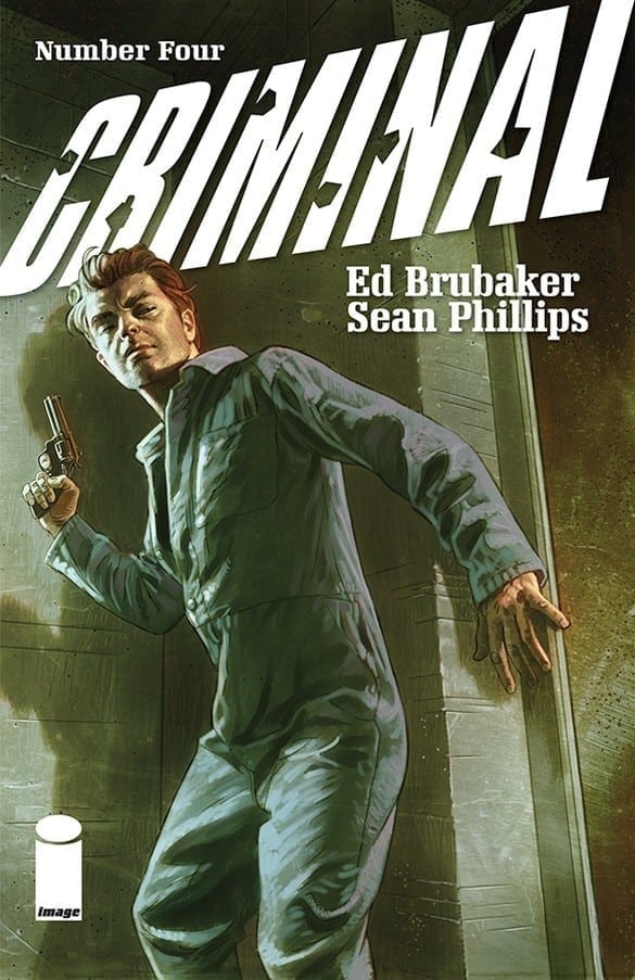
Criminal #4 by Ed Brubaker, Sean Phillips and Jacob Phillips returns to a ‘done in one’ single issue format with an excellent character study on re-occurring lowlife Ricky Lawless.
Criminal#4 Written by: Ed Brubaker Art by: Sean Phillips Colors by: Jacob Phillips
Story
Criminal #4, like the first issue, tells one single story between its covers. And like that excellent debut, the focus on character over crime makes it a standout. This tale is all about Ricky Lawless. Ricky is having a rough few days. He has been up for days, binging on speed given to him as payment for stealing cars. He is also looking to plan a robbery…or is he? And why is he calling his ex-girlfriend?
Brubaker uses first-person narration to get us into Ricky’s drug-addled brain and it works beautifully. Writing drug trips and druggy narration can easily fall into cliche and stereotype, but Brubaker avoids that by being subtle and by how well he knows how to write Ricky as a character by now. It’s also that love for the character that makes us care for him, despite what a piece of shit he usually is.
Not that there is no plot at all, as there are a few twists and turns that keep the narrative flowing, not to mention the usual easter eggs and call-backs for longterm Criminal fans.
Art
Sean Phillips and Jacob Phillips are in the top tier of comic art teams. The synergy and synchronicity the line work and colors have are unparalleled. Sean can capture emotion on faces like no one else, he is master at ‘reaction shots’. Jacob continues to experiment more and more with colors every issue; the use of full-color backgrounds in this chapter being a great example.
There is some fun lettering work too, especially with the occasional old-school word balloon that pops up frequently (helping to reminds us this is a comic book that loves being a comic book).
Conclusion
This series continues to be outstanding. If you’re not pulling this book weekly, then you are the criminal.
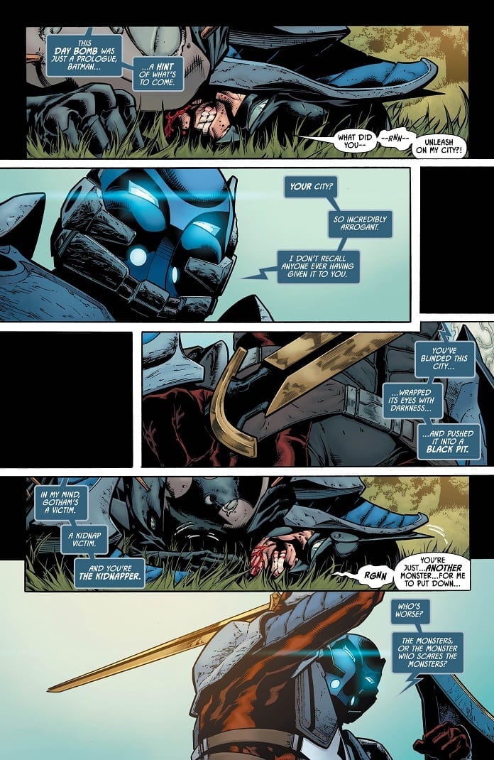
The Arkham Knight ramps-up the crusade against Batman in Detective Comics #1002. After a showdown in the park, the Knight manages to get his hands on someone very close to Bruce, attempting to turn a member of the Bat Family against him.
The Writing
Of course, the big questions are the Arkham Knight’s identity, and why he wants to dispose of Batman. While we don’t get the answers to those questions, there’s plenty of intrigue to be had in Detective Comics #1002.
The knights’ arrows are made of the same material as Batman’s armor, enabling them to pierce his suit. Plus, when one member of Bruce’s circle learns Arkham Knight’s identity, their exchange suggests the two are familiar. Tomasi does an excellent job of building tension throughout the book, clearly implying the Arkham Knight is someone well-known to Bruce, thus promising some great conflict in future issues.
Speaking of tension, the storytelling in Detective Comics #1002 has a great sense of dynamism. We build to multiple standoffs, but never lose momentum after one resolves. Instead, the tension lingers, adding additional layers to the story.
What makes the Arkham Knight a great antagonist is that the character is a physical embodiment of questions that have haunted Batman’s legacy for decades. Is what he does moral? Is his war on crime doing more harm than good? Readers can form an opinion, but it’s difficult to form an objective impression.
The Artwork
Bradley Walker provides some incredibly vibrant, dynamic pencil work in Detective Comics #1002. The character designs feel a bit cartoonish compared to the grittier, illustrated looks we’ve seen on recent Bat titles. However, the poised manner with which Walker composes panels makes it feel just as substantive.
The action is well-paced throughout, but it’s in the book’s first half where we can really appreciate the choreographed look. Andrew Hennessy provides the inks, which mesh well with Walker’s art style.
Nathan Fairbairn is on color duty again, offering an unusually-light palette for a Batman title. It’s an unconventional look, but it works well alongside the lines.
Final Thoughts
Detective Comics #1002 deepens an intriguing story, with quality artwork to bring the words to life. Great stuff.
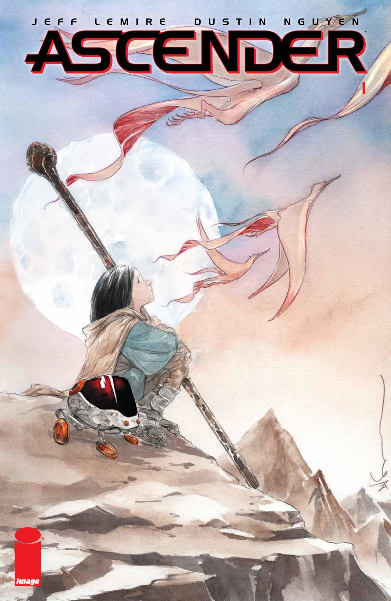
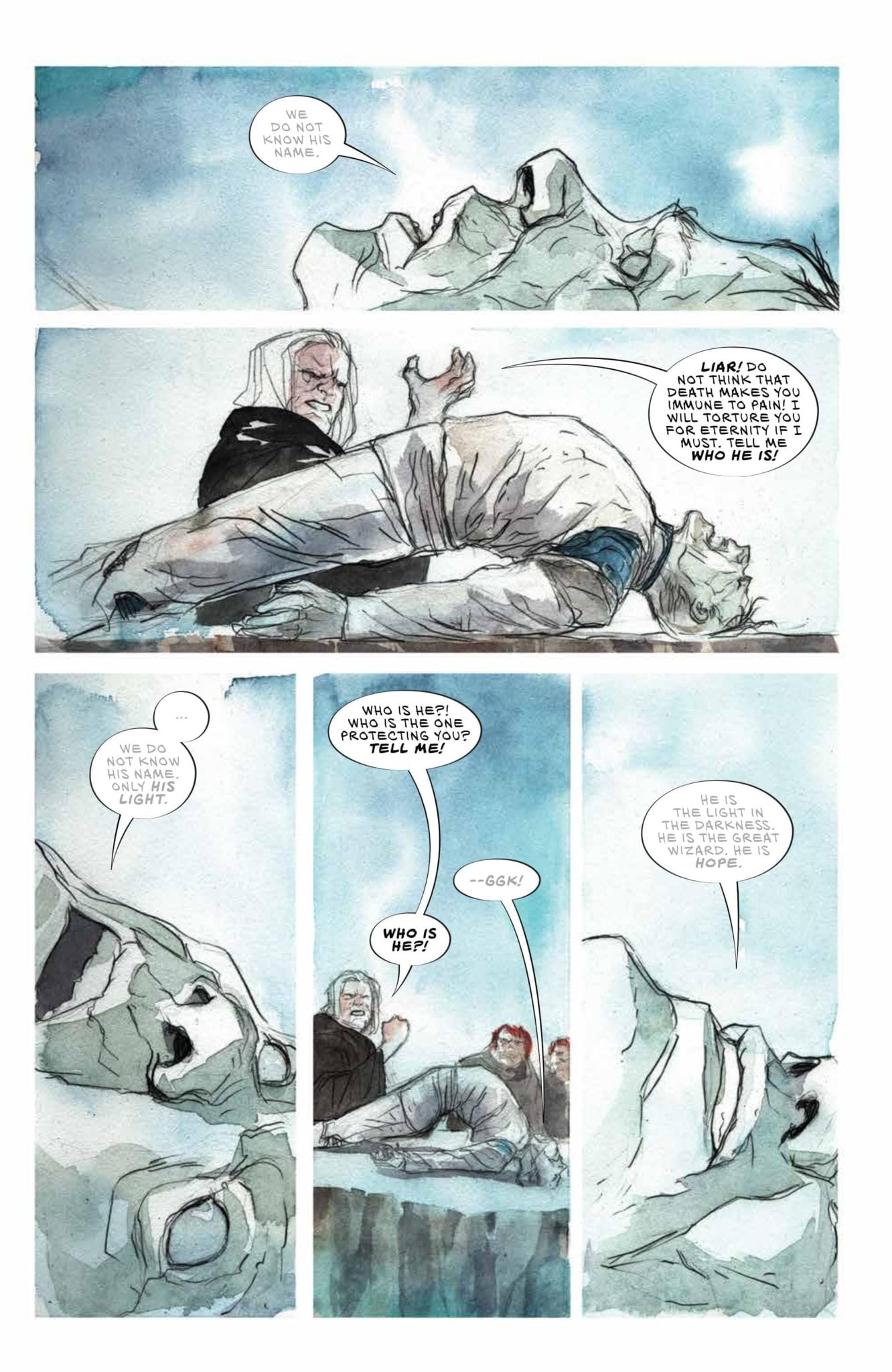
It’s hard to follow up on the successful sci-fi story that was Image Comics’ DESCENDER series. But Jeff Lemire and Dustin Nguyen are moving forward with a fantastic sequel. ASCENDER, set 10 years after the original series’ events, reveals a world where technology has been all but extinguished by the Harvesters. Now the supreme wizard known as Mother commands the civilizations throughout the former United Galactic Council. She proclaims liberation, but are her subjects really free?
Story
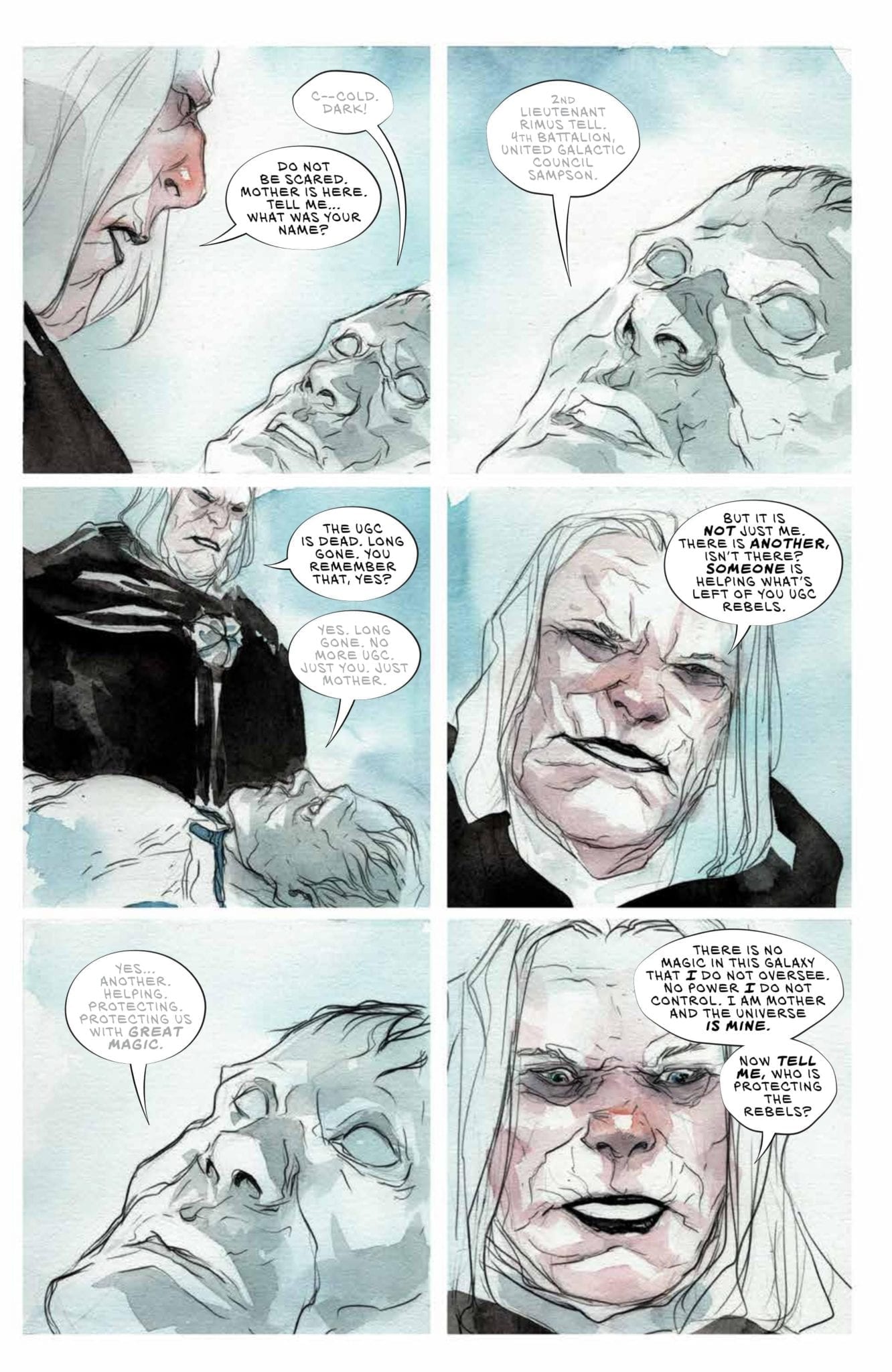
The story places its initial focus on Mother and inhabitants of the planet Knossos. After arriving in her dragonlike transport, which doubles as a spaceship to compensate for the lack of technology, Mother asks to see the Knossosian’s prisoner of war.
Though the captive has since died, Mother shows off her powerful magical abilities by bringing him back to life for the purpose of interrogation. One can almost feel the Mother’s horrific breath as it emanates from her mouth, infusing the corpse with life once again.
Mother’s interrogation focuses on the man’s service in the USG military and whether he knows about a supposed magic wielder protecting what’s left of it. A sense of intrigue builds as we learn of this unknown being who may hold the power to topple Mother’s forces.
The story shifts its setting to the planet Sampson where we meet Mila, the daughter of Andy from DESCENDER. Mila and her father live in seclusion to avoid confrontation with Mother and her forces. The young girl is aware of the ever-present danger, but implores her father to let them experience human society less them remain hermits forever.
Mila yearns for the freedom to interact with the world as she sees fit. But with Mother running the show, will she be able to find it?
Art
Dustin Nguyen’s breathtaking artwork for the cover and inner story brings life to Lemiere’s narrative. His penciling combines light sketch marks to add layers of texture to each character. And the colors help readers distinguish the transitioning environments, such as the dull grays on the icy Knossos and the bright hues of the lush Sampson.
Steve Wands’ lettering is particularly helpful in allowing readers to grasp the story’s themes. He uses a robot-like font for the winged servants of Mother, showing how they function just like the machines she so despises. But the scribbled style of Mila’s internal dialogue is even more effective, fostering a sense of imagination and childlike wonder in the reader. It looks as if these sentences were taken straight from her diary.
Conclusion
ASCENDER #1 is the thrilling sequel opener fans of DESCENDER have been waiting for. By flipping the script from technology to magic, the storytellers are finding a way to unpack their surprising similarities.
Do you think this story will live up to the fame of DESCENDER? Let us know in the comments below!
Timothy Hunter has had a lot on his mind lately. His journey through The Dreaming, while increasing his understanding of the magical realms, kept him away from home for a long time. But upon returning Timothy learned of Ellie’s disappearance, and the only person who can help him is Ms. Rose, his magical guide whose motives are quite questionable.
Story
Kat Howard is on a mission to make Timothy as confused as possible in this issue. And it makes for that much more of an exciting story. Upon his return to London, the poor boy has put his search for the Books of Magic on pause in order to search for Ellie. Fortunately, Rose agrees to assist Timothy in his search, but her shady relationship to his recently deceased teacher leaves him questioning her every move.
Howard’s Timothy comes with all the qualms one would expect from a teenager. Shifting realities, a teacher’s confusing instructions, and less time to see your friend — all the core aspects of a student’s high school experience. They may be exaggerated to fantastical proportions, but it’s clear young readers will resonate with Timothy’s journey.
The duo’s quest to find Ellie inadvertently sends them to Faerie, a mysterious land saturated with magic. They’ll have to find a way out of the realm and get back on track less they lose her forever.
Art
BOOKS OF MAGIC #7’s cover features the classic pastel art of Kai Carpenter. The illustration depicts Timothy and Rose in the midst of a forest in Faerie, complete with watchful eyes to emphasize the dangerous nature of the realm.
The issue’s inner story features fantastic artwork from Tom Fowler, Brian Churilla, Jordan Boyd, and Todd Klein. Fowler’s illustrations of Faerie’s environment captures the magic that suffuses it, and Churilla’s inks accentuate their details more so. Boyd uses earthy colors in the creatures of Faerie to highlight their dependence on the magical land. In addition, Klein employs cursive lettering for the Faerie inhabitants to help readers imagine Timothy’s journey is taking place within a child’s storybook.
Conclusion
Issue #7 dives deep into Timothy’s connections, both in regard to Rose and the land of Faerie itself. Readers will eagerly anticipate the reveal of these answers in the next issue.
What do you think is Timothy’s connection to Faerie? Let us know in the comments below!
Tom King and company has baited readers since September of 2018 with the clues and misdirection that fill the pages of Heroes in Crisis. Who had committed these heinous acts of murder, and why?
With the eighth of nine books that make up this story hitting shelves today, those questions have (most likely) been answered. A confession has been given, and its ramifications will be felt throughout the entire DC Universe.
** Major Spoilers Below **
Story
You’ve seen all the clues. You’ve heard the testimony and eavesdropped on the secret confessions of the World’s Greatest Super Heroes. Now, with the killer revealed, it’s time to find out why. What could have driven a hero to the brink, to turn a savior into a murderer? Rifts will form between old allies, and the trinity of Wonder Woman, Superman and Batman will have their leadership challenged and will question their own judgment. Sanctuary has become something they never imagined…and it’s still potentially carrying on without them!
Poor Wally West. Pushed aside as the prime Flash in The Flash: Rebirth in 2009. Erased from memory in the New 52 reboot. Forgotten of in a post-Rebirth world, including by his fellow Titans and wife. Also, his children were also wiped from existence, and he briefly died from running too much. It’s no wonder that he was in need of some serious superhero therapy.
Now, as revealed in the latest pages of Heroes in Crisis, Wally’s emotions and curiosity have gotten the better of him. Because of such, As a result, he has been revealed as the culprit of the killings at the Sanctuary.
Writing
This issue is all about the confession of Wally West, and it feels like it is one for Tom King as well. King has sprinkled clues throughout the previous issues of the series, and uses the entirety of this issue to divulge the who, how, and why.
King’s best work is in character studies. Just look at his takes on The Vision and Mister Miracle. Where Heroes in Crisis shines is in the confessionals. King takes a deep dive into the tortured and conflicted minds of the lesser known and unheard of DC Universe heroes. Those moments of tragedy and emotion are much more compelling than the murder mystery. Furthermore, though this book finally sheds light on the mystery, it’s Wally’s inner turmoil, and Tom King’s dialogue, that drives the story.
Perhaps, a focus on Wally West would have better suited this series, much like King’s work on Vision and Mister Miracle. A Flash who feels he doesn’t belong in this timeline, who is dealing with the emotional strife of living in a world where he is forgotten by his friends, his wife, and where his children have never existed.
Art
Mitch Gerads takes over the artwork for the majority of this issue of Heroes in Crisis. Gerads showcases some major talent in each panel of this issue. As Wally speeds through, cleaning up his mess, Gerads evokes the hurriedness of the situation through chaotic bursts of speed and lightning. And readers are sure to feel just as charged to flip through the pages to the end.
What Gerads does best in this book is evoke the rage and despair that Wally West endures. His facial expressions and his posture make the character come to life on the page. The penciled scratches etched on Flash’s face and costume suggests a worn and battered hero. One who has reached a breaking point.
Conclusion
With the big answers revealed, it will be very interesting to see how Heroes in Crisis concludes, and how the revelations of this issue will affect the entire DC continuity from here on out. Perhaps The Flash will undo everything he has done with time travel, as Flashs’ tend to do. Regardless, the strongest aspects of this series have been the character studies. It’s the look at the flawed people under the masks, as opposed to the murder mystery, that sell the story.
Are you surprised at who the killer is in Heroes in Crisis? How do you think the series will conclude? Let us know in the comments!
Coming this summer, some of Marvel’s mightiest heroes will come face-to-face with villains they have yet to contend with in ‘Acts of Evil’.
Ms. Marvel, who will take on Super Skrull, Venom (Lady Hellbender) and Punisher, who will be tabbed against Brood Queen, will all celebrate their respective annual issues in pinning them against the unexpected.
“You know what everyone says is worse than the devil? The devil you don’t know,” said Kathleen Wisneski. “For ‘Acts of Evil’, Marvel is pitting our heroes against villains they’ll never see coming, and we’ve lined up creative teams with fresh takes on these characters to make sure our fans are just as blindsided.”
The creative team for Ms. Marvel Annual #1: Ms. Marvel vs. Super Skrull will be Magdalene Visaggio and Jon Lim, while Karla Pacheco and Adam Gorham will helm Punisher Annual #1: Punisher vs. Brood Queen and Venom Annual #1: Venom vs. Lady Hellbender will be spearheaded by both Ryan Cady and Simone di Meo.
The ‘Acts of Evil’ series, in sizing up Marvel’s heroes against new villains, will launch with these three in July and continue in August and September. Keep an eye out for more reveals as we cruise through the summer.
Click HERE for the official release from Marvel, including a look at all the covers.
What do you think, what epic Marvel matchup would you like to see? Let us know in the comments section below.
The original series originated in 2002, out of the pages of X-Force, which was also a Giant-Size issue, which brought together a group of mutant celebrities that were all camera-friendly and media savvy. The issue will introduce a new threat for the group to fight and will also introduce a brand new U-Go Girl. UGG was part of the original team that also consisted of Doop, Guy Smith, Anarchist, Veenus Dee Milo, Spike and Henrietta Hunter.
Giant-Sized X-Statix #1 is set for release in July. Keep an eye out for a release date as summer draws closer.
Click HERE for for the official press release from Marvel.
What do you think, does the world need more Mutants? Are you excited about the revival of this fan-favorite mutant squad? Let us know in the comments section below.
In practice, the loa are powerful spirits who command respect and service in humans. The titular character in Punk Mambo #1, the first chapter in the new five-part series from Valiant, offers them neither of these.
Punk Mambo uses her powers for profit on the streets of New Orleans. But, when one of the loa bonded to her is kidnapped, she heads off to track down the culprit.
The Writing
Cullen Bunn weaves a fun, fantastic tale in Punk Mambo #1. Readers will pick up on some similarities to characters like John Constantine, only with a less self-serious tone. The series is a supernatural detective story, but it leans heavily on black comedy with a lively, madcap zeal. Beneath the humor, though, are the bones of a solid story.
Punk Mambo (real name Victoria Greaves-Trott) appeared in several Valiant titles in recent years, but new readers will have no problem picking up what the character is about. We know she’s snide, cynical, and much older than she appears. She also has some pretty incredible Voodoo-inspired powers, which she employs in a mercenary fashion. We get all the information we need, while avoiding a prologue-style info-dump.
Punk Mambo #1 functions as an excellent Act One for the larger story. It introduces the character, and also opens the door to a larger narrative, suggesting there may be some price to pay for her flippant attitude toward the powers she wields.
The Artwork
Adam Gorham provides some excellent artwork for Punk Mambo #1. He employs a variety of close-cropped and wider images, giving us variety while remaining visually cohesive. His character designs are appealing, opting for a lot of heavier, shadowy lines, which are complemented by vibrant color work.
Gorham uses detail very selectively. He often allows backgrounds to fade out, focusing attention on the characters without detracting from the visual effect. However, the details that are present feel very deliberate, creating some eye-catching images throughout.
Final Thoughts
Punk Mambo #1 is a great start to the new series, providing an entertaining story and alluring artwork. Highly recommended.
IDW Publishing are no strangers to Dick Tracy. They have been reprinting the newspaper strips in wonderful collection books since 2006 and have already published one new comic based on the character.
Their new outing, Dick Tracy Forever, is one from writer Michael Avon Oeming’s bucket list and is something that he has been wanting to work on for over a decade. It promises to change the way we see the character while also proving why the character continues to be popular and relevant today.
Dick Tracy Forever #1 Credit: IDW Publishing
Writing/Story
Michael Avon Oeming has embraced the history of Dick Tracy to create a new set of tales, not in continuity but set in their own world. The format of this first issue harps back to the early days of the comic strip from 1931 and incorporates the fun extra’s that Chester Gould enjoyed, such as the Crime Stoppers Guide.
In Dick Tracy Forever, these elements are not just page fillers but also mood setters. The crossword puzzle is pasted onto the side of imposing, dark buildings reflecting the claustrophobic nature of the city Tracy works in.
The three stories Oeming offers are all tenuously linked, another call back to the strips from the 1930’s and 40’s that bled into one another. Each is action packed and features a different crime but Tracy’s distribution of justice is constant. Oeming illustrates Tracy’s determination for justice by selecting criminals from different backgrounds, each with a different story. The reader compares and judges as they see fit but Tracy works in black and white; commit a crime and you are punished.
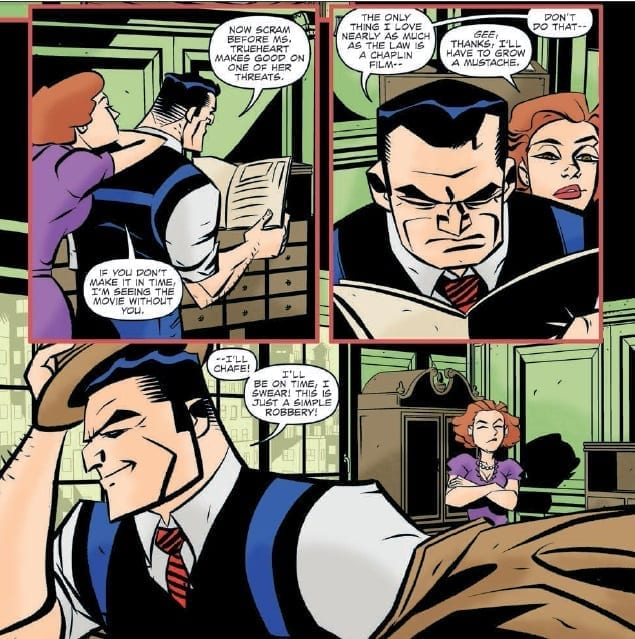
One of the endearing features of Chester Gould’s creation were the support cast that surround the central detective. Oeming understands this and gives the extra’s their own character, updated for a modern audience. Tess Trueheart is the most prominent and Oeming has picked up the feisty, independent attitude that she always had. He has in turn made her central to the stories, assisting or impeding Tracy’s investigations. The interaction between these two lovers gives the comic heart and comedy in equal measures.
Dick Tracy Forever #1 Credit: IDW Publishing
Art
Oeming’s art is bold and brash just like the central character. He has adopted a noir style suitable to stories set in the 1930’s. Long dark shadows fill each panel reflecting the darkness that surrounds Tracy in his fight against crime. There is a sense that all of this comic is set in the dark hours when criminals come out to play.
Tracy has strong features which Oeming accentuates with thick, black lines and harsh angles. In comparison, Tess is much rounder in feature with a more delicate outline.
There is a progression to the art style throughout the comic. Subtle changes to the depiction of the characters and their design chart the history of the Dick Tracy strip itself. The change from battered brown trench coat to the iconic yellow that Dick Tracy is known for seems to match a change in the Tracy character.
The coloring sets the mood and not just of the scenes. Taki Soma pays close attention to the characters and what they are wearing. The color of their garments reflect their personalities, which is most notable by Dick Tracy himself.
Shawn Lee uses a range of lettering techniques to help the dialogue flow from panel to panel and page to page. However, it is the introduction of thought balloons that will really but a smile on the readers face. The good old fashioned thought balloon is rarely used these days and has been replaced by caption boxes. However, Lee uses them liberally bringing Tracy’s thoughts directly into the comic strip. This gives the reader a unique impression of the character that can be lost by a voice over type caption. The reader is able to see the workings of the detective’s mind as it happens without the distance created by captions.
Dick Tracy Forever #1 Credit: IDW Publishing
Conclusion
The last outing of Dick Tracy for IDW Publishing, Dick Tracy Dead or Alive, wasn’t the most successful interpretation. The art style that was used didn’t fit the energetic, dynamic character that Dick Tracy is. Oeming’s interpretation however is spot on.
The Disney movie from the early 1990’s understood the character and what makes him so appealing. As a result, they created a cinematic visualisation of the character and his life. It was over the top; over acted; simplistic; but above all entertaining. Dick Tracy Forever does exactly the same thing but in comic book format. It takes elements from the early years and reinterprets them for a modern audience. There is the focus on crime but also on the central characters relationships. The Gruesome Villains that made the character so famous have a part to play but at this stage they barely feature. This is because for the first decade the criminals were mostly representations of the real life criminals that were making the headlines. Oeming does the same thing in this comic. It may be set in the past but the criminals are all too modern; desperate veterans, technical spies, corrupt billionaires.
Dick Tracy Forever is an exciting start to a new series. It combines nostalgia and modern storytelling in equal amounts to create a relevant take on a classic character. Much like the Disney movie, Dick Tracy Forever has clearly been made by people who love the character and as a result the readers won’t be able to stop themselves from loving it.
Continuing their line of Star Trek comics, IDW Publishing asks the question, “What happened next?” In their new offering, Star Trek Year Five, the creators return to the original crew of the Enterprise and explore the final year of their original mission. Everyone knows what came after but where did the Enterprise go in that final, missing year?
Star Trek Year Five #1 Credit: IDW Publishing
Writing/Story
The crew of the star ship Enterprise have been exploring together for exactly four years. Their current mission provides then with a spectacular light show to accentuate their celebrations.
But as the crew celebrate Captain Kirk receives a communication containing news he doesn’t want and Lieutenant Uhura picks up a distress call from an uninhabited planet.
The most important job of a first issue is to hook a reader so that they will continue to come back month after month. For a lot of Star Trek fans that hook is in the title of this comic; Year Five. To witness the continuation of the original mission through to completion appeals to all fans of the original series.
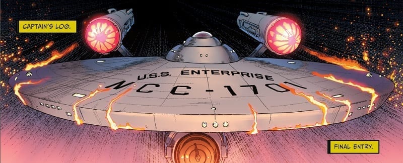
And if the title wouldn’t do it the opening section of this comic would. Writers Jackson Lanzing and Collin Kelly open the comic with a panel showing the Enterprise, NCC-1701, burning up, under obvious distress with two caption boxes, two words each:
Captain’s Log. Final Entry
No matter what happens next that first panel has trapped you in the story. Those four words sends shivers down your spine, like hearing the words ‘Winter is coming’, they have an involuntary effect on the reader.
The first page is a jaw dropper packed with emotion but the reader will have to wait for a resolution because there is the fifth year to live through.
The rest of this issue is a set up for the series and the first mission in the Enterprise’s final year. There is a lot of exposition in the opening pages, which is littered throughout with continuity references. Lanzing and Kelly know the characters very well and capture their individuality in their speech. The cast of Year Five are the characters from the original series, down to a T. This isn’t an interpretation or re-imaging; this is Star Trek series 4.
Star Trek Year Five #1 Credit: IDW Publishing
Art
It is not only the story that captures the feel of the original Star Trek; the artwork also embraces the 1960’s aesthetic beautifully. The combination of Stephen Thompson’s pencils and Charlie Kirkoff’s colors is reminiscent of the Star Trek comics produced in late 1960’s and early 1970’s where Alberto Giolitti provided the artwork. The panels are dynamic with viewpoints that reflect the characters within.
Captain Kirk, for example, strides through a panel, his importance and presence cannot be restrained by the boarders or gutters of the page. Thompson gives the panel a low camera angle so that the readers look up to the captain in the same way as the crew. There are a number of character establishing panels throughout this first issue of Year Five and they show how much of an understanding the artists have for the cast.
The hardest job goes to Neil Uyetake who has to fit the massive amount of dialogue over Thompson and Kirkoff’s art. Luckily for Uyetake, the characters are the stars of this comic, not the sets, so he is able to position the speech balloons around the cast. On occasions this creates a claustrophobic feel to some of the spaces which helps to remind the reader that the original Enterprise was much smaller than later ships. The lettering gives the reader the impression of being trapped in a submarine rather than a luxurious star liner. This is a working ship, not a pleasure cruiser, and this point is illustrated by the packed panels and lack of open spaces.
It also provides a wonderful comparison to the away teams trip on the surface of Lloyd Zeta-9 because there is suddenly so much space. Large landscapes fill the page and the dialogue becomes less prominent.
Star Trek Year Five #1 Credit: IDW Publishing
Conclusion
Star Trek Year Five issue one states its intentions from the beginning and, throughout this issue, constantly reminds the reader that this is Original Series Trek. The characters are the ones we know and love. The sets have a 1960’s TV show aesthetic, so much so that you could believe that this comic was set on the sound stages of Paramount Pictures lot.
The entire art team work together to produce a single vision of this Star Trek universe, referencing not only episodes from the original series but also extended universe material, especially the comics style from the 1960’s.
And, of course, this comic has one big hook for the reader which captures you from the very first page. Once you start to read Year Five you will want to know what happens next; it is highly improbable that after issue one, anyone would miss issue two.