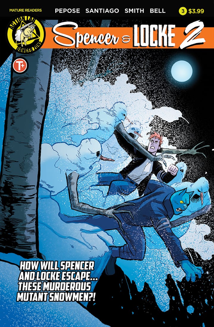
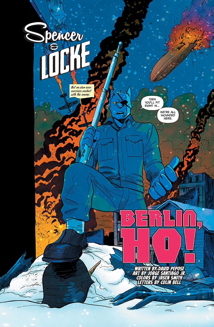
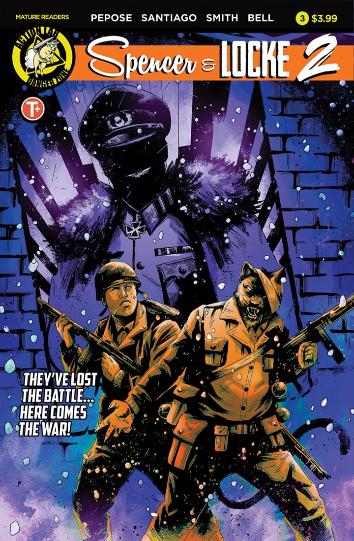
Spencer & Locke 2 #3 is out this week, delivering some of the best moments of the series to date.
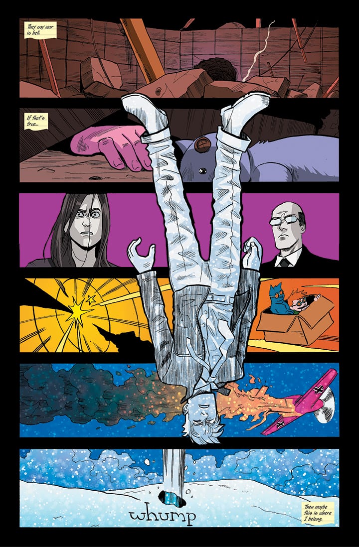
Hovering in the place between life and death, Locke is forced to navigate the quagmire of his mind. Meanwhile, Hero decides to take matters into her own hands to avenge her father. The series is written by David Pepose, with art by Jorge Santiago Jr., colors by Jasen Smith, and letters by Colin Bell.
As I sat down to read this issue, I thought to myself, with 100% sincerity, “when we last left our heroes…”
That’s the kind of fun mindset that Spencer & Locke puts you in as a reader. The series treats its material seriously, as it should, but it still feels like the creative team is just having a blast telling their story. This issue, for instance, has Locke facing his inner demons. It’s intense, poignant, and it has a really strong emotional payoff in the end. But also, his inner demons manifest themselves as Nazi killer mutant snowmen.
Issue three is very character-driven. The villainous Roach does continue to wreak havoc, and there’s a last page cliffhanger that moves the plot forward, but for the most part, this chapter slows things down for a moment before heading into next issue’s explosive finale. Pepose and Santiago take the chance to peel back the layers on their characters and explore what makes them tick.
And it’s beautiful (in a tragic way). While lingering between life and death, Locke comes face-to-face with his childhood self and is forced to make a difficult decision. It’s arguably his defining moment in a series that bears his name. The scene is a reminder of what this comic is all about, and how intelligent and in touch with humanity it is, Nazi killer mutant snowmen and all.
Roach also gets his own “behind the curtain” moment, as the opening page flashes back to his time as a POW and the horrors he faced (done by Santiago and Smith in the style of Beetle Bailey). These flashbacks build out Roach’s character and make him more than just the mass murderer we’ve come to know and fear. They actually build sympathy for him, and a villain you can sympathize for is maybe the scariest villain of all.
Ok, finally, we have to talk about Locke’s daughter Hero. At the end of the last issue, Hero pulled a hoodie over her face like a cowl and vowed to take on Roach herself. This issue, we see her debut as “Captain Astounding,” and it’s one of the high points of the entire Spencer & Locke saga. Pepose writes her narration perfectly, and Bell’s lettering never lets you forget that this is still just a little girl, no matter how big she acts.
No matter how dark or serious Hero tries to act, there’s an innocence to her inner monologue that will put a smile on your face. It’s noir, reminiscent of Batman or Sin City, but by way of a child who has a very different idea of what constitutes “edgy.” I would gladly read a comic strip series of indefinite length about the adventures of Captain Astounding.
Only one issue left of Spencer & Locke 2, and it looks like it’s going to be a doozy! All bets are off, and the way this series has gone, I would expect something big and probably tragic to happen.
Are you reading Spencer & Locke 2? Sound off in the comments with your own thoughts on the issue!
On paper, Event Leviathan #1 kicks off DC’s latest companywide crossover but it fails to deliver many substantial new developments.
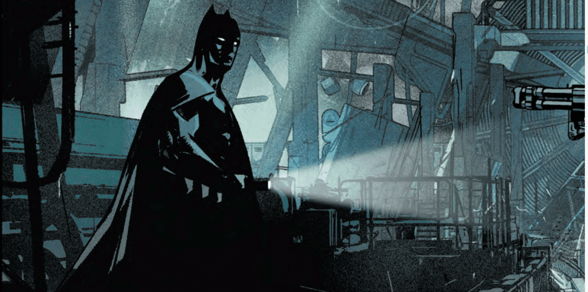
Batman and DC’s best detectives are on the case in Event Leviathan #1.
DC recently wrapped up Heroes in Crisis, a “whodunit” mystery that promised to send lasting shockwaves throughout the DC Universe. That event didn’t live up to the hype and, based on this opening installment, Event Leviathan #1 might follow in the footsteps of its predecessor.
Event Leviathan #1
Script: Brian Michael Bendis
Art & Cover: Alex Maleev
Letters: Joshua Reed
STORY
Writer Brian Michael Bendis’ story relies almost exclusively on dialogue. He delivers the majority of the plot through a conversation between Batman, Lois Lane and, eventually, Steve Trevor. Later on, an interaction between Doctor Strand and Leviathan delivers another sizable chunk of the story. This issue is a dry reading experience because, most of the time, the reader just watches characters sit around and talk. Despite all its flaws, Heroes in Crisis was comparatively more enjoyable to read because writer Tom King usually offered some redeeming feature. Regardless of the controversial narrative decisions he made, King explored the emotional consequences of being a hero and made the reader think about them. There’s not much to hang on to in Event Leviathan #1; even when compelling plot threads, like Steve Trevor’s paranoia, pop up, they drown in a monotonous flood of lengthy dialogue.
With most crossover events, there’s an implicit expectation that most readers are familiar with the background of the story heading into the first issue. Bendis has been building up to Event Leviathan in Action Comics, so Event Leviathan #1 isn’t a cold open to this crossover. While it’s not fair to expect all fans to have read recent issues of Action Comics and the Superman: Leviathan Rising Special before they dive into this story, Bendis recaps that framework throughout Event Leviathan #1. Unfortunately, the exposition dilutes a story thatdoesn’t progress the event beyond what we already know. Bendis largely repeats the same information, like the coordinated collapse of the world’s intelligence agencies and Talia al Ghul’s potential involvement. This issue would have been a fairly successful prelude to the event but, as the first part of a self-billed mystery thriller, it’s a dissatisfying repackaging of Bendis’ recent work in related comics.
Though Bendis relies too heavily on dialogue, the conversational dynamic between Lois Lane and Batman has the potential to carry the series. It’s satisfying to see Lois challenge Batman repeatedly despite the fact that the world as they know it has fallen apart.
Lois Lane isn’t afraid of Batman in Event Leviathan #1.
Lois doesn’t let Batman get away with his usual schtick. When he shows up and tries to solve the case himself, Lois shows that she’ll be a crucial part of the effort to save the world. She helps the Dark Knight unravel some of the mystery and, collectively, they decide this takeover attempt isn’t like the others. Bendis has the opportunity to do right b Lois; if he writes her as the strong, independent character she’s meant to be, she could break free of the stereotypes many fans still have about her.
When Green Arrow arrives, he concurs and quickly emerges as another main player in the series thanks to his spunky attitude and his raw reactions to the chaos around him. “Shush, nerd,” he brashly tells Batman when the Dark Knight starts to hog the conversational spotlight. Oliver Queen also angrily screams at Steve Trevor and blames him for letting this conspiracy unfold in the first place. Batman’s response, that whatever’s going on happened under all their noses, offers another glimpse at Bendis’ promising dynamics between these characters.
Bendis makes it clear that Lois Lane will be a major player in Event Leviathan.
Though the mystery doesn’t draw the reader in as eagerly as one might hope, these interactions are enough of a hook to draw them for at least another issue.
ART
Event Leviathan #1 is the first comic in recent memory where, at times, it feels like the art purposefully takes a back seat to the story. Artist Alex Maleev uses sketchy, noir-like art to complement the mysterious mood of the story and, for the majority of the issue, he uses dim, subdued colors. Without flashy visuals, the reader is compelled to focus on the dialogue-driven plot. The primary function of the art can be found in the characters’ facial expressions; Maleev breathes life into Bendis’ lines by showing the reader how the heroes are feeling.
Steve Trevor is the most expressive character in Event Leviathan #1.
These expressions are especially prevalent on Steve Trevor’s face. As someone who was intimately involved with the now-defunct intelligence community, Colonel Trevor has been through hell. He’s racked with guilt, shock and paranoia as he grapples with everything that’s happened. Stress lines make him look 20 years older and, when he calls Lois Lane a suspect, the empty look in his eyes shows that the Steve Trevor we know and love is gone. Thanks to Maleev’s art, these facial expressions elevate Bendis’ script by adding some heart to a exposition-heavy story.
Maleev’s art gets a chance to shine in one of the issue’s most mysterious sequences. In a flashback, when a villain clad in a metallic suit arrives, Trevor gets teleported in a protective field. There’s a blinding explosion and Maleev uses apocalyptic shades of reds, orange and yellow to show a devastating blast. Previous issues of Action Comics and the Leviathan Rising one-shot heavily implied that some characters have been hidden away with these protective fields. But Maleev’s art expands on that established knowledge because, when Trevor arrives at his destination, he’s surrounded by bright blue energy. Asking for a connection to Doctor Manhattan and Doomsday Clock would be wishful thinking but, nonetheless, the source of the blue energy feels important to the series’ bigger picture.
Steve Trevor looks like he just arrived from the future like the titular character in The Terminator.
Again, Maleev complements Bendis’ story and the art offers more intrigue than most of the script.
FINAL THOUGHTS
Event Leviathan #1 fails to build on the momentum of the Leviathan Rising one-shot. Instead, it simply spins its wheels; Bendis doesn’t offer many new nuggets of information in the story. The event may be a slow-burn mystery but, with such a dull first issue, Bendis may have already smothered the flame of the fans’ intrigue.
So far in the Star Trek: The Q Conflict, the creators have included four ships full of cast members, a range of omnipresent aliens and story elements from three of the Star Trek franchises. When it comes to cross over events, IDW Publishing does not do things by half.
As the series heads towards a grand finale next month, who has the strength to gain the upper hand and take the battle directly to Q? In this penultimate issue, more characters are brought on board and the crossover continues to grow.
Star Trek The Q Conflict #5 Credit: IDW Publishing
Writing/Story
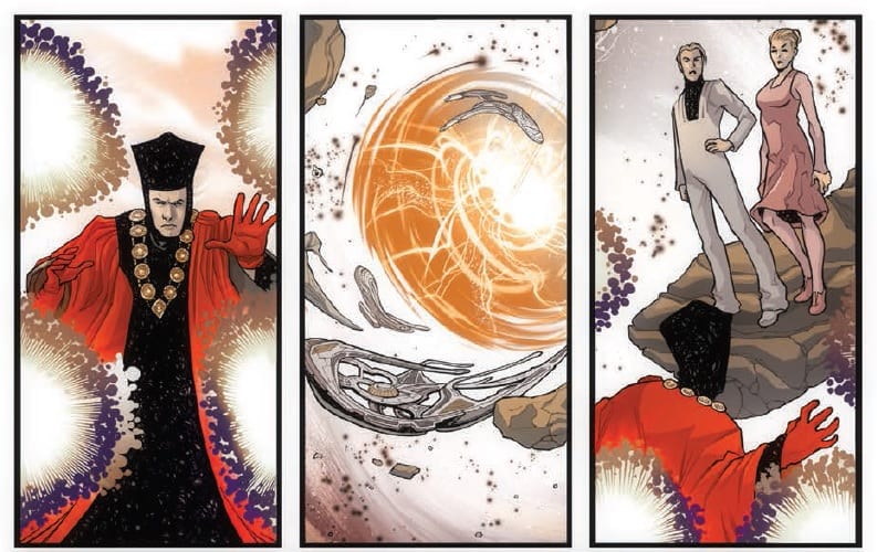
After the cliff hanger from issue four, with Q on the brink of all-out war with the Wormhole aliens, this issue starts with a dull thud. The opening panels are energised and bristle with unbelievable power but all too soon it’s over. Intervening in the conflict are additional members of the Q continuum and they instantly calm the situation down.
The games are allowed to continue but Q has received a talking too that may prove to be his undoing. As if to counter this, Q’s next mission involves one of the deadliest creatures in the known universe: The Borg Queen.
Scott and David Tipton soldier on with their crossover, attempting to get in every aspect of the franchise they can before the six issue run is complete. As previous issues, each new game features aspects from one of the franchises and this month is the turn of Voyager. Unfortunately, even before the game is introduced any engagement that the reader has with the story has been shattered by how quickly the last encounter is tied up.
Issue four had a jaw dropping cliff hanger with two mighty powers about to go to war. This issue starts by sweeping it all conveniently under the carpet. The Tipton’s forgo the difficult job of dealing with the consequences of their narrative by introducing a bland ‘reset button’. Like so many other aspects of this series, just as there appears to be anything of any substance, it is quickly disposed of and put away so that the tedious central concept can continue unabashed.
Credit where credits due, The Tipton’s know the characters of Star Trek exceptionally well, each individual has their own distinct voice. It is a shame that the story itself is made the main focus and also has the least amount of substance. The obsession with fitting in as much as possible from the Star Trek Universe is hampering the storytelling and dragging the narrative down into a quagmire of references and unnecessary characters.
By the end of this issue the reader should be at peak excitement, leading as it does into next month’s finale, however, just like the opening, the ending lacks any sense of drama. Throughout the entire issue there is no sense of danger, threat or excitement and one of the most dangerous villains in Star Trek history turns out to be as effective as a shop mannequin.
Star Trek The Q Conflict #5 Credit: IDW Publishing
Art
The art work continues at its usual standard. The pencils by David Messina and inks by Elisabetta D’Amico are impressive but the script does not give them a chance to shine. Last issue there was an element of drama to the layouts and panels but this month it has become very static and any adventurous spirit has flown the coop.
There are a few moments of space battle that almost get the blood pumping but these are restricted to single panels. No sooner is the reader engaged than they are pulled back out of the narrative by long winded chatter and even more character introductions.
Alessandra Alexakis does a wonderful job on the colors, making the scenery look and feel like Star Trek, and Neil Uyetake’s somehow manages to fit all of that speech onto the page without detracting from the artwork. Unfortunately for them, the over explanatory script and lacklustre plot has switched the reader off long before their work can be appreciated.
Star Trek The Q Conflict #5 Credit: IDW Publishing
Conclusion
Star Trek The Q Conflict has wavered from the beginning. It is a great concept but it is drowned by a need to squeeze as many characters in as possible and limits the space in which to tell a story. The last issue had a glimmer of hope and appeared to be leading somewhere but that was shot down in flames in the opening of this issue.
It is the story that is at fault as, for the most part, the art work endeavours to tell a Star Trek story in the best way possible. There are some wonderful character renderings and the scenery is pitch perfect Star Trek. The plot, however, has meandered through the different incarnations of the franchise desperate to include as much as possible without giving any of it to space breathe. Each villain that has been introduced has barely posed any threat, apart from the Wormhole Aliens, and this month was an insult to a character that was portrayed brilliantly on the screen.
Maybe it is a blessing that there is only one issue left in this story because to endure much more would be cruel punishment indeed.
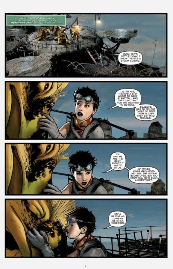
Sonata #1 by creators David Hine, Brian Haberlin, and Geirrod Van Dyke serves as a sweeping introduction to an impressive new science-fantasy story from Image Comics.
This first chapter lays out a clash between two cultures. At issue: a planet which both see as the key to their species’ respective futures. Our protagonist, Sonata, hails from the peaceful Ran, who come into conflict with the aggressive Tayans after the latter dams their shared water supply.
The Writing
Sonata #1 is an impressive opening from writers Hine and Haberlin. The title character is enjoyable as a protagonist, and characters feel believable and engaging. The worldbuilding, though, is one the story’s strongest assets.
From the beginning, the writers manage to exposit without resorting to info dumps. We have a good grasp on who are characters are, why they’re here, what they’re doing, and even the relative complexity of their technologies in comparison to one another. Then, add in some fascinating ideas, like a species of ghoulish-looking monsters called the Sleeping Giants, and a deeper layer of the planet’s mythos uncovered by the issue’s end. It’s rich, colorful, and inventive storytelling.
The stakes in the story are also laid out very clearly from the outset of Sonata #1. The colonial mission which brought the people to this planet is a one-way trip. Survival is on the line; thus, if the two can’t coexist, they could face mutual extinction.
The only real minor complaint here is the black-and-white nature of their conflict. One society is peaceful, living harmony with nature, and maintains good relations with the planet’s indigenous people. The other is violent, seeks to dominate nature, and views others as primitive and inferior. On one hand, there is some precedent for the Tayans’ stark colonialist worldview if you look at human history. On the other, it sets up a pretty clear dichotomy of “good” versus “evil,” with little space for ambiguity. Both ultimately feel a little one-dimensional as a result.
That notwithstanding, Sonata #1 opens multiple avenues for the plot to explore, and makes for a very compelling opening chapter overall.
The Artwork
Haberlin provides pretty stellar art for the book. From the opening pages, the illustrations are eye-catchingly stunning.
There’s an impressive level of detail on display, from the alien settings to the character designs. It’s all presented with a vibrant, lively sense that makes the work leap off the page. Each panel on each page feels carefully-planned and constructed. While the work often remains pretty tightly-focused on the characters, from time to time Haberlin provides a full-page illustration or wide shot that absolutely blows the reader’s mind.
Of course, Van Dyke’s colorwork on Sonata #1 really helps bring the work to life. It’s incredibly rich and vibrant, giving each page the level of life it deserves. The colors are really beyond reproach here.
Final Thoughts
Sonata #1 may be one of the strongest debuts of 2019. It’s a compelling, well-constructed story with intriguing worldbuilding and eye-popping artwork. You’ll definitely want to add this one to the pull list.
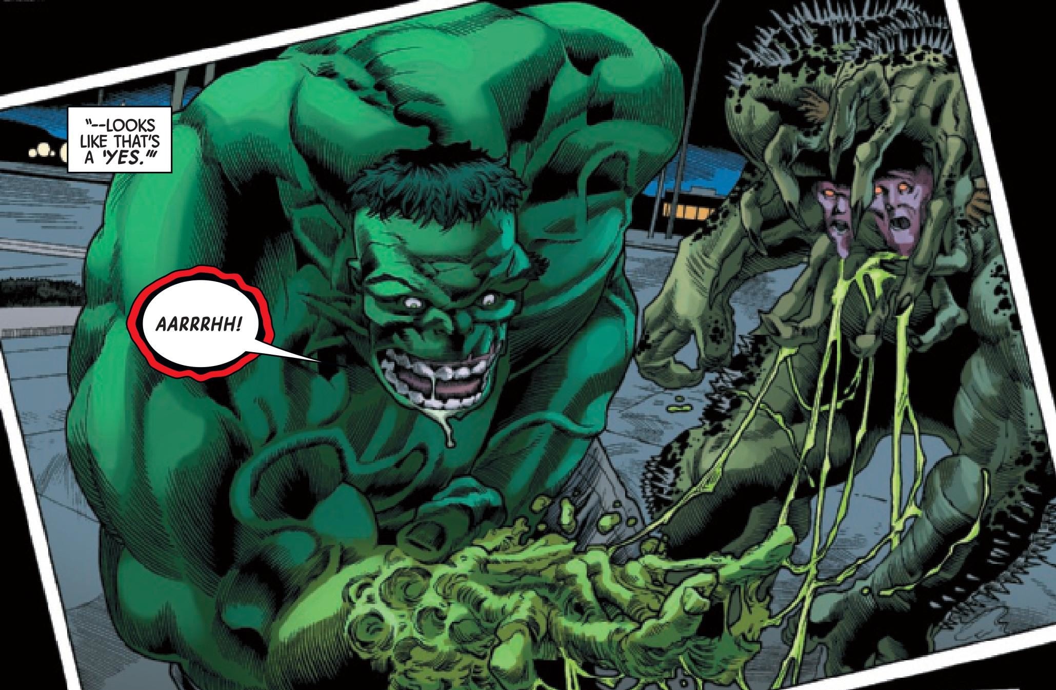
THE IMMORTAL HULK #19 takes a different angle than previous issues by focusing on someone other than Bruce Banner/Hulk. Readers instead bear witness to the rage and pain of another human-turned-monster: Betty Ross. Her turmoil leads her on path to Bruce, who’s busy fighting the new version of Abomination made from the corpse of Rick Jones. Suffice it to say, these three unfortunate characters are in for a confrontation that will reveal an unearthly rage and make the earth tremble.
Story
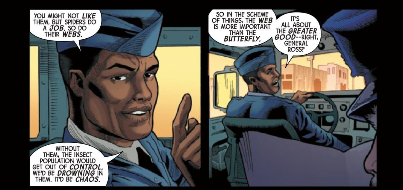
Al Ewing doesn’t pull any punches with this story, giving full light to the innermost turmoil of its characters. The legendary author takes readers into Betty’s memory of riding with her military father and one Captain Fortean. Betty comments on a butterfly stuck in a spider’s web, wondering if it will be able to escape. Fortean remarks how it’s important for spiders to keep the insect population in balance and how the butterfly’s likely death will be for the greater good.
Betty doesn’t seem convinced and with good reason – her inner dialogue reveals she’s identified with that butterfly ever since. Ewing uses this effective parallel throughout the story to represent Betty’s rage and feelings of entrapment. Like the butterfly in the spider’s web, she’s been caught between the anger of her father and Bruce himself, struggling to stretch out her wings and truly be herself. Unfortunately, the anger has so twisted her innermost self that the resulting monstrosity wants nothing more than to kill Bruce and anyone standing in her way.
Art
Just when one thinks the artwork in this line couldn’t be more gruesome, penciler Joe Bennett presents new levels of horror. And this is exactly what makes the comic come alive. His depictions of the Hulk’s flesh dissolving after coming in contact with Abomination’s acid are given added definition with Ruy José and Belardino Brabo’s solid ink work. And colorists Paul Mounts and Rachelle Rosenberg’s putrid greens and brown hues add the cherry on top to this horror-themed artwork.
VC’s Cory Petit’s lettering further plunges readers into the story. He often features font that looks as if it’s made of slime during Hulk and Abomination’s battle scene to create the effect of it splattering all around.
The Comic Covers
Alex Ross’s main cover depicts a grotesque image of Abomination with Rick Jones’ face inside his jowls, setting the theme of inner turmoil that’s present within this story.
Greg Smallwood’s variant cover, on the other hand, features the Hulk fighting the Fantastic Four to celebrate the 25th anniversary of the MARVELS series and showcase a key moment in his history. Ema Lupacchino and David Curiel feature yet another variant that shows an armored Spider-Man being shot at, which has little if any connection to the story within.
Conclusion
THE IMMORTAL HULK #19 combines themes of horror, love, and pain in a way that leaves one in utter shock. Ewing, Bennett, and the rest of the creators have shown they can effectively bring the darkest aspects of human nature to life.
What did you think of Bruce and Betty’s confrontation? Let us know in the comments below!
From the fantastical story to the psychedelic art, Silver Surfer Black #1 balances between a mind-bending space romp and a touching exploration of a beloved character.
From the start, Silver Surfer Black #1 examines the heart of the titular character.
Silver Surfer Black #1
Story: Donny Cates and Tradd Moore
Art: Tradd Moore
Colorist: Dave Stewart
Letterer: VC’s Clayton Cowles
Warning: the following article contains spoilers for Silver Surfer Black #1. Reader discretion is advised.
STORY
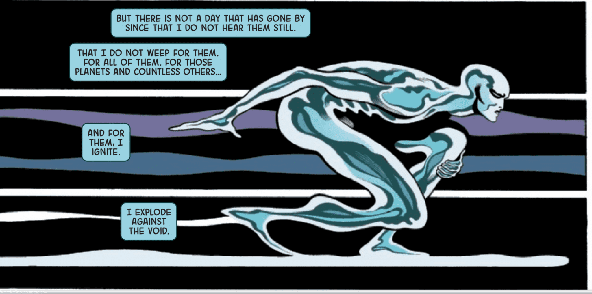
Though Silver Surfer is one of Marvel’s most powerful cosmic characters, he hasn’t received many chances to show why he’s a beloved hero in recent years. Fans of the character were likely disappointed when he literally fell into a black hole in Guardians of the Galaxy #1. But Donny Cates, the writer of this Guardians series and Silver Surfer Black, clearly has important plans for Norrin Radd. In the span of one issue, the Surfer saves the other heroes from the black hole, pulls himself back from the brink of destruction, fights alien gods and meets the “big bad” in Cates’ Venom series. That’s all in a day’s work for Silver Surfer.
With just a few lines, the narration from Radd’s perspective Cates and co-writer Tradd Moore help readers unfamiliar with the Surfer understand the character’s classic struggles. From describing Radd’s guilt over his role in Galactus’ destructive feeding to showing his preference to use non-violent methods, the writers construct an accessible starting point for new readers and an entertaining reintroduction for those who already know the character.
The narration is consistently stunning.
By using eloquent prose, Cates and Moore make the narration the strongest element of the issue; a number of the lines make the reader stop and dwell for a moment on the passionate words. “I listened and played deaf to the sounds of the dying, pleading and screaming of [these] people,” the Surfer says. “I heard their songs. And I did nothing but shine my light down upon the dying.” Radd’s guilt is devastatingly tangible and his remorse makes him even more sympathetic.
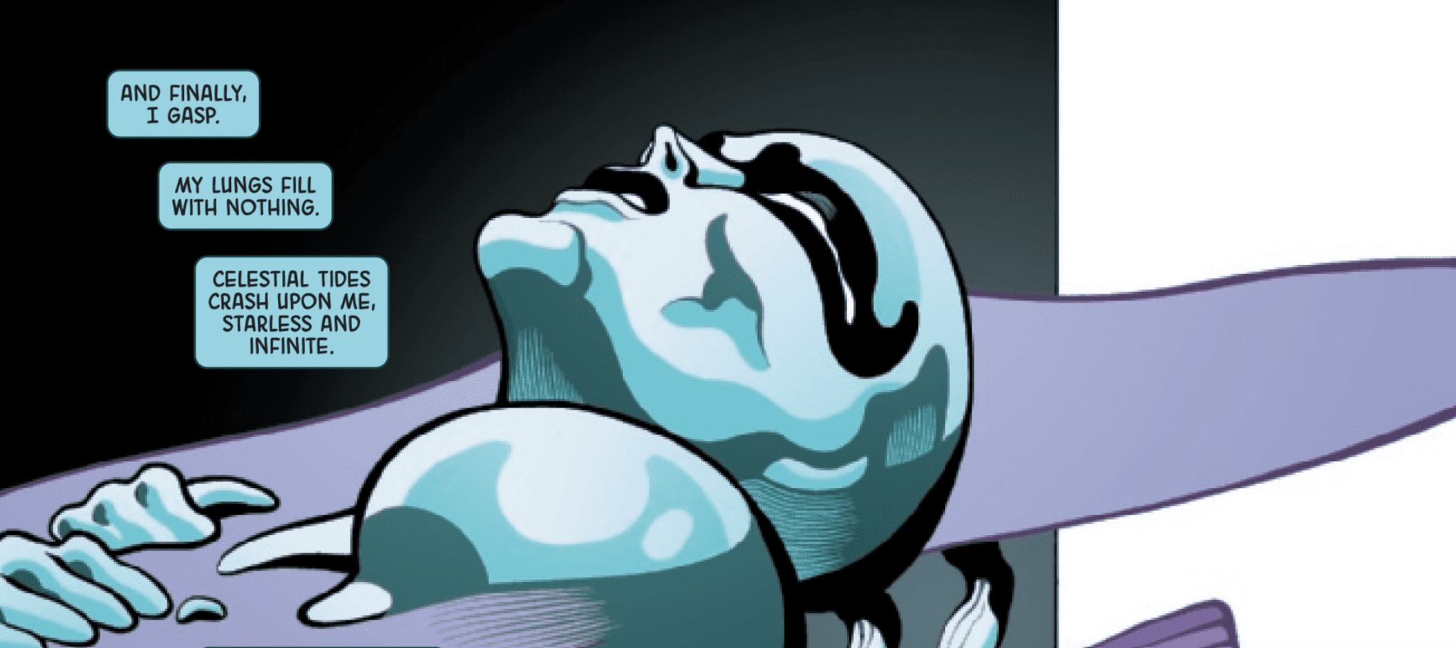
Logically, this issue focused on the Surfer as an individual; though the writers show how Radd saved the other heroes from the black hole, they spend too much time on this plot thread. Instead, the majority of the story focuses on the Surfer’s fight to survive his own journey through the metaphorical and physical darkness. After he uses the last of his strength to rescue his allies, he tumbles through space, where he’s “unmade” while reality distorts around him.
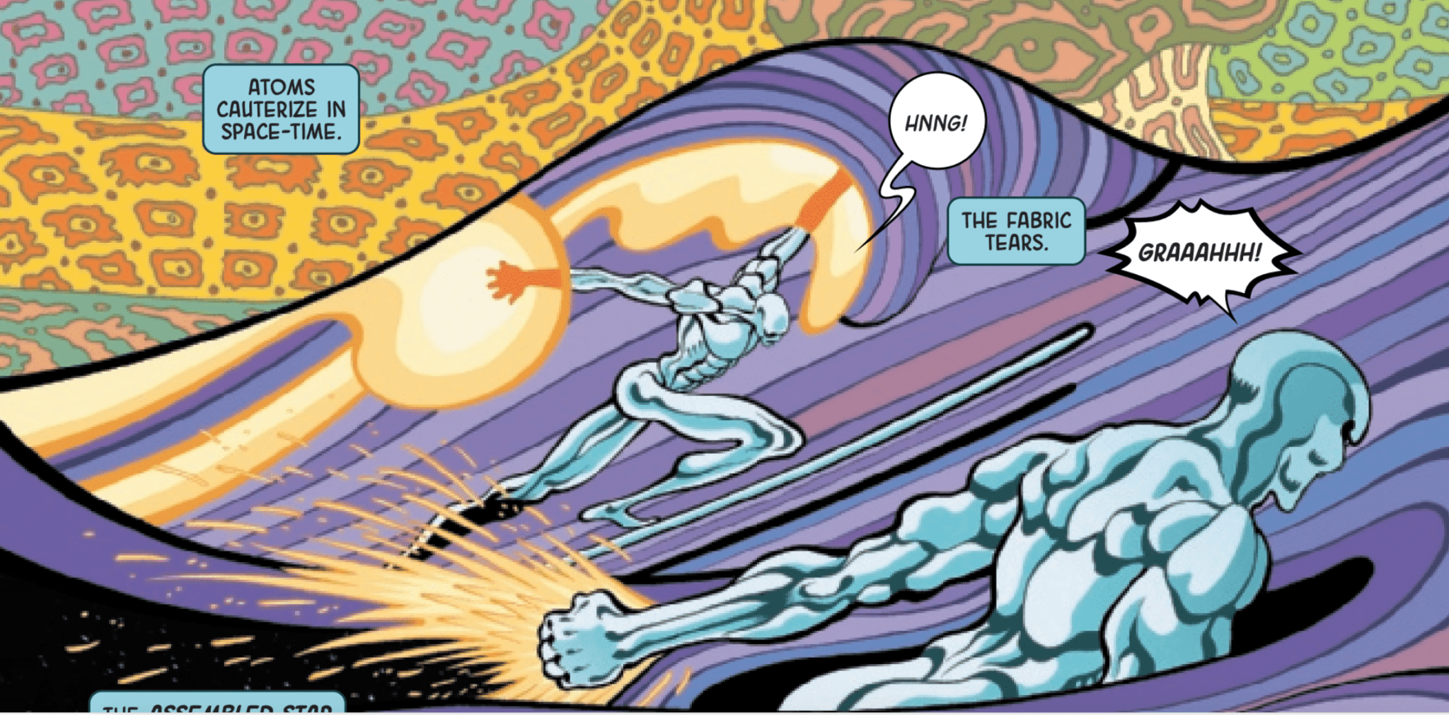
The Surfer falls through a black hole and Tradd Moore’s art makes the experience feel trippy.
The journey nearly brings Radd to the end of his rope; “I drown [and] I am lost,” he says. Of course, no matter the circumstances, the Sentinel of the Spaceways doesn’t give up. In just one issue, Cates and Moore break the Surfer down and build him back up again. After a brief healing process, he answers the call when a killer must be brought to justice.
Radd’s search for the killers bring him to a foreign planet and, when he’s attacked by some sentries, the Surfer demonstrates the full extent of his powers when they refuse to peacefully yield. Once again, though the Radd finds himself in a no-win situation, he perseveres. Cates and Moore make the hero’s brave tenacity shine as bright as the silver that covers his skin. “Though weakened, I am far from helpless,” he says. “Though outnumbered, I am unafraid. And, though far from home, without a soul in the universe to come to my aid , I never battle alone,” he continues. The Surfer has regained his place as one of the most impressive characters in the Marvel Universe.
Thanks to a mysterious black goo, the Silver Surfer’s hand lost its shine.
Part of that journey back to the top can be credited to a mysterious black goo. The substance tips the scales in Radd’s favor during his fight with the sentries, who turn out to be alien gods. After touching the goo, Radd’s hand turns black. The Surfer unloads with a massive burst of energy that enables him to defeat the gods. The mystery of the black goo is one of the few unanswered questions left at the end of the issue. Hopefully, the rest of the miniseries will explain the Surfer’s transformation and the power that fueled it.
ART
The Surfer’s trip through a black hole feels psychedelic.
When trying to describe the artwork, one word keeps coming to mind: trippy. During Radd’s trip through the black hole, Moore warps the Surfer’s body in bizarre ways that enhance the story’s fantastical tone. Similarly, the alien gods look like they’re creatures from Alice in Wonderland, which adds to the dream-like quality of the art. Likewise, colorist Dave Stewart uses bright, vibrant and unusual hues of many colors, including celestial pinks and purples.
Throughout the issue, the artwork complements the story by elevating its emotional impact. When the narration suddenly shifts from talking about himself to discussing a discussion of Galactus’ violent feeding habits, Stewart uses blood red for the background to augment the jarring juxtaposition. Moore makes Galactus’ face look demonic and, in some panels, like the classic version of Frankenstein’s Monster. Moore and Stewart combine with the narration to make the Devourer of Worlds and his destruction horrifying. This excellent cooperation, between the story and the art, can be found on each and every page of the issue; few comics can claim that.
Galactus looks like Frankenstein’s Monster in Silver Surfer Black #1.
With Silver Surfer Black #1, Marvel delivers an exceptional introduction to a new miniseries and it also functions fairly well as a standalone issue. The art is consistently a sight to behold and the narration deserves to be reread multiple times for its heartfelt expressiveness.
What’d you think of Silver Surfer Black #1? Do you plan to continue reading the miniseries?
Nick Spencer’s “HUNTED” arc has concluded, but there’s plenty of fallout. AMAZING SPIDER-MAN #23 gives us an epilogue to Kraven’s final hunt.
***SPOILERS LIE AHEAD***
Imagine hunting and killing your whole family of clone brothers to prove yourself to your father. Imagine then having that father swiftly taken away from you by your own hand. The final image of your father underneath your swelling, bloody hands is him in a Spider-Man outfit.
Kraven may be gone but his clone-son may be even more tragic and deranged given the origin we just experienced. He passes on his name and entire identity to this clone-son who will be the new Kraven The Hunter going forward. It may damper the emotional resonance of this story, but it’s pretty well done as far as clone replacement stories go–especially in Amazing Spider-Man comics.
Spencer has setup a whole mess of future threads. The Savage Six becoming an official gang is the most exciting. If we learned anything from Superior Foes Of Spider-Man and all the scenes with Boomerang in this run of Amazing Spider-Man, it’s that Nick Spencer makes C and D level super villains into top tier characters.
Taskmaster and Black Ant repair their bromance after a “Tasky” betrayal. Their relationship has been an absolute joy and another instance where Spencer has been able to take lower tier villains and transform them into your new favorite characters.
We get some closure on Peter’s horror vision of Mary Jane as he races home to find that she was actually fine. This is where we get another tease for the future story that Spencer has been slowly building towards since the very first issue.
We don’t know anything about this centipede stalker operating in the shadows, but Spencer has been playing the slow-burn perfectly and the hype is growing. One of the most enjoyable elements of this Amazing Spider-Man run has been the old school approach to building tension and drama. It’s rewarding to read Spidey comics again, we seem to have a lot to look forward to.
One of the biggest treats of Amazing Spider-Man #23 is the return of artist Ryan Ottley. We get to see his iconic take on the symbiote suit as well as a large chunk of heroes and villains we hadn’t previously seen him illustrate.
Ottley still blows me away with Spidey’s movement and poses every time he graces the book with his talent. It’s not a flashy style, but it’s one that fits the character and his movements perfectly.
Texture is something that Ryan Ottley excels at, and there’s plenty of it in Amazing Spider-Man #23. From Lizard’s scales to Taskmaster’s skull, there’s a bunch of different textures on display that readers can easily imagine what they would feel like under their finger.
Colorist Nathan Fairbairn gives these textures more depth and does wonderful work blending colors together in scenes like the prisoners escaping only to be met by the Avengers and Fantastic Four. A lot of the characters in this issue have very simple color layouts but Fairbairn keeps the pages very lively.
At the time of this review, the final page was not shared with us by Marvel. The mysterious funeral attendee’s identity remains a secret until Wednesday. My first guess would have to be Kraven’s brother, The Chameleon. Be sure to check out the issue on 6/12!
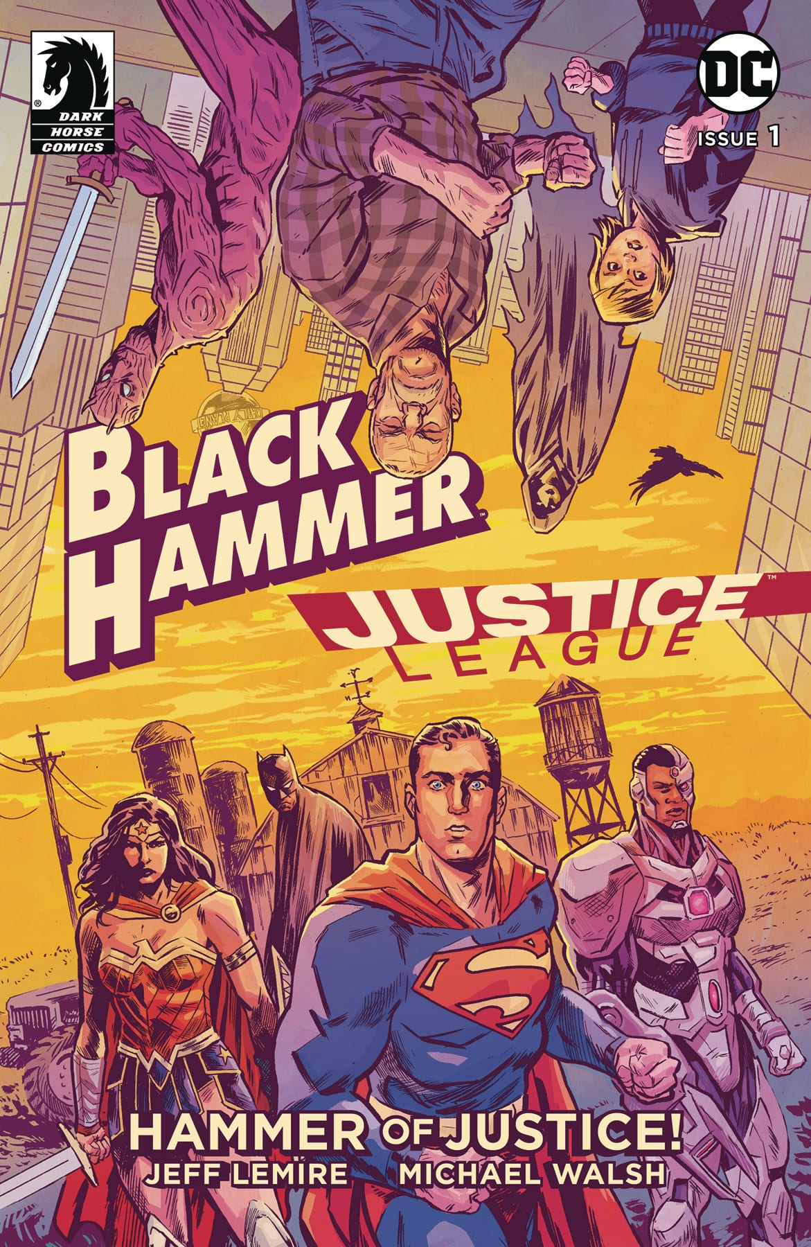
Black Hammer/Justice League #1 by Jeff Lemire, Michael Walsh and Nate Piekos sets up one of the most interesting, mysterious and unique company/character crossovers we have seen. It’s a superhero ‘event’ as only the Black Hammer family could do.
A strange man arrives simultaneously on Black Hammer Farm and in Metropolis, and both worlds are warped as Starro attacks! Batman, Green Lantern, Flash, Wonder Woman, Superman, and more crossover with Golden Gail, Colonel Weird, and the rest of the Black Hammer gang!
Black Hammer/Justice League#1 Written by: Jeff Lemire Art by: Michael Walsh Letters by: Nate Piekos
Black Hammer created by Jeff Lemire and Dean Ormston
This review contains MILD SPOILERS
Story
Black Hammer has always been a comic that is ABOUT comics. In telling his own unique superhero epic, Lemire and company have also been playing with genre tropes and expectations. So bringing in a well-known property like the Justice League opens up all kinds of possibilities. This initial issue is mostly set up and it’s simple (mild spoilers will follow): a strange man appears to both the Black Hammer characters and the Justice League; he switches the places of both. Oh, and the JL were fighting Starro when it happens. So now we have the JL characters living on the idyllic ‘farm’ and the BH dropped right into the middle of a fight with a giant space starfish. Either situation is now ripe for awesome possibilities.
Lemire also does a great job making this accessible to new readers that maybe aren’t very familiar with BH. Comic fans will, of course, recognize what the various BH characters are supposed to represent, but casual readers are given enough info to get a grasp as to who these characters are. The Justice League is well known enough, and Lemire (who has written the JL characters before in various comics) writes them a way that is very recognizable.
The story also seems to be very important to the overall ongoing Black Hammer mystery, so diehard fans this is not just a cash grab or throwaway ‘event’. It fits in with everything that has been going on.
Art
All of the various Black Hammerbooks always have great and unique art. This one is no different. Michael Walsh falls in line with all the other BH family of artists. The linework here has one foot in the superhero world (especially in the JL scenes) with the layouts, dynamic poses and energetic panels. And the BH scenes perfectly match the more scratchy, muted and ‘eerie’ feeling the main title gives out. Walsh is handling pencils, inks and colors and just straight up doing a bang up job. Like all Black Hammer books, it’s very pretty to look at.
Conclusion
If you have or have not been reading Black Hammer, then Black Hammer/Justice League #1 is a must buy. It’s a perfect introduction to this world for new readers AND it’s thrown a wrench in the ongoing mystery for the longtime fans. It’s truly the best of both worlds.
Black Hammer/Justice League #1 is scheduled to be released on July 10, 2019.
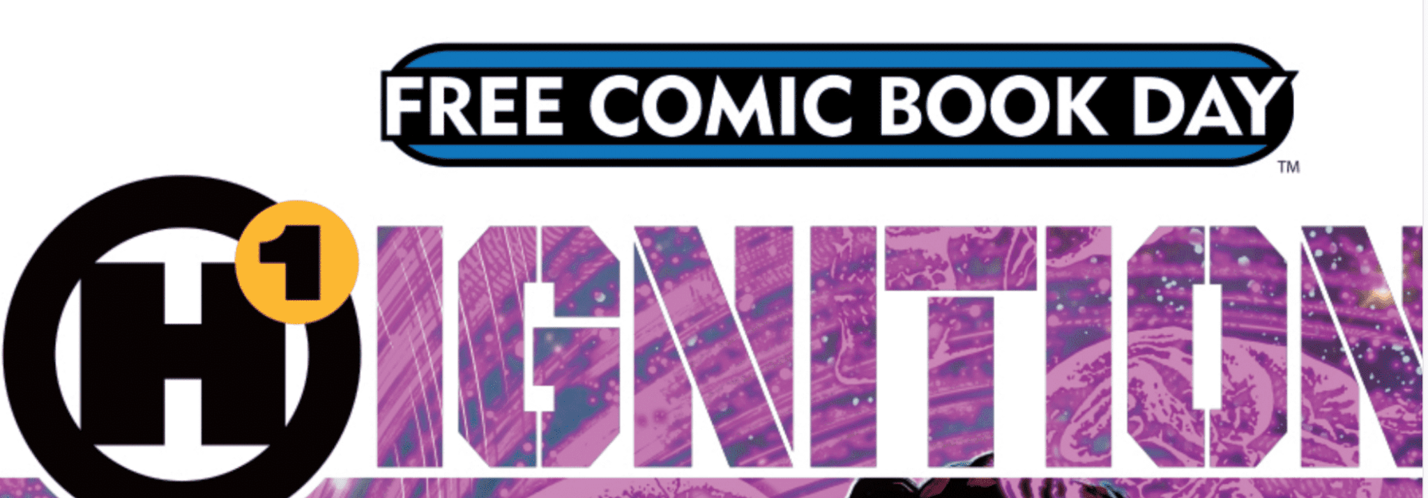
It takes more than a promising premise and a notable name to reasonably predict the success of any project. But, early on, all signs indicate that Humanoids’ H1 Universe could be an alternative to big-name players like Marvel and DC. Now, with the release of Ignited #1, the world has been introduced to this new line of comics, which is headed by acclaimed writer Mark Waid.
Ignition is the spark that sparks the H1 Universe
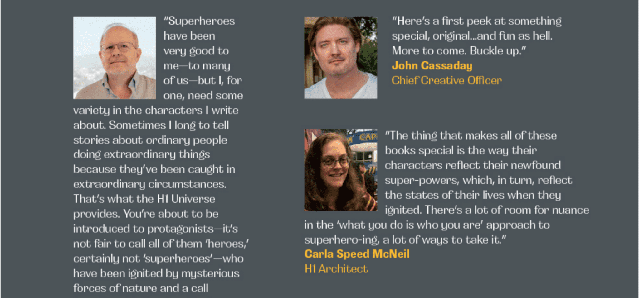
Along with the other H1 architects, Waid is saying all the right things about what readers can expect to find in this universe. In Ignition, the Free Comic Book Day special issue that launched H1, Waid states, “in superhero universes, there’s always a certain status quo that must be maintained. Not here…. The possibilities of H1 are endless and very dangerous.” That “status quo” has worked for decades and it’s why Marvel and DC continue to be so successful. But, amongst other downsides, the formula has become predictable; most of the time, you know what to expect in an Avengers story. Though it’s still highly enjoyable because it uses the same beloved characters, we should welcome an enticing attempt to break the mold.
Mark Waid and other H1 Architects are saying the right things but can they deliver?
Speaking of which, one of the most compelling aspects of H1’s mission statement is its rejection of genre. Like Waid, Jonathan Lang, the writer of the upcoming Meyer series, was quoted in Ignition. He states, “at other publishers, genre was always pushed front and center, sometimes at the expense of the character’s authenticity. H1 provides the vehicle to get stories into a truly diverse and character-based world. This is not a marketing ploy. It’s in H1’s very DNA.” Forcing stories to fit into strict genres and categories has been a criticism of comics for quite some time. Similarly, many fans have wanted to see the Marvel Cinematic Universe branch out of typical superhero cinema and explore romance, horror and other genres. Based on Lang’s quote, it sounds like H1 will focus on placing its characters in diverse styles of storytelling. Mark that as another point in H1’s favor.
With this new line, Humanoids strives to deconstruct genre and reject other patterns of the industry. But these encouraging signs only offer an incomplete peek at the reasons comic book fans should be excited. We all have different reasons for reading comics. Many fans use them to escape from the real world; it can be liberating to get lost in worlds where heroes like Batman and Captain Marvel roam. But this escapism has a price: comics sometimes struggle to genuinely tackle real-world issues. Once again, H1 seeks to buck this trend.
In Ignition, Kwanza Osajyefo, an H1 Architect, states, “it’s been said that the best stories touch on actual issues. Ignited stabs at the nerve of what’s happening in our real life. The series approaches superhumanity in a more real and relevant way.” H1’s comics embrace the problems that pervade the world as we know it and, potentially, they’ll serve an alternative function in the reader’s life. Rather than offering pure escapism through wild, fantastical stories, H1 will allow readers to remain engaged with reality by pulling narrative threads right from the headlines.
With Ignited, H1 shows that its stories will be heavily grounded in reality.
Waid drills the point home when he discusses the inspiration for Ignited. He asks, “what if the Parkland survivors had the power and resources to effect change on a monumental scale?” According to the writer, that’s exactly the pitch for the series. Waid, who references himself as a “socially conscious political wonk “ says these comics are firmly tied to the world we live in every day. This realistic approach could allow H1 to powerfully explore meaningful topics.
Still not convinced? The diversity of H1’s creative team is the most encouraging component of the new universe’s foundation. As the Director of Creative Development Waid spearheads the project and a wide range of voices will help shape his vision. The team consists of Osajefyo (co-writer of Ignited,) Magdalene Visaggio & Darcie Little Beaver (Strangelands) Devin Grayson (Omni,) Lang (Meyer,) Quinton Peeples (Big Country) and Helen Mullane (Nicnevin and the Bloody Queen.) Combined with the other aforementioned factors, this diversity could legitimately set H1 apart. It’s 2019 and the most powerful players in the game (Marvel and DC) are still struggling to consistently incorporate fresh perspectives. Both companies have been criticized because the majority of their comics are still written by straight white men. As a result, H1 has an opportunity, like with other complaints against DC and Marvel, to answer fans’ hopes by emphasizing diversity and inclusiveness.
Right now, it’s way too early to say that H1 will be successful or that it’ll ever challenge the most successful publishers. But, with this new comic book universe, Humanoids is taking a number of common criticisms of comics and building itself a platform by addressing them. It’s a good time to be a comic book fan and H1 could make it even better by revolutionizing the industry.
What do you think about H1? Do you think it has the potential to make a difference in the comic book industry?
Criminal Underworlds, family gatherings and dynamic magical violence form the backbone of AfterShock comics‘ new series Trust Fall.
Ash is a young woman trapped inside her family home. She has a ‘gift’, some call it a blessing, some call it a curse, but her gift means she is over protected by her family. They keep her house bound except for special missions and as a result her view on the world is slightly off-kilter.
Trust Fall #1 Credit: AfterShock Comics
Writing
Christopher Sebela introduces the reader to this world from the point of view of Ash. We see the world as she sees the world; see it as she has come to understand it. The city she lives in, known to her as The Wild, is like any other major city in the world but Sebela is able to distort the image because of Ash’s unique world view. In a lot of respects, she has lived a sheltered life and Sebela brings this out through the narration.
There is a running theme based on ‘definitions’ throughout the comic, with Sebela portraying the world from the inside of this emerging criminal family. Ash’s view of the people around her has been manipulated by her family and her upbringing. Sebela is setting up his central character for a fall, referenced in the title and again in the early pages of the comic. The reader gets to know the world Ash lives in, as she sees it, so that we can then learn about the ‘real’ world in time with Ash.
Trust Fall is set up as a coming of age story, a tale of self-discovery in a criminal world tinged with magic. Family features as the central point for Sebela’s discussion, as he makes it clear that families can be loving, protecting, and caring but also, cruel, manipulative and self-centred. In Trust Fall Sebela is asking what it means to be a part of a family, for good or bad.
Trust Fall #1 Credit: AfterShock Comics
Art
Chris Visions’ art work is overflowing to the point that the pages can barely contain it. He creates a sense of dynamism that affects not only the images within the panels but the panels themselves.
The layouts are anything but consistent. He mixes up the use of gridded pages with stacked images to push the narrative forward and create a vibrant, ever moving, atmosphere. The action sequences are outstanding and capture the chaotic nature of the violence they portray. The boarders break down and gutters disappear as one action leads into the next, extending a brief moment in time so that it seems to last much longer.
The overlaid conversation gives the moment more of a temporal rigidity as the act of reading enforces a sense of timing onto the reader however, the energy created by the visuals takes over and pushes the reader forward at a much faster pace.
Even when you get to sedate scenes, such as a family meal, Visions’ art work is bursting with uncontrollable energy. The emotional conflicts between the characters is represented not only through the figures interactions but the layouts and colors. There is a physical sense of overpowering and oppression around the table. Trust Fall’s emotional impact is relayed through the art work, while Sebela’s narration and speech unleashes the plot.
There is a lot of exposition and narrative throughout Trust Fall but it’s barely noticeable as Hassan Otsmane-Elhaou threads it into the art work as if they are one and the same. He stacks and overlays the speech balloons to match Visions art style, creating a multi layered image. Often the speech is the main focus for the reader, leading them through the page but at other times, the lettering slips into the back ground almost, to allow the art to tell the story.
Trust Fall #1 Credit: AfterShock Comics
Conclusion
Trust Fall is a densely packed first issue in every sense. There is a solid plot inhabited by a number of very strong characters. Sebela has crafted his world building into the story structure so that it works on several levels to give the reader a deeper understanding of the characters and settings.
This layering is then visually represented to perfection by both Visions and Otsmane-Elhaou. The aesthetic of Trust Fall stands out from the crowd and makes a significant mark in the sea of comic books that are available. The energy is so vibrant that a quick flick through would entice any reader.
As first issues go, you couldn’t ask for more; Trust Fall has emotion, intrigue, action, and stunning visuals.


 Black Hammer/Justice League #1