Home Blog Page 427

Review: Deadpool Battles Nightmares in DEADPOOL ANNUAL #1

Monkeys Fighting Robots

In Marvel Comics’ Deadpool Annual #1 (on sale August 21), writer Dana Schwartz forces Wade Wilson to face the worst nightmares of others, which makes the Merc With A Mouth confront some gritty, uncomfortable truths. But the issue misses the mark because it doesn’t allow Wade to face his own fears.

Deadpool Annual #1
Wade Wilson is back in Deadpool Annual #1

Deadpool Annual #1

Writer: Dana Schwartz

Penciler: Reilly Brown

Inkers: Nelson DeCastro with Craig Yeung

Color Artist: Matt Herms with Guru-eFX

Letterer: VC’s Joe Sabino

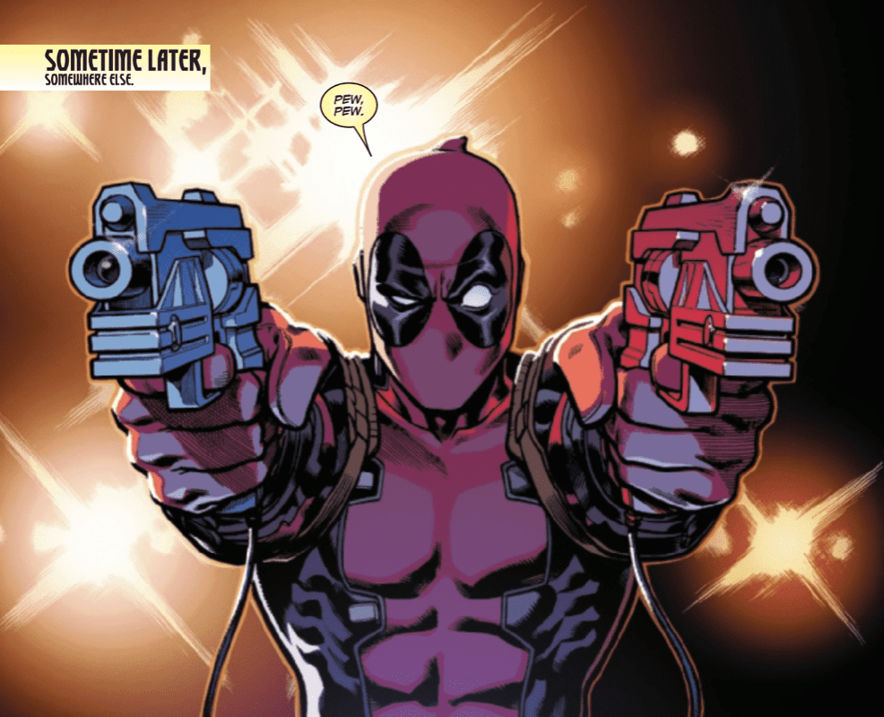
Sometimes, the thing fans love the most about Deadpool can be the character’s most glaring weakness. The Regenerating Degenerate is known for cracking wise and approaching life with a sarcastic sense of humor. This levity can be bittersweet, though. That’s abundantly clear in Deadpool Annual #1.

Schwartz doesn’t explicitly describe the relationship between eight-year-old Peter Quincy and his adult neighbor Mr. Hewitt. With that being said, it’s heavily implied that Hewitt abuses Peter, which leads the boy to request Deadpool’s services. The reveal of the abuse doesn’t arrive until the climax of the issue. The journey to that point is filled with Deadpool brushing off the words of Nightmare, the villain he’s forced to face as part of the “Acts of Evil” line. In typical Deadpool fashion, the antihero makes jokes almost every time Nightmare opens his mouth. This behavior undercuts Nightmare’s credibility as a villain and also makes it difficult to take the plot seriously.

Deadpool Annual #1
It’s hard to take this comic seriously when Deadpool adds too much levity to the serious moments.

Deadpool laughs at everything the villain throws at him, including a visit to a dream sequence in which President Abraham Lincoln mourns the loss of life in the Civil War. By the time the intended twist (Peter’s relationship with Hewitt) arrives, the reader is so detached from the story that even this emotional moment fails to resonate. Throughout the comic, there’s clearly a missed opportunity for some character growth. Wade could confront his own fears and potentially move past them. Instead, he focuses on Peter and Nightmare chooses to flex his muscle by taking Wade to two irrelevant dreamscapes. As a result, the comic doesn’t successfully dig deep enough to stand apart from its predecessors.

It’s par for the course for Deadpool to excessively insult his villains and soften the tone of the story; but other comics have struck a more effective balance between attempted humor and serious content.

On the surface, it’s hard to evaluate a Deadpool comic because they’re supposed to be funny. Humor is inherently subjective so it’s unfair to write one of these comics off because the success of the comedy depends on the reader. But the best Deadpool stories genuinely capture the character’s voice and, more often than not, Schwartz fails to do so here.

Whether it’s in the movies or the comics, Deadpool’s pop culture references are one of the many reasons he’s such a fan-favorite. Usually, these references are timely or, at the very least, they’re accessible. Here, Schwartz packs a number of dated nods to pop culture characters into the story. In the span of a few pages, Wade calls a mailman Cliff Clavin, Mr. McFeeley, Herman Post and Willie Lumpkin. Readers who immediately understood these references might find that they worked well. Others who had to google the names to understand the attempted joke will probably disagree. 

Time and again, the jokes don’t land. In a Deadpool comic, that’s a problem. At one point, Wade claims, “I guess I’m not exactly ‘haha’ funny. More like ‘New Yorker Cartoon‘ funny. So…no, [I’m] not very funny.” Actually, at his best, Deadpool is one of the funniest characters in comic books. The two movies starring Ryan Reynolds as the Merc With a Mouth are perfect examples of that.

Deadpool Annual #1
The comedy doesn’t always work but there are times when it hits the mark.

To be fair, the comedy does work a few times in this issue. Early on, Peter invites Deadpool into his room. In this scene, the comedic timing is impeccable. “I did write some other letters…maybe just two or three…hundred to Squirrel Girl,” the boy says. The line is split between two panels. In this sequence, the collaboration between penciler Reilly Brown and letterer VC’s Joe Sabino is one of the best elements of the comic.

First,  Brown focuses on Peter so the reader can’t see the rest of his room. The next panel allows the kid to complete the line and the viewer to see Peter’s obsession with Squirrel Girl. Between the reveal that he sent hundreds of letters to the hero and the fact that his room is absolutely filled with merchandise displaying the character’s likeness, this moment showcased the creative team’s sense of humor.

Deadpool Annual #1
The shrine in Peter’s room is one of the best parts of this comic.

The comedy is elevated by the illustration of the memorabilia. Brown, inkers Nelson DeCastro with Craig Yeung and color artists Matt Herms with Guru-eFX make Peter’s room feel like it belongs in the Joker’s circus. In the corner, a stuffed animal of Squirrel Girl looks terrifying; the black shadowing around its eyes make the toy look more like Pennywise the Clown than a friendly superhero. Just a few feet away, Peter’s headboard prominently displays Squirrel Girl’s face. This design is creepy in a different way. The face looks friendly but it’ll still be horrifying to wake up and see it staring at you in the middle of the night. Thanks to the art team, these designs turn Peter’s room into a off-putting shrine of Squirrel Girl. It’s fair to assume that Deadpool would view the room in that lens and the artists exquisitely convey that mindset.

Fans of the Merc With a Mouth will want to like Deadpool Annual #1. Though some of the comedy is effective, it usually fails to connect and it dilutes the gravity of the plot. Ultimately, it’s up to the reader to decide whether the comic is still worthwhile if that’s the case.

What do you think of Deadpool Annual #1? What do you hope to see Wade do next?

Monkeys Fighting Robots Youtube

Review: 47 METERS DOWN: UNCAGED Offers A Better Concept With Poor Execution

Was a sequel to 47 Meters Down necessary? There hasn’t been a decent shark film since 2016’s The Shallows, which starred Blake Lively trying to survive a shark all by herself. Two years ago, 47 Meters Down released and starred Mandy Moore and Claire Holt as two sisters who find themselves trapped at the bottom of the ocean with several great white sharks. The film featured a unique concept that was handled horribly and ended on a sour note. Now, a standalone sequel has arrived to offer a better concept with the same bad execution.

Johannes Roberts returns to write and direct this claustrophobic sequel, and the screenplay shares a lot in common with the first film. 47 Meters Down: Uncaged stars Sophie Nelisse, Corinne Foxx, Brianne Tju, Sistine Stallone, Davi Santos, Khylin Rhambo, Breck Bassinger, and John Corbett. Similar to the first film, the plot focuses on two sisters, but these sisters are having a hard time bonding after their parent’s recent marriage. What a better way to bond than by nearly being eaten alive by multiple sharks?

Struggling stepsisters Sasha (Foxx) and Mia (Nelisse) decide to go on a scuba diving adventure with their two friends to an underwater Mayan city. Once they reach a certain point in the caves, they realize they aren’t alone and are trapped with the deadliest ocean predator. Roberts and co-writer Ernest Riera put together some of the worst dialogue for these girls. For instance, upon entry into the cave, there is a back and forth between two of them where they make mention of butt sizes. It just comes across in a cringe way, and maybe that’s also because these girls aren’t the best actors. The screenplay doesn’t spend enough time building up the four main girls involved, it gets you acquainted and then it’s time to watch them die.

47 meters down uncaged underwater
L to R – Brianne Tju, Corinne Foxx, Sophie Nelisse, & Sistine Stallone.

47 Meters Down: Uncaged has a unique set design for the characters to swim around in, some of the sequences are very intense and the film does keep you on the edge of your seat. However, it’s amazing how in two years the CGI for the sharks has somehow gotten worse. 47 Meters Down: Uncaged may have been inspired by Neil Marshall’s The Descent (A better film) but it borrows more from its predecessor, which is why it fumbles. The performances are just so uninspired and not good at all, but for most of these girls, this is only their first or third film.

Roberts should focus on directing more and writing less, he has the potential to one day make a very well done film. Some of the film’s best shots are when the girls are captured with a shark swimming right behind them without their knowledge. Adding to that, there are a few instances of slow motion and it’s some of the worst slow-motion sequences since Jeepers Creepers 3. Luckily, the film’s end is a slight improvement over 47 Meters Down, but it’s more ridiculous than the last one. There is never a dull moment in 47 Meters Down: Uncaged but there isn’t a single thing to make you care about its characters or their survival. The score composed by musical duo tomandandy compliments the intense moments featured in the film, but to enjoy this movie you have to turn off your brain completely.

47 Meters Down: Uncaged won’t be included in the small list of shark films to watch repeatedly like Jaws, Open Water, or The Shallows. A movie that goes bigger in its concept, but doesn’t seem to properly execute it because it spends more time borrowing all of the mistakes from the last film, so much so that both films have the same runtime.

Monkeys Fighting Robots Youtube

Review: SCARY STORIES TO TELL IN THE DARK Is PG-13 Horror Done Right

Scary Stories To Tell in the Dark is surprisingly a well done PG-13 horror film. From time to time there comes a horror film that shows how effective it can be without being R rated. Two standouts within the last decade include Insidious and The Conjuring, both directed by the talented James Wan. These films managed to frighten audiences by ditching blood and guts to focus on building tension with solidly written characters involved and a growing sense of danger. While Scary Stories To Tell in the Dark isn’t nearly as effective, it still a great example of just how effective a PG-13 horror film can be.

Directed by André Øvredal and based on Alvin Schwartz’s popular children’s book anthology series of the same name, the film follows a group of friends in the late 1960s who discover an old book that writes the horrific fates of the townspeople. The film’s cast includes Zoe Colletti, Michael Garza, Gabriel Rush, Austin Abrams, Austin Zajur, and Natalie Ganzhorn. For those that grew up with the book series, Scary Stories To Tell in the Dark will certainly bring back old childhood fears.

The central plot focuses on Stella, Auggie, Ramon, and Chuck, a group of teens who discover a book in a haunted house that brings their fears to life. Sound familiar? That’s because this is the 2015 Goosebumps film done properly. Make no mistake about it, this is a movie about stupid teens doing stupid things, but they are all likable in some way. Chuck brings fills the cliched comedic role, Stella is the brains of the operation, and Ramon is the new kid in town. Despite being based on a series of children’s stories, the film pushes the boundaries a bit but remains very playful and lighthearted.

scary stories red room
Austin Zajur in SCARY STORIES TO TELL IN THE DARK to be released by CBS Films and Lionsgate. Image courtesy of CBS Films.

Adding to that, each cast member does a solid job in their respective role, but Colletti’s performance as Stella is a standout, as she can make you care for her character’s situation more effectively out of everyone else. Of course, she is the main character so it would be expected that the film’s lead effectively carries it, and she does that very well. It will be interesting to see what she brings to the table for the inevitable sequel.

One thing that hinders Scary Stories To Tell in the Dark, is its lack of time spent with the monsters involved. These monsters are visually pleasing to see on screen, except for the Jangly Man, who doesn’t seem properly edited. With each new scary story, there comes an introduction to another monster, but only five to ten minutes is spent with each one. Even Harold, who is one of Scary Stories To Tell in the Dark’s well-known monsters doesn’t get enough screentime. Scary Stories To Tell in the Dark would rather spend its runtime discussing racial injustice and other social issues, almost as if Jordan Peele stepped in for a brief cameo in the writing department. These are all background elements that don’t connect to the film’s monsters or its main story.

Luckily, the talented Autopsy of Jane Doe director showcases just how good he is at building tension. Øvredal delivers effective PG-13 scares that rely heavily on tension building and a few jumpscares. Also, Marco Beltrami and Anna Drubich’s score compliments the film’s tone and atmosphere.

While not a complete home run, Scary Stories To Tell in the Dark has a lot of good elements that are blended very well for the most part, but the screenplay is lacking in some places. Adults that grew up with the series of books will certainly get their nostalgia trip and everyone else who is unfamiliar with the concept will equally have just as much fun.

Monkeys Fighting Robots Youtube

Review: NEON FUTURE Shows a Future That May Not Be So Bright

Monkeys Fighting Robots

Neon Future #6 from new comic publisher Impact Theory came out Wednesday. With this release came the accumulation of Neon Future’s first arc in spectacular fashion ending with a bang whilst setting up the future.

Impact Theory’s Neon Future wrapped up its first art last week in spectacular fashion, setting up an exciting future for the series.

A History Of Neon

When marketing a new company, the best way to start is with a big name, and Impact Theory did just that with Jim Krueger. The idea of Neon Future formed in the mind of Co-Founder/CEO Tom Bilyeu’s mind when he heard of Steve Aoki’s plan to cryogenically freeze himself after his death. Thus, Bilyeu went on the hunt for a writer. Having coffee with Eisner winner Krueger, he knew who would anchor the project. Neil Edwards and Jheremy Raapack then joined as the series’ pencilers, with inks courtesy of Keith Champagne and colors by Abe Lee.

Krueger and team set out to make a new realistic future with help coming from Steve Aoki himself and Team Aoki. The inspiration from Aoki was so deep that the main character Kita Sovee is the musician’s doppelganger. Neon Future draws heavily from the dozens of recognizable Sci-Fi’s before it but never falls into straight ripping them off.

At the end of each issue, Bilyeu leaves a letter for the reader that shows how much pride and love he has for the company, team, and Neon Future. This letter shows that love and more with his announcement of another arc of Neon Future in the form of six issues. Talk about getting a reader excited!

A Future Made Of Neon

Neon Future starts in the future, thirty years to be exact. Yet it feels much like our recent times with America divided into factions. A.I. and automation are causing mass unemployment, with the government now being under a new authoritarian rule. This rule promises a return to simpler times without advanced tech. They create Article 10, referring to it as ‘The Return’.

This ‘Return’ will bring jobs back to many by removing the technology that caused job loss, but would also put out Augmented humans with jobs. Creating a divide between those with integrated technology (Augmented) and those without (Authentic). Sounds like a lot to take in, right? You could also say it sounds like a possible future for our real world.

The world Krueger builds within the first half of Neon Future shows how much work went into it: its politics and history. We learn much of the lore through character interactions and narration. Diving into a new world may seem like a lot but with great crafting, the creative team weaves in lore masterfully. The series starts with a bang by having recently deceased TV personality Clay Campbell narrate his death/rebirth. As irony prevails, Campbell is captured by the augmented that he hunts, the underlings of Neon Future’s Leader, Kita Sovee.

Kita finds Campbell’s death as a great opportunity to have one of their past nemesis be on their side. Augmenting Campbell, Kita brings him back from the brink of death, allowing him to choose the path of the butterfly or blade. That’s where that awesome logo comes in. Campbell, surprised and frightened, decides on running away.

Following this escape, Krueger writes a dirty future filled to the brim with bigotry, showing Authentics mattering more than those Augmented. In these moments, Neon Future starts to show its heavy-handed cards with scenes showing how divided the population is. Many characters use slang names for people that are Augmented. But fear and hatred goes both ways, with those augmented having names for the Authentics.

The first half of Neon Future relies greatly on Krueger’s world-building while showing the problems happening in the world. Campbell’s first steps with augmentations quickly bring the realization of how the ‘other side’ is treated. Our team of artists paints what seems like a peaceful line of augmented people going home with one becoming singled out and running away just to be shot down.

Through these gorgeous panels nearly void of words but heavy in dark colors, Campbell and the reader learn that the violence we’ve seen previously isn’t just a one-off moment. Although Neon Future has lighter funnier moments throughout, it’s equally balanced. This synergy of humor and seriousness works out well making Neon Future hard to put down.

Each new character introduced feels interesting in their own respects, with none feeling wasted for the story. Not much is known on Kita, but each time he graces the page you want more time with him. As Campbell learns what it’s like for those he hunted, we learn the grizzly facts along with him. In Neon Future, there is no easy way or even “correct” way. But for Campbell’s turning point, we have a moment that hits hard.

With the fear of being alone, Campbell gets the help of Kita’s left-hand woman Dee to help him back home, only to learn that hatred can run deep. Even though her son is back, now that he is augmented, Campbell’s mother doesn’t see it as a positive. This pivotal moment is when Campbell seems to start believing in Kita and Neon Future.

From this moment on, Neon Future strays from the plot and starts to focus on Campbell’s character with some Neon Future sprinkled in. One issue focuses entirely on Campbell learning to fight, showing the shift to a singular character story. Then the series moves on to the finale, but this is where we’ll stop. No point in having everything spoiled for you! These last few paragraphs seem like a lot but there is much more in the first three and last three issues of Neon Future’s first arc.

Neon Art/Neon Lights

Teaming for the art department is Neil Edwards and Jheremy Raapack with inker Keith Champagne and colorist Abe Lee. Throughout Neon Future, there are moments with gorgeous, fluid art that flows from panel to panel, where, in other instances when images are brought to the forefront, the lines seem to take a hit. This happens mostly with faces. Some start looking awkwardly mushed towards the characters face like a hand grabbed them forcefully from the back and squeezed.

This isn’t with every face we see, but enough of them that you wish you didn’t see so many conversations. This problem happens with other items, like guns, machinery, and body parts, but they don’t draw as much attention as the faces do. On one fight scene in Neon Future #6, one character, and their enemy looks the same size (as they should be for plot reasons), but in a few separate panels, their sizes change with one growing humongous and the other smaller. Then they’re back to normal. This size-shifting looked quite weird, throwing off what was a great story-driven moment.

I also love this cover. Between the beautiful bright colors and it being one of my favorite characters from the comic I would totally buy this as a poster. And the other as a poster!

Besides those minor issues, Neon Future’s first six-issue arc has fantastic art that flows well with the pacing of the story. The team easily mixes chaotic fights with easy to follow moments that are akin to poetry in moments. With Lee’s colors, the art becomes a living and breathing futuristic world. The darkness is never overshadowed by the bright light. Lee adds that extra layer that helps excel the world the team is building. As the series goes on, additional color artists join the team, such as David Kim, Nuo Xu, Anthony Washington, Gabe Eltaeb, and C’endan Clairborne, with Lee moving into the Art Director position.

Neon Closures

The first six issues of Neon Future are that of a building foundation with more than a few hands on the cement roller. What started as a story of the worldwide ramifications of Article 10 and the division of people the story quickly devolved into a singular focus. This is most noticeable in the last three issues, with Neon Future starting to lose sight of its own story. Within the first three issues, we see a vast world ripe with venues to explore and stories to tell, but starting with Neon Future‘s fourth chapter, our narrative starts to focus singularly on Campbell and his story.

Campbell’s story is a blast to read through, but with how the story is written and plotting forward in it’s first few issues, it feels as it should stick its focus on the world with Campbell being an after story. That just speaks to Krueger’s fantastic world-building and a plot that makes you invested into the world, but when Neon Future opens each issue with an explanation of “The Return,” it feels like the story was shifted in what was going to be something else.

Instead of a story of what may be a future, we receive one focused on a man. The title implies that it’s about our future or the group known as Neon Future itself, but instead, it spirals into the life and times of Clay Campbell. The next arc promises a wider reach into the world, so here’s to hoping that arc keeps the great world building and the world at large story that its first few issues had.

The first issues creative team page compared to….

One problem seems to stem from how large the cast of story creators is. We have six people for the “story” section alone, which could’ve been what contributed to the weird shift we saw midway through the series. None of these observations take away too much from how great the story is. At points, it holds its inspirations on its sleeve while not ripping straight from those sources, with Krueger’s writing pushing the story forward with the speed or lack of when the plot calls for it.

The lettering in Neon Future #1 falls upon Clem Robins, but as the series goes on, so does the letterer, with Samantha Levenshus, Farhad Heydarian, and A Larger World taking over.

Following Robins departure we see the lettering team take more chances with some fun encounters happening, making characters scream names like they do in superhero comics. But Neon Future’s lettering only plays with fonts and placement every once in a while but doesn’t try too much, instead of playing it safe and close to the chest.

..The final issues creative page, which becomes cluttered with names and a few job changes.

A factor that does set Neon Future apart from the others: it has recap pages! I’m a sucker for these when I read monthly titles because we all know sometimes you just need a quick recap.

For a debut series, Impact Theory did phenomenal with Neon Future. By the end of the first arc, you will crave for more of the world and its characters. To support Impact Theory, directly purchase Neon Future from their website here!

Side Note: What the hell happened to the internet?

Memorable Quote: “There’s not enough yoga in the world to calm me down with a fucking dragon coming after me, Kita!” – Clay Cambpell.

I can’t even stay calm when a dog looks at me. Good luck staying calm when a dragon stares you down!

Monkeys Fighting Robots Youtube

Review: Battling With Grief In FAITHLESS #5

Monkeys Fighting Robots

Brian Azzarello and Maria Llovet ask you to witness the fall and rise of an artist in Faithless #5, published by BOOM! Studios this week.

Set deep in an erotic world of lust and magical nightmares, Faithless combines horror and beauty like nothing else on the shelf. Grief and suffering surrounds Faith as those she loves push her to express her emotions in artistic ways. But how much loss can she take and who are her real friends?

Battling With Grief In FAITHLESS #5
Faithless #5 Credit: BOOM! Studios

Character Focus

After the second, shocking, death of one of her friends, Faithless’ heroine becomes despondent, desperate to close herself off from the world. Fortunately, Mr Thorn will not allow that, mostly because the crying woman is making his sofa untidy.

The opening page is perfect example of Azzarello and Llovet’s commitment to character. Nine panels with no background focuses the reader’s attention directly on Mr Thorn as he talks, seemingly, directly to the audience. It is not until the final tier of the page do you realise that the conversation is two sided. Azzarello uses the speech to demonstrate the characters easily distracted train of thought while also implying the supernatural element of his life.

From this moment onwards the focus shifts to Faith herself as she moves through her grief. Each of her interactions allow a different stage of grief to be addressed and the facets of Faiths personality are explored. She is a contradictory, complex person and this is highlighted through her conversations, especially the park talk with Ginny. Her friend points out her double standards when it comes to Poppy and reluctantly Faith faces this.

Battling With Grief In FAITHLESS #5
Faithless #5 Credit: BOOM! Studios

Drawing On Faith

Maria Llovet captures the reaction shots of Faith during these various conversations beautifully. The reader can see the denial followed by acceptance in Faiths body language alone. Llovet is able to draw the personalities out of the characters making them act in every single panel. Her figure work is so full of life and energy. The change in Faith between the start of this issue and the end is visible in the way Llovet draws her; she grows as a character before the reader’s eyes.

The panel layouts are fairly standard, with Llovet employing stacked panels that stretch the width of the page. She then breaks up one of these panels to draw attention to a particular action or sequence. This intensifies the moment; in one instance giving it a sense of almost uncontrollable desire and in another adding importance to a seemingly insignificant object.

Llovet’s art work is simply gorgeous and bursting with color. Each page is a melee of visual delights. She is able to represent the bustle of a children’s playground in an instant setting the scene which is then evident across the page. She is also able to use the background to lead the reader through the panels to accentuate the character’s actions. Llovet uses the entire page to tell the story so that the reader gets an indication from a simple glace what is happening. Then the reader is drawn into the page by the panel layouts and the lettering.

The lettering on the sound effects is playful and colourful. It has a hand-drawn style that perfectly matches the art work behind it. The lack of black outlines means that the sounds appear to emanate from the images rather than be separate from them. They blend in with the scenery and characters.

The speech balloons, by AndWorld Design, also have a hand-drawn aspect to them. The irregular shape of the balloons matches the style of the comic as a whole. A slight change in coloring helps to identify who is speaking in some of the scenes and well placed balloon tails link the speech to the character even if they are off panel.

Battling With Grief In FAITHLESS #5

Conclusion

Faithless is a passionate work of Art. If you don’t get caught in the magical embrace of the narrative, it may be easy to get lost in the story or question the character motives. A number of the sequences require the reader to accept a certain care free abandonment of usual narrative structure. Elements from previous issues, like certain big plot points, are barely mentioned or even overlooked entirely in this issue. Azzarello and Llovet hope that you will put these to the back of your mind while you follow Faiths journey.

Faithless is a compelling comic with complex characters and adult content that isn’t just about uncensored sexual exploits. It demands a mature reader and rewards you for allowing the narrative to flow like an uncontrolled river rather than a structured canal. By this point in the series any reader should know what to expect and the creators do not let you down.

Monkeys Fighting Robots Youtube

Review: PRETTY VIOLENT #1 Is a Pleasurable Gore-fest Of Cartoon Violence

Monkeys Fighting Robots

If over the top violence and strong language is your thing, then Image’s new series Pretty Violent will rip out your guts! This colorfully violent ongoing is out this Wednesday, full of gore and lots of swears, delivering on everything its title promises.

In this day and age, everyone wants to be a hero, even someone whose family members consist of villains. That’s where Pretty Violent #1 begins, with our main character Gamma Rae and her desire to be different. Having been born strong, she (unlike her siblings) has the desire for good deeds–not wicked. But with every dream comes the crushing of said dreams, and the crushing of body parts.

Over the course of Pretty Violent #1, Gamma Rae learns just how hard it is to become a hero while learning how hard it feels to be hit with a dead body. Writers Derek Hunter and Jason Young violently present the plot in the first few page, showing what our main character desires and how a world filled with heroes this desire will become a violent gore fest.

Gamma Rae goes through multiple setbacks throughout Pretty Violent #1, but is constantly covered in optimism (and gore) for her goals. At points she gets literally caked in gore, yet her costume stays clean. Either that’s a superpower in itself or she has a great tailor! She has a cape so we know it’s not Edna Mode.

With art that’s reminiscent of Adventure Time and other new age cartoons, it makes sense that Pretty Violent #1 is drawn by Derek Hunter, who was an animation designer on the show. Hunter draws a colorfully violent world where Gamma Rae’s adventure to becoming a hero leaves a wake of bodies. Brains splattered, guts ripped asunder, and many other acts of horrific violence are drawn in such a cartoon matter that they seem more fun than it should.

When having a character ripped in half, not many artists think to make it fun or have the guts spell out DEAD, but that isn’t the case with Hunter’s art in Pretty Violent #1. Bright colors by Spencer Holt mixed with flavorful uber violence help carry Gamma Rae story to becoming a hero. If Pretty Violent #1 was drawn in anything other than over the top cartoon antics it wouldn’t work as well as it did, or stand out as such.

Violence spills from the panels into the white space of the pages causing fights to seem bigger than keeping them confined in panel. Hunter does this playing with panels in a few different instances and ways to make Pretty Violent #1 be exactly what its title implies. This unique take on art doesn’t stop on just the art side, but Hunter plays with speech bubbles, dialogue and sound effects.

Onomatopoeia and sound effects are a highlight in comics, but aren’t used often in different or fun ways. Granted that could be because more and more comics feel the need to be “serious” to be the next classic, but Pretty Violent #1 has no care about any of that. Instead Pretty Violent #1 is more concerned with having fun and making the reader feel as if they’re watching an adult version of Saturday Morning Cartoons.

Gore and body parts aplenty, Hunter uses this to his advantage by turning blood or guts into sound effects. This method makes it so the violent hits in Pretty Violent #1 feel more dramatic and akin to a cartoon. Much like a cartoon, Hunter makes the emotions of characters feel overdone. This use of overdone or overly drawn emotion is seen in most cartoons and works perfectly in this universe.

Over the top violence in Pretty Violent #1 wouldn’t have worked to such a great effect if not for Holt’s vivid colors. Hearkening back to its cartoon nature Pretty Violent showcases majestic use of brighter and lighter coloring mixing in with the gore. With this colorful take on violence the images pop off the panels that much more.

Pretty Violent #1’s art carries this debut issue more so than its plot. The characters may be fun and over the top, but that’s all. The story doesn’t break boundaries for comics, but damn will you have a fun time reading it. Unlike other comics that are trying to be the next Watchmen or such, Pretty Violent doesn’t seem to be going for that, going instead for a story where you can pick it up to enjoy beautiful, gory, over the top violence that will stick in your head.

Pick up Images Pretty Violent #1 at your local comic store this Wednesday!

Monkeys Fighting Robots Youtube

Review: STRONGHOLD #5 – All Good Things..

Monkeys Fighting Robots

This week sees the final issue of Stronghold from AfterShock Comics hitting the shelves and when Gods are woken can anyone survive the unparalleled anger that has been brewing for centuries?

From the very first issue Stronghold has been ambitious and pushed the boat out when it comes to storytelling. The individual creators are all on top form but when they come together they produce something spectacular. Although it may not be selling numbers to equal Marvel or DC comics, Stronghold has the potential to be a significant title in comic book studies. At its heart is a meta-deconstruction of superhero tropes and science fiction clichés.

STRONGHOLD #5 All Good Things..
Stronghold #5 Cover Credit: AfterShock Comics

Gods Of Fiction

In this final issue Phil Hester questions the concept of Gods and aliens. He draws lines between the two and then raises concerns over the blind acceptance of both. Over the previous four issues Hester has built up Michael’s life just to tear it all down again in the finale.

The story moves at a break neck speed in the first half of this issue. Hester brings the major characters together in ‘The Temple’, which is the title for this chapter. Once everyone is in place everything is explained and it’s quite the mind blower: a conspiracy, centuries in the making.  In narrative terms it’s like Jonathan Hickman and Alan Moore got together to write a superhero story. Think Miracleman crossed with The Black Monday Murders.

The scale of the story has exploded over the course of the five issues but Hester manages to keep the entire narrative rooted in two characters, Michael and Claire. Their relationship has grown over time and the interaction between them allows the reader to accept the rest of the story. It is also a narrative crutch on which the plot leans. Without the believable characters the story would fall apart.

STRONGHOLD #5 All Good Things..
Stronghold #5 Credit: AfterShock Comics

Myth Building Art

Elements of the Superhero genre are replicated within the pages of Stronghold but they have been subverted to meet the needs of the narrative. Superman’s Fortress of Solitude has been turned into a tomb to bury the history of the Primacy, otherwise known as Michael. The concept of a safe haven for the superhero to escape to has been twisted by Hester and turned into a palace of false worship and disturbing imagery thanks to Ryan Kelly’s artwork.

The reader is introduced to the Temple slowly before a full page spread exposes the vast, empty horror of the Primacy’s past. Kelly keeps the backgrounds obscured in the early pages to make the full reveal more impactful. The sense of wonder and awe is mixed with revulsion and fear in the vast space of rock and petrified Titans. The scale of the Temple reflects the scale of the narrative as the history is unveiled.

The design of Michael’s real self is alien enough to standout against the humans surrounding him but still recognisably Michael. This is achieved through a mix of intricate inking and a contrasting coloring. Dee Cunniffe makes Michael’s form stand out in the panels by giving him an unnatural purple color, free from shades. His appearance represents the alien-ness of his heritage and creates a division between him and the humans, even the augmented humans like the Holdmother.

The division is important for the plot and the visual expression makes it much easier for the reader to accept. In a comic as complex as Stronghold has become it is important to make the storytelling as clear as possible and this is exactly what Kelly and Cunniffe have done.

The final piece to the puzzle is adding the drama. While the script and the art build a lot of the tension and establish character, it is arguably Simon Bowland’s lettering that gives the story it’s pace and, in turn, builds the drama. He splits the speech up and spreads it across multiple panels, like paragraph breaks, giving each idea or phrase its own space to breath. Sometimes he uses connectors to stretch the break and at other times his balloons butt up against each other.

By changing the types of links between balloons Bowland is able to draw out speeches or condense them depending on the narrative weight of the statements. He also keeps the majority of the balloons floating up against the top of the panel boarder. This makes it easier for him to emphasis a particular speech balloon simply by bringing it down, into the panel so that it doesn’t touch any of the boarders.

STRONGHOLD #5 All Good Things..
Stronghold #5 Credit: AfterShock Comics

The End

Stronghold has a complex, multi-layered story and technically wonderful art work. As this is the final issue the story of Michael and Claire inevitably has to come to an end. And it is in the closing pages of this comic where the only complaint can be levelled at it. The whole thing is over too quickly. Hester and Co wrap everything up in the last few pages and it feels too sudden. In some ways it is like an episode of Star Trek: The Next Generation where the plot is neatly wrapped up in the final five minutes.

After the roller-coaster ride of a series the ending comes too soon. It is lacking a final chapter, an aftermath to the story. This would allow the creators to examine other aspects of the Superhero genre while giving the characters and solid send off.

Despite the abrupt ending, everything about Stronghold is expertly produced to create an exciting, multifaceted comic. It can be read on a number of levels and will appeal to a wide range of readers. It is a self-referential science fiction story that takes comic book craft seriously. Anybody who reads comics should be reading this and anybody who studies comics should be studying this.

If you have not read the previous issues it may be too late for you to get into Stronghold but I would recommend, without doubt, to hunt down the trade collection as soon as it is released. You will not be disappointed.

Monkeys Fighting Robots Youtube

Review: BAD RECEPTION #1 And How To Ruin The Perfect Day

Monkeys Fighting Robots

Bad Reception from AfterShock Comics is a modern horror about a collection of friends who gather for a wedding and go off grid with no internet, no phones, and no contact with the outside world.  What could possibly go wrong?

Chapter one, Vows, sets the scene by making the reader follow a trail of blood through the darkness in one of the most ambitious opening gambits in any comic this year. Juan Doe, creator, writer and artist on the comic, engages a risky approach to bringing the reader into the story. The first third of the comic contains caption boxes of a radio interview overlaid onto a black background with an expanding red trail splitting the page in two.

The trail starts like a sound wave, representing the radio interview but grows as the interview becomes more intense until a double page reveal hammers home the true nature of the trail. Doe slowly builds up tension, making the reader question where this opening is going and the anticipation he creates pays off on that double page; it’s a jaw dropper of a moment.

BAD RECEPTION #1 And How To Ruin The Perfect Day
Bad Reception #1 Cover Credit: AfterShock Comics

Daring Openings 

The openings strength lies in introducing the two main elements of the story in a very simple, minimalistic way. The trail of blood leads ultimately to the murder aspect of the comic, something that will be picked up in later issues, while the radio conversation sets out the Technological element of the story. It introduces the reader to the concept of Nomophobia, the fear of no-mobile-phone, which in turn explains a large part of the character’s personalities and reactions further down the line.

The opening is bold and daring. The number of pages it takes up illustrates Doe’s commitment to the cause but could in fact put some people off. This is not how a mainstream comic would handle this type of story. Doe takes his time, making sure that he makes his point without rushing it. He teases the reader for several pages, making them wait for the payoff.

If this comic is going to lose any readers, it will be in those first few pages. If you make it to the end of the opening still engrossed, the shock factor alone will see you through the rest of the comic. If you skip a head you will not be invested enough to continue with the comic.

BAD RECEPTION #1 And How To Ruin The Perfect Day
Bad Reception #1 Credit: AfterShock Comics

Characters Good And Bad

Doe’s lettering and coloring in the opening of Bad Reception is very straightforward but is an approach that works particularly well for this type of story. The Radio conversation has formulated caption boxes with two colors, one for each speaker. It makes it very clear on each page who is talking.

As the story progresses Doe uses contrasting colors on the page to highlight different aspects of the plot. The top two thirds of each page are given over to introducing the characters. Doe has his two central characters compile a wedding guest list and then shows each guest being invited to the wedding. This is a beautiful way of introducing the characters and each of their relationships with the happy couple.

Doe changes the panel coloring for each guest to distinguish between them on a page and give some instinctive indication of their personality.  Doe’s protagonists have a warm, emotional red tinge that also foreshadows future events, as indicated by the opening.

To contrast all of the guests introductions, there is another character being introduced in the bottom third of each page. There is no text, no speech to give the reader any clues as to who it is but there is a lot to indicate what kind of person it is. The colouring is a mix of blood red and deep, cold blues. The actions portrayed are violent and merciless. Doe juxtaposes the introductions on each page comparing the technological needy, carefree friends and family of the couple with the wild, off the grid character in the bottom third of the comic.

This approach to storytelling constantly underlines the threat to the characters. With the bottom third being used in this way Doe is able to keep that element of violence in the reader’s mind on every turn of the page; you simply cannot escape from it. This creates additional tension and builds suspense perfectly. Doe is able to introduce a large number of characters while maintaining a disturbing, lingering atmosphere.

BAD RECEPTION #1 And How To Ruin The Perfect Day
Bad Reception #1 Alternative Cover Credit: AfterShock Comics

Conclusion

This is a difficult first issue. Doe has a lot to introduce in the way of characters and concepts but he manages to do it with an element of flair and panache. There are a number of complex characters that Doe introduces and each is an individual from the moment they appear on the page. The framing of the story allows a naturalistic introduction and the layout of the pages allows Doe to create an unsafe environment for the reader. He does not let you forget the violence at the heart of the story as introduced in that opening gambit.

The bold opening and the approach that Doe has chosen, may put some people off. This is a challenging comic with some moments more challenging than others. However, if you commit to it, allow yourself to get lost in this world Doe has created, the payoff from each section is wonderfully handled and will make you want the next chapter straight away.

Although Bad Reception is set up like a slasher movie, with the psychopath preparing to kill the misbehaving teenagers, anyone who has read a murder mystery story will know that it’s not going to be that simple. Juan Doe has created an unnerving and engaging opening issue with clever, atmospheric panels that draw the reader relentlessly across the page. Find a safe place to read this comic because there is no safety contained within.

Monkeys Fighting Robots Youtube

ORPHAN BLACK: THE NEXT CHAPTER – How The Writers Handled Change Of Medium

Monkeys Fighting Robots

Becoming a professional writer in comics is tough. Most writers work in other mediums to perfect his or her storytelling craft. That is why it was important to chat with Lindsay Smith and Heli Kennedy. They are a great example of expanding into new mediums for writers.

Orphan Black is a science fiction series that lasted five seasons, ending back 2017. Created by Graeme Manson and John Fawcett, the show starred Tatiana Maslany as several identical people who are clones.

What made Orphan Black resonate with fans is how well it portrayed the moral and ethical implications of human cloning, and its effect on issues of personal identity.

Now, two years later, Orphan Black has been resurrected by Serial Box, a platform that has merged ebooks and podcasts. Orphan Black: The Next Chapter is set 8 years after the season 5 finale, featuring all the same characters and narrated by the lead actor Maslany, with the ten-episode season starting on September 12.

Monkeys Fighting Robots had a chance to talk with Lindsay Smith and Heli Kennedy of the Serial Box Orphan Black Writers Room about the new season and change of the medium.

What're You Reading This Weekend?

MFR – What is the biggest difference between writing a television script and a serialized audio play?

SMITH – Since Serial Box is both text and audio, it’s easiest for me to treat it like writing prose, same as I do for novels. But unlike my own novels, Serial Box is a hugely collaborative, constructive process. There’s always magic that happens at every writers’ summit when we all get together to brainstorm a coming season, everyone bringing their own particular strengths and creative twists to the process that I don’t think any of us could have come up with on our own. I love it.

KENNEDY – Since this series is both audio and text, I’d say the biggest difference for me is the ability to express the internal, emotional lives of characters. Delving into characters’ thoughts, memories and feelings allows us to share details about them which would be difficult to put on screen. The characters in the Orphan Black universe are unique, fleshed-out individuals, so being able to do this is fun. If something goes down between Cosima and Delphine, we can really get into the internal nitty gritty of it—from both sides.

What're You Reading This Weekend?

MFR – Since you have an unlimited special effects budget with the audio series do push the story in new ways that you couldn’t with the TV show?

SMITH – Well, this season is going to be pretty explosive… sometimes literally! But I think another big advantage of the prose text/audio format is how deep inside characters’ heads we’re able to get. It was so much fun to look at how Tatiana Maslany portrays each of the different clones and extrapolate that into their thought process.

KENNEDY – Well, I’d say we aren’t as concerned about budget or the number of clones we put in a scene. We don’t have a technodolly to contend with (the programmable camera crane that made it possible to shoot Tatiana as several characters in the same shot). So that’s awesome. We can use any and as many clones as we want! And since the characters are so dynamic, it’s amazing to have this freedom. I had some of this freedom in the comic series I wrote for the show, but with prose I’d say the sky’s the limit.

MFR – Tatiana Maslany carries a heavy load when it comes to building up tension, how do you set her up for success?

SMITH – We’ve tried our hardest to do right by her and these phenomenal characters. And while a lot of them have moved forward in their character arcs since the TV show’s end, this serial’s still going to feel like signature Orphan Black–conspiracies, crazy science, drama, and a core group of badass women being awesome.

KENNEDY – Tat’s a wiz when it comes to making characters pop using her voice and accents—it’s one of Orphan Black’s hallmarks. So, we worked hard to give her individuals she could bite into. I think these strong characters will pull you into this new Orphan Black rabbit hole—some crazy stuff is gonna go down. I can’t wait to hear everyone come to life. And we may have thrown a couple new accents at Tatiana…just for fun…hee, hee.

MFR – ORPHAN BLACK has a passionate fanbase, did this provide more pressure to hook the listener with the first episode or are you going for a slow burn?

SMITH – It is a lot of pressure! We’re starting with the somewhat risky move of introducing a new clone on page one–one who doesn’t know who and what she is. But I think fans are going to love her, and especially love seeing how her connection to the sestras we already know and love will unfold in some very surprising ways.

KENNEDY – The fan base is extremely passionate and intelligent, so it’s always a lot of pressure. But we worked to keep the pace and vibe of the book series consistent with the show: we’re introducing new clones that we really love and new, cool science in a classic OB mystery propelled by thriller-like action. Damn, we hope clone club likes it!

ORPHAN BLACK: THE NEXT CHAPTER - How The Writers Handled Change Of Medium

MFR – What has been the best part of working on ORPHAN BLACK: THE NEXT CHAPTER, and why?

SMITH – Seeing the passionate response from fans who are so excited to see this amazing story continue. Their enthusiasm for the project makes all the hard work completely worth it, and we’re so honored to have their support with the next chapter.

KENNEDY – For me, working with a brilliant team of Sci-Fi/Fantasy novelists and dedicated editors has been amazing. We have a team of people with diverse, interesting backgrounds in hacking, ethics—one of our writers is a futurist! Like, how cool is that?! Brainstorming and just chatting with them has been exciting, educational and totally fulfilling. It’s been a pleasure to collaborate with everyone—you all rock!

MFR – Have there been talks about what to do with the material after release? (Novelization or graphic novel)

SMITH – Season 1 of my previous serial with Serial Box, The Witch Who Came In From the Cold, was republished as an omnibus by Saga Press. I wouldn’t be surprised if we see something similar for this!

KENNEDY – Personally, I’d LOVE to adapt this series into a graphic novel, if anyone’s thinking about it… I really like working in that medium, and would love to see our characters after having read and heard them.


Are you going to check out the new season of Orphan Black? Comment below with your thoughts.

Monkeys Fighting Robots Youtube

Review: DETECTIVE COMICS #1009…Not the Book to Read Before Catching a Flight

Monkeys Fighting Robots

Bruce Wayne exists in two separate realities: that of a billionaire playboy, and another as the Caped Crusader. But, what’s Bruce to do when one of the world’s deadliest assassins seems to be gunning for the former persona and several of his powerful and wealthy associates? That seems to be the question in Detective Comics #1009, out this week from DC Comics.

Bruce is off to a business conference in Singapore, and he insists of sharing a jet with several fellow CEOs. Of course, this makes for trouble when Deadshot is on your trail.

The Writing

With Detective Comics #1009, writer Peter J. Tomasi delivers a solid story that builds to a strong, cliffhanger ending.

Despite the dark tone of the first page, the book has equal doses of action and comedy. Bruce playfully trades barbs with both Alfred and Lucius, interspaced by Deadshot’s introduction, where he also exchanges some slightly more tense dialogue. He manages to transition smoothly into a serious tone in the book’s second half without giving the reader tonal whiplash.

The action stretches plausibility; I mean, how much bad luck—and bad timing—could one planeload of people have? Still, the ending promises a great premise for our next issue. Bruce is ready to go Batmode once Deadshot shows up, but he can’t under the circumstances. It presents an interesting quandary for him, and it’ll be interesting to see how he pulls it off.

That said, Detective Comics #1009 isn’t terribly compelling on its own. Instead, it feels a bit like we’re setting up a more interesting story to come. Contrast this with our last issue, which was a self-contained, one-and-done story. This isn’t really a fault on the book, as you sometimes need chapters like this in episodic storytelling. In general, Detective Comics #1009 places all the pieces on the board, setting the stage for the action to come.

In all, it’s a fun entry in the series. From a narrative standpoint, though, it mainly serves to get all the characters in place to tell a larger story. Aside from the jokes, there’s not as much to sink one’s teeth into.

The Artwork

Christian Duce provides artwork in Detective Comics #1009. His style is well-suited for the job; detailed and expressive, but not overly-heavy, with just a hint of cartoonish flair. He manages to convey the grim tone of the first few pages, then transition seamlessly as Batman’s façade peels back to reveal the Bruce Wayne persona underneath.

One of the strengths on display here is the ability to convey action effectively. The artwork balances dynamism and cohesion, delivering a final product that’s visually engaging, but still flows nicely from panel to panel. There’s so much going on in the last third of Detective Comics #1009 that it can be a little visually overwhelming, but the reader never feels lost or unsure of what should be the focus of attention.

The color by Luis Guerrero is very vibrant. He employs a brighter palette than we’re accustomed to seeing in a Batman book. It meshes well with Duce’s illustration style, though, giving the book a complete and cohesive look.

Final Thoughts

Detective Comics #1009 is an interesting read, and it sets us up for an even more interesting story to come. In that light, I’d recommend it. Pick up a copy for yourself at your local comic book shop.

Monkeys Fighting Robots Youtube