FEARLESS #2, out this week from Marvel Comics is a collection of short stories that are not afraid to take risks in the subject matter or stories told. These tales are both strong and emotionally compelling. And for many readers out there, this is exactly what we needed and wanted to see.
Storm looking fierce on the cover of Fearless #2
***SPOILER WARNING***
Like the first issue, Fearless #2 has three short stories within its pages. Each short has a different creative team behind it, yet the three work together thanks to their predominant focus (the strong female characters in Marvel).
One of the three short stories in this collection is continued from Fearless #1, so if you haven’t read that one, you should check it out before picking up this issue.
Ms. Marvel has been pulled into the ‘Campfire Song’ plot in Fearless #2.
The first short story in Fearless #2 is called ‘Campfire Song Part 2’, and as you can guess, is the short that is continued from before. This plot is going to be the only one to make it into all three issues of Fearless, so in many ways, it could be considered the backbone of the series.
This whole plot seems to be partially about bringing some of the most iconic Marvel women into one location. The reason for their being there seems innocent enough, but there’s an insidious undertone that has left readers concerned from the very start. And if the conclusion of this plot is any indication, we’ve had a very good reason to be worried.
Seanan McGuire is the author behind this short story, as well as the first (and later, third) parts of the tale. She’s managed to weave together multiple character plots so that it makes sense for these ladies to converge in one place. And the undertone mentioned above has been on point – subtle, but unmistakably present.
McGuire perfectly captures the oppression that many mutants (and Inhumans) face in this world. And she does so in a context that many young adults can connect to. That alone makes this plot one worth reading.
Claire Roe (artist) and Rochelle Rosenberg (colorist) did a fantastic job bringing this plot to life. The characters were all depicted in a more relaxed setting, even dressing down in some cases (Carol went for the plaid because of course, she did).
Ever wanted to see Night Nurse kick butt? Wish granted.
The second plot in this issue is titled ‘Night Nurse: A Cape of Her Own’ and features the one and only, Night Nurse. Okay, the title totally gave that part away. But moving on… This issue gave the Night Nurse a real chance to shine. She makes appearances in many comics, but this is the first plot that truly and completely revolved around her. And it proved that she can be a hero in every sense of the word.
This plot perfectly balanced the more intense moments with little bits of humor. After all, who doesn’t want to see Night Nurse cold clock an antagonist with a fire extinguisher? And it has a few unexpected cameos as well, to round things out.
Karla Pacheco wrote this tale, and she clearly didn’t hesitate to give the Night Nurse her due. Iolanda Zanfardino provided the lines for the short, and Rachelle Rosenberg appeared once again for the coloring. Together they made something truly unforgettable.
Our two favorite girls are back on the case.
The last short in Fearless #2 is by far the shortest of the three. But in many ways, it took some of the biggest risks. This one was titled, very simply, ‘X-23’ and naturally focused on Laura and her sister, Scout.
Together our clones invade a facility that supposedly housed a bunch of their clones; only to find something even more horrifying inside. There is some strong political commentary going on here, all without directly stating it as such. Regardless, it’s clear how our creative team feels about this particular issue.
Eve Ewing took her emotions and opinions to paper for ‘X-23’, being the writer of this short. Meanwhile, Alitha Martinez was the lead artist, and Rachelle Rosenberg providing the colors. The darker shading shown here perfectly complemented the dark tones of this story.
An amazing cast of characters, and an equally impressive creative team.
Fearless #2 had a few elements that made their way through all three stories, tying them all together. The first element, of course, has to do with the leading characters. All are iconic ladies from the Marvel universe – and some of our favorites at that.
The second element you may have already picked up on; Rachelle Rodriguez. She was the colorist for all three of these tales. The third piece is on a similar vein; Cardinal Rae provided the lettering for the entire issue; thus giving us a visual connection between the three. It made everything feel nice and cohesive, despite the difference in focus.
In the end, Fearless #2 proved to be exactly what it promised; fearless. These plots have taken quite a few risks, while also showing us exactly what these leading characters are capable of. And now we seriously can’t wait to see what will be in store for Fearless #3.
Ever wonder how Captain Marvel would deal with a swarm of creatures? Well, wonder no more, for MARVEL ACTION: CAPTAIN MARVEL #1 out this week from IDW answers that question. This issue is a fun and lighter take on the beloved character, with a story perfect for all ages.
Captain Marvel is ready for a fight in Marvel Action: Captain Marvel #1.
***SPOILER WARNING***
Marvel Action: Captain Marvel #1 is clearly a lighter take on the heroine so many know and love. But that’s not always a bad thing. Sometimes it’s just fun to see Carol taking on something on a smaller (or more humorous) scale.
This issue brings together so many of the best elements in Captain Marvel. And adds on bits that any teenager or young adult will appreciate; sleepovers, scary movies, and BFFs. What more could we possibly hope for?
The plot of course. Because all of what was mentioned above was merely the fun setting before a curveball was thrown at poor Carol. It looks like her movie night wasn’t meant to be. At least they managed to get through one scary movie before things blew up.
Chewie takes center stage on this alternate cover of Marvel Action: Captain Marvel #1
Sam Maggs clearly had a lot of fun writing this issue. They took one of the iconic (and oft-overlooked) supporting characters in Carol’s story and really ran away with the idea. It’s a bit of a silly plot, at times. But in a way that’s all in good fun. And let’s be honest here, who doesn’t like a swam of kitties? Except, you know…they’re not actually cats.
This issue will make fans chuckle. And, as mentioned above, it’s friendly for readers of all ages. The violence is toned down to be palatable for kids, but the plot itself isn’t immature (or at least, not so much as to be off-putting for older readers).
You can tell this creative team had a blast with this plot.
Our artists also had a lot of fun creating this issue, by the look of things. Sweeney Book was the lead artist, with Brittany Peer providing the coloring. Together they brought us some truly hilarious pages to enjoy.
Carol was drawn a little shorter than normal, leaning towards an almost cartoonish appearance (but not quite). Really, they were going for making her look younger and cuter. And it worked. Her expressions were comical, and very clearly Carol regardless.
The latter pages are where this issue really stands out. The swarm of creatures does resemble a certain character (Chewie), which understandably resulted in readers immediately jumping to some conclusions about their nature.
The last panel was the highlight of this issue, showing off some brilliant artwork as well as the more humorous side of the plot.
Time for a movie night in between two BFFs.
Marvel Action: Captain Marvel #1 is a fun and light read. It’s perfect for Captain Marvel fans that are looking for a bit of an escape from the real world. Or for fans of Chewie who just want to see more Flerken chaos.
With the recent revamping of Hellboy’s popularity, it only makes sense that the comic series that started it all would receive its own rebirth. Fortunately, HELLBOY AND THE B.P.R.D.: SATURN RETURNS #1 promises to perform more favorably than the recent Hellboy film reboot. Readers are reintroduced to the fascinating Bureau of Paranormal Research and Development as they work with the half-demon to investigate a series of occult-like murders that stretch back years in a small New Hampshire town.
Story
The opening pages of this issue take readers to Tatoskok Falls, New Hampshire, a quiet town in 1975 New England that’s recently come to the forefront after a number of murdered bodies were discovered. It is here where Hellboy and B.P.R.D. Agent Kinsley begin their investigation into the possibility of supernatural forces being involved.
It is unclear to Kinsley whether otherworldly beings would be a part of this case, especially given that the “mysterious” occult symbols local authorities called them in to investigate were actually a random combination of religious icons, including the Star of David.
Mike Mignola and Scott Allie’s writing evokes feelings of intrigue, fear, and betrayal—all of which are the qualities that make up the quintessential Hellboy story. It sets up a intriguing mystery story that will grip readers for issues to come.
Art
Christopher Mitten’s penciling, Brennan Wagner’s coloring, and Clem Robins’ lettering are sights to behold in this intriguing issue. Mitten crafts authentic foliage to bring to mind falls in the New Hampshire countryside, yet finds a way to combine it with the horrific corpses to upend reader expectations. Wager’s warm colors for the environment and deep reds for the blood stained bodies only add to this effect.
To add to the unsettling aura of this issue, Robins places the letter boxes far apart throughout the issue to give readers time to take in the horror of the murder scene.
Comic cover
Mitten’s cover artwork depicts Hellboy holding an owl with a pile of skulls in the background. This gives readers an unsettling sense of the issue to come as owls are often used a symbols of occult practices.
Conclusion
HELLBOY AND THE B.P.R.D.: SATURN RETURNS #1 offers an intriguing new murder mystery for Hellboy and the team to solve. Something tells us there’s more to these murders than meets the eye, and the B.P.R.D. better be ready for it.
What are your theories as to the cause of these murders? Let us know in the comments below!
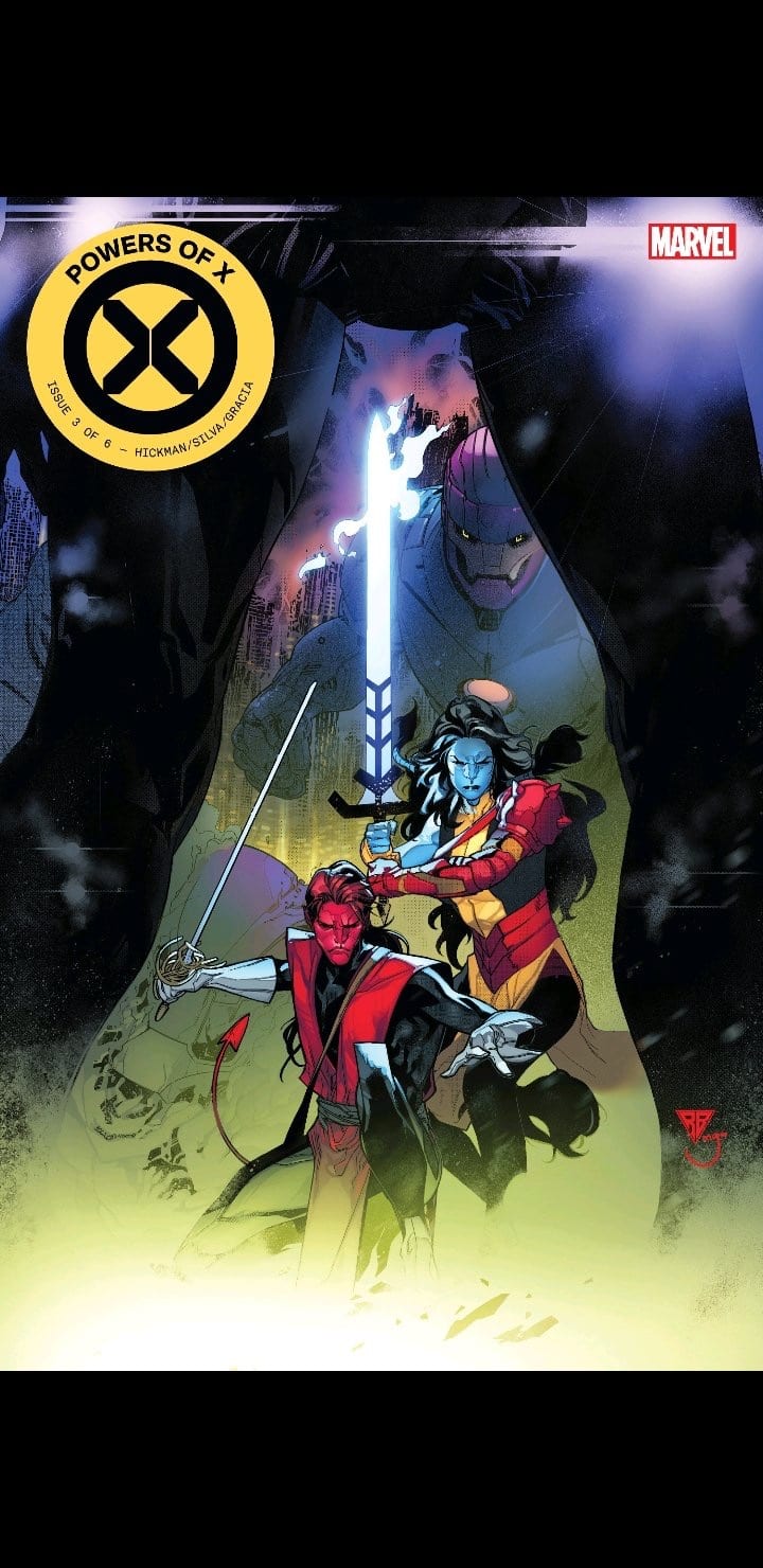
This week POWERS OF X #3 drops a fast-paced test of how well you’ve been paying attention to Jonathan Hickman’s bold vision. We spend all our time in Year One Hundred and see a plan unfold intended to unplug Nimrod.
BE SURE TO CHECK OUT THE VARIANT TO THIS COVER
***SPOILERS LIE AHEAD***
Have you been paying attention? Are you able to keep up? Powers Of X #3 will put that to the test. Hickman’s masterful comic book craft can prove to be quite dense at times but always supremely rewarding for those who are willing to fully dive in.
Luckily, with the Dawn of X titles we’ve gotten so far, there are plenty of graphs and charts that are extremely helpful. This issue in particular has some very slimmed down graphs that really help illustrate what is going on with Moira X and her ninth life.
Even if you’re not entirely on the same page as Hickman, this issue does a great job painting the grand scheme picture once the finale is reached. We see the plot unfold and the end goal being to restart Moira with the information she’ll need to overcome Nimrod in her tenth life–after Wolverine injects the info into her head and promptly kills her.
LOGAN ALWAYS DOING THE DIRTY WORK
Powers Of X #3 provides a satisfying payoff and landmark for this new era of X-Men comics. Moira is front and center as the most important mutant to have ever existed. Giving us the breakdown of her nine lives after her finale reset was perfectly executed and helps keep readers on the same page with the creators.
Speaking of keeping readers on track with Hickman’s intense vision, R.B. Silva and Marte Gracia put on an absolute show in this issue. Powers Of X #3 has a rapid pace to it, loaded up with action that barely gives the reader much time to breathe. They illustrate this dense and complicated story with careful craft, making it easier to digest.
It’s also a stunning book to read through. Silva gives characters so much weight and purpose with every little action. The landscape of Year One Hundred is uniquely futuristic while subtly calling back to familiar territory.
YEE-HAW!
The action sequences are swift and enthralling, there’s no fat in these panels. Nimrod being at the center of chaos gives Marte Gracia the wonderful pink hue to work with. There’s a beautiful display of color throughout this issue, every sequence explodes off the page.
Powers Of X #3 is an important benchmark issue, resetting Moira for her tenth life with the knowledge to prevent Nimrod. We’re now up to date with Moira back in House Of X. This issue rewards readers who have been keeping up with Hickman’s bold new vision.
It’s also an easier digest for those who may be a little lost on exactly what’s happening across these two titles. By the end of Powers Of X #3 readers are provided with enough to understand the bigger picture.
This week Marvel unleashes DAREDEVIL #10 on the world. Chip Zdarsky’s run on the book keeps getting better and better–this one might make you sweat a little.
EAT YOUR HEART OUT QUESTION
***SPOILERS LIE AHEAD***
Matt Murdock finds himself in the right/wrong place at the right/wrong time. While visiting the brother of the man Daredevil murdered, as his probation officer, Murdock finds himself in the middle of a police shootout inside the police station.
Detective Cole North has a hit put on him by the Owl while inside a police station filled with crooked cops. His “guardian devil” happens to be there to bail him out and even provide a cover for him–blaming the entire mess inside the police station on Daredevil.
Everything that Chip Zdarsky has introduced to Daredevil is paying off already in just ten issues. Between Matt quitting his other life, sleeping with the mob wife/librarian, Cole North’s conflicted being, and Matt’s questioning of morality and religion–there’s already so much to grab onto that was birthed in this series. There’s a lot of merit in that, not carrying over a lot of baggage from the previous creators.
The theme of Matt Murdock struggling with his religion and not being able to “shake the devil’s influence” is enthralling. The conflicted character of Cole North has been developed and unfolded at the perfect pace. Even Matt shedding his Daredevil skin, something we’ve seen in superhero comics hundreds of times, has felt fresh and exciting.
BRILLIANT LAYOUTS
Daredevil fans have been blessed in recent years. The Charles Soule Daredevil run was no easy act to follow, but Zdarsky is doing it. What’s most impressive is how effective this series is without feeling anything like the Soule run. It’s potentially two all-time great runs back-to-back with completely different visions.
Zdarsky isn’t the only creator making this an experience to remember either. Artist Jorge Fornés and colorist Jordie Bellaire elevate this series to the it’s current standing–which is among the best comics Marvel is putting out at a time that they are on fire across the board.
Daredevil #10 is a perfectly crafted build of suspense and anxiety. The way the drama unfolds will bring readers to the edge of their seats. Fornés slowly raises the intensity throughout and when the bullets start flying and Matt steps out of the shadows, it’s extremely satisfying.
BIG MAN AT A LITTLE DESK
This issue’s paced and executed like an intense, panic-inducing episode of a great television show. It specifically reminded me of the heart palpitations I had watching that episode of True Detective when Rust Cole goes undercover in the trailer park to pull that biker guy out in the middle of a raid. It’s not often that comic book art can do that to a reader.
Not to mention how absurdly cool Matt looked once he emerged in his makeshift Daredevil mask wielding police nightsticks. That’s another element we’ve seen a lot of recently but feels fresh and exciting with these creators behind it.
Jordie Bellaire’s specific use of red as an immediate sign of danger in these panels is striking. She provides a contrast in these panels that gives it an iconic and memorable appeal that will insure that readers will keep this imagery in their heads long after closing the book.
In Marvel Comics’ Deadpool Annual #1 (on sale August 21), writer Dana Schwartz forces Wade Wilson to face the worst nightmares of others, which makes the Merc With A Mouth confront some gritty, uncomfortable truths. But the issue misses the mark because it doesn’t allow Wade to face his own fears.
Wade Wilson is back in Deadpool Annual #1
Deadpool Annual #1
Writer: Dana Schwartz
Penciler: Reilly Brown
Inkers: Nelson DeCastro with Craig Yeung
Color Artist: Matt Herms with Guru-eFX
Letterer: VC’s Joe Sabino
Sometimes, the thing fans love the most about Deadpool can be the character’s most glaring weakness. The Regenerating Degenerate is known for cracking wise and approaching life with a sarcastic sense of humor. This levity can be bittersweet, though. That’s abundantly clear in Deadpool Annual #1.
Schwartz doesn’t explicitly describe the relationship between eight-year-old Peter Quincy and his adult neighbor Mr. Hewitt. With that being said, it’s heavily implied that Hewitt abuses Peter, which leads the boy to request Deadpool’s services. The reveal of the abuse doesn’t arrive until the climax of the issue. The journey to that point is filled with Deadpool brushing off the words of Nightmare, the villain he’s forced to face as part of the “Acts of Evil” line. In typical Deadpool fashion, the antihero makes jokes almost every time Nightmare opens his mouth. This behavior undercuts Nightmare’s credibility as a villain and also makes it difficult to take the plot seriously.
It’s hard to take this comic seriously when Deadpool adds too much levity to the serious moments.
Deadpool laughs at everything the villain throws at him, including a visit to a dream sequence in which President Abraham Lincoln mourns the loss of life in the Civil War. By the time the intended twist (Peter’s relationship with Hewitt) arrives, the reader is so detached from the story that even this emotional moment fails to resonate. Throughout the comic, there’s clearly a missed opportunity for some character growth. Wade could confront his own fears and potentially move past them. Instead, he focuses on Peter and Nightmare chooses to flex his muscle by taking Wade to two irrelevant dreamscapes. As a result, the comic doesn’t successfully dig deep enough to stand apart from its predecessors.
It’s par for the course for Deadpool to excessively insult his villains and soften the tone of the story; but other comics have struck a more effective balance between attempted humor and serious content.
On the surface, it’s hard to evaluate a Deadpool comic because they’re supposed to be funny. Humor is inherently subjective so it’s unfair to write one of these comics off because the success of the comedy depends on the reader. But the best Deadpool stories genuinely capture the character’s voice and, more often than not, Schwartz fails to do so here.
Whether it’s in the movies or the comics, Deadpool’s pop culture references are one of the many reasons he’s such a fan-favorite. Usually, these references are timely or, at the very least, they’re accessible. Here, Schwartz packs a number of dated nods to pop culture characters into the story. In the span of a few pages, Wade calls a mailman Cliff Clavin, Mr. McFeeley, Herman Post and Willie Lumpkin. Readers who immediately understood these references might find that they worked well. Others who had to google the names to understand the attempted joke will probably disagree.
Time and again, the jokes don’t land. In a Deadpool comic, that’s a problem. At one point, Wade claims, “I guess I’m not exactly ‘haha’ funny. More like ‘New Yorker Cartoon‘ funny. So…no, [I’m] not very funny.” Actually, at his best, Deadpool is one of the funniest characters in comic books. The two movies starring Ryan Reynolds as the Merc With a Mouth are perfect examples of that.
The comedy doesn’t always work but there are times when it hits the mark.
To be fair, the comedy does work a few times in this issue. Early on, Peter invites Deadpool into his room. In this scene, the comedic timing is impeccable. “I did write some other letters…maybe just two or three…hundred to Squirrel Girl,” the boy says. The line is split between two panels. In this sequence, the collaboration between penciler Reilly Brown and letterer VC’s Joe Sabino is one of the best elements of the comic.
First, Brown focuses on Peter so the reader can’t see the rest of his room. The next panel allows the kid to complete the line and the viewer to see Peter’s obsession with Squirrel Girl. Between the reveal that he sent hundreds of letters to the hero and the fact that his room is absolutely filled with merchandise displaying the character’s likeness, this moment showcased the creative team’s sense of humor.
The shrine in Peter’s room is one of the best parts of this comic.
The comedy is elevated by the illustration of the memorabilia. Brown, inkers Nelson DeCastro with Craig Yeung and color artists Matt Herms with Guru-eFX make Peter’s room feel like it belongs in the Joker’s circus. In the corner, a stuffed animal of Squirrel Girl looks terrifying; the black shadowing around its eyes make the toy look more like Pennywise the Clown than a friendly superhero. Just a few feet away, Peter’s headboard prominently displays Squirrel Girl’s face. This design is creepy in a different way. The face looks friendly but it’ll still be horrifying to wake up and see it staring at you in the middle of the night. Thanks to the art team, these designs turn Peter’s room into a off-putting shrine of Squirrel Girl. It’s fair to assume that Deadpool would view the room in that lens and the artists exquisitely convey that mindset.
Fans of the Merc With a Mouth will want to like Deadpool Annual #1. Though some of the comedy is effective, it usually fails to connect and it dilutes the gravity of the plot. Ultimately, it’s up to the reader to decide whether the comic is still worthwhile if that’s the case.
What do you think of Deadpool Annual #1? What do you hope to see Wade do next?
Was a sequel to 47 Meters Down necessary? There hasn’t been a decent shark film since 2016’s The Shallows, which starred Blake Lively trying to survive a shark all by herself. Two years ago, 47 Meters Down released and starred Mandy Moore and Claire Holt as two sisters who find themselves trapped at the bottom of the ocean with several great white sharks. The film featured a unique concept that was handled horribly and ended on a sour note. Now, a standalone sequel has arrived to offer a better concept with the same bad execution.
Johannes Roberts returns to write and direct this claustrophobic sequel, and the screenplay shares a lot in common with the first film. 47 Meters Down: Uncaged stars Sophie Nelisse, Corinne Foxx, Brianne Tju, Sistine Stallone, Davi Santos, Khylin Rhambo, Breck Bassinger, and John Corbett. Similar to the first film, the plot focuses on two sisters, but these sisters are having a hard time bonding after their parent’s recent marriage. What a better way to bond than by nearly being eaten alive by multiple sharks?
Struggling stepsisters Sasha (Foxx) and Mia (Nelisse) decide to go on a scuba diving adventure with their two friends to an underwater Mayan city. Once they reach a certain point in the caves, they realize they aren’t alone and are trapped with the deadliest ocean predator. Roberts and co-writer Ernest Riera put together some of the worst dialogue for these girls. For instance, upon entry into the cave, there is a back and forth between two of them where they make mention of butt sizes. It just comes across in a cringe way, and maybe that’s also because these girls aren’t the best actors. The screenplay doesn’t spend enough time building up the four main girls involved, it gets you acquainted and then it’s time to watch them die.
L to R – Brianne Tju, Corinne Foxx, Sophie Nelisse, & Sistine Stallone.
47 Meters Down: Uncaged has a unique set design for the characters to swim around in, some of the sequences are very intense and the film does keep you on the edge of your seat. However, it’s amazing how in two years the CGI for the sharks has somehow gotten worse. 47 Meters Down: Uncaged may have been inspired by Neil Marshall’s The Descent (A better film) but it borrows more from its predecessor, which is why it fumbles. The performances are just so uninspired and not good at all, but for most of these girls, this is only their first or third film.
Roberts should focus on directing more and writing less, he has the potential to one day make a very well done film. Some of the film’s best shots are when the girls are captured with a shark swimming right behind them without their knowledge. Adding to that, there are a few instances of slow motion and it’s some of the worst slow-motion sequences since Jeepers Creepers 3. Luckily, the film’s end is a slight improvement over 47 Meters Down, but it’s more ridiculous than the last one. There is never a dull moment in 47 Meters Down: Uncaged but there isn’t a single thing to make you care about its characters or their survival. The score composed by musical duo tomandandy compliments the intense moments featured in the film, but to enjoy this movie you have to turn off your brain completely.
47 Meters Down: Uncaged won’t be included in the small list of shark films to watch repeatedly like Jaws, Open Water, or The Shallows. A movie that goes bigger in its concept, but doesn’t seem to properly execute it because it spends more time borrowing all of the mistakes from the last film, so much so that both films have the same runtime.
Scary Stories To Tell in the Dark is surprisingly a well done PG-13 horror film. From time to time there comes a horror film that shows how effective it can be without being R rated. Two standouts within the last decade include Insidious and The Conjuring, both directed by the talented James Wan. These films managed to frighten audiences by ditching blood and guts to focus on building tension with solidly written characters involved and a growing sense of danger. While Scary Stories To Tell in the Dark isn’t nearly as effective, it still a great example of just how effective a PG-13 horror film can be.
Directed by André Øvredal and based on Alvin Schwartz’s popular children’s book anthology series of the same name, the film follows a group of friends in the late 1960s who discover an old book that writes the horrific fates of the townspeople. The film’s cast includes Zoe Colletti, Michael Garza, Gabriel Rush, Austin Abrams, Austin Zajur, and Natalie Ganzhorn. For those that grew up with the book series, Scary Stories To Tell in the Dark will certainly bring back old childhood fears.
The central plot focuses on Stella, Auggie, Ramon, and Chuck, a group of teens who discover a book in a haunted house that brings their fears to life. Sound familiar? That’s because this is the 2015 Goosebumps film done properly. Make no mistake about it, this is a movie about stupid teens doing stupid things, but they are all likable in some way. Chuck brings fills the cliched comedic role, Stella is the brains of the operation, and Ramon is the new kid in town. Despite being based on a series of children’s stories, the film pushes the boundaries a bit but remains very playful and lighthearted.
Austin Zajur in SCARY STORIES TO TELL IN THE DARK to be released by CBS Films and Lionsgate. Image courtesy of CBS Films.
Adding to that, each cast member does a solid job in their respective role, but Colletti’s performance as Stella is a standout, as she can make you care for her character’s situation more effectively out of everyone else. Of course, she is the main character so it would be expected that the film’s lead effectively carries it, and she does that very well. It will be interesting to see what she brings to the table for the inevitable sequel.
One thing that hinders Scary Stories To Tell in the Dark, is its lack of time spent with the monsters involved. These monsters are visually pleasing to see on screen, except for the Jangly Man, who doesn’t seem properly edited. With each new scary story, there comes an introduction to another monster, but only five to ten minutes is spent with each one. Even Harold, who is one of Scary Stories To Tell in the Dark’s well-known monsters doesn’t get enough screentime. Scary Stories To Tell in the Dark would rather spend its runtime discussing racial injustice and other social issues, almost as if Jordan Peele stepped in for a brief cameo in the writing department. These are all background elements that don’t connect to the film’s monsters or its main story.
Luckily, the talented Autopsy of Jane Doe director showcases just how good he is at building tension. Øvredal delivers effective PG-13 scares that rely heavily on tension building and a few jumpscares. Also, Marco Beltrami and Anna Drubich’s score compliments the film’s tone and atmosphere.
While not a complete home run, Scary Stories To Tell in the Dark has a lot of good elements that are blended very well for the most part, but the screenplay is lacking in some places. Adults that grew up with the series of books will certainly get their nostalgia trip and everyone else who is unfamiliar with the concept will equally have just as much fun.
Neon Future #6 from new comic publisher Impact Theory came out Wednesday. With this release came the accumulation of Neon Future’s first arc in spectacular fashion ending with a bang whilst setting up the future.
Impact Theory’s Neon Future wrapped up its first art last week in spectacular fashion, setting up an exciting future for the series.
A History Of Neon
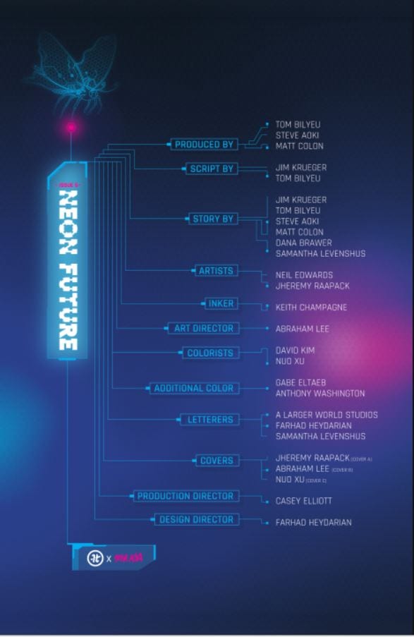
When marketing a new company, the best way to start is with a big name, and Impact Theory did just that with Jim Krueger. The idea of Neon Future formed in the mind of Co-Founder/CEO Tom Bilyeu’s mind when he heard of Steve Aoki’s plan to cryogenically freeze himself after his death. Thus, Bilyeu went on the hunt for a writer. Having coffee with Eisner winner Krueger, he knew who would anchor the project. Neil Edwards and Jheremy Raapack then joined as the series’ pencilers, with inks courtesy of Keith Champagne and colors by Abe Lee.
Krueger and team set out to make a new realistic future with help coming from Steve Aoki himself and Team Aoki. The inspiration from Aoki was so deep that the main character Kita Sovee is the musician’s doppelganger. Neon Future draws heavily from the dozens of recognizable Sci-Fi’s before it but never falls into straight ripping them off.
At the end of each issue, Bilyeu leaves a letter for the reader that shows how much pride and love he has for the company, team, and Neon Future. This letter shows that love and more with his announcement of another arc of Neon Future in the form of six issues. Talk about getting a reader excited!
A Future Made Of Neon
Neon Future starts in the future, thirty years to be exact. Yet it feels much like our recent times with America divided into factions. A.I. and automation are causing mass unemployment, with the government now being under a new authoritarian rule. This rule promises a return to simpler times without advanced tech. They create Article 10, referring to it as ‘The Return’.
This ‘Return’ will bring jobs back to many by removing the technology that caused job loss, but would also put out Augmented humans with jobs. Creating a divide between those with integrated technology (Augmented) and those without (Authentic). Sounds like a lot to take in, right? You could also say it sounds like a possible future for our real world.
The world Krueger builds within the first half of Neon Future shows how much work went into it: its politics and history. We learn much of the lore through character interactions and narration. Diving into a new world may seem like a lot but with great crafting, the creative team weaves in lore masterfully. The series starts with a bang by having recently deceased TV personality Clay Campbell narrate his death/rebirth. As irony prevails, Campbell is captured by the augmented that he hunts, the underlings of Neon Future’s Leader, Kita Sovee.
Kita finds Campbell’s death as a great opportunity to have one of their past nemesis be on their side. Augmenting Campbell, Kita brings him back from the brink of death, allowing him to choose the path of the butterfly or blade. That’s where that awesome logo comes in. Campbell, surprised and frightened, decides on running away.
Following this escape, Krueger writes a dirty future filled to the brim with bigotry, showing Authentics mattering more than those Augmented. In these moments, Neon Future starts to show its heavy-handed cards with scenes showing how divided the population is. Many characters use slang names for people that are Augmented. But fear and hatred goes both ways, with those augmented having names for the Authentics.
The first half of Neon Future relies greatly on Krueger’s world-building while showing the problems happening in the world. Campbell’s first steps with augmentations quickly bring the realization of how the ‘other side’ is treated. Our team of artists paints what seems like a peaceful line of augmented people going home with one becoming singled out and running away just to be shot down.
Through these gorgeous panels nearly void of words but heavy in dark colors, Campbell and the reader learn that the violence we’ve seen previously isn’t just a one-off moment. Although Neon Future has lighter funnier moments throughout, it’s equally balanced. This synergy of humor and seriousness works out well making Neon Future hard to put down.
Each new character introduced feels interesting in their own respects, with none feeling wasted for the story. Not much is known on Kita, but each time he graces the page you want more time with him. As Campbell learns what it’s like for those he hunted, we learn the grizzly facts along with him. In NeonFuture, there is no easy way or even “correct” way. But for Campbell’s turning point, we have a moment that hits hard.
With the fear of being alone, Campbell gets the help of Kita’s left-hand woman Dee to help him back home, only to learn that hatred can run deep. Even though her son is back, now that he is augmented, Campbell’s mother doesn’t see it as a positive. This pivotal moment is when Campbell seems to start believing in Kita and Neon Future.
From this moment on, Neon Future strays from the plot and starts to focus on Campbell’s character with some Neon Future sprinkled in. One issue focuses entirely on Campbell learning to fight, showing the shift to a singular character story. Then the series moves on to the finale, but this is where we’ll stop. No point in having everything spoiled for you! These last few paragraphs seem like a lot but there is much more in the first three and last three issues of Neon Future’s first arc.
Neon Art/Neon Lights
Teaming for the art department is Neil Edwards and Jheremy Raapack with inker Keith Champagne and colorist Abe Lee. Throughout Neon Future, there are moments with gorgeous, fluid art that flows from panel to panel, where, in other instances when images are brought to the forefront, the lines seem to take a hit. This happens mostly with faces. Some start looking awkwardly mushed towards the characters face like a hand grabbed them forcefully from the back and squeezed.
This isn’t with every face we see, but enough of them that you wish you didn’t see so many conversations. This problem happens with other items, like guns, machinery, and body parts, but they don’t draw as much attention as the faces do. On one fight scene in Neon Future #6, one character, and their enemy looks the same size (as they should be for plot reasons), but in a few separate panels, their sizes change with one growing humongous and the other smaller. Then they’re back to normal. This size-shifting looked quite weird, throwing off what was a great story-driven moment.
I also love this cover. Between the beautiful bright colors and it being one of my favorite characters from the comic I would totally buy this as a poster. And the other as a poster!
Besides those minor issues, Neon Future’s first six-issue arc has fantastic art that flows well with the pacing of the story. The team easily mixes chaotic fights with easy to follow moments that are akin to poetry in moments. With Lee’s colors, the art becomes a living and breathing futuristic world. The darkness is never overshadowed by the bright light. Lee adds that extra layer that helps excel the world the team is building. As the series goes on, additional color artists join the team, such as David Kim, Nuo Xu, Anthony Washington, Gabe Eltaeb, and C’endan Clairborne, with Lee moving into the Art Director position.
Neon Closures
The first six issues of Neon Future are that of a building foundation with more than a few hands on the cement roller. What started as a story of the worldwide ramifications of Article 10 and the division of people the story quickly devolved into a singular focus. This is most noticeable in the last three issues, with Neon Future starting to lose sight of its own story. Within the first three issues, we see a vast world ripe with venues to explore and stories to tell, but starting with Neon Future‘s fourth chapter, our narrative starts to focus singularly on Campbell and his story.
Campbell’s story is a blast to read through, but with how the story is written and plotting forward in it’s first few issues, it feels as it should stick its focus on the world with Campbell being an after story. That just speaks to Krueger’s fantastic world-building and a plot that makes you invested into the world, but when Neon Future opens each issue with an explanation of “The Return,” it feels like the story was shifted in what was going to be something else.
Instead of a story of what may be a future, we receive one focused on a man. The title implies that it’s about our future or the group known as Neon Future itself, but instead, it spirals into the life and times of Clay Campbell. The next arc promises a wider reach into the world, so here’s to hoping that arc keeps the great world building and the world at large story that its first few issues had.
The first issues creative team page compared to….
One problem seems to stem from how large the cast of story creators is. We have six people for the “story” section alone, which could’ve been what contributed to the weird shift we saw midway through the series. None of these observations take away too much from how great the story is. At points, it holds its inspirations on its sleeve while not ripping straight from those sources, with Krueger’s writing pushing the story forward with the speed or lack of when the plot calls for it.
The lettering in Neon Future #1 falls upon Clem Robins, but as the series goes on, so does the letterer, with Samantha Levenshus, Farhad Heydarian, and A Larger World taking over.
Following Robins departure we see the lettering team take more chances with some fun encounters happening, making characters scream names like they do in superhero comics. But Neon Future’s lettering only plays with fonts and placement every once in a while but doesn’t try too much, instead of playing it safe and close to the chest.
..The final issues creative page, which becomes cluttered with names and a few job changes.
A factor that does set Neon Future apart from the others: it has recap pages! I’m a sucker for these when I read monthly titles because we all know sometimes you just need a quick recap.
For a debut series, Impact Theory did phenomenal with Neon Future. By the end of the first arc, you will crave for more of the world and its characters. To support Impact Theory, directly purchase Neon Future from their website here!
Side Note: What the hell happened to the internet?
Memorable Quote: “There’s not enough yoga in the world to calm me down with a fucking dragon coming after me, Kita!” – Clay Cambpell.
I can’t even stay calm when a dog looks at me. Good luck staying calm when a dragon stares you down!
Brian Azzarello and Maria Llovet ask you to witness the fall and rise of an artist in Faithless #5, published by BOOM! Studios this week.
Set deep in an erotic world of lust and magical nightmares, Faithless combines horror and beauty like nothing else on the shelf. Grief and suffering surrounds Faith as those she loves push her to express her emotions in artistic ways. But how much loss can she take and who are her real friends?
Faithless #5 Credit: BOOM! Studios
Character Focus
After the second, shocking, death of one of her friends, Faithless’ heroine becomes despondent, desperate to close herself off from the world. Fortunately, Mr Thorn will not allow that, mostly because the crying woman is making his sofa untidy.
The opening page is perfect example of Azzarello and Llovet’s commitment to character. Nine panels with no background focuses the reader’s attention directly on Mr Thorn as he talks, seemingly, directly to the audience. It is not until the final tier of the page do you realise that the conversation is two sided. Azzarello uses the speech to demonstrate the characters easily distracted train of thought while also implying the supernatural element of his life.
From this moment onwards the focus shifts to Faith herself as she moves through her grief. Each of her interactions allow a different stage of grief to be addressed and the facets of Faiths personality are explored. She is a contradictory, complex person and this is highlighted through her conversations, especially the park talk with Ginny. Her friend points out her double standards when it comes to Poppy and reluctantly Faith faces this.
Faithless #5 Credit: BOOM! Studios
Drawing On Faith
Maria Llovet captures the reaction shots of Faith during these various conversations beautifully. The reader can see the denial followed by acceptance in Faiths body language alone. Llovet is able to draw the personalities out of the characters making them act in every single panel. Her figure work is so full of life and energy. The change in Faith between the start of this issue and the end is visible in the way Llovet draws her; she grows as a character before the reader’s eyes.
The panel layouts are fairly standard, with Llovet employing stacked panels that stretch the width of the page. She then breaks up one of these panels to draw attention to a particular action or sequence. This intensifies the moment; in one instance giving it a sense of almost uncontrollable desire and in another adding importance to a seemingly insignificant object.
Llovet’s art work is simply gorgeous and bursting with color. Each page is a melee of visual delights. She is able to represent the bustle of a children’s playground in an instant setting the scene which is then evident across the page. She is also able to use the background to lead the reader through the panels to accentuate the character’s actions. Llovet uses the entire page to tell the story so that the reader gets an indication from a simple glace what is happening. Then the reader is drawn into the page by the panel layouts and the lettering.
The lettering on the sound effects is playful and colourful. It has a hand-drawn style that perfectly matches the art work behind it. The lack of black outlines means that the sounds appear to emanate from the images rather than be separate from them. They blend in with the scenery and characters.
The speech balloons, by AndWorld Design, also have a hand-drawn aspect to them. The irregular shape of the balloons matches the style of the comic as a whole. A slight change in coloring helps to identify who is speaking in some of the scenes and well placed balloon tails link the speech to the character even if they are off panel.
Conclusion
Faithless is a passionate work of Art. If you don’t get caught in the magical embrace of the narrative, it may be easy to get lost in the story or question the character motives. A number of the sequences require the reader to accept a certain care free abandonment of usual narrative structure. Elements from previous issues, like certain big plot points, are barely mentioned or even overlooked entirely in this issue. Azzarello and Llovet hope that you will put these to the back of your mind while you follow Faiths journey.
Faithless is a compelling comic with complex characters and adult content that isn’t just about uncensored sexual exploits. It demands a mature reader and rewards you for allowing the narrative to flow like an uncontrolled river rather than a structured canal. By this point in the series any reader should know what to expect and the creators do not let you down.