Home Blog Page 421

Review: MIDNIGHT VISTA #1 Adds Fresh Flavor To Alien Abduction

Monkeys Fighting Robots

In AfterShock Comics’ Midnight Vista #1 (on sale September 4,) writer Eliot Rahal takes the alien abduction trope and revitalizes it by adding new emotional layers. Rahal and the art team present the reader with a book that looks and feels like a remastered 1950’s B-movie and has the potential to offer fresh possibilities for the classic storyline.

Midnight Vista #1
Writer: Eliot Rahal
Artist Clara Meath
Colors: Mark Englert
Letters: Taylor Esposito

On the surface, Midnight Vista #1 is straightforward; Oliver Flores, a young boy, gets abducted by aliens and returns to his home in Bernalillo County 17 years later. But the strongest flavor in this issue comes from the details. By honing in on several of the brief narrative moments, it’s easy to see that they transform the comic from a fairly standard introduction to an alien story to a layered story that offers several possibilities for the next steps of the plot.

It’d be too easy to have Oliver come from a perfect life at home; instead, Rahal presents the reader with a child who’s sandwiched between two newly divorced, argumentative parents. In the first scene, Oliver hides and watches TV while parents loudly argue on the phone. Here, the most powerful detail is also one of the most subtle choices; as Oliver flips through the channels and his parents keep fighting, he rapidly increases the volume of the TV to drown them out. Rather than saying anything, crying or running away, Oliver simply sits there and tries to drown out the drama and lose himself in the TV. The entire art team works together to maximize the impact of the moment.

Midnight Vista #1
The subtle artistic choices in this scene maximize its impact.

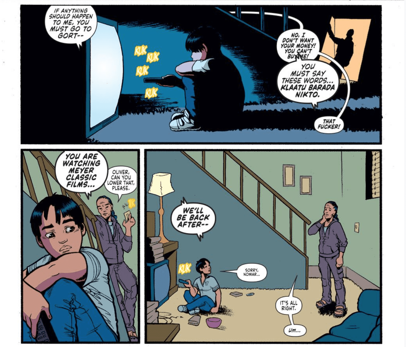
First, Meath draws Oliver sitting in the dark, with the TV acting as the only source of light in the room and Englert complements this contrast by practically drowning Oliver in the darkness. Finally, Esposito’s lettering acts as the cherry on top, as the sound of Oliver clicking the remote, paired with the increasing size of the speech bubbles for the TV and the parents’ argument, makes it clear that the boy is desperately trying to ignore the yelling. Each component of the art builds off another one and, altogether, it shows the successful level of collaboration that’s unique to comic books.

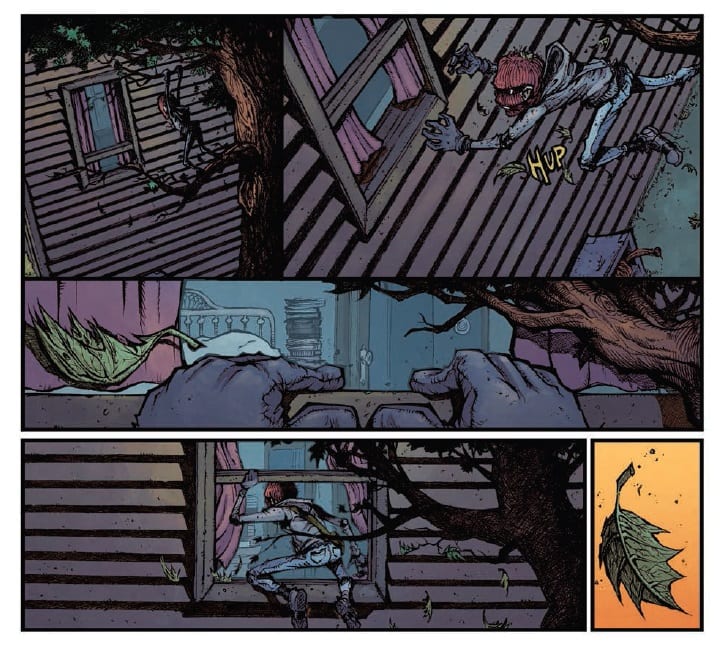
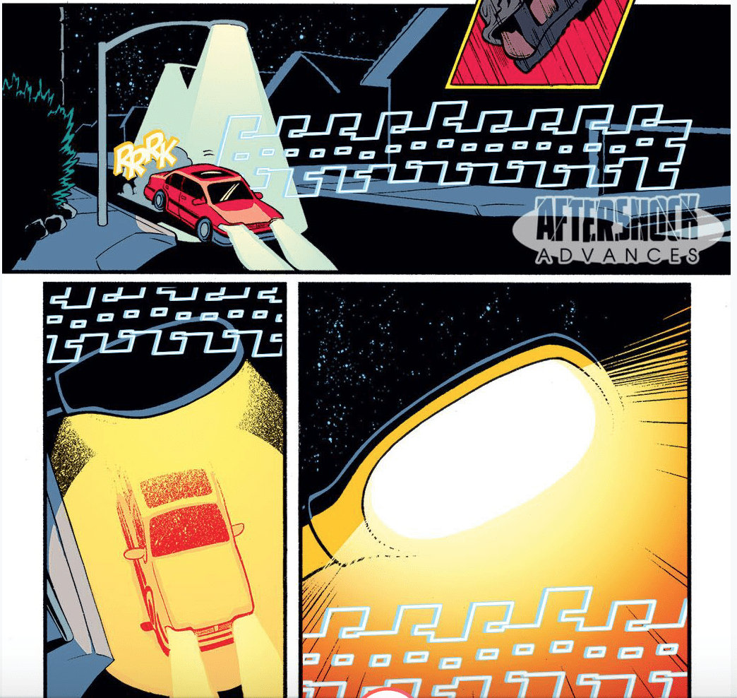
Of course, Midnight Vista #1 is also an alien abduction story and, goodness gracious, the whole team nails the tone of this genre. From the sight of Oliver getting beamed up to the alien spaceship to the jarring reveal of the aliens, a sense of extraterrestrial dread fills the issue. Meath’s aliens are based on the typical stereotype with freakishly large eyes and a slitted nose placed on a similarly oversized head. But, though the creatures’ appearance isn’t a new sight, both the story and the art team still make them grotesque and creepy.

Midnight Vista #1
From the start, Midnight Vista #1 creates a dreadful mood.

The first time the reader sees the aliens, they’re dissecting Oliver; they’re holding the boy’s intestines in their hands. The creatures coldly tell Oliver to remain calm and one of the aliens mind-controls the boy as they shoot something into his nose. Plus, when the aliens, posing as humans, ask a police officer for help in their quest to find Oliver, one of the creatures literally says, “Small talk, small talk, small talk.” The aliens are masquerading as humans and the combination of their stilted dialogue and their deformed disguises, the charade is unsettling.

Though Midnight Vista can’t be completely evaluated because the story just began, the first issue successfully draws the reader in. Rahal raises enough questions that makes the next installment mandatory reading for hooked readers.

What did you think of Midnight Vista #1? Where do you hope to see the story go from here?

Monkeys Fighting Robots Youtube

Review: DESCENDENT #5 Comes To A Horrific Conclusion

Monkeys Fighting Robots

Taking a turn from intrigue into supernatural horror, the final issue of Descendent from AfterShock Comics is released this week. Tying up loose ends and bringing character arcs to a close, Stephanie Phillips has a difficult job on her hands holding everything together.

However, with the majority of the secrets already revealed, the stage is set for a disturbing confrontation. In order to save lives, David and his fellow conspiracy hunters must face the enemy head on but none of them are prepared for what awaits them.

Descendent #5 Credit: AfterShock Comics

Written In Fire

In order to set up the final piece of the puzzle, Phillips starts this issue off with another flash back. This time to Massachusetts 1692 and the start of it all. This sequence cleverly sets up both the villain and the motives behind everything that has happened in previous issues.

The decision to take the narrative away from the murky realms of the ‘uncertainty in the supernatural’ that kept the X-Files going for 11 seasons, allows Phillips to end the series on an exciting high note. The shift from F.B.I drama to almost The Wicker Man standards of horror provides the narrative with a shocking twist but also a speedy conclusion to many of the story threads.

The central characters are forced by the confrontation to face various aspects of their personalities, with varying degrees of satisfaction. The conclusion to David’s character arc is especially interesting. He has been a man obsessed from the very beginning but has never had to face his obsession. Phillips walks the character into the very thing he has been searching for his entire life but how do you deal with something like that? David has moments of weakness and his fear and trepidation affects his actions.

For the final issue of a series, Descendent has an ending that is fitting and satisfying for the reader. The journey to this point, and through this issue, has been a roller-coaster of a ride for the characters and the readers alike. Police procedural, family drama, and supernatural horror have all played their part with Phillips blending each part of the story together wonderfully. There has been a strong narrative thread through all five issues, feeding the characterisation and the drama.

Review: DESCENDENT #5 Comes To A Horrific Conclusion
Descendent #5 Credit: AfterShock Comics

Drawn From Blood

In earlier issues of Descendent Evgeniy Bornyakov demonstrated an aptitude for bringing conversations to life through his art work. In this final issue he finally gets a handle on the action scenes. With the characters performing much more physical acts in this issue, Bornyakov has needed to pack the panels with more dynamism. Altering the shape of the panels has helped greatly in producing the fast paced motion required. Bornyakov has focused on the characters and their placement within a panel, favouring an almost empty background for most of the action.

In turn, Lauren Affe has picked up establishing the scene with her colors. The twilight hours are pictured beautifully with simple background lighting and the choking atmosphere created from a burning pyre dominates the panels and pages as the fight escalates. The increase in tension is reflected by the growing clouds of grey/brown smoke that begins to take over the page.

Affe’s lighting is especially effective on the characters during the final confrontation sequence in this issue. She highlights the characters faces, picking out their expressions and relaying emotional states which are instantly recognisable for the reader. As a consequence, the emotional journey of the characters becomes easier to follow.

The emotional state of the characters is also picked up through Troy Peteri’s lettering. The subtle changing of font size within speech balloons adds nuances to the speech. So does the visual depiction of the speech balloon’s themselves. Throughout, Peteri gives the villain a slightly different boarder to her speech balloons, this highlight’s not only her speech but also the speech in the panels surrounding her. The reader can instantly see the that there is a difference between them; a constant reminder of the villain’s origins.

Review: DESCENDENT #5 Comes To A Horrific Conclusion
Descendent #5 Credit: AfterShock Comics

Descendent Conclusion

Over the five issues, Descendent has been an interesting read with highs and lows in both script and art. The ending however is a combination of the best from both. The plot is well paced with a decent combination of humour and horror. The art work is more consistent throughout the issue and captures the tone of the script on every page.

In some respects, the ending has come too quickly with the switch from investigative drama to supernatural horror being a bit sudden. The build-up has plenty of scope for a much longer series with the twist coming at a much later date. However, this final issue is a triumphant and a pleasure to read. It has satisfying conclusions to a number of the character and plot arc’s leaving the reader with a sense that this chapter is complete.

Hopefully this team will get the chance to work together on future comics because, by the end, each aspect of the comic was working fluidly together to tell the story.

Monkeys Fighting Robots Youtube

Review: VAMPIRELLA RED SONJA #1 Is The Start Of A Great Relationship

Monkeys Fighting Robots

Are you interested in journalism with a bite, if so then you need to check out Dynamite’s newest ongoing Vampirella Red Sonja #1 hitting your local comic book store on September 4, featuring the classic characters of Vampirella and Red Sonja, as they team up to figure out why the bikini-clad warrior is in the wrong timeline.

Vampirella Red Sonja #1 begins in the year 1969, the same year Vampirella herself debuted in the comics world. In this canon, she becomes a journalist to investigate supernatural mysteries. The storyline is a perfect fit for Vampirella, as she is on the search for answers for a slew of murders on Dyatlov Pass in Russia. While attempting to solve the mystery, Vampirella runs into Red Sonja. That’s about as spoiler-free as you’ll get!

Jordie Bellaire puts her spin on Vampirella, giving her a new occupation as this new story beat is what drives the plot well.

Love this Variant Cover by Leonardo Romero!

Before we learn of her new job letterer Becca Carey hints at it amazingly with Vampirella’s narration boxes. Instead of having her usual red box with the black bat, Carey has it as a plain black box, but with a record, play, pause and stop button. At first, this may seem confusing, but once you see her using a recorder, it makes sense and comes off quite smart.

Another unique visual in Vampirella Red Sonja #1 is Drew Moss’ paneling. Throughout Vampirella Red Sonja #1 Moss uses 3-5 rectangle panels for the pages, thus keeping the paneling simple. While this happens for multiple pages, Moss adds in a few different square panels throughout and two full-page layouts. This may sound simple, but it seems that’s what the team of creators was aiming for; plain and simple to help draw in readers that are new to comics. With how much Vampirella Red Sonja #1 relies on characters talking and dialogue bubbles this works best.

The colors by Rebecca Nalty are bright and lively throughout with backgrounds and characters having a palette that catches the eyes, but at times these make the characters faces seem flat. These moments of flat faces look like color-work from the early 2000s.

Another beautiful Variant Cover, this time by Babs Tarr!
A Clash of Titans (Vampirella and Red Sonja of Course) (Conclusion)

Vampirella Red Sonja #1 works best as an introduction to the new universe in a way that any long-term fan or newcomer would appreciate.

Memorable Quote: “Sometimes the literal irony of humans really gets to me.” – Vampirella

You and me both!

Dear Blood-Sucking Readers

If this is your first time reading either of these characters, let us know what you thought! Or if you’re a long-time fan, how does it compare to others? No matter which one you are, make sure to stop by your local comic shop and pick it up!

Monkeys Fighting Robots Youtube

Review: GOING TO THE CHAPEL #1 Is “Wedding Crashers” By Way Of Tarantino

Monkeys Fighting Robots

Going to the Chapel #1 is out this week from Action Lab: Danger Zone, and it gives a whole new meaning to “wedding crashing.”

Emily Anderson is having second thoughts about getting married, but her troubles quickly worsen when her wedding is hijacked by a gang of Elvis-themed bank robbers. With her dysfunctional family on one side and the thieves on the other, Emily has to try and take control of her own hostage situation and maybe get out of walking down the aisle at the same time. The series is by writer David Pepose (Spencer & Locke) and artist Gavin Guidry (The Death Defying), with colors by Liz Kramer and lettering by Ariana Maher.

We actually got the chance to speak with Pepose a few months back about Chapel if you’re interested in how the series came together. It’s the author’s take on the rom-com, a genre he feels gets a bad rap. As he said in a different interview, “I think rom-coms are just as flexible of a genre as crime or science fiction. And so I wanted to write something that I thought I would really like to read, that both men and women would enjoy and have a lot of fun reading.”

going to the chapel review

The comic reads a lot like a Tarantino story, with its unique and eccentric characters and neo-western setting. Going to the Chapel takes place almost exclusively in the titular church, and the single setting gives the story a sense of claustrophobia and heightened tension. It feels very cinematic, especially with the way Guidry frames the shots. Most of these panels could easily be torn directly from page to screen (if a film were to ever happen).

This hostage situation isn’t all grim and gritty, though. Chapel is actually a pretty lighthearted and fun comic, which you can feel between Guidry’s cartoony style (not in the “Sunday Funnies” kind of way, but just simple, not heavily-detailed linework), Maher’s big sound effects, and Kramer’s pastel color palette. There are a lot of pinks, purples, and yellows throughout this comic to drive home the romance element, which is interesting when coupled with the action happening on the page. This juxtaposition tickles your brain and draws you further into the story.

Pepose infuses Going to the Chapel with plenty of absurd comedy as well. There’s absurdity inherent to the plot, sure, but the real humor comes from the family dysfunction element. The Andersons make the Bluth family look tame by comparison and they’ll have you laughing out loud, especially Grandma Harriet (stick around to the end of this review to get some of grandma’s advice firsthand in an extended preview).

going to the chapel review

Through all the crime and craziness, though, this is a comic with lots of heart. Don’t let the Elvis masks fool you. It ultimately is a love story. It’s about relationships, family, happiness, and way more. Just like he did with Spencer & Locke, Pepose is a master at lowering your guard with some zany antics and then smacking you upside the head with some “feels.”

And then the team drops a few bombs that adds a whole new element to this series: mystery. You’ll turn the last page and your brain will start turning with all sorts of theories that won’t go away until you get your hands on issue two. The key to comics – to any kind of entertainment, really – is “never be boring.” Always keep your audience engaged and wanting more. This creative team understands that.

Going to the Chapel has already drawn comparisons to Die Hard, Runaway Bride, and Arrested Development. Don’t you think you owe it to yourself to get in on such a unique and fun reading experience?


Are you looking forward to Going to the Chapel? Did you already get your hands on a copy at a convention? Sound off in the comments with your thoughts!

going to the chapel review going to the chapel review going to the chapel review going to the chapel review going to the chapel review going to the chapel review going to the chapel review

Monkeys Fighting Robots Youtube

Review: FANTASTIC FOUR 4 YANCY STREET #1 – The Ben Grimm Story We Deserve

Monkeys Fighting Robots

Are you tired of interstellar travel that somehow always starts a war with aliens? Or any of the weirdly obscure adventures the Fantastic Four go on? Well, Fantastic Four 4 Yancy Street is right up your street. Out now at your local comic shop.

Fantastic Four 4 Yancy Street is more of a one-shot than the start of anything; or as Marvel says, “the first in a series of regular essential release.” Taking place in between the ongoing (reviews here), the Fantastic Four now reside on one of the most famous streets in Marvel history—Yancy Street. This street means a lot to the Fantastic Four, but the most to Ben Grimm (The Thing), who this story primarily revolves around.

Retelling of Ben Grimm’s childhood, with art by Greg Smallwood

Ben’s love for Yancy Street runs deep, he has fond memories of his older brother, until said brothers death. Writer Gerry Duggan and artist Greg Smallwood use three pages to retell Ben’s troubled childhood. They use a newspaper print look and simplistic art style/paneling. The three pages even have the small colored box on the top of its page. This art is beautiful and works best for the flashback, with Smallwood then changing his style to reflect the present. This style change comes with the popularly used white paper, while Smallwood opens his panels to breath more.

The present by Greg Smallwood

With his troubled past now retold, Ben stumbles upon graffiti on the youth center dedicated to his older brothers memory. Wanting to “clobber” the urban artist Ben makes his way home asking Reed for help on finding the suspect. The moment inside the Fantastic Four’s house Smallwood starts to open his panels more until he goes full Kirby structures. When Reed enters the frame, Smallwood graces the reader with a full-page filled with devices Kirby would have loved.

As the pace quickens, Smallwood returns to the simple square panels, now with six per page helping Duggan’s story keep the flow. Then, all the sudden, Mark Bagley takes over. For the battle between Ben and The Terrible Trio, Bagley makes the panels huge. As great as Bagley’s art is, it was such a vast departure from Smallwood’s that its jarring, in a negative way.

Mark Bagley starts the action!

Then, before you know it, Luciano Vecchio and Pere Pérez are the artists on the book. This shift in style doesn’t hit as hard as the previous since Vecchio and Pérez’s style art similar to Bagley, but the change still feels awkward.

A great call back to the artistic history of the Fantastic Four is the way letterer VC Joe Caramagna plays around with the font size and colors. Anytime a character yells Caramagna makes sure you know with boisterous lettering that screams off the page. The conversations are very stylized. This old-school technique is refreshing and fits perfectly.

The Fantastic Four On Yancy Street (Conclusion)

Fantastic Four 4 Yancy Street is a fun Ben Grimm story that keeps the Fantastic Four grounded. Yancy Street acts as a standalone story that those not reading any current Fantastic Four stories can enjoy.

The art my take a hit each time it changes artist, but for the most part, it works quite well. 4 Yancy Street would’ve benefited by staying with just one artist. Smallwood’s art is the highlight of the issue.

Memorable Quote: “I don’t smash–I CLOBBER!” – The Thing

Yeah, because then your catchphrase would be, “It’s smashin’ time!” Which sounds weird and inappropriate!

Monkeys Fighting Robots Youtube

Review: Exceptional Dream Weaving In PRETTY DEADLY THE RAT #1

Monkeys Fighting Robots

Bones Bunny and Butterfly return to regale you with more Pretty Deadly tales from the creative minds of Kelly Sue DeConnick, Emma Rios, Jordie Bellaire and Clayton Cowles. Released by Image Comics on 4 September, The Rat is the third volume in the Pretty Deadly series and moves the action to 1930’s Hollywoodland.

Exceptional Dream Weaving In PRETTY DEADLY THE RAT #1
Pretty Deadly The Rat #1 Credit: Image Comics

Pretty Tales

As the rain falls hard upon Hollywoodland, the body of Clara Fields is found in the mountains. The police trace the next of kin, her uncle Frank: The Conjure-Man, and so begins a murder mystery attended to by Death herself.

This new volume of Pretty Deadly has the same framing elements as the previous two arcs. The mystical characters, Bones Bunny and Butterfly, lead the reader back into DeConnick’s magical-realist world. The opening pages bleed in to the main story, setting the tone and preparing the reader for the adventure that is to follow.

Each volume of Pretty Deadly is drawn from a particular genre, the first was a western and the second was a war comic. This third volume comes out of the expressionist movies of the 1920’s and the influence that they had on American noir movies of later decades.

DeConnick’s narrative pacing follows the structure of an early crime movie; the body, the investigation, and the need for revenge. She uses the tragedy of Clara Fields, who the reader knows nothing about at the start, to introduce the other characters into the plot. The grief and anger that Frank feels is evident in his speech but also his desperate actions. These actions lead the reader through the darkness of Hollywoodland as DeConnick slowly reveals Clara’s character via the debris of her life left behind.

There are stories within stories with linking themes weaving through them all. It is a highly complex and poetic tale unfolding in front of the reader. DeConnick gives the story a theatrical essence from the opening and this is followed up throughout. The reader sits and watches this magical tale play out, lost in time with these characters.

Exceptional Dream Weaving In PRETTY DEADLY THE RAT #1
Pretty Deadly The Rat #1 Credit: Image Comics

Deadly Art

Emma Rios’ art is perfect for this type of story. She creates magical images even out of the most mundane or grotesque things. Her fluid drawing style and highly detailed images produce a total immersive experience for the reader. It is impossible not to fall into this world completely. The beauty and horror are mixed together with no visible joins so that it becomes difficult to separate the two. This is the visual equivalent of Frankenstein, a gothic/romantic horror.

The influence of 1920’s movies is evident on each page. The abstract nature of some of the panel layouts and the metaphorical use of imagery creates a magical world similar to a Fritz Lang movie. Rios manipulates the standard notions of comic book layouts, breaking the rules as often as she can to produce extraordinary visuals. Gutters break into the panels helping to establish mood; collections of images are stacked to produce complex representations of characters; The very boarders of the panels shatter to break the wall between worlds.

All of this outstanding art work is colored beautifully by Jordie Bellaire, proving why she is one of the best in the business. The depression of the era flows through the muted colors surrounding Frank as he investigates his niece’s death.  As Clara’s life is revealed to the reader, Bellaire floods the pages with brightness and life. The dreams and stories take on a life of their own, so much larger than the reality of Franks existence. Scenes of passion are expressed with red washes, while greed and obsession have their own hues.

Leading the reader through this dreamland is Clayton Cowles lettering, holding it all together. The change in fonts and caption box design signpost to the reader which part of the many realities the action is taking place in.

The narrative flow is controlled by the sweeping lines of the artwork and the smart placement of the lettering. The character’s emotional states are also displayed in the same way. Frank’s arrogance, grief and finally anger is there in his speech, the words, the text and the balloons all working together to create an emotional state. Broken speech balloons, balloons that are small and cramped with only a few words, and large balloons with heavy boarders and bold text, give the comic it’s drama and creates the character’s stage presence.

Exceptional Dream Weaving In PRETTY DEADLY THE RAT #1
Pretty Deadly The Rat #1 Credit: Image Comics

Conclusion

Pretty Deadly is a spectacular read. It’s like sitting in a theatre and disappearing into a magical, dramatic world. The narrative flows thanks to clever writing and beautiful artwork that breaks conventional comic book rules. Everything from the opening page to the stunning final moments of this issue are mind blowing. It is the best entry so far in this planned five volume collection.

If you are a fan of The Sandman Universe or classic experimental Hollywood movies, then Pretty Deadly is for you. It is magical realism realised in the most exemplary fashion. If Pretty Deadly doesn’t stimulate your imagination, then nothing will.

Monkeys Fighting Robots Youtube

Review: THE PLOT #1 Will Make You Scared To Go Home Again

Monkeys Fighting Robots

The Plot #1 is out this September from Vault Comics, and it’s a chilling horror story wrapped up in a compelling family drama, perfect for fans of Locke & Key and The Haunting of Hill House.

When his estranged brother and sister-in-law are murdered, Chase Blaine becomes guardian to his niece McKenzie and nephew Zach. The three move back to the 200-year-old Blaine family house in Cape Augusta, Maine, but something spooky and supernatural awaits them there. The series is by writers Michael Moreci and Tim Daniel, and artist Joshua Hixson, with colors by Jordan Boyd and letters by Jim Campbell. The Plot will be the inaugural title for Nightfall, Vault’s new annual horror imprint. 

Yes, this is another “dysfunctional family moves into an old, haunted mansion in the secluded corners of Maine” story, but there’s a reason this plot structure works so well. It allows creators to tell deep, complex, and – most importantly – uniquely personal stories. The Plot may share some key themes with the aforementioned Lock & Key and Hill House, but still it doesn’t feel like anything you’ve read before.

the plot review vault comics

Like most successful horror stories, this is a very character-driven narrative. Daniel and Moreci understand that in order for the scares to be effective, the stakes have to feel real, and for the stakes to feel real, you have to be connected to the players. The Plot is ultimately a story about family, and the Blaine family feels like a family you know. It may even be your family. Their struggles and their conflicts are understandable. They have secrets in their past that they try to bury, things they’re ashamed of. You relate to them as a reader, because whose family doesn’t have secrets, and so when those secrets start crawling out of the woodwork, the dread hits home hard.

If you read Shanghai Red, you know that Josh Hixson is a star on the rise. His art is grim and atmospheric, especially when coupled with Boyd’s soft and muted color palette. This team is a match made in horror heaven. They capture small moments perfectly, like a hand reaching out to pick up the phone and pulling back at the last second. You can feel the tension here; horror lives in these moments. The Blaine family home comes alive through the art. If you ever heard the expression “the setting is a character in itself” and questioned what that means, The Plot is your answer. Every hallway oozes impending doom. Every shadow harbors a devastating secret. Reading this comic is a claustrophobic experience; you feel trapped within this house alongside these characters, unable to escape the terrors that lie within.

the plot review vault comics

And that’s ultimately what The Plot is all about, the things we can’t escape. Our pasts. Our families. The monsters that live in the bog behind our ancestral family homes. It’s about having to face our demons, both literal and figurative, which is about the scariest thing any of us can do. Again, that’s what makes this comic so effective. It’s taking all of those abstract things we’re terrified of in real life and bringing them to life.

Jim Campbell is a letterer at the top of his game here. This is a first issue, so there’s a decent amount of exposition (no worries, Moreci and Daniel never make it feel heavy-handed), but the way Campbell letters the dialogue, you’re able to navigate the monologues and conversations with ease. This comic flies by, which is shocking when you consider all that happens. That’s largely thanks to Campbell’s handiwork. And then there are the horrifying sound effects, which Campbell kindly acknowledged were done by Hixson. Every “KRAK” is bone chilling; every “WHUD” hits with the impact of a brick to the head. Even everyday sounds like a phone ringing or a dog barking seem scarier here.

The Plot is comics’ next great horror masterpiece. It’s clearly a very personal project for all of the creators; you can feel the passion and care put into every panel. You have until this Monday (September 2) to order it at your local comic shop, so get on it!

Monkeys Fighting Robots Youtube

Review: the Hunter & the Hunted in DETECTIVE COMICS #1010

Monkeys Fighting Robots

Just sit right back and you’ll hear a tale… Well, it’s a tale of Batman, some billionaires, an assassin, and a couple of long-lost castaways on a South Pacific island in Detective Comics #1010, out this week from DC Comics.

Bruce is separated from the rest of the survivors after their plane crashes on a seemingly-deserted island. He’s rescued by some unexpected residents, but the rest of the party remains under Deadshot’s command. For now, it’s up to Batman to try and rescue the captives, even if help is still thousands of miles away.

Detective Comics #1010

The Writing

Detective Comics #1010 delves into many of the tropes of “stranded on an island” stories. We have man-eating animals, surprising locals, perseverance against adversity, man’s inhumanity to man…it’s all here. The tone is part Lost¸ part Gilligan’s Island, a fact that Deadshot himself lampshades at one point. Writer Peter J. Tomasi is able to take those clichés and do something interesting with them, though.

Bruce spends a large chunk of the issue swapping stories with two castaways stranded on the island since World War II. This twist is likely inspired by real-life stories of soldiers hiding out in the jungle for decades, unaware of the war’s end. The men, Clarence and Hiroshi, have an interesting and charming tale to tell, and will presumably return in successive issues. Former enemies, they eventually learned to trust one another and survive. This theme of enemies-turned-allies seems to echo the issue’s official synopsis on DC’s website, despite the narrative not really progressing to that point in the story just yet.

Most of the book’s action is contained within the last few pages. Detective Comics #1010 builds to a suspenseful ending, hooking the reader and ensuring we come back for the next issue.

The book lays a mystery regarding who paid Deadshot to kidnap the people. We’re yet unsure of how this plays into a larger narrative, but the character’s statements suggest there’s much more at play than just what we see here. It’s quality writing all things considered.

Detective Comics #1010

The Artwork

Artist Christian Duce is back for Detective Comics #1010. He brings many of the same strengths to the table we saw in our last issue, blending expressive and exaggerated elements alongside more grounded images.

Duce generally sticks to a very meat-and-potatoes approach here. No elements of the work leap out as exceptional, but on the flipside, everything is firmly respectable. There’s no shame in that; as a visual storyteller, one doesn’t need to mystify the reader on each page. The work hits the narrative beats well, forming a cohesive final product.

David Baron provides colors for Detective Comics #1010, bringing a vibrant and varied palette to the table. From the lush, bluish greens of the jungle to the fiery reds and yellows of Deadshot’s blaster, Baron meshes nicely with his fellow artists on a stylistic level. He even embraces a sepia tone at one point, which was a nice stylistic touch given the subject at hand.

Final Thoughts

Detective Comics #1010 is a great chapter in Tomasi’s ongoing story. It’s Batman by way of a WWII-era Howling Commandos comic, so if that catches your attention, you’ll find plenty to like here.

Monkeys Fighting Robots Youtube

Review: BATMAN/SUPERMAN #1 Is A Major Event For DC Comics

Monkeys Fighting Robots

Continuing the story of The Batman Who Laughs, DC’s newest ongoing Batman/Superman #1 sees the duo take on villainized heroes and friends. The plot may not be anything new or groundbreaking, but with the duo of Batman and Superman, it’s an entertaining ride.

What’s a better combination than peanut butter and jelly? The classic combination of light and dark, yin/yang, Boy Scout and Dark Knight, we’re talking about Batman and Superman!

Writer Joshua Williamson quickly introduces us to the Batman Who Laughs with a gore-filled origin. For those that didn’t follow his introduction in 2017’s Dark Knights: Metal (check out our Reviews of Metal and more here). Transporting the reader back to Earth-0 we learn our Batman was regaling this story to Gordon, who in turn tells the Dark Knight that he has heard this. Per usual with Batman, nothing is what it seems, as he was talking to Superman, not Gordon, with Superman arriving on the scene in a two-page spread. This spread is a great first page to show the duo, with Superman carrying a fainted Killer Croc as he hovers above Batman.

Primarily this moment furthers the point of how powerful Superman is compared to Batman as the Boy Scout nonchalantly apologizes, “Had some business to take care of on the way over.” Killer Croc seems like a cat in a tree for Superman. Artist David Marquez highlights their differences by having Batman hold his cape in a manner of nearly hiding, while Superman is flying above his friend. Batman/Superman is Marquez’s first work at DC Comics.

Marquez’ pencils and Sanchez’ colors work well with the story. The dark mood plays off Marquez’ realistic pencils as the story seems like it could happen in real life. Sanchez’ use of neutral colors spotlights this aesthetic.

The colors by Alejandro Sanchez show the duo in their token themes by having the light hit Superman while draping Batman in shadows. This lighting isn’t limited to this page, but runs throughout Batman/Superman #1. While this dark and moody coloring isn’t only on Batman but all through Gotham and other residents; in comparison, the few scenes in Metropolis are bright in tone. This theme is played within Williamson’s inner dialogue and interactions between the duo.

There are a few moments in Batman/Superman #1 where letterer John J. Hill’s work shines through. The transition between Batman to The Batman Who Laughs is an excellent example of changing the dialogue box and font to match what is happening. It would have worked well if Hill kept this theme throughout the book. When we see a villainized Shazam, all that is different is a shaker box/font. In Shazam’s moment of transformation, a change of color to red would have helped dramatize the scene.

Batman is more planned oriented, Superman seems more laid back and “come as it may,” which Bats isn’t a big fan off. In their inner thoughts, the characters act as opposites, but not in a disrespectful manner, more as how two friends would act. Williamson has a great understanding of the characters and how they interact. Beginning the main plot point Gordon informs the duo of a kidnapping by a “Superman” that is laughing, making the team believe that the Batman Who Laughs may be behind it. This plot comes hot off the ending plot of The Batman Who Laughs, but Williamson doesn’t test if you’ve read it. Instead, the backstory is explained by Batman and Superman as the story moves along.

Batman/Superman #1 doesn’t feel like the start of an ongoing. Instead, it feels like the beginning and middle of a line-wide event. DC Comics has been planning something akin to this story with the Batman Who Laughs since his introduction. Maybe DC Comics should’ve had this story as an event instead of making it the core story in a new ongoing. This story even has tie-ins naturally making it feel like a 2019 event, but alas it’s not.

A Batman/Superman Team Effort (Conclusion)

Batman/Superman #1 is an enjoyable ride, but instead of being an ongoing series, the book should have been a limited series. This might bother new readers who were going in looking for a fresh start. With the Tie-ins titled with a heroes name then Infected it would’ve worked better if this was called DC infected or something akin to that. The word infected brings up another point.

Heroes turned into a villain is such an old trope that now it feels overdone, and nothing new. My feels on this could very well change by the end of this overreaching, line-wide plot, but we won’t know for another few issues. Plus, that trope sells like Aunt May’s wheat cakes!

Memorable Quote: “You should really consider quitting smoking.”

Well, when Superman tells you that you probably should listen!

Side Note: Why the hell couldn’t Superman hear Billy’s heart? Just a minor flub on his powers, but that seems to always happen when necessary for plot reasons.

Monkeys Fighting Robots Youtube

Review: MOUNTAINHEAD #1 Expressively Dark But Also Lacking

Monkeys Fighting Robots

Body horror and petty crime open up the first issue of IDW Publishing’s new title Mountainhead which hit stores this week. A dark humoured tale of consequences populated with an array of disturbing characters: Mountainhead doesn’t set out to make any friends.

MOUNTAINHEAD #1 Expressively Dark But Also Lacking
Mountainhead #1 Credit: IDW Publishing

Scaling The Mountain

The opening page of the comic is the most disturbing visual in the comic. From the very beginning John Lees wants the reader to know what kind of story they are getting into.

The image is gruesome and not easy to decipher. There are the remains of numerous people jumbled together, scattered across the crisp white snow as if they have just fallen from a torn bag made of human skin. This is matched with a nihilistic voice-over of a child who turns out to be the main protagonist.

Without doubt, a stark, blood soaked, eye-catching opening.

From there John Lees introduces the reader to the character of Abraham and his paranoid father through a series of house break ins and dodgy hotel stays. Their relationship is one built on mutual respect and dependency. It is made clear that the father/son relationship only exists because of the psychological manipulation of the youngster. Abraham is ‘required’ by his father and made to feel guilty if he desires a different life.

John Lees gives the two character’s distinctive voices and Abraham’s is clearly the more reasonable, constantly reassuring his father and acting like a hostage negotiator. His calming tone comes through the cleverly selected speech and sentence structure. In contrast his father’s speeches ramble on, long winded, paranoid rantings. He is a man under pressure and, most likely, already passed breaking point.

When the story moves away from the down town crime narrative it becomes less engaging. The towns folk Abraham meets in British Columbia are caricatures with little substance. John Lees doesn’t give the reader time to adjust to these characters instead concentrating on an attempt to create a Twin Peaks like atmosphere. The narrative moves too quickly through Abraham’s new life, not giving him or the readers time to adjust. It is as if the writer can’t go a scene without including something out of the ordinary.

MOUNTAINHEAD #1 Expressively Dark But Also Lacking
Mountainhead #1 Credit: IDW Publishing

Carving Out The Mountain

Ryan Lee has a distinctive style. His characters have over exaggerated features creating highly detailed caricatures. The faces of the cast take on the most prominent aspects of their personalities, in a similar way that the villains from Dick Tracy did in the 1940’s.

Abraham has a simply innocence to him, with a small stature reflecting the years he has spent at the psychological mercy of his abusive father. The rest of the characters each cast their distinctive shadow across the panels making them easily recognisable.

Ryan Lee’s artwork is playful and brings out the dark humour that runs through the narrative. However, the accentuated figures highlight some of the personality deficiencies from the script. Visually speaking the characters are wonderful but some of them lack substance.

As with the script, the lettering has highs and lows. Doug Garbark gives the speech balloons a soft edge, lacking a black boarder, which integrates with the art very well. There are also some irregularities with the shape of the balloons or the text within them that gives the speech emphasis and even added humour.

Whereas the irregularities add to the storytelling some of the placements create inconsistencies.  In one panel two characters may be separated by the speech, creating a natural wall insinuating a distance between them but this disappears almost straight away. The speech moves to the edges pushing the character’s together even though nothing has changed in the relationship.

There is also the matter of the caption boxes changing color. This happens on the very first page, different colors are used even though there is a single speaker. This causes confusion in the reader which effects the pacing of the story.

The coloring across the rest of the comic, provided by Shawn Lee is wonderful. He adapts his color pallet to match the scene as it plays out. This requires realistic coloring on some pages and hyperbolic shading on others. Red washes flood violent or disturbing panels just as the night scenes are dulled with greyish blues.

MOUNTAINHEAD #1 Expressively Dark But Also Lacking
Mountainhead #1 Credit: IDW Publishing

Conclusion

Mountainhead has some strong storytelling techniques and expressive art work. The page layouts lead the reader dramatically through a page while the coloring sets the scene and atmosphere. However, the expressive artwork doesn’t help to cover up areas of character lacking from the script. The pacing is often broken by inconsistencies causing unwanted pauses and the introduction of Abraham casts a shadow across the rest of the comic.

An intriguing first half let down in the second but there is potential for something exhilarating. The mix of dark humour and gore just needs a few strong characters to carry it forward.

Monkeys Fighting Robots Youtube