Home Blog Page 386

Review: AMAZING SPIDER-MAN #34 Launches Into Marvel 2099

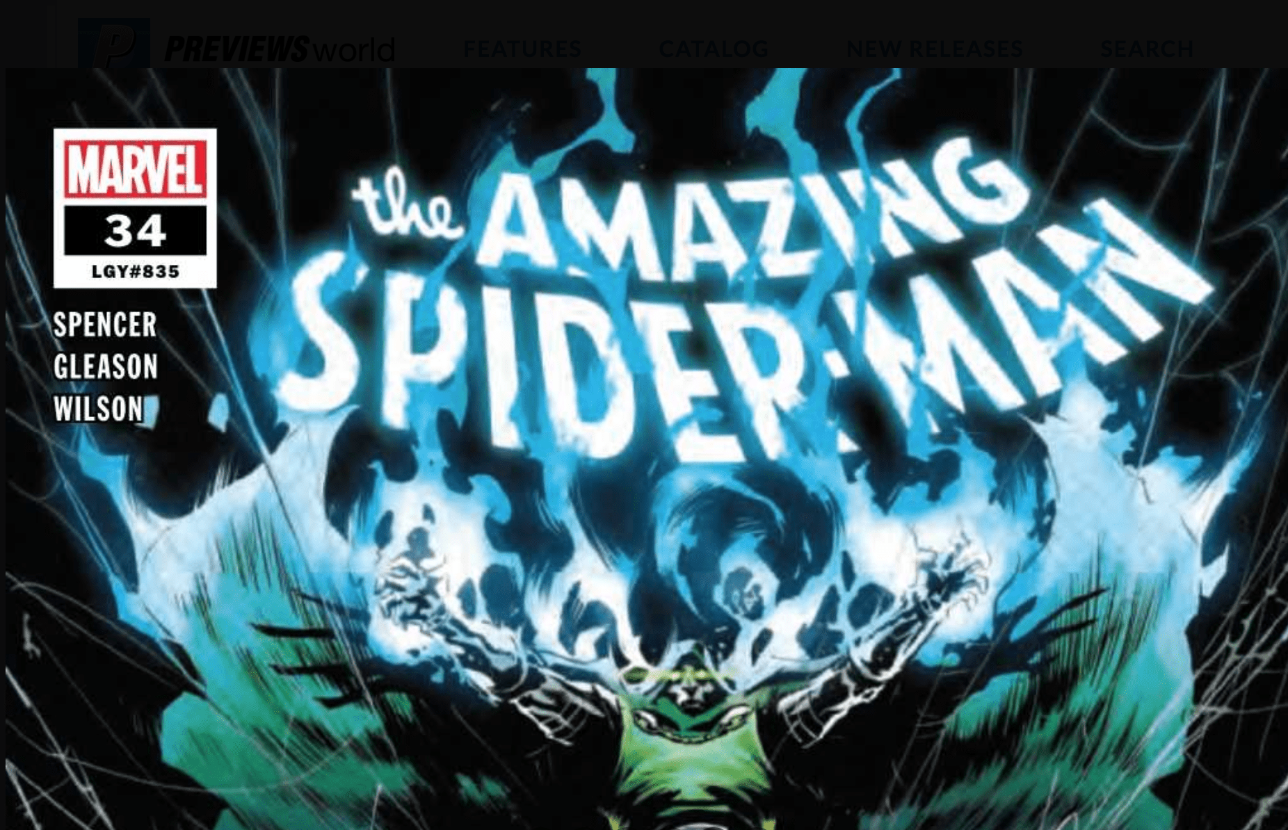
Amazing Spider-Man #34 cover

In Marvel Comics’ Amazing Spider-Man #34, (on sale November 20), the various elements of Marvel 2099 fall like dominoes and the event shifts into high gear. With such a heart-pounding issue, writer Nick Spencer draws the reader in and leaves us begging for more.

Amazing Spider-Man #34 

Writer: Nick Spencer

Artist: Patrick Gleason

Colorists: Matthew Wilson, Dee Cunniffe and Chris O’Halloran

Letterer: VC’s Joe Caramagna

Amazing Spider-Man #34
Miguel O’Hara is struggling to remember the future, which could doom his efforts to save it.

To quote gifted comedian John Mulaney, “The other shoe just dropped.” Before this issue, Spencer slowly set up Marvel 2099. The event remained shrouded in mystery and we didn’t know what to expect. Here, Spencer firmly kicks off the event and, boy, it’s a doozy. From an attempted assassination to the end of worlds, the stakes couldn’t be higher. It had been easy to assume that Marvel 2099 would only affect the future but the present is clearly in danger, too.

In addition to the shift from a slow burn to a rapidly escalating mystery, another compelling narrative progression could define the event’s next steps. In previous issues, Miguel O’Hara and other characters have focused on how the present has doomed the future. But now, even though his world is ending, Miguel becomes more hopeful about tomorrow. He’s worried about his chances of finding Peter but his optimism shines through. “Who knows what the future holds?” Miguel asks. In times like this, hope can make all the difference.

Most events start with a bang but the sight of Doctor Doom getting gunned down might just take the cake. Of course, as Spidey points out, “It’s always Doombots with this guy.” Still, the art team makes Doom’s “death” feel like a major moment. In one lifelike panel, artist Patrick Gleason shows the surrounding crowd panicking or taking a picture with the fallen tyrant. (It’s easy to imagine some of the bystanders taking a selfie with the corpse.) Bright camera flashes, courtesy of colorists Matthew Wilson, Dee Cunniffe and Chris O��Halloran, light this scene and the body looks almost angelic in its innocence. Don’t worry, it’s not all doom and gloom; there’s plenty of visual comedy, too.

Amazing Spider-Man #34
Both in the present and the future, Doctor Doom plays a vital role in Marvel 2099.

Everybody knows the meme where the animated Spider-Man are pointing at each other, so it’s delightful when it pops up in comics or movies. The art team references the classic image when Miguel finally finds Peter Parker. Miguel eagerly runs to his predecessor and yells, “Spider-Man!” Confused, Peter shouts, “Spider-Man?!” Though the reunion is short-lived, it’s still the highlight of the issue — Spencer has slowly built toward it for weeks now. It’s fitting that destructive emerald energy blasts from the Doombot serve as the background; sure, it’s a chaotic time to meet up but for the Spider-Men, it’s just another Tuesday.

Marvel 2099, like many comic events, got off to a slow start. Inpatient readers (like yours truly) may not always enjoy this pace. But now that it’s officially off and running, we can’t wait to see where it goes.

What’d you think of Amazing Spider-Man #34? Where do you hope to see the series go from here?


Monkeys Fighting Robots Youtube

Review: ABSOLUTE CARNAGE #5 Concludes Marvel’s Latest Thrilling Event

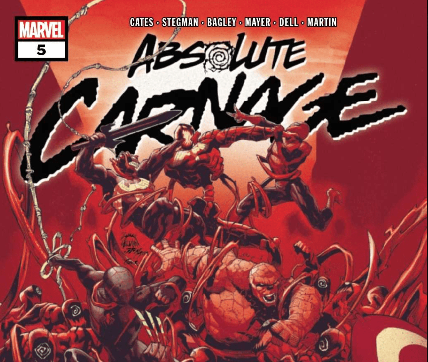
Absolute Carnage #5

In Absolute Carnage #5, (on sale November 20), writer Donny Cates bring Marvel’s horror-infused event of the year to a close. While he radically changes the status quo for Eddie Brock and sets up an even more terrifying sequel, the conclusion doesn’t live up to the expectations set by its predecessors.

Absolute Carnage #5 

Writer: Donny Cates

Penciler: Ryan Stegman

Inkers: JP Mayer & Jay Leisten

Color Artist: Frank Martin

Letterer: VC’s Clayton Cowles

Up to this point, Absolute Carnage has gotten better with each issue. Each one featured twists, turns and moments that stayed with readers long after they finished reading. So maybe it was inevitable that the conclusion was a letdown; the series couldn’t live up to itself. As promised by the end of the penultimate installment, we got the final clash between Venom and Carnage. But it didn’t quite deliver.

Absolute Carnage #4 ended with Venom, who just grew wings, flying after the similarly winged Carnage. So we knew we were in for a treat; in a series that’s featured symbiote dragons, a Venom-Hulk and a bunch of other crazy stuff, we couldn’t wait to see how it’d come to a head. While strong dialogue and stellar art continue to define this series, the final fight between Venom and Carnage is anticlimactic.

Absolute Carnage #5
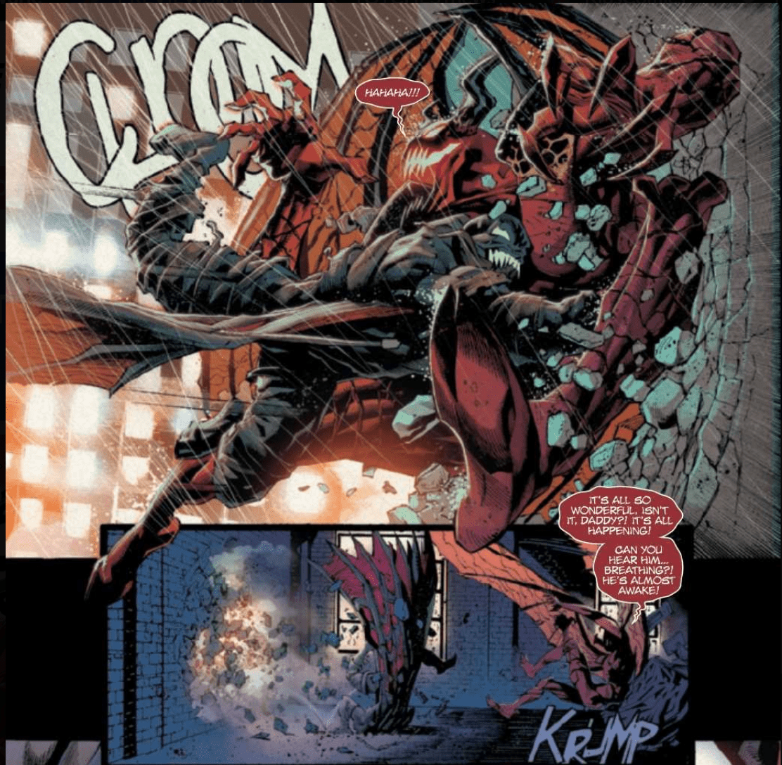
It all comes down to this: one final battle between Carnage and Venom.

To be fair, the ultimate battle in any event doesn’t have to be awe-inspiring. This one actually lines up with Eddie’s arc throughout the event; he doesn’t have to be outmuscle Carnage because he can find other ways to win. But at the height of the plot, Eddie makes a questionably bold sacrifice that’s sure to send shockwaves throughout the Marvel Universe. Unfortunately, the shocking moment takes away from the resolution of the current story when Cates briefly previews the ramifications of Brock’s decision. We’re left with a clear idea of where the sequel is going. But this knowledge comes at the expense of a sense of finality — rather than ending, Absolute Carnage just stops.

Absolute Carnage #5
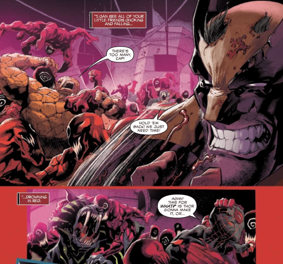
Other heroes are present in Absolute Carnage #5 but the story isn’t about them.

While the event has incorporated numerous aspects of the Marvel Universe, Cates changes course and narrows the scope so that it focuses on the two main rivals. Previously, he’s given the Avengers and other heroes important roles in the story. While they’re present here, the battle comes down to Venom and Carnage. This focus feels somewhat fitting, given the bitter conflict between the two. But the lack of narrative importance for the other heroes is also disappointing.

As always, the art team adds immeasurable depth to an already rich story. When Carnage taunts that Eddie, penciler Ryan Stegman conveys the villain’s shifting mood. At first, he’s arrogantly bragging that Eddie has already lost the battle. Then, the glee on Carnage’s face is sickening when he laughs and boasts, “You’re going to lose your little boy!” It’s impossible not to root against the horrifying antagonist. Time and again, dynamic facial expressions inject the story with tangible passion. After Carnage presents Eddie with an impossible choice between saving his son or the world, the look on Eddie’s face could say 1000 words. He knows he has to do something terrible and the resentful determination in his eyes is palpable. Stegman’s ability to add visual emotion to a script is unparalleled.

Our expectations for Absolute Carnage #5 were quite high because the series has been so outstanding. While there’s plenty to like about this conclusion, it doesn’t hit the mark because the ending focuses on setting up the sequel.

What did you think of Absolute Carnage #5? Are you excited for a potential sequel?

Monkeys Fighting Robots Youtube

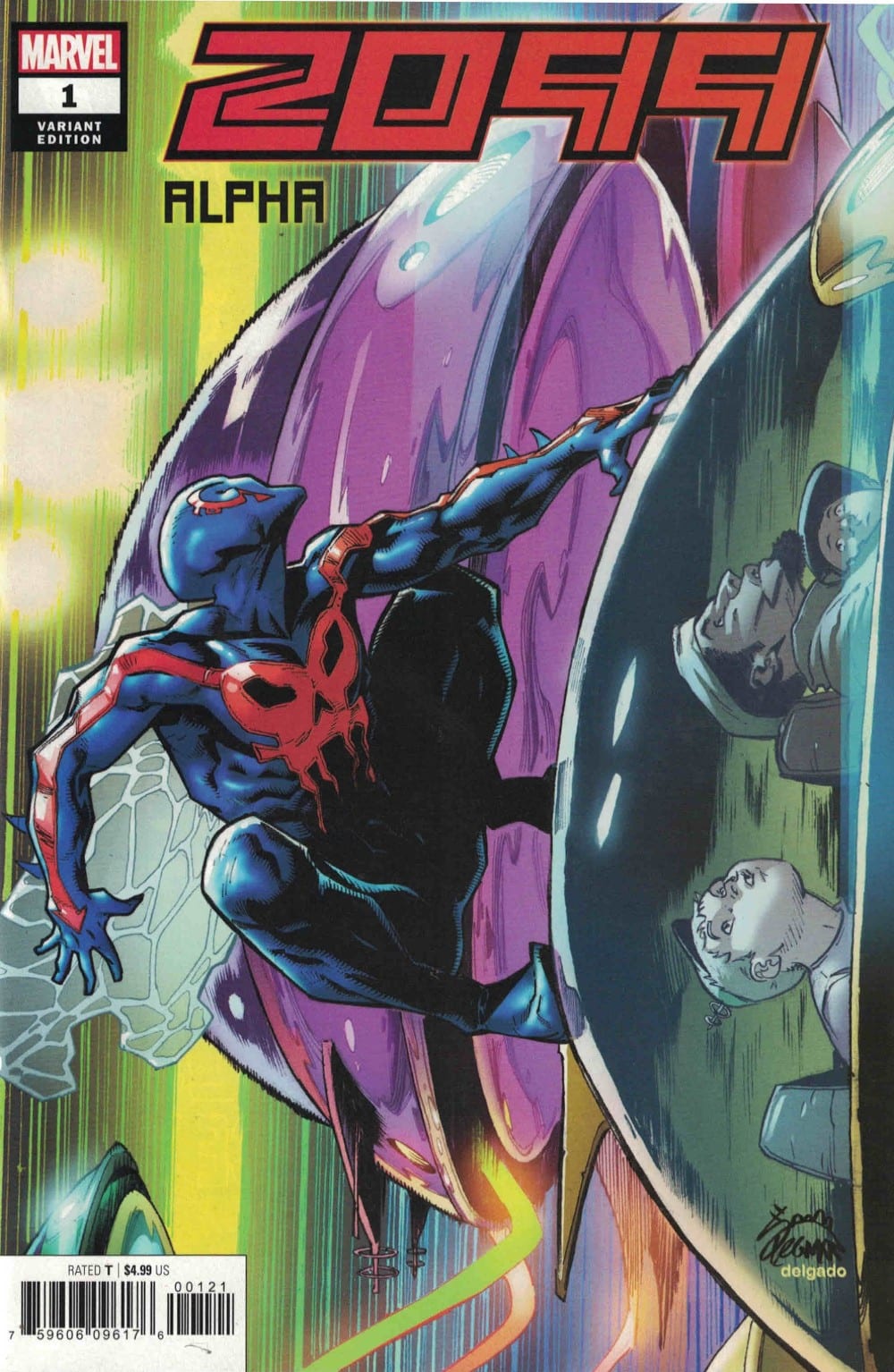
Review: The Future Is Intense In 2099 ALPHA #1

2099

The return to the future of 2099 begins with 2099 Alpha #1 thanks to Dan Slott, Victor Bogdanovic, and Marte Garcia showing off a period in desperate need for heroes. Does this glimpse into the world of tomorrow show events worth anticipating or a bleak era ahead?

Summary

In the future of 2099, the world seems ready to tear itself appear on many fronts but where are the heroes? Will anyone step forward and turn the tide of chaos sweeping the land?

2099

Writing

As it has been a bit since the last time 2099 has been used in a major storytelling capacity it is not surprising to find the place is in an utter state of disarray. The dystopian aspects of the future are on full display and there is a lot of great scene-stealing moments. Still, as a setup, it only offers a minor taste of what all the different plots will focus on for the different heroes. With the book servicing as the launch for five series, it almost packs too much into one issue.

This doesn’t mean this book isn’t without its merits on its own. Nick Spencer makes sure to point out some moments which will be interesting to see play out in the various books. The scenes with Doom 2099 alone are intense and memorable. They help to showcase the level of villainy this version of Doctor Doom is capable fo pulling off.

marvel comics 2099 alpha #1 exclusive preview

Artwork

The artwork really helps to cement the idea the future is bleak. The art by Victor Bogdanovic showcases a chaotic world where mutations are running wild and violence is around every corner. The scenes with the appearance of Conan 2099 offer the perfect display of carnage to show off this feature.

The coloring by Marte Garcia adds to the feeling of dread and gloom in the issue. Characters, buildings, and vehicles have an aura of dinginess thanks to the coloring work. The perfect blending of colors offers a sign things are going to get a lot worse before they get better.

2099 Alpha

With VC’s Joe Caramanga on lettering, the comic establishes some great voices for the storytelling. Through this narration technique, the scenes between Doom 2099 and his captive allow the audience to get a better glimpse into the other characters who will feature in the other 2099 books.

Conclusion

Though 2099 Alpha #1 isn’t a perfect introductory issue, it still leaves the reader with enough interest to want to check out this new event. The scenes with Doom 2099 will be sure to strike up a conversation and leave people to want to see how the heroes will be able to face whatever he has up his cape. So far, the future looks to be a fantastic read for those willing to take a trip to 2099.

Monkeys Fighting Robots Youtube

The Plot Thickens in WONDER WOMAN COME BACK TO ME #5

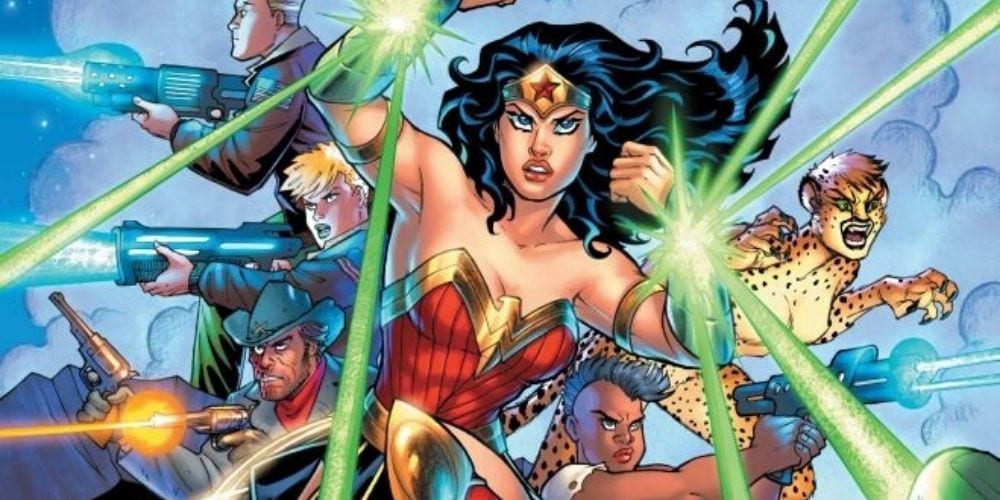
WONDER WOMAN COME BACK TO ME #5, releasing this Wednesday from DC Comics, brings us back to the crazy adventure Diana and her friends have gotten themselves into. And it has gotten even more chaotic than before, which is saying something.

Wonder Woman is looking epic on this cover.

***SPOILER WARNING***

A friendly reminder, before we begin: Wonder Woman Come Back to Me has been published once before, during a run in Justice League Giants. This collection is really just for fans that missed that, or for the collectors out there.

So far, each issue of Wonder Woman Come Back to Me has been split into two parts. And yet, Wonder Woman Come Back to Me #5 felt like it wasn’t broken up at all, as it flowed from one part to the next in rapid succession. It made for a fast-paced issue, one with a surprise twist.

Wonder Woman Come Back to Me #5 pg1
Cheetah is loving all of the violence.

In this chaotic plot, Wonder Woman went off after the lost love of her life, only to find herself (and her allies) in a strange world. Things only got weirder from that point, culminating with everyone getting pulled aboard an alien space ship. Only, it doesn’t actually end there.

To say that this is a wild plot would be an understatement. It seems like every page brings about a new danger or surprise for Diana to deal with. And thus, the readers are kept entertained as the plot bounces from one thing to the next.

Amanda Conner and Jimmy Palmiotti did an excellent job of moving the plot forward while keeping it surprising and unpredictable. This may be the most out-there plot that Diana has had to experience. But it certainly is a memorable one.

Wonder Woman Come Back to Me #5 boasted one major plot twist. But it also went a long way in explaining some of the dissonances that has come up before now. There are still a whole lot of questions that need to be answered. But at least we’re getting closer to the truth.

Well, that was a change of events.

Wonder Woman Come Back to Me #5 has artwork that matches the chaotic and fast-paced plot. The battles are bright and dynamic, with Cheetah’s enjoyment of the brutality being clear to everyone. While sometimes the expressions of other characters can seem a little bit off, on the whole, everything is carefully thought out. And some of the expressions were perfect (especially every shot that showed Cheetah’s delight).

Tom Derenick (pencils and inks), Alex Sinclair, and Hi-Fi (colors) and Travis Lanham (letters) worked together to bring us this issue. And they did an exciting job with what they were given. The book is vibrant and brightly lit, making it very pleasing to the eyes.

There’s little doubt that the highlight of this issue came from the battles shown. They were intense and dramatic, all while displaying an excellent understanding of movement. There were some apparent juxtapositions made between Wonder Woman’s fighting style and the alien Princess’ savagery in combat. But that was smart, as it was the first hint towards something untoward.

The other satisfying part of the battles shown was that they had a real sense of impact. It was hard not to wince whenever Diana took or delt a blow, as the artists made them feel so real. In many ways, those fight scenes carried more weight than the threat of unnamed guards and electric weapons.

And it’s time to be tasered, for the sake of plot and all that.

Wonder Woman Come Back to Me #5 has brought us a lot closer to getting the answers that we’ve been desperately seeking. And at least now we finally have a face for the person behind everything – even if we don’t understand the why just yet.

It was an exciting issue, on the whole, with one major twist about halfway through. In hindsight, it’s something we probably should have seen coming. But the transition was nicely done. It’ll be interesting to see how this affects everyone’s plans to get back home.

Monkeys Fighting Robots Youtube

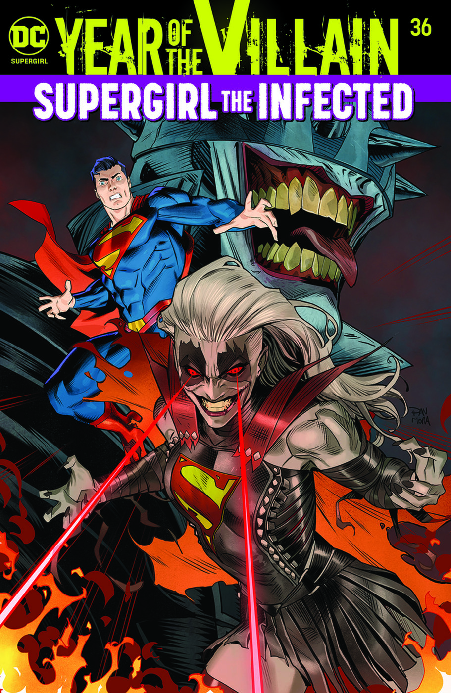
Review: SUPERGIRL #36 Is Back In Black…Metal?

Supergirl #36
Supergirl #36 Credit: DC Comics

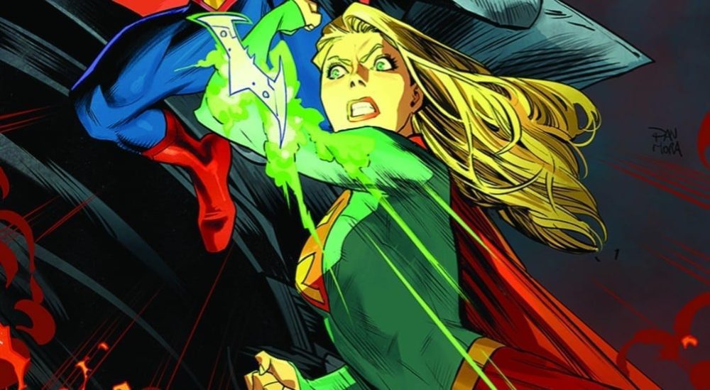
In this week’s Supergirl #36 from DC Comics,  the Daughter of Krypton finally joins the universal Event story featuring the Batman Who Laughs virus. With the infection spreading wildly, what will Kara’s roll be in the fight between heroes?

Drawn to the Fortress of Solitude by Brainiac, Supergirl is infected with nanites and stopped in her tracks. Fighting internally to break free, Supergirl has limited time before the evil Brainiac can download all of the Kryptonian database. But a larger threat is on the horizon, one that could spell doom for both Supergirl and her enemy. One infecting the DC Universe. The Batman Who Laughs.

Supergirl #36 cover
Supergirl #36 Credit: DC Comics

A Mixing of Genres

A strong opening sees Supergirl overrun by insect like robots, their extendable legs covering her body, attempting to claw inside. The scene is reminiscent of a scene from Superman III and contains the same level of horror generated by that 1980’s movie.

Marc Andreyko sets the scene early and reiterates the horror motif that has been running through the last few issues of this superhero comic. It has all been building to this: a confrontation with Brainiac.

Except, there is a lot of other stuff going on. This issue is tightly linked to various other DC comics that are released this month, with some of the fight scenes being shared across the pages of Batman/Superman. The Batman Who Laughs virus that has been infecting other heroes has finally found its way into the pages of Supergirl and not even her super strength can protect her.

How Andreyko manoeuvre’s Kara from the Fortress of Solitude into the greater DC arena is almost flippant in its disregard for narrative structure. He turns his back on the opening so quickly that he undermines the months of build up that has surrounded the two characters and their inevitable meeting. A resolution of sorts comes later in the comic but even this moment feels rushed, a victim of the crossover story.

And that is where this issue’s main problem lays. It is swallowed by the crossover. If you aren’t reading any of the other DC comics then this will leave you out in the cold; partially wondering what is going on but also not really caring very much. The ‘evil’ Supergirl comes off as lazy, both in design and character, especially without the backstory of the Batman Who Laughs. The action then moves at break-neck speed as if Andreyko has to tie everything up before the end of this issue.

The narrative is a blend of skin crawling horror and light hearted superhero shenanigans. There is plenty of banter in the fight sequences and pantomime level posturing by the villains but none of it is genuine enough to be anything other than cheesy. A clever script could have pulled this off but Andreyko just doesn’t quite manage it.

Supergirl #36 interior art
Supergirl #36 Credit: DC Comics

Goth Girl In Action

The only thing keeping the reader engrossed in this issue is the art work. Eduardo Pansica’s pencils and Julio Ferreira’s inks bring all of the energy and dynamism you would associate with the character. The Superhero tropes are there, just as in the script, but the clever panel layouts and shifting points of view give the artwork an edge over the narrative. The visual storytelling blends the horror and superhero aspects together successfully making this issue decidedly uncomfortable in places. The theme’s are set in the opening and carried throughout, almost overcoming the cliches of the costume design, which have been forced onto the comic by the crossover.

The coloring is a lot more murky than usual, another victim of the crossover. In an attempt to bring the comic more in line with the other titles in the event Chris Sotomayor has toned down the color pallet. The scenery is awash with grays and there is a prevailing sickly green tinge to an array of panels. These coloring choices do make sense in the grander scheme of the story and they reflect effectively Kara’s journey in this issue.

Unsurprisingly, the only aspect of the comic not adversely affected by the crossover is the lettering. Tom Napolitano does a spectacular job of keeping the speech flowing evenly through the panels and differentiating between characters; especially between those infected by the virus. For Napolitano the crossover offers him the opportunity to play around with the styles he has set up in previous issues.

Supergirl #36
Supergirl #36 Credit: DC Comics

Conclusion

When people talk about the pros and cons of Event comics, Supergirl #36 could be used as a prime example of both the good and the bad. It has engaging elements that relate to the characters own story, written and drawn by the usual artists. However, it also has a narrative forced upon by the crossover with a whole set of new cliches, most likely designed by another team of creators. The joins between the two are obvious and more often than not the quality of one is lost beneath the need of the other. 

Entire scenes are missing from the story because they happen in a different comic. This interferes with the pacing of this comic and pulls the reader out of the story. Even if you are reading the related titles, the flow of Supergirl is interrupted and her story, the one that readers have been following for the last few months, is almost dismissed with a wave of a hand. The conclusion is unsatisfying and quick. Regular readers are let down by the need to include the crossover events.

The Supergirl comic, historically, always has the same problem. A new creative team launch the comic with some outstanding stories, building an impressive world for Kara Danvers to live in. But after a while, the momentum flags and the old stories are repeated, with Supergirl thrown into any and all Event stories as possible. This in turn dilutes her narrative and affects the quality of her comic until a re-launch with a brand new creative team.

We are currently in the later part of that cycle and next month sees a new team take on the Daughter of Krypton, albeit with the hangovers from this event story. Hopefully Supergirl will once again take flight and soar above the rest, where she belongs.

Monkeys Fighting Robots Youtube

King’s BATMAN Run is a Masterpiece, and BATMAN #83 is Just Another Reason Why

Joker and Catwoman have a friendly chat after trying to kill each other (BATMAN #49)

To talk about all the amazing things in Batman #83, written by Tom King, with art by Mikel Janín, colors by Jordie Bellaire and letters by Clayton Cowles, we first need to talk about something in recent comics that is frustrating. Let’s touch on this briefly to show how King has consistently been rising above these pitfalls despite controversy and backlash, and how Batman #83 is just another brilliant chapter in King’s masterwork of subtext.

In the past couple of years, comics seem to be telling readers everything they need to know. From the opening pages of issue #7, they tell readers every single thing that happened in the last six issues and how it has affected all of the characters. Then a huge life-changing event occurs in issue #7, and often the characters take a moment to effectively sit down and debrief. Of course, this doesn’t always happen in a sit-down, sometimes it’s hidden in quips and asides. Regardless of the packaging, one never wonders, “How are these characters feeling?” The story is spoon-fed to us. It feels more like listening to a sermon, with readers acting more like a sounding-board than active participants.

King rarely tells readers in his story how his characters feel, and characters often say things that they don’t truly mean. It’s King’s understanding of subtext that allows us to feel like a player in the story. What remains unexplained or unsaid is as much a part of a story as what is explained or said. When things are left up to interpretation, we bring our own life experiences into the mix to solve the puzzle. We think, “Oh, I went through something like this, I know how angry he must be,” or “Why doesn’t he just say ‘I need you,’ we know that’s what he’s thinking!”

One of the most striking moments of King’s Batman run is in issue #49. The Joker and Catwoman have a showdown at a church. They both seem to mortally wound each other and then spend the rest of the issue lying on the church floor, bleeding out, and chatting. No big fights, no world-threatening events, very little talks of feelings. Just jokes and nostalgia. As Joker talks about the “good old days” of fighting Batman and how they would all laugh, he says to Selina, “You were there. But you never laughed.” Selina’s response isn’t an explanation. She says, “Yeah, you’re right. That is odd.”

Joker and Catwoman have a friendly chat after trying to kill each other. (BATMAN #49)

The fact that Selina almost seems to avoid the question speaks louder than any answer could. They talk about everything but their feelings, deflecting and rabbit-trailing like they have something to hide. They ask why Penguin has an umbrella, and talk about how underrated they think Two-Face is. Of course, as the issue progresses and Joker and Selina lie side-by-side, trying to stop their bleeding, Joker comes back to the original question. “I only laugh when I win,” Selina finally says.

But it’s the initial deflection that leads us to wonder if she’s telling the truth or just finding a new way to stop the line of questioning. Either way, Joker is destined to get under her skin. He says to Selina of her and Batman’s wedding plans, “He can’t be happy. And also be Batman.” It’s after Joker lets go of his wound to try and finally shoot Selina, and he collapses in her arms that something odd happens. Selina laughs. Is it because she won? Or did Joker’s words get to her? It doesn’t feel like she won.

So, it’s not that King doesn’t explain everything, so much as what is explained can’t be trusted. These characters can’t voice their feelings because their feelings are more profound than they can express. The very fact that characters find some things too difficult to say means more than if they said them. A dozen or so issues later, King digs his heels into this approach with the “Knightmares” arc, essentially six issues of nothing but Batman’s bad dreams. A lot of the dialogue is minimal. A lot of the actions are metaphorical. All of it is deeply subtextual.

Batman chases his quarry in a practically wordless comic. (BATMAN #67)

This drove people crazy. It’s fair to get impatient, not many things happened in these issues. But King has dramatically rejected the format and pacing of an average comic book. He doesn’t create an event for every issue, and sometimes he doesn’t even mind if nothing happens to advance the plot at all. King focuses on his characters while pulling back his exposition so we can still question if we even understand the characters in the first place. King doesn’t connect all the dots for the readers; he lets the readers do some of the work.

Batman #83 is another slow and straightforward issue that merely describes Batman breaking out of a room. It’s somewhere on page three that it becomes clear: “Oh, so this IS the issue.” There is no point in waiting for the action to begin because King takes his time. Batman barely speaks. Instead, we get the art of Mikel Janín and the colors by Jordie Bellaire, creating volumes out of silence. Batman never says, “I’m in pain.” His silence does. His mouth never speaks, “I’m afraid to lose,” his eyes do.

The work King is putting into his run on Batman is something different. It’s slow, methodical, and its best moments are as painful as they are enjoyable. But the result is like doing open-heart surgery on the character beneath the cowl. We see Bruce Wayne’s heart laid bare, one pregnant pause at a time. It’s not so much King’s pen that has created his masterwork as it is his extreme restraint. He invites us into the story to be equal parts in figuring out what is going on, and he allows us to come alongside him and diagnose Bruce Wayne. Because in the end, Bruce Wayne is me, Bruce Wayne is you, and Bruce Wayne is most definitely Tom King.

Monkeys Fighting Robots Youtube

Review: AQUAMAN #54—Fatherly Advice For Black Manta

AQUAMAN #54 cover artwork

AQUAMAN #54, available in stores on Wednesday, November 20th, places all of the focus on one of the DC Universe’s most least-understood villains—David Hyde, a.k.a. Black Manta. Wagering war against Aquaman ever since accidentally killing his father, Hyde is now using an A.I. clone of his father to attack Amnesty Bay. Will Aquaman, Aqualad, and the rest of the team be able to stop this intimidating father and son duo?

Story

Writer Kelly Sue DeConnick tells this story through the lens of Hyde’s past, walking the reader through various memories of his father. One shows the young Hyde throwing a coin into a water foundation, only to find his father fishing it out soon after and giving the child a hard lesson in “reality;” another features the two watching a football game with Hyde senior explaining why the purpose of any game was to crush your opponent completely.

These memories full of “fatherly advice” help the reader understand why the character chose such a villainous path. We see how Hyde’s father believed the world to be bereft of any true “goodness,” meaning the best way to face the hardships was by taking what you want—preferably by force.

fatherly advice

Readers are brought back and forth between these flashbacks and the fight Hyde and his A.I. “father” wage against Aquaman. One might think such a story structure would be too chaotic, but each transition occurs smoothly, propelling the narrative forward with further context regarding Hyde’s character. And it all culminates with Hyde overpowering Atlantean hero, leaving Aqualad and the rest of the team in charge of finding a way to stop the villain’s rampage.

Black Manta's destruction

Artwork

The artwork within this issue, if likened to a musical genre, would be considered “death metal”—fast-paced, intense, and slightly eery. Even the slower scenes of Hyde’s are short-lived, serving as the breath of air one takes after being tossed around by the ocean’s waves. The art team uses this tactic to draw the majority of readers’ attention to these scenes.

Robson Rocha and Jesús Merino’s penciling, along with Daniel Henriques and Vicente Cifuentes’ ink work, provides great differentiation between the destructive fighting in the present and the dreamlike sequences that represent Hyde’s memories of his father. This distinction is made more prevalent through Sunny Gho’s coloring, which employs cool, subdued shading in the memories’ backgrounds and harsh, warm colors to back up the chaos in the here and now.

This sense of contrast can be seen in Clayton Cowles’ lettering as well, showing mostly symmetrical word balloons in the past to represent the cold nature of his father and an assortment of differently shaped segments of dialogue in the present scenes. These harmonious art features help tell the story of Hyde’s father’s parenting—a robotic, calculating approach to parenting that ironically generates a rage-filled son.

Comic Covers

Main Cover

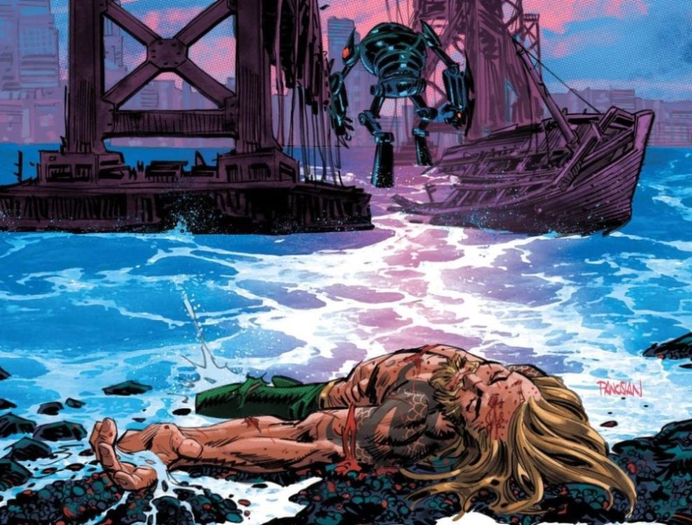
Dan Panosian’s main cover artwork is unique in that it comes in two parts; the first side shows Aquaman fleeing from the mechanized Black Manta, leading to the conclusion of the seemingly short-lived battle on the second. In this panel we see Aquaman defeated, adding more doubt into readers’ minds as to whether the good side can come out on top.

Variant Cover

Shane Davis, Michelle Delecki, and Morry Hollowell’s variant cover artwork follows the trend of previous iterations in this series, featuring Aquaman navigating the ocean depths surrounded by sharks. We’re once again reminded of the hero’s true mastery of this force of nature.

Conclusion

AQUAMAN #54 is the perfect story for DC Comics’ Year of the Villain event, giving readers a reason to sympathize with one of its most deadly criminals. We’re anxious to learn more about Hyde’s troubled psyche in the coming issues.

Do you think there’s any hope for Hyde’s redemption? Let us know what you think in the comments below!

Monkeys Fighting Robots Youtube

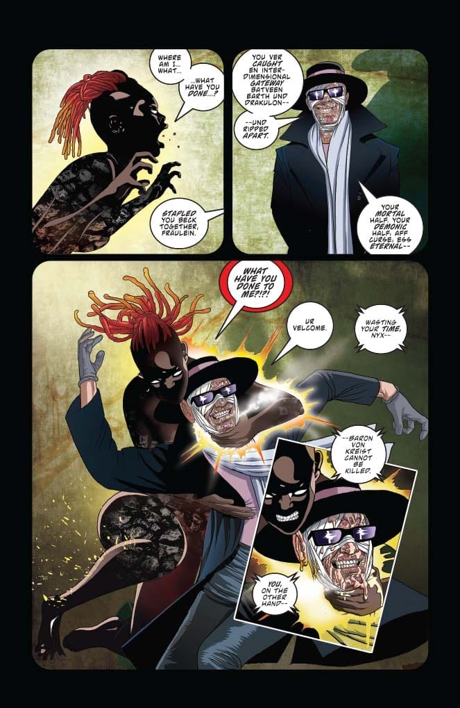
Review: VAMPIRELLA #5 Offers Great Characterization, Minimal Story

Vampirella #5

Vampirella’s enemies organize and grow in the shadows of Vampirella #5, out this week from Dynamite Entertainment. Meanwhile, the therapy sessions continue, delving into more and more of the character’s recent memories.

The Writing

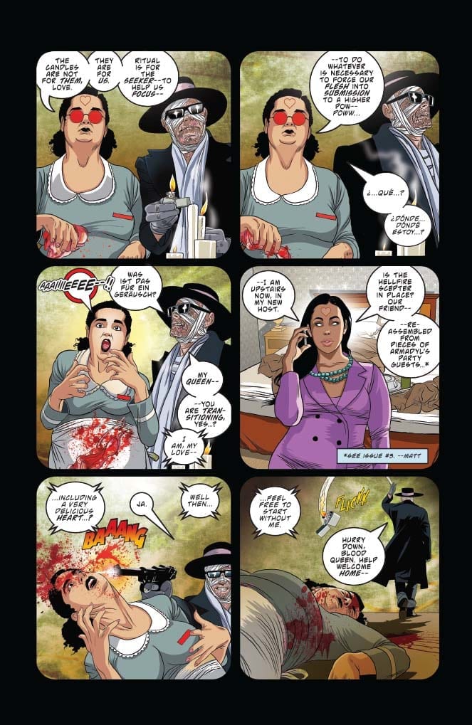
We spend most of the book’s first half in a flashback focused on our antagonists: Von Kriest, Blood Red Queen of Hearts, and now Nyx as well. In this way, we learn a little more about their plans (if not their motivations). We then pivot, focusing on our heroine in the second half of Vampirella #5, fleshing out her relationship with other characters.

Writer Christopher Priest has spent his run on Vampirella slowly constructing a distinct impression of the titular character. The book reads like a puzzle, with each issue adding details to provide a clearer impression of Vampirella, as well as the events she’s trying to relay to her therapist.

Time-hopping has been a cornerstone of the series since the first issue. We’re constantly pulled from the therapy sessions, which Priest uses as a framing device, to different points in the past. Rather than a conventional, linear plot, we experience events out of order, but uncover more details with time. In Vampirella #5, for example, we begin a year before our first issue, then leap to six months later, all relayed through a framing device in the present. It’s an interesting experiment…but the time jumps can be disorienting and chronologically confusing.

Even after five issues, we’ve yet to see the emergence of any clearly-defined plot. One can be unsure which events are key moments that motivate any larger conflict, or what that conflict may be. Because we’re not firmly-grounded in the narrative, the structure (or lack thereof) makes it hard to orient ourselves and figure out where—and when—we are. This problem could be especially pronounced for new readers who are unfamiliar with some of these characters.

Priest’s characterization was a little rough in our first few issues. By Vampirella #5, however, the dialogue seems to flow more naturally, and personas feel more realistic and compelling. The series is evolving into a compelling examination of Vampirella as a character…but the lack of a distinct narrative continues to drag it down.

Vampirella #5

Vampirella #5

The Artwork

Artist Ergün Gündüz has a unique vision for the aesthetic of this series. He does a great job overall of composing panels, and occasionally gives us some very striking imagery.

That said, the level of detail employed varies throughout the book. In some panels, we see meticulously-thorough illustrations of backgrounds and environments, while in others, the background recedes, focusing the reader’s attention solely on the characters. While this approach can accentuate the figures in the composition, it’s not always the most visually stimulating.

In addition, the figures themselves can still be rather stiff from time to time throughout Vampirella #5. While generally looser and more natural than in some previous issues, there are moments when characters appear to simply stare into space, like a mannequin.

Gündüz’s color work, however, is excellent. We have a wide palette of colors on display; the visceral red gore and fiery, ethereal glows catch the reader’s eye, but don’t overshadow the rest of the page. It’s flashy, but well-balanced, highlighting the artist’s subtle skill.

Vampirella #5

Final Thoughts

Vampirella #5 continues to offer an interesting impression of this iconic character. If there were a story to accompany the study, we could reall have something here. As is, though, it still feels rather directionless and meandering.

Monkeys Fighting Robots Youtube

Review: MARAUDERS #2 Welcomes In The Red Queen

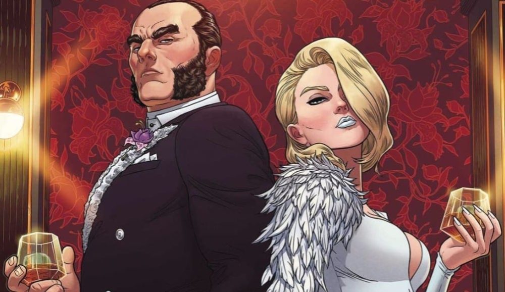
Marauders #2 cover detail
Marauders #2 Credit: Marvel Comics

The world is abuzz with X-Men stories and Marvel’s Marauders #2 hits the shelves this week with promises of high adventure and daring do. Mutant Pirates and Big Business are strange bedfellows, but this is the Dawn of X and anything is possible.

Going into this issue and two thirds of The Hellfire Trading Company’s directors seats have been filled leaving a single spot left open. Sabastian Shaw believes he can strong-arm his choice into that seat but Emma Frost has other plans. In fact, Emma Frost has all the plans and they are slowly unfolding for all to see.

Marauders #2
Marauders #2 Credit: Marvel Comics

A Cutthroat Business

Marauders #2 is a comic in two haves. The first half is set in a boardroom at the heart of The Hellfire Trading Company. The second half is on the open seas, where Kate Pryde and her boat of merry mutants are doing all the right things but not necessarily in the right way. 

Gerry Duggan hops from one location to the other creating a series of narrative beats, each building in dramatic tension as the pages are turned. He skips backwards and forwards between the action using one scene to add relevance or emphasis on the previous one. The narrative structure allows Duggan to break up the more conversational scenes with some action but it also provides opportunities to contrast characters.

Each of the three central characters are compared within this issue. Duggan uses the story to demonstrate personalities and the clashes that are inevitable later down the line. By the end of this issue you know exactly what to expect from Frost, Shaw, and Pryde. 

One of the highlights of Marauders is the witty banter between the characters. Duggan effectively uses conversation within action sequences without changing the pace of the fights. Short, snappy soundbites are built into the movements of the characters as they interact verbally and physically on the page. The script has the humour but the artwork provides the timing, especially the placement of the lettering by Cory Petit.

As the comic opens the speech balloons create a solid and steady thread through the images, leading the reader through the back and forth of Frost and Shaw’s conversation, When the action hots up, the placement of the balloons becomes more erratic in the panels, signifying the movement of the characters and the chaotic nature of the fights. The visual element helps to set the tone for each page and sequence, allowing the reader to digest the scenes more naturally. 

Marauders #2
Marauders #2 Credit: Marvel Comics

Art of the High Seas

Matteo Lolli has a smooth and fluid style of inking giving the panels an easy flow through the pages. His attention to composition within a panel and the page layout add to this fluidity in appearance. Lolli concentrates on the movement of the characters and their physical interactions, allowing the script to add most of the personality. This approach works because artist and writer complement each other; providing what is required from each of them.

A lot of the detail on the page comes from the color work. Federico Blee adds depth to the scenes and has a flair for bringing out the drama. He uses an array of bold colors and isn’t afraid to cover a page or panel. At times this produces a sense of chaos but then he’ll pull most of the color from a panel highlighting the action within it.

This issue is all about the appointment of the Red Queen and there is a foreshadowing of that throughout thanks to Blee’s use of the color red on pretty much every page. There is a bright splash of red as a constant reminder to the reader where this story is going.

Marauders #2
Marauders #2 Credit: Marvel Comics

Conclusion

With a lot going on in the Mutant world at the moment it can be difficult to keep up. The beauty of this issue of Marauders is that you can pick it up with no prior knowledge and still enjoy it. Duggan’s script is inclusive in every respect and the art style is easy on the eye, putting any reader at ease. 

Major things are happening in the narrative, and references are made to the larger X-Men universe but at heart, Marauders is a good old fashioned pirate romp with added mutant shenanigans, in both senses of the word. 

Monkeys Fighting Robots Youtube

INTERVIEW: Composer Lior Rosner On Will & Grace & The Day After The Nutcracker

NBC’s revival of Will & Grace is a beloved hit that’s added three seasons to the show’s original eight-season run and, now in its (second) final seasons, the show continues to deliver the same lovable characters but with updated sounds from composer Lior Rosner.

Will & Grace returned after an eleven-year hiatus with its four stars on board. Eric McCormack, Debra Messing, Megan Mullally, and Sean Hayes all returned to deliver new seasons that didn’t skip a beat. From the start, the reception was positive, “Will & Grace reunites its ever-hilarious cast for a revival season that picks up right where the show left … adding a fresh relevance and a series of stories that make sharply funny use of the passage of time.”

PopAxiom spent about the length of a sitcom talking to Lior about his journey from Israel to the U.S., making music for famous franchises, and an unofficial sequel to the Nutcracker known as Sugar Plum on the Run.

Beat Band

With a musical dad, Lior picked up instruments like guitar and trombone early on, but it wasn’t for him. “I liked playing the piano, and I was very into jazz.”

Born in Israel, Lior’s musical career took hold while performing military duties for his homeland. “It all started with my service in the Israeli Army. I got accepted to the prestigious group called the Air Force Beat Band. I was a keyboard player.”

Being a member of the band was motivational. “It’s amazing hearing your arrangements performed by a group.”

Lior, “… started writing arrangements …”

About his time in the Beat Band, Lior adds, “… it’s a great opportunity for young people to be in an environment like this where you can write something and hear it immediately. You hear it, fix it, come back the next day.”

After military service, Lior moved on to the University of Jerusalem. “It drew me back to study the masters of classical music.”

Ultimately, Lior, “… moved out here [L.A.] to work on film and T.V.”

FOX Family

Lior’s earliest gig in the U.S. started when he was hired by Fox Family. It was there that the young composer became part of a long existing franchise: Power Rangers. Lior laughs, “It was some of my first work and how I got my VISA here.”

At Fox Family, Lior says, “I learned a lot on the spot. You get to write a lot for cartoons and children’s shows. I did it for three years.”

After Fox Family was purchased by Disney, “I worked there for one more year.”

Will & Grace

Lior co-composes Will & Grace with Scott Icenogle. Lior, “… knew the original show.” His composer knew the producers of the show and together, “We implanted the idea of us giving the theme a facelift.”

The team put a presentation together where they “… created some new cues …” As they say, the rest is history. Lior and Scott were hired for the show.

Working on Will & Grace is “… a lot of fun.” Taking things to a whole other level of challenge and fun for Lior on Will & Grace: “I had to re-create the themes and song from I Love Lucy for a special episode. I had to write some original music in that kind of style.”

Run, Sugar Plum, Run

Lior’s work is part of a project called Sugar Plum on the Run, which features new and familiar sounds. The project, “… came out of my desire to create something for the holiday season.”

Lior explains, “When I moved here, I was fascinated by how, for a whole month at the end of the year, the vibe changes everywhere. I realized they always use the same music, and I wanted something that was evergreen like that.”

Lior began creating “… variations of the Sugar Plum Fairy.”

Together with a friend, they, “… created a story.” Lior “… created interludes …” and, “… narration telling a story about the Sugar Plum Fairy leaving the kingdom and going on a journey outside of the kingdom … basically a sequel to the Nutcracker. The day after.”

Lior recognized that he “… needed a strong narrator.” He began by “… approaching different actors.” One actor agreed, and his name is Jeremy Irons! “He did it for charity, which was nice.”

About working with Irons, “He’s incredible. His performance in the original Lion King is insane. It’s so good.”

Sugar Plum on the Run is available on your favorite streaming service. For fans, there’s also something more coming soon. “There’s also an animation short in the works with the character.”

Find Sugar Plum on the Run HERE!

sugar plum, lior rosner, jeremy irons

Wrapping Up

Who is part of Lior’s creative DNA? “If you look at my music on my iPhone, I have an eclectic list.” Lior thinks about it for a moment before dropping some names from the film scoring world. “Jerry Goldsmith, John Williams, James Horner, and John Powell.”

More specifically, Lior explains, that for Sugar Plum, “… it’s all very inspired by Russian composers. If, like, Tchaikovsky could assemble the best Russian musicians. Rachmaninoff, Khachaturian …”

How does the music of his homeland inform his work today? “One of the reasons I left Israel was because I don’t like the music. Especially the pop music. I was always attracted to the classic American songbook. I studied jazz. Film music and old Frank Sinatra.”

Lior reflects, “I must have some influence from Jewish music but in a very subtle way.”

Lior is hard at work on Will & Grace as it heads through its (second) final season. In January a new project is coming out. “It’s a show on Netflix called A.J. and the Queen created by Michael Patrick King and RuPaul.”

Thanks to Lior Rosner and Impact24 PR for making this interview possible.

Want to read more interviews like this? CLICK HERE.

Monkeys Fighting Robots Youtube