Home Blog Page 317

INTERVIEW: Production Designer Erin Magill On ‘Swallow’ And ‘The Quarry’

Erin Magill’s production designing skills are on display in two films currently receiving great attention. The first is the psychological thriller Swallow starring Haley Bennett (Thank You For Your Service). The second is The Quarry which centers around Michael Shannon’s (Man of Steel) small-town sheriff contending with a new preacher in town who may not be what he seems.

Viewing the trailers will tell you all you need to know about how different these films are. Swallow comes off as a sleek, stylish, Kubrick-esque film that’s unnerving and disturbing. Meanwhile, The Quarry is grounded, gritty, and a disturbing thriller in its own way. Both films are held together by the powerful gravity created by the performances of each lead — one male, one female. Thematically, each film deals with distinct themes.

PopAxiom spoke with Erin about her road to designing in Hollywood and her work on two diametrically different films, Swallow and The Quarry.

Stage To Screen

Like any kid growing up, Erin was a fan of all things entertainment. “I wouldn’t say I was a cinephile, but I was a kid who grew up loving T.V. and movies. I have always been creative and done well in art classes and things like that.”

With a knack for creativity, Erin went off to college. “My undergrad was in a design program that covered everything from graphic design to window displays. One of the classes was ‘Creativity 101’, where I’m pretty sure we just watched a lot of Peewee’s Playhouse.”

Erin enrolled in a theatre design course despite not being as passionate about the stage as the silver screen. “The teacher — John Iacovelli — he also was a production designer and in one of our lectures, he showed us all these behind-the-scenes photos of Honey, I Shrunk The Kids. I got to see these images of him on set building the giant blade of grass and the big Lego and all the sudden I realized ‘that was a job!’”

Erin got an internship towards the end of college at the standard-bearer for computer-animated filmmaking — Pixar. “I started on Ratatouille my senior year of college then ended up working there after college for the majority [of the time] on Toy Story 3.”

Animation wasn’t something Erin was interested in, but she loved designing. Pixar proved to be the perfect stepping stone toward Erin’s work today. “The Pixar University Program allowed anyone in the company to take these classes. The program geared toward people passionate about making films. I ended up getting the job as a set decorator.”

Erin says she, “… learned a great deal …” at Pixar. The hands-on education lead her to her next step. “I ended up going to AFI in L.A. for production design.”

michael shannon-film-interview-erin-magill

About The Quarry

Ten years and many projects later, Erin is the designer behind two newly released movies. How did she become a part of The Quarry production? “The Quarry came through a line producer I had worked with on Hearts Beat Loud, she was talking to the producers [of the film] and brought my name up to them.”

Her producer friend ended up taking on another project, but Erin remained. Of the production, she says, “… it happened very fast. The film had a very tight schedule based on Michael Shannon’s availability.”

To land The Quarry gig, Erin went through a fairly typical process of discussions and putting together a “… ‘look book.’” However, Erin shares the funny truth behind what tipped the scale in her favor to become part of The Quarry crew. “[Director Scott Teems] … ended up telling me that he had looked at my Instagram and liked a lot of my photos.”

In the book, The Quarry takes place in South Africa, but the film changes things up a bit. “In the script, they moved the story to West Texas,” and Erin tells us how the production itself changed things up a bit more, making it more challenging than she imagined “… when I jumped on, it was shooting in and around New Orleans.”

Selling the story in dusty, dry West Texas was going to be tough. “We tried to avoid the Spanish moss and the above-ground graves. It was a big concern.”

Another idea in flux was when the story would take place. “I think [Scott] viewed it as an allegory, very much like the Bible stories; timeless. Good and evil. It could feel relevant today. Originally he hadn’t put a time period in the script. By the time I got down to New Orleans, we had agreed it would be mid-to-late 80s.”

swallow-film-thriller-erin-magill

About Swallow

Now flip all that realistic grittiness around because we’re talking Erin’s other other film, Swallow. “There’s this idea of control in the film.”

Swallow’s design is borderline minimalist. A better term might be meticulous. “There are all the same amount and type of conversations for Swallow as The Quarry,” Erin says, “But they couldn’t be any more different in terms of style.”

Swallow is a complicated story. At its core, Erin says, “It’s more of the psychological, horror film. And something people probably haven’t seen before in the content and where it goes.”

Swallow is classy but tense. According to Erin, “It looks more expensive than the money we had. It was one of the best collaborative experiences.”

Designing Productions

Swallow takes place in the modern-day, while The Quarry is set 30-ish years ago. Erin’s knack for capturing an era is due, in part, to the people from which she’s learned. “One of my first jobs out of grad school was working on the art department of Mad Men. I got to learn and work with some of the best people who know how to do ‘period’ correct.”

Discussions about how to accurately represent another period of human history are tricky. “There’s a level of factual — this is what this actually looked like. But then we ask, ‘do we want to play up one thing or another’ or do we avoid a certain color because of how it might conflict with the story? If it’s a more stylized film, you want to play it up.”

On The Quarry, Erin says, “… we wanted to stay rooted in a realistic but moody place. These people don’t have a lot of money, so you realize that most things aren’t even from the 80s. The church was probably built in the 50s, and then there are things from the 60s, 70s, etc.”

A part of Erin’s ability to set the right mood is the result of research. “I have a large library collection with stuff like the history of furniture. I collect home magazines.”

Erin shares another trick of the trade. “I have an opportunity I buy old wallpaper books that you can sometimes find at old estate sales or eBay. A lot of those are great because they’re well preserved, and you can see the colors and patterns used at the time.”

Erin’s personal process includes her own sort of story. “You kinda have to make up the whole history of the town. Whether anyone will ever know or what the director’s thoughts are about, it doesn’t matter. You kinda have to do it for yourself so that things are aged properly.”

Wrapping Up

From where does Erin draw inspiration? “As a designer, I find paintings, photography, those artists, and I have a vast library that I use a lot for reference. Those are the biggest inspirations for me.”

Erin shares the name of a few inspirational artists. “An artist I loved growing up was Joseph Cornell. He would do these boxes with miniatures … like a diorama in a shoebox or something. He made me love set design. Photographer, Alex Soth and Philip-Lorca diCorcia … I use a lot of their imagery.”

What remake would Erin want to join as a production designer? “The child in me loves Overboard; Goldie Hawn and Kurt Russell and this ridiculous 80s movie. I never saw the remake. I assumed they ruined a perfect film.”

Erin adds another film to her remake wish-list. “Here’s one that I love, I was obsessed with this movie as a kid, Auntie Mame. I’d read that Tilda Swinton got the rights to the book it was originally based on. I feel Tilda will do it right. That would be a dream. That’s a movie that would have very fun sets.”

Both The Quarry and Swallow are available on YouTube, Amazon Prime, Google Play, and various other on-demand services. So, amid a global pandemic, what’s next? “Nothing is happening. There are articles out there about what people think it will look like when we get back to business. It will be interesting to see how all that happens.”

Are The Quarry or Swallow on your watch-list?

Thanks to Erin Magill and Impact24 PR for making this interview possible.

Want to read more interviews like this? CLICK HERE.

Monkeys Fighting Robots Youtube

SWAMP THING by Nancy A. Collins: A Nearly Forgotten Chapter
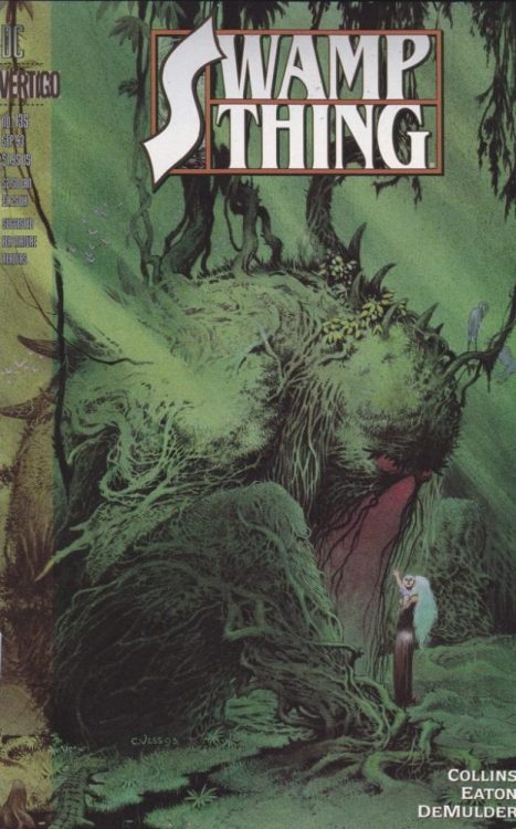
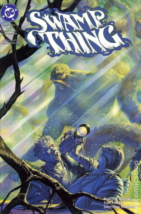
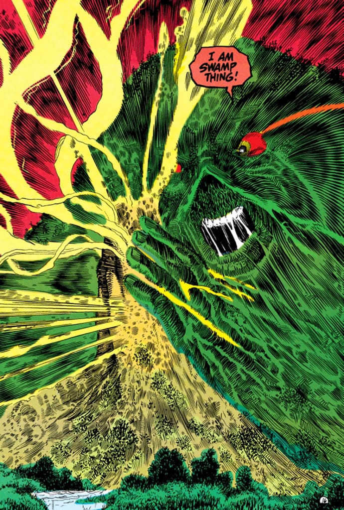
The work of southern-gothic horror novelist Nancy Collins on DC’s Swamp Thing is a unique tale both in terms of the classic character and the context around it. While not the modern classic that Alan Moore’s run is, Collins’ tenure put the now-iconic character on a new and unique trajectory for both the foreseeable future and for the beginning of DC’s Vertigo imprint.

Collins’ creative perspective both brought Swampy back to his roots (no pun intended) as a Bronze Age horror creation while also further examining the character concepts instilled by Moore. Her knowledge of southern-gothic writing traditions and Cajun folklore allowed her to hone in on Swamp Thing’s home of Houma, Louisiana for much of her inspiration. Collins adopted a more episodic “monster of the week” structure while still adhering to an overarching plot. Each of these segues usually involves a piece of Louisiana history and/or folklore, with the appropriate amount of embellishment. Swampy’s friendship with the local Cajun population makes him subject to their history – and with it, some of their torments. Tormented soul-monsters, undead demonic pirates, and weary spirits make up the cast of Swamp Thing’s more unusual enemies and allies when he’s not dealing with the usual suspects.

Collins still adheres to the plots set forth by Moore, Rick Veitch, and Doug Wheeler, but she uses her own perspective to set her run apart from the others. The run of monsters and villains such as General Sunderland and arch-nemesis Anton Arcane really just serve as growing points of contention for the core of the story: Alec’s (Swampy’s “real” name) family life. Swamp Thing’s wife Abigail has been able to handle the flow of usual enemies threatening hers and Alec’s life for a long time; that is until she also had to start caring for their child, Tefe. The responsibility of having to raise a child with growing supernatural powers while her husband has to remain guardian of The Green and fight off supernatural forces becomes a growing problem in the run’s background. Alec’s inability to wisely handle this situation comes as both an internal and external conflict; he cannot fully devote his time as a father and husband as the avatar of the Earth’s plant life and representative of the Parliament of Trees. Collins’ treatment of Alec’s desire to retain his humanity despite his title keeping him from doing so is one of the most compelling aspects of her run.

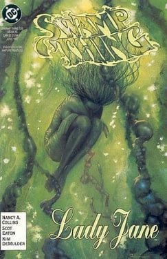
Truly the most compelling point of Collins’ Swamp Thing is her development of Abigail as her own character with wants and needs outside of just being a plot device for the main hero. Collins implements a great deal of socio-political issues into her work here. Homosexuality, racism, religious fundamentalism, and other issues are brought up consistently and often at length (this is pretty on-brand for early 90’s Vertigo comics). However, her most controversial move is having Abigail Holland/Cable/Arcane leave her husband, child, and her home in the swamp for the sake of her own happiness and sanity. In an era where mainstream comics championed killing off heroes’ wives and girlfriends for shock value, this was a bold move. A bit too bold a move for many fans and even DC editorial at the time, who had earlier suggested killing off Abby as was essentially tradition at the time. Collins’ decision to give her the autonomy to strike out on her own earned her a fair amount of scorn from the comic community. In the long run however, this has been remembered as the beginning of a healthier trend. Alan Moore himself actually called Collins to congratulate her on sticking to her guns and making what could only be considered as the “right” decision for the story.

The potential significance of Nancy Collins’ two-year run on  Swamp Thing potentially outweighs the actual series’ quality. Note that this is a well-written and highly entertaining read with plenty for fans of Swamp Thing, horror, and Vertigo Comics alike to enjoy. While it never reaches the heights of some of its more popular contemporaries such as Gaiman’s  Sandman or Ennis’ run on  Hellblazer, it benefits from the author’s specific outlook. Collins’ experience as a southern gothic-horror writer, and her unwillingness to capitulate to the wishes of editors and fans alike warrants her work here a second look. The humanizing of Abigail Arcane and focus on Swamp Thing as a being torn between responsibility and desire makes for a compelling read – and this is before even considering the monsters and mythology thrown in.

If you’d like to give this piece of nearly forgotten comics history a look, it can be found digitally at DC Universe, or in a recently released omnibus volume available for order from your local comic shop!

Monkeys Fighting Robots Youtube

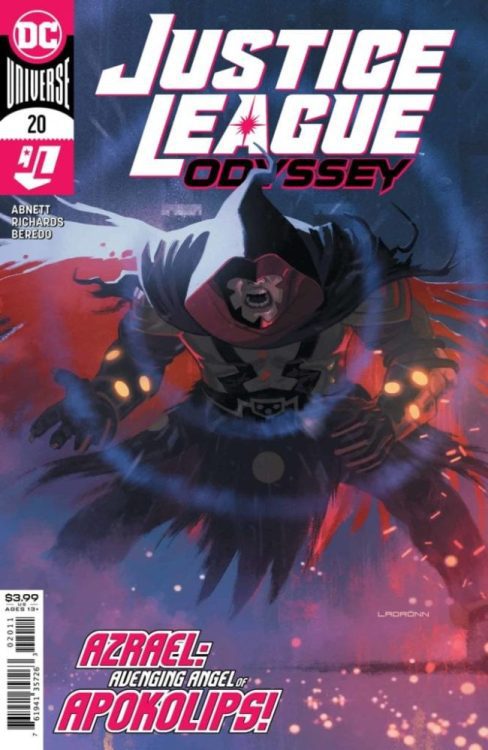
Review: A Darkseid Controlled Azrael Attacks In JUSTICE LEAGUE ODYSSEY #20

JUSTICE LEAGUE ODYSSEY #20, on sale Tuesday, May 12th, is the long-waited follow-up to issues #19’s surprising death. After learning Darkseid seized complete control over Starfire’s mind, Blackfire, her own sister, destroyed her in the blink of an eye. When confronted by Jessica Cruz, the Tamaranean Queen claimed there was no hope for her sister once under the overlord’s control. But is this true? Is there any hope of saving both friend and foe?

Story

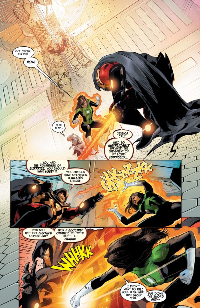
The chamber of the time-lord Epoch rumbles with action as a new battle erupts? The combatants? Cruz and the anti-hero Azrael. Under normal circumstances, this wouldn’t be much of a challenge for the Green Lantern. But due to the influence of Darkseid, this rogue employs Omega powers that rival any superhuman’s might.

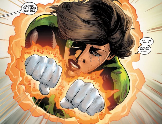
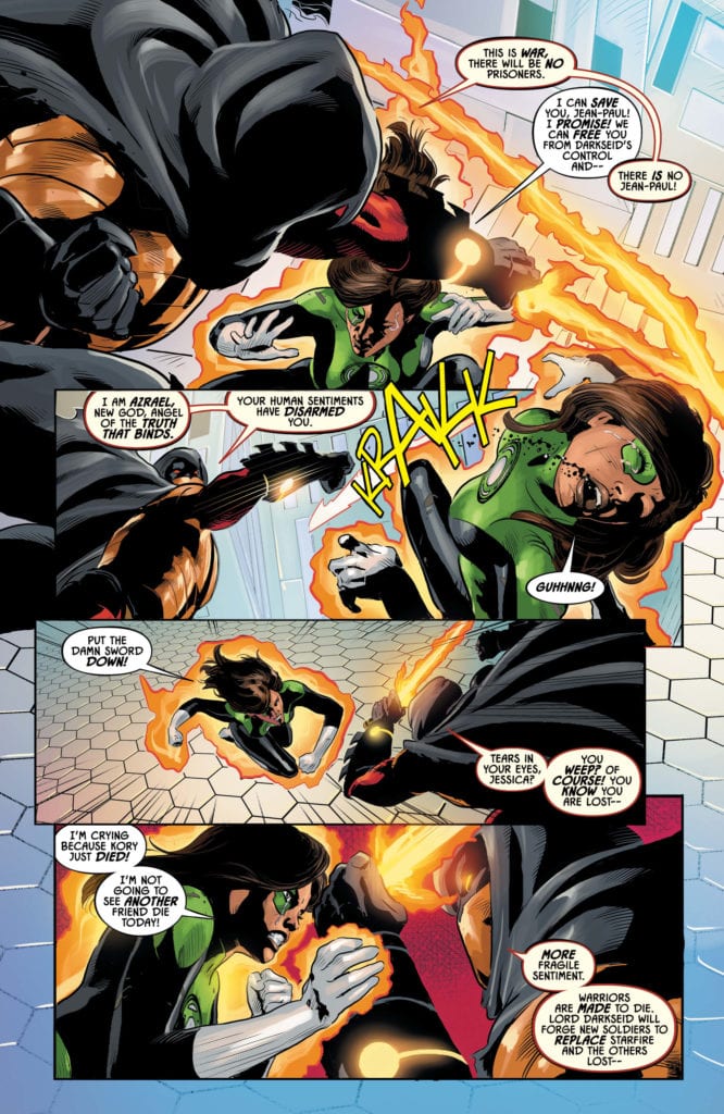
Cruz, employing an unearthly level of resilience, pleads with Azrael to abandon Darkseid while simultaneously fending off his Omega fueled sword strikes. The warrior responds with a message similar to that of Blackfire, claiming the tyrant’s power is insurmountable. Nevertheless, Cruz continues to reason with the man. And then, in an all too familiar display of power, Blackfire rushes in and vaporizes Azrael in the blink of an eye.

Writer Dan Abnett’s Cruz casts the perfect image of a caring and powerful hero. Despite her great strength, she’s unable to stop the destruction of those she cares about. We experience her feelings of utter helpless in the wake of such events. However, readers find a glimmer of hope when the hero decides to use Epoch’s time traveling technology against the forces of Darkseid.

Artwork

Cliff Richards’s penciling and ink work, working in tandem with Rain Beredo’s coloring, helped make this issue shine. Their artwork captures the cosmic level fights with bright colors and character illustrations that are full of movement. At the same time, readers will find each character express a wide-range of emotion that helps draw them into the story. Andworld Design’s lettering compliments these factors very well through its variation in font size based on dialogue inflections.

Conclusion

JUSTICE LEAGUE ODYSSEY #20 tore at the heartstrings, showing the true costs of Cruz in this war against Darkseid. We desperately want this powerful hero to find a way to right these wrongs in the coming issues.

Do you think Cruz’s hope of breaking through to those under Darkseid’s control is realistic? Let us know in the comments below!

Monkeys Fighting Robots Youtube

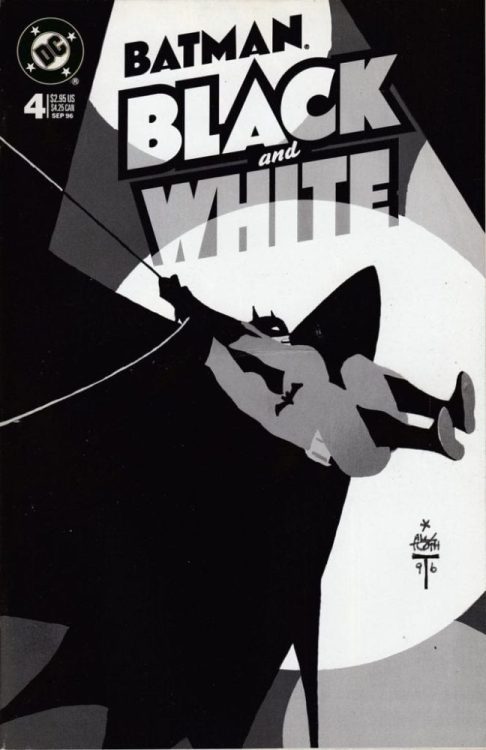
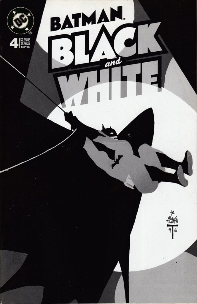
I’d Buy That For A Dollar: BATMAN BLACK AND WHITE #4 (September 1996)

Batman Black and White

Welcome to ‘I’d Buy That For A Dollar’ a column where I will be exploring the weird and wonderful world of dollar bin diving. The only rule is each and every comic is purchased for one dollar (or less!).I'd Buy That For A Dollar

This week’s comic is Batman Batman Black and White #4.

Batman Black and White

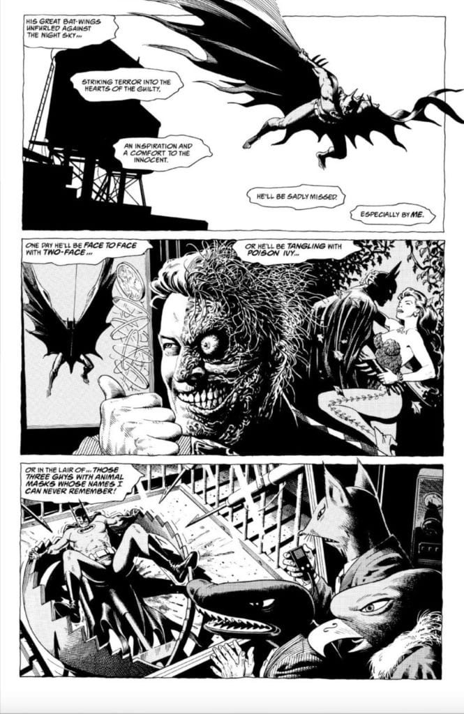
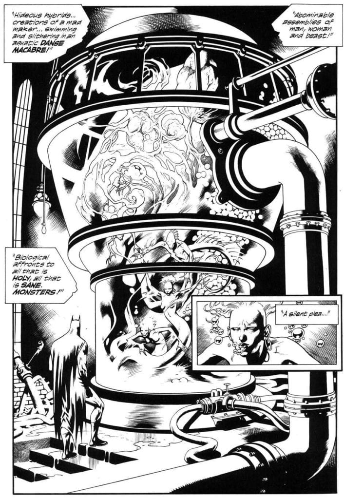
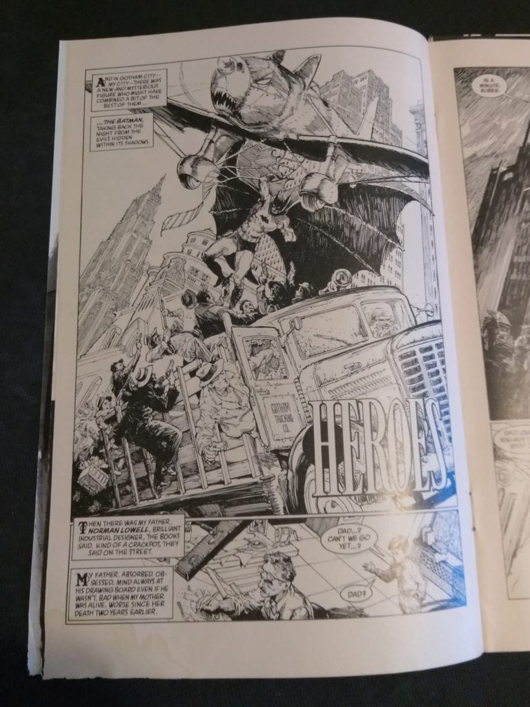
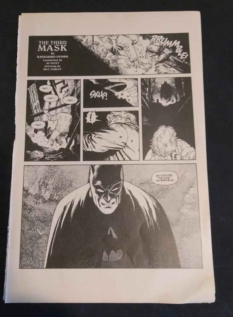
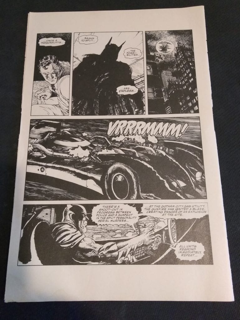
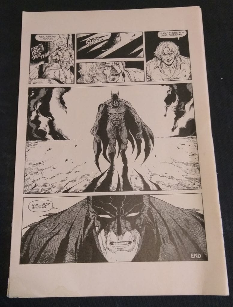
Batman Black and White is a multi-volume limited series with a simple and fantastic concept;  great comic creators making short, black and white Batman stories. Pretty much every issue is great, so grabbing one in a bin dive is a no brainer. Issue #4 is one of the best ones. Just check out the stacked credits: “An Innocent Guy” by Brian Bolland, “Monsters in the Closet” written by Jan Strnad, art by Kevin Nowlan, “Heroes” written by Archie Goodwin, art by Gary Gianni (this one won an Eisner Award), “Leavetaking” written by Dennis O’Neil, art by Brian Stelfreeze and “The Third Mask” by Katsuhiro Otomo.  

Oh, and the cover is by Alex Toth!

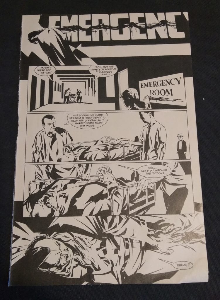
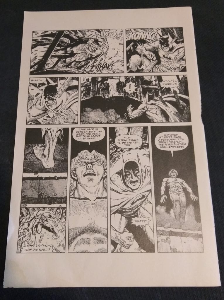
Each story is a solid read and any synopsis would give away too much, so I’m just going to let the pages flow below, in the order they appear in the comic.

*My issue was missing Brian Bolland’s piece and “Monsters in the Closet”, so I read the those digitally. This comic is literally falling apart (as you can see by the loose pages in the pictures. 

An Innocent Guy by Brian Bolland

Batman Black and White
Bolland’s Two-Face has a total outlaw comics vibe here.

Monsters in the Closet written by Jan Strnad, art by Kevin Nowlan

Batman Black and White

“Heroes” by Archie Goodwin, art by Gary Gianni

Batman Black and White

“Leavetaking” by Dennis O’Neil, art by Brian Stelfreeze

Batman Black and White

and finally, the best one in the issue…

“The Third Mask” by Katsuhiro Otomo

Batman Black and White

Batman Black and White

Batman Black and White


Batman Black and White

That Otomo jam is the best right? Makes me want to see an Otomo Neo-Gotham ala Aklira’s Neo-Tokyo! Anyway great book, grab it and keep hitting those dollar bins!


You can find great dollar bins at almost every local comic shop. So find a shop, ask a comic clerk what they can do for you during this time and get some dollar comics! Pick them up curbside and have them delivered if you must!

Got your own awesome dollar bin finds? Toss them at me! 
Send emails to manny@monkeysfightingrobots.com
Follow me on Instagram: _idbuythatforadollar_
Tweet at me: @MannyG1138

Monkeys Fighting Robots Youtube

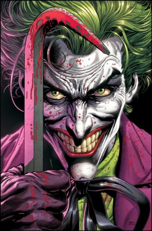
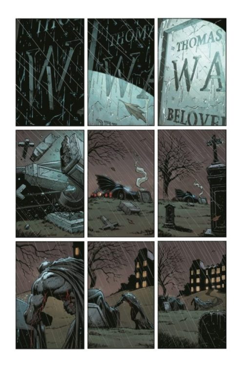
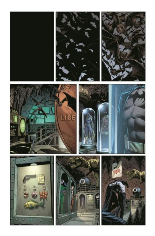
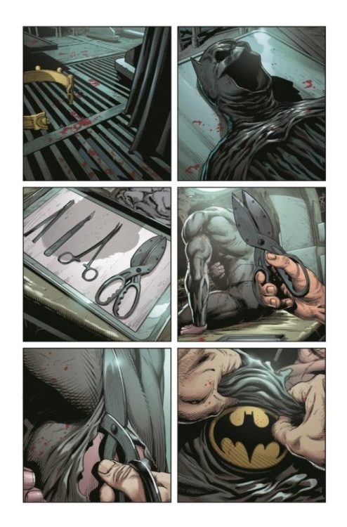
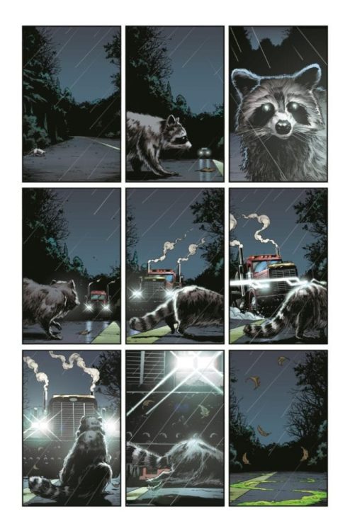
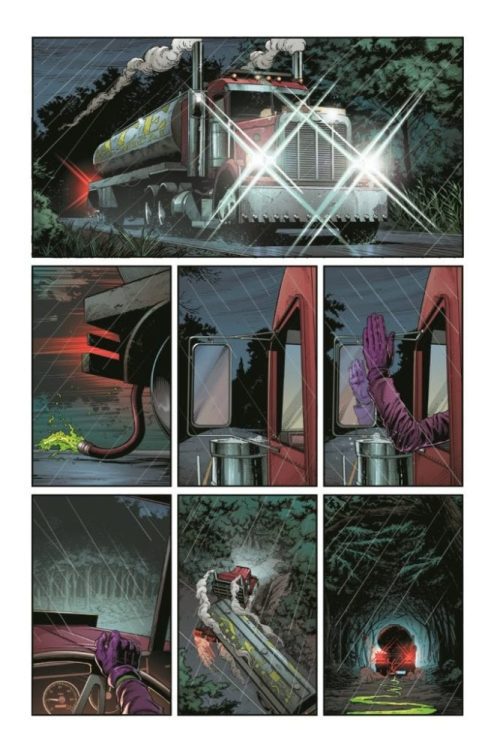
7-Page Preview • BATMAN: THREE JOKERS

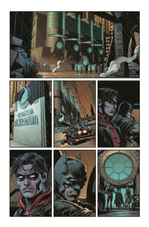
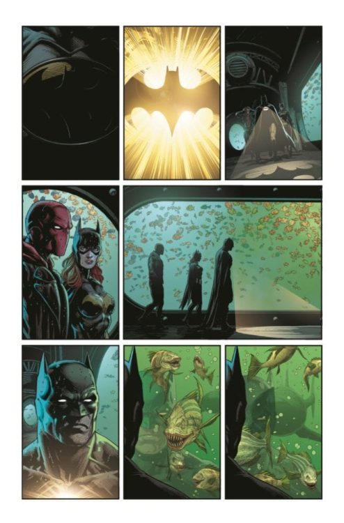
DC Comics released another four pages of Batman: Three Jokers Tuesday afternoon, and Monkeys Fighting Robots has put all the earlier pieces of the puzzle to give a seven-page preview of what could be the biggest book of 2020.

The book is written by Geoff Johns, with art by Jason Fabok and Brad Anderson.

About Batman: Three Jokers:

30 years after The Killing Joke changed comics forever, Batman: Three Jokers re-examines the myth of who, or what, is the Joker and what is at the heart of his ongoing battle with Batman.

The pages below are labeled, so you understand the story.

According to the the DC Comics press release, Batman: Three Jokers is a 3-issue, 48-page (per issue) prestige format monthly limited series and will carry DC’s “Black Label” content descriptor (for readers 17+). Issue #1 arrives in open and operating comic book stores and participating digital retailers on Tuesday, August 25, 2020.

Are you excited for the book? Comment below with your thoughts.

Monkeys Fighting Robots Youtube

SUPERMAN SMASHES THE KLAN: An Authentic Story On Racism

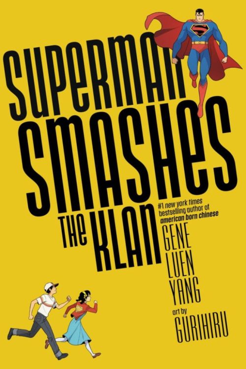
Superman Smashes The Klan cover

Superman Smashes the Klan is a 3-chapter series adapting an iconic episode of “The Adventures of Superman” radio show. The episode serves as an important part of both the history of Superman and in real-world activism. With the Ku Klux Klan becoming something of an urban legend in the 40s, human rights activist Stetson Kennedy de-mystified them by infiltrating their ranks, and revealing their nature to the Superman writers. The program – and it’s new graphic novel adaptation – shows how systematic racism can be. Today with Asian people subject to racism over the Covid-19 outbreak, a character like Superman is needed more than ever.

Superman Smashes Klan Perception

Award-winning writer Gene Luen Yang has experience with Superman. Whether he’s writing the New 52 Clark Kent or Kenan Kong, Yang tries to honor the original Man of Steel’s legacy. Superman Smashes The Klan, however, hits a little close to home because in it Superman helps a Chinese American family. For Yang, this allows him to add a more personal, relatable touch to his writing.. However, just adapting the original story verbatim would waste the story for a modern audience. So Yang creates a story about Superman also struggling to accept his own alien origin.

After being exposed to Kryptonite for the first time (another element originating from the radio show), Superman experiences hallucinations. Not because of the “Der Grunstein,” but because anything that reminds Clark about how different he is scares him. Clark’s first use of his heat vision and flight to defend himself from bullies actually scares away a friend of his. Plus, his parents convince him to try and be as normal as possible. Despite this being a way to protect Clark against religious fanatics, this is still giving in to bigotry. Imagine trying to deny who you really are for your whole life (many readers won’t have to imagine, and this part of the story will resonate with them).

How To Write Racism

Superman Smashes The Klan isn’t just about Clark accepting himself; it’s also goes into authentic detail about racism. It’s easy to associate racism with a legally safe Klan pastiche, but it’s not enough to depict them as bullies. Take primary antagonist Matt Riggs; he takes care of his sister-in-law and nephew. He also has very high expectations that goes in two ways. Riggs expects his nephew to control his temper, but when he hears Chuck was replaced on the baseball team by a Chinese boy, Riggs sees this as a threat to whites’ collective identity. Chuck, however, acknowledges that getting kicked off the baseball team was his fault, but goes with his uncle out of loyalty.

Racism isn’t just an ideology; it’s a commitment that doesn’t go away very easily. Even the Lee family experiences a more casual form of racism. Just about everyone in the family has to speak English as a way of fitting in. The son Tommy also makes casual jokes at his own race’s expense despite the way it affects his sister Roberta. And Roberta isn’t even her real name (it’s Lan Shin). All of which begs the question: what’s the point of fitting in if that means giving in to bigotry?

Superman Smashes The Klan Colorfully

Japanese art team Gurihiru of Unbelievable Gwenpool fame does a spectacular job of illustrating a whimsical world in Superman Smashes The Klan. One of the most eye-catching parts of the series is how Gurihiru reminds readers this series takes place in the 40s. From characters’ clothing to the vehicles and architecture. How many people even remember Superman’s iconic phone booth scenes?

The character designs feel youthful and highly expressive, reminding readers of the colorful times of the Golden Age. However, these quirky faces can give way to the darker scenes of the series. The fact that the Klan of the Fiery Kross members wear hoods to conceal their faces feels absolutely ghastly in contrast to the typical face designs. But some of the most interesting and expressive moments come from when Superman is exposed to Kryptonite. Superman feels the effects of the green stone, revealing his true nature. His first reactions cause him to hallucinate, seeing him as an alien monster from pulp magazines. So much so that most things with a dark green hue are a sign of a threat towards Superman.

Janice Chiang The Decoder

Letterer Janice Chiang composes some steady words on every panel in Superman Smashes The Klan. The word balloons are evenly spaced out and keep inside their panels before moving to the next. A few word balloons or designs even get coloring for specific purposes. Red outline word balloons, for example, indicate that the words are being spoken in Cantonese. When something big comes up – like the Lee children’s excitement towards Superman – the words enlarge and bolden. Yet again, the Kryptonian words and lettering steal the show with their intricate designs. They look absolutely alien as much as how Superman sees them. By the time the words are translated in English, it indicates Superman starting to accept his alien heritage.

Superman Smashes The Klan Barriers

Superman Smashes The Klan will go down in history as a reminder of why Superman is the Man of Tomorrow. He represents the best of humanity and reminds us that “humanity” isn’t exclusive to people most familiar to you. No matter how different someone is to you, you are bound to the same future. To be anything like Superman, you have to realize the worst of humanity doesn’t represent the whole. Real racists genuinely believe they’re doing good and are unwilling to accept their views as wrong. You have to be true to yourself and others to see past the barriers.

Monkeys Fighting Robots Youtube

REVIEW: LOIS LANE #10 Gets Big and Multiversal, But Stays Grounded

Lois Lane Rucka DC Comics

Lois Lane #10, written by Greg Rucka, with art by Mike Perkins, colors by Andy Troy, and lettering by Simon Bowland, makes some massive changes. The gentle, easygoing series just got multiversal and risked getting too big to handle. But this creative team, forever on their A-game, never lets us forget the human characters behind it all.

Lois Lane Perkins DC Comics

Writing

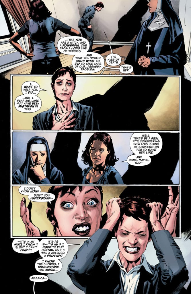
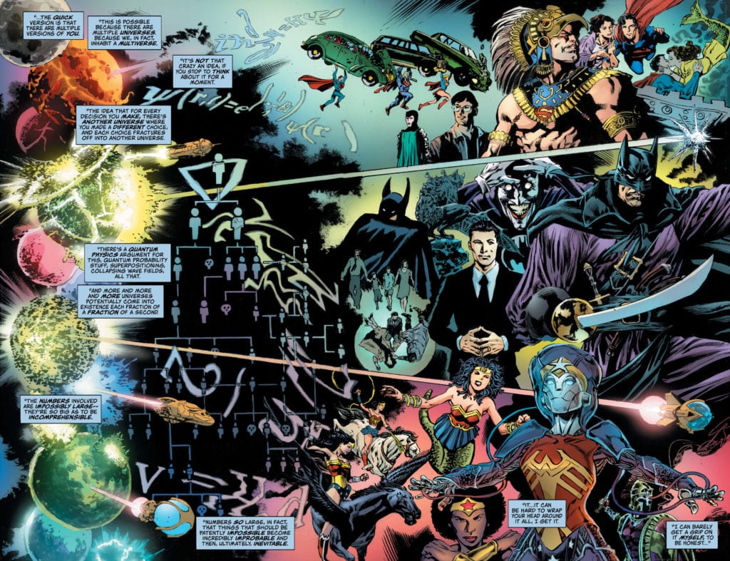
Rucka made a sharp turn with this issue. Instead of quips from the Question and kisses from Superman, we get witches and Multiverse Theory. It’s all enormous and potentially hard to follow, but Rucka keeps every moment relatable. He interrupts a speech about the Multiverse to show Lois and Clark having a chat like a regular husband and wife, with Superman stuffing chips into his mouth. Jessica Midnight, at one point, compares remembering incantations to remembering what last night’s dinner tasted like. In a stroke of genius, Rucka takes the moment a step further and Renee asks, “What’d you have for dinner last night?” “Chicken. It was dry.” Every time Rucka risks losing our attention with big concepts, he brings us back to something small. Somehow, this relatable series opens the door to the Multiverse and stays just as relatable as ever.

Art

If this series has shown anything, it’s that Perkins is master of the small moments. The little smiles, the sarcastic smirks, the pain underneath the surface. He is always pulling back, and his best work is a result of his extreme restraint. Well, scratch all that, because this issue shows he’s good at pulling out all the stops too. Of course, we still have those brilliant little moments, Supes snacking on chips and Lois looking annoyed as he whooshes in and out of the window to deal with emergencies as they come up. But we also get to see giant tapestries of the Multiverse. The kind of pages you almost feel bad about reading through, instead of just looking at them for hours. But still, we have the subtleties of humanity on every page. It’s this attention to detail, even amid giant concepts and multiversal spreads, that keeps this series’ tone brilliantly intact.

Lois Lane DC Comics Troy

Coloring

Troy’s coloring goes through interesting stages in this issue. For one thing, it’s from Troy’s coloring that we learn about the characters’ fear of the unknown. Moments of uncertainty for Jessica and Renee are framed by black shadows. The explanation of the Multiverse is similarly dark, and so is the depiction of Lois’ dangerous gambit as the issue comes to a close. But Troy also accompanies many of these scenes with a tinge of purple. The multiversal energy is purple, so are Jessica’s spells. It’s interesting then to see that the one character most related to purple in this issue is Lois Lane. She’s depicted in lighter tones that lack quite the same element of foreboding, but it creates a sense of mystery nonetheless. How much does Lois really know about all of what’s happening? And how much are we ever going to find out?

Lettering

This issue has lots of information we have to take in, in only so much time. Most of the pages are full of panels where characters almost seem to be talking at once. Word balloons overlap each other and are generally quite full. Bowland communicates to us the urgency of events. We can hear the panicked tones in every scene as characters grapple with what everything means for them. On one particular page, Bowland sets the pacing brilliantly. As Lois and Clark talk, Clark keeps zooming out the window to stop emergencies. Each time he comes back, he apologizes briefly, and each of them tries to get as many words in as they can before he has to fly off again. And suddenly, they slow down. “Tell me,” Clark says after Lois suggests she’s not feeling great. It’s alone in the panel; it gives Lois space to react. She begins to respond and explain but then trails off and summarizes in the next panel. Again, all on its own, she says, “Wanting to fix it.” Bowland gives this page the space it needs, and these gentle moments stand out beautifully.


Lois Lane #10 continues a delightful series. And we can now see that even when big concepts and actiony moments take center stage, this series won’t sacrifice its tone or humanity. It manages to make even the biggest multiversal threats feel personal. Read this brilliant series from DC Comics; it’s the best thing on the shelves.

Monkeys Fighting Robots Youtube

Longbox Legends: JUNJI ITO’S CAT DIARY: YON & MU – Cats From Hell

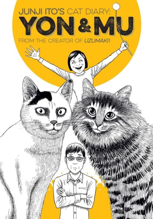
Junji Ito’s Cat Diary: Yon & Mu’s story is utterly different than Ito’s other work, yet that’s what makes it unique.

SCAREDY CATS

Back in 2009, Ito published a few short stories based on his real-life cats. It wasn’t until 2015 that Kodansha Comics translated and released it in America. Nonetheless, at its core, Junji Ito’s Cat Diary: Yon & Mu (hereafter, Yon & Mu) is the polar opposite of Ito’s usual horror. Instead of being a horror story focused on walking fish (GYO) or a manga adaption of a novel (Frankenstein), Yon & Mu focuses on real accounts of his two beloved cats. Ito puts a fun spin on his usual modus operandi by retelling the story of how he and his (at the time) fiancee came to own the two cats.

Smush The Cat
Smush the cat – Junji Ito

Ito is well known for his immensely creepy horror Manga, that’s loved for the art and storytelling. Yet, as Yon & Mu revolves more around his real-life cats and him, the storytelling is vastly different. Instead, Ito includes usual struggles new cat owners have while keeping humor involved. The stories range from their first meeting, the cats ruining the house, Ito trying to get the cats affections, and trying to play with them. Each story is short and fun, reminding some cat owners of their own stories. Nevertheless, he does include his famous horror roots, which makes the stories even more interesting.

THE HORROR OF YON & MU

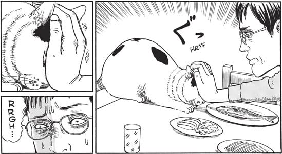
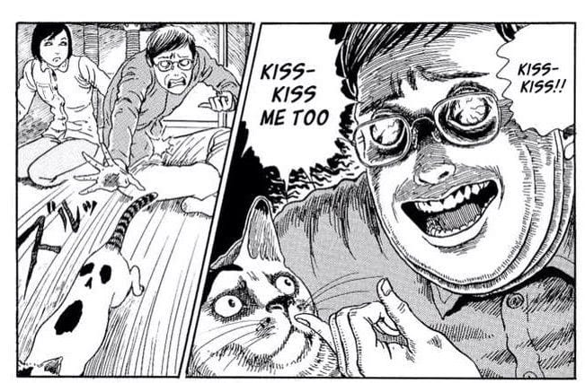
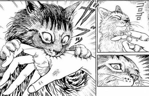
Ito does include horror, although the horror shows more in a visual manner. By taking something as simple as giving a cat raspberries and smoochies, Ito turns it into something terrifying. Yet, one of the best examples happens during an all-nighter before his character’s deadline, after rushing to get work done J-Kun steps out to wash his face. Out of the corner of his eye, he sees a terrifying slug, but it’s just Yon. As the day carries on, each time he sees a cat, they’re horrible creatures. Nonetheless, he is just sleep-deprived.

Want a kiss?
Kiss, kiss – Junji Ito

As overdramatic as those hallucination scenes seem, owners of cats and have probably been in the same situation. Of course, those aren’t the only terror-inducing moments. Ito has always been amazing with drawing horrifying faces, Yon & Mu continues that trend. He includes inhumanly faces that terrify you, yet he does it in humorous ways. To a degree, you may think this is to represent the cat’s perception of us. If you’re a small cat and a human held you screaming “kiss, kiss” you’d find it scary as hell.

TRANSLATION/LETTERING

Yon & Mu’s English translation is handled by Stephen Paul, with lettering by Evan Hayden. Having not read the original Japanese edition, it’s hard to compare the translations. But, when a translation is terrible you can tell with words and sentences reading awkwardly. Luckily, that doesn’t transpire anywhere. Hayden’s lettering works amazingly as well.

In some cases, lettering in Manga seems off if the bubble is bigger than the words placed in them, leaving a lot of space. Nonetheless, one of the coolest moments is the original Japanese sound effects staying in. In some older Mangas, they are taken out and replaced, yet here they are kept, with a note of what they say.

Yum
Just a nibble – Junji Ito

THE CATS IN THE CRADLE

In the last five years, Ito’s name has become more famous, while being known by many. That, and he has seen more translations of his work over in America. This is nice, as he is a master at his horror craft. That’s what makes Yon & Mu so unique in his Manga creating history. As great as the stories of his cats are, they aren’t horror like his others, only the visuals are. Nonetheless, Yon & Mu is a fantastic story of Ito falling in love with his cats. Now, it would be nice if it was mentioned more when people speak of his skills.

Monkeys Fighting Robots Youtube

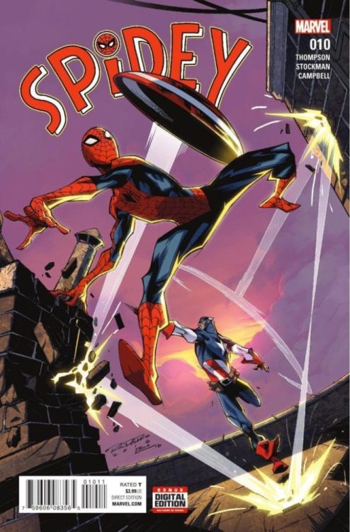
SPIDEY #10 (2016): When A Hero Knows Your Name

SPIDEY #10, released in September 2016, was a monumental addition to Robbie Thompson’s take on Spider-Man. His initial issues focused on establishing Peter Parker as a hero, but this story added another challenge—convincing everyone else he was. It’s a task that seems impossible to surmount. But when Peter learns someone important knows him, things will start to change for our hero.

Story

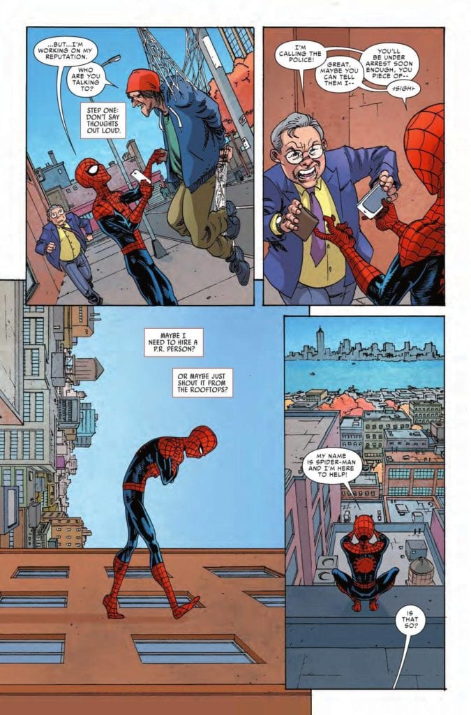
Peter finds himself continually rejected by the people he attempts to save. It happens to him almost daily. In fact, the ungratefulness would be enough for any kid to consider giving up, but we find our hero is made of sterner stuff. Still, he resorts to (comically) shouting his good intentions from the rooftops.

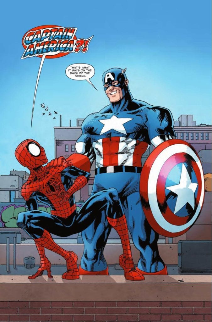
He then finds his own personal hero, Captain America, standing behind him. And, to his great surprise, the star-spangled Avenger reveals he’s heard of Spider-Man. But does he know Peter is a hero?

Thompson’s script proceeds to follow them through the city as Peter learns what it’s like to be praised for saving the day. Readers get inside Peter’s head as he desperately looks for the reason everyone loves Cap. And, just when the answer seems out of reach, the veteran hero shows how much he respects Peter with encouraging words and an invitation to take on a group of villains together.

As so, through the medium of Cap, Thompson creates the perfect environment for Peter to more fully embrace his status as a hero.

Artwork

Nathan Stockman’s penciling and ink work, Jim Campbell’s coloring, and VC’s Travis Lantham’s lettering were a thrill in this issue. Stockman contrasts the wiry frame of Peter with Captain America’s muscular build, giving readers a subjective look at how our hero views himself when compared to his idol. What’s more, each character’s colors are full and vibrant, giving them the center spot of readers’ attentions. The letter boxes add to the dynamic qualities of the issue as well, following the movements of our heroes as they leap from rooftops.

Conclusion

SPIDEY #10 was the perfect turning for Peter in this retelling of his early exploits. Working together with Cap was an important milestone in the struggling teen’s story.

Did you enjoy the retold meeting of these two heroes? Let us know in the comments below!

Monkeys Fighting Robots Youtube

Review: NOVEMBER Vol. 2: The Gun in The Puddle

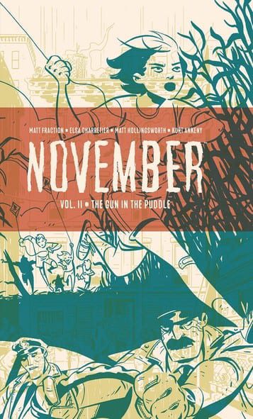
Where the first volume of Matt Fraction and Elsa Charretier’s conspiracy-noir tale “November” built itself on its mystery and jagged plotlines, the second volume ramps up the pace with a focus on characterization and rapidly rising stakes. Along with Matt Hollingsworth on colors and letters from Kurt Ankeny, “The Gun in the Puddle” is a tight and jarring chapter with impeccable pacing and stellar character writing that compliments the prior volume with a focused manner.

“One phone call for help and all hell breaks loose for three strangers connected by bad luck, a twist of fate, and a gun in a puddle of rain. In the middle of a dense criminal underworld, these strangers’ lives collide on one fateful and bloody night.”

Writing & Plot

Matt Fraction‘s writing on “November” Vol. 2 is more pointed and deliberately focused than that of the first part. Whereas “The Girl on the Roof” set up a larger mystery, this volume deals with the fallout of those events. There is a welcome renewed focus on the intimate lives of those trapped in this conspiracy, especially on the girl who found the titular gun in the puddle. There are a couple of meditative flashback scenes of her in childhood and they actually fit into the story nicely. Their quiet introspection delivers more humanity to a character we didn’t get to see much of in the first volume, and they’re a nice contrast to the other events in the book. As with before, the narration is poetic and works wonderfully with the art to deliver characterization. The dialogue, what little there is of it, is naturalistic and reflexive to a point of almost heightened believability. If you woke up locked in a trunk, what would you say besides whimpers and swears? If the first volume’s choppy narrative turned you off in any way, “The Gun in the Puddle” is sure to remedy those dislikes with a much more straightforward narrative.

Art Direction

The striking visual style in “November” is once again crafted by Elsa Charretier‘s unique pencils and Matt Hollingsworth’s moody colors. Charretier’s brand of character work and environmental detail in her lightly cartoonish style create the character-centered noir atmosphere in a manner that’s gritty, but not overpoweringly so. Hollingsworth fills the pencils with thick shadows and often all-consuming colors. There are entire pages and sequences that are bathed in one specific hue, and it works wonders for establishing the story’s tone. The visual aesthetic is topped off by Kurt Ankeny’s handwritten-note style of lettering. His take on adding words to images is admittedly a bit hard to read at times, but it creates a sort of intimacy in the reading experience that becomes an irreplaceable component among the rest of the visual work within this comic’s pages.

“November Vol.2: The Gun in the Puddle” is a tightly-paced and intense ride of a noir-thriller. Fraction’s more streamlined script in this volume engages the reader in the plot of this conspiracy while still allowing for plenty of intimate character building. The artistic vision of Charretier and Hollingsworth is a dreary yet gorgeous look at New York that is perfect for this type of story. If you were a fan of the first volume, then be sure to order Volume 2 from your local comic shop by its release date on May 3!

Monkeys Fighting Robots Youtube