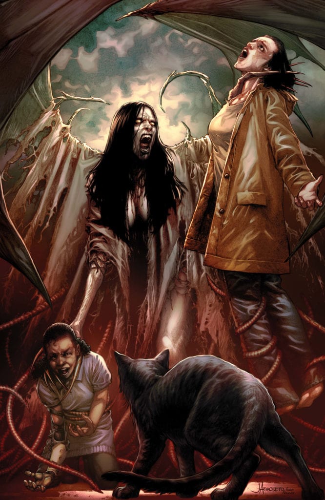
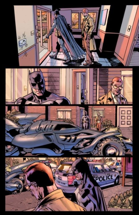
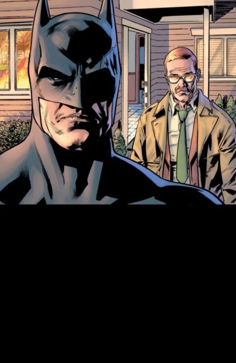
Creative duo M.R. Carey and Peter Gross (Lucifer, The Unwritten), along with artist Vince Locke ( Sandman, Books of Magic) return to finish their mysterious horror mini-series in “The Dollhouse Family” #6. The finale mixes this comic’s unique blend of haunted house, demonic, and cosmic horror into a satisfying end that manages to offer still more world-building – and the potential for more stories from this universe in the future.
“Nobody leaves the Dollhouse. All will be weighed. Only one can prevail.”
Writing & Plot
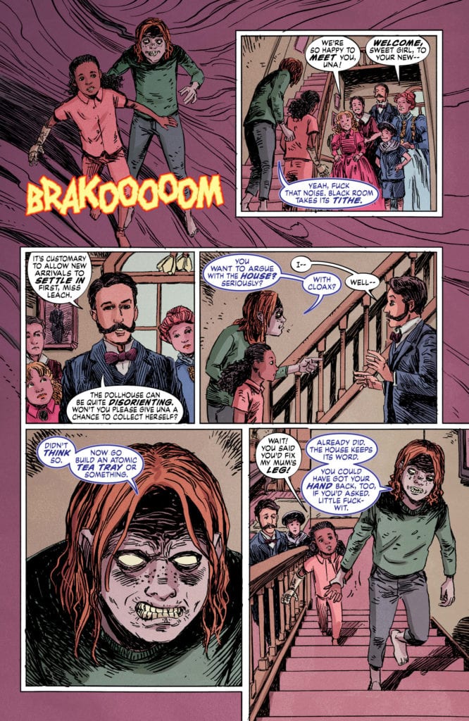
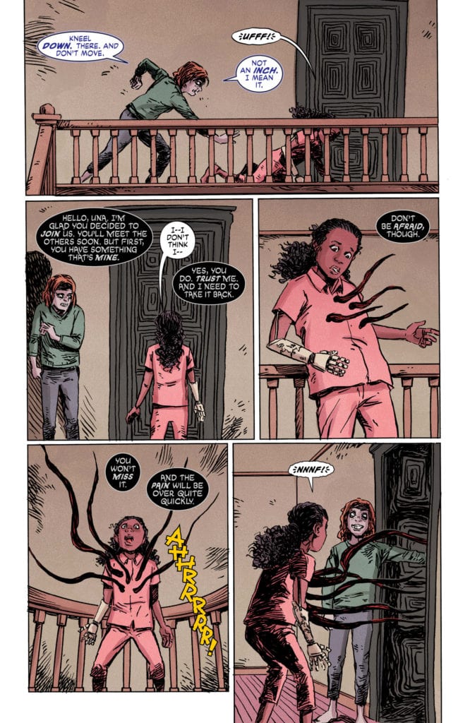
Writer M.R. Carey‘s seamless construction of complex yet near-effortless plots continues into the final issue of “The Dollhouse Family.” The tiny hints that have been teased in every issue thus far come forth in inventive manners that add a tremendous amount to the scope of this mini-series. This seemingly-demon or ghost focused story that danced around with the cosmic launches full-bore into the latter with wildly inventive revelations. The final conflict feels personal and satisfying to watch as Alice and her family work to overcome the entity that has been haunting her since childhood. This issue formally introduces a new ally into the fold that becomes the vehicle for most of the major revelations by offering explanations as to the gravity of the conflict the Dealy family finds itself in. A mistake often made in 6-issue mini-series such as this is to attempt to more story than the frame can hold. Carey impressively manages to dodge this in a final issue that, while slightly more exposition-heavy and faster-paced, offers a carefully constructed end to this finely tuned tale.
Art Direction
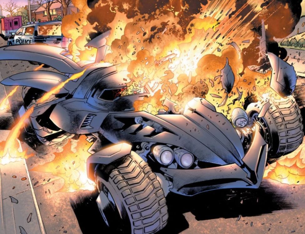
Peter Gross‘ layouts and Vince Locke‘s pencils close out “The Dollhouse Family” with their consistently unique visual touch. Gross’ layouts consistently provide the visual flow to carry the reader through Carey’s suspenseful script, often defying conventional panel construction in the process. Vince Locke’s a bit off-the-wall art style, which has always been a perfect look for this series, reaches a gory peak with this final fight. The often haunting visuals provided thus far climax into creations of fleshy demonic terror. Much of the atmosphere comes from the grim life Cris Peter’s colors give the pages. The color choice here crafts not only the eerie horror atmosphere of the slower moments but also the gory shock of the unfathomable monstrosities the Dealy family have to face off against. Horror, like most great comic genres, live and die on their visual integrity, so it’s fortunate “The Dollhouse Family” has had such a stellar art team to see it through.
This final issue of “The Dollhouse Family” brings about a fascinating and satisfying end to this unique horror mini-series. M.R. Carey’s script brings events to a tight close while opening the possibilities of this universe up to a potential future. The visual touches of Peter Gross, Vince Locke and Cris Peter collide to deliver one last cosmic and gory horror experience that is perfectly unique for this story. Be sure to catch the finale of this excellent series when it hits stands on 5/20!
Christopher “Titus” Strickland, better known as Twitch streamer and professional gamer FyrBorne, is a tattoo artist from Tennessee who doesn’t remember life without video games. His rise to fame began with EA’s Battlefield 4.
Battlefield 4 released in 2013 and is now in the annals of gaming history, so FyrBorne has turned his skills onto new games like Valorant and Call of Duty: Warzone. Using his Twitch stream, FyrBorne has amassed a dedicated following of fellow gamers and used his powers for good, working on behalf of charities. Between gaming and charities, FyrBorne works out of Ambition Tattoos in his hometown of Tennessee.
PopAxiom spent some time talking with Fyrborne about his work as an artist, charities, and his rise as a gamer and streamer.
Let’s Play
FyrBorne’s earliest memories include holding a controller with eyes locked on pixel characters. “I’ve been playing games since I can remember. One of my first memories is owning the original Nintendo Entertainment System when I was around four or five, and playing Super Mario Brothers 2.”
Many games later, FyrBorne’s hand-eye coordination, timing, and strategic thinking harmonized into potential gaming excellence. “The first game I was exceptionally good at was Rainbow Six: Vegas. I’ve been playing Rainbow Six titles since they first came out. Rainbow Six was the first one I got to sit down and spend a lot of time on. I’ve always been a first-person shooter player.”
Going from gamer to ‘gamer making a living from gaming’ wasn’t precisely a designed career path. “It was surprising to learn I could do this for a living. I didn’t realize it could be a job until I started working with EA.”
EA or Electronic Arts is one of the largest video game publishers on the planet. How did FyrBorne get together with the company that makes Star Wars and FIFA? “I started working with EA because of my rank on a leaderboard for Battlefield 4. I was the #1 Designated Marksman Rifle user in the world.”
FyrBorne’s ranking started an upward spiral of new connections and opportunities. “I ended up being interviewed by a local community for Battlefield, which got me introduced to a competitive team for a bunch of games and eventually introduced me to the community manager for Battlefield. I was invited to start streaming on their twitch channel. I had my own, but I was new and terrible at it.”
Becoming Number One
Leaderboards are standard now in most video games in some form or another. For Battlefield 4, EA featured a detailed ranking of players. “You could check to see where you were against other people in comparison to your town, as well as to all around the world. Their website was always keeping track of successful fights with pistols or rifles.”
FyrBorne was on board with Battlefield 4 from the time it was in beta. At that time, he explains, ��… the marksman rifle was hands-down the worst series of guns in the game.”
It didn’t deter FyrBorne from playing with the worst gun in the game. “I started playing with them and thought, ‘Wow, these are bad I’m going to just use these.’ It was funny. I would get messages from players saying, ‘How are you beating me with that thing?’”
FyrBorne’s mastery of the marksman rifle is a story that includes a mysterious rival from a far-off land. “I was racing a guy in Russia for #1 in the world. For three or four months in a row. We went back and forth for a long time.”
Learning To Stream
Streaming is the place where social media stars are made, but it takes the proper mix of skills to get it right. “When I first started, I was not very good at it. I was playing on streams specifically to show off my skill level. I thought ‘This would get me through. No one wants to hear what I have to say, they want to see what I can do.’ So, I streamed from one to nobody for months.”
FyrBorne was “… putting out good gameplay …” but the viewer numbers weren’t climbing the leaderboard so-to-speak. “I had someone join my channel, and they were talking to me, so I spoke to them while still playing the game. I realized more people wanted to talk. My strong suit is my ability to talk constantly and play decently.”
Talking Charities
As FyrBorne’s fame rose in the virtual world, he made strides to help in the real world. “My connection with charities started when I started working with the competitive [gaming] community. One guy left to go work with St. Jude. We started talking about his work there. I thought it was cool, so I joined one of their charity events.”
One year later, Fyrborne was at St. Jude’s Memphis campus for a special event, the St. Jude Play Live Summit.
At the summit, there’s lots of formal talk about St. Jude’s current state and its future. But FyrBorne found a deeper connection with the people on a personal level. “I got to meet some of the kids and see all the stuff they do there. That was the most profound experience to see all these people working towards the same goal. I’ve been working with them ever since.”
Charities are now as much a part of his life as tattoos and gaming. “So, my goal is to try and grow a strong community and continue to do more for St. Jude, and other charities I work with like Stackup, a military support charity.”
Body & Art
FyrBorne’s covered in tattoos and creates artwork on people when he’s not gaming. Who inspires his artwork? “Some of the artists who inspire me are mostly out in California. One of my favorites is Carlos Torres, he’s a black and grey realism artist. Another fellow named Mike Dorsey, he’s up in Ohio and did a piece on my shin. He does a lot of traditional Japanese work. Up in Detroit is Bob Tyrel.”
FyrBorne is a living canvass of colorful and beautiful art. But the motivation to start getting tattoos did not come from a desire to be that. “One of my biggest fears in the world is needles. So, I started getting tattoos to try and beat my fear of needles. It hasn’t worked. I’m fine with tattoos but piercings and hypodermic needles, oh man, I pass out.”
There’s a lot of intricate work on FyrBorne’s body, but what was his first tattoo? “My first tattoo was dragon scales on my spine. It was not my smartest move. Man, it was rough.”
If you ask him how many tattoos he has, FyrBorne will say, “… one. I’m just one big tattoo. If I had to guess, it would be 40 to 45 deep. All I have left is the back of my thighs, my stomach, and my lower back if I do not include my head.”
Wrapping Up
FyrBorne is currently killing suckers in PvP (Player-Versus-Player) content in two games: Valorant and Call of Duty: Warzone. What does he do to relax after a night of streaming and competitive gaming? “I play League of Legends every night after I stream. It makes me want to pull my hair out if I had any. It’s just like Valorant, it’s a very technically difficult game, and I play it because it gives me a challenge in a game mode I don’t play nearly as much as shooters.”
FyrBorne’s charity work has gone on strong during the global pandemic. He’s been raising money for St. Jude all the month of May by “… playing Minecraft or eating those nasty jellybeans, the Beanboozle ones, peppers, hot sauce, anything that will entertain people.”
Are you a fan of FyrBorne?
Thanks to Christopher “FyrBorne” Strickland and Impact24 PR for making this interview possible.
Plenty of people can tell romantic stories about reading Wonder Woman or Thor for the first time and being hooked on comics from then on. My introduction to the medium was decidedly less cool. My first books were the Disney comics stacked in between my sister’s growing collection of Spider-Man issues. I remember none of the plots of these books, making me wonder if they were plotted at all.
Later, when I got older and paid more attention to my sister’s comic books, I found myself bored with superhero stories. Why should I care about a silver dude surfing around space, talking like a caricature of an eighteenth-century gentleman? Nevermind the fact that I found the books overstimulating, looking like a deconstructed Zoetrope. All the action and overlapping dialogue and narration might have been too much for me then.
So, I didn’t read comic books for a long time. I bought into the pretension that superhero comic books were silly rags for boys and nerds—and I was totally neither. Yet I kept trying. I wanted to understand why my sister and millions of others love them. To this end, I took two comic-book related courses in college.
Then Marvel came to Netflix, and my point of view was forever altered.
A Heroine I Could Relate To
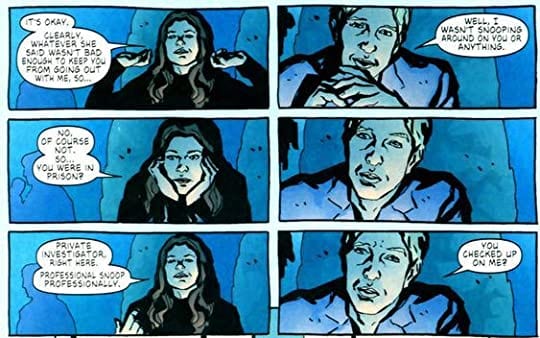
Beginning in 2015, Netflix gave us Marvel’s lesser-known heroes in their own set of series. Jessica Jones (created by Melissa Rosenberg) was the first one I watched and one of only three that I truly enjoyed. (I’m highly critical and selective, okay?) It was this gritty neo-noir show that gave me a “superhero” I could relate to. Unlike the larger-than-life super-powered mythical male figures or hyper-sexualized females, Jessica Jones is a leather jacket wearing, foul-mouthed private eye with PTSD who doesn’t want her powers. This I could dig.
Once I finished the series, I read the out-of-sequence volume my sister had bought, which was even further down to Earth than the show. In Jessica Jones: Alias, Vol. 2, Jessica hardly uses her powers except when someone pisses her off. She’s just a person with the same relationship drama, dealings with bureaucracy, and work problems we all have—and in a real way instead of the tangential, histrionic manner we usually get from the big-time superheroes.
Written by Brian Michael Bendis with art by Michael Gaydos, Alias, Vol. 2 follows our anti-heroine on a five-issue arc as she investigates the disappearance of a sixteen-year-old girl from Lago, New York. The story is a quiet, small-town mystery. It’s got the classic murder, bullying, and outcast mutant trope as every reader would expect. Jessica is at the same time a private investigator just doing her job and a strange interloper who stirs up as much controversy as she uncovers. Her main transgression starts with her presence, but she also has sex with a cop and curses out a bigoted pastor (he foolishly calls mutants “abominations”).
How Bold, How Blue…
The story is told through dialogue and thought captions, no unnecessary narration here. This helps the story flow and progress naturally as if we see the events unfold in real-time. The at-times bold coloring and layout assist in creating a simultaneously realistic and cinematic look. A few pages are washed out with moody purple or cerulean, providing another kaleidoscopic means of getting inside Jessica Jones’ head.
Jessica on a date with Scott Lang, A. K. A. Ant-Man
In terms of layout, it’s like no other comic book I’ve read. Among the typical six-panel and nine-panel grids are pages whose panels look as if they’re drifting away. It’s reminiscent of high school PowerPoint presentations, but it isn’t just some cheap effect. It’s like a movie or a memory.
Of course, none of this is particularly unique to veteran comic book readers, especially lovers of irreverent misfit stories. But it’s these stories that color the world of comic books darker and more enticing.
Alias may not have been the exact catalyst for my commitment to reading comics, but it led to a more in-depth exploration behind the scenes. Subsequently, I took a history of comics and a comic book writing class at university. Now I have two comic book outlines burning holes in my hard drive. Some day the market will want an eight-page book about penguins in the North Pole converting to Judaism. When that day comes, I’ll have Jessica Jones to thank.
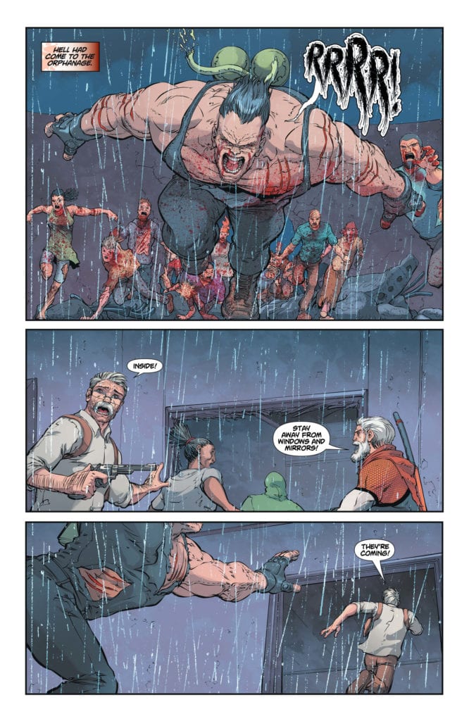
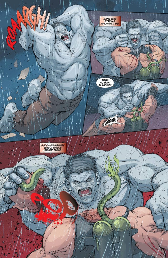
Taylor doesn’t pull punches with his finale. Many “unkillable” characters prove to be less than unkillable in this issue. But in the midst of the brutality and gore, Taylor sprinkles in gentler moments. On occasion, he pushes the gentle moments a hair’s breadth too far. Characters bare all with the simple looks on their faces, and so a few of their lines seem unnecessary. But mostly, Taylor hits his balance masterfully. Packaging the gentle moments with rough exteriors. So when Cheetah is called a “good kitty,” and we see her connect with the kids, we’re all the more on the edge of our seats when they are plunged back into danger.
Art
Mostert, Scott, and Edwards spend some time in the uncanny valley for this issue again. Many of the characters look just slightly off. The proportionality of their faces doesn’t look quite right, with noses and eyes that seem too small. While this does occasionally distract from the gentler moments Taylor sets up; the gory fight scenes are where these artists shine. With hands ripping through heads, and a particular moment where Deathstroke looks downright mythical, they have fun with the gruesome aspects of this issue.
Coloring
Lokus certainly helps with the gruesomeness. Nearly every panel of every page is speckled with blood. Lokus makes it look as though it’s raining down on the characters from above, in vibrant red. It’s not long before each bloody massacre takes on a darker color palette. Lokus gives moments of triumph a bright palette, while a page later, he’s coloring the same scene in darker tones. It’s the blood in the background that ties the whole thing together. Just as the vibrant red dries on the side of buses or characters faces to a dull brown, each moment has the potential to go from adrenaline-pumping victory to heartbreaking defeat.
Lettering
Temofonte continues to have fun with the lettering, as in previous issues. Sound effects are incorporated into the moments that are causing them. The sounds of guns are written in large red letters that look like the gore they cause. A car going up in flames creates a sound that looks like the fire itself. And it’s fitting that Temofonte’s sound effects take center stage in many of the panels. Her sound effects are often tied to an action that’s driving the scene.
This creative team has managed to create stakes and joy in a zombie apocalypse. As the world careens towards its end, we attach to these characters that are otherwise written off. Taylor balances quirkiness and brutality with brilliant results. Read the finale of a great series, DCEASED Unkillables #3, out now from DC Comics.
PLUNGE #3, hitting comic book stores on Tuesday, May 19th, continues writer Joe Hill’s thrilling new tale. This issue follows Captain Gage Carpenter and his crew search through the wreckage of Derleth, a ship that’s been lost for decades. But what our protagonists find will take this series from mystery to horror in one fell swoop.
Story
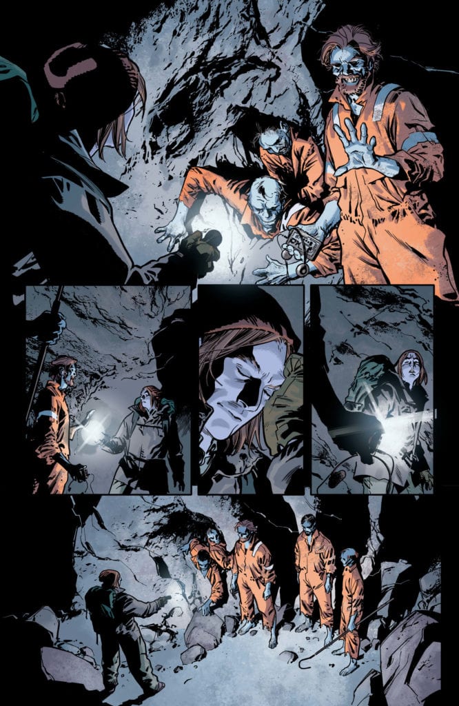
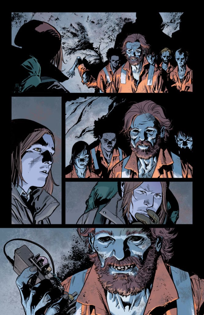
While Gage and Lacome investigate an anomaly on their ship, the rest of the crew have been searching the island where the Derleth‘s wreckage was found. Russell, prodded by curiosity, ventures deep into its many caves. But a surprising welcome party greets him right off the bat.
We find the supposedly dead crew of the Derleth greet Russell in all their ageless glory. What’s more, it appears they know a lot more about our protagonists than one would reasonably expect. But before Russell can learn more about them, the first mate, Julian, gives him a modified device with headphones, which turn out to be more than he bargained for.
Now it’s up to Gage to both rescue his brother from an unknown fate and unravel the mystery of the Derleth crew’s survival after 40 years.
Hill’s masterful series continues to up with ante with this thrilling issue. Readers will be anxious to learn more about Julian and his crew.
Artwork
Stuart Immonen’s penciling and ink work, Dave Stewart’s coloring, and Deron Bennett’s lettering add their own unique flavor to create beautiful horror themed illustrations. The panels are filled with wavy lines and dark shades set against lighter backdrops, upending readers’ visual expectations. Additionally, the cryptic fonts employed help emphasize the unsettling nature of each subsequent scene.
Conclusion
PLUNGE #3 takes us on a thrilling ride filled with suspense. Watching the crew dive deeper into the mystery of the Derleth will leave readers on the edge of their seats.
Why do you think the Derleth‘s crew has survived all this time? Let us know in the comments below!
DC Comics has released a preview for the upcoming seventh issue of the 12-issue series The Batman’s Grave by Warren Ellis and Bryan Hitch.
Here’s DC’s official description of the comic:
In this seventh of 12-issue maxiseries written by Warren Ellis with art by Bryan Hitch, there’s a lunatic on the loose and a dead body inside a supposedly impregnable home. Members of the justice system are being murdered by a secret army, and nobody knows what’s happening. Does the Batman have the single clue that’s the key to the whole nightmare?
After two episodes that set up the plotline for the season to come Killing Eve‘s third season starts to hit its stride with the third episode, “Meetings Have Biscuits.”
Eve, Carolyn, and Bitter Pill start to look through Kenny’s research about The Twelve and how it links to his death. They find a potential lead through the money trail. But The Twelve are aware of the investigation and send Villanelle to London to clean up.
“Meeting Have Biscuits” was vintage Killing Eve. It matches the heights of the show’s trademark wit and humor as well as having Villanelle do what she does best. The episode opens with Villanelle showing malicious and sadistic sides when on an assassination mission. One of Villanelle’s actions during the episode was kidnapping a baby and uses him as a way to annoy her handler. The baby’s appearance was a way show despicable Villanelle and Dasha were but still be oddly charming.
Most of the humorous moments come from the London team. Their first scene was in a bathroom with Carolyn having a bath and causally lets people in for a meeting. The actual meeting was filled with Shane Black style dialogue that helped made the show so popular to begin with. A couple of my favorite lines was Carolyn’s daughter making a snide commet and Eve revealing who Kenny was investigating.
As well as comedy Shane Black’s work was known for a crafting good thriller and like a Black story “Meetings Have Biscuits” works as a thriller. In the episode Villanelle and the London team were conversing to the same point – they were both looking for an accountant who worked for The Twelve. It had led to a tense conclusion as they race to the same point. The story involving the accountant and a missing $6 million makes “Meetings Have Biscuits” work both as an individual episode and adds to the wider mystery about The Twelve.
When Eve spoke with the Bitter Pill she reveals that Kenny was investigating The Twelve it was linked to events in the first season. It was a nice little callback for fans of the series and showed how extensive the shadow of The Twelve.
“Meeting Have Biscuits” also adds to the dynamic between Villanelle and Eve. When Villanelle receives her orders to go to London she states she’s not ready because of Eve. And when she arrives in the city she spends as much time looking for ways to mess with Eve as she does to go on her mission. This culminated with Eve and Villanelle facing each other on a bus and despite Villanelle being a trained assassin Eve attacks her with fury. Villanelle does get the upper hand in their fight but Eve uses the sexual tension between the pair to save her skin.
“Meeting Have Biscuits” was a big step up for the third season. It has gone beyond the early point plots that each season has to go through and now starting to get its own identity.
Writer John Lees and artist Dalibor Talajic, along with colorist Lee Loughridge and Sal Cipriano return with another chilling chapter of short horror in “Hotell” #3. This issue brings the most haunting story yet, complete with tension, gore, and the uncovering of some of the secrets beneath Pierot Courts – secrets likely better off buried.
“You won’t find it on any map, but if you happen to be driving down Route 66 in the dead of night and you’re truly desperate for shelter, sanctuary or secrecy, you might see a battered sign on the side of the road. The Pierrot Courts Hotel – where the tormented make their last stand with the demons that haunt them…where many check-in, but few check out.”
Writing & Plot
John Lees is making full use of the horror anthology style with “Hotell” #3 by including yet another completely different kind of horror story. Instead of demonic infants or reanimated wives, this chapter includes as the hunt for a serial killer who once stopped for a night at – you guessed it – Pierot Courts out in the desert. He is hunted by a journalist with a personal stake in his choice of victims, and on her trail, she ends up at the same ominous hotel as it appears to her on her journey.
Not only is this issue its own unique horror entry in Lees’ series, but it’s a revealing dive into what some of the behind-the-curtain elements of this unnatural hotel. It’s an issue that actually improves on plot points from prior issues that were a bridge too far at the time by showing (not explaining) what caused some of those events. In the process, Lees also writes the most tense and visceral issue of this comic yet. The usual clever setup is matched by intense pacing and a classic “don’t go in there!” approach to the audience perspective. This is a comic that knows how to intelligently and creatively dish out some small secrets without spoiling the game, and can maintain one darkly satisfying time while doing it.
Art Direction
Dalibor Talajic‘s emphasis on character art and visions of terror create a horror series that is a consistent joy to look at in “Hotell.” Talajic’s focus on characterization is essential for a comic that delves into the backstories and psyches of its protagonists. There is an intimacy in the detail that makes the reporter’s perspective all the easier to interface with. A large part of crafting effective horror is being able to care about the protagonist as they face monstrous odds, and Talijic’s pencils take care of this on the visual end. He’s also given his chance to craft his most haunting creation of flesh and bone thus far, and it’s sure to be a satisfying thrill for monster fans. The colors provided by Lee Loughridge offer an all-encompassing atmosphere of darkness and dread, using shadows and eerie light effects to fill the dark corridors of this maddening hotel. Sal Cipriano’s letters finish off the visual front with a stylized use of traditional lettering that works especially well at establishing tension in the voice of the characters.
“Hotell” #3 is a gripping and intelligent chapter in this short-horror anthology series. John Lees writes an issue that is not only the most outright terrifying of the issues so far, but also divulges some of Pierot Courts secrets without giving too much away. Dalibor Talajic and Co. once again create an atmospheric and detailed visual experience that wraps the reader in this comic’s unnatural and growingly unsettling world. Get this issue from your local comic shop when it hits shelves on July 22nd!
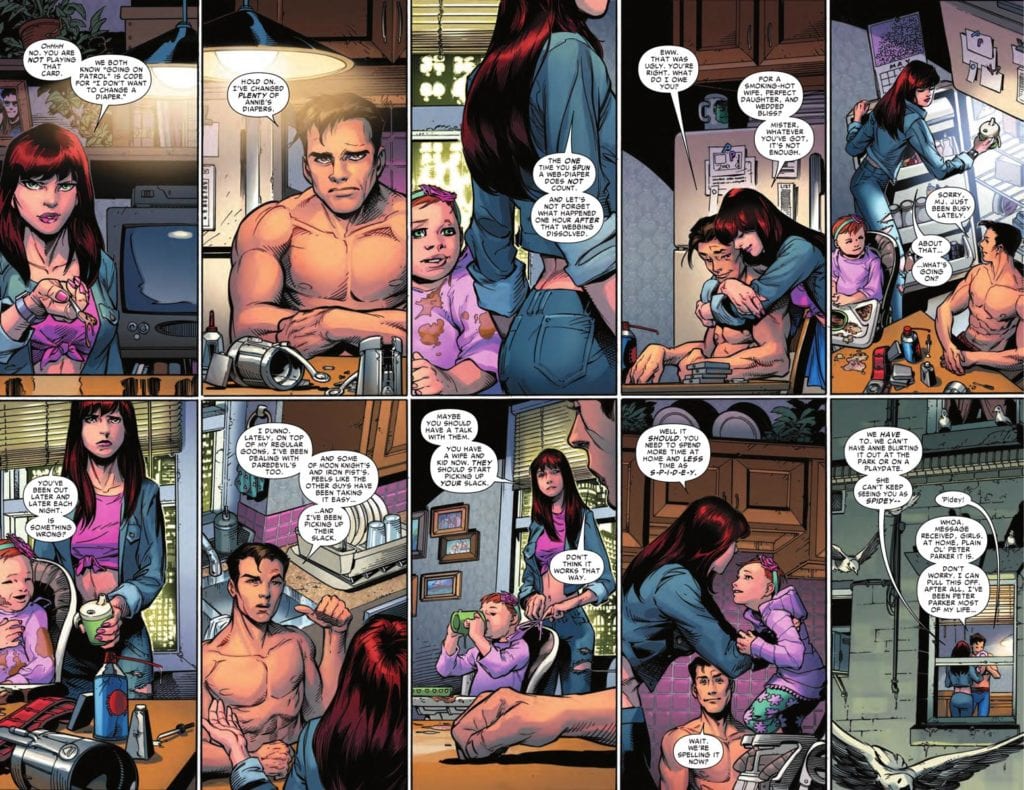
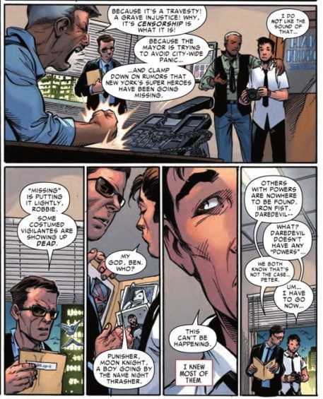
There were many highly anticipated spin-off stories to come out of Marvel’s 2015 Secret Wars event, but AMAZING SPIDER-MAN: RENEW YOUR VOWS (2015) #1 rocked the comics landscape unlike any other. Released in June of the same year, the inaugural issue paid service to Spidey fans by presenting a married version of Peter Parker and Mary Jane Watson, along with their daughter Annie. However, the the disappearance of the world’s superheroes led Peter on a fact-finding mission to protect his world and family.
Story
Our friendly neighborhood hero finds himself living the dream. With his marriage to Mary Jane, this narrative gives Peter the life he’s always wanted. But it’s not all pie in the sky. The interactions between the family is just what readers would expect in a Spider-Man marriage: arguments over Peter’s responsibilities.
Dan Slott presents readers an engaging portrayal of family life in one of the most popular comic couples. We see the highs, lows, and all-round average days anyone would expect. However, as their version of New York happens to find itself in Battleworld from the Secret Wars event, their peace cannot last for long. And readers find it begins with missing superheroes.
Peter finds himself unraveling this mystery while trying to be present for his new family. But when one of his most ferocious villains threatens their safety, will be cross a line in order to protect them?
Artwork
Pencils and Inks: Adam Kubert’s penciling and John Dell’s ink work work beautifully together in this issue. The details of Peter and Mary Jane pay homage to their classic designs over the years.
Colors: Justin Ponsor’s coloring work fits well with the tone of this book. The tones of even our colorful heroes are darker, reflecting the harsh realism revealed as the story progresses.
Letters: VC’s Joe Caramagna’s lettering helped frame the scenes of each panel, giving readers a place to focus their attention.
Conclusion
AMAZING SPIDER-MAN: RENEW YOUR VOWS (2015) #1 was one of the most beloved alternate Spidey stories. Seeing Peter and Mary Jane in a happy marriage once again is enough to encourage fans to pick this one up!
Did you enjoy seeing Peter and Mary Jane as parents? Let us know in the comments below!
Electric Soup #14 cover
Credit: Electric Soup Press/John Brown Publishing
Frank Quitely is a recognisable name in the comic book community. He has a distinguishable style of highly detailed caricature. Over the year’s he has won a number of awards, including an Eisner Award for his work on We3. He has worked on The Authority, Batman and Robin, All Star Superman, and JFK: Justice? F**k Knows.
Read that list again as there’s one title that isn’t as well known.
JFK: Justice? F**k Knows was a two page parody strip published in the Scottish adult humour magazine Electric Soup. The Comic was Quitely’s slip road into the super fast highway of his career and those early parody strips are the foundation that he has built his style around.
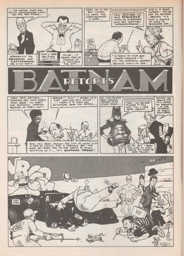
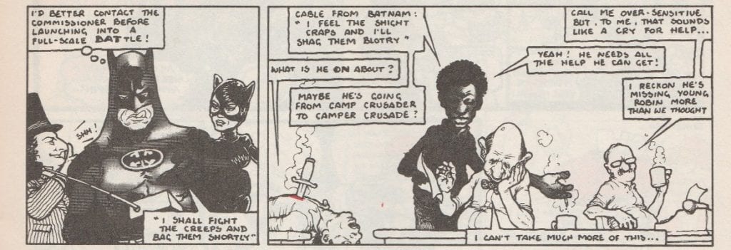
The most popular, and regular, strip that he produced for the magazine was The Greens, itself a parody of another comic strip The Broons. However, the most interesting out of the 17 issue run, and the one that was a taster for the work he was to produce, was called Batnam Retorts. Published in 1992, it riffed off of Tim Burton’s second caped crusader movie and highlighted Quitley’s flair for humanising superheroes.
BATNAM RETORTS from Electric Soup #14 Credit: Electric Soup Press/John Brown Publishing
Scottish Broth
After being thrown out of the Glasgow School of Art, Quitely picked up a number of freelance illustration jobs, creating nightclub posters and drawing people’s pets. However, it was getting a regular strip in Electric Soup that started his comic career.
He wrote and illustrated one and two page cartoon stories that were often filled with cheesy gags and Glasgow humour. However, surrounded by more traditional humour magazine artwork and underground comic styles, Quitely’s work stands out. It has unique, thinly inked defining lines and an eloquent dynamism that flows from panel to panel.
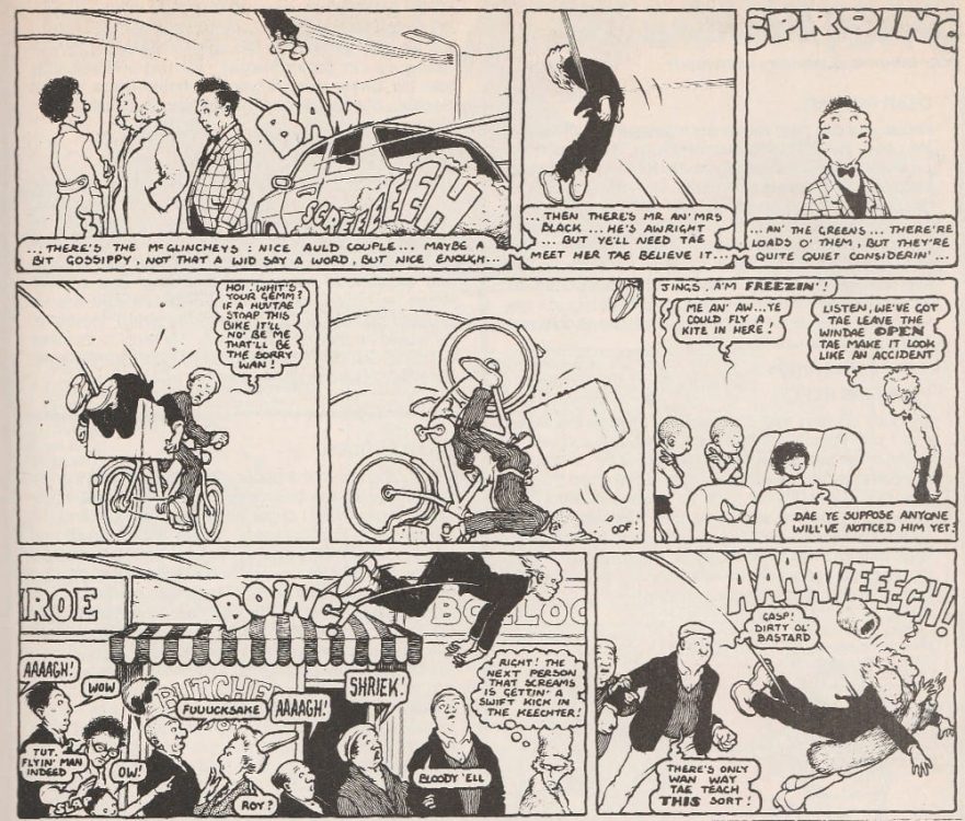
In The Greens episode for issue 12, the children try to play a prank on their Granpaw that results in a slapstick journey across Glasgow for the unconscious old man. Quitely draws the sleeping figure in a number of uncomfortable positions as he is ricocheted from panel to panel. The flow of the story is fed by the exaggerated actions of the old man’s body and the corresponding motion lines. Across the two pages Quietly controls the reading direction and the pace of the narrative with obvious skill.
THE GREENS from Electric Soup #12 Credit: Electric Soup Press/John Brown Publishing
I’m Batnam
Quitley has said that it is his job to ‘make the illustrations provide a dynamic visual narrative’ and that is clear from his earliest work. In Batnam Retorts it isn’t a physical dynamism that Quitley aims for, although there is one panel that uses slapstick humour. The focus is on the contrast between the superhero characters and the civilian counterparts.
Forming the foundation of the overall joke for the strip, the interaction between the Tim Burton superhero archetype and, what can be considered as, real people is a theme that the artist takes with him throughout his career. He creates a visual contrast between the outlandish characters and the office dwelling police force. One row has an opening panel showing the bulky, black form of Batnam, gadget in hand and a grimace on his face (see below). This is juxtaposed with a panel of tired, coffee drinking men slouched at their desks. The backgrounds in both panels are bare but the contrast between Batnam and the Commissioner is clear.
Across the two pages of art this distinction between Supers and Ordinary is clearly displayed. The group of villains in their over the top outfits stand out against the street scene of everyday Glasgow folk.
BATNAM RETORTS from Electric Soup #14 Credit: Electric Soup Press/John Brown Publishing
All Star
If you compare this strip to some of his later works, such as All Star Superman, the contrast between the super and the ordinary is still there, just on a larger scale. Quitely imbues his version of Clark Kent with all the humble, bumbling nature that made Christopher Reeve’s performance so memorable in the 1978 movie. The journalist is a true everyman, as uncomfortable in his suit and tie as everybody else. He then becomes an almost unstoppable force when he changes into his superhero costume.
Some of the contrast is down to the coloring by Jamie Grant who uses browns and greys for the ‘ordinary’ world and bright, garish colors for the super elements. However, Quitely illustrates Superman in a way that instantly gives him a superior air. The flat, energy absent scenes of Clark Kent fade away next to the dynamic visuals of the Man of Steel. In the comic Superman is trying to reconcile his life, preparing for his impending death, and Quitely is using the visuals to demonstrate how difficult that is. There are two distinct sides to Superman and they are worlds apart.
All Star Superman #2 Art Credit: DC Comics
The Batman Link
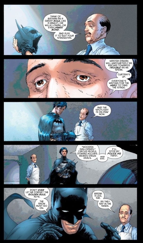
One thing that stands out from the Batnam Retorts comic strip is Quitely’s understanding of the dynamic between Bruce and Alfred, the human element of the Superhero story. In the movie, Batman Returns, Burton portrays the relationship as an aging father and unruly, awkward son. Quitely clearly picks up on this and uses it, however in just three panels he is able to tell you everything you need to know about both characters.
In his future career, Quitely goes on to draw Batman and Robin for DC comics and the relationship he illustrates between Dick and Alfred is the same. On a page from issue 3 (below), there is an exchange between the two characters that is almost a retelling of one panel from Batnam. In it Alfred helps Dick get ready as Batman, handing him his costume and giving him a pep talk. The exact same situation is portrayed in panel 4 of Batnam Retorts.
The way that Aflred looks at Bruce is the same in both comics. Even the butler’s appearance is very similar with an oval, wrinkled face topped with very little hair. Dick is different, but that jokey snarl at the bottom of the page mirrors the concentrating, tongue out, face of Bruce from Electric Soup.
The space that Quitely has to tell the story is different for both strips however he creates the same pacing and invokes the same character narration.
Batman and Robin #3 Credit: DC Comics
Forever Forward
Frank Quitely has come a long way from his early days in Glasgow. Not physically, as he still lives and works there. And not technologically, as he still produces a lot of his work with ink on paper. However, his design work and page layouts have become almost as legendary as the characters he has drawn. With each new project Quitely pushes himself and his art to get the most out of a medium he clearly loves.
He recognises that comics are different from other mediums and uses different skill sets to tell a story. He also loves doing the unexpected, pushing the reader to accept more. Not only does he have control over his pencils and layouts, but he has complete control over the reading experience. This is something that is evident in the superb We3 but has been a part of his work from the very beginning.
The strips in Electric Soup may see like simple throw away gags but captured within them are the seeds of Frank Quitely’s greatness.


")