

Frank Quitely is a recognisable name in the comic book community. He has a distinguishable style of highly detailed caricature. Over the year’s he has won a number of awards, including an Eisner Award for his work on We3. He has worked on The Authority, Batman and Robin, All Star Superman, and JFK: Justice? F**k Knows.
Read that list again as there’s one title that isn’t as well known.
JFK: Justice? F**k Knows was a two page parody strip published in the Scottish adult humour magazine Electric Soup. The Comic was Quitely’s slip road into the super fast highway of his career and those early parody strips are the foundation that he has built his style around.
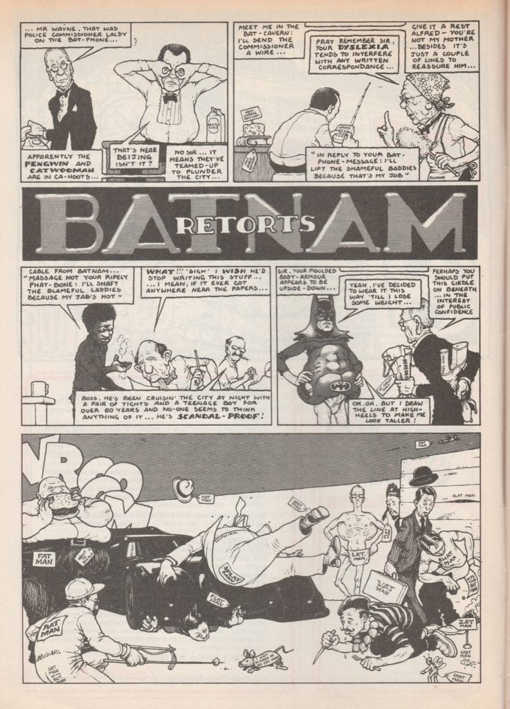
The most popular, and regular, strip that he produced for the magazine was The Greens, itself a parody of another comic strip The Broons. However, the most interesting out of the 17 issue run, and the one that was a taster for the work he was to produce, was called Batnam Retorts. Published in 1992, it riffed off of Tim Burton’s second caped crusader movie and highlighted Quitley’s flair for humanising superheroes.
Credit: Electric Soup Press/John Brown Publishing
Scottish Broth
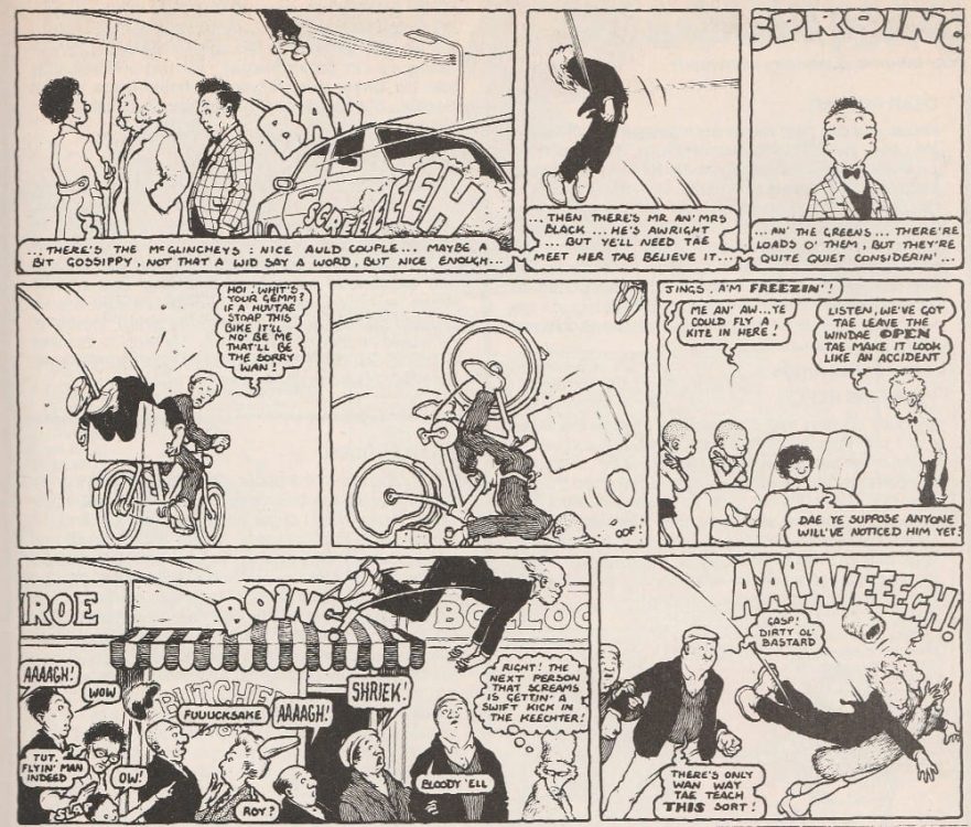
After being thrown out of the Glasgow School of Art, Quitely picked up a number of freelance illustration jobs, creating nightclub posters and drawing people’s pets. However, it was getting a regular strip in Electric Soup that started his comic career.
He wrote and illustrated one and two page cartoon stories that were often filled with cheesy gags and Glasgow humour. However, surrounded by more traditional humour magazine artwork and underground comic styles, Quitely’s work stands out. It has unique, thinly inked defining lines and an eloquent dynamism that flows from panel to panel.
In The Greens episode for issue 12, the children try to play a prank on their Granpaw that results in a slapstick journey across Glasgow for the unconscious old man. Quitely draws the sleeping figure in a number of uncomfortable positions as he is ricocheted from panel to panel. The flow of the story is fed by the exaggerated actions of the old man’s body and the corresponding motion lines. Across the two pages Quietly controls the reading direction and the pace of the narrative with obvious skill.
Credit: Electric Soup Press/John Brown Publishing
I’m Batnam
Quitley has said that it is his job to ‘make the illustrations provide a dynamic visual narrative’ and that is clear from his earliest work. In Batnam Retorts it isn’t a physical dynamism that Quitley aims for, although there is one panel that uses slapstick humour. The focus is on the contrast between the superhero characters and the civilian counterparts.
Forming the foundation of the overall joke for the strip, the interaction between the Tim Burton superhero archetype and, what can be considered as, real people is a theme that the artist takes with him throughout his career. He creates a visual contrast between the outlandish characters and the office dwelling police force. One row has an opening panel showing the bulky, black form of Batnam, gadget in hand and a grimace on his face (see below). This is juxtaposed with a panel of tired, coffee drinking men slouched at their desks. The backgrounds in both panels are bare but the contrast between Batnam and the Commissioner is clear.
Across the two pages of art this distinction between Supers and Ordinary is clearly displayed. The group of villains in their over the top outfits stand out against the street scene of everyday Glasgow folk.
Credit: Electric Soup Press/John Brown Publishing
All Star
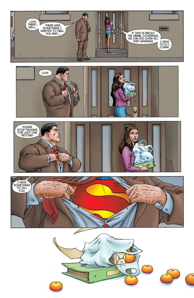
If you compare this strip to some of his later works, such as All Star Superman, the contrast between the super and the ordinary is still there, just on a larger scale. Quitely imbues his version of Clark Kent with all the humble, bumbling nature that made Christopher Reeve’s performance so memorable in the 1978 movie. The journalist is a true everyman, as uncomfortable in his suit and tie as everybody else. He then becomes an almost unstoppable force when he changes into his superhero costume.
Some of the contrast is down to the coloring by Jamie Grant who uses browns and greys for the ‘ordinary’ world and bright, garish colors for the super elements. However, Quitely illustrates Superman in a way that instantly gives him a superior air. The flat, energy absent scenes of Clark Kent fade away next to the dynamic visuals of the Man of Steel. In the comic Superman is trying to reconcile his life, preparing for his impending death, and Quitely is using the visuals to demonstrate how difficult that is. There are two distinct sides to Superman and they are worlds apart.
The Batman Link
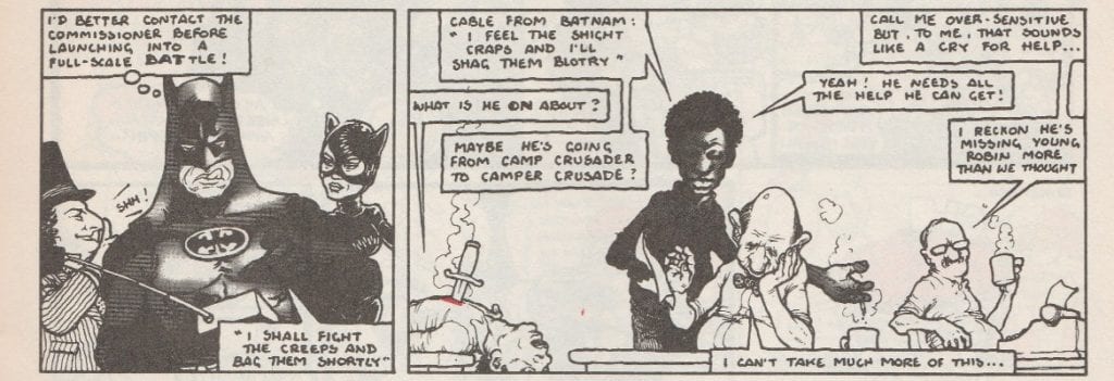
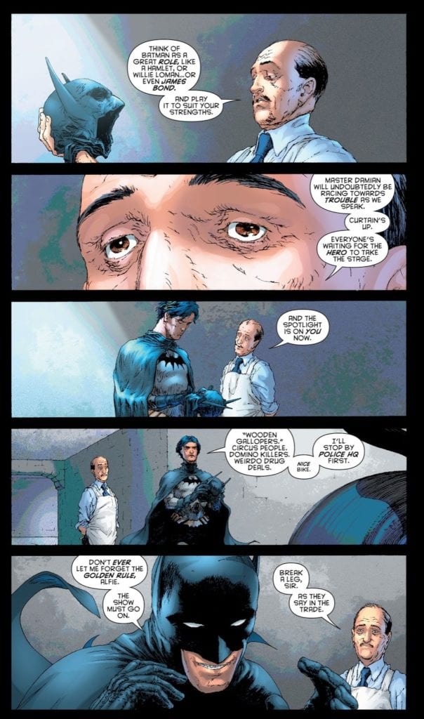
One thing that stands out from the Batnam Retorts comic strip is Quitely’s understanding of the dynamic between Bruce and Alfred, the human element of the Superhero story. In the movie, Batman Returns, Burton portrays the relationship as an aging father and unruly, awkward son. Quitely clearly picks up on this and uses it, however in just three panels he is able to tell you everything you need to know about both characters.
In his future career, Quitely goes on to draw Batman and Robin for DC comics and the relationship he illustrates between Dick and Alfred is the same. On a page from issue 3 (below), there is an exchange between the two characters that is almost a retelling of one panel from Batnam. In it Alfred helps Dick get ready as Batman, handing him his costume and giving him a pep talk. The exact same situation is portrayed in panel 4 of Batnam Retorts.
The way that Aflred looks at Bruce is the same in both comics. Even the butler’s appearance is very similar with an oval, wrinkled face topped with very little hair. Dick is different, but that jokey snarl at the bottom of the page mirrors the concentrating, tongue out, face of Bruce from Electric Soup.
The space that Quitely has to tell the story is different for both strips however he creates the same pacing and invokes the same character narration.
Forever Forward
Frank Quitely has come a long way from his early days in Glasgow. Not physically, as he still lives and works there. And not technologically, as he still produces a lot of his work with ink on paper. However, his design work and page layouts have become almost as legendary as the characters he has drawn. With each new project Quitely pushes himself and his art to get the most out of a medium he clearly loves.
He recognises that comics are different from other mediums and uses different skill sets to tell a story. He also loves doing the unexpected, pushing the reader to accept more. Not only does he have control over his pencils and layouts, but he has complete control over the reading experience. This is something that is evident in the superb We3 but has been a part of his work from the very beginning.
The strips in Electric Soup may see like simple throw away gags but captured within them are the seeds of Frank Quitely’s greatness.