DC Comics’ Lois Lane #11is the penultimate chapter in a stellar series. Written by Greg Rucka, with art by Mike Perkins, Colors by Andy Troy, and letters by Simon Bowland, this issue delves back into its influences. The hardboiled crime fiction tone that this creative team has worked so hard to create isn’t just a choice of style. We see here that Lois Lane follows the story beats of old mysteries, as much as it follows its looks.
Writing
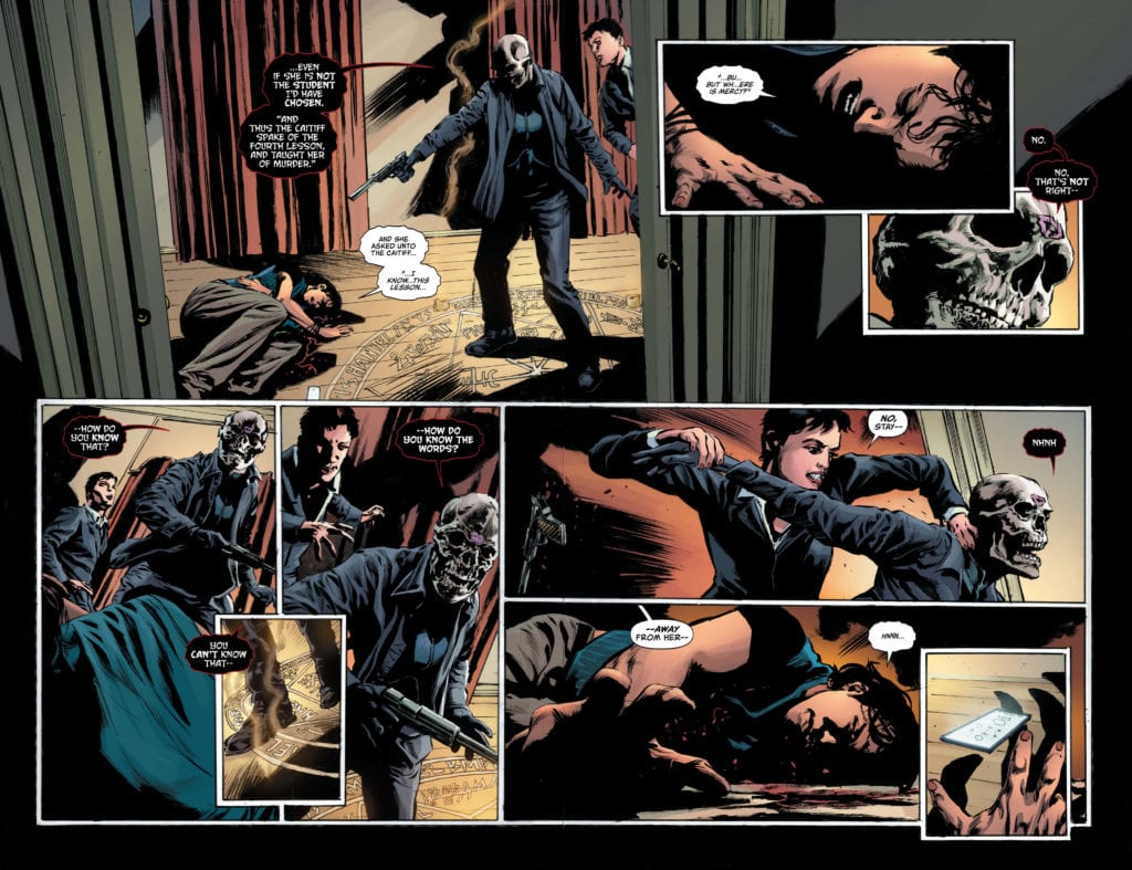
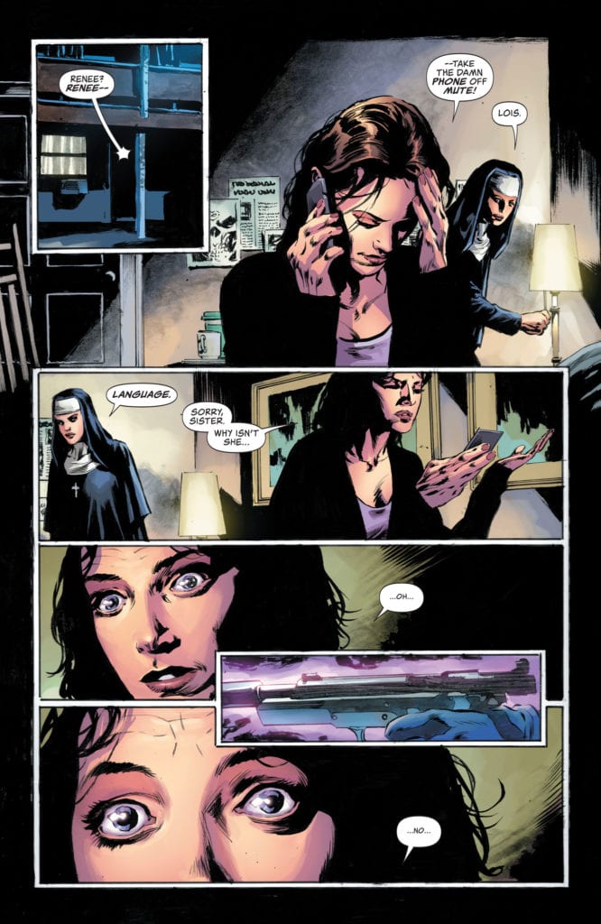
Rucka begins the denouement with this chapter. With one issue to go, it’s natural for the story to be winding down. But it all feels chaotic and slightly out of step. Until you remember, this story has been a hardboiled mystery from page one. Lois, our wise-cracking investigator, has been two steps ahead of the plot the whole time. She knows far more than she’s letting on. And so, as shit hits the fan and everything begins to crumble, we’re met with a smiling Lois Lane who isn’t surprised by any of it. It’s all going as planned. Rucka, very briefly, employs a Deux Ex Machina to continue the story along. Rucka introduces rules as quickly as they help the characters. But that’s the price of writing a story that leaves readers so brilliantly in the dark. It’s a small price to achieve this level of mystery and intrigue.
Art
Perkins’ art in this chapter is all over the place. And I mean that in the best way possible. As we reach the series’ climax, the drama is intense. Perkins captures looks of anxiety, fear, and anger so perfectly; he manages to put them on the face of a skull. It’s incredible to reach such a degree of dramatic flair that you can see a skull is worried. And yet the drama’s landing is cushioned by Perkins’ trademark subtlety. Lois sits on the edge of her bed, worried that things may have finally gotten out of hand. Her anxiety, her fear, her sadness is intense. But then she brushes her hair out of her face and looks serene. “There’s nothing you can say. She trusted me.” It’s one thing to see Lois in pain. But to see her fight back her guilt and put on a brave face, we feel it so much deeper.
Coloring
You don’t need to read this issue to know what’s going on. A simple flip through the pages, and you can figure it out the tone of each scene, every beat. That’s because Troy’s coloring is so vividly connected to the story. Troy uses his coloring thematically and consistently. We see the splashes of purple, so common in this series, that represent mystery and the unknown. Characters like the Kiss of Death and Lois Lane are surrounded by purple on the page. Each knows more than they let on. And as we peak into the multiverse again, the purple hues cover each part of the page. The climax of the series is framed in the fires of hell. Yellow and red mingle together to create a sense of danger. And finally, the last few pages see a warming up of the color palette—a return to safety. For the cherry on top, Troy keeps Lois framed in purple. She still has more to let us in on.
Lettering
Bowland’s lettering helps show the readers how phased characters are about events coming to a head. The Kiss of Death says, in big bold letters, “I am the Rock.” She is the instigator of chaos, and she’s happy about it. But as new things come to light, her dialogue shrinks. Soon, she’s rambling in a font that’s half the size of everyone else. Lois is cool as a cucumber for much of the issue. After all, she is Lois Lane. Yet when she starts piecing together that she could have made a miscalculation, the font of her dialogue shrinks too. Later, when things seem to be okay, Lois’ font briefly shrinks down again. Like her words are being let out with a sigh. Through this constant shifting of the font, Bowland lets us peek behind the curtain. Which characters are confident things will work out, and which of them are scared?
Lois Lane #11 is one of the most potent titles to come out of DC Comics. It establishes tone and imbues characters with a three-dimensionality that is sorely missing in their portrayals on other titles. As this creative team steps into the home stretch, we see the plot begin to wind down. But even so, much of the mystery remains intact for the final chapter. Lois Lane #11 is out from DC Comics this week!
Writer and artist Livio Ramonelli’s “The Kill Lock” #5 brings a climax of devastating proportions. An intense mix of brutality, suspense, and tenderness, this fifth chapter is the most high-stakes issue of this riveting sci-fi comic series.
“Run down. Beat up. On their last legs. The Linked know that this is their final chance to find a cure for The Kill Lock. Face-to-face with the last hope for salvation, will it be relief or pain? If one dies… they all do.”
Writing & Plot
On the verge of supposedly finding the “cure” for the Kill Lock, the four robot leads – the Artisan, the Wraith, the Laborer, and the Kid – find themselves fighting for their lives. Ramondelli has terrific sensibilities when staging fight sequences – a skill probably honed with his work on IDW’s Transformers comics – and this issue may have the best yet. The visceral action is met with the usual stellar dialogue that varies greatly among the characters both primary and extra. Most of the dialogue in this chapter is a conversation between just two of the bots, and while it’s naturalistic and well-written, it could be considered a bit long-winded. Again, however, Ramondelli’s ear for dialogue is just as good as his artistic skill, so this may come off as nothing more than a nitpick. This is a taut and emotionally tense issue that proves once again that Ramondelli is just as good a writer as he is an artist.
Art Direction
Speaking of art, “The Kill Lock” #5 is yet another stunning chapter to behold. The painted-style visuals of both the machines and the desolate tundra planet they find themselves on are marvelous as ever. The unique looks of the robots themselves – from the lanky cyclops in the Artisan to the walking medieval tank of the Wraith – add to their characteristics and personalities just as much as their dialogue does. The used future aesthetic of the distant planets the cast visits make for striking atmospheric tone, granting these protagonists’ lonesome journey a sense of scale and magnitude. Being an artist as well as a writer, Ramondelli understands how to work the magic of the comics medium. There are many wordless panels that let the art do the storytelling, whether they be fight sequences or contemplative moments of silence. The lettering from Tom Long may be his best yet on this issue, as the arrival of some new faces sees an even greater use of his unique individual fonts for each droid. Once again, “The Kill Lock” #5 is just a riveting to look at as it is to read.
“The Kill Lock” #5 is this series’ climactic chapter before the finale, and it’s likely the most gripping chapter thus far. Intense fight sequences interlace with suspenseful dialogues between protagonist and antagonist, leading up to an ending that will make the wait for next month’s issue near unbearable. Be sure to pick up this issue when it hits stands at your local comic shop on 6/9!
Force Works 2020 #3 is a fun, if not slightly vacuous, ending to Matthew Rosenberg’s first story arc. It is a fine thematic addition to the ongoing Arno Stark A.I. event happening across all Iron Man related titles.
My first exposure to Force Works was in the 1994 Iron Man cartoon. In the comics at that time, Iron Man had broken away from the main Avengers team to form a more proactive group. In the cartoon, the members were the Scarlet Witch, Spider-Woman (Julia Carpenter), the alien Century, War Machine, and Hawkeye, while in the comics, U.S. Agent was utilized instead of Hawkeye, War Machine’s interaction with the group seems to have been confined to his interactions with Iron Man, and Wonder Man was a founding member, killed on their first mission (Don’t worry! He got better! Then didn’t. Then did again!). There have been other iterations of Force Works, but I was intrigued to read this new iteration written by Rosenberg.
This issue’s cast of War Machine, Mockingbird, Quake, and U.S. Agent provides a chance for these secondary characters to shine and not be used as fodder for meaningless comic book deaths.
This issue was light, low stakes superhero writing at its finest. There is a certain silliness to the entire thing, like when M.O.D.O.K. combines with Ultimo to form ULTIMO.D.O.K. Thankfully, moments like this are undercut with a self-aware quippiness, with Bobbi Morse responding, “That name isn’t as clever as you think it is.” This self-awareness works in the comic’s favor, although at times, it runs the risk of making all of the characters sound the same, merely becoming self-aware quip machines.
There are some good character moments that offset this risk, though. U.S. Agent, in particular has a moment to shine toward the end. John Walker is known as a character who follows orders, sometimes to a fault. However, this issue gives him a moment to shine that shows that underneath that patriotic exterior, he has a heart and is capable of growth.
Artist Juanan Ramírez and colorists Federico Blee and Guru-eFX have created a very good looking comic, which despite the low stakes feeling plot, looks beautiful and bombastic. The linework and coloring is exceptional! Letterer V.C.’s Travis Lanham also does a good job capturing the voices of each character on the page, differentiating between voices of the human characters, robotic voices of the Deathloks, and even Rhodey’s voice when he’s in his armor. I might’ve also added a similar differentiating effect to M.O.D.O.K.’s voice as well, but perhaps I’m just nitpicking at this point.
Overall, Rosenberg and company have put together a fine-enough issue, and of course, this is only the first arc, establishing the characters and their interactions with each other. It will be interesting to see if he can continue to resuscitate this often-forgotten title in Marvel’s history.
Did you read Force Works 2020 #3? Tell us what you thought of it in the comments below.
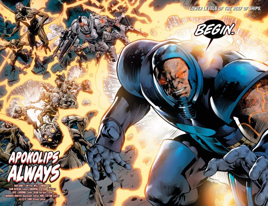
JUSTICE LEAGUE ODYSSEY #21, hitting comic book stores on Tuesday, June 9th, is the beginning of the end in a certain way. It’s the beginning of the League’s confrontation with Darkseid for the fate of the future—and all of the universe’s history. But it’s the end of our heroes’ chances to persuade the pompous Epoch to destroy his Revision Mechanism. And the fallout will determine the fate of the universe.
Story
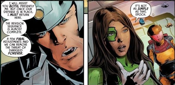
Jessica Cruz, Epoch, and the rest of the team have some major decisions to make with the onset of Darkseid and his mighty forces. The evil overlord is on a mission to eradicate the League—or so it seems.
The New God’s obsession with the technology held by Epoch is revealed to be the key motivation behind his onslaught. But Cruz is the only League member who seems to grasp the villain’s true intention. Epoch, for one, is committed to firing up the Mechanism is an be-all and end-all to not only Darkseid’s threat but all threats.
In order to stall for time, Cruz and team unleash the Esktaon on Darkseid—an event readers undoubtedly have been waiting for. The foes clash and wreck most of the Reef, almost leading the heroes to conclude a premature victory. But with Epoch racing to fire the Mechanism, Cruz knows the most important thing to do is to stop him,
Dan Abnett’s writing is full of unbridled energy. His epic description of the explosive fight is matched only by the dynamic dialogue between Epoch and Cruz as they fight against both Darkseid and one another.
Artwork
The illustrations within this issue fit beautifully with Abnett’s fast-paced narrative. Will Conrad’s penciling and ink work, combined with Rain Beredo’s coloring, offers readers stunning displays of power in Darkseid’s Omega Beam blasts and Eskaton’s mighty blows. The energy blasts are full of vibrant warm colors to serve as a contrast to the demon’s cooler hued attacks. In addition, Andworld Design’s lettering compliments the action by giving personality to each character, from Dexstar’s feline-esque dialogue font to Darkseid’s bold, rocky style.
Conclusion
JUSTICE LEAGUE ODYSSEY #21’s story is a roller coaster ride that you just don’t want to stop. The intriguing storyline and non-stop action leaves us coming back for more. We’re anxiously awaiting the answers sure to follow in issue #22.
What did you think of the fights in this issue? Let us know in the comments below!
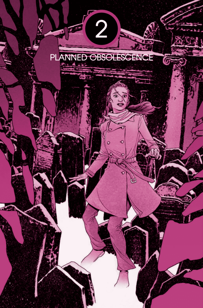
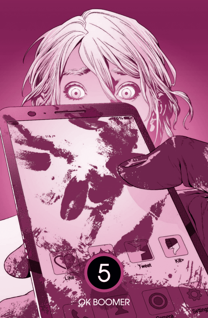
The trade paperback for You are Obsolete hits your local comic book shop on June 16, the book is an insane, intense, thriller, and Monkeys Fighting Robots got to talk with the writer of the series, Mathew Klickstein.
About the book: YOU ARE OBSOLETE is a spine-tingling thriller that evokes the eerie naturalism of 1970s horror films with a modern deadly digital twist.
A disgraced journalist is called to cover a mysterious story on an isolated European island. As she investigates, she discovers the children have taken control and are somehow killing off all adults by their 40th birthdays. Now, she must discover the truth behind the killings while staying on the good side of the children’s harsh leader…or she’s next.
You are Obsolete is written by Klickstein, with art by Evgeniy Bornyakov, Lauren Affe drops the color, and you will read Simon Bowland’s letters.
MFR: YOU ARE OBSOLETE is very intense; what techniques did you use to create tension in your comic book?
KLICKSTEIN:Thank you for so saying, and it’s been extremely rewarding to see how readers and reviewers have connected with the story, characters, and particularly the eerie tone/atmosphere of YOU ARE OBSOLETE.
I believe the series has resonated on such an intense level emotionally with so many fans is that I grew up on a steady diet of the best of sci-fi/horror from yesteryear, be it The Twilight Zone, the works of Ray Bradbury, Stephen King, Michael Chrichton, Philip K. Dick, Jules Verne and their ilk. These were my real, lifelong teachers as I developed my own writing style and I really do believe I learned how to develop stories and characters through my voluminous reading and watching of the works of these giants of the genre(s), absorbing in some ways what it was that allowed these creators to conjure up such fantastic and creepy tales.
When I sit down to write, it’s rare I have much idea of where I’m going or what I’m doing; I’m the type of author who allows the characters to dictate where we’re going and what we’re doing. That’s a major part of the rush of writing for me. When it’s really flowing, I feel more like a stenographer than anything else.
But, again, I think a lot of this comes from the fact that I have always – and continue – to immerse myself deeply in the works of the great masters of the past (right now I’ve been revisiting Franz Kafka, HP Lovecraft and Edgar Allan Poe, along with going back to some of Stephen King’s earliest short stories, for example). And I always give that same advice to those who ask me how they can get so inspired to write stories of their own: read a lot, and read the good stuff. It wears off on you, for sure.
MFR: The book also has the reader reaching for the answers to the mystery. How did you know how much information to give the reader to make them turn the page?
KLICKSTEIN: That’s a really great question and something I haven’t thought about before.
I don’t mean to be oblique here, but I suppose it goes back again to what I was saying earlier: I learned how to develop my characters and stories through osmosis of the many books, short stories (not to mention interviews, autobiographies/biographies/documentaries etc.) I’ve ravenously read and watched over the years of the masters of sci-fi/horror. As with that creepy tone/style we were discussing earlier, such a steady diet of sci-fi/horror material also greatly impacted my pacing here, and that in turn affected how the information in the “mystery” elements of the story unraveled.
In the case of YOU ARE OBSOLETE, I felt particularly inspired by a lot of favorite movies of mine from the 60s, 70s, and 80s – The Wicker Man, The Stepford Wives, Videodrome, They Live, Carnival of Souls, Village of the Damned, Repulsion, etc. As eclectic as these films are, they all have in common a kind of subtle, slow-burn rhythm to the way their narratives and their own mystery elements progress.
Agatha Christie has been a major source of inspiration for me ever since I was a kid and used to read her books – such as And Then There Were None – over and over again, the way a musician might listen to the same song or record over and over again both for the visceral enjoyment of it … but also to better understand and “absorb” how the song or record was constructed.
I can’t really say specifically how I developed the pace of information dispersal in YOU ARE OBSOLETE; I don’t really use outlines or charts or whatnot the way more meticulous or analytical authors/creators often do. I can only say I’ve repeatedly read and watched the works that have really touched me in a profoundly creative way over the years, and I suppose indirectly they endowed me with a likeminded tone, style and – yes – rhythmic flow that runs throughout my own works such as YOU ARE OBSOLETE.
MFR: The artwork in YOU ARE OBSOLETE is brilliant. Talk about what Evgeniy Bornyakov brought to the table as the artist of the series.
KLICKSTEIN:I agree, and it seems that’s a unanimous take on YOU ARE OBSOLETE. The artwork is simply stunning.
Evgeniy did an astonishing job, and I always like to let everyone know that not only is he a genius craftsman, but he’s incredibly fast too. It could be moderately unnerving: I would see some of his work for a few panels and always be immediately blown away. But a few times (very few), there might be a tweak or two needed, and I tell you, more than once it was only minutes later that I would receive back the redesigned images, and they would be exactly what I called for. I couldn’t believe it.
He’s like a machine, and yet there’s so more humanity and vivacity to the work that what he produces doesn’t just look like some kind of plastic CGI output. His images are so alive and real, and the fact they’re so spectacularly mesmeric at the same time made me feel so lucky that AfterShock brought him onboard YOU ARE OBSOLETE.
MFR: How did your relationship evolve over the five issues with Evgeniy?
KLICKSTEIN:Truth be told, I never once spoke directly with Evgeniy. I’m not even sure exactly where he lives – I believe somewhere in Russia? All communication with him was mediated by my editors at AfterShock, Christina Harrington and Mike Marts – who both also did a phenomenal job of working with me throughout the course of completion, especially since I was a first-timer here.
I wrote the scripts as detailed and specifically as possible so that the artists would understand exactly what it was I wanted – exactly how the characters should look, how the lettering should be done, how the coloring and compositions of the panels should be realized. Christina and Mike would then relay this information to the artists, I would go over their sketches and rough work, explain if there were any tweaks needed (infrequent), and Christina and Mike would then relay those details back to said artists, they’d make the changes, and – BOOM – the pages/issues/series were steadily completed.
There was some degree of evolution, though, in the process in that I could reference certain previous images, panels, facial expressions, and so forth that helped move things along more swiftly later on. A prime example here is that I had some difficulty communicating to Evgeniy exactly how I wanted those horrific smiles of the adult characters in the story to look. In Evgeniy’s earliest sketches, they appeared too malevolent, as though the characters were up to something evil themselves. After revisions, they just looked sad and pathetic, which was also not quite right.
I found using screenshots – in this case one from the film I, Tanya where the Tanya Harding character played by Margot Robbie is smiling so painfully, so intensely at one point after successfully completing one of her major skating routines and a few from the “It’s a Good Life” episode of The Twilight Zone – helped to convey what I was looking for in those facial expressions of our adult characters.
Once Evgeniy nailed the complex nuance of those facial expressions, during the production of later issues I could say, “Can you make the expressions look like how you made them look in Issue 1 and 2?” That shorthand really helped us move faster still later on, which was great.
MFR: Do you have a favorite panel or page from the book? If so, please explain why.
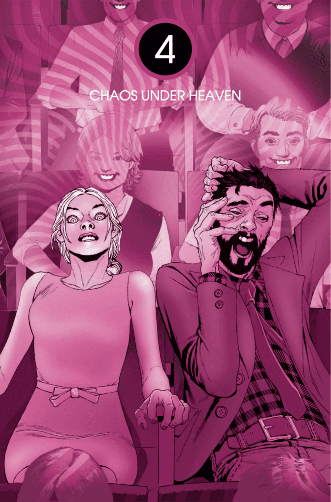
KLICKSTEIN:Although as mentioned I didn’t have an outline or too much of a specific idea of where the story and characters would take me along the way of my completing YOU ARE OBSOLETE, I did have a basic understanding of the beginning/middle/end on a general level and was eagerly awaiting Issue 4 (“Chaos Under Heaven”), which indeed became my favorite installment of the series.
Honestly, I still can’t believe my editors Christina Harrington and Mike Marts allowed me to create that issue the way I did. I was truly worried when I turned in that script and assumed that I would hear back from them that I needed to do a full rewrite. It’s just so weird and different than conventional comic books. Both in content and in style.
Much to my amazement and relief Christina and Mike seemed to really dig what I was doing with that one, and Christina in fact was particularly jazzed, coming up with ways we could push the form and style even more with ideas I hadn’t considered regarding how the lettering could be done for that issue and so forth.
I had to work closely (again, through mediation via Christina and Mike) with Evgeniy as well as colorist Lauren Affe on how we were going to alter the aesthetics of Issue 4 because I wanted it to really stand out and be something special even within the context of the series itself.
SPOILER ALERT: The whole issue is basically one long-running, “real-time” mushroom trip the main character goes on, and in so doing, she has flashbacks to her younger years in which we learn a great deal more about who she is, where she came from and why she is the rather complicated person we’ve gotten to know her as through the first three issues. I had a lot of fun delving deeply into her psyche here and, certainly, with the spectacular work of Evgeniy and Lauren in particular, we were able to take the reader on this psychological adventure while still offering some spellbinding imagery that would really pop throughout the pages.
Meanwhile, in plunging the reader into main character Lyla Wilton’s backstory, I was able to offer up some important ideas about how her industry (and, for most of my life, mine too), Media, has changed for good or ill over the past decade or so. I didn’t want to be too pontifical here, but it was in these panels that I was allowed – both by Christina and Mike, but also the organic flow of the story itself – to connect what Lyla was going through to the genuine, contemporary reality of Media today, which is a subject near and dear to my heart as both a consumer and creator in that field.
Many of my journalist friends – including John Wenzel of the Denver Post who offered the blurb that we used on the cover of the trade edition about the story being a perfect summation of what’s happening in the modern world – were equally delighted to see that I could make a few points about certain unfortunate realities to our changing industry. That was a very satisfying result, as well.
I’m grateful that with Issue 4 we were able to create something that was artistically very pleasing, that really took up the thrills and horror elements up a notch due to Lyla’s intense mushroom trip, but that I was also able to find an organic and meaningful way to make a few points about some real issues affecting us all today.
MFR: Another aspect that works well is Lauren Affe’s colors. Did you have a color palette in mind when designing the book?
KLICKSTEIN:For the most part, I gave Lauren a significant amount of carte blanche in her color palette and how she brought the brilliant effulgence to each panel throughout the series.
There were of course, instances in which certain coloring flourishes were needed – I wanted the earlier elements of the story to evoke an old-timey nostalgic feel and hence the de-saturated, sepia-toned of those panels, for example. Again, we had to work more closely for Issue 4 due to the way we were changing up the aesthetic overall of those pages, as well.
But for the most part, I have to hand it to Lauren – she really handled the coloring herself and I couldn’t be more proud of how it turned out. She completely “got” what I wanted to do from the story and characters alone, and – as with Evgeniy – I didn’t have to say much to get her to do what was needed to make the series what it became.
One part I did have some fun with her was when we were trying to figure out how the screens of the children’s phones would look when they engaged the killer app, which is the central plot point of the narrative. Once again, I found that screenshots from films would help best here and, in fact sent her shots of the amorphously radiant “shimmer” border from Alex Garland’s Annihilation, which Lauren immediately understood and incorporated into the coloring for those scenes in a way that was just right.
MFR: Social commentary is a big part of YOU ARE OBSOLETE. Over your career, how has the good and bad of the current state of the world influenced your writing?
KLICKSTEIN: Having been a journalist for more than half my life, I can’t help but inject at least some form of social commentary – whether directly or indirectly – into all of my work.
It’s just a part of who I am, and I became politically active at a young age – working on political campaigns and for various organizations such as the ACLU as early as high school and well through college. For a while in my late teens, I thought I might become a speechwriter.
Even as a kid in elementary school, I used to be a bit of a “troublemaker” in arguing with teachers or just generally being a pain in standing up for what I believed in.
I think I organized my first petition signing campaign in fourth grade and led a protest involving a group of students about some minor issue even before that. I think we were mad; they were cutting recess a little short and refused to leave the basketball court. I got the other kids to chant, “Hell no, we won’t go!” I was maybe seven or eight during that escapade.
I was remarkably fearless for a little kid, very irreverent and – with a former hippie mom who raised me to always “tell it like it is” even to older authority figure types, I ended up being a little firebrand by habit at a very young age. I’d be lying if I didn’t say it wasn’t exhilarating and “fun” too. But, yeah, I was also a little asshole in some ways, and after a while, the “lil’ rabble-rouser” routine got old.
Some of this background of course impacted how I developed Lyla’s character, particularly those scenes in Issue 4 in which drug-addled flashbacks chronicle how she became the inveterate truth-seeker and truth-teller she fancied herself as.
As I grew older, I calmed down a fair amount and – through enough experience in the field – grew completely disillusioned by politics. But I still had and have that kind of contrarian style to a lot of my work, even in my more mainstream, commercial output. It’s part of my DNA as an artist and a person in general, I suppose.
And, yes, in observing how our society has been precipitously evolving over the past few years – especially in reaction to developments in fields I’m involved in or have close friends involved in from the inside such as Media and “new-tech” – I couldn’t help but let some of that insider analysis come through in telling Lyla’s story, especially since the entire series is one long confession of hers told after the fact as a kind of “report” on what happened, which does include the social, psychological and cultural ramifications of said story, often including those that are affecting all of us in a very real way today.
To me, that’s a big part of why so many of the great sci-fi stories we love, be they The Twilight Zone or They Live or Fahrenheit-451 or Brave New World and 1984 continue to resonate with us decades after they came out. They’re not only fantastic stories with well-crafted characters we grow to love and hate on an indelible level. They also say something about the time in which they were created and, if they’re really special, about the general human condition that can deeply connect with us still so many years later.
I dearly hope I have some of that magic in YOU ARE OBSOLETE, but only time will tell. And if nothing else, at least it’s hopefully an adequate time capsule of the continuously shifting era we’re living in today or that we were living in during the months the series was developed and completed.
MFR: Lyla Wilton is an engaging main character. How hard is it to create a main character that readers connect with?
KLICKSTEIN:To have attempted such a complex character that seems to have stuck the landing quite well according to how readers and reviewers alike have been connecting with her is of course very gratifying. She’s not a hero. Heroes can be pretty boring, off-putting and unrealistic. That wouldn’t have worked for this story.
I needed someone real to recount the story, and it seems that’s what I conjured up with Lyla Wilton. That in turn, helped make the story feel more palpable – even in its more fantastical, sci-fi elements – which in turn makes it that much more intensely frightening.
It wasn’t very hard at all. As I said, she just kind of popped into my head and told the story herself. All I had to do was listen closely and write down what she laid out for me. Some might call this a form of insanity, but as Hunter Thompson once said (probably far more than once), being crazy can pay.
MFR: What did you learn from the process of making YOU ARE OBSOLETE that’s going to make you a better storyteller?
KLICKSTEIN: I’m a firm believer in the Dodo’s dubious wisdom from Alice’s Adventures in Wonderland that the best way to explain something is to do it. I find this to be absolutely true when it comes to developing yourself as a storyteller or artist. Whenever someone asks me how he or she can become a writer, I always say, “Just start writing.” (And, of course, read a lot, and watch a lot of good movies.)
Learn from doing, learn from observing. I’ve never gotten much from direct education viz. writing or creativity, and this was after four years at the top film school in the country. Mark Twain said it best: “Never let your schooling interfere with your education.”
I’ve always learned so much more and so much faster from just sitting in that chair and getting it done. Which is one of the reasons why I feel so fortunate I’ve been able to continue my “education,” if you will, over the years through writing and producing in all these different mediums and via various platforms be they film, television, reportage, theater, and yes now comic book creation.
I had absolutely no idea how to put together a comic book before I pitched the story of YOU ARE OBSOLETE to AfterShock. Mike Marts in fact had to send me a few sample scripts from books AfterShock had released just so I could teach myself the language, structure, and ebb-and-flow of a publishable comic book.
I wasn’t thrown into a pool, having to learn how to swim. I was thrown off a cliff, having to learn how to fly. There was no time (or money/resources) to take a class or go to a seminar or something. I learned by doing.
And, from what it seems from the stellar reviews of this debut series of mine, I guess I learned quite a lot.
Collaborating directly with my editors and indirectly with the artists onboard also reinforced and taught me new tricks for working with others on creative projects, and it reminded me too how much I enjoy such esprit de corps, particularly when you’re lucky enough to work with such capable, passionate and hardworking individuals on your project.
In essence, what did I learn from the process of working on my first comic book series? I learned how to work on my next comic book series. And hopefully many more thereafter.
MFR: With the COVID-19, the comic book industry is at an evolutionary moment. What do you think the comic book industry will look like in 10 years?
KLICKSTEIN:I certainly can’t make such a prediction, and I don’t think anyone else can either. Whatever’s going to happen is going to happen, and we have no control over the waves here, only how we choose to surf them.
But I will say that the human race has proven again and again over the centuries to be a resilient bunch. We’ve survived much worse than this. Along with we as individuals, our culture and society has survived throughout some of the worst traumas – natural or manmade – imaginable and unimaginable.
A lot of this comes down to perspective, how far back and how deep into the past you wish to reach to discover where we’ve gone and where we’ve been in the past. And one thing you discover if you go back far enough, if you go down deep enough, is, yes, we survive. We survive and even often flourish during plagues, during world wars, during famines, and all manner of natural disasters. Society and culture persist. Always.
I believe this is true throughout the history of the evolution of the arts and entertainment as well. There were those who thought the printed page would destroy storytelling as we knew it, which before then was oral only. Nope. There were those who thought radio would destroy the printed page. Nope. Those who thought television would destroy the movie industry. Nope.
Yes, the progression and proliferation of the Internet – particularly its problematic and plutocratic economic infrastructure – has had some devastating effects over the traditional Media and entertainment industries. But, there are still newspapers. There are still cable channels. There are still movie theaters and even drive-in movie theaters.
There are still record stores, and there are still and will still remain comic book shops, comic book conventions and printed comic books that people will want to hold in their hands, buy on New Comic Book Day every Wednesday, trade/exchange with one another, criticize, analyze, scrutinize and adapt to film/television.
One thing I’ve learned throughout the process of creating YOU ARE OBSOLETE and going out to conventions and stores for signings events etc. is that the comic book industry is indeed its own subculture and community.
The consequences of the COVID virus and the quarantine/containment period are dire and vast, for sure. But, the comic book community is robust, supportive of itself and its members, and ultimately encouraging.
People are bursting at the seams to go back outside and to stores. They want to talk with others in person and shake hands, hug, smile, laugh, argue, point fingers in faces, knock over tables, paint murals on store walls, go to museums, admire great works of art in person and share real-life, here-and-now experiences away from the mediation of the cold, inorganic glass teat of screens.
Human beings – especially “creatives” – are social creatures. And we’re creators. We want to be with each other, and we want to make things we can hold and feel and give to one another and trade with one another. That innate truth is not changing. It never has and never will.
There is a pernicious segment of our society’s upper-crust that both directly and indirectly profits off of keeping us scared and disputatious, hiding away from one another, consigned to our cave-like rooms and interacting only digitally with one another and the “outside world” writ large. But the overwhelming majority of us will never allow that horrific reality to persist.
And so to the comic book industry and its commensurate community still have a long way to go before they’re ever – if ever – obsolete.
What AfterShock Comics are you reading? Comment below with your thoughts.
After the detour to Russia, the third season of Killing Eve returns to its main plot with “End of Game.”
Niko had miraculously survived a pitchfork being shoved through his neck but left unable to speak and rejects Eve. Because of this Eve becomes demanded to bring down The Twelve and finds a potential lead to Dasha. Villanelle gets her first assignment as a Keeper but finds out she is still doing the same work. This time she must assassinate a Romanian politician. Konstantin prepares to escape The Twelve and go into hiding with his daughter. Whilst Carolyn finds out MI6 has withheld information from her.
I love Jodie Comer as a performer. As Villanelle she has shown an incredible range. In “End of Game” she was both hilarious and tragic. Comer had one of the funniest moments in the series so far when she attends a youth hockey match with an air horn and made a show of herself. She acted like a big child and I loved it.
The episode also saw Villanelle reunite with Irina. At the end of Season One they had a hilarious dynamic when Villanelle kidnapped the child and finds out that Irina’s was not easy to manage. Because of this Irina wasn’t keen on Villanelle coming back into Konstantin’s life, so Villanelle had to find a way to get into her good books. Because of Villanelle, Irina ends up exploring her own dark side.
Villanelle’s tragedy comes in two forms. Villanelle wants to run off with Konstantin and his family but Konstantin tells her she cannot. Konstantin’s rationale of not taking an unhinged psychopath with him was sound, but to Villanelle it hurts because Konstantin was the closest thing she has to a father. The other half of the tragedy was when Villanelle had to perform the assassination mission and it doesn’t go as plan, leading Villanelle to have a big realization.
The episode saw Eve and Dasha face off against each other for the first time. The attack on Niko ended up inspiring Eve and it surprisingly shook off her depression. She got her mojo back and was able to stand up against a ruthless assassin in an excellent scene at a bowling alley.
As well as the net tightening on Dasha, Konstantin feels the heat. His plans to go into hiding could suffer from two fronts. The first threat was Villanelle. The other threat was The Twelve who want to find out the $6 million from them, forcing the man to fast-forward his plans.
Fiona Shaw as Carolyn also had a chance to shine. In the past, Carolyn has been a tough stoic character with a sharp wit. Even after her son was killed, she maintained this image. But in “End of Game” this image finally broke and she revealed the grief she was feeling. Carolyn had to have a heart-to-heart about her feelings with her daughter.
“End of Game” worked as a character development episode and gave the main cast members a chance to shine.
On June 10th, AWA Studios will release the second issue of Archangel 8. It continues the story of Raziel, an angel on a mission, who must infiltrate a violent drug cartel and avoid the attention of others like himself.
It is relentless in its storytelling and barely gives the reader a moment to breath between action sequences. Even in those moments it does allow, they are filled with the effects of the violence portrayed elsewhere. Archangel 8 comes with a mature readers warning for a reason but it’s not just for the gory element. There are depths to this story. Layers to be stripped back and considered by the reader. AWA want to entertain but they also want their readers to think.
Archangel 8 #2 Credit: AWA Studios
Narrative Punches
Despite the cover wearing it’s angelic wings with pride, very little of the actual comic makes reference to this supernatural element. Instead Michael Moreci focuses on portraying the violence inherent in the drug cartel that forms the main focus of this issue. Whether it’s directly from the criminal activity or the effects of their actions, each scene is soaked in spilt blood.
The opening sets the scene and illustrates the self importance of the cartel’s leader. Moreci has Delmar make a speech about Empire’s and perceived strength, linking the organisation to concepts of conquest and struggle. When in reality Delmar is a violent bully and a thug. Moreci wants the reader to see this contradiction in the villain because it plays a part later in the narrative when Raziel, or Archangel 8, is faced with a similar contradiction in his own way of life.
Moreci packs this issue with moral dilemmas and characters who act out of enforced instinct. Their actions are not really their own but a culmination of years of fear and repetition. The drug runners go through the motions as they have been trained without giving it a second thought. This is reflection on religious teaching and again is brought up later in the issue in regards to Raziel.
This issue’s main aim is to portray the violence that surrounds Raziel and force the reader to question the Archangel’s work. The reader is shown the actions and consequences of the world in which Raziel moves and lives. It is a constant deluge of horror with no respite for the characters or the audience.
Archangel 8 #2 Credit: AWA Studios
Realist Images
The art by C.P. Smith is gritty and realistic, as is the coloring by Snakebite Cortez. The overall look of the comic is cast in shadows with very little exaggeration. This is unusual for a vigilante comic as you would expect some of it, especially the violence, to be over the top and bordering on cartoonish. However, Smith’s work recalls the MAX Imprint Punisherseries written by Garth Ennis and illustrated by Laurence Campbell. The attention to detail in each panel and the focus on realistic interpretation add an extra level of discomfort to the scenes.
There are occasions where this realism falls away and Smith introduces an abstract image. The panel transitions or narrative help to explain the seemingly out of place image but the reader has to pay attention. To help the reading along, Smith employs simple page layouts with the image focal points central to the panels. The storytelling is easily accessible and generates a pace that keeps the reader turning the page.
Sal Cipriano’s lettering follows Smith’s structure allowing the reader to easily follow the speech through the panels. There is some manipulation of the text, with italic bold used on certain words, however, the majority of the character’s voice comes from the script and not it’s presentation. The only element of the lettering that doesn’t fit the style of the artwork as well is the sound effects. The stark white bubbled lettering is a fixture of superhero comics but with the adherence to realistic images in Archangel 8, the two styles don’t blend. The playfulness of the sound effects seem out of place with the brutal actions being displayed.
Archangel 8 #2 Credit: AWA Studios
Conclusion
AWA’s mature readers comic Archangel 8 fuses drug cartels with Angelic mythology to create a violent comment on society and religion. Less than subtle in most places, the comic draws on a history of excessive vigilantes, such as The Punisher, to produce the appearance of a comic typical to this genre. Underneath the blood and guts, however, is a deeper cut at religion . Moreci has his characters question the ineffability of God and His Word sin the hope that the readers will follow suit.
By itself this issue of Archangel 8 does not make any groundbreaking statements. The majority of the issue contains a lot of macho posturing and excessive violence that ultimately does nothing to enhance the experience. There is an element of shock for shock’s sake and is reminiscent of the Baseball Bat Meeting in the movie The Untouchables. Cliches that have existed in vigilante comics for decades are replayed here in this comic.
Where Archangel 8 exceeds other comics of this nature is in the longer story, the world building that Moreci is doing issue to issue. He is merging existential questions with societal dilemmas to elevate the conversation above the standard ‘right or wrong’ discussion that usually surrounds vigilantes. This is Lucifer crossed with Batman, Preacher merged with The Punisher, Good Omens made by Robert Rodriguez. Archangel 8 is an adult action story with a conscience and a point to make.
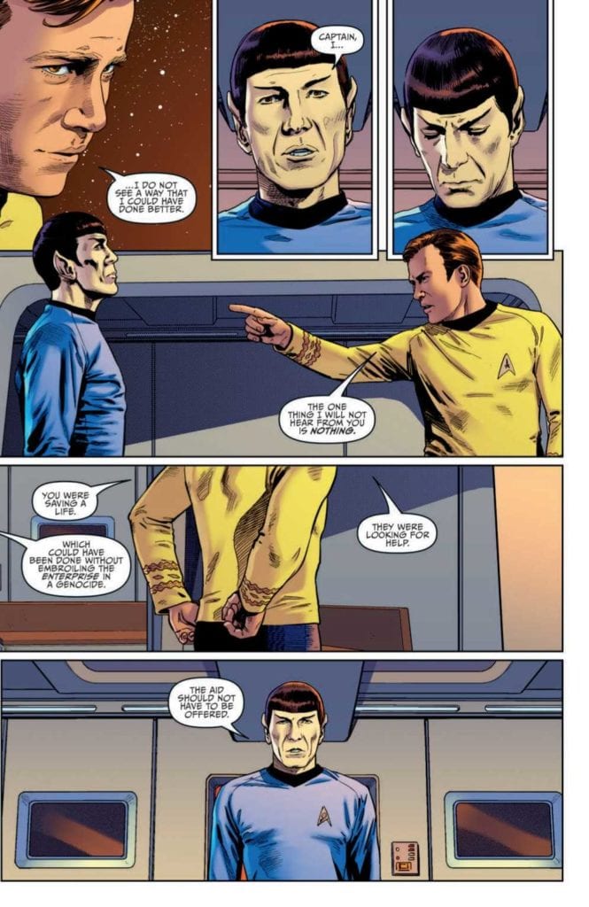
STAR TREK: YEAR FIVE #11 finds Captain Kirk and the Enterprise crew fighting former ally Gary Seven for control of the ship. Written by Jackson Lanzing and Collin Kelly with art by Stephen Thompson, the protector of the future must sacrifice his allies to prevent a cataclysm. Does he succeed, or will Kirk cheat death one more time?
Cover Art
Stephen Thompson’s cover art brings one word to mind: “mod”. It’s a perfect example of the elegant silhouette style that was so prevalent and popular in the 1960’s when the original Star Trek show was released. The shapes of the characters and ship are emblematic of the series, and the style captures the stylistic flavor of its time in a classic and classy way.
Writing
Jackson Lanzing and Collin Kelly’s story reads on par with an episode from the original series. There’s a character scene where Kirk is giving Spock a positive review for his performance, and in typical Spock fashion, he disagrees. The ensuing argument is as close to time traveling back to the 60’s to see the actors play the scene out in person as you can reasonably get. The dialog and tone is perfectly on-point.
The story also adheres closely to the vibe of the original series. Gary Seven uses his superior tech to invade Enterprise and take control of its systems. Kirk, in typical Kirk fashion, pulls off a minor miracle by isolating the invader and saving his crew. The final moments set up a one-on-one, showdown, cliffhanger that earns your anticipation for the next issue.
Looking at the story structure, it’s super lean. In essence, it would just qualify as the first half of an on-air episode. And that’s okay. Character introductions are simple and make perfect sense in context, the action pace is brisk. There’s no fluff here. Not one panel is wasted telling a good, old-fashioned space adventure story.
Pencils/Inks
Drawing a Star Trek comic based on real actors is a risky proposition. If Spock doesn’t look like Spock, that’s an immediate red flag. Thankfully, Stephen Thompson portrays the legendary characters with the right mix of homage and realism. These legendary characters aren’t rendered so hyper-realistic as to look like static portraits, but their renditions are just close enough to the real thing to pay respect to the original show.
Thompson does an equally admirable job rendering the look of the ship and its technology. The Bridge looks like the Bridge. Engineering looks like Engineering. Even the classic, albeit goofy, phaser rile makes an appearance in the hands of Lt. Chekov. All the little bits of Star Trek aesthetic are present to satisfy lovers of the show.
Favorite Panel/Page: The favorite panel of this issue is the external shot of Enterprise as the leaves in escape pods. There was no clear depiction of escape pods in the original series, so to show something “new” that organically matches the “old” style is impressive. Plus, who doesn’t love a great long shot of old NCC-1701.
Coloring
The original Star Trek designers were fond of primary colors for the shows design. Charlie Kirchoff’s coloring leans on the history of primary color uniforms and adds well-placed gradients and shading to give each character the right amount of depth and contour. The original shows lighting tended to be bright to the point of almost tacky, so Kirchoff wisely cools the lighting and adds a little extra shadow to infuse the panels with more drama. Nice work here by Kirchoff.
Lettering
Neil Uyetake’s lettering work is first rate. The human(oid) dialog is well-placed to keep the pacing up while letting the art tells the action parts of the story. There are some unusual designs for word bubbles that I’ve never seen before. However, they make total sense considering your have an 8-limbed alien speaking through a modified spacesuit into a universal translator. I don’t know what that’s supposed to sound like, but it’s believable in Uyetake’s lettering.
Conclusion
STAR TREK: YEAR FIVE #11 looks, reads, and feels like it was lifted directly from the original series. The dialog is realistic to the voices of the characters, the story is on the level of one of the better episodes, and the art hits all the right nostalgia notes. Highly recommended for any Star Trek fan.
Author’s Note: Local Comic Shops (LCS) are going through a tough time right now with the pandemic outbreak of COVID-19. Comics fans of every flavor that care about his or her LCS should try to do what they can. So, here’s my part:
If you’re in Northern Delaware, South East Pennsylvania, or Southern New Jersey area, please take a moment to visit Captain Blue Hen Comics in Newark, DE. Say ‘hi,’ pick up a book, order a book (they’re on Comichub.com), and let them know you support them.
If you’re nowhere near that area, please find YOUR LCS using Comic Shop Locator and lend your support.
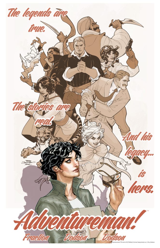
Image Comics’ new series Adventureman, written by Matt Fraction with art by Terry and Rachel Dodson, colors by Terry Dodson, and letters by Clayton Cowles, pulses with life from page one. It’s a story within a story. We first follow Adventureman and his steampunk-meets-Golden-Age-comics team. They fight bad guys to save the world. But it’s not long before we learn this is actually just a story being read by our real main character, Claire. Adventureman and his fellow heroes are just a work of fiction… or are they? These characters and the world this creative team has created is enchanting. There better be a lot more where that came from.
Writing
Fraction does what he does best in this series: he gives every character a quirky, charming voice. In the opening moments, Fraction’s writing shines. The characters are each given a brief description and we see them in action soon after. Their quips are just the right amount of self-aware. It all feels like an homage/satire of golden age comics, and it all lands well. But Fraction also suffers from a typical pitfall of creating a new world. After the opening moments, we are given lots of explanation. Narration tells us a more backstory than we need. What Fraction should know, though, is that this world and these characters speak for themselves. They are already clearly full of life and need no explanation to make us gravitate towards them. Fraction’s writing is strong as long as he doesn’t second-guess himself.
Art
The Dodson and Dodson duo help craft this new world with style. Their art style in and of itself is gorgeous. Whether they’re drawing a person or an animal, there’s a real sense of what that character is thinking. The Dodsons have a brilliant grasp of human expressions. And so, it’s interesting to see things as they are in Adventureman’s world. Everything is flashy and cool. Pages are filled with power poses and cool angles. But when we step out of that world into the “real” world, things are suddenly less polished. We get a layer of awkwardness and wry smiles that was missing in the pulpy world of superheroes. They give a charming quirkiness to the real world in this comic, and fill Adventureman’s world with a sense of drama and danger.
Coloring
Similarly, Terry Dodson’s colors in Adventureman’s world have an element of “mood lighting” to them. As we open onto a looming Armageddon, we know doom is coming before we’re ever given word. The commissioner’s office is colored in blues and greys. It’s like a cloud is over each page. But when the action picks up and characters are exchanging punches and retorts, the color begins to come back in. By the time the scene comes to an explosive conclusion, the colors are bright and the scene seems lit up by fire and destruction. In the real world, however, scenes are given equal treatment. Whether Claire is sitting in the bookstore or putting a foot through a bug-man, the color palette remains the same. It becomes a great visual representation of how Claire thinks about what she reads and how she lives.
Lettering
One of the coolest things that happens in this issue, happens with the lettering. We see this in the sound effects, drawn by Dodson and Dodson, and the lettering done by Cowles. The main character of the story, Claire, is deaf. Generally, this doesn’t seem to affect her much, as she has hearing aids that seem to work like a charm. But the thing is, Claire likes the quiet. Cowles takes up space with the lines of characters. It gives Claire’s scenes a sense of claustrophobia. There is noise everywhere. And at one point, as sound effects surround her, she turns her hearing aids off. Once she turns them off, the outline of the sound effects stay while the letters are gone. This tells us the noises are still happening, Claire just can’t hear them. And visually, though the sound effects and word bubbles once wrapped around her, they no longer get near her. She becomes blissfully unaware of the loud city in an island of silence.
Adventureman #1 is a brilliant start for a series. This creative team sets up two great stories that you invest in almost immediately. The characters are vibrant and full of life, and the world they live in is interesting. Adventureman #1 will be out from Image Comics on June 10th!
On Friday, June 5th, DC Comics sent ripples through the comic book industry by announcing it was dissolving its long-standing relationship with Diamond Distribution. First reported by the Hollywood Reporter, DC goes on to explain the change is made with the best interests of the Direct Market in mind:
“We recognize that, to many of you, this may seem like a momentous decision. However, we can assure you that this change in DC’s distribution plans has not been made lightly and follows a long period of thought and consideration. The change of direction is in line with DC’s overall strategic vision intended to improve the health of, and strengthen, the Direct Market as well as grow the number of fans who read comics worldwide.”
However, not everyone has expressed enthusiasm (to put it mildly) over DC’s decision to change distribution models. Peter David (“PAD”), respected and award-winning writer for Marvel, notable for his work on such titles as The Incredible Hulk, Aquaman, X-Factor and Star Trek, has taken to Facebook to express his view that DC’s move is a declaration of “war” on Marvel:
“DC has just declared war on Marvel Comics.
Oh, they aren’t framing it that way. But they have.
Because DC has just announced that they are severing ties with Diamond Comics, DC represents thirty percent of the market, and there is no way–simply no way–Diamond will be able to survive with that kind of come down in revenue. The mission here is to drive Diamond out of business, which will then cripple Marvel Comics.
And of course stores are now screwed, because they suddenly all have to open accounts with new unknown and untested distribution centers. The ones that managed to hold on during the Covid-19 closures will have considerable trouble surviving.
This is potentially catastrophic.
PAD”
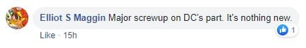
As of this writing, David’s post has received 273 comments, both for and against his assessment.
Let us know what you think in the comments section below.
Do you think David’s calling out of DC is an accurate picture and will hurt everyone in the long run, or is his take a bit of hyperbole from the competition?