Home Blog Page 309

The Grammar Of Comics In BLUE IS THE WARMEST COLOR

Blue is the warmest color
Blue Is The Warmest Color Cover Art Work

Getting people to accept comics as serious literature can be difficult. Part of this is because the only interaction that people have with comics is the numerous blockbuster movies that Marvel, and occasionally DC, release. It’s hard to hold something up for serious consideration when the pinnacle of experience is three hours of costumed muscle men punching each other.

Stereotypes and modern social symbols affect initial interpretations and can form a barrier to experimenting with new mediums. If all you see is one genre of a medium, why would you want to venture any further?

However, it’s not just the iconography that can create blockades for new readers, the structure of a comic can be challenging to translate, and itself be off-putting. When faced with a page of panels, often overlapping or with small inserts, it can be daunting to read.

Natural instincts will drive a reader to take the Z-Path reading approach through a page, starting at the top left and finishing at the bottom right. However, even comics with straight forward panel layouts aren’t always grammatically easy to read. How does one panel interact with another? Is the new row of panels a new idea or a continuation of the previous row? The different page and panel transitions can be complicated to follow if you are not au fait with a particular style of comic and, just like any storytelling medium, comics contain flashbacks, dream sequences, and changes of perspective, all of which can complicate things further.

In Understanding Comics*, Scott McCloud approaches Comics as if they have their own grammatical structure, containing signifiers specific to sequential art. Thierry Groensteen takes this concept one step further in his books**. He describes the structure of a comic as if it was a language of its own, made up of the same elements that make up any written language. He breaks comics down into paragraphs, sentences, and even verbs; an entire syntax that can be studied beyond image interpretation.

To explain the workings of a comic as language is not an easy task, it can appear as complex as learning any new language. However, as much of the comic language is visual in nature and created using concepts that readers are already familiar with in other mediums, especially prose novels, it isn’t as complicated as it first seems. Basic ideas can be demonstrated in simple ways if the right comic is chosen as an example. You can use comic strips like Peanuts or Dick Tracy to easily explain the progression of images to build simple sentence structure; Neil Cohn does this wonderfully in his book The Visual Language of Comics***. Alternatively, you can look at the page layouts in a graphic novel such as Blue Is The Warmest Color and see how it follows a structured formula akin to a prose novel in order to tell it’s story.

By studying the different techniques that Julie Maroh uses in Blue Is The Warmest Color it will become clear that the graphic novel utilizes familiar and repeated structures to advance plot and enhance character. It does this in the same way that a movie or a prose novel uses techniques specific to those mediums to lead an audience naturally through the narrative.

* Understanding Comics Chapter 3: Blood in the Gutter by Scott McCloud, Published by William Morrow in 1993
**The System of Comics and Comics and Narration by Thierry Groensteen published by University Press of Mississippi
***The Visual Language of Comics Chapter 3: The Visual Lexicon part 2 written by Neil Cohn and published by Bloomsbury Academic in 2013.

Blue Is The Warmest Color
Page 8: From color to grey scales

Blue Is The Warmest Color*

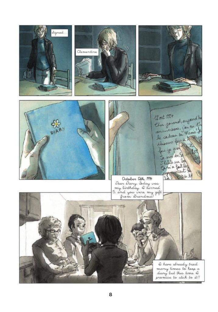
Le bleu est une couleur chaude was first published in french in 2010. Written and drawn by Julie Maroh, it is a story about self discovery and social bigotry. The central character, Clementine, falls in love with an older teenager she glimpses briefly in the street and her life is changed dramatically by the relationship that follows.

Maroh’s art style is fairly expressive, reflecting the aesthetic of the 1990s, where most of the comic are set. The main character’s features are slightly exaggerated, giving each one a distinctive look, which is important because most of the story is set in grey scales with only a splash of color. This is because the majority of the story is told as flashbacks, through the use of a diary that one of the characters reads.

The contrast between the present day and the diary entries is reflected by the lack of color. It creates a clear distinction between the time periods with the written captions providing setting both physical and emotional. This is the first of many examples of Maroh using the structure of her graphic novel to aid the reading experience.

*Simply to be known as Blue from this point onward

Blue Is The Warmest Color
Page 9: Signalling a scene break

Scene Breaks

When you pick up a prose novel there are a number of structural elements that you would expect to find contained within the book. The narrative is often broken down into paragraphs and chapters, denoting moments of time and scenes from the characters’ lives.

A graphic novel or comic contains the same breakdown of narrative information; however, it might not take the same form as prose. The most obvious separations of time are between the panels themselves; however, the structure of sentences and paragraphs in a comic goes beyond single panels. A series of panels and gutters define a period within a scene, and the overall page structure reflects various lengths of time. In Blue, Maroh signifies time shifts in a visually obvious way, as I will demonstrate.

As already explained, Blue takes the form of diary entries to tell Clementine’s relationship with Emma. The book* opens with Emma visiting Clementine’s parents’ house and picking up a blue-covered diary that has been left for her. There is a somber mood which overshadows everything that is to come.

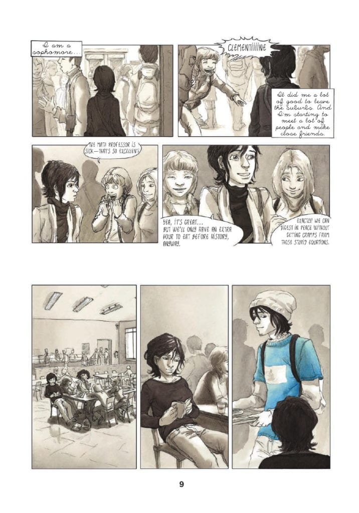
Early on, you get an example of how Maroh uses the space on the page to signify jumps in time or breaks in scenes. On page 9, the reader is introduced to Clementine in her school when one of her friends calls out her name. Two tiers of two panels reveal Clementine in a short character moment that also establishes her situation and location: she is a high school student on campus. In the scene Clementine and her friends discuss the bonus of having an extra hour for lunch. The scene then skips to the canteen where Clementine is sat with her friends, already well within the lunch period.

To illustrate the jump in location and the passage of time, there is an extended gutter between the two scenes. A gutter that is noticeably larger than the gutters between the four panels at the top of the page.

This extended gutter creates a larger time-lapse than the previous gutters suggest. At the top of the page, there are mere moments between each panel, even the move from the end of tier one to the start of tier two is representative of a shorter period of time. This is because the gutter is smaller between the panels and the tiers. However, the break between the end of tier two and the start of tier three is approximately four times the size. The physical time it takes the reader to get from panel 4 to panel 5 is longer and indicates that the journey Clementine took between the two moments is also longer.

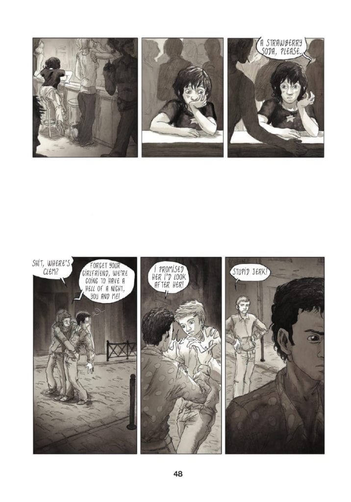
This approach to the layout continues throughout the novel with the gutters between scene changes altering in size, representing longer periods of time. Another great example of this occurs on page 48.

Clementine has been taken out by her friend Valentine for a night on the town, visiting the local gay bars. During the evening, Clementine starts to feel like a third wheel so she secretly splits off from her friends. She finds herself sitting alone at a bar where she orders a drink. This occurs at the end of the first tier of the page. There is then a break between the first and the second tiers when the focus shifts to Valentine realizing that Clementine has gone.

The gutter between the two tiers is especially large, almost big enough for another row of panels to be introduced. This large gutter represents two narrative elements, one physical and the other emotional.

In the first instance there is a shift in space/time between the characters. The action moves away from Clementine and focuses on Valentine. The size of the gutter infers that there is a lengthy time period between one ordering her drink in the bar and the other noticing he has lost his friend. There is also the indication that Valentine has traveled some distance away from his friend.

The larger gutter illustrates a psychological distance as well as a physical between the characters. Although they are friends, the evening is clearly more enjoyable for Valentine than it is for Clementine. She is uncomfortable and unsure of herself and her surroundings. Valentine on the other hand is in his element, enjoying himself. For Valentine, the large gutter is a visual indication of the phrase’ time flies when you’re having fun’.

Although the altering of gutter sizes is not unique to Blue, very rarely is it used so notably to reinforce the characters’ movements and emotions. The standard practice is to change a scene on a page turn, a technique Maroh employs; however she is able to add more narrative weight to the story by changing scenes mid-page.

*This article is based on the soft cover, Arsenal Pulp Press printing with the first edition in 2013. Any references to page numbers therefore refer to this particular print and may differ from other editions.

Blue Is The Warmest Color
Page 48: Extended Gutters

Chapter Endings

Although not all novels, or graphic novels, are produced with chapters, there is always an element of significant narrative change where a character or plot reaches a point of no return. These usually take the form of some thematic breakthrough or mood change in the story.

Maroh chooses not to use formal chapter breaks, but there are sections of the book that perform the same function. These pages are notable because the structure of the page layout is significantly altered.

Throughout Blue, Clementine’s life and ideals are challenged and there are turning points where something important happens. These points are punctuated in the book in one of two ways. The first is via full-page spreads, that is, one image taking up an entire page. I will come back to these later.

The second technique that Maroh uses is to significantly alter the panel form and layouts. The alterations signify the importance of a moment of time as it stands out, not only on the page but in the rhythm of the novel as a whole.

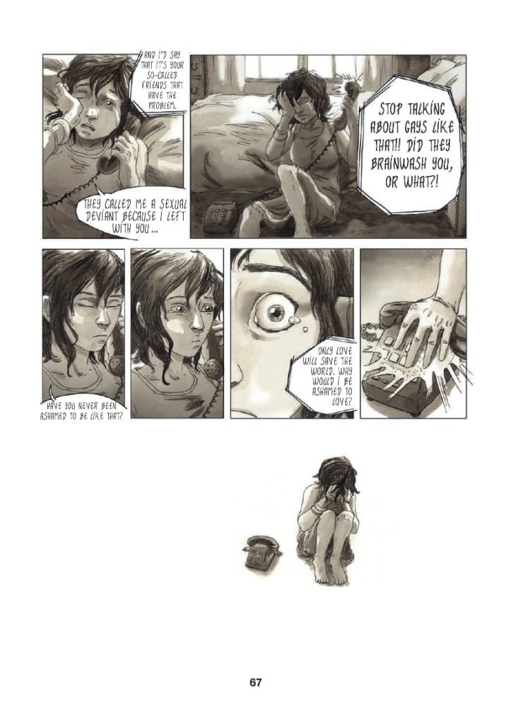
After a bad day at school, where Clementine is bullied by her once best friend because of rumors about her sexuality, she turns her frustrations on Emma. Via a telephone call, Clementine blames Emma’s indiscretions for the bullies’ behavior, and in return, Emma points out Clementine is hiding who she is. The scene, which reaches a climax on page 67, is a turning point for Clementine as she is forced to seriously face her sexuality and the implications it will have on her life. She has to accept who she is and how she is going to live her life.

The emotional moment of realization is the biggest turning point in her teenage life, so big that it cannot be contained within the borders of a panel. The top two-thirds of page 67 are laid out in the same formula as the rest of the novel, with tiers of panels placed next to each other. However, the end of the scene is of such significance that Maroh ends it by breaking her own structure. Even a large gutter is not enough to punctuate this moment.

Instead, the emotional Clementine is pictured by the telephone, a physical representation of her conversation with Emma, and nothing else. She is not situated in a location; there is no background or foreground, no set whatsoever. Even the conventions of the comic are stripped away by removing the panel borders and, by association, rendering the gutter obsolete. The bottom third of the page becomes an empty world only populated by Clementine and the memory of her argument.

Similar moments appear in the graphic novel, but not many. This visual representation is reserved for life-changing character moments. Maroh uses the technique sparingly, to punctuate the major narrative beats as if they were chapter endings. These moments are emphasized full stops and force the reader to contemplate the events leading up to this point.

Blue Is The Warmest Color
Page 67: Broken Panel Structure

Splash Page Punctuation

I previously mentioned the splash page. Within Blue, Maroh uses the splash page sparingly and in a similar way to the ‘Chapter Ends’. It is a technique she uses to emphasise a specific emotional moment. Where the two techniques differ is that Splash Pages focus on Emma instead of Clementine. Although this is primarily Clementine’s story, it is also Emma’s.

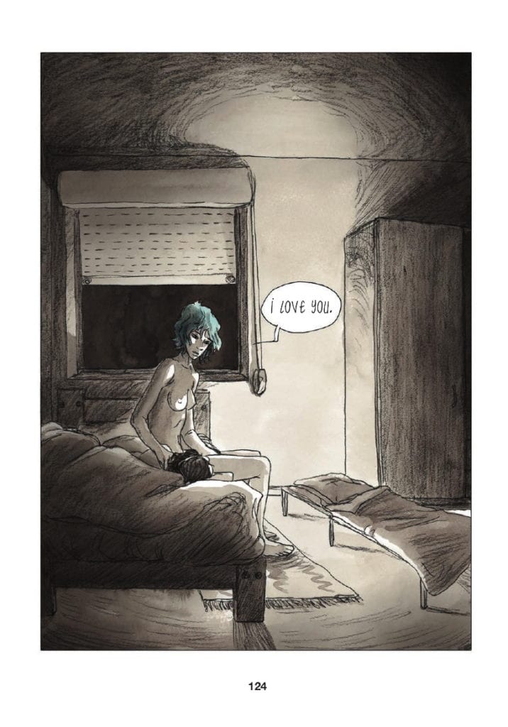
The splash pages represent an emotional high, or extreme low, where Emma is the central concern. The first two such pages, pages 82 and 83, illustrate Clementine’s growing obsession with Emma, a focus of her love and attention. Page 124, which is arguably Emma’s breakthrough moment in the narrative, shows the older woman’s vulnerabilities but also her strengths.

She sits on the edge of the bed in Clementine’s parents’ house, naked and exposed. There is an element of risk in the scene as signified by the cot bed, where Emma should be sleeping.* The reader can barely see Clementine, only the top of her head is visible, but all of Emma is on display. The darkness outside and the surrounding shadows are reminders of the problems that the couple still have to overcome, but there is also a column of light, shining on Emma as if it were a ray of hope. The full-page is a character dissection of Emma, where she has been and where she is at that moment. In this sequence that changes Clementine’s life forever, the moment is writ large and focused, specifically, on Emma.

The next full spread, page 145, also focuses on Emma, but this time the image, almost black with scribbled pencil, represents the breaking of a heart. Page 124 endears Emma into the hearts of the reader, making the follow-up page, page 145, that much more painful. Despite it being a monumental part of Clementine’s life, it is almost as important to Emma. This is why Maroh chooses this technique to focus on the narrative and character.

The final full-page spread is also the final page in the novel. It is all-encompassing, signifying both the lives of the characters and a grander sense of immateriality. These moments, illustrated in the novel with such a presence, are the most important periods of time for each of the characters. The size of them makes the moments last long beyond what is expected, but are also just as fleeting. Each page is in actuality only one panel, but they contain so much more, physically, and emotionally.

* Clementine’s parents are homophobic and at this point in the story do not know that their daughter is gay

Blue Is The Warmest Color
Page 124: A Splash Page highlighting character and narrative.

Conclusion

Everybody’s lives are made up of the mundane and the monumental. The passing of time can contain a vast array of experiences and emotions but just as easily be fleeting and forgettable. It is the job of the writer/artist to differentiate between those times and emphasise what is relevant for the narrative. In Blue, Julie Maroh employs different visual techniques to portray the moments in her heroine’s life.

Large gutters, layout alterations, and oversized panels all create different types of punctuation within her storytelling. Consistency with these techniques enhances the reader’s experience and understanding of the narrative. Very quickly, you become accustomed to Maroh’s style and the visual grammar she utilizes to reflect elements of character and plot. In the same way that you would instinctively understand the structure of a novel or the editing in a movie, Blue has a straightforward structure that the reader can follow to get the most out of the graphic novel without being overwhelmed by complex, medium-specific, constructs.

Monkeys Fighting Robots Youtube

Review: OXYGEN #1 RED Is An Exhilarating Breath Of Fresh Air

Oxygen Red cover
Oxygen #1 Red Cover Art Credit: Andrew Wildman

After years of working in the comic book industry, Andrew Wildman stepped back from the mainstream to work on personal projects. His latest, Oxygen, is a seven issue science-fiction mystery story which he is releasing digitally through his own website.

In recent years Wildman has worked as a story-boarder for film and television and the style of this comic is visually influenced by these working experiences. The plot and character are drawn from another aspect of Wildman’s life, his life coaching. Together these two aspects create a fascinating world of layers for the reader to unpick.

Oxygen Promotional Image
Oxygen Promotional Image Credit: Andrew Wildman

Reading Red

The first thing that becomes apparent when you start to read Oxygen’s first issue, entitled Red, is that each page has exactly the same layout. Three stacked panels of equal size greet the reader on every page. In the introduction to the comic Wildman states he wanted to ‘play out the whole thing as though it is a series of storyboards for a movie’. This is a bold move and one that Wildman pulls off perfectly.

Each panel acts like a television screen with Wildman as the director controlling the audience’s viewpoint. Where the comic has an advantage is that the images are static, allowing the reader to decide how much time they spend taking them in. Early on this makes the pacing slow because Wildman gives the reader a lot to digest. The first few pages are reminiscent of the opening sequence from Alien with the camera slowly panning around the Nostromo.

Wildman , however, has more control over the reader than you might expect. Once the central character is awake and the world literally starts to crumble around him, Wildman picks up the pace and pushes the reader through the panels. The reader becomes as helpless in the forward motion as the astronaut does in the story. Instinctively you find yourself zipping from panel to panel as the transitions become more and more dynamic. They stack up like animation cells ready to be run through a projector.

The narrative itself for this first issue is a simple affair with the central character reacting to a dire situation. Readers of Wildman’s last comic, Horizon, will know that the writer/artist always has a plan and many elements that you see in this first issue will take on different meanings as the story progresses. You just need to check out his blog posts to know that even the title and predominant color of this issue, red, has a significance in the story somewhere.

Oxygen Red Interior Art
Oxygen #1 Red Page In Progress Credit: Andrew Wildman

Patreon and Production

Over the years Andrew Wildman has worked on some big titles for Marvel Comics, most famously a superb run on Transformers with Simon Furman. These exciting adventure comics required a certain level of dynamism that is evident in Wildman’s current work. Throughout Oxygen: Red Wildman is able to give the impression of movement as if the images have their own kinetic energy. The different levels of energy create the tension within the narrative, like the changing music in a movie. You understand the sense of danger and feel the spaceship breaking apart. This adds an urgency to the story that gets your heart beating.

Wildman’s sense of depth and perspective, shifting the viewpoints around like a steady-cam, produce a truly cinematic experience on the page. The build up in pace from the opening to the end is impressive and works on a subconscious level. To start with you take your time, picking details out of the panels, but before you realise it you’re at the end, lost on an alien world with the astronaut.

This is a comic you will instantly want to go back and re-read. And when you do you’ll start picking up on smaller details, questioning certain elements and art choices. Wildman has a plan for everything and nothing goes onto the page that doesn’t serve a purpose. On the opening page there are a collection of books and CDs, each chosen by the creator for a reason.This reason may serve the narrative or be autobiographical in nature but it has been specifically chosen by Wildman to represent something.

If you are the kind of person that likes to understand the choices that artists/writers make and the processes they go through, then Andrew Wildman is a perfect creator to follow. He has a regular blog where he constantly releases his thought processes and sketches, giving a great insight into how he works. His Patreon is an extension of this where he shares more works in progress and exclusive looks at upcoming pages and design. He posts regularly and it all adds something to the reading experience of Oxygen.

Oxygen Andrew Wildman
Oxygen Sketched Panel From A Future Issue Credit: Andrew Wildman

Conclusion

By itself, Oxygen is a surprisingly action paced comic despite the fact that it serves simply as an introduction to Wildman’s new world. There isn’t a lot of obvious character development but at the same time you can get to know the astronaut quite well if you take the time to pick the panels apart.

The driving force behind this comic is the design, especially the approach to layouts. By choosing the three stacked panel approach, Wildman has created a comic where he has complete control over what the reader sees and how the reader experiences the narrative.

However, one of the biggest selling points is Andrew Wildman himself. Most people who buy this comic will probably take a look at the production information that Wildman is posting and begin to lose themselves in the creative process. The creators Patreon page is a wealth of information that enhances the final product and is addictive in itself.

With 6 more planned issues, Oxygen is a triumphant of storytelling and production. At only £2 for the first downloadable issue, you’ll not find a better comic to spend your money on.

Oxygen #1 Red can be purchased through Andrew Wildman’s web site: andrewwildman.org/oxygenbook

Andrew Wildman’s Patreon Page can be found here: www.patreon.com/andrewwildman

The color artist on Oxygen is J P Bove.

Monkeys Fighting Robots Youtube

Review: REAVER #8 Brings The Deep Impact

Reaver #8, Cloonan cover

REAVER #8, out now from Image, brings the impish Rekala and gigantic Essen Breaker (“Ess”) back together to stop Stagger from abducting the townschildren. Justin Jordan’s writing and Niko Henrichon’s art combine for a high fantasy chapter that’s surprisingly introspective.

Cover Art

Becky Cloonan’s cover is mesmerizing. Rekala needs to bleed to stop the working, and yet her pose is calm rapture. The stark contrast of her bleeding arms, combined with her shock of red hair, turn a peaceful water scene into malevolent magic.

Writing

Justin Jordan picks up the story immediately where the prior issue left off. Rekala arrives to save Ess from Stagger, and she quickly proves that going with the smaller opponent is not always the best choice. After the rescue, Ess and Rekala catch each other up on their exploits while separated. The impact of their solo (mis)adventures cause them both to question their purpose and motivations on the current mission.

Reaver #8, story sample

While there’s plenty of action in this book, it’s the character development that elevates the issue beyond your basic high adventure. Ess, in particular, has seen more than his share of violence and considers at what point does his life stop revolving around bloodshed. At what point does a soldier stop being a soldier, if ever?

Jordan catches you off guard with the giant’s thoughtfulness when you least expect it. This issue promises character development and maturity that’s more nuanced than you would expect.

Pencils/Inks

Nobody in Henrichon’s art is pretty, and that serves the issue well. From Stagger to Ess to Rekala, all of Henrichon’s characters are battle-weary, worn and scarred. The imperfections give each character more depth and authenticity to match the roughness of the harbor town they’re in. Henrichon has drawn warriors that look like they’ve been fighting all their lives.

Reaver #8, art sample

Coloring

Henrichon’s color are largely muted throughout the issue. Instead of creating a bland atmosphere, the muted colors provide a harsh contrast to the bloody action. Reds pop violently for emphasis, and the harsh yellows of the orphanage fire practically make the characters sweat on the page form the heat. Excellent use of color for impact by Henrichon.

Lettering

In between action, Jordan has peppered in a fair bit of dialog for the characters to open up to each other. Henrichon’s lettering expertly moves the readers eyes through the panels to keep up the pace without interfering with the characters’ facial expressions. Faces are so important to the dialog delivery, and a lesser lettering job would have crowded out the “acting”. Not so here. Great job, again, by Henrichon.

Conclusion

REAVER #8 packs as much character development punch as action in a brisk 21 pages. The artwork pops precisely when it needs to for maximum effect and the story sets up a desperate showdown with Stagger. This series is improving with each issue.


Author’s Note: Local Comic Shops (LCS) are going through a tough time right now with the pandemic outbreak of COVID-19. Comics fans of every flavor that care about his or her LCS should try to do what they can. So, here’s my part:

If you’re in Northern Delaware, South East Pennsylvania, or Southern New Jersey area, please take a moment to visit Captain Blue Hen Comics in Newark, DE. Say ‘hi,’ pick up a book, order a book (they’re on Comichub.com), and let them know you support them.

If you’re nowhere near that area, please find YOUR LCS using Comic Shop Locator and lend your support.

Thanks, and stay safe.

Monkeys Fighting Robots Youtube

Review: BATTLECATS #3 – These Are The Thundercats You’re Looking For

Battlecats #3, cover

BATTLECATS: TALES OF VALDERIA #3, available from Mad Cave Studios on June 10th, tells the origin story of the next team to be promoted to the rank of protector over Valderia. Kelthan, the main protagonist of this issue, is educated on the rich history of Valderia as part of his training to become the next Battlecat. It may have not been intended, but BATTLECATS is a more worthy successor to Thundercats than the recent cartoon reboots.

Writing

In the story, Zaphyra teaches young Kalthan about the workings of royal government. Kalthan aspires to become a Battlecat for the king, and he’s given the chance to pursue his dream. Along the way, he meets other students from diverse backgrounds but with similar goals. On every page, writer Mark London gives the reader digestible chunks of information about this world without making you feel overloaded.

London’s story of the team’s origins is, admittedly, thin. At best, this story barely qualifies as a prologue. That said, this is a perfect primer issue to educate the reader on Valderia, its menagerie of species, the customs and legacies of each character and their tribe, and give a glimpse of the future. If London had crammed all this world-building into a complete story in one issue, it would have either been twice as long or overstuffed with word balloons. London’s choice to create a story-thin but lore-rich issue was the right call and cleverly written in its setup.

Pencils/Inks

Michael Camelo’s art style is super clean and very imaginative. Valderia is not simply another planet. There are floating islands and landscapes with odd geometries that give you plenty of visual interest. The creature designs are equally imaginative, and Camelo’s style has a vaguely manga flavor that’s atypical for fantasy books of this sort. Camelo’s characters and worlds are high fantasy in nature, but the designs of the landscapes and costumes add a scifi element that’s wholly unexpected in the best way.Battlecats #3, art sample

Coloring

Julian Gonzalez impresses with coloring that implies light, shadow and texture. All the characters in this issue are fur-based animals, so it would have been easy to defer all the fur texturing to the artist. Not so here. Gonzalez took the time to use multi-color fills and gradients to make the fur detail look finished without looking flat. It’s a strong bit of detail work that pays off in the end result.

Battlecats #3, color sample

Lettering

Miguel Angel Zapata’s lettering is clean, clear, and keeps the readers eye moving along the page to maintain pace. Camelo’s art is stellar in this issue, so the last thing you want is to have the panels crowded with poor word balloon placement. Zapata demonstrates exactly how to put a lot of that world-building exposition in place while letting the stellar art shine through.

The lettering, however, doesn’t completely work with the combination of font choice and the use of italics. In a few spots, Zapata’s use of italics made the stylistic font a little hard to read, especially with names. It’s a minor criticism which can be easily adjusted in future issues.

Conclusion

BATTLECATS: TALES OF VALDERIA #3, available from Mad Cave Studios on June 10th, is a strong setup issue for future tales. The artwork is gorgeous and the depth of history is impressive. If Mad Cave keeps turning out books like this, I’ll be sticking with this series for a long time.


Author’s Note: Local Comic Shops (LCS) are going through a tough time right now with the pandemic outbreak of COVID-19. Comics fans of every flavor that care about his or her LCS should try to do what they can. So, here’s my part:

If you’re in Northern Delaware, South East Pennsylvania, or Southern New Jersey area, please take a moment to visit Captain Blue Hen Comics in Newark, DE. Say ‘hi,’ pick up a book, order a book (they’re on Comichub.com), and let them know you support them.

If you’re nowhere near that area, please find YOUR LCS using Comic Shop Locator and lend your support.

Thanks, and stay safe.

Monkeys Fighting Robots Youtube

Review: Hellfighter Powers Up In HELLFIGHTER QUIN #2

Hellfighter Quinn #2, Ilhan cover

HELLFIGHTER QUIN #2, available from Mad Cave Studios on June 10th, follows Quin through the first round of the tribunal. Every combatant wants the orbs power to defend their clan, and Quin forms an alliance to get it. Deadeye and Glass Assassin join the fight in an issue packed with fighting action.

Cover Art

Atagun Ilhan’s cover is coming at you with a dynamic action pose for Glass Assassin and Deadeye. There’s a risk using a solid blue background that you wind up with too much negative space. But Ilhan mitigates that problem by filling the voids with arrows and the characters’ limbs in forced perspective. It’s an exciting cover.

Writing

Jay Sandlin brings the competing warriors together to form an alliance in an “enemy of my enemy is my friend” scenario. The fellowship’s formation didn’t feel forced or rushed, and Quin goes along with his allies with enough awkwardness to make it feel believable.

There’s a lot of new pieces of information introduced in this issue, and despite it only being #2, the story doesn’t overload you with too many labels or jargon or context. Sandlin’s world-building feels very smooth and organic. I could follow the story and take in new bits and pieces about this world easily. The reader shouldn’t need to take notes to keep track of what’s going on, so Sandlin succeeds here.

Pencils/Inks

Atagun Ilhan drew the interiors as well as the cover, so the artwork is consistent, inside and out.  There’s a lot of fight scenes in this issue, as you would expect for a battle tournament. Ilhan adds in plenty of violence without getting gratuitous. Every character looks like they’re constantly in motion to give the issue a rapid pace. This is a high energy issue.

The one area that doesn’t quite work in Ilhan’s art is the detail, especially with faces. On several panels, the faces look warped and ill-defined. This could have been a result of rushing due to lack of time, but the result is sub-par. For future issues, more attention is needed to getting details in the faces proportioned correctly, consistent and cleaned up.

Hellfighter Quinn #2, art sample 2

Colors

Maria Santaolalla has a difficult task. Almost the entirety of this issue takes place in an underground labyrinth. Effectively, stone walls and darkness. Sanataolalla used a fairly wide spectrum of blues to maintain the sense of darkness while still giving illumination on the visual interest points in the background to give you something to look at. When blood flows, Santaolalla makes the reds pop without looking fake or out of place.

Combined with the critique about Ilhan’s work on the faces, the skin tones from Santaolalla are equally off. In several panels, the faces appear to be two-tone. It looks like it was an attempt to imply deep shadow, but the result looks more like the characters are wearing caked mud.

Hellfighter Quinn #2, color sample 1

Lettering

Justin Birch’s lettering is the most exemplary art of the entire book. Birch’s choice of reverse-bolding with white letters contrasts well against the largely dark panels. The pop of red in the word box background anchors the continuity of Quin’s inner monologue all the way through the issue, and the red is a nice touch to pair with the gore of the situation.

Conclusion

HELLFIGHTER QUINN #2, available from Mad Cave Studios on June 10th, packs a ton of action and world-building into a brisk 21 pages. It’s easy reading with lots of visual interest. If the art team tightens up the minor issues with faces, this will be a very enjoyable series.


Author’s Note: Local Comic Shops (LCS) are going through a tough time right now with the pandemic outbreak of COVID-19. Comics fans of every flavor that care about his or her LCS should try to do what they can. So, here’s my part:

If you’re in Northern Delaware, South East Pennsylvania, or Southern New Jersey area, please take a moment to visit Captain Blue Hen Comics in Newark, DE. Say ‘hi,’ pick up a book, order a book (they’re on Comichub.com), and let them know you support them.

If you’re nowhere near that area, please find YOUR LCS using Comic Shop Locator and lend your support.

Thanks, and stay safe.

Monkeys Fighting Robots Youtube

INTERVIEW: Composer Devin Burrows Creates Terrifying Tones For THE WRETCHED

The Wretched is a supernatural horror movie featuring failed marriages, angsty teenagers, and witches. To bring the world to life through the score is composer Devin Burrows.

In The Wretched, John-Paul Howard (Midnight, Texas) is Ben, a teenager living with his father while his parents get a divorce. Ben starts meeting locals, including Mallory, played by Piper Curda (I Didn’t Do It). Soon, things go from weird to spooky to terrifying as Ben must stop the evil actions of a child-stealing witch.

PopAxiom and Devin Burrows spoke about his life of making music, the unique get togethers he’s had with directors Brett and Drew Pierce, and making music for the horror film The Wretched.

Teachers

Devin’s musical training started early. “I took up the guitar at about age 12. I had a great teacher who was into everything from classical to jazz to fusion. At that age, you’re a sponge, and he got me excited about lots of musical possibilities.”

Music was a vital part of Devin’s life, but so were movies. “I used to go over to hang out with friends. We’d watch movies. My friends Brett and Drew (aka directors of The Wretched, the Pierce Bros.), their dad worked on the practical FX for Evil Dead. He had this amazing collection of movies at his place. That’s where we got our education in film. That helped establish my appreciation for film music.”

Devin continued his musical education through high school and well beyond. “In my 20s, I got really into classical music and studied the greats. In 2011, I got to score a film called Deadheads. I loved it.”

About The Wretched

The Wretched is receiving strong reviews, including an RT score of 74 percent. In limited release, playing mostly at drive-in cinemas, it’s become the first movie since Black Panther to win the box office five weekends in a row. “The cast and crew went to see it at the drive-in. There were a lot of people there.”

Devin’s involvement with The Wretched is via a longtime friendship. “I worked with Brett and Drew on Deadheads. We have a lot of similar interests and work great together.”

About the directing siblings, Devin says, “It’s always a treat to work with them. They have high expectations and challenge me. I always find a way to do something new and interesting with them.”

More often than not, composers read a script and watch a mostly-finished movie by the time they start their work. However, Devin’s relationship with the Pierce Brothers made The Wretched a much more intimate project. “We started working together very early during the script writing phase. They would send me drafts, and I would create themes or ideas and send those back. We went back and forth like that for a while. It was this good, creative energy … feedback loop.”

What did the directors want from the score? “I remember them saying they wanted the tone of the film to be varied. A lot of horror films can be dark and dour in tone. But for this film, they wanted a lot of character development. They wanted to be more Spielberg-like, varied in tone … like Jaws.”

For the creators, the varied tones make viewers “… more invested by the time the crazy, scary stuff happens.”

For cinephiles, Devin says, “Music-wise, the film is influenced by Poltergeist, Psycho, The Others … to name a few.”

Strange Instruments

During that close-knit early process, the directors visited their composer for an unusual meeting. “Brett and Drew came over to my place pretty early on. We did a sort of musical instrument casting. I spread out a bunch of instruments. Among them was the Indian Sarangi and Bowed Psaltery.”

Several instruments made the final cut. But one, in particular, stood out. “As soon as they heard the Sarangi, they were like ‘We want that!’”

By Devin’s admission, “I’m no Sarangi virtuoso. I was able to play it enough to get the types of effects that I wanted.”

Playing the instrument required dusting off some old skills. “I played violin at a very young age, so I have a very rusty bowing technique. It required a little experimentation and practice. It’s used in kind of an experimental way in the film too to give these woods … a specific sonic signature.”

After knocking off the rust, technology played its part. “Digitally … I made some changes to it so that it has a dry, throaty sound.”

Devin’s Sarangi isn’t merely an exotic instrument. It’s also a little spooky. “It’s covered in goatskin. It has this sort of animal-like quality when you play it. Deer play a sort of role in The Wretched, and this had that quality that worked well with the film.”

Wrapping Up

Devin shares a few composers who make up his creative DNA. “Ravel … writes such beautiful music. Stravinsky … The Rite of Spring … it’s a ballet about ritual sacrifice. It’s ideal for horror.”

Devin believes influences come from all over the place. “I listen to a lot of contemporary classical music, jazz fusion … all of that influences, and you put your musical stamp on things.”

That spark of inspiration can come anywhere and anytime. “I use my voice memo app all the time to record sounds when I have an idea. I’ll wake up in the middle of the night or be at the grocery store and be like, ‘Oh, I need to try this idea.’”

What remake would Devin love to compose? “The Others is one. I would be highly interested in getting the gig for The Others. Poltergeist too.”

The Wretched is available on your favorite streaming platforms and is also playing around the United States at local drive-ins. As productions have slowed to a crawl due to the pandemic, Devin’s shifted focus. “I’m focused on creative projects of my own and will probably release some music that way. I have a few collaborations in the works.”

Is The Wretched on your watch list?

Thanks to Devin Burrows and Impact24 PR
for making this interview possible.

Want to read more interviews like this? CLICK HERE.

Monkeys Fighting Robots Youtube

The 2020 Eisner Award Nominations Are In, And…

Eisner Award Nominee logo

Comic-Con International has announced the 2020 Eisner Award nominees, and Image leads the publishers with 17 total nominations. Dark Horse takes the 2nd place spot with 14, and Fantagraphics leaps ahead of last year’s showing to tie DC for 3rd place with 12 nominations.

The entire nominee list is below:

Best Short Story


Best Single Issue/One-Shot

  • Coin-Op No. 8: Infatuation, by Peter and Maria Hoey (Coin-Op Books)
  • The Freak, by Matt Lesniewski (AdHouse)
  • Minotäar, by Lissa Treiman (Shortbox)
  • Our Favorite Thing Is My Favorite Thing Is Monsters, by Emil Ferris (Fantagraphics)
  • Sobek, by James Stokoe (Shortbox)

Best Continuing Series

  • Bitter Root, by David Walker, Chuck Brown, and Sanford Greene (Image)
  • Criminal, by Ed Brubaker and Sean Phillips (Image)
  • Crowded, by Christopher Sebela, Ro Stein, and Ted Brandt (Image)
  • Daredevil, by Chip Zdarsky and Marco Checchetto (Marvel)
  • The Dreaming, by Simon Spurrier, Bilquis Evely et al. (DC)
  • Immortal Hulk, by Al Ewing, Joe Bennett, and Ruy José et al. (Marvel)

Best Limited Series

  • Ascender, by Jeff Lemire and Dustin Nguyen (Image)
  • Ghost Tree, by Bobby Curnow and Simon Gane (IDW)
  • Little Bird by Darcy Van Poelgeest and Ian Bertram (Image)
  • Naomi by Brian Michael Bendis, David Walker, and Jamal Campbell (DC)
  • Sentient, by Jeff Lemire and Gabriel Walta (TKO)

Best New Series

  • Doctor Doom, by Christopher Cantwell and Salvador Larocca (Marvel)
  • Invisible Kingdom, by G. Willow Wilson and Christian Ward (Berger Books/Dark Horse)
  • Once & Future, by Kieron Gillen and Dan Mora (BOOM! Studios)
  • Something Is Killing the Children, by James Tynion IV and Werther Dell’Edera (BOOM! Studios)
  • Undiscovered Country, by Scott Snyder, Charles Soule, Giuseppe Camuncoli, and Daniele Orlandini (Image)

Best Publication for Early Readers

  • Comics: Easy as ABC, by Ivan Brunetti (TOON)
  • Kitten Construction Company: A Bridge Too Fur, by John Patrick Green (First Second/Macmillan)
  • The Pigeon HAS to Go to School! by Mo Willems (Hyperion Books)
  • A Trip to the Top of the Volcano with Mouse, by Frank Viva (TOON)
  • ¡Vamos! Let’s Go to the Market, by Raúl the Third (Versify/Houghton Mifflin Harcourt)
  • Who Wet My Pants? by Bob Shea and Zachariah Ohora (Little, Brown)

Best Publication for Kids

  • Akissi: More Tales of Mischief, by Marguerite Abouet and Mathieu Sapin (Flying Eye/Nobrow)
  • Dog Man: For Whom the Ball Rolls, by Dav Pilkey (Scholastic Graphix)
  • Guts, by Raina Telgemeier (Scholastic Graphix)
  • New Kid, by Jerry Craft (Quill Tree/HarperCollins)
  • This Was Our Pact, by Ryan Andrews (First Second/Macmillan)
  • The Wolf in Underpants, by Wilfrid Lupano, Mayana Itoïz, and Paul Cauuet (Graphic Universe/Lerner Publishing Group)

Best Publication for Teens

  • Harley Quinn: Breaking Glass, by Mariko Tamaki and Steve Pugh (DC)
  • Hot Comb, by Ebony Flowers (Drawn & Quarterly)
  • Kiss Number 8, by Colleen AF Venable and Ellen T. Crenshaw (First Second/Macmillan)
  • Laura Dean Keeps Breaking Up with Me, by Mariko Tamaki and Rosemary Valero-O’Connell (First Second/Macmillan)
  • Penny Nichols, by MK Reed, Greg Means, and Matt Wiegle (Top Shelf)

Best Humor Publication

  • Anatomy of Authors, by Dave Kellett (SheldonComics.com)
  • Death Wins a Goldfish, by Brian Rea (Chronicle Books)
  • Minotäar, by Lissa Treiman (Shortbox)
  • Sobek, by James Stokoe (Shortbox)
  • The Way of the Househusband, vol. 1, by Kousuke Oono, translation by Sheldon Drzka (VIZ Media)
  • Wondermark: Friends You Can Ride On, by David Malki (Wondermark)

Best Anthology

  • ABC of Typography, by David Rault (SelfMade Hero)
  • Baltic Comics Anthology š! #34-37, edited by David Schilter, Sanita Muižniece et al. (kuš!)
  • Drawing Power: Women’s Stories of Sexual Violence, Harassment, and Survival, edited by Diane Noomin (Abrams)
  • Kramer’s Ergot #10, edited by Sammy Harkham (Fantagraphics)
  • The Nib #2–4, edited by Matt Bors (Nib)

Best Reality-Based Work

  • Good Talk: A Memoir in Conversations, by Mira Jacob (One World/Random House)
  • Grass, by Keum Suk Gendry-Kim, translation by Janet Hong (Drawn & Quarterly)
  • Kid Gloves: Nine Months of Careful Chaos, by Lucy Knisley (First Second/Macmillan)
  • Moonbound: Apollo 11 and the Dream of Spaceflight, by Jonathan Fetter-Vorm (Hill & Wang)
  • My Solo Exchange Diary, vol. 2 (sequel to My Lesbian Experience with Loneliness), by Nagata Kabi, translation by Jocelyne Allen (Seven Seas)
  • They Called Us Enemy, by George Takei, Justin Eisinger, Steven Scott, and Harmony Becker (Top Shelf)

Best Graphic Album—New

  • Are You Listening? by Tillie Walden (First Second/Macmillan)
  • Bezimena, by Nina Bunjevac (Fantagraphics)
  • BTTM FDRS, by Ezra Claytan Daniels and Ben Passmore (Fantagraphics)
  • Life on the Moon, by Robert Grossman (Yoe Books/IDW)
  • New World, by David Jesus Vignolli (Archaia/BOOM!)
  • Reincarnation Stories, by Kim Deitch (Fantagraphics)

Best Graphic Album—Reprint

  • Bad Weekend by Ed Brubaker and Sean Phillips (Image)
  • Clyde Fans, by Seth (Drawn & Quarterly)
  • Cover, vol. 1, by Brian Michael Bendis and David Mack (DC/Jinxworld)
  • Glenn Ganges: The River at Night, by Kevin Huizenga (Drawn & Quarterly)
  • LaGuardia, by Nnedi Okorafor and Tana Ford (Berger Books/Dark Horse)
  • Rusty Brown, by Chris Ware (Pantheon)

Best Adaptation from Another Medium

  • Giraffes on Horseback Salad: Salvador Dali, the Marx Brothers, and the Strangest Movie Never Made, by Josh Frank, Tim Hedecker, and Manuela Pertega (Quirk Books)
  • The Giver, by Lois Lowry and P. Craig Russell, (HMH Books for Young Readers)
  • The Handmaid’s Tale: The Graphic Novel, by Margaret Atwood, adapted by Renee Nault (Nan A. Talese)
  • HP Lovecraft’s At the Mountains of Madness, vols. 1–2adapted by Gou Tanabe, translation by Zack Davisson (Dark Horse Manga)
  • The Seventh Voyage, by Stanislaw Lem, adapted by Jon Muth, translation by Michael Kandel (Scholastic Graphix)
  • Snow, Glass, Apples, by Neil Gaiman and Colleen Doran (Dark Horse Books)

Best U.S. Edition of International Material

  • Diabolical Summer, by Thierry Smolderen and Alexandre Clerisse, translation by Edward Gauvin (IDW)
  • Gramercy Park, by Timothée de Fombelle and Christian Cailleaux, translation by Edward Gauvin (EuroComics/IDW)
  • The House, by Paco Roca, translation by Andrea Rosenberg (Fantagraphics)
  • Maggy Garrisson, by Lewis Trondheim and Stéphane Oiry, translation by Emma Wilson (SelfMadeHero)
  • Stay, by Lewis Trondheim and Hubert Chevillard, translation by Mike Kennedy (Magnetic Press)
  • Wrath of Fantômas, by Olivier Bouquet and Julie Rocheleau, translation by Edward Gauvin (Titan)

Best U.S. Edition of International Material—Asia

  • BEASTARS, by Paru Itagaki, translation by Tomo Kimura (VIZ Media)
  • Cats of the Louvre, by Taiyo Matsumoto, translation by Michael Arias (VIZ Media)
  • Grass, by Keum Suk Gendry-Kim, translation by Janet Hong (Drawn & Quarterly)
  • Magic Knight Rayearth 25th Anniversary Edition, by CLAMP, translation by Melissa Tanaka (Kodansha)
  • The Poe Clan, by Moto Hagio, translation by Rachel Thorn (Fantagraphics)
  • Witch Hat Atelier, by Kamome Shirahama, translation by Stephen Kohler (Kodansha)

Best Archival Collection/Project—Strips

  • Cham: The Best Comic Strips and Graphic Novelettes, 1839–1862, by David Kunzle (University Press of Mississippi)
  • Ed Leffingwell’s Little Joe, by Harold Gray, edited by Peter Maresca and Sammy Harkham (Sunday Press Books)
  • The George Herriman Library: Krazy & Ignatz 1916–1918, edited by R.J. Casey (Fantagraphics)
  • Krazy Kat: The Complete Color Sundays, by George Herriman, edited by Alexander Braun (TASCHEN)
  • Madness in Crowds: The Teeming Mind of Harrison Cady, by Violet and Denis Kitchen (Beehive Books)
  • PogoVol. 6: Clean as a Weasel, by Walt Kelly, edited by Mark Evanier and Eric Reynolds (Fantagraphics)

Best Archival Collection/Project—Comic Books

  • Alay-Oop, by William Gropper (New York Review Comics)
  • The Complete Crepax, vol. 5: American Stories, edited by Kristy Valenti (Fantagraphics)
  • Jack Kirby’s Dingbat Love, edited by John Morrow (TwoMorrows)
  • Moonshadow: The Definitive Edition, by J. M. DeMatteis, Jon J Muth, George Pratt, Kent Williams, and others (Dark Horse Books)
  • Stan Sakai’s Usagi Yojimbo: The Complete Grasscutter Artist Select, by Stan Sakai, edited by Scott Dunbier (IDW)
  • That Miyoko Asagaya Feeling, by Shinichi Abe, translation by Ryan Holmberg, edited by Mitsuhiro Asakawa (Black Hook Press)

Best Writer

  • Bobby Curnow, Ghost Tree (IDW)
  • MK Reed and Greg Means, Penny Nichols (Top Shelf)
  • Mariko Tamaki, Harley Quinn: Breaking Glass (DC); Laura Dean Keeps Breaking Up with Me (First Second/Macmillan); Archie (Archie)
  • Lewis Trondheim, Stay (Magnetic Press); Maggy Garrisson (SelfMadeHero)
  • G. Willow Wilson, Invisible Kingdom (Berger Books/Dark Horse); Ms. Marvel (Marvel)
  • Chip Zdarsky, White Trees (Image); Daredevil, Spider-Man: Life Story (Marvel); Afterlift (comiXology Originals)

Best Writer/Artist

  • Nina Bunjevac, Bezimena (Fantagraphics)
  • Mira Jacob, Good Talk (Random House); “The Menopause” in The Believer (June 1, 2019)
  • Keum Suk Gendry-Kim, Grass (Drawn & Quarterly)
  • James Stokoe, Sobek (Shortbox)
  • Raina Telgemeier, Guts (Scholastic Graphix)
  • Tillie Walden, Are You Listening? (First Second/Macmillan)

Best Penciller/Inker or Penciller/Inker Team

  • Ian Bertram, Little Bird (Image)
  • Colleen Doran, Snow, Glass, Apples (Dark Horse)
  • Bilquis Evely, The Dreaming (DC)
  • Simon Gane, Ghost Tree (IDW)
  • Steve Pugh, Harley Quinn: Breaking Glass (DC)
  • Rosemary Valero-O’Connell, Laura Dean Keeps Breaking Up with Me (First Second/Macmillan)

Best Painter/Digital Artist

  • Didier Cassegrain, Black Water Lilies (Europe Comics)
  • Alexandre Clarisse, Diabolical Summer (IDW)
  • David Mack, Cover (DC)
  • Léa Maz��, Elma, A Bear’s Life, vol. 1: The Great Journey (Europe Comics)
  • Julie Rocheleau, Wrath of Fantômas (Titan)
  • Christian Ward, Invisible Kingdom (Berger Books/Dark Horse)

Best Cover Artist

  • Jen Bartel, Blackbird  (Image Comics)
  • Francesco Francavilla, Archie, Archie 1955, Archie Vs. Predator II, Cosmo (Archie)
  • David Mack, American Gods, Fight Club 3 (Dark Horse); Cover (DC)
  • Emma Rios, Pretty Deadly (Image)
  • Julian Totino Tedesco, Daredevil (Marvel)
  • Christian Ward, Machine Gun Wizards (Dark Horse), Invisible Kingdom (Berger Books/Dark Horse)

Best Coloring

  • Lorena Alvarez, Hicotea (Nobrow)
  • Jean-Francois Beaulieu, Middlewest, Outpost Zero (Image)
  • Matt Hollingsworth, Batman: Curse of the White Knight, Batman White Knight Presents Von Freeze (DC); Little Bird, November (Image)
  • Molly Mendoza, Skip (Nobrow)
  • Dave Stewart, Black Hammer, B.P.R.D.: The Devil You Know, Hellboy and the BPRD (Dark Horse); Gideon Falls (Image); Silver Surfer Black, Spider-Man (Marvel)

Best Lettering

  • Deron Bennett, Batgirl, Green Arrow, Justice League, Martian Manhunter (DC); Canto (IDW); Assassin Nation, Excellence (Skybound/Image); To Drink and To Eat, vol. 1 (Lion Forge); Resonant (Vault)
  • Jim Campbell, Black BadgeCoda (BOOM Studios); Giant DaysLumberjanes: The Shape of Friendship (BOOM Box!); Rocko’s Modern Afterlife  (KaBOOM!); At the End of Your Tether (Lion Forge); Blade Runner 2019 (Titan); Mall, The Plot, Wasted Space (Vault)
  • Clayton Cowles, Aquaman, Batman, Batman and the Outsiders, Heroes in Crisis, Superman: Up in the Sky, Superman’s Pal Jimmy Olsen (DC); Bitter Root, Pretty Deadly, Moonstruck, Redlands, The Wicked + The Divine (Image); Reaver  (Skybound/Image); Daredevil, Ghost-Spider, Silver Surfer Black, Superior Spider-Man, Venom (Marvel)
  • Emilie Plateau, Colored: The Unsung Life of Claudette Colvin (Europe Comics)
  • Stan Sakai, Usagi Yojimbo (IDW)
  • Tillie Walden, Are You Listening? (First Second/Macmillan)

Best Comics-Related Periodical/Journalism

  • Comic Riffs blog, by Michael Cavna, www.washingtonpost.com/entertainment/comics/
  • The Comics Journal, edited by Gary Groth, RJ Casey, and Kristy Valenti (Fantagraphics)
  • Hogan’s Alley, edited by Tom Heintjes (Hogan’s Alley)
  • Inks: The Journal of the Comics Studies Society, edited by Qiana Whitted (Ohio State University Press)
  • LAAB Magazine, vol. 4: This Was Your Life, edited by Ronald Wimberly and Josh O’Neill (Beehive Books)
  • Women Write About Comics, edited by Nola Pfau and Wendy Browne, www.WomenWriteAboutComics.com

Best Comics-Related Book

  • The Art of Nothing: 25 Years of Mutts and the Art of Patrick McDonnell (Abrams)
  • The Book of Weirdo, by Jon B. Cooke (Last Gasp)
  • Grunt: The Art and Unpublished Comics of James Stokoe (Dark Horse)
  • Logo a Gogo: Branding Pop Culture, by Rian Hughes (Korero Press)
  • Making Comics, by Lynda Barry (Drawn & Quarterly)
  • Screwball! The Cartoonists Who Made the Funnies Funny, by Paul Tumey (Library of American Comics/IDW)

Best Academic/Scholarly Work

  • The Art of Pere Joan: Space, Landscape, and Comics Form, by Benjamin Fraser (University of Texas Press)
  • The Comics of Rutu Modan: War, Love, and Secrets, by Kevin Haworth (University Press of Mississippi)
  • EC Comics: Race, Shock, and Social Protest, by Qiana Whitted (Rutgers University Press)
  • The Peanuts Papers: Writers and Cartoonists on Charlie Brown, Snoopy & the Gang, and the Meaning of Life, edited by Andrew Blauner (Library of America)
  • Producing Mass Entertainment: The Serial Life of the Yellow Kid, by Christina Meyer (Ohio State University Press)
  • Women’s Manga in Asia and Beyond: Uniting Different Cultures and Identities, edited by Fusami Ogi et al. (Palgrave Macmillan)

Best Publication Design

  • Grunt: The Art and Unpublished Comics of James Stokoe, designed by Ethan Kimberling (Dark Horse)
  • Krazy Kat: The Complete Color Sundays, by George Herriman, designed by Anna-Tina Kessler (TASCHEN)
  • Logo a Gogo, designed by Rian Hughes (Korero Press)
  • Madness in Crowds: The Teeming Mind of Harrison Cady, designed by Paul Kopple and Alex Bruce (Beehive Books)
  • Making Comics, designed by Lynda Barry (Drawn & Quarterly)
  • Rusty Brown, designed by Chris Ware (Pantheon)

Best Digital Comic

  • Afterlift, by Chip Zdarsky and Jason Loo (comiXology Originals)
  • Black Water Lilies, by Michel Bussi, adapted by Frédéric Duval and Didier Cassegrain, translated by Edward Gauvin (Europe Comics)
  • Colored: The Unsung Life of Claudette Colvin, by Tania de Montaigne, adapted by Emilie Plateau, translated by Montana Kane (Europe Comics)
  • Elma, A Bear’s Life, vol. 1: The Great Journey, by Ingrid Chabbert and Léa Mazé, translated by Jenny Aufiery (Europe Comics)
  • Mare Internum, by Der-shing Helmer (comiXology; gumroad.com/l/MIPDF)
  • Tales from Behind the Window, by Edanur Kuntman, translated by Cem Ulgen (Europe Comics)

Best Webcomic

Monkeys Fighting Robots Youtube

Review: BIRDS OF PREY #1 Has Unused Potential

Birds of Prey 1 cover

The Birds of Prey are Back?

The Birds of Prey have recently stepped back into the spotlight thanks to the movie a few months back. Since then, two titles were announced. One by Amanda Conner and Jimmy Palimot and another by Brian Azzarello and Emanuela Lupacchino. The latter was announced to make a full Birds of Prey series while the former would make a one-shot.. As time went on, the popularity of the female team came and went. DC began to think a whole series wouldn’t be profitable and cut it to a miniseries. More time passed, and soon that miniseries became a one-shot Black Label book. Even after all that, it was pushed back even further due to world events. Now that it’s out, can Azzarello deliver a good story that was cut down twice?

Birds of Prey 1 cover

**Some Spoilers Below**

Story:

Early one morning, Black Canary gets a call from a man she worked with. He warns her that a new threat is coming before being murdered by a gang. At the same time, Harley Quinn arrives back in Gotham. She has been taken off the Suicide Squad as well as left the Joker. She now seeks a new purpose in life. Finally, we have Renee Montoya meeting up with Huntress to discuss crime. The detective has been sending Huntress down paths that she is not allowed to go on. With all four players in place, the gang begins to descend on Gotham to wreak havoc.

Birds of Prey 1 p1

It’s obvious that this had to be cut down for the one-shot format. The problem is the way it’s cut, it’s done in such a way that the flow is all over the place. It starts slow, doing a good job setting up the characters and their motivations, then proceeds to hop all over the place. We focus on Black Canary, then Harley, then Huntress and round and round. Black Canary doesn’t even meet up with Huntress and Harley till the back half of the book. Then there’s the non-ending which only irritated me. We end on not one but two cliffhangers. Did the Birds escape? Did Harley end up killing the Joker? We don’t know and never will!

That said, Black Canary appears to have gotten the most attention out of our four members. The man at the beginning had enough connection to send Dinah into a depressive episode. Before she’s even cleared, she loses someone else: Byron from her 2015 Series. These deaths affect her and put her in the game. Black Canary ends up having an actual personal stake and wants vengeance. It fleshes her out a whole lot more than the other members and makes me want to read Dinah’s story more.

Birds of Prey 1 p2

Art:

While I had plenty of issues about the story, I have no problem with the art. Emanuela Lupacchino has done excellent work over the years, and this comic is no exception. All the characters look great, especially the gang that comes into Gotham. They have a Dia de Los Muertos style, and it’s cool. I want to see this gang show up outside the one-shot, but only if she’s illustrating. The colorwork compliments Lupacchino’s art but providing darker, grittier colors for the action but also bright ones to have characters pop. It’s just a fantastic looking book.

Conclusion:

Overall, this issue is a beautiful looking mess. While the artwork is fantastic, the editing to try and cram the whole series into 100 pages brings the entire thing down. Granted, Black Canary’s development in this is the highlight, but the jumping around fails to keep the readers’ attention. The pieces are all there. Anyone can tell that there are great ideas within these pages. There’s just not enough space to save the idea as a one-shot. I hope the team can get a do-over; The Birds of Prey deserve it.

Monkeys Fighting Robots Youtube

Exclusive AfterShock Preview: DARK RED #10 – It’s Bloodbath

Exclusive AfterShock Preview: DARK RED #10

Dark Red #10 hits your local comic book shop on July 1, but thanks to AfterShock Comics, Monkeys Fighting Robots has an exclusive four-page preview of the contemporary and horrifying tale of vampirism in the heart of America.

About the book:
The epic conclusion of the controversial second story arc. Can Chip return to the world he left behind? And if he does, will he have anyone left to return to? The tale of the city, the country — and the monsters in between.


Dark Red #10 is written by Tim Seeley, with art by Corin Howell, Mark Englert dropped some color, you will read Carlos Mangual’s letters, and Meghan Hetrick created the cover.

Check out the DARK RED #10 preview below:

The series uses vampires as a way to talk about the isolation of Middle America and the political divide our nation is facing. You can read Monkeys Fighting Robots’ review of the first issue by clicking here.

Monkeys Fighting Robots Youtube

Get Lost in 70’s Grindhouse-Noir with a BLACKING OUT Playlist

Writer Chip Mosher and artist Peter Krause’s Blacking Out is an original graphic novel available to be backed on Kickstarter, and Mosher came up with a playlist to enhance your reading experience!

BLACKING OUT follows a drunk ex-cop looking for redemption as he attempts to solve a murder during the Southern California fire season.

Comics industry veteran and writer Chip Mosher and legendary artist Peter Krause (The Power of Shazam!, Irredeemable) present BLACKING OUT, a 56-page graphic novel presented in a deluxe oversized hardcover in the European album tradition. BLACKING OUT also showcases the amazing talents of colorist Giulia Brusco (Scalped, Django Unchained), letterer Ed Dukeshire (Buffy the Vampire Slayer, Mighty Morphin Power Rangers), and designer Tom Muller (X-Men).

Blacking Out is as dark as the smoky California skies that fill its pages. And like smoke, this noir clings to you. Redemptive, surprising, & bleak.” – Brian Azzarello (100 Bullets, Moonshine)

This graphic novel was crafted with music in mind, so Mosher put together an awesome playlist full of classic rock, jazz, and soul tracks to pull you into the pages. Here he lists out and explains his thoughts on each track:

It’s funny. When I wrote Blacking Out, I listened, almost exclusively to Interpol’s Antics on repeat. I’d start with track four or five, “Take Me On A Cruise” or “Slow Hands,” and then put the album on repeat. Antics has a real trance-like effect on me and it offered Neo-noir white noise that let me enter the world of Blacking Out.

But when I was thinking about a soundtrack for the comic, none of those songs seemed right. With what Pete did with the visuals, grounding the story in a ‘70s aesthetic, it was important to find stuff from that era, but that didn’t sound like it. I wanted to find obscure tracks that felt out of time and remained timeless.

“Maggie M’Gill,” The Doors
I love the opening bass on this track. The Doors recorded this song in an empty club right before they did a live show. Maggie M’Gill was one of their lesser tracks, but I think this bassy and jazz’ed up version elevates the song to the level it should be sonically and really sets the mood…it’s dirty. It’s a song that’s drunk on itself.

“Ladytron,” Roxy Music
I feel like when you hear this song from Roxy Music’s debut album, it’s like entering another world. It doesn’t feel like 1972, but also doesn’t feel like the musical future it predicts. It’s kind of the sonic equivalent of the 1939’s World’s Fair futuristic cars… I think of this as the song that Conrad is hearing when he enters the bar to get his swerve on.

“Coming Down Again,” The Rolling Stones
Great song off of a masterful Stones album. I was told by a friend who’s a Stones aficionado that Keith Richards doesn’t even remember recording this album. Think about this backing Conrad as he wakes up at Anita’s.

“I Got Nothin’,” Iggy Pop and James Williamson
Feels like Conrad’s theme song as he starts to investigate the case. Great song from the mid-‘70s that was frequently bootlegged, but not officially released until decades later.

“Sunshine of Your Love,” Ella Fitzgerald
I was at this Northern Soul club in Leeds with the Thought Bubble crew when this track hit the air. Holy shit. I love this song and this version by Ella Fitzgerald is amazing. It had to go in the Blacking Out playlist.

“The Seeker,” The Who
A bit on the nose regarding Conrad, but hey, sometimes you want a song that really tells you what the hell is going on…

As I ransack their homes
They want to shake my hand
Focused in on nowhere
Investigating miles
I’m a Seeker, I’m a really desperate man!

“A White Shade of Pale,” King Curtis
Another song that feels out of place in its era. King Curtis’s sax covers of any song are worth a listen, but I love this one and think it would be great background music on any scene.

“Kill City,” Iggy Pop and James Williamson
Another great post-Stooges composition by Iggy and James Williamson. Says it all. Feels like it could have come out last year—love the noir feel of this song. Conrad, Anita, Mattie, and Lund definitely live in Kill City.

“If There Is Something,” Roxy Music
I’m a huge Sisters of Mercy fan and their song “Some Kind of Stranger” is my favorite. I was struck when I heard this track about how much of the main melody of “Some Kind of Stranger” is taken from this Roxy Music track. In any case, as it pertains to Blacking Out, I think this song would be great on some of the later scenes with him and Anita. Maybe when they take the walk and talk…

“Achilles Last Stand,” Led Zeppelin
An unappreciated gem by Page, Plant, Jones, and Bonham. We’re ramping up here, getting ready to experience the big finale.

“In Every Dream A Heartache, Roxy Music
(Laughs) I’m not going to say much about these next three songs as anything I say would give it away… but …oh shit. It’s coming. Watch Out.

“Winter,” The Rolling Stones
Maybe some regrets. SPOILERS! We are going into the Wilderness here….

“Jump Into the Fire,” Harry Nilsson
Maybe… the end? Read and find out folks! (Tuning the bass mid-song is amazing.)

“Ghost Rider,” Suicide
This plays over the credits. The greatest song about a comic book character ever written. 1977. Can you believe it? Sounds amazing. It had to go over the credits. And fits a bit, but had to throw this in for fun. The Sisters of Mercy used to cover this track live… Yeah, I know. I love that stupid band. Shut up.

Listen to the playlist on Spotify here:

If this playlist hits your musical sweet spot and the preview piques your interest, be sure to back the Kickstarter here for your own copy of the oversize hardcover and extra perks like art cards and more!

Monkeys Fighting Robots Youtube