Home Blog Page 294

Review: ALL-AMERICA COMIX #1 & the Crippling Use of Gen-Z Slang

Writer Joe Casey and artist Dustin Nguyen craft a Gen-Z inspired modern superhero in “All-America Comix” #1. Along with Brad Simpson on colors and Russ Wooten’s letters, this one-shot unfortunately squanders its inspirational premise with a gross overuse of generational slang, social media cliches, and inconsistent visual work.

“Her last name is VASQUEZ! Her first name…says it all! And when confronted with the hidden secret of the universe, you won’t believe the cosmic truth she uncovers! Brought to you by the Wildcats Version 3.0 team of JOE CASEY and DUSTIN NGUYEN—reunited for the first time in fifteen years!”
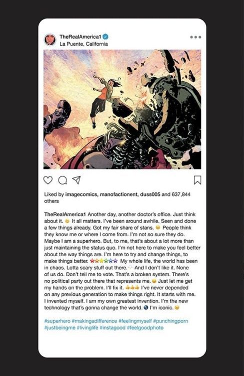
Writing & Plot

“All-America Comix” begins with a promising – if not cliched – premise. America Vasquez is a young superhero who has decided to reject the classical ideas of patriotism and heroism in favor of a more direct approach to change. This is a blatant and potentially effective appeal to the mentality of the politically frustrated youngest generation. Where this idea loses itself is in its application. As soon as the script starts dropping misused hashtags and contemporary slang, the story’s inspirational focus goes off the rails. The internal narration of this comic is delivered in panels designed like Instagram posts or tweets, hashtags included. While a unique idea, it ultimately undermines any narrative seriousness this comic tries to display and immediately dates the content. As noble a cause it may seem to appeal to the concerns of the current generation by utilizing their terms, it never comes out as anything other than cringey or patronizing when used by an older writer. Completely avoiding social media/slang culture and going specifically after the larger issues with a young protagonist is much more effective (see G. Willow Wilson’s Ms. Marvel). This issue attempts to go after some internal strife for America as well, such as the struggle for identity and purpose most go through at that age (that is amplified even more during these times), but the story doesn’t stick with the thread long enough to give it any meaning. Even well-intentioned misfires are still misfires.
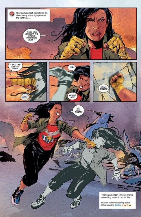
Art Direction

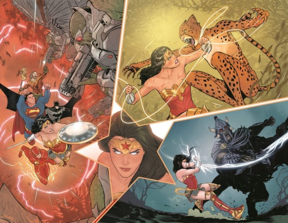
As someone who’s usually a fan of Dustin Nguyen’s art, his work on “All-America Comix” #1 seems a little rushed and inconsistent. He has some great moments, specifically a couple of fight scenes, an interdimensional trip and a fight with a giant robot, but outside of these, the visuals look as though they were drawn just to be finished. The facial details for America’s emotional states are solidly drawn, but the rest of her features and animations are, again, inconsistent. Nguyen and colorist Brad Simpson really get a chance to shine with a lengthy (dialogue-free) sequence involving America falling through an interdimensional tear, and it’s full of inventive panel construction and an incredible array of color-usage. Outside of this sequence, Simpson’s colors carry most of the artistic weight through the issue.  Russ Wooten’s lettering may be the single most impressive aspect of this comic. His dialogue balloons are full of an exaggerated take on the classic superhero comic font style, and also offer a wide range of changes based on context. The visual work overall is solid, but nothing to necessarily amaze.

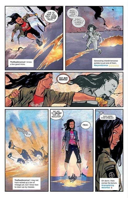
Despite a great concept and the intention of actively appealing to the interests of the newest generation of young adult comic readers, “All-America Comix” #1 falters in its tacky script and lackluster visuals. There’s a message to be made here in regards to the writing: older writers should not attempt to utilize the slang and cultural terminology of younger generations. It never comes out properly, and it typically comes off as patronizing. This comic was apparently supposed to be a full series judging by its cliffhanger of an ending, but the unusual lack of quality from typically highly skilled creators may have killed this one in its crib.

Monkeys Fighting Robots Youtube

Mariko Tamaki, Mikel Janin Team Up For WONDER WOMAN

Wonder Woman Janin

2020 Eisner nominee Mariko Tamaki will be joined by artist Mikel Janin on Wonder Woman, starting in issue #759 later this month. DC Comics has now released a few preview pages from their initial story.

Here’s the description and some art (including covers by Jim Lee and David Marquez) to get excited about:

New adventures are ahead for everyone’s favorite Amazon warrior princess this July as New York Times bestselling writer Mariko Tamaki (Supergirl: Being Super, Harley Quinn: Breaking Glass) becomes the new writer for Wonder Woman, beginning with #759, on sale July 28!

Mariko’s debut story arc features art by fan-favorite artist Mikel Janin (Batman) for issues #759 and #760, and here’s your first look at pages by Mikel, the fantastic cover by David Marquez (Batman/Superman) and a breathtaking cardstock variant cover by Jim Lee!.

It’s a brand-new day for Wonder Woman! As Diana starts to pick up the pieces of her life following her battle with the Four Horsewomen and her run-in with the Phantom Stranger, Man’s World has become more complicated to navigate than ever before. It seems everyone has a take on who Wonder Woman should be—some who look on her heroics with admiration, and some who lie in wait to seek revenge. A familiar threat is watching Diana’s every move, and now is the perfect time to strike…

WONDER WOMAN #759

Written by MARIKO TAMAKI

Art by MIKEL JANÍN

cover by DAVID MARQUEZ

Card stock variant cover by JIM LEE

ON SALE 07.28.20

$3.99 US | 32 PAGES

CARD STOCK VARIANT COVER $4.99 US

Monkeys Fighting Robots Youtube

DC’s THE DREAMING: WAKING HOURS Gets New Variant Covers

Dreaming waking hours

DC Comics has revealed some new cover images for the upcoming spinoff of The Dreaming, titled Waking Hours.

Check out the official breakdown and cover images below:

The Dreaming: Waking Hours #1 Gets New Variant Cover, 1:25 Incentive

The latest chapter in the Sandman Universe arrives in August with The Dreaming: Waking Hours #1! Writer G. Willow Wilson and artists Nick Robles and Mat Lopes team up for this new series, featuring Dream’s latest creation: Ruin, the nightmare of catastrophic failure—who lives up to his name a little too well.

In advance of the new series, DC presents a new open-to-order variant cover for The Dreaming: Waking Hours #1, by Sandman Universe veterans Yanick Paquette and Nathan Fairbairn. This cover replaces the previously solicited The Dreaming: Waking Hours #1 variant cover by Bill Sienkiewicz.


Additionally, The Dreaming: Waking Hours #1 will arrive with a 1:25 incentive variant cover, featuring Robles’ design work for the series’ breakout new character, Ruin. This cover follows the format of similar 1:25 incentive covers for recent issues of Batman. More on Ruin can be found in G. Willow Wilson’s essay on the character, here.

Dreaming waking hours

“He’s very different from the other nightmares we’ve met in the Sandman Universe, all of whom live up to their names—they’re malicious and sadistic,” Wilson said of the new inhabitant of The Dreaming. “Ruin, on the other hand, isn’t very good at his job. He’s soft, he’s shy, he’s awkward, he’s eager to please. He is as terrified by his own darkness as a dreamer would be. He makes this profound, heartbreaking effort not to frighten anyone. And he sets off on this quest to find the person he fell in love with, against all odds.”

One of Dream’s heaviest responsibilities is the creation of nightmares—the beings that haunt our sleep and turn our thoughts toward darkness. In the form of Ruin, the nightmare of catastrophic failure, Dream was certain he’d built his next masterpiece…but Ruin can’t help but live up to his name, sending every situation into a spiral of unexpected consequences. Unfortunately, Shakespearean scholar (and exhausted new mother) Lindy has dreamed of Ruin…and in the process, she’s delivered him unto the waking world!

Dreaming waking hours

The Dreaming: Waking Hours #1 hits shelves on August 4.

Monkeys Fighting Robots Youtube

Review: HAWKEYE FREEFALL #6 – How Far Can He Fall?

Marvel Comics releases Hawkeye Freefall #6 July 1. Written by Matthew Rosenberg, with art by Otto Schmidt and lettering by VC Joe Sabino, this issue, while full of heart, portends a fall from grace for everyone’s favorite smart-mouthed Avenger.

Writing

Rosenberg’s writing, while quippy and tongue-in-cheek at times, also exudes a lot of heart. When Hawkeye discovers that Bullseye, dressed in Clint’s Ronin costume, has injured Bryce, a kid working for the Hood, Rosenberg is able to convey the seriousness of the moment. Even though Bryce dies in Night Nurse’s home and we see Hawkeye contemplating how to find Bullseye, Rosenberg provides a slight bit of levity here, by indicating that Clint is tuning Night Nurse out (for bringing Bryce to her place instead of the hospital). Somehow, this combination of seriousness and humor works. While the text does seem to be heading toward a continued downward trajectory for Clint, Rosenberg can add moments of wit into serious moments without reducing the stakes.

Art

While I like Schmidt’s coloring and shading, I am not the biggest fan of his facial work, but I think he does an outstanding job of capturing some quiet character moments, like Clint’s pensiveness as he waits to find out if Bryce will be ok.

Other times, however, I do feel like I’m looking at a Frank Miller drawing.

Again, I love the shading and the way some of the colors bleed into each other. The design work just isn’t my cup of tea, although I do think it does help the actions feel more kinetic.

Lettering

There are two highlights of Sabino’s lettering in this issue. Both involve some quieter character moments. The first is the previously mentioned scene when Night Nurse is chewing out Hawkeye for bringing Bryce to her apartment for treatment (only for him to die). The way Sabino colors Hawkeye’s thought boxes and shades the words of Night Nurse is able to convey the idea that Hawkeye is tuning her out and lost in thought. The second moment is when Sabino letters Hawkeye’s cellphone, showing all the other super people trying to reach him to let him know that Cap was shot by Bullseye. Schmidt also deserves credit here for the look on Clint’s face as he reads his messages and the shading around his eyes as he resolves to use Bullseye’s own costume to pursue the villain.


This was an enjoyable issue. It has all of the heart and wit one would expect from a Hawkeye comic, and I’m always a fan of seeing the original Hawkeye outfit make an appearance. But the last page indicates that dark things may be in store for The World’s Greatest Marksman.

What did you think of Hawkeye Freefall #6? Tell us in the comments below!

Monkeys Fighting Robots Youtube

MARKED #6: A New Story Arc In Goth Rock Magic

Marked #6 Cover

Marked #6 is a new story arc in a series published this week by Image Comics by supernatural series veterans David Hine and Brian Haberlin.

Recap

Prior to Marked #6, the titular coven was slow on supernatural threats, so they used their magic to pursue influencer lifestyles. That is until a former member sold out to the US government to create Lovecraftian super-soldiers, forcing an all-out battle where lives are lost.

World of Marked #6

In all consideration, Marked #6 is a fairly decent place to introduce new readers. David Hine provides character moments where relationships take importance. The focus of this issue, the apparently dead Pope, manages to reach out to his friends. All through a culture that Brian Haberlin illustrates. In comparison to this pair’s previous collaboration Sonata, this series evokes their experience in supernatural series like Witchblade. Just the cremating funeral scene is rather interesting to look at how Marked has its unique culture. Not to mention, there’s a whole world of horrors that draws people in to the point of obsession. Heck, H.P. Lovecraft is a prominent character.

Art

Haberlin’s triple role as co-writer, penciler, and inker shows a great deal of investment he has in Marked #6. The amount of detail, shading, and architecture alone is phenomenal. The funeral scene at the beginning has just the right amount of atmosphere to evoke a sense of loss. The character designs meanwhile evoke their personalities, such as Saskia’s pupil-less eyes evoke that she can see people’s souls while contrasting her caring nature.

Geirrod Van Dyke’s colors just so happens to display how characters who dress mostly in black still look unique. Despite the primarily dark setting, Marked #6 displays how this might actually be the safer place. As brighter colors are an indication of threats coming their way.

Francis Takenaga, in contrast, goes out of his way to give different characters color-coded captions. Saskia has red captions with white font, almost as a sign that she is the one who will push the plot forward. Especially since it matches a word balloon of surprise that comes up later, this in contrast to the standard green captions with a yellow gothic font that describe the settings. It sets the tone for the series before moving into the subject at hand.

You Don’t Need The Full Details To Get Marked #6

It can certainly seem daunting to start a series from somewhere other than the beginning. But Marked #6 has something better going for it than continuing a story that finished. There’s an entire world that draws readers in, ready to swallow them whole for being curious. One where going back to the beginning could seem like a waste of time.


What do you think? Is Marked #6 an excellent place to get into a new world of possibilities? Or would you prefer to start at the first issue? Leave your thoughts in the comments.

Monkeys Fighting Robots Youtube

Review: Breaker Accepts His Fate In REAVER #9

Reaver #9, Cloonan cover

REAVER #9, available from Image Comics on July 1st, follows Breaker and Rekala as they’re “captured” by the town’s guards while on the hunt for Stagger. Justin Jordan’s story marks the turning point for Breaker as he comes to accept who (and what) he is, and Rekala kicks ass.

Cover Art

Becky Cloonan’s cover is a mild spoiler for the ending of the last issue (you can read our review here), zooming in on the face of a bloody and beaten Bren. Technically, it has almost nothing to do with this issue, but it does remind the reader of what’s at stake for Breaker and Rekala. Solid composition, intense facial emotion, and you could imagine this is what Breaker sees in his mind’s eye when he finally decides to let go of everything holding him back.

Writing

There’s not a lot of forward progress in this issue from Jordan’s story, but that’s perfectly okay. It’s more of a character piece, set inside a dungeon/prison that gives Breaker the means to come to terms with his past as a killing soldier. By embracing his past, Breaker decides to accept his role as a killer when it’s for something that matters instead of on command.

Conversely, Rekala is a lethal imp who revels in the chaos and the fighting. You’d think such a character would be erratically wild, but surprisingly, Rekala is probably the most clear-minded person in her entire group, almost to a fault. Her viciousness is matched only by her confidence, which makes her oddly charming in a Deadpool sort of way. Rekala is quickly becoming my favorite character discovery this year.

Reaver #9, story sample

Again, there’s not a lot of story progress but a ton of character growth, and I’m intensely looking forward to what mayhem comes in the next issue.

Pencils/Inks

Niko Henrichon’s art remains consistently good from the previous issue. The rough lines used to scratch out the characters plays up the feeling of weary and worn warriors that have earned more than their fair share of scars. Breaker is a mountain of a man, but at no time does Henrichon play him up as nonsensically large. Likewise, Rekala’s impishly small frame stands out but doesn’t look impossibly out of place. Both characters are strong examples of designing unusual anatomy for effect but selling it through consistency from one panel and page to the next.

Equally notable about Henrichon’s art is the rough line art on the backgrounds and its effect on the story. Using that rough, chalk pencil-like line style on all the backgrounds gives the impression that every scene is carved in wood, which is thematically consistent with the time period and the setting of the story. You could imagine you’re flipping through pages made of woodcut art, adding to the atmosphere.

Reaver #9, coloring sample

Coloring

Henrichon’s coloring adds to the woodcut art style by heavily playing up the yellows to immerse nearly every panel in torchlight. That color choice gives each setting a touch of warmth and life, and it provides a hue to the skin of every character that makes the whites of their eyes pop with intensity. Breaker and Rekala’s eyes have a keen intensity that’s brought out more so with the soft glow of the environment around them. Henrichon’s color choice seems simple and natural, but it’s executed well and adds to the intensity of the main characters in a subtle way.

Lettering

Clayton Cowles’ lettering is well placed for moving the reader’s eye along from panel to panel. There’s a lot of dialog in this issue, so Cowles wisely breaks up paragraphs into chunks and spreads them along the panel borders in the direction of the panel flow. It’s a common technique that’s executed well, and it keeps the reader’s eye moving, so you’re never bogged down with fits and starts—excellent pacing by Cowles.

Conclusion

REAVER #9, available from Image on July 1st, is a well-executed break in the story to build the main characters and set up their team dynamic for what promises to be a blowout conclusion. The art is rustic in ways that adds to the story’s setting, and Rekala is a hell of a lot of fun. I’m eagerly waiting to see what happens in the arc’s finale next issue.

Monkeys Fighting Robots Youtube

Review: Prophecy Is Challenged In PROTECTOR #4

Protector #4, Legostaev cover

PROTECTOR #4, available from Image Comics on July 1st, follows Mari and her escorts on their way to the Fortress, dealing with insurrection and alien traps along the way. Simon Roy and Daniel Bensen’s story wrestles with primitive notions of myth and prophecy while confronted with alien technology advanced enough to be mistaken for magic.

Cover Art

Vlad Legostaev’s cover work is gritty. The use of blues and greys give off a stone-like feel that matches the primitive setting for the story. Luo, the central figure on the cover, projects the serious demeanor of a warrior, which strongly matches her personality in the pages to come. I would be keenly interested in seeing what Legostaev could do with style when adapting a horror book along the lines of Frankenstein.

Writing

The story by Roy and Bensen is simple until it isn’t. Mari and her group are rafting through the rapidly evolving wilds of a terraformed Earth on their way to the Fortress. Luo, being the strong Hudsoni warrior firmly entrenched in believing what she can see and touch, questions Mari’s elevated status as the “Chosen One.” When the group encounters an alien satellite that tries to spirit Mari away, Luo seizes the opportunity, and chaos ensues.

The actions and dialog of Luo, Slaver, Mari are simple on the surface. Still, there’s a deeper meaning in this story about our deference to technology, that we largely don’t understand, for guidance and protection. The traditions of the old resist against quickly evolving changes of the new. That resistance, unaddressed, boils over in violent outbursts.

It sounds like this issue is a brilliantly deep and thought-provoking read, and it may be. Or, it could be a weird story that accidentally opens up the opportunity for the reader to consider ideas you hadn’t thought of before. Either way, it’s fun to dig deeper into this story when you read it more than once.

Pencils/Inks

Artyom Trakhanov’s art style is heavily stylized, and that’s putting it mildly. There’s no adherence to anything resembling consistency or anatomy. At times, it was difficult to understand what was going on in some panels. You could make the case that the art style (at least consistent with Trakhnov’s other works) looks like doodles in a junior high schooler’s composition notebook.

But here’s the critical difference.

Trakhnov’s work adds to layers of depth to the themes in the written story specifically because it looks primitive and amateurish. The common themes in the story of legends and prophecy clashing against new tech resemble, in a way, ancient drawings or cave paintings to emphasize the narration from the Hudsoni’s perspective. To be fair, Trakhnov’s art will not be everyone’s cup of tea, but I appreciate that it’s a good match for the type of story Roy and Bensen are telling.

Coloring

Jason Wordie’s coloring and Hassan Otsmane-Elhaou’s lettering save this issue from being just a weird oddity and turn the book into something more. How do you color in the lines when the lines have no rhyme or reason? How do you add texture and shading to a figure that makes no anatomical sense? Wordie answers these questions with pure, brilliant execution. The figures are shaded, sometimes with Mario Bava-esque tones, to emphasize the animalistic emotion in each scene. This is most apparent during the big battle towards the end of the issue, and Wordie takes drawings, that risk looking ridiculously cartoonish in black and white, and turns them into powerful punches of energy.

Protector #4, coloring sample

Lettering

Otsmane-Elhaou’s lettering takes the saving grace of Wordie’s coloring and bumps it up even further with amazing lettering technique. On its face, it’s silly to see sound effect lettering that spells out ‘STAB’ or ‘DRIP’ or ‘CHOMP,’ but again, this is an example of an expert letterer changing the typical into the atypical to marry the lettering style with the art and color. The sound effects are overly simplistic to the point of amateurish, by design to match the primitive perspective of the storytellers and the rough, raw style of the art. This is a stellar example of the letterer adopting a style that’s not his own in service of the overall aesthetic.

Protector #4, lettering sample

Conclusion

PROTECTOR #4, available from Image on July 1st, is a simple story that’s anything but in execution. Everything about this issue is rough, raw, primitive, and if you look deep enough, possibly very thought-provoking. It won’t be to everyone’s taste, and maybe that’s a good thing.

Monkeys Fighting Robots Youtube

Steve Geppi Replaces Heidmann As President Of Diamond Parent GFE

Diamond thin logo

In an abrupt move, Stan Heidmann has vacated the position of President within Geppi Family Enterprises (GFE), the parent company of Diamond Distribution. Steve Geppi, Chairman & CEO of GFE and the public face of Diamond Distribution, has assumed the role of President left by Heidmann for the foreseeable future.

It’s unclear what prompted Heidmann’s sudden departure, but the press release issued by Diamond today indicates this change may be the first part of a comprehensive, strategic shift. The full transcript of the press release is provided below.

Does this bode well for Diamond Distribution? What other changes do you expect to see in the coming weeks? Let us know your thoughts in the Comments section, and please share this on social media using the links below.

A Message from Steve Geppi

(BALTIMORE, MD) — (July 1, 2020) —

Good Morning,

Today I am announcing an organizational change that will help us lean even further into the many opportunities to elevate our industry, our business and our brands in this fast-moving and evolving marketplace.

Effective immediately, I am reassuming the role of President, Geppi Family Enterprises (GFE), in addition to my position as Chairman & CEO. Stan Heidmann will be departing the organization. I thank him for his contributions and wish him all the best in his future endeavors.

As you know, I have a strong history of growing and leading this organization for several decades and I am energized about our next phase. I am supported by an exceptionally talented executive leadership team with deep expertise and an unwavering commitment to our industry as well as by the incredible teams they have built. I am proud and privileged to work with such amazing people.

Under my guidance, the executive leadership team will support a comprehensive strategic review to position the enterprise for future growth. I feel a tremendous responsibility to our employees and the industry, and I fully intend to set all Geppi Family Enterprise brands on a path for robust growth. I am confident we have the right leadership with talented teams in place and I see enormous opportunities for GFE.

You will be hearing more from me in the coming weeks as I am committed to keeping you all informed and involved. Be well, and I hope you find some time this holiday weekend to relax and recharge. Thank you for your continued support. I appreciate all you do.

ImageSteve Geppi
Chairman, President & CEO
Geppi Family Enterprises


Monkeys Fighting Robots Youtube

How She Finds Her Freedom in STAR #5

Ripley Ryan is no longer playing around on this cover of Star #5.

STAR #5, out this Wednesday from Marvel Comics, concludes the tale of Ripley Ryan – for now. The reporter-turned-villain is tired of having her narrative controlled, so she is taking things into her own hands.

Ripley Ryan is no longer playing around on this cover of Star #5.

***SPOILER WARNING***

It has been a wild ride. Fans of Captain Marvel first saw Ripley as a young reporter, one who worked for a small magazine and seemed happy to do her job. Then a villain entered her life, and thus Star was born. While it wasn’t quite that simple, fans still witnessed the entire progression over the course of just a couple of arcs.

The series concludes with Star #5 – yet it’s clear that her story is far from over. Even the ending of the issue discuses this making it obvious that Star will be making cameos in other Marvel issues. So be sure to keep your eye open for her in the near future!


The Writing

The conclusion to this series is every bit as entertaining and dramatic as the first four issues of the series. Kelly Thompson demands the reader’s attention in Star #5, as Star struggles to gain control of her abilities (granted to her by the bond she has with the Reality Stone).

That isn’t the only thing Star has struggled with over the course of the series. She’s suffering from PTSD, courtesy of her battle against Captain Marvel, she’s a victim turned aggressor, yet she can’t let go of the pain.

All of this is directly discussed within these pages, the duality of Star’s nature. It’s refreshingly open and honest while having a healthy dash of hope (thanks to Scarlet Witch for that). There’s something so human about that, even while seeing it pushed to the extreme.

Don’t worry, there’s also plenty of fighting to be found. As well as several hints for what is to come in the greater Marvel Universe. That alone makes this an issue you’re not going to want to skip out on.

No matter how you look at it, it’s going to be fascinating to see where Star ends up next. There’s no doubt that she’s going to find a way to influence the events around her. She would, even without access to the Reality Stone. After all, she’s come into her own over the course of this miniseries.


The Artwork

Star #5 had some brilliant artwork to backup all of that storytelling. Javier Pina and Filipe Andrade were the lead artists, working alongside Jesus Aburtov for colors, and VC’s Clayton Cowles for lettering.

The fight scenes are compelling. So much so that they’ll leave readers wishing for more. A promise that feels like it’ll be kept in future appearances of Star. Meanwhile, the emotions elicited via the artwork cannot be ignored. Star has a backstory filled with pain, and that pain radiates off the pages.

The colors felt so alive and vibrant. Star stands out on the pages, especially in contrast to those opposing her. There’s some irony to her color palette, but it actually works really nicely for her. It also ties into the conflict of her character.

One lovely decision about the color pallet – it was intentionally changed depending on the timeline. Any time a flashback occurred (and there were a couple of those moments) the colors became more muted. A quick and immediate way of making that transition clear.

The lettering is subtle, yet also effective in this issue. The careful placement of thoughts, text, and other text elements was exactly what Star’s narrative needed. There’s no clutter, yet there’s no avoiding her either.

All of these elements worked together to create something bold and perfect for Star’s determination and plight. It suited the character perfectly, from her weakest moments to her strongest.


In Conclusion

Star #5 is a conclusion that lives up to promises made to the fans. It’s consuming, spectacular, and will leave fans wanting more. Which is fortunate, because Star’s tale is not done. She is not the type of character to give up and walk away. Not now.

This issue is also going to prove to be relevant to the rest of the Marvel universe in some way as well. Placing any bets on what shes’ going to do next?

Monkeys Fighting Robots Youtube

How MARVEL ACTION CLASSICS: AVENGERS #1 Will Make You Smile

Iron Man, Hulk, and Spider-Man all play a role in Marvel Action Classics Avengers #1.

MARVEL ACTION CLASSICS: AVENGERS #1, available now from IDW is about to bring two entertaining and comical stories to the fans. Get ready for chaos and laughter, and just a few quirks along the way.

Iron Man, Hulk, and Spider-Man all play a role in Marvel Action Classics Avengers #1.

***SPOILER WARNING***

Marvel Action Classics: Avengers #1 is actually a reprinting of two different issues, put together into a nice collection. Marvel Adventures Super Heroes #1 (from 2008) and Marvel Adventures Superheroes #4.

Both issues involve some of our favorite Avengers heroes, mainly Hulk, Spider-Man, and of course, Iron Man. These adventures are honestly perfect for younger fans, as well as really any fan just looking for an excuse to laugh for a bit.


Best of Show

The first story in Marvel Action Classics: Avengers #1 is titled ‘Best of Show’, and it includes a guest appearance from an occasional Avenger. Hercules. While Hercules does make an appearance, most of the attention is focused on others from his mythos (think of the fluffy options).

What follows is a significant amount of insanity and a lot of entertainment. This is a lighthearted event, one perfect for animal lovers as well as Marvel loves. No worries: no puppies were harmed in the making of this issue.

Written by Paul Tobin, this story knows better than to take itself too seriously. Not only that, but it has a bit of fun with mythology humor and the like. Those jokes may go over the heads of any kids reading, but adults will certainly enjoy that extra level of entertainment.

Alvin Lee (pencils), Terry Pallot (Inks), Emily Warren (colors), and Nate Piekos (letters) were all involved for the artwork for this particular issue, and you can tell that they had a lot of fun with it. After all, how often do you get to showcase Hulk romping around with multiple headed dogs?

The images are bright, using bold colors as often as possible. Think class superhero color palette, and you’ve got a solid idea of what will be found here. The characters are expressive, yet intentionally pushed to an exaggerated level. All for the sake of fun! Which these heroes had a bit of (well, Hulk did, at least).

The issue also includes a story from Marvel Adventures Super Heroes Featuring Iron Man #4.

Klaw’s Good Ol’ Fashioned Country Revival

Next up in Marvel Action Classics: Avengers #1 is ‘Klaw’s Good Ol’ Fashioned Country Revival’ which is every bit as chaotic and quirky as you might expect, given that title. Yes, it does bring Klaw back to the forefront, and yes, it does have a country theme.

It turns out that sometimes villains just get sick of being beaten so often, so they give up and try something new. This whole plot actually ties in quite humorously with the joke found withing Avengers: Age of Ultron. You know, the whole joke about Klaw having a mixtape? Only, it gets a lot weirder.

On the bright side, it also discusses things like unintentional bias, giving people a chance, and jealously. All of which makes for a great lesson, for younger and older audiences alike. And it’s all wrapped up in a hilarious bow. Talk about a win-win.

Paul Tobin is the mind behind the script, so give them all the credit for the jokes and insanity that ensued. Alvin Lee (pencils), Terry Pallot (inks), Val Staples (colors), and Nate Piekos (letters) all put their heads together for the artistic side of things, and once again a lot of fun was had here.

The scenes are bold, larger than life (well, Hulk is always larger than life), and full of small details to catch your eye. Klaw and his crew look drastically different, but for good reasons. Meanwhile, the heroes are all in their iconic outfits and colors (something that is remarked upon).

The colors are once again bold and bright, making eye-candy for anybody looking for something vibrant and fun. Even the backdrops do their best to stay away from duller colors. Though the characters stand out the most, with their heavy use of primary colors.

All put together, that makes for a quick and entertaining read. One that will make you laugh – either out of amusement or at the absurdity of it all. Regardless of the reason, it will bring a smile (or an eye-roll) to your face.


Conclusion

Marvel Action Classics: Avengers #1 is such an offbeat and funny read, it almost feels like it came out of nowhere. It pulled in fan-favorites from the Avengers and gave them a chance to have a bit of fun together.

This issue is not one to read if you’re looking for something serious. But if you’re looking for something to brighten your mood? Give it a go, it’ll be worth it.

Monkeys Fighting Robots Youtube