Home Blog Page 292

Review: The Truce Begins To Unravel In SACRED SIX #1

Sacred Six #1, Lee cover

SACRED SIX #1, available from Dynamite Comics on July 8th, begins a new story where creatures of the night attempt peaceful living in the town of Ashthorne in an uneasy alliance with humans. Christopher Priest’s story sets up multiple threads from Dynamite’s canon of Vampirella characters to weave a narrative that’s completely new, and yet, all too familiar.

Cover Art

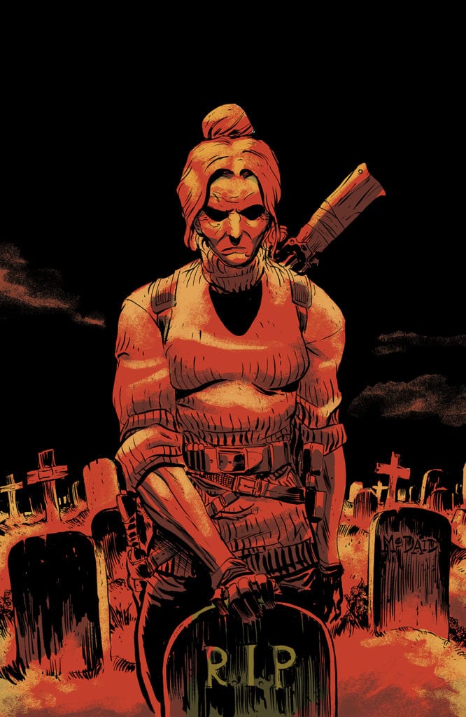
There’s no better way to kick off a Dynamite series than with a cover by Jae Lee. On the painting, Nyx, Pantha, Chastity, and Draculina are overlooking their collective target, ready to pounce. Without even a hint of action, Lee’s composition and whimsical style communicates characters that are powerful and confident.

Writing

Priest’s story establishes the town of Ashthorne, and the dynamics of its supernatural residents, pretty quickly. First, through the eyes of its children. Then, through the misfortune of one its local zombies. Finally, through the conflicts of its town leaders.

Priest’s concept is pretty simple (“a town of monsters that just wants to be left alone”), but he deserves kudos for establishing so many interpersonal relationships in a small amount of pages. That said, there are a few too many threads started all at once with jarring cuts in the narrative flow. It was difficult to absorb it all without having to re-read the issue more than once. The inaugural issue could have benefited from either more pages or focus on fewer sub-plots to start off.

Pencils/Inks

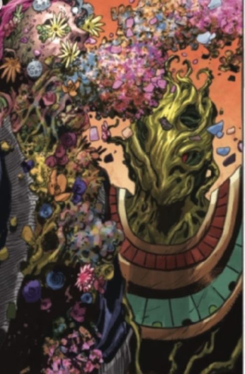
Lee is a go-to artist for Dynamite covers, so it was a major treat to see him also drew the prologue as well. (Note for Dynamite: convince Lee to do a whole series or at least a one-shot). Lee’s prologue is a young adult’s slightly re-imagined recount of ancient Egyptian intrigue, and it’s gorgeous. The Egyptian characters are drawn with aristocratic superiority, and Lee’s signature whimsy suits perfectly for a vampire-centric story.

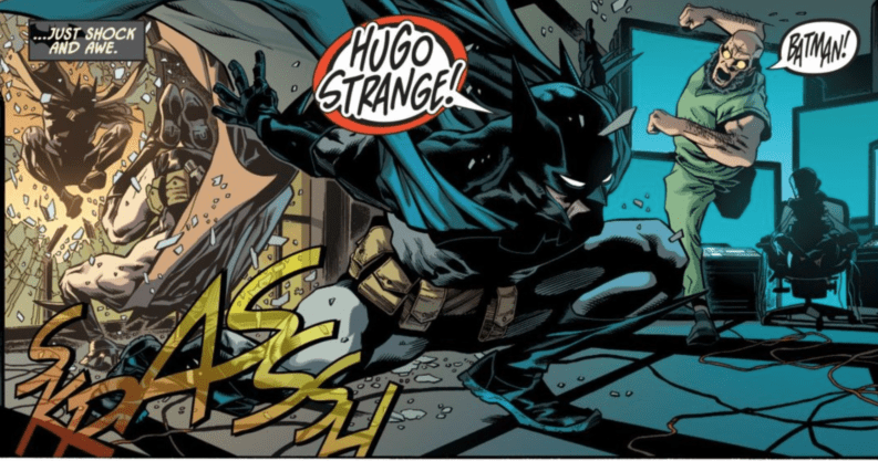
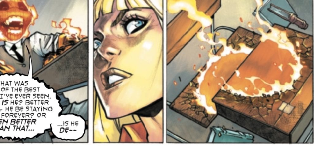
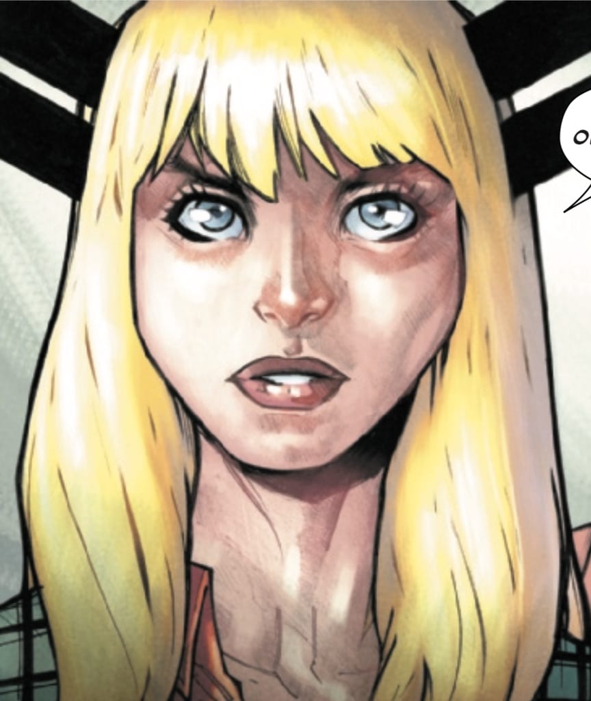
Moving on to his first mainstream work, Gabriel Ibarra draws everything post-prologue to set up the goings-on in and around the town of Ashthorne. Lee and Ibarra’s styles couldn’t be more different, but where Lee captures the majesty and magic of ancient Egypt, Ibarra breathes life into the dust and shadows of a Gothic town filled with gloom. Ibarra’s characters are immersed in constant shadow, even during the day. Although the creatures of Ashthorne live in peace with humans, Ibarra’s use of hidden eyes and faces that just barely emerge from the shadows when speaking gives the distinct impression that everyone in Ashthorne is dangerous.

Coloring

June Chang and Mohan’s coloring stands out for visual interest when almost nothing is bright or clear. In the sunny heat of an Egyptian battlefield, the scenes are covered by the yellow haze of smoke and sand. During the children’s walk home, two perspectives are colored (for two different sets of children) with the foreboding gloom of a setting sun. And the Ashthorne town meeting is barely lit by candlelight to keep the otherwordly residents “comfortable.” It’s almost a portfolio on the myriad of expert ways to do haze and indirect lighting for dramatic effect.

Lettering

Willie Schubert’s lettering is the glue that holds this issue together. Lee and Ibarra’s work are both gorgeous, but the shift from one to the other is a bit harsh. Schubert softens the shift with lettering that maintains a consistent level of readability and tone for the reader during the transition. This is a great example of lettering that helps to balance the art.

Conclusion

SACRED SIX #1, available from Dynamite Comics on July 8th, kicks off a complex new story in the Vampirella universe. The characters are fully-realized, and the art, from two separate artists, is dramatic and perfectly suited for the horror genre. This book is worth a look.

Monkeys Fighting Robots Youtube

Review: Revealed Identities Bring Crisis In STEALTH #3

Stealth #3, Howard cover

STEALTH #3, available from Image Comics on July 8th, follows Tony’s father as he seeks to reclaim his suit and gather intel on Dead Hand before Detroit is ripped apart. Mike Costa places the heroes and villains on a collision course while Tony struggles with his new secret.

Cover Art

Jason Howard’s composition on the cover is a great match for this issue’s content. Dead Hand takes the city hostage in Joker-like fashion, and he calls on the citizens of Detroit to turn over Stealth. Effectively, he turns Detroit against their hometown hero and puts Stealth right in the palm of his hand. There’s a quality about this cover’s composition that’s reminiscent of classic Neal Adams’ Batman covers.

Writing [No Spoilers]

Mike Costa’s story focuses on the fallout from Tony’s discovery of Stealth’s real identity. Deadly Hand turns Detroit into a fear-zone by ordering and carrying out random executions, and Stealth visits old haunts to gather any weapon he can use to put an end to the violence.

Howard’s cover works so well because this reads very much like a Batman/Joker story from cover to cover. Costa sets up a villain that’s practically a kissing cousin to the Joker, distorted face included. Stealth is a man against the world, using gadgets and guile to stop Dead Hand. And Detroit (much like Gotham) is ready to boil over from the violence and fear. Despite the lack of action in this issue, the tension is turned up to 11 for the next issue.

Pencils/Inks

Nate Bellegarde’s art is grounded and emotional. Building on Costa’s writing, most of the issue is a plot development that starts the climb towards the arc’s climax. That development takes place in small vignette scenes where the characters are exchanging information and laying plans, usually through serious conversation. To prevent those scenes from becoming flat, Bellegarde pays a lot of attention to facial expressions that communicate just as much through the eyes as their word balloons.

Bellegarde’s attention to facial expressions is made all the more exceptional by the distinctive and realistic design of all the characters, including the lesser side characters. From the doctor you meet in the opening scene to the gang members that receive an unlikely proposition, everyone looks like real people you’d see walking down a city street. Noses, eyes, and hair are distinctive and natural, and you can tell Bellegarde took the time to not just put copy/paste side characters in the panels just to get it done.

Coloring

Tamra Bonvillain’s coloring is excellent in this issue for her execution of shading. There’s an entire range of scenes that take place just past sunset, and the sky is cast in deep violet. The characters have an outdoor meeting, and the character shading pops without looking too bright, and it makes the darkening sky stand out more than its already rich color. It’s a gorgeous bit of work from Bonvillain.

Lettering

Sal Cipriano’s lettering is clean, easy to read, and efficient. Cipriano made a clever choice with the caption boxes when Stealth is suited up that staggers with a beveled square tooth on one edge to mimic the style of Stealth’s wing design. It adds to the flair of the overall issue’s style and makes the text more enjoyable to read.

Conclusion

STEALTH #3, available from Image Comics on July 8th, is a strong mid-point in the story arc that looks and feels like a classic Batman/Joker story. The writing is grounded and hits all the right emotional notes, and the art matches the emotional punches beat-for-beat. This is a solid recommendation.

Monkeys Fighting Robots Youtube

Review: DETECTIVE COMICS #1023 – A Few Talons More…

DC Comics released Peter Tomasi’s Detective Comics #1023 on July 7th. Joined by artist Brad Walker, inker Andrew Hennessy, colorist Brad Anderson, and Rob Leigh on letters, this issue serves as a lead-in to James Tynion IV’s Joker War event.

spoilers ahead

Writing

As the Joker raises Lincoln March and an army of Talons, Batman pursues Harvey Dent, breaking into Hugo Strange and the Mad Hatter’s lair to find him. Batman eventually confronts Two-Face, but right when he thinks he’s been subdued; Lincoln March arrives with the Talons.

There are a few nice callbacks in this issue. The Court of Owls continues to show their resiliency as a relatively fresh addition to the Batman lore. Two-Face even dons the armored suit used by Jim Gordon during his brief stint as Batman during Scott Snyder’s run.

Overall, however, this issue rings a little hollow. I say this as someone who really likes Peter Tomasi’s work, but the characterization in this issue just seemed shallow. At times, the writing in this issue was just people yelling other people’s names and then fighting.


One gets the impression that some of the books at DC are in a holding pattern mode, waiting for the new status quo to establish itself after Death Metal.

Art, Inks, and Colors

The art team does a serviceable job on this issue. I appreciate their Joker, a kind of grinning gremlin, and the other villains, like Two-Face and Mad Hatter. Their Batman, however, made me less than enthused.

I have to acknowledge that I enjoy the line work and the colors, particularly the shine that the darker parts of Batman’s costume has. But while Batman’s legs are certainly muscular, the rest of the design, from the upper body to the cape to the cowl, make me think of a skinny guy in cosplay. Maybe I’ve just been too spoiled by Jason Fabok, Mitch Gerads, and Mikel Janín’s Batman designs over the last five years, but Batman has lost some of his foreboding grandeur.

I will say that the image of Alfred’s broken neck that Batman sees while he’s in the Hatter’s trance did make me feel a little.

Batman snapping his neck back into place sits in an awkward place between touching and perhaps needlessly grotesque, but I think the moment works in a comic with some otherwise shallow characterization.

Lettering

Leigh’s lettering is serviceable in this issue. I have a lot of respect for a letterer who tries his best to make sure that every character has a unique voice, whether through font or coloring, which Leigh does here. He is also able to communicate tone well, whether its Batman’s steady internal monologue or the aforementioned characters-shouting-each-other’s-names-and-then-attacking dialogue. Leigh also adds in plenty of “sound effects” throughout the issue, all of which are seamlessly added into the fabric of the story without begin overwhelming or distracting, but providing the accentuation (as in the above “krak” of Alfred’s neck).

Conclusion

I was initially excited about Tomasi being on Detective. I’ve been a big fan of his for a few years now, but this issue demonstrates to me that maybe it’s time for a new writer to take over. Hopefully, once the Joker War runs its course, and Death Metal establishes a new status quo, a fresh vision can be brought to this Bat-title.

Monkeys Fighting Robots Youtube

Review: X-FORCE #10 – A Minor Miscalculation?

Continuing the tale of Krakoa’s “CIA,” X-Force #10 gets released by Marvel Comics on July 8th. Writer Benjamin Percy, along with artist Joshua Cassara, color artist Guru-eFX, letterer VC’s Joe Caramagna, and designer Tom Muller take readers into the heart of the island nation of Terra Verde, which has been overrun by an invasive plant form that Beast is responsible for creating.

spoilers ahead

Writing

As Domino, Wolverine, and Kid Omega fight there way through the temple in Terra Verde; Jean Grey struggles with a crisis of conscience when she learns that Beast has been keeping secrets, not just from the rest of Krakoa, but the other members of X-Force, specifically about his actions in Terra Verde. Later, she joins Sage and Black Tom Cassidy in the effort to destroy the Terra Vedean plant creature and rescue whoever remains from the X-Force team.

Percy and company make a few interesting choices in this issue. First, they continue a decades long trend of making Hank McCoy an inherently unlikeable character. Hank dismisses the genocide he unleashed on Terra Verde as a minor miscalculation, at least until being confronted by Jean.

This brings me to the second interesting choice Percy makes. Rather than show the entire conversation and the resolution to the argument between Jean and Beast, he resolves it using a prose section, which many of the Hickman-related X-titles have been in the habit of using. While these sections are often used to provide supplementary material in the X-books, I haven’t really seen them used to skip past showing an entire sequence of character interactions. I’m of two minds about this choice.

Finally, Percy adds fuel to the fire of the whole Jean/Scott/Wolverine polyamorous relationship question. This issue seems to confirm that is in fact the case.

Art, Colors, and Design

Not all of X-Force’s initial infiltration team makes it out of Terra Verde. Wolverine does, while Domino’s fate is a little unclear. Domino spends a good chunk of the issue as the POV character, but then who inner monologue stops, and we never see her again. However, Kid Omega’s fate is clear, and it is here that the art team does some really great work.

Kid Compost, indeed! These are some really horrific images. The art team really highlights the brutality of Kid Omega’s death (actually, that’s been a theme on X-Force. One wonders how any of the X-characters ever lived through their previous adventures).

Lettering

Caramagna’s lettering is good in this issue. Nothing flashy, but everything he does is serviceable to the story. Domino’s monologue flows well and accentuates the horror she encounters, while Jean’s telepathic communication provides the exposition necessary to understand how X-Force can overcome the Terra Vedean threat.

My only complaint concerns the aforementioned prose page, which is designed well, but makes the mistake of “telling” where a comic book should be “showing.” That has less to do with Caramagna specifically than with the artistic choice to tell the story this way.

X-Force continues to be one of the stronger X-titles. Its premise as a mutant “CIA” continues to be intriguing. This issue, in particular, sees a bit of a shakeup in the team with Colossus’s involvement foreshadowed. By the issue’s end, Domino’s fate is a little unclear, and how will Beast act moving forward after his confrontation with Jean?

What did you think about X-Force #10? Tell us in the comments below!

Monkeys Fighting Robots Youtube

Review: STRANGE ACADEMY #2 – School’s in Session!

It’s the first day of classes for the students in Strange Academy #2, released by Marvel Comics on July 8. The students of Dr. Strange’s academy for magic users get their first taste of just how hard it will be, not only to hone their magical abilities but to get along with each other. Writer Skottie Young along wither artist Humberto Ramos, colorist Edgar Delgado, and letterer VC’s Clayton Cowles give us a glimpse into the day in the life of this “strange” (yeah…I know) school.

Writing

We spend a good chunk of the issue spending time with the students, as they get to know each other and work through potential conflicts, and their eccentric faculty, including such venerable Marvel characters as The Ancient One, Scarlet Witch, and Magik (more on her in a bit).

One gets the impression reading this comic that Young is writing a young X-Men story, but with magic users. It isn’t too hard to imagine the character of Emily as a Kitty Pryde or Jubilee (specifically from X-Men: The Animated Series) type of character. She is a young girl thrown into an extraordinary world with fellow students from extraordinary places. In issue #1, her parents were scared of the possibility that others could find out what she can do (much like Jubilee’s foster parents from the aforementioned X-Men series). Anime fans might also get a My Hero Academia vibe from it.

There aren’t a lot of stakes in the story. Sure, there is the threat of possible expulsion for failure, but for the most part, we just get to walk with the students through their first day. And sure, Magik sends some students to Hell as punishment for tardiness and rudeness, but it’s mostly played for laughs.

One plot point to watch for in future issues concerns “the cost of magic.” In issue #1, Zelma explained to Emily that there is always a cost to magic. To use magic, “here” requires taking something from somewhere else. When Emily asks Zelma why she doesn’t feel the same draining sensation at Strange Academy that she did at home, Zelma evasively explains that the faculty have “taken care of it.” Later in a faculty meeting, this is brought up, with some ominous undertones that indicate that not all may be well at Strange Academy.

Art

Speaking of Magik, one of my favorite panels from this issue involves her….let’s call it an “instructional lesson” to her students. When Iric, the Asgardian, shows up late to her class, challenging her to do something about it, Magik does “something about it,” and sends him to Limbo or “Hell.”

Iric’s roommate, Doyle Dormammu, takes some delight in seeing the teacher punish his annoying roommate (a relationship that I’m sure will grow from animosity to grudging respect as the series progresses)…perhaps TOO MUCH delight.

Ramos does good work here, communicating Magik’s displeasure with Doyle and his subsequent disappearance. The cracks in the wood of the desk are a nice touch!

Coloring

Delgado’s colors and shading are beautiful in this issue. Following the situation mentioned above with Doyle and Iric, Magik notes Doyle’s mistake: he neglected to realize that the person next to him (in Doyle’s case, his roommate), could mean the difference between life and death, a lesson the two boys learn in Limbo.

As Magik gives this speech, Delgado’s use of colors and shading almost gives Magik (and this issue) a watercolor look at times.

While Ramos’s style is a little bit too cartoon-y for my tastes (although I think that fits the tone of the book), Delgado’s coloring, particularly how he shades them, is gorgeous.

Lettering

In a book with a lot of characters from many different dimensions, Cowles’s lettering helps to give each character their unique voice. Doyle’s Dark Dimension dialect is kept separate from the Asgardian dialect of Iric, while Gus the Frost Giant is given his own unique blue lettering in contrast to Dessy’s pink lettering, which is somehow able to communicate a torturedly sweet yet demonic tone. It does seem that, with all of the other non-human students having some kind of unique accent on their lettering, that Shaylee the Fairy should have some sort of unique addition to her lettering as well.

This is a fun series so far, and one that I think would be a good jumping on point for young adult and teen readers, given “group of misfits coming together and forming a quirky friendship group” vibe of the book.

I do find it interesting that Magik and Scarlet Witch are in the same issue. As a Krakoan, Magik’s people are being taught to despise the Scarlet Witch. I wonder if any of this will come up in their interactions or how any future conflict between Krakoa and the Scarlet Witch might affect her and Magik’s professional relationship at the academy. That may, of course, depend on how self-contained Strange Academy remains from other titles.

What did you think of Strange Academy #2? What do you think the faculty is hiding from the students? Tell us in the comments below!

Monkeys Fighting Robots Youtube

Review: NAILBITER RETURNS #2 Continues the Series’ Momentum

Nailbiter #2 Cover

This second issue of Nailbiter Returns out this week from Image Comics continues the momentum of the first issue, and provides a thrilling tale that engages the reader.

Written by Joshua Williamson and illustrated Mike Henderson with colors by Adam Guzowski, Nailbiter Returns follows Alice — the daughter of the Nailbiter — on a quest to find her mother, who has recently gone missing. The art is exceptional and perfectly compliments the story as it unfolds.

Nailbiter #1 Cover

Nailbiter Returns #2 Story

The story of Nailbiter Returns #2 continues the quest of Alice to find who is responsible for her mother’s disappearance and does an excellent job of keeping the readers engaged. While the issue opens with a separate story from Alice’s that features characters we are unfamiliar with, it eventually connects with the main story in a clean and satisfying way.

The most interesting technique used in this issue of Nailbiter Returns is when the story subverts the readers’ expectations. There are moments when scenes are set up to allow the reader to assume what events occur but are directly contradicted later. This allows the issue to be filled with fun twists that are sure to catch the reader off guard.

Nailbiter #2 Preview

Art

The pencils and inks of Nailbiter Returns are clean, and the semi-realistic art style is great for getting across exaggerated emotions while still keeping a serious tone. Gore and violence also maintain the same horrific impact they would have if the art style were hyper-realistic.

Most scenes in NailBiter Returns are filled with color, which not only makes them a pleasure to look at but also causes panels devoid of color to stick out and possess an eerie feeling. One scene in NailBiter Returns #2 depicts extreme violence, and the colors chosen are all very bland beside the vibrant red of blood. This is very effective and emphasizes the traumatic nature of the scene.

Gradients are also used heavily throughout Nailbiter Returns #2, mostly as backgrounds. This is a pleasant change from many of the single-color backgrounds seen in other comic books because the variety of colors provides more for the eye to look at. In terms of story, these gradients serve to calm the reader and relieve tension, tricking the reader into a false sense of security before shocking them with a horrifying scene.

Conclusion

NailBiter Returns #2 is a brilliant issue that is clearly created by people who know what they are doing. The storytelling and artistic techniques used to surprise the reader or put emphasis on certain scenes are all extremely effective and come together to create a truly thrilling tale. The continuation of the mystery surrounding Alice’s mother is engaging and keeps the reader turning the pages. This issue is a phenomenal read and exciting for what could occur in the rest of the story.


Are you enjoying the new Nailbiter narrative? Let me know in the comments below!

Monkeys Fighting Robots Youtube

BLACKHAND IRONHEAD – A Relevant Capepunk Story

Blackhand Ironhead Cover

Blackhand Ironhead is the latest release between Panel Syndicate and Image Comics for September 23, 2020. Headed by comic artist David Lopez, and his colorist Nayoung Kim bring the series stateside, with help from script tutor David Munoz, logo artist Cris Castan, and translations by Stephen Blanford.

Blackhand Ironhead – What A Time For a Collection

Blackhand Ironhead physically collects at a time of important relevance. This series is what TV Tropes calls a Capepunk, a series about the prevalence with superheroes in a realistic manner. Realistic, in this case, refers to the age-old question from Watchmen “who watches the Watchmen [police].” Because people with some form of power can easily let it go to their heads, the current Ironhead, Alexia Ross’s father, for example, is a respected superhero and runs a corporate empire. But he is heavily image-obsessed and even suggests his daughter take over the company in an impractical outfit that she doesn’t even fit in. Even then, he wants to leave Alexia a better world than what it was before a heart condition claims him.

Unfortunately, it turns out the old Ironhead had a few skeletons in the closet. One of which comes in the form of Alexia’s older half-sister, the current Black Hand. The original Black Hand was supposedly a supervillain who had a fling with Charles Ross. But the only reason she was thrown in jail was being a threat to Charles’ reputation. All without a lawyer or due process.

That reflects a particularly bad reality, especially for people of color. Readers of Blackhand Ironhead are quickly becoming aware of some of the morally reprehensible things done by notable people. Athletes, pro wrestlers, police, even people in the comics industry, all of which involved in some form of abuse scandals. If these people are the highest authority or what to aspire towards, does this give them the power to do as they want? Or is it an excuse to justify their actions? These questions serve as the basis for a story of significant importance.

Art

As writer and artist, Lopez crafts Blackhand Ironhead as he sees fit. The younger characters like Ironhead and Blackhand not only look youthful, but their lack of greater detail make them expressive. A good number of the older characters like Charles and Titan, however, have the traditional designs of square-jaws. But this design makes them look both old, stiff, and not a lot of room for expression. Unless they get angry, something Nayoung Kim shows with both red and black on Titan’s face. The only exception to that role is Arthur Watson, whose high energy fills him with life and expression.

A number of objects come with surprising detail within Blackhand Ironhead. Some of the supervillain weaponry look positively whacky, including an Oscar Meyer car with giant ears. Against the rotoscoped or simple architecture, the whimsy is a nice distraction from the seriousness—all without feeling obligatory.

Blackhand Ironhead: A Look at Superheroes

At the end of the day, Blackhand Ironhead isn’t simply a critique of superheroes like The Boys. It’s about how heroism is about responsibility, not entitlement. No matter how many people criticize superheroes, there is still a need for them in bleak times. But that doesn’t mean that their sacrifices and efforts should make them above it all. Because when service and reputation matter more than helping others, that’s abusing karma to avoid responsibility.

What do you all think? Is this series just another attempt at Watchmen? Or do the themes matter now more than ever? Leave your thoughts in the comments.

Monkeys Fighting Robots Youtube

SOMETHING IS KILLING THE CHILDREN #8 – Reflective Tensions

Something is Killing the Children #8 cover

Something is Killing the Children #8 out this week brought to readers by Boom! Studios continues James Tynion IV, Werther Dell’edera, and Miquel Muerto’s horror thriller.

Something is Killing the Children #8: Reactions

This moment requires context.
This requires context.

Prior to Something is Killing the Children #8, lead monster hunter Erica Slaughter took drastic measures to find the titular ‘something.’ Despite disliking her superiors, she doesn’t have any way to lure the monsters out without bait. So Tynion goes into how those actions have consequences. The town’s deputy sheriff Tom even points a gun at Erica and her watcher Aaron for the last trade’s climax. Despite the somewhat necessary actions to fight the monster, the baiting technique is still child endangerment.

Aaron is more than willing to exploit the moral gray areas of handling the situation at hand. Since the town doesn’t really have any idea of what they’re dealing with, this might seem necessary. However, his first action is to knock out a nice old woman who could’ve calmed a tense situation down with a call. Erica meanwhile dislikes her superiors like Aaron and is willing to compromise where she can rather than get her way. It’s practically a way of saying that while some morals can be obstacles, some ethical boundaries are necessary. Otherwise, what kills the children might not be the monsters.

Art

Werther Dell’edera continues to provide the tense situations of Something is Killing the Children #8. Half of this issue has double-page spreads filled with panels with placements so chaotic the reader feels the tension with each second. Nothing since the Dark Knight Returns 16-panel pages has something like been attempted. Or in such a way that tells the reader that things are only going to get worse.

Jumping into Something is Killing the Children #8

Except for maybe Miquel Muerto’s coloring. The mostly saturated world of Something is Killing the Children #8 leaves readers feeling uneasy. Sure there’s a bit of light to contrast the settings, but it practically reflects a bad mood. When the sheriff questions Erica’s helper from issues back James, all he gets is what readers already know, not much. It’s frustrating to both sides as it looks like nobody knows how to deal with the situation. The only exceptions are clashes that further illustrate the tensions like when Erica hits Aaron to illustrate her frustrations with her superiors. Or the sight of blood near the end of the issue represents the threat of the monsters.

The lettering by Andworld Design further illustrates the tense moments of Something is Killing the Children #8. With each word balloon, the time in an already tense situation feels longer. In just the double spreads, the transition from one panel to the next feels longer or shorter, especially when they’re of different sizes. The sparse wordmarks of bright colors are practically the building tensions exploding.

Study Up On Something is Killing the Children #8

Something is Killing the Children #8 requires a little background knowledge to fully appreciate. While it’s not friendly to new readers, the act of consequences are a strong theme here. Tensions build up over time, especially as reactions with the main characters. It can even be a critique on the nature of the anti-hero in modern times. Just because something can only be done through moral gray areas, it doesn’t justify lowering the moral bar.

What do you think? Would you rather start at the beginning for an emotional context? Or would rather just dive into the unknown, barring consequences? Leave your thoughts in the comments.

Monkeys Fighting Robots Youtube

How The Plan Is Falling Apart In FIREFLY #17

A new figure enters the fray in Firefly #17.

FIREFLY #17, out this Wednesday from Boom! Studios brings readers back to a ‘verse full of dangers, and people who think they have the right to dictate how the rest of humanity should behave. That’s a world that Malcolm Reynolds has always chafed against.

A new figure enters the fray in Firefly #17.

***SPOILER WARNING***

The crew of Serenity has been facing many changes over the recent years (months?), many of them being unpredictable even to the most dedicated of fans. On the bright side, that means the series has consistently been full of surprises.

Malcolm Reynolds makes for the most unlikely of sheriffs, yet in Firefly #17, one can see just how easily he can get stuck between a rock and a hard place. After all, it’s not like the rest of his crew have quit the illegal gigs just because of his new career path.

Mal’s job title has always had a timer going for it. There was simply no way he would be capable of staying there long term. Now we’re starting to see the endpoint of his run at going legit, and it’s not looking pretty.

The alternate cover for Firefly #17 is looking a might foreboding…

The Writing

Greg Pak is still at the helm of this project, bringing the Firefly crew to new heights – and lows. This is a plot that has been coming to a head for a while now, yet he’s somehow managed to up the ante in spite of that.

Firefly #17 is an issue packed to the brim with action. Much of it revolves around the obvious guesses (Mal does have a penchant for trouble), but a few moments will bring surprises – and cheers. There’s something refreshing in that.

The introduction of the Blue Sun organization was a good call, and it’s still paying off even several issues later. That’s proof of a slow-building plot arc right there. One that feels distressingly similar to another organization fans already saw fall.

The conclusion of this issue is setting up for another climactic series of events. Events that might, with any luck, bring the beloved crew back together once again. Though possibly not for the reasons fans would like.

It’s just like Mal to be cleaning up after his crew.

The Artwork

The artwork found inside Firefly #17 is bold and distinct. While fans can certainly recognize their favorites from the show, it’s clear that the creative team has started to feel bolder in taking risks in styles and portrayals. On the whole, those risks have paid off.

The medium is well-suited to the changes created, as well as for all of the actions (and explosions) provided thus far. There are a few fight scenes worth talking about here, but one of them stands above the rest. The unique style of the series shone clearly at that particular moment, making the whole scene feel even fiercer than it otherwise could have been.

Lalit Kumar Sharma was the lead artist, with Francesco Segala providing the colors, and Jim Campbell the letters. Together they created a newer looking universe that still manages to feel familiar. All while providing the characters, action, and setting that fans have come to love.

They say there’s no rest for the wicked.

In Conclusion

Firefly #17 continues to bring fans along a path full of surprises. This is not where fans expected to find their favorite crew, yet in some ways, it is still fitting. In many other ways, it proves that this is a series with many more stories left to tell.

Monkeys Fighting Robots Youtube

Review: THE FLASH #757 – The Legion of Zoom Attacks!

It’s the beginning of the end of Joshua Williamson’s Flash story in The Flash #757, released by DC Comics on July 7. Eobard Thawne sets his a plan in motion, years in the making, against Barry Allen and the Flash Family. Joined by Rafa Sandoval on Pencils, Jordi Tarragona on Inks, Steve Wands on Letters, and Colors by Hi-Fi, Williamson sets in motion the final stretch of his story almost five years in the making with the introduction of the Legion of Zoom.

Writing

Williamson has certainly been playing the long game with his run on The Flash. Back in 2016, The Flash: Rebirth #1 introduced readers to a murder case that was eerily similar to the death of Barry’s own mother at the hands of Eobard Thawne. While Barry’s initial suspicions about the case were dismissed because his objectivity was called into question, Barry is vindicated not only by finding out that, no, Heather’s husband did not kill her, but in fact, the Reverse-Flash did, on the very night that saw Wally West return from the Speed Force! Before Barry can investigate this revelation, however, Central City is attacked by a number of Flash’s rogues, in locations that are directly tied to Barry Allen. Williamson is bringing his story together, setting up a(nother) final confrontation between the Flash and Reverse-Flash, which will hopefully see the return of the entire Flash Family!

Art and Coloring

I’m a big fan of the Sandoval/Tarragona art team over the past few issues. They are very good at conveying the bombastic, frenetic action of the story, since characters are always portrayed in wide, expansive poses with their arms spread.


Seriously? Who runs like this?

They are helped, of course, by the solid coloring from Hi-Fi. All the colors are excellent. The red of Flash’s costume really “pops” against the background.

One thing I like about the following panel is the way that the art team portrays the nuances of Thawne’s negative Speed Force energy.

The line work is solid, and the colors within the energy are shaded well without bleeding too much out into the solid colors of the background setting, something that can tend to happen when portraying these types of energy fields.

Lettering

Wands does a fine job with lettering. Most of the lettering focuses on either Barry’s dialogue or inner monologue, although Wands does throw in a few nice flourishes. The Speed Force lightning and whooshing sounds are always a nice touch. Wands also gives each of the Rogues unique lettering when their names are said (a fun, if silly, comic book trope).

Conclusion

Williamson’s run is coming full circle, racing towards its conclusion while calling back to the beginning of his run, including the return of Wally West and the death of Heather Macy. With the Legion of Zoom attacking Barry’s life, it’s most likely the case that Williamson is setting up the return of the Flash Family as his run comes to an end.

What did you think of The Flash #757? Tell us in the comments below.

Monkeys Fighting Robots Youtube