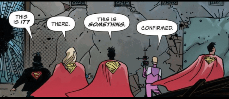
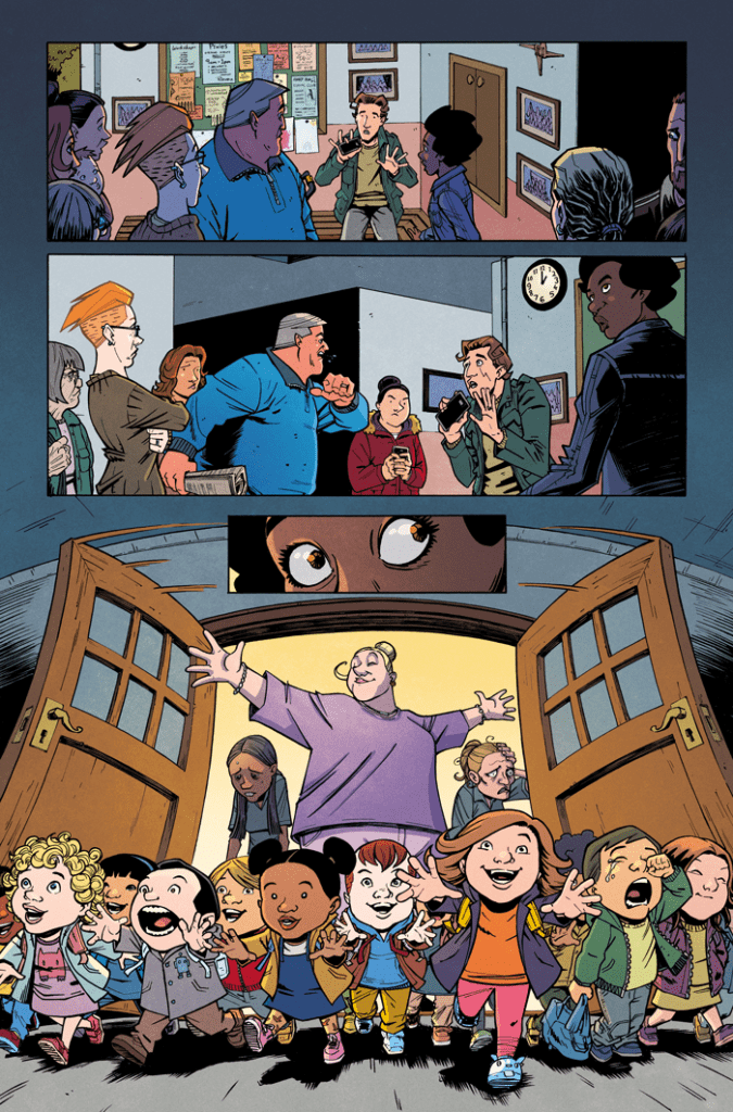
On September 22, DC Comics released Actions Comics #1025. Writer Brian Michael Bendis, penciler John Romita Jr., inker Klaus Janson, color artist Brad Anderson, and letter Dave Sharpe continue their “House of Kent” story. Hopefully, all of its members will make it out alive!
Writing
One can’t help but feel some joy at seeing the entire Super-Family together again. It’s certainly been fun to see Conner Kent reconnect with all of the people who had forgotten him. But one also can’t help but feel like this arc, and Conner’s return, in general, might’ve been better served in the hands of Jurgens or Tomasi. Bendis’s “House of Kent” arc is hampered by an Invisible Mafia story that’s running out of gas (no pun intended, given the villain of the arc).
It does feel like it’s time for a change of writer on this title (in Mark Waid we trust?). Hopefully, after waiting so long for his return during the Rebirth era, Conner Kent will still be alive and recognizable in a post-Bends Superman run.
Art and Colors
Fans of Romita Jr. should like this issue because when he draws characters close up, they can be quite compelling. Sometimes, though, from far away, his drawings can be a bit angular and sloppy. For instance:
It’s hard to get past Jon Kent’s Bart Simpson hair, as well as whatever doodle for beginners hellscape Brainiac 5 crawled out of. Maybe Romita fans will disagree with me, but as epic as Conner’s return to the Superman titles SHOULD be, I wish this was a prettier book.
Anderson, of course, provides some excellent colorwork. While some of his colors can be a little too “solid” in scenes where he colors the Super-Family, in other panels, like those involving Red Mist, his color work is shaded and nuanced, provide an excellent complement to Romita.
Letters
As with any Bendis book, there can be a tendency for an over-abundance of word balloons to cramp the comics panels. This issue largely avoids that (except in a Daily Planet scene), with Sharpe providing some great lettering, both in character dialogue and in some of the exposition boxes. This issue feels very kinetic, with the lettering only being minimally distracting at times.
Conclusion
As happy as fans are to see Conner, many of them are waiting for a changing of the guard on the Superman titles. We know Bendis’s time on the book is coming to an end. Who knows? Maybe his finale will surprise and please fans. Hopefully, every member of the Superman family will make it out alive for whatever comes next.
What did you think of Action Comics #1025? Tell us in the comments below!
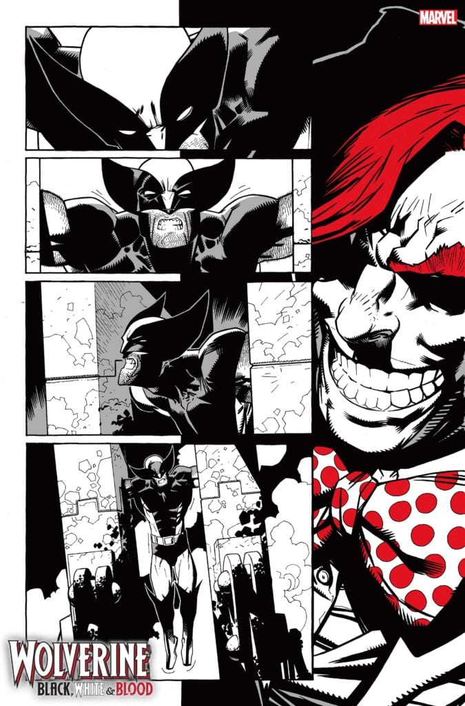
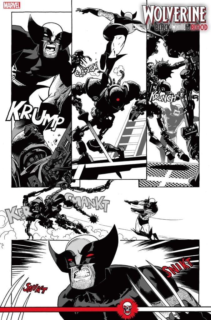
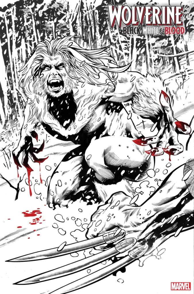
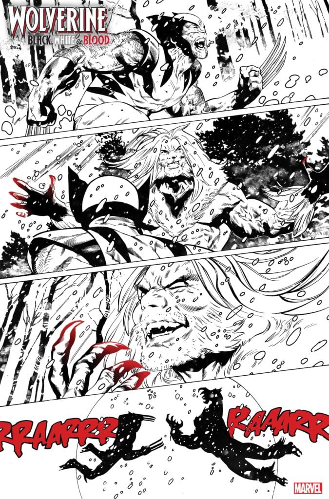
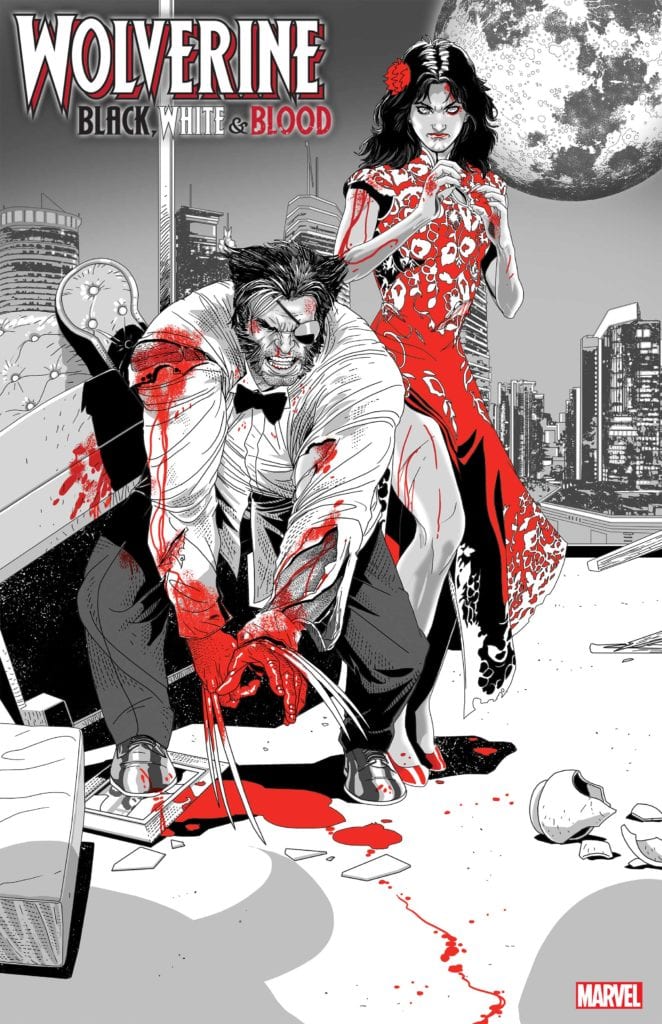
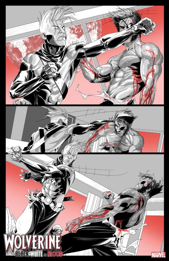
Wolverine: Black, White, and Blood #2 (of 4) hits your local comic book store on December 16, but thanks to Marvel Comics, Monkeys Fighting Robots has a six-page preview for our readers.
The book is written by Vita Ayala, Chris Claremont, and Saladin Ahmed, with art by Greg Land, Kev Walker, and Salvador Larroca.
About Wolverine: Black, White, and Blood #2 (of 4): SHARPEN YOUR CLAWS FOR ROUND TWO OF WOLVERINE’S ALL-NEW ALL-STAR BLOODY BATTLES!
The adventures of WOLVERINE continue in the visceral black, white, and blood-red format! Legendary X-scribe Chris Claremont re-teams with the incomparable Salvador Larroca to bring LOGAN back to Madripoor as PATCH, where he and KATE PRYDE face their toughest battle yet. Then, Saladin Ahmed and Kev Walker build a life-or-death catch-22, courtesy of the maniacal ARCADE, that will force Wolverine to make a life-or-death decision! Vita Ayala and Greg Land put Wolverine on a mission to stop a “cure” for the X-gene, where he’ll cross paths with his deadliest foe: SABRETOOTH!
Do you have Wolverine: Black, White, and Blood on your pull list? Comment below with your thoughts.
From Saladin Ahmed and Kev Walker’s story:
From Vita Ayala and Greg Land’s story:
From Chris Claremont and Salvador Larroca’s story:
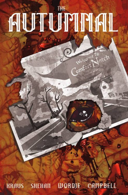
Just in time for the changing of the seasons and just shy of Halloween, acclaimed novelist Daniel Kraus (The Shape of Water, Trollhunters) and artist Chris Shehan bring readers the first issue of “The Autumnal” from Vault Comics. With help from colorist Jason Wordie and letterer Jim Campbell, this debut issue is a deceptively quiet start that will have readers begging for more with its engaging characters, measured pacing, and outstanding visual work.
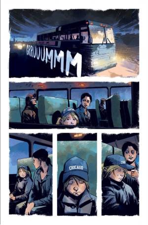
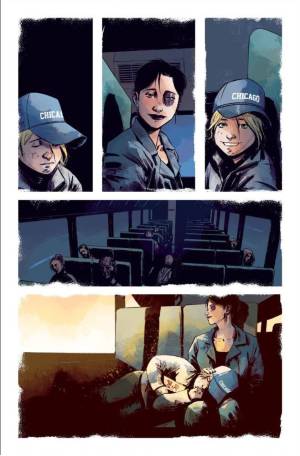
“Following the death of her estranged mother, Kat Somerville and her daughter, Sybil, flee a difficult life in Chicago for the quaint – and possibly pernicious – town of Comfort Notch, New Hampshire.”
Writing & Plot
Daniel Kraus’s script for “The Autumnal” #1 offers accomplishes an immense amount of storytelling – while also doing very little. The characterization and is accomplished primarily through the considerable but not overbearing dialogue. The act of bringing the audience up to date with Kat and Sybil Somerville is also done this way, but also with the inclusion of environmental and visual context clues. This pair has had a hard life, and they don’t take crap from anyone. The pair are instantly endearing and I found myself caring about their story almost immediately. The dialogue and internal narration from Kat is primarily layered with anger and spite born out of being protective of her child, but also flecked with her own inner sadness and trauma. This representation of a low-income single mom would almost seem like a stereotype if it wasn’t portrayed so damn well and in such a thoughtful way.
Now based on what I’ve described above, you might think that this is some comic about a familial drama. Admittedly, the horror elements in this issue take their time in being presented. This is the most impressive aspect of “Autumnal” #1. The information given about the Somerville family beyond Kat’s woes is sparse and allows for the setup getting into the late pages to be as well-hidden as possible. See, this really does feel like a pointed drama for most of this comic, but its transition into an eerie horror still feels natural. There’s isn’t any sudden flip of the switch and the world turns upside down. The strangeness just steas=dily compounds until the issue’s climax. There isn’t much that can be said without giving away the plot, just know that in terms of slow-burn horror hiding the bit, this comic nails the act.
Art Direction
What gives “Autumnal” #1 its immersive and increasingly haunting atmosphere is the character-centric pencils of Chris Shehan and otherworldly colors of Jason Wordie. Shehan has a notable gift for crafting distinct characters and their expressions that makes getting into them as a reader an effortless task. Kat’s personality and hidden depths are made outwardly obvious by Shehan’s talent, as are Sybil’s deceptively complex emotional range. Just as impressive is his eye for visual directing. This comic does have a cinematic approach to how it frames character and progresses the story in the early segments. His approach increasingly hinges on cues specific to the comics medium. Building tension by leaving the focus of a scene covered but gauging the terror in the eyes of the characters is a tactic that packs a heavier punch in comics than in film, and this comic does so brilliantly. Building this comic’s unique atmosphere in a whole new way is colorist Jason Wordie (one of my favorite colorists in the business right now). Each page and/or scene is given its own color palette that bathes everything in that sequence in a hue, such a pale green, light blue, or autumnal orange. However, there are also some sequences where he introduces an effect that almost looks as though he splashed random transparent colors on the page. This look blurs the reality on the page, and is mainly used at the comic’s more unusual sections. It’s gorgeous, atmospheric, and highly detailed work that rally makes this slow-burn horror comic shine.
“The Autumnal” #1 is a successfully riveting opening chapter for a character-centric, slow-burn style horror comic. Daniel Kraus’s scrip offers a stellar portrayal of a hardened low-income single mother and her exceptionally smart but equally troubled daughter, wrapped up in a brilliantly paced and increasingly uneasy horror story. Chris Shehan and Jason Wordie’s visual work is outstanding i every regard and fills this book with the perfect atmosphere to successfully immerse the reader in its enviornment. If this kind of horror is your thing, then pick up this new printing when it hits shelves at your local comic shop on 9/23!
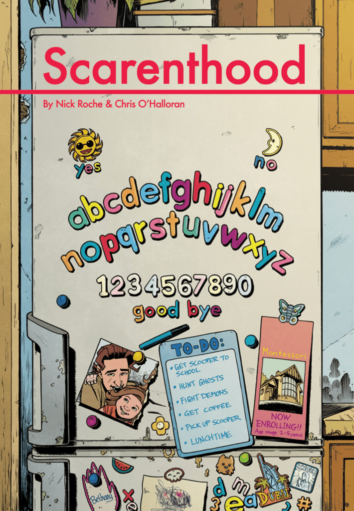
Monkeys Fighting Robots spoke with writer/artist Nick Roche about his upcoming comic SCARENTHOOD, an “Irish-set suburban folk horror” that’s as much about the fear of failing your kids as it is demon hunting.
The series is by Roche, colorist Chris O’Halloran, and letterer Shawn Lee. The logo design is by Wayne Daly, and David Mariotte is the editor. SCARENTHOOD #1 hits stores October 28th from IDW Publishing.
About the series: TO-DO LIST: Drop kids at preschool/ Grab coffee with other parents/ Go ghost-hunting in woods/ Fight demonic entity/ Collect kids/ Naptime. With their kids away on a field trip, a group of parents disturbs an ancient evil buried beneath the old Church Hall, unearthing a decades-old mystery about a missing child, and inviting something… hungry into their lives. Suddenly, their mornings go from playdates and peanut allergies, to a battle for the souls of one broken family-and one child in particular. What scares you the most: fighting demons, or letting your kids down?
Monkeys Fighting Robots: First off, SCARENTHOOD is just too good of a title to not ask about. Where did that come from?
Nick Roche: It took AGES to come up with it! And I wasn’t even trying at that stage; the early pitch was called something completely different – Chris and I still have files saved with that title. And people thought it was fine. But I could see no one was sold on it, and to be honest, neither was I. I don’t even want to share it, because I’d be worried it would taint the name SCARENTHOOD with its mediocrity. I might use it as a subtitle for a SCARENTHOOD story at some point. But the specifics of the title are lost to me, it just sort of sifted into my brain as I worked on something else, and I’m SO glad it did. Because it was one of those passive bits of creativity that happens TO you, it feels like someone else came up with it. (But they didn’t, RIGHT? Legally, that’s important to state.)
MFR: I get the sense that SCARENTHOOD comes from a very personal place — what was your thought process in coming up with the story?
NR: Eight years ago, there’s no way I could have cooked this up. But seven years ago, I became a dad and found myself emotionally, morally, and occasionally financially responsible for a little girl. Once she got to pre-school age, I found myself having to white-knuckle my way through chat with the other parents at the school gates. As a comic creator, you get used to the isolation of your own hovel, so I was very much out of my depth forging chatty bonds with complete strangers. It made me feel like I was the one starting school and navigating new social circles. A lot of us were self-employed or stay-at-home parents, and we realised that the discipline of returning to the home was solely down to us — nothing was stopping us from doing what we wanted or going wherever we liked. Of course, that mainly just meant for coffee, though I’m convinced some of the mums and dads were hooking up on the side. Rather than caffeine or canoodling, my mind leapt to ghost-hunting, and I imagined a world where the parents of pre-schoolers fight the forces of evil in the local woods while their kids are in class. And that’s pretty much SCARENTHOOD.
MFR: You have four very distinct parents at the center of this mystery. What can you tell us about them and how you developed their personalities?
NR: Cormac’s the lead — he and his daughter Scooper are new to the area (with a ton of emotional baggage), and both are having trouble fitting in. The other parents know each other from the school run already: Jen’s husband is wealthy but works away from home a lot. She’s lonely, with itchy feet and a yearning for pre-parenting excitement. Sinead likes to rile the others and crack jokes at their expense, all while observing matters as they unfold. And Flynno is an older parent who had a kid late in life after his other children had grown up. He’s an inveterate bullshitter who tries to explore the truth in the world via outlandish conspiracies, including one about a prominent Irish rock singer. He’s at the heart of the story, due to an event that befell his family over forty years ago.
I tried to select personalities and character types that complement and conflict nicely with each other. One of them is partly me, there’s a little of two of my best friends in some others, and one is loosely based on a former in-law that I no longer have to interact with. I’ll let readers guess which is which.
MFR: Horror is one of the hardest genres to get “right” in any medium, but I feel like comics are especially difficult since you can’t utilize music or other shortcuts — you have to rely purely on your skills as a storyteller. Do you have any preferred storytelling moves or techniques that you use to scare your audience?
NR: It’s an odd one; I’m 100% not a ‘Horror Guy’. We were pretty sheltered as kids, and just weren’t allowed near anything stronger than a PG cert movie. So by the time I was legally allowed to watch horror stuff, my curiosity had died down, and I never really dived into it. And yet… as soon as I got the chance to write my first comic (Transformers Spotlight: Kup), I basically wrote ‘I Am Legend, With Robots’. Just full-on horror featuring psychological breakdowns and creepy nocturnal Zombots. Then with the Wreckers series I followed that up with, I leaned into mechanised body horror, with the odd giant spider. And now I’m writing about parental anxieties and adult isolation… via ancient demonic entities and haunted Catholic effigies. It’s still a surprise to me.
I like to employ multiple panels per page in the instances of high tension. A quick-paced rhythm of intensifying close-ups on a character as something starts to dawn on them, or intercutting panels of something terrible with the object of its ire. Repeated panels are good too, with a gradual change across them as the situation becomes more tense. Oh, and loads of black. Tons of the stuff. Jesus, so much of it.
MFR: How does being both writer and artist make it easier to tell a horror story, and how does it make it more difficult?
NR: For instances like the above where I’m playing with very specific panel layouts, it really helps that the writing and art are coming from the one person, because they’re coming from the one place; the script was written via thumbnails, so I’m able to structure the story around the best visual way to share that information. Any drawbacks are mainly of the normal ones I feel with making comics, which is the voice in my head that’s asking, “Are you SURE you’re doing this right?” That can be a little stronger when it’s horror, because as I say, I’m not very well steeped in the genre, and I may think that someone whose parents loved them enough to let them watch all of Driller Killer would probably do a better job than me.
MFR: Chris O’Halloran’s colors are seriously next-level on this book — he can shift the tone from “everything’s fine” to “shit just got real” on a dime. How involved is Chris in the development and storytelling process?
NR: Well, you can see for yourself just how much he’s bringing. He’s utterly in control of the tone of each scene. If there’s anything lacking in the line-art, atmosphere-wise, he finds a way to wrest control of the moment and make the reader realise, “Right, THIS is how we’re gonna make you feel.” He just gets better and better too — the pages he’s handing in for the final issue are THICK with atmosphere. And he’s perfect at capturing the feel of the location too. It was so important to have an Irish colourist to share the visual shorthand when it comes to the environments, but he’s exceeding that. There’s a scene set in a particular location in urban Dublin, and you can smell the fossil fuels from it. I say this to everyone: I can’t BELIEVE I’m getting to work with him. He’s amazing.
MFR: Horror is a very intimate genre, especially in a small-town folk horror like SCARENTHOOD. How do you approach a story like this as a writer/artist compared to something bigger and more action-driven like TRANSFORMERS?
NR: I think with the Transformers stories I wrote, I was starting to explore the concept of family dynamics, and a look at what a parental relationship would mean between a robot that turns into a helicopter AND an armoured car, and one that turns into a giant spider. After I hoovered up every Eisner going with those, I tried to bring that focus to humans. Plus, I’d worked in lots of horror beats into my TF work, so apart from a few explosions and character switching between humanoid and fighter jet mode, there are fewer differences between my own Transformers work and SCARENTHOOD than you may think.
Though SCARENTHOOD is drawn in a cartoony style, its settings are taken from real life, so there are times when I feel like going detail crazy on some mech backgrounds that come from my imagination, rather than take a reference shot of how exactly the folds sit on a three-quarter-length jacket. But then, when I’m drawing hundreds of robots, SCARENTHOOD is exactly the sort of thing I wish I was drawing…
MFR: In your mind, what is the perfect horror story of any medium?
NR: I’m a big fan of MR James’ short stories, and he’s one of the biggest influences on SCARENTHOOD. So it’s either “Oh, Whistle And I’ll Come To You, My Lad” (including the great Jonathan Millar adaptation from 1968) or Ghostwatch, a one-off BBC Hallowe’en hoax-umentary special from 1992 featuring a suburban family terrorised by a sinister presence that viewers (including myself) believed was real at the time.
MFR: Who are your horror inspirations, the writers and filmmakers who made you want to make SCARENTHOOD?
NR: There’s so many gaps in my knowledge of horror, I’m starting to feel like a real tourist here… It’s hard to go wrong with any MR James stuff, and the BBC adapted a ton of them back in the 1970s, all shot on videotape. These adaptations all have a hauntological feel of their own, and even though their period pieces, that sense of creepy nostalgia is something I want to tap into with SCARENTHOOD. I’m a big fan of an animated short called The Sandman from 1991 which has a deliciously gruesome sting in its tale. (And kids in danger; always good to lean on that trope!) And an odd one, but for kids in Ireland, every St Patrick’s Day meant a showing of Darby O’ Gill and The Little People, whose depiction of The Banshee and a headless coachman to deliver you to the afterlife absolutely shat me up. Basically, it’s Disney and The BBC’s fault.
Big shout-out to From Hell, also. That caused me to sleep with the light on when I first read it. In my mid-twenties.
MFR: And finally, we’re all going through some tough times right now — what are your go-to comfort comics?
NR: Current stuff I’ve been enjoying are [Kieron Gillen and Dan Mora’s] Once And Future, and John Allison’s web series, Destroy History and Steeple. A highlight of lockdown was devouring Simon Furman and Geoff Senior’s Dragons Claws in one go, and writing that has made me want to do it again. I’ve mainly been reading the reprint of The Pan Book Of Horror, a 60-year old anthology with VERY outdated attitudes and verbiage, but has a good hit-rate for nasty little scares. Hmm. Maybe I am becoming a Horror Guy…
Thanks again to Nick Roche for taking the time to chat with us! SCARENTHOOD #1 is out October 28th from IDW Publishing.
When the strongest Avenger collides with the unstoppable Juggernaut, it’s safe to say they’re going to make a mess. Marvel Comics invites you to take a front row seat at the strong man battle of the year between the Hulk and the Juggernaut in JUGGERNAUT #2, available to retailers on September 28th.
Says Marvel of the upcoming issue: “it’s Juggernaut VS Hulk in an epic clash that will shake the Marvel Universe to its core—literally!” You can check out an exclusive preview image and read the full Marvel press release below.
Can you think of a better matchup? Let us know what you think in the Comments section, and please share this post on social media using the links below.
THE UNSTOPPABLE GOES UP AGAINST THE STRONGEST THERE IS IN JUGGERNAUT #2
New York, NY— September 24, 2020 — Renowned X-Men writer Fabian Nicieza (X-Force, Deadpool) and celebrated artist Ron Garney (Captain America, Daredevil) are taking the unstoppable Juggernaut in a bold new direction with a brand-new series! JUGGERNAUT #1 hit stands yesterday, and fans learned that Cain Marko’s new path is as full of destruction and mayhem as ever before. The action continues next month when a matchup that True Believers have debated about for decades comes to life. That’s right —it’s Juggernaut VS Hulk in an epic clash that will shake the Marvel Universe to its core—literally! Get an exclusive look at this legendary battle now by visiting Marvel.com.
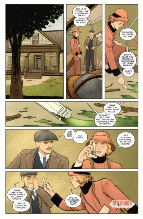
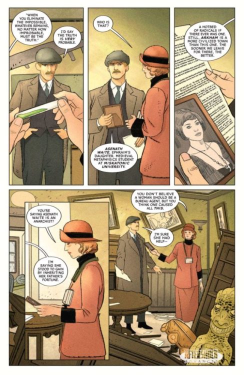
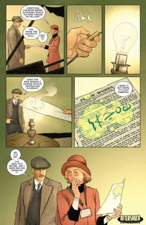
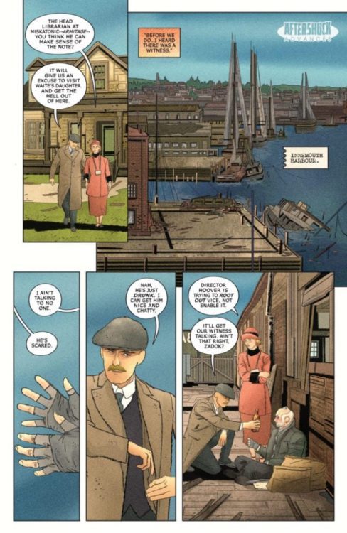
MISKATONIC #1 hits your local comic book shop on November 11, but thanks to AfterShock Comics, Monkey Fighting Robots has an exclusive four-page preview of the Lovecraftian-horror thriller.
The book is written by Mark Sable, with art by Giorgio Pontrelli, Pippa Bowland drops the colors, and you will read Thomas Mauer’s letter work. Jeremy Haun and Nick Filardi worked on the main cover, with Tyler Crook creating the incentive cover.
About MISKATONIC #1: Miskatonic Valley holds many mysteries – cultists worshipping old gods, a doctor deadset on resurrecting the recently deceased, a house overrun by rats in the walls – but none more recent than a series of bombings targeting the Valley’s elite.
These horrors reach a breaking point when the brilliant, hard-nosed investigator Miranda Keller is sent to stop the bombings. To J. Edgar Hoover, there can be no other explanation than those responsible for similar actions during the Red Scare of the 1920s…but when Miranda digs too deep; she uncovers an unimaginable occult conspiracy, one that may cost Miranda her job – and her sanity.
Enjoy the preview below:
What AfterShock Comics are you reading? Comment below with your thoughts.
Javier Garrón is a Marvel Comics artist from Barcelona, Spain, and he was part of Marvel Comics’ YOUNG GUNS for 2018-19. Garrón has worked on Ant-Man and the Wasp, Miles Morales: Spider-Man, and now the Avengers. Monkeys Fighting Robots was able to talk with him about Avengers #35 from an artist’s perspective.
(Avengers #35 was written by Jason Aaron, with art by Javier Garrón, Jason Keith is the color artist, and you will read Cory Petit’s letter work.)
MFR: Can you talk about your relationship with Jason Aaron? Are his scripts tight, or does he give you room to flex your artistic muscle?
Garrón: He’s the most awesome team member you could have by your side. He’s extremely supportive and encouraging of collaboration. We recently had to design quite a big batch of characters, and that was a truly fun and productive team effort. You know, I was already a massive, huge fan of his work prior to landing on the Avengers title. When I was offered the project, I was ecstatic. He’s as big a star in comics as you could get. But when it comes to day to day work, he’s just Jason, and he’s here to build something together. His texts are detailed but not ironclad with lots of suggestive, evocative parts that are solely crafted to help push the artist’s imagination further.
Image courtesy of Marvel Comics.
MFR: How much fun is it drawing the Ghost Rider on a wooly mammoth?!
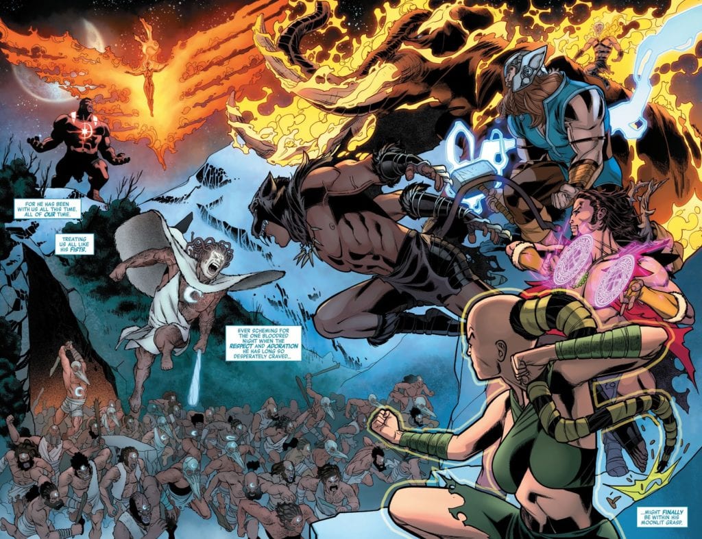
Garrón:Oh, wow, that was bonkers! I’ve never drawn the character before (maybe in a couple of con sketches but never on an official page, I believe), and it’s so much fun. We take a couple of concept swings with the character during the Khonshu arc, and each one is crazier and more fun to approach visually. The fire really gives you a lot of room for kinetic effects, bringing so much more energy to the panels.
I won’t lie; I was scared for the mammoth part. I’ve never drawn one! Not even an elephant! Yes, it’s a challenge, and that’s how you grow as an artist, that’s true. But on the other hand, it’s more pressure. I was reading the Aaron run on the series since the beginning, so I know how true titans as McGuinness or Pichelli draw it. I’m aware of how high the bar is set, and these are the moments when you realize it when you face something you’ve never set yourself against. I was also trying a new approach on these pages.
Covid19 had already hit hard here in Spain where I live, and we were in quarantine when I was drawing this issue. I do most of my page work in traditional media (with a variable amount of digital and post-work depending on the page), but since I keep hearing every artist say digital is better and makes you go faster, I decided this was the moment to try it. I didn’t know how long the quarantine could take, and I could probably run out of paper, so the moment was never going to be better. I was not only facing new challenges in terms of characters but also going through the learning curve of trying to fully draw pages digitally. I was nervous about being the weakest link in the series’ quite stellar line of artists.
Image courtesy of Marvel Comics.
MFR: Avengers #35 has several floating elements, from Mjölnir to Khonshu’s head. How do you work with colorist Jason Keith to give these elements movement?
Garrón:The work rhythm in a monthly title is very intense, and deadlines are always looming, so there’s not much time to prepare things in advance, and most of the talk is usually done on the go. At least that’s my experience so far. I respect the process of the colorists tremendously and don’t like to meddle. I trust the gut instinct of every artist I work with the same way I like to be trusted. You usually should follow your artistic instincts. If I have any specific thought or suggestion about any particular subject, I leave notes inside the file I send to editorial. We’ve aimed for bright and dazzling coloring of energy, blurs, and kinetic lines for objects in movement and depth of field through line hierarchy (width of line in the inking process: things closest to the camera have thicker lines and it becomes thinner as we move away) and lighting/effects (shadows, smoke, graded or colored lines…).
Image courtesy of Marvel Comics.
MFR: On page 5 or Avengers #35, the oval panel has an optical illusion element as Mjölnir lifts off the page. Can you explain your panel layout for page 5?
Garrón:One of the things I try to keep in mind when planning a page is making them different from the previous one in terms of panel composition. Unless, of course, it’s something I’m specifically looking for as a narrative device. Otherwise, and making more specifically a superhero comic, I want the comic to be as dynamic as possible, and that means not only not repeating a page layout but also, when the scripted moment calls for it, making itself the money shot.
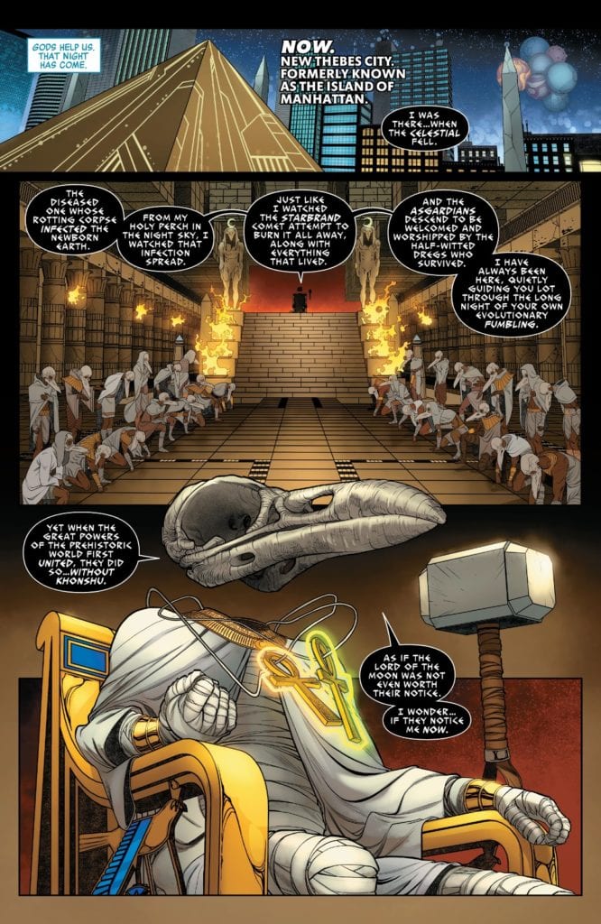
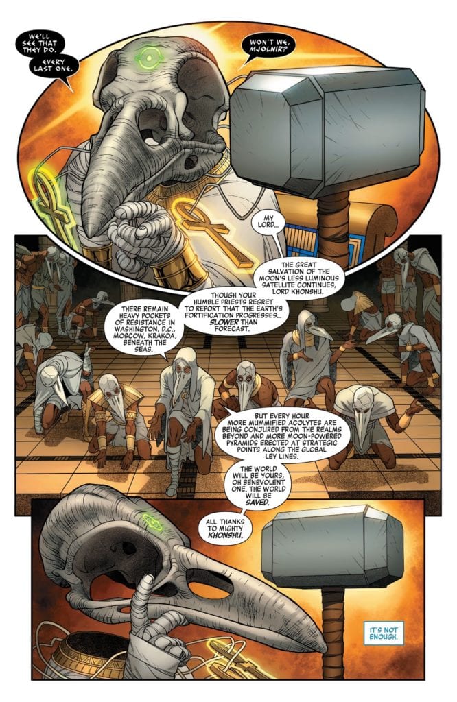
In the previous page, we revealed (SPOILER) that Khonshu, the Moon God, is in possession of the Mjolnir. We also see his high priests gathered around the throne. And in that page, we establish Khonshu’s power and dominance over the situation with a symmetry axis. He is at the left of it, the hammer in his right (or her right? Not sure if Khonshu is gender-neutral, I should ask Jason!), and his army deploys symmetrically at his feet. We repeat this rigid, strict structure in page 5, but we add an extra reveal: you may not have paid much attention to the two glowing ankhs hanging from his neck, but that means he has their power. And on page 5, panel 1, we see the Eye of Agamotto on Khnoshu’s forehead. So the page is almost symmetrical to continue the visual narrative established in the prior page, but to highlight the reveal (and also make the page more visually attractive and distinctive), I shaped the first panel almost like the Eye of Agamotto itself.
Image courtesy of Marvel Comics.
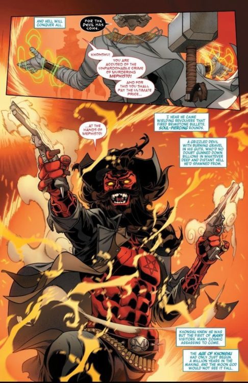
MFR: Avengers #35 features a western gunslinging Mephisto; what was the process like bringing this character to life?
Garrón:That was so much fun! It’s what I love from Aaron’s Avengers run, the crazy amalgam and remix of Marvel’s mythos, characters, and genres bringing such a fresh take to the series. While also keeping the scope of the main story epic and in the widest possible frame.
Some elements were already pointed out in the script. He was described as a Wild West version of Mephisto, with a beard, a black cowboy hat, and a pentagram on his chest instead of a lawman’s star. Oh, and also firing black magic revolvers.
What I usually do when approaching a character design is taking a deep dive and researching it. But being on a deadline, you have to ration your time and efforts. I knew from reading the script he wouldn’t be appearing much. In page 7 and maybe a glimpse of him on the final page of the issue. So it wouldn’t be wise to spend much time here when you need to keep the pages being done, and there are far more relevant things to design, story-wise. So I did some online research on cowboy costume design, fantasy westerns, and Mephisto representation throughout the years. I put it all in the mixer inside my head and pressed the “on” button. I wanted him to have several layers in his upper body, so he has a shirt and jacket, but open so we could see the inverted star in his chest. And also give a sense of looseness and chaos. The wild beard, the buckle with his initial (as an ego move) and little spikes here and there (the belt, the guns) making him more dangerous-looking.
Image courtesy of Marvel Comics.
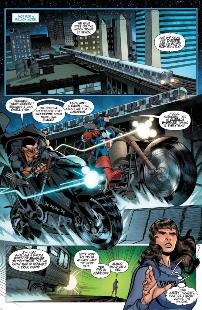
MFR: In Avengers #35, Captain America and Blade are fighting side by side. They are similar in build and size; artistically, how do you give them personality to differentiate the two?
Garrón: It’s a matter of body language for me. Captain is more analytic and avoids confrontation as much as possible. Blade is more temperamental and jumps into a fight more easily. We don’t see them much in this issue, and most of the time is battling mummies, so I had to establish this visually from the get-go. Page 8, panel 2, we see them riding their motorcycles, and the script just gave me the key. The differences between their bikes tell a lot about them. Blade’s bike is slick and black, a sleek street bike, with swords sheathed on it and shurikens fitted on the side. Cap’s bike is older, bigger, a bit clunkier. Like an old WWII Army bike. So we would have Blade leaning forward in his bike and Cap more seated straight. And that body position echoes through the battle sequences: Blade jumps head first, almost like a bull charging the enemy, with his swords ready to cut through the enemy without a second thought: and Cap uses his shield, uses his legs to kick his enemies out of his way, and generally approaches the combat more strategically. Blade showing his vampire fangs, raging in the battle, Cap serious and frowned. It’s all in the body language.
Image courtesy of Marvel Comics.
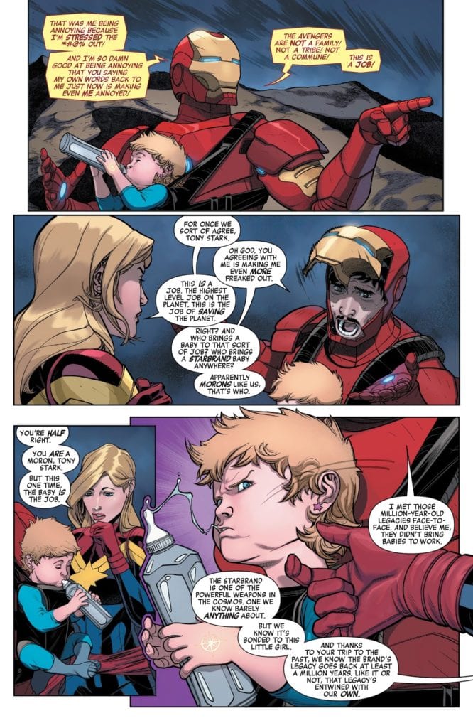
MFR: Later in Avengers #35, Captain Marvel and Iron Man are having a conversation, and Tony Stark lifts up his face shield during the conversation. Was that in the script? Also, do you draw Tony’s face first and then put the armor around him, or do you draw the armor first and then fit his face in?
Garrón:It was definitely specified in the script very clearly. Iron Man’s faceplate pops up, showing the surprise and worry on his face, as Carol agrees with him, looking stern and serious.
In terms of drawing the character, well, it was a bit of a struggle. I previously drew Iron Man for a video comic, a Marvel project for Disney XD (you can easily find it in Youtube). But that was like two or three years ago, and I didn’t remember how I approached it. Should the armor come first? Or Tony Stark? I experimented a bit with 3D models to help me achieve a higher level of detail and speed things up. But didn’t quite like the results. So, in the end, I opted for layouting the figure, the body volume, set the proportions, and then detail the armor on top of it. And I felt way more comfortable this way. At first, not being familiar with the armor design I had to draw, I still used some visual reference, but it’s way more comfortable to just go with your instinct (again here referenced) and do your thing, your way.
Image courtesy of Marvel Comics.
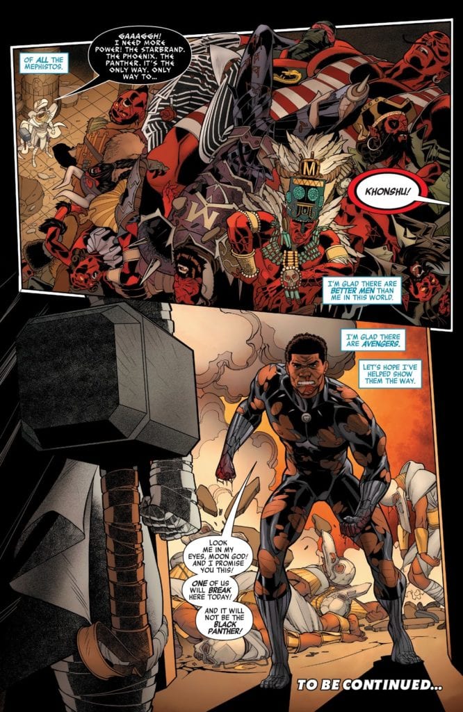
MFR: Javier, talk about the final page of Avengers #35. You have a giant pile of dead Mephistos and then a beaten down Black Panther is storming through the doorway. Why did you use the visual angle you did on this page?
Garrón:For the pile of Mephitos, I just thought the high-angle shot would make the reader understand the scene and appreciate better the details of the bodies. It also gives a better sense of scale when you use the architecture of the temple, its lines as visual guides for the eye with the tiny Khonshu at the bottom of it.
For Black Panther, I preferred to place the camera at a low angle, behind Khonshu, to reflect the surprise of the hero’s appearance from his perspective. Also, showing the hammer forefront you say that even though Black Panther showing up is an unexpected surprise, Khonshu is extremely well prepared and in full possession of massive power to confront it. This point of view also provides a nice shot of the destruction and knocked out priests Panther has left on his way to confront the Moon God.
We see Khonshu’s triumphs in the first panel, the highs, and then his threats and quite possibly defeat, his lows, in the second panel. All told through the position of the camera.
MFR: Javier, thank you for your time, and best of luck with Avengers!
Garrón:Thank you for inviting me to do the interview! It’s been so much fun! Hope I provided enough interesting insight into the making of process, and both you and the readers have a good time with it! And of course, hope you all are enjoying our Avengers run! I’m extraordinarily proud of it, and I think, as a fan myself, when I go through my first reading of the script, that it’s a ton of fun. Hope you have a blast too!
Released by Marvel Comics on September 23, X of Swords – Creation #1 kicks off the next big X-Men event that the X-titles have been setting up for months! Writers Jonathan Hickman and Tini Howard, artist Pepe Larraz, color artist Marte Gracia, and letter VC’s Clayton Cowles inaugurate the next era in the Dawn of X in this 67-page issue.
Writing
Hickman and Howard weave a high sci-fi/fantasy tale intrigue, conflict, and betrayal. Both writers had a lot on their plate in this issue, to surprise readers, make the stakes clear, and set up coherent ground rules for what is a massively sprawling tale seven prose section (more than half of which are diagrams).
Some of the story beats are predictable. Given what we know of Apocalypse’s own “survival of the fittest” philosophy when readers discover that the ones attacking Otherworld are his children, it is evident that his peaceful greeting to them will end will betrayal and violence.
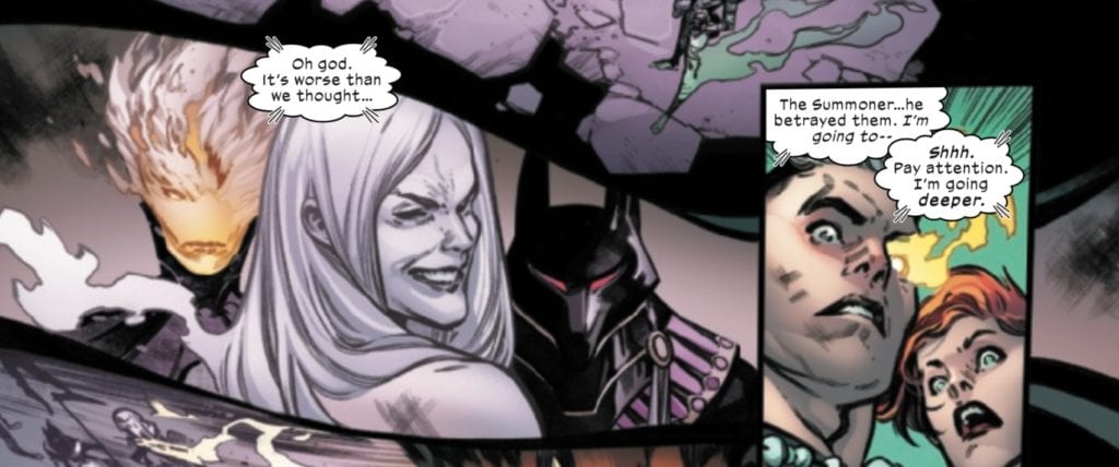
What is a bit surprising is that Apocalypse’s grandchild, the Summoner, is in on the betrayal, which Rachel Summers and Cable discover when they probe Banshee’s mind on Krakoa (and a page after the Summoner stabs Apocalypse in the back). We discover that just as Apocalypse sought to reclaim Arrako and join it to Krakoa, so his children want to reclaim Krakoa (which spells death and violence for its current inhabitants…all but the fittest of course).
Art & Colors
Larraz does a lot of good work on this issue. There’s a real cinematic quality to the pages where Apocalypse is approaching his children, and Cable and Rachel are probing Banshee’s mind. As the story moves back and forth between these settings, one can almost hear the dramatic music building in one’s mind, increasing the tension and letting readers/viewers know that something is about to go down.
Then, of course, comes the moment when the Summoner betrays Apocalypse, and the scene shifts back one final time to Cable and Rachel’s mind probe, where we see the devilish grin of betrayal on the Summoner’s face.
Larraz does an excellent job capturing the fiendish look on the Summoner’s face, which is nicely juxtaposed with the look of shock on Rachel and Cable’s faces.
Gracia’s colors in this sequence are great, and provide a nice contrast between the images from the Summers’ mind probe, with the grayish-purple, and the bright colors of the waking world. Overall, this is a book with a diverse color pallet, and Gracia does a great job giving each scene its individual hues, adding to the overall fantasy atmosphere of the story.
Letters
This event has a lot going on. It would be very easy for many of the pages to become swamped in word balloons. Thankfully, Cowles is able to avoid this pitfall. The word balloons in this issue are detailed, but not overwhelming nor clunky, and the prose sections, which sometimes suffer in the X-books because they can be superfluous or tell what should be shown, actually provide a nice supplement to the regular panels.
Conclusion
After months of waiting, X of Swords has arrived. This issue raises the stakes, puts all the players in motion, and promises to be the type of giant, comic book spectacle that X-fans and fans of Hickman’s previous work should love.
Are you excited for X of Swords? What did you think of X of Swords – Creation #1? Tell us in the comments below!
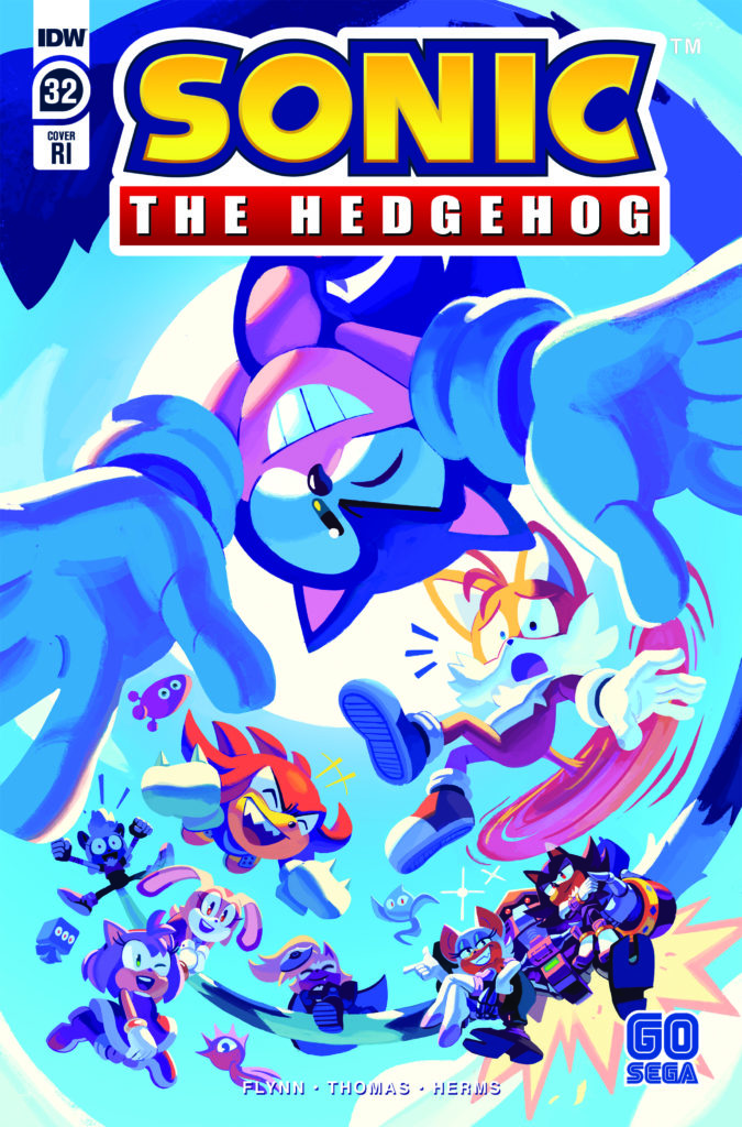
Sonic The Hedgehog #32 from IDW Publishing is out this week and marks the end of Ian Flynn’s run as writer for the series. Flynn had been onboard since the series was relaunched by IDW back in 2018 and has helped the comic reach a lot of positive acclaim with this new run. Joining Flynn is Adam Bryce Thomas (pencils and inks), Matt Herms (colors), and Shawn Lee (lettering).
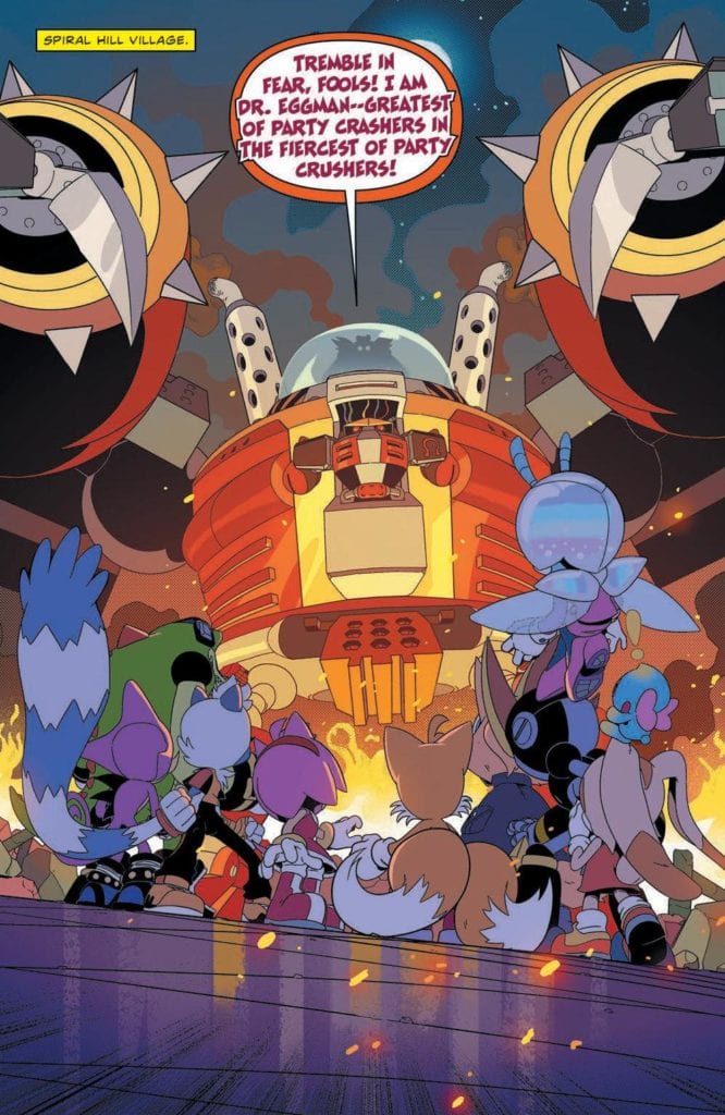
The second half of the Metal Virus Saga epilogue. With all the chaos of the recent past still fresh in everyone’s minds, Dr. Eggman launches a new assault—determined to take down his enemies once and for all.
Writing
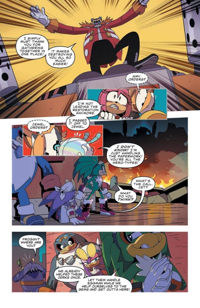
As Dr. Eggman decides to crash the victory party, it’s surprising how the entire cast seems to have difficulty repelling his attack. Tails, Rogue, Amy, and the Chaotix are all present and Dr. Eggman still seems to have the upper hand. It does serve as a great setup though to allow for Blaze to offer some assistance in a very special way.
Ian Flynn takes the time to make sure the characters are in a better place when everything is said and done. The overall story isn’t as incredible as the more over the top aspects which came during the Metal Virus storyline but its still an entertaining issue. The run since the series arrived at IDW comics has been on a high level of quality and the creative team should be proud of what they have created.
Artwork
The art by Adam Bryce Thomas focuses on making sure the battle against Dr. Eggman comes off as epic and intense. Two great full-page splashes are used in the issue. One showcases the colossal scale of Dr. Eggman’s weapon and the other has Tails and the gang working to thwarting his efforts.
The colorwork by Matt Herms makes the action scenes more extreme. The best example of the impact comes as Blaze uses the power of the Sol Emeralds. By tapping into their power, energy radiates around her and allows her to perform a miracle.
The lettering by Shawn Lee helps guide the flow of the narrative from panel to panel. This allows for the action to unfold much smoother. As always Lee knows how to make sure the sound effects add to the panel’s presentation instead of becoming distracting.
Conclusion
Thought Sonic the Hedgehog #32 may be the end of Ian Flynn’s run as writer of the series, it doesn’t mark the end of Flynn’s involvement with the franchise. A miniseries titled Sonic The Hedgehog: Bad Guys is coming soon and is written by Flynn. With Flynn’s departure, it will be interesting to see where writer Evan Stanley takes the series moving forward.
Spiral, not Chris Rock’s delayed SAW film, but Shudder’s latest addition, examines the horrors of being different in today’s society. The film follows very familiar beats, but still manages to get under your skin. A film that explores what it’s like to be gay in America, and how acceptance from everyone is impossible.
While hate crimes and riots continue in America, Spiral arrives at the perfect time. In fact, glimpses of an old hate crime are showcased multiple times throughout the film. This is done in order to highlight that a lot of people will not change, they will just get better at hiding their hatred. Of course, it is also a plot device used for one of our main characters. Directed by Kurtis David Harder, and written by John Poliquin and Colin Minihan. Spiral follows a same-sex couple, who move to a small town in order to raise their 16-year-old daughter with better social values. Sadly, this town isn’t as accepting as it appears and the neighbors are far from inclusive.
Jeffrey Bowyer-Chapman as Malik in Spiral
The film stars Jeffrey Bowyer-Chapman, Ari Cohen, Jennifer Laporte, and Lochlyn Munro. Spiral starts off very promising, but when the twists are exposed, you might be a bit confused. Exploring cults is always fun with the horror genre, but it takes a more sinister turn here. Malik (Chapman) and Aaron (Cohen) are our two male leads, who move to this new town and are just looking for a fresh start. Malik is the one to look out for, as he was involved with the hate crime that the film will revisit. Overall, the writing from Poliquin and Minihan is fine, but there’s not enough done with Aaron’s character.
Aaron is white, and homosexual, so he doesn’t really suspect much from his new neighbors. However, Malik is not only homosexual but black as well. He instantly begins to feel like the odd one out, while Aaron doesn’t suspect a thing. If Aaron’s past had been explored like Malik’s, it would have made the film that much better. Once the town’s secrets are revealed, the narrative raises a couple of questions. In fact, a lot is left up in the air. Spiral misses a few marks due to a mixed bag reveal but thrives in addressing social horrors.
Malik and Aaron in Spiral
Chapman and Cohen are terrific in their roles, but Chapman steals the show as Malik. At first, Malik is thrilled to get settled in, but then one strange occurrence after the other changes the entire mood. The way Chapman captures Malik’s emotions are amazing and it helps the viewer connect with the character. Again, Cohen is great as Aaron, but his character isn’t developed much. Viewers will instantly connect with Malik and while clearly done on purpose, knowing the background of Aaron too would have been a nice touch.
Harder takes you on a very uncomfortable journey that many will compare to Jordan Peele’s Get Out. There’s tension, dread, and it just progresses as Malik and Aaron realize their error in moving to this new town. It really is unfortunate that the reveals weren’t more fleshed out. Once Malik finds out what’s going on, all of the unease that has been built up flat lines a bit. Still, Spiral is an effective social horror film overall, and it features solid performances from everyone. Also, Avery Kentis’ score during this film is magnificent and will keep you on the edge. Honestly, it is the only thing that helps maintain the tension once the reveals start happening.
Ari Cohen as Aaron in Spiral
Spiral wants to be like Get Out but stumbles slightly with its underwhelming finale. Despite all of its writing mishaps, this is a worthy addition to the list of social horrors. It is refreshing to see LGBTQ representation in this genre, and Harder will have you feeling uncomfortable from start to finish. Spiral effectively helps remind society that some people really only get better at hiding the hatred within them.