Javier Garrón is a Marvel Comics artist from Barcelona, Spain, and he was part of Marvel Comics’ YOUNG GUNS for 2018-19. Garrón has worked on Ant-Man and the Wasp, Miles Morales: Spider-Man, and now the Avengers. Monkeys Fighting Robots was able to talk with him about Avengers #35 from an artist’s perspective.
(Avengers #35 was written by Jason Aaron, with art by Javier Garrón, Jason Keith is the color artist, and you will read Cory Petit’s letter work.)
MFR: Can you talk about your relationship with Jason Aaron? Are his scripts tight, or does he give you room to flex your artistic muscle?
Garrón: He’s the most awesome team member you could have by your side. He’s extremely supportive and encouraging of collaboration. We recently had to design quite a big batch of characters, and that was a truly fun and productive team effort. You know, I was already a massive, huge fan of his work prior to landing on the Avengers title. When I was offered the project, I was ecstatic. He’s as big a star in comics as you could get. But when it comes to day to day work, he’s just Jason, and he’s here to build something together. His texts are detailed but not ironclad with lots of suggestive, evocative parts that are solely crafted to help push the artist’s imagination further.
MFR: How much fun is it drawing the Ghost Rider on a wooly mammoth?!
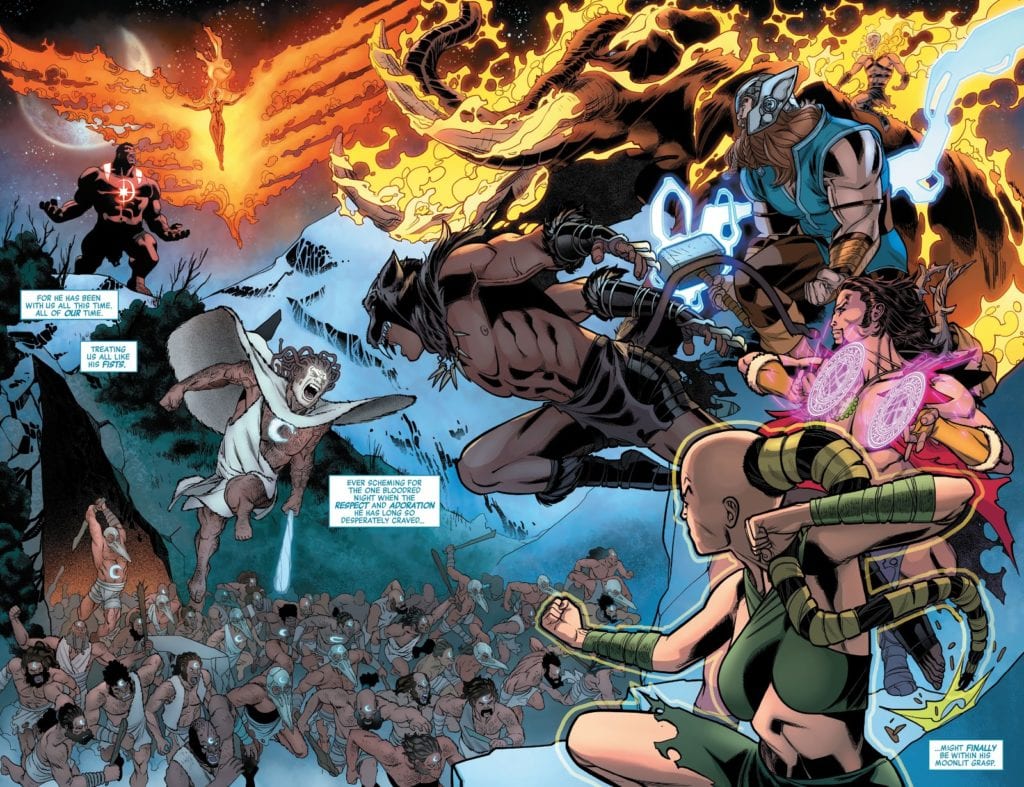
Garrón: Oh, wow, that was bonkers! I’ve never drawn the character before (maybe in a couple of con sketches but never on an official page, I believe), and it’s so much fun. We take a couple of concept swings with the character during the Khonshu arc, and each one is crazier and more fun to approach visually. The fire really gives you a lot of room for kinetic effects, bringing so much more energy to the panels.
I won’t lie; I was scared for the mammoth part. I’ve never drawn one! Not even an elephant! Yes, it’s a challenge, and that’s how you grow as an artist, that’s true. But on the other hand, it’s more pressure. I was reading the Aaron run on the series since the beginning, so I know how true titans as McGuinness or Pichelli draw it. I’m aware of how high the bar is set, and these are the moments when you realize it when you face something you’ve never set yourself against. I was also trying a new approach on these pages.
Covid19 had already hit hard here in Spain where I live, and we were in quarantine when I was drawing this issue. I do most of my page work in traditional media (with a variable amount of digital and post-work depending on the page), but since I keep hearing every artist say digital is better and makes you go faster, I decided this was the moment to try it. I didn’t know how long the quarantine could take, and I could probably run out of paper, so the moment was never going to be better. I was not only facing new challenges in terms of characters but also going through the learning curve of trying to fully draw pages digitally. I was nervous about being the weakest link in the series’ quite stellar line of artists.
MFR: Avengers #35 has several floating elements, from Mjölnir to Khonshu’s head. How do you work with colorist Jason Keith to give these elements movement?
Garrón: The work rhythm in a monthly title is very intense, and deadlines are always looming, so there’s not much time to prepare things in advance, and most of the talk is usually done on the go. At least that’s my experience so far. I respect the process of the colorists tremendously and don’t like to meddle. I trust the gut instinct of every artist I work with the same way I like to be trusted. You usually should follow your artistic instincts. If I have any specific thought or suggestion about any particular subject, I leave notes inside the file I send to editorial. We’ve aimed for bright and dazzling coloring of energy, blurs, and kinetic lines for objects in movement and depth of field through line hierarchy (width of line in the inking process: things closest to the camera have thicker lines and it becomes thinner as we move away) and lighting/effects (shadows, smoke, graded or colored lines…).
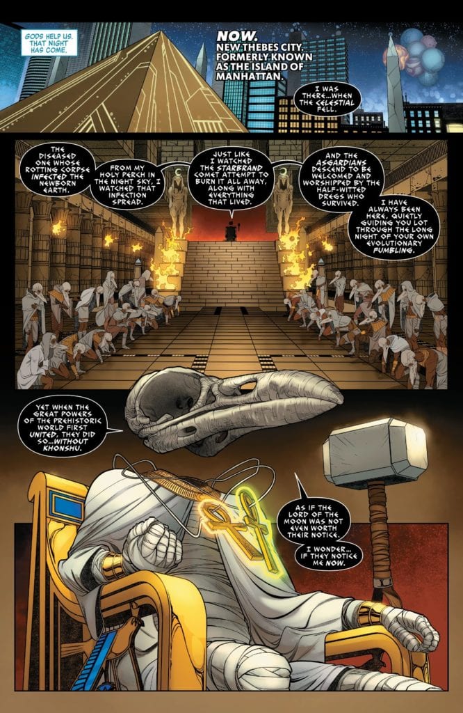
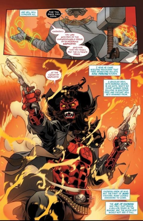
MFR: On page 5 or Avengers #35, the oval panel has an optical illusion element as Mjölnir lifts off the page. Can you explain your panel layout for page 5?
Garrón: One of the things I try to keep in mind when planning a page is making them different from the previous one in terms of panel composition. Unless, of course, it’s something I’m specifically looking for as a narrative device. Otherwise, and making more specifically a superhero comic, I want the comic to be as dynamic as possible, and that means not only not repeating a page layout but also, when the scripted moment calls for it, making itself the money shot.
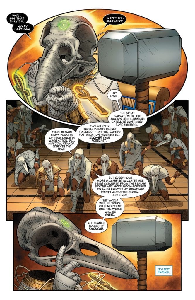
In the previous page, we revealed (SPOILER) that Khonshu, the Moon God, is in possession of the Mjolnir. We also see his high priests gathered around the throne. And in that page, we establish Khonshu’s power and dominance over the situation with a symmetry axis. He is at the left of it, the hammer in his right (or her right? Not sure if Khonshu is gender-neutral, I should ask Jason!), and his army deploys symmetrically at his feet. We repeat this rigid, strict structure in page 5, but we add an extra reveal: you may not have paid much attention to the two glowing ankhs hanging from his neck, but that means he has their power. And on page 5, panel 1, we see the Eye of Agamotto on Khnoshu’s forehead. So the page is almost symmetrical to continue the visual narrative established in the prior page, but to highlight the reveal (and also make the page more visually attractive and distinctive), I shaped the first panel almost like the Eye of Agamotto itself.
MFR: Avengers #35 features a western gunslinging Mephisto; what was the process like bringing this character to life?
Garrón: That was so much fun! It’s what I love from Aaron’s Avengers run, the crazy amalgam and remix of Marvel’s mythos, characters, and genres bringing such a fresh take to the series. While also keeping the scope of the main story epic and in the widest possible frame.
Some elements were already pointed out in the script. He was described as a Wild West version of Mephisto, with a beard, a black cowboy hat, and a pentagram on his chest instead of a lawman’s star. Oh, and also firing black magic revolvers.
What I usually do when approaching a character design is taking a deep dive and researching it. But being on a deadline, you have to ration your time and efforts. I knew from reading the script he wouldn’t be appearing much. In page 7 and maybe a glimpse of him on the final page of the issue. So it wouldn’t be wise to spend much time here when you need to keep the pages being done, and there are far more relevant things to design, story-wise. So I did some online research on cowboy costume design, fantasy westerns, and Mephisto representation throughout the years. I put it all in the mixer inside my head and pressed the “on” button. I wanted him to have several layers in his upper body, so he has a shirt and jacket, but open so we could see the inverted star in his chest. And also give a sense of looseness and chaos. The wild beard, the buckle with his initial (as an ego move) and little spikes here and there (the belt, the guns) making him more dangerous-looking.
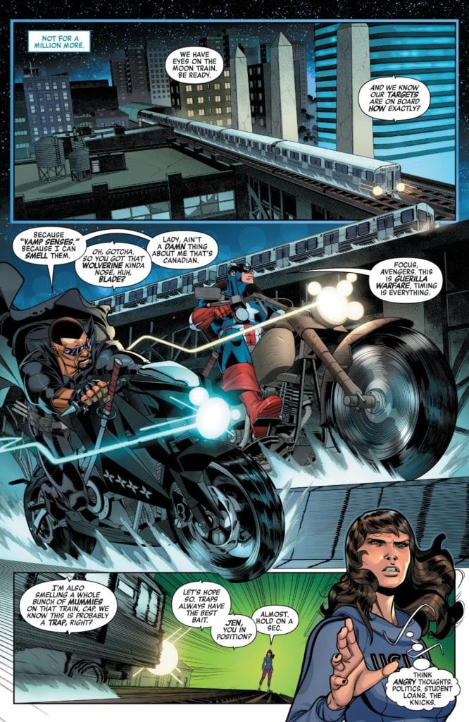
MFR: In Avengers #35, Captain America and Blade are fighting side by side. They are similar in build and size; artistically, how do you give them personality to differentiate the two?
Garrón: It’s a matter of body language for me. Captain is more analytic and avoids confrontation as much as possible. Blade is more temperamental and jumps into a fight more easily. We don’t see them much in this issue, and most of the time is battling mummies, so I had to establish this visually from the get-go. Page 8, panel 2, we see them riding their motorcycles, and the script just gave me the key. The differences between their bikes tell a lot about them. Blade’s bike is slick and black, a sleek street bike, with swords sheathed on it and shurikens fitted on the side. Cap’s bike is older, bigger, a bit clunkier. Like an old WWII Army bike. So we would have Blade leaning forward in his bike and Cap more seated straight. And that body position echoes through the battle sequences: Blade jumps head first, almost like a bull charging the enemy, with his swords ready to cut through the enemy without a second thought: and Cap uses his shield, uses his legs to kick his enemies out of his way, and generally approaches the combat more strategically. Blade showing his vampire fangs, raging in the battle, Cap serious and frowned. It’s all in the body language.
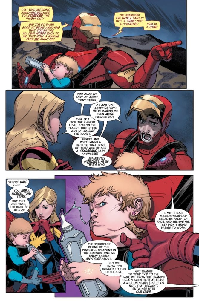
MFR: Later in Avengers #35, Captain Marvel and Iron Man are having a conversation, and Tony Stark lifts up his face shield during the conversation. Was that in the script? Also, do you draw Tony’s face first and then put the armor around him, or do you draw the armor first and then fit his face in?
Garrón: It was definitely specified in the script very clearly. Iron Man’s faceplate pops up, showing the surprise and worry on his face, as Carol agrees with him, looking stern and serious.
In terms of drawing the character, well, it was a bit of a struggle. I previously drew Iron Man for a video comic, a Marvel project for Disney XD (you can easily find it in Youtube). But that was like two or three years ago, and I didn’t remember how I approached it. Should the armor come first? Or Tony Stark? I experimented a bit with 3D models to help me achieve a higher level of detail and speed things up. But didn’t quite like the results. So, in the end, I opted for layouting the figure, the body volume, set the proportions, and then detail the armor on top of it. And I felt way more comfortable this way. At first, not being familiar with the armor design I had to draw, I still used some visual reference, but it’s way more comfortable to just go with your instinct (again here referenced) and do your thing, your way.
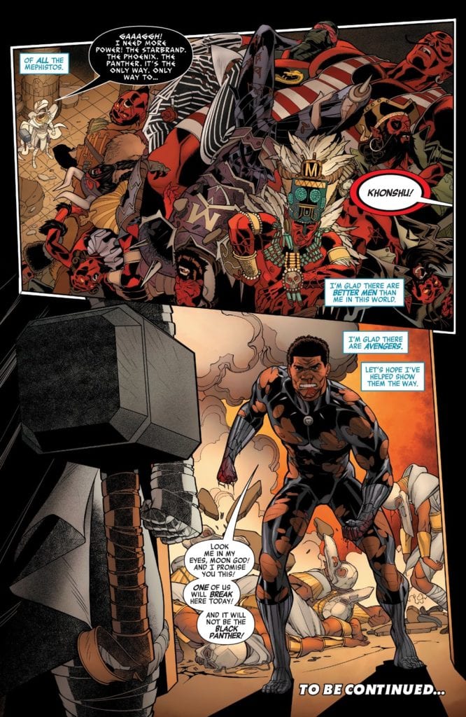
MFR: Javier, talk about the final page of Avengers #35. You have a giant pile of dead Mephistos and then a beaten down Black Panther is storming through the doorway. Why did you use the visual angle you did on this page?
Garrón: For the pile of Mephitos, I just thought the high-angle shot would make the reader understand the scene and appreciate better the details of the bodies. It also gives a better sense of scale when you use the architecture of the temple, its lines as visual guides for the eye with the tiny Khonshu at the bottom of it.
For Black Panther, I preferred to place the camera at a low angle, behind Khonshu, to reflect the surprise of the hero’s appearance from his perspective. Also, showing the hammer forefront you say that even though Black Panther showing up is an unexpected surprise, Khonshu is extremely well prepared and in full possession of massive power to confront it. This point of view also provides a nice shot of the destruction and knocked out priests Panther has left on his way to confront the Moon God.
We see Khonshu’s triumphs in the first panel, the highs, and then his threats and quite possibly defeat, his lows, in the second panel. All told through the position of the camera.
MFR: Javier, thank you for your time, and best of luck with Avengers!
Garrón: Thank you for inviting me to do the interview! It’s been so much fun! Hope I provided enough interesting insight into the making of process, and both you and the readers have a good time with it! And of course, hope you all are enjoying our Avengers run! I’m extraordinarily proud of it, and I think, as a fan myself, when I go through my first reading of the script, that it’s a ton of fun. Hope you have a blast too!