Home Blog Page 244

Review: THE TRUE LIVES OF THE FABULOUS KILLJOYS: NATIONAL ANTHEM #1 Turns On, Tunes In, and Makes Noise

Killjoys…make some noise.

Writer Gerard Way (Umbrella Academy, Doom Patrol, and a singer of a semi-popular little musical act known as My Chemical Romance) joins with co-writer Shaun Simon and artist Leonardo Romero to return to tell the tale of what started the Killjoy’s ride against capitalist censorship and rad times in “The True Lives of the Fabulous Killjoys: National Anthem” #1. Along with colorist Jordie Bellaire and letterer Nate Piekos, this first of six issues attacks its readers with sensory overload and creative narration, aided by outstanding artwork and an impossible to dislike aesthetic. Equal parts The Invisibles and They Live!, “National Anthem” is sure to be a hit with fans of Way’s work and batshit crazy comics fan alike.

“After the Analog Wars, the Killjoys lost their way — and their memories. A rat chews through Mike Milligram’s TV cord, and reality unravels. But when his Ramones records disappear, Mike remembers what the Fabulous Killjoys and some toy rayguns can do. Gerard Way and Shaun Simon take it all back to their original concept, rebooting the Killjoys in present-day America, where it’s impossible to tell what’s real and what Mom and Dad just tell you to keep you calm.”
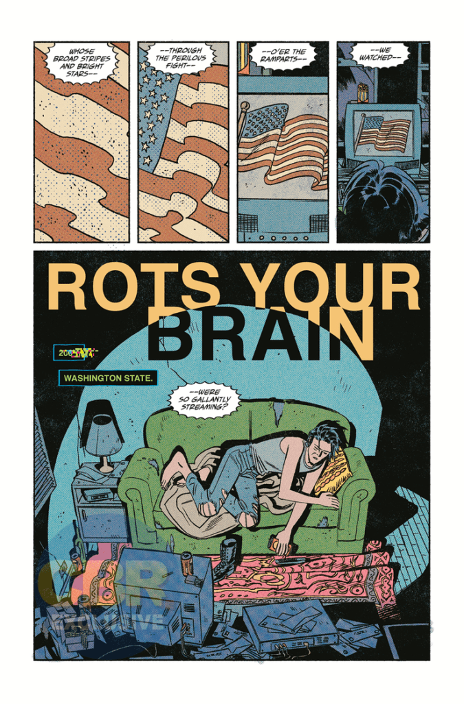
Writing & Plot

This series’s standing as both a prequel and a soft reboot of the original Killjoys story honestly strengthens “National Anthem” in terms of its readability and its ability to stand alone as a comic. Gerard Way and Shaun Simon blast the reader with esoteric information at a lightning pace as it is, so not being relied upon to have read the previous series for better understanding helps out by itself. This being said, having read the previous series, as well as Way’s other works and knowing the aesthetic and style of My Chemical Romance’s Danger Days album, which this comic is based on, will help prepare you for its unapologetic weirdness. Make no mistake, this is a “weird” comic. Way has worn his love of Grant Morrison’s work on his sleeve both in-person (Morrison actually portrayed the villain in a couple MCR music videos for Danger Days) and in his own writing. In many ways, this feels like a love letter to the Mad Scotsman’s own style. The way that Way and Simon use both outlandish and unnaturalistic dialogue, as well as almost frantic chaos-poeticism will be welcome to readers who anticipate and/or enjoy this style, but could be alienating to those who won’t see it coming.

While I understand Way’s love for Morrison’s style and writing approach (he’s one of my favorites as well), there’s a point where tribute becomes emulation. “National Anthem” comes very close to hitting that point. When I said earlier that this comic is a mixture of The Invisibles and John Carpenter’s They Live, I meant that literally. This issue really does read like an Americanized retelling of Morrison’s Vertigo counterculture epic mixed with the anti-commercialization messages of Carpenter’s film quite clearly in blatant black and white. For anyone who is somehow unfamiliar with these works and still reads comics, then this won’t be an issue. However, as much as I enjoy this book, it’s so blatantly obvious that it has to be called out. Even with this gripe though, it’s hard not to be impressed with the sheer talent and panache that Way and Simon pull off this comic’s written execution. Not only does it move at a lightning pace without ever losing the audience, but it accomplishes an insane amount of storytelling for a 48-page issue. Yes, that is a double-sized comic, but the pacing and plot traveled in that span is seriously impressive. Way and Simon do such a stellar job at familiarizing the reader with this insane world and its cast while also nailing down this esoteric writing style that it’s hard not to be impressed by this comic’s sheer bombastic-ness.
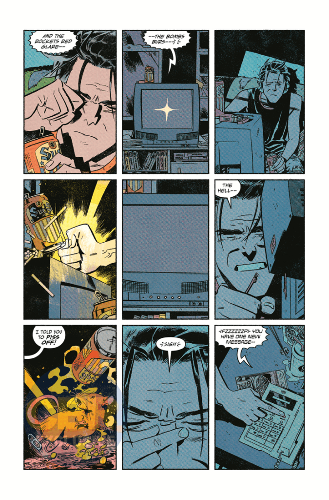
Art Direction

The pencils of Leonardo Romero in “Killjoys: National Anthem” #1 are just as eloquently everywhere-at-once as the script, offering a multitude of styles while maintaining a detailed professionalism that’s difficult to replicate. There’s a mixture of pop-art, Ditko-vividness, Richard Case weirdness, and modern stylings that make this comic just such a damn treat to look at. Romero actually has a semi-similar artistic style to original Killjoys artist Beck Cloonan, but with thinner lines and sharper detail. Bringing Way and Simon’s vision of desolate wastes, 50′ Americana, and inter-dimensional monstrosities to life has got to be an insanely daunting task, but Romero eats it alive here. His visual direction is a huge part of what makes this comic such a fast-pace shot of lighting to read, as each page shows off major segments of story but manages to take its time to allow the weight of every moment to hit. All the while, it feels like that tunnel in Willy Wonka. The other massive component to this book’s success is Jordie Bellaire’s coloring. The neon and vaporwave crossed over with the vivd retro aesthetics of Steve Ditko, all covered with a newsprint varnish makes this comic’s desired aesthetic. Each page spits Bellaire’s vibrant work and pulls you deep into this comic’s world and concept. The lettering from Nate Piekos is distinct, borrowing font styles from silver age comics but with the bolds and effects of modern comics. This is a visually outstanding book, with an aesthetic that pays tribute to a classic era while also being wildly original.

‘The True Lives of the Fabulous Killjoys: National Anthem” #1 is a shot of psychedelic adrenaline from the land of inter-dimensional rock and roll. It’s an obvious connection to the works of Grant Morrison and other counter-culture material makes little impact on how much fun this first issue is. Gerard Way and Shaun Simon’s script is written with a pace shot out of a cannon and laced with slick prose. The visual work from Leonardo Romero and Jordie Bellaire is astoundingly rad, with waves of light and color that you can almost hear. If you’re a fan of the original Killjoys series (MCR album included), or just like weird and insanely cool comics, be sure to grab this issue when it hits shelves at your local comic shop on 10/14!

Monkeys Fighting Robots Youtube

Review: ASCENDER #13 — An Escalation Throughout The Cosmos

ASCENDER #13, available in comic book stores on Wednesday, September 30th, escalates the conflict between Mother and the resistance tenfold. While our hero Mila is in the midst of a space flight from Sampson, Mother’s forces continue to grow, extending their reach further into the cosmos. Will Mila and the team avoid them forever, or will their pursuers catch up after acquiring more allies?

Story

The story follows Mila, Telsa, Hilda, and the rest of their crew en route to a new location: Phages. Hilda describes this place as a “ghost planet,” warning Telsa against bringing them there. The pilot notes how Mother is even afraid of the planet. But this only encourages her partner even more; the hardened fighter has finally found a place to rest (or so she believes).

Throughout much of this narrative, the writing gives readers an insight into the young protagonist’s thoughts regarding the adventure so far. We feel her rollercoaster of feelings as the memories of their recent flight from Sampson and Mother’s forces. And she notes how much she misses Andy and her old life.

But while all of this is taking place, readers are brought to Mother herself, who’s decided to release a universal order to bring in any USG rebels hiding throughout the universe, which of course includes Mila and the crew.

Writer Jeff Lemire is a master of story escalation. Being able to balance scenes of calm and reflection with those full of excitement and danger makes his writing so engaging.

Artwork

Dustin Nguyen’s artwork and Steve Wands’s lettering were the perfect pairing for this narrative. Their depictions of Mila’s frustrations in learning magic, as well as her longing for her father, helps readers treat her as if she were a real person. And Mila’s dialogue, depicted as torn pages from her journal, draws readers into the narrative even more.

Conclusion

ASCENDER #13 is equal parts introspective and adrenaline-fueled. And this is why we love Lemire’s storytelling.

What do you think lies in store on the planet of Phages? Let us know in the comments below!

Monkeys Fighting Robots Youtube

INTERVIEW: Up On The Glass Star Chase Fein Torments Old Friends

Old friends reunite and dormant desires return in Up On The Glass, a thriller from director Kevin Del Principe (Fashion of the Wolf), co-writer Nikki Brown (Those Little Monsters), and starring Chase Fein (On The Rocks).

Up On The Glass introduces viewers to Liz and Hunter Shelton, a married couple living a good life. The pair reunite with old college friends, including Jack (Chase Fein) who’s life is on the rocks. As the night among friends becomes more intimate, jealousy and desire motivate a descent into murder and mayhem. For a tension-filled 90-minutes, viewers get an engrossing thriller.

PopAxiom and Chase talked about becoming an actor and turning into Jack for Up On The Glass.

Theatre & Film

Acting is something that seems built into Chase’s being. “I was always kind of an entertainer since I was a kid, cracking jokes for everybody and doing magic. In high school, I did some plays.”

Chase picked up speed on the road to stage and screen come college. “It wasn’t until I went to New York University and Stella Adler Studio of Acting that I fell in love with acting. The Stella Adler Studio set me on the path and changed my life.”

Before TV and film, there was only the theatre. “Stella Adler was a four-year conservatory. All we did was theater. I went to RADA (Royal Academy of Dramatic Arts). There it’s all theatre classics,” Chase adds, “I’m a classics nerd, so I did my Master’s in European Classical Acting.”

Now 39 credits into his career as an actor on film and television, Chase shares some perspective on acting for stage and screen. “It’s like painting and sculpting. They’re different mediums, and both have exciting elements.”

“What’s often missed with theatre and film,” Chase says, “is that they complement each other. I got the theatre heart and soul, the use of my full body, my full voice, and full emotions.”

For film and television, Chase continues, “it can sometimes be jarring for a theatre actor. We’re imitating real life. The camera’s a foot away from you and can read your brain. Ease and relaxation pairs with the intimacy of film.”

chase fein-actor-up on the glass

About Up On The Glass

Chase’s connection to Up On The Glass came via a close bond. “I got involved with it through my friend Rachel Imbriglio, a casting director. We originally met when I played some fun parts on a kid’s show, Mutt and Stuff. We hit it off and have been friends ever since.”

As Chase explains, Rachel “saw a film of mine called On The Rocks (2017), and that character had a certain essence that vibed with Jack for this project.”

“We went to grab a drink,” Chase says, “and I met Kevin and Nikki.” Soon after, Chase “read the script and thought it was super-cool.”

The work to make Jack began.” Kevin gave me a lot of great backstory and ideas about Jack’s type of person and the overall movie. That gave me a lot of texture and flavor into Jack.”

“Although I had a connection from the beginning,” Chase shares a bit of the process for making Jack come alive, “he was elusive throughout the process of finding him. I would work with different friends of mine and tried different styles. It was an amalgamation of all these things that was absolutely enjoyable. But it was tricky, tough, and confusing.”

Chase says the process, though challenging, “was a blessing,” he adds, “Sometimes as actors, you want a perfect experience of everything lining up. We find the character, we play it perfectly, and everything is there. But, to be honest, we’re not playing perfect people. The people we play don’t have everything figured out.”

“I think, in the end,” Chase says, “it helps because there’s a turbulent confusion, a sense of loss, and that helped me get to the heart and find this guy.”

For actors, all preparation leads to the stage and gets under the lights. “Things come alive when you’re on your feet.”

Making Up On The Glass

Film productions are hectic hurricanes of different players moving in many directions. Up On The Glass was no different a storm. “We had to fit so many pages in a day that I think I went crazy. We’re on page 36, and you’re with the guys. Now, we have a 10-minute turnaround. He’s dead, and you’re dragging him. So, ten minutes of crying and then, jump back to page 50, and you’re dancing and having a good time.”

“It sounds crazy,” Chase says about a day in the life on set, “but it’s a lot of fun.”

What’s Chase’s quick pitch for Up On The Glass? “Grounded mid-Western retelling or re-imagining of the Talented Mr. Ripley and that kind of world.”

Chase explains Up On The Glass a bit more. “You watch a movie like the Talented Mr. Ripley, and it’s perfect. The talent is incredible. Everything is so clean, and he’s great at imitating. He watches something once, and he’s imitating,” however, Up On The Glass looks at similar ideas differently,” but Jack is the not-perfect Matt Damon. He doesn’t have the tools and watches desperately to see how he fits in.”

up on the glass-interview-thriller

Wrapping Up

Chase’s influences are many. “I love Jack Nicholson, Daniel Day-Lewis, Christian Bale, Michael Fassbender, and Kate Blanchett. Non-actors like Paul Thomas Anderson or the MMA fighter Anderson Silva.”

Chase explains more about the types of people he admires. “I’m drawn to artists who have a fully-immersed obsession with their work. They love it so much that they can be in it for 18 hours a day.”

“I love Alan Watts,” Chase says when asked about a dream project, “I would love to play a biopic about Watts.” The question gets a little more specific, honing in on a dream remake or reboot: “I’m a huge sucker for emotionally driven science fiction, so one of my favorite movies is Solaris.”

Up On The Glass is available on VOD and various streaming services like Amazon and YouTube. So, what’s next? “Right now in quarantine,” Chase says, “I’m working with a couple of people to get a few features prepped. I’m learning Russian for two hours a day and practicing drumming too.”

Is Up On The Glass on your watch list?

Thanks to Chase Fein and October Coast
for making this interview possible.

Want to read more interviews? CLICK HERE.

Monkeys Fighting Robots Youtube

SHANG-CHI #1: The Opposing Parallel Sides Of Family Life

Shang-Chi #1 Cover

Shang-Chi #1 is this week’s beginning of a new series from Marvel Comics. Under fan-favorite writer, Gene Luen Yang, numerous artists like Dike Ruan, Philip Tan, and Sebastian Cheng provide several sides of the conflict. All while letterer Travis Lanham ties everything together.

Background

Shang-Chi is a character whose creation comes from a reaction to the 1970s kung-fu movie craze. Originally planned to be an adaptation of 1972’s Kung Fu TV show, Marvel instead adapts elements from the pulp villain Fu Manchu. Under Steve Englehart and Thanos creator Jim Starlin, Shang-Chi combines those previous elements with the late Bruce Lee to capture the kung-fu trend. Shang-Chi would face his father, the Fu Manchu stand-in Zheng Zu in rejection of becoming an assassin. With a movie featuring the character scheduled to appear in February 2021, now is probably a good time to acquaint with the character. But after some guest appearances, people should know Shang-Chi as a character more than the legend.

Shang-Chi #1 The Burden of Family Legacy

Shang-Chi #1 pulls the reader into the life of the title character. People who are unfamiliar with Shang-Chi probably only see surface-level details like his impressive martial arts skills. It’s something that indeed defines his life, even at his attempts to live an everyday life. At the same time, this background is also what isolates him. He is so used to people trying to kill him that just a handshake from a pretty woman with no ill intent surprises him. But nothing seems to keep Shang-Chi away from his family past. Both when his boss brings it up and when his father’s cult is out for him again. It’s hard not to feel bad for the guy after all of this.

This time, things are just a little bit different. A new head of this cult, Sister Hammer, is out for blood to claim total control of this “Five Weapons Society.” But the only way she can do that is by eliminating Shang-Chi. By the end of Shang-Chi #1, however, Shang-Chi does get a personal stake in this story through his relationship with Sister Hammer. One that could be hopeful or outright devastating. Anything specific would spoil the tale.

How Art Creates The Legend

Shang-Chi #1 Philip Tan art
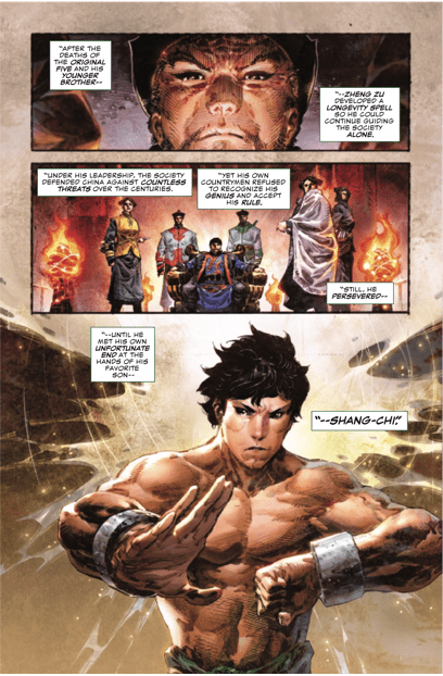
Shang-Chi #1 features several artists to illustrate the different aspects surrounding the title character. Philip Tan creates a very detailed that make what he draws look larger than life. The moments frozen in time look like portraits with Sebastian Cheng’s colors displaying the characters in all of their glory. Something the captions from Travis Lanham enhances through slowing down the reader’s gaze so that the reader witnesses them.

Shange-Chi Action from Ruan
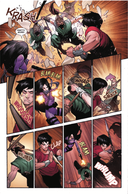
Compare this to Dike Ruan’s more relaxed art style. By separating Shang-Chi from his legend, readers find a normal man. Not that it takes away his ability to handle himself in a chaotic fight. The movements through some dynamic panels showcase not just the speed at which Shang-Chi moves but how he can cover multiple enemies more than a few bullets could.

See The Legend of Shang-Chi #1

Shang-Chi #1 is off to a great start by introducing readers to a character with legendary influences. But also by trying to show that despite this origin, Shang-Chi is still just trying to live his life to the best of his ability. What can we expect when the Five Weapons Society goes at him with full force? We’ll have to wait and see.

Monkeys Fighting Robots Youtube

Review: The Calm Before The Storm In THAT TEXAS BLOOD #4

That Texas Blood #4, Phillips cover

THAT TEXAS BLOOD #4, available from Image Comics on September 30th, continues the slow, simmering build toward uncovering the cause of Travis’ death and what that means for Randy. Light on action and forward progress of the main plot, this issue swells with anticipation.

Cover Art

Chris Condon loads the back pages of this series with little insights into what inspired the comic, so we know Jacob Phillips’ cover inspiration was a The Simpsons episode titled “Mother Simpson.” Having some recollection of that episode, it nails the emotional imagery nicely. It’s a quiet moment during dusk where Randy’s girlfriend is driving to (surprise) meet him, and it feels hopeful and dreadful at the same time. Phillips pulled off some tremendous emotional punch.

Writing

Condon’s story doesn’t have a lot of forward progress in the series, but what it does do is build, build, build on the tension. Randy struggles to come to terms with his brother’s death, and you can feel the conflict within him as he can’t quite figure out what to do next. The Sherriff’s questioning of the local barkeep, and his subsequent talk with his wife, echoes Randy’s stress and confusion about the next steps in expectation in whatever is about to happen.

The new subplot is the imminent arrival of Randy’s girlfriend, and her journey feels ominous in the way you feel anxious watching a mouse about to walk into a lion’s den. She’s going after Randy out of love and concern, but there’s little doubt she’s not prepared for what’s about to happen.

And what is about to happen? I’m not sure, but Condon has done a masterful job lighting a very long fuse on a powder keg about to blow.

Pencils/Inks

Phillips’ art is less detailed in this issue than previously. Where the previous issues had more defined linework, this issue missed some of that detail that made the characters feel like stylized extrusions of real people and closer to vague character placeholders. It’s all there – the town, the backdrops, the atmosphere, but some of the sharpness, especially in the faces, lowered the impact of the characters’ emotions. That lack of detail was a bit of a miss when the issue is so focused on exposition and inner turmoil.

Coloring

Linework aside, Phillips’ coloring work in this issue is top-notch. The entire issue jumps from one scene to the next, filtered through harsh lenses. The bar scene where something(?) is about to happen to Randy is saturated with red. The dusk scene with Randy’s girlfriend driving down the highway is bathed in bluish-purple to hint at the sadness she doesn’t know is about to hit her. Phillips executed an excellent demonstration of mood through color.

Lettering

Phillips’ lettering work adds to the tension of the story by using a small font in over-sized word balloons to make the dialog feel heavier. It’s an excellent technique for public speaking that works equally well in comic form. Talk softly, so the audience has to lean in and pay closer attention. By keeping the dialog lettering compressed inside larger bubbles, the reader has to lean in and focus more intently on what’s being said. The dialog feels weightier and more important. This technique is executed so well; it almost takes away from the art in a few panels. This is excellent lettering work by Phillips.

Conclusion

THAT TEXAS BLOOD #4, available from Image Comics on September 30th, turns the heat up a few ticks to a fast simmer before the entire town boils over. Short on action and plot movement but very long on tension and anticipation, I sincerely hope the climatic impact pays it off. I eagerly recommend this issue and can’t wait to see what happens next.

Monkeys Fighting Robots Youtube

A New Enemy Rises In FIREFLY: BLUE SUN RISING #0

FIREFLY: BLUE SUN RISING #0, available this Wednesday from Boom! Studios, brings with it a cross-over event for the world of Firefly. This issue is the first of two, and only one of several events worth keeping an eye out for.

***SPOILER WARNING***

spoilers ahead

It’s hard to believe that the beloved show, Firefly, has grown its presence in the comic book world enough to warrant a crossover event, and yet that is exactly what is happening here. At least two issues are going to be revolving around the Blue Suns – the latest big bad to enter the universe (and cause Mal no end of problems, naturally).

Seeing a bit more of this new big and terrifying corporation will prove to be interesting, of course. They’re the replacement for the Alliance, and have proven to bring with them their own series of complications.

That isn’t the only exciting bit of news to be looking forward to this fall. The Blue Sun Rising arc’s release has been carefully timed. For what? To increase the excitement for Firefly’s latest graphic novel, Firefly: Watch How I Soar. Set to release sometime in November, fans can probably guess who this novel is going to follow (hint: it’s Wash).

The Writing

Firefly: Blue Sun Rising #0 isn’t the first deviation from the main plot for Firefly. It isn’t even the first time it’s happened in this latest run. As it turns out, Malcolm Reynolds has been pretty busy as of late, and that’s creating a whole lot more material to write about.

As with the main series, this issue was written by Greg Pak. He’s really taken the world of Firefly and turned it into something of his own making. A fact that couldn’t possibly be clearer in this issue.

It’s interesting to see how much the team has changed over time, but what’s more interesting in this case is watching how the enemies have changed. It’s a depressing thought – the idea of the Alliance merely (and quickly) being replaced with another major antagonist. Yet it’s also painfully realistic.

This new enemy, the Blue Suns, seemed easy to overlook at first. Typical bureaucrats and businessmen. But now…thanks to this crossover event, that’s no longer going to be a possibility. The infusion of hard science fiction elements makes these guys a larger threat than ever. Though at the same time, it feels to be at the cost of some of the original elements and tones that made fans love the series. Only time will tell how it all plays out.

Fans of Kaylee will love this variant cover of Firefly: Blue Sun Rising #0.

The Art

Firefly: Blue Sun Rising #0 contains artwork as bold as the changes within. It really does feel like our characters are fighting for their lives on outer worlds and moons – with nothing but dirt and danger to keep them company.

Dan McDaid took the lead for this issue, working alongside Marcelo Costa (colors) and Jim Campbell (letters). There’s plenty of action to spot, and it admittedly looks even more dramatic thanks to the lovely backdrops, making the darker figures really pop.

The sense of motion and impact is also exceptionally done – especially when there’s an explosion to portray (and this is the Firefly crew we’re talking about…). The final scene portrayed does raise some questions, and eyebrows, as it pulls in elements unfamiliar to Firefly’s series so far.

The ‘Verse is in Flux in Firefly: Blue Sun Rising #0

Conclusion

Firefly: Blue Sun Rising #0 is the start of a new crossover experience for Firefly, and from the looks of it, a whole new complication for the crew. There’s no doubt that what happens here is going to affect the main continuity, the only question is, how will they handle it?

Monkeys Fighting Robots Youtube

Review: LEGION OF SUPERHEROES #9 – Looming Threats and New Love Interests

On September 29, DC Comics released Legion of Superheroes #9. Writer Brian Michael Bendis, colorist Jordie Bellaire, and letterer Dave Sharpe are joined by a plethora of artists doing different pages, including regular series artist Ryan Sook, Mike Grell, Nicola Scott, and Mitch Gerads, among many others. The trial of the Legion concludes as a new threat looms on the horizon, and a new romance blooms!

Writing

Legion of Superheroes continues to be one of the best books that Bendis is writing at DC. Perhaps it is because a rebooted version of a bunch of teenage heroes with a lot of growing up to do, along with an unexplored 31st-century world, gives Bendis a lot of leeway with his creativity and storytelling choices versus a more established and grounded character.

This issue does turn into a giant talkfest at times. It should take a bit more advantage of its futuristic and galactic scope by getting out of the United Planets’ legislative chamber and out into the universe.

One revelation from this issue may simultaneously excite and annoy longtime fans of the Legion of Superheroes, as Bendis’s future threat sounds like a rehash of a beloved and classic Legion story. However, with a rebooted timeline, a retelling of this story in this new futuristic setting could offer a chance for a fresh spin on a classic (in the style of Marvel’s Ultimate Spider-Man). Readers will have to wait and see, but Bendis does do his best work when he isn’t bogged down by modern-day continuity, and the Legion provides him with a wide open future.

Art & Colors

Many artists bring their A-game to this issue. Ryan Sook’s work is always reliable, while Mike Grell shows off a very retro-looking Saturn Girl costume on his page.

One stand out is Nicola Scott’s work on page nine. Her character work on Timber Wolf, Saturn Girl, Lightning Lad, and Cosmic Boy is solid and is well-complemented by Bellaire’s colors, who colors the setting with a nice mixture of oranges, grays, and blacks to accentuate the colors of Timber Wolf’s costume. The tears on Saturn Girl’s face are also a nice touch as Timber Wolf tells the Legion founders his sad origin story.

Tula Lotay’s page also stands out. It is a one-page panel of Dream Girl. Her character design on this page is drawn gorgeously, and Lotay and Bellaire really capture the luminosity that the character exhibits through their color and design work. This also happens to be the page where Bendis reveals the looming threat to the Legion, so it’s worth checking out!

Mitch Gerads page is also worth bringing up, not only because Gerads does beautiful work, but his page also contains a major revelation about the romantic lives of two legionnaires, a scene that plays to Gerads strengths, as his style, from the shading of the colors to the design work, lends itself to quiet character moments.

Letters (And Art…Again)

Another page that stands out for both its art and its lettering is Riley Rossmo’s page. Rossmo’s work on this page almost gives it the appearance of a Teen Titans Go! cartoon if it had a little bit more of an anime influence (I guess in this case, it’s more appropriate to talk about the comic page as having a manga influence?). Rossmo helps to bring a frenetic energy to the conversation that Triplicate Girl is having with herself.

Here, Rossmo is helped by Sharpe’s lettering, which is not only colored to match each triplicate but also moves and acts as an excellent supplement to the high-paced back and forth between this character and…well…herself. Sometimes, this issue can get a little bogged down in some back and forth word ballooning, but it works for this page.

Conclusion

Legion of Superheroes continues to be a strong book. The comic still continues to get a bit bogged down in talking that sometimes doesn’t go anywhere, but the art is to die for! It also continues to offer a unique setting for future stories. As long as it can balance all of its characters and offer moments of excitement in between their interpersonal development, this can be one of DC’s stronger titles.

What did you think of Legion of Superheroes #9? Tell us in the comments below!

Monkeys Fighting Robots Youtube

Top 4 Comic Book Series Worth Writing An Essay About

Monkeys Fighting Robots

With all the legacy of the comic book industry that has made its way into TV and movies over the past decade, it can easily be tempting to immerse yourself in this culture and read everything you can reach. This can be a problem as the comic industry releases dozens of new titles a week and thousands a year. In this regard, it becomes almost impossible for beginners to understand where to start reading. Only on rare occasions can you come to a comic store and buy one episode of Batman or the Avengers without having to know what happened before and have a good understanding of what is happening at the moment. Comics can also be a great topic for your university essay, as it’s original and interesting. Don’t believe me? We’ve put together a list of the best comics for you so you can choose one or two for your essay topic.

  1. Watchmen

At first glance, this is a simple story about former “superheroes” and the events surrounding the mysterious murder of one of them. In fact, behind the ridiculous names and costumes hides an epoch-making work that has influenced not only the comic book industry but also modern cinema. Watchmen is the only comic to be included in TIME Magazine’s 100 Best Literary Works of the 20th century.

This work uses 100% of the potential of the comic as a form of presentation. The history of the Watchmen is so multi-layered and detailed that all other forms will simply kill one or another aspect or plan laid down by the authors. The comic is literally packed with metaphors, allegories, symbols, references to real events and personalities. Since the release of the film, the view that this comic cannot be filmed has become even stronger, so take the challenge and write an essay about it. If you have doubts or you are not sure that your essay will be worthy of the original, then just buy essays online.

  1. DC: The New Frontier

This is not the first or the last comic on our list, which takes place in an alternate universe. Specifically, in this story, Darwin Cook encroaches on the laurels of Alan Moore, since here, like the Watchmen, the heroes live in a universe as close as possible to the real one. Events unfold around Green Lantern Hal Jordan, Martian Hunter John Jones, and Flash Barry Allen, who are just starting their superhero careers. Retired Justice Society, Superman, and Wonder Woman work for the government, and Batman is hiding from the authorities. In this world, superheroes are one of the most discussed topics since the whole world is closely watching them.

Drawing is the hallmark of this comic. The style of the artist Darwin Cook is somewhat reminiscent of the cult Bruce Timm and Jack Kirby. The drawing is perfect for the atmosphere of the comic; you can even believe that it has illustrations from posters from the 60s. Isn’t that what you want to write about immediately?

  1. Maus by Art Spiegelman

Art Spiegelman’s Maus is the only comic strip to win a Pulitzer Prize. Jews are mice; Germans are cats. The artist Spiegelman used a drawn comic strip to depict the Holocaust story he heard from his own father. On a global scale, the book has not so much thematic as a breakthrough value. After being awarded the 1992 Pulitzer Prize to Maus, comics were no longer perceived as color pictures for children’s entertainment. And now such things are respectfully called graphic novels.

Spiegelman is shocking that he talks about fascism without exploiting the techniques and plots that have already become standard in the literature on the Second World War. You can use this comic strip for history or sociology essays.

  1. Daredevil

After the end of the previous episode, Daredevil moves to live in California and starts a new life there with a new lawyer job. In case you don’t know, Daredevil is a blind superhero who sees the world around him in a completely different way from everyone else. Both Mark Wade and artist Chris Samnee use it brilliantly: their comics are full of smells and sounds that convey exactly how a person “sees” everything around without sight, but with additional abilities. Chris Samnee is also a great painter: comics are very clean, clear, and detailed, in the best traditions of the 60s, but with strange acidic pop-art inserts in suitable places. The interweaving of styles is exactly what can be discussed in an essay.


Comics have long become an independent literary genre – important and noteworthy. Serious writers and talented artists use the graphic novel format (yes, that’s what comics are now called) to tell the most incredible or, conversely, completely real stories. And you can use comics for your writing, and you won’t regret it!

Monkeys Fighting Robots Youtube

Review: DARK NIGHTS DEATH METAL: MULTIVERSE’S END #1 – A Fun Romp Through the Multiverse

DC Comics releases Dark Nights Death Metal: Multiverse’s End #1 on September 29. Writer James Tynion IV, artist Juan Gedeon, color artist Mike Spicer, and letterer Rus Wooton take readers on a journey through the remaining Earths of the multiverse as the Green Lanterns and the Justice League Incarnate try to disrupt Perpetua’s plans to reshape all of existence, with help from an unlikely ally.

spoilers ahead

Writing

This issue was a lot of fun! The Justice League Incarnate is one of DC’s most criminally under-utilized concepts, but it’s good to see them taking part in Snyder and company’s zany, multiversal epic. Tynion does an excellent job capturing the voice of each character, with some of the best dialogue saved for the interactions between Guy Gardner and Captain Carrot. Astute readers will also recognize a smattering of easter eggs to famous and infamous moments in DC history, including a certain “refrigerator” reference (which made sense as a nod to the reader but may have been in poor taste. Of all the nods to choose…).

Still, this issue captures the right balance between being a fun, action-packed adventure that borders on the cartoony while still carrying the weight of a story where all of existence hangs in the balance.

Art and Colors

Gedeon’s art style is an excellent match for this story. With a character like Captain Carrot taking up so much time in this book, Gedeon’s style captures the more cartoonish moments of the book well. However, while he is able to capture the cartoon energy of certain scenes, there are other panels that he draws with a lot more solid detail and line work.


Up close, Gedeon’s character designs lose their cartoonish quality with their detail and shading.

Spicer’s colors complement Gedeon’s art exceptionally well. For up-close shots, like those above, his colors are more nuanced, with the pre-Crisis Owlman skeleton and helm almost having a paint-brushed look. For the other more cartoony looking frames and the action sequences, his colors are more substantial and pop on the page.

Letters

Wooton’s letters serve this issue well. Many of the characters are given their own unique word balloon styles. Even though there is a small amount of DC-Crisis history exposition, it doesn’t slow down or crowd out what is overall a very action-driven issue that features cameos from across the DC multiverse.

Conclusion

This issue was a fun installment to DC’s Death Metal epic. Again, seeing the Justice League Incarnate is always a delight. Owlman’s heel turn (on the villains) is an excellent exploration of his character and how the original “evil version of Batman” processes the presence of a bunch of evil Batman from the Dark Multiverse. It would’ve been great to see Calvin Ellis’s Superman get a little more panel time, but hopefully, this isn’t the last we’ll see of him.

As Guy says in this issue, all this Crisis stuff may indeed make our heads spin, but if our heads are spinning, we ought to at least have fun while it’s happening. This issue will help with that.

What did you think of Dark Nights Death Metal: Multiverse’s End #1? Tell us in the comments below!

Monkeys Fighting Robots Youtube

Review: GIANT-SIZE X-MEN – TRIBUTE TO WEIN & COCKRUM #1 – A Gorgeous Homage

On September 30, Marvel Comics releases Giant-Size X-Men – Tribute to Wein & Cockrum #1. This issue retells the original tale from Len Wein and Dave Cockrum 1975’s Giant-Size X-Men #1, with some minor updates in outdated language and over thirty-six artists paying tribute to the story, with each artist doing a different page. VC’s Clayton Cowles letters this new edition.

In the age of Jonathan Hickman’s Dawn of X, with its emphasis on Krakoa, it only makes sense to re-release the first issue that introduced the living island. This issue is a fine tribute to Wein and Cockrum’s classic story, with unique material in the back, including interviews by Jess Harrold from the wives of Wein and Cockrum, Christine Valada, and Paty Cockrum, as well as a few words by Chris Claremont.

Two notable pages stick out, in part because the original images are included in Claremont’s tribute. The first is by Carmen Carnero and David Curiel, featuring an image of Storm taking flight in Africa to answer the prayers of her people. The second is Mark Brooks’ image of the assembled New X-Men in the Westchester mansion. Carnero and Curiel’s take on Storm de-sexualizes her a bit, gives her a more stiff character design, and more of a scowl compared to the original image. Brooks’ image is a beautiful homage to the original assembly of X-Men, with updated character designs, gorgeous colors, and a metaled-up Colossus.

Cowles does an excellent job in this issue of updating the original lettering in this new edition, making the letters a little bit more substantial and legible without changing the look of it too much from the original.

Fans of the X-Men should love this issue. It’s a gorgeous tribute to the comic that changed X-Men forever! Hardcore fans will love revisiting the story and will love the bonus material. This is also a great tribute to release at this time when X-Men stories are focused on Krakoa. Revisit the tale that started it all! Or at least, got it started again!

What did you think of Giant-Size X-Men – Tribute to Wein & Cockrum #1? Tell us in the comments below!

Review: GIANT-SIZE X-MEN - TRIBUTE TO WEIN & COCKRUM #1 - A Gorgeous Homage

Monkeys Fighting Robots Youtube