Killadelphia #8, out this week, is another fun and gripping issue, full of fearsome vampires, entertaining violence, and a look into the world of Killadelphia‘s afterlife.
About the Book:
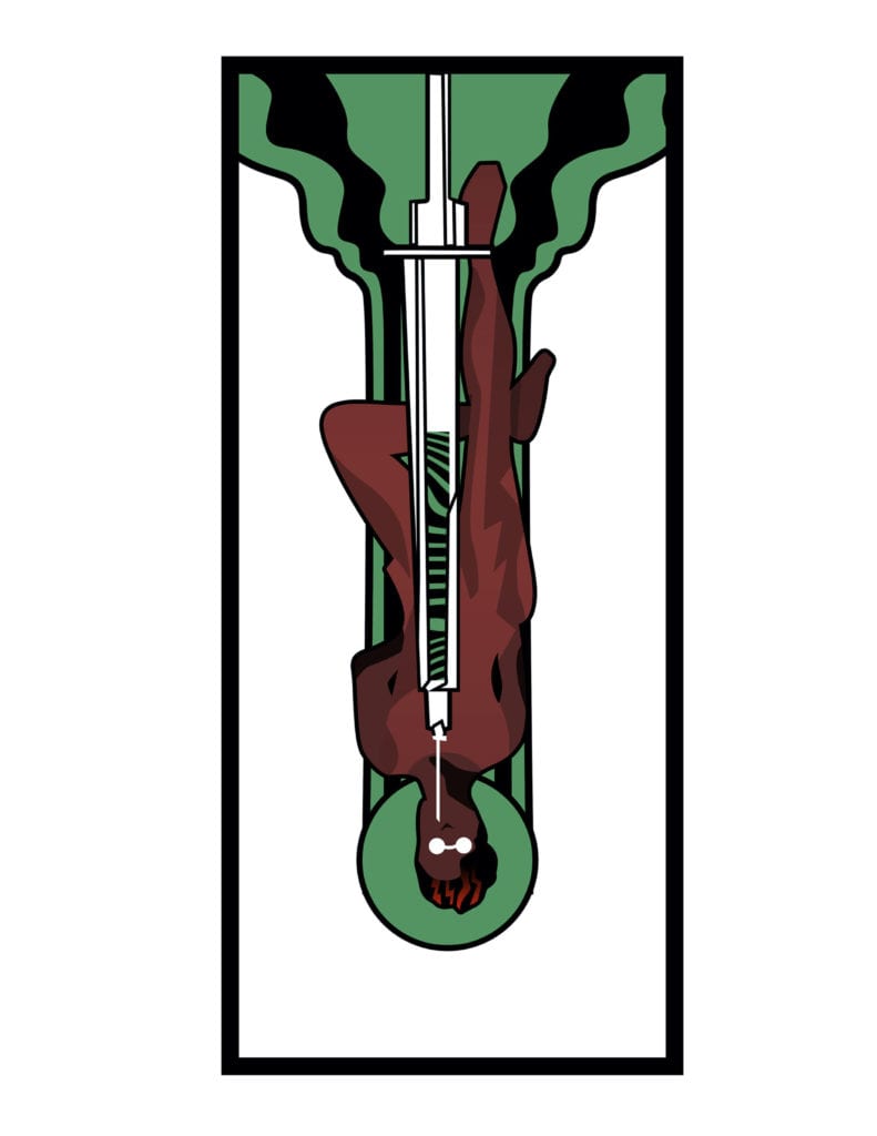
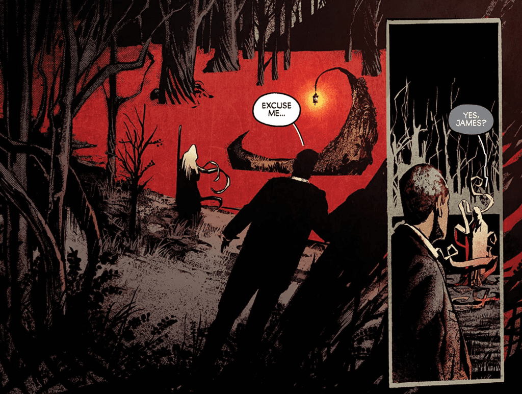
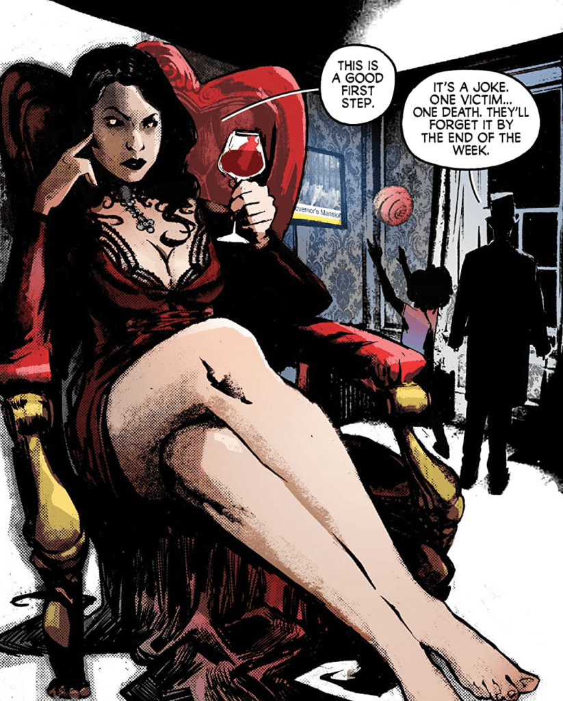
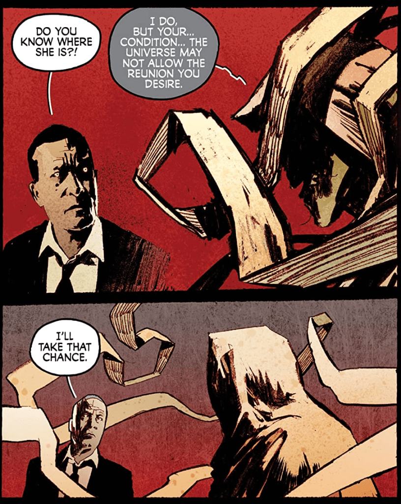
After John Adams was defeated, his wife, Abigail Adams, has taken over leading the vampires. They have already murdered the mayor to alert Philadelphia that they are still around, and now are setting their sights on a bigger target. Jimmy Sangster is dealing with the problem without the help of his undead father, who is exploring the afterlife in search of his deceased wife. All these plotlines come together to make Killadelphia #8 a captivating issue.
Killadelphia #8 Story
The writing of Rodney Barnes in this issue excels at making you want to keep reading. We have the characters we have grown to love facing a new threat lurking somewhere in Philadelphia. The story is always captivating, and the tone of the story being a mix between a police mystery and a horror tale, makes it such a fun read for fans of either genre. The version of the afterlife shown in this issue is another thing that stands out. It seems to take inspiration from the underworld in Greek mythology, but the way the undead fits into the picture and its aesthetics are completely new, and it is an absolute pleasure to see this new take.
A very interesting part of Killadelphia #8’s story is how Barnes can balance three narratives, all happening at once. In this issue, we have scenes of Abigail Adams as she speaks to other vampires, Jimmy Sangster dealing with a disemboweled mayor, and James Sangster Sr. as he navigates the afterlife. These scenes are very nicely interspersed, and there is never a time when it feels one scene is being focused on too much or not enough.
Art
I have nothing but praise for Jason Shawn Alexander’s work on this issue. Every face looks nearly photographic, and his vampires always look cool and frightening. Killadelphia #8 is yet another beautiful showcase of Alexander’s talent. The art in this issue does nothing but make me want to pick up the next, and I have a strong belief that other readers will feel the same.
The colors of Luis NCT fit with Alexander’s line art incredibly well, and his little use of vibrant colors in Killadelphia #8 makes it more impactful when colors do appear. The dark scenes of the issue make it so that when blood is spilled, it pops out on the page; and effortlessly allows scenes full of bright colors to have an ethereal tone.
Marshall Dillon does a great job of having the lettering go along with the art. The color choice of pink for the backgrounds of captions pairs nicely with the red and black color scheme that comprises much of Killadelphia #8. Speech bubbles are very simple and get the point across, and the inverted color scheme of speech bubbles for characters is a good choice to demonstrate that they are otherworldly.
Conclusion
Killadelphia #8 continues the amazing story of the series. The series is so fun, dark, and violent that it’s extremely difficult to put down an issue once you have picked it up. Barnes does fantastic work as he continues to keep the story thrilling, and Alexander, NCT, and Dillon are there to back him every step of the way. Each person plays a vital role in helping Killadelphia become the stunning series it is now, and I can not wait to see where it will lead.
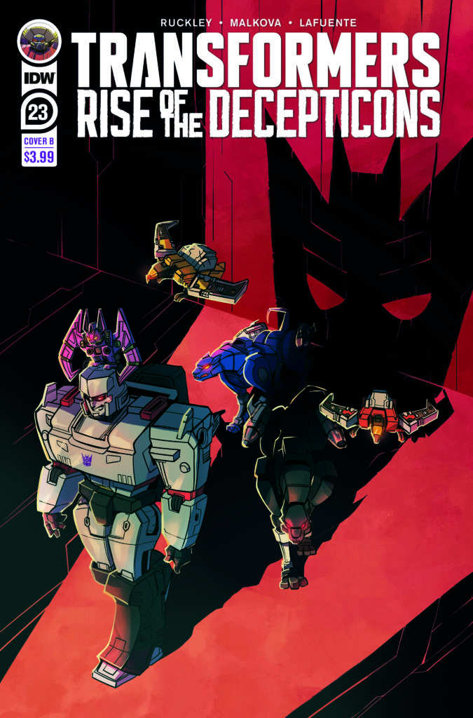
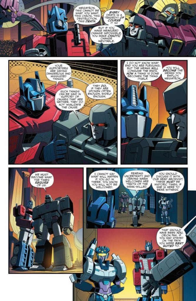
Transformers #23 out this week from IDW Publishing brings the series to a familiar location. The start of the civil war between the Autobots and Decepticons has arrived. The issue is made possible thanks to Brian Ruckely (writer), Anna Malkova (pencils/inks), Joana LaFuente (colors), and Jake M. Wood (lettering).
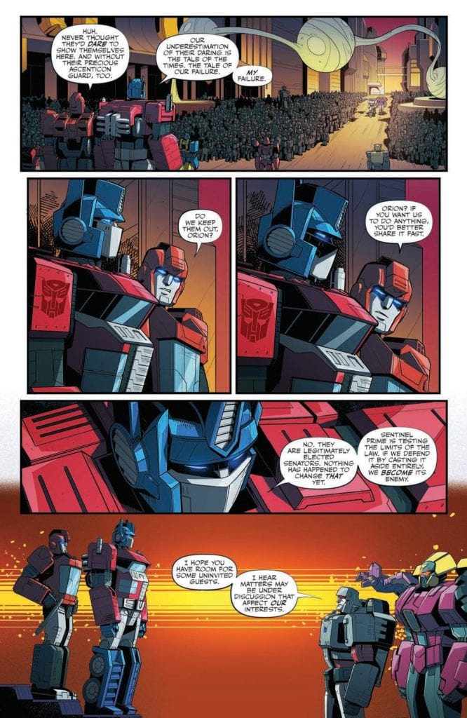
Cybertron has suffered. The world is in chaos. The situation on the ground truly is a crisis. Sentinel Prime, head senator and leader of the Autobots, will denounce the Ascenticons, the Rise, and anyone he thinks is an enemy of Cybertron’s security.
Writing
This issue arrives at the point everyone knew was coming. From the rumors, whispers, and obvious sub-plots (and the plot of the original cartoon in the 80s), what everyone saw coming has arrived. Megatron addresses the senate and delivers his true intentions. From there, things go downhill for the Autobots.
Though it took a while (and at times felt like it was taking too long) Brian Ruckley, has finally finished the introduction. Moving forward the book will focus on the war between the Autobots and Decepticons. It’s a welcome sight and one can only hope the story will keep moving forward to ensure momentum isn’t lost. The characters don’t need long pontifications anymore about the building civil unrest and the eventual downfall of the society.
Artwork
This issue has some intense moments but strangely not during the battle scenes. Anna Malkova’s art features some very emotional facial expressions, especially by Megatron as he passionately delivers his speech to the senate. Still, compared to the jaw-dropping brutality seen in the previous issue, the combat is tame in comparison.
The color by Joana LaFuente enhances the emotional scenes as they occur throughout the issue. One of the best examples is shown when Megatron is shown entering the door to the Senate. The glow around him makes it feel like a spotlight is a character entering a stage and letting the audience know they have arrived with a purpose.
The lettering work by Jake M. Wood allows the speech to flow very smoothly, which is ideal for this type of event. When a character arrives and delivers a speech intent on laying out their plan to both audiences (the one in the comic and the one reading it), proper sequencing of speech is highly beneficial. Here, Wood’s work makes it feel like the audience is there on the Senate floor as Megatron reveals his dark secrets to the world.
Conclusion
Transformers #23 finally kicks things into high gear. After taking a while, the series has reached the start of the war between the Autobots and Decepticons. From here, action SHOULD be the main focus of the series. The key point in the previous sentence is the word SHOULD.
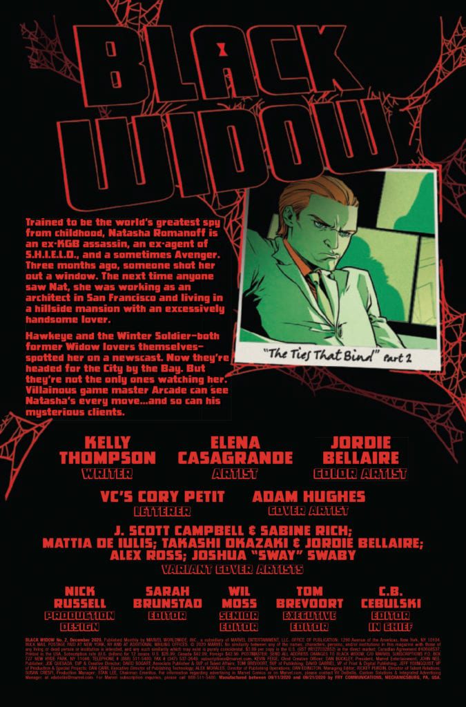
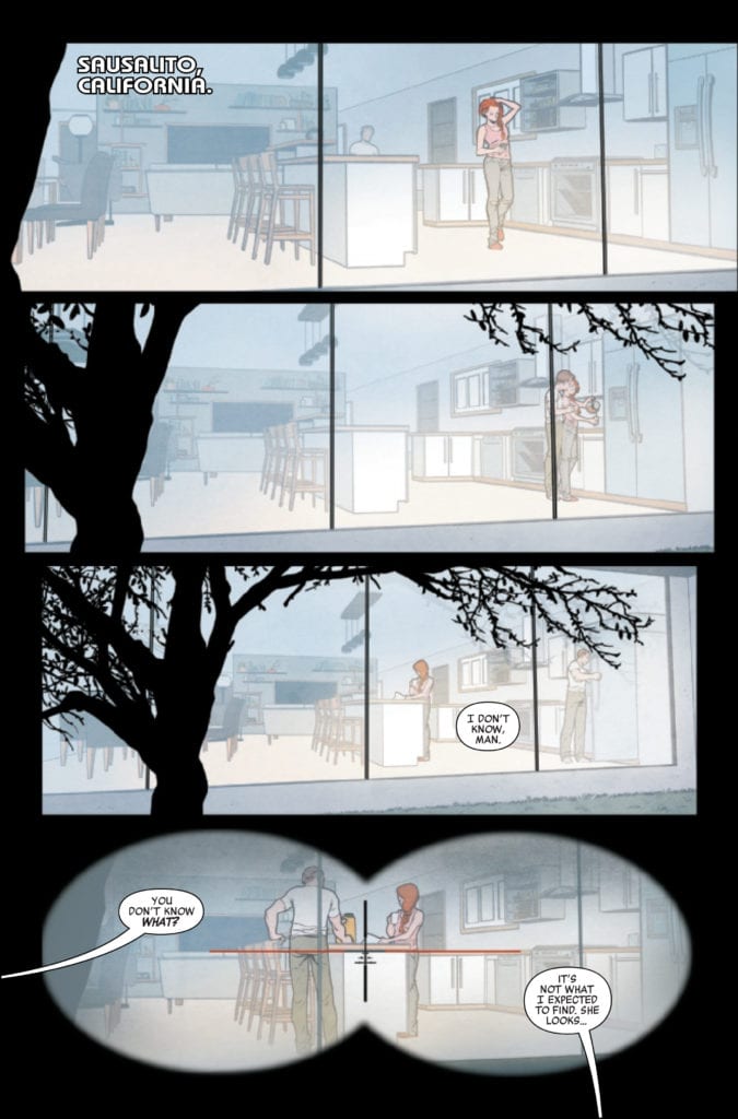
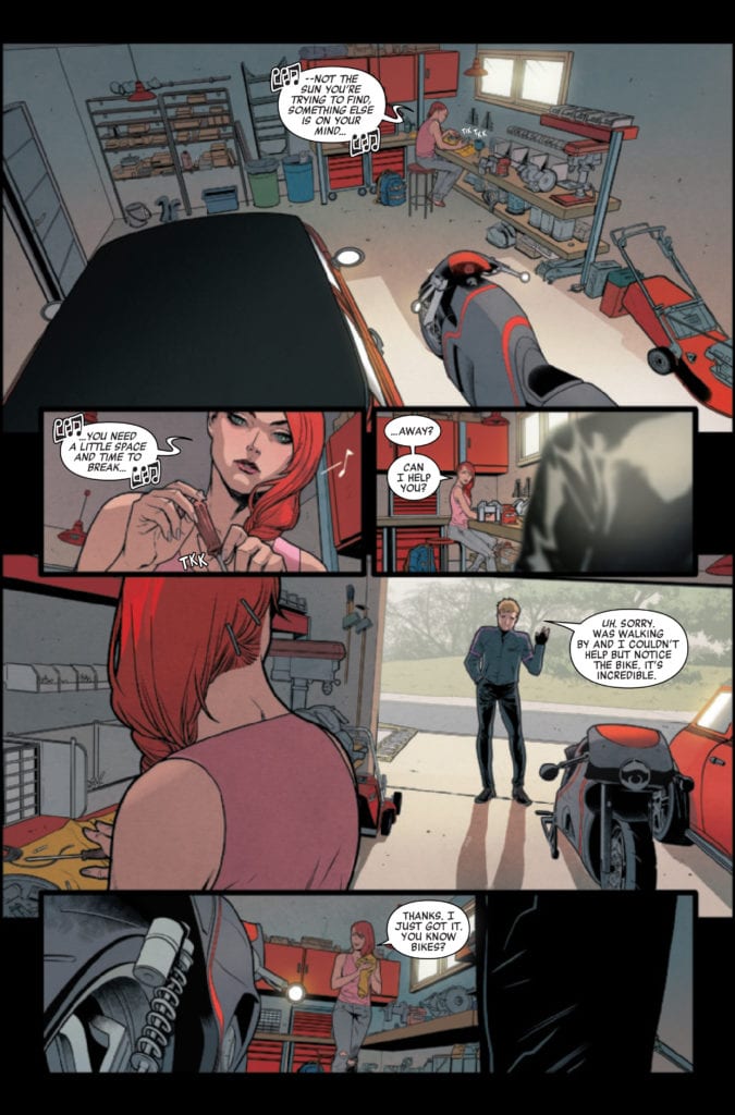
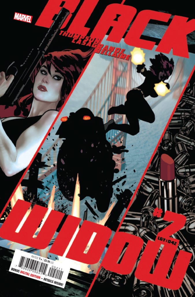
BLACK WIDOW #2 hits your local comic book store October 7th, but thanks to Marvel Comics, Monkeys Fighting Robots has an exclusive four-page preview for you.
About the issue: WIDOW NO MORE? Something is very wrong with Natasha Romanoff: she’s – happy?! Retirement definitely agrees with the world’s deadliest woman as she revels in the perfect life she never even dreamed she could have. But scratch the surface of that perfect life and you’ll find something very wrong – and a woman like Nat just can’t help but scratch.
BLACK WIDOW #2 is by writer Kelly Thompson and artist Elena Casagrande, with colors by Jordie Bellaire, and letters by Cory Petit. The main cover is by Adam Hughes.
MFR critic Cat Wyatt on the first issue of the series:
“BLACK WIDOW #1 is full of creative writing, character development, surprising twists, and absolutely perfect artwork. Altogether, it does the character (and her fans) justice.”
Marvel’s BLACK WIDOW movie is currently scheduled for May 7, 2021 after being delayed twice due to the COVID-19 pandemic. It was originally scheduled for May 2020.
Check out the BLACK WIDOW #2 preview below:
Are you reading BLACK WIDOW? Sound off in the comments!
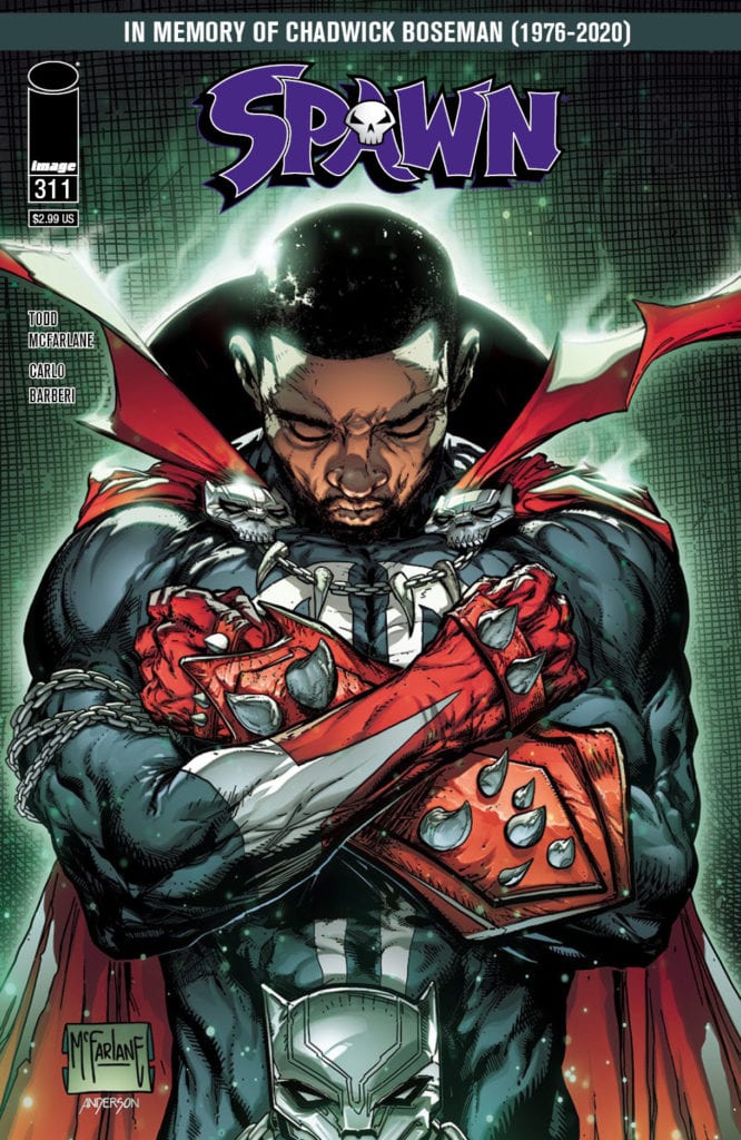
In honor of Chadwick Boseman’s passing, Todd McFarlane has created a touching cover for Image Comics’ SPAWN #311, available on October 28th. The cover features Boseman giving the Wakandan salute while wearing Spawn’s classic costume.
Says McFarlane about the inspiration for the cover: “We should all admire the traits Chadwick shared with us. And the inspiration he gave to millions of children around the globe who got to see a strong, meaningful and proud hero that looked like themselves.”
You can check out the full size cover and read the full Image press release below.
Will you be adding this issue to your collection? Let us know what you think in the Comments section, and please share this post on social media using the links below.
TODD MCFARLANE PAYS TRIBUTE TO CHADWICK BOSEMAN IN UPCOMING SPAWN COVER
PORTLAND, Ore. 09/30/2020 — Image Comics President and SPAWN creator, Todd McFarlane, will pay tribute to Chadwick Boseman in the upcoming SPAWN #311 with a cover in memory of the late actor who brought to life Marvel’s Black Panther character in the Avengers films.
“Given the limited amount of minority characters in the comic industry today that are considered major Superheroes, I thought it appropriate for one of those well-known heroes (Spawn) to pay tribute to a man who made a lasting impact on helping shape such a strong superhero of color,” said McFarlane. “Chadwick Boseman is a person who honed his skills and then made a career using them. Then he fought a fight against his own body that showed the true spirit of this man. We should all admire the traits Chadwick shared with us. And the inspiration he gave to millions of children around the globe who got to see a strong, meaningful and proud hero that looked like themselves.”
SPAWN #311 Cover B by McFarlane (Diamond Code AUG200369) will be available at comic book shops on Wednesday, October 28.
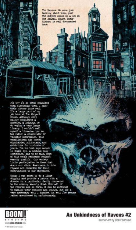
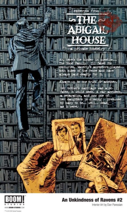
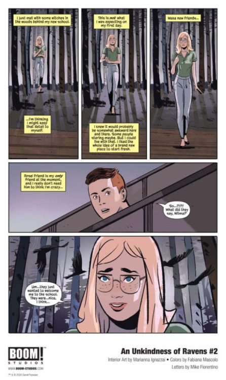
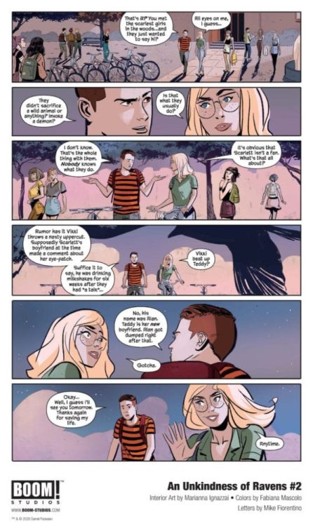
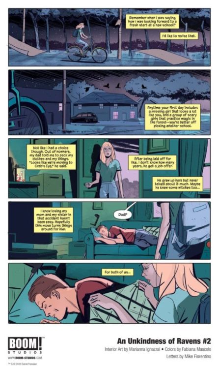
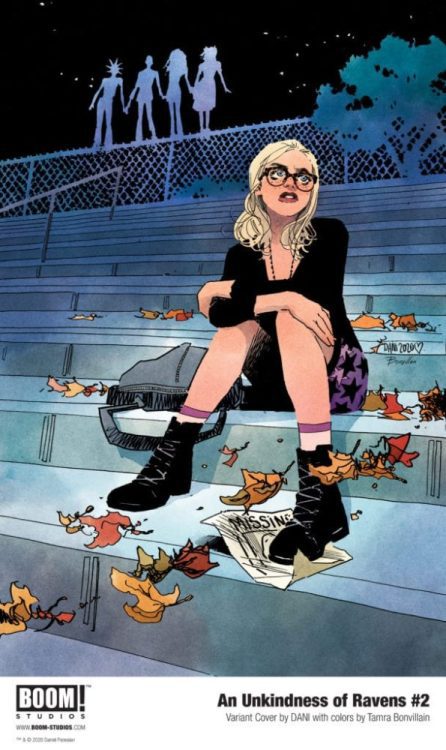
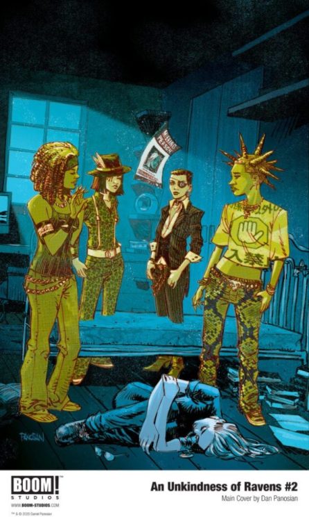
An Unkindness of Ravens #2 hits your local comic book shop on October 28, thanks to Boom! Studios, Monkeys Fighting Robots has an exclusive first look at the issue for our readers with five interior pages and three covers.
The book is written by Dan Panosian, with art by Marianna Ignazzi, Fabiana Mascolo drops the color, and you will read Mike Fiorentino’s letter work. An Unkindness of Ravens #2 features a main cover by Panosian and variant covers by Qistina Khalidah and DANI.
About An Unkindness of Ravens #2: Wilma is being courted by the Ravens, a group of witches who want her to join their coven. But Scarlett, the most popular girl in school, wants Wilma for herself. But Scarlett, the most popular girl in school, has eyes on Wilma herself, and her motives may not be as genuine as they initially appear…
Check out the preview below!
Do you have An Unkindness of Ravens on your pull? Comment below with your thoughts.
About the series: * Not all the witches burned during the Salem Witch Trials – and the ones that survived did so together. Now, generations later, their descendants protect the ancient secrets entrusted to them. They call themselves the Ravens.
* Wilma is the new girl in school, and she plans to go completely unnoticed – except that she bears an eerie resemblance to the Raven member Waverly. And Waverly just went missing.
* But the truth behind Waverly’s disappearance will put the entire coven in danger – and Wilma will have to rely on power she never knew she had if she wants to save her new friends.
Midnight 99 is available digitally through Amazon for $2.99 on October 6. Thanks to NeoText Publishing, Monkeys Fighting Robots has an exclusive look at chapter 2 of Ashley Christine’s debut novella, a classic hard-boiled whodunnit. (Scroll to the bottom to read the book.)
“MIDNIGHT 99 is a reaction to my frequent existential angst of living on a planet that my species is slowly destroying,” – Christine.
“When I couldn’t find an answer as to why we humans are so out of sync with our environment, I made up my own—which is that giant Reptilian space Lizards are using humans to terraform planet Earth to an ideal Lizard temperature. They also created the patriarchy, wealth inequality and were producers of Eddie Murphy’s 1985 hit ‘Party All The Time.’” – Christine.
Also, as a genderqueer/non-binary woman and unabashed eccentric, I wanted to create a character that someone like me could relate to. Enter Tulsa Kalhoun, a chaos-baiting, genderfluid, bisexual dumpster fire of a human being. She’s the unholy spawn of Hunter S. Thompson, Grace Jones, and Tank Girl. She is loud, unapologetically herself, and always just a little bit horny. Like me, she’s queer and a weirdo—a queerdo. Which is a word I just made up. And trademarked.” – Christine.
About the book: Meet Tulsa Kalhoun. Once upon a time she was a well-respected, pantsuit-wearing broadcast journalist— until an inconvenient supernatural awakening left her career and sanity in tatters. Now she stumbles through this world peddling a private pharmacy of perception-expanding herbal narcotics, made with plants you’ve never heard of from places not found on maps. But when Tulsa wakes up in a hotel bathroom on the eve of the secret unveiling of Earth as the ultimate Reptilian vacation destination, blacked out from a particularly indulgent vision quest bender, she knows that she’s supremely and epically screwed. Because a supposedly unkillable Lizard Overlord named Doug is dead on the toilet.
With no memory of what happened— and an ever more tenuous hold on the daily cocktail of alien pharmacologicals that barely keep her tethered to this plane of existence—Tulsa has to retrace her steps, searching for clues of how she got to her current predicament. She’ll have to wade through a swamp of daunting challenges and colorfully shady characters like the Illuminati, the Youthinati, debauched Reptilian tourists, kinky gray aliens who are way too into butt stuff, Neckties, Necronauts, off-brand soda, her super-hot half-human half-Lizard ex-girlfriend, and her own self-destructive tendencies.
Marvel Comics released X-Factor #4 on September 30. Writer Leah Williams, artist Carlos Gomez, colorist Israel Silva, and letterer VC’s Joe Caramagna continue the story begun in X of Swords: Creation #1, showing the aftermath of the battle in Otherworld, the fates of the fallen mutants, and raising the stakes of the upcoming conflict with Apocalypse’s children by throwing a wrench in Krakoa’s resurrection protocols.
While X of Swords: Creation established that the X-Men would pick ten champions to fight on behalf of Krakoa, it was easy to wonder, “What’s the big deal? These characters will be resurrected anyway” (not just in a typical comic book-y way, but in a Krakoan resurrection protocol way). Sure, even if they were resurrected, their loss in the tournament will still ensure the invasion of Krakoa by Arakko. This issue, however, really raises the stakes by revealing that one’s death in Otherworld messes up one’s Cerebro back-up, replacing it with some Otherworld amalgamation of one’s identity. Indeed, we learn in this issue that while a version of Rockslide has returned, this is not the same character who died in Otherworld, and so Krakoa suffers its first real loss and permanent death. This event just got some teeth!
Polaris takes center stage in this issue, caught between her grief over Rockslide’s death, her inability to stop it, and her father’s harshness. It is truly heartbreaking to watch Lorna gather the pieces of Rockslide as she mourns his loss and carry his pieces off into the night. Gomez’s artwork does a good job capturing Lorna’s emotions in her desperate gathering and clinging to Rockslide’s remains and her forlorn wandering into the night.
But there is an arc here that ends in triumph, as Lorna works through the darkness of the night, Gomez and Silva portray Lorna the next morning as having gone through her dark night, having understood Lady Saturnyne’s message to her, and constructed a casting circle out of Rockslide’s remains as a tribute to him.
There is a beautiful image of the image drawn by Gomez and colored by Silva of Polaris standing in the center of the sunrise, with a gorgeous lens flare. This is juxtaposed to a sad-looking Apocalypse who sits in the darkness being scolded by Xavier and Magneto, who note that no one will miss him. In some ways, Apocalypse’s own despair mirrors Polaris’s, and as the sun shines on her, so does the morning sunshine in on Apocalypse, as Caramagna’s letters present Lorna’s inner monologue about pain, redemption, and the hope for something better. As the sun has shone on Lorna, so it may shine on Apocalypse once again.
X-Factor #4 was a strong second chapter to the X of Swords event, elevating the threat that Krakoa faces and potentially shaking up Krakoa’s status quo. The possibility exist that some of the residents of Krakoa may not make it out alive, or, since this is comic books, may at least have their characters or personalities transformed by the time this event ends.
What did you think of X-Factor #4? Tell us in the comments below!
Shang-Chi #1 Alternative Cover Credit: Marvel Comics
Marvel Comics are masters at putting out Superhero comics packed with action and adventure. In today’s market, however, it seems that every comic has to distil the feeling of a multi-million dollar movie into 22 pages without losing the sense of grandeur, and excitement. With limited space to tell a strong narrative as well as pack in the excessive action, the creators at Marvel have to limit sequences to a handful of panels. This poses interesting dilemmas when it comes to portraying fight scenes, especially with highly choreographed fighting styles required for such titles as the new Shang-Chi.
In Brothers and Sisters part one, writer Gene Luen Yang and artists, Dike Ruan and Philip Tan, are tasked with launching a new title that will appeal to new and old readers alike. Whether or not they are successful or not remains to be seen but their approach to the storytelling is definitely an exciting one.
A number of different factors can limit storytelling in North American comics: page count and cost per comic are two main elements. It’s much harder to fill an entire chapter or issue of a comic with a single fight scene when that constitutes a fourth or fifth of your total page count. In order to capture the feel of those intense combat sequences from, for example, Manga books, artists Ruan and Tan use condensed imagery and clever panel layouts.
Spoiler Warning: The following breakdowns contain minor spoilers for Shang-Chi #1
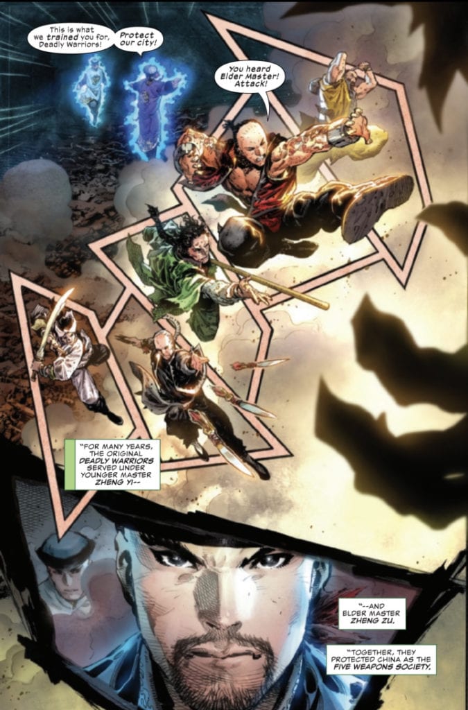
There are three different approaches to capturing the dynamic action in issue one of Shang-Chi. The first, used in the opening flashback sequence by Tan, is to break up a single image with a number of unusually shaped panels. Page four of the comic has the Elder Master send his Deadly Warriors to do battle with Fin Fang Foom. The page is designed like a full page spread, one moment in time with the Warriors leaping into battle, however Tan has broken the image up to create the impression of a string of panels thereby extending the time period within the page. Add to this an overly large insert panel, with a close up of the Elder Master, and Tan is able to create the sense of a long and difficult battle with, essentially, a single image.
There is a line of action on the page starting with Zheng Zu in the top corner. His sweeping arm leads the reader to follow the action diagonally up the page from left to right, following each of the Warriors in turn. You start at the bottom of the diagonal sweep and jump from character to character, reading as if it is a sequence of separate panels because Tan has placed borders behind them . There is no real narrative need for those borders, however from a visual point of view it focuses the audience’s attention and forces you to read each character one at a time. You can see the team but you also get a sense of the individual.
Tan has created a page grid that distorts the reader’s sense of time. You relate the characters to each other because they are part of a single image but you also see them independently. Each has an action, a skill unique to themselves and Tan highlights each of their actions in turn. There are no more pages to this fight scene, the villain turned up at the bottom of page three and the entire fight is contained within page four. However, by focusing on each character separately and as part of a whole, the audience pieces together a series of events and conjures up the entire fight in their mind. You turn the page believing you have witnessed a full and difficult battle.
Shang-Chi In Action Credit: Marvel Comics
One Image Or Many?
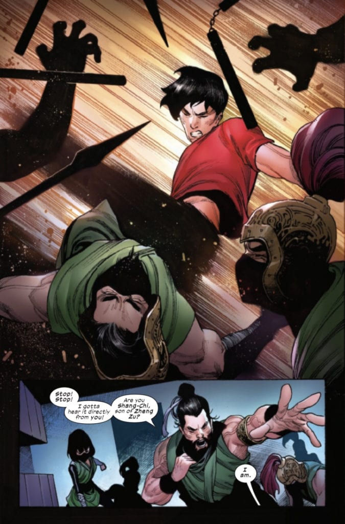
Ruan also uses a large single image to depict a moment of action but this is different in two respects. On page 17 the title character Shang-Chi is embroiled in a fight with a swarm of Warriors of the Deadly Staff. Two thirds of the page is taken up with Shang-Chi striking out with a roundhouse kick. In contrast to Tan’s earlier page, this image represents a single moment in the battle and instead of stretching the time out, Ruan shortens it to emphasise Shang-Chi’s deadly speed.
Much of the image is static: Shang-Chi’s torso and head, and the warriors that he is striking. His leg, however, becomes a blur, fading out towards his foot. Ruan is showing that Shang-Chi’s kick is moving faster than your eyes can see. The background is replaced by motion lines and a brightening light that is centred on Shang-Chi. Everything about the image is about speed and power. It is a snapshot of the fight and even then it is difficult to focus on Shang-Chi’s movement.
The rest of the fight follows a more standard Superhero comic layout. The start of the fight, on page 16, is broken down into panels with an obvious grid layout. The shock moment of the warriors breaking through the wall extends across the top of the page. It is the biggest, most dramatic moment on the page and therefore is given the most space to occupy. Afterwards the reader is treated to a series of snapshot actions, seemingly unrelated to each other. Shang-Chi avoids some nun-chucks, Leiko Wu shoots her guns, and various warriors get struck in the face. It is a series of events, small moments that add up to a greater whole.
Almost opposite to both previous examples, Ruan is showing staggered elements of the fight, insinuating outcomes although a closer examination shows that this is not a string of actions and consequences but simply standalone actions. There are no backgrounds as these have been replaced by movement lines which further distorts the sense of timing for the sequence. The layout may be different to Tan’s page but the outcome is the same. The reader is given an impression of the totality of the fight, filling in the gaps left by the gutters and the page turn.
Everyone loves a good action scene but, just like in cinema, some serve an artistic purpose beyond the narrative. Style and aesthetics are as important, if not more important, than the narrative function and if produced well can alter an audience’s view of the whole. Each of the three different approaches to displaying action takes a different route but their goal is the same. They illustrate the style and finesse of the fighters. In the scenes mentioned above the fight itself isn’t as important as what the fight says about the characters.
Tan’s flashback sequence has an element of Myth about it. It depicts a frozen moment in time while containing all the elements of a Legend. In contrast Ruan’s uses modern comic techniques to illustrate a modern fighter. A comparison between the two allows the reader to see where Shang-Chi has come from, where he currently is, and where his future lies.
Not only do the artists bring a sense of power and dynamism to the fights, equal to any live action movie, but they are also able to use the scenes to comment on character and narrative. This condensed storytelling frees up more space in the comic for the narrative to flow. It allows for more plot and more character to be included without losing the action and excitement that most readers will be expecting when they pick up Shang-Chi #1.
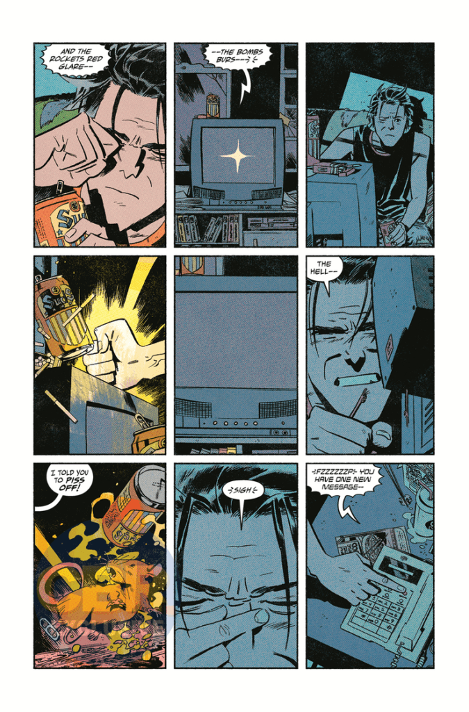
Writer Gerard Way (Umbrella Academy, Doom Patrol, and a singer of a semi-popular little musical act known as My Chemical Romance) joins with co-writer Shaun Simon and artist Leonardo Romero to return to tell the tale of what started the Killjoy’s ride against capitalist censorship and rad times in “The True Lives of the Fabulous Killjoys: National Anthem” #1. Along with colorist Jordie Bellaire and letterer Nate Piekos, this first of six issues attacks its readers with sensory overload and creative narration, aided by outstanding artwork and an impossible to dislike aesthetic. Equal parts The Invisibles and They Live!, “National Anthem” is sure to be a hit with fans of Way’s work and batshit crazy comics fan alike.
“After the Analog Wars, the Killjoys lost their way — and their memories. A rat chews through Mike Milligram’s TV cord, and reality unravels. But when his Ramones records disappear, Mike remembers what the Fabulous Killjoys and some toy rayguns can do. Gerard Way and Shaun Simon take it all back to their original concept, rebooting the Killjoys in present-day America, where it’s impossible to tell what’s real and what Mom and Dad just tell you to keep you calm.”
Writing & Plot
This series’s standing as both a prequel and a soft reboot of the original Killjoys story honestly strengthens “National Anthem” in terms of its readability and its ability to stand alone as a comic. Gerard Way and Shaun Simon blast the reader with esoteric information at a lightning pace as it is, so not being relied upon to have read the previous series for better understanding helps out by itself. This being said, having read the previous series, as well as Way’s other works and knowing the aesthetic and style of My Chemical Romance’s Danger Days album, which this comic is based on, will help prepare you for its unapologetic weirdness. Make no mistake, this is a “weird” comic. Way has worn his love of Grant Morrison’s work on his sleeve both in-person (Morrison actually portrayed the villain in a couple MCR music videos for Danger Days) and in his own writing. In many ways, this feels like a love letter to the Mad Scotsman’s own style. The way that Way and Simon use both outlandish and unnaturalistic dialogue, as well as almost frantic chaos-poeticism will be welcome to readers who anticipate and/or enjoy this style, but could be alienating to those who won’t see it coming.
While I understand Way’s love for Morrison’s style and writing approach (he’s one of my favorites as well), there’s a point where tribute becomes emulation. “National Anthem” comes very close to hitting that point. When I said earlier that this comic is a mixture of The Invisibles and John Carpenter’s They Live, I meant that literally. This issue really does read like an Americanized retelling of Morrison’s Vertigo counterculture epic mixed with the anti-commercialization messages of Carpenter’s film quite clearly in blatant black and white. For anyone who is somehow unfamiliar with these works and still reads comics, then this won’t be an issue. However, as much as I enjoy this book, it’s so blatantly obvious that it has to be called out. Even with this gripe though, it’s hard not to be impressed with the sheer talent and panache that Way and Simon pull off this comic’s written execution. Not only does it move at a lightning pace without ever losing the audience, but it accomplishes an insane amount of storytelling for a 48-page issue. Yes, that is a double-sized comic, but the pacing and plot traveled in that span is seriously impressive. Way and Simon do such a stellar job at familiarizing the reader with this insane world and its cast while also nailing down this esoteric writing style that it’s hard not to be impressed by this comic’s sheer bombastic-ness.
Art Direction
The pencils of Leonardo Romero in “Killjoys: National Anthem” #1 are just as eloquently everywhere-at-once as the script, offering a multitude of styles while maintaining a detailed professionalism that’s difficult to replicate. There’s a mixture of pop-art, Ditko-vividness, Richard Case weirdness, and modern stylings that make this comic just such a damn treat to look at. Romero actually has a semi-similar artistic style to original Killjoys artist Beck Cloonan, but with thinner lines and sharper detail. Bringing Way and Simon’s vision of desolate wastes, 50′ Americana, and inter-dimensional monstrosities to life has got to be an insanely daunting task, but Romero eats it alive here. His visual direction is a huge part of what makes this comic such a fast-pace shot of lighting to read, as each page shows off major segments of story but manages to take its time to allow the weight of every moment to hit. All the while, it feels like that tunnel in Willy Wonka. The other massive component to this book’s success is Jordie Bellaire’s coloring. The neon and vaporwave crossed over with the vivd retro aesthetics of Steve Ditko, all covered with a newsprint varnish makes this comic’s desired aesthetic. Each page spits Bellaire’s vibrant work and pulls you deep into this comic’s world and concept. The lettering from Nate Piekos is distinct, borrowing font styles from silver age comics but with the bolds and effects of modern comics. This is a visually outstanding book, with an aesthetic that pays tribute to a classic era while also being wildly original.
‘The True Lives of the Fabulous Killjoys: National Anthem” #1 is a shot of psychedelic adrenaline from the land of inter-dimensional rock and roll. It’s an obvious connection to the works of Grant Morrison and other counter-culture material makes little impact on how much fun this first issue is. Gerard Way and Shaun Simon’s script is written with a pace shot out of a cannon and laced with slick prose. The visual work from Leonardo Romero and Jordie Bellaire is astoundingly rad, with waves of light and color that you can almost hear. If you’re a fan of the original Killjoys series (MCR album included), or just like weird and insanely cool comics, be sure to grab this issue when it hits shelves at your local comic shop on 10/14!
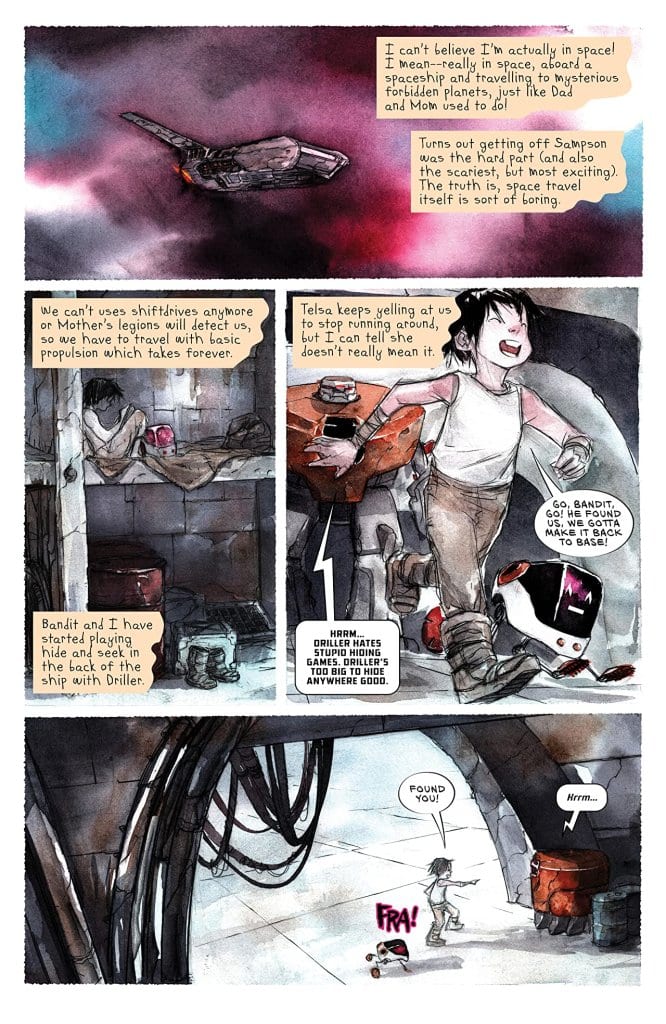
ASCENDER #13, available in comic book stores on Wednesday, September 30th, escalates the conflict between Mother and the resistance tenfold. While our hero Mila is in the midst of a space flight from Sampson, Mother’s forces continue to grow, extending their reach further into the cosmos. Will Mila and the team avoid them forever, or will their pursuers catch up after acquiring more allies?
Story
The story follows Mila, Telsa, Hilda, and the rest of their crew en route to a new location: Phages. Hilda describes this place as a “ghost planet,” warning Telsa against bringing them there. The pilot notes how Mother is even afraid of the planet. But this only encourages her partner even more; the hardened fighter has finally found a place to rest (or so she believes).
Throughout much of this narrative, the writing gives readers an insight into the young protagonist’s thoughts regarding the adventure so far. We feel her rollercoaster of feelings as the memories of their recent flight from Sampson and Mother’s forces. And she notes how much she misses Andy and her old life.
But while all of this is taking place, readers are brought to Mother herself, who’s decided to release a universal order to bring in any USG rebels hiding throughout the universe, which of course includes Mila and the crew.
Writer Jeff Lemire is a master of story escalation. Being able to balance scenes of calm and reflection with those full of excitement and danger makes his writing so engaging.
Artwork
Dustin Nguyen’s artwork and Steve Wands’s lettering were the perfect pairing for this narrative. Their depictions of Mila’s frustrations in learning magic, as well as her longing for her father, helps readers treat her as if she were a real person. And Mila’s dialogue, depicted as torn pages from her journal, draws readers into the narrative even more.
Conclusion
ASCENDER #13 is equal parts introspective and adrenaline-fueled. And this is why we love Lemire’s storytelling.
What do you think lies in store on the planet of Phages? Let us know in the comments below!


")