Home Blog Page 236

Oped: Doomsday Clock, Death Metal, and Narrative Consistency in Comics: Must There Be “Continuity”?

Recently, I’ve been reading Bob Batchelor’s Stan Lee: The Man Behind Marvel, a biography about the comic book industry’s most iconic frontman. One of the things that struck me was how much fans enjoyed Lee’s attempts to connect the Marvel Universe he co-created with people like Jack Kirby and Steve Ditko, giving it an editorial direction and establishing the feeling of a shared world among the characters. This led, in part, to Marvel’s success.

Many comics fans, like myself, appreciate the world-building and lore that gets developed in the shared universes we pay $3.99 per issue every week to read about. Done well, a shared universe can be fun to explore, as the Marvel Cinematic Universe has shown us. However, shared universes can also collapse under their own weight, as what might otherwise have been good stories get overloaded with too many attempts to set up future stories in other books or movies (something the MCU has also demonstrated. Looking at you Iron Man 2 and Avengers: Age of Ultron, or Batman v. Superman: Dawn of Justice in DC’s case).

A lot of the conversations I currently see in the Twitter-verse call into question the need for continuity. Many fans say that what we need are good standalone stories that don’t require buying multiple tie-ins for endless events that all promise to be the hyper-mega culminating story but have diminishing returns. Or in DC’s case, attempts to fix continuity end up creating more problems than they sometimes fix, like Doomsday Clock and now Dark Nights: Death Metal.

Alan Moore once talked about the need for narrative consistency within comic book stories. Readers often want to feel like the story “counts” as a part of the character’s history and journey, hence the emphasis upon continuity.  Surely there is a way not to betray narrative consistency while allowing creativity to flourish.

Someone involved in the comics industry once told me that there’s nothing worse than the fans who say things at conventions like “in issue #301 the character said THIS, but in issue #322 they said THIS.” That kind of narrative micromanagement is too much to ask any writer or artist to maintain. However, J.R.R. Tolkien often tried to proactively “smooth out” inconsistencies in his Middle Earth narrative. Thankfully, comic book stories are no strangers to retroactive continuity.

Space for creativity, however, doesn’t mean there should be a wholesale betrayal of a narrative thread or the concept of continuity. I don’t need to iron out all of the details of why Superman can appear in a Green Lantern book when he’s lost inside the Phantom Zone in his own book. I can give that a pass. I WILL be concerned if he’s married in one book and not the other.

I have seen this done well, and I have seen this done….let’s say “less than” well.

Take DC Comics’ Rebirth initiative.

DC spent about 2 ½ years seeding their comics with various plot devices and hints about Dr. Manhattan and an elusive “Three Jokers” mystery. But then there was a shift in DC’s decision direction away from the Rebirth/Doomsday Clock/Three Jokers thread and toward Snyder’s Metal thread. Sure, there is some attempt now to course correct through Synder’s Dark Nights: Death Metal, but it has the air of needing to correct an editorial mistake that fans reacted badly to.

Maybe if we smoosh these stories together hard enough, we can make them fit!

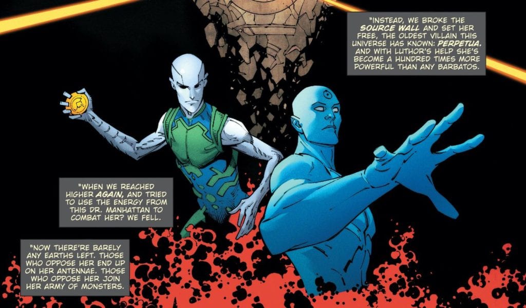
Don’t get me wrong. I’m excited for Death Metal! For the record, I was ok with the Metal and Rebirth threads existing side by side. In fact, at first, Snyder referred to Dark Nights: Metal as Rebirth’s “strange twin.” But there was no real narrative explanation for abandoning the original Doomsday Clock/“Superman Theory” plot threads that were supposed to catch up “one year later” (yes, I know. There were delays in release, but there was time to build a compelling build-up to Doomsday Clock while also honoring Snyder’s narrative thread). Doomsday Clock and Three Jokers were teased in main continuity for years. Now, their status in continuity has been called into question (even though both series are now practically complete). Even Tom King’s forthcoming Bat/Cat story has had its status in continuity made unclear.

Whether or not some of these narratives should’ve existed in the first place is another question. Still, when the planning and thread are laid in continuity, and those things are abandoned halfway through their arc, narrative trust with the readers is broken. Not that writers must be absolute slaves to continuity, but some consistency is nice.

When narrative trust is betrayed, it is an example of bad world building and poor curation of the characters.

Now, let’s look at a different example: Marvel Comics, circa 2012-2015.

Marvel had multiple narrative threads running in their universe around this time, particularly in their Avengers titles. Springing out of Avengers v. X-Men and the end of Brian Michael Bendis’s run on the franchise, Rick Remender and Jonathan Hickman were both telling universe-spanning Avengers stories, but those stories were going in very different directions from each other.

Remender’s Avengers narrative focused on Captain America’s attempt to ease human-mutant relations by forming an Avengers Unity Squad consisting of both X-Men and Avengers team members. Hickman’s tale dealt with an expanded Avengers roster, also consisting of some former X-Team members, which dealt with larger than life universe-ending threats.

Adding to this mix of status quo changing narratives, Brian Michael Bendis was up to some time-traveling shenanigans in both Age of Ultron and All-New X-Men. Rick Remender was also writing Captain America at this time, writing a story that saw the characters aged up and replaced by Sam Wilson, the Falcon. Jason Aaron was telling an epic narrative in Thor that eventually bled over into the event comic Original Sin, which itself lightly tied into Hickman’s own run.

Now, if you try to line up all of these authors’ narratives, you cannot make them line up perfectly in a way that makes sense. I know because I’ve tried.

But these narratives don’t blatantly contradict each other either, and even nod to each other at times. None of them go out of their way to undermine the others (even if pinning down EXACTLY when Thor becomes unworthy across Hickman, Remender, and Aaron’s runs is a little tricky). Each author told their own stories and did minimal damage to the other narrative threads.

I will forever see DC Rebirth as an example of snatching defeat out of the jaws of victory, but I’m hoping Snyder’s Death Metal can put things on a steady path and that Jim Lee and the folks at DC create a world where creativity can flourish, and as the Justice League said in Snyder’s last issue, “Every story can count.” And that’s the point. In a shared universe, we, the readers (particularly those of us interested in world-building), want the stories we love “to count.”

Monkeys Fighting Robots Youtube

Top 5 Geeky Spots To Visit In Israel

Top 5 Geeky Spots To Visit In Israel

Are you a proud geek traveling to Israel? Here are 5 places you should visit if you’re looking to scratch that irksome, geeky itch.

comic book store, comikaza, IsraelComikaza

Comikaza is the first and cheapest comic book shop located at the Dizengoff Center mall in Tel Aviv. At the store, you could find thousands of comics, trade paperbacks, manga, and yes, even posters, action figures, and Funko Pop! collectibles. The three staff members, Ori, Jackob, and Vladik, are the nicest, most experienced geeks you could ever hope to meet, and you can always count on them to recommend your next favorite book.

ufo music, geeky apparel store

UFO Music

UFO Music is the perfect haven for the fashionable geeks out there. If the huge Batman statue didn’t already tell you everything you need to know, you could find a large collection of t-shirts, backpacks, and bracelets, among other things, at this store. UFO Music is also located at the famous Dizengoff Center in Tel Aviv, so if you ever wanted to go on a geeky shopping rage, this mall is the place to be!

israeli cartoon museum, comics museum

The Israeli Cartoon & Comics Museum

Located at Holon, a 20-minute ride from Tel Aviv, The Israeli Cartoon & Comics Museum is a museum dedicated to the history and art of cartoons and comics, both Israeli and international. The museum has a comics archive, exhibitions, guided tours, and courses for kids and teens interested in creating comics.

lvl up gaming bar, geeky bar

LvlUp Gaming Bar

It’s been a long day of running around the streets of Tel Aviv. Now, all you’ll want to do is kick back, drink a cool beer or two, and play some video games. Doesn’t it sound just amazing? Well, LvlUp Gaming Bar is the perfect place to do just that. The first Israeli gaming bar contains an arcade station, 14 computers, 7 PlayStation consoles, and 3 Nintendo Switch consoles. It has a menu specifically created around some of your favorite games and tournaments you could participate in or watch- need I say more?

icon festival, comics festival, sci fi festival

Icon Festival

Even though Icon Festival is not technically a “place,” it is simply an attraction too cool not to mention. Taking place at the beginning of each October, Icon Festival is a festival dedicated to all things sci-fi and fantasy. Each year, hundreds of Israeli geeks come to enjoy the screenings, booths, awesome cosplays, and workshops the festival offers. Highly recommended for people who wish to visit a con outside North America.

Which place sounds the most appealing to you? Comment below!

Monkeys Fighting Robots Youtube

Review: CATWOMAN #26 Is Going Back to Her Roots

CATWOMAN #26, available this Tuesday from DC Comics, is about to bring Catwoman back to her roots, well, sort of. Following the events of the Joker War, our sticky-fingered feline needs some time to find herself and clean up a few loose ends.

Catwoman and her namesakes are featured on this variant cover of Catwoman #26.

Selina Kyle has moved back to Alleytown, the location where she began her infamous life of crime. This is part of her attempt to go back to her roots and to prove to the world that she is still the dangerous and talented criminal many knew her as.

Catwoman #26 is a complex issue, featuring a version of Catwoman who is recovering, all while the world itself is still coming to terms with what has happened. Catwoman made a whole lot of new enemies during the Joker War, and while it might have been the right thing to do, that won’t save her from the consequences.

*One thing that Catwoman #26 contained and likely every issue to release this week is an introduction stemming entirely from current events. This two-page spread talks about the history of voting in America and urges all readers to go out and vote. It’s a wonderful sentiment.

Thus a new enemy is about to enter the scene.

The Writing

Catwoman #26 simultaneously drops hints about her past while setting up for future conflicts. In that sense, it is quite elegantly done. There’s still a lot to learn about how Selina Kyle operates, and this plot arc is providing yet another glimpse into that side of her life.

Written by Ram V, this issue didn’t solely focus on Selina building herself back up (though there is undoubtedly that). It also ties in strongly with the events of the Joker War, and more specifically, with Batman 101.

In a way, it’s setting up for her next several rounds of conflicts, from the look of things. The risk and cost have been set; it’s really just a matter of waiting and seeing how it all goes down. In all likelihood, fans will get more chances to learn about her methods along the way.

All things considered, Catwoman #26 was a well-written issue, one that worked hard to develop a character who has changed so much over the years. While also reminding fans of how she formed in the first place.

Hello Father Valley, you don’t seem creepy at all.

The Art

The art inside Catwoman #26 has a lot to portray in a relatively small time frame. Selina is all over the place, setting up deals and adventures, not to mention a few threats that she doesn’t yet know about.

None of which would have carried the same impact if not for the artwork itself. Fernando Blanco (art), FCO Plascencia (colors), and Tom Napolitano (letters) all worked together to make this adventure pop.

Pop it does. The backgrounds are shockingly vibrant, with starry skies and colorfully lit buildings providing the backdrop for intense conversations and dramatic silhouettes. It’s all very much in line for Catwoman when you stop to think about it.

The characters feel almost fluid on the page, with their expressions clear as day and their personality shining through in unique ways. The action scenes, in particular have a unique look to them, but it all fits the narrative.

Father Valley has a specific way of operating, which may or may not align with Cobblepot’s plans.

Conclusion

Catwoman #26 is exactly the issue fans, and Selina needed following the dramatic events in the Joker War. It gives Catwoman a chance to recover, go back to her roots, and address all the problems she helped to create.

In many ways, this is a story about Selina owning up to what she has done, both in recent and far past. It’s refreshingly honest while also a poignant reminder of how this clever character got her start.

Monkeys Fighting Robots Youtube

AfterShock Preview: Like, Share And Subscribe To The Grave In I BREATHED A BODY #1

Modern Internet culture has a dark side when it comes to how far an influencer will go for likes and clicks. AfterShock Comics and writer Zac Thompson go past the dark side of Internet culture into one hell of a tech horror comic series in I BREATHED A BODY #1, coming January 2021.

Says AfterShock about the new series: “It’s The Social Network meets Hellraiser. When the world’s biggest influencer posts something irredeemably horrific online, the world changes in an instant.”

You can check out a selection of preview pages and read the full AfterShock press release below.

What do you think about the merging of online social influence and horror? Let us know what you think in the Comments section, and please share this post on social media (but not in Hell) using the links below.

I BREATHED A BODY #1 / $4.99 / 32 pages / Color / On Sale 1.20.21

Writer: Zac Thompson

Artist: Andy MacDonald

Colorist: Triona Farrell

Letterer: Hassan Otsmane-Elhaou

Cover: Andy MacDonald w/ Triona Farrell

Incentive Cover: Trevor Henderson

A science fiction horror series about social media, big tech, and influencer culture.

It’s The Social Network meets Hellraiser. When the world’s biggest influencer posts something irredeemably horrific online, the world changes in an instant. Now it’s up to his social media manager, Anne Stewart, to fan the flames of outrage and create a sensationalist campaign that rewrites the rules of “banned content.” Thus begins a carnival of lust, revulsion, desire, and disgust – all for viral videos.

Written by Zac Thompson (LONELY RECEIVER, UNDONE BY BLOOD, X-Men) and illustrated by Andy MacDonald (Multiple Man, Rogue Planet), I BREATHED A BODY is a horror series about the voyeurism of violence and the Big Tech companies who
engineer patterns of fear in society.

ZAC THOMPSON ON WHAT THE BOOK IS ABOUT AND WHY HE IS THRILLED FOR IT TO BE RELEASED:

“I Breathed A Body is a supernatural horror book set in Silicon Valley about the voyeurism of violence. Thanks to social media, we’ve become prepared to see death and despair at any moment. Modern social networks are a relentless barrage of provocative content designed to keep us outraged, engaged, and fearful. This book is an indictment of the Big Tech companies who engender and profit from this vitriolic environment.

Modern content culture deals in excess of everything. Violence, sex, depravity. We’ll consume anything that’s fed to us by our influencer idols. I Breathed A Body will lay bare the intimate psychology behind creating depraved content. The story follows social media manager, Anne Stewart who gave up her previous life to work for the most popular influencer in the world, Mylo Caliban. He’s an ultra-famous prankster and general shithead (think the Paul brothers), but Anne doesn’t mind making content with the kid. Until one night where everything changes. Mylo uploads something so vile and shocking that it threatens to change the world forever. This act throws Anne into the impossible position of planning and creating violent content in the pursuit of “viral videos”. And with each upload, things keep escalating.

Before coming to comics, I worked with YouTube influencers for years. I was a video producer creating content and attempting to leverage the labyrinthine algorithms that keep viewers engaged. Since then, the landscape of social media has changed for the worse. Fear takes precedence over all other emotions. We live in shocking times. Outrage drives engagement. Engagement drives profit and the question of the moral cost of this system has never been more important. This age of “content” is inherently appalling. This series will explore the ramifications of our collective moral outrage, its role in society, how/if it can affect change, and what it means to worship content above all else. If nothing is famous for longer than five minutes, does anything matter anymore?”

ZAC THOMPSON ON SOME OF THE INSPIRATIONS BEHIND CREATING THE BOOK:

“You can’t talk about the voyeurism of violence without talking about Clive Barker. I wanted to take everything I love about The Hellbound Heart and push it into the modern era with a distinct “alt-future” lens. So I’m also channeling the work of Alex Garland taking inspiration from his recent show Devs. But also leaning into some of my recent obsessions in the world of weird fiction like Jeff VanderMeer, Yoko Ogawa, and Thomas Ligotti to build a strange, horrific, and surreal world. There’s also plenty of David Cronenberg influence, and a little of Michael Haneke’s Funny Games at play.

Nothing is quite what it seems in I Breathed A Body but all the characters will take these strange idiosyncrasies as factReaders will constantly learn more about the strange world they’re occupying as the narrative presses forward. I didn’t want to create something that just points a finger at Facebook or Instagram where we’re firmly planted in the grim reality we all occupy. So I’m doing something akin to Lonely Receiver (my other horror book at Aftershock) and building a familiar but different world that mirrors reality in calculated and perverse ways.”

ZAC THOMPSON ON 3 REASONS WHY READERS SHOULD PICKUP THIS BOOK:

“It’s got a lot of fungal horror. Recently, I’ve developed a love for mushrooms and the unique space that occupy within the complex systems of nature. They are these creatures that are neither living nor dead in the conventional sense. Fungal horror has been around for a long time and I wanted to take this strange horror subgenre and propel it firmly into the future. So every issue is layered with as much speculative fungal fiction as I could muster. There hasn’t really been a horror comic like this.

Andy MacDonald’s art on this book is stunning. Those who admired his art on Multiple Man or Rogue Planet will be blown away here. We’ve built an immersive world with little flourishes of magic, like biotech phones with wings. His character work is immaculate, giving each member of the cast a life of their own and brings a real pathos to the whole cast. This is a sad world, filled with broken people who hide behind excess. And finally, Andy’s impeccably detailed line work makes the horror pop off the page and burn into your eyeballs.

Andy and colorist Triona Farrell are an outstanding team. They’re effectively occupying two worlds in this book. The shiny sun-drenched world of San Francisco and the dark and moody underbelly of horror beneath it all. Andy’s linework is confident and detailed to create a rich world that slowly coils around you. While Triona’s colors act as this radiant and brilliant lure. Finally, the letters by Hassan Otsmane-Elhaou work within this complex corporate world to create a unique sense of style while presenting some mysteries of their own. Every page is beckoning you to look just a little closer, to sit in this world and relax. Only to have your throat torn out by the last page.”

ZAC THOMPSON ON HIS FAVORITE PAGE/PANEL AND WHY:

“The final three pages of issue #1 are so vile and awful that I had a lot of second thoughts about even scripting them. But this is a book about pushing boundaries, about walking along the razor’s edge between depravity and entertainment. And though they are awful and gut wrenching… they begin a twisted carnival of lust, revulsion, desire, and disgust that we couldn’t help but lean into as the series moved forward. This book is meant to shock you.”

ZAC THOMPSON ON THE NEWS THAT UNDONE BY BLOOD: OR THE SHADOW OF A WANTED MAN TPB VOL. 1 HAS SOLD OUT AND GONE TO A SECOND PRINTING:

“Seeing such an incredible response to the Undone By Blood trade legitimately warms my heart into a near volcanic state. As a creator there is nothing more rewarding than seeing your work find a passionate and growing audience. Thrilled to hear we’re going to a second print. And so excited to see a whole new host of people discover Sweetheart AZ, Ethel Grady Lane, and good old Solmon Eaton.”

Monkeys Fighting Robots Youtube

Review: THE SCUMBAG #1 Is Exactly What You Think It Is (Which Isn’t Exactly A Good Thing)

Modern-day comics icon Rick Remender (F.E.A.R. Agent, Uncanny X-Force) teams with artist Lewis LaRosa to craft “The Scumbag” #1, a book about a stumbling, disgusting, uh, well you saw the title. While this seems like the perfect Remender book on the outset, this comic reads as if the writer is parodying himself. With a ridiculously stereotypical main character and an uninspired plot, this comic is saved solely by its gorgeous artwork and potential possibility of the story improving in its later issues.

“Ernie Ray Clementine is a profane, illiterate, drug-addicted biker with a fifth-grade education. He’s the only thing standing between us and total Armageddon because this dummy accidentally received a power-imbuing serum, making him the world’s most powerful super spy. The Fate of New York rests in the hands of the worst person in it!”

Writing & Plot

Rick Remender has grown into one of the most prolific comic writers in the industry currently for his surprisingly intelligent plots and ability to create awful characters sympathetic. When “The Scumbag” #1 was first announced, there was a sort of running joke about this being yet another Remender comic about a POS human being turning reluctant hero. Unfortunately, this first issue reads like an amateurish parody of Remender’s style. The introduction of Ernie Clementine is so full of uninspired cliches, vapid humor, and charmless characterization that it’s difficult to believe that it was Remender who wrote this. Now, great low-brow comics use their crass humor and subject matter in conjunction with earnest storytelling and heartfelt characterization in order to make them rise above their surface-level absurdities. Great examples of this include Remender’s own F.E.A.R. Agent and Eric Powell’s award-winning The Goon. As it appears in this first issue, “Scumbag” has no intention of becoming anything more than what it is. This would be fine if there was anything more than some over-the-top nastiness and some occasionally funny situational irony carrying the plot forward. The climactic moment where Clementine becomes the one person who can save New York is so buried under the protagonist’s own need to be a stereotype that it buries any exciting or humorous potential the moment might have offered. Outside of a couple of fleeting moments of introspective narration, there’s nothing to this comic’s script that offers any motivation to pick up a 2nd issue.

Art Direction

To say that Lewis LaRosa is the saving grace of “The Scumbag” #1 is to put it mildly. The grungy details and sordid, believable dirty denizens of New York’s back-alleys and bars are brought to life in all their slimy glory thanks to LaRosa’s talents. Outstanding variety in character design is combined with stellar animation and environmental work, but drawn with a textured realism that gives each panel a depth seldom seen in comics. The visual of Ernest Clementine openly crapping himself on a crowded New York sidewalk while onlookers gawk and scream is permanently branded in my brain, and for better or worse it’s thanks to the artist. LaRosa gets to flex his talents for drawing fights and action as well, for while the grandiose sci-fi plot just kinda sits in terms of the writing, it’s given brilliant momentum and design from a visual perspective. Enemies visibly vibrate with power and have their facial features drastically shifted by an oncoming fist with incredible detail. The colors of Moreno Dinisio work greasy wonders in conjunction with the pencils, as every individual, article of clothing, street sign, and wads of booze and heroin stained cash are bathed in painted grim realism. It’s reminiscent of the work of Lee Bremejo, albeit with heavier inks and thicker lines. Visually this is some seriously outstanding work, and since this series is going to have a different all-star artist on every issue (like Andrew Robinson and the aforementioned Eric Powell to name a couple), this may be a reason for some to pick up this comic. Maybe. The lettering from Rus Wooten is just as fitting to the book as the art. The wavering font stumbles around in the same fashion as our protagonist, perfectly capturing the inebriated stupor he speaks in. It straightens up when the dialogue comes from one of the story’s interdimensional secret agents, and offers subtlety in its font changes for tone and volume. From the visual end, this is a great looking book.

“The Scumbag” #1 is a great looking comic that also happens to be the most disappointing Remender chapter I’ve ever read. Instead of capitalizing on his usual emotionally effective handling of stereotypically broken men, this comic offers nothing but crude humor and absurd irony but with nothing to latch onto about any of it. Lewis LaRosa and Moreno Dinisio’s visual work here is absolutely outstanding, full of smoky, grimy life that is far better than this script deserves. This could be one of those cases where the story actually picks up and goes somewhere in later issues. If you think that may be the case, and you love LaRosa’s art (as well you should), then go ahead and grab this comic when it hits shelves on 10/21.

Monkeys Fighting Robots Youtube

REVIEW: GIDEON FALLS #26 Sets Its Characters on a Collision Course

Image Comics Gideon Falls Lemire

Image Comics’ Gideon Falls is a far-reaching, era-spanning, multiverse-hopping story with a huge cast of characters. In the space of 25 issues, writer Jeff Lemire, artist Andrea Sorrentino, colorist Dave Stewart, and letterer Steve Wands have created a universe that’s sprawling and enormous. To take all of these interlocking characters and plotlines, which feel like they couldn’t be further apart, and bring this story to a conclusion in two issues seems impossible. Image Comics’ Gideon Falls #26 shows that impossible is just what this creative team does.

Writing

Lemire highlights the enormity of this story. We check back in with each major character and see where they are in the multiverse. It seems crazy that all of them could reunite. They’re literally worlds apart. But Lemire focuses each character in on finding a way out of the crumbling multiverse. And as the multiverse falls apart, Lemire begins to suggest that the lines between each version of Gideon Falls might be more blurry than we thought. It should feel rushed, but Lemire finds a natural way to begin his concluding act. Lemire leans on Sorrentino to help bridge the gap between each multiverse and does volumes worth of storytelling in the span of two pages. With Norton Sinclair closing in at every turn, Lemire raises the stakes and gets our hearts racing for the final issue.

Image Comics Gideon Falls Lemire

Art

Much of the blurriness of Gideon Falls #26 is due to Sorrentino’s art. Sorrentino doesn’t use traditional panels on this issue when he can help it. Panels are in the shape of cogs or look like they’ve splattered onto the page. With characters portrayed on different sides of a cube, we begin to question what the characters are experiencing and seeing. Sorrentino makes us feel almost as though they can see out, off the page. And as one character is separated from the rest, we see them fall into an area of the page that looks ripped away. Sorrentino makes the multiverse walls come tumbling down by breaking through the walls between the reader and the material. It feels as though the characters are coming off the page. Sorrentino shows their world is crumbling by having it crumble into ours.

Coloring

Stewart gives us a visceral sense of how close each character is to danger. As Fred wanders through steampunk worlds, with his new friend along for the ride, the pages look nearly colorless. But as Clara and her dad ride across horizons in a Western version of Gideon Falls, everything feels bright and warm. Sinclair’s influence drains the life out of the page, and Clara and her dad seem far from his reach. As the day wears on, Stewart turns the western sky from a yellow to dark orange. The page both warns of coming danger, with the red tone seeping in, and acts as a last splash of color before Sinclair closes in. In the closing pages, Stewart strips each panel of almost all colors except for the red color of blood.

Lettering

Wands’ lettering shows the disintegration of the multiverse. In Gideon Falls #26‘s final moments, as characters talk from panels placed on each side of a cube, Wands keeps their word balloons inside each of the cube’s faces at first. But as the page continues and lines blur, their dialogue begins to jump outside each panel. This shows us the move from the characters being separate to being able to communicate. At first, they aren’t speaking on the same plane of existence. Their speech is only heard by those at their level; it’s restricted by their panel. But as their dialogue jumps out, the rest of the page is used as a shared space, a giant panel shared by all of them. They’re speaking to one another now. And as they notice that someone is missing, and that character’s cube goes tumbling off into the abyss, Wands’ places their lettering on the page with no tails. Their words become as alone and orphaned as this separated character.

Image Comics Gideon Falls Lemire


Gideon Falls #26 gears up for a big finale. Even with a giant-sized final issue, tying together a sprawling narrative like this seems impossible. But this creative team, with Gideon Falls #26, looks to be on track. They begin to bring all of the threads together so that everyone is accounted for in their final issue. Well, almost everyone. Pick up Gideon Falls #26, out from Image Comics October 21st, at a comic shop near you!

Monkeys Fighting Robots Youtube

Review: WEREWOLF BY NIGHT #1 Needs More Horror

Werewolf By Night #1, McKone cover

WEREWOLF BY NIGHT #1, available from Marvel Comics on October 21st, re-introduces and reinvents the titular character for a new generation. Written by Taboo and B. Earl, this new take casts off the Jack Russell character in favor of a Native American teen named Jake, who uses his lycanthropic talents for vigilante justice on the reservation.

Cover Art

Mike McKone and Jason Keith’s cover is exceptionally well-drawn, inked, and colored. What’s most notable is the composition. Long-time Marvel fans will notice the cover looks oddly familiar, and that’s because of both the cover and the story inside echo another, much more recognizable Marvel character. Can you guess which one? If not, head on down to the writing section.

Writing

If you’re a Werewolf By Night fan since the character’s origins in 1972, be forewarned. There is no connection between the original Werewolf By Night and this issue in any way except the title. I’m a fan of the original character, but I appreciate not trying to reproduce what’s come before and accepting a fresh, creative vision.

Does this bold, new take hold up? Yes and no.

Taboo and B. Earl have put together a solid story, but it’s really not a werewolf story. If you hadn’t guessed from the not-so-subtle hints dropped in the Cover Art section, this is almost beat-for-beat an MCU Hulk story. Jake, the werewolf and male lead, has the ability to change into a werewolf at night, partly motivated by emotions such as anger. His female friend (not girlfriend… yet) manages to keep him calm and focused on the task at hand through auditory cues such as music. Again, this is almost an exact replica of the Hulk/Bruce Banner relationship with Black Widow in the Avengers films.

WBN-Hulk covers

Is that bad? No, but it doesn’t read as horror or necessarily unique in the character dynamics. I like the Hulk-Black Widow relationship in the films, so this works on that level.

For the plot, Jake and his not-girlfriend, Molly, patrol the reservation at night, attacking trespassers. Jake soon suspects the higher-ups at this day job in a research lab are up to no good, so he and Molly decide to take matters into their own paws. It’s standard fare to have two headstrong teens, especially one with superpowers, go after the bad guys on their home turf, but what strikes as odd is the police’s complete lack of engagement. Normally a reservation would be under the jurisdiction of the Bureau of Indian Affairs (BIA) police. Still, Jake and Molly make no attempt to inform the BIA of relatively harmless trespassers or about fishy shenanigans at Jake’s company.

Further, Jake and Molly seem unsettlingly cavalier about using violence, to possible lethal effect when Jake attacks the convoy, without much cause. And that’s the part that generally doesn’t work. There’s no dramatic tension. No turmoil over Jake’s curse. No struggle to accept who he is and how to control the beast within. It’s as if Jake woke up to the fact he’s a werewolf one day and said, “well, let’s go beat up some bad guys.” It’s all very antiseptic and completely devoid of dramatic punch.

It’s a good story structure and pacing but emotionally flat.

Pencils/Inks

Okay, let’s get to the most important artistic piece first- how does the werewolf look? He looks great. Ignoring my own warning about not comparing to the original, this werewolf is a massive improvement.

Werewolf By Night #1, art sample 1

Scot Eaton and Scott Hanna went for the “beast that walks on two legs” approach that’s more The Howling (1981) than Lon Cheney Jr’s The Wolfman (1941), and Jake’s feral form is powerful and menacing. The long, tribal braid is a nice touch to give the werewolf a little flair and distinction.

Better still, Eaton and Hanna hit you with high-momentum action art. When the werewolf moves, you can feel the predator on the attack. When the werewolf is chasing some cars (it’s not as cliché as it sounds), the chase is exciting and energetic. When the werewolf attacks trespassers in the opening sequence, the slashes are swift and brutal. Eaton and Hanna not only created an intimidating monster but a dynamic action fighter. Nice work by Eaton and Hanna.

Coloring

Miroslav Mrva nails moonlight coloring and glow. Most of the major scenes take place in the moonlit desert, and the shading of the characters, the sky, and the surroundings feel completely authentic to that eerie glow that only comes from moonshine. I hope the editors keep Mrva on for the rest of the series.

Werewolf By Night #1, art sample 2

Lettering

VC’s Joe Sabino’s lettering was adequate for the story, but the word balloons looked overstuffed in spots. Perhaps it was the font choice, but it would have been easier to read if the text was broken up into manageable chunks. On the plus side, the lettering placement is excellent, and the word(y) balloons didn’t affect pacing in any noticeable way.

Conclusion

WEREWOLF BY NIGHT #1 reads more like a Hulk story than a horror comic, it’s a standard action plot with exceptional artwork. I would recommend this to anyone with an insatiable hunger for werewolf entertainment.

Monkeys Fighting Robots Youtube

RAI #8: Safe Spaces Can Be More Risky Than Danger Zones

Rai #8 Cover

Rai #8 continues writer Dan Abnett’s saga of the cyborg ronin. Artist Juan Jose Ryp brings the cast into uneasy territories that colorist Andrew Dalhouse masks to further the illusion of safety. All while, letterer Dave Sharpe displays the desperation in the way characters speak.

Recap

Rai #8 continues the cyborg brothers Rai and Raijin’s journey to destroy their AI creator Father’s backups, the Offspring. Rai’s single-mindedness in this quest, however, puts his social situations at tense times. Meanwhile, Rai’s ward, Spylocke, has made contact with Father’s current host Bloodshot.

Rai #8: Safety vs. Comfort

Rai #8 impressions
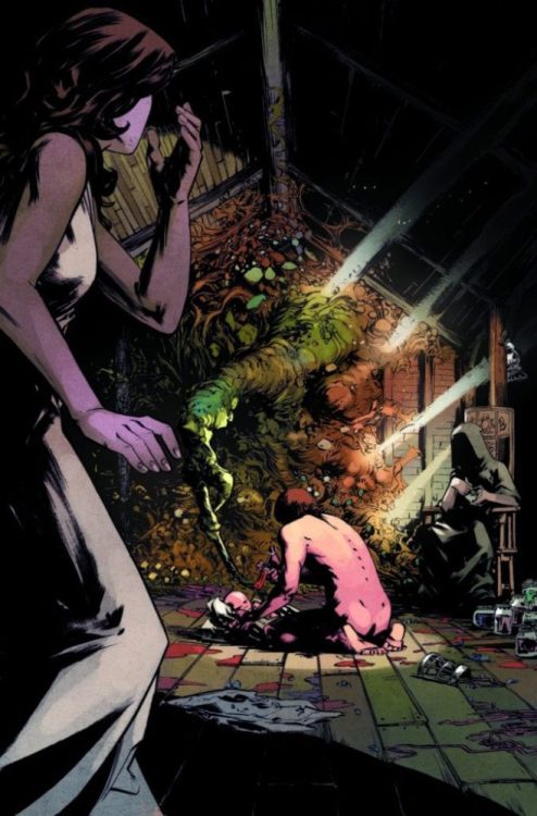
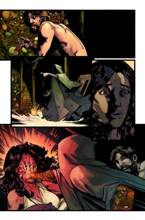
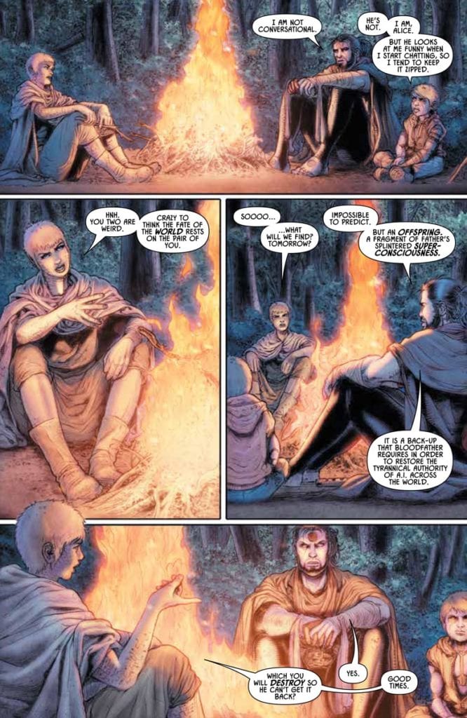
Abnett, in just the opening pages of Rai #8, displays the outline of the arc’s tensions. Despite being on a quest to destroy a tyrannical AI, Rai is not a very social person. Rai and Raijin’s guest traveler Alice from the last issue does not seem to have changed her opinions regarding them. But even then, she doesn’t judge or berate either of them. The reader then views Fusion, the leader of the positronic android community of New Ur. Despite how welcoming and social he seems to the three, he constantly dodges questions about who he is until it suits him. Near the end, it becomes extremely apparent that Fusion is toying with them. And yet another character from the last issue, Tekus, willingly takes Fusion’s side because Rai refused to help their old community. That’s despite the fact Tekus’ new home is only for Positronics, unlike his old one, where both humans and positronics lived in harmony. Because when there’s a threat that can turn humans inside out, the safer option might be a regressively ugly one. With the issue’s release at a time of real factionalism taking place, it’s all the more blood-curdling.

The B-Plot of Rai #8 stands in contrast to safety from a threat. Spylocke, despite every one of her instincts telling her to cut and run, remains to help Bloodshot. The datastream is a dangerous place for her as Father could destroy her form and mind with his security. Yet Bloodshot’s remaining consciousness remains a safe place for them. But even then, it’s only temporary until both Ray Garrison (Bloodshot) and Lula (Spylocke) can escape. It’s actually rather hopeful as they put one another’s fate in each other’s hands.

Art

A subtle introduction to a villain.
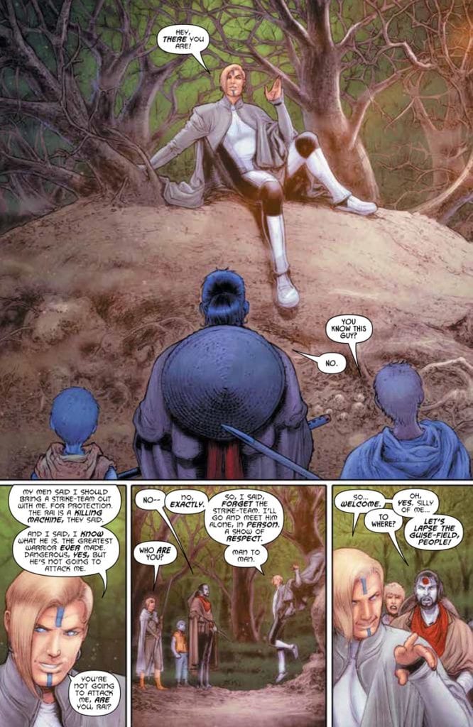
Juan Jose Ryp’s rough but naturalistic artwork makes the above situations all the more tenuous. The trees, fire, and soil of the wilderness look uneven but feel serene. All of that changes with Fusion’s introduction; his relaxed posture and high position give way to a more even change of scenery. However, after a decent first impression, the orderly even architecture and guards make New Ur feel more like a trap. What’s worse, the bright coloring from Andrew Dalhouse helps mask the illusion of safety.

Compare this to the B-plot of Rai #8, every place in the background looks chaotic and abstract. Yet the space between objects is rather neutral. Unlike when pixels suggest something dangerous like the sharks sniffing Spylocke’s trail or how the background pixelates to show her fright, standing in a pixelated rib cage doesn’t feel safe in this case. Until this becomes apparent as a form of camouflage from predators, Lula’s relief is a mutual feeling between her and the reader.

Dynamic Lettering

Dave Sharpe’s lettering in Rai #8 does quite a lot to set the mood of settings. Most of the dialogue conveys the situations between characters, and it’s the subtle changes that make a big difference. When Fusion speaks with more archaic letterers, it’s a display of how sophisticated he speaks and how high and mighty he implies. It’s something he shares with his followers as well. Then there are Spylocke’s captions that display her inner thoughts completely detached from her actions and spoken dialogue. They convey both an inner turmoil and enhancing her amazement at things like Ray’s personality doing everything to speak to her. Which is a lot considering most of what Bloodshot says is short but with a lot of effort to convey how dire his situation is.

Venturing Into Forbidden Territory With Rai #8

Rai #8 doesn’t just continue the journey of the title character; it acts as a buffer of dire situations. Characters that readers grow to love see what they struggle with as they try to fit in with the world. But sometimes, the world can lure them into a false sense of security. However, even the most dangerous places aren’t devoid of hope. This is just the turning point to a major development in the saga, best to stay tuned for more developments.

Monkeys Fighting Robots Youtube

Kickstarter Preview: PEACEKEEPERS Is A Crime Drama Perfect For Fans Of FARGO & THE WIRE

kickstarter preview peacekeepers

THE PEACEKEEPERS is a new comic hitting Kickstarter October 19th, and you can read the first 11 pages right here on Monkeys Fighting Robots.

The book is by writer Rylend Grant, artist Davi Leon Dias, colorist Iwan Joko Triyono, and letterer HdE. It’s the same team that created ABERRANT for Action Lab: Danger Zone, a series which won the Ringo Award for Best Villain in 2019 (and was nominated for two additional awards — Best Writer and Best Single Issue).

About THE PEACEKEEPERS:
All hell breaks loose in quaint a northern Michigan community when a team of in-over-their-heads bank robbers kills a beloved Sheriff’s Deputy. In a small town with BIG secrets, local detective Richard Holton races to peel back the layers of a depraved down home conspiracy before the bungling Federal Agents assigned to the case send everyone involved to ground.

THE PEACEKEEPERS is a dark, quirky crime drama in the vein of Fargo or No Country for Old Men. It’s a love letter to case-a-season police dramas like True Detective and The Wire, to Elmore Leonard novels, and to comic masterpieces like Criminal and 100 Bullets.

Check out THE PEACEKEEPERS 1 & 2 on Kickstarter here.

The campaign is funding a 64-page, perfect-bound comic which will collect the first two chapters of the story.

Grant is a screenwriter by trade, having worked on projects for JJ Abrams, Ridley Scott, Justin Lin, John Woo, Luc Besson, and F. Gary Gray, so he brings a very cinematic quality to the projects he pens. His most recent work, BANJAX for Action Lab: Danger Zone, is currently up for four Ringo Awards (including Best Series).

Read the first 11 pages of THE PEACEKEEPERS:

kickstarter preview peacekeepers

kickstarter preview peacekeepers

kickstarter preview peacekeepers

kickstarter preview peacekeepers

kickstarter preview peacekeepers

kickstarter preview peacekeepers

kickstarter preview peacekeepers

kickstarter preview peacekeepers

kickstarter preview peacekeepers

kickstarter preview peacekeepers

kickstarter preview peacekeepers


You can check out THE PEACEKEEPERS 1 & 2 on Kickstarter here.

Monkeys Fighting Robots Youtube

Interview: Ryan O’Sullivan Talks A DARK INTERLUDE, Unreliable Narrators, And More

a dark interlude vault comics ryan o'sullivan interview preview

Monkeys Fighting Robots spoke with writer Ryan O’Sullivan about his new series A DARK INTERLUDE, the first issue of which drops November 18th from Vault Comics.

O’Sullivan works on the series with artist Andrea Mutti, colorist Vladimir Popov, and letterer AndWorld Design. The masterful Tim Daniel is the book’s designer.

A DARK INTERLUDE is the “not-quite-a-sequel” to 2018’s FEARSCAPE (and O’Sullivan speaks more to what that means below). It continues the story of unreliable narrator Henry Henry and the Fearscape, a magical realm where mankind’s greatest fears take corporeal form.

We’ve read the first issue, and all we can say is that if you liked FEARSCAPE, or you enjoy entertaining dark fantasy stories with smart, witty metacommentary (à la Sandman), you will love A DARK INTERLUDE. The series has a unique narrative voice and a fearlessness to take risks. It’s one of those comics that reinvigorates your love for the medium.

Check out the first 8 pages of A DARK INTERLUDE #1 right here:

And read on for our interview with Ryan O’Sullivan:

Monkeys Fighting Robots: Ryan, thanks for taking the time to talk with me (though I’m sure Henry Henry won’t approve of you speaking with press).

Ryan O’Sullivan: I don’t think Henry Henry really cares what I do. He took over the Vault Comics Twitter last week and couldn’t even remember my name. (Though he also blocked me. So maybe he wasn’t being entirely honest.)

MFR: A DARK INTERLUDE is being called the “not-quite-a-sequel” to FEARSCAPE — what exactly does that mean?

O’Sullivan: It means that it’s not quite a sequel. Explaining it any better than that might give the game away too much. (Especially given that one of the chief conceits of the book is that it is a “sequel” mocking the culture of never-ending sequels/reboots/shared universes we’re currently blighted with.) It’s set in the same Dark Fantasy (think Sandman) world as FEARSCAPE, with the same cast of characters, and takes place 18 months after it, so I could see why some people might think it’s a sequel. I respect their opinion, even if it’s not one I personally hold.

I will say this – you don’t need to have read FEARSCAPE to enjoy A DARK INTERLUDE. (It will add to the experience, though! Just like each Fast and the Furious film adds another layer to the deep mythos of the film series.)

MFR: And where will readers find themselves when they pick up the first issue? How have things changed for your characters since the end of FEARSCAPE?

O’Sullivan: A DARK INTERLUDE begins with our narrator, Henry Henry, locked up in a mental health hospital in the real world. Comics’ most unreliable narrator is trying to reform himself, but the supernatural creatures from the Fearscape have other ideas.

As for the rest of the cast? Issue #1 will reveal all!

a dark interlude vault comics ryan o'sullivan interview preview

MFR: One of the signatures of FEARSCAPE was the way you called out tropes (like grid layouts or exposition dumps) while executing those exact tropes yourselves. Where did the idea to do that come from, and how are you keeping it fresh, funny, and interesting for DARK INTERLUDE?

O’Sullivan: Keeping something fresh just requires you don’t end up flanderising yourself/consuming yourself. If the entire story was just Henry Henry complaining about tropes then people would get bored, and the work would read as indulgent/vain/etc. At some point you have to pivot away from deconstruction and actually start constructing something.

A DARK INTERLUDE is a character-driven story. You may not notice it at first, because of the formalism in the storytelling, or the acridity in the narration, or other deliberately antagonizing/distracting narrative elements, but the thing you’re coming back for issue after issue is the characters. If a story has characters in it that don’t feel like people – full of flaws, contradictions, and death drive, then you won’t care about it. You might find it entertaining, and think the writer is smart for having people jump out of panels or whatever, but unless you populate your story with characters that have an inner consciousness the reader won’t really care about it. (A good story needs to excite both hearts and minds.)

And I think that’s why readers enjoy A DARK INTERLUDE – they care about Henry Henry. Not in the sense that they like him, or that they empathize with him, or that they treat him as some sort of vicarious stand in for their baser instincts, but because he feels like a real human being. And in comics, that sort of thing is rare. Most characters in comics just have the personality of Xander from Buffy. (Quip quip quip…stand around being sad saying their feelings out loud…quip quip quip…stand around being sad saying their feelings out loud….)

As an aside: I’ve never understood why writers in a visual medium are so scared of leaving things unsaid. Of allowing things to be implied. This is why I adore Inio Asano. He doesn’t spell things out. I love “Iceberg” writers such as Carver and Hemingway. Comics needs more of them. (If you’re reading this and you know any – @ryanosullivan is my twitter handle. Hit me up. Seriously.)

MFR: I also love the way you call out the “other side” of comics, specifically reviewers and readers who love to overanalyze things. (I’ve never felt so personally attacked by a comic, and I love it.) How much of that commentary comes from your own experiences, and how much comes from you getting into the head of Henry Henry and saying what you think he would say?

O’Sullivan: We play with autofiction in A DARK INTERLUDE because we’re looking to blur the barriers from what is real and what is not. This helps makes the reader uncertain about what to believe, which forces them to think. As much as A DARK INTERLUDE takes shots at writers, artists, readers, and all other parts of comics, it also takes shots at itself. And it leaves the reader to formulate their own idea of what the comic is about.

Don’t get me wrong, Death of the Author is utter dreck. There is a specific answer to the riddle of A DARK INTERLUDE. I’m just not prepared to say what that is. (Because doing so would defeat the purpose of writing it!)

MFR: Henry Henry is one of the most unique, unlikable, and unreliable narrators I’ve come across in comics — what are the advantages and drawbacks to writing a narrator who lets you say whatever you want at the cost of the readers’ trust?

O’Sullivan: The reader’s trust shouldn’t be lost by the presence of an unreliable narrator. If anything the opposite should happen. The reader should realize that the author respects them enough to know they’ll figure out this Henry Henry guy is lying, thus allowing the reader and author to conspire together against the unreliable narrator. What makes A DARK INTERLUDE dramatic, is that Henry Henry is trying to upset this bond between author and reader, so that he can have ownership of the story instead of me. Unfortunately, sometimes he is successful.

Of course, the above is the exact sort of thing an unreliable author would say to gaslight a reader. So, once again, I leave it to the readers to draw their own conclusions.

I will say one other thing, actually. Perhaps of more interest for other writers than readers. The very real risk of writing a character like Henry Henry is that, because he is so distasteful, a reader must find him entertaining to enjoy the book. (The humor counterbalances how distasteful he is.) If he is not to a reader’s particular sense of humor, they will loathe the story. (As it will just be a story about a distasteful man they do not find amusing.) This is a completely valid read. There are people who cannot enjoy Lolita simply because the protagonist being a pedophile is too abhorrent for them. Henry Henry is not quite that horrible, but the principle remains the same.

a dark interlude vault comics ryan o'sullivan interview preview

MFR: How is it working with Andrea Mutti, Vladimir Popov, and AndWorld Design again? How has your partnership and the way you all work together evolved from FEARSCAPE to now?

O’Sullivan: Andrea sends me slightly less angry emails in Italian. So overall a net positive. Honestly, they’re all a joy to work with. I can’t imagine doing this book without Andrea, Vlad, Deron, Ariela, or any of the folks at Vault Comics.

MFR: And while much of the story’s metacommentary is conveyed through dialogue or Henry’s narration, a lot of it is more subtly hidden in the colors and lettering. How much of this is established in the scripting/planning stage, and how much of it is Popov and AndWorld bringing their own flair and expertise?

O’Sullivan: Metacommentary is all decided at the script-level. Although sometimes compromises have to be made at the inking/coloring/lettering stages due to time constraints. Honestly, the expertise of my collaborators isn’t so much in innovation as it is in execution. They’ve all been doing this longer than I have, and being able to count on that experience to deliver the incredible work they do – that is what gives me the freedom to push myself when writing. I know they can deliver anything I ask for – that allows me to be ambitious. They’re also incredibly tolerant. I’m a demanding writer. They put up with it because they care for the work. And I love them for it.

MFR: There’s been a lot of talk this year about the business of comics and how comics should be distributed. Why was it the right move for you to put out these stories in single issue format as opposed to a series of graphic novels?

O’Sullivan: A DARK INTERLUDE was created from the ground-up as a single-issue series. You can’t release something like that as a graphic novel. Graphic novels have an entirely different “rhythm” to them.

MFR: FEARSCAPE and A DARK INTERLUDE are very much celebrations of comics. As mentioned, you don’t hesitate to comment on the industry’s flaws and tropes, but it’s still clear that you and the team love what you do. What draws you to comics as opposed to other mediums?

O’Sullivan: Comics feels like one of the last fringe mediums. The concept-to-publication timeline is tiny compared to novels or films. This allows comic creators to evolve at a faster rate than their contemporaries. (It also allows you to avoid accidentally stepping into trends. You won’t, for example, end up halfway through a novel as eight other identical novels appear on the shelves due to everyone pulling from the same influences/contemporary concerns.) This is another reason I enjoy releasing stories in single issues – it helps get the story out there into the readers’ hands ASAP.

The comics medium also feels unexplored. It’s been dominated by juvenile stories for decades. (Not a slur. They are what they are. I enjoy them for it. I would not work in comics if I didn’t.) But because of this, the “language of comics” hasn’t really been explored to the same extent as the novel or the poem. That makes it an obviously exciting area to play in. I just wish more writers were doing exciting work that pushed the medium. Plenty try, but with (direct market) comics being such a (small c) conservative, nostalgic, industry; most “inventive” comics are just rehashes of what Gerber/Moore/Morrison/Milligan/etc were doing 30-40 years ago.

MFR: And finally, the word “interlude” suggests more to come… Is there anything you want to tease about what you and the team are planning?

O’Sullivan: I would be hesitant trusting the title of a book with an unreliable narrator. But, by that same token, I would distrust interview answers from the author of said book. The only way to know for sure, is to buy A DARK INTERLUDE issue #1 on November 18th and see or yourselves. (Future Googlers – hello! Did you notice the butterflies on the cover?)


Thanks again to Ryan O’Sullivan for chatting with us. A DARK INTERLUDE #1 is out November 18th — call your LCS today and tell them you want it!

Monkeys Fighting Robots Youtube