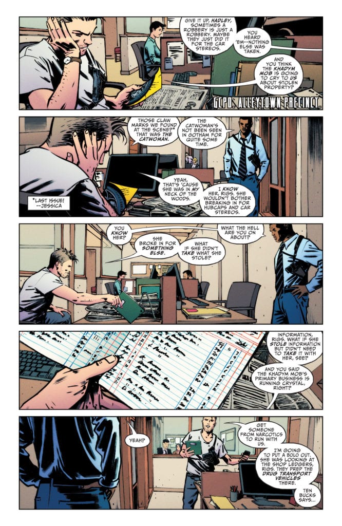
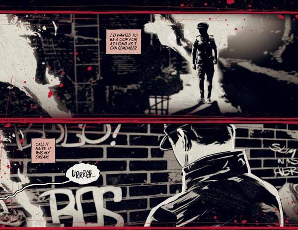
CATWOMAN #27, available Tuesday from DC Comics, continues Selina Kyle’s venture back into Allytown. She’s determined to bring back her reputation while chasing off the new enemies she’s made. Either would bring on plenty of complications on their own. But together?
Catwoman is looking strong and confident on this alternate cover of Catwoman #27.
Selina Kyle has some grand plans for Alleytown now that she’s back. She’s moved in, taken over one segment of the crime world – and has eyes on the rest. After all, this is Catwoman, so none of that is probably all that much of a surprise.
Yet somehow, Catwoman #27 is, in fact, setting up to reveal several surprises along the way. It is a plot that weaves in multiple events, such as those from the Joker War, as well as those of her solo series.
One step behind all of her moves.
The Writing
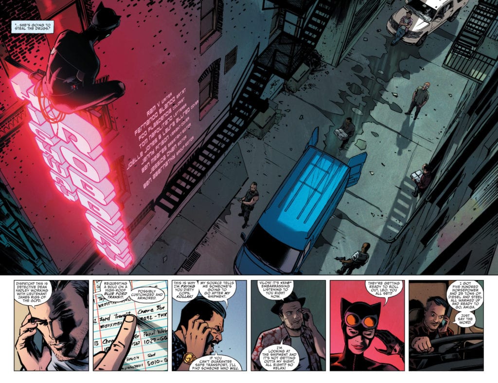
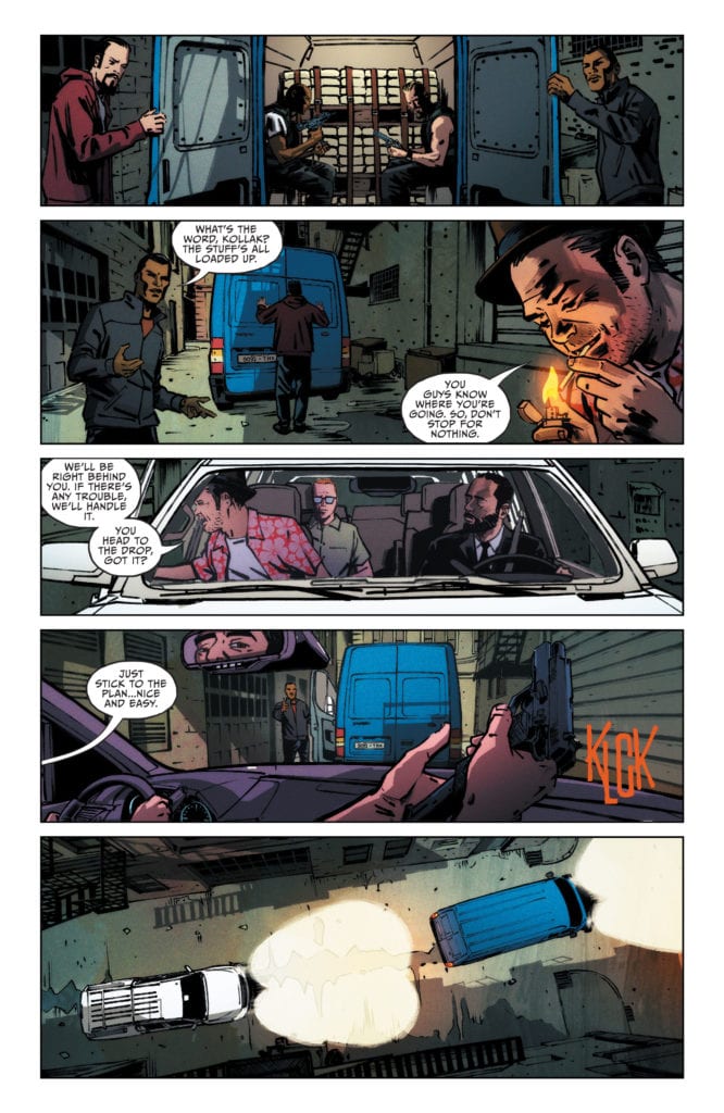
Catwoman #27 is an issue that is full to the brim of action – almost literally. It seems as if every page is filled with daring plots and schemes from the one and only Catwoman. She does have grand plans, and she doesn’t seem inclined to wait for them to come to fruition.
As such, Ram V had to condense many events and actions all into a single issue. It makes for an exceedingly fast read, but that doesn’t lessen the impact any. If anything, it is actually doing the opposite, as she seems to be making enemies faster than she’s losing them.
Interestingly, there do seem to be several layers hidden within this plot. It’s hard to see how it will all unravel – at least, for the moment. Yet some pieces are already falling into place, as enemies and allies make themselves known (to the readers, at least).
It is intriguing seeing Selina work here. The scheming, the back alley deals, the attacks, and the paybacks. It’s so easy to forget this side of her when she’s standing next to Batman, yet it is still very much a part of her.
Something that the series seems to want to remind everyone – characters and readers alike. This is likely the true reason for the fast-paced and action-packed read, even while it feels like it’s setting up for a larger conflict down the line.
Meanwhile, something is about to go down.
The Art
As mentioned above, Catwoman #27 is full of action. Be it a stealth mission or an all-out fight in the streets. It’s an issue showcasing the multiple styles and methods which Catwoman is using to get the job done. Happily enough, it also showcases the talent of the artistic team involved.
Fernando Blanco (art), FCO Plascencia (colors), and Tom Napolitano (letters) really had to go all out for this issue. There is hardly a single moment where Selina isn’t up to something. Even when sitting still, she’s got the presence of a cat ready to pounce.
One of the many highlights for this issue has to be the sense of movement – an important feature when cars and heists are involved. On a related note, this sometimes involved some creative use of negative space.
The result? Well, it leaves Catwoman looking like a badass once again. She’s rushing around the city almost like a madwoman, and it shows through clear as day thanks to the artwork.
So it begins.
Conclusion
Catwoman #27 is a fast-paced issue with a lot to tell – and even more to set up for. Selina struck off on her own with the intent of dealing with all of her new enemies. So far, she hasn’t taken down that many. But a conflict feels on the verge of occurring, thanks to the events of this issue.
Dark Horse Comics has announced a new Black Hammer series called BLACK HAMMER: VISIONS, with issue #1 making its way to retailers on February 10th. 2021. This new series will spotlight a host of guest creators eager to put their spin on a Black Hammer character for an all-new adventure.
Says Dark Horse of their new series: “Black Hammer: Visions is a series of one-shots bringing some of comics’ most exciting talent into the Black Hammer Universe.” You can check out a selection of preview images for the first issue’s cover and read the full Dark Horse press release below.
Which guest creator are you looking forward to the most? Let us know what you think in the Comments section, and please share this post on social media using the links below.
MILWAUKIE, Ore.(November 16, 2020)—Experience Black Hammer like never before in this exciting reimagining of the Jeff Lemire and Dean Ormston created, Eisner-award winning series! Black Hammer: Visions is a series of one-shots bringing some of comic’s most exciting talent into the Black Hammer Universe including Patton Oswalt, Geoff Johns, Scott Snyder, Dean Kotz, Scott Kolins, Chip Zdarsky, Johnnie Christmas, Cullen Bunn, Malachi Ward, Matt Sheean, Kelly Thompson, Leonardo Romero, Mariko Tamaki, Diego Olortegui, Cecil Castellucci, and Melissa Duffy, with colors by Jason Wordie, Bill Crabtree, Jordie Bellaire and Dave Stewart and letters by Nate Piekos!
“As much as I love writing in the world of Black Hammer, it’s nothing compared to the thrill of seeing creators I admire bringing their voices to these characters that Dean and I created.” –Jeff Lemire
“When you’re as long in the tooth as myself there are very few things that excite, but seeing this incredible creative lineup working on Black Hammer makes me feel like a giddy teenager all over again.” –Dean Ormston
Kicking off Black Hammer: Visions, Patton Oswalt joins artists Dean Kotz and Jason Wordie to explore the life of youthful super heroine Golden Gail on the Black Hammer Farm before the beginning of Black Hammer#1, and her struggle to maintain sanity as a middle-aged woman trapped in the unchanging body of a superpowered grade-schooler. This 32-page issue also features variant covers by Evan Dorkin with Sarah Dyer, and Gilbert Hernandez with Dave Stewart!
Black Hammer: Visions #1 (of eight) will hit comic shops on February 10, 2021. It is available for pre-order at your local comic shop.
The Pull is a title from TKO Studios releasing November 17th as part of its third wave. Superstar writer Steve Orlando creates a world where resource overuse causes the end of the world. Orlando uses this setting to demonstrate how factionalism comes about from such an event. The art by Ricardo Lopez Ortiz, colors by Triona Farrell, and lettering by Thomas Mauer all assist Orlando’s message by showcasing factionalism’s primary component empathy.
The Pull of The Story
Orlando puts a lot into The Pull, so much that even the general outline is a lot. The world is ending in not-so-subtle allegories to resource mismanagement; this one happens to have an eldritch abomination called the Undoer comes knocking in reaction to the Hard Heat energy source. A scientist tried to warn everybody, but only some eco-fanatics listened; the scientist Maximo Tith went mad from the data and general public’s rejections, so he forms a doomsday cult. The cult’s plan, pull off some crazy science project to send people’s essence to a new universe, ergo, a mass suicide plan. However, Maximo’s elite law enforcing son-in-law Brenton Demm got in the way, accidentally killing hundreds of the cult members.
The Pull takes place a year after this event, with the Undoer less than a week away. People have lost hope, with many looking for means or reasons to off themselves in the face of Armageddon. Demm, after surviving the incident, has lost all motivation to live or die. Now he does his job as the only thing keeping him going and some hedonistic pastimes. But when his ex-wife and Maximo’s daughter Gayano Tith shows up with a plan to try and save everything, Demm takes the chance to make something out of the limited time.
The Pull: How Factionalism Weaponizes Empathy
The Pull releases at a time when political discourse and factionalism reach an all-time high. With the real world on the brink of crisis, empathy seems like something the world needs more than ever. But Orlando puts into action how fundamentally flawed this way of thinking is. Empathy is both a form of love and exploitation, where people’s feelings manipulate them. Both Maximo and Gaya are the ones who think of the people who listen to them; because in their minds, they’re the ones best suited to handling situations, and people have to follow their lead. But given how narcissistic they can be, imagine this in the context of a Covid-19 vaccine that only might work; will you put your faith into someone who’s supposed to know what they’re doing, or are you too tired to be skeptical?
Feeling responsible for other people’s feelings is a sign of projecting and toxicity. However, the most startling realization comes from how, in the end, the reader is the one most guilty of this. Orlando might be the one who set everything up, and the characters moved the plot, but it’s the reader who projects themselves onto the characters and setting. Some of them will relate to Demm more; others will relate more towards Gaya based on how much they can relate or look up to. The reader is complicit in the activities of The Pull by being the one to turn the page. Effectively the reader is the one making the choices for the characters. The reader probably isn’t even aware of this, thanks to how the art encourages their feelings.
The Weight Of Illustration
Ortiz, as the artist, presents kinetic and dynamic action to whatever scene takes place. The angles at which action scenes featuring Demm give the impression that the reader can feel each move and blow. Plenty of close-ups also increase the intensity to increase the subject at hand even further. A hard heat blast charging for a shot at Demm’s head features a first-person close up toward’s Demm. It serves as both an empathetic link to the attacker who suffered losses in part to Demm, but this also punishes the reader if they wanted to kill somebody in cold blood. In effect, it’s not just the world of The Pull, revealing its worst but also the reader’s world as well.
The Color In Space
The coloring by Triona Farrell adds another element to the empathetic intensity. The flashy lights of the Hard Heat effects always steal attention. The earlier charging effects feature the light from a blast increase with the emotional intensity. In this way, the reader embraces the appeal of its use. This, however, makes the reader just as guilty as the denizens who abused this energy source. Wanting to see more of the effects of Hard Heat in action like invisibility is what pulls the reader closer to a cataclysmic end. With each quest growing more intense with a red light of Hard Heat glowing brighter, so too does the inevitable clash with the Undoer.
Empathy/Sympathy Flip Lettering
Thomas Mauer, as letterer, enhances The Pull‘s narrative experiences from the above artwork. For example, a dynamically styled “Woosh” wordmark accompanies Demm’s mad dash to fill the reader with excitement. In turn, that leads to the dramatic “DON’T” a few pages in the initial disaster. The reader feels Demm’s agony and trauma because of his recklessness; it’s what makes his later appearances a little more sympathetic. Because after that experience, the reader would probably rather watch him from a distance.
Embrace The Pull With Context
The Pull is very much a product of its time, capturing the feeling of factionalism that plagues modern culture. People will always empathize with who they’ll like more, but that should never mean they make decisions for them. The most carefully constructed means of doing so are compelling, but that should be no excuse for listening only to them. The decision to see through something until the end is a group effort that all parties must agree for. Otherwise, people will factionalize over moral superiority.
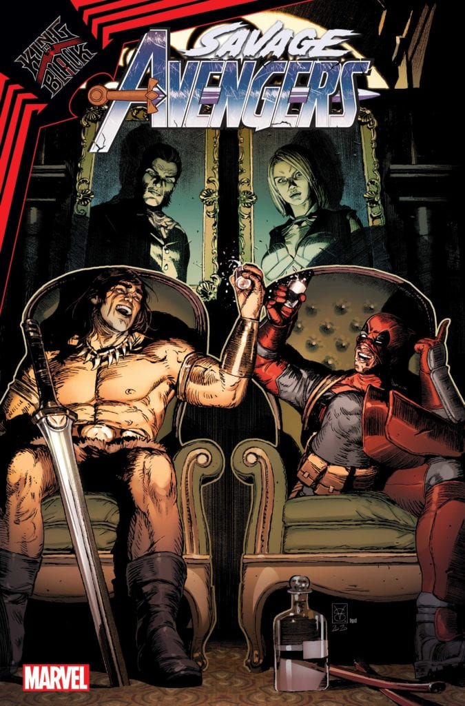
Marvel Comics sent over the cover to SAVAGE AVENGERS #18 today, and it started the conversation of which Marvel character would you like to have a drink with? After checking out VALERIO GIANGIORDANO’s cover below, comment with your thoughts on your drinking buddy.
SAVAGE AVENGERS #18, a King in Black tie-in issue, hits your local comic book shop in February 2021. The book is written by GERRY DUGGAN, with art by KEV WALKER. About the issue:THROUGH HELLFIRE AND…DEADPOOL? Conan, Deadpool, and the Night Flyer escape Riker’s in the endless night during the reign of the King in Black. What crazy heist will ruin Deadpool’s 30th anniversary? Here’s a hint: It involves the Hellfire Club!
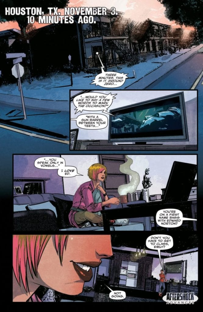
Writer Stephaine Phillips (The Butcher of Paris) and artist Robert Carey (Power Rangers), in collaboration with story creator Janosh Neumann, bring readers the first issue of political-espionage thriller “Red Atlantis.” With colors from Rosh and letters by Troy Peteri, this opening chapter offers an engaging and unexpected opening sequence with solid art, but never does enough to separate itself from its genre contemporaries.
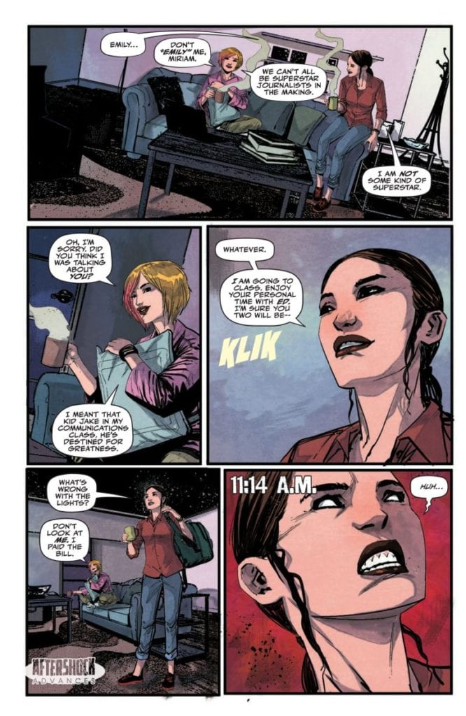
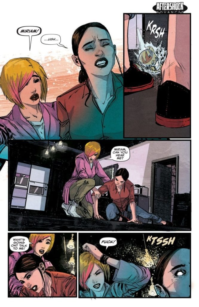
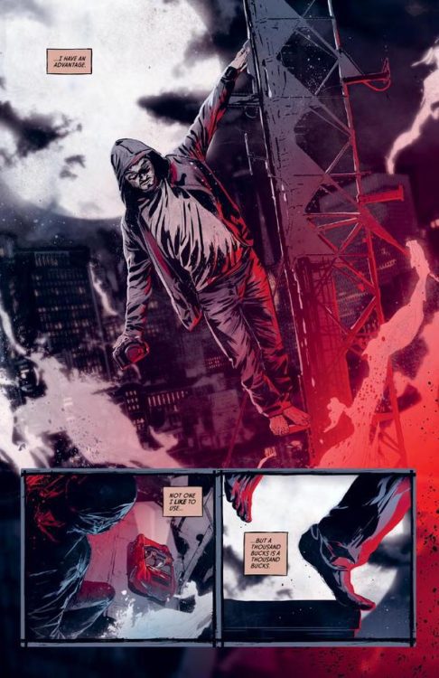
“A series of unexplained, violent crimes on Election Day around the U.S. leads the FBI to zero in on a covert group of Russian terrorists. When a Texas journalism student named Miriam accidentally finds herself mixed up in the investigation, her life will never be the same. With political espionage, treason and even mind control, can she clear her name and stop the U.S. from entering into a new Cold War?”
Writing & Plot
Writer Stephanie Phillips takes the story and concept created by Janosh Neumann and puts together a script for “Red Atlantis” #1 that is sharp, entertaining, and expertly paced. The jarring and prutal opening events immediately pique the reader’s interest with the desire to know what the hell just happened. This opening comic feels like it carries a ton of momentum through each page, and part of this has to do with how natural all the character introductions and their dialogue feels. From the detectives to the local cops and to the average people caught in the middle of this story’s strange tragedy, this really does feel like a procedural/ political thriller. This is where I noticed this comic’s problem, however. I realized after reading this issue, and then re-reading it, that I didn’t really care much about the characters or the larger plot. This comic feels good to read because it’s competently written, but every element in it feels like something that has been done dozens of times over by now. It’s not that the script necessarily has tons of forward momentum, rather that the plot is like a ball on a downward hill. The script is so competently put together that it is almost naturally entertaining in a sort of predictably bland way. It reminds me of a network precedural drama – completely entertaining, but utterly forgettable. This may be just a first issue problem where the characters and plot will become more realized as the story continues, but as it is this is again a well-written but derivative attempt at a modern political thriller.
Art Direction
The visuals in “Red Atlantis” #1 are realized by artist Robert Carey, who uses a careful eye for character detail and excellent directing to create a solid comic in terms of artwork. Every one of Carey’s characters have their own distinct body language and facial animations, with an outstanding amount of detail. There are flaws and imperfections in every person’s face that make them seem fully realized as human beings. Carey’s random detail-work is also extremely impressive. There’s a panel where Carey draws a person holding a handkerchief, and you can actually see the person’s finger outlined under the cloth. That’s a tiny minor detail that isn’t very common in comics. The visual direction is a large reason why the comic’s pacing feels so solid, as Carey keeps the panel flow and character focus feeling very natural. It’s nothing that hasn’t been done in thousands of other comics, but it’s still very competent. The colors from Rosh are really outstanding here, offering nuanced color gradients and smoky effects on every panel. Rosh’s work gives every page a kind of dimension that works hand in hand with Carey’s detailed pencils to craft a very high-quality visual experience. The lettering from Troy Peteri (who also lettered Phillips’s The Butcher of Paris) is smooth and modern, using an innocuous and clean font that effectively conveys the dialogue and narrative while sort of just staying out of the way. Overall the visuals of this comic make the experience worth picking up a copy on their own.
“Red Atlantis” #1 is an entertaining and very competently made comic that fails to make itself stand out in the genre of political conspiracy thrillers. The script is full of solid dialogue and intrigue premises, but it suffers in terms of making the audience care about anything going on. The visual work is honestly stellar however, and makes this opening chapter worth the price of admission on its own. If this sort of procedural conspiracy thriller is your idea of a good time, then grab a copy from your local comic shop today!
Merging genres is commonplace in Comics, and some groupings are better suited than others. This is abundantly clear in TKO Studios’Lonesome Days Savage Nights written by master of horror Steve Niles and, co-founder of TKO Studios, Salvatore Simeone. The new hard-boiled horror comic crawls through the filthy streets, meting out its own form of justice in a thinly veiled metaphor for Intermittent Explosive Disorder.
Part An American Werewolf in London, part The Crow,Lonesome Days Savage Nights is a dark exploration of a man’s soul as he tries to come to terms with the pain in his life. This is achieved through the use of a classic monster of rage, the werewolf, and the setting of the story. Niles and Simeone take aspects of Noir fiction, elements of horror, and mix them with a healthy portion of comic tropes.
“This damned burg’s getting me. If I don’t get away soon I’ll be going blood-simple” Dashiell Hammett – Red Harvest
Lonesome Days Savage Nights Credit: TKO Studios
Dual Character
The premise for Lonesome Days Savage Nights is a simple one, in the same way any private eye, pulp fiction narrative is simple. There is always a straightforward crime to be solved that leads the protagonist down a labyrinth of unfortunate events and to a party of unscrupulous people. The twist with Niles/Simeone’s concept is that their central character also happens to be a werewolf. Stu is an ex-police officer who has set himself up as a private detective in a style familiar to readers of Marvel’s Alias. The jobs aren’t pretty or pleasant but they pay the bills and distract Stu from himself.
The werewolf angle is introduced in a way reminiscent of the Angel television series, as if the beast is an advantage to the investigative nature of Stu’s life but quickly it becomes apparent that it is a constant battle. The bouts of anger and constant suppressive drinking marks Stu out to be a man desperate for help. In the story his anchor is Audrey. She has a calming effect on Stu, allowing him to control the beast inside and focus the rage into his work only when he needs to. But this is a tragedy; a story packed with unfortunate events and it is clear almost from the beginning that in the war to control his inner self, Stu isn’t going to be the victor.
Stu’s tale of horror, from his attack by a werewolf as a police officer to the tragic events in the opening chapter of the comic, is a litany of classic horror motifs submerged in a noir style. The writers give Stu a pessimistic voice so that the reader is constantly aware of the characters woes and depression. Stu’s inability to accept himself and his situation is paramount to the story. He drinks to escape but is also aware that it weakens his control over the animal inside. He is in constant battle with himself and Niles/Simeone layer the narrative with this conflict.
Lonesome Days Savage Nights Credit: TKO Studios
The Darkness in the Gutter
The fight doesn’t remain in the narrative, but instead drains out into the artwork. Szymon Kudranski’s style is very visceral with emotional character renderings and heightened expressions. The line work is extremely detailed but also cast in oceans of shadow, forcing the reader to peer closer and closer to the page to glean as much information as possible. This, by its very nature, brings the reader into the comic, both physically and emotionally. Kudranski traps you with his artwork and brings you down to the same level as the protagonists.
It becomes impossible to escape from the sounds and smells of the streets and filthy apartment blocks. The colors in the printed version are murkier than the smoother, cleaner version you can sample online. This adds an extra level of texture to the images and the readers experience. You can’t help but get your hands dirty by holding the book, with your fingers unavoidably slipping into the images as they bleed to the edge of the page. Even the lettering by Thomas Mauer has a grittiness to it with Stu’s internal monologue encased in liver pink colored caption boxes, and the whites of the speech balloons somehow lose their intensity, as if they are being invaded by the shadows in the panels.
There are two outstanding visual elements to Lonesome Days Savage Nights. The first is the sound effects which are torn from the page. Their integration into the artwork is seamless and yet they tear themselves away from the action to resonate with the reader. You may not hear these guttural snarls and blood curdling screams but you definitely feel them.
The second aspect is the form of the panels themselves and the treatment of the borders/gutters. Throughout Kudranski rips into and splatters the gutter, breaking the frames of the panels and bleeding the images into each other. This constantly shifting border style is representative of Stu’s inconsistent state of both body and mind. The violence of his change from man to wolf and the frustration he feels at his life is reflected through the comics form, often more successfully than some of the textual narrative.
Lonesome Days Savage Nights Credit: TKO Studios
Conclusion
Lonesome Days Savage Nights is, on the surface, a classic monster movie and can be enjoyed simply for it’s violent revenge story. However, dig a little deeper and you get a story of mental instability. The central character is dealing with a violent rage he can barely control. There are moments of stability and moments of fracture and anger where he strikes out. The physical trauma Stu experienced as a police officer has left him psychologically scarred and his coping mechanisms, or lack thereof, are the main thrust of this narrative.
There are problems with this book, mainly to do with overused tropes. The first chapters plot is formulaic and doesn’t offer many surprises after the beautiful transition spread on the second and third pages. The influences from other media are sometimes too obvious, causing friction to the reading experience. For example, one of the characters is a merging of Jack Goodman from An American Werewolf in London and the guiding Crow from J O’Barr’s The Crow. The merging is obvious and acknowledging this for a moment pulls you away from the story.
Lonesome Days Savage Nights Credit: TKO Studios
Once you have escaped from the cliches of the plot early in the comic, Lonesome Days Savage Nights is an engrossing tale of internal violence and repressive anger. The over familiar elements slink into the background as the fast paced narrative drags you through grimy streets and broken lives. Kudranski’s artwork, complemented by Mauer’s lettering, is engaging and emotive throughout. The design of the layouts and the attention given to the comics form is as impressive as the images themselves.
TKO Studios have some exciting creators on their roster, and Lonesome Days Savage Nights is a prime example of the brilliance that they can achieve.
Available in either Graphic Novel format or a collection of six, individual issues, Lonesome Days Savage Nights is waiting to draw you in and rip you apart.
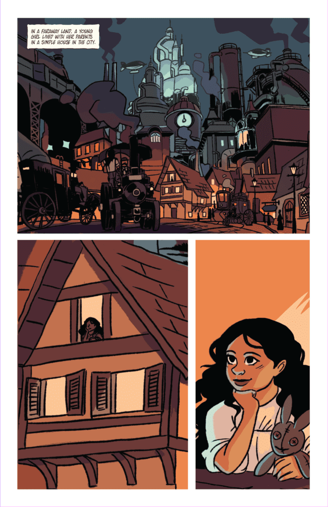
Yes – Unicorn: Vampire Hunter – the title to this fantasy comic book series comes across as a little frothy. It kind of sounds like the creator threw darts at a board of random nouns and this is what stuck. But don’t be deceived, dear reader. If you give this book a chance, you will find a well-crafted concoction of fairy-tale concepts, mixed with heart and magical action.
Written by Caleb Palmquist, with illustration by Daryl Toh and letters by Dave Lentz, Unicorn: Vampire Hunter #1 is wrapping up a successful campaign on Kickstarter, which you can still help support.
Story
There is one thing vampires fear more than anything else…
…and it’s not the sun. Everyone knows that wooden stakes and holy water kill vampires, but not many people know that the best weapon against a vampire is a unicorn’s horn.
Unicorn: Vampire Hunter is a fantasy adventure comic about a curious young woman, a wise old wizard, and a unicorn with a penchant for killing vampires. It is a heartfelt story about friendship, love, and finding purpose in an unpredictable world.
“In a faraway land…” is how writer Caleb Palmquist starts off this tale of a vampire-hunting Unicorn, setting the whimsical storybook tone quite succinctly. Palmquist expertly crafts this unique world — part medieval fairytale, part steampunk fantasy. It’s an easy book to consume, perfect for both kids and kids at heart. Palmquist manages to craft a wholly enjoyable fantasy adventure, while tugging on just the right amount of Disney-esque nostalgia strings.
Art
Artist Daryl Toh brings a robust and whimsical quality to the artwork. It really shows in the character designs. Character expressions akin to a Disney animation pack this first issue. This really helps with the charming nature of the book. Toh has also developed a landscape that is engaging and vibrant. The detail of the world drawn behind the characters is unique and filled with such soul.
Conclusion
Don’t let the silly title mislead you — Unicorn: Vampire Hunter #1 is a stellar introduction to this fantasy comic series, filled with real emotion, an interesting premise, and vibrant visuals.
You can support Palmquist, Toh, and Unicorn: Vampire Hunter by supporting the book on Kickstarter. You can also learn more by following their Facebook page, and visiting their website.
Available now from Dark Horse, Cyberpunk 2077: Trauma Team #3 is the second-to-last issue in the limited series. The creative team of writer Cullen Bunn and illustrator Miguel Valderrama with colorist Jason Wordie and letterer Frank Cvetkovic keep the readers on their toes.
Issue three picks up from the final cliffhanger moment of the previous issue. Nadia’s gun is pressed to the back of the client’s head. But, after a tense struggle, the team leader, Stratter, stops Nadia from killing the man. Valderrama uses inset panels and close-ups on the weapon seemingly to stretch time, to convey the weight of Nadia’s actions. We want Nadia to pull the trigger and blow that smug smile off this murderer’s face. But we can’t have that satisfaction because Nadia can’t stoop to his level. She isn’t a murderer; she’s a medic.
NADIA HESITATES TO TAKE REVENGE.
So far, Bunn has given small hints to Nadia’s past and her character. We know she’s traumatized, and we know she’d do anything to save her team. However, her reason for staying in this job has caused her so much pain wasn’t clear until this issue. In one of the most intimate scenes of the entire series, Bunn wrote an interaction between Nadia and a young girl, showing just how compassionate and dedicated the protagonist is to her job.
No Way Out
As the team made their way out of the building, another team member, Knapp, gets gunned down. To treat him, Nadia, Stratter, and the client enter an apartment. A mother and daughter occupy the apartment, and the mother asks Nadia to help her sick daughter in the middle of working on Knapp. In the time it takes for Nadia to consider helping the girl, Knapp dies. Stratter blames Nadia for this and argues with her over treating the girl. To stop their arguing, the client offers to “do their job for them” and handle the armed mob outside the door.
In the midst of the client’s carnage, Nadia stands her ground with Stratter and treats the girl. She gives the mother antibiotics and sweet reassurance. She touches the girl’s face and smiles. Here, colorist Wordie contrasts the dark red of the client’s rampage with light blue and warm yellow, providing a reprieve from the death and violence. This is when we get the sense that Nadia is more interested in this side of being a medic and that she will do anything to save a life. This isn’t just some job for her.
If we weren’t invested in Nadia’s story before, we are now. Bunn and his team have delivered a slow burn of a series rooted in the psychology of a memorable heroine. But the mission continues. The team still has to get out of the building, and they may not make it out alive. Could the client turn on them? Whatever happens, the stakes are high going into the final issue.
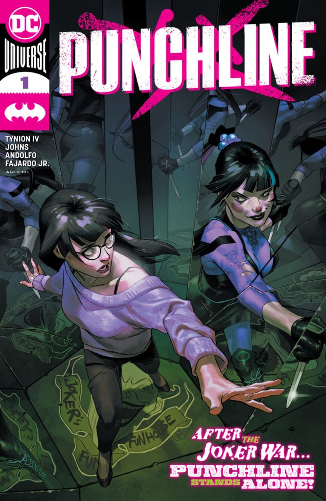
When James Tynion IV started his run of Batman, he introduced the character of Punchline to the world. Joker’s new right-hand woman would play a major role in the Joker War story, from being Joker’s middleman to the villainous bank brokers to concocting a new Joker toxin. In the real world, this character has also gained popularity for her design and attitude. With the war behind us, the clown princess of crime is heading to trial, but under her true identity. She proceeds to make dozens of videos proclaiming her innocence and posts them online. This couldn’t possibly swing the public in her favor, would it?
*Some Spoilers Below*
Story:
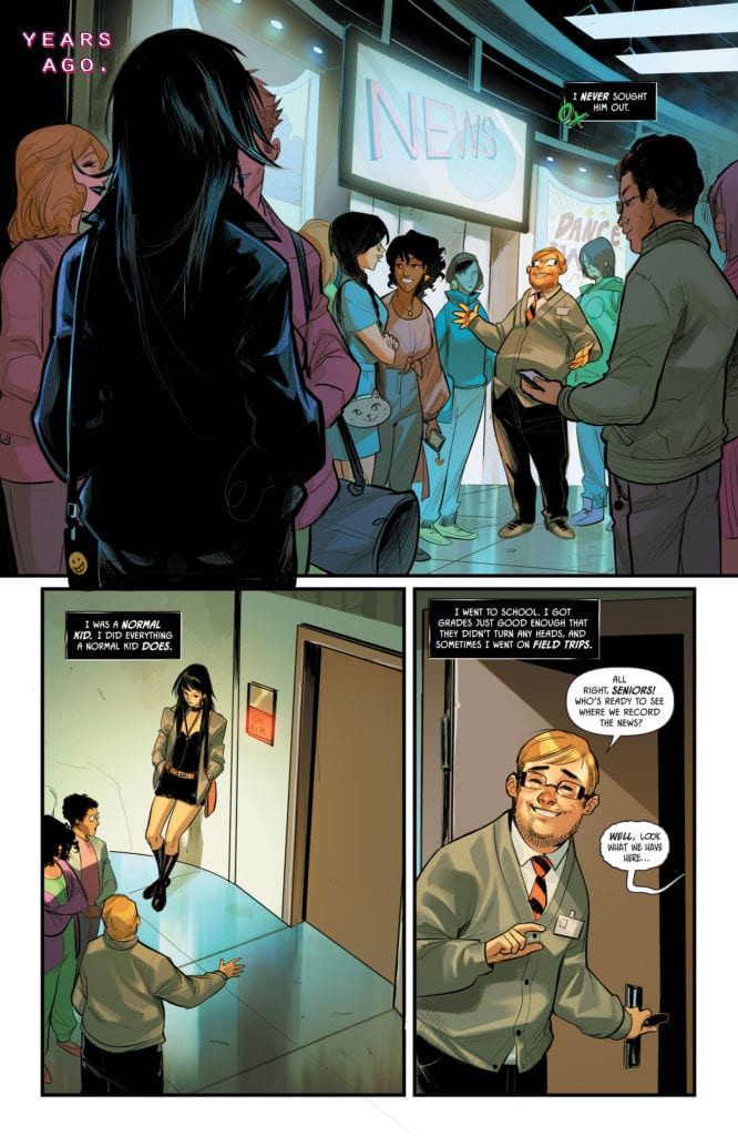
We open with Punchline revealed to be Alexis Kaye, stating to the court that she is innocent. After getting approved by Leslie Thompkins, the trial is pushed forward, with Kaye defending herself. This causes a schism between the youth of Gotham and other Gothamites as she uses social media to promote her innocence. One such example is the Row siblings, Cullen and his sister Harper, also known as Bluebird. While Harper understands and believes Punchline must be charged, Cullen begins to change gears when finding Alexis’ old blog. From there, the tale of how a senior in college met the Clown Prince and began.
Punchline isn’t innocent. We learn that not only did she descend into the madness, but she is pulling strings to manipulate Gotham. The argument between Harper and Cullen should be the heart of this issue. The pair butt heads of whether Punchline is guilty or not. It’s actually a surprisingly topical comic, showing how a person could abuse social media. If it wasn’t for the fact that we see Punchline’s origin, this could have been a great issue to have the fans debate.
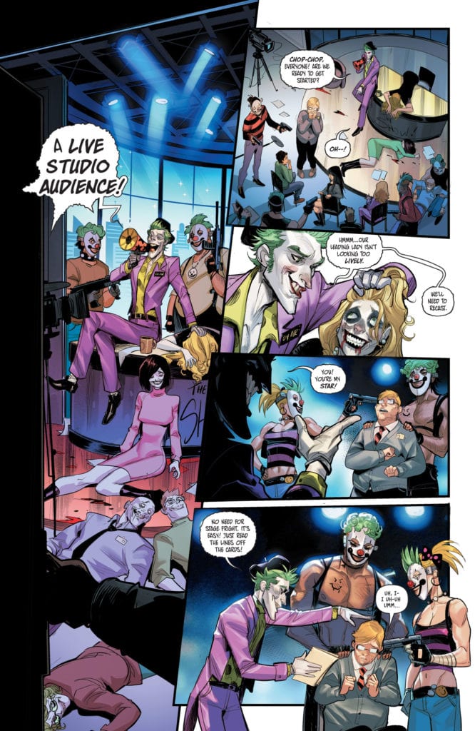
Unfortunately, we do see the truth, and it ruins the potential. Punchline’s actual origin is in the same vein as Harley Quinn, being twisted due to trauma caused by Joker. However, the main difference is that she searched for the Joker and demanded to be treated as an equal by stabbing him. The difference between Harley and Punchline had to be clear, or else it could lose readers, but to get that difference out, Johns and Tynion IV lost the opportunity to make a story that people could debate about.
Art:
Mirka Andolfo is the artist behind this issue, and she does a great job. The way she frames Punchline during the flashbacks gives off an unhinged feel. The panels start off being straight, but slowly over time, the angles become more apparent until she kills a rat. By that point, Mirka cements her style and delivers a great look for Punchline and the other characters of Gotham. When the story picks back up, hopefully, Mirka returns to bring it to life.
Conclusion:
Overall, despite a very cool look and topical subject matter, the writers don’t take a chance to invest in the latter. Comics are a great platform to take a stance on societal topics, and while they touch on it here, it could have been done better. This issue was designed to have us understand who Punchline is, and it did succeed in that. This comic does deserve some praise, but it isn’t essential for reading.
X of Swords has relied on several twists and unreliable narrators in its telling.
First, Summoner misled Apocalypse and the X-Men about his intentions and the fate of Arakko. Then Apocalypse’s children, the original horsemen, claimed that their mother Genesis, Apocalypse’s wife, had been killed, which readers then discovered was not true at the end of X of Swords – Stasis #1.
With each new telling of Arakko’s history, parts of the story that have been told have been misleading. With X-Men #14, Genesis provides us with the whole story, about her ongoing battle with the Amenthi forces, about her defeat of Annihilation, and about the Amenthi helm that drives her to conquer Krakoa.
One detail we learn from Genesis’s account is that Amenth has bred mutants with their own demonic forces (a possible allusion to the chimeras that House of/Powers of X pointed to?) from which has emerged a group of Amenthi Summoners who work with their Arakko Summoner fellows to build and man prisons for mutants in Arakko. Even though the Amenthi Summoners are products of demonic breeding, the prose page reveals that the Arakko Summoners may be the more insidious. As the text says, “the latter [reveal] the corruptive nature of that station and their undying allegiance not to the Golden Helm or the mutant state, but to the expansion of their own power and twisted religion.”
One is reminded of the Black Swans who appeared in Hickman’s Avengers run, the followers of a religion of destruction, whose own agenda often made them an untrustworthy ally to hero and villain alike. Religion, myth, and creation/apocalypse are big parts of Hickman’s writing, and the Summoners appear to be a “return to the well” thematically for him. I wouldn’t be surprised if the Summoners play a role throughout the remainder of Hickman’s run on the X-titles.
To that end, X of Swords will more than likely end with the reuniting of Krakoa and Arakko, with the mutants of Arakko, including the Summoners, being integrated into the life of Krakoa, changing it forever. There is some indication of this reunion in the prophecy of Idyll, the last late prophet of Arakko: “Only under the black moon will the two become one. A white light will judge them, and a red land will see them split forever.”
Whatever the black moon is, it probably refers to the islands’ merging after the “white light” judges them (probably Saturnyne). However, there is some foreboding here, with the promise that “a red land will see them split forever.”
Who are the two that become one? What exactly is split forever?
We will probably have to wait until the end of X of Swords to find out.