Home Blog Page 217

Review: JOHN CONSTANTINE: HELLBLAZER #12’s Glorious Conclusion

John Constantine Spurrier DC Comics

John Constantine: Hellblazer should never have been canceled.

The book is one of the strongest series to ever come out of DC Comics this century (2000-2020). Its conclusion, with issue #12, cements that fact. Writer Simon Spurrier, artist Aaron Campbell, colorist Jordie Bellaire, and letterer Aditya Bidikar somehow take a series, cut down in its prime, and whittle all of their plans down to one magnificent final issue. DC Comics John Constantine: Hellblazer began as a slow trudge towards its ending, with each new development carefully teased out. This creative team isn’t scared to break the mold and get the wheels moving in order to bring us a finale that truly delivers.

Writing

There are some obvious downsides to Hellblazer‘s premature cancellation. Spurrier finds himself in the unhappy place of having to move the plot very far, very quickly. That’s nearly impossible to do without being over-explanatory and heavy on the exposition—something Spurrier typically avoids artfully. Hellblazer #12 is, in fact, very expositional. Constantine spends much of the issue describing what’s going on as it happens. But Spurrier doesn’t allow it to feel like he’s preaching at us. The book still feels natural.

That’s because Spurrier never loses John’s voice in all this. Every moment of explanation is written as a kind of “Damn, the poor sod has no clue what I’ve got him into.” The tragedy that is John Constantine is heightened by each confession of what’s really going on. So, despite Spurrier’s captions being essentially a narration of events, they’re not only necessary, they’re brilliantly executed. The reader never feels talked down to. And Spurrier has created enough of a cryptic and subtle plot that John’s explanations are important to hear. This shouldn’t have been possible. But Spurrier condensed what may have been months and months of plans down into one fantastic script, without sacrificing any of this series’ quality.

John Constantine Spurrier DC Comics

Art

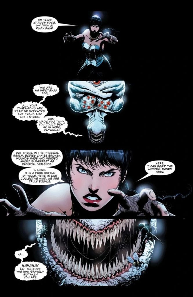
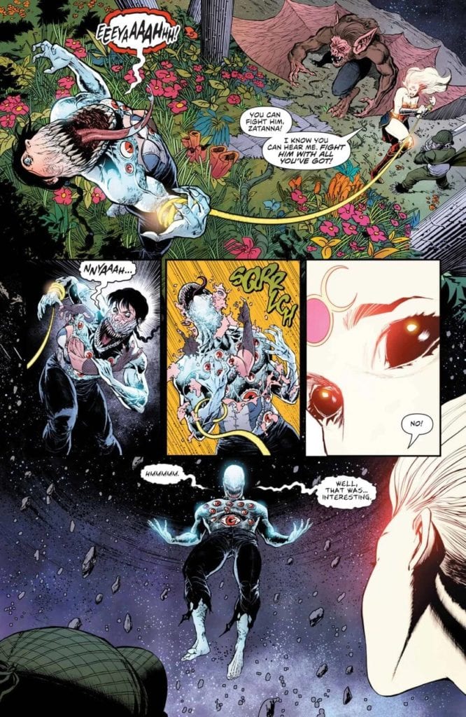
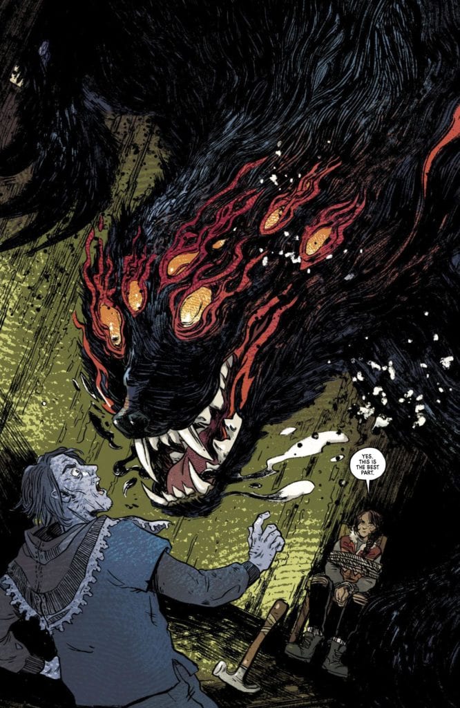
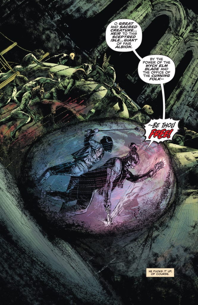
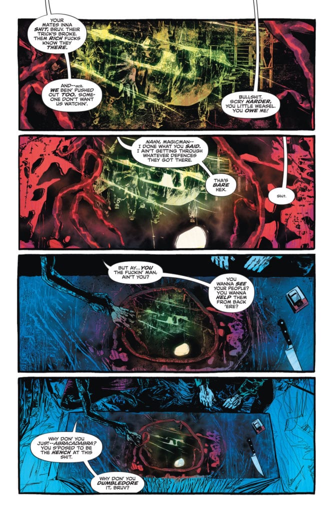
So much of Campbell’s art in this chapter focuses almost claustrophobically on John. Occasionally we see K-Mag, Noah, and the others, but there’s an artistic jostling of these characters. It’s as though Constantine, himself, is pushing them off to the sidelines. After K-Mag has been scrying, it’s not long before Constantine has taken over, pushing K-Mag out of the way. And while Tommy and Nat are busy dealing with their own fight elsewhere, Campbell sets up the conflict and then keeps us from the action. Instead, we see Constantine trying to put a stop to it from miles away.

The only other character that gets quite the same amount of attention from Campbell is, well, John Constantine. This Constantine being the older version. Campbell makes two things clear with this: this is the showdown we’ve been waiting for, and Constantine is too scared to get attached. It’s as though John can only look at his enemy or stay focused on himself because he knows there’s going to be collateral damage. He doesn’t want to have to face those getting caught in the crossfire.

Coloring

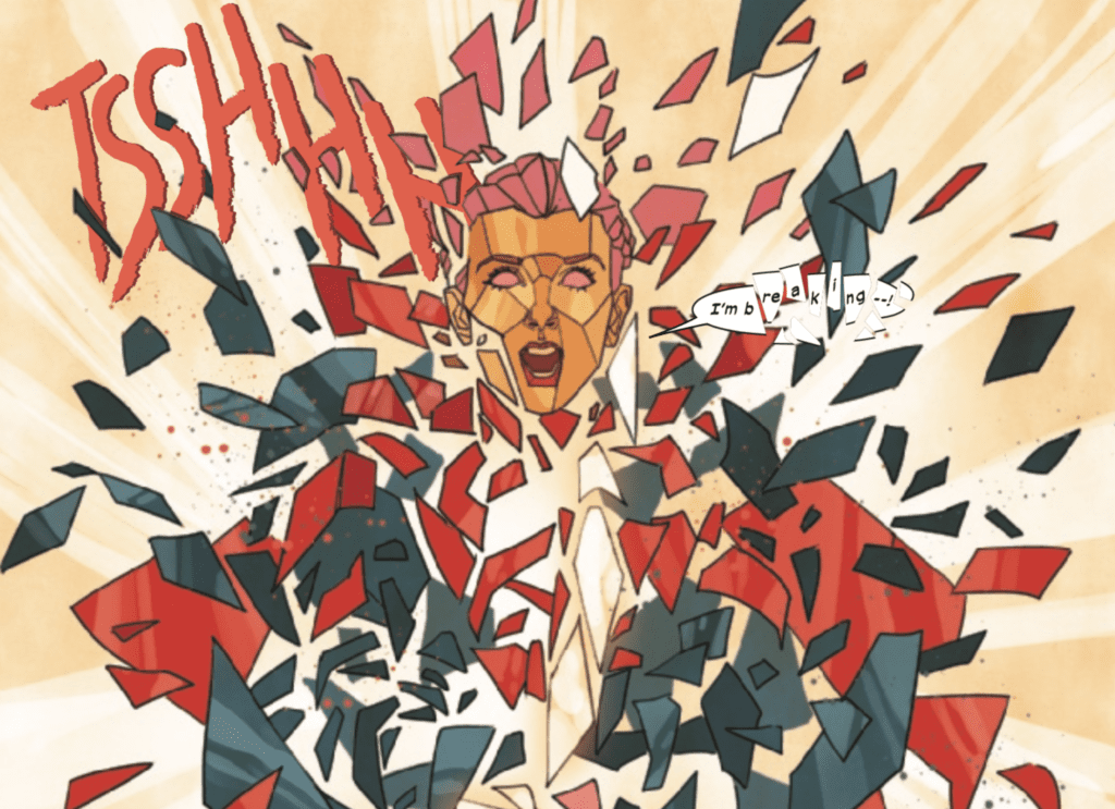
Bellaire begins our journey, back where she left us. In the same rotting cesspool of green where the last issue finished. But soon, we’re back with John, miles away. Bellaire colors John’s scenes in a bluish haze. Except for a few vibrant moments, even the blood in these scenes looks dull. Bellaire’s coloring works in tangent with Campbell’s art. It’s a window into John’s soul. He can’t allow the true nature of what he’s doing to sink in, so he keeps everything at arm’s length. The blood, which he’s covered in up to his elbows, blends in with the rest of the scene because John won’t allow himself to think about it.

Later, when John Constantine, the older, gives our own Constantine a call, Bellaire highlights the difference between them. In a nine-panel grid, set up by Campbell, Bellaire shows the human colors of John Sr. along the diagonal. The older Constantine actually looks human; his flesh looks fleshy, while the younger Constantine is still blue and distant. This is John’s worst nightmare. A version of himself that lets his guard down and experiences everything around him, no matter how horrific.

John Constantine Spurrier DC Comics

Lettering

Bidikar shows Constantine’s own discomfort with each new revelation. John Constantine is typically a very confident man, but this issue shows he may be in over his head. As the issue progresses, we see the difference between John’s confidence and his fear through Bidikar’s text boxes. Most of John’s narration is easy to see. Bidikar places these captions in orange text boxes that stand out. But occasionally, John seems a little like he doesn’t want to be telling us his thoughts. He talks about why he came back to K-Mag, admitting that he’s got no other options, and the narration is placed outside of a text box. It’s just lettering up against the art. It feels less confident and almost as Constantine wants us as readers to miss this bit.

Bidikar does this several times throughout the issue. It’s the moments when John loses his confident tone. “Bugger. All” is a prime example of his panic setting in. But it’s also the important moments of John letting his guard down for a second. Bidikar brilliantly highlights these moments by not highlighting them. The captions stand out because they’re trying to blend in with the page. It’s a brilliant step into the mind of the character. John Constantine is exactly the kind of man who would mutter the world’s truths under his breath.


DC Comics’ John Constantine: Hellblazer #12 has no right being this good. It’s too many brilliant stories, smooshed into one issue, with incredible grace. Spurrier, Campbell, Bellaire, and Bidikar have created a beautiful finale, against incredible odds. This issue may deliver, but it only makes it harder to say goodbye to this series and leaves one wondering what could have been. Pick up John Constantine: Hellblazer #12, out from DC Comics on the 24th of November, from a comic shop near you!

Monkeys Fighting Robots Youtube

Review: JUSTICE LEAGUE DARK #28 Shows Why A Price Must Always Be Paid

JUSTICE LEAGUE DARK #28, available in stores on Tuesday, November 24th, wraps up the The Cost arc in fantastic fashion. Last issue Zatanna used her magic to infuse her very being within the villainous Upside-Down Man. But will this ultimately hold him? The resulting story is full of suspense, horror, and hope.

Story

Faced with a now merged Upside-Down Man and Zatanna, readers will wonder whether the threat is abated (though at great cost). The heroes lost so much recently, so it would feel like the ultimate gut-punch to lose the sorcerer.

Unfortunately, the villain has the ability to counter Zatanna’s magic. What was thought to be the final blow actually turned into a seemingly equal war of wills.

Fortunately for our favorite magician, the lessons of paying the price for magic applies to the Upside-Down Man as well.

Ram V’s writing brilliantly conveys the trials and tribulations Zatanna and the protagonists experienced throughout the past arc. And the final clash is an incredible sight to behold.

Artwork

Amancay Nahuelpan’s penciling and ink work, June Chung’s coloring, and Rob Leigh’s lettering came together wonderfully in this issue. Zatanna’s transformation contains a grotesque surrealism that keeps readers’ eyes glued to the pages. The peach toned pieces of her face are stitched to the Upside-Down Man’s pale skin, which adds to the story’s eerie vibes. And the fonts complete the effect with squiggled styles featured in the villain’s word balloons.

Conclusion

JUSTICE LEAGUE DARK #28 ended an engaging storyline in one of the most satisfying ways possible. We are anxious to see what new horrors await our heroes.

What terrors do you think lie in store for our heroes going forward? Let us know in the comments below!

Monkeys Fighting Robots Youtube

Review: I WALK WITH MONSTERS #1 Is An Irresistible & Bloody Mystery

From writer Paul Cornell, artist Sally Cantirino, colorist Dearbhla Kelly and letterer Andworld Design comes cone of the most promising and intriguing starts to a horror comic in recent memory. “I Walk With Monsters” #1 is a quiet and dark comic that bleeds (literally and figuratively) with character drama and mystery. With a nuanced script and pitch-perfect visual work, this could easily be one of the best horror comics of the decade if it can keep up this momentum.

“In Jacey’s past is the Important Man who took away her brother. Now Jacey has David, who sometimes transforms into a terrifying beast. Together, they’ve found a way to live to hunt, sniffing out men who prey on the vulnerable. But Jacey and David are about to run into the Important Man again.”

Writing & Plot

Paul Cornell throws readers right into the world of “I Walk With Monsters” #1 by picking up the shapeshifting elephant in the room and shoving it in the reader’s face in all its monstrous and bloody glory. David’s bestial transformation is this comic’s most obvious and theatrical draw, so eschewing the classic build-up to the monster in favor of an immediate introduction is a great way to then focus on the characters, their relationship, and the backstory at the heart of this series. Cornell’s script uses ultimately very few words, and the ones he uses convey very little in terms of the larger plot. He’s focused very much on visually exploring Jacey and David’s relationship, and it works out brilliantly. Cornell understands how the comics medium works, and as such there is absolutely no exposition or even discussion of the larger plot here. There are hints in the quiet two-syllable word conversations between Jacey and David as to what their relationship is and wat they do, but for the most part Cornell leaves it up to the audience to explore the truths behind the story for themselves. The quiet and minimalistic scripting is submerged in this comic’s haunting atmosphere and sense of dread.

Art Direction

The pencils of Sally Cantirino in “I Walk With Monsters” #1 offer a rough-hewn but highly detailed and appropriate visualization of the world this story lives in. Her style is among the weird but intriguing styles often seen in horror comics today, comparable to the work of Jeff Lemire or Gabriel Ba. The monster design in here is also really, really good. There’s an almost sketchbook quality to the work that works perfectly for the quiet, desolate horror world this comic inhabits. Her panel direction offers solid horror direction, cutting to and away from the horror and revelations in a way that builds tension. The colors from Dearbhla Kelly are stunning, painting the panels in murky shadows and autumnal colors. Hers is a color palette becoming more and more common in modern horror comics, as it’s similar to the aesthetic in Harrow County and the recent TKO series Redfork. This isn’t a negative however, as it’s an effective choice that fits horror comics of this type spectacularly well. The lettering from Andworld Design has a similar effect as Cantirino’s art. It’s a rough but extremely fitting style. The font looks as though the letterer tied a bunch of sticks together in the shape of letters and called it good. I swear I mean this as a good thing, because it seriously works. The atmosphere cultivated in this comic’s visuals is murky and cold, and it’s the perfect tone for this story.

“I Walk With Monsters” #1 is a mysterious horror intro that delves on human trauma even more than it does its monstrous main attraction. Paul Cornell’s script chooses few words and no exposition to allow the reader to become in the story’s mystery. The visuals from Sally Cantirino and Dearbhla Kelly wash the visuals in detail and a cold autumnal horror atmosphere. This is a stellar opening issue to this horror comic series, and one I highly recommend picking up from your local comic shop on 11/25.


Monkeys Fighting Robots Youtube

WIDOWMAKERS: RED GUARDIAN AND YELENA BELOVA #1: Standing Apart From The Greater Flame

Widowmakers #1 Cover

Widowmakers: Red Guardian and Yelena Belova #1, available now from Marvel Comics, showcases characters appearing in the Marvel Cinematic Universe Black Widow movie. Writing this action-packed issue is Devin Grayson, co-creator of one of the main stars Yelena Belova. Taking on the art duties is Michele Bandini, with Elisabetta D’Amico assisting in inking. Erick Arciniega provides some illuminating colors, while Cory Petite brings great placement for lettering.

For Mother Russia

Widowmakers: Red Guardian and Yelena Belova #1 is a good way for Grayson to show how far her creation has gone. That being said, it’s probably best to avoid going into Yelena’s convoluted history in the more recent Black Widow series unless you’re into the whole cloning plot. Who needs that when Grayson displays Yelena’s everyday life and motivations that most readers would relate towards. Because who doesn’t want to be a capable spy who can stick it to corrupt rich people? At such, James Bond levels of action even.

Then there’s Alexei, the original Red Guardian. He’s the kind of character you don’t know whether to love or hate. Alexei is both a loyal soldier willing to help out someone he barely knows and a loyalist to a regime that has a higher body count than the Third Reich. This creates some rather interesting and complicated characters who would inevitably clash with the greater Marvel Universe. The kind of clashes that get readers questioning whom to root for.

Art

The primary artist of Widowmakers: Red Guardian and Yelena Belova #1, Bandini, makes dynamically eye-catching illustrations. Whether it’s characters, backgrounds, or objects, Bandini fills the page with enough detail to show what’s going on. She’s also quite good with action scenes making them rather comparable to Chris Samnee’s Black Widow.

A noticeably great effect in the issue is the use of illumination. Arciniega makes good use of spotlights to guide readers towards plot directives. They often accompany supplementary captions from Petit that, in turn, guide readers through panels. This makes them as dynamic as the action scenes taking place. Readers are bound to get excited when they find wordmarks of gunshots accompanying fast movements.

Widowmakers: Red Guardian and Yelena Belova #1 Will Make You Want Black Widow

Whether as a standalone or a companion piece to Black Widow material, Widowmakers: Red Guardian and Yelena Belova #1 will excite people. The artwork will get your blood pumping with how it pushes the characters through intense action. With Red Guardian and Yelena Belova who could go in any direction in this espionage action setting, readers will want more.

Monkeys Fighting Robots Youtube

X OF SWORDS Aftermath: Wolverine’s Mistakes Catch Up With Him in WOLVERINE #7

This may be the coolest X of Swords issue so far, not just in terms of action and visuals, but even in terms of plot twists.

spoilers ahead

Wolverine has two intense fights in this issue, broken up by two relatively violence-free challenges, one featuring an arm-wrestling competition between Magik and Pogg Ur-Pogg and another a drinking contest between Wolverine and Storm (a “gimme” for Krakoa…but there’s a twist. More on that later).

Wolverine’s first fight with Summoner is beautifully illustrated by Joshua Cassara and Guru-eFX, as the two champions fight across Blightspoke, “a realm of collapsed realities.” A lot of esoteric and surreal imagery is used to depict this realm in easily one of the best fight sequences and drawn scenes of the whole X of Swords Event. But there’s a twist. The fight was “to the death.” As in, if you die, you win. Which Summoner does. Plot twist one.

In another twist, Solem calls in the vow that Wolverine made to him in exchange for his sword back in X-Force #13, calling in Wolverine to fight War on his behalf, a fight Wolverine wins, although the point goes to Arakko.

The fight with War also brings up another mistake Wolverine made–trying to kill Saturnyne. It turns out that the drink he had with Storm dulled his healing factor, leaving him drunk. This was Saturnyne’s revenge for the attempt on her life. Plot twist two.

Interestingly, this issue contains two contests with champions from the same team facing off with each other–Wolverine/Storm and Solem/War. This choice of champions is commented upon by Saturnyne and may reveal the long game that Saturnyne is playing. She states, “You were all born of the same place, and you all share the same blood. So no matter your nation, you are all enemies, and you are all lovers. When Krakoa fights Arakko, so does it fight itself.”

Rather than ending with a bloody conflict, perhaps the opponents of Arakko and Krakoa will find that they have more in common than not, and rather than one of them being destroyed, there may be a deeper unity between the two nations foreshadowed here. Perhaps Saturnyne has benevolent intentions.

Wolverine #7 is available now!

Monkeys Fighting Robots Youtube

X OF SWORDS Aftermath: Things Shatter and Get Joined Together in EXCALIBUR #14

Part 15 of X of Swords marks the beginning of the tournament to determine the fate of Krakoa. While the first half of this series consisted, for the most part, Krakoa’s champions retrieving their swords, I assumed the second half would largely consist of one sword fight per issue between the two groups of champions. This issue shows that Saturnyne’s game is maybe a bit more complex than that.

The first fight between Captain Britain and Isca the Unbeaten begins like I imagined most of this X-event would go, with a Medieval style tournament, with both sides watching their champion fight to the death. What I imagined would be a quintessential fight ended almost as soon as it began and takes up very little space in this issue. Within a few sword parries, Issa’s blade shatters the starlight sword, and with it, Betsy Braddock.

Aside from being an extraordinarily rendered page by artist Phil Noto, this moment was foreshadowed by Gorgon back in Marauders #14.

Indeed, Isca’s sword breaks Betsy in a very literal way, making short work of this Captain Britain. While Betsy is presumed dead, don’t be surprised if this is a part of some scheme by Saturnyne to teach Betsy a lesson, especially given Betsy’s tarot card from Stasis, which spoke about how being paranoid doesn’t mean someone isn’t after you.

A majority of this issue is actually spent exploring Cypher’s challenge. While the cover indicates a hopeless fate for the inexperienced fighter, readers learn that his challenge consists of marrying one of Arakko’s champions, Bei the Blood Moon. The fact that this challenge takes up more than half the issue’s pages foreshadows the nature of the rest of the tournament, which will not be without bloody conflict but will consist of banal challenges that leave most of the contenders relatively unscathed.

This isn’t a straightforward fight, and while I do consider it to be boring and anti-climatic at times, I can’t help but wonder, with Captain Avalon, “What is Saturnyne up to?”

Excalibur #14 is available now!

Monkeys Fighting Robots Youtube

X OF SWORDS Aftermath: Fakeouts and Anti-Climaxes in MARAUDERS #15

X of Swords is turning into a bit of an anti-climactic affair. While I enjoy fake-outs and character moments, this event is a talkfest that doesn’t go anywhere (I also say this as someone who has read ahead).

This issue starts interesting enough, showing the consequences of Wolverine’s assassination of Lady Saturnyne at the end of the last issue. We learn that Arakko has invaded Earth and overcome the Avengers and the Fantastic Four. Readers are treated to an image of the Sanctum Santorum before seeing Dr. Strange’s burning body get thrown out the window. As the action then turns to focus on a crucified Wolverine, we learn that this is a vision Lady Saturnyne shows Wolverine about the future consequences of his actions, had his attempt to kill her been successful (which it wasn’t).

Attention turns back to the feast at the Starlight Citadel, which is not without some funny interactions. Still, for having set up the forces of Arakko to be an overwhelming, menacing threat, they lose their sense of menace as this series goes on.

If one were to compare this event with Hickman’s first event from his Avengers run, Infinity, this first big X-event certainly falls short of action and menacing villains (even though it had the potential to start off strong).

Perhaps, Hickman and company are setting up something else as a part of their storytelling long game. There were many ideas laid out in House of X/Powers of X, ideas that have only barely been explored in the first year of the Dawn of X (Arakko was only one of those ideas). Throughout this series, there have been hints about the possible reconciliation between Krakoa and Arakko, with one of the sword bearers of Arakko, Redroot, discussing the merits of Krakoan society with Death. Maybe there is a major shift in the status quo about to be established.

Or maybe there’s an editorial mandate to stretch out Hickman’s X-run as long as possible (and who knows how the recent revelation in Fantastic Four #26 that Franklin Richards is no longer a mutant may affect his run).

In any event, this is the fourth issue in a row of this series, which seemed to be setting up an epic and violent tournament between Arakko and Krakoa, that has turned into an on-going talkfest.

I’m a fan of Hickman and the X-titles’ potential, but Hickman and the X-team need to pick up the pace a little bit and provide some payoff.

Marauders #15 is available now!

Monkeys Fighting Robots Youtube

Review: BUZZARD #2 Is Fun, Energetic, And Violent

Buzzard #2 Cover

MFR described the first issue of Buzzard as “unapologetically British, with a punk rock flair and off-the-wall violence.” This second issue brings more of the same charisma and action as the first, this time with an added bonus of character development.

Buzzard is created by Andrea Wolf, with art by Ezequiel Assis, cover art by Samuele Zardinoni, and cover graphics by Rob Jonesand. You can help fund the second issue, which is currently on Kickstarter.

Story

Welcome to modern Britain: a lost land where folks look for meaning in bizarre places, with devastating results. CEOs double as vigilantes, bored millionaires role-play as neo-Nazis and jaded scientists toss ethics in the bin to chase massive leaps. All under the beady eyes of commoners too apathetic to give a damn. 

Erik Lincoln aka Buzzard, obnoxious high-schooler-by-day/bladed-armed-hitman-by-night, navigates this chaos better than anyone. Is he a daredevil with peanuts for brains? I mean, yeah. But though he toys with his own life, he’ll do anything to improve his sister’s.

This balls to the wall action-comedy delves with irony and gusto into the contradictions and challenges of today’s world, fueled by British humor and running on a manga edge. 

Buzzard #2 Page Sample

Writing

What writer Andrea Wolf did to make the first issue of Buzzard entertaining and successful is very much alive and well in this second issue. It was described as having loose and raw dialogue, which it still has. This time, however, Wolf includes some of the back story for Erik (aka Buzzard). We are also introduced to Mathilde, Erik’s younger sister. These moments in this issue really add some depth to the various characters, and the world that they inhabit.

But make no mistake, there is action to be had in this book. Now with super hi-tech arms, Buzzard takes on the upper class, low-key Nazis, as well as their thugs-for-hire, with bloody brutality. There is some high flying combat at just the right moments sprinkled throughout the book. That, coupled with the aforementioned character development, makes for a well-rounded installment in the Buzzard saga.

Art

Artist Ezequiel Assis returns with spruce linework that still manages to have a bold intensity to it. This time, the “Manga edge” that is mentioned in the above synopsis is very much apparent, more so than in the first issue. Assis makes good use of Manga elements, such as Mathilde’s big, expressive eyes, as well as the speed lines during the action sequences. All of it helps make the artwork in Buzzard #2 fun and energetic, and a laudable compliment to Wolf’s story.

Conclusion

You won’t regret picking up this fun, action-packed independent comic. It’s got the best parts of Deadpool and Kingsman

You can support Wolf and the second issue of Buzzard which is currently being crowdfunded on Kickstarter. You can also support the creative team by following them on Facebook and Twitter.

Monkeys Fighting Robots Youtube

Review: DUNE HOUSE ATREIDES #2 Settles Into Its Style and Starts To Gather Speed

Dune
Dune House Atreides #2 Credit: BOOM! Studios

There is a new Dune Graphic Novel coming out from Abrams just in time for Christmas, and the movie trailer is still doing the rounds wherever people can get to a cinema. Therefore BOOM! Studios and Dune House Atreides #2 are in a good position to benefit from all the excitement currently being generated for the franchise.

After a scene setting first issue, the prequel adaptation continues to expand the Dune universe by introducing new characters and expanding on the histories of the famous Houses. The titular planet is just a central hub around which a universe of action is beginning to unfold. With such a strong fan base, and numerous visions of the franchise starting to appear, is BOOM!’s version setting the standard for others to follow?

Dune
Dune House Atreides #2 Credit: BOOM! Studios

Into the Desert

Setting out from the brutalist city of Carthag, Imperial Planetologist Pardot Kynes is led into a sandy landscape to discover first hand some of the secrets of Dune. The Bene Gesserit outline their extensive breeding program, Duncan Idaho learns of Harkonnen cruelty, and Leto Atreides is abandoned on Ix.

The second issue of this adaptation is split into mini chapters, reading like the original novel by Brian Herbert and Kevin J Anderson. Each section contains an element of discovery, a thematic thread running through the comic. With each discovery a little more can be understood of this vast universe created by Frank Herbert. Characters, families, and religious organisations are being slowly fleshed out for the reader through multiple stories that, as yet, are unconnected.

Herbert and Anderson have adopted their story well from the novel to the comic. However, any newbies to the franchise may find the narrative disconcerting as it leaps from one character to another, like a series of unrelated chapters unfolding on the page. This style of storytelling works better in a longer format, and will enhance the reading experience when this is inevitably collected. However, each bite sized narrative at least contains a satisfying chunk of plot that relates thematically across the entire issue. By the end the reader comes away with some understanding of the world, if not the direction of the plot.

Dune
Dune House Atreides #2 Credit: BOOM! Studios

World Design

After reading the first issue last month, the design and art style has had time to sink in. Dev Pramanik sketches his way through the pages and seems to have found a flow that matches the story. His inking has a diffused appearance, creating a hazy landscape and his characters are emotive if a little difficult to read at times.

The layouts are very rigid with heavy black frames on the panels but the shape of the panels change to express the action within them. The lettering also helps to break-up the stiffness in design by occasionally crossing the frames and entering the gutter, drawing the reader back away from the page to help take in the larger picture. Ed Dukeshire has a lot of script to get onto the page but his economy of word balloons and strategic placement means that the action is never interrupted. The sound effects throughout this issue of Dune have a lightness to them and they blend perfectly with the main artwork.

Pramanik’s line work is definitely enhanced by Alex Guimaraes’ colors which clearly separate the chapters. Each world, and by default each central character, has its own atmosphere produced from the shifting color palettes. From the desolate desert of Arrakis to the cold Harkonnen home-world, Guimaraes creates unique environments for the characters to inhabit. The shift from planet to planet is easier to follow because of the shift in color but it also gives the reader a better understanding of each world.

Dune
Dune House Atreides #2 Credit: BOOM! Studios

Conclusion

All of the separate elements of this comic work well. They tell the story and build atmospheres that relate specifically to each section of the narrative in a worthwhile way. Elements that make Dune an interesting reading experience in the Novel format are transposed to the comic successfully, especially the inner monologues that sit on the page, color coded for ease.

The plot itself is fast paced enough for the monthly comic format and you get the impression that something is happening, that it is all going somewhere. Comics like this will always feel harder to engage with if you are not used to the franchise but this second issue does a much better job of making readers feel at home. The first issue was a visual cultural shock but this month everything seems to work together better, or maybe the style choice has had time to sink in over the last month. Either way, Dune House Atreides #2 is a satisfying read and it’s beginning to feel a lot more like Dune.

Monkeys Fighting Robots Youtube

Review: The Last Vermeer Offers Disposable Court Drama

The Last Vermeer is impressive visually, but rather dull for most of its runtime before delivering a solid third act. The film is not atrocious by any means but just seemed to lack a reason for anyone watching to care. Period dramas have a list of classics to offer, but The Last Vermeer will not be joining that list. A post World War 2 film that is wonderfully directed, and features some impressive acting, but its narrative is just lacking.

Being set after the fall of Hitler, and being based on a true story was the film’s most interesting aspects. The Last Vermeer showcases strong cinematography, acting, direction, from start to finish. The film seems to drag on at times, but a stellar lead performance makes it bearable. Directed by Dan Friedkin, The Last Vermeer stars Guy Pierce, Claes Bang, Vicky Krieps, Roland Moller, and Olivia Grant. In the film, Han van Meegeren, a famous swindler is expected of selling Johannes Vermeer paintings to the Nazis. He is investigated by a member of the Dutch resistance (Bang) and a soldier (Moller). As the film progresses, the truth’s regarding Meegeren schemes is revealed.

Guy Pierce as Han van Meegeren in The Last Vermeer

The screenplay for The Last Vermeer was written by Mark Fergus, Hawk Ostby, and John Orloff. In a script full of uninteresting characters, it is great to know that our central character will keep the audience invested. Meegeren is considered one of the greatest forgers in history, and thanks to a brilliant performance from Pierce, the interest in the character grows with each new scene. Meegeren has a burning passion for painting, it has existed in him since his youth. Unfortunately, his father would beat him for painting, but he escaped and went on to live out his passion. A passion that has turned him into a con artist, as far as the Nazis are concerned. The script gives you enough to introduce Meegeren and the performance just makes him captivating. Every other character comes off like a distraction and it’s unfortunate because the acting isn’t bad at all.

The Last Vermeer effectively develops its central character and what begins as a mystery, transforms into a courtroom drama for its final act. A third act that was so well written it puts the earlier portions of the film to shame. Not knowing enough details about Captain Joseph Pillar, the resistance member investigating Meegren, is where the film lacks. A lot of time is spent with Meegeren and Pillar, so it’s odd to learn little to nothing about him, as he carries the story with our con artist. Also, subplots seem to go unresolved as the film progresses, which felt odd. As mentioned above, the performances are great for everyone involved. Pierce eats up the scenery as Meegeren, coming off very unorthodox, gifted, and mischievous. Bang is delightful as Pillar despite not learning much about him, he keeps you interested in learning what is going on with Meegeren.

Claes Bang as Joseph Pillar in The Last Vermeer

Friedkin’s direction is acceptable here, and the cinematography was breathtaking. The highlights come from the courtroom scenes because there’s emotion, stunning internal shots, and a growing sense of intrigue that feels like it was trying to break out during the first two acts. Otherwise, the pacing choice made The Last Vermeer come off as flat as Pillar’s character. Pierce’s performance is so great that when he is off-screen viewers may grow even more uninterested in the flat character of Pillar. That solid performance just isn’t enough because the writers failed to give viewers any reason to care about him, but he does get a little development. Visually this film is a home run, it’s just the narrative hiccups that hinder it at times.

The Last Vermeer is effective for what it has to offer, but as far as period dramas go, there are better. Being based on a true story was the film’s biggest attraction, but it’s carried by Pierce’s strong performance and its visual treats. Despite the narrative hiccups and an undeserved final act, The Last Vermeer offers disposable drama that checks off enough boxes to possibly be enough for some viewers. 


Monkeys Fighting Robots Youtube