Writer Mike Mignola, artist Tiernen Trevallion, colorist Dave Stewart, and letterer Clem Robins come together to bring us Dark Horse’s Hellboy and the BPRD: Her Fatal Hour, a two-part issue about looking monsters right in the eye and yawning. “Her Fatal Hour” and “The Sending” show the sheer skill of the BPRD. These kinds of cases are just another day to them.
Writing
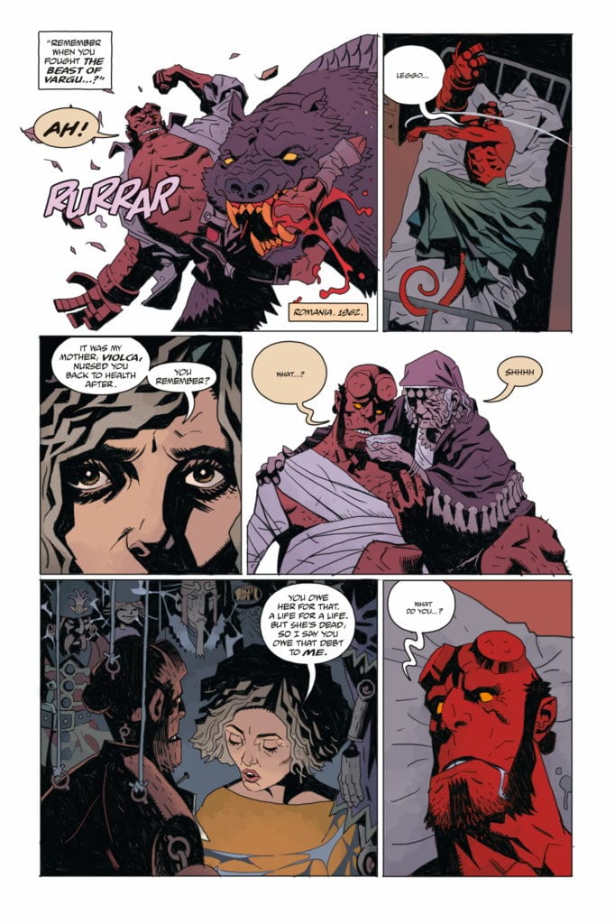
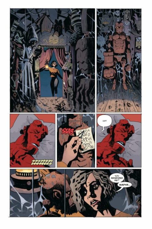
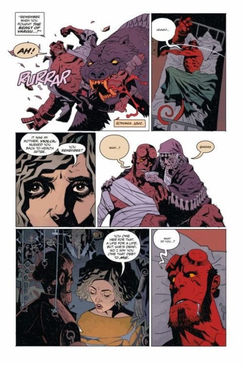
Mignola shows us just how used to this world his characters are. Hellboy, fighting a monster off of a girl, encounters a ghost at one point. “Save her,” the ghost says. Hellboy isn’t phased. “Workin’ on it,” he says before diving back into the mayhem. This is the heart of a lot of Mignola’s charm. He downplays the moments other writers would be tempted to overdo. Yet Mignola does overplay one moment.
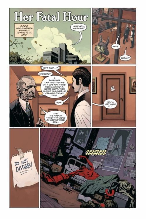
Two BPRD agents stand outside of Hellboy’s room as he is “tossing and turning in his sleep.” What he’s really doing is fighting a monster. The entire sequence seems to take a while. Hellboy catches up with an old friend before the fight even starts. These BPRD agents apparently spend the whole time outside Hellboy’s door. It’s an odd moment where Mignola lets himself get a little too enraptured by his own character. It’s one of the extremely rare examples of Mignola lacking a touch of subtlety. Something he more than makes up for elsewhere in the script.
Art
Trevallion strikes a careful balance in approaches when creating this work. He pulls from both Mignola’s minimalism and Duncan Fegredo’s attention to detail. Some scenes, like Hellboy’s room, Trevallion adds in all the right details. A “High Noon” poster on the wall, dirty plates and empty cans on the floor. Other times, Trevallion pulls back. When one character holds their dying mother, Trevallion removes all signs of a background. It’s the two characters, alone against a blank white space. This makes the moment feel like nothing exists outside of it. It’s sad, it’s lonely, and it’s all we need to see to feel what Trevallion is communicating.
Coloring
Stewart creates such a calming feel throughout these panels. When no one is fighting, you can visibly see the safety in the gentle colors. When Stewart is coloring flashback scenes, he uses a dark purple color palette. At first glance, this looks almost calming. It’s as though all the events are happening in a kind of twilight. But as the flashback scenes progress, Stewart shows us that the “twilight” is a warning of the coming darkness. A bold red panel shocks the reader back to reality, reminding them that the stakes are rising.
Lettering
Robins also brings a lot of the “wake up calls” into each fight scene. The bright blue of the “SMAASH” or the pink “THUD” make the scenes feel full of action. At one point, when a ghost zooms into the room, Robins places the “AAAAAAAAAAAAAA” noise it’s making behind all the characters. This makes the noise feel like it goes on forever. Like it envelops the room. So later, when Hellboy grabs the ghost and the “AAAAA” is shown lower and in front of the ghost, it feels like there has been a shift in the dynamic. It’s these subtle differences that Robins uses to show who has the upper hand.
This issue is about drinking whiskey in the aftermath of a monster fight. It’s about shopping for books on a page strewn floor of the site of a ghost attack. This creative team wants to show us just how normal goblins and ghouls are to the BPRD. Dark Horse’s Hellboy and the BPRD: Her Fatal Hour is out December 2nd at a comic book shop near you. Pick it up there and also catch our own exclusive interview with this issue’s artist, the brilliant Tiernen Trevallion, here!
Hellboy and the BPRD: Her Fatal Hour, written by Mike Mignola, with art by Tiernen Trevallion, colors by Dave Stewart, and letters by Clem Robins, hits your local comic book shop this week. Thanks to the great people at Dark Horse Comics and Superfan Promotions, Monkeys Fighting Robots got a chance to talk to Trevallion about the upcoming two-parter.
About the Issue: Master of horror Mike Mignola is joined by artist extraordinaire Tiernen Trevallion and award-winning colorist Dave Stewart to bring you the follow-up to smash Hellboy hit ”The Beast of Vargu”!
1 of 7
Monkeys Fighting Robots: What about “Her Fatal Hour” and “The Sending” makes these great companion pieces to one another? What through lines do you see that thematically link them and lead to you and Mignola releasing them together?
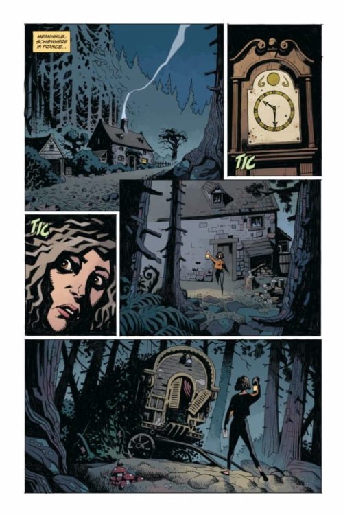
Tiernen Trevallion: That decision was entirely Mike Mignola’s. Both stories deal with old friends; both Nadia and in particular Harry Middleton are significant to Hellboy. There is, if you like, a theme of a distant outside influence, of manipulation from afar. One instance is the solution to the story, and one is the cause.
MFR: Your art style feels like such a perfect balance of Mignola’s minimalism and Duncan Fegredo’s (artist of “The Beast of Vargu”) more detailed approach. Some panels you draw with lots of details, like Hellboy’s room with the High Noon poster, and then other panels you remove the background altogether, like the women in the church. What factors lead you to choose one approach over the other as you went through?
TT: Thanks for that, I’m also a huge fan of Duncan Fegredo’s work. What I’m usually trying to do is focus. I’m asking the reader to concentrate on certain elements. With the women in the church, this is a poignant moment, so I’m attempting to emulate the feeling of loss and vulnerability in the simplest way possible: by isolating them. With fight scenes, I usually avoid any background, or maybe just leave a suggestion, because the reader wants to see a dynamic punch-up, not get distracted by an interesting vase…unless the vase is getting broken in a pleasing way… Damn those vases…
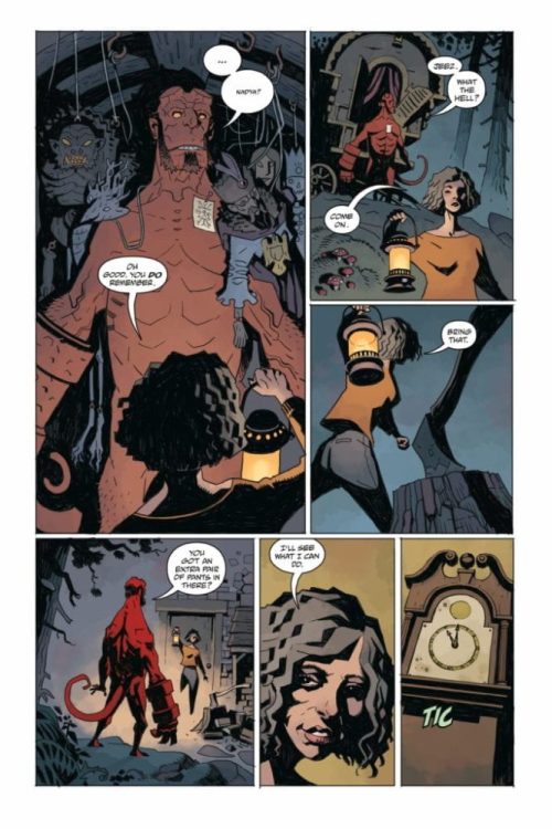
MFR: There’s a brilliant casual atmosphere to these scenes. Nadya is drinking in front of the fire after a big fight scene; Harry is leafing through broken books on the floor elsewhere. How did you hone in on this aspect of the characters? And when did you know you kind of wanted them to be laid-back despite the horror going on around them?
TT: I think these guys have seen enough to make them not so much laid-back, but rather prepared for how to deal with the situation. Harry leafing through books on the floor came from the script; Mike suggested that Harry is looking around, but listening. I liked the idea of him being interested in not only the case, but also all the books spread everywhere. Again, that final scene with Nadia, that’s at Mike’s direction. A horrific chapter in her life has been closed.
MFR: Harry isn’t a character we’ve seen a lot of, but he has a lot of significance. He was a friend of Bruttenholm, and a big influence on Hellboy. How much of his voice did you feel like you pulled from earlier appearances, and how much did you feel like you brought out on the drawing board?
TT: I have to confess, I didn’t know much about Harry until I did this story. There are a few gaps, I fear, on my Mike Mignola/Hellboy shelf. I have of course caught up a little on Harry Middleton now, and I rather enjoyed drawing him. Nice old chap! I hope I did him justice.
Thanks again to Tiernen Trevallion for taking the time to give such great answers to our questions, and for the brilliant work put into HELLBOY AND THE BPRD: HER FATAL HOUR!
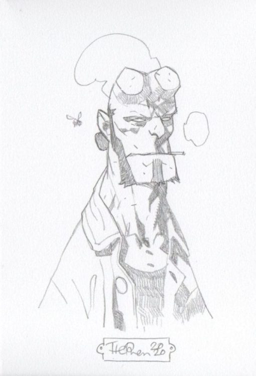
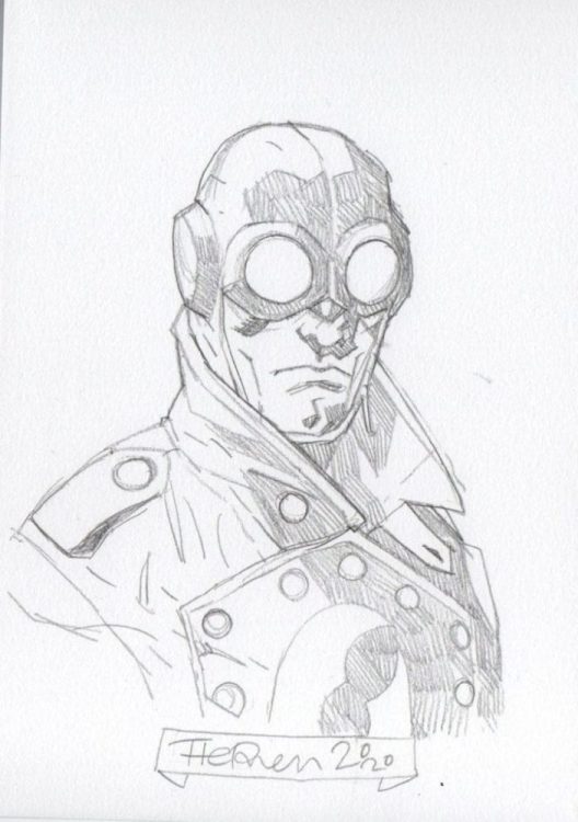
Trevallion is also currently selling limited edition giclee prints, signed and numbered, of this issue’s cover. Each print comes with an A5 sketch of something from the Mignolaverse. You can get ahold of these awesome prints and sketches on Tiernen Trevallion’s Facebook page. Below are some of the jaw-dropping sketches from his page:
1 of 3
Dark Horse’s Hellboy and the BPRD: Her Fatal Hour is out December 2nd at a comic shop near you! Pick it up, and keep an eye out for our upcoming review!
Director Shannon Kohli (Supergirl, The Magicians) makes her feature film debut with All Joking Aside, a comedy-drama starring Raylene Harewood (Supernatural, Legends of Tomorrow) as an up-and-coming comedian who befriends a comedian on the rocks.
Charlie (Raylene Harewood) is a smart young woman taking her first shot at stand up comedy. During her set before a sparse audience, Charlie meets Brian Markinson’s (Continuum) Bob, a grade-A heckler. In All Joking Aside, Charlie and Bob’s paths are destined to come together, and by the film’s end, it’s for the best for both of them. The pair form an odd-couple relationship that ends up telling a compelling and entertaining narrative.
PopAxiom spoke with Raylene Harewood about becoming an actor, doing stand-up comedy for All Joking Aside, and getting to play something evil.
The Goal
Raylene Harewood is originally from Winnipeg, Manitoba, Canada, and says, “Growing up, I had a lot of hobbies, and acting was one of them.”
“When I was around 16,” she continues, “I was in my first professional theatre show. I had this moment backstage where I thought, ‘Oh, my gosh if I don’t do this for the rest of my life, I will be so unfulfilled.’”
Raylene set her sights on studying acting. “I set my goal to get into a theatre school. I applied to a few and got into a few. I ended up choosing Studio 58 in Vancouver, and the rest is history.”
About All Joking Aside
Raylene’s filmography thus far includes the hit Fox-turned-Netflix show Lucifer, the undead detective series iZombie, and stints on Supernatural, Charmed, Legends of Tomorrow, and The Magicians. “I learned about the part while on the set of The Magicians,” she shares her road to starring in All Joking Aside, “[an episode] directed by Shannon Kholi. She pulled me aside one day and said she was doing a feature, and she thought I’d be great for the lead.”
Raylene auditioned and landed the role of Charlie, a stand-up comic in the making. “That was completely new for me. I was a huge stand-up fan before that. I love John Mulaney, Gary Gulman, but that was my first time doing it.”
Preparation is vital for success in just about anything. “I did one five-minute set a few weeks before doing the film,” Raylene says about her preparation to play Charlie. “That was one of the most terrifying experiences of my life.”
“I thought it was going to be an amateur night,” she continues, “but it turned out to be a night for experienced comics to test out new material. I was the only person who had never done it before.” No pressure.
“I wrote it myself,” Raylene says of the material she used in the five-minute set. “Stand-up is fun. I looked at it like a puzzle where you’re figuring out the best way to put words together to make people laugh.”
The stand-up moments in All Joking Aside are crucial to the way the narrative drives forward. “The main thing that we talked about in prep was mostly about getting me comfortable doing the stand-up.”
“We did a lot of me working the writing,” she adds, “especially because stand-up comedy is so personal. It’s tough to write it for someone else. So, that was a challenge, taking what’s written in the script and making it my own.”
“I can’t say I was totally comfortable,” Raylene laughs when asked about doing stand-up comedy. “I think it works for the character. The progression of where she started and where she ends makes sense.”
All Joking Aside was shot in and around New York City. “One of the tougher days was when we shot all the park scenes. It was very cold. Trying to get my mind off of the cold and on whatever I was doing was quite a challenge.”
“It was super-fun,” she says of her experience while making All Joking Aside. “I loved acting with Brian.”
Wrapping Up
Raylene’s wanted to be an actor since she was sixteen. Who’s inspired her along the way? “I’m going to say something now, but in three hours, I’ll think of something new. I will say Viola Davis is a huge inspiration to me. When I was younger, as a comedic actor, Raven-Symoné was a huge inspiration. She’s so funny in That’s So Raven. David Tenant is one of my favorite actors.”
“I want to play like a villain or something,” she says about future roles, “Cruella DeVille or something like that. Something really dramatic, evil, and glamorous.”
All Joking Aside is available in a digital store near you. “I’ve done a few made-for-TV movies this summer. One is called Cross Country Christmas and another called CranberryChristmas.”
Is All Joking Aside on your watch list?
Thanks to Raylene Harewood and October Coast
for making this interview possible.
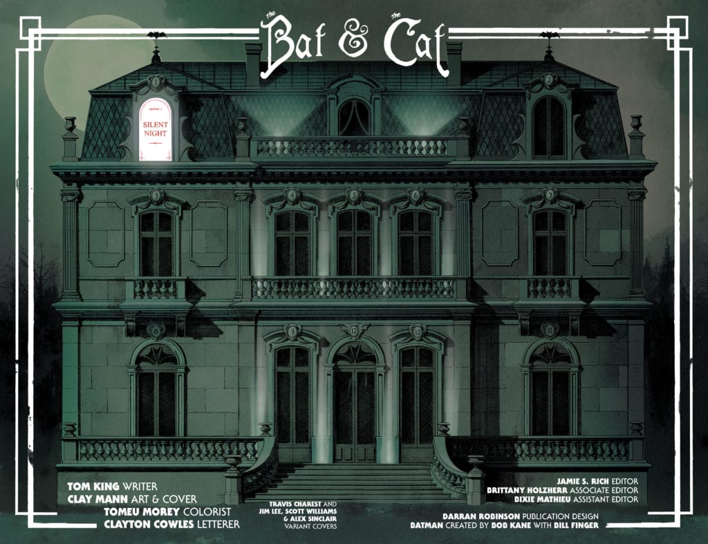
There’s something to be said for “romances” that plant themselves firmly in the realm of the platonic. Stories that discuss the connection between friends, not lovers. In some ways, these stories feel like they get at something deeper. They’re not just about mutual attraction and sexual chemistry. They’re about shared trauma, laughter, and the ability to let your guard down completely. So, DC Comics’ Batman/Catwoman #1 isn’t really about Batman and Catwoman. It’s a “romance” about the friendship, or at least the complicated relationship, between Catwoman and the Joker.
Writer Tom King, artist Clay Mann, colorist Tomeu Morey, and letterer Clayton Cowles push the titular relationship to the sidelines in their new series for DC Comics. They focus instead on the undeniable connection between Selina and her friend, colleague, and enemy, the Clown Prince of Crime.
Writing
King isn’t focusing on the action in these pages. Deaths and fight scenes happen off-panel. We meet people who have somehow escaped death, but we don’t know how. Those moments don’t matter. They’re gaps we can fill in on our own. The moments that do matter to King are the quieter moments. King wants to talk about the aftermath of superheroism, the embarrassment that sets in after the adrenaline rush has subsided. And these are the scenes that count. We’ve seen the fistfights before; we know how they go. We haven’t seen Joker and Catwoman reminiscing on a rooftop as the sun rises.
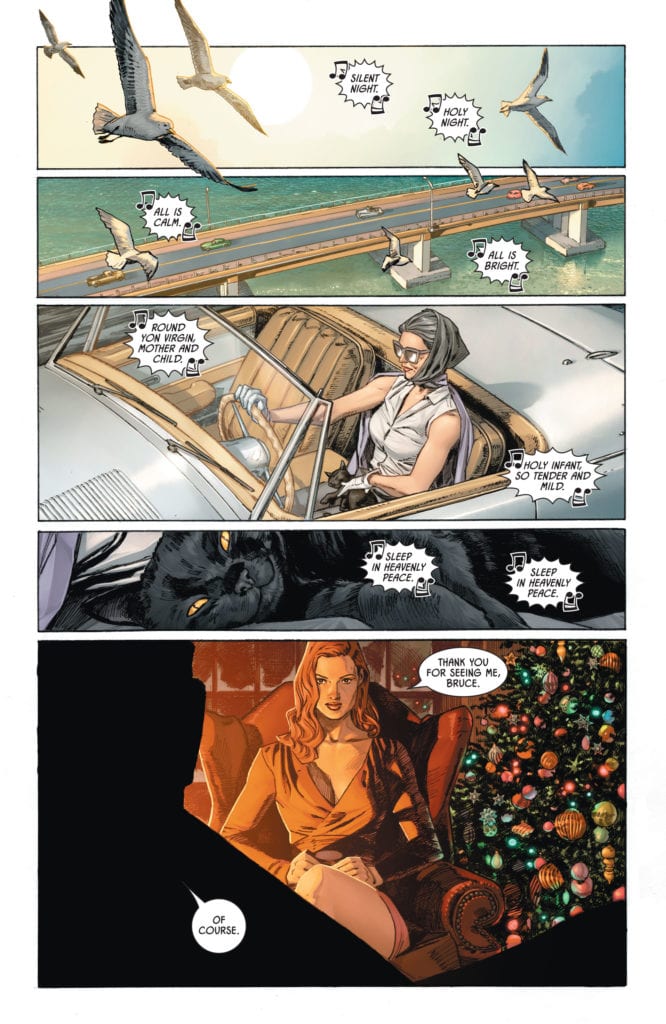
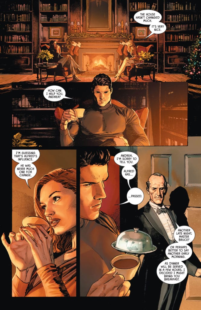
King also creates a kind of distance to the events of this issue. While one timeline follows our characters in the “present,” we also follow an older Selina Kyle, years in the future, as she goes to tie up loose ends with people she and Bruce knew. Bar everything else, we know she at least survives to grow old. Present-day happenings might scar our cast of characters, and Selina suggests they do, but they won’t kill them. King wants to see what it looks like for superheroes to try and live a normal life. But what’s so telling about this issue, is normality doesn’t sneak in when Selina and Bruce get together. Their relationship is larger than life, it’s mythological. No, normality sneaks in when she and Joker discuss how she’s changed. Knowing Selina outgrows her life as Catwoman almost makes her time with Bruce seem silly. It’s when her guard comes down, and her mask literally comes off, that feels like a respite from all this play-fighting through the night.
Art
Mann doesn’t stay within the lines. Characters jut out of the panels they’re in. Sometimes it’s just an elbow or a forehead that sticks into a neighboring panel, other times they tower over a separate scene. Mann uses this as simple way of creating a flow on the page. One panel seamlessly blends into another. But sometimes, Mann is showing us something important. As an older Selina talks with another character, we see a scene of her and Bruce, jutting into this scene from the future. The scene feels like it’s living in the shadow of the past. As she and her friend weep together, we see how much their lives are marked by times gone by. Maybe they’re chasing that feeling, the feeling of being an important player in the world. Maybe they wish they could forget it all. Either way, their present is inextricably tied to their past.
When the Joker and Selina talk about each of their lives’ new direction, Mann shows us how Joker is beginning to feel about Selina. Mann splits a panel of each of their faces in half, so they look like two sides of one person. Mann shows us their kinship, how they’re not that different. Joker was once her colleague, maybe even her friend, now she’s sleeping with the enemy. We see an image of Batman at the top of the page, and Joker’s head and shoulders are superimposed over it from the panel below. He and Batman are facing different directions. The Joker looks alone, even hurt. It’s as though he feels he’s lost a friend. His back is to Batman and Selina like he’s third-wheeling and left out in the cold. It’s incredible. He’s a villain, a murderer, a psychopath. Mann somehow keeps him dangerous, yet also makes him relatable.
Coloring
Morey gives us all the more reason to sense a connection between Catwoman and Joker. Throughout the issue, Morey uses purple and green. At first, this seems like it’s just the colors of the Joker. But Morey reminds us there are versions of Catwoman’s costume that were also purple or green. Yet the purple and green don’t stop at their fashion sense. It colors nearly every scene that they’re in. Whether it’s the purple sky of a sunrise over Joker and Selina talking, or the green alligators Batman and Catwoman are fighting off, or the color scheme of an old friend’s home. The only other color that takes up quite as much space is red. Red becomes the overpowering color of all of the most dramatic scenes. Whether it’s the sky in the background as Catwoman and Batman hunt for criminals, the red shirt of an old man trying to live down his past, or the red glow of the fire as Bruce catches up with an old flame. These are the moments of the golden age. The moments that feel important. Red is the passion, the violence, the blood, and the lust that fills a hero’s life.
Lettering
Cowles uses a clear symmetry on the page to tell us something about each character and how they relate to one another. He shows a mutual respect between Catwoman and Joker. Their word balloons mirror each other, almost as though they reach out to one another. At one point, as Catwoman is dangling from a ceiling, we see her dialogue stretch downwards. She’s speaking to Joker, who is sitting elsewhere in the room, waiting for her. His words go up to meet hers. And later, as we see they are almost merged on the page, their dialogue comes to the middle. Each line getting closer to touching the others. It’s this mirroring that makes them feel like equals. They speak to each other on the same level, literally. There’s no talking down or one-upmanship. They’re people who understand one another.
DC Comics’ Batman/Catwoman #1 is sneaky. It pretends to be a Bat/Cat romance, to get its foot in the door. Once it has, it invites you into a beautiful meditation on friendship, trauma, and the people in life you can never quite shake. This creative team lays out the complicated history of a superhero and the even more complicated history of a couple of supervillains. It’s brilliant, it’s shocking, it’s simple, and it’s oh so complex. DC Comics’ Batman/Catwoman #1 is the start of a rule-breaking, ass-kicking series that’s going to leave a mark on Gotham City forever. Pick up Batman/Catwoman #1, out from DC Comics December 1st, at a comic shop near you!
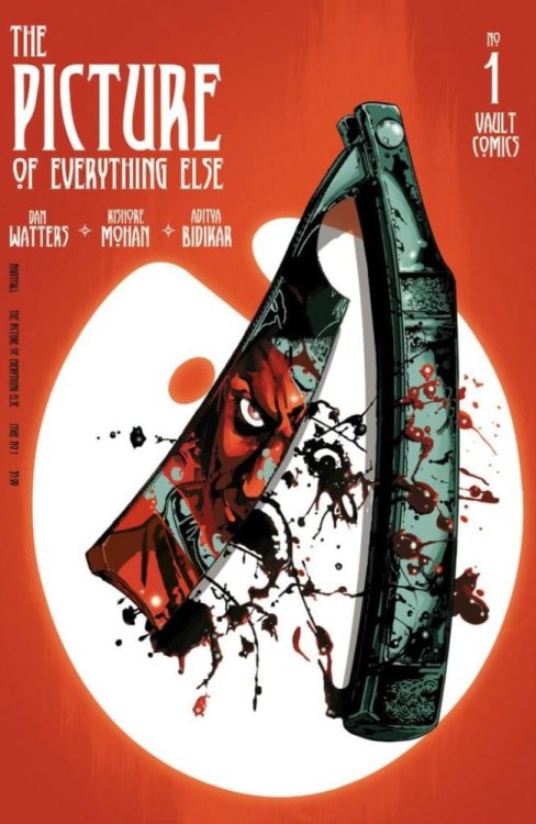
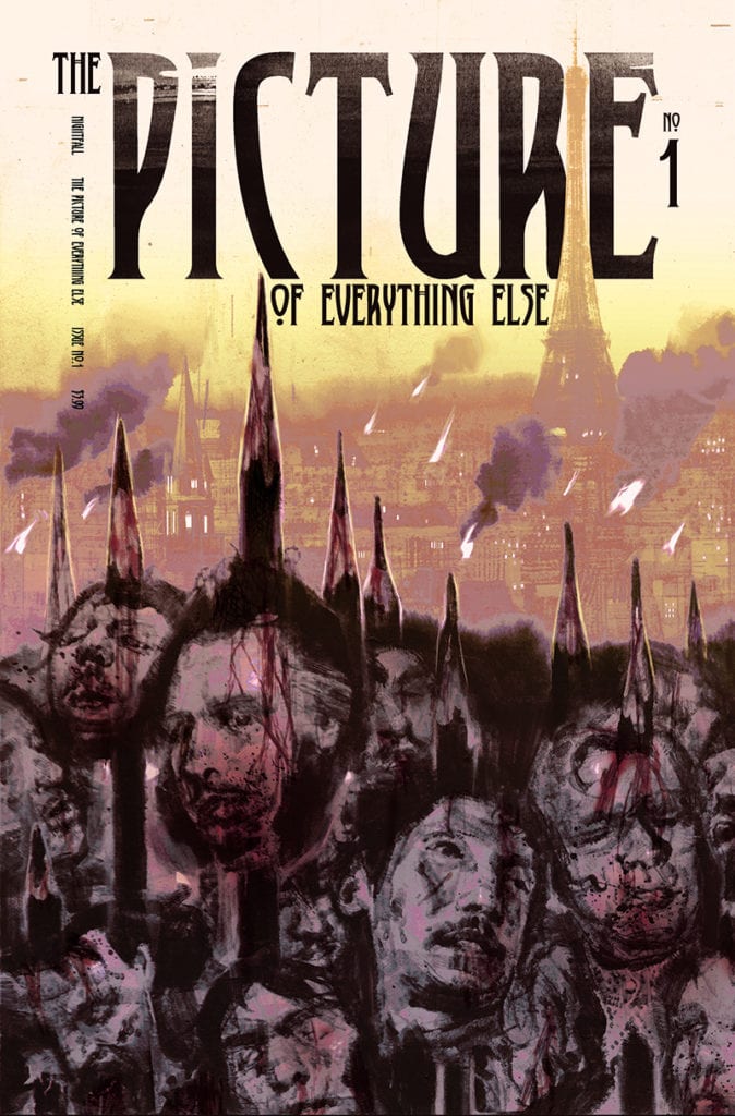
Monkeys Fighting Robots spoke with writer Dan Watters about THE PICTURE OF EVERYTHING ELSE, his new horror series steeped in the lore of Oscar Wilde’s The Picture of Dorian Gray.
The series is by Watters and artist Kishore Mohan, with letters by Aditya Bidikar, and design by Tim Daniel. Issue #1 hits your local comic shop on December 23rd.
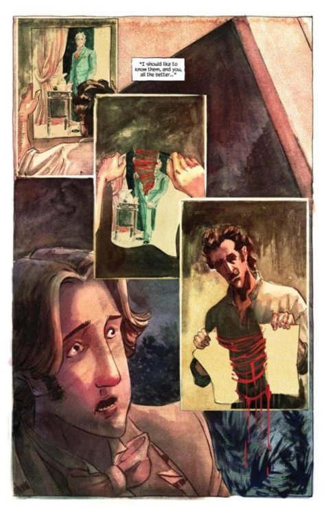
About the series: As the 20th century dawns, art promises to change the world…and steep it in blood. A rash of impossible killings sweep through Paris, tearing the rich and beautiful apart in their beds. When two art thieves stumble upon the portraits of the victims damaged in the exact same manner they died, it appears the man who once painted the immortal portrait of Dorian Gray has returned-with darker plans for future works. From the minds of Dan Watters (Coffin Bound, Lucifer, Deep Roots) and Kishore Mohan comes a haunting balance of depravity and beauty.
We’ve read the first issue, and it is a beautifully unsettling horror story about art, friendship, vanity, and so much more.
Preview the first issue of THE PICTURE OF EVERYTHING ELSE right here:
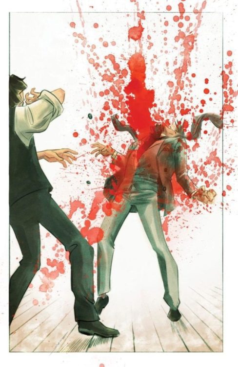
1 of 12
And read on for our interview with Watters:
Monkeys Fighting Robots: What inspired you to tell this story, and how did you and Kishore come to work together on it?
Dan Watters: This story was pretty much inspired by seeing multiple TV series and books and things revisiting Oscar Wilde’s The Picture of Dorian Gray, and focusing entirely on the immortal decadent with his painting in the attic, while I sort of pointed with confusion at the man in the background who’d painted an immortal painting, and said “what about that guy? Isn’t he more interesting?” So as no one else seemed to want to tell his story, I realised it was probably my job.
As soon as that seed had taken root, I called up Kishore. We’d been developing something quite different — a gothic fairy-tale set during the Klondike gold rush, which I hope we come back to one day. He’d already drawn some beautiful pages for that when I called and said “I’m really sorry. But you’re the perfect artist for this. I think this needs to be our book.” And to Kishore’s eternal credit, his reaction was entirely one of excitement and the next thing I knew we were discussing the right sort of gas lamps for 1890s Paris.
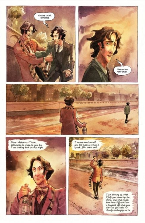
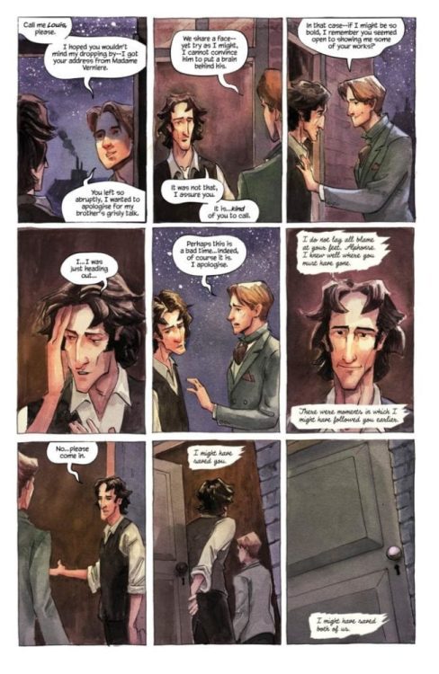
MFR: What can you tell us about your protagonists, Marcel and Alphonse?
DW: Marcel and Alphonse have been great fun to spend time with. They’re two poor up-and-coming Parisian artists who moonlight as art thieves in order to meet their rent. They’re thick as thieves (or more accurately thick and thieves) but have very different ideas about what art is, and what art can do for the world. And that’s going to lead them to make very different choices.
MFR: And I feel like I know both Marcel and Alphonse intimately already after just the first issue. What’s your development process like to create such fleshed out characters?
DW: It’s horrible and cliché’d, but you mostly listen to them. They’ll tell you who they want to be. The main trick, I think, is to make sure each of them is distinct. Every one is different, and they aren’t just mouthpieces for the ethos of the story, if the story has one of those at all. Instead, the job of the writer is to be a bit of a horrible bastard, really. The job is to make them care about something, and then not to let them have it. That’s when people reveal themselves.
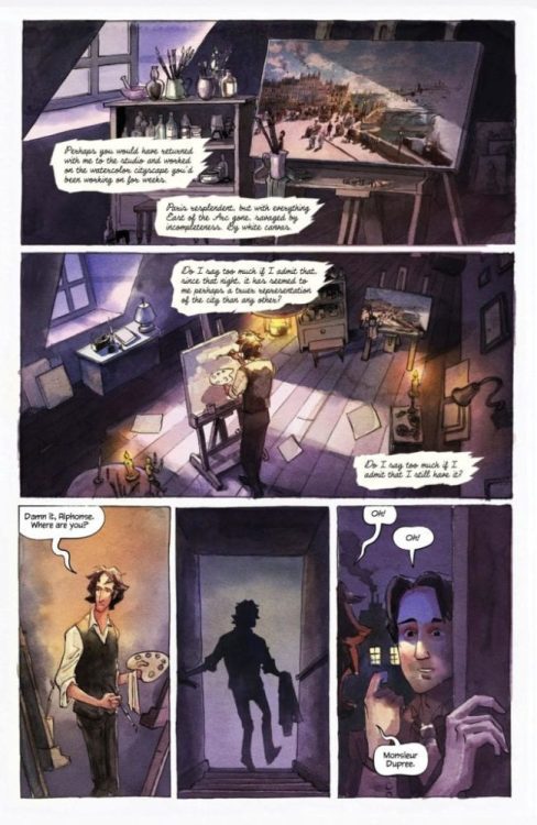
MFR: How did the themes of the story and the time period it’s set in influence the art style, i.e. the color palette and the choice to use watercolors?
DW: I don’t want to overly speak for Kishore and his process… but as I mentioned, I knew he was the right artist for the book as soon as I had the idea. He does these beautiful watercolor images, mostly cityscapes, but I hadn’t seen him do them for a comic before. He spent a lot of time on the palette, and will redo pages more than once sometimes if he’s not happy with them. He’s also been mixing in other methods and materials — switching over to acrylics to get across certain moods, for example.
MFR: Between the title and one of the characters, there are major connections between PICTURE OF EVERYTHING ELSE and Oscar Wilde’s Picture of Dorian Gray. What is your personal connection to the source material, and why did you choose to pick up its mantle?
DW: I love The Picture of Dorian Gray. It’s one of those books I come back to again and again, and it always reads so differently, depending on how old I’ve been, and what life’s looked like. It took on a whole different dimension as I learned more and more about Wilde’s life too. For example, I think most people see either Dorian or Lord Henry as Wilde’s stand-ins. I’m certain he was Basil. A great artist, destined to be betrayed by his work. Which is maybe daft, because Wilde wrote that book before his tragic downfall at the hands of his lover Bosie and his imprisonment. He couldn’t have known just how betrayed he was going to be. Maybe he tasted it in the air, or maybe the reality just added another facet to the book after the fact.
MFR: I love how you use Marcel’s letter to build suspense — it lets the reader know that something sinister is coming, and then we’re turning every page waiting for the shoe to drop. What other methods do you like to use to create dread in your horror comics?
DW: Well, I have quite particular ideas about how horror can and can’t work in comics. You don’t have jump scares, you don’t have musical cues to tell your audience how to feel. So building tension has to be done in other ways. I get labelled a horror writer a bit, which is probably fair, since I’ve written Lucifer and Home Sick Pilots and Coffin Bound; but I gravitate towards horror because I’m working in comics, and comics mean you have to do something different with the horror every time. You have to lean into the metaphors to make us feel for the characters, to make us really care if something bad happens to them. You can’t get away with simple life and death stakes and expect us to empathize with the character just because they’re human and we are too. I suspect that can work on screen because you’re looking at a real breathing moving person. That’s why bad horror films still make us jump. Comic images are that bit more removed from reality, they wear their artifice in every balloon and gutter, so you have to work that bit harder, innovate that bit more.
All of which is to say, I don’t know if I’d be quite as much of a horror writer in other mediums. I think it’s very interesting in comics.
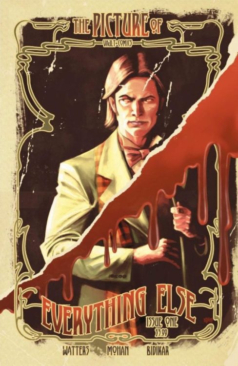
MFR: Comic book covers are crucial in setting a tone and getting people to pick up your book, and your guys’ main cover pulled me in immediately. What was the thought process behind such an unsettling and haunting image?
DW: All the credit for that goes to Kishore! The cover image was entirely his idea. We knew we wanted everything to have a Belle Epoque feel to it, and that’s what we immediately started talking to designer Tim Daniels about for the logo. We wanted each cover to feel like an invite to a party as scary and anticipatory as the 20th Century.
MFR: In this story, there is a literal danger in art. How metaphorical is this? Do you as a creator find it’s dangerous to invest yourselves too much in your art, to use your “life as a brush” as Alphonse does?
DW: Ha! I guess this is kind of what the story is about, and it’s sort of what I’m asking myself by telling it. I do wonder if there’s a danger for artists — and definitely writers — to take themselves too seriously, though. Your work, and the response to it, should never be the thing that defines your life. That way lies echo chambers, and you can lose focus of what the point was in the first place — which was to talk about the world, and to marvel at it.
MFR: And, finally, what do you hope readers take away from this series?
DW: I hope they enjoy themselves. I fear that hoping for anything more than that would lead to a certain form of madness. I’m not convinced stories like this should particularly lay things out for us. They should show us things, make connections between them, and then say, “what did you make of that?” Those are my favourite kinds of stories.
Thanks again to Dan Watters for taking the time to chat with us. THE PICTURE OF EVERYTHING ELSE #1 is on sale 12/23/2020; Final Order Cutoff is 11/13/2020, which is TODAY if you’re reading this the day of publication.
As Apocalypse faces off in a final contest with his long lost wife Genesis, Scott and Jean confront the Quiet Council with the news from Cable’s telepathic warning in Cable #6.
Scott and Jean suggest leading a strike team to rescue their people, but this meets with resistance from the Quiet Council members, particularly Sebastian Shaw. The danger, he suggests, is twofold. First, if the gates are left open for the strike team to return, this potentially leaves Krakoa open to invasion. Second, and an even greater point of contention in the issue, if members of the Quiet Council itself go and they fail, a loss of so many members could cause instability in the government of Krakoa. The council decides that if a member goes to Otherworld, they lose their seat.
While Scott’s status as a Krakoan captain going forward is unclear, the decision to go to Otherworld means Jean Grey has lost her seat and will need to be replaced. I’m sure this will be a point of contention moving forward in the aftermath, given that this may open the door to Krakoa’s first vote or to a more villainous person taking Jean’s place.
As independently operating heroes, the X-Men had the luxury of taking risks in the face of impossible odds. Still, this issue highlights how governing a nation is more complex than being a superhero. As Cyclops points out, governing requires necessary evil, but heroes can’t operate by the logic of necessary evil but my right and wrong.
Cyclops declares that while the Quiet Council governs Krakoa, the X-Men will be its heroes.
While Xavier and Magneto seem to give their tacit approval to this statement, this issue’s prose section reveals that the X-Men proper were disbanded when the Krakoan government was founded. While X-Force was approved as the nation’s official strike team, the X-Men’s independent nature and loaded history were seen as a potential impediment to Krakoan progress.
But Scott argues that the X-Men are still important as heroes and exemplars, injecting a little idealism into the real politick of governance. We’ll see if this opens up potential conflicts in the future with a Quiet Council that, in its attempts to include multiple mutant ideologies in its ruling body, may have let a few foxes into the hen house.
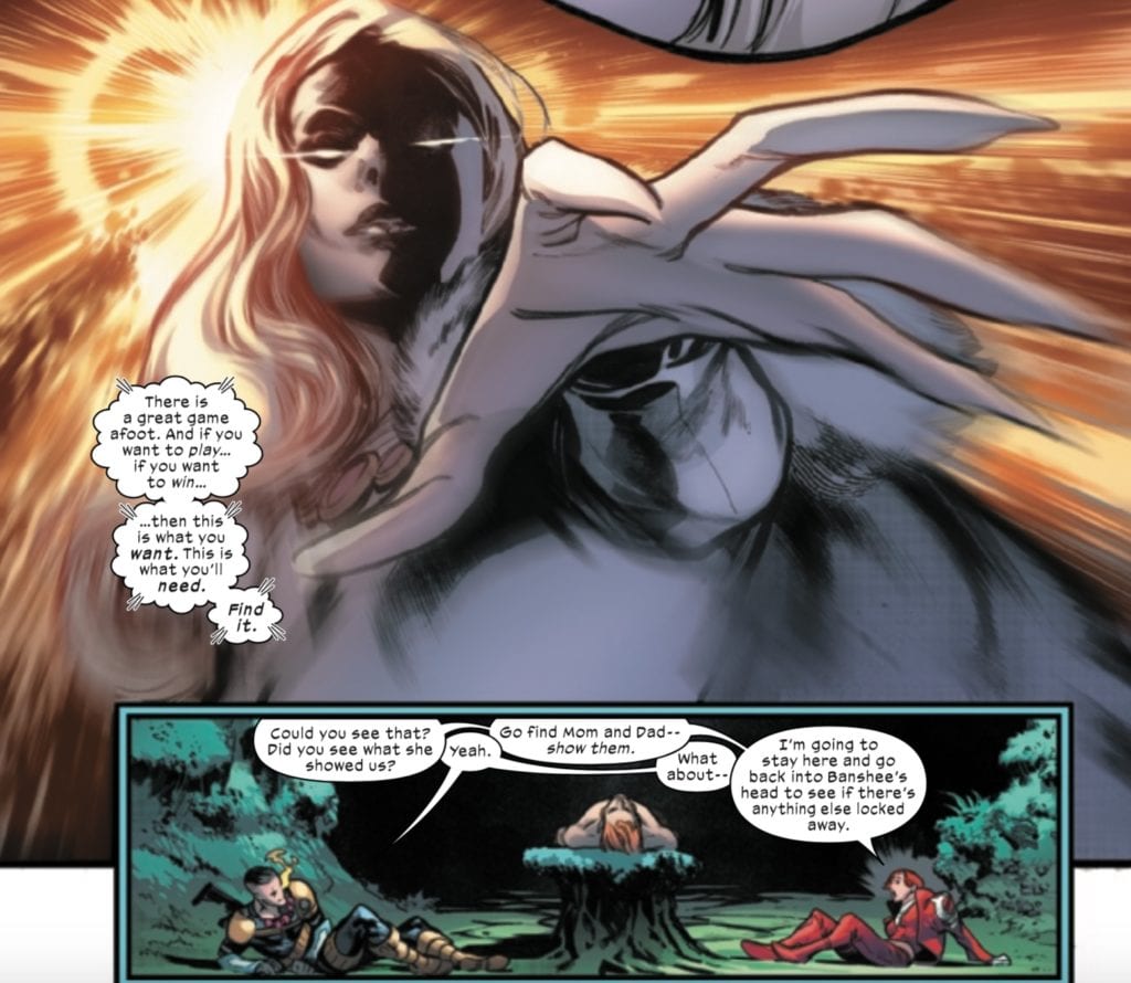
X of Swords has been a little slower as an event than I’d like, but this issue sets things in motion for the final three issues.
Cable loses to Bei the Blood Moon in a battle to the death because of a moment’s hesitation. Still, thankfully, Cypher intercedes on his behalf, and Saturnyne accepts a death of Cable’s fighting spirit in place of bodily death.
Gorgon’s fight with the White Sword follows, with the former having to face the latter’s one hundred swords, thirteen of whom he kills before falling himself. This makes the score 19-19. Where Krakoa had fallen catastrophically behind, they find themselves tied with Arakko. Perhaps it’s here where we see Saturnyne rigging the contest to put Krakoa back on equal ground.
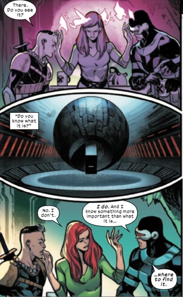
Back to Cable, we know he is one of the pieces Saturnyne has been moving from all the way back in X of Swords: Creation.
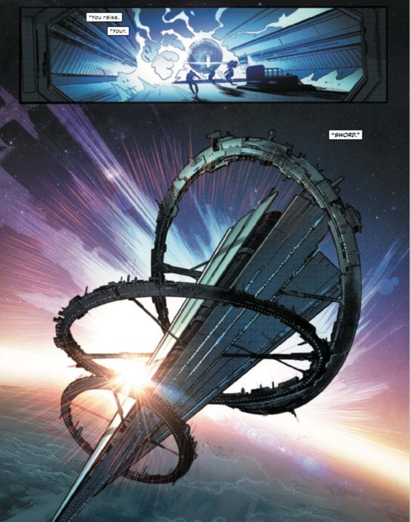
We know that Saturnyne showed Cable an image of the Bridge, an inter-dimensional transport device, located on the Peak, former headquarters of S.W.O.R.D. Powering up this device holds the key to opening a portal and releasing the deadly Vescora, a virus that infects and consumes entire realities. At the end of Creation, Saturnyne commented to Monet about facing their enemy and drawing their sword, with her words juxtaposed with the former S.W.O.R.D. Base.
In Cable #6, when Nathan communicates with his parents, Saturnyne cuts off their link. Nevertheless, it’s enough to set Scott and Jean in motion, and given what we know of the finale by this point, this leads them, ultimately, to raise. Their. SWORD.
And (minor spoiler), thanks to the finale, we know that this is exactly what Saturnyne wanted.
When the Hellions set out into Otherworld, it intended to enter Arakko to stop their ten champions before they could engage in Saturnyne’s tournament with the sword carriers of Krakoa. Given how much of the event has passed, it should be apparent that that mission was a failure. Instead, Sinister’s true motives are revealed–to harvest the genetic codes of the mutants of Arakko.
As they enter Arakko, they encounter Tarn the Uncaring, the Genomic Mage and leader of The Locus Vile, a group of grotesque mutants whose mutations have been spliced and mutilated by Tarn. Ignoring Tarn’s warnings, Sinister collects genetic samples from the Locus Vile. In the ensuing fight, half of the Hellions are decimated, including Sinister himself, who gives his collected samples to Psylocke to take back to Krakoa (don’t worry about Sinister, though. It is long established that this is just one of many Sinister clones).
As Psylocke, Greycrow, and a severely injured Havok return to Krakoa with the intent of revealing that Sinister deceived them, they are ambushed by Sinister, who, using smoke as a cover, kills them all and feigns getting attacked himself.
This certainly raises more issues with Krakoa’s resurrection protocol since everyone’s backups don’t include these last few memories of their deaths (not the first time we’ve run into this problem with corrupt members of the Quiet Council using this system against other mutants).
Even more concerning, I noted in a previous piece that the existence of Amenthi hybrids opens the door to a topic brought up in House of X/Powers of X–the existence of chimera mutants. Chimeras are genetically bred (by Sinister) and splice together the powers of multiple mutants. By attaining samples of the Locus Vile, Sinister may be one step closer to unlocking the secrets to creating the chimera mutants.
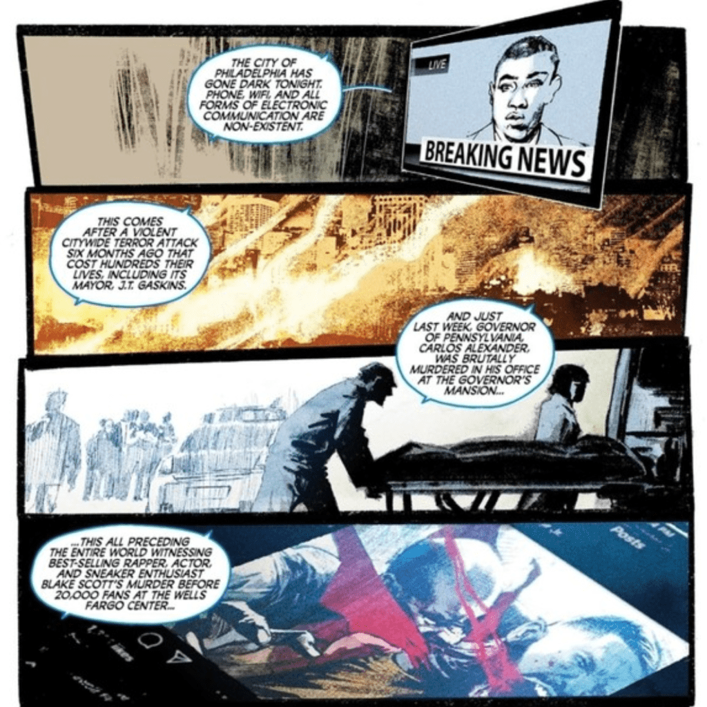
Killadelphia #10, out now from Image Comics, is a mortifying issue of delightful violence and is one of the best issues to come out of the series so far.
About the Book:
Abigail Adams has been leading the vampires ever since her husband was killed. They recently have been responsible for the murder of the governor of Philadelphia and the famous rapper, Blake Scott. A particularly malicious vampire called Jupiter turned himself into the authorities to convert those in prison and stage a massive vampire breakout. At the same time, James Sangster Jr. and his group are doing everything they can to stop this vampire epidemic.
Killadelphia #10 Story
Rodney Barnes never fails to tell an engaging tale, especially in Killadelphia #10. The dialogue is terrific throughout the issue, whether it be comical or deeply disturbing. The backstories of characters often told in Killadelphia’s issues are another intriguing aspect of Barnes’ writing. In this issue, as in multiple other issues, we are given the backstory of a vampire. It is strange to spend so much time characterizing villains, but by doing so, Killadelphia becomes a more fleshed out world. The vampires here are not just mindless killing machines, but rather many were individuals whose lives were ruined to the point that becoming a vampire was the best way for them to get revenge. This by no means prevents the reader from seeing them as the villains, but it gives them an understanding of the characters’ actions, which prevents them from being a bland, standard monster.
These backstories also provide Barnes with the opportunity to fit more historical fiction into the series. One aspect of what made Killadelphia stand out from other modern vampire stories was the choice of former president John Adams as the main undead antagonist. This historical tie-in was a captivating scenario, and Barnes continues this after Adams’ death by introducing new vampires with ties to other important moments in American history. One such vampire is introduced in Killadelphia #10. They aren’t historical figures, but they originally lived during significant historical moments, such as the Civil War. It is a great way to keep the series’s historical fiction aspect without continuously focusing on Adams.
Art
Jason Shawn Alexander can create stunningly, realistic characters with expressions that make them genuinely seem alive. Killadelphia #10 features more of these highly believable characters, along with intense action. These horrifically violent scenes are marvelous to look at, as Alexander’s characters have beautifully dynamic poses and depth that makes it feel as if characters are coming out of the page. This issue also contains pages with the focal point. To make these central images stand out, Alexander places smaller panels around them or even makes the characters overlap the panel borders. The center of a page is almost always an automatic focal point, so by making the center image the most important, the effect becomes even more substantial.
Luis NCT pair’s colors spectacularly with Alexander’s art in Killadelphia #10 and give a stronger impact on the violent action scenes. NCT also provides some pleasant sepia tones for flashback scenes, which works phenomenally well as delivering an older tone due to the instant association people have between the color and old photographs.
Marshall’s Dillon lettering in Killadelphia #10 fits perfectly with the art and story. Both subtle and explosive sound effects help the story feel in motion and add to the terrifying imagery it accompanies. During flashbacks, Dillon places sound effects in panels’ background when they would ordinarily be in front of everything else. This dulls the lettering’s impact, which was most likely done intentionally to help relay the fact that the flashbacks are a retelling of events and are not currently happening. This is a highly effective choice and shows off Dillon’s lettering talents.
Conclusion
Killadelphia #10 is one of the best issues in the series so far, and you do not want to miss it. The plot is increasingly becoming more thrilling, and Alexander’s art is exceptional (as always). The coloring and lettering bring the story to life and help provide for a highly satisfying issue.
THAT TEXAS BLOOD #6, available from Image Comics on December 2nd, solves the mystery of Travis’ murder, but not without a bloody cost. Chris Condon concludes the first arc of the series by highlighting the toll memory, anger, and regret can take on a person.
Cover Art
Jacob Philips created a strong cover for this final issue in the arc. Randy sits in a chair, looking at the reader, contemplating his next move with a gun in hand. The bright red pool of blood provides an eye-catching contrast. The cat lazily strolling by adds some curiosity to what’s going on, but Randy’s facial expression is unclear. Is he angry? Is he ambivalent? It’s tough to tell, and that brings the impact of the cover down.
Writing
Condon spent the previous 5 issues (check out our review for issue #5 here) putting Randy on a hot pan and slowly turning up the heat. You could feel the tension of the town rising by degrees with every single page as Randy crosses paths with the local gangsters and unsavory elements. Each time coming away from them a little more beaten down and resigned to the fact that he never really left the town and all the bad that comes with it.
Travis’ murderer and the circumstances of his death are wrapped up in a neat little bow. Randy metes out some well-earned “justice,” but when the Sheriff’s investigation and Randy’s inflicted retribution intersect, we learn that serious mistakes were made. It all goes horribly wrong.
It’s a satisfying conclusion to the arc in terms of connecting all the dots, but the finale felt anti-climatic. Randy’s decision to take action came off as numb or disconnected, but maybe that was the intent. All the simmering from the previous issues leads you to believe there’s going to be a big bang, but Condon doesn’t quite pay off the built-up energy. It’s a solid conclusion that fell a little flat.
Pencils/Inks
Jacob Phillips has been consistently good throughout the series, and this issue is no exception. There’s a lot of little character moments in this issue where the postures, faces, and gestures mean everything to push the panels’ emotions. Phillips nails the emotional expression right down to a simple hug.
For this reviewer, the best sequence in this issue is a scene where nothing happens at all… visually. There’s a shootout just at the halfway point that you never really see but can tell is happening (partly achieved by great lettering we’ll get to in a minute) that holds the tension and your attention with nothing more than perfect panel framing. Phillips deserves big props for the art of this series.
Coloring
Consistent with the previous issue, Phillips makes great use of color to shift between different scenes and flashbacks to help move the narrative along. There’s an exciting part where Randy meets the Sheriff, and the panels alternate between red and blue to match the flashing of the police car lights that’s visually creative. Overall nice work from Phillips.
Lettering
Phillips executes some excellent lettering issue, particularly with the aforementioned shootout scene. As the “camera” holds a position on the front of a saloon, it’s through the lettering and the sporadic exclamation of gunfire that you get the real impact of what’s happening. This is one of those infrequent cases where the sound lettering tells the story, and Phillips does a great job with it.
Conclusion
THAT TEXAS BLOOD #6, available from Image Comics on December 2nd, brings the latest bloody chapter in this town’s history to a close. This series takes a hard look at the toll of carrying the past with you and the dangers of letting the past decide your future. THAT TEXAS BLOOD is a great comic that holds up as one of the best examples of crime noir in years. I highly recommend the complete 6-issue arc.