FUTURE STATE: WONDER WOMAN #2, out now from DC Comics, is the last issue of a miniseries by writer/artist Jöelle Jones, colorist Jordie Bellaire, and letterer Clayton Cowles. This final issue leaves a bittersweet taste in the reader’s mouth. Its story is underwhelming but it still explores the medium beautifully through the art.
Writing
Writing a 2-issue miniseries is hard. It’s harder when it features a character no one knows yet. This is not to say there aren’t any redeeming qualities about Future State: Wonder Woman #2’s story. The reader does get a better sense of Yara Flor’s character. Jones explores the history of storytelling and what it means to be a hero wonderfully, and some of the jokes land great. But the entire issue feels a bit unfocused. The ending, especially. The way in which the story progresses, it seems like Jones expects us to feel for Yara and her soldier’s relationship. We are expected to care when not enough was given for us to do so.
But even after saying all of this, what the reader still truly cares about is Yara and how different she feels from any other DC Comics’ superhero we’ve seen before. I, for one, am still excited to see on which adventures Jones is going to take this character on next.
Art
In this issue, Jones experiments boldly with the artform. In a flashback sequence, she changes styles completely and draws entire panels with red, harsh pencils. The flashback sequence and the scenes taking place in the present interact flawlessly with each other. In addition, the usual positives about Jones’ art style continue to appear in their full glory. They make the reader get lost in Future State: Wonder Woman #2’s enchanting world. The facial expressions are highly expressive, but never to the point of unnecessary exaggeration. Whenever Jones draws backgrounds, they’re well-detailed and gorgeous, and whenever there’s action, those pages get filled with liveliness.
Coloring
Bellaire continues to knock it out of the park with her incredible coloring skills. Each page conveys true emotion through the colors. There are specifically a few pages where Yara Flor needs to find her lost soldier in a sea of lost souls, and the way Bellaire decides to color those pages is truly unique. Bellaire colors the souls in pretty much the same gray color and Yara in her usually bold, energetic colors. This obviously makes Yara pop a lot more on the page and distinguishes her. Great work from Bellaire.
Lettering
Cowles goes all out with his sound effects in Future State: Wonder Woman #2. The sound effects are big, stylistic, and experimental, using a lot of unique techniques to convey the feeling or sound Cowles is going for. This manages to elevate the artwork’s energetic look and compliment it. The way Cowles draws his balloons never feels out of place. Even the dialogue balloons are not perfect circles and it all feels very hand-lettered. Without any actual words, each reader can see this as clear as day. Cowles was having incredible fun lettering this issue, and we’re all thankful for it.
Conclusion
Future State: Wonder Woman #2 is visually stunning. Its artwork is bold, energetic, and mesmerizing. I just wish the story was more up to par with the rest of this comic’s ingenious elements. With that being said, it’s still very much worth picking up at your local comic book shop!
Whenever a movie is adapted from another medium, such as a novel or comic, one critique that you will find hard to escape from is the statement ‘it’s not as good as the original’. Whether you’re talking about straight adaptations, remakes, or re-imaginings, there will always be an underlying belief that the new form cannot improve on the original.
Critic Pauline Kael wrote;
‘Movies are good at action, they’re not good at reflective thought or conceptual thinking. They’re good at immediate stimulus, but they’re not a good means of involving people in the other arts or learning about a subject.’ (from Deeper into Movies, published 1973)
This is an elitist view, one which will always favour the novel over the movie, and comes from a position of intellectual superiority. This is a view that follows adaptations into the 21st century, especially with the rise of the Superhero movie and Marvel’s dominance of the box office.
It is also a problematic viewpoint when discussing comic book adaptations, especially the Superhero movie, for two reasons which I will explain below.
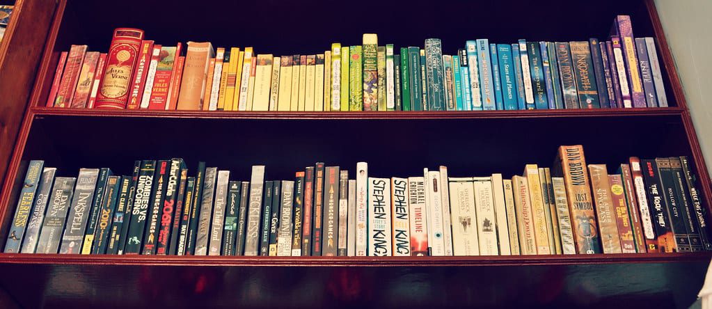
“Bookshelf of Colors” by bonheureux is licensed under CC BY 2.0
High versus Low
Kael’s argument stems from adaptations of novels, which were seen as a higher art form than cinema. This comparison, however, is not as easily transferred to discussions about comic book adaptations, especially relating to those from the Superhero genre. This is because the original source material, i.e. the comic book, is not part of that ‘higher art form’ in the first place. In fact, throughout most of comic history, the form has been maligned for being a cheap form of throwaway entertainment. The early popular comic books were soon bastardized for monetary gain. Publishers sold characters for advertising rights, radio shows, and cinema serials, with no thought for the original. A character like Superman took on many forms across multiple media platforms with no care to create any continuity between them. It’s even arguable that continuity in the comics themselves took a few years to arrive. The integrity of the ‘original’ was so low to start with that when the movies appeared it would be impossible to place the comic on a pedestal for comparison.
As we move into the modern age of cinema/comic adaptations the ‘high art’ argument is still invalid. Although comics have started to gain a form of respectability, most notably through the creation of Graphic Novels in the book market, they are not comparable to the likes of War and Peace or Great Expectations. A collectors market puts a price value on specific comics, creating notoriety, but they are not valued for their artistic or literary content. For Kael’s argument to be relevant we would first need to accept that comics engage readers in an intellectual way and promote the involvement in the larger Art World. Unfortunately, comics are still primarily seen as just entertainment with little pretension for the high arts.
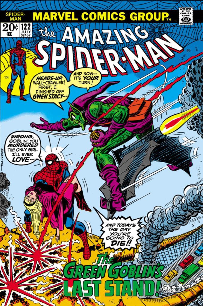
The Amazing Spider-Man #122 Credit: Marvel Comics
The Long Running Continuity Angle
The other main difference between the adaptation of a novel and a superhero comic book is that, for the most part, comic book adaptations are not directly linked to a specific story or comic issue. Segments from certain chapters of a characters story may be incorporated into the whole, but generally the movie versions take the themes from a selection of the comic stories. Sam Raimi, for example, was inspired by the first 122 issues of The Amazing Spider-Man for his first Spider-Man movie. He sourced narrative elements from the first iconic issue, but also from numerous other issues in that run, leading up to the confrontation between Spider-Man and the Green Goblin published in #122. But there were also influences from later chapters of the superhero’s story. Raimi’s intention was to capture the elements that made a Spider-Man story and create his own version of them. By employing this concept, how is it possible to then say the original is better? The movie is an amalgamation and the comic series stretches over many years and titles. Are we to believe that no part of the movie is better than any issues of the comic? Can we even compare like for like?
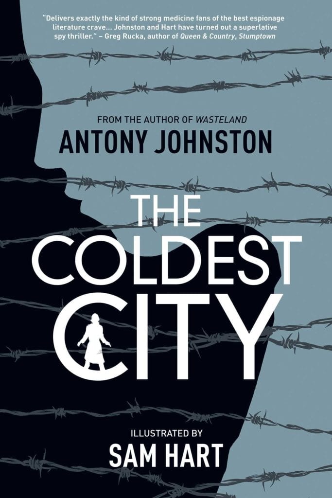
When you move beyond the confines of the origin story, modern superhero movies have plots that are drawn from a number of sources. These are mostly from the comics but sometimes from other media, as I pointed out in my last entry regarding the Supermanmultimodal narrative. Unlike a Pride and Prejudice adaptation, most comic book films are not translating a single text into a movie version. Even when the original source text is a single book, such as in the case of The Coldest City by Antony Johnston and Sam Hart which became the movie Atomic Blonde, the adaptation is not necessarily based on the final printed product. The producers of Atomic Blonde were provided with a completed script for the graphic novel but the art work had not been finalised. Atomic Blonde was produced explicitly with a cinema aesthetic in mind and it was the theme of the comic that was used to make the movie. The intentions of each were different; one is an oppressive spy thriller told through stark black and white static images, and the other is a fast paced, action/mystery spy movie. The majority of each were created separately despite the graphic novel’s release date being 5 years earlier. In such circumstances, how is it possible to say that the ‘original’ is better when all that denotes the original is the release date?
When it comes to superhero movies there is no original, in the specific sense, to compare against. The best that you can do is compare and contrast the movie version against the history of the character in printed form. But even then, the task is complicated by the many interpretations of the characters across the years. You can say that Zack Snyder’s Man of Steel is not as good as the original but what are you referring to? The original Action Comics #1? Or some other version of the character in a different comic?
The Coldest City Credit: Oni Press
Conclusion
Robert Stam discusses the concept of the original text being superior in his essay The Dialogics of Adaptation. He posits that the ‘first is best’ argument is based on the original having seniority and has iconography that is culturally rooted. However, neither of these two aspects have dominance over comic book adaptations or superhero movies specifically.
Stam explains that ‘poststructuralist’ theoretical developments [..] indirectly undermine some of these prejudices’, which partially dismantles Kael’s ‘high art’ standpoint when it comes to novels. But taking the comic form into consideration we can dismiss the ‘high art’ argument anyway. By transferring one low art form into another there is no superiority argument. The ever changing serial nature of comics also makes the seniority aspect difficult to argue, especially for the long running titles such as Batman, Wonder Woman, or the Avengers. If the comic itself has changed multiple times since inception, how can a movie be judged for doing the same thing?
As audiences and readers, we each have our favourite versions of a particular character or story but to imply that one version is better than another is to compare two dissimilar things. We cannot expect a film to contain the same visual or narrative beats as a comic, or vice versa. They are two separate mediums which operate in completely different ways. We can compare one superhero film to another, marking which is more successful, or choose which is our favourite form. But is one really better than the other? Or are we just drawn to specific interpretations and are we dismissive of variations?
Editor Note: This article has been updated as the original stated that The Coldest City script had not been competed when it was optioned as a movie. This was incorrect and the article has been amended accordingly.
Playing games and entertaining an audience simultaneously is a skill set that’s new to the 21st century as Twitch streamers reach into the tens of thousands of views daily, and TheHunterWild aims to make the most of his connection with his viewers.
PopAxiom spoke with TheHunterWild about falling in love with video games, becoming a streamer, and creating a streaming future that’s fun and safe for everyone involved.
Game On
According to Hunter, he started playing games when “I was single digits years old. My parents got me an NES. I remember hating most of the games because they would kick my butt left, right, up, and down.”
Indeed, old-school gaming of that era created replayability through being wildly difficult. “The games were so brutal,” Hunter affirms, “but that’s carried over to the way I play games now, where I tend to play on the hardest difficulty.”
“If they’re not challenging enough, I create challenges for myself,” Hunter says of playing modern games. If it’s too easy, you make rules for yourself to me it harder.
That idea brings up one of the fantastic things about modern video games. “That’s one of the things I love about gaming in the 21st century; there’s so much diversity. Within each game, there are often modes that allow you to focus on the environment and the narrative or increase the challenge.”
“We can craft the game to suit our desires and have fun,” Hunter says, “That’s what gaming is all about, having fun.”
Dev To Stream
The Hunter Wild’s been on Twitch since 2014 and, at the time of this writing, is passing 63,000 followers on Twitch. But what was he doing before then? “The first career I had as an adult was as a game designer. I started a company when I was 19 to make games, and I left to pursue a degree in philosophy.”
“There was also the nature of games,” Hunter explains about his departure from development, “that to be successful at that time, they needed to be violent. I consumed games like that, but I didn’t want to craft a game like that.”
Becoming a Twitch streamer wasn’t a life goal at this point. “The game that allowed me to discover Twitch was Hearthstone. I started playing the game when it was in beta. I found someone on YouTube who said they also do Twitch streaming.”
“I came over to Twitch and found my biggest inspiration for streaming, Ducksauce,” he says. “I would watch him every morning and would start my day with a smile. That connection was like a calling; I could do this for other people. Live a career in service to this broader idea of co-creative experiences and community connections.”
Hunter wasted no time and “jumped right into it. It’s formulaic but really fun. You have to listen to your inner voice and do your own thing.”
The basics of streaming on Twitch aren’t very different, but those who are good at it, like Hunter, balance playing a game while being decent at it and communicating with a live audience that’s chatting away in Twitch’s chat window. “It is all-consuming for the mind.”
Take A Slice
“A lot of this is an alignment of values I hold in my life with my career,” Hunter says about his life as a pro Twitch streamer. “There’s a big struggle with the reality that in this career, your job is always personal. You don’t have this detachment from your identity and your vision for what you want to do as a content creator.”
Managing the personal with the public persona is a big focus for Hunter. “The community leadership part is a huge quality for me that ties into my underlying philosophy for how life should be best lived, which is in conjunction with others. It’s coming together. It’s co-creative experiences. And in the 21st century, an age defined by the infinite potential of connectivity, we also find ourselves in loneliness.”
“I want to connect the disconnected,” he says without reservation. “In streaming, the core content is video games, but the real stuff I want to focus on is that connection with the tribe; community building.”
Hunter explains it in delicious terms I think most everyone can understand. “I envision this as a pizza. The things I want out of the pizza are the toppings. The dough is great, but it’s mostly just an edible plate. It’s gotta be there, but the real meat of it is all the conversation, the vulnerability, the authenticity, and sharing stories.”
“I can do this too,” he realized early on. “I have this same kind of drive. I need to find the people that will resonate with me.”
StreamerSquare
Hunter’s community focus takes center stage internally as a matter of personal philosophy, but externally too. Being a streamer comes with perils that are easy to miss. “It is very challenging, and it’s a topic that comes up a lot in the industry. At StreamerSquare, it’s something that we focus on a lot, which is the ‘always on’ mentality of always having to present yourself to your audience.”
StreamerSquare started in 2014 and helps current and future content creators learn everything they need to know to make their streams the best they can be, including everything from lighting to self-care. “I think one of the big issues at hand is authenticity, not always trying to show your best self but your most genuine self for and with your community.”
“Sometimes that means having to take a day off to safeguard your mental health,” he explains, “a part of that communication is being forthright and saying ‘I’m taking a mental health day.’ Everyone needs them.”
The importance of that statement “I’m taking a mental health day” serves several purposes. “In part, it’s to tell them, when you have these days, you’re not alone.”
“All these big personalities that you see, the highlight reels of life, also come with the downsides of being human and having difficult days or even difficult years,” Hunter declares a certainty for all people. “Navigating that is important, and so is actively taking days off, so you don’t burn out. There’s a positive way to navigate that and a toxic way.”
Wrapping Up
Hunter’s gaming roots stretch back to the early days of Nintendo. “Formative games for me are SimCity and a bunch of the Sim titles. Legend of Dragoon, a Playstation 2 title. I would love to see a remaster of that game.”
“The game that I played the most that got me into game development,” he shares, “was Dark Age of Camelot, which was an MMO that had a three-realm system for PvP. You’d go out into these big, open areas and have epic battles. The developer used a Kickstarter to work on Camelot Unchained.”
Hunter’s a big fan of Kickstarter, which has helped bring great games to life. “It’s a great setup because it allows the ideas to connect with individuals instead of pitching an idea to one or two people at a studio.”
Hunter streams daily. So, what’s coming next? “We have several irons in the fire with StreamerSquare that I cannot talk about, but I wish I could because it’s so exciting. For TheHunterWild, we have a big year ahead of us with game launches. So, launch titles are one of the focuses of my channel. We do three days of back-to-back 12-hour marathons for the new games that come out. It’s a big year for new launches that it’s difficult to fit into the schedule.”
Fans of Hunter have a lot coming their way. “We are expanding and growing the Patreon massively. I’m adding my fine art back into my life. I put fine art to the side when I started streaming, but now I can incorporate that back in and bring my creativity to people who want it. I get to add my creations to lives directly. I’m working non-stop on art with a public feed on Facebook that’s cataloging the process from the failures to the triumphs.”
Are you watching TheHunterWild on Twitch?
Thanks to Hunter Wild and Impact24
for making this interview possible.
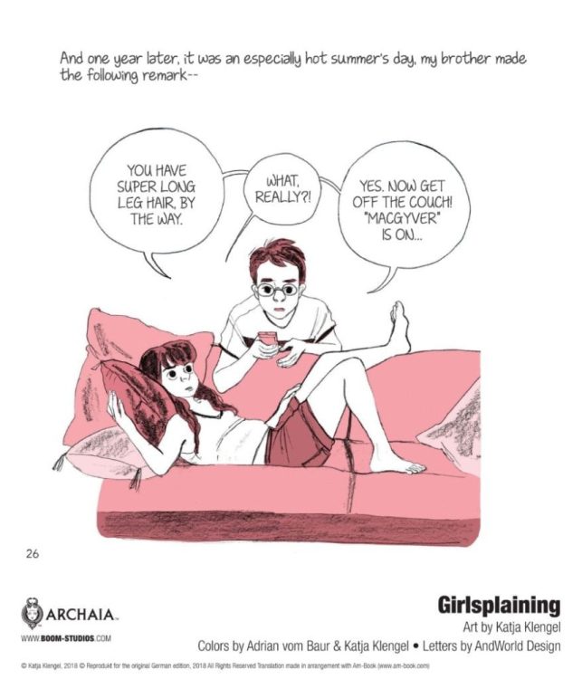
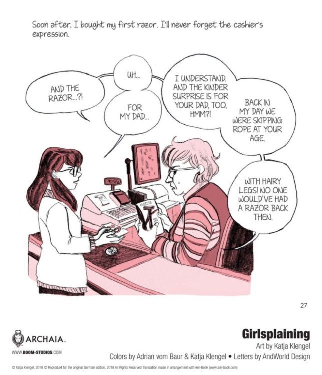
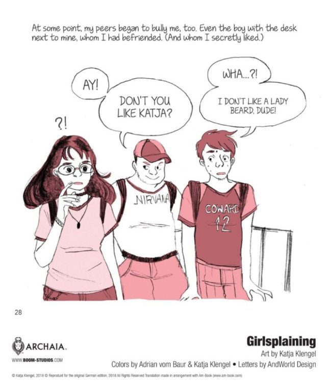
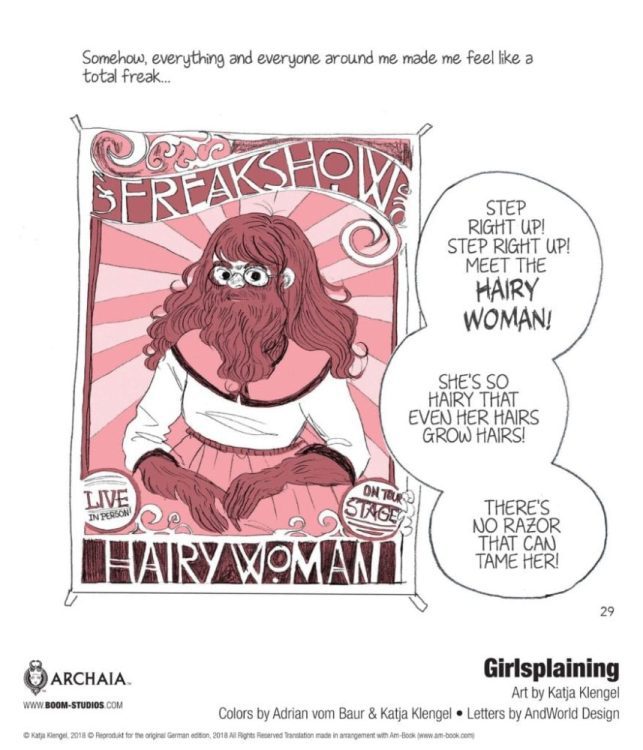
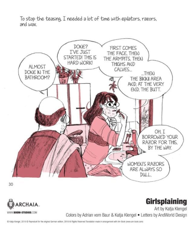
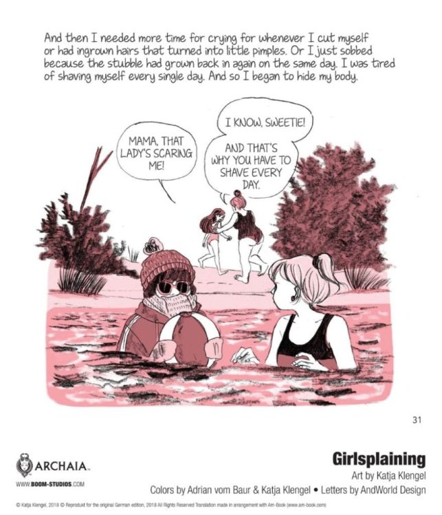
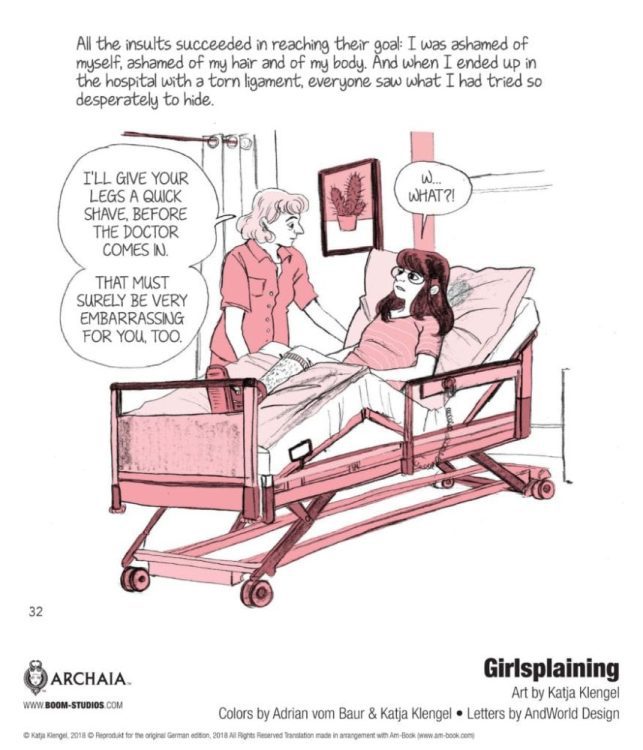
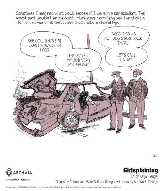
GIRLSPLAINING: A (Sorta) MEMOIR by German cartoonist Katja Klengel hits your local comic book store on March 3 and book stores on March 9, but thanks to BOOM! Studios, Monkeys Fighting Robots has an eight-page preview for our readers.
About the graphic novel: Why do we fear the word “vulva” so much? Do we really have to be ashamed of our body hair? Why do gender roles in children’s toys seem to be stuck in the ‘50s? With a healthy sense of humor, an open heart, and unsparing candor, Klengel looks back on her childhood through the lens of the popular culture that shaped her identity and examines what being a woman today means to her (and really, a whole lot of us!).
GIRLSPLAINING: A (Sorta) MEMOIR is drawn by Klengel, Adrain vom Bauer assists Klengel on colors, and AndWorld Design handled letter work.
SHADOW DOCTOR #1 hits your local comic book store February 17th, but thanks to AfterShock Comics, Monkeys Fighting Robots has an exclusive four-page preview for you.
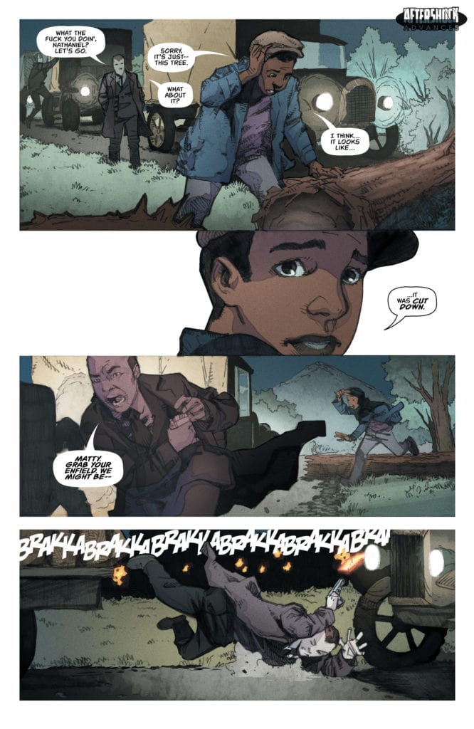
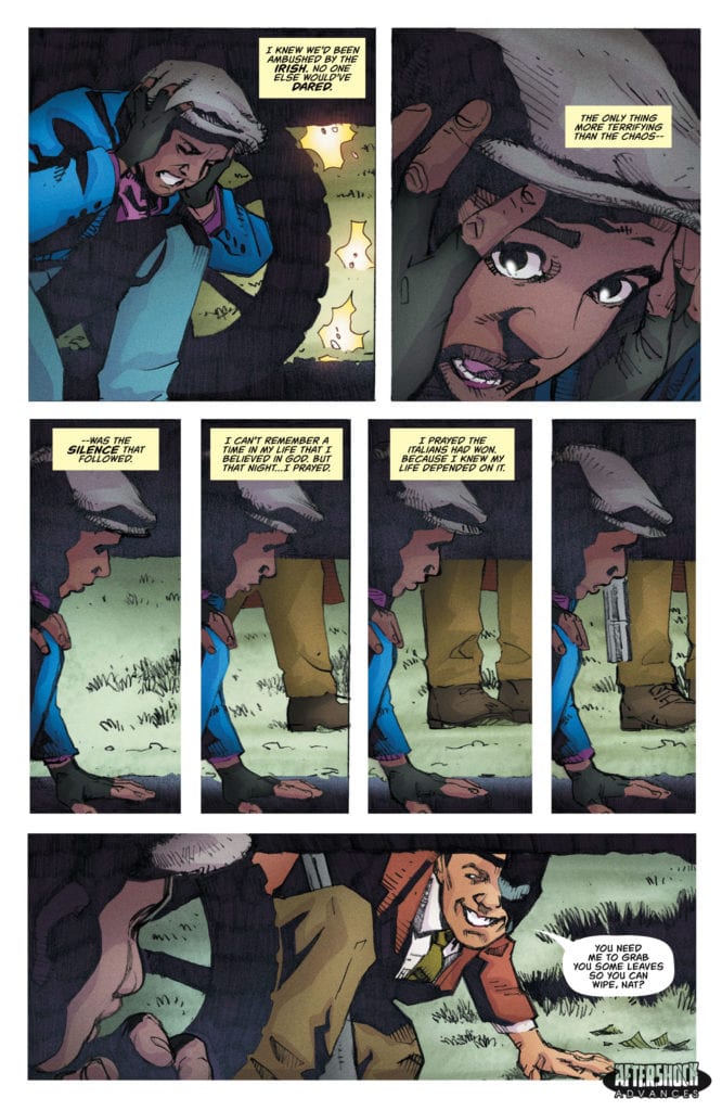
About the issue: Years in the making, this is the true story of writer Peter Calloway’s grandfather, Nathaniel Calloway, a Black man who graduated from medical school in the early 1930’s. Unable to get work at any Chicago hospitals because he was Black, and unable to secure a loan from a bank to start his own practice because he was Black, he turned to another source of money in Prohibition-era Chicago: the Mafia, run by none other than Al Capone.
SHADOW DOCTOR #1 is by writer Peter Calloway and artist Georges Jeanty, with colors by Juancho! and letters by Charles Pritchett. The main cover is by Mark Chiarello.
As Calloway himself says:
“On the one hand, his story represents the promise of America. On the other hand, it shows the worst of it.”
Check out the SHADOW DOCTOR #1 preview below:
Are you looking forward to SHADOW DOCTOR? Sound off in the comments!
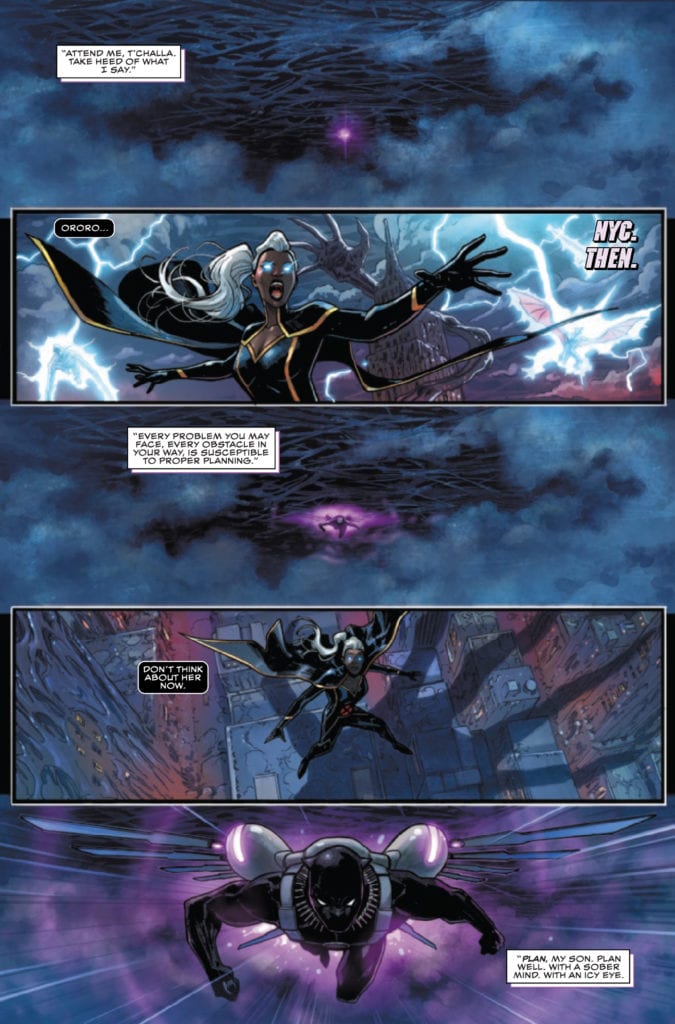
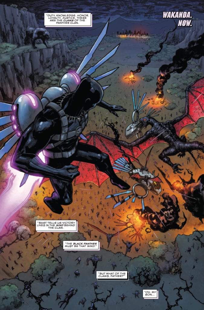
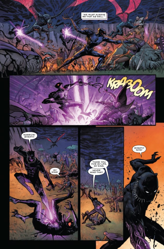
KING IN BLACK BLACK PANTHER #1 hits your local comic book store February 10th, but thanks to Marvel Comics, Monkeys Fighting Robots has an exclusive four-page preview for you.
About the issue: SYMBIOTES INVADE THE UNCONQUERABLE COUNTRY OF WAKANDA! T’Challa’s most treasured allies are lost in a storm of Knull’s making in this wild one-shot! Critically acclaimed writer, actor and producer Geoffrey Thorne explores a Wakanda gone dark – invaded by Knull’s massive symbiote army. Wakanda needs its king. It needs the Black Panther. But once again, the hero must choose between his role as an Avenger, his role as a king… and the yearnings of his heart.
KING IN BLACK BLACK PANTHER #11 is by writer Geoffrey Thorne and artist German Peralta, with colors by Jesus Aburtov, and letters by Joe Sabino.
Check out the KING IN BLACK BLACK PANTHER #1 preview below:
What has been your favorite KING IN BLACK tie-in so far? Sound off in the comments!
Period. End Of Sentence is a 2019 Oscar-winning documentary short film about a quiet sexual revolution happening within India, and composer Giosuè Greco crafted a compelling score.
In 2019, Period. End Of Sentence beat out a field of strong contenders in the short film documentary category. The film draws inspiration from the life of Arunachalam Muruganantham, a social activist who is one of the women featured in the movie. Activists Shabana Khan, Gouri Choudary, Ajeya, and Anita make up the rest of the activist super-team covered in a dense and captivating 25-minute runtime.
PopAxiom and Giosuè spoke about becoming a musician and creating music for an Oscar-winning film.
Keep Writing
Giosuè’s grandfather was a saxophone player, “so we always had a saxophone lying around the house. I grew up in a family where music was very supported and started cultivating that passion.”
At “about 12 or 13,” he says, “I realized music is what I wanted to do. I started picking up different instruments, flute, guitar, piano.”
Giosuè went to a “music-centric high school where I could play in different bands and orchestras.”
Becoming a composer was still nowhere on Giosuè’s radar. “I didn’t study composing in school per se, but I studied classical music and had the fundamentals. I studied classical saxophone.”
“Playing saxophone,” he explains, “the only thing you can do other than playing classical is jazz. When I started Berklee, my idea was that I was going to play jazz forever, and I was going to be the greatest jazz saxophonist ever.”
Giosuè attended Berklee and completed the “music production engineering program.” After Berklee, he flew out to LA. “I wanted to try and be a music person. I wanted to do everything. I started interning at studios, but it’s not quite hands on. I started producing pop music and experimenting with sounds.”
“Film composition is something that I ended up doing in LA,” he admits. “I was lucky enough to cross paths with Dan Romer (Beast Of No Nation). At the time, he was looking for a tech person. We clicked immediately, and shortly after, he asked me if I wanted to do some additional writing for a score. From that moment on, I just kept writing.”
About Period. End Of Sentence
Giosuè became part of the Period. End Of Sentence team through Dan Romer. “They had some music temped in the cut that was a lot of dance music. They wanted to do an original score, and they contacted me because they knew I was working for Dan.”
“It was a very short period,” he says of the time spent creating the score for the short film. “ I think it took two weeks to record the project. It was one of those things I did and moved on, and kind of forgot about it.”
Giosuè thought the project “was great, but I was not expecting a nomination and then a win!”
“We didn’t have any formal spotting sessions for this film,” he reveals. Instead, the process was more organic. “I went with what I thought was appropriate for the scene. There’s a lot of wide shots and silent moments. So, I thought I’d take the most acoustic approach possible.”
Giosuè, like any modern-day composer, uses a lot of digital tools to make a score. But he says, “I always try to keep things as organic as I can, even if it’s a synthesizer.”
Wrapping Up
Talk of influence starts with one of the legends. “My dad was, I don’t want to say obsessed, but he loved Ennio Morricone. I’m convinced he’s the basis of anything I ever do musically. It’s so ingrained in my mind at this point.”
Giosuè is a massive fan of filmmaking icon Federico Fellini and mentions one of his films as a dream project. “Amarcord. I would love to work on a modern version of that film.”
Period. End Of Sentence is two years removed from an Oscar award, and Giosuè’s worked on a lot of projects since then. So, what’s next? “Not Going Quietly. It’s about Ady Barkan, a political American healthcare activist. The story takes place during 2015 as Ady continues his fight and ALS takes over his body.”
Is Period. End Of Sentence on your watch list?
Thanks to Giosuè Greco and Impact24 PR
for making this interview possible.
Shepherd #1 begins a new series from Scout Comic imprint Black Caravan on February 3. From the Molinari writing team comes a two-for-one story about the title character in his role and his origin. One art team focuses on the series’s mythic scales; the other shows the protagonist’s down-to-earth motivations.
Writing The Shepherd #1 Are…
Father-son writing team Andrea Lorenzo Molinari and Roberto Xavier Molinari show the ins and outs of the title character. The Shepherd #1 makes a grand first impression by introducing his role of guiding the recently deceased. What makes him stand out is his intelligence and empathy; he’s smart enough to identify fraudulent gods taking advantage of wayward souls and caring enough to see what weighs these ghosts down. The complementary story suggests this sense of empathy comes from a very personal place. So if the grand scale doesn’t get the reader hooked, the origin might.
Before the Shepherd comes a man, one who sees the good and bad of empathy. Lawrence Miller lives a mundane if fulfilling life with a family and job he loves. Has the reader ever had a family they love but get annoyed to a degree with? It’s perfectly normal to expect this as people can cruise through life without too much worry. Because if everybody follows some rules, that routine can make the most sense. When Lawrence ignores the rules he sets for himself because he connects (empathizes) with people, the reader empathizes with Lawrence when everything falls apart. Who doesn’t feel like they get punished by ignoring routine?
Two Sides Of Art
Shepherd #1 features two art teams for these sides of its lead.
The initial story “Do You Like Ghost Stories?” features art from Luca Panciroli, where the mythic scale is on display. The story setting’s architecture is not only mythic in Egyptian imagery, but the large size dwarfs the Shepherd. This makes him look vulnerable to threats inside; had it not be for colorist Pamela Poggiali providing the Shepherd with impressive-looking magic. This, when combined with SFX and a logo from letterer Joel Rodiguez makes the Shepherd as mighty a presence as the setting.
So what happens when “Origins” presents Shepherd #1 in a mundane light? Ryan Showers presents the Shepherd’s life as Lawrence as simple and orderly. The architecture, furniture, and plainer backgrounds are drawn in ways that don’t look important. The brown coloring that Heather Breckel provides in most scenes assist in this mundane atmosphere. A cold looking blue color, meanwhile, signifies a coming radical change. The captions from letterer Jacob Bascle give these empty feeling spaces weight with Lawrence’s thoughts. It all provides a real sense of being helpless as thoughts and emotions pile on top of one another.
Check Out Shepherd #1 For A Pre-Order!
Shepherd #1 has the makings of a surprise hit series. By displaying a character in action first and then showcasing his motivations, it provides a nice juxtaposition. A character so powerful and compassionate who comes from a place like anyone a chance to connect with. With a trade already scheduled for April and reading this, I am compelled to preorder to see where this all goes.
Midnight Sky #7 is a new arc from Scout Comics’ series, publishing February 3. Writer James Pruett dives right into the conflict of the effects war has on people, especially families. Artist Scott Van Domelen showcases these effects by going into expressive detail on characters. It’s something that colorist Ilaria Fella by showcasing a spectrum of colors depending on the situation.
Background
Midnight Sky follows Jennifer and her children Elita and Alejandro, dealing with an invasion of changelings. These shape-shifting fairies long replaced many people, including Jennifer’s husband, and have taken over some government powers. More or less, the purpose is to weaponize hybrids like Elita, who can use magic to make their blood lethal.
Midnight Sky #7: Writing Family War Dramas
Midnight Sky #7 does not hold hands when it comes to how it presents its conflicts, and that’s a good thing. Like any war story, going into a conflict with only a general idea doesn’t actually prepare readers for it. The intense emotions that the characters speak displays how much everyone has been through. While the reader will question where Alejandro is away from Jennifer and Elita, they already have a good idea of how much this war affects them. Everybody is scared, for themselves and the people they love. When the reader finds how all sides are getting desperate, they find an empathetic link from Pruett that hooks them in.
Expressing Conflict
Van Domelen enhances this conflict even further by showing how emotional these characters get. By showing how Elita gets angry at how scientists are drugging kids on tables in a sequence of facial differences, it leads to a splash page where Elita unleashes her power. This very power that the scientists were trying to gather is destructive, highlighted by a bright red light from Fella. Because once that act is over, she feels the fatigue and shock of her actions accented by muted greens. Just these pages of Midnight Sky #7 are a display of the overall conflict of the series. If the story wasn’t enough to get readers invested, they will be after this.
The lettering by Van Domelen(?) in the meantime act as even further extensions of the issue. The word balloons do more than guide the reader through panels; they showcase different conflicts happening at once. As one wide panel show two sides of a setting’s conflict, the reader can look at adjacent panels that split apart rather than focus on one conflict by following the word balloons. That is until the panel gets wide again when the conflict intersects.
Get Into Midnight Sky #7
Midnight Sky #7 is a fine way of getting into a conflict that goes beyond the core cast. It captures the essence of war that inspires the reader to have empathy among the characters. Because in a war where conflicts are never so simple, looking at how it affects people is what keeps the reader’s attention.
Fear Case #1 begins a new thriller from Dark Horse on February 3 by best-selling writer Matt Kindt. Kindt fans like myself will genuinely enjoy another mind-bending romp, especially considering this is a continuation of Bang!. Only instead of spy fiction, this series dives into Lovecraftian horror. Considering the effort, the creative team puts into the characters; there’s a genuine fear for them.
What’s The Fear Case?
Fear Case is about two Secret Service agents tasked with finding the titular item. The Fear Case in question has appeared throughout history, leaving disaster and tragedy in its wake. So dangerous, the agents have to find it in one week before passing the case to a newbie.
Fear Case #1 Weaponizing Ideas
Kindt’s main focus in Fear Case #1 is setting up and building characters enough to be likable. He does this by making the two main characters familiar with their genre settings.
Mitchum is very much the no-nonsense character common in buddy scenarios. If he were anywhere else, he’d be a hardboiled detective with a heart of gold. He values hard work and a good cup of coffee that helps him get through the day.
Then there’s Winters, a fan of pulpy novels by the writer Philip Verge from Bang!. He feels like a viewpoint to the reader, especially Kindt fans, since they would relate to him the most. Like the reader, Winters is driven to see the plot through and keeps an open mind about its absurdities.
Given the subject matter of the plot surrounding the titular MacGuffin, it might pay to be genre-savvy. Of course, with how Fear Case #1 presents the item in question, it might not be of any help. There is already a replacement ready and a culture of a time limit on the case.
Much like serializations that are planned ahead, there is already a replacement ready for Mitchum and Winters. This feels like the agents are in danger of being killed off. Which given how much time these partners show their quirks and how they appreciate one another’s company, this sense of danger feels outright tragic.
Atmosphere Thy Name Is Jenkins
Husband and wife team Tyler and Hilary Jenkins give Fear Case #1 an atmosphere of anticipation and reality distorting. Tyler on pencils gives most of the issue a sense of scale. On one page, when Mitchum and Winters confront a suspect, Tyler displays what’s at risk and how the agents work together. Mitchum gets the person’s attention while everyone stays focused on the knife she has. It’s what allows Winters to disarm her by getting out of everyone’s sight.
Hilary’s strengths lie within the surreal nature of the case. One page displays the carnage of past cases in bright but semi-muted color, presenting itself more like an absurdist painting than a record. In juxtaposition with Mitchum and Winters explaining the case to their replacement, it’s a warning that he’ll have to deal with the case if they fail. Considering the overly darkroom this newer agent is in after they leave, it already weighs heavy on him.
The lettering in the meantime by Tyler(?) displays the nature of conversations. The standard word balloons are extensions of in-the-moment talks of character, going from one panel seamlessly. Meanwhile, the text and word balloons in flashbacks are without outlines, acting like these words are detached from reality. It brings a real sense of discontent as we advance with the plot.
Get Your Printings of Fear Case #1
Fear Case #1 is a title that rightly deserves its reputation that sells out before appearing on shelves. Kindt and the Jenkins make this series out to be a blink-and-you’ll-miss event where the plot beckons the reader to follow along. Not only because of an intriguing plot but compelling characters the reader relates with. I know I’m hooked and paying attention to this series going forward. What about the rest of you?


")