Home Blog Page 176

Review: JUSTICE LEAGUE #59 Kicks Off A Compelling Exploration Of Symbolic Superheroes

JL 59 cover

Infinite Frontier has launched the DC Universe into a bold new era, and writer Brian Michael Bendis is leading the way with Justice League #59, on sale now. Along with David Marquez, color artist Tamra Bonvillain, and letterer Josh Reed, Bendis takes the team in an exciting new direction and launches a fascinating exploration into the superhero’s complex place in the world.

WRITING

The most compelling aspect of Justice League #59 comes on the first page. While Bendis and Marquez offer a fun, albeit predictable, fight between a mysterious threat and the team’s new line-up, the story hooks the reader on this opening page by diving right into the heart of the matter. Bendis makes it quite clear that his run on this book, at least in the early going, will question what it means to be a superhero.

One could say that this analysis sounds like a tired path to follow, but Bendis offers a fresh twist by contextualizing this examination within the popular understanding of the DCU. However you feel about Zack Snyder’s depiction, he seemingly presented the iconic heroes as genuine gods among men. This presentation also seems to be the foundation for Bendis’ depiction of the Justice League.

On the first page, an unseen narrator (who turns out to be Green Arrow) explains the team’s shortcomings. He states that regular people see heroes as symbols rather than individuals. Queen then argues that Superman’s decision to share his identity to the world made him more relatable and more inherently human.

This theme of relatability is also at the forefront of the book’s first scene. There, Black Adam sympathizes with a young boy whose mother has passed away. On paper, the two characters are drastically different; one is the almighty ruler of Kahndaq, the other is an ordinary child. But Bendis shows how they still manage to connect with each other over a shared experience, as Black Adam is honoring the anniversary of his beloved’s death just as the boy is grieving his own loss.

JL 59 Black Adam
Black Adam finds himself at the heart of the story in Justice League #59

Bendis captures the striking bond between Black Adam and the child, and it feels like this moment is a small, yet powerful, taste of the question this book will explore: what, if anything, truly separates superheroes from regular people? Based on this first intriguing scene, Bendis is beginning this consideration from a solid position that only stands to improve from here on out.

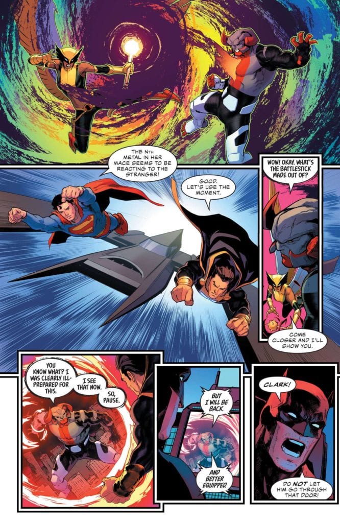
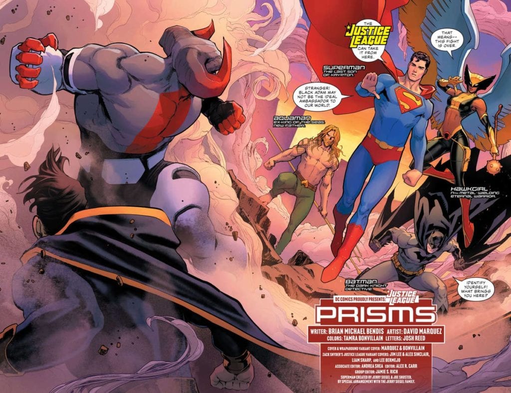
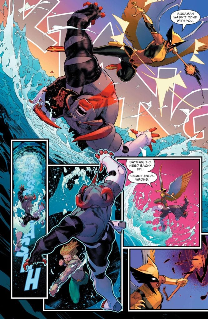
Don’t worry, there’s still plenty of traditional caped crusader goodness packed into the book. The reader gets to meet the core of the new team — Superman, Aquaman, Batman, and Hawkgirl — before the rest of the group is introduced later on. This quartet, alongside Black Adam, must battle an unstoppable monster, who calls itself Brutus, but what should be a fairly easy fight devolves into a near disaster.

JL 59
In JUSTICE LEAGUE #59, the new line-up has to confront a mysterious threat they’ve never seen before.

From Hawkgirl’s malfunctioning mace to Aquaman’s inability to match up with the beast, everything goes wrong during the team’s clash with Brutus. The new Justice League is quickly put to the test, and after the fight, the members are left to collectively lick their wounds and ponder the group’s next move. A surprising reveal on the last page also sets up the next step in this story, in which Bendis will bring in one of his original creations from a previous series.

ART

From the start, Marquez and Bonvillain compliment Bendis’ script perfectly. On the first page, Queen’s aforementioned narration is set against the image of the team members combined symbols. Bonvillain uses a gradient for these interconnected icons, from The Flash’s lightning bolt to Superman’s “S”. The top of the page is colored with a shiny gold that captures the flawlessness that’s often associated with superheroes.

But this shiny hue increasingly fades to a dim, subdued orange-bronze at the bottom. This subtle touch hints at the failure that Queen speaks to; the shift in color appropriately begins right when Green Arrow explains that mankind’s inability to understand typical heroes is one of the reasons why the Justice League doesn’t always work. This clear synergy between the art team and the writer is remarkable.

JL 59 Hawk
The new team nearly bites off more than it can chew in Justice League #59.

Likewise, Marquez and Bonvillain beautifully depict Kahndaq like a hybrid of Rome and a mythical kingdom. The former utilizes what looks like classical architecture to fuel that comparison to legendary city, while the latter gives the scene a breathtaking purple-orange background that’s right out of a fairytale. This otherworldly tone lines up with the story that’s unfolding on the page, as Black Adam comes across like a magnificent king that one would expect to see in a storybook. The unspoken comparison between superheroes and fairytale characters adds another layer of insight to an already dynamic story.

Brutus’ arrival shatters the innocent tone featured in the first scene. Thanks to the art team, the fearsome beast comes complete with demonic horns and both hellfire and brimstone. It arrives in a burst of flames that disrupts that lovely purple background, creating a strong juxtaposition in the process. For his part, Reed’s letters add to the sense that Brutus isn’t from this world. Unlike every other character, his speech bubbles have a sketchy, rough border, and his text is Bizarro-like because it’s slightly crooked. The eventual confirmation that Brutus comes from an entirely different dimension makes the battle scene even more effective. For the beloved heroes, it’s painfully clear that Brutus is a menace unlike any other.


At this point, Justice League #59 is just the appetizer for Bendis’ work on the book. Fans may be divided over his place as the series’ writer, given his sometimes polarizing work at Marvel. But based on this first outing with these assembled heroes, Bendis has a firm grasp on DC’s most esteemed characters, and he has laid out a fascinating path for them. Plus, having art as beautiful as the combination of Marquez and Bonvillain is a wonderful cherry on top. Any and all Justice League fans should get in on the ground floor of what’s sure to be a memorable run.

Monkeys Fighting Robots Youtube

Review: NIGHTWING #78 is the Start of a Bright, New Era

Nightwing Taylor DC Comics

Writer Tom Taylor, artist Bruno Redondo, colorist Adriano Lucas, and letterer Wes Abbott are back! After their brilliant work on DC Comics’ Suicide Squadthey’ve set their sights on Dick Grayson. With DC Comics’ Nightwing #78, they kick off a new era for the spandex-clad acrobat. And if this first issue is any sign of what’s ahead, this is going to be a fun ride.

Writing

Taylor wastes no time in pulling on your heartstrings. It’s not abnormal to cry while reading a Tom Taylor comic. In fact, that’s a response he often hopes for. But to cry during the first issue of a run? I mean… I’m not saying I cried but… Shut up! You’re crying! *Ahem* Moving on…

Taylor shows us a brief moment in Dick’s past. It’s a memory that seems kind of forgettable. He stands up for someone who’s being bullied at school and, when he gets home, he and Alfred debrief. But Taylor’s understated writing makes this small moment shine. It’s a memory that makes Nightwing who he is. But as the story continues, we see that this run won’t just be about small character moments. Heads are crushed, apartments are invaded, and deadly plans are made. Taylor shows us that this is going to be an eventful series that’s joyfully all over the place. He’s just as comfortable writing action as he is writing heartfelt conversations.

Nightwing Taylor DC Comics

Art

Redondo is equally versatile. There’s so much movement to this comic. In one panel, we see Nightwing jump over some goons he’s beating up. Redondo doesn’t show the jump as several different panels. Instead, he shows each turn and twist in the same panel. This makes Nightwing look lightning fast. But later, when Nightwing is shooting his grappling hook off into the sky, Redondo shows us each tiny beat. We see Nightwing pull it out, aim, shoot, and zoom off. It feels like a laid back moment that adds a little fun to the read. Redondo is a master of time on the page, and he’s constantly switching up the pacing to create a rhythm to the plot.

Coloring

Lucas does a beautiful job of setting a scene. When we see Nightwing’s memory, each panel looks like it’s in a pale blue haze. It’s the feeling of a bright morning. And even though the scene progresses throughout the day, the memory maintains that feel. When we cut to a modern day Nightwing, Lucas changes the colors. The pinks and yellows of every scene make it feel more like a sunset than a morning. Maybe it’s just a nod to the passage of time, or maybe there’s a dark night ahead for Nightwing. (“Leaping into the Light” would be an ironic title for this first arc, if that’s the case.) Either way, Lucas’s colors are a stunning visual cue of time passing.

Nightwing Taylor DC Comics

Lettering

Abbott’s lettering is tons of fun. We see the familiarity between Dick and Barbara when they talk. As kids, Barbara has huge gaps between his lines of dialogue where Dick interjects. She seems enthusiastic about talking to him, but worried she’s not giving him room to talk. When they grow up, the gap shrinks. These are now two people who know each other well. They know the pauses that they need to leave for the other to interject. They’re relaxed and at home around each other.

But lots of the fun in this comic comes from Abbott’s sound effects. Every sound has its own unique font. The “CRK” of Dick headbutting someone in the jaw is as thin as the hairline fracture he undoubtedly caused. The click of a gun being cocked is barely noticeable compared to the big “TOK” of Nightwing punching someone in the face. But it’s the action lines around these moments that make them feel fun. They’re part of the scene, involved in the movement of the characters. Abbott makes each sound feel alive.


It’s good to have this creative team back. Nightwing is going to be a fantastic ride and DC Comics’ Nightwing #78 is a brilliant start. Expect lots of heartfelt drama, a healthy dose of laughs, and some incredible action. At least for this first issue, you definitely won’t be disappointed. Pick up Nightwing #78, out from DC Comics March 16th, at a comic shop near you!

Monkeys Fighting Robots Youtube

SUPERMAN: RED AND BLUE #1 – Painting The Colors Of Humanity

Superman: Red and Blue #1 Cover

Superman: Red and Blue #1 is DC celebrating the boy scout in blue and his humanity. Each story has a down-to-earth vibe to emphasize the man over the super, even in boyhood.

Untitled: A Silver Age Reaction

The first story of Superman: Red and Blue #1 does not have a title as writer John Ridley makes a point about Superman’s conflicting emotions. This story is a reaction to a World’s Finest Silver Age comic, where Superman was at the mercy of a Soviet internment camp. It’s an event that makes him sweat as much as moving a planet with all of his might. Now in his civilian identity, he’s interviewing the man who tortured Superman for months and the reader shares Clark Kent’s trepidation.

Artist Clayton Henry makes clever use of his illustrating and inking techniques where objects and characters in bolder lines hold weight. The red and blue coloring by Jordie Bellaire is what brings out the emotional stakes. Finally, Dave Sharpe gives allows lettering moments that need to sink in to take up space on the page. It’s what allows the reader to experience Clark’s nervousness.

The Measure of Hope: The Man For Tomorrow

Brandon Easton writes this section of Superman: Red and Blue #1 about how Superman inspires people but has human flaws. A fan asks Superman to appear at his mother’s funeral after a lifetime of following Superman’s example. But even Superman can’t be everywhere at once and he arrives late. If anybody’s ever felt like they never have enough time to do important things, this story might resonate with them.

Steve Lieber makes every important character stand out with bolder lines against the background, even sheets with the Superman logo. The colors by Ron Chan showcase emotional states. Characters colored in both red and blue showcase people in personal conflicts. Even the lettering captions demonstrate this conflict, the red captions of the fan’s mother echo in juxtaposition with the fan’s blue captions.

The Boy Who Saved Superman: Premiere Superman Red and Blue #1

Superman Red and Blue #1 premiere story

Wes Craig depicts arguably the best story of Superman: Red and Blue #1 by showcasing someone Superman admires. The titular “boy” isn’t some famous writer or war hero. He’s just a regular person who, despite the risks, tries to help Superman when he’s hurt in battle. Through this readers find that Superman admires people like them as much as they admire him.

Craig’s art is extremely expressive in both character and setting. The look of surprise on Clark’s face is what gets readers undivided attention, along with his internal dialogue from Deron Bennett. Within the conflict are a large amount of panels that shift in size to express how chaotic the situation is. Combining with all of the colors, this makes the calmer situations in the Daily Planet feel like a moment of relief.

Human Colors In Superman: Red and Blue #1

This section of Superman: Red and Blue #1 serves as a juxtaposition against DC’s Batman anthology. Dan Watters gives this plot a silly start, a fifth-dimensional imp steals the world’s colors as well as people’s concept and feelings about color; like red representing the passions of love and war. So when Superman has the opportunity to put everything back, he’s conflicted as he could restart many of the world’s problems. Batman thinks that color should be locked away until Lois reminds Superman that black-and-white is Batman’s domain.

Dani gives this story a very simple aesthetic to demonstrate the story’s conflict. Every page features very simple lines to illustrate the shapes and characteristics of the setting. Batman’s cape and cowl makes him stand out when he and Superman are in the same room. This brighter Sin City aesthetic gives way to warmer and cooler colors when Superman gives the color back. It makes the world feel more lively despite the potential trouble.

On a smaller note, Sharpe comes back to give the words spoken some character. The imp speaks with a unique font in outlined word balloons, to further emphasize his otherworldliness. Lois’ captions meanwhile have a style with a fancy starting letter to promote her ability as a writer. It’s like she’s writing an article for the Daily Planet to make sure the events of the story are recorded.

The School of Hard Knock-Knock Jokes

The final section of Superman: Red and Blue #1 has Marguerite Bennett depict how the lessons of Superman’s parents shaped him. At only five years old, Clark has a lot of concern about his kindergarten days. The reader feels sympathy for Clark in how he expresses his concerns in showing off his powers. Trying to fit in is a struggle and trying to be friends with lonely and unpopular kids, for fear of losing new friends, is outright terrifying. The lessons from Ma and Pa Kent about inclusion feel so powerful.

Jill Thompson’s art, with its extremely detailed illustrating, shading, and coloring, is all very enticing with Clark’s bright colors guiding readers throughout the section. When Clark looks at the world from a frightening upwards angle, some brightness changes everything. The red sound effects like a child’s laugh and parents’ smooching from Troy Peteri enhances that feeling of brightness greatly.

Look Out For Superman: Red and Blue #1

Superman: Red and Blue #1 serves as a great way to introduce new and old readers to the Man of Steel. By putting reader’s behind the eyes of Clark Kent, his humanity really shines through. The Boy Who Saved Superman displaying Superman’s admiration for the common man hits similar notes as recent hit Soul. It all reminds fans that behind the sensationalism is a man to relate with.

Monkeys Fighting Robots Youtube

Review: SAVAGE #2: Why We Can’t Be More Like Real People

Savage #2 Cover

Savage #2, out from Valiant Entertainment on March 17, has writer Max Bemis examine the title character’s mental limitations. The artwork by Nathan Stockman shows how Kevin Sauvage feels restrained by the modern world. Despite all of the flashy colors from Triona Farrell, the lettering by Hassan Otsmane-Elhaou shows how awkward Kevin feels. It’s a great story about trying to connect with others and all of the awkwardness that gets in the way.

Savage #2: Bigger Implications

Bemis displays how Kevin’s main conflict in Savage #2 isn’t just fitting in with modern life, but dealing with his self-consciousness. It becomes apparent that amid all of the celebrity life and mad scientist encounters from the last issue, Kevin never really adjusted to normal life. When speaking with a girl who doesn’t know his celebrity status, he is awkward in his presentation. Without an influencer script or proper social skills, Kevin fumbles his words. The reader empathizes that despite Kevin’s celebrity status, he’s still a teenager.

Says so much about character.
When Kevin realized his brother is a bigger jerk-weed than anticipated.

It doesn’t help that his brother, Henry, is proving to be a bad influence. Constantly, Henry shows more concern with monetizing his brother than actually caring for him. One of the reasons Kevin has trouble talking to a girl is because Henry is a greedy chauvinist uninterested in teaching his brother social skills. Worst of all, instead of any concern for Kevin’s well-being during and after dinosaur attacks, Henry wants to publicize them. With Henry serving as a gateway to modern life, the reader can’t help but empathize with Kevin and his frustrations with this lifestyle.

Ferocity Loses Its Edge

Stockman gives the images of Savage #2 a confining sense of scale. Throughout the issue, Kevin looks small and restrained even when he’s not wearing restraints. He only moves wildly when he’s in danger. Not that it does him any good when going through a double page spread labyrinth full of death traps. Sure Kevin escapes, but he looks completely exhausted at the end.

All that blood curdling rage in orange by Farrell can’t even buy Kevin a moment of peace. Some of the panels in the above labyrinth have a sense of annoyance with their green and blue backgrounds. The reader can’t help but empathize with these color coded moments. They’d be pretty annoyed and exhausted too after such a gauntlet.

Lettering Of The Wild!

Finally, the lettering by Otsmane gives the words spoken more meaning. Kevin, in all of his appearances, goes between being loud to soft spoken. A number of times Kevin begins and ends his sentences with stylistic fonts to show how much energy he’s trying to put into his words. A huge sound effect looking word to get people’s attention can quickly get the momentum running, until Kevin says something he regrets. Which then leads to a softer speaking font in lowercase words that express how much that misspoken word affects the moment.

Savage #2 tension
You try not getting nervous from this shot.

When speaking with Savage #2 antagonist Professor Hanley Nealon, who flaunts his dramatic speech, it’s hard not to feel awkward. Nealon likes to feel in control of the situation which is where his use of speech balloons comes in. The balloons guide the reader around the page and his lab, while Nealon himself says many words without really saying anything. This all sounds intelligent, but it’s really just his way to disorient Kevin and the reader. Nealon’s flair for the dramatic shines through in a splash page where Nealon explains his motivations for Kevin in one big stylistic word balloon. It’s deranged and unsettling to the reader.

Tune In For Savage #2

Savage #2 is really getting readers more invested in the journey of Kevin Savage. With how much the modern world only wants to exploit Kevin, the reader empathizes with his frustrations. A brother who shows no real care, a mad scientist ready to experiment with him, and Kevin’s own disillusionment with his “savagery.” It will leave the reader begging to see Kevin’s next stage of development sooner.

Monkeys Fighting Robots Youtube

Review: THE AUTUMNAL #5 Is Intricate Slow Burn Horror At Its Finest

From writer Daniel Kraus, artist Chris Shehan, colorist Jason Wordie , and letterer Jim Campbell, comes the fifth chapter of one of the most well-crafted horror comics of the year. “The Autumnal” #5 is a thoughtfully paced comic book with intimate focuses on its cast of characters, while adding more pieces to the creeping puzzle that is the unseen terror of Comfort Notch. With an equally meditative and unnerving script and eerie perfect artwork, this comic is yet another incredible installment in a brilliant story.

“The sudden vanishing of a Comfort Notch citizen compels Kat to follow a hidden-in-plain-sight clue… before the worst omen of all manifests from the leaves.”

Writing & Plot

The writing on Daniel Kraus for the duration of this entire series thus far has been nothing short of astounding, and the same goes for “The Autumnal” #5. The script for this issue is rife with character moments that feel real and grounded, and make every person feel like someone you could actually speak to. Kat is now one of my favorite comic protagonists in recent years, and its because I feel like I understand and empathize with every aspect of both her past and her current struggle. She is a single mother with a checkerboard past that is only trying to do best by her child, and her instincts tell her over and over that there is something overwhelmingly wrong with this new town. The fact that she is also a good person is a bonus. There are almost no horror clichés here; Kat doesn’t stick around just to further the plot, as she is rooted to Comfort Notch and its people by her own nature. The supporting cast is fantastic as well, with Kat’s daughter being a delightful character, the scarred drug addict Carol being a sympathetic grouch, and tattoo removal specialist-turned boyfriend Rob keeps on being a beacon of reason and light. The dialogue itself feels real and genuine, with each character having their own voice. The creepy moments land with the perfect amount of shock, and the tender moments feel affirming. This series continues to be one of the most well written comics on stands right now, with Kraus being a tour de force of talent.

Art Direction

The paradoxical soothing yet unnerving aesthetic of “The Autumnal” #5 is built once again by artist Chris Shehan, whose pencils provide stunning detail and tone for environments, characters, and the general creepiness of Comfort Notch. The small town covered in leaves and woods comes across like a mix of a Stephen King novel and John Carpenter’s Halloween. The little details of the houses and resident small town diner carry a sense of familiarity to them that draws the reader into the comic with ease. The character animations are once again outstanding, with each person having their personalities portrayed through their expressions. Kat’s worry and suspicion shows through her eyes, Rob’s concern for his new lover is plastered on his face, while the lies of the deceitful are bared through grinning teeth. The colors of Jason Wordie are what really sell the “Autumn” part of “The Autumnal,” with the whole town and setting being draped in that orange and red hue that can suddenly turn into foggy shadow and other dark, vivid hues during the more horrific scenes. Subtlety is still the name of this comic’s game, so the visual direction of this comic is crafted to keep the reader strung along with often silent panels to accomplish storytelling beats that can only be done in this medium. Minor details are brought to your attention that can sometimes be difficult to make out, but that is all in the design. The letters from Jim Campbell are a perfectly contemporary font that blends in with the story and still sells the tone of the dialogue and narration perfectly. This is an expertly crafted comic book, and one of the most intricately put together horror books of the year.

“The Autumnal” #5 is a brilliant, insightful chapter in a horror comic series that is brimming with brilliance, character insight, and creeping horror. Daniel Kraus pens a script that gives priority to the evolving emotions and relationships of the main cast, while demonstrating a keen sense of tension and dread building when it comes to telling a horror story. The visuals from Chris Shehan and Jordie Bellaire are a beautiful and haunting display of character and environmental artistry, with out-of-nowhere haunting imagery and top-notch panel direction. This truly is one of the finest horror comics in recent memory, and you owe it to yourself to pick up this latest issue when it hits shelves on 3-10.

Monkeys Fighting Robots Youtube

Marvel Comics Exclusive Preview: SPIDER-WOMAN #10

marvel comics exclusive preview spider-woman #10

SPIDER-WOMAN #10 hits your local comic book store March 17th, but thanks to Marvel Comics, Monkeys Fighting Robots has an exclusive four-page preview for you.

About the issue:
The fuse lit back in #1 finds its destination.

Spider-Woman has crossed so many lines, leading to this moment and an offer to embrace the destiny forged by her Hydra years. Will she take it? You may think you know what a super hero would choose, but Jessica has a habit of defying expectations.

The issue is by writer Karla Pacheco and artist Pere Pérez, with colors by Frank D’Armata, and letters by Travis Lanham. The cover is by Jung-Geun Yoon.

MFR reviewer Cat Wyatt calls the current SPIDER-WOMAN run “tense and compelling,” and says it “uses brilliant layouts, creative storytelling, and vibrant artwork to continue Jess’ story.”

Check out the SPIDER-WOMAN #10 preview below:

marvel comics exclusive preview spider-woman #10

marvel comics exclusive preview spider-woman #10

marvel comics exclusive preview spider-woman #10

marvel comics exclusive preview spider-woman #10

marvel comics exclusive preview spider-woman #10

marvel comics exclusive preview spider-woman #10


Are you reading SPIDER-WOMAN? Who is your favorite Spider-person? Sound off in the comments!

Monkeys Fighting Robots Youtube

AfterShock Comics Exclusive Preview: MISKATONIC #5

aftershock comics exclusive preview miskatonic #5

MISKATONIC #5 hits your local comic book store March 24th, but thanks to AfterShock Comics, Monkeys Fighting Robots has an exclusive four-page preview for you.

About the issue:
Miranda Keller is one of J. Edgar Hoover’s first female investigators. After all she’s seen in the Miskatonic Valley – a white supremacist cult, bulletproof amphibious humanoids and the reanimated dead – she might also be the last. Now, her career and her life depend on stopping the resurrection of an Elder God.

MISKATONIC #5 is by writer Mark Sable and artist Giorgio Pontrelli, with colors by Pippa Bowland, and letters by Dave Sharpe. The main cover is by Jeremy Haun with Nick Filardi.

What MFR reviewer Darryll Robson had to say about the series in his review of the first issue:

MISKATONIC is addictive storytelling from the get go. Historical and modern sensibilities clash in a narrative full of intrigue and realism. It has instantly set itself up as an unmissable series.

Check out the MISKATONIC #5 preview below:

aftershock comics exclusive preview miskatonic #5

aftershock comics exclusive preview miskatonic #5

aftershock comics exclusive preview miskatonic #5

aftershock comics exclusive preview miskatonic #5

aftershock comics exclusive preview miskatonic #5

aftershock comics exclusive preview miskatonic #5


Are you reading MISKATONIC? Sound off in the comments!

Monkeys Fighting Robots Youtube

Review: PARENTHESIS—On Recovery

IDW Cover

Some non-fiction graphic novels leave an indelible mark on the reader, and Parenthesis is one of them. Written and illustrated by Élodie Durand, Parenthesis offers an unglamorous and tender account of living with and recovering from tumor-related epilepsy. Originally published in French under the title La Parenthèse by Editions Delcourt in 2010, Parenthesis is now available from IDW’s imprint Top Shelf Productions.

Durand establishes her non-linear, epistolary story of Judith with her cutting her hair short. These hair clippings fall in the shape of parentheses. Then the narrative jumps to a past meeting with a friend which serves as the inciting incident for Judith’s reconciliation with her past, of her self-image, and her relationships, chiefly with her mother. In fact, it is to her mother that the novel is addressed.

From the opening scene, the plot moves forward and back as the protagonist pieces together the memories she nearly lost. And with her parents’ help, Judith reconfigures events she thought she knew. Once her timeline encroaches on the present, Judith finally contends with the shame she expressed in the beginning. While this structure might seem confusing as described, it is not so on the page. Durand takes things slow, steeping the reader in the minutiae of her daily life.

A Scattered Mind

Artistically, the book is not messy as such, but it isn’t polished. This choice seems intentional, to reflect the protagonist’s scattered mind and Durand’s stream of consciousness approach to the narrative. This style also reflects Judith’s view of herself while experiencing epilepsy and during her recovery; she saw herself as monstrous, if not without an identity entirely.

JUDITH VIEWS HERSELF AS MONSTROUS.

Durand’s use of intercut “self-portraits” illustrate her sense of self as they devolve in form sequentially from diagnosis to post-recovery. These self-portraits are genuinely disturbing, but I couldn’t look away. When you’re presented with something so authentic and unapologetic, you’re forced to interrogate your own self-image.

Moreover, it’s these self-portraits putting us in the mind of the author that help create sympathy when Judith does out-of-character things. At the start, Judith has symptoms she can’t explain. Therefore, she lashes out angrily at friends. Without proper context, you might be quick to call Judith rude and inconsiderate. But because of the schema from the art, you sympathize.

Later we learn that the increasing severity of her illness forces Judith to rely heavily on her parents—especially her mother—to perform basic daily tasks. This is undeniably devastating and relatable. As someone who is around the same age as Durand was at the time of her diagnosis, I understand the frustration stemming from loss of control, loss of a mature identity when you’ve only recently achieved independence.

Throughout Judith’s story, Durand maintains a strict black-and-white color palette, which gives the sense that the reader is looking into her secret sketchbook. Black-and-white also represents the past, and the haziness of memory. Here, as in the self-portraits, Durand seeks not to gloss up her past, but to simply piece it all together into a cohesive narrative. The effect, while tragic, is a mundane quality to the book as opposed to an over-the-top dramatic one. The reader comes to realize that life goes on despite and because of illness.

ALL EYES ARE ON SICK JUDITH.

Universal And Particular

Reinforcing the private sketchbook (or diary) aesthetic is the lettering and layout. Durand’s cursive captions and minimal use of panel borders contribute to the stream of consciousness quality. However, while these choices make the whole reading experience specific and intimate, the crafting is clear. Durand has spent hard time making this graphic novel. According to her own caption narration, Parenthesis covers roughly ten years of Judith’s life.

And it’s a combination of the time, raw style and narration which make Parenthesis such an effecting, timeless and timely graphic memoir. The novel’s poignancy lies in its specificity. Ten years after its initial publication, Durand’s memoir has resonance for those who have struggled and those who have not.

For these reasons, I believe this is a must-read for fans of non-fiction graphic novels. You may find a bit of catharsis in the story, even if you weren’t looking for it. Who knows, you might discover a close for the parentheses of your own recovery.

Monkeys Fighting Robots Youtube

Review: BUFFY THE VAMPIRE SLAYER #23—Impractical Magic

Buffy

As the plans of villains Anya and Xander clash, a greater magic force threatens to upend everything. From Boom! Studios, Buffy the Vampire Slayer #23 is written by Jeremy Lambert and illustrated by Ramon Bachs. Two other frequent Boom! contributors, Raul Angulo and Ed Dukeshire, provide colors and lettering respectively.

By this point, so much has happened to the Scooby Gang, one wonders how things could get worse. But if you remember the TV series as well as the comic series team does, then you know there’s one more trick to pull.

Warning: Spoilers ahead!

spoilers ahead

The Ring of Fire arc has turned multiple friends into foes. Anya, the former Watcher, continues her secret plot against the Watcher Council. Meanwhile, Xander’s a vampire hell-bent on trapping Willow with him. Now, through the magic of a mysterious gift from issue #20, Willow has been taken over by an eerie sort of doppelganger.

Previously On…

So, yes, we now have our very own comic book ret-con of Dark Willow. Lambert’s choice of ret-con feels earned instead of arbitrary, perhaps making it more agreeable for long-term fans of both the show and comic book series. Willow’s struggle to understand her powers has been able to develop over twenty-two issues and a spin-off full of introspection and growing self-awareness.

Dark Willow
SOMETHING SINISTER TAKES OVER WILLOW.

Giving Willow an evil doppelganger means real Willow doesn’t shoulder all the blame. Besides, it’s Anya pulling the strings. Overall, Lambert’s choices have successfully condensed and simplified the Dark Willow story arc while maintaining Willow’s likeability. As a fan of both the show and comics, I must admit I didn’t like the show’s take on Dark Willow.

Dark Willow

While I understood the how and why of her magic addiction, it was heartbreaking to see Willow become the bully. Once it happened, I felt I could no longer relate to my favorite character. So far, the approach to a Dark Willow arc in the comics has been more relatable, due in part to the fact that vampire Xander is the one who lured Willow into the underworld. But, again, it’s not exactly his fault that she’s gone dark.

On the art side of things, Bachs has adapted Dark Willow’s look from the show as well. Bachs’ style seems to pay homage to pop art and early comics by using dot shading and severe action lines. There’s even a striking extreme close-up panel that could have been drawn by Roy Lichtenstein himself. All this to say that Bachs’ Pop Art-inspired inking and character design a la Bob Montana (Archie Comics) betrays a deep love for comics while supporting the playful campiness inherent in the Buffyverse. His choices here lend a sense of familiarity to the art.

Moreover, Angulo’s tendency to wash (or fill) colors lends a neo-noir, cinematic mood to this issue. Each color also corresponds to a place or character. For example, Dark Willow’s parts of the issue are awash in a deep shade of purple, a color of mystery and royalty. This color helps emphasize Dark Willow’s power and momentary control over the Scoobies in the latter half of the issue. On a baser level, she just looks so imposing and badass.

Changed Utterly

On a final note, Dukeshire’s lettering is pretty consistent except for a minor problem on the second to last page. On a previous page, Dukeshire outlined Willow’s telepathic dialogue with her Dark Self in blue. Then on page 23, he outlined what appear to be Dark Willow’s response to Willow in the same shade of blue. But that dialogue could also be Willow’s own inner monologue. It’s only a little confusing given that Dark Willow’s other speech bubbles have been colored black and outlined in purple. Adding to the confusion is the fact that what Willow “says” in the thought bubbles sounds more like Dark Willow.

Regardless, such a small flaw is forgivable with an issue so satisfying. With each new tantalizing twist and obstacle, the Ring of Fire arc challenges the Scooby Gang in ways we’ve never seen before. Now the question is how will Buffy take on two changed versions of her best friends? Not to mention Anya. It is on that delicate thread that our hope for the future of the Scooby Gang hangs.

Monkeys Fighting Robots Youtube

SCOUT’S HONOR #3: Separating The Inspiration From Toxicity

Scout's Honor #3 Cover

In AfterShock Comics’ Scout’s Honor #3, writer David Pepose puts the protagonist, Kit through a test of character. The art by Luca Casalanguida details this gritty situation while the colors by Matt Milla bring some brightness to these difficult moments. Through captions and sound effects, Carlos M. Mangual’s lettering brings a dramatic echo to every dire situation Kit faces.

Scout’s Honor #3 The Badge Of Courage

Pepose solidifies the reader’s support of the protagonist Kit after much build up from previous issues. With everything she does and her inspiration of the Ranger Scouts in question after some startling revelations, where does Kit have left to go? As it turns out, the answer is simple nowhere but up.Scout's Honor #3 page arc

Throughout Scout’s Honor #3, Kit’s greatest challenge is the difference between strength and honor. Kit believes in the Ranger Scouts’ ideals that prioritize surviving in a post-apocalyptic world, but she’s against the “Boy’s Club” mentality. Her journey echoes that of her friend-turned bitter rival Dez.

In his attempt to live up to his father’s expectations as well as his own, Dez only finds disappointment and rejection. The reader can’t help but sympathize with him when his father, the Scoutmaster slaps him. That reaction particularly rings true when one considers that the Scoutmaster is anything but the honorable man he pretends to be.

Kit’s relationship with her father is quite different. He’s Kit’s inspiration for living. Even after his death in the series’ second issue, Kit holds him close. While she still keeps her guard up around the scouts, Kit maintains the values her father taught her without conforming to the scouts’ dominant ideals.

Smoothing Out The Grittiness

Casalanguida gives Scout’s Honor #3 a generally gritty style, aside from some important moments. The issue features an impressive amount of shading and detail to characters and terrains. Visually, it looks like the characters are trying to be as tough as the post-apocalyptic world they are living in. That toughness doesn’t seem to end very well when Dez almost gets killed when he tries to defeat an enemy.

By comparison, the smooth panels and the bright colors Milla uses for Kit’s scenes offers the reader a chance to catch a breath and relax in the middle of the aforementioned despair.Kit's personal situation

Otherwise, Mangual makes every action and word impactful in Scout’s Honor #3. The words of Kit’s drone companion, captured in green caption-like word balloons, is some of the only comfort she has. Its simplicity in its support of Kit is both comforting and sad, considering their bond stems from Kit’s role as the drone’s leader. Every other human connection she has ranges from plain to passive aggressive. Unfortunately, there’s nobody she can trust, other than a programmed drone.

Even cheers for her in repetitive sound effects don’t resonate with Kit, as they echo a lie she tells to be among them. Kit might have passed the scouts’ trials, but she had to pretend to be a boy to even qualify. This tension is exemplified by the scouts calling her “Brother Kit”. The reader feels Kit’s emptiness by sharing her awareness of her real gender.

Pick Up Scout’s Honor #3

Scout’s Honor #3 reaffirms the reader’s faith in Kit after losing this trust had been lost in previous issues. Now, it’s so easy to root for her because now the only thing she has left to lose is her honor. The other scouts clearly lack this desirable trait, so Kit stands out among the rest. Now, all she and the reader have left to do is see the series to the end.

Monkeys Fighting Robots Youtube