Home Blog Page 168

Review: DARKHAWK: HEART OF THE HAWK #1 Celebrates The Character

Darkhawk

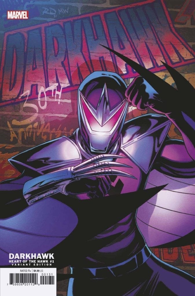
Darkhawk: Heart Of The Hawk #1 out this week from Marvel Comics marks the 30th anniversary of the character’s introduction. Darkhawk has made many cameos since his ongoing series was canceled and even had a mini-series in 2018. This issue offers three stories showcasing the character’s past, present and even leaves hints about what may come for Darkhawk in the future. This anniversary comes courtesy of Danny Fingeroth (Writer of the first story), Mike Manley (artist of the first story and co-creator of Darkhawk), Chris Sotomayor (Colorist for the first story), Dan Abnett (Writer of the second story), Andrea Di Vito (Artist for the second story), Le Beau Underwood (Inker for the second story), Sebastian Cheng (Colorist for the second story), Kyle Higgins (Writer for the third story), Juanan Ramirez (Artist for the third story), Erick Arciniega (Colorist for the third story), and VC’S Travis Lanham (Letterer for the whole issue).

Summary

Celebrate the 30th anniversary of the ’90s hottest hero in three spectacular stories! First, an untold story from Darkhawk’s early days by creators Danny Fingeroth and Mike Manley! Then explore the winged hero’s cosmic years by Dan Abnett and Andrea Di Vito. Finally, find out what the future holds for Darkhawk by Kyle Higgins and more!

Darkhawk

Writing

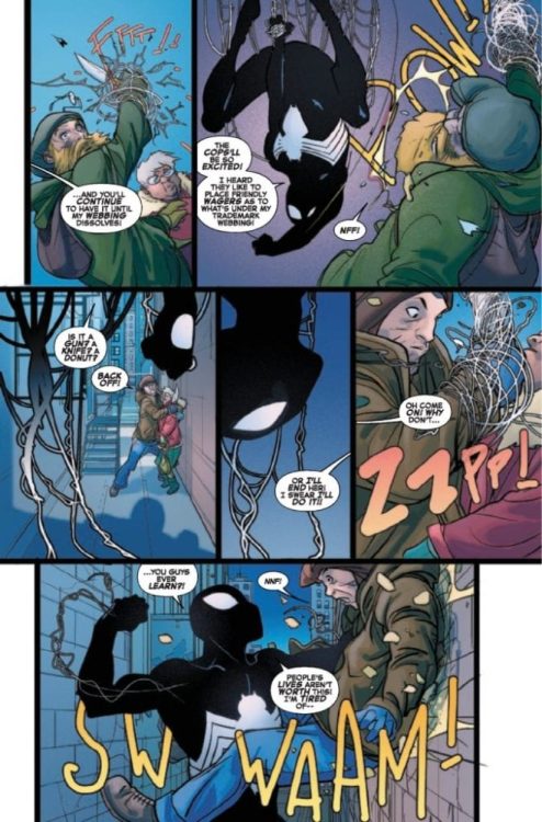
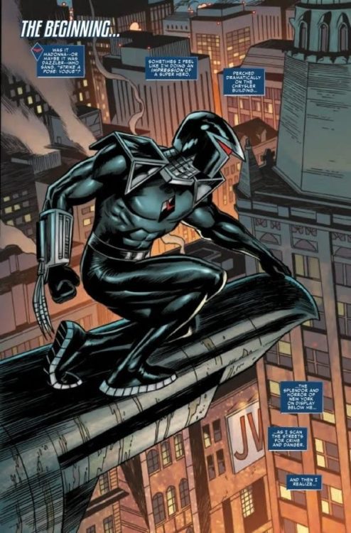
Each of the three stories in the issue looks at a different time in Darkhawk’s history. The first story, “Cry of the City” by Fingeroth, feels like it was missing from the original series. It introduces a plot point that would have made Darkhawk’s struggle to become a hero much harder. It’s sad the story can’t be expanded upon or inserted back into the character’s history.

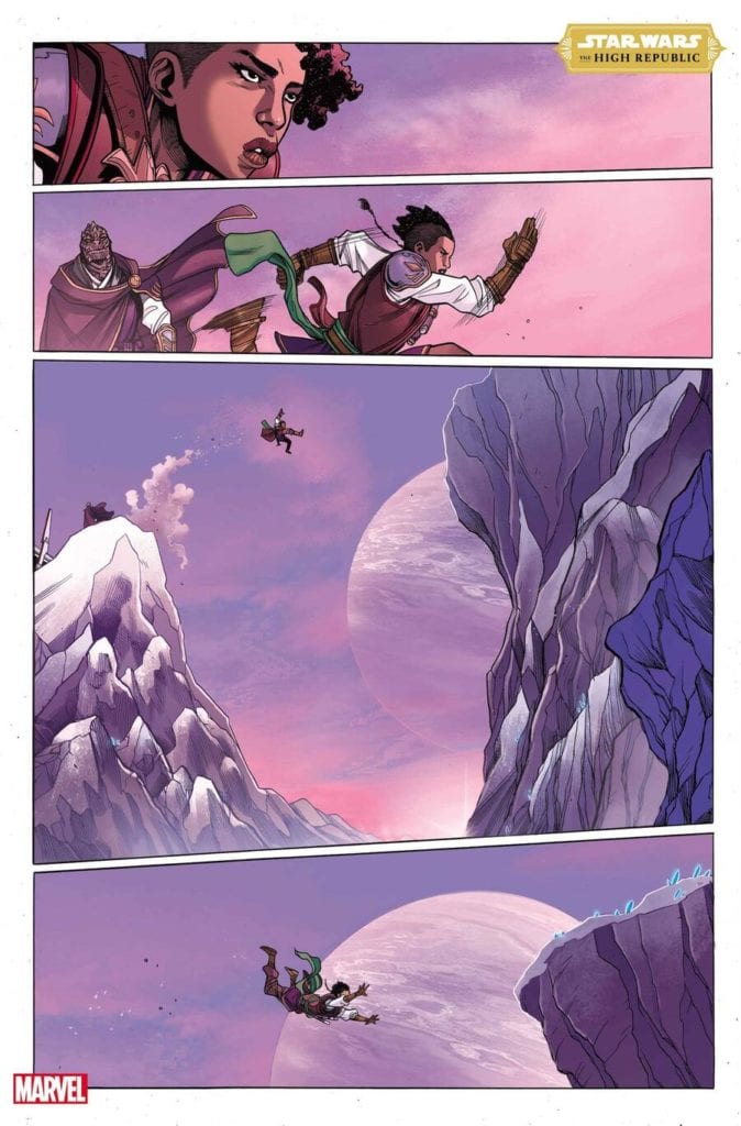
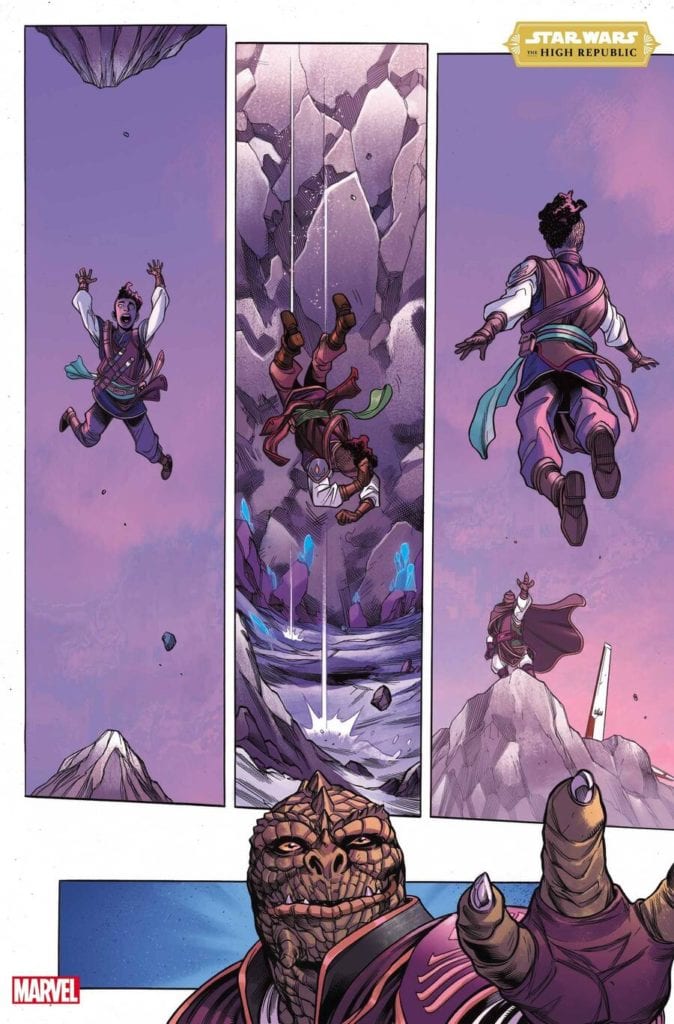
The second story by Abnet, “Long Way From Home,” takes a look at the more modern stories. Since Infinity Countdown, Darkhawk has been popping up in titles such as Guardians of The Galaxy connecting him to a more cosmic side of Marvel Comics. This story shows Darkhawk finding his way through space and coming face to face with one of Marvel’s most vicious alien races. It’s the least gripping of the three stories, but it is still an entertaining story.

Darkhawk

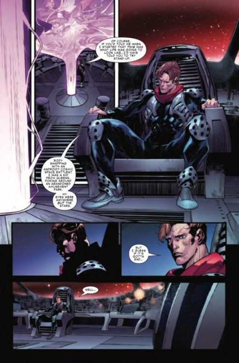
The final story, “Last Flight” by Higgins, takes the time to set up a possible future for the Darkhawk. The story hints at something called the “Shadow War,” a possible event on Marvel Comics’ horizon. It’s impossible to go into detail about this story without spoilers. It definitely takes Darkhawk and his secret identity, Chris Powell, somewhere they have never gone before.

Artwork

With “Cry of the City,” Darkhawk’s co-creator Manley provides a nostalgic feel for the character. Though with Sotomayor providing the colors, the character does have a more modern look. Overall the pair deliver a story feeling like a missing piece to the original series.

Darkhawk

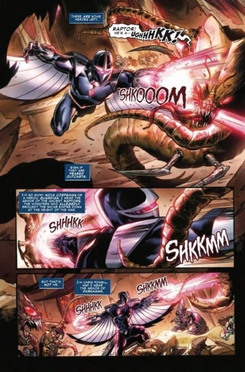
The look of “Long Way From Home” by Di Vito and Underwood has a fantastic look to it, thanks to their combined work. With recognizable alien species in every panel, it feels like the cantina scene from Star Wars. Cheng’s colorwork helps elevate the action, especially as Darkhawk has to use his powers when a fight breaks out.

“Last Flight” ends the issue on a more somber note. Ramirez’s artwork features a more reflective look to Chris Powell as he contemplates how he got to this point. Arciniega’s colorwork utilizes darker colors for a bleaker outlook for Chris and brighter ones when a cosmic disaster is on the horizon.

Darkhawk

The Lettering by VC’s Travis Lanham deserves a lot of praise in this issue. Between all three stories, Lanham captures the look of lettering from the past and present. The lettering for “Cry of the City” feels like it was pulled directly from the 90s.

Conclusion

DarkHawk: Heart Of The Hawk #1 is a definite read for fans of Darkhawk but could be an ideal starting point for new readers curious about the character. Darkhawk has become a supportive character for teams such as the New Warriors and Guardian Of The Galaxy. If Darkhawk is ready to return to greater things later this year, this issue is a perfect way to understand Chris Powell better.

Monkeys Fighting Robots Youtube

THE FALCON AND THE WINTER SOLDIER – The Whole World is Watching | TV Review

Following the events in Madripoor, the episode “The Whole World is Watching” takes the titular characters to the Latvian capital where the show feels like it’s spinning its wheels.

Sam and Bucky continue their search for Karli Morgenthau (Erin Kellyman), believing that finding the location for a funeral would be their best chance. But they face complications due to Jack Walker encroaching on their mission and the Wakandans demanding Sam and Bucky demand they hand over Zemo after eight hours.

The Falcon and The Winter Soldier felt nowhere near as revolutionary as WandaVision. It looks and feels more like a Marvel movie being stretched out rather than a TV show. The first two episodes did a fair enough job setting up the new situation for the MCU world and the characters and ‘Power Broker’ functioned as a focused episode.

‘The Whole World is Watching’ felt meandering. The best example of this was the reintroduction of the Dora Milaje. Their appearance did make some sense because they wanted to bring Zemo to justice because of the events of Captain America: Civil War. But their appearance boiled down to them having an action scene against the new Captain America and give him the humiliation he deserved. They were a plot device and to help fill some time.

Ayo suffered from an issue that affected characters in the last episode: over expository dialogue. Yet it was even worse for her because she was recounting information that both the audiences and the characters already know. It was redundant.

Where the episode does succeed was with the character moments. One of the key scenes was when Sam met Karli and they talked about the morality of her cause. It showed some moral complexity of the new world. Karli can be summed up as her cause was understandable but her methods were questionable.

Jack Walker got some character development. In “The Star-Spangled Man” Jack had doubts whether he could live up to the Captain America mantle and in this episode, he was shown to be impulsive. The episode ends with a dark moment but there should have been more of a build-up. The program needed to show more of Jack’s violent tendencies. Comic book fans would have predicted this turn but in the context of the show, it came across as too sudden.

“The Whole World is Watching” had smaller scale action than in the previous episodes. It worked in the context of the episode. The first action sequence had a parkour feel to it as characters get chased in an old warehouse. The final action sequence had the air of Skyfall and Mission Impossible III because characters had to race across a city to stop the villains from enacting their plans. It was fun to watch the Flag Smashers using knives when they were fighting.

“The Whole World is Watching” was at best a fairly standard episode of TV that felt more like filler.


Monkeys Fighting Robots Youtube

BATMAN DETECTIVE #1: Putting ‘World’ Back In The ‘Greatest Detective’

Batman Detective #1 Cover

Batman Detective #1 from DC Comics hits comic stores on April 13. Writer Tom Taylor challenges the Dark Knight by focusing on “The World’s Greatest Detective.” Artist Andy Kubert brings forth some interesting designs in costumes for the cast. Something that colorist Brad Anderson ensures to stand out. Letterer Clem Robins makes the internal strife and actions of Batman easy to follow.

Batman Detective #1: World’s Greatest

Taylor takes a page out of Batman Inc., where Batman’s title as ‘World’s Greatest Detective’ becomes more literal. Beryl Hutchinson’s return as Knight is a nice callback to that line with how Batman franchises his mantle. It feels like a means for people anywhere to use the Dark Knight as inspiration to help others. So what happens when a group of extremists wants to disenfranchise him by killing innocent people?

Batman Detective #1 Conflict
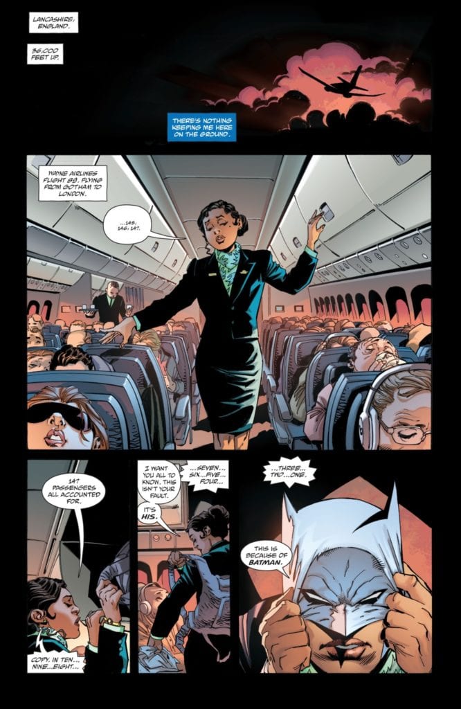
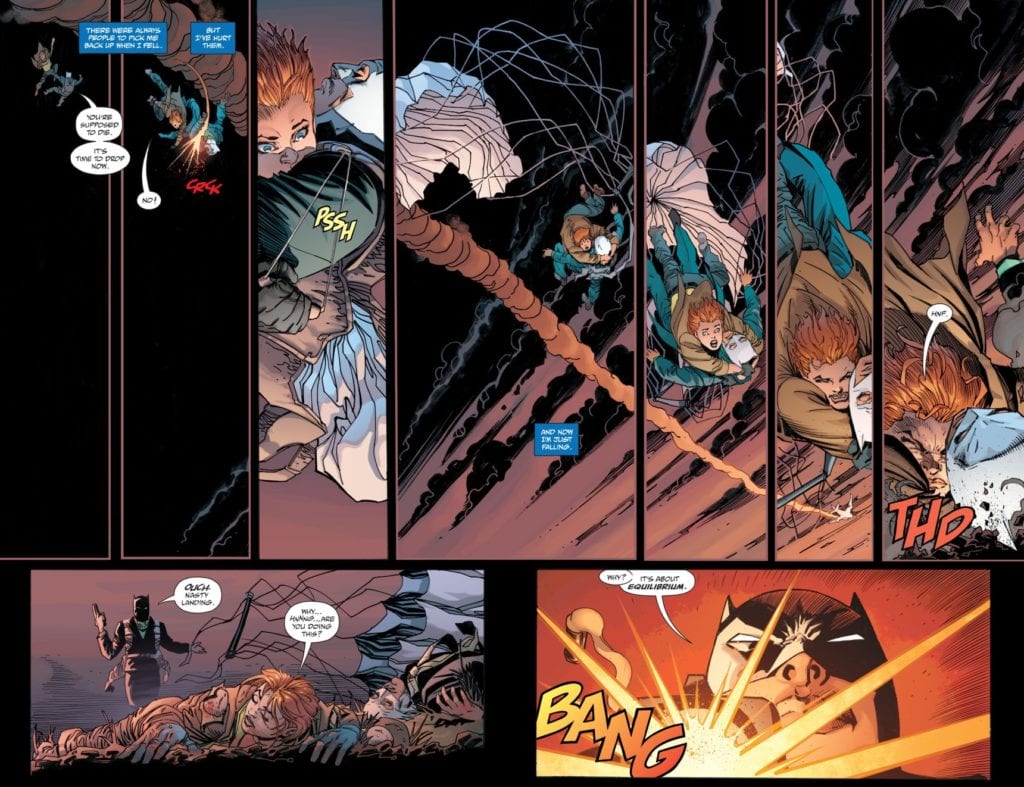
Worse still, Bruce Wayne already feels powerless with some “current” events. All of this destruction to smear Batman’s name feels like rubbing salt on a wound. This is why it’s good to see Knight and Squire bring some levity to Batman’s personal crisis.

Finally, Batman as a noir-style detective is on full display. The connections he uses to investigate crimes, his preparation and ability to think on his feet, and above all else, Bruce’s hardboiled attitude. Despite Batman’s capabilities, he feels like he’s already lost his battle against crime. It’s a feeling that many longtime Batman fans have to grapple with, making the connection to Batman even greater.

Costumes Make The Detective

Kubert’s designs give a unique perspective to Batman Detective #1. Batman, for example, wears a costume resembling Zack Snyder’s post-Apokolips costume. Doing away with the iconic campier Batsuit helps accentuate the mood of the series. There’s no time for theatrics for Batman this time around, only the detective.

Especially when the anti-Batman terrorists go out in all white versions of his iconic costume, these designs are meant to mock Batman with how bright Anderson makes them. Unlike Batman’s darker costume, which allows him to move through the shadows, these “anti-Batmen” want his image to be seen in full view. This way, whenever anybody sees Batman’s visage, the innocent will cower in fear.Contrast at large

If all of this isn’t enough, Robins’ lettering gives voice to the internal and external conflicts of Batman Detective #1. The captions that display Bruce’s thoughts feel slow and heavy, which coincides with his defeatist mind. The sound effects from the anti-Batmen, meanwhile, are loud, fast, and merciless. For them, there’s no thinking or second-guessing, only a mission.

Investigate Batman Detective #1

Batman Detective #1 is a must-read for fans of the Caped Crusader. It’s not just the sensational storylines but how people see the different sides of the Dark Knight. The detective angle just happens to have this deep sense of introspection on the character’s limitations. That way people can learn to love Batman even more.

Monkeys Fighting Robots Youtube

Preview: SIRENS OF THE NORSE SEA – A Mythic War Of Vikings And Mermaids

Fierce Vikings and mystical Sirens face each other in a neverending battle over their greatest source of life: the sea.

Adapted from Isabelle Bauthian’s original work, “Sirens Of The Norse Sea” from writer Françoise Ruscak and artist Phil Briones is a stunning tale of high-fantasy on a mythical sea full of beats and wonders alike. A hit overseas, this graphic novel is  finally available here in the States for your reading pleasure!

Mixing popular mythology with intense action and wildly imaginative fantasy, “Sirens of the Norse Sea” is a wondrous tale to behold for fans of the genre.

“Vikings, the world’s fiercest warriors and greatest sailors rule the land. But the sea has never been so easy to claim, for another creature dwells within it: the Siren. For generations, Viking clans have had to face Siren tribes: a constant battle between cunning and brute strength, and charm and sorcery, with the vast ocean in between.
In each book in the series, their paths intersect, for better or for worse.”

Be sure to order this stunning graphic novel from your local comic shop today or directly from Humanoids publishing today!

Monkeys Fighting Robots Youtube

Exclusive Preview: MIGHTY MORPHIN #6 – Zordon’s Past Threatens Angel Grove

Exclusive Preview: MIGHTY MORPHIN #6

MIGHTY MORPHIN #6 hits your local comic book shop on April 14, but thanks to Boom! Studios, Monkeys Fighting Robots has an exclusive four-page preview for our readers.

The book is written by Ryan Parrott, with art by Marco Renna, Walter Baiamonte with assistance by Katia Ranalli and Sara Antonellini drop the colors, and you will read Ed Dukeshire’s letter work. MIGHTY MORPHIN #6 features main cover art by acclaimed illustrator InHyuk Lee, and variant covers by Eleonora Carlini, and Peach Momoko.

About the issue:
Still reeling from the revelation of the New Green Ranger’s true identity, the New Mighty Morphin team must join with former Ranger Grace Sterling to save Angel Grove from a new threat tied to Zordon’s surprising past. But nothing could prepare the Rangers for the two people who stand in their way…


Enjoy the preview below.

Monkeys Fighting Robots Youtube

AfterShock Comics: Read A 4-Page Preview Of SHADOW DOCTOR #3

SHADOW DOCTOR #3

SHADOW DOCTOR #3 from AfterShock Comics hits your local comic book shop on April 28, but thanks to the publisher, Monkeys Fighting Robots has an exclusive four-page preview for our readers.

The book is written by Peter Calloway, with art from Georges Jeanty, Juancho! drops the color, and you will read Charles Pritchett’s letter work. Mark Chiarello created the cover.

About the issue:
Nathaniel got what he wanted: he had the money – a gift from Al Capone – to start his medical practice. He was going to be a doctor. Then the bomb went off. In the chaotic aftermath – and with a life on the line – Nathaniel was going to learn what taking money from the mafia truly meant.


Enjoy the preview below.

Monkeys Fighting Robots Youtube

4-Page Preview: Chip Zdarsky’s SPIDER-MAN SPIDERS SHADOW #1 (OF 4)

SPIDER-MAN SPIDERS SHADOW #1 (OF 4)

Some writers know Peter Parker’s tone very well, and Chip Zdarsky is going to run wild with it in this WHAT IF? story.

Marvel Comics has provided Monkeys Fighting Robots with an exclusive preview of SPIDER-MAN SPIDERS SHADOW #1 (OF 4), hitting your local comic book shop next week.

The book is written by Zdarsky, with art from Pasqual Ferry, Matt Hollingsworth drops the color, and you will read Joe Caramagna’s letter work. Phil Noto created the cover.

About the issue:
WHAT IF PETER PARKER BECAME VENOM? Peter Parker once put on an alien suit that nearly destroyed his life – but what if he’d never taken it off? Ignoring every warning, Spidey embraces the dark symbiote! Haunted by terrible nightmares and exhausted by an endless barrage of bad guys, Peter can’t seem to catch a break these days. So when the Hobgoblin attacks, he finds a hero at the end of his rope…and vulnerable to new dark impulses. Spider-Man is about to change his rules – but is it truly Peter who is in charge? Creative powerhouses Chip Zdarsky, Pasqual Ferry, and Matt Hollingsworth bring you a terrifying tale of a Peter Parker possessed and on the edge!

Enjoy the preview below.

Monkeys Fighting Robots Youtube

Review: FRIDAY #3 Shows Us We’ve Only Seen the Tip of the Iceberg

Friday Brubaker Panel Syndicate

In Brubaker’s letter section, aptly named “Thank God It’s Friday,” he spends some time talking about the behind the scenes of this particular issue. The major takeaway is that the end of Friday #3 was meant to be the end to Friday #1. But then the characters took over. It’s clear that writer Ed Brubaker, artist and letterer Marcos Martin, and colorist Muntsa Vicente are just getting started.

Writing

It takes guts to let go of the reigns. When Brubaker describes his original plans for Friday #1, one can picture what he’s talking about. A tight script with a cliffhanger ending. Brubaker is good at those. But instead, Brubaker let his characters tell the story. Kings Hill and all of its charming occupants took us the long way round. In this chapter, things begin to feel faster. Friday has always seemed a little awkward. We can see how she feels out of place, like she’s too big for Kings Hill. Now, we see her beginning to feel at peace. She starts to see that growing up isn’t about getting too big for some things, it’s about being at peace with never outgrowing your home. It’s a beautiful development for the character, which Brubaker punctuates with a complication. As Friday crouches in the snow, her life goes up in flames around her. And maybe, just maybe, that brief moment of peace only made things feel worse. It’s a heartbreaking moment that was beautifully led up to by all of us taking the long road.

Friday Brubaker Panel Syndicate

Art

This is a pretty emotional issue. But Martin achieves that by playing down the emotions on the page. Friday is a rather stoic character. She has a tough exterior. She doesn’t smile much, but she doesn’t look melancholy either. Most of the time, Friday looks concentrated. Her brow is knit, her eyes are focused. So when she grins, even slightly, it’s huge. There’s a fantastic moment on one of the pages where Martin has three panels of Friday’s face, side-by-side. The first is covered in shadows, but what we can see of her face makes her look a little sad. Then, we see her smile, just a little. “And feeling like herself for the first time since the summer,” the words say above her. In the final image in that row, she’s frowning. “Being a person was so stupid and frustrating sometimes,” the next panel says. It’s a beautiful moment. The very fact that something made Friday smile is what makes her sad. This small, innocuous row of images shows the emotional depth of the writing and art. It shows us that these characters are complex. So complex, they even confuse and infuriate themselves.

Coloring

Vicente’s coloring is downright intriguing in this issue. In the last issue, Vicente used the color yellow to show Friday’s childishness. When we first met her, she was in a big yellow sweater, and as she grew up we saw her in less and less yellow. It’s telling, then, that when Friday goes to visit Lancelot Jones, his room’s light looks yellow through the window. Lancelot represents, to Friday, her childhood. He was her childhood friend and partner. It’s because of him that she seems to feel guilty about growing up. As she goes back out into the night, the colors of adulthood take over. The cool blues and dark purples of the forest. But then, we get one last dazzling show of yellow. Vicente colors one fateful scene almost entirely in yellow. It feels like the bright, dying moments of her childhood as Friday sits, heartbreakingly aware that she is undoubtedly an adult now.

Friday Brubaker Panel Syndicate

Lettering

Martin’s letters are just as much a work of art as his pencils. Sound effects are worked into the artwork seamlessly, often splashing across the background of a panel, with the cause of the noise in the foreground. Martin gives us a sense of how a character is feeling by the size of their dialogue. Friday yells at Lancelot’s window. When he doesn’t answer she says “God damn it,” in small letters. It’s under her breath and full of rage. She talks to herself often, actually. When she looks for a sled in a dark shed “… Tell me they didn’t get rid of… no…” she says quietly. She follows up with “There you are,” in big letters. This isn’t a comic you think about reading, it’s a comic you just read. You hear every moment in your head, never thinking twice about how it would sound. Martin masterfully leads readers through this issue.


This is just the end of the first arc for Friday. Hell, it was supposed to be the end of the first issue. But that means that we have lots to look forward to. This creative team continues to do beautiful work. Get your copy of Friday #3 at Panel Syndicate. This fantastic site lets you pay what you want for each issue. If you can spare a few dollars, please do! That way we can keep reading this wonderful series for a very, very long time.

Monkeys Fighting Robots Youtube

Review: Dark Side Photosynthesis In STAR WARS: THE HIGH REPUBLIC #4

Writer Cavan Scott and artist Ario Anindito, with inker Mark Morales, colorist Annalisa Leoni, and letterer Ariana Maher present “Star Wars: The High Republic” #4. This issue continues to present and explore new threats and concepts within the Star Wars universe while digging into more character storytelling and great galactic adventure. With more stellar artwork from the visual team, this issue is another entertaining success in this new chapter from the Galaxy Far Far Away.

“THE JEDI TURNED AGAINST EACH OTHER?! AVAR KRISS and her band of brave JEDI helpless in the clutches of a traitor in their midst. STARLIGHT BEACON under attack from an insidious foe. Danger from an age-old enemy. Who is really pulling the strings on the distant planet of SEDRI? Plus: The secret history of the terrifying DRENGIR revealed.”

Writing & Plot

Cavan Scott’s script for “The High Republic” #4 is the most fast paced and action oriented thus far, but it still takes the time to flesh out its cast. The opening sequence is a flashback showing Avar Kriss training under her former master and current ally, Jedi Master Sskeer, before taking us back to the present where the latter is possessed by a Dark Side wielding plant. The trails that these characters have faced up to this point have ensured that every moment in this comic has tension. Nothing in this chapter feels like a throwaway, and each scene adds something to the characters or the lore at large. Sskeer’s struggle with trauma, Avar’s coming to grips with her own role and her former master’s fall, and the first real test of Starlight Beacon all come to a head here. The discovery of the Drengir on the outset seems a bit odd, even for Star Wars, but the notion of ancient Dark Side aligned plants just works here thanks to Scott’s framing of this new menace. Knowing that there is still much more story to come is immensely intriguing, and this issue’s end is one of the wildest yet coolest cliffhangers I’ve gotten to see in comics recently, Star Wars or otherwise.

Art Direction

This unexplored era of the Star Wars universe in “The High Republic” #4 is brought to life by the consistently brilliant grouping of Ario Anindito’s pencils, Mark Morales’s inks, and Annalisa Leoni’s colors. The animation and detail that the lines and shades give to the characters and environments here all look near-immaculate with the same kind of high production we’ve been getting from all of Marvel’s Star Wars outings. The art style still obviously retains the look and feel of a Star Wars tale, but with new design choices the replicate the unseen era we get to see here. The panel direction as well is kinetic and natural, making this fast paced issue easy to follow and very capable at building tension. The colors are gorgeously vivid, giving every panel a life that is rare even in the most well-produced mainstream comics. From the bright golds and whites of Starlight Beacon to the dank tunnels in the home of the Drengir, and to the glow of lightsabers humming in the dark, everything in this book looks spectacular. This is another piece in the long line of outstanding looking Star Wars comics, and one that very much has a life of its own.

“Star Wars: The High Republic” #4 is an intense, character-driven, and action-packed installment in this fantastic series. Cavan Scott’s script is full of lore and character building and also full of twists and pleasant surprises. The visuals from Anindito, Morales, and Leoni are vivid and full of life, bringing this mysterious era of Star Wars history to focus with familiar yet new energy. Be sure to grab this issue when it hits shelves on 4-7!

Monkeys Fighting Robots Youtube

Review: DEADPOOL NERDY 30 #1—Party On, Wade

Main Cover

Be ready to party, fans of Deadpool, because it’s Wade’s 30th birthday and you’re all invited. Available now from Marvel, Deadpool Nerdy 30 #1 is an eight-part anthology celebrating the 30th anniversary of the character’s first appearance in The New Mutants #98.

Writers: Joe Kelly, Skottie Young, Kelly Thompson, Fabian Nicieza, Gail Simone, Daniel Way, Gerry Duggan, Brian Posehn, Rob Liefeld, & Chad Bowers

Artists: Gerardo Sandoval, Aaron Conley, Kevin Libranda, Bob Quinn, Patch Zircher, Michael Shelfer, Paco Medina, Scott Koblish, & Rob Liefeld

Colorists: Chris Sotomayor, Jean-Francois Beaulieu, Rachelle Rosenberg, Jim Charalampidis, Jesus Aburtov, Nick Filardi, Brian Valenza, Jay David Ramos, & Federico Blee

Letterer: VC’s Joe Sabino

Nerdy 30 strings together eight loosely connected, semi-biographical shorts. They follow Deadpool from conception to death, then finally to the inception of the character in New Mutants in a meta, tongue-in-cheek ending. Part retrospective, part birthday party—all delightful.

Liefeld Cover

No Chill Whatsoever

Each story is entertaining on its own, thanks to some returning favorite creators. But there are a couple stand-outs. The first of which is story six entitled “No Chill Whatsoever.” Written by Marvel mainstay Daniel Way and drawn by his frequent collaborator Paco Medina, “No Chill Whatsoever” layers a neo-noir style over Deadpool’s childish pursuit of a birthday cake.

It’s Deadpool’s birthday, and no birthday is complete without a cake. So, instead of turning in a drug chemist to the C. I. A., Deadpool handcuffs the man to a rack inside the freezer of an ice cream shop. Medina’s bold outlines and dusty, charcoal-like shading coupled with colorist Jesus Aburtov’s pastel blue, purple, and green create a sense of whimsy that is complementary to the writing.

Moreover, (without revealing the story’s ending) Deadpool manages to get in a final word against C. I. A. corruption, which gives this non-violent short a little punch. It’s classic ‘Pool: adventurous, hilarious—and socio-politically relevant.

Party for One

The second standout was story seven, “Party for One.” As the penultimate story, “Party for One” follows Deadpool as he’s close to death. As usual, he’s got himself into a multi-villain conflict and is now dealing with the consequences. Writers Duggan and Posehn take Deadpool’s habit of talking to himself to a hilarious existential extreme. Deadpool mocks himself, sings, and questions his life, while confined.

Artistically, Koblish ups the melodrama of it all by using a cinematic style, especially in the latter half of the story. Deadpool flashes back to the conflict that lead to his current predicament. On one page, we get a dramatic medium shot panel of an injured Deadpool. Next, an overhead of Deadpool getting shot. Then, finally, Deadpool stumbles away from a burning city, negotiating with another villain. It all looks and feels like one of Marvel’s big blockbuster movies.

Near Dead Deadpool

Filardi’s contrasting cold light blues and warm orange, the latter framed in black, gives a sense of shifting time and space. The colors also contribute to the overall gravitas. But in no way does “Party for One” ever feel too serious. It’s tongue-in-cheek and self-aware as this story seems to mock every self-serious comic book hero’s near-death experience. It’s as if Duggan, Posehn, and Koblish have let us in on their inside joke.

Lettering

Even though there’s a lot to love about it, Deadpool Nerdy 30 #1 isn’t flawless. My only problem with this anthology is the lettering. Sabino’s lettering is functional for the most part, but his tendency to place SFX in corners and his placement of speech bubbles takes some of the fun out of the read.

One too many times I found myself puzzled by a speech bubble tail pointed toward a character’s chest or leg instead of their mouth. In my two favorite stories, there are instances of SFX tucked so close to the corner that my eyes almost missed them as I scanned the page.


Despite my lettering nitpicks, Nerdy 30 is still a wild ride and a comforting hug to long-term fans of Deadpool. So, if you haven’t already, give yourself an excuse to celebrate and pick up this special issue!

Monkeys Fighting Robots Youtube