Home Blog Page 162

How EVE #1 Introduces a World Forever Altered By Climate Change

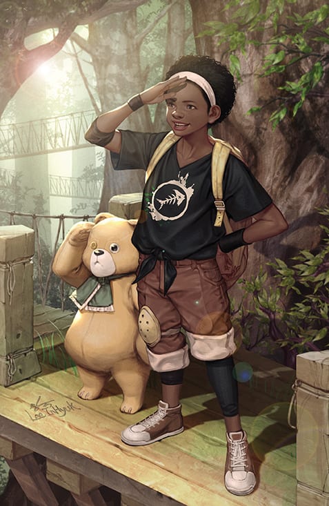
BOOM! Box’s EVE #1, available now, grabs all of the brutal truth that comes with climate change and bundles it into one approachable and humanizing tale. This is the tale of a young girl named Eve and her quest to save the world.

Eve #1 is the beginning of a new miniseries with very real concern.

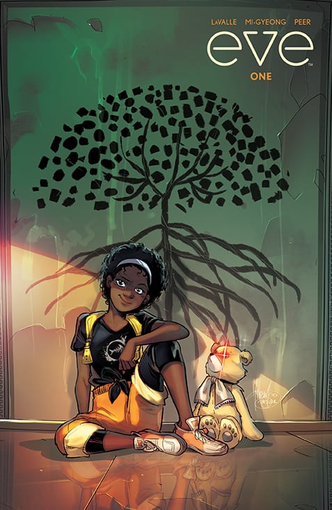
Eve #1 is the beginning of a brand new miniseries by BOOM! Box. Written by Victor LaValle, with artwork by Jo Mi-Gyeong, Brittany Peer, and Andworld Design, this series is unafraid to tackle the very real and heavy concept of climate change.

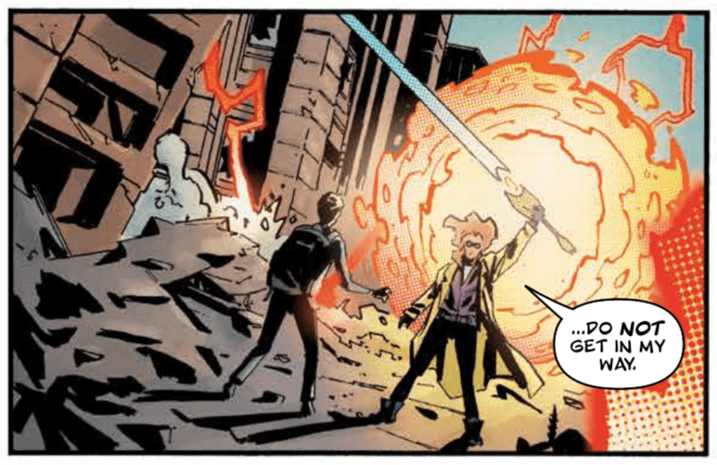
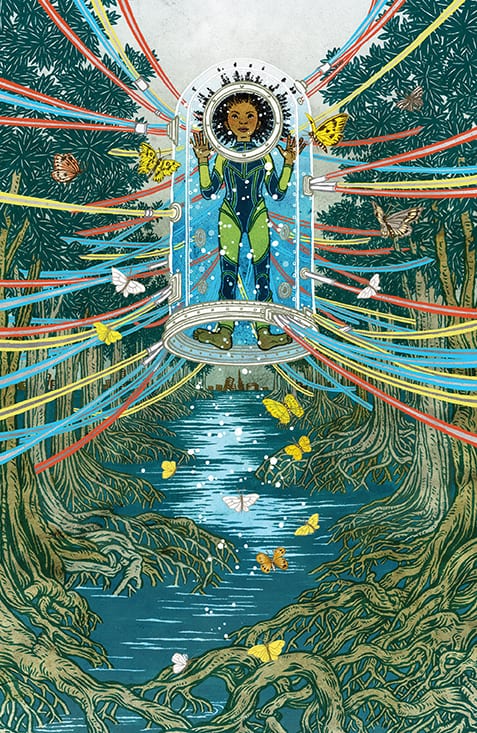
However, it is about to do so in a very approachable fashion. Young Eve lives in a world where the ice caps have melted. She’s alive, though most of humanity likely can not say the same. She’s safe in a bunker, but she cannot remain. Not if she is to help save the world from further damage.

More importantly, to young Eve, at least, she has to save her father. She may not understand everything that’s going on, but she does understand that he’s not here. She’ll do whatever it takes to bring herself to him, even if it means facing off against a terrifying and dark world.

A drastic change is in order for this variant cover of Eve #1.

Writing

Eve #1 is a bold introduction to this five-issue series. Already it’s easy to feel attached to Eve. She’s so happy, even when wandering alone and talking to herself. She’s so young and so human. So real.

Unfortunately, she also has a major trial waiting in her future. And it doesn’t take long to understand how she was so unaware of what is happening to the world around her. Or to understand the dangers she’s about to face.

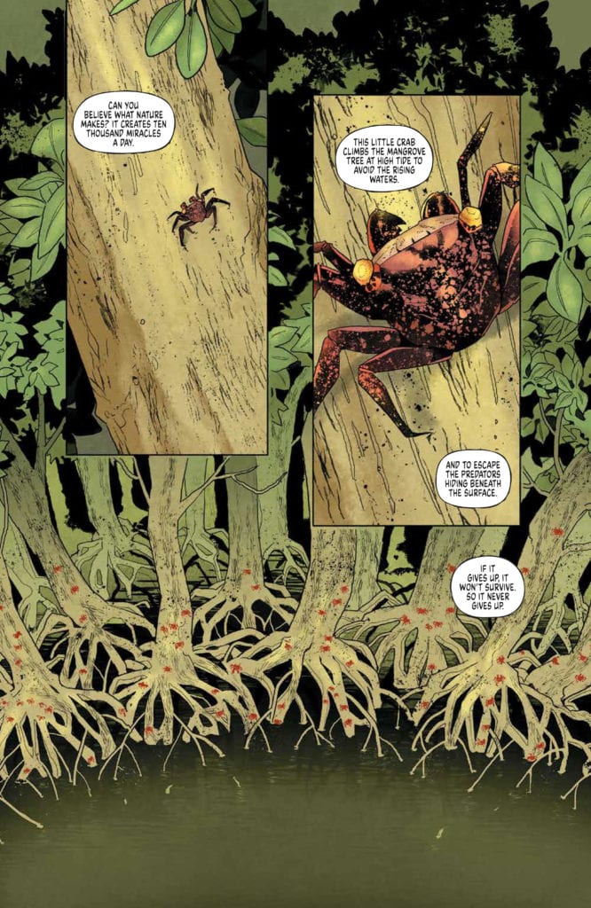
What really strikes home is how real the situation is. Ice caps melting doesn’t sound as out there as aliens, does it? The threat is one we can all easily imagine, and that makes the story hit home in so many hard to prepare for ways.

Victor LaValle included a letter at the end of this issue, explaining his motivation for writing this series. He dedicates his drive and understanding of climate change to his wife – a climate change writer. The ultimate goal here was to create a story that carries a message – the need to do something about climate change now before it is too late. It’s a message that is heard loud and clear.

She looks just like a young girl about to set off on an adventure.

Artwork

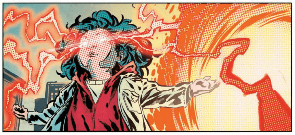
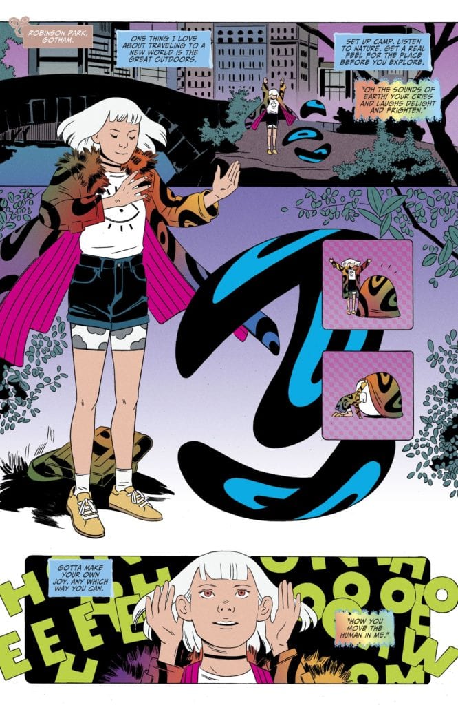
It’s truly outstanding how quickly the scenes changed in Eve #1. One moment Eve is on a beautiful and lush island. The next, she’s in a bunker, all alone. Save for one inorganic life form with a…unique design.

Jo Mi-Gyeong’s artwork makes Eve appear to be the little girl that she is. She’s happy and sheltered. Yet even early on, it’s possible to notice some hints of what is truly happening. There are signs of aging – hints for why a bunker would be needed in the first place.

The colors provided by Brittany Peer are so incredibly vibrant. Much of the issue is in hues of blues and greens, merging tech with organics. There’s something so somber about the colors – colors that otherwise should be indicative of life.

Andworld Design’s lettering helps to bring the story home – aiding in that gut punch the series was aiming for. There’s no denying the truth of these words, not as they merge with the artwork and carry readers through the narrative.

That’s one way to avoid the rising waters.

Conclusion

Eve #1 is the start of a vehemently emotional, all too real, and powerful story. It resonates with the need to do something. It is full of a daughter’s love for her father and the determination to do whatever it takes to save him.

If the goal of this series was to hit hard with a discussion of climate change, then it succeeds. It’s powerful yet not overwhelming, unavoidable yet approachable. It is proving that, once again, the lens of fiction helps to get the message across.

Monkeys Fighting Robots Youtube

How Power Saves and Corrupts in THE LAST WITCH #5

BOOM! Box’s THE LAST WITCH #5, available now, continues the quest of Saoirse – a growing witch who may just be humanity’s last hope. Assuming she can hold onto what makes her the hero she so desperately wants to be.

It’s time to see Saoirse’s latest battle in The Last Witch #5.

Over the course of just a few issues, readers have watched young Saoirse go from being a scared child to a young woman with the weight of the world on her shoulders. She’s a witch, one who must defeat her great-aunts if she hopes to protect her brother – and everyone else.

Yet there’s something even darker lingering on the horizon. The moral of this story has always been that power corrupts. Yet with each issue, Saoirse grows stronger. What will that mean for our little witch? Will she continue to be a hero, or is she fated to follow the path of those before her?

The Last Witch #5 picks up with Saoirse preparing for her third battle. This time, she’ll be facing Badb, a wind witch. However, our youngling will not be alone, as she has her brother, grandmother, and an unlikely new ally to help out.

Alone out in the middle of a snowstorm. Sounds…safe?

Writing

The Last Witch #5 is a dark and emotionally compelling tale. It tugs at heartstrings and twists our hopes. It’s impossible not to fear for Saoirse – not just because of the odds she’s up against, but because it feels as if there is something sinister just out of sight.

All credit must go to Conor McCreery for creating such an elusive feeling. The story here is a powerful one, and yet that doesn’t automatically imply that it is a benign tale. We’ve seen too much from this world to make any assumptions at this point.

What really hits home here is how young and human Saoirse comes off earlier in the issue. Between all of the fighting, we’ve granted a rare glimpse of the internal battle raging. How afraid she is, how much she misses her mother and father, how the weight is beginning to make her crumble.

All of which feels starkly contrasted by the fight she was thrown into here. Sure, it’s dramatic and bold, but it is also telling a different story – one that is horrible and haunting. Badb makes for the ideal foil, given everything Saoirse has been dealing with as of late.

What makes this issue all the more intriguing is that it concludes the miniseries. It is grand, as the conclusion of all plot arcs should be. But it is also very much open-ended. Perhaps we’ll one day see what happens to Saoirse. Or perhaps we’re meant to create our own assumptions from here. We’ve been handed all of the pieces to the puzzle, after all.

She has gone through so much, and in such a short period of time.

Artwork

The Last Witch #5 wouldn’t be the same without V.V. Glass, Natalia Nesterenko, and Jim Campbell. Together they brought Saoirse’s fears and battles to life, and it’s going to leave a lasting impression.

It’s so easy to look back at the first issue of this series and see how much Saoirse has changed. Even on a visual level, it’s quite evident. She’s tired, scared, and scarred – both emotionally and physically. That the artists were able to portray all of this is hauntingly beautiful.

There are moments when the artwork steals the show. Such as when a mysterious stranger’s true personality cracks his mask. Or when Saorise seemed to finally near her breaking point. All of these moments are going to be stuck in my mind for quite some time.

The color and shading bring these scenes to life – the good and the bad. The snowy backdrops force the characters – allies and enemies alike – to pop in the foreground. All while the elemental magic really does give the impression that it is glowing.

Looks like her heartfelt moment was just interrupted.

Conclusion

It is fascinating to think of how much the world and characters have changed in five issues. Yet here we are, getting ready to say goodbye to The Last Witch #5. Well, goodbye for now, at least. There’s always hope that the miniseries will continue at some point and finally tell us the rest of this tale.

Monkeys Fighting Robots Youtube

Review: MAN-BAT #4: The Best And Worst Kind Of Monsters

Man-Bat #4 Cover

Man-Bat #4 hits comic stores on May 4th, continuing DC Comics’ gripping series. Dave Wielgosz writes this issue’s narrative around the exploitation of a characters’ innermost desires. Sumi Kumar enhances this narrative by illustrating how the characters present themselves. The colors by Romulo Fajardo Jr. meanwhile make the environments look like they’re overwhelming the characters. Tom Napolitano’s lettering finalizes how monstrous these characters can be.

Man-Bat #4: The Delusions

Wielgosz is making the titular monster evermore sympathetic. Throughout Man-Bat #4, the reader can feel Man-Bat’s frustrations at both Kirk Langstrom and Scarecrow. While Man-Bat’s human self, Kirk, has the life he dreams of, it’s at a great expense. Not only is Kirk denying his other-self autonomy, he’s taking out his character flaws on his ex-wife Francine. Even worse, Kirk and Francine’s innermost desires reveal an unhealthy codependence between them. It’s something that Scarecrow is more than willing to exploit for his own ends. The fact that Man-Bat is completely aware of this situation while Kirk is controlling his body gives the reader a strong sense of how Man-Bat feels violated.

Feeling Small

Throughout Man-Bat #4 Kumar presents the power of a character’s presence. Scarecrow, watching over the Langstroms, feels like an all encompassing presence of terror looming over them. Jonathan Crane, Scarecrow’s alter-ego, sets himself above Man-Bat, making him look terrifying. Man-Bat, in the meantime, displays vulnerability in his body language, almost like a marionette helplessly under Scarecrow’s control. In comparison, Batman’s mere presence casts a big shadow that makes him look monstrous.

Fajardo colors the backgrounds to showcase character’s mindsets. In Batman’s interrogation of a thug for example, Batman’s dark shadow obscures the warm orange lights. Then, there’s a sound wave that lightly colors a page to further display a factor changing the Langstroms’ moods. This, in addition to the changing background colors, makes the reader feel their happiness turn into rage.

Finally Napolitano provides word balloons that demonstrate characters progressively shedding limitations. Kirk and Crane speak with regular round word balloons unlike Man-Bat and Scarecrow whose word balloons warp. After Scarecrow holds Man-Bat down, Man-Bat screeches in a different font with bigger words making him look like he’s fully unleashed.

Get Man-Bat #4

Man-Bat #4 reaches the series’ thrilling climax. The titular character is ready to show what he’s made of after Kirk and Scarecrow have held him back. Now, all the reader can do is wait until the grand finale.

Monkeys Fighting Robots Youtube

Review: Fighting For Precious Cargo In STAR WARS: WAR OF THE BOUNTY HUNTERS ALPHA #1

Seasoned Star Wars storyteller Charles Soule (The High Republic, Darth Vader: Dark Lord of the Sith) teams up with powerhouse artist Steve McNiven to deliver a kickass, bloody tale starring our favorite Beskar-clad hired gun in “Star Wars: War of the Bounty Hunters Alpha” #1. This prelude event adds an interesting twist to Boba Fett’s story just after the events of Empire Strikes Back without shoehorning anything in that seems out of place. With spot-on dialogue and world-building and outstanding artwork, this issue is a must-own for die-hard Star Wars fans.

“The notorious bounty hunter BOBA FETT has finally landed his greatest prize – HAN SOLO, frozen in carbonite for easy transport. Fett will bring the smuggler to TATOOINE to collect the massive bounty placed on Solo’s head by the fearsome crime lord JABBA THE HUTT. Sounds easy. What could go wrong?”

Writing & Plot

Taking place almost immediately after Han Solo being frozen in carbonite in Empire Strikes Back, Charles Soule decides to add some complications to Boba Fett’s journey back to Jabba’s palace with his gift for the crime lord. In short, Fett needs some help from an untrustworthy acquaintance, and in order to get that help he needs to kill someone in a classic “kill Peter to Pay Paul to rescue your enormous bounty” type situation. Souls writes this scenario is a manner that fits in seamlessly with the rest of the main Star Wars film story as a whole, without anything feeling forced in for the purpose of canon. This is a kickass representation of our favorite Mandalorian (Din Djarin not withstanding) doing kickass things while sprinkling in some nostalgia and fan service without ever going overboard. The dialogue is absolutely spot-on, to the point where I was reading Fett’s words in Temuera Morrison’s voice (no disrespect to Jeremy Bulloch, I grew up on the Prequels and Clone Wars) and it all just felt right. This single issue accomplishes a ton in terms of action and focused storytelling, crafting a tightly packed but perfectly paced single comic chapter that still teases more story to come. Charles Soule once again demonstrates just how good he is at this with another Star Wars issue that is both a blast to read and a great addition to the universe’s canon.

Art Direction

I don’t think I realized just how much I wanted Steve McNiven to draw a Star Wars book, especially one starring Boba Fett, until I saw the interiors for “Star Wars” War of the Bounty Hunters Alpha” #1. McNivern’s pencils and style of cross-hatching create a texture and detail that stands out not only among Marvel’s Star Wars outings, but in comics as a whole. This book is immaculately detailed in terms of both its characters and environmental art. Aliens new and old look like they came right out of an ILM storyboard, and the city streets and alleys of Nar Shaddaa are alive with grimy architecture. The action is choreographed with fantastic speed and intensity, making for some of the most exciting and brutal fighting to be found in Star Wars media. The colors from Laura Martin are vibrant while also exhibiting a kind of used and worn look, firmly placing this story and its setting into the sort of sketchy environment our famous bounty hunter is inhabiting. The lighting effects are a huge highlight of the visuals here, as not only do they give the panels dimension but they tint everything else being the lights in a given panel. This makes the explosions feel bigger and the city feel even more teeming with activity. The letters from Travis Lanham really shine in the sound effects department, with every impact and noise exhoing off the page with fantastic font choice. This is a staggeringly good looking Star Wars comic that perfectly fits the high-impact storytelling going on in these pages.

“Star Wars: War of the Bounty Hunters Alpha”#1 is a (literal) blast of a chapter in the Star Wars universe. This snippet featuring an all-time favorite and involving some of the most important plot points in the films is handled with both care and ingenuity by Charles Soule, who writes one of the most entertaining Star Wars comics I’ve ever read. The visual work of Steve McNiven and Laura Martin is simply superb, with work that explodes off the page and brings the grimy underworld of the Galaxy Far Far Away to life in all its bloody glory. Be sure to grab this issue when it hits shelves on 5-5!


Monkeys Fighting Robots Youtube

Review: THE SWAMP THING #3 Feels Like the Start of an Epic Myth

Swamp Thing Perkins DC Comics

You may think you know “the Green,” the interconnected network of all of the DC Universe’s plant life, but you’ve never seen it like this. Writer Ram V, artist Mike Perkins, colorist Mike Spicer, and letterer Aditya Bidikar invite us deep into the world of the Green in The Swamp Thing #3. It’s outright hypnotizing in its beauty.

Writing

In my last review for DC Comics’ The Swamp Thing, I noted that V seemed to be writing like Alan Moore. His characters spoke in eloquent metaphors and had thoughts that looked like they were pulled right out of a poetry book. It seemed a little odd at times, a little inhuman. But something about The Swamp Thing #3 fits V’s tone perfectly. The poetic nature of his writing, the eloquent back and forth between characters, all feels right. In the world of the Green, everything feels larger than life. So when V’s characters speak like beings out of mythology, it fits. This is an exciting new chapter in V’s The Swamp Thing. It creates a setting and stage for him to write a new mythology into the fabric of the DC Comics Universe. In many ways, V seems to be channeling Lewis Carroll in this chapter as much as he is Alan Moore. It’s whimsical at some moments, melodramatic in others, but all of it feels perfect for the story he’s creating.

Swamp Thing Perkins DC Comics
Perkins’ page here almost feels like it hypnotizes the reader. It’s beautiful but understated at the same time.

Art

Perkins does a magnificent job of surrounding us with the Green. He makes it look as though plants are growing around each panel. Flowers pop out past the gutters on the page, making each plant feel alive and dangerous. That’s how Perkins characterizes the Green. It’s a gorgeous world where everything is so used to being pushed around or put down by humanity. Everything is fighting to survive. Throughout the issue, the Green has a dangerous beauty to it. Whether it’s the plants that frame each scene, or the mysterious characters that fill it, they are each both intoxicating and suspicious. And Perkins doesn’t shy away from this double nature. He’s constantly showing us the faces of characters plotting or full of fear. It’s not just his characters that have life in this issue. The entire world they inhabit feels like a character in its own right.

Coloring

With a setting like the Green, it’s truly surprising how versatile Spicer’s color palette is. Spicer’s colors are full of dark and deep greens, but there are yellows, pinks, reds and blues too. The pages are brimming with life. And the scenes in the green are colored completely differently from the scenes in the human world. When Levi Kamei gets a CT scan, the page is predominately black. But from the moment he arrives in the Green, we see intense colors. Some characters cause yellow destruction, crackling across the page, others have a pink aura. But none of them are drab or boring. This world is stunning and Spicer makes damn sure of that.

Swamp Thing Perkins DC Comics
In that last caption, Bidikar morphs Levi’s thoughts into those of the Swamp Thing. It’s a small detail that’s incredibly rewarding to the reader.

Lettering

Bidikar’s lettering gives this issue a lyrical quality. Characters take their time talking to one another and Bidikar gives each word balloon space. So, when a character has a long paragraph to speak, they do so in short bursts. Each balloon is connected to the one before, but often with room between each line. When one character sits on a throne and speaks to others like this, it makes her seem fully in control. She moves at her own pace. She is a goddess talking to humans. When another character is talking with Swamp Thing, acting as his guide, she has a rhythm to what she says too. “Jennifer? Juniper? Conifer?” she says. Each has its own world balloon, but the lines are stacked closely together. “Ivy hasn’t seen her!” she finishes with a word balloon that’s far below the rest. You can hear the pause like a playful break in her musical dialogue. It’s thanks to Bidikar’s spacing and division of dialogue that characters often seem to almost be singing, rather than just saying their lines.


DC Comics’ The Swamp Thing #3 is mesmerizing. It pulls you into the world of the Green and has you wishing you could stay. Unfortunately, we’ll have to wait until issue 4 to visit again. Pick up The Swamp Thing #3, out from DC Comics May 4th, at a comic shop near you!

Monkeys Fighting Robots Youtube

Exclusive Preview: Maria Llovet’s LUNA #4 from BOOM! Studios

Maria Llovet's LUNA #4

Maria Llovet’s LUNA #4 from BOOM! Studios hits your local comic book shop on May 19, but Monkeys Fighting Robots has an exclusive five-page preview for our readers, thanks to the publisher. Llovet creates the main cover with a variant cover by Ariela Kristantina.

About the issue:
In this darkly erotic series, an innocent young woman finds herself drawn to a mysterious commune where the search for immortality collides with the true power of enduring love. Lux reveals the truth to Teresa that threatens to disrupt everything. Teresa is poisoned. And then things get really bad.

LUNA #4 features a main cover art by series artist Maria Llovet and a variant cover by artist Ariela Kristantina (Chain).

Digital copies can be found at comiXology, iBooks, Google Play, and Madefire.

Monkeys Fighting Robots Youtube

Review: SEPARATION Squanders Setup For Bizarre Divorce Horror

Separation has the potential to go down as one of the weakest horror films this year. It’s an intriguing film at the start, but then shifts into a lifeless blend of cliches, horrid direction, wasted acting from those involved, and several other questionable filmmaking decisions. Coming from the same director that has worked on The Boy, Brahms: The Boy 2, and The Devil Inside, this film being a trainwreck should come as no surprise. A horror film with a divorce driving most of its narrative, Separation fails to come off as anything other than an insult to its viewers.

The amount of effort that went into this film seems minimal, but as mentioned above the acting is decent enough. It’s impressive that a horrendously executed film managed to acquire some terrific performers. Separation’s early moments are promising, but once tragedy strikes it progressively gets worse. Directed by William Brent Bell, and written by Josh Braun and Nick Amadeus. Separation stars Brian Cox, Violet McGraw, Madeline Brewer, Mamie Gummer, and Rupert Friend. The film follows Jeff Vahn (Friend), a failed artist who is going through a divorce from his wife, Maggie Vahn (Gummer). At the center of their unhealthy exchanges is their daughter, Jenny Vahn (McGraw). After an unfortunate accident, Jenny finds solace in her artist father and a new ghostly best friend.

Rupert Friend as Jeff in Separation


Braun and Amadeus have a screenplay that shows potential, but Separation falls flat on several angles. However, after initially viewing the film, it does have a clever transition from being a haunted house film to becoming a whodunnit. Jeff and Maggie’s crumbling marriage is taking a toll on not only them but their daughter as well. Maggie’s father, Paul Rivers (Cox), is brought into it and none of these characters are likable. Jenny, the young girl who is the target of this ghostly presence is the closest person for viewers to care about while watching this film. Maggie is understandably upset at Jeff for being unemployed but is presented as being aggressively rude to him, while Jeff just takes it all in from not only her but his father-in-law too.

Characters bickering over child custody back and forth in a lazy manner for most of its runtime doesn’t provide room to particularly care what happens. The writing in Separation attempts to be shocking but is anything but shocking once the conflict is resolved. The development for these characters is weak, but Jeff does have a new career path by the end of the film, so his character growth is present in ways. In fact, Jeff’s growth as an artist is made to be more important than his growth as a father, so his growth is uneven. The whodunnit side of this film is poorly done because the film decides to pretend it can outsmart its audience. Instances in Separation make it abundantly clear who is to blame, but viewers will be treated to prolonged stalling as the film progresses. While the script isn’t overly bad, or illogical, it’s just very lazy and the film never feels like it has the emotional weight it’s looking for. 

Violet McGraw stars as “Jenny Vahn” in director William Brent Bell’s SEPARATION, an Open Road Films / Briarcliff Entertainment release. Credit : Open Road Films / Briarcliff Entertainment

Bell’s direction is void of any tension building, odd pacing choices, and it just feels like it’s coasting through to the credits. There are moments to spark terror, but even those moments are lackluster due to this poor direction. Thankfully, the performances are adequate to keep your interest. Cox is wonderful as the unlikable father-in-law, as many would expect. McGraw and Friend are terrific as father and daughter, and this relationship is one of the only believable aspects in this film. The chemistry is there, and you want to see this relationship blossom. McGraw is terrific as this heartbroken little girl who just wants her parents to get along, and viewers will feel for her. Also, Separation does include some rather chilling puppet imagery throughout, and it’s amplified by the decision to hide them in the shadows when they appear.

Separation struggles to leave an impact, despite its solid setup at the start to get audiences interested. McGraw and everyone involved should be proud of their efforts though because they managed to make the most out of a rough situation. The art department for this film is also a major highlight. If there is anything to be learned from this film, it’s that going through a divorce can be a struggle, but that doesn’t mean audiences should have to suffer with you.

Monkeys Fighting Robots Youtube

Review: CROSSOVER #6 – Full of BIG Appearances

Crossover #6 Cover

Crossover #6, out now from Image Comics, is the unforgettable conclusion to the “Kids Love Chains” arc and introduces exciting new twists.

Crossover #6 Art Example

Donny Cates pulls no punches in Crossover #6. If you thought the story elements in the previous issues were shocking or featured amazing crossovers from other series, you will not be prepared for what is in store in this issue. The story twists in unexpected ways, more crossovers than we have ever seen occur, and nearly every page is filled with thrilling action. Crossover #6 is one of the best, if not the best, issues in the series and is a perfect way to bring the arc to its conclusion. There is enough closure to be satisfied, but there is still much more to be resolved, and the issue even introduces new tantalizing bits of information that hook in readers.

Crossover #6 Lettering Example

Crossover #6 lets Geoff Shaw’s artistic abilities shine more than ever before in the series through intense action, dramatic moments, and character-heavy pages. There are so many gorgeous spreads in the issue that feature precise detail and many things going on that I can’t imagine the time and effort that went into it. The forms in the action scenes are full of energy and make the chaos incredibly apparent, and the facial expressions of the issue make certain that the emotional moments of the issue pack a punch. Shaw puts forth some of his best work in this issue, and it’s not something you would want to miss.

In an issue full of many comic book characters from many different genres, the coloring needs to match the colorful nature of these characters. Dee Cunniffe does this and more in Crossover #6 and delivers a broad palette and many impressive coloring techniques. Some of the issues’ backgrounds have a gorgeous rainbow pattern, beams of light have stunning lens flare effects, and Cunniffe makes the many different heroes from many different genres somehow work together in a single coherent style. The characters are from many books with various artists, and still, the coloring of the issue somehow makes them all fit together. It is a daunting task that Cunniffe pulls off superbly.

Crossover #6 Coloring Example

Crossover #6 contains lots of action, which John J. Hill enhances with bold fonts for sound effects. Hill also gives a certain amount of dynamism to sound effects by having each be stretched along a specific path. This is used in some cases to guide the reader’s eye along the page, which makes the action more seamless. Hill also has words extend past the borders of their speech bubble, demonstrating the volume behind the character’s dialogue.

Crossover #6 is an issue that takes the series down an unexpected path and reveals exciting information that will be further developed in later arcs. It is a fantastic conclusion to the series’ first arc and is not something you should miss if you have been enjoying the series.

Monkeys Fighting Robots Youtube

Why You Should Read: Shade The Changing Girl/Woman

In 2016, writer and My Chemical Romance frontman Gerard Way came together with DC Comics to create the Young Animal imprint. This imprint would function similar to how the original Vertigo imprint did back in the 1980’s, with new writers breathing life into failing or nearly forgotten characters and giving them a contemporary twist. The initial lineup of books included Way teaming with artist Nick Derington for a new Doom Patrol as the imprint’s flagship title. He also collaborated with writer Jon Rivera and artist Michael Avon Oeming for a resurrection of long-forgotten Silver Age spelunker Cave Carson in Cave Carson Has A Cybernetic Eye. They even added a new (and genuinely really cool) Gotham vigilante with Mother Panic, created by Way, Jody Houser and Tommy Lee Edwards. While I consider every one of these to be fantastic and upsettingly overlooked (except arguably Doom Patrol, generally considered the best run on that property since Morrison), the one I feel most attached to is Cecil Castellucci and Marley Zarcone’s Shade the Changing Girl and its sequel Shade the Changing Woman. This soft sequel to Peter Milligan’s criminally underrated Shade the Changing Man from the Vertigo wave ( incidentally a reimagining of the Steve Ditko character of the same name) is an emotionally sincere, unique, psychedelic, and beautiful piece of storytelling about growing and learning to embrace the people who stand by you.

“There’s no such thing as a little bit of madness. Far away on the planet Meta, Loma’s going nowhere fast. She’s dropped out of school, dumped her boyfriend, and is bored out of her mind.  She longs to feel things. That’s where her idol, the lunatic poet Rac Shade, and his infamous madness coat come it. Loma steals the garment and makes a break across galaxies to take up residence in a new body: Earth girl Megan Boyer. Surely everything will be better on this passionate primitive planet with a dash of madness on her side and this human girl’s easy life. Only now that she’s here, Loma discovers being a teenaged Earth girl comes with its own challenges and Earth may not be everything she thought it’d be. Megan Boyer was a bully whom everyone was glad was almost dead, and now Loma has to survive High School and navigate the consequences of the life she didn’t live with the ever-growing and uncontrollable madness at her side. Not to mention that there are people back on her homeworld who might just want Shade’s coat back.”

Don’t let the fact that Shade The Changing Girl is a sequel hold you back from reading it. While there are some references and context to be gleaned from having read Milligan’s series, Castellucci and Zarcone’s comic is perfectly digestible on its own. Treating Rac Shade (Milligan’s protagonist) as a sort of disembodied and nearly forgotten celebrity is appropriate for both the messaging of the prior comic and its elusive real-world status. Girl/Woman is a sort of commentary and inverse of Milligan’s comic. Loma receives much more personal development and awakening as a person while wearing the madness vest than Rac did, even with Loma starting out worshipping the prior comic’s mad poet protagonist. Where Man contained that classic British snark combined with unapologetic strangeness and imagination, Girl/Woman combines the latter of these styles with a modern teenage yearning. Its visions of aliens, interspecies love, and plots to destroy the Earth are brought back around to the complex interpersonal relationships that are warped and rebuilt by the context of Loma’s entering our society. The big twist? She does it by possessing the body of a recently deceased high school student. This series is as much a psychological deep dive as it is a psychedelic space adventure, and these elements work in tandem to craft one of the most unique comics of the past decade.

Cecil Castelucci’s writing throughout this series swings from poetic narration to the grounded, expression-filled dialogue of modern-day teenagers. Loma herself is an edgy, madness-obsessed experience hunter whose obsession with following in Rac Shade’s misbegotten footsteps has landed her in a situation she doesn’t realize she wants to be in. At the same time, the recently deceased high schooler whose body she has possessed was popular for all manner of conniving, unsavory reasons. This comic explores the concepts of idol worship, contentment, sexual attraction, and the old adage of “the grass is always greener,” while also staging the rising threat of interstellar war in the background. This comic does a lot, and while it can certainly seem overly weird and convoluted to certain readers, lovers of this kind of artful discussion and oddity within comics will find an absolute gem here. There is an intense beauty within this series’ words and events, and it is emotionally and mentally uplifting for the right crowd.

As brilliant as the writing is in this series, the visuals will reach out and drag your eyeballs across each issue’s panels. Becky Cloonan’s ever-inviting covers are mesmerizingly colorful and full so of personality that matches the vibe of the story that you’ll wish she drew the interiors as well; that is, until you see Marley Zarcone and Kelly Fitzpatrick’s panels. This comic is a masterwork in creative comic design, with panels utilizing the reality-bending nature of Loma’s madness vest to create psychedelic floating transitions from one sequence to the next. The comic has a dream-like feel to its composition that works perfectly for its poetic words. The character and environmental art contrasts  to these wildly colorful oddities, with a simplicity and flatness that is strangely perfectly fitting. The detail in character animations and different designs is made up by very fine pencil work from Zarcone, with thicker lines that create open spaces for color to fill in. Fitzpatrick’s colors are the artistic highlight of this series, with all of the big mind-bending forays into madness and the illustrations of alien worlds being given a massive array of hues that thematically fit the scene. Earth is often portrayed in a rather small and comparatively dull visual range, while the planet Meta is a little more varied but still has a similar situation. The insane trips into the artistic world of Loma’s experimentation with madness explodes with life however, and is the main visual draw of the comic. This is one of the most visually unique comics from the past decade, and it’s a gorgeous experience from beginning to end.

Shade The Changing Girl and its sequel Shade The Changing Woman are fascinating and deeply insightful forays into human emotion, desire, and art. Castelucci’s thoughtful and poetic scripts intermingle with realistic character concerns and troubles that make the world here seem tangible although it is quite literally always on the brink of absolute madness. Although certainly not for everyone , I still wholeheartedly believe this is one of the most underrated and under read comics of the past decade, and an absolute gem in DC’s Young Animal lineup.


Monkeys Fighting Robots Youtube

Review: ROBIN #1 – On a Journey of Self-Discovery

Robin #1 Cover

Robin #1, out now from DC Comics, throws Damian into a situation unlike any we’ve ever seen before as he goes on a journey of self-discovery.

Things are not easy for Damian Wayne at the moment. After Alfred was brutally murdered right before his eyes, Damian decides to go on a journey similar to the one his father went on during his training. It is a mission that causes him to meet many new faces, stop many bad people, and get into many exciting fights.

Written by Joshua Williamson, Robin #1 is an exciting introduction to this new journey Damian is embarking on. Williamson fills the issue with fights, new characters, and plenty of context so that new readers don’t feel lost. The issue’s ending is particularly notable: kicking off the series with an enormous cliffhanger that is so confusing I’m not sure how anyone can resist picking up the second issue just for the closure.

Robin #1 Art Example

Gleb Melnikov is well-versed in dynamic poses, and this skill shines through in Robin #1. The fight scenes that comprise much of the issue are gorgeous because of Melnikov’s incredible ability to draw figures that look like they are in motion. Melnikov also uses many shadows in his compositions and often uses plain backgrounds when the reader should be focusing on what the characters are doing. These are simple and effective ways that Melnikov turns Robin #1 into a thrilling first issue.

It should come as no surprise that Melnikov’s colors pair wonderfully with his art, and the way the two work hand-in-hand in Robin #1 is fantastic. One technique that Melnikov uses is to drastically change the palette of a scene for a single panel to add energy and highlight the significance of a panel. This is done during the final blow of some fight scenes, and it causes the most climactic moments of the conflict to stand out.

Robin #1 has many names dropped in its dialogue, and ALW’s Troy Peteri takes advantage of every one of these moments by giving each name a stylized font. When introducing a new character, an infamous organization, or a title, Peteri makes the font stand out. Peteri is not afraid to have fun and provides an astonishing variety of styles in Robin #1, and it significantly helps to increase the energy of the issue.

The work of Williamson, Melnikov, and Peteri create an impressive first issue of this new series and promises much to be seen in the future.

Monkeys Fighting Robots Youtube