

Crossover #6, out now from Image Comics, is the unforgettable conclusion to the “Kids Love Chains” arc and introduces exciting new twists.
Donny Cates pulls no punches in Crossover #6. If you thought the story elements in the previous issues were shocking or featured amazing crossovers from other series, you will not be prepared for what is in store in this issue. The story twists in unexpected ways, more crossovers than we have ever seen occur, and nearly every page is filled with thrilling action. Crossover #6 is one of the best, if not the best, issues in the series and is a perfect way to bring the arc to its conclusion. There is enough closure to be satisfied, but there is still much more to be resolved, and the issue even introduces new tantalizing bits of information that hook in readers.
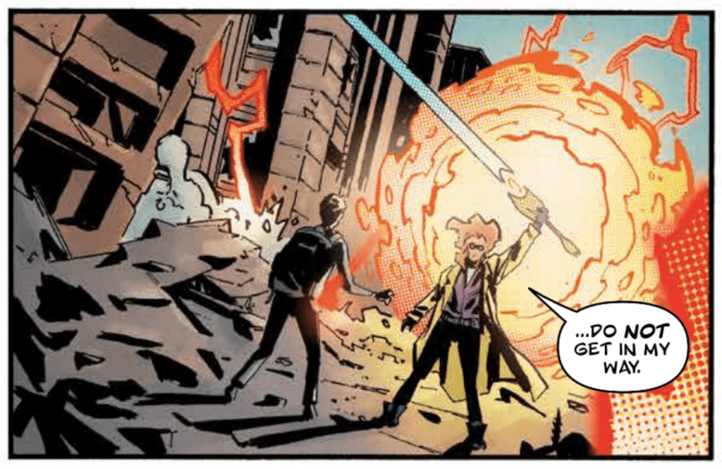
Crossover #6 lets Geoff Shaw’s artistic abilities shine more than ever before in the series through intense action, dramatic moments, and character-heavy pages. There are so many gorgeous spreads in the issue that feature precise detail and many things going on that I can’t imagine the time and effort that went into it. The forms in the action scenes are full of energy and make the chaos incredibly apparent, and the facial expressions of the issue make certain that the emotional moments of the issue pack a punch. Shaw puts forth some of his best work in this issue, and it’s not something you would want to miss.
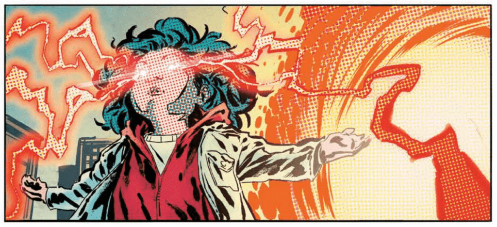
In an issue full of many comic book characters from many different genres, the coloring needs to match the colorful nature of these characters. Dee Cunniffe does this and more in Crossover #6 and delivers a broad palette and many impressive coloring techniques. Some of the issues’ backgrounds have a gorgeous rainbow pattern, beams of light have stunning lens flare effects, and Cunniffe makes the many different heroes from many different genres somehow work together in a single coherent style. The characters are from many books with various artists, and still, the coloring of the issue somehow makes them all fit together. It is a daunting task that Cunniffe pulls off superbly.
Crossover #6 contains lots of action, which John J. Hill enhances with bold fonts for sound effects. Hill also gives a certain amount of dynamism to sound effects by having each be stretched along a specific path. This is used in some cases to guide the reader’s eye along the page, which makes the action more seamless. Hill also has words extend past the borders of their speech bubble, demonstrating the volume behind the character’s dialogue.
Crossover #6 is an issue that takes the series down an unexpected path and reveals exciting information that will be further developed in later arcs. It is a fantastic conclusion to the series’ first arc and is not something you should miss if you have been enjoying the series.