

Robin #1, out now from DC Comics, throws Damian into a situation unlike any we’ve ever seen before as he goes on a journey of self-discovery.
Things are not easy for Damian Wayne at the moment. After Alfred was brutally murdered right before his eyes, Damian decides to go on a journey similar to the one his father went on during his training. It is a mission that causes him to meet many new faces, stop many bad people, and get into many exciting fights.
Written by Joshua Williamson, Robin #1 is an exciting introduction to this new journey Damian is embarking on. Williamson fills the issue with fights, new characters, and plenty of context so that new readers don’t feel lost. The issue’s ending is particularly notable: kicking off the series with an enormous cliffhanger that is so confusing I’m not sure how anyone can resist picking up the second issue just for the closure.
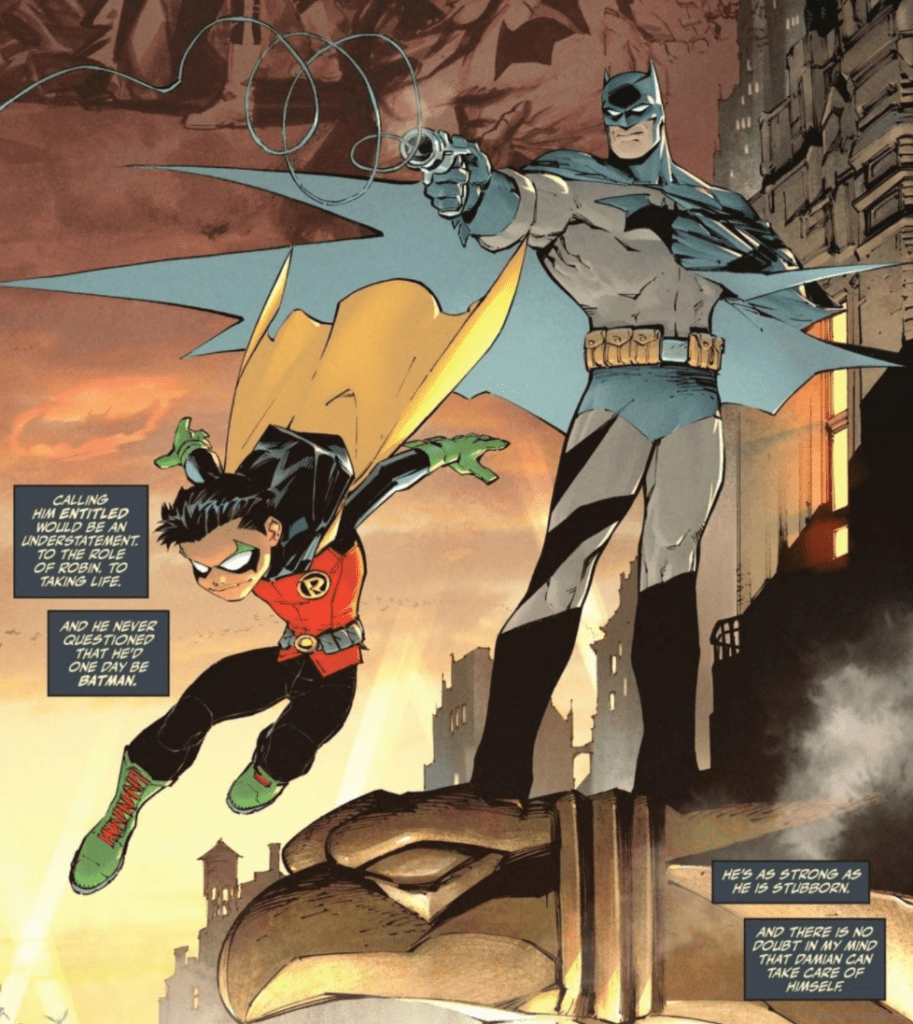
Gleb Melnikov is well-versed in dynamic poses, and this skill shines through in Robin #1. The fight scenes that comprise much of the issue are gorgeous because of Melnikov’s incredible ability to draw figures that look like they are in motion. Melnikov also uses many shadows in his compositions and often uses plain backgrounds when the reader should be focusing on what the characters are doing. These are simple and effective ways that Melnikov turns Robin #1 into a thrilling first issue.
It should come as no surprise that Melnikov’s colors pair wonderfully with his art, and the way the two work hand-in-hand in Robin #1 is fantastic. One technique that Melnikov uses is to drastically change the palette of a scene for a single panel to add energy and highlight the significance of a panel. This is done during the final blow of some fight scenes, and it causes the most climactic moments of the conflict to stand out.
Robin #1 has many names dropped in its dialogue, and ALW’s Troy Peteri takes advantage of every one of these moments by giving each name a stylized font. When introducing a new character, an infamous organization, or a title, Peteri makes the font stand out. Peteri is not afraid to have fun and provides an astonishing variety of styles in Robin #1, and it significantly helps to increase the energy of the issue.
The work of Williamson, Melnikov, and Peteri create an impressive first issue of this new series and promises much to be seen in the future.