Published by A Wave Blue World, the DEAD LEGENDS saga unleashes a new fury of fists and feet with DEAD LEGENDS II #1 on August 11th, escalating the action established in the preceding 5-issue miniseries. Writer James Maddox reunites with artist Gavin Smith, letterer Ryan Ferrier, and color assistant Milena Deneno for a new descent into epic storytelling that embraces the legacy of Kung Fu and Wuxia cinema history.
I was fortunate enough to get to talk to James about this new volume and his influences, the process, and his experiences working with the amazing art team on this ass-kicking adrenaline shot of a comic book.
MFR: This series wears its influences on its sleeve, ranging from Bruce Lee’s films to The Raid, and of course some classic comics like Shang-Chi and The Deadly Hands of Kung Fu. As a writer, how did you manage to maintain the line between homage and outright copy?
JM: In a genre that has a lot of history and influential titles, I found it was best to be aware (as much as is possible) of the ground that’s covered by other creators. Then draw a focus on the aspects, details and character traits that would make DL stand out as a unique experience. Sure, there’s going to be nods and overlap, but after doing our best to understand the works that laid the foundation of this genre, the main through-lines of Dead Legends are all me and Gavin.
MFR: We find ourselves in a Golden Age of kickass, unique women protagonists in comics and other mediums. Where did the idea for Yan and Red Death as the two leads in Dead Legends come to you?
JM: From day one, Gavin had the design made for Red Death as a staple character in the series, but it took some time and planning for us to come up with Yan. Once the groundwork for Yan was set, she took the spotlight and ran with it. And even though I’d like to think Dead Legends embodies an ensemble cast, the standouts from that crew have always been Yan and Red Death. Partly because of the history that brought them to this tournament, and partly for the brutality they employ to reach their goals.
MFR: Something folks may not realize is how insanely difficult writing and scripting a fight scene can be – much less dozens of them. What was your process like for coming up with all of the fight sequences through this series?
JM: Mainly, I wanted to balance the pages devoted to character drama and those dedicated to combat. To do that, Gavin and I worked out a system that essentially let us put our individual focuses on the page. I was more into the difficult choices facing these characters, while Gavin was able to use the allocated space to choreograph some brutal fights. Finding the balance to those two aspects takes some back and forth, but the collaboration has helped bring out the best of both approaches to this series.
MFR: The main cast is wildly diverse, both in terms of representation and personalities. How did you come up with the cast, and how did their voices develop as you wrote them?
JM: I approached the series with certain characters locked in. Red Death, Damon, Stalk and a handful of others had their design and voices from the start, but others found their way after the first pass of the issue 1 script. By the time I sent off the final draft, I felt the foundations for each of them were set and made moving forward to later scripts that much easier.
MFR: Gavin Smith draws the hell out of every page in Dead Legends, and Ryan Ferrie’s lettering is super clean. How did you all start working together, and what was your combined process like for this series?
JM: Gavin and I have been friends for years, and we’d always talked about collaborating on a project together. When a spot opened up in his schedule, I asked him what he wanted to draw most in a series, and he said a martial arts book and even showed me some of the characters that he’d want to use for the series (Blind Tiger was one of these characters). Things worked out, and here we are. Ryan and I have been con buds for a while, and he came on board because he liked the concept, and even though he was phasing out of lettering work to focus on writing, he did us the favor of taking on Dead Legends.
MFR: How did publisher A Wave Blue World contribute to the process behind this book? What kinds of tips and encouragement did they give to help achieve this vision of tightly-woven ass-kickery?
JM: Tyler and Wendy Chin-Tanner (the co-publishers of AWBW) have been a driving factor in getting this series into the hands of readers. Before he departed AWBW, Joe Illidge was on point in his role as editor and he strengthened the story for both volume one and two with his suggestions and critiques. But throughout the journey of this series, Tyler has pushed us to tell the kind of story we think is both fun and important, trusted us with constructing the vision, and provided us with the support to make it happen.
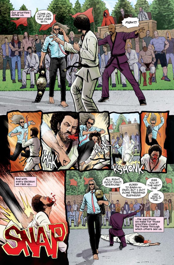
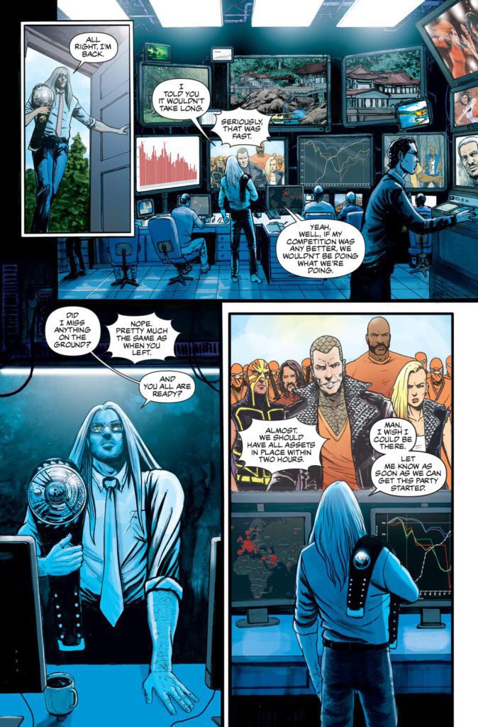
Writer James Maddox, artist Gavin Smith, letterer Ryan Ferrier & color assistant Milena Deneno continue their grindhouse epic in the wake of volume one’s catastrophic tournament!
“This comic is ultimately a challenge in balancing emotional storytelling with the action of classic martial arts movies and Kung Fu comics,” writer James Maddox explains. “The resulting approach offers relentless action that punctuates a story of loss, perseverance, and found families.”
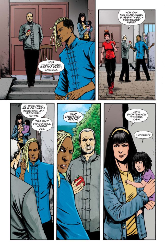
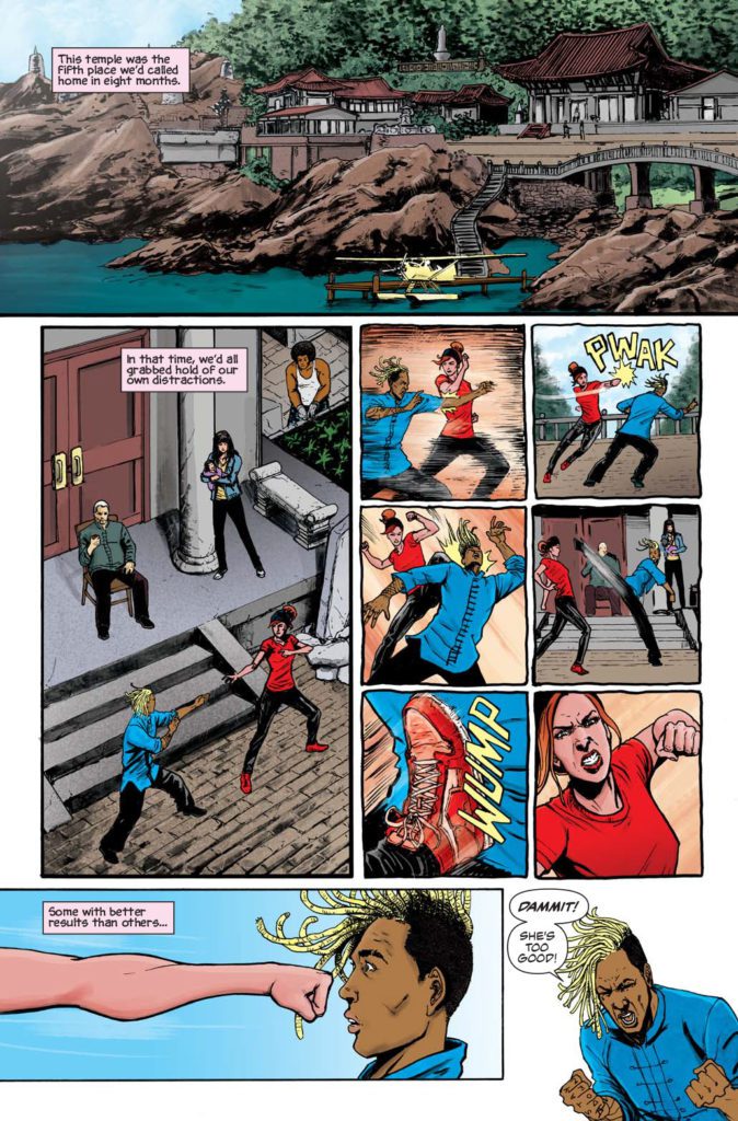
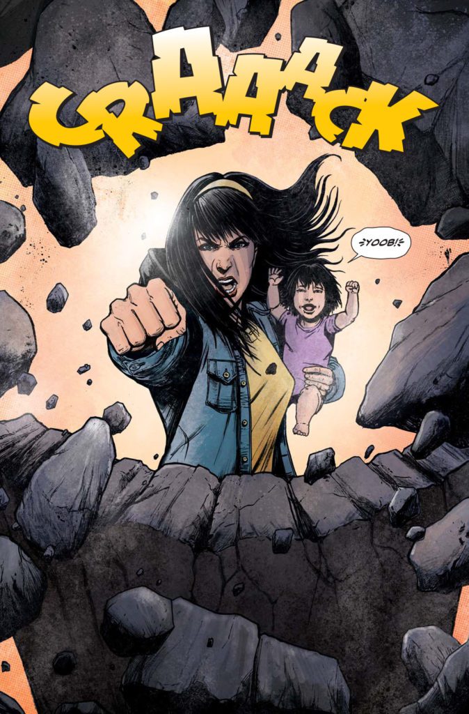
The continuing story follows the trials of Yan, a young woman trained by her grandfather, Jee Sin—one of the most deadly and experienced martial arts experts in existence. After winning the last Dead Legends tournament and taking lethal revenge on her husband’s killer, Yan flees the competition’s self-destructive overseer and his army of merciless followers. Luckily, she has friends like Red Death and Stalk to aid her and the child. But new adversaries, including the unhinged Tigress, will resort to sinister tactics that Yan and her fellow refugees couldn’t fathom.
The resulting comic should resonate with fans of iconic cinematic martial arts film, including Riki-O: The Story of Riki, Ong-Bak: The Thai Warrior, Bloodsport, The Raid: Redemption, Kill Bill, and the seminal oeuvre of Bruce Lee.
“This second outing allows me to dive deeper into both the technical roots of martial arts, as well as its more fantastic extrapolations,” artist Gavin Smith—who holds a black belt in Tae Kwon Do��elaborates. “I can’t wait to show off the intricate web of issue four and some of Red Death’s most savage fight scenes. James and I were able to amplify the sheer chaos and brutality of the first volume.
Be sure to check out the first and this second volume of Dead Legends from publisher A Wave Blue World, available now!
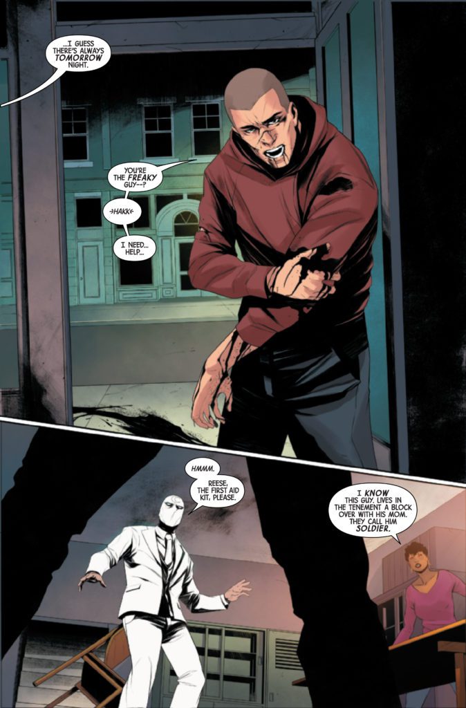
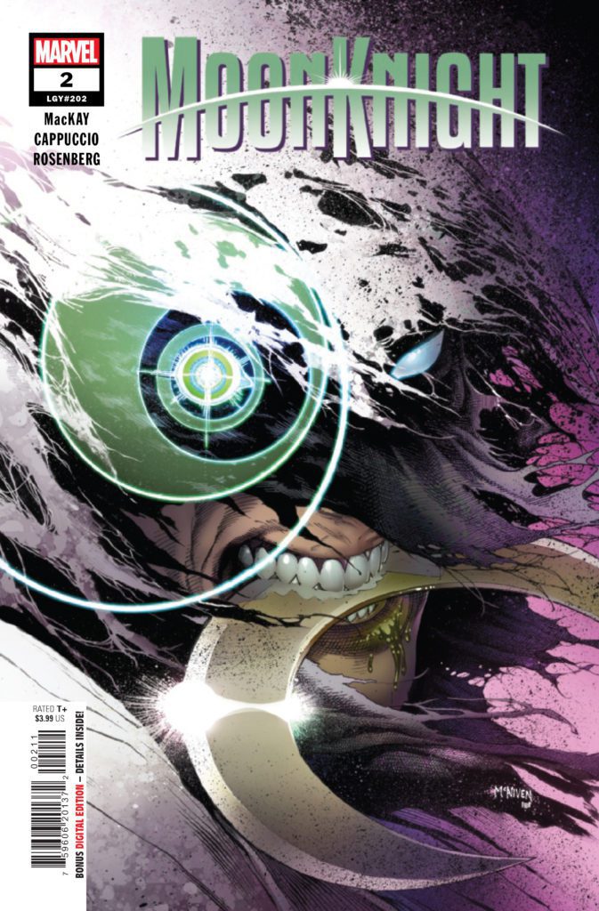
MOON KNIGHT #2 hits your local comic book store August 18th, but thanks to Marvel Comics, Monkeys Fighting Robots has an exclusive four-page preview for you.
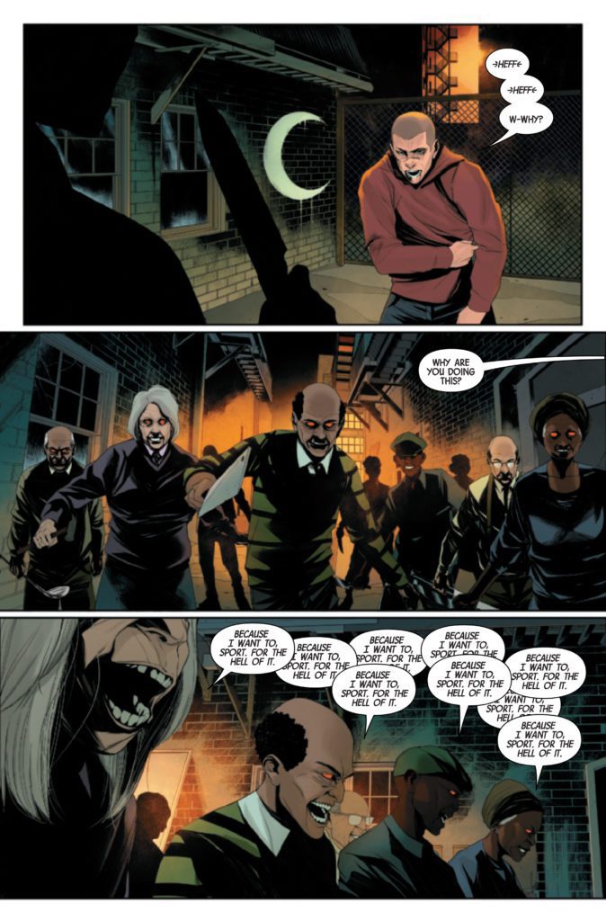
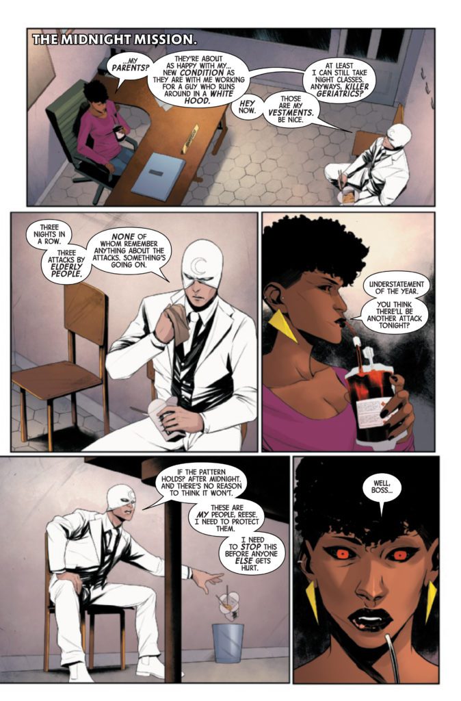
About the issue: Moon Knight has established his territory, and the people within it are under the protection of his Midnight Mission. But what happens when those very people are turned into weapons against him? When gangs of elderly residents leave a trail of bizarre violence, Moon Knight must put his body, mind and very soul on the line to get to the bottom of it.
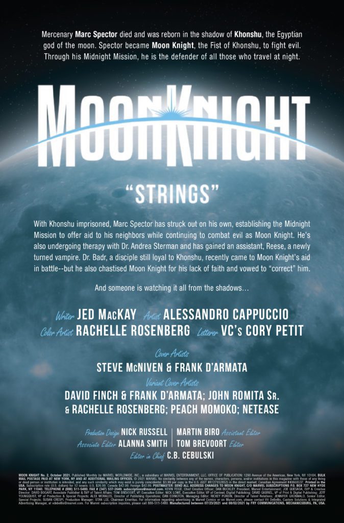
The issue is by writer Jed MacKay and artist Alessandro Cappuccio, with colors by Rachelle Rosenberg, and letters by Cory Petit. The main cover is by Steve McNiven and Frank D’Armata.
MOON KNIGHT is currently being developed as a TV series for Disney+, starring Oscar Isaac as Marc Spector. It will be part of Phase Four of the MCU.
Check out the MOON KNIGHT #2 preview below:
Are you digging the new MOON KNIGHT run? Sound off in the comments!
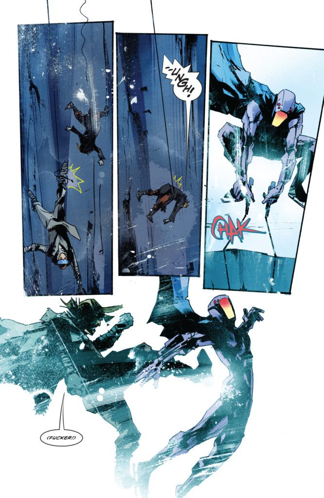
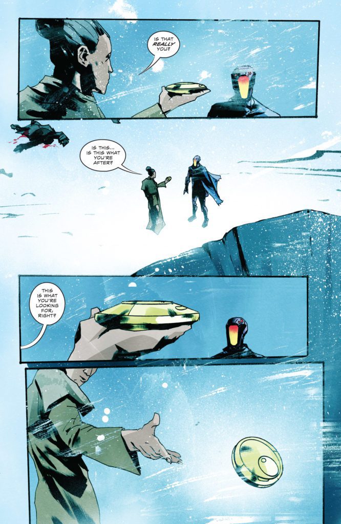
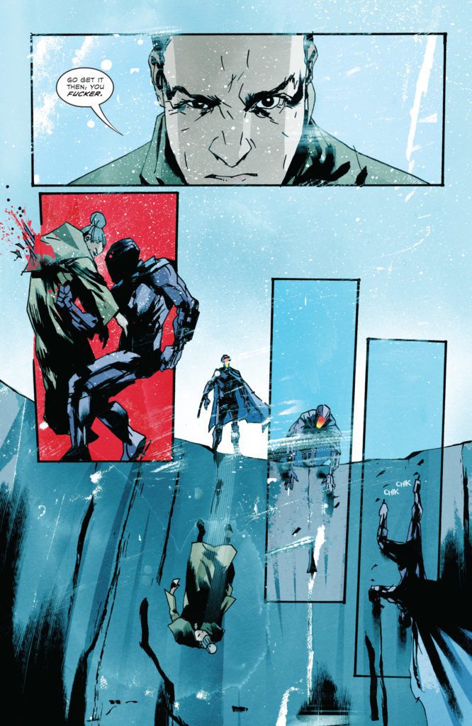
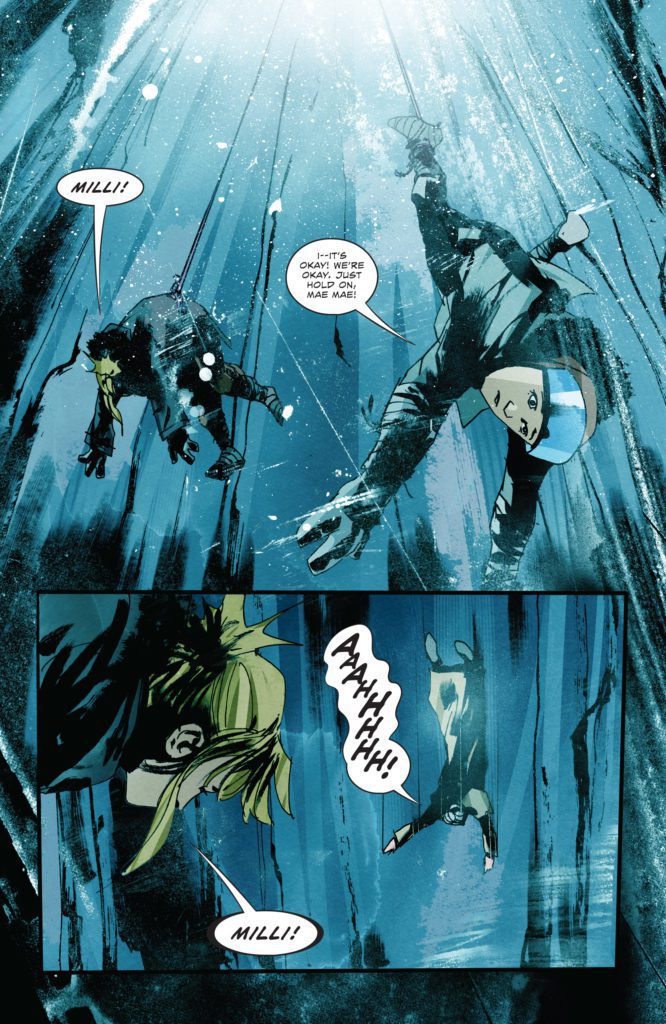
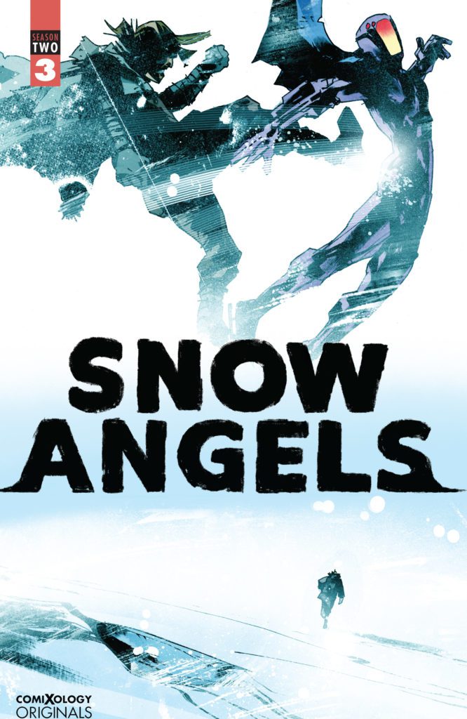
SNOW ANGELS Season Two #3 hits the internet August 17th, but thanks to comiXology, Monkeys Fighting Robots has an exclusive six-page preview for you.
About the series: Milliken and Mae have never left The Trench—it’s all they’ve ever known. They were born in The Trench, and they’ll die there, just like all their people do. The two girls, eight and eleven, are a part of The Trenchfolk, a sprawling settlement of people living inside the massive ice walls of a vast, seemingly endless frozen trench carved into the surface of an otherwise icy wasteland. The Trenchfolk survive in this hostile world by following The Three Testaments of The Trench—golden rules repeated like a mantra from birth to death…
1. YOU MUST NEVER LEAVE THE TRENCH.
2. THE TRENCH PROVIDES.
3. THE TRENCH IS ENDLESS.
Milli and Mae don’t really know how their people came to live here. No one does, not even their wise and gentle Father. On Milliken’s twelfth birthday, their father takes the two girls on an overnight skate down the trench — a coming-of-age ritual to teach them how to fish the frozen river, how to hunt the wild Trenchdogs that wander its frigid banks, and how to give proper thanks to their frozen Gods — The Colden Ones. It’s the trip of a lifetime until the girls push beyond the borders of their humble land and awaken the Trench’s deadly defender…The Snowman! What follows next is an action-packed story of survival, loss and redemption.
SNOW ANGELS is by writer Jeff Lemire and artist Jock, with letters by Steve Wands. This issue marks the halfway point of the “second season,” which will run 6-issues and cap off the series.
Check out the SNOW ANGELS Season Two #3 preview below:
Are you loving SNOW ANGELS as much as we are? Sound off in the comments!
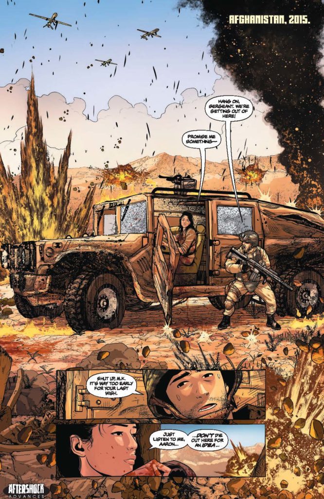
SEARCH FOR HU #1 hits your local comic book store September 8th, but thanks to AfterShock Comics, Monkeys Fighting Robots has an exclusive four-page preview for you.
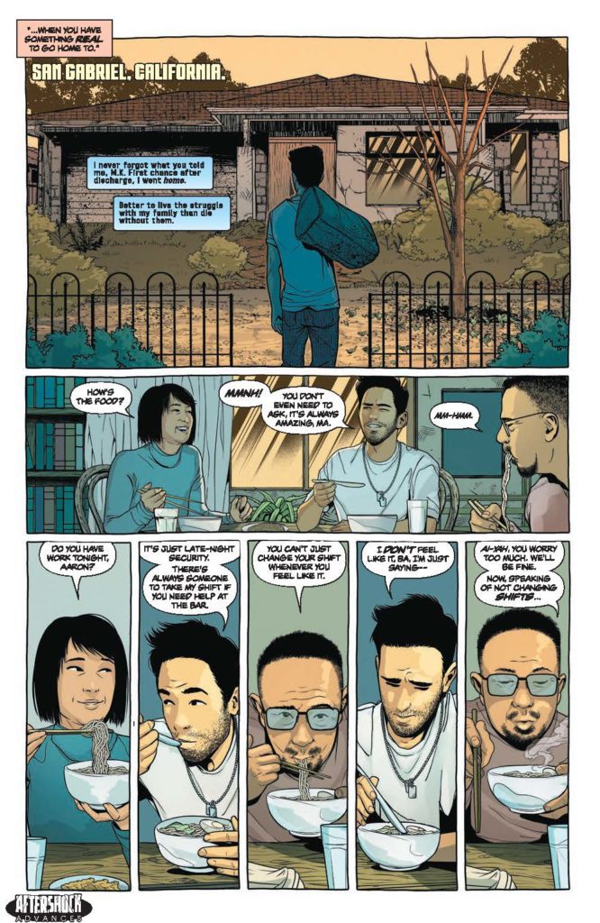
About the issue: Aaron Tse lives for his family, and if he’s not careful, he’ll die for its secrets.
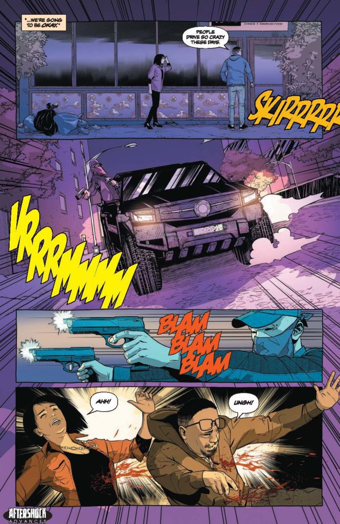
When he left the military, Aaron Tse’s first thought was providing for his aging parents. His parents’ bar is experiencing hard times, and one night it’s shot to hell, with his parents critically injured in the attack.
But this was no ordinary robbery — Aaron’s mother reveals that she fled China to escape a blood feud between the Jewish and Chinese sides of her family…both of which are powerful organized crime families. Peace existed between these two families — the Hu and the Margolis — but now it’s been broken, and Aaron must protect his parents from further violence. Aaron hops a plane to the homeland he never intended to explore, on a path to revenge he never wanted to walk.
The series is by writers Steve Orlando and Jon Tsuei, artist Rubine, colorist DC Alonso, and letterer Carlos M. Mangual.
“A fast-paced, action-packed exploration of complex cultural histories, powered by a bloody family feud.”
Check out the SEARCH FOR HU #1 preview below:
Are you excited for SEARCH FOR HU? Sound off in the comments!
Respect brings the musical entertainment you’d expect, yet Aretha Franklin’s story seems half-baked. When the music isn’t blaring, it’s a sluggish look at Aretha Franklin’s life, but carried by strong performances. Respect still shines a good light on Ms. Franklin’s impact, her struggles, and how she overcame them to be this larger-than-life icon of soul music. It’s too long, but the powerhouse performances will keep you glued as Ms. Franklin’s story is told through Jennifer Hudson’s great performance.
Formulaic and standard are the best words to describe Respect since biopics on singers and music groups are happening more frequently. The difference is this time it’s Aretha Franklin’s story being told. Respect feels like it’s holding back at times, in regards to the trauma in Ms. Franklin’s life. Fans of the late musician should still find something to appreciate here. Directed by Liesl Tommy and written by Tracey Scott Wilson, the film stars Forest Whitaker, Marc Maron, Marlon Wayans, Audra McDonald, Hailey Kilgore, and Jennifer Hudson. Respect follows Aretha Franklin (Hudson), a preacher’s daughter who endures abuse but grows up to become the Queen of Soul along the way.
Set mostly in the 1960s, Respect depicts several crucial events from Ms. Franklin’s childhood to early adulthood. The film begins with C.L. Franklin (Whitaker), Aretha’s father, telling his daughter to come and sing downstairs for one of his late-night parties. From there, Respect taps into her journey as a singer and the hardships she faced. The abusive torment Ms. Franklin endured from her father and future husband, Ted White (Wayans), creates sympathy for the audience to get behind the soon-to-be Queen of Soul. However, between her early pregnancy as a child, racism, and her abuse from two other men, Respect never spends enough time with all of this trauma. It’s holding back on Ms. Franklin’s demons but fully embraces her accomplishments. Towards the end of the film, a drinking habit becomes a coping tactic for Ms. Franklin. One of the darker sequences in the film, so her trauma could have been told better to justify her drinking problem.
Wilson’s screenplay is at its best when it focuses on Ms. Franklin’s musical progression, studio time, and her eventual on-stage performances. These scenes are enhanced by every performer on screen. Hudson shines as Aretha Franklin, bringing her spin to the Queen of Soul. When she uses her voice, it will draw you in for the entire performance. Whitaker impresses as her troubled father that wants the best for his daughter, and Wayans is on another level here as Ted White. His abusive behavior is portrayed so well, it only makes Ms. Franklin’s eventual separation from him that much better. Hudson and Wayans’s toxic relationship was done to perfection thanks to their gripping performances.
Respect suffers mostly because of its pacing, the performances save it in the end. Ms. Franklin’s life was a journey indeed, but this was too long and time could have been spent elsewhere to make the narrative better. The film’s runtime is enough to dive into the demons referenced, yet there is a half-baked effort at highlighting the Queen of Soul’s struggles. Most of the film sees her navigating through the music industry in search of multiple hits, as she called them. Emotional sequences fall flat as well because of this sluggish pacing, such as Martin Luther King’s death not being that impactful. Pacing aside, gathering a roster of talented actors was enough to keep Respect engaging.
Respect is a solid attempt at telling the life story of Aretha Franklin, it just could have dug deeper. Held back by its PG-13 rating, the film never can fully tap into the darker aspects of Aretha Franklin’s life. Hudson’s performance will keep you engaged, and musically, fans will get enough out of this biopic. If there’s a glass half-filled feeling after, that’s because Respect is similar to that in terms of the overall execution.
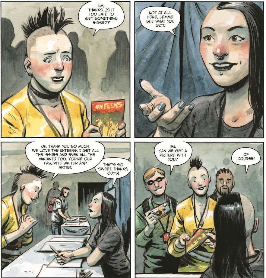
Now iconic creator Jeff Lemire (Sweet Tooth, Moon Knight) teams up with artist Tyler Crook (Harrow County) for another winner in the world of Black Hammer. The Unbelievable Unteens #1 is Lemire taking a familiar but engaging approach to a story from the perspective of the culture he knows best. With a tight script and phenomenal artwork, this issue is a great start for what is sure to be another hit for the Black Hammer Universe.
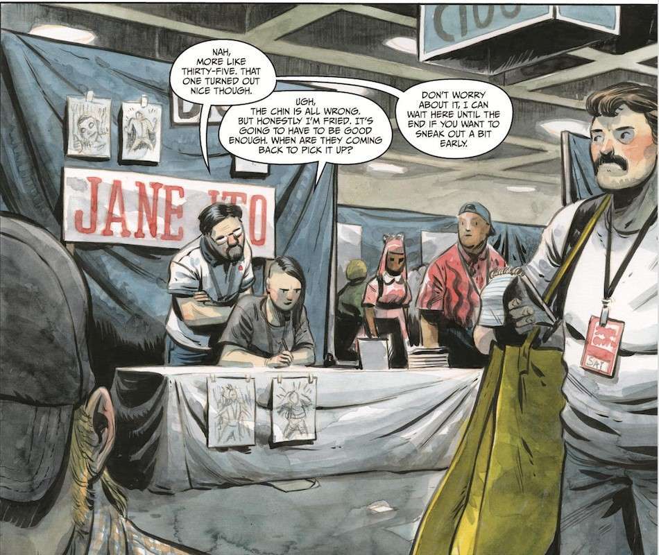
“After signing at a comic book convention, UnbelievableUnteens artist Jane Ito finds herself visited by one of the characters from her own creation–but was it her own creation? Were the Unteens an actual school of teenaged misfit superheroes who battled supervillains under the lead of the mysterious Dr. Miles Moniker? And if so, who wiped their memories and why? As Jane’s world is turned upside down and she learns the true nature of her identity she discovers a sinister plot leading her to assemble a team she had suspected was purely fictional.”
Writing & Plot
Jeff Lemire writes a tightly paced and thoroughly engaging script for The Unbelievable Unteens #1. He handles the introduction of Jane Ito through an intimate and honest look through the lens of a comics creator. Jane’s fulfilling but draining career is viewed from a perspective we readers don’t often get to see. The first third of this comic is paced and set up in a beautifully character focused manner that lets us see into Ito’s world. The introduction of the main plot is thankfully just as entertaining.
Lemire pulls the whole “creator meets their art” trick we’ve seen before. His writing is just so clean and naturalistic though that it still feels refreshing. The Unteens themselves are a clear nod to young misfit-superhero groups like the X-Men, The Power Pack, and the Doom Patrol. Black Hammer has always functioned as a pastiche tribute to classic comics. Lemire maintains that idea in Unteens, and like other Hammer books builds the plot around rules set in this original universe. The slow-burn building of the story Lemire is stylistically known for is in effect here as well. This issue endears us to Ito and her newly animated creation, and eagerly starts us on this new journey.
Art Direction
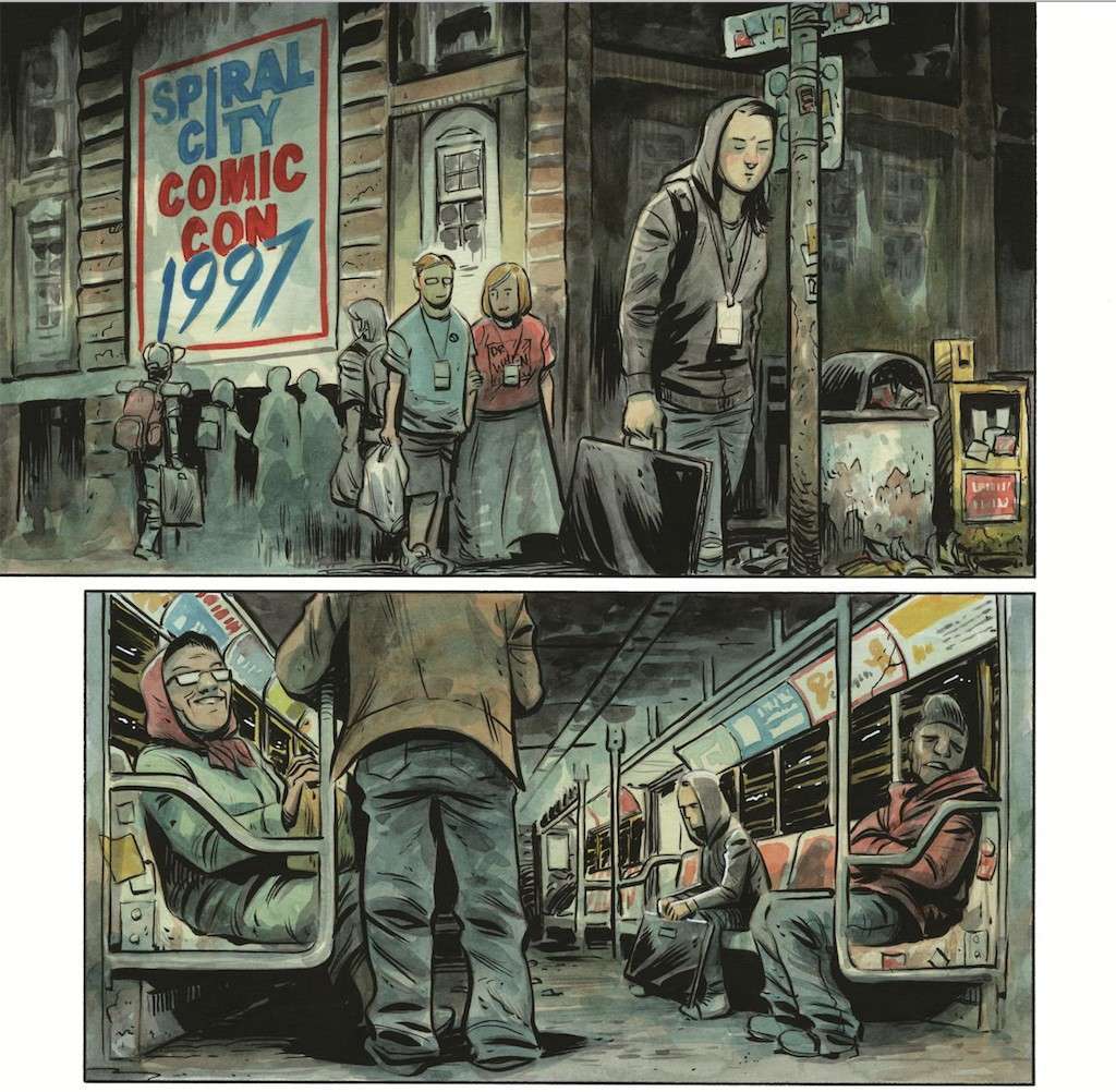
The BlackHammer universe has seen a crew of outstanding artists over the course of its expansion. Now, Unbelievable Unteens #1 receives the gorgeous work of Tyler Crook. The Harrow County artist brings his animated watercolor style to Spiral City and fits right into its lore. Crooks animations are stunning and clear. Every animation across Ito and her new friend’s ghastly face is well-realized and relatable. The character designs themselves are unmistakable, making remembering everyone a breeze if/when more of a cast arrives in later issues. The environmental detail here is astonishing as well. Crook captures Jane’s mood through how she perceives her environment. Almost this entire comic is shaded in a foggy gray mist. From the con floor to Ito’s studio apartment, her weariness colors every panel. Crook juxtaposes this against the sudden bright sun of his Unteens flashbacks.
I will never tire of seeing the vivid shades Crook’s watercolor style brings to a comic book. Crook also letters the comic, and he of course nails this as well. His lettering has a clean modern look that can change almost intuitively in shape and style. His effect lettering is visually unique as well, making this another complete win of a project for the accomplished artist.
Verdict
The Unbelievable Unteens #1 is a stellar and engrossing start to this new chapter in the Black Hammer universe. Jeff Lemire’s script has him taking his well-known Black Hammer pastiche trick and applying it to another familiar comic book trope. However he keeps the concept fresh with a unique perspective and killer pacing and dialogue. Tyler Crook’s visual work is an absolute winner once again, with his detailed animations, great environments, and moody colors, crafting a fantastic version of Spiral City. Be sure to grab this latest comic from the world of Black Hammer when it hits shelves on 8/11!
Defenders #1 from Marvel Comics comes to comic stores on August 11 with a splash. Writer Al Ewing, with series artist and colorist Javier Rodriguez, mystifies readers by introducing the titular group. With additional inking by Alvaro Lopez and lettering by Joe Caramagna, these characters present themselves as larger than life.
Defenders #1 On First Impressions
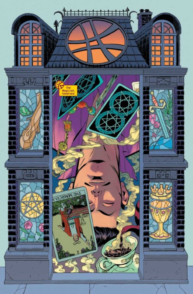
Between Ewing and Rodriguez, making a good first impression is what matters the most. Ewing understands all of the characters he is working with, especially those who drive the plot forward. This is why Doctor Strange serves as the point-of-view, his great power and tactical knowledge make him an excellent leader. Plus, with how Rogriguez presents Strange’s magical capabilities, it’s impossible to look away. With Strange floating upside down and with the border of the page looking like the edge of a card, Rodriguez actually makes the scene look like a Tarot card.
As for the other characters, their portrayals vary to a degree. Despite an impressive presentation in Masked Raider’s introduction, it raises an important question. Why does he draw a gun on Strange when he just wants to talk? Other characters in Defenders #1 act realistically in comparison. Especially with how breakneck the pace becomes once the conflict comes up. Some of them like Silver Surfer and Red Harpy are going through troubles. Being plucked out of their places against their will leaves them more than a little peeved.
Extra Elements
With how much Rodriguez puts into the art, having some backup in the form of Lopez’s inking helps a lot. With so many abstract illustrations, Lopez helps lighten a creative burden. As for Caramagna, his lettering makes the magic coming from Strange twice as impactful. The bright blue bordered word balloons and font from the magic he utters give off a more powerful impression. Unlike when a scientist utters a spell from a book in a more diminutive font and word balloons. In this way, Strange feels like he’s in a completely other league.
Defenders #1 Assemble!
Defenders #1 opens strongly by showing off the awesome power and influence of Doctor Strange. Through Strange’s eyes come a perspective so dire, it leaves the reader wondering how this mish-mash ensemble will handle everything going forward.
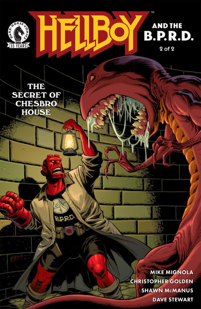
Dark Horse Comics’ Hellboy & the BPRD: The Secret of Chesbro House #2 strikes a brilliant balance. It somehow manages to be fun and terrifying all at the same time. Writers Mike Mignola and Christopher Golden, with artist Shawn McManus, colorist Dave Stewart, and letterer Clem Robins, work together to create a weird and wonderful issue.
Writing
Mignola and Golden really take advantage of how much they set up in the first issue. When issue #2 begins, Hellboy is already diving into action. And it’s all action for the entire issue. From the first page to the last, things are moving at an incredible speed. Yet somehow, Mignola and Golden still find time for moments of quiet horror. Dark rituals and skulls that whisper secrets give these action-packed moments an extra pump of adrenaline. You’ll have fun reading this, but you’ll also be up at night thinking about it.
Art
McManus brings a levity to many of the scenes. When we see a girl offered up to some demonic entity, we’re not as frightened as we could be. That’s because McManus doesn’t feel a need to milk these moments. But at the same time, McManus’ nonchalant treatment of these moments add to the terror. The fact that a possessed skull and a ghost with eight arms visually reads as “business as usual” makes each moment feel ignored by the characters. As though, letting the moment sink in would surely make Hellboy and the other characters go mad.
Coloring
We’ve still got the cool blue scenes where Hellboy stands out in bright red, like we had in the last issue. And much of the issue sticks to that motif. Occasionally, the color palettes seem to blend, creating a purple hue. But mostly, this issue is about a world where Hellboy stands out. He’s in a haunted house, fighting ghosts. Everything about it should mean that he’s right at home. But we see that he’s just not quite like the ghosts or the people. He’s the middle ground. When he fights a monster at the end, also shown in brilliant red, we see that the color of their skin is different. Hellboy might be from Hell, but his whole identity has been changed by the years he’s been on Earth.
Lettering
Many of the sound effects from Robins are playful and flashy. He fills scenes with them. They overlap each other, lead the reader from one panel into another, and give each panel they’re in a sense of chaos. Except for one page, where Hellboy beats a monster’s face. The “SPLUTCH” noise of his fist making contact looks more or less the same in the three panels we see. It makes Hellboy feel like the consistency in the madness. He’s reliable and he’ll get the job done.
Dark Horse’s Hellboy & the BPRD: The Secret of Chesbro House is fun and scary. It jumps right into the action from page one, and keeps the rollercoaster going until its last moments. But even in the chaos, this creative team delivers subtle horrors that will stick with you. Pick up Hellboy & the BPRD: The Secret of Chesbro House #2, out from Dark Horse August 11th, at a comic shop near you!
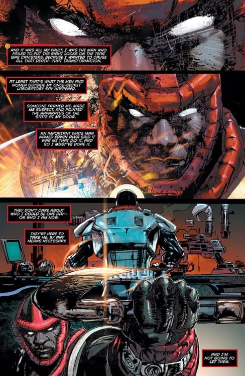
Writer Brandon Thomas and artists Denys Cowan and Bill Sienkiewicz bring back the central figure of the Milestone line with explosive energy in Hardware: Season One #1. With colors from Chris Sotomayor and letters by Rob Leigh, this issue is a jaw shattering right-hook of a comic. Loaded with emotional socio-political appeals and class-related commentary, this is the proper way to bring a nearly-forgotten character back to life.
“Curtis Metcalf was the brightest shining star of Alva Industries, a brilliant scientist mentored by Edwin Alva since childhood…until the failures of Alva technology at the “Big Bang” disaster threatened to destroy the company, and Alva needed a scapegoat. Now Curtis is on the run from the Dakota police department…but a man as smart-and paranoid-as Curtis takes precautions. With a nearly indestructible suit of armor and remarkable inventions that he never handed over to Alva, Curtis stands determined to do much more than clear his name…he’s going to take the fight back to Alva himself!”
Writing & Plot
Brandon Thomas’s script for Hardware #1 is a textbook example of how to pack story into a 22-page comic book. Thomas manages to revamp the Hardware origin from the original Milestone series into something familiar yet still engrossing. The reintroduction of Hardware into modern comics won’t be blazing any trails, but it is a solid hybrid of classic superhero origins and modern struggles. I’ll be blunt, I have never read a Hardware comic before, or even a book from DC’s long-gone Milestone imprint. However, I feel confident that this will be a comfortable read for newcomer like myself, as well as fans of the original run.
Thomas’s style itself here is a mixture of small bits of dialogue and multi-focused narration. The perspective shifts from Metcalf and P.O.P’s (his A.I.) to the main villain, Edwin Alva. This not only gives us the angle of Curtis’s anger, but also the feigned righteousness of the establishment he is fighting.
Thomas is quick to ground Metcalf in issues at the forefront of the socio-political discourse, while digging at certain issue from a different lens then what we’re used to in mainstream comics. Many “Big 2” comic books tend to lean more into the “defeating hate with love” side of overcoming racial injustice. Thomas does not. Hardware actively returns the favor to those aiding in his oppression. There’s a righteous fury in this story that is exceptionally rare in mainstream comics, and it’s both cathartic and refreshing. Thomas also touches on the intertwining of corporate greed and how it weaponizes systemic racism. This is an abrasive, immensely effective comic that is a sincere rarity in Big 2 superhero comics. I welcome more of Thomas’s work in the future, as well as more writers who bring this perspective with them.
Art Direction
The return of Milestone in Hardware: Season One #1 is visually crafted by heavyweight artists Denys Cowan and Bill Sienkiewicz. Cowan’s pencils, which graced work in the original Milestone imprint, return to Hardware in their energetic glory. Cowan’s scratchy, cross-hatch heavy lines add an aggressive edge to this comic book that perfects the emotional weight of the storytelling. His animations pull us into the pages and let us feel the emotional depth of the characters we see. The inks from Sienkiewicz add dimension to this work that flows perfectly within the panels. Seeing this art is like watching the best aspects of 90’s comics come back to life with modern touches. Cowan and Sienkiewicz’s work is jagged and aggressive, but still soft in the moments where it matters.
Chris Sotomayor’s colors are rich and atmospheric. He leans towards the darker edge of shades, even during daylights sequences. I say the latter part since most of this comic takes place at night, which Sotomayor fills in with realistic color detail. The night air glows orange with the buzz of streetlights and, of course, explosions. The letters from Rob leigh take some inspired leaps. Most of the comic resides in the usual clean, contemporary font type for dialogue and narration. P.O.P.’s electronic interjections are given a more classic computer look. However, the SFX lettering is absolutely top notch, with work that becomes part of the action, blending into explosions and combat. A real kicker of a sequence is during a scene where Metcalf is speaking through a speaker (of sorts). Leigh letters this with massive, jolting red letters that look as if they’re part of the environment itself. It’s really outstanding work, and part of what makes Hardware work so damn well visually.
Verdict
Hardware: Season One #1 is an earth-shattering return for a long-gone period of comics history. Brandon Thomas’s script is aggressively poignant and action-packed. It’s a refreshing take on an immensely important topic written in a manner unseen in mainstream comics. The visuals from Denys Cowan, Bill Sienkiewicz, and Chris Sotomayor are an excellent blend of 90’s jagged styling and sharp character creation. This is a stellar return for this character, and the Milestone imprint as a whole. Be sure to grab this comic when it hits shelves on 8-10!
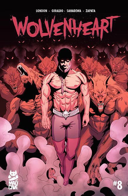
Wolvenheart #8 from Mad Cave Studios comes to comic stores on October 27 with pre-orders available now. Series writer and company co-founder Mark London opens a jumping-on point of this title. Alejandro Giraldo’s dynamic layouts make the action stand out with color by Warnia Sahadewa and lettering by Miguel Zapata.
Background
Wolvenheart follows time-traveling, dhampir, monster hunter Sterling Cross. After an adventure in preventing an apocalypse, he comes to find the titular organization radically different.
Wolvenheart #8: Change Is Nice
London makes Wolvenheart #8 a good jumping-on point without alienating past readers. Despite being a sequel to the last trade, the story does not hinge on it. But it does help to understand Sterling’s sense of alienation from the rest of the Travelers.
People who were his enemies like Elizabeth Bathory are now his allies. Which is rather interesting when looking at the way she interacts with others. This Bathory is social, sarcastic, and fears falling back into her vampiric nature. With likable new characters like vampire versions of Romeo and Juliet, even the reader fears the idea of Bathory’s regression.
Then there’s Sterling’s mentor, Van Helsing. With just the beginning of the issue for reference, even new readers know that Van Helsing can be villainous. His merciless nature and strive for immortality make his new status as an antagonist feel more like a natural progression of his character than a retcon.
Actions Howl
Giraldo gives the action in Wolvenheart #8 an easy to immerse energy with his layouts. In most of the issue’s downtime, there are panels where everything seems at peace. It’s like everything is routine until actions or conflict arise. When that happens the panels distort to a degree. Like when Romeo and Juliet do a trapeze act that gets interrupted and puts them in danger. But then the following page’s layout returns to order to show they’re safe. There are wilder examples, like where a conflict with Van Helsing’s werewolves take up an entire splash page.
Thankfully to keep track of these events, Sahadewa’s coloring highlights unique characteristics. Like in a case where Bathory bathes in a bright red blood substitute while her shadow is in the background with candle light. Along with lettering by Zapata that explains her desire for real blood, the reader feels like Bathory might be slipping into villainy.
Follow Along Wolvenheart #8
Wolvenheart #8 features the beginning of a new story for both new and old fans. With plenty of action and intrigue abounding, readers won’t be able to look away. Wolvenheart #8 is out from Mad Cave Studios at a comic shop near you on October 27th.


 Between Ewing and Rodriguez, making a good first impression is what matters the most. Ewing understands all of the characters he is working with, especially those who drive the plot forward. This is why Doctor Strange serves as the point-of-view, his great power and tactical knowledge make him an excellent leader. Plus, with how Rogriguez presents Strange’s magical capabilities, it’s impossible to look away. With Strange floating upside down and with the border of the page looking like the edge of a card, Rodriguez actually makes the scene look like a Tarot card.
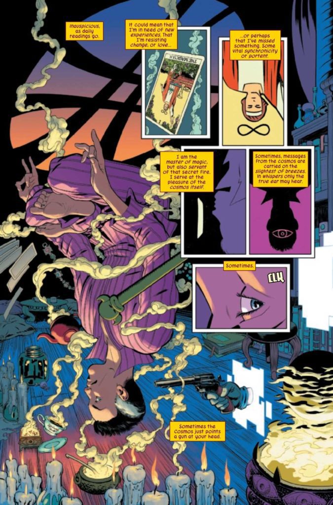 As for the other characters, their portrayals vary to a degree. Despite an impressive presentation in Masked Raider’s introduction, it raises an important question. Why does he draw a gun on Strange when he just wants to talk? Other characters in Defenders #1 act realistically in comparison. Especially with how breakneck the pace becomes once the conflict comes up. Some of them like Silver Surfer and Red Harpy are going through troubles. Being plucked out of their places against their will leaves them more than a little peeved.


 Then there’s Sterling’s mentor, Van Helsing. With just the beginning of the issue for reference, even new readers know that Van Helsing can be villainous. His merciless nature and strive for immortality make his new status as an antagonist feel more like a natural progression of his character than a retcon.