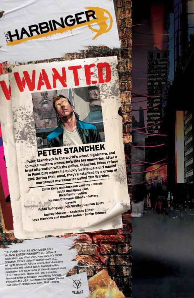
The Harbinger #2 is where this Valiant Entertainment series really begins. Peter Stanchek’s inner conflict starts tying into a bigger story that’s at work. On November 24th, comes a story about how having power isn’t quite the same as having strength.
Recap
Peter Stanchek of the Renegades is back from the dead and only Chicago’s Psiot City inhabitants are happy about it. Now, Peter has to face off against Chicago’s state superheroes and his inner self, The Renegade.
The Harbinger #2: Down With The Renegade!
Between writers Collin Kelly and Jackson Lanzing, there are two plots brewing. The Harbinger #2 puts a compelling focus on Peter Stanchek’s legacy as “The Renegade.” The last issue introduces readers to The Renegade, an angry, self-loathing thoughtform who represents Peter’s past. While Peter tries to be better than The Renegade by being more moral, we tragically witness some of his shortcomings. This manifests in the form of The Warning, a group of mercenary superheroes who have a bone to pick with Psiots. The violations they enact on Psiots, by stripping the Psiots of their minds, suggests a truly insidious plot; a campaign for ideological gain.
Hyper Expressive Detail
Artist Robbi Rodriguez continues to illustrate some eye-catching artwork in The Harbinger #2. The facial language of the characters gives readers a very good idea of their personalities. Just one look at how the villainous Futurist nonchalantly reacts to Peter’s presence gives readers a glimpse of his scheming. That’s not even including how otherworldly Peter’s powers look, especially with the coloring of Rico Renzi. Unlike the more mundane powers of one civilian, Peter genuinely looks powerful enough to take on the world.
On the note of that civilian Psiot, Young Ago, Hassan Otsmane-Elhaou uses his lettering in conjunction with the artists to showcase his powers. The way Young Ago’s words take up so much space and obscure the SWAT Teams demonstrates how much power he has in a situation. In juxtaposition with Psiots standing nonviolently up to these oppressive police forces, Young Ago’s powers might not look as fancy, but that doesn’t mean he can’t hold his own.
Get Involved In The Harbinger #2
The Harbinger #2 is where the series gets really interesting and makes a big impression. A plot is brewing and it all revolves around Peter’s character arc. To go along with this is artwork that demonstrates the flashy powers of these characters. Readers are going to be left waiting expectantly for the next great issue of a story that gets better and better.
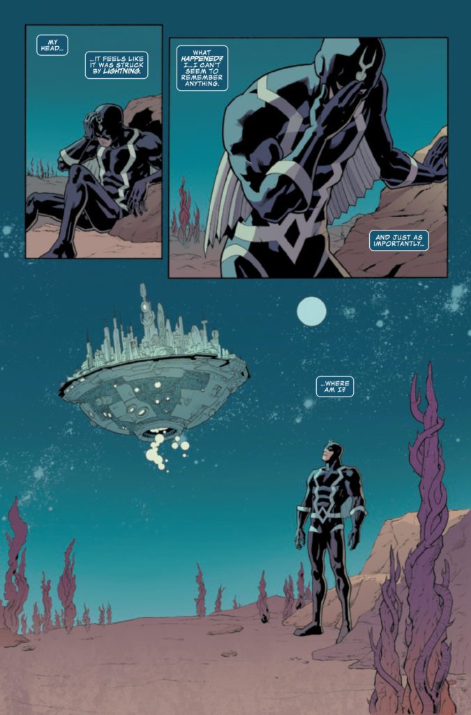
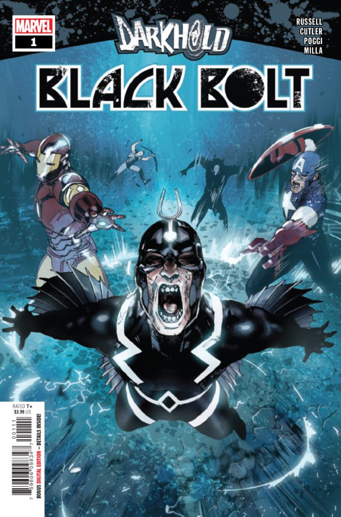
THE DARKHOLD: BLACK BOLT #1 hits your local comic book store December 1st, but thanks to Marvel Comics, Monkeys Fighting Robots has an exclusive four-page preview for you.
About the issue: THE KING OF THE INHUMANS BREAKS HIS SILENCE! Black Bolt’s mighty voice is his greatest gift…and since childhood, it has been his greatest curse. Recruited with four other heroes to read from the Darkhold, a powerful evil text written by the elder god Chthon, Black Bolt thought he was signing up for a battle befitting a king. But the true battlefield…is his own mind. Critically acclaimed writer Marvel Russell brings you a scream-worthy story that will break an empire!
The issue is by writer Mark Russell, penciler David Cutler, inker Roberto Poggi, colorist Matt Milla, and letterer Clayton Cowles, with a cover by Travel Foreman and Dan Brown.
Check out the DARKHOLD: BLACK BOLT #1 preview below:
Who is your favorite Inhuman? Sound off in the comments!
Comic books are a relatively recent medium of art but, unlike other art forms, comic book characters haven’t changed much. They have been around since the near beginning and are still thriving today, still protected by copyright law and owned by the same publishers. People have come and gone in that time frame, and these beloved characters have gone on their own path, but not as much as an outside observer would expect. Especially recently, any change in status or lessons learned in superhero comic books are reverted after a short period, leading to many versions of the same story being told repeatedly. There are many reasons why this occurs, but it results in stories without consequences and leads to stagnant characters.
The Stagnant Spider-Man
A prime example of a character in superhero comic books that is often refused the opportunity to grow is Peter Parker’s Spider-Man. This can be seen in Dan Slott’s run of The Amazing Spider-Man and The Superior Spider-Man. Whether or not you enjoyed Slott’s time with Spider-Man, you must give him props for doing something different with the famous web-slinger. For those unfamiliar with the run, Doctor Octopus took over Peter’s body, becoming the “Superior Spider-Man” for an enormous portion of the run. Peter was eventually restored to his original body but found himself in charge of Parker Industries — a global company that employed thousands. This was a drastic shift from the typical making-ends-meet Peter we know from his appearances in other media. Slott’s run would be a fantastic example to refute my premise that superhero comic books refuse to change, had it ended differently.
By the end of his run, Parker Industries was gone, and Peter was poor once again, bringing back the typical image of Spider-Man that most people have in their minds. One of the only large changes Slott had made to the character was allowing him to finish his graduate degree — a change that was reversed in the first issue of Nick Spencer’s run with the character (not including the story he did for Free Comic Book Day). Slott discussed this purposeful reversion of the character in an interview he did with Syfy Wire in 2019. “I always knew his company was going to lie in ruins by the end of the story… I always knew I was going to return it to factory setting before I passed it off to the next guy.” This is a kind and considerate action to take when thinking of future writers of the character but results in a dull overall story with no lasting consequences from supposedly earth-shattering storylines.
Another Consequence
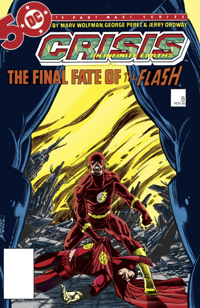
One consequence of this noncommitment to change in superhero comic books that permeates most Marvel and DC Comics characters is the feeling of no stakes during huge events. For example, when DC Comics has a “Crisis” event today, it is never anywhere near as impactful as the original Crisis on Infinite Earths. Even if similar situations occur, such as two major characters dying, it still won’t have the same effect. Because well-versed readers are aware of how infrequently significant changes stick. Even when the publisher decides to keep a major change, such as Alfred Pennyworth’s death in Batman #77, it still doesn’t make a lasting impression since it is a “Boy Who Cried Wolf” scenario. We’ve had Superman, the Flash, Batman (several times), Jason Todd, and Damian Wayne die and then come back to life. Who’s to say that Alfred won’t come walking out of the tomb any day now?
The Flip Side of the Coin
One may argue that this act of returning characters to a well-known state at the end of a writer’s run is a fantastic action because it allows for the first issue of a run to be more accessible to new readers. This is a valid point, as I firmly believe that the superhero comic books (and the comic book industry in general) should put as much effort as possible into drawing in new readers. Still, it does put aside the interests of individuals who have been following a series past the end of a writer’s run in favor of those of a new reader. Also, the only way to keep returning to the same state over and over again is to ignore the character’s long history, constantly reboot, or have such unchanging and boring characters that they don’t shift in any noticeable way after many years. As long as the certain core elements of a character are kept — their heart, philosophy, and ideals — they will be recognizable. The character will have decades more history impacting their every decision, so whether the character works at the Daily Bugle or not is inconsequential.
Conclusion
Claiming that comic book characters have not changed over their extensive history is ridiculous, but it doesn’t take a detective to see that slightly altered versions of the same story have been told again and again for major characters in superhero comic books. They are rarely allowed to grow and learn their lessons, leading to a character that seems either stubborn, stupid, or stuck in an endlessly long streak of bad luck. This doesn’t mean that the storytelling within current superhero comic books is dull — else I would not read so many of them — just that it is disappointing to see a character supposedly growing and changing throughout a run, only to have them continually return to the place they started.
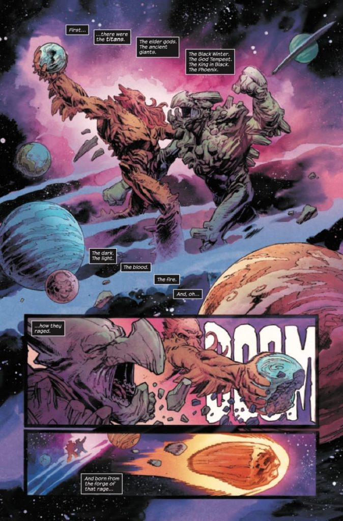
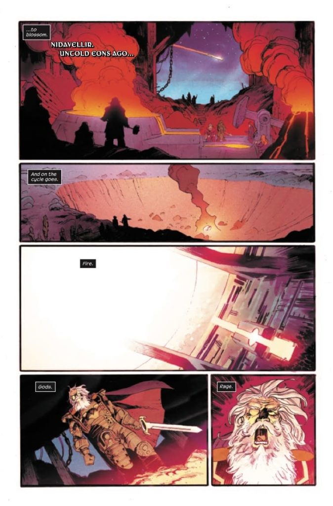
Marvel Comics’ Thor #19 feels like eons of storytelling, boiled down to a sleek 20 pages. Writer Donny Cates, artist Nic Klein, colorist Matt Wilson, and letterer/designer Joe Sabino set the stage for a terrifying new villain to enter the fray. And they do so by going all the way back to the beginning.
About Thor #19 (from Marvel Comics)
“GOD OF HAMMERS” STARTS HERE! Mjolnir has gone missing! And nobody, not even the powerful eyes of Lady Sif, is able to locate it. So Thor must turn to the last person he wants help from…Odin. For until the hammer is found, nobody in the realms is safe! Artist Nic Klein is back for the twists and turns not even the All-Father is ready for!
Writing
Cates shows, in his opening pages, that he can get through huge amounts of exposition smoothly. He gives us a nuanced rundown of the Norse Gods’ entire history. And as he reaches present day, it becomes clear why he took us back in time. To fully understand what’s going to happen next, Cates wants us to know a thing or two about Mjolnir. But as Thor and Lady Sif talk about recent events, Cates briefly gets out of his rhythm. Thor’s dialogue is clunky and expository. It feels more like Cates is telling us what we need to know, not showing us. It’s only really noticeable because Cates’ intro is such a brilliant example of packaging exposition well. And it’s only a small speedbump in a script that feels full of mystery and subtlety.
Art
Klein’s art is stunning. He draws in his own unique style, yet occasionally dabbles in the techniques of Jack Kirby. A monster that Thor, Jane Foster, fights in a flashback gives Klein the opportunity to draw briefly like the King of Comics. Even as he does this, he holds on to his own unique style throughout. But it’s more than just his style that makes Klein’s art work so well. He has a way of luring the reader in, before punching them backwards. He brings the reader’s eyes inward, to the center of the page, then uses the action of the scene to push the art back outwards again. It makes you feel involved in the story, like you’re watching each fight closely from the sidelines, betting on who will come out on top.
Coloring
This is a dark time for Thor. He feels like the whole world is against him. But a lot of the darkness is coming from within him too. Wilson has a brilliant way of showing this. When Thor stands on the Rainbow Bridge, talking to Lady Sif, the contrast couldn’t be any clearer. The vibrant colors of the bridge are under his feet. They ought to shine on the whole scene and make things bright. But no, instead the scene is cast in a cold blue light. We see that Thor isn’t letting brightness into his world. Maybe he’s punishing himself, maybe he’s hunkering down for the next fight. But either way, Wilson shows us that Thor definitely isn’t allowing himself to be happy.
Lettering
In one of the fight scenes, Sabino makes subtle choices that make big changes to how the scene sounds in the reader’s mind. As two figures fight, one of them grunts and yells each time he’s hit. The font tries to burst past the borders of each word balloon, pushing the edges of the balloon out so that they wrap each letter. When another character swoops in to his friend’s aid, he kicks the attacker in the chest. In response to being kicked, the attacker grunts. Instead of letters that are trying to escape their word balloon, Sabino goes in the opposite direction. He shows a “RAGHH!” that’s written smaller than the rest of the font on that page. Instead of grunting loudly, we hear it as the character having the wind knocked right out of them. They’re barely able to make a noise at all. It’s just one example of the many intricacies to Sabino’s work in this issue.
Marvel Comics’ Thor #19 is a comic that exists to herald a coming doom. This creative team sets everything up for the God of Hammers to take the spotlight. When he does arrive, there will be plenty of dread waiting for him. Pick up Thor #19, out from Marvel Comics November 24th, at a comic shop near you!
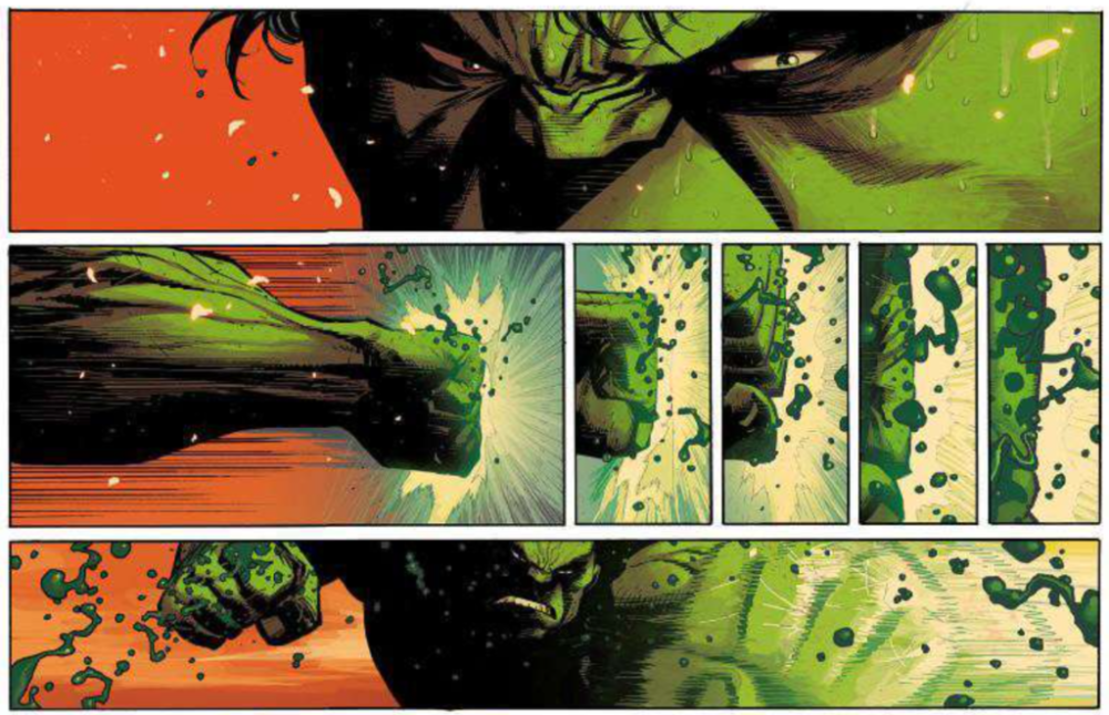
Hulk #1, out tomorrow from Marvel Comics, is the first bombastic issue from the new creative team that takes the Hulk in a wildly different direction.
Writing
It is not difficult to argue that the first issue of a series is its most important. Often, it sells the most and has the responsibility of telling the readers what the new series will do differently from its predecessors. Donny Cates makes sure his first Hulk tale stands out loud and proud. Not only does Hulk #1 give us a wildly new scenario that allows for character exploration we have never seen before, but it also is filled with an impressive fight, even for a Hulk book. Cates quickly lets readers know that while we will be treading lots of new ground for our favorite green monster, the epic battles are here to stay.
Art
Ryan Ottley is such a unique and brilliant artistic talent, and it is great to see him putting his abilities towards this character. Hulk #1 has Ottley making abundantly clear that he is amazing at everything vital to the art of the Hulk. Dynamic poses, stunning inhuman muscles, and intricate debris and destruction make it evident that Ottley will not disappoint during his time on this series. Ottley also makes use of dramatic lighting for much of this issue, which pushes already intense scenes to be almost frightening.
Coloring
Frank Martin uses a bold and wide color palette for much of Hulk #1, and when he restricts it, the colors present make a strong statement. This can be seen during the final blow of the main fight of the issue, where the brighter and warmer palette is replaced with one much darker and cooler, giving a brutal and merciless tone to this vicious punch. Strong choices like this allow Martin’s coloring to enhance the story and art in a way that could never be present otherwise.
Lettering
The lettering choices that VC’s Cory Petit makes in Hulk #1 fit well with the story and art and help to strengthen the narrative. Examples of this are when Petit uses a bold and jagged font for intense sound effects or description, and when words extend far past the edges of a speech bubble to emphasize their loud volume. Petit’s efforts result in an issue that can flow without interruption, and never takes the reader out of the story for even a second.
Hulk #1 takes the timeless character in an entirely new direction and lets readers know to expect the unexpected. This series has a phenomenal creative team, and if this first issue is any indication, you will not want to miss where this intense story will lead.
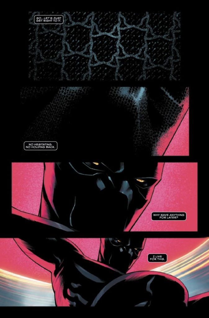
Writer John Ridley and artist Juann Cabal’s highly anticipated start to one of Marvel’s most popular series is finally here with Black Panther #1. With colors from Frederico Blee and letters from Joe Sabino, this first chapter following Ta-Nehisi Coates’ run is a slow but engaging book that examines the fallout from T’Challa’s recent decisions as King of Wakanda. With tight, thoughtful scripting and clean, high-fidelity visuals, this new entry point is off to a great start.
“Secrets from T’Challa’s past have come back to haunt him! Fresh from returning from his travels in space, Black Panther receives an unexpected and urgent message from a Wakandan secret agent! Now T’Challa must race the clock not only to save his agent, but also to keep his true agenda under wraps. Because if the truth comes out, it could cost T’Challa everything…”
Writing & Plot
John Ridley focuses on some of the more intricate aspects of the current world Wakanda exists in with Black Panther #1. The direct results of decisions made in Coates’ run, as well as plans set in motion during T’Challa’s time as sole ruler of Wakanda, make up the bulk of this comic’s plot. T’Challa’s decision to plant sleeper agents in world governments, making Wakanda a democratic country, and, to a lesser extent, his place with the Avengers, are all touched on here. However, the first of these is the main focus and what makes this issue feel like the start of an espionage thriller.
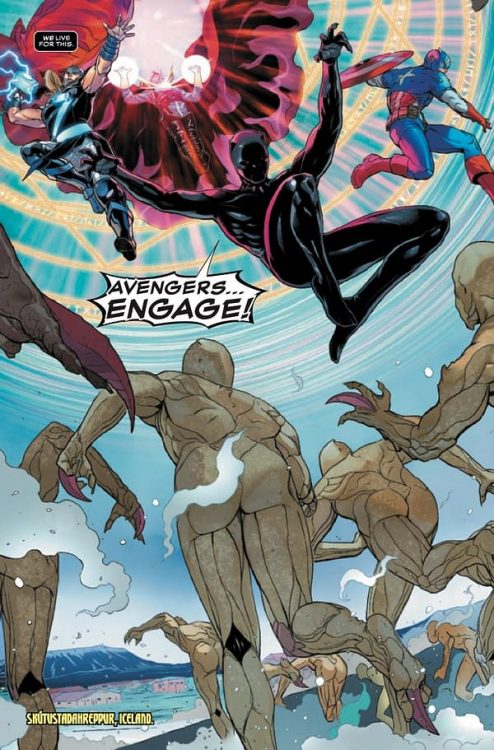
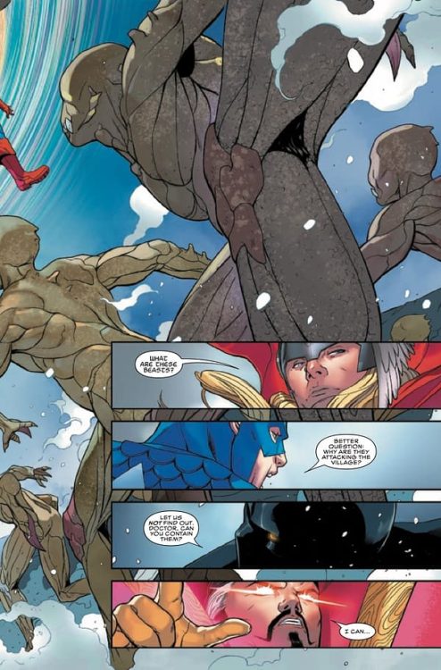
Ridley makes the wise choice of not focusing too much on the least interesting aspect of a Marvel character comic – the ties to the Avengers. T’Challa’s involvement with Marvel’s titular super-team has always been generally tenuous, and Ridley seems interested in keeping it that way. The comic’s opening is a pretty cut-and-paste action sequence with Black Panther and some other Avengers (Cap, Thor, and Doctor Strange) as a sort of attention-getter. It’s also the worst part of the book. As soon as the King gets back home and the political stuff hits, the comic improves drastically. The small but heavy hits of action between lengthy conversation sequences feel like explosive punctuation. The more espionage-action structure of this issue makes it feel like a Mission: Impossible film rather than a superhero comic.
Despite the amount of dialogue, Ridley’s script never comes across as overstuffed or laborious. All of the dialogue is consequential and genuinely compelling. There’s no exposition, and every conversation comes off as both great dialogue writing and important information. This is a well paced and intelligent script and I can’t wait to see what’s next.
Art Direction
The kinetic action scenes, detailed environments, and character animations in Black Panther #1 are due to the pencils of Juann Cabal. His clean, thin pencils and conservative use of inks/shadows make for a bright visual experience with a lot of “pop.” I find Cabal’s style to be reminiscent of Mikel Janin due to their use of a sort of digital style and very little inks. His characters are given considerable personality via how detailed he draws their facial animations. This is especially effective given how many one-on-one conversations there are in this book. My only complaint is that, at a couple of points, his characters look a bit same-y. However, this isn’t very obvious and can easily be looked past.
Cabal’s action scenes, which are few in this comic, are directed and drawn with cinematic energy. Cabal a small number of panels to convey events on a page. This approach makes his action scenes look like big set pieces rather than intimate fights. This isn’t a problem at all, it’s just a note on his approach.
Colors & Lettering
Frederico Blee’s colors are the explosion of life that really grabs your attention to this comic’s interior. His bright, hyper-energetic palette is what makes this issue a high-fidelity Marvel comic experience. While it may not suit everyone, the digital filter-esque use of color brings huge of energy to Cabal’s pencils. For better or worse, Marvel’s comics have been taking a lot of creative suggestions from the Marvel Cinematic Universe. Here, at the very least, it makes for a very pretty comic book. The lettering from Joe Sabino is solid, and does exactly what it is supposed to do. There’s solid SFX lettering and he fits Ridley’s lengthy dialogue into speech bubbles in a manner that is tidy and legible.
Verdict
Black Panther #1 is a tight and intelligent start to this new chapter for the King of Wakanda. John Ridley’s script glosses over the more mainstream-friendly moments to focus on political intrigue and tense espionage storytelling. The visuals from Juann Cabal and Frederico Blee are bright and attention grabbing, even if they don’t entirely fit the kind of story they’re in. Be sure to grab this new start point when it hits shelves on 11/24!
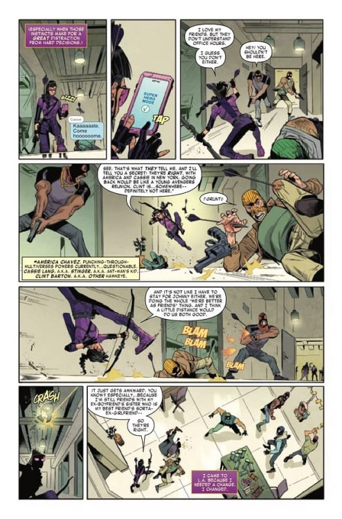
Kate Bishop is one or Marvel Comics’ most charming characters. She’s always in over her head, yet also seems to constantly have a handle on things. She’s confident and terrified. In a nutshell, Kate Bishop is a great example of a truly human character. She’s a ball of paradoxes and contradictions, all delivered with a wink. Luckily for Kate Bishop fans, Hawkeye: Kate Bishop #1 writer Marieke Nijkamp, penciller Enid Balam, inker Oren Junior, colorist Brittany Peer, and letterer Joe Caramagna understand her character. They bring us a delightful first issue, diving right into the quirks that make Hawkeye so relatable.
Writing
We open on Kate Bishop texting, as she’s investigating the headquarters of a shady operation she’s been tracking. Throughout, Nijkamp has Kate talk to herself, pretending it’s a two-way conversation with the henchmen she’s putting down. Normally, all the information Nijkamp is conveying would feel like an exposition dump. We learn that Kate is thinking of heading back home to New York, that she feels nervous yet like it’s the right thing for her. We learn all about her friends’ various responses to her delaying the trip. But Nijkamp packages all of this information in such a funny way, that it all comes through so smoothly. Because every line is delivered to a goon with a fist in his face, we take it all in with a chuckle.
Art
There’s so much that is done well in Balam and Junior’s artwork. They capture the jokey-yet-sincere nature of every scene. But, at one point, Nijkamp’s script jumps around in time, mid-page. Balam and Junior give no visual indication in their page layout that these scenes are different. As a result, some pages are quite confusing and take a couple reads. But this doesn’t take away from the actual beauty of the scenes they create. Their characters feel big, body shaking emotions, but then devastate the reader with their quiet, subtle dismissiveness instead. Balam and Junior joyfully oscillate between the theatric and the understated.
Coloring
First, Peer shows us how much Kate stands out in the world of private investigations. She’s a bright purple figure against a grey background. But when we see Kate go to the Resort Chapiteau, everything changes. The whole scene is lit up in vibrant colors. The transition between the two makes us feel like the lights have been turned on in a dark room. Peer makes us feel like Kate, exposed and out in the open. When we get our pages that jump around in time, it’s Peer’s coloring that acts as our one cue that these scenes are different. The past scenes have a yellowish tone to them and an orange background. When things kick into gear in the present, the same orange background pops up. Peer shows us that these characters have a rhythm that they fall back into around each other.
Lettering
Hawkeye: Kate Bishop #1‘s script is chock full of wild sound effects. And whether its the “FWOOOSH” of an arrow, taking us from one panel to the next, or a “SWEEP” sound effect that almost seems to push a henchman over itself, Carmagna delivers. The story involves a lot of texting. We see caption boxes throughout that are part of a group text that Kate is a part of. With all the characters, it could get confusing quick. But Carmagna color codes each caption box to each character, and places their name in small grey font at the top, every time a new character joins the conversation. It’s a simple way of keeping the reader focused and on the same page.
Marvel’s Hawkeye: Kate Bishop #1 is tons of fun. This creative team captures the “goofy yet capable” nature of their main character. Pick up Hawkeye: Kate Bishop #1, out from Marvel Comics November 24th, at a comic shop near you!
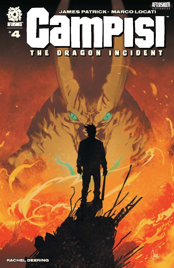
CAMPISI: THE DRAGON INCIDENT #4 hits your local comic book store December 1st, but thanks to AfterShock Comics, Monkeys Fighting Robots has an exclusive four-page preview for you.
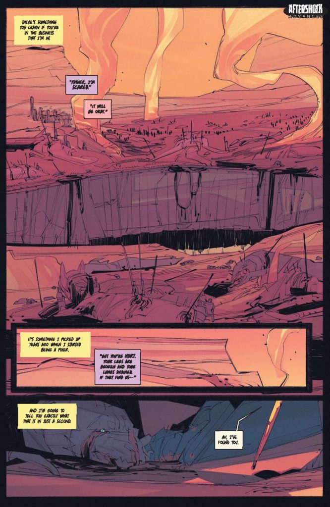
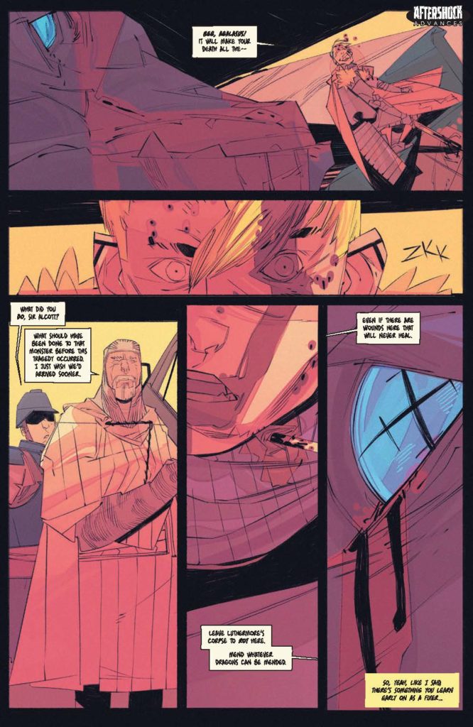
About the issue: The dragon $&#% has hit the fan. It’s all but certain that the dragon is going to destroy Green Village, and the people who couldn’t or wouldn’t leave the neighborhood are going to die. Sonny Campisi has one last desperate chance to save his home, but he’s going to need the help from the most unlikely source.
Each issue of CAMPISI: THE DRAGON INCIDENT features 24 pages of story and art with a cardstock cover!
The series is by writer James Patrick and artist Marco Locati, with letters by Rachel Deering, and a cover by Fran Galán.
Check out the CAMPISI: THE DRAGON INCIDENT #4 preview below:
Are you reading CAMPISI: THE DRAGON INCIDENT? Sound off in the comments!
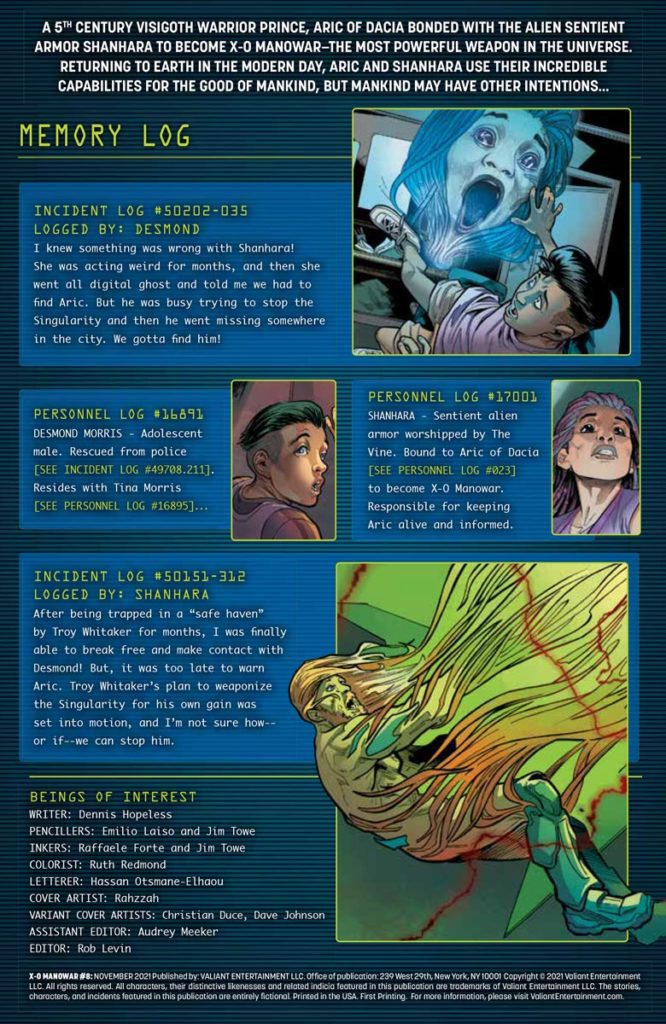
Valiant Comics’ X-O Manowar #8 arrives with a dynamic climax to the series through the titular armor’s mind, Shanhara. Her story of privacy and rights violations is surprisingly compelling for an alien AI.
Background
Aric of Dacia (X-O Manowar) spent the last several issues finally getting a handle on a nanite swarm. Only to turn out his benefactor, Troy Whittaker, has been using him.
X-O Manowar #8: The Story of Shanhara’s Sentence
Dennis Hopeless makes X-O Manowar #8 all about Shanhara. By calling back to a few other issues, readers see how insidious Troy’s deceptions are. Through Shanhara, readers feel the data collection that evokes the real world fears of losing freedom. The fact the reader gets this through an AI is a rather interesting angle. It’s why when Shanhara recounts her tale, it feels like she’s in the process of regaining her autonomy.
City Of The Singularity
The art of X-O Manowar #8 offers a chilly presentation of this series’ threat. Jim Towe shares penciling duties with Emilio Laiso and inking with Raffaele Forte to present how invasive the nanite swarm is, in crystalline form. The green hues by Ruth Redmond make the crystals twice as menacing. The side characters have thick outlines but don’t show their faces, instead their body language shows their fright.
Hassan Otsmane-Elhaou brings some top-notch lettering to X-O Manowar #8. In addition to some highly expressive and distorting word balloons, a few captions highlight Troy’s presence. Including the captions of Shanhara’s doppelgänger shifting into speech balloons.
Connect to X-O Manowar #8
X-O Manowar #8 sets up a pretty intense stage for the coming conclusion. The villain isn’t just established, Troy Whittaker makes the gravity of his threat apparent. His violation of Shanhara is just the tip of an epic climax. This will leave readers ready and itching for the next issue.
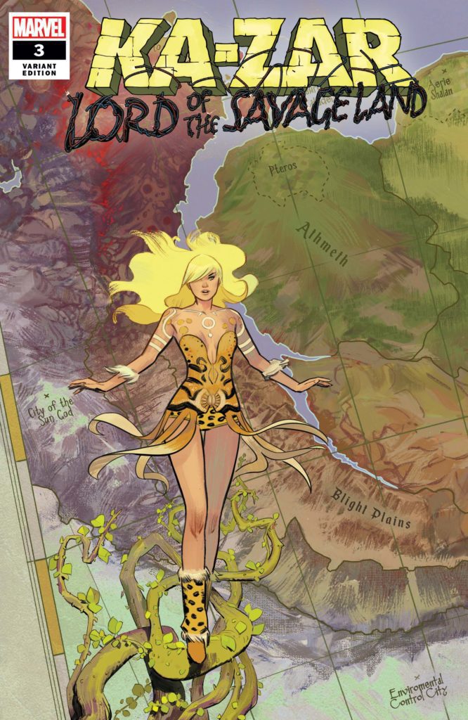
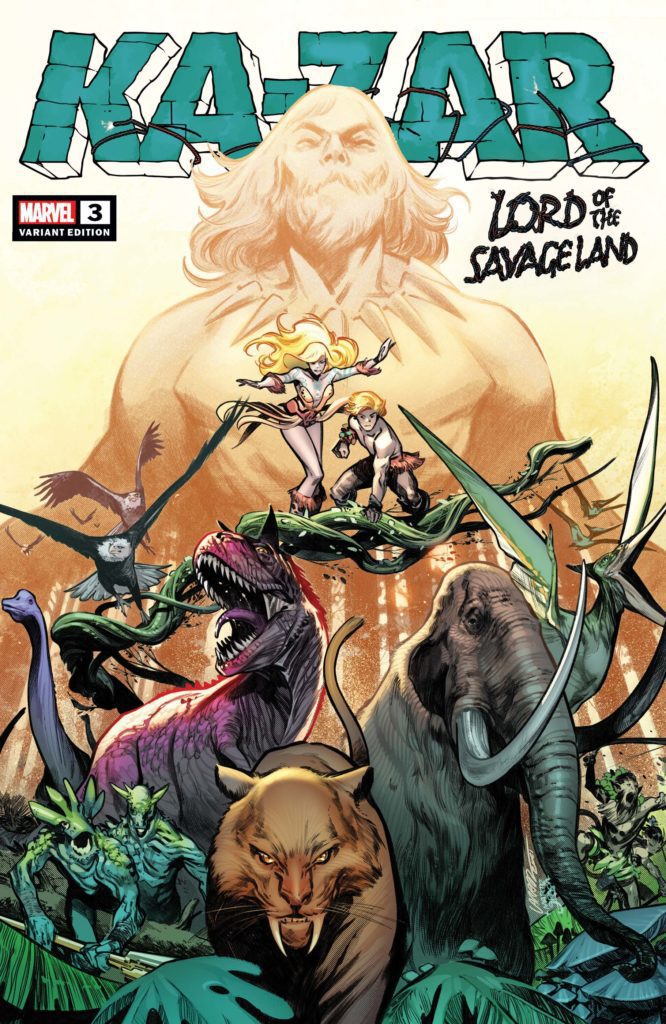
Writer Zac Thompson (Yondu, No One’s Rose) and artists German Garcia and Alvaro Lopez continue their saga of classic adventure mixed with post-colonial dread with Ka-Zar: Lord of the Savage Land #3. With colors from Mat Lopes and Mat Milla and letters from Joe Caramagna, this tense and often brutal chapter strikes dead-center at what Thompson & Co’s focus is with this new version of Ka-Zar. With a sharp, sometimes frightening script and stunning visual work, this is a brilliant climactic chapter.
“THE NEW MASTER OF THE SAVAGE LAND IS REVEALED! Matthew Plunder has betrayed his parents-and now the entire continent is headed for landfill. Welcome to Domovoy’s Domain… You won’t enjoy the experience. Zac Thompson and Germán García reshape a corner of the Marvel Universe in another installment of their pulse-pounding, heart-throbbing adventure through forbidden territory!”
Writing & Plot
Zac Thompson pens a script that blends a classic comics feel with the unflinching shock of confronting contemporary issues. Ka-Zar: Lord Of The Savage Land #3 follows up the tragic ending of the prior chapter with, well, more tragedy. The even more determined Plunder family sets out to hunt down Domovoy, the source of this biotechnical blight plaguing the Savage Land. While I would never spoil anything, let’s just say they bite off more than they can chew.
The parallels drawn up between the Plunder family’s attempted colonizing of the Savage Land and what this biotech plague is doing are brilliant and disturbing. The notion of tech perverting nature in a sort of ecosystem-based colonization is a gem of a concept. What I’m looking forward to most as this series continues is this concept being explored more. There are a couple moments that could come across as a bit of preachy veganism. However, if this is the case, I find that in context they make sense.
Dialogue
Thompson’s dialogue sensibilities here swing between poetic, almost psychedelic narrations and Silver Age-tinged dialogue. The vision/flashback scenes are colored by the trauma Ka-Zar feels in regards to his past. This comes out as animals reciting their pain in evocative, beautifully penned passaged describing agony. On the other hand, in-story character dialogue is a finely tuned mix of classic and contemporary sensibilities. Especially in the way Matthew talks, there’s a sense of internal narrative to the character’s words. It’s the kind of writing that dominated comics for decades, from the Golden Age adventure books that inspired Ka-Zar to the character’s original appearance by Lee and Kirby. Much of the time though, sentence structure and word choice feel mostly naturalistic and contemporary. There’s a lot to like about this script, and I’m curious to see what Thompson has coming next.
Art Direction
German Garcia and Alvaro Lopez draw the absolute hell out of Ka-Zar: Lord Of The Savage Land #3. The combination of their unique pencils and action-focused panel direction makes for a gorgeous and immersive visual experience. The thin penciling gives the characters softer features. There’s an almost rounded aesthetic to the panels that is rare among mainstream comic books. The animations and detail are greatly drawn, yet in a more subtle manner than what you may be used to. Where many contemporary “Big 2” books utilize thicker lines with more jagged features and intensely detailed backgrounds, this comic sticks out with its smooth character-focused approach. The environments, while gorgeous or threatening depending on where on the Savage Land we are, have a sort of homogenous approach directed to them.
When focused in on the Plunders, the land morphs into a nebulous wall of nature. Details can still be seen, but its as if a neon haze overtakes everything. Whether intended or not, I like this touch as a parallel to how Kevin must see the Savage Land. This perspective shifts when Ka-Zar needs to borrow the abilities of a nearby animal, a la Animal Man. Here, the close-up details of various organisms, from hordes of ants to fish, work together like a mural.
Colors
Much of what makes this aesthetic so striking is the coloring of Mat Lopes (The Dreaming) and Mat Milla. Their work in Ka-Zar uses a less saturated, almost watercolor-like style that focuses on lighter tones of the chosen colors. This isn’t to say that the book is light on color.” though. On the contrary, every panel sings with their work. Most panels veer towards choosing one overall tone (brown/tan in deserts, blue/purple at night). The vision sequences however are where they get especially creative. These panels are flooded with an organic mass of color. This approach works especially well due to the mind-bending visions Kevin is having in his dreams. Every aspect of Ka-Zar’s visual experience is unique excellence.
Verdict
Ka-Zar: Lord Of The Savage Land #3 is a thrilling, gorgeous, and unexpectedly brutal chapter in this mini-series. Zac Thompson’s script doubles down on the harm that has been done to the Savage Land over time, and while it can be a bit preachy, it is wholly compelling. The visuals from German Garcia, Alvaro Lopez, Mat Lopes, and Mat Milla are uniquely stunning in ways not often seen in mainstream comics. This is a truly special series coming out of the Marvel comics lineup, so be sure to grab this issue today!


 Peter Stanchek of the Renegades is back from the dead and only Chicago’s Psiot City inhabitants are happy about it. Now, Peter has to face off against Chicago’s state superheroes and his inner self, The Renegade.
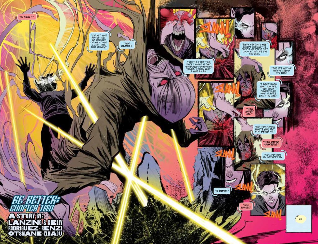


 Aric of Dacia (X-O Manowar) spent the last several issues finally getting a handle on a nanite swarm. Only to turn out his benefactor, Troy Whittaker, has been
 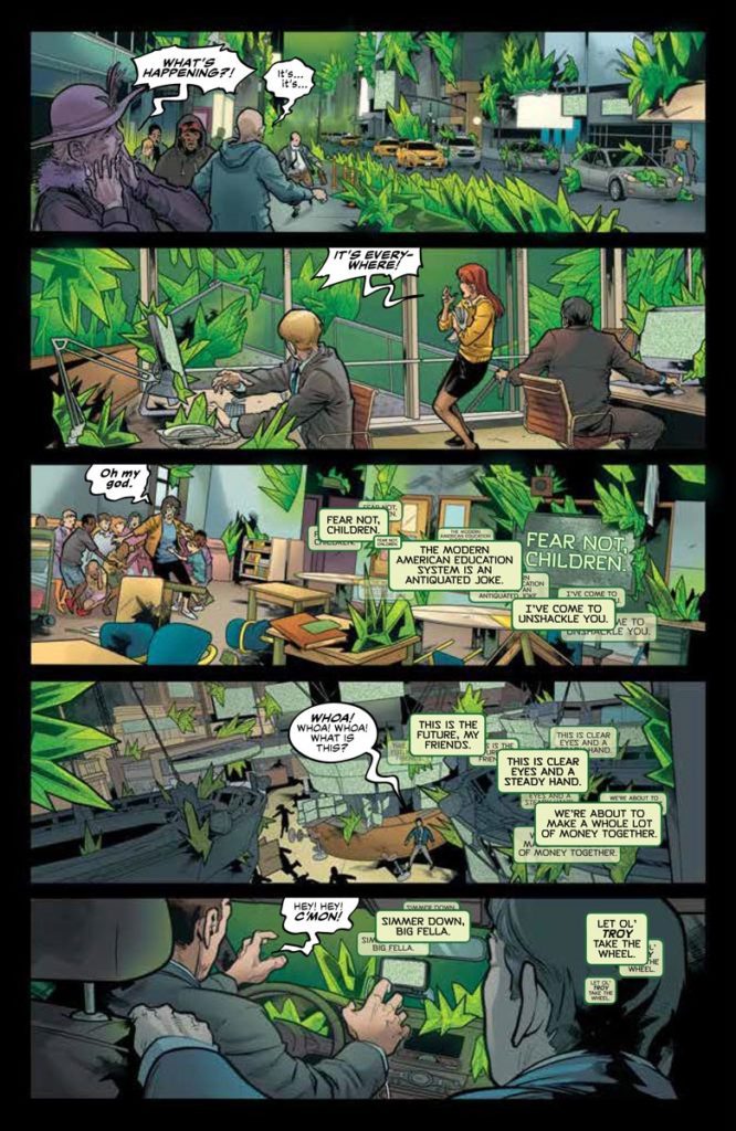 The art of X-O Manowar #8 offers a chilly presentation of this series’ threat. Jim Towe shares penciling duties with Emilio Laiso and inking with Raffaele Forte to present how invasive the nanite swarm is, in crystalline form. The green hues by Ruth Redmond make the crystals twice as menacing. The side characters have thick outlines but don’t show their faces, instead their body language shows their fright.
")