Hulk #1, out tomorrow from Marvel Comics, is the first bombastic issue from the new creative team that takes the Hulk in a wildly different direction.
Writing
It is not difficult to argue that the first issue of a series is its most important. Often, it sells the most and has the responsibility of telling the readers what the new series will do differently from its predecessors. Donny Cates makes sure his first Hulk tale stands out loud and proud. Not only does Hulk #1 give us a wildly new scenario that allows for character exploration we have never seen before, but it also is filled with an impressive fight, even for a Hulk book. Cates quickly lets readers know that while we will be treading lots of new ground for our favorite green monster, the epic battles are here to stay.
Art
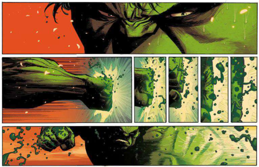
Ryan Ottley is such a unique and brilliant artistic talent, and it is great to see him putting his abilities towards this character. Hulk #1 has Ottley making abundantly clear that he is amazing at everything vital to the art of the Hulk. Dynamic poses, stunning inhuman muscles, and intricate debris and destruction make it evident that Ottley will not disappoint during his time on this series. Ottley also makes use of dramatic lighting for much of this issue, which pushes already intense scenes to be almost frightening.
Coloring
Frank Martin uses a bold and wide color palette for much of Hulk #1, and when he restricts it, the colors present make a strong statement. This can be seen during the final blow of the main fight of the issue, where the brighter and warmer palette is replaced with one much darker and cooler, giving a brutal and merciless tone to this vicious punch. Strong choices like this allow Martin’s coloring to enhance the story and art in a way that could never be present otherwise.
Lettering
The lettering choices that VC’s Cory Petit makes in Hulk #1 fit well with the story and art and help to strengthen the narrative. Examples of this are when Petit uses a bold and jagged font for intense sound effects or description, and when words extend far past the edges of a speech bubble to emphasize their loud volume. Petit’s efforts result in an issue that can flow without interruption, and never takes the reader out of the story for even a second.
Hulk #1 takes the timeless character in an entirely new direction and lets readers know to expect the unexpected. This series has a phenomenal creative team, and if this first issue is any indication, you will not want to miss where this intense story will lead.