Home Blog Page 117

Review: NIGHTWING #88 is a Nostalgic Shotgun Blast of Fun

Nightwing Taylor DC COmics

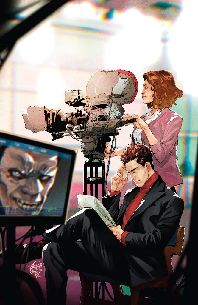
DC Comics’ Nightwing continues to be a glorious love letter to fans of Dick Grayson. Writer Tom Taylor, artist Bruno Redondo, colorist Adriano Lucas, and letterer AndWorld Design continue to celebrate all the different facets that make Nightwing who he is. Nightwing #88 focuses on Dick Grayson as a team member and leader.

Writing

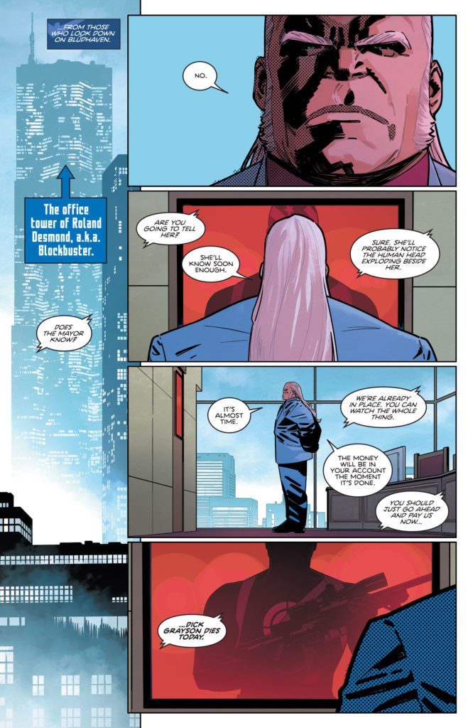
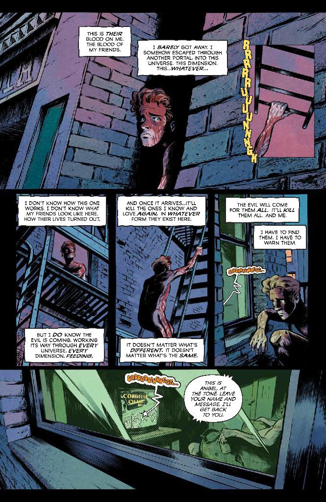
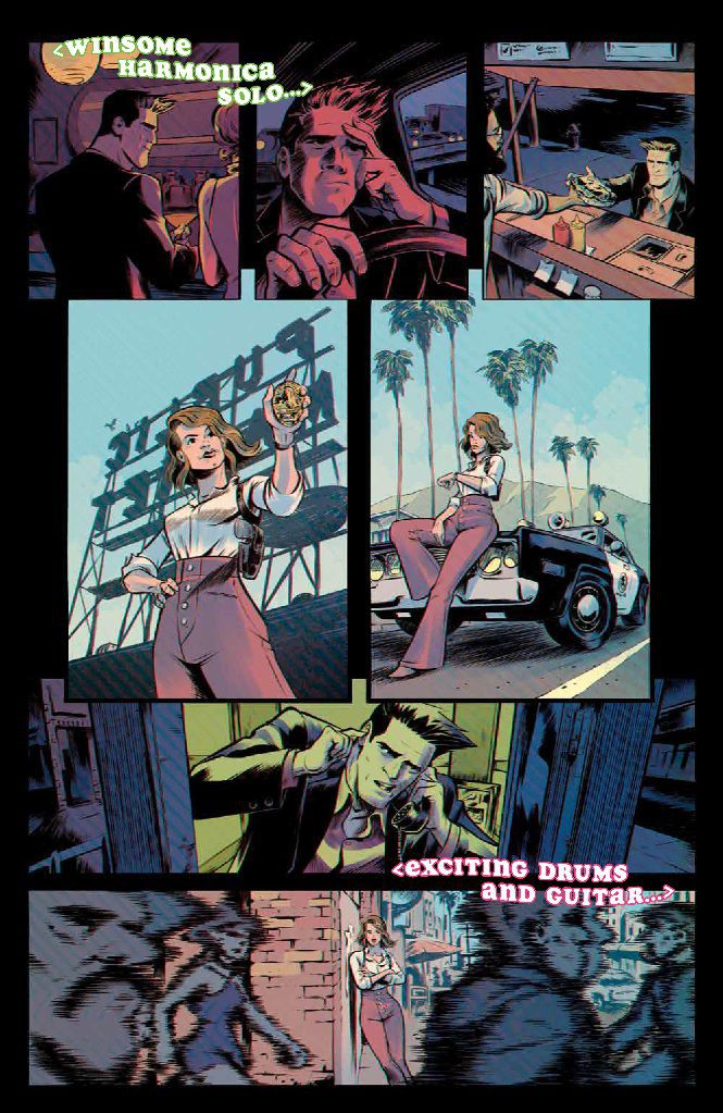
This issue centers around a public appearance Dick Grayson has to make. Grayson has promised Bludhaven that he’s going to use his newfound wealth to start the Alfred Pennyworth Foundation, which will work to give back to the citizens of the city of Bludhaven. But for once, it’s Grayson who has a price on his head, not his alter-ego Nightwing. Taylor sets the stakes up early and mysteriously. We get glimpses of the characters that are contracted to take out Dick Grayson. But once the stakes are in place, Taylor amps up the fun. We get to see a ton of brilliant cameos, lots of bombastic action, and a final page that will make your heart drop.

Nightwing Taylor DC COmics

Art

In any comic drawn by Bruno Redondo, there’s just way too much to talk about. There’s beauty in the page layouts, in the minute details, and in everything in between. Many of Redondo’s layouts work to give us a sense of space. We see characters walking through separate panels stretched over one background. It feels like we’re strolling alongside the character, matching their speed. And then there’s the wonderful details of every character’s costume, too. Redondo shows all the seams and creases in every dramatic pose. Redondo’s enthusiasm for drawing costumes is so clear. He even draws Grayson as an awe-struck cartoon character when he’s presented with his new Nightwing costume. Redondo’s love of the craft drips from every page. It fills the panels and the gutters alike.

Coloring

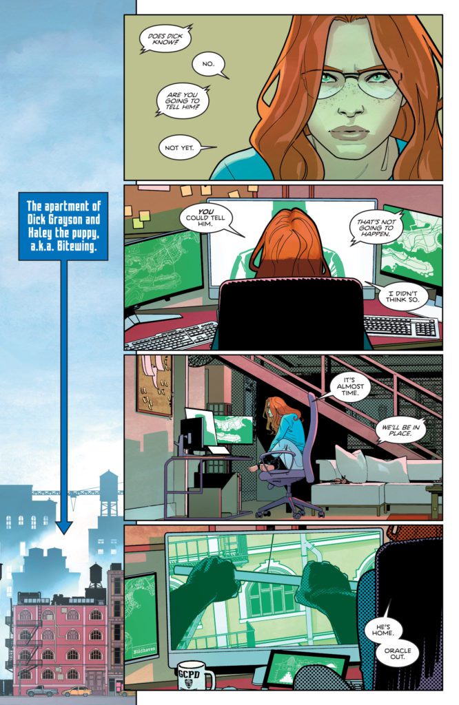
Much of the first few pages of this issue are colored primarily in shades of blue. Lucas makes it clear: this is Nightwing’s town. But as the issue progresses, things get a little more colorful. We see the red and yellow of a gun going off. On the next page, Lucas uses those same colors to color the person who finds the shooter. The character’s fury is a force to be reckoned with and is as intense as a gunshot. By the end of the issue, the color scheme has changed quite a bit. The vibrant colors give way to a muted red. The juxtaposition from the first few pages, all shown in a cool blue, tells us that danger has come to Bludhaven. There’s going to be a shift in the status quo.

Lettering

AndWorld Design’s lettering is playful and fun. The word balloons ping pong us back and forth across each panel. Occasionally, a few word balloons take a double take to figure out the reading order. But one of the best gags from the comic is thanks to AndWorld Design’s letters. When we see Blockbuster’s office from an exterior establishing shot, there’s a caption box with a short arrow that points more specifically to where in the skyline his office is located. Later, when we get a similar shot of Nightwing’s apartment, there’s another caption box to point out where it is. But the caption box now has a long arrow, stretching way down. It’s a brilliant way to show the disparity between how Blockbuster and Nightwing live.


DC Comics’ Nightwing #88 is so freaking fun. It’s heartwarming, action-packed, and full of great laughs. If you love Nightwing and you love Dick Grayson, you’ll love this series. Pick up Nightwing #88, out from DC Comics January 18th, at a comic shop near you!

Monkeys Fighting Robots Youtube

Review: ARROWSMITH: BEHIND ENEMY LINES #1 – Magic In Wartime

Industry veterans writer Kurt Busiek (Astro City, Conan The Barbarian) and artist Carlos Pacheo (X-Men, Fantastic Four) have returned to their original creation after an almost 20-year hiatus with Arrowsmith: Behind Enemy Lines #1. Along with inks from Jose Rafael Fonteriz, colors by Jose Villarruiba, and letters from Tyler Smith and Jimmy Betancourt, this wonderfully unique and visually stunning return sees a blending of genres and styles that is a rare achievement even in the comics medium. With a stellar script and incredible visual work, this long-awaited return is one that is sure to please old readers and intrigue newcomers alike.

“Young airman Fletcher Arrowsmith plunges back into the heat of war—and finds himself behind enemy lines, facing a threat that could doom the Allied Powers.”

Writing & Plot

It shouldn’t be surprising to see contemporary comics legend Kurt Busiek come up with an idea so unique like that found in Arrowsmith: Behind Enemy Lines #1. While it may be old news to fans of the 2003 series So Smart In Their Fine Uniforms (which will receive the deluxe hardcover treatment this April), new readers such as myself will no doubt be dazzled by the blending of genres here. The first few pages’ appearing like many WWI stories, journalistic narrative and all, serves as a great misdirection. As soon as the tiny dragons and magical airborne swordfights appear, the full brunt of creativity on display here comes to light. This is a world with a lived-in fantastical mystery that is so intriguing because it also comes off as relatable and realistic. The backgrounds of the characters and the wartime struggles here are the same as the ones in our own world. Here, they just have dragons and golems as a common occurrence.

Busiek’s writing itself is split up between naturalistic dialogue and overhead narrative. Said narrative is delivered in the guise of journal entries, a common feature in war stories. This further lends that sort of familiarity in the fantastical I mentioned earlier. Creating the sense that this happened in some way, like so many period piece war stories do, is the spark that makes this comic work so well as a concept. The magical elements feel so matter-of-fact that their whimsy fades into a reality as the story pulls the reader in. This is brilliant work by Busiek, and I can’t wait to read the oncoming chapters.

Art Direction

There aren’t many artists who could bring the grounded yet magical feeling found in Arrowsmith: Behind Enemy Lines #1 to life. Fortunately, Carlos Pacheo is here to team up with Busiek again to do just that. Just like in the original series, Pacheo’s light, animated pencils bring a detail and relatability to his characters. At the same time, his designs and touches of magic in this world combine with the facsimile WWI aesthetic to pull the reader effortlessly into the unique creation we see here. Pacheo uses thin, arguably faint lines that, in conjunction with Jose Rafael Fonteriz’s smoky inks, deliver an artistic storytelling feel that captures the seriousness in the fantastical perfectly.

The watercolor-style technique brought by Jose Villarrubia continues to add to the wartime aesthetic, crafting something that combines the fog of war with a sort of mystic, dreamlike feeling. Arrowsmith’s visual style is as wonderfully unique as its core concept is.

Verdict

Arrowsmith: Behind Enemy Lines #1 is a sharply written and gorgeous return to this long-absent world. Kurt Busiek pens a script that takes familiar war story tropes and blends them with the wonder of a long-present magic system while keeping the comic’s core themes intact. The visuals from Carlos Pacheo, Jose Rafael Fonteriz, and Jose Villarrubia are stunningly animated and atmospheric, with a blend of styles that humanizes the characters, grounds the setting, and brings the mystical elements to life in a consistently manner. Be sure to grab this wonderful opening issue when it hits shelves on 1-19!


Monkeys Fighting Robots Youtube

Review: WASTELANDERS: BLACK WIDOW #1 – A Tragic Tale

Marvel Comics is taking a familiar approach with the characters in the Wastelanders series. Each character will get their own one-shot showing their story and how they survived this long in the alternate reality. This is the same approach used by the Marvel Cinematic Universe.

Wastelanders: Black Widow #1 offers us a glimpse into how Yelena made out in this horrible future. Written by Steven S. DeKnight, with pencils by Well-Bee, colors by Mattia Iancono, and letters by Cory Petit, we get another hard look at how bad the Marvel Universe can become.

WRITING

Steven S. DeKnight has been writing each of these one-shot books to build up the Wastelander universe. Each tale comes with it’s own bit of tragedy and loss, and this issue is no different. DeKnight gives us a Yelena that has been beaten down by too much and has become disconnected from the world. DeKnight makes good use of flashbacks in this issue as well. These are effective in showing us how happy Yelena was before the Wasteland as she used to pal around with her sister and they would go on missions together. When the depression and loss starts to hit, DeKnight takes the time to show us the downward spiral of Yelena. This is evident as she no longer fears death and becomes increasingly violent. The addition of the Lizard in this issue is a pleasant surprise. If there was one villain who would find a way to survive and torment heroes in a time like this, it’s the Lizard. While his panel time isn’t excessive, DeKnight establishes that the Lizard is a violent threat that can take a lot of damage. He is able to withstand Yelena’s electric burst and still keep moving, that says a lot about his toughness.

ART

Well-Bee is the penciler for this issue and he does an excellent job of emphasizing scale for characters. This is made incredibly evident the first time we lay eyes on the Lizard King as he towers over one of his minions. Bee’s pencils bring the look of desperation as we see several establishing shots of how the wastelands look. Long stretches of nothing but dead grass and graves are seen multiple times throughout the issue, which adds depth to just how dire things really are in this universe.

Mattia Iacono does an amazing job using moody colors to make this issue feel dire. Panels use light and bright colors for the happy times in Yelena’s life, but quickly turn to dark and dreary when we get to the Wasteland. Something as simple as a bright red blood spot sticks out on the dark backgrounds of this issue. Iacono does everything right for this issue to come off as depressing, and his colors hit you hard the more you get into the story. By the end of the book, we don’t feel hopeful, but rather worried for what might happen next.

The letters by Cory Petit are just as dark and dreary as the pencils. Black boxes with red lettering work perfectly here, not just because they are Black Widow’s colors, but because they also represent a scheme that isn’t visually appealing, just like the wasteland. Petit is a pro that knows how to make readers feel a word. When Widow gets thrown to the ground by the Lizard King, we see a “Kraka” sound effect when she lands. We feel that as we read the effect.

CONCLUSION

Wastelanders: Black Widow #1 continues the shared universe from Steven S. DeKnight. Each issue builds up how depressing the world is now, and getting different points of view has been a successful method for readers to enjoy each character. Wastelanders: Black Widow #1 is out now at a comic shop near you.

Monkeys Fighting Robots Youtube

Review: ANGEL #1 — Back Among the Living of L.A.

Angel 2022 #1
Angel #1 Credit: BOOM! Studios

These days the average audience is used to different dimensions or alternate timelines, because these narrative devices have hit the big screen in some of the most popular movies of the last 10 years. However, this type of storytelling has been a part of niche culture for a long time. Philip K. Dick wrote The Man In The High Castle in 1962, Star Trek introduced it’s Mirror Universe to television in 1967, and every superhero comic fan knows of DC’s Crisis on Infinite Earths from 1985.

The television series Buffy reveled in it’s version of an alternate universe, with evil versions of the central characters and a high level of kink. It went one step further in 2019 when BOOM! Studios released a completely rebooted Buffy comic, with an Angel series to follow, which essentially set up a whole new comic universe for each series. In the latest release from the publisher, the Angel comic has once again shifted dimensions and the new writer, Christopher Cantwell, gets to re-imagine the characters all over again.

In a world where something evil is coming (when isn’t it?), can this new iteration of Angel, Cordielia, and friends, stand together and face the inevitable end of days?

Angel 2022 #1
Angel #1 Credit: BOOM! Studios

Re-introduction

Whether you are brand new to Angel or have been following the characters since the early days of the Buffy television series, this first issue for 2022 immediately lets you know that the characters you are about to meet are different from any other version you may have met before. Cantwell’s plot starts with a mysterious figure emerging into the world like Kyle Reese in The Terminator, and uses the man’s inner monologue to set the scene:

“I am the only one left. In the Universe…dimension…whatever I came from.”

This introduction prepares the readers to meet the cast and lays the groundwork for the endless possibilities that this new version of the world can divulge. This settles the reader at the beginning of the comic so that they can enjoy rediscovering the characters. As the clever interpretations slowly appear across the pages, fans get to be excited and surprised by how different our heroes are.

Cantwell uses this first issue to introduce a number of familiar faces and places but gives them enough twists to make the reveals interesting and often funny. There are surprises, shocks, and clever manipulation of Angel lore throughout, but none of it is at the cost of the central story. The narrative is as friendly for a new reader as it is a hardened fan, which is a pleasant change for comics. Cantwell gives every reader something to enjoy.

Angel 2022 #1
Angel #1 Credit: BOOM! Studios

Re-Imagined

Daniel Bayliss’ artwork is a joy to read. It is slick and punchy, mimicking the unrealistic sheen of the Hollywood aesthetic. However, when the story moves away from the lights and sets of the T.V. studio and onto the streets of L.A., a darkness begins to prevail and the off kilter angles in the panels create a sense of foreboding. Bayliss produces a stark contrast between the two worlds inhabited by the characters which is instantly visible on the page.

The colorists, Patricio Delpeche with assists from Maria Agustina Vallejo, play a large part in this scene setting because they create the dynamic visuals across the full page. Certain elements on a page are highlighted by the contrasting color choices so that a page made up mostly of dark purples and blues can be used to draw the reader’s attention to one element of one panel, which has been colored with a luminous green. The opening few pages of this comic demonstrate the brilliant storytelling that the art and colors can achieve and are only the beginning of the brilliance to follow in the rest of the comic

Angel #1 is a story about different worlds, in the sense of alternate dimensions but also of social and cultural environments. Delpeche’s colors help to illustrate the difference between the various hemispheres and so does Becca Carey’s lettering. Choices made by Carey about the design of caption boxes and overlay fonts make it easy for the reader to differentiate between one world and another. A surprising amount of the humor is brought out through Carey’s design work. The television theme tune that runs through one scene is a prime example. The text itself is the joke but the lettering makes it land and draws out the laugh.

Angel #1 Credit: BOOM! Studios

Conclusion

When BOOM! Studios released its first Angel comic in 2019, the creators produced an exciting, horror based take that was perfect for the character and his entourage. It is a difficult act to follow, however Cantwell and Co. have done a masterful job. They have focused on the humor elements that made the Angel television series so enjoyable, and centered the plot around Angel’s family of characters. Conflict and intrigue comes from the demonic elements in the story but also from the central characters’ interactions with each other. Cantwell has presented a dysfunctional family with obvious secrets bubbling under the surface, waiting to burst out to complicate relationships.

From the opening mystery to the overpowering demonic conclusion, Angel #1 is a joy to read. It has engaging characters, who are both familiar and brand new at the same time, a structured plot that moves at a steady pace, and artwork that fits the tone of this new version of Angel’s world. It leaves you gasping for more: more action, more demons, but most importantly of all, more wonderful interpretations of characters that have been around for over 22 years now.

Monkeys Fighting Robots Youtube

Review: WORLD CLASS – The Joys of Struggling Towards a Goal

World Class Cover

World Class from Mad Cave Studios’ YA imprint, Maverick, comes a compelling tale about pushing past comfort zones. The graphic novel comes to comic stores on February 9, 2022 and bookstores on February 22nd.

World Class Synopsis

World Class Banner

About World Class (from Mad Cave):

Life’s a pitch for teen football star, Adrian “Colombian Cannon” Molina. With his powerful shot, Adrian looks like a shoe-in for the European junior league. When a Regents United elite prep school scout offers him a full scholarship, the news seems too good to be true. Adrian’s celebration is short-lived thanks to his meeting with the team’s star, Titan Evans. Titan is everything Adrian is not; rich, powerful, and connected. Despite that, Titan sees the Colombian Cannon as a threat to his domination on the pitch. Hallway brawls and constant bullying from Titan and his cronies consume Adrian’s new life along with crippling anxiety thanks to the fear of losing his spot on the team.

Appearance Is Everything

World Class captures the tensions, anxieties, and excitement of a sports biopic. Adrian Molina is such a relatable character. Getting onto a great Association Football team in another country is one thing, but having to share space with a school bully is terrifying. Titan is a character readers will love to hate, until it becomes apparent that he’s facing pressures of his own. These two struggle to act as teammates, which serves as one of the most effective arcs in the book.

Fortunately, writer Jay Sandlin makes the other elements of World Class just as satisfying. Adrian doesn’t have to deal with his struggles alone, his teammate Luciano serves as a foil to both Adrian and Titan. Luciano is friendly, open, and isn’t afraid to speak his mind about what’s going wrong. He’s a real team player who earns a major plot point in the book. The quirky supporting cast, like Game of Thrones loving Kong and spotlight hog Ashlie, are all memorable in their own right. Some of them, like Ashlie, even have plots and arcs of their own outside of the main story. It makes the world these characters live in feel authentic.

Channels The Excitement

Just a look into the game
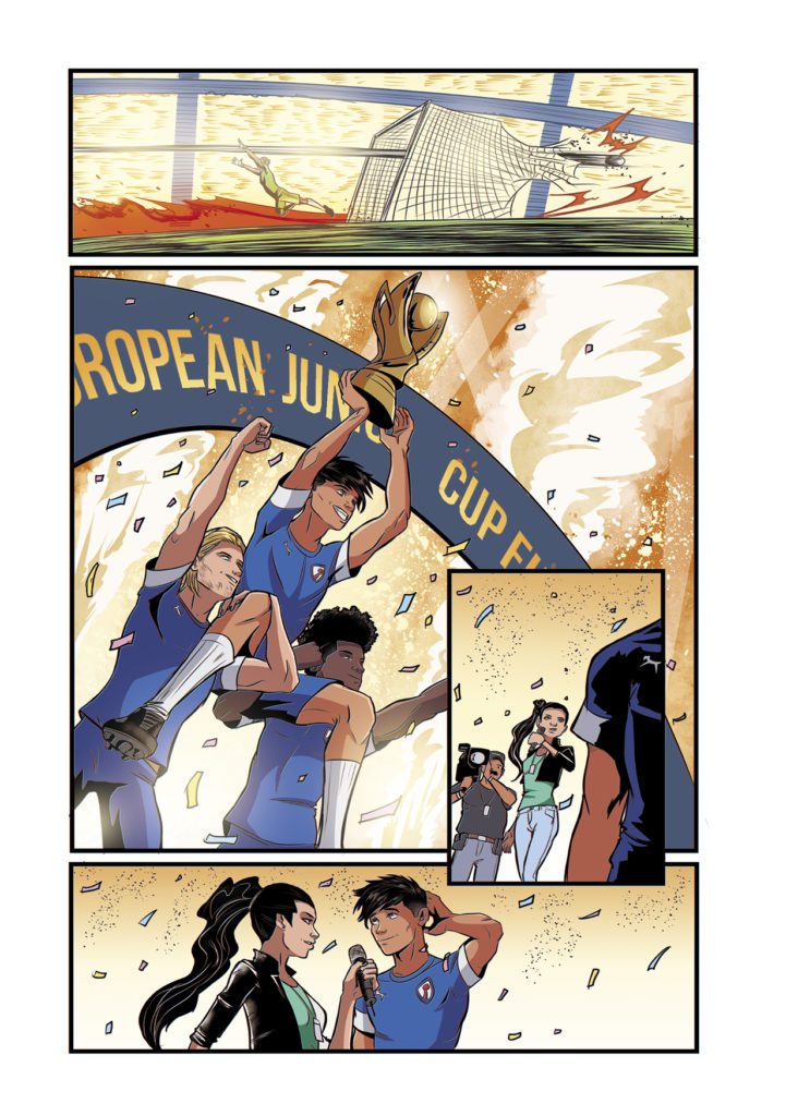
Patrick Mulholland illustrates World Class with energy and visuals that imprint readers with the thrills of watching a real game. In fact, some two-page spreads look like collages of snapshots that evoke a Mulholland comic that caught everyone’s attention. The way he uses panels and angles to accentuate characters’ actions is outright phenomenal. It also helps to have a colorist like Rebecca Nalty to give these panels color coded backgrounds to match the intensity. The background sometimes fades away, putting everything into one dramatic moment.

The lettering by Justin Birch has plenty of energy of its own. Mundane conversations get filled with so much emotion, the word balloons can sometimes barely contain the dialogue. One bit that stands out is how the game announcers have color coded word balloons to represent their teams. Plus, Birch’s use of sound effects make the actions sequences twice as dynamic.

World Class Says It All

World Class has everything readers didn’t know they could want from a sports series. From compelling, rich characters to art that instills excitement through its panel work, this is one title to keep an eye on.

Monkeys Fighting Robots Youtube

Review: THE HARBINGER #3 – Becoming the Hero

Harbinger #3 Cover

The Harbinger #3, from Valiant Entertainment, is a compelling story about stepping up as a hero. The Harbinger #3 came to stores on December 22nd.

Background

Peter Stanchek is back from the dead. He comes to find a Chicago district under threat of mercenary superheroes, The Warning. And the past he doesn’t remember is causing trouble in the form of the Renegade.

The Harbinger #3: A Hero Emerges

The Harbinger #3 Superhero at the ready
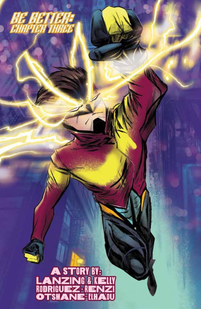
Between writers Collin Kelly and Jackson Lanzing, The Harbinger #3 begins a compelling Hero’s Journey. After getting to know and love the amnesiac Peter Stanchek, readers will enjoy Peter’s rise to the occasion against the Warning. His new identity of Harbinger comes with a powerful feeling of hope- hope for both the Psiots under oppression and Peter’s redemption. Best of all, his interactions with the Renegade are building up to a big self-confrontation. For now, readers can enjoy seeing the character win as more developments brew on the horizon.

Thrilling Art

Best Harbinger art
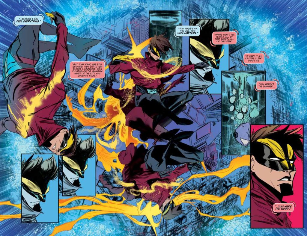
Throughout The Harbinger #3, Robbi Rodriguez decorates the pages with panels and colors to reflect the plot’s dynamic. At first readers get an orderly 9 panel grid that showcases a steady, if uncertain, pace. Every page following that erupts into moments full of energy from splash pages to spreads showing off Harbinger’s psychic powers. The vigorous colors of Rico Renzi along with the shifting angles of perspective are a sight to behold.

Harbinger eavesdrop
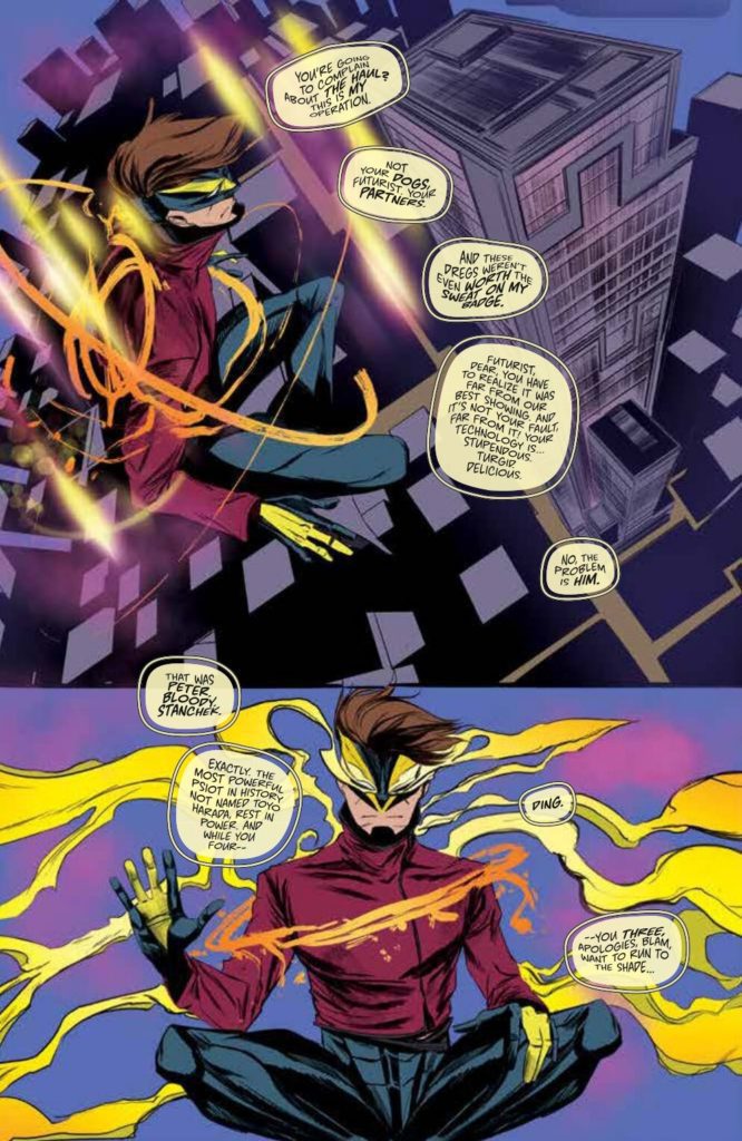
Then there’s Hassan Otsmane-Elhaou’s lettering which shows off some stylistic interactions. Aside from the color coded captions with Harbinger and Renegade’s telepathic interactions, the way Harbinger uses his telepathy to spy on the Warning is eye-catching. The warping text gives readers a feeling of dealing with radio static.

Get Into The Harbinger #3

The Harbinger #3 serves as a high point of the series. With Peter Stanchek triumphantly rising as a hero, readers have more to look forward to. The art, story, and characterizations all meld together to form an unforgettable chapter.

Monkeys Fighting Robots Youtube

Marvel Comics Exclusive Preview: BEN REILLY: SPIDER-MAN #1

marvel comics exclusive preview ben reilly spider-man

BEN REILLY: SPIDER-MAN #1 hits your local comic book store January 19th, but thanks to Marvel Comics, Monkeys Fighting Robots has an exclusive four-page preview for you.

About the issue:
BECAUSE YOU DEMANDED IT! Iconic Spider-Man scribe J.M. DeMatteis (KRAVEN’S LAST HUNT, SPIDER-MAN: THE LOST YEARS) returns to spin his webs once more within the Spidey mythos, this time joined by explosive artist David Baldeón (WEB WARRIORS, DOMINO)! Together, they’re bringing you unlocked memories in the life of BEN REILLY, A.K.A. SPIDER-MAN! Darkness looms over New York City as murders begin to pile up…but how are they all connected? Do the answers Ben is looking for reside in the haunted halls of the RAVENCROFT INSTITUTE? Find out as we return to the era when Ben Reilly was the one, true SPIDER-MAN!

The issue is by writer J.M. DeMatteis and artist David Baldeon, with colors by Israel Silva, and letters by Joe Caramagna. The main cover is by Steve Skroce and Dave Stewart.

As alluded to in the solicit text above, BEN REILLY: SPIDER-MAN will focus on “untold” stories from Reilly’s time as the one-and-only webslinger. The cover even features an old-school trade dress, which is a really nice touch.

Check out the BEN REILLY: SPIDER-MAN #1 preview below:

marvel comics exclusive preview ben reilly spider-man

marvel comics exclusive preview ben reilly spider-man

marvel comics exclusive preview ben reilly spider-man

marvel comics exclusive preview ben reilly spider-man

marvel comics exclusive preview ben reilly spider-man

marvel comics exclusive preview ben reilly spider-man


Are you excited for Ben Reilly’s new solo title? Who is your favorite Spider-Man? Sound off in the comments!

Monkeys Fighting Robots Youtube

Exclusive Preview: 5 WORLDS: THE EMERALD GATE VOL. 5

The fifth and final volume of the critically acclaimed YA graphic novel series 5 Worlds: The Emerald Gate is almost here! The wondrous and creative science-fantasy series comes to a close on January 18th, and we at MFR have the exclusive preview!

Written by Mark and Alexis Seigel, with art from Xanthe Bouma, Boya Sun, and Matt Rockefeller, 5 Worlds is the perfect series for fans of Avatar: The Last Airbender, She-Ra And The Princesses Of Power, and Steven Universe.

In the epic conclusion to the 5 Worlds series, the final battle looms as Oona, Jax, and An Tzu travel to the treacherous world of Grimbo (E)! There, Oona must light the last beacon to save the 5 Worlds, but first she has to find it! When Jax saves an old friend, Oona is given a clue to the green beacon’s location.

Unfortunately, the journey to lighting it on this strange, watery planet is the most dangerous yet. Meanwhile, Stan Moon has one more trick up his sleeve as his frightening powers and mysterious connection to An Tzu continue to grow. How can Oona ever hope to beat him? Can she count on her friends or will a terrible betrayal mean the 5 Worlds will be lost to evil forever?

From Mark Seigel Himself:

In our fifth and final volume of 5 WORLDS, Oona, Jax and An Tzu reach the green world called GRIMBO (E). We’ve been hearing about this world all along, including a legendary restaurant called Mintz.
Unlike the other four worlds, GRIMBO has resisted colonization and exploitation—resistance not just from its people, but from its very ecosystem: an ocean blanketed in a lethal, predatory moss!
Small pockets of settlers get by on the rocky islands that dot Grimbo, and a native plant people called the BEANU are the only ones who seem to travel everywhere else with ease. For the setting of Oona’s climactic confrontation with Stan Moon, Alexis and I envisioned a living world with a seemingly hostile exterior and many deep secrets. Boya, Xanthe, and Matt developed amazing visions of many ecologies above and below water… For the BEANU characters, they went through quite a lot of exploration before locking into these peas-in-a-pod beings—and the astonishing Willow King. There are other beings and some mind-blowing visionary dreamscapes we visit in the series finale—can’t get into that without major spoilers—in which I feel our artists broke new ground for comics. You’ll need to see for yourself!
Be sure to grab 5 Worlds: The Emerald Gate Vol. 5 when it’s released by Random House Children’s Books on 11/18!
Monkeys Fighting Robots Youtube

AfterShock Comics Exclusive Preview: LAND OF THE LIVING GODS #1

aftershock comics exclusive preview land of the living gods

LAND OF THE LIVING GODS #1 hits your local comic book store February 2nd, but thanks to AfterShock Comics, Monkeys Fighting Robots has an exclusive four-page preview for you.

About the issue:
It is said that when the world dies, the spirits of the first people will return to witness the last days of humanity. Well, the spirits have arrived, and the end is here. But not everyone has given up hope.  

Naledi, a teenage girl living in the deserted city once called Johannesburg, has always believed that there is a land, hidden away in time where the gods still live. And where there are gods, there are miracles. Perhaps even miracles that are big enough to save our dying planet. And so, after a lifetime of isolation, Naledi will head out into the unknown with little to hold onto but her faith – and her magical pet plant, Buyo.

The series is by writer Isaac Mogajane and artist Santtos, with letters by Dave Sharpe. The main cover is by Santtos, and the incentive variant is by Andy Clarke and Jose Villarrubia.

LAND OF THE LIVING GODS will introduce you to a world of wonder and cruelty, beauty and perseverance – and will leave you profoundly changed.

Check out the LAND OF THE LIVING GODS #1 preview below:

aftershock comics exclusive preview land of the living gods

aftershock comics exclusive preview land of the living gods

aftershock comics exclusive preview land of the living gods

aftershock comics exclusive preview land of the living gods

aftershock comics exclusive preview land of the living gods


Are you excited for LAND OF THE LIVING GODS? Sound off in the comments!

Monkeys Fighting Robots Youtube

Review: MAZEBOOK #5 – Finally Letting Go

From modern comics icon Jeff Lemire comes the finale of his most recent original outing in Mazebook #5. With lettering from Steve Wands, this final chapter is the devastating, bittersweet ending we all needed. With succinct yet powerful writing and his typical signature visuals at their best, this  chapter marks the end of some of the best work in Jeff Lemire’s library.

“As Will continues his fight across a dangerous metropolitan maze on the hunt to find his long-gone daughter, he comes face-to-face with his own literal monsters as he tries to find her and bring her home.”

Writing & Plot

Jeff Lemire hones in on the lessons needed to overcome grief in Mazebook #5. Will has finally followed the supposed message from Wendy to its inevitable conclusion. Here, he faces down monsters of his own making, and hears what he needs to hear. To say anything else would be a spoiler and disservice to what Lemire has crafted.

This final chapter feels more succinct than prior issues. This is due largely to this comic feels like a giant epiphany. This issue is packed with powerful moments of realization, all intercut by what are probably the two most powerful scenes in the whole series. Lemire creates these beautiful, rending sequences that blend the absolutely real with a dreamlike fantasy. This issue, and this entire series really, is an example of a giant therapeutic lesson on processing loss. The issue’s penultimate scene, where Will hears what he needs to hear, is painfully potent. The feelings and themes Lemire explores in this comic are relatable to pretty much everyone on the planet. As such, it would take an exception creative hand to produce something that doesn’t feel heavy-handed or overwhelming, nor insensitive.

Lemire captures human experience and combines it with the fantastical to create one of the most beautifully brilliant comic stories in recent memory.

Art Direction

There’s not much else to be said about Lemire’s work in Mazebook #5 that I haven’t said in prior reviews for the series. His signature scribbled, rough-hewn pencils continue to surprise with just how full of life and detail they are. Lemire captures powerful, emotionally devastating or triumphant scenes with a keen eye for human expression. These sequences have so much weight because of Lemire’s framing and direction, along with his deceptively sharp characterization prowess. Like in prior issues, he splices in pages with odd, almost novelty panel layouts. He crafts some sequences in panels shaped as pieces of the maze Will is racing through, tracing his journey through this dream-realm. The story never gets difficult to follow though, and its thoughtful design contributes to the book’s atmosphere.

The lettering from Steve Wands matches Lemire’s visuals perfectly. His hand-scrawled font captures a reading experience that relays the comic’s tone to the audience in a manner that continues to add to the atmosphere. This is, as always, a brilliantly put-together comic from the visual end.

Verdict

Mazebook #5 is a bittersweet gut-punch of an ending to this mini-series. Lemire crafts a finale full of revelations and cathartic moments that bring this story to an inevitable, beautiful conclusion. His signature visual style is the perfect vehicle through this story to be experienced through, with the wiry pencils and faint watercolors crafting a wholly unique atmospheric experience. Please be sure to grab this finale when it hits shelves on 1-12!.


Monkeys Fighting Robots Youtube