Home Blog Page 113

Review: GRRL SCOUTS: STONE GHOST #3 — A Cosmo Stained in Ink

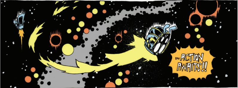
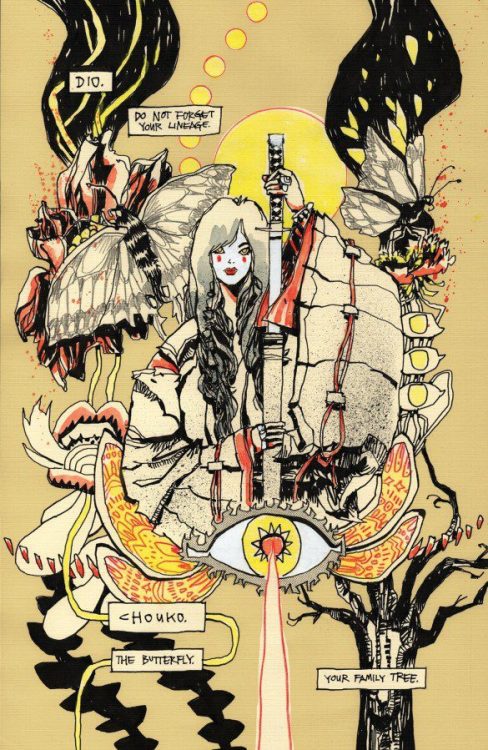
It’s very hard to mistake a Jim Mahfood comic. Much of his comics career has been dedicated to pushing his mixed-media, psychedelic style to further heights of insanity. Grrl Scouts has been with him for most of that career, which is why the series has gone from women smuggling weed to a full-blown space opera. But, when a comic’s this kinetic, and looks this damn good? You just have to get swept away in it. Swim against the current, and you might get hurt.

WRITING

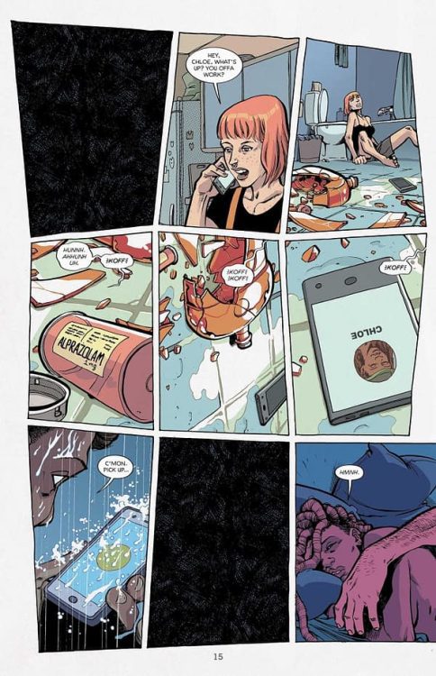
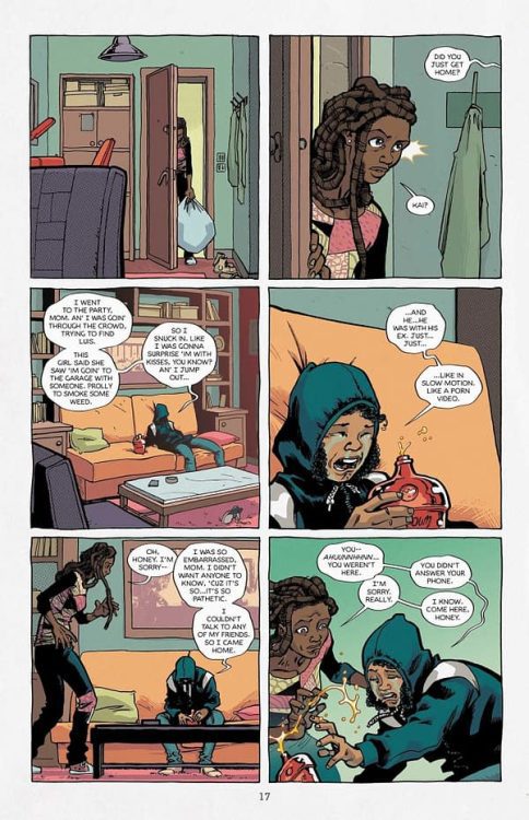
Grrl Scouts: Stone Ghost continues to juggle a bunch of storylines while occasionally hinting at how this story might connect to ones before. The main plotline continues the story of shy newcomer Dio and her offbeat robot companion Natas as they travel the universe to recover the ashes of Dio’s boyfriend. Their search finds them kidnapping a gangster so that they can dream-jump inside his head to find the ultimate location of the ashes, all while Dio attempts to ignore dreams hinting that she might be a descendent of “The Butterfly,” first member and founder of the Grrl Scouts. But meanwhile, Dio’s ghost friend Gordi expresses regret over betraying Dio to a cult worshipping a dark god named “The Teeth,” whose cult leader sends a man with a kettle for a head to hunt down Dio, and… Well, there’s a lot going on. Self-indulgence continues to be the comic’s raison d’etre. The issue opens up with the characters declaring they’ve bought themselves comfortable sweaters off-panel. Why? Well, why not? This is a series, after all, that opened on a spread of band posters and Kevin Smith tapes waaaay back in 1999. Mahfood wants to make something entertaining above all else, and part of how he does that is by throwing all his influences into a blender and setting it to “liquify.”

Part of Mahfood throwing what’s on his mind into his comic, however, is a continuing plotline about the main character, Dio, grieving over her boyfriend’s death from brain cancer. Mahfood has been open about this being inspired by the death of a real-life friend, to the point where the character’s last moments with a George Harrison LP are said to mirror the real article. No one would mistake this for a fully somber comic, but death weighs a lot heavier on its mind than in previous outings. This too, is part of carrying the series through decades. While it may be as free-wheeling and kinetic as ever, this is no longer a comic by someone in their twenties.

ART

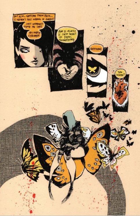
It’s hard to know where to start here. Just take a look at the example pages. Mahfood is a born stylist, and knows just how important presentation can be. What’s new for this comic, however, is that he’s coloring it himself. He goes with a more limited palette, dominated by primary reds, blues, and yellows. Flashbacks to Dio’s boyfriend are presented as scribbles on yellow notepad paper. It’s a book that’s willing to play with layouts, colors, character design… If there’s one thing that’s immediately obvious in this book, it’s that Jim Mahfood had fun drawing it. And that’s one of the biggest reasons this book is worth picking up. It’s a jam session.

VERDICT

Grrl Scouts: Stone Ghost continues the series tradition of each installment somehow looking better than the last, and opens up the series into a wild sci-fi world. Now, more than ever, it’s a vessel for Mahfood to do whatever the hell he wants. I wouldn’t have it any other way.

Monkeys Fighting Robots Youtube

Review: Pub Crawls and Pratfalls in HELLBOY: THE SILVER LANTERN CLUB #4

Hellboy has always, at heart, been a bit of a goof. For as skilled as Mike Mignola is at drawing shadows and quiet moments of contemplation, he’ll just as happily have Hellboy fall over himself, or maybe end up in a pink bathrobe. Which is why it’s nice to see one of the many Mignolaverse titles lean into comedy. For as much awe as the books can treat their own lore with, it’s fun to see Silver Lantern Club treat the supernatural the same way Hellboy himself does: cryptic, commonplace, and very annoying.

WRITING

The Mignolaverse’s backbone is built on simple folktales, and Mignola and Chris Roberson have been writing Hellboy stories for quite awhile. “Simple and breezy” is the name of the game here. Framed as a tale being told to Hellboy by former paranormal investigator Simon Bruttenholm, it recounts a time that Simon and fellow investigator Edward Grey were roped into a werewolf hunt. Edward’s friend and immortal werewolf hunter Yad Tovich drags them from pub to pub, insisting that there’s no time to spare in their supernatural hunt — except for one more drink, of course. But Simon and Edward quickly come to realize that the hunter Yad may be a bit more calculating than he lets on. The plot, then, is an opportunity for the characters to bounce off one another as they wander London’s bars at night. The supernatural itself even takes a backseat to the bar-hopping, much of it coming from half-remembered adventures the characters drunkenly explain to one another.

Yad Tovich has shown up in a previous Hellboy story as a more tragic character. But here he sets the tone for the issue, cast as a drink-loving, spirited old man, unreluctant to lead others into trouble. Werewolves have never fit into the Hellboy universe’s aesthetic of crumbling castles and Victorian fashion quite as well as vampires, but they certainly belong with Yad’s rugged, outdoorsman attitude. I have a feeling we’ll be seeing more of him.

ART

Ben Steinbeck and Christopher Mitten share art duties here, with Steinbeck drawing the modern day framing scenes, and Mitten working on the meat of the story. Mitten’s scratchy lines and exaggerated character acting both compliment the story’s chaos. Mitten is obviously having a lot of fun drawing drunk characters, as he makes them sway and stumble and grip streetlamps for support. Meanwhile, Steinbeck’s art, while still cartoony, feels more weighty and grounded. It works as a contrast to Mitten’s more impressionistic style, making the scenes where Simon talks to Hellboy feel more fixed in the present.

Befitting a story less focused on the supernatural, Michelle Madsen’s colors ground the story in earthy browns and greens. The werewolves of the issue fit right into this natural environment, the only supernatural tell being their small, bright-green eyes. It all makes for a believably dingy vision of Victorian London for the protagonists to stumble through.

As for letterer Clem Robins, he’s been working on Hellboy books for quite a while, and maintains his pleasant, handwritten look. It’s a style seen through most Mignolaverse titles, and helps keep all the books with different art styles and tones feel consistent with one another.

VERDICT

Hellboy: The Silver Lantern Club is a series that trades the Mignolaverse’s ghost stories for bar tales. Which means getting to see a more grounded, rowdy side of the universe. It’s a fun change of pace, and makes for a nice, comfortable read. After so many years, it’s nice to see these characters can still hold their liquor.

Monkeys Fighting Robots Youtube

Review: Connecting Dots in DARK KNIGHTS OF STEEL #4

Dark Knights of Steel

DC Comics’ Dark Knights of Steel #4 answers plenty of questions. Writer Tom Taylor, artist Bengal, colorist Arif Prianto, and letterer Wes Abbott give us a history lesson about this alternate version of the DC Universe. While this issue has plenty of action and drama, it’s the quiet, intimate moments that shine.

Writing

Taylor’s script fills in many of Dark Knights of Steel‘s blanks. But, in some cases, the mystery was more interesting than Taylor’s answers. Taylor takes us through the lives of the Els. With exploding volcanoes, twisted villains, and devastating heartbreak, there’s plenty to talk about in these pages. It often feels that it’s the flashiest moments, however, that fall flat. They blend into the usual chaos of comic book madness. Instead, it’s the details of the friendship between the Waynes and the Els that feel like a breath of fresh air. Taylor takes typical family drama tropes and turns them on their head in heartwarming ways. So while this issue’s action felt run of the mill, their were still stunning moments to witness, like pauses between crashing waves.

Dark Knights of Steel

Art

Bengal similarly struggles with this script. His art is stunning, but it’s jam-packed with emotional sequences. These moments feel melodramatic in a way that robs the story of stakes. When King Jefferson’s eyes crackle with power at the sound of bad news, it feels like too much. And when Jor-El screams at someone for looking to the stars for insight, the outburst is sudden and less terrifying than a calm delivery of the same line. But then, the same moments that work well in the writing work brilliantly in the art as well. When characters hide their faces, or turn away from the reader, it speaks to us more than any expression could. And when the characters are full of a simple happiness, a slight smile on their faces, you can’t help but smile along with them.

Coloring

There’s a wonderful thing that Prianto does with the color scheme of Dark Knights of Steel #4. It quickly becomes clear that certain colors mean specific things. Red is often associated with the power of the Els. Even the red glow of a volcano quickly provides an opportunity for the Els to show their might. Conversely, green is the color of encroaching evil. It’s the color of Kryptonite and death. Right after we see a character undergo a green tinted metamorphosis, we come back to a peaceful scene of celebration. But in the background, there’s a green tarp that’s held up by sticks. It feels as though Prianto is hinting that the danger hasn’t passed, it’s still hiding in the shadows. And with that, even joyful moments in garden paradises can become omens of oncoming doom.

Lettering

Abbott’s approach to lettering in Dark Knights of Steel #4 manages to be both straightforward and fun. His sound effects mimic what’s happening in the scene. The sound of a fist breaking a rock into bits looks cracked and like it’s splitting into pieces. The noise of heat vision piercing the air is written in a font that looks like it’s made up of lasers. The quiet snapping of wood is shown in small, jagged lettering. Abbott blends his letters into the story, but if you stop to notice them you see how they’re full of a playful flair.


DC Comics’ Dark Knights of Steel #4 is full of punchy action that ultimately feels quite forgettable. But in the margins of these scenes, in the respites from the chaos and drama, there are beautiful moments that will stick with you. Pick up Dark Knights of Steel #4, out from DC Comics February 1st, at a comic shop near you.

Monkeys Fighting Robots Youtube

Review: A Blast Of Chinese Mythology In MONKEY PRINCE #1

From writer Gene Luen Yang (Dragon Hoops, Superman Smashes The Klan) and artist Bernard Chang comes an ancient legend arriving in the DC universe with Monkey Prince #1. Featuring colors by Sebastian Cheng and letters from Janice Chiang, this opening issue is a gorgeous, wildly fun, and inventive take on one of the oldest stories in literature. While it does feel a tad rushed and throws a lot at the reader very quickly, this first chapter in an exciting ride I’m looking forward to seeing more of.

“Introducing the newest hero in the DCU, the great sage, equal to the heavens, better than his predecessor the legendary Monkey King, even better than the Justice League—and definitely the Teen Titans—(actually, all the heroes combined), everyone put your hands together for…the Monkey Prince! Marcus Sun moves around a lot because his adoptive parents are freelance henchpeople, so this month he finds himself as the new kid at Gotham City High School, where a mysterious man with pig features asks Marcus to walk through a water curtain to reveal himself as who Marcus really is…someone who has adventured through The Journey to the West, can transform into 72 different formations, can clone himself using his hairs, and is called…the Monkey Prince!”

Writing & Plot

Gene Luen Yang‘s script for Monkey Prince #1 is full of an infectious enthusiasm that’s hard not to love. There’s an almost Saturday morning cartoon type of energy to this comic, and I found myself smiling through much of the reading experience. We meet Marcus Sun as a high schooler traumatized by his first-hand experience with an angry superhero (due to the fact that his parents are for-hire goons). Rather suddenly, we then get dipped into the mythical and magical hijinks of him becoming the Monkey Prince, heir to the power of the Monkey King. Yes, that Monkey King. I won’t get into any more details at risk of spoilers, but if you’ve ever read or are familiar with Journey To The West (or ever watched Dragonball), then this issue will doubtless be a treat.

Yang’s utilization of the classic mythical property is inspired, and it never gets in the way of the main plot. There’s almost no exposition, so the pacing stays lightning-fast and new developments come very quickly. This method fits the tone comic very well, but it can cause a bit of whiplash. Quite a lot gets thrown at the reader very quickly, so it can sometimes take a moment to gather what exactly is happening. This issue is saved by just how much of a joy this comic is to read. The character reveals are surprising and emotionally satisfying (whether that emotion be fear or delight), and the plot is an absolute joy to behold. This is the most outright fun I’ve had with a DC comic in recent memory.

Art Direction

The amount of exuberant energy the script for Monkey Prince #1 requires would need an especially talented artist to pull it off. Fortunately, Bernard Chang is on hand to deliver. His immensely detailed pencils and tight direction create a reading experience that is wickedly exciting to follow, and easy for a reader to fall into. Chang’s designs for characters new and old are intricately designed and animated. The classics are easy to recognize, and the new ones are sure to stay in your mind. Every character has unique features and is easy to recognize instantaneously. The design for the Monkey Prince himself is outwardly simple, yet obvious that Chang put a ton of work into. The character’s costume design is a perfect blend of mythical royalty and a modern superhero. Chang puts a ton of effort into placing these mythical beings and settings into the DC universe and making it feel seamless.

As phenomenal as Bernard Chang’s work is, it wouldn’t be nearly as effective as it is without Sebastian Cheng’s colors. His vivid, hi-fidelity palette pulls the reader into this read with a style that matches the energy of the pencils and script. Every panel leaps off of the page thanks to Cheng’s work here. The lettering from Janice Chiang is sharp and well-designed, with expressive fonts and effective SFX lettering that makes itself known but still stays out of the way. This is a stunning comic book from front to back, with an absolutely killer visual team.

Verdict

Monkey Prince #1 is an immensely fun new take on an old mythology that blends seamlessly into the DC universe. Gene Luen Yang’s script, while a bit rushed-feeling, creatively introduces a cast of iconic characters and stories into another universe of storied characters and does it with a blast of narrative energy. The visuals from Bernard Chang and Sebastian Cheng are stunning and brilliantly directed, making this one of the most fun and gorgeous DC comics in recent memory. Be sure to grab this debut issue when it hits shelves on 2-1!

Monkeys Fighting Robots Youtube

Exclusive Preview: Jarod Roselló’s RED PANDA & MOON BEAR (BOOK TWO)

Red Panda & Moon Bear (Book Two): The Curse of the Evil Eye

Red Panda & Moon Bear (Book Two): The Curse of the Evil Eye hits your local book store on April 12, but thanks to Top Shelf Productions, Monkeys Fighting Robots has an exclusive preview for our readers.

About the book:
Super siblings save the world! In their second amazing graphic novel, these Cuban American kids are getting even better at using their powers to protect the community… but has their luck just run out? How do you stop a curse?!

When an evil curse descends upon the city of Martí, it’s up to Red Panda and Moon Bear to put a stop to it… but it won’t be easy! First, they’ll have to solve weird mysteries, fend off new monsters, and uncover the secret history of their neighborhood. With their trusty dog companions and some magical new friends by their side, Red Panda and Moon Bear must find a way to defeat Mal de Ojo — The Evil Eye — and keep it from ruining the lives of everyone they love! — a 216-page, full-color softcover graphic novel with 3” French flaps, 6” x 9”

Check out the preview below.

Red Panda & Moon Bear (Book Two): The Curse of the Evil Eye

Red Panda & Moon Bear (Book Two): The Curse of the Evil Eye

Red Panda & Moon Bear (Book Two): The Curse of the Evil Eye

Red Panda & Moon Bear (Book Two): The Curse of the Evil Eye

Red Panda & Moon Bear (Book Two): The Curse of the Evil Eye

Red Panda & Moon Bear (Book Two): The Curse of the Evil Eye


ABOUT JAROD ROSELLÓ:

Jarod Roselló is a Cuban American cartoonist, writer, and educational researcher from Miami, Florida. His debut graphic novel, The Well-Dressed Bear Will (Never) Be Found, was published in 2015 by Publishing Genius Press. His chapbook, The Star, was the winner of the 2015 Epiphany Literary Magazine Chapbook Contest. His short fiction and comics have been published in The Rumpus, Hobart, Hayden’s Ferry Review, Sonora Review, and The Collagist, among other places. His childhood and educational research has been published in Bank Street Occasional Papers, International Review of Qualitative Research, and Contemporary Issues in Early Childhood. He teaches comics and fiction in the creative writing program at the University of South Florida.


Monkeys Fighting Robots Youtube

Review: True Villainy in ONE-STAR SQUADRON #3

One-Star Squadron

One-Star Squadron is unlike any of DC Comics’ other projects. It has no villainous monologues or doomsday devices. Instead, One-Star Squadron is full of the real life weapons of our own destruction. Writer Mark Russell, artist Steve Lieber, colorist Dave Stewart, and letterer Dave Sharpe fill One-Star Squadron #3 with true villains: the puppeteers of capitalism.

Writing

I’ve read about Superman facing down Doomsday. He’s fought 5th dimensional imps and global terrorists. This is the first time I’ve seen Superman face a smarmy board of directors. And Russell immediately shows us how this fight for Superman isn’t as simple as all the others. The board of directors are polite, even jovial. Worst of all, they’re not threatened one bit. Russell shows us that these are dangerous people. The type of people that see nothing wrong with what they’re doing. They just smile and get their way. In making the villains of One-Star Squadron #3 your average corporate shark, Russell underlines the hopelessness in today’s zeitgeist. If these guys are so self-deceived they’d happily stare down the Man of Steel, what are we supposed to do?

One-Star Squadron

Art

So much of the casual feeling of our villains comes from Lieber’s art. He almost convinces you to like this board of directors. They’re charismatic and charming. Hell, they’re some of the only people to smile in these pages. But that’s also what makes them sinister. Lieber, in creating an entirely different mood, in the confines of the boardroom, shows how disconnected this board is from the grief their decisions bring about. They don’t want to know. They’re blissfully unaware. Every other character, under Lieber’s pen, is haggard and depressed. Red Tornado agonizes over how to keep his staff afloat, while they sneer at him with contempt. In previous issues, the melodrama of a character’s body language was often used comedically. But now, Lieber has seamlessly moved into the realm of heartbreak. The deeply expressive faces of these characters, juxtaposed against the toothy grins of the corporate elite, will make you want to cry.

Coloring

There’s a similar disconnect in Stewart’s coloring. The bright colors of superhero costumes, often symbols of hope, hang around the frames of disillusioned has-beens. And while these characters are shown in vibrant uniforms, their surroundings are grey and dull. Their costumes are an extension of the brave face they’re trying to put on. Meanwhile, the board of directors in their black turtlenecks, grey suits, and faded blue hoodies are brimming with joy. They have learned to blend in with their surroundings. They’ve figured out how the world works, and how to make it bend to their will.

One-Star Squadron

Lettering

Sharpe uses the spacing between word balloons to convey hesitation or confidence. When we open on the board of directors, Sharpe immediately shows us what a confident group of people this is. Their dialogue seems rehearsed, perfectly scripted. Their word balloons bump up against each other. There’s no air between each thing they’re saying, they’re ready to jump into the conversation the moment their colleague is finished with their “line.” They then ask Superman a rhetorical question. “It would be naïve to expect the world to work differently for heroes, wouldn’t it?” There’s a big gap between that line and Superman’s response: “Maybe.” Sharpe pulls you into every scene. The visual rhythm he creates tells us everything we need to know about the power dynamics at play.


DC Comics’ One-Star Squadron seamlessly moves from the hilarious to the flat-out sad. Russell, Lieber, Stewart, and Sharpe are creating an indictment of our throwaway culture. They lure us in with plenty of laughs, before giving us a poignant punch to the gut. I, for one, can’t wait to see where it takes us next. Pick up the stunning One-Star Squadron #3, out from DC Comics February 1st, at a comic shop near you!

Monkeys Fighting Robots Youtube

BELFAST Is A Lovely Nostalgic Look To A Troubled Time

BELFAST

Kenneth Branagh is a director known for making a wide range of films. He has made numerous Shakespeare adaptions, Disney films, an MCU offering, etc. However, Belfast is his most personal film because it is a semi-autobiographical story.

Buddy (Jude Hill) is a young Protestant boy growing up in a working-class neighborhood of Belfast just as The Troubles flare up. The Catholic residents get hounded out of the neighborhood by the more militant Protestant community members. As the sectarian tensions grow, Buddy also sees problems with his parent’s marriage and their finances, issues involving his grandparents, and falling for a girl in his class.

Nostalgia has dominated the cultural landscape in recent years. It has been popular and profitable. Branagh set out to reclaim the true meaning of nostalgia by making a sincere reflection about his childhood.

Belfast was told from a child’s point of view. Buddy overheard conversations about his parents’ financial issues, his grandfather (Ciarán Hinds) having health issues, and Buddy’s dad (Jamie Dorman) getting pressured by Billy (Colin Morgan) to join the cause. Due to Buddy’s age, he only had an inkling about what was happening, and the adults tried to protect the boy from the worst aspects of these issues.

Buddy’s age made him innocent, and he wasn’t judgemental towards Catholics. He spoke like a child regarding Catholic practices: he did not speak out of a place of prejudice or hatred. When Moira (Lara McDonnell) told Buddy how to tell if someone’s a Catholic, Buddy picked holes in her logic.

Buddy was fortunate that his family didn’t have any prejudice towards Catholics, so he didn’t inherit any negative views. The film pointed out that the neighborhood was mixed before the militants hounded the Catholics out. Protestants and Catholics were friends and neighbors, and the children played together before Billy led the mob against the Catholics. Belfast had a great opening where it showed Buddy’s neighborhood was a close-knit community. The children were playing games, their mothers called them in when dinner was ready, and older children helped the adults round up the kids. This wholesome vision quickly turned to panic and terror when the mob attacked the street.

Belfast showed the early events of The Troubles. Communities were purged of Protestants and Catholics, makeshift walls were constructed, and the British army was sent to try and maintain the peace. The economy of Northern Ireland suffered because of the issues. Buddy’s dad had to work in England and could only visit his family once a fortnight. The violence and the economy were factors to Buddy’s parents debating on whether they should leave Belfast, the only place Buddy’s ma has ever known.

Belfast did feel a little like the sitcom Derry GirlsDerry Girls followed a group of teenage girls (and the wee English fella) in 1990s Derry. Both were about growing up in The Troubles, and both took the wisest approach: show people trying to live their lives. In Belfast, characters go to work school and spend time with their family. In Buddy’s case, he gets up to misadventures like trying to sit next to a girl he liked in school or getting roped in by Moira to steal from the local shop. It was all relatable. The film’s villain used The Troubles for his own financial gain than any conviction.

Branagh did sneak some references to his own body of work and showed his influences. Buddy was reading a comic book, and at Christmas, there was a book written by an author Branagh had adapted. The film showed Buddy having a love for cinema and TV; an experience Branagh must have had as a child. However, a scene where the family watch Chitty Chitty Bang Bang looked more like a commercial than how a family would watch a film.

Belfast did have an excellent cast. Hill was a strong child performer and did have some sweet interactions with Catherine (Olive Tennant). But Hill’s Buddy was a passive character since he was a child; he was just a spectator to events. Balfe and Dornan were terrific as the parents. Balfe was the mix of loving and stern that a mother would be and having to do with the financial, personal, and social strains put upon her. Dornan showed he could play an everyman character who has to be the breadwinner, be a good father despite being away in England, and protect his family from the poisoning effects of The Trouble. Despite their marital issues, Dornan and Balfe did play a believable and caring couple.

Belfast was at times a meandering experience because it straddled numerous plotlines, yet it managed to be a wonderful film that showed one family’s experience amidst The Troubles.

Monkeys Fighting Robots Youtube

Review: X-MEN #7 — An X-Man Falls So That Others Can Live

Gerry Duggan’s X-Men run is seven issues in, and so far we have seen several characters get spotlight issues. In this weeks X-Men #7, it’s Cyclops’ turn as we see how he transforms into the newest mutant on the block, Captain Krakoa. Duggan is joined by Pepe Larraz on pencils, Marte Gracia on colors and Clayton Cowles on letters.

WRITING

Gerry Duggan has had the tough task of following Jonathan Hickman’s monumental X-Men run, but this issue feels like Duggan is coming into his own as the writer of the series. Duggan continues to build up his villain Dr. Stasis, and in this issue we get to see more of the character than in any other issue so far. We see that Stasis has his own genetic mutants and uses them to do his bidding. On top of that, Duggan effectively provides a number of sweet moments between characters. Whether it’s Emma consoling Scott after a resurrection, or Wolverine crying for a fellow teammate, Duggan packs this issue with emotion. X-Men #7 allows us to see what a true hero looks like, and Cyclops personifies that role. Cyclops commands the team with ease, utilizes the younger members in new ways (like he does with Synch by combining their powers), and makes many tough decisions as well risk his life to save civilians. Not all heroes wear capes; some wear ruby quartz visors.

ART

Pepe Larraz is a phenomenal artist who has never let fans down with his line work. On certain pages in this issue, like a full page of Cyclops unleashing his full optic blast on Dr. Stasis’ creatures, we get to see just how good of an artist Larraz really is. Emotion plays a big part in this issue, as mentioned. Larraz has an ability to give us gut-wrenching panels that make us feel a certain way. As Wolverine lies over the body of a fallen comrade, Larraz shows one of the most emotionally sound X-Men breaking down, and this gets to you as you look at the panel.

The colors by Marte Gracia go hand in hand with Larraz’s pencils. This is a Cyclops issue, so expect a lot of red as he unleashes optic blasts on his enemies. Gracia’s colors flow into the issue so effortlessly and seem to pair perfectly with what Larraz lays down on the page. The creatures Dr. Stasis unleashes on the population are colored perfectly, at times covered in shadows with a slight amount of light hitting off of them. This is a perfectly shaded issue that is illuminated by the bright reds and oranges as mutants use their powers to save the city.

The letters by Clayton Cowles work well here for readers. The thing that stands out most for me is the disgusting sounds Dr. Stasis’ creatures make. In your head you can hear a distorted “Roar” or “Hisssss” as these gross mutations storm the city and wreak havoc on the residents. The highlight of the lettering is a nice big “Zark” as Cyclops blasts several mutant creatures with an amazing bank shot.

CONCLUSION

X-Men #7 is the best issue of the run so far. This creative team overloads us with action, emotion, and intrigue as we start moving toward a new dawn for Cyclops and his team. X- Men #7 is on sale now at your local comic shop.

Monkeys Fighting Robots Youtube

Exclusive Preview: James Kochalka’s GLORK PATROL (Book Two)

Exclusive Preview: Glork Patrol (Book Two): Glork Patrol Takes a Bath

Glork Patrol (Book Two): Glork Patrol Takes a Bath from James Kochalka hits your local book store on March 9, but thanks to Top Shelf Productions, Monkeys Fighting Robots has an exclusive preview for our readers.

About the book:
Guess who’s back for even more wacky outer-space adventure? The Glorkian Warrior and his crew! It’s a sticky, soapy, messy delight from the award-winning creator of Johnny Boo and Dragon Puncher!

What a mess! It all started when Glorkian SuperGrandma told the Glork Patrol they could eat candy for breakfast… now their “Dada,” the Glorkian Warrior, has a lot of cleaning up to do. Super Backpack gets a robot super-suit made of candy wrappers and takes Baby Gonk on the adventure of a lifetime, while Glorkian Warrior stays behind and tries to help the uncontrollable Baby Quackaboodle take a bath.

Families come in all kinds… even in outer space. This kooky, colorful adventure will feel hilariously relatable and have kids giggling through story time and bath time alike!

Check out the preview below.

Exclusive Preview: Glork Patrol (Book Two): Glork Patrol Takes a Bath

Exclusive Preview: Glork Patrol (Book Two): Glork Patrol Takes a Bath

Exclusive Preview: Glork Patrol (Book Two): Glork Patrol Takes a Bath

Exclusive Preview: Glork Patrol (Book Two): Glork Patrol Takes a Bath

Exclusive Preview: Glork Patrol (Book Two): Glork Patrol Takes a Bath

Exclusive Preview: Glork Patrol (Book Two): Glork Patrol Takes a Bath

Exclusive Preview: Glork Patrol (Book Two): Glork Patrol Takes a Bath


ABOUT JAMES KOCHALKA

James Kochalka is, without question, one of the most unique and prolific alternative cartoonists working in America today. His comics have been published internationally by almost every alternative comics publisher; he’s recorded several music albums under the name James Kochalka Superstar (making him a favorite at college radio stations across the country), and he’s developed animated cartoons for Nickelodeon and Cartoon Hangover. He is the first official Cartoonist Laureate of the state of Vermont, appointed in 2011. Among his best-known works are the Monkey vs Robot series, the superpowered frathouse comedy SuperF*ckers, the beloved Johnny Boo and Dragon Puncher series for children, and his magnum opus, the decade-plus span of daily diary comics known as American Elf. James lives in Burlington, Vermont with his wife Amy, their two sons, and their cats, all of whom appear frequently in his comics.


Monkeys Fighting Robots Youtube

Review: CHRONOPHAGE, A Family Drama Wrapped in Sci-fi/Horror

Chronophage
Chronophage Cover Credit: Humanoids

It’s difficult to pin a label on Chronophage. Is it a horror? Is it Science Fiction? Is it a drama? The answers are not straight forward, like the book itself, however the only thing you really need to know is that it is good.

Let’s give that the emphasis it deserves, so you know that we mean it: It’s VERY good!

This new graphic novel is written by Tim Seeley, drawn by Ilias Kyriazis, lettered by Crank!, and is published by Humanoids. It’s release date is the 15th of February, and it has 130+ mind bending pages of exquisite storytelling.

The plot revolves around a single mum, Chloe, and her relationships with her daughter, Kai, and a travelling businessman named Heath. At first the family drama unfolds with a hint of supernatural terror but before long the twists and turns of the characters lives spiral out of control as the genre bending narrative not only plays with the lives of it’s cast but also with the very medium itself.

Chronophage Page Art Credit: Humanoids

Unwinding Stories

Tim Seeley’s script is tight and naturalistic. The characters are comfortable within their bodies and their speech reflects this. Their changing tones and inflections match the people we are introduced to. As a reader, you are instantly drawn into their lives and the mystery unravelling in the plot is secondary to the characters, to begin with. By opening the book with a character-driven, relationship-heavy, examination of life, Seeley creates a safe springboard for the readers which eases you into the world of Chronophage while not giving any hint as to where the story is going.

In fact, one of the triumphs of the book is that at no point will you guess where the story will lead. The family drama gives way to an urban ghost story before travelling along a number of different genre lines ending in a superb ‘where-will-it-go’ finale that is satisfyingly upsetting. All of these twists and turns could so easily have led up a blind alley or two but Seeley keeps a tight control over the narrative and allows the strong characters to lead the readers into one of the craziest but most satisfying narratives released in the last few years.

Chronophage Page Art Credit: Humanoids

Removing the Fourth Wall

From the design and layout of the opening nine panel grid you know that you are in for an artistic treat. Ilias Kyriazis’s hand is so obvious on the page. The wobbly panel borders and loose, sketchy inks, demonstrate a personal – almost intimate – touch and is present from the very start. This style draws the reader into the comic and the narrative, making Seeley’s characters more empathetic and emotional. You can’t help but have feelings for Chloe and her daughter, and even her brash mother and dodgy new boyfriend.

The everyday feel of the characters and settings in the opening salvo of the narrative grounds the story and allows the readers to identify with the characters. This makes the occasional emotive panel leap from the page as they appear alien among the recognizable other. Emotional outbursts are rendered with an overlay of red across the entire panel thus soaking the moment with anger and rage, a contrast to the more natural panels that lead up to and follow such moments. However, these moments become more significant as the comic unfolds and the true nature of Seeley and Kyriazis’ story is exposed. Without wanting to spoil anything, as that would be an absolute crime for a book of this nature, the way that Kyriazis uses the plot to examine the nature of comic book storytelling is simply brilliant. There are moments where the artwork doesn’t so much break the fourth wall but simply refuses its existence. Cheeky blink and you’ll miss them moments, such as the use of a ‘censored’ black rectangle grabbed by a character to cover up his genitalia, are subtly woven into the panels, preparing the reader for the larger, in-your-face moments where the comic’s Reality is questioned.

You can follow this book through simply to engage with the clever and moving narrative, but it does raise more interesting and exciting questions about the nature of the format itself. The use of the panel becomes more than just a way of containing each image and is transformed by Kyriazis into a portal through which stories and characters can move and interact, outside of the usual principles of narrative. The possibilities of Comics as a medium is examined within the confines of a science fiction horror story in much the same way that the BBC television show Staged challenged the format of modern TV sit-coms.

As the pages build a complex narrative and critical subtext, control over the flow of the story falls onto the lettering, here handled brilliantly by Crank! There is as much going on with the text and the sound effects as there is in the rest of the book. Difficult to navigate conversations have been laid out in simple yet effective patterns, allowing the reader to navigate the often unusual flow. Certain elements of the speech have unique qualities that are required to be both confusing but readable, not an average ask in mainstream comics. However, in Chronophage, challenging conceptions of story and the comics format appear to be the name of the game. Luckily, Crank! excels and appears to enjoy pushing the possibilities of his craft.

Chronophage Page Art Credit: Humanoids

Conclusion

Despite the title of this book, Chronophage, sounding like the name of a 1980’s European time wizard, there is amazing work between the covers that will entertain you but also make you think about what you are reading. There are twists and turns a plenty but a strong character-driven undertone makes the most outlandish parts of the book totally acceptable.

I would recommend approaching this book with no prior knowledge of what it is about. The promotional material, in my opinion, gives too much away. It is far better to be in the dark and learn, with Chloe, what is happening in her world.

And there is a lot happening. There are moments of disturbing horror, grotesque sci-fi, and experimentation with the Comics form itself. This book has it all and that makes it difficult to pin down, except of course, for these important words: This book is VERY good!

Monkeys Fighting Robots Youtube