A lot of Hellboy one-shots don’t need much context. They’re a big red guy tromping through classic ghost tales or folklore. But for this comic? There’s a year in the title. Which sets it in a fairly specific point in Hellboy’s life, building on subplots Hellboy and the B.P.R.D. comics have had running for years. All built around a mystery that calls back to a one-page backup from an over decade-old comic. Newer readers can still have fun, but this one goes out to all the lore-heads.
WRITING
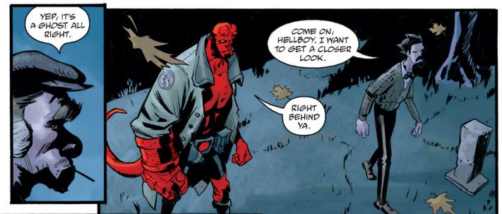
Mike Mignola and Chris Roberson keep their team-up going strong, focusing here on a fairly classic team for the comic itself – Hellboy and his surrogate father, Trevor Bruttenholm. The comic begins when Hellboy visits Bruttenholm at his Brooklyn office, hoping to reconnect in the face of Bruttenholm’s frequent absence from headquarters. Bruttenholm suggests they investigate a local haunting he’s been following as a hobby. And so, the two investigate the mystery at a leisurely pace, hoping to find the identity of a ghost haunting a mass pauper’s grave.
Each installment in the 1957 series of one-shots has focused on Hellboy’s relationship with a different member of the B.P.R.D., but the Hellboy/Trevor dynamic is both the comic’s longest running and most emotionally charged. Though the overwhelming feeling here is one of distance – both Hellboy and Trevor are dealing with recent loss they feel they can’t tell the other about. That the story’s core mystery concerns the forgotten dead weighs on both of them, coming through in moments of silence and frustrated aimlessness. But as the mystery continues, Hellboy starts to show more of his wonder and enthusiasm for his childhood heroes, while Bruttenholm remains a jaded adult.
It’s also worth mentioning that the story reveals Hellboy was present for what was previously a throwaway joke in a one-page backup story. It is in service of what’s ultimately a sweet story about wondering how we’ll be remembered when we’re gone, though one has to wonder if it was necessary to insert Hellboy into yet another minor part of the universe’s history. It makes the world feel smaller. Of course, this is the fate of many long-running universes – most readers are connected to the characters above all else. Background details can be about unnamed strangers, but stories are going to be about characters readers like. So tell a story about a previous background detail, and a beloved character will probably get involved. Tell enough, and the universe will start to shrink.
ART
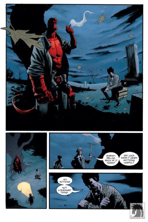
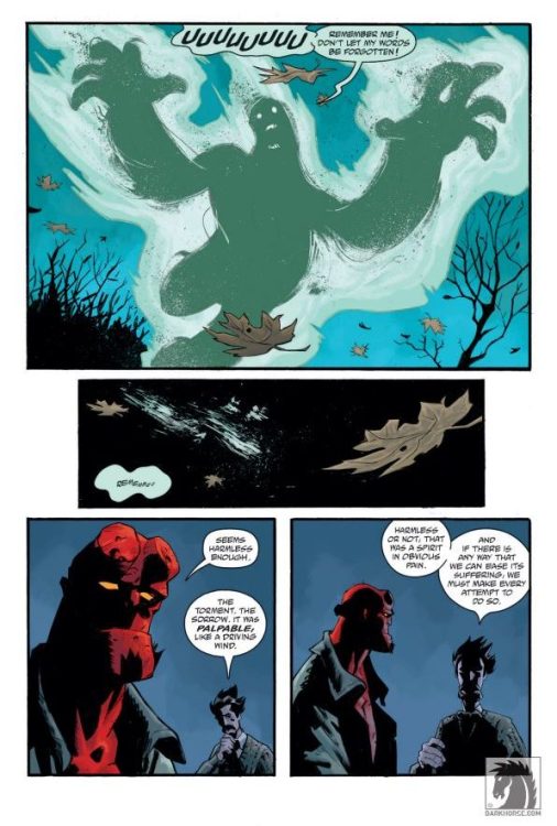
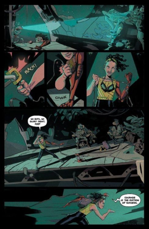
Stephen Green is on art duties, and pulls off the unenviable task of making an issue of mostly dialogue visually interesting. He always manages to make the characters feel lively, whether its young Hellboy reading a comic, jaw agape, or an auctioneer quietly adjusting his glasses. He draws a rugged, scarred Hellboy with wild sideburns. It’s a fun take, and works well for a Hellboy who’s been around the block but isn’t quite as world-weary as he will eventually become. He also does a good job when it comes time to draw the supernatural, as his ghost is a sketchy silhouette, smeared and speckled like it was made of ink.
As for Dave Stewart’s colors and Clem Robins’ lettering, both are Mignolaverse regulars who maintain their high standards. In the page above, you can see how the sky briefly turns electric blue to compliment the unearthly green of the ghost, the letters trailing away as it fades into darkness. Both creators have been integral to keeping the feel of the Mignolaverse titles, which is incredibly important for a universe that puts mood front and center.
VERDICT
Hellboy and the B.P.R.D.: 1957-Forgotten Lives helps the reader get a feeling for where Hellboy and Bruttenholm are at following the events of 1956. The ghost at the core of the narrative gives them a chance to reflect on recent losses, both acting as a sort of recap and stage-setting for whatever stories come next. It’s a chance to check in with the characters before the next big Hellboy and the B.P.R.D. plot starts up. Though I’m glad we’ll be getting a few more one-shots first – I’m always happy to spend a bit more time with these characters.
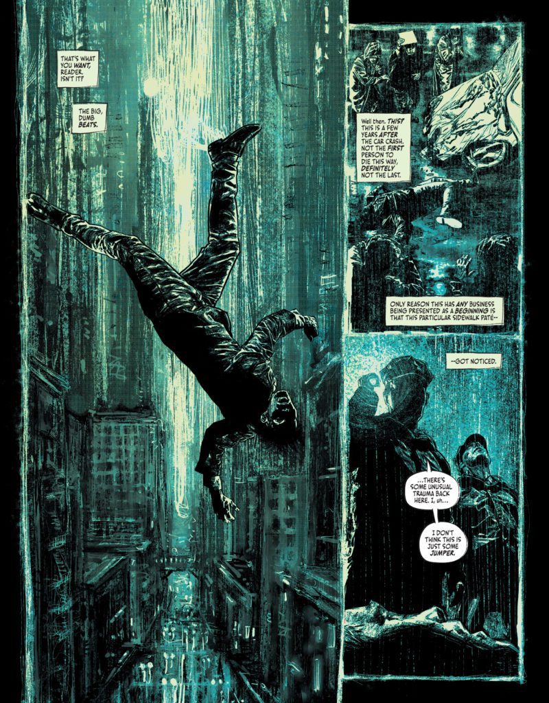
Suicide Squad: Blaze #1 starts by contemplating where a story should begin. The narrator, with a proverbial finger flipped to the reader, eventually gives up trying to figure out where to start and just begins giving us what we want: “The big, dumb beats.” Suicide Squad: Blaze #1 is a comic that plays by no one’s rules. It turns its nose up at being defined or picked apart. Writer Simon Spurrier, artist Aaron Campbell, colorist Jordie Bellaire, and letterer Aditya Bidikar have created a story that’s as wild, rebellious, and aggressive as its characters.
About Suicide Squad: Blaze (from DC Comics):
The attacks begin without warning. Brutal, sudden…cannibalistic. A metahuman with all the power of Superman but none of his humanity. An unstoppable being ruled only by hunger and instinct, striking at random across the world. To stop this threat, Harley Quinn, Peacemaker, Captain Boomerang, and King Shark have been assigned to corral, nursemaid, and if necessary execute five deadly new recruits: the expendable products of a secret government procedure called BLAZE. They’re ordinary prisoners, endowed with incredible power… and the certain knowledge that it’ll burn through them like wildfire. They have six months to live, maximum.
Writing
Spurrier’s tone is irreverent and aggressive. He’s hostile towards the reader, almost mocking them for picking up the comic in the first place. He skips through to the important bits, narrating about his impatience for the story to get going. Of course, this is all actually done through the voice of Spurrier’s main character, Michael Van Zandt. But it’s a brilliant reverse psychology that pulls the reader in. And while there’s plenty of aggression to be felt from Van Zandt and some of the other characters, there are little moments of levity and humor that happen on the sidelines too. Like when King Shark puts his hands over his nose at the smell of blood, quietly telling himself to keep it together. Spurrier creates an overall mood for this issue, for sure – this reads like a comic that’s been backed into a corner and is swinging at anyone who gets close – but he also shows incredible range with his characters. From the psychotic to the well-meaning. From the suicidal to the homesick. There’s so much to love and fear in each of them.
Art
I could talk for days about Campbell’s incredible art. You can smell his grimy prison cells, feel the texture of the desert sands on your fingertips, and taste the rain in the air of his gloomy Gotham nights. His characters feel layered. At first glance, many of them often look emotionless. Yet, behind their eyes is a deep-seated hatred that still shines through. These are characters who have their walls up. And Campbell’s art doesn’t stop inside the panels. He makes an art of his page layouts too. The panel borders for much of this comic have a slightly uneven border to them, looking like they were actually drawn on with a black pen. One page, depicting a rainy night, actually uses the rain to create the edges of each panel. Campbell’s art feels like it’s barely contained, bursting at the seams and trying to get out.
Coloring
A big part of this story is about the destructive nature of power. Power itself is often shown in a brilliant green that crackles across the page. When the main characters have powers bestowed upon them, the room is cast in a green light. And then three of those characters awake with powers that manifest in dazzling lime colored energy clouds. But even before the characters have their new gifts, there are pages that have a sickly green hue to them. These pages almost look as though they’re beginning to rot, like gangrene is setting in. Bellaire seems to be saying that even the promise of power corrupts. Her pages are stunning and disturbing all at once. Moments of extreme violence are rendered in a breathtaking mélange of colors, looking more like a painting by Cezanne than a comic book page. Bellaire is the perfect fit for a comic that’s finding beauty in the most unlikely places.
Lettering
Bidikar gives Van Zandt’s narration of events a really natural feel. When Van Zandt is saying something that’s beside the point, or something he doesn’t really care for the reader to notice, Bidikar writes in small, lower case lettering. You can hear it like Van Zandt is saying it under his breath. Bidikar’s sound effects are shown in a scratchy, thin lettering across every page. It matches the feel of the book perfectly. One “SKOOSH” noise in particular, the sound of someone’s head getting caved in by a mallet, looks like it’s being formed by the blood in the scene. Bidikar brings even more flavor and fun to every scene.
DC Comics’ Suicide Squad: Blaze #1 is a no-holds-barred, brutal, brilliant issue. This creative team will disturb you and delight you in equal measure. You don’t want to miss this raucous, wild new series – even if it has you reading it from between your fingers as you try and cover your eyes. Pick up Suicide Squad: Blaze #1 at a comic shop near you!
Sabertooth #1 answers one of the most pressing questions in the X-Men books since Jonathan Hickman ushered in a new era for the mutants; What happened to Sabertooth? Victor LaValle is not only going to show us what Sabertooth has been up to, but he’s also going to show us that he’s as vicious as he’s ever been. Joined on the issue by Leonard Kirk on pencils, Rain Beredo on colors, and Cory Petit on letters, we are allowed to see what happens to the mutants that break the laws of Krakoa.
WRITING
LaValle had an exciting decision in front of him for a book like this. He had to decide how he wanted to write Sabertooth. At times, the character appeared as an anti-hero who would work with other mutants, or he was a ruthless killer who did whatever he wanted. LaValle chose the latter. This is a psychological book that focuses on the mind of Sabertooth. From the get-go, LaValle allows us to see that Sabertooth has no remorse for what he did in House of X, he killed civilians while on a mission, and he has no intention to change. This is made clear by him attacking fellow mutants the first chance he gets. LaValle writes Victor like the true creep that he is. While meeting with representatives from Krakoa, all Sabertooth wants to do is murder them. Sabertooth not only wants to kill everyone, but he also wants to kill them gruesomely, and in that sense, LaValle nails down who Sabertooth really is. LaValle takes us through the inner workings of Sabertooth’s mind and shows us how disturbed of a character he really is. Whether it’s ripping off fellow mutants’ faces or beheading people who wish to help, there is no redemption in sight for Victor Creed.
ART
Kirk has his number called as he does the pencils for this issue. Kirk has the difficult task of drawing all these vicious panels of beloved characters getting murdered. On top of that, he also has to draw a visually appealing issue that won’t ruffle feathers as these characters die. Kirk shines most on this issue when drawing these deadly panels. X-Men dying is not that big of a deal at the moment, but them dying this violently is something that rarely happens. Having a beloved character getting their throat bitten out by the story’s main character is a tall task, but Kirk pulls it off with his stylish line work and clean pencils. Kirk can draw both the feral side of Sabertooth as he murders all his enemies and the calmer, emotional side of the character as he accepts his final fate in the pit. This duality highlights the complexity of a character like Sabertooth and Kirk’s talent as an artist drawing both emotions.
The colors by Beredo are integral to the issue, if for no other reason than to color all the various superhero blood everywhere. In all seriousness, Beredo had a challenging task at hand; coloring a maniac murdering for half the issue is a difficult task. Decapitated characters with blood splashing all over the page, blood on X-Men’s faces mixed with a dark background and of course, the ever difficult Warlock. Many of the backgrounds are light for such a dark story, especially when Beredo is lighting up the page with a Cyclops optic blast. This is a violent and gross issue to color, but Beredo does a fantastic job of keeping readers invested in the work on the page. Beredo’s colors add life to this book, whether it’s blood-splattered or an emotional epiphany for Sabertooth.
Petit is on letter duty, and he also had a difficult job. As characters get their faces ripped off, we see “Shhhrrrrppp.” In a comic book, we can hear that noise in our head as we read the issue. Petit also gives us the infamous “Bamf” sound from nightcrawler. You may smell a little brimstone as you read that on the page as well.
CONCLUSION
Sabertooth #1 picks up right where we last saw the villain, in the Krakoan pit. This issue gives us insight into what Sabertooth has been doing with his time and why he still deserves to be locked up. Sabertooth #1 is on sale at a comic shop near you!
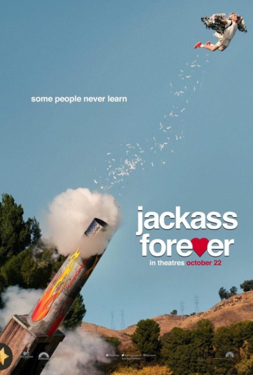
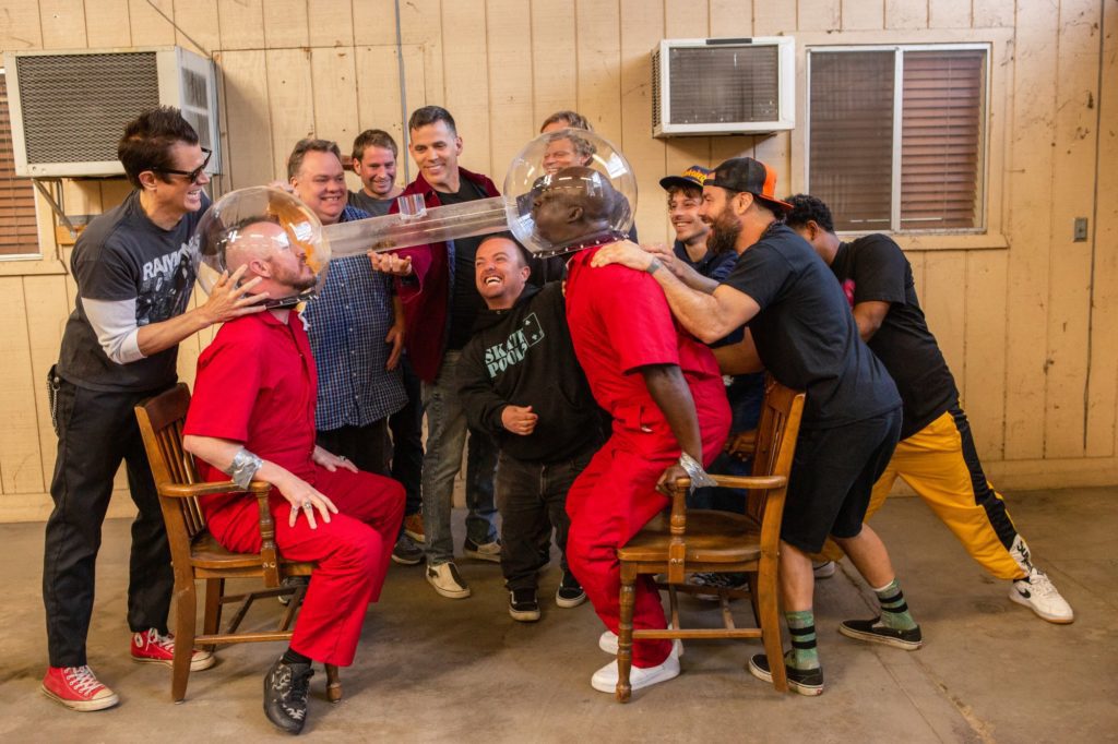
Jackass Forever revives the death-defying franchise for a new generation and those who grew up with the MTV series. The film’s ridiculous stunts line up with the gags pulled in the past, but this reunion with old friends is highly thrilling. Jackass Forever will make you laugh and squirm while the insanity unfolds. This is a satisfying return that should be experienced with an audience.
This franchise probably shouldn’t exist, but Jackass was Youtube before it even existed for those that grew with the MTV series. It provided a compilation of nonsense and risky stunts before they were easily accessible through a search bar. Jackass Forever arrives at a time where penis stunts and several bonkers gags can be found online at any point. This doesn’t take away from the antics pulled in Jackass Forever, but it does make the experience nostalgic.
Jeff Tremaine returns to direct Jackass Forever which features many familiar faces including Johnny Knoxville, Wee Man, Steve-O, Ehren McGhehey, and other surprise guests. No one should expect a traditional film here, but expect a long compilation of outlandish stunts that will cause endless eruptions of laughter. One, in particular, involves bees in a spot they don’t belong and this sequence grows increasingly disturbing as it progresses. There are some familiar gags found in Jackass Forever, so that is one of the film’s weaker aspects.
Knoxville and his crew deliver the painful yet hilarious gags audiences expect and one involving a heavyweight fighter will stick with you. McGhehey is MVP due to the amount of excruciating pain he endures. It’s all for the sake of my entertainment though, and I laughed more than I expected. Jackass Forever waste no time getting to the penis jokes during its opening act, which was insane to witness and Godzilla will never be the same.
Arriving over a decade after Jackass 3D, this fourth entry doesn’t disappoint but it would have been nice to see some other old faces return. Jackass is the only franchise I can recall using horse semen for comedic purposes, and the semen jokes are taken to the next level in Jackass Forever. While the humor is consistent, certain bits had me wincing and cringing, but this wasn’t in a negative manner.
There are just moments that you can’t believe these guys still put themselves through this for our entertainment. The amount of dedication to being ridiculous for comedic purposes shouldn’t be overlooked. Jackass Forever is dumb fun done correctly, as it doesn’t take itself seriously, and doesn’t expect you to either. There undoubtedly is a lot of unused footage that will be revealed on Jackass 4.5 because that has been the trend in the past.
Jackass Forever has earned the right to be called my second favorite theatrical experience of the year so far. A fun trip down memory lane that doesn’t need to accomplish much besides making you burst into uncontrollable laughter. Even if you aren’t a fan of Jackass this latest entry could send you back in time to revisit the previous entries. I’m not sure how much longer Knoxville and his crew can keep this up, but nostalgia never gets old when it’s done right.
Jackass Forever is the most fun you’ll have laughing in a crowded theater this year. It’s ridiculously immature, but that’s what you will be here to witness and it’s enjoyable from start to finish. The familiarity of it all combined with the callbacks kept me smiling in between all the laughter. Jackass Forever was a delightful return with old friends who still want to have the most bonkers fun possible.
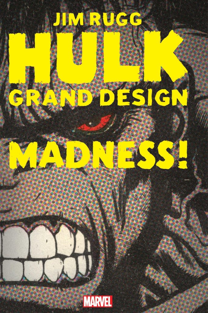
Jim Rugg joins the Grand Design club with HULK GRAND DESIGN. Like Ed Piskor (X-Men Grand Design) and Tom Scioli (Fantastic Four Grand Design), Rugg handled everything on the book: pencils, inks, colors, and lettering. With the book set to release on March 16, 2022 (3:16 y’all!), the Pittsburgh-based cartoonist took some time to talk about the project. Check out the interview below and make sure you tell your local comic shop that you want HULK GRAND DESIGN!
Monkeys Fighting Robots: Let’s start with something basic. Why Hulk? What about the Green Goliath made you want to tackle just an incredibly gigantic project? RUGG: Hulk is the first comic book character that I remember. Before I started reading comics, I had a Hulk cereal bowl. I was 6. And every morning before 1st grade, I would eat breakfast and read his origin and study John Romita’s Hulk drawing. Plus, I loved monsters and Hulk was like the coolest looking monster ever. As a cartoonist, I look at Hulk and think – he’s one of the greatest, most well-known fictional characters of the 20th century. It is exciting to get to play with a character of Hulk’s stature, quality, and longevity.
MFR: What was the initial process in getting Incredible Hulk Grand Design started? Did you approach Marvel or did Marvel approach you? Was there a lot of negotiation involved? RUGG: I think Marvel asked for a pitch. After Ed Piskor’s X-Men Grand Design, I sent Marvel a proposal for a Hulk Grand Design book. Nothing happened for a while but eventually, Marvel green-lit Tom Scioli’s Fantastic Four Grand Design. And then I think they got back to me in late 2019 or early 2020. There was a little negotiation. Nothing unusual.
MFR: Were you given any kind of deadline, or was that something you set for yourself? RUGG: I didn’t have a deadline right away. We figured out the number of books and pages and I started working. Then when I was about halfway through the first book, we decided on a deadline. I made this book during lockdown, so there were some unknowns and ups-and-downs. I think Marvel’s editors were working from home most of the time. Early in the lockdown, I was told to stop working on Hulk – that’s when I did Octobriana 1976 – the world’s 1st blacklight comic book.
MFR: How much leeway did Marvel give you once the project was green-lit (pun intended)? RUGG:Marvel gave me a lot of leeway. I wasn’t sure what to expect because I hadn’t done much work for Marvel before Hulk Grand Design. I would send things in like outlines and pages. And they mostly just said, great, keep going. I’m used to working on my own books without any outside input or feedback. So I was very comfortable with this approach. Wil Moss took over editing the book early in the process. When we talked about it, I felt like he viewed it as a unique project and gave me a lot of freedom as a result. He and his assistant editors were great – when I needed something, had questions, had ideas, they were there. But he also gave me a lot of room to make Hulk Grand Design like I would make Street Angel or one of my other books. As I got more comfortable, the book really became a dream project. Ultimately, if you love Hulk Grand Design or you hate it, it’s on me. Marvel was awesome in that they hired me to be me and they really let me do what I wanted. I could not be happier with that part of the experience.
MFR: I know this was an immense research project as well. I mean, you are a self-described Hulk fan, but we are talking hundreds of issues here. Did Marvel give you access to all the Hulk back catalog? How did you go about reading so many comics? Did you have a set ‘reading schedule’? RUGG: I bought comics, borrowed comics, I read reprints and digital copies of many of the comics that I couldn’t find. I would read like 20 issues a night. Some days, I would read Hulk comic books all day. Eventually, I had a Google doc that was broken into 80 pages. Each page had a sentence or two description. That was my script. When I started a new page, I would write/draw the page based on that description. It usually took 2-3 days to make a page. I would reread the relevant issues during the writing process.
Cover to HULK GRAND DESIGN #2 by Jim Rugg
MFR: Did you take notes as you read? RUGG: Yes. I was overwhelmed when I started. So I began making very basic notes on index cards – who did the Hulk fight? Anything else noteworthy in the issue like the artist, characters, story? So I ended up with a huge stack of index cards that summarized the Hulk in chronological order. From there, I organized the notes into pages.
MFR: Was there anything new about the Hulk you connected with as a character? Anything new about the book you discovered? RUGG: Hulk is a static character for the first 20 years. The changes are mostly visual as different artists take over. That was interesting. It’s not entirely new, but seeing it issue by issue was exciting – a lot of good comic book artists drew Hulk. In the late 200s, the Hulk’s character begins to evolve with writer Bill Mantlo. And then Peter David comes on and continues to explore some of the threads that Mantlo introduced. It was interesting for me to see how creators approached Hulk. He is so different than most of the Marvel heroes. So watching creators try to develop his character was interesting.
MFR: So what would you say is your favorite story arc? RUGG: Mr. Fixit. That was different. It was what drew me to reading comics. The characterization was very different than the Hulk Smash green monster Hulk. But it felt like a good version of the character to me. Weirdly, I think it’s Hulk at his happiest moment. Jeff Purvis’ art is strong too. That’s a fun story arc. But Hulk is full of fun stories. I enjoyed John Byrne’s brief run as writer/artist. I like when Hulk’s S.H.I.E.L.D. girlfriend is turned into Ms. M.O.D.O.K. Across 60 years of history, there are so many great stories!
MFR: Did you have a favorite writer and artist? RUGG: Sal Buscema does a great green Hulk. Buscema draws Hulk almost like a pyramid shape. He looks very powerful. Before this project, I thought Herb Trimpe was my favorite Hulk artist. And I love Herb Trimpe’s Hulk! But Sal Buscema’s Hulk is probably the iconic version from my childhood memories.
MFR: What story arc did you like the least? RUGG: The Pantheon. I hated it. It was the storyline that made me quit reading Hulk. And when I look at it critically, it’s the least Hulk-like arc and runs for 4 years. I can see how a creator would go in this direction. It’s a different take on the character. But I feel like it turned a unique character into something generic. It featured a civilized Hulk in a costume – i.e. like most of Marvel’s superheroes. And Hulk was constantly getting his ass kicked during this arc. I don’t read Hulk because I want to see Hulk smashed. The supporting cast of the Pantheon bored me as well.
MFR: You love to work with different mediums, tools, and methods. How did you decide what method to use for each page or moment? RUGG: I approached each page differently. When I started a page, I only had a sentence or two of description. So I considered everything – tools, look, tone, story, characters. And then I would use whatever media I thought would look the best with the page’s story. I used everything – paint, ink, markers, nibs, brushes, wash, digital, printer, scanner, ballpoint pens, notebook paper, pencils, colored pencils, collage. I guess it’s somewhat intuitive. I would also keep a list of different ideas that I wanted to use from color palettes to collage to book excerpts and advertising. I think I was able to use most of them.
MFR: Did you try any new art methods with Hulk Grand Design, anything you had never tried before? RUGG: I used markers a lot more than I have in the past. But I can’t think of anything that was completely new. I definitely used more materials and techniques in this book than any other (except maybe Supermag). Using different materials and methods was a huge part of the fun of making this!
MFR: Do you have a favorite page, sequence, or image from the project? RUGG: I’m happy with how the last page turned out. But honestly, I’m happy with most of the pages. I had one page that required major changes and I think the revised page is much better so that’s good. There are a couple of Hulk vs Wolverine pages that I’m proud of – one in Monster and one in Madness. The first Mr. Fixit page is a personal favorite.
MFR: Is there an aspect that you struggled with? RUGG: I struggled early in the project. Trying to shape the narrative was tough. There was so much to fit into the story. I also struggled stylistically and with confidence. This is a giant character. I guess I was intimidated. But after I started working on pages, it felt great. Each page felt like a chance to tackle a new character or fight or version of the Hulk – that became very exciting.
MFR: And finally, what do you hope we (the readers!) will get from Incredible Hulk Grand Design? RUGG: I hope longtime fans will get a chance to remember some of the stories and moments that made them Hulk fans. Whether it’s character moments, artists, covers, etc. As long-time fans, they know Hulk. I hope they will have moments of awe as they see my interpretations of the Hulk. And I hope it provides a little bit of community for Hulk fans. I used to love talking comics with friends or at the comic shop. So I hope Hulk Grand Design readers will enjoy the book and enjoy talking about it with their fellow Hulk fans at the shop or online. For new readers – it’s a chance to share my enthusiasm for the character and the medium of comics. I hope it blows their mind and makes them fall in love with comics and they become life-long comics readers.
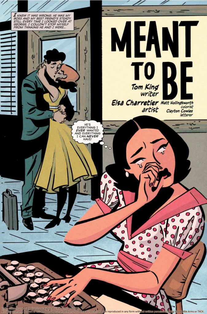
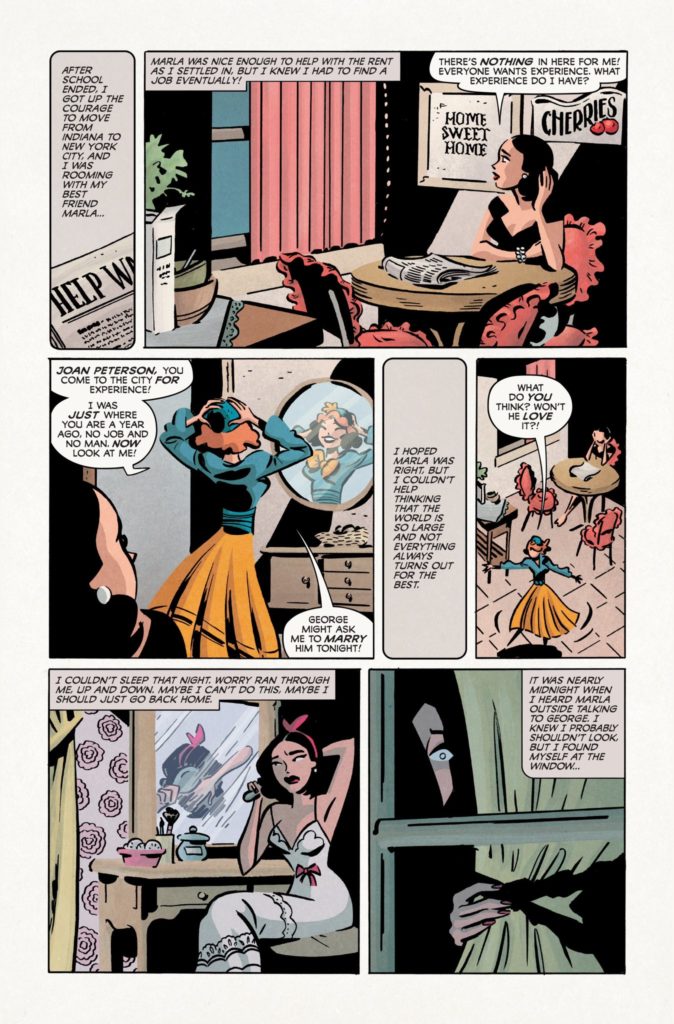
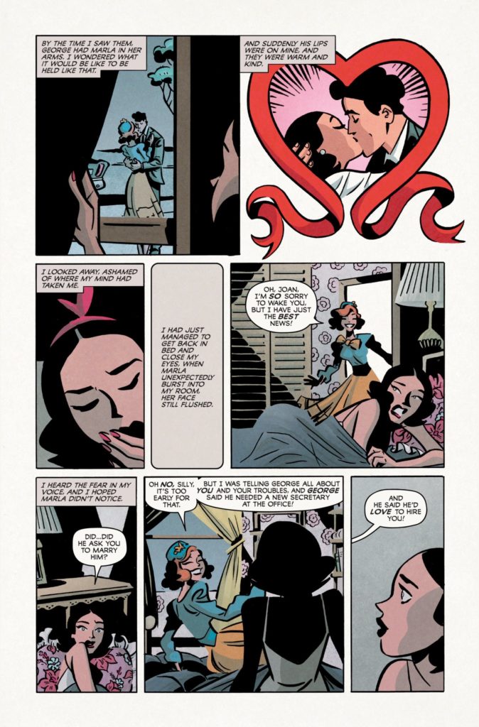
Love Everlasting #1 is not what you’d expect. The first few pages, heavy-laden with the exposition dumps of thought bubbles and caption boxes, are a recreation of the romance comics of the 50’s to 70’s. It’s retro, cheesy, and delightful. But soon, Love Everlasting #1 changes quite a bit. Eventually, it’d be more accurate to call it psychological horror than to call it a romance comic. Writer Tom King, artist Elsa Chatterier, colorist Matt Hollingsworth, and letterer Clayton Cowles are doing something completely original with this series. Better yet, they’re allowing readers to get access to it for free, through their Substack, Everlasting Productions.
Writing
It’s tempting to say that King is lampooning the writing of old romance comics in his first few pages. The story is melodramatic and the romance between the two characters is sudden and intense. But King actually seems to embrace these staples of the genre, rather than poke fun at them. The first story in Love Everlasting might be over the top, but it’s joyfully over the top. You find yourself chuckling at the drama, yet still giddy when the story comes to a close. If King had simply wanted to write in the style of old romance comics, he could have done so and done so well. But instead, he takes things a step further. As we go into our second story, everything becomes immediately confusing. And King lets the confusion sink in before offering any clues as to what is going on. By the end of the issue, King has turned the whole genre on its head. He’s changed everlasting love from a dream into a threat. This script will leave you begging for the next chapter.
Art
Chatterier’s art perfectly matches the style of the 50’s and 60’s. It’s playful and beautiful at the same time. As we meet our protagonist, Joan Peterson, we quickly learn that she’s someone who feels more like an extra than a main character. And Chatterier shows this brilliantly. In every panel, Joan looks small. She’s often off to one side, like she’s trying to stay out of everyone’s way. There are plenty of instances of her even hiding behind things. The other characters, like her confident roommate Marla, stand tall in every frame, taking up space and brimming with happiness. And when we switch into another story, Joan seems the same. She’s a supporting character in her own life. Until she begins to suspect that something is up. We see her in the dead center of a panel while she stares at the reader, with the art style changed to a scratchy, unfinished look. When Joan finally feels like she understands what’s going on, at least somewhat, she starts to push into the center of every frame. She takes charge. She starts acting like a real main character.
Coloring
Hollingsworth gives each story in Love Everlasting #1 a distinct flavor. The first story, about Joan falling for George, has many panels that have a slight pink tint to them. We’re seeing the world through the hopelessly in love eyes of Joan. The next story, focusing on Joan and a musician from the Village, Hollingsworth colors in blues and purples. The entire chapter feels like it’s happening in a nightclub. And the last full story we get, set in the Wild West, is colored in earthy tones of beige and red. Hollingsworth makes us feel that these aren’t just different chapters. They’re entirely different worlds.
Lettering
Cowles ups the drama of every scene with his lettering. We see the small font of people speaking with bated breath, leaning in for a kiss. Or we see the growing font of Joan’s realization in a caption box. “But then. But then! But then!!” it says, with each refrain being bigger than the last as she finally latches onto some hope. As Joan begins to realize that everything isn’t okay, Cowles places small caption boxes on the page that interrupt her other thoughts. Finally, this culminates in a jagged, red word balloon with large, bold letters. Every beat, every change, is emphasized by Cowles masterfully.
Love Everlasting is a smart, terrifying upending of the romance genre. It reels you into a world that feels comfortable and familiar, before pulling the rug out from under you. You don’t want to miss this fantastic new series. Each issue is free through Everlasting Productions, with issue #1 available now.
From page 1, you know that shit’s going to go down in Newburn #3. Or, more accurately, shit has already gone down. Writer Chip Zdarsky, and artist, colorist, and letterer Jacob Phillips open this issue on three dead bodies, lying in pools of their own blood. Image Comics’ Newburn has thus far been no stranger to death. But this issue, in particular, takes a turn for the gruesome and macabre. It’s disturbingly interesting.
Writing
Zdarsky makes an interesting shift in this issue. For once, Newburn is facing something unlike anything he’s ever seen before. Zdarsky isn’t showing us the Columbo-esque confidence of someone who has figured out everything on page one. He’s showing us the step by step process of Newburn figuring something out from the ground up. We see Newburn talk more than usual. We see him listen more carefully. As such, there’s plenty of text in Newburn #3. Perhaps a bit more than in his first two outings. But Zdarsky brilliantly counteracts this by pulling back on the dialogue altogether near the end. Once Newburn has figured everything out, the pages become wordless. The silence rings in the air as you lean forward in your seat. Zdarsky creates a fantastic rhythm in his script, pulling you in for the big, satisfying finale.
You kind of have to love that Image Comics missed the last “Holy Shit” on this page when blacking out swear words for their previews.
Art
Once again, Phillips shows us what makes Newburn so different from everyone. In a world of snarls, grimaces, and the occasional smile, Newburn is a constant stoic. He’s a man who is always in control. And even Phillips’ page layouts show us this. They’re your typical, straight-edged, neatly placed panels. They echo the ordered, tidy life that Newburn lives. He may deal with all kinds of crazy people, but he won’t let their way of life effect his. Until, in the last couple pages of this issue, the layouts change. In place of all of the right angles, we see gutters that slant and cut through the air. Newburn is finally facing someone who’s just as chaotic as he is orderly. Phillips heightens this moment of the script by making these pages unlike anything we’ve seen yet.
Coloring
Phillips’ coloring is always a highlight in this series. Every scene feels like it has a specific hue to it. The first scene, out in the cold morning light, is cast in a soft blue tone. The scenes in the Black Castle have a menacing red glow to them. And one scene, set in a morgue, is shown in with a green tint to it. Each coloring choice adds to the ambience of every setting. But it also works to match the feeling of each beat of the narrative. Phillips choices are both stunning to the eye and thematically engaging, as usual.
Lettering
There’s a specificity to the size of Phillips’ lettering. As Newburn #3 reaches its big crescendo, the font of the dialogue gets bigger. Soon, the bolded and italicized lettering has these characters yelling at one another. Then, on the next page, Newburn is whispering to himself in a smaller font than usual. You can hear each character change their volume for emphasis. Phillips wants you to do more than just read this comic. He wants you to hear it.
Image Comics’ Newburn #3 is a gruesome good time. Zdarsky and Phillips are creating a brilliant series that has incredible range. In one issue, they can dive into the complexities of the human spirit. In the next, they’re talking serial killers and knife fights. I can’t wait to see what they’ve cooked up for us next. Newburn #3 is out from Image Comics at a comic shop near you!
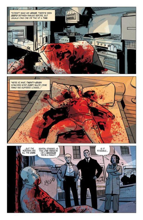
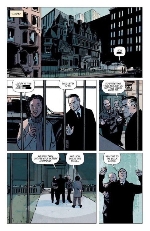
DEVIL’S REIGN #4 hits your local comic book store February 9th, but thanks to Marvel Comics, Monkeys Fighting Robots has an exclusive three-page preview for you.
About the issue: NEW YORK UNDER SEIGE! Wilson Fisk, duly elected Mayor of New York, has broken. Whatever shred of decency that may have been left of him is gone entirely and now, with an army of super villains at his command, THE KINGPIN has set his gaze upon everyone the heroes of the Marvel Universe hold dear – but even the Kingpin is unaware of the magnitude of danger he has put the city, its citizens and even himself with his war against the city’s super heroes!
The issue is by writer Chip Zdarsky and artist Marco Checchetto, with colors by Marcio Menyz, and letters by Clayton Cowles. The main cover is by Checchetto and Matthew Wilson.
Check out the DEVIL’S REIGN #4 preview below:
How are you enjoying DEVIL’S REIGN so far? Sound off in the comments!
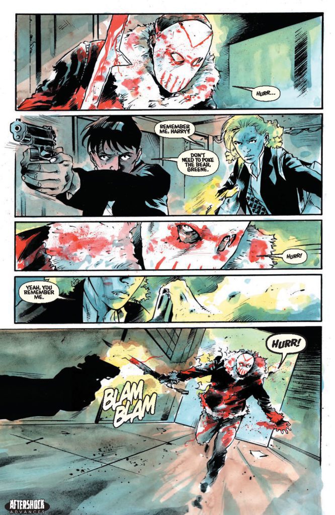
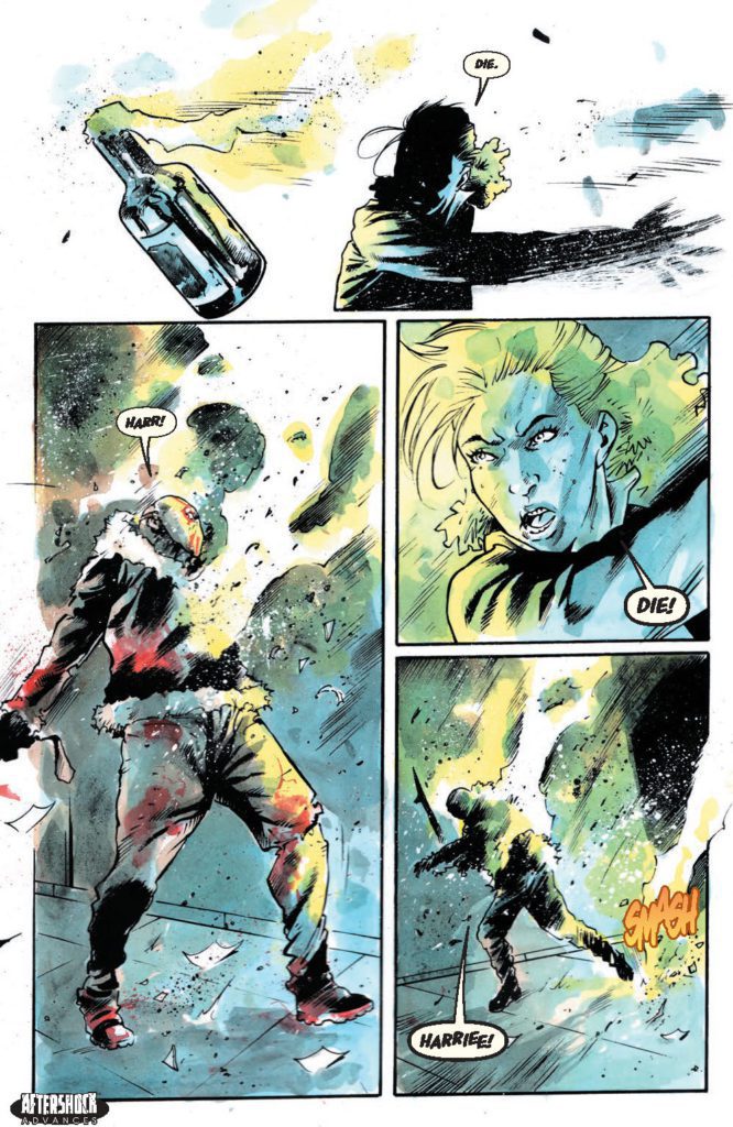
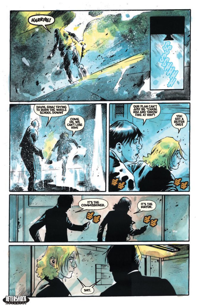
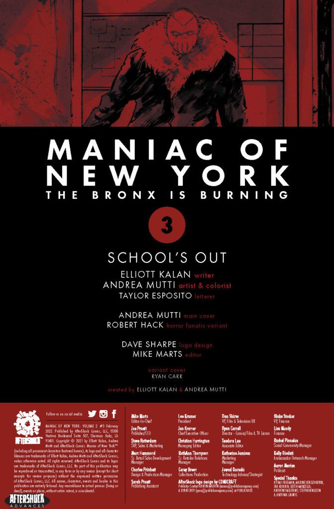
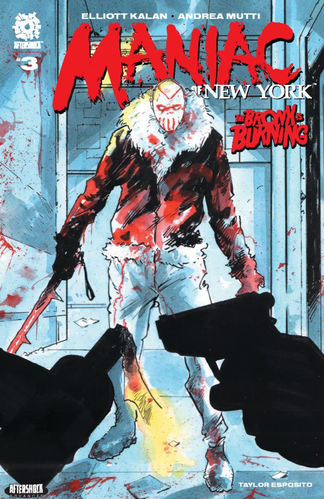
MANIAC OF NEW YORK: THE BRONX IS BURNING #3 hits your local comic book store February 16th, but thanks to AfterShock Comics, Monkeys Fighting Robots has an exclusive four-page preview for you.
About the issue: Gina Greene and Zelda Pettibone are face-to-face with Maniac Harry once more, and they’re armed with enough Molotov cocktails to burn down the borough! But the Mayor of New York seems determined to get in their way. Can Gina and Zelda stop Harry before his body count rises?
SPOILER ALERT: They can’t! There’s only one issue left after this one, and it just might be the biggest bloodbath yet!
The comic is by writer Elliott Kalan and artist Andrea Mutti, with letters by Taylor Esposito. The main cover is by Mutti, and the Horror Fanatic variant is by Robert Hack.
Check out the MANIAC OF NEW YORK: THE BRONX IS BURNING #3 preview below:
Are you caught up on MANIAC OF NEW YORK? Sound off in the comments!
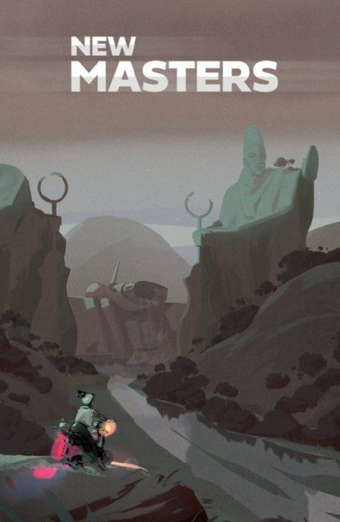
From Shobo and Shof Coker (Outcasts Of Jupiter) comes a smart and unique take on a familiar sci-fi concept with New Masters #1. This story of colonization in a distant future offers a perspective we don’t often see in out Western-dominated world of comics fiction. With a sharp, intriguing script and stunning visual work, this could prove to be the start of a new mega-hit over at Image Comics.
“In a striking vision of West Africa under the thumb of alien colonizers, a motley crew of outcasts find themselves caught up in a power struggle for control of an ancient artifact with immense power.”
Writing & Plot
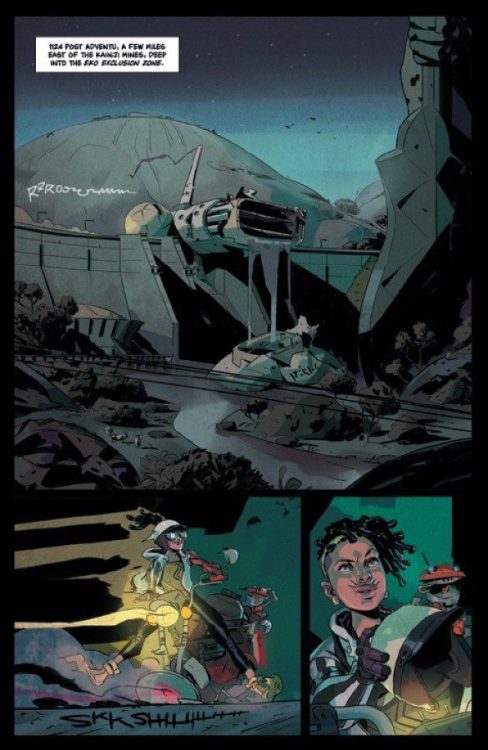
Developing a brand new science fiction world is a daunting task from a scripting perspective. In order to keep the story engaging, the perfect blend of worldbuilding and characterization needs to take place. It’s fortunate then that Shobo Coker pens a script that effectively accomplishes both with New Masters #1. This far-future vison of an Earth colonized by advanced alien races from the perspective of West Africa is a fascinating hotbed for storytelling from a perspective we seldom get to see. Our main cast, including Ola, a scavenger, and Tosin Ojumah, the human governor of this new territory shared with other alien societies, are each survivors navigating a new brand of colonialism from different ends of the societal spectrum. Being West African himself, Shobo has a perspective on this kind of resource-based hostile control that we here in the “West” definitely do not. The class and labor elements in this story bring in some cyberpunk genre tropes to help craft something familiar, but still unique unto itself.
Shobo’s writing style carefully combines distinctive dialogue and necessary exposition to create something informative and compelling. Character speech is filled with personal colloquialisms that add a sense of place and realism to this society. The expository bits come out as characters speaking to each other about current events in-world. These sequences still have the flow of naturalistic dialogue, and as such aren’t a chore to get through. Every aspect of this comic’s writing feels deliberately constructed, but with a natural flow that makes for an engaging and relaxed read that the reader will feel drawn into, but not overworked by.
Art Direction
Science fiction comics introducing new visions of the future have to have immensely talented artists to bring these concepts to life. Fortunately, Shof Coker demonstrates he is more than capable of such in New Masters #1. Coker’s detailed and colorful art style brings this vivid vision of far-future West Africa as the Earth’s interplanetary hub to life with stunning energy. Every one of Shof’s character designs, human and alien, are distinct and memorable. Wardrobe design is a mix of futuristic-affluence and ever-present poverty. On one hand, people in upper-tiers of society wear ornate or sleek gowns and professional dress suits. On the other, people still living in the city’s poor outskirts and risk their lives to earn a pittance wear worn tank tops and ripped pants. Each denizen of this city has a different aesthetic to match their role in this society. Shof’s colors highlight this even more. His use of watercolor-esque styling and vibrant, varied tones craft a stunning and definitively futuristic look to the whole comic. I can’t help but compare Shof Coker’s work to to that of Mike Huddleston in Decorum or Nick Dragotta in East Of West. You know this book is doing something right if I’m comparing it to Hickman joints.
Verdict
New Masters #1 is an exciting and sharply crafted opening chapter for this sci-fi comic with a needed new perspective. Shobo Coker’s script expertly balances exciting action with worldbuilding, compelling exposition, and naturalistic dialogue. Shof Coker’s art is distinct, vivid, and stunning, crafting this futuristic vison of an alien-colonized West African metropolis with a flair both familiar and wholly unique. Be sure to grab this new release when it hits shelves on 2-2!